44
THE RELATIVE STRENGTH CONCEPT APPLIED TO SECTOR INDICES An Illustration with the DJ Stoxx 600 Index Yann CORDIER, CFTe, MFTA AXA Investment Managers London, 10/03/2015
| Date post: | 15-Apr-2018 |
| Category: |
Documents |
| Upload: | truongtuong |
| View: | 222 times |
| Download: | 2 times |
THE RELATIVE STRENGTH CONCEPT APPLIED TO SECTOR INDICES
An Illustration with the DJ Stoxx 600 Index
Yann CORDIER, CFTe, MFTAAXA Investment Managers
London, 10/03/2015
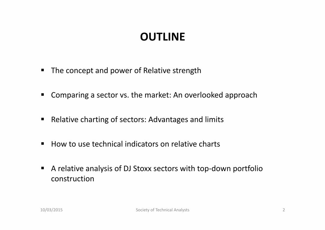
OUTLINE
The concept and power of Relative strength
Comparing a sector vs. the market: An overlooked approach
Relative charting of sectors: Advantages and limits
How to use technical indicators on relative charts
A relative analysis of DJ Stoxx sectors with top‐down portfolio construction
10/03/2015 Society of Technical Analysts 2

1. THE CONCEPT AND POWER OF RELATIVE STRENGTH
10/03/2015 Society of Technical Analysts 3
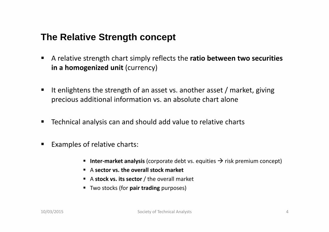
The Relative Strength concept
A relative strength chart simply reflects the ratio between two securities in a homogenized unit (currency)
It enlightens the strength of an asset vs. another asset / market, giving precious additional information vs. an absolute chart alone
Technical analysis can and should add value to relative charts
Examples of relative charts:
Inter‐market analysis (corporate debt vs. equities risk premium concept) A sector vs. the overall stock market A stock vs. its sector / the overall market Two stocks (for pair trading purposes)
10/03/2015 Society of Technical Analysts 4

Relative charting:The famous example of DJ Transport vs. DJ Industrials (1)Daily chart, 2008-2009
10/03/2015 Society of Technical Analysts 5
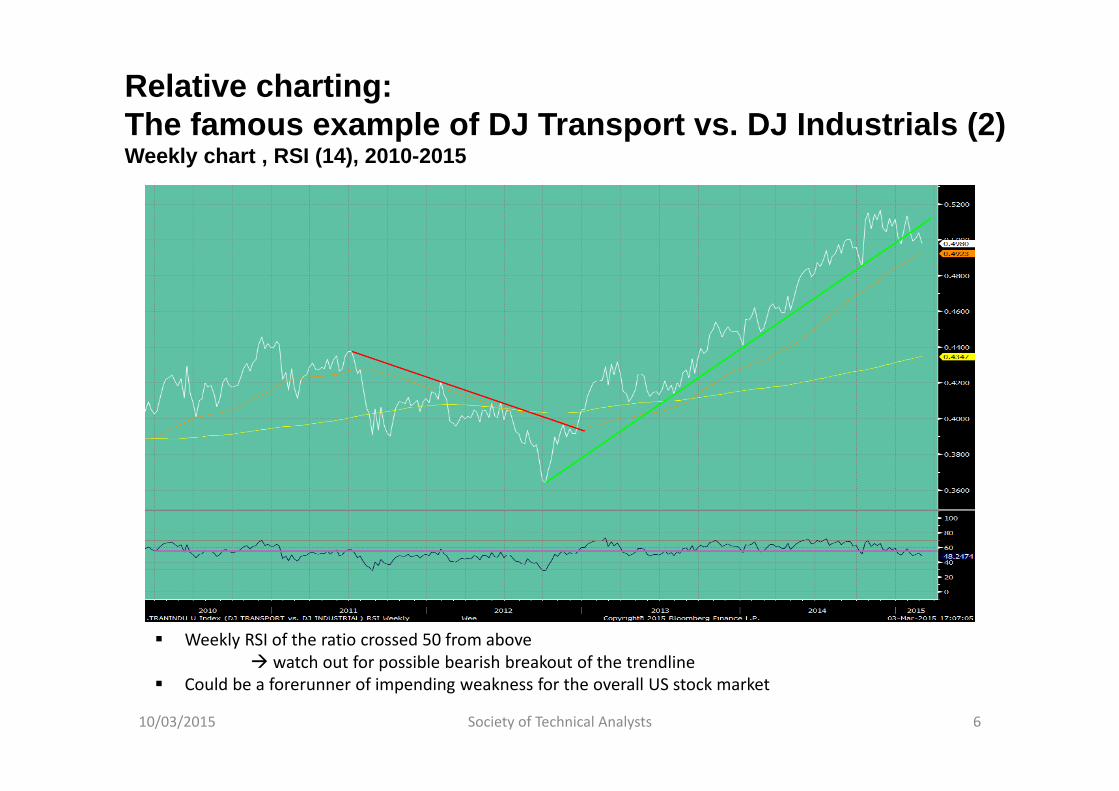
Relative charting:The famous example of DJ Transport vs. DJ Industrials (2)Weekly chart , RSI (14), 2010-2015
10/03/2015 Society of Technical Analysts 6
Weekly RSI of the ratio crossed 50 from above watch out for possible bearish breakout of the trendline
Could be a forerunner of impending weakness for the overall US stock market
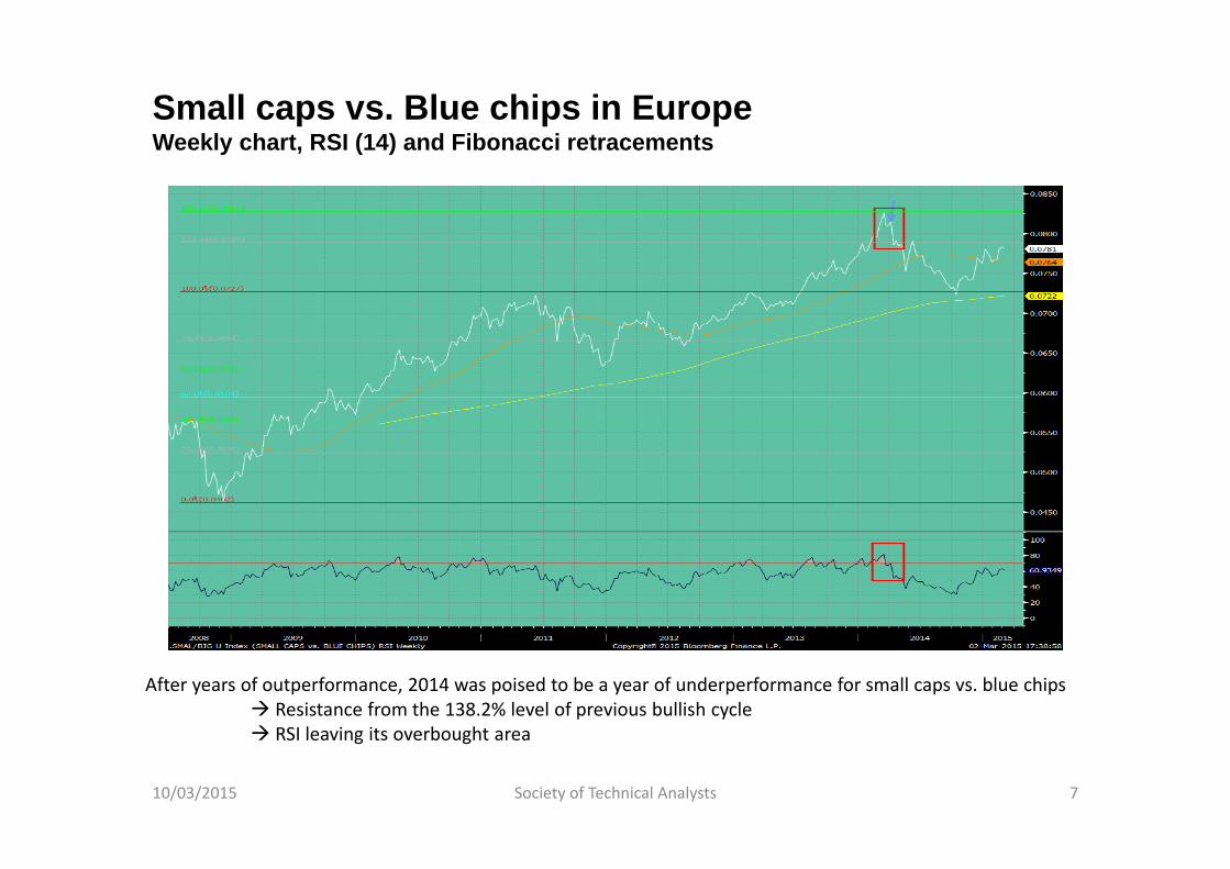
Small caps vs. Blue chips in EuropeWeekly chart, RSI (14) and Fibonacci retracements
10/03/2015 Society of Technical Analysts 7
After years of outperformance, 2014 was poised to be a year of underperformance for small caps vs. blue chips Resistance from the 138.2% level of previous bullish cycle RSI leaving its overbought area
Relative Strength:Buy the strongest of two assets
Mostly, the best pick is the asset that performs most (Don’t fight the trend!)
Especially useful when comparing emerging currencies vs. $, £ or €, or sectors vs. the equity market
Example of US Healthcare and Consumer Staples vs. the S&P 500
10/03/2015 Society of Technical Analysts 8
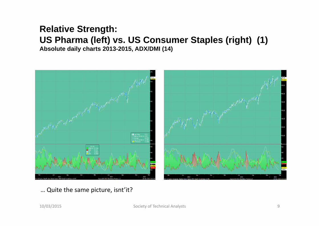
Relative Strength:US Pharma (left) vs. US Consumer Staples (right) (1)Absolute daily charts 2013-2015, ADX/DMI (14)
10/03/2015 Society of Technical Analysts 9
… Quite the same picture, isnt’it?
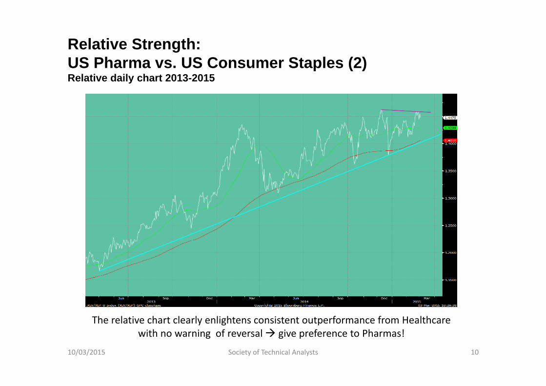
Relative Strength:US Pharma vs. US Consumer Staples (2)Relative daily chart 2013-2015
10/03/2015 Society of Technical Analysts 10
The relative chart clearly enlightens consistent outperformance from Healthcare with no warning of reversal give preference to Pharmas!
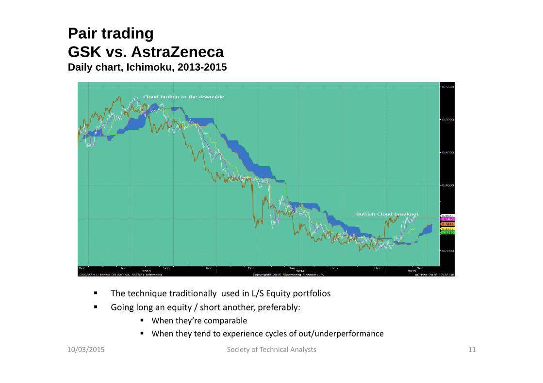
Pair tradingGSK vs. AstraZenecaDaily chart, Ichimoku, 2013-2015
The technique traditionally used in L/S Equity portfolios Going long an equity / short another, preferably:
When they’re comparable When they tend to experience cycles of out/underperformance
10/03/2015 Society of Technical Analysts 11

2. COMPARING A SECTOR VERSUS THE MARKET:AN OVERLOOKED APPROACH
10/03/2015 Society of Technical Analysts 12

The interest of analysing a sector vs. the overall stock market
Most equity portfolios are guided by hunt for alpha Bottom‐up approach (stockpicking)
Overall portfolio construction is rarely an ex ante priority, hence the value of Top‐down approaches
The stock market is a succession of cycles of frenzy or disinterest vis‐à‐vis sectors, countries and/or styles (value, growth, yield…)
Relative strength approach is the least risky way to implement contrarian opinion principles
10/03/2015 Society of Technical Analysts 13
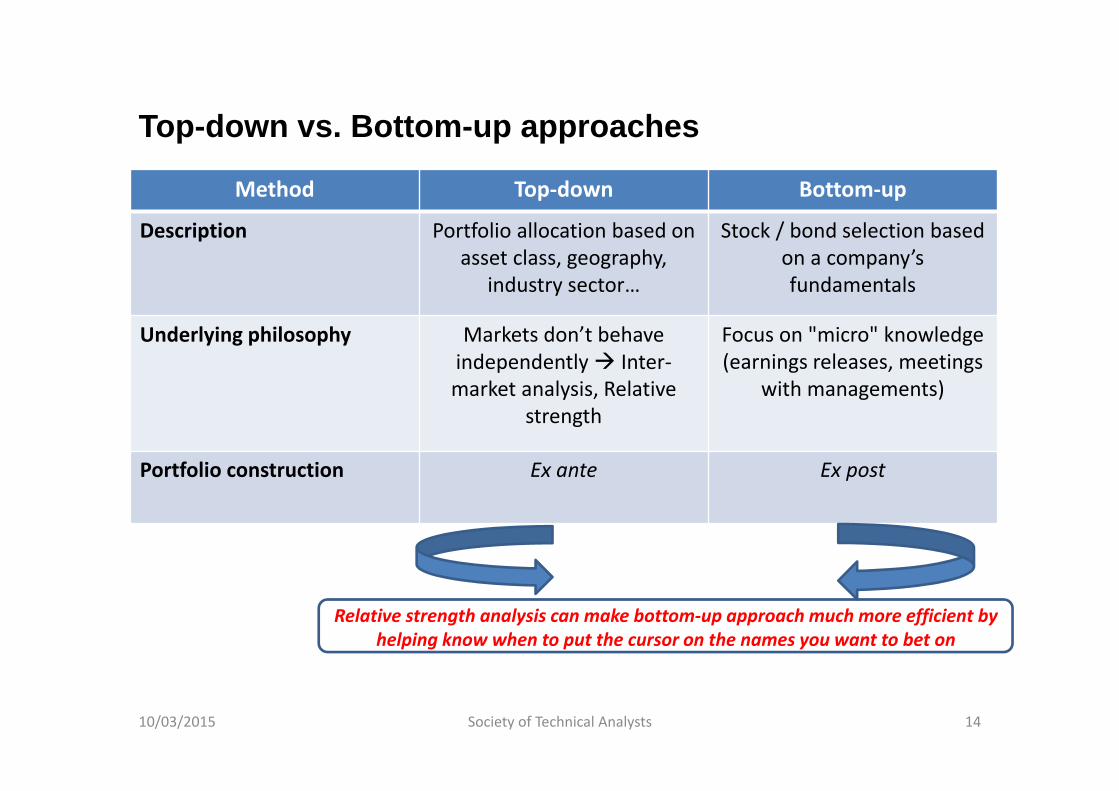
Top-down vs. Bottom-up approaches
Relative strength analysis can make bottom‐up approach much more efficient by helping know when to put the cursor on the names you want to bet on
10/03/2015 Society of Technical Analysts 14
Method Top‐down Bottom‐up
Description Portfolio allocation based on asset class, geography,
industry sector…
Stock / bond selection basedon a company’sfundamentals
Underlying philosophy Markets don’t behaveindependently Inter‐market analysis, Relative
strength
Focus on "micro" knowledge(earnings releases, meetings
with managements)
Portfolio construction Ex ante Ex post
3. RELATIVE CHARTING OF SECTORS:ADVANTAGES AND LIMITS
10/03/2015 Society of Technical Analysts 15
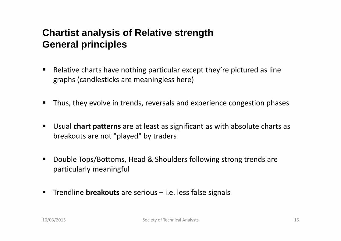
Chartist analysis of Relative strengthGeneral principles
Relative charts have nothing particular except they’re pictured as line graphs (candlesticks are meaningless here)
Thus, they evolve in trends, reversals and experience congestion phases
Usual chart patterns are at least as significant as with absolute charts as breakouts are not "played" by traders
Double Tops/Bottoms, Head & Shoulders following strong trends are particularly meaningful
Trendline breakouts are serious – i.e. less false signals
10/03/2015 Society of Technical Analysts 16
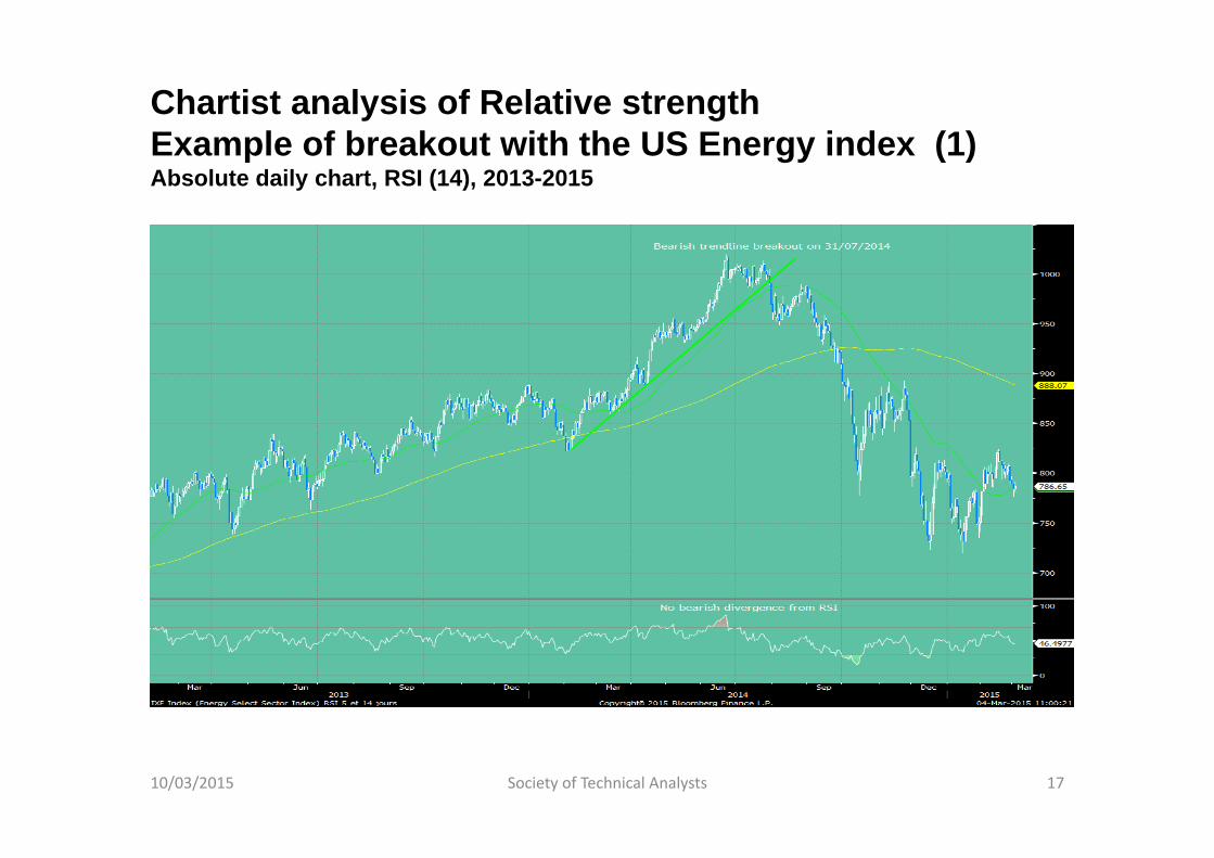
Chartist analysis of Relative strengthExample of breakout with the US Energy index (1)Absolute daily chart, RSI (14), 2013-2015
10/03/2015 Society of Technical Analysts 17
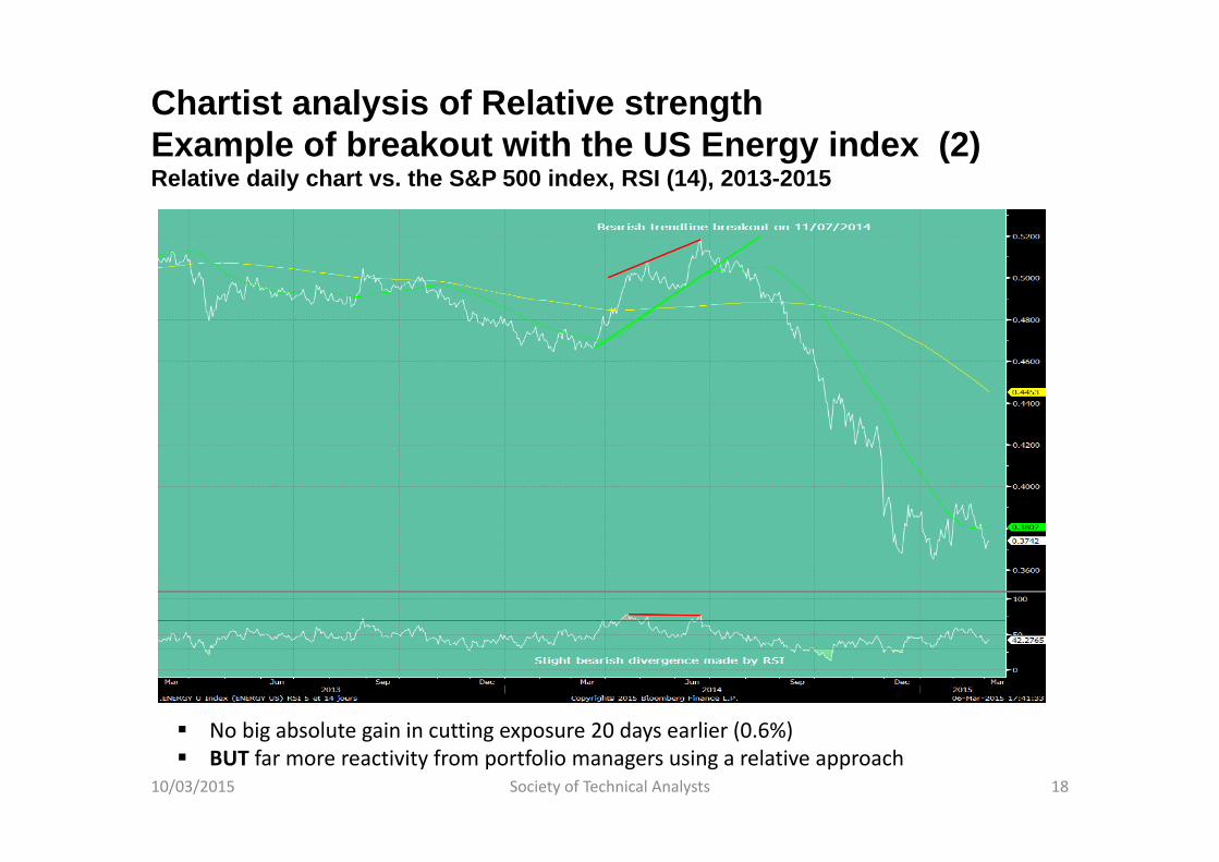
Chartist analysis of Relative strengthExample of breakout with the US Energy index (2)Relative daily chart vs. the S&P 500 index, RSI (14), 2013-2015
10/03/2015 Society of Technical Analysts 18
No big absolute gain in cutting exposure 20 days earlier (0.6%) BUT far more reactivity from portfolio managers using a relative approach
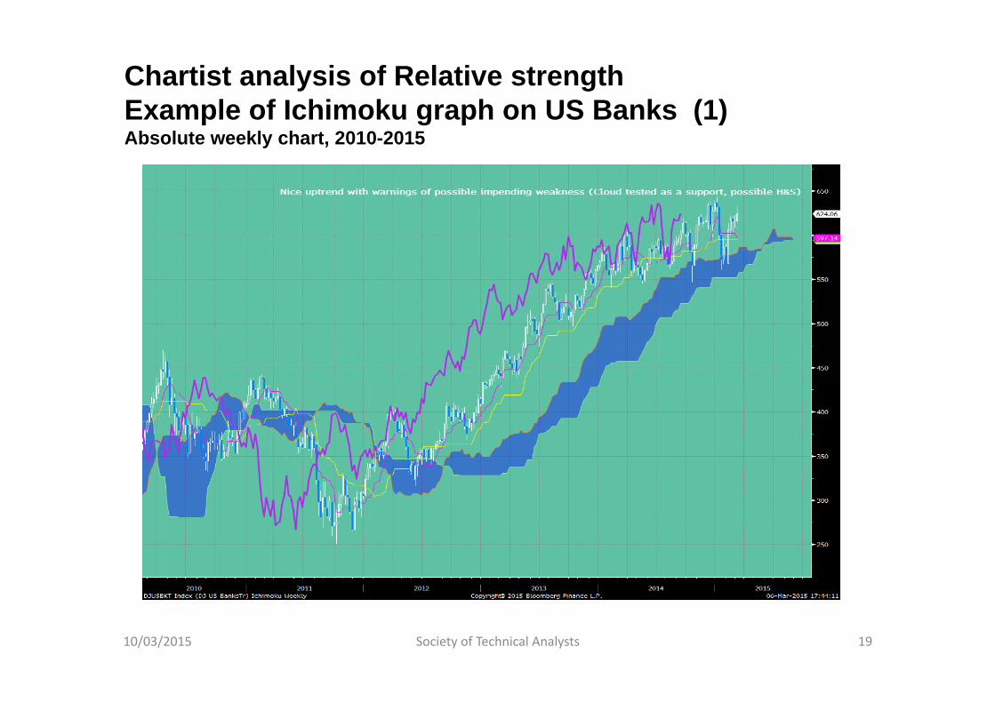
Chartist analysis of Relative strengthExample of Ichimoku graph on US Banks (1)Absolute weekly chart, 2010-2015
10/03/2015 Society of Technical Analysts 19
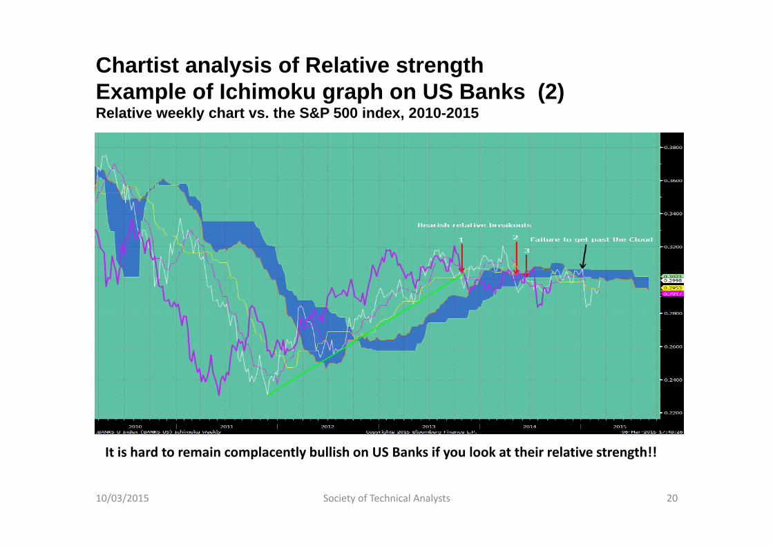
Chartist analysis of Relative strengthExample of Ichimoku graph on US Banks (2)Relative weekly chart vs. the S&P 500 index, 2010-2015
10/03/2015 Society of Technical Analysts 20
It is hard to remain complacently bullish on US Banks if you look at their relative strength!!
Chartist analyst of Relative strengthThe importance of multi-timeframe approach
As usual, it is important to make sure that a trade does not go in a way that is opposite to its primary trend
As regards sector indices, cycles are generally rather long (i.e. several months)
The most rewarding trades are made when LT, MT and ST display comparable patterns
Ideal situation #1: When a ST/MT trend resumes after a pullback while the LT trend was not impacted
Ideal situation #2: When a ST/MT trend starts to develop but the LT trend is not impacted yet (but with clues it could happen soon)
10/03/2015 Society of Technical Analysts 21

4. HOW TO USE TECHNICAL INDICATORS ON RELATIVE CHARTS
10/03/2015 Society of Technical Analysts 22
Technical indicators, the RS’s best friends
Cycles on sectors vs. market tend to be long (longer than on pair trading with frequent reversions to the mean)
Trend indicators are well suited to take full benefit of this phenomenon (cf. Ichimoku charts)
Importance of catching turning points and not simply following trends
Divergences on momentum oscillators are particularly powerful
Bollinger bands provide extremely reliable signals
Oscillators very often make significant patterns by themselves
10/03/2015 Society of Technical Analysts 23
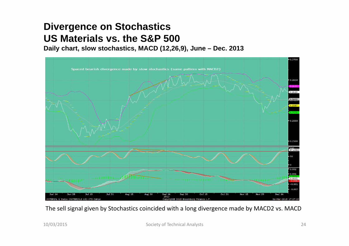
Divergence on StochasticsUS Materials vs. the S&P 500Daily chart, slow stochastics, MACD (12,26,9), June – Dec. 2013
10/03/2015 Society of Technical Analysts 24
The sell signal given by Stochastics coincided with a long divergence made by MACD2 vs. MACD
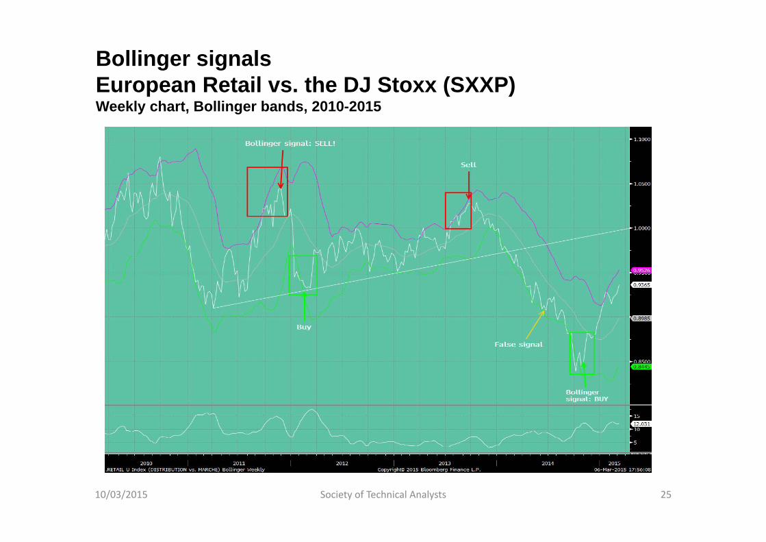
Bollinger signalsEuropean Retail vs. the DJ Stoxx (SXXP)Weekly chart, Bollinger bands, 2010-2015
10/03/2015 Society of Technical Analysts 25
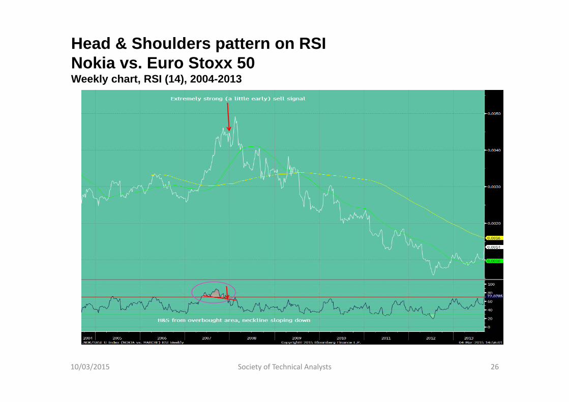
Head & Shoulders pattern on RSINokia vs. Euro Stoxx 50Weekly chart, RSI (14), 2004-2013
10/03/2015 Society of Technical Analysts 26
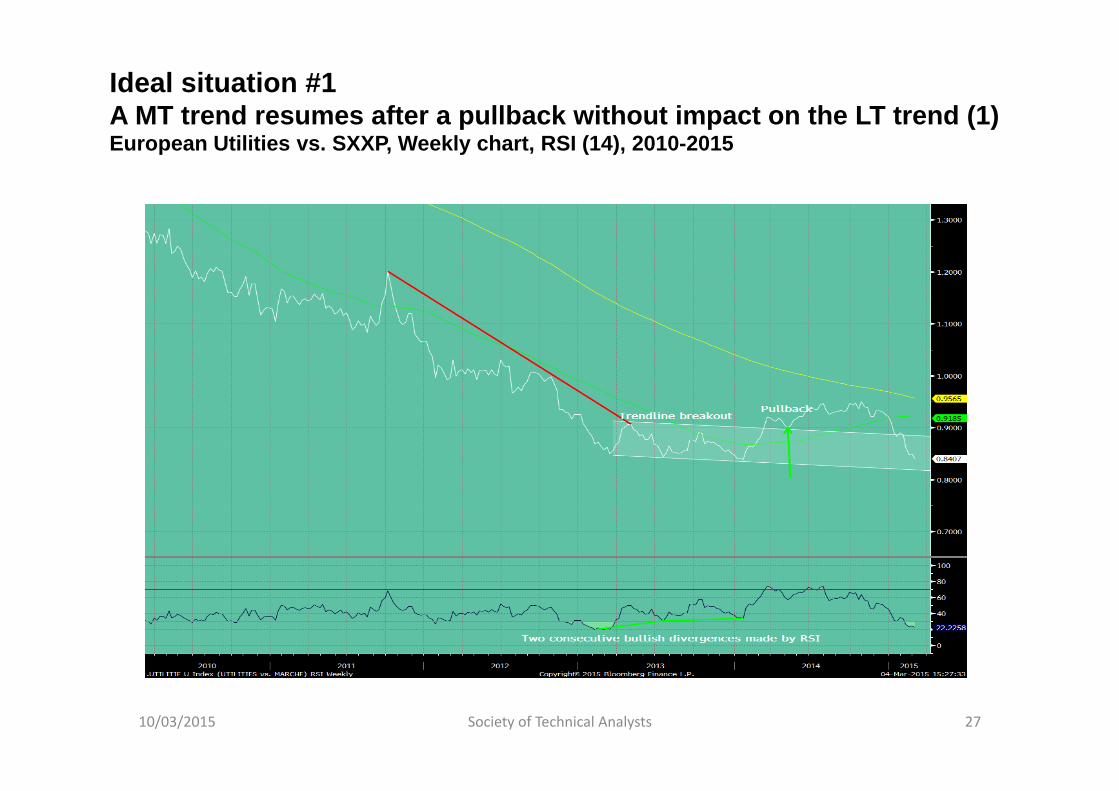
Ideal situation #1A MT trend resumes after a pullback without impact on the LT trend (1)European Utilities vs. SXXP, Weekly chart, RSI (14), 2010-2015
10/03/2015 Society of Technical Analysts 27
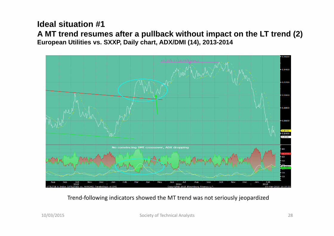
Ideal situation #1A MT trend resumes after a pullback without impact on the LT trend (2)European Utilities vs. SXXP, Daily chart, ADX/DMI (14), 2013-2014
10/03/2015 Society of Technical Analysts 28
Trend‐following indicators showed the MT trend was not seriously jeopardized
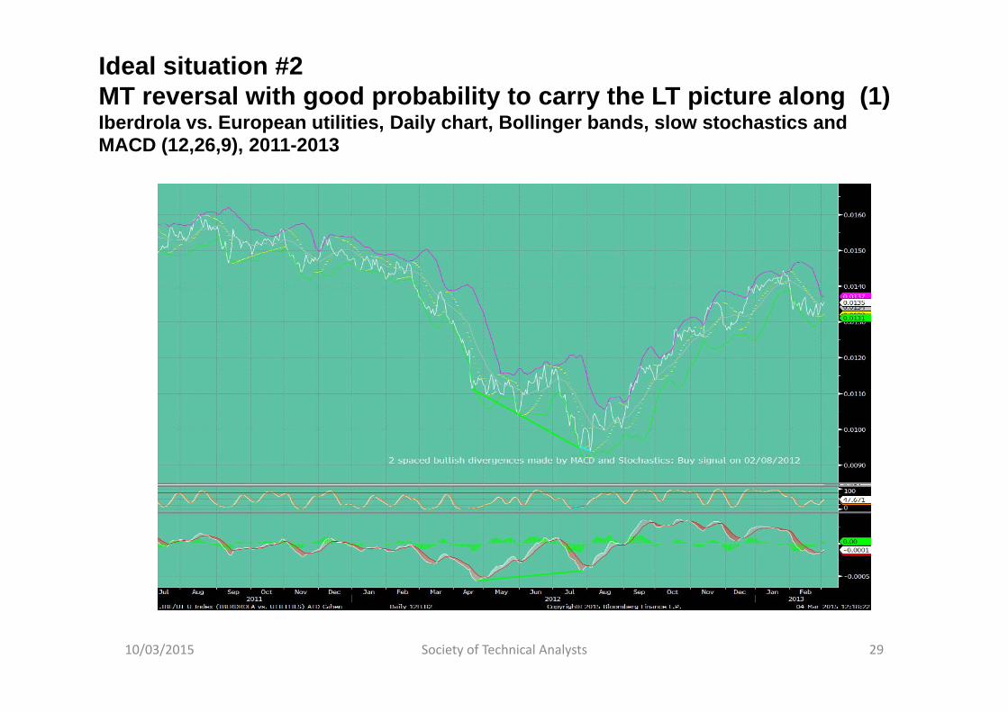
Ideal situation #2MT reversal with good probability to carry the LT picture along (1)Iberdrola vs. European utilities, Daily chart, Bollinger bands, slow stochastics and MACD (12,26,9), 2011-2013
10/03/2015 Society of Technical Analysts 29
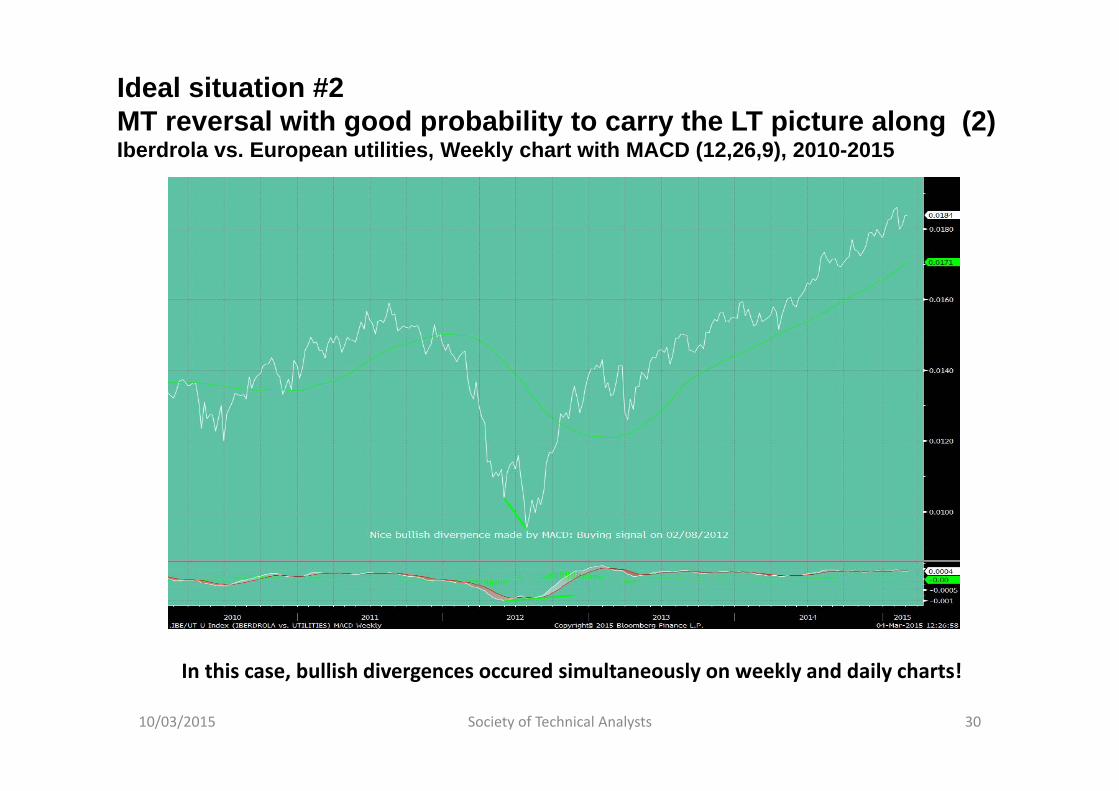
Ideal situation #2MT reversal with good probability to carry the LT picture along (2)Iberdrola vs. European utilities, Weekly chart with MACD (12,26,9), 2010-2015
10/03/2015 Society of Technical Analysts 30
In this case, bullish divergences occured simultaneously on weekly and daily charts!

Is there an optimal combination of technical indicators on relative charts?
RSI is generally more reliable on relative charts than on absolute ones, and is powerful on LT charts
MACD brings enormous value‐added:
Peak & trough divergences made by MACD2 Crossing the Signal 0 acting as a Support or Resistance
Bollinger bands are perhaps more helpful for pair traders, but Bollinger signals made by sectors vs. the market are very powerful and reliable
10/03/2015 Society of Technical Analysts 31
5. A RELATIVE ANALYSIS OF DJ STOXX SECTORSAND PORTFOLIO CONSTRUCTION
10/03/2015 Society of Technical Analysts 32
Analysing the Stoxx index subsectors today
3 parameters should be taken into account:
1. Synchrony between different timeframes2. Recent signals3. Sector weightings in portfolios today
Portfolio construction is then based on technical analysiswith a contrarian bias
10/03/2015 Society of Technical Analysts 33
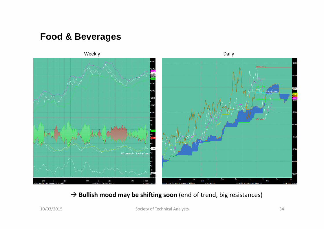
Food & Beverages
10/03/2015 Society of Technical Analysts 34
Weekly Daily
Bullish mood may be shifting soon (end of trend, big resistances)
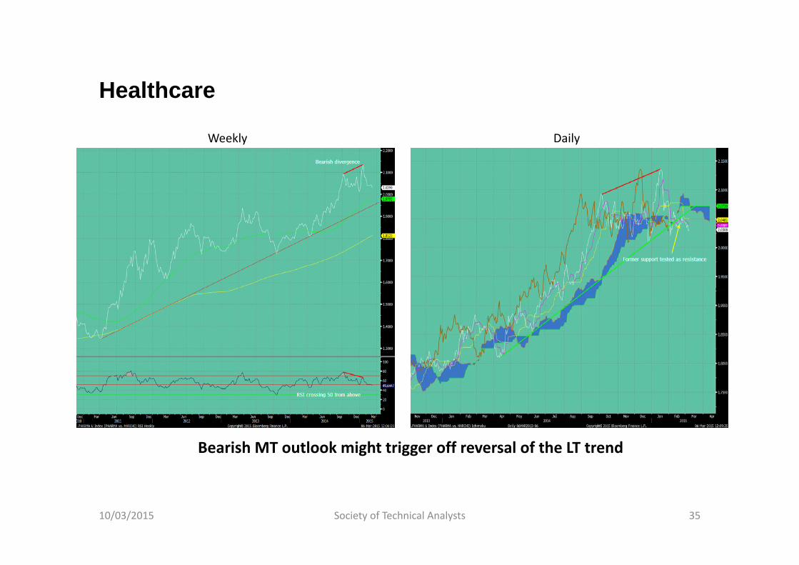
Healthcare
10/03/2015 Society of Technical Analysts 35
Weekly Daily
Bearish MT outlook might trigger off reversal of the LT trend
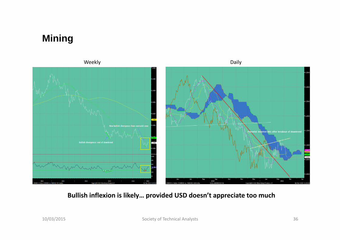
Mining
10/03/2015 Society of Technical Analysts 36
DailyWeekly
Bullish inflexion is likely… provided USD doesn’t appreciate too much
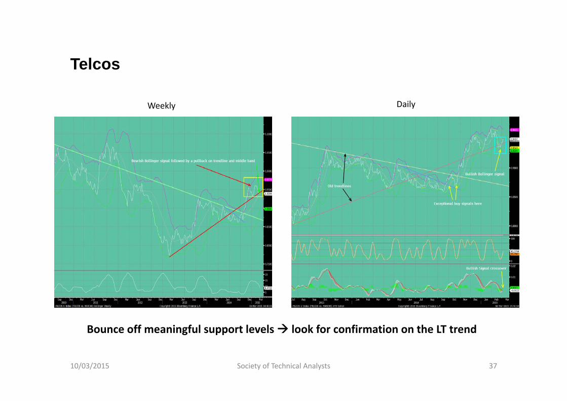
Telcos
10/03/2015 Society of Technical Analysts 37
Weekly Daily
Bounce off meaningful support levels look for confirmation on the LT trend
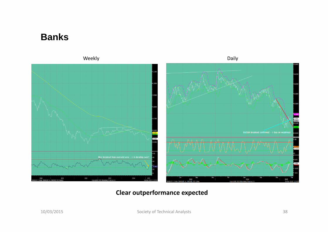
Banks
10/03/2015 Society of Technical Analysts 38
Weekly Daily
Clear outperformance expected
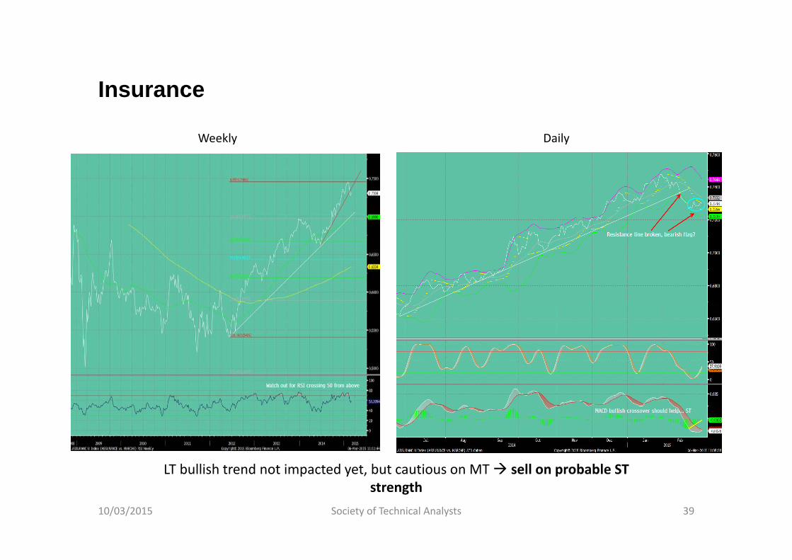
Insurance
10/03/2015 Society of Technical Analysts 39
DailyWeekly
LT bullish trend not impacted yet, but cautious on MT sell on probable STstrength
How are investors positioned on European sectors today? (1)
As most equity fund managers are bottom‐up, they tend to stick to their highest convictions
Inertia in their sector positioning is an interesting consequence of it (Portfolio shifts may take several months, cf. 3‐year UW on Banks)
Polls among the biggest managers give a key clue to risks to the up‐ or downside for sectors (extreme complacency or mistrust)
Recent examples:
Media ("overcomplacency" end‐2013 with 450 Bp OW overall; strong, repeated bearish divergences from RSI) Utilities Healthcare Telcos
10/03/2015 Society of Technical Analysts 40

How are investors positioned on European sectors today? (2)
10/03/2015 Society of Technical Analysts 41

How would we be positioned in terms of sectors today?Summary table
10/03/2015 Society of Technical Analysts 42
NB: Rating scale goes from ‐‐‐ to +++ Underlined sector means that recommendations on both time horizons coincide An asterisk signals a change of recommendation
Weeklychart
Dailychart
Automotive+
(a correction wouldn't jeopardize uptrend)+
(Buy on weakness)
Banks+
(RSI left oversold area, wonderful Bollinger signal)++
(broke resistance, bullish consolidation)
Basic Materials+
(inverted H&S pattern, bullish RSI divergence)+
(++ if Cloud is broken to the upside)
Capital Goods‐
(inflexion but resistance from Cloud and SMAs)+
(as far as the support line holds)
Energy *+
(inverted H&S, RSI using 30 as a support level)‐ =
(contradictory signals)
Food & Beverages‐ =
(trend has been fading)‐ =
unless Cloud is broken to the upside (but thick!)
Healthcare‐ ‐
(RSI crossed 50 from above)‐ ‐
(support line broken, then tested as a resistance)
Insurance=
(but could rapidly worsen)= ‐
(broke support, sell on probable ST strength)
Media‐
(caution: risk of Rising Wedge, high bandwidth)=
(near a key resistance)
Retail++
(broke to the upside from a bullish flag)+
(bullish ascending triangle)
Telcos *+ =
(bouce off trendline and middle band)++
(bullish Bollinger signal)
Utilities‐ ‐
(broke key support)‐
(too early to go back)
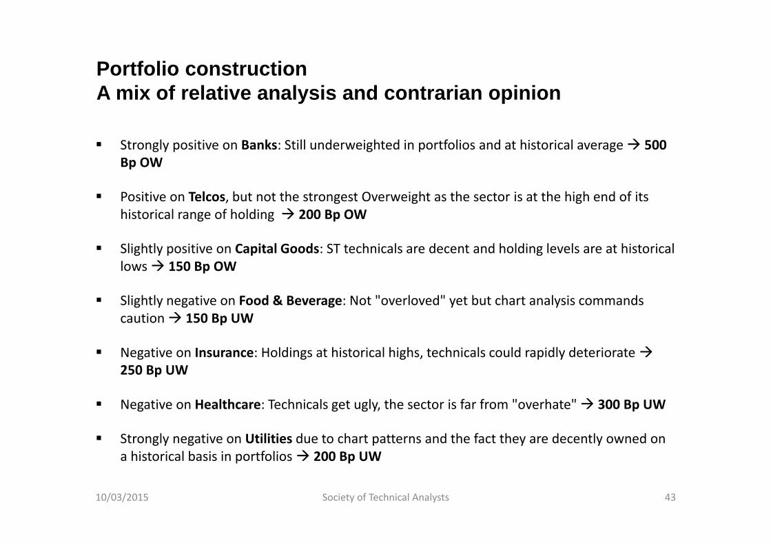
Portfolio constructionA mix of relative analysis and contrarian opinion
Strongly positive on Banks: Still underweighted in portfolios and at historical average 500 Bp OW
Positive on Telcos, but not the strongest Overweight as the sector is at the high end of itshistorical range of holding 200 Bp OW
Slightly positive on Capital Goods: ST technicals are decent and holding levels are at historicallows 150 Bp OW
Slightly negative on Food & Beverage: Not "overloved" yet but chart analysis commandscaution 150 Bp UW
Negative on Insurance: Holdings at historical highs, technicals could rapidly deteriorate250 Bp UW
Negative on Healthcare: Technicals get ugly, the sector is far from "overhate" 300 Bp UW
Strongly negative on Utilities due to chart patterns and the fact they are decently owned on a historical basis in portfolios 200 Bp UW
10/03/2015 Society of Technical Analysts 43
Conclusion
Relative strength charts add valuable information
A Top‐down approach based on relative momentum makes sense to build an equity portfolio
Big sector rotations are a rather inert process
Nevertheless, identifying reversals is made easier with relative analysis
Combining chart analysis, oscillators and multiple timeframes may lead to nice, consistent results (ca. 80% win rate when LT and MT signals coincide)
10/03/2015 Society of Technical Analysts 44


