214 Part 3: Practice The Form and Color of SeisScape Displays When Earth’s last picture is painted and the tubes are twisted and dried, When the oldest colours have faded, and the youngest critic has died, We shall rest, and, faith we shall need it – lie down for an Æon or two, Till the Master of All Good Workmen shall put us to work anew. And those that were good shall be happy: they shall sit in a golden chair; They shall splash at a ten-league canvas with brushes of comets’ hair. They shall find real saints to draw from – Magdalene, Peter, and Paul; They shall work for an age at a sitting and never be tired at all. And only the Master shall praise us, and only the Master shall blame; And no one shall work for money, and no one shall work for fame, But each for the joy of the working, and each, in his separate star, Shall draw the Thing as he sees It for the God of Things as they are! “When Earth’s Last Picture is Painted” Kipling
Transcript
214
Part 3: Practice
The Form and Color of SeisScape Displays
When Earth’s last picture is painted and the tubes are twisted and dried,
When the oldest colours have faded, and the youngest critic has died, We shall rest, and, faith we shall need it – lie down for an Æon or two,
Till the Master of All Good Workmen shall put us to work anew.
And those that were good shall be happy: they shall sit in a golden chair; They shall splash at a ten-league canvas with brushes of comets’ hair.
They shall find real saints to draw from – Magdalene, Peter, and Paul; They shall work for an age at a sitting and never be tired at all.
And only the Master shall praise us, and only the Master shall blame;
And no one shall work for money, and no one shall work for fame, But each for the joy of the working, and each, in his separate star,
Shall draw the Thing as he sees It for the God of Things as they are!
“When Earth’s Last Picture is Painted” Kipling
215
CHAPTER NINE: TESSELLATING SEISMIC DATA They builded a tower to shiver the sky and wrench the stars apart,
Till the Devil grunted behind the bricks: "It's striking, but is it Art ?" The stone was dropped at the quarry-side and the idle derrick swung,
While each man talked of the aims of Art, and each in an alien tongue. Kipling
The Conundrum of the Workshops
9.1 The Structure of a Seismic Section
A seismic section is a complex mosaic of overlapping and often conflicting signals,
some of which are geologically or seismically relevant and some of which are noise. Of
the relevant signals, some have strong amplitudes and we can see them on all seismic
displays. Some, however, have weak amplitudes and are superimposed on the stronger
events. As I showed in Chapter 4, these weaker events are very hard to see on
conventional displays. As a rule, however, the importance of a coherent event to an
interpretation is not directly proportional to its amplitude. An interpretation often depends
just as much on weak, hard-to-see events as it does on strong, visually dominating events.
For the purposes of the rest of this thesis, I consider that these two levels of events
form different structures within the seismic as a whole. The strong amplitude, major
events, forms the seismic macrostructure whereas the weak amplitude events form the
seismic microstructure.
I established in Section 4.2.1 that the wiggle trace display has very low apparent
resolution. I also showed, however, that because it is constructed purely of achromatic
lines and edges, it is useful for pattern recognition and that, unlike gray-scale displays; it
has a future in seismic visualization. Wiggle trace displays are prominent throughout the
industry and geophysicists will continue to use them in the future, albeit for reduced
purposes. Because they are so familiar and because they show primarily major events, I
use them as the base for my definitions of macrostructure and microstructure.
216
9.1.1 Seismic Macrostructure
Figure 9.1 shows a wiggle trace display of a portion of a Trujillo seismic line. When
we look at this display, we see a series of strong amplitude, major events, which appear
as almost solid black objects. Regardless of the display used, you expect to see these
events, and you expect to see how they relate to one another. I consider these events
constitute the seismic macrostructure, which I define as follows:
Seismic Macrostructure
For any seismic section, the seismic macrostructure is the collection of coherent
signals observable on a wiggle trace display. In terms of absolute and apparent
resolution, the seismic macrostructure equates to the apparent resolution of a wiggle
trace display.
Figure 9.1: A wiggle trace display of Trujillo data (data courtesy PeruPetro). The section contains a series of prominent events that constitute the macrostructure.
217
9.1.2 Seismic Microstructure
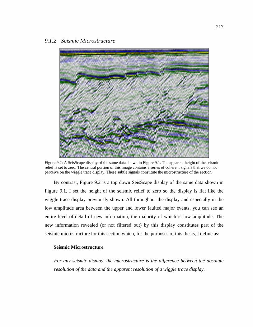
By contrast, Figure 9.2 is a top down SeisScape display of the same data shown in
Figure 9.1. I set the height of the seismic relief to zero so the display is flat like the
wiggle trace display previously shown. All throughout the display and especially in the
low amplitude area between the upper and lower faulted major events, you can see an
entire level-of-detail of new information, the majority of which is low amplitude. The
new information revealed (or not filtered out) by this display constitutes part of the
seismic microstructure for this section which, for the purposes of this thesis, I define as:
Seismic Microstructure
For any seismic display, the microstructure is the difference between the absolute
resolution of the data and the apparent resolution of a wiggle trace display.
Figure 9.2: A SeisScape display of the same data shown in Figure 9.1. The apparent height of the seismic relief is set to zero. The central portion of this image contains a series of coherent signals that we do not perceive on the wiggle trace display. These subtle signals constitute the microstructure of the section.
218
With that definition in mind, Figure 9.2 reveals only part of the microstructure
because, whereas it exposes more of the absolute resolution, it does not necessarily
expose it all.
9.1.3 The Twin Objectives of Seismic Visualization
I chose to define the terms macrostructure and microstructure because the remainder
of this thesis is dedicated to developing techniques to improve seismic visualization.
These techniques generally fall into one of two classes depending upon which type of
structure they are designed to enhance. Some techniques enhance seismic macrostructure
whereas some enhance seismic microstructure.
In Chapter 3, I introduced the concept of considering the display as a resolution filter
and showed that, in general, this filter degrades resolution. Recalling Figure 3-12 and
Figure 4-24, the images all show how much lower the apparent resolution of conventional
displays is in comparison to SeisScape displays. In terms of the previous definitions,
these examples showed how conventional displays filter out seismic microstructure. This
leads to the primary and most obvious purpose of visualization, that being:
Objective #1
The primary purpose of seismic visualization is to reveal seismic microstructure. In
terms of absolute and apparent resolution, this equates to minimizing the difference
between the two.
Beyond a consideration of apparent resolution, which mainly applies to
microstructure, the display also affects our ability to perceive amplitude changes along
macrostructure events. Consider Figure 9.3, which is another SeisScape view of the data
shown in Figure 9.1. Unlike Figure 9.2, this display has a significant relief height and I
rotated it counter-clockwise around the x-axis so that you can see amplitude changes
along the macrostructure events.
219
The uppermost event in this section is a water bottom reflection. When you examine
this event on either the wiggle trace display or the top-down SeisScape display, the
amplitudes along it appear almost constant. Figure 9.3, however, reveals that there is
significant variation in the amplitudes along the event, variations that you would not
expect from looking at the first two images.
You see the same sort of short period and long period amplitude variations along the
other macrostructure events as well. Consider the first set of faulted events below the
water bottom. If all you had to go on were Figure 9.1 and Figure 9.2, you would not
expect the trace-to-trace amplitude variation exposed by Figure 9.3. It is clear that neither
the wiggle trace display nor the top-down SeisScape display adequately communicate the
amplitude structure of the macrostructure events. This example illustrates that the display
acts as a filter upon the macrostructure just as it does upon the microstructure and it
introduces the second, less obvious, purpose of visualization.
Figure 9.3: The same display as shown in Figure 9.2 but rotated counter clockwise around the x-axis and with a non-zero relief height. In this orientation, you can see amplitude changes along the macrostructure events.
220
Objective #2
The secondary purpose of visualization is to reveal the amplitude structure of
macrostructure events.
Considering SeisScape displays are three-dimensional and show amplitude as
topography, this secondary purpose appears satisfied by default. However, as with all
things seismic, if it looks easy then you do not understand it! Revealing the amplitudes of
macrostructure events is trivial, provided the events are flat. Once they start to dip,
however, things become a little more complicated.
9.2 The Seismic Mesh
A SeisScape display is a three-dimensional representation of seismic data and is
composed of three elements; (1) a tessellated1 mesh of points that form the mosaic of the
surface; (2) a lighting component that illuminates the surface; and (3) a variable density
color display that is draped over the surface. Each of these components has analogies in
the conventional displays. The tessellated mesh is loosely analogous to the wiggle trace
display, the lighting is analogous to the amplitude mapped gray-scale display and the
variable density color display is identical to chromatic variable density displays.
Each component of the SeisScape display plays its own part in establishing our
perceptions of seismic data. I discuss the first of these components, the tessellated mesh,
in this chapter. I discuss the lighting component and the variable density coloring in the
next two chapters respectively. Tessellation, affects our ability to perceive both the
seismic macrostructure and through its inter-relationship with the lighting calculations,
our ability to perceive the seismic microstructure. In this chapter, I focus primarily on the
first of these, the viewer’s ability to perceive amplitude variations along macrostructure
events.
1 In computer graphics tessellation refers to the process of converting a complex polygonal surface
into a series of non-overlapping triangles.
221
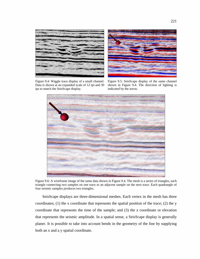
SeisScape displays are three-dimensional meshes. Each vertex in the mesh has three
coordinates; (1) the x coordinate that represents the spatial position of the trace; (2) the y
coordinate that represents the time of the sample; and (3) the z coordinate or elevation
that represents the seismic amplitude. In a spatial sense, a SeisScape display is generally
planer. It is possible to take into account bends in the geometry of the line by supplying
both an x and a y spatial coordinate.
Figure 9.4: Wiggle trace display of a small channel. Data is shown at an expanded scale of 12 tpi and 30 ips to match the SeisScape display.
Figure 9.5: SeisScape display of the same channel shown in Figure 9.4. The direction of lighting is indicated by the arrow.
Figure 9.6: A wireframe image of the same data shown in Figure 9.4. The mesh is a series of triangles, each triangle connecting two samples on one trace to an adjacent sample on the next trace. Each quadrangle of four seismic samples produces two triangles.
222
However, in practice the three-dimensional nature of the display becomes confused
when the real world bent-line coordinates of the line are used. Consequently, in what
follows, all of the SeisScape displays shown use straight-line geometry. I illustrate the
mesh structure of a SeisScape in wireframe mode in Figure 9.6. For reference, I show a
wiggle trace display and a solid SeisScape display in Figure 9.4 and Figure 9.5
respectively.
9.2.1 Tessellation
As you see in Figure 9.6, the SeisScape mesh consists of triangles. Triangles are the
basic unit of all 3D graphic objects and they are the building blocks or bricks of 3D
graphics. Using an analogy from construction, you can build almost any structure from
small bricks. However, when you look at the structure from a distance, you do not see the
bricks themselves, you only see the structure. The same is true of triangles, regardless of
the complexity of a surface, in 3D graphics; an object is always built out of triangles.
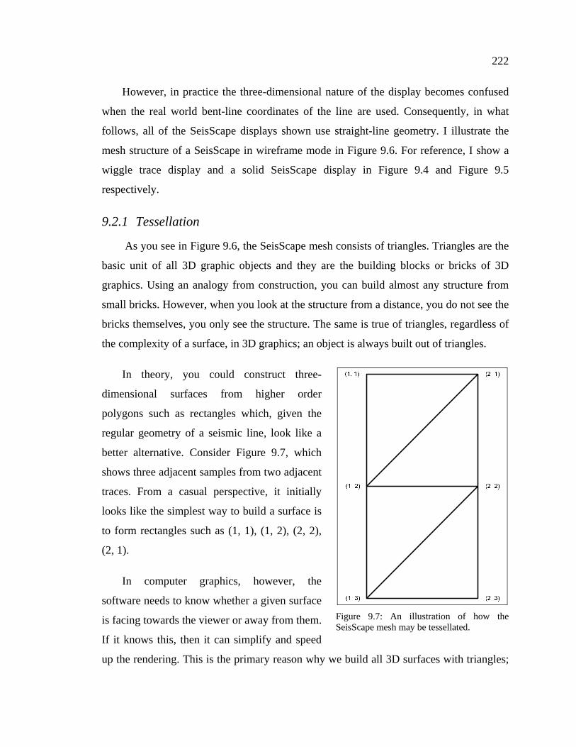
In theory, you could construct three-
dimensional surfaces from higher order
polygons such as rectangles which, given the
regular geometry of a seismic line, look like a
better alternative. Consider Figure 9.7, which
shows three adjacent samples from two adjacent
traces. From a casual perspective, it initially
looks like the simplest way to build a surface is
to form rectangles such as (1, 1), (1, 2), (2, 2),
(2, 1).
In computer graphics, however, the
software needs to know whether a given surface
is facing towards the viewer or away from them.
If it knows this, then it can simplify and speed
up the rendering. This is the primary reason why we build all 3D surfaces with triangles;
Figure 9.7: An illustration of how the SeisScape mesh may be tessellated.
223
triangles are planar and consequently the software can always determine which way they
face. Conversely, a rectangle, especially one formed from seismic data, is rarely planer
and therefore can face both towards the viewer and away from them at the same time.
That is why we rarely use rectangles and other higher-order primitives when building
three-dimensional objects and why we always tessellate seismic data.
9.2.1.1 Tessellation Ambiguity
Given seismic data occurs on a regular grid, it at first appears that constructing a
tessellated seismic mesh is as simple as constructing either a wiggle trace or a variable
density display. This is not the case because both wiggle trace and variable density
displays are unambiguous whereas a SeisScape display is not. When you build either a
variable density display or a wiggle trace display, you do not physically connect points
on adjacent traces. Therefore, there is only one way to build them and the displays are
unambiguous. However, when you construct a SeisScape display, you physically connect
points on adjacent traces and there is always two ways to do the connections. Each
connection produces a different surface and consequently, a SeisScape mesh is
ambiguous at every sample. For each given sample, there are always two ways to connect
it to its neighbors, each approach producing a locally different surface.
When you tessellate a seismic section, you form two triangles for each sample on
every trace. You do this one of two ways, as shown by the left and right images on Figure
9.8. When I formed meshes in the early SeisScape displays, I tessellated the points using
the schema shown on the left. Under this schema , if the sample position is (1,1), i.e. trace
1 sample 1, then the coordinates of the first triangle are (1,1), (2,1), (1,2) and the second
(1,2), (2,1), (2,2). However, I could also have used the second schema shown on the
right. Under this schema , the coordinates of the triangles become (1,1), (1,2), (2,2) and
(1,1), (2,1), (2,2).
224
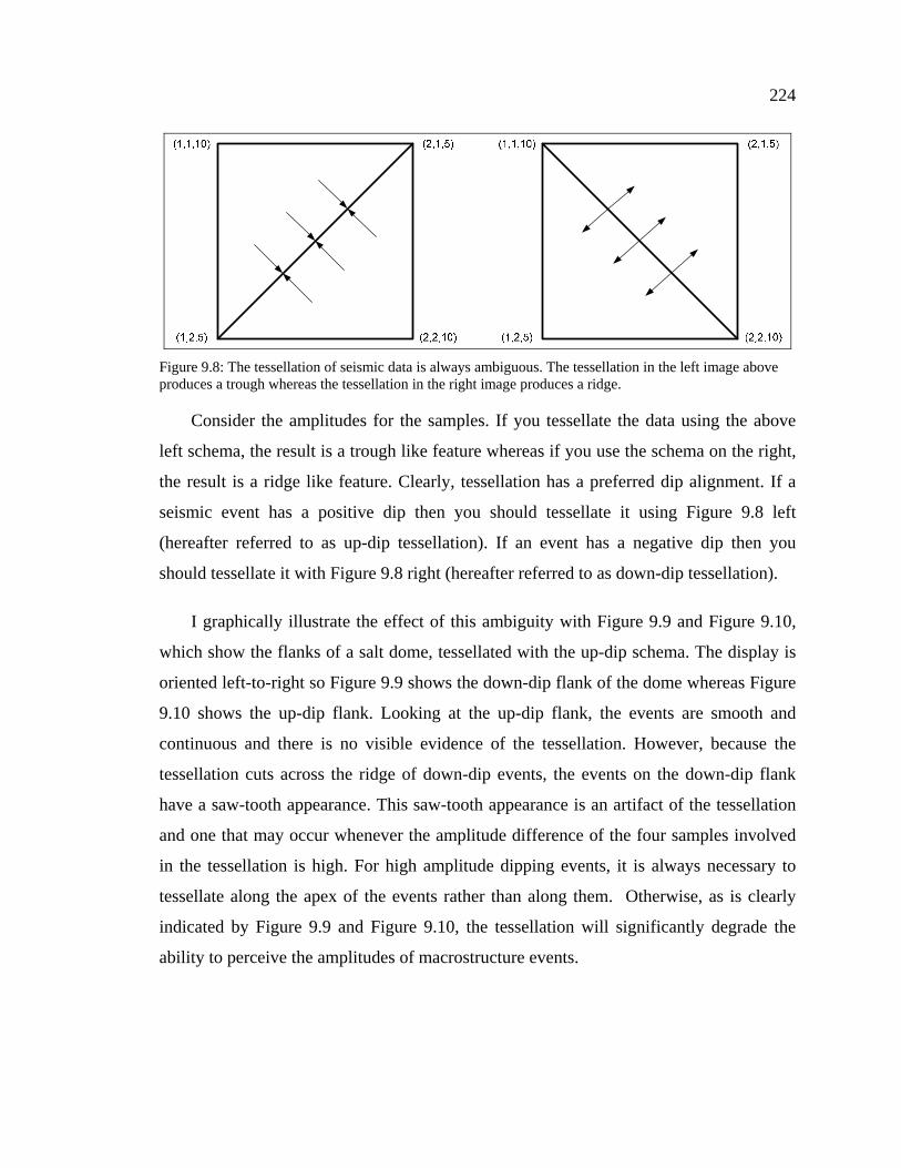
Consider the amplitudes for the samples. If you tessellate the data using the above
left schema, the result is a trough like feature whereas if you use the schema on the right,
the result is a ridge like feature. Clearly, tessellation has a preferred dip alignment. If a
seismic event has a positive dip then you should tessellate it using Figure 9.8 left
(hereafter referred to as up-dip tessellation). If an event has a negative dip then you
should tessellate it with Figure 9.8 right (hereafter referred to as down-dip tessellation).
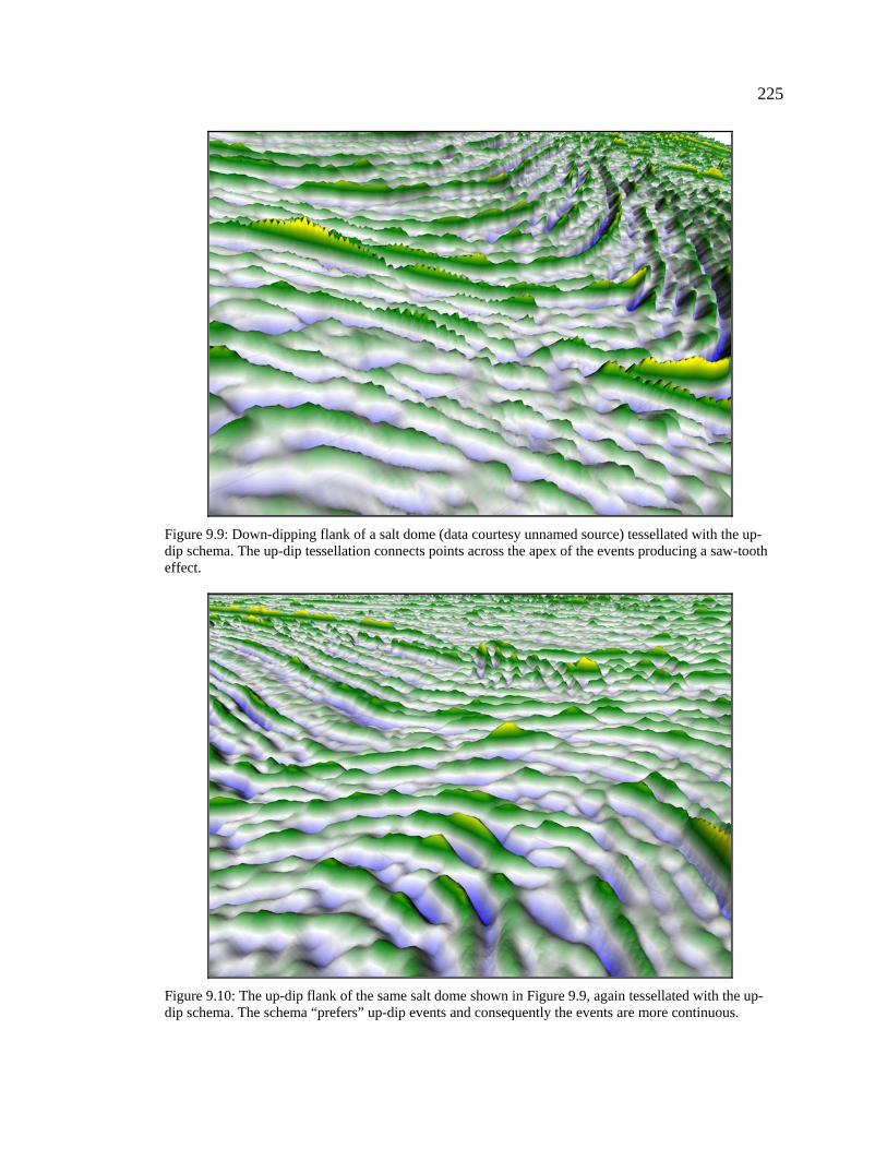
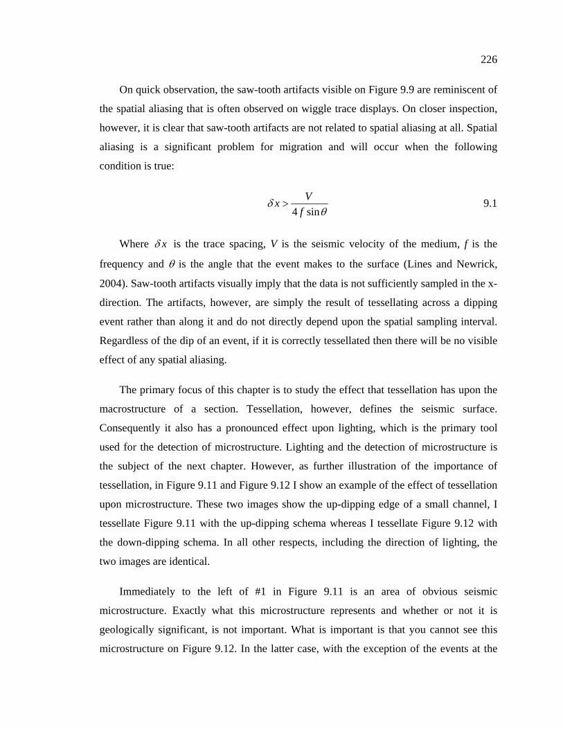
I graphically illustrate the effect of this ambiguity with Figure 9.9 and Figure 9.10,
which show the flanks of a salt dome, tessellated with the up-dip schema. The display is
oriented left-to-right so Figure 9.9 shows the down-dip flank of the dome whereas Figure
9.10 shows the up-dip flank. Looking at the up-dip flank, the events are smooth and
continuous and there is no visible evidence of the tessellation. However, because the
tessellation cuts across the ridge of down-dip events, the events on the down-dip flank
have a saw-tooth appearance. This saw-tooth appearance is an artifact of the tessellation
and one that may occur whenever the amplitude difference of the four samples involved
in the tessellation is high. For high amplitude dipping events, it is always necessary to
tessellate along the apex of the events rather than along them. Otherwise, as is clearly
indicated by Figure 9.9 and Figure 9.10, the tessellation will significantly degrade the
ability to perceive the amplitudes of macrostructure events.
Figure 9.8: The tessellation of seismic data is always ambiguous. The tessellation in the left image above produces a trough whereas the tessellation in the right image produces a ridge.
225
Figure 9.9: Down-dipping flank of a salt dome (data courtesy unnamed source) tessellated with the up-dip schema. The up-dip tessellation connects points across the apex of the events producing a saw-tooth effect.
Figure 9.10: The up-dip flank of the same salt dome shown in Figure 9.9, again tessellated with the up-dip schema. The schema “prefers” up-dip events and consequently the events are more continuous.
226
On quick observation, the saw-tooth artifacts visible on Figure 9.9 are reminiscent of
the spatial aliasing that is often observed on wiggle trace displays. On closer inspection,
however, it is clear that saw-tooth artifacts are not related to spatial aliasing at all. Spatial
aliasing is a significant problem for migration and will occur when the following
condition is true:
4 sin
Vxf
δθ
> 9.1
Where xδ is the trace spacing, V is the seismic velocity of the medium, f is the
frequency and θ is the angle that the event makes to the surface (Lines and Newrick,
2004). Saw-tooth artifacts visually imply that the data is not sufficiently sampled in the x-
direction. The artifacts, however, are simply the result of tessellating across a dipping
event rather than along it and do not directly depend upon the spatial sampling interval.
Regardless of the dip of an event, if it is correctly tessellated then there will be no visible
effect of any spatial aliasing.
The primary focus of this chapter is to study the effect that tessellation has upon the
macrostructure of a section. Tessellation, however, defines the seismic surface.
Consequently it also has a pronounced effect upon lighting, which is the primary tool
used for the detection of microstructure. Lighting and the detection of microstructure is
the subject of the next chapter. However, as further illustration of the importance of
tessellation, in Figure 9.11 and Figure 9.12 I show an example of the effect of tessellation
upon microstructure. These two images show the up-dipping edge of a small channel, I
tessellate Figure 9.11 with the up-dipping schema whereas I tessellate Figure 9.12 with
the down-dipping schema. In all other respects, including the direction of lighting, the
two images are identical.
Immediately to the left of #1 in Figure 9.11 is an area of obvious seismic
microstructure. Exactly what this microstructure represents and whether or not it is
geologically significant, is not important. What is important is that you cannot see this
microstructure on Figure 9.12. In the latter case, with the exception of the events at the
227
upper left of the image, using the incorrect schema has not significantly degraded the
macrostructure events. However, this down-dipping schema all but erases the low
amplitude, high angle microstructure events.
Saw-tooth or diamond pattern
artifacts are indicative of a larger
problem inherent in tessellating an
arbitrary data set; before you can
correctly tessellate a series of points,
apriori knowledge of the surface is
essential. Rendering a model in three-
dimensions requires two sets of data; (1)
a set of vertices that define the points in
the model; and (2) a set of indices that
define the vertices for each triangle.
Whereas the vertices define the
general outline of the model, it is the
indices that give it shape. Vertices are
just points in space; indices form
surfaces out of those points. Ultimately,
tessellation is the process of determining
what those indices should be.
Under controlled circumstances,
such as generating a model of an object
in a game, we know the underlying
geometry of the object. Tessellating is simple under these circumstances because we
know which points connect to which other points. Tessellating a seismic section is much
harder, however, because we do not know the underlying geometry and that geometry
may not even be unique. An unmigrated seismic section, for example, may contain
conflicting, dipping events at the same point and therefore, any tessellation schema may
Figure 9.11: The up-dipping edge of a channel (data courtesy PeruPetro) tessellated using the up-dip schema. Note the presence of microstructure to the left of #1 and above.
Figure 9.12: The same data as shown in Figure 9.11 but tessellated using the down-dipping schema. Note that the appearance of the up-dipping microstructure is considerably degraded.
228
enhance one dipping event at the cost of another. This is the main reason why I said that
whereas the apparent resolution of a SeisScape display is higher than that of a
conventional display, it is still not equal to the absolute resolution of the data.
This is not to imply, however, that determining an appropriate local tessellation
schema is impossible. It may well be, given the nature of seismic data, that the
tessellation of any point is non-unique. However, there are approaches we can take,
which will improve the overall definition of the seismic surface. In the next section, I
introduce three possible techniques.
9.3 Tessellation Schemas
Tessellating a seismic section is a non-trivial task. It requires apriori knowledge of
the dips and orientations of both the macrostructure and the microstructure events, which,
in practice, is very difficult to obtain. Even in the case of a fully interpreted seismic line,
the level of information provided by the interpreted events is insufficient for tessellation,
which requires knowledge of the local structure of the data at every sample.
The tessellating software must also complete the tessellation quickly and without
significant viewer interaction. For example, when you animate through a 3D seismic
volume, you must tessellate each inline, crossline or timeslice before the viewer can
interact with them. To maintain animation speed, therefore, you must tessellate each
section in less than roughly 1/10th of a second. This precludes any input from the user. As
a further complication, each section is unique and consequently the software cannot use
the tessellation of a previous section as a guide. Altogether, tessellation is by far the most
difficult part of producing a SeisScape display.
The simplest technique for getting around tessellation problems is to provide the user
with the option to tessellate using either an up-dip or a down-dip favoring schema (see
Figure 9.8). This approach is fast and is practical for sections with limited dips. However,
for most seismic sections, it is inadequate for two reasons. The first is that the simple up-
dip/down-dip schemas are only valid for small dips. They cannot handle situations where
the correct tessellation requires connections with samples other than to one of the two
229
nearest samples on the adjacent trace. The second reason is that, as was shown in Figure
9.11 and Figure 9.12, each schema favors one dip orientation and degrades the other. This
makes them unsuitable for sections that have conflicting dips.
What is required is an adaptive system of tessellation that determines the correct
tessellation for each point in the section. In the remainder of this section, I report on
several methods that I developed to accomplish this task. First, I report on a subdivision
approach that I developed early in my research and later abandoned as impractical. I
report on it here for two reasons; (1) whereas it was impractical at the time, with the
advent of gpu based geometry processors it will become practical in the near future; (2) I
use surface normals generated via this approach, to develop a practical low-dip
tessellation schema.
9.3.1 Forward Loop Subdivision
The problem of ambiguous tessellation parallels a problem that is already familiar to
geophysicists, that of under sampling. The lower the frequency of sampling, especially in
the spatial direction, the greater is the effect of tessellation ambiguity. For example, if we
sampled the data shown in Figure 9.9 at twice the spatial and temporal frequency, we
would considerably reduce the saw-tooth artifacts. The tessellation would still connect
points across the apex of the events rather than along them. However, the resampling
would reduce the difference in amplitude between the four connected points and therefore
it would lessen the saw-tooth effect, which is pronounced on the display. This suggests
that one way to reduce the effect of incorrect local tessellation is to resample the data
both spatially and temporally. The optimal way to resample a data set is in the frequency
domain. However, I considered that this approach was computationally excessive.
Instead, I concentrated on strictly time domain approaches.
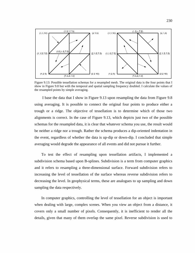
I first considered using simple averaging to resample the data. I did not implement
this method, however, because I concluded, based upon Figure 9.13, that whereas
averaging may reduce tessellation artifacts it would not eliminate them.
230
I base the data that I show in Figure 9.13 upon resampling the data from Figure 9.8
using averaging. It is possible to connect the original four points to produce either a
trough or a ridge. The objective of tessellation is to determine which of those two
alignments is correct. In the case of Figure 9.13, which depicts just two of the possible
schemas for the resampled data, it is clear that whatever schema you use, the result would
be neither a ridge nor a trough. Rather the schema produces a dip-oriented indentation in
the event, regardless of whether the data is up-dip or down-dip. I concluded that simple
averaging would degrade the appearance of all events and did not pursue it further.
To test the effect of resampling upon tessellation artifacts, I implemented a
subdivision schema based upon B-splines. Subdivision is a term from computer graphics
and it refers to resampling a three-dimensional surface. Forward subdivision refers to
increasing the level of tessellation of the surface whereas reverse subdivision refers to
decreasing the level. In geophysical terms, these are analogues to up sampling and down
sampling the data respectively.
In computer graphics, controlling the level of tessellation for an object is important
when dealing with large, complex scenes. When you view an object from a distance, it
covers only a small number of pixels. Consequently, it is inefficient to render all the
details, given that many of them overlap the same pixel. Reverse subdivision is used to
Figure 9.13: Possible tessellation schemas for a resampled mesh. The original data is the four points that I show in Figure 9.8 but with the temporal and spatial sampling frequency doubled. I calculate the values of the resampled points by simple averaging.
231
create reduced levels of geometric detail. The farther away an object is from the viewer,
the lower the level-of-detail needed to render it.
In 3D graphics, reverse subdivision is generally more important than forward
subdivision because objects in a scene are geometrically well known. In the case of
seismic data, however, we need to increase the level-of-detail, not reduce it. To
accomplish this, there are a number of time-domain approaches that produce higher
detail. The one I selected for trial was Forward Loop Subdivision (Loop 1987).
Forward Loop subdivision is just one of many possible face-splitting schemes. Its
primary advantage is that all faces in the input mesh must be triangular. The resulting
subdivided mesh is also triangular with each input triangle split into four output triangles.
The output topology of the mesh thus mimics that shown in Figure 9.13, which makes it
ideal for use on seismic data. Other schemes, such as Catmull-Clark subdivision (Catmull
1978), which also use B-splines, use input quadrilaterals rather than triangles. Initially, a
quadrilateral scheme looks like a better fit for subdividing seismic data because the input
data to the tessellation always consists of a quadrilateral of four samples. In practice,
however, Catmull-Clark and other quadrilateral based schemes unduly smooth the input
samples. Loop subdivision also affects the input samples but to a lesser degree and for
that reason I decided to test it.
232
The Loop scheme is based upon the three-dimensional box spline, which produces
C2 continuous surfaces over regular meshes. I show an example of applying this
technique in Figure 9.14 (the incorrectly tessellated data), and Figure 9.15 (the same data
after one level of subdivision). The subdivided mesh is clearly smoother and provides a
better visual representation of the seismic event. Nevertheless, although Loop subdivision
appeared promising, I decided not to pursue this line of research. Because of that, I did
not effectively test its effect on microstructure and as a result, I cannot comment on
whether or not it would improve our ability to perceive conflicting dips.
My reasons for abandoning this approach were based upon hardware limitations. A
typical seismic line contains millions of samples, each of which requires at least two
triangles to render. Loop subdivision increased this to eight triangles per sample, which
made the tessellated meshes too large for the gpu architecture then available. The
subdivision was also CPU based and consequently too slow when animating a large 3D
volume.
Nevertheless, I include subdivision here because it may hold possibilities for the
future. Since I ran this test, gpu architecture has considerably improved and a four-fold
increase in rendered triangles is no longer a serious limitation. At the time of writing, a
new gpu shader, the geometry shader, is also starting to make an impact. The geometry
shader can produce new triangles during rendering. Consequently, it is now possible, in
theory, to perform subdivision on the fly. This would eliminate the performance issues
Figure 9.14: Close-up of the diamond pattern and saw-tooth tessellation artifacts produced by incorrect local tessellation.
Figure 9.15: The same data shown in Figure 9.14 but after one level of Loop subdivision. Note how the subdivision has reduced the tessellation artifacts.
233
caused by subdividing large 3D data sets in the CPU. For these reasons, whereas real-
time subdivision of seismic data it not currently practical, it may become practical in the
near future and is a possible line of future research into tessellation.
9.3.2 Adaptive Tessellation
A seismic section is a complex object, which contains details on several different
levels. At the beginning of this chapter, I defined two terms to describe these levels; (1)
macrostructure, which refers to the prominent events that are visible on any display; and
(2) microstructure that is the fine scale seismic details not visible on wiggle trace
displays. Both levels of events are affected by tessellation. The most obvious effect of
incorrect tessellation is the saw-tooth pattern that degrades the appearance of dipping
macrostructure events. Beyond this, however, as I showed in Figure 9.12, incorrect
tessellation can effectively erase microstructure events.
The challenge is to develop an efficient adaptive tessellation schema that eliminates
the obvious saw-tooth artifacts and preserves conflicting-dip microstructure events. I use
the term adaptive because to meet the above criteria, the schema must determine, for each
seismic sample, the best way of connecting it to its neighboring trace. There is an
additional caveat; any schema must be practical in terms of hardware limitations and
software performance on large datasets. To those ends, I set three conditions that a
schema must meet before I would consider it:
1. It must produce approximately the same number of triangles as was used to
render the original data set.
2. It must preserve the original amplitude of the samples.
3. For performance issues, it must also perform any calculations on the gpu.
In the remainder of this section I report on three tessellation schemas, two that I
consider appropriate for low-dip sections (≤ 1 samples per trace) and one for high-dip
sections (≥ 2 samples per trace). I call the three adaptive schemas because they adapt the
234
tessellation for each sample. The low-dip schemas decide which of the two connections
shown in Figure 9.8 is most appropriate for a given sample. These schemas form triangles
that connect only to the two adjacent samples on the next trace. The high-dip schema lets
you form triangles that connect to samples outside this range.
Figure 9.16 is an overview of the data shown in Figure 9.9 and Figure 9.10. I used
this is the section of data to illustrate the effectiveness of the techniques. The numbered
events have dips in the range of 1 – 1.5 samples per trace which puts them at the limit of
the low-dip schemas. I evaluate each schema by analyzing how effective it is at reducing
the macrostructure artifacts on these events. I will deal with the effectiveness of the
techniques on microstructure in the next chapter that covers lighting.
Figure 9.16: SeisScape display of seismic data over a salt dome. The area shown contains both steeply up-dipping and down-dipping events many of which exhibit tessellation artifacts. The display is oriented from left to right, consequently #’s 1, 2 & 4 are down-dip events and #’s 5, 6 & 7 are up-dip.
235
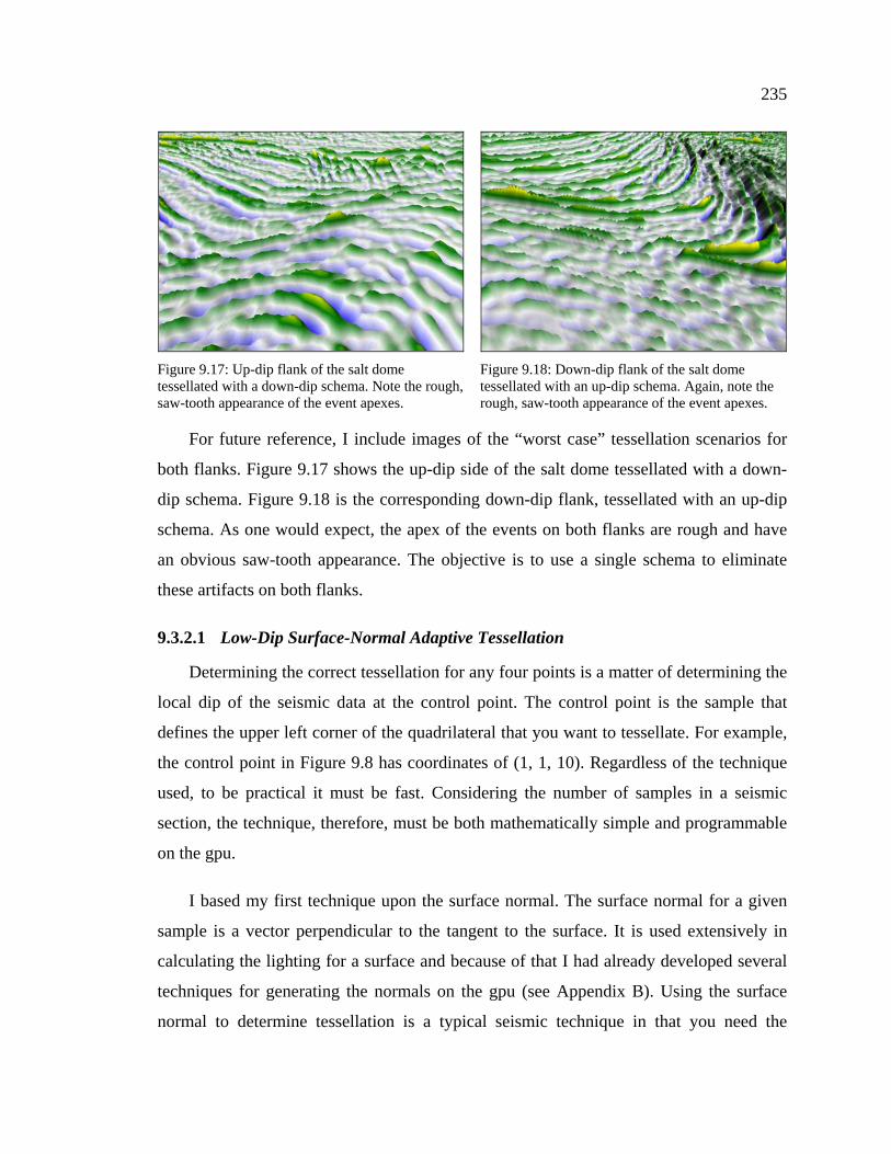
For future reference, I include images of the “worst case” tessellation scenarios for
both flanks. Figure 9.17 shows the up-dip side of the salt dome tessellated with a down-
dip schema. Figure 9.18 is the corresponding down-dip flank, tessellated with an up-dip
schema. As one would expect, the apex of the events on both flanks are rough and have
an obvious saw-tooth appearance. The objective is to use a single schema to eliminate
Determining the correct tessellation for any four points is a matter of determining the
local dip of the seismic data at the control point. The control point is the sample that
defines the upper left corner of the quadrilateral that you want to tessellate. For example,
the control point in Figure 9.8 has coordinates of (1, 1, 10). Regardless of the technique
used, to be practical it must be fast. Considering the number of samples in a seismic
section, the technique, therefore, must be both mathematically simple and programmable
on the gpu.
I based my first technique upon the surface normal. The surface normal for a given
sample is a vector perpendicular to the tangent to the surface. It is used extensively in
calculating the lighting for a surface and because of that I had already developed several
techniques for generating the normals on the gpu (see Appendix B). Using the surface
normal to determine tessellation is a typical seismic technique in that you need the
Figure 9.17: Up-dip flank of the salt dome tessellated with a down-dip schema. Note the rough, saw-tooth appearance of the event apexes.
Figure 9.18: Down-dip flank of the salt dome tessellated with an up-dip schema. Again, note the rough, saw-tooth appearance of the event apexes.
236
answer before you can perform the calculation. Tessellation defines the surface and hence
the normal.
1: An idealized surface normal to an event along the x-axis.
2: Z-Axis rotation (ωz) is caused by the event dip.
3: X-axis rotation (ωx) results from amplitude changes across an event.
4: Y-axis rotation (ωy) results from amplitude changes along an event.
5: {+ωz, -ωx} = 6: {+ωz, +ωx} =
7: {-ωz, -ωx} = 8: {-ωz, +ωx} =
9:{+ωz, +ωy} = 10: {+ωz, -ωy} =
11: {-ωz, +ωy} = 12: {-ωz, -ωy} =
13: {+ωz, +ωx, +ωy } ≅
, 14: {+ωz, -ωx, -ωy } ≅
,
15: {-ωz, -ωx, +ωy }≅
, 16: {-ωz, +ωx,-ωy }≅
,
Figure 9.19: The surface normal at any sample is perturbed by three rotations, ωz due to the dip of the event, ωx due to amplitude changes across the event and ωy due to changes along it.
237
The technique of using the normal (the product) to find the surface (the input) is
similar in many respects to depth migration. Depth migration requires, as input, a detailed
velocity-depth model. Determining that model, however, is why we perform depth
migration in the first place. In this regard, the two techniques are analogous because they
both need the answer as input. I understood this difficulty before I developed the
technique. I realized, however, that the surface normal has interesting properties that
were possibly useful in determining at least the direction of local dip and as a result, I
decided to experiment with it.
I illustrate these properties in Figure 9.19 that shows the rotations that the surface
normal experiences. Figure 9.19.1 is a conceptualized surface normal to the seismic
section. The surface normal is in the z-direction (pointing out of the image), the time
samples are the y-direction and the traces are in the x-direction. This normal undergoes
three rotations; (1) a rotation around the z-axis (ωz), which is caused by the dip of the
event; (2) a rotation around the x-axis (ωx), which is caused by amplitude variations
across an event; and (3) a rotation around the y-axis (ωy), which is caused by trace-to-
trace amplitude variations along an event. To determine the correct tessellation for any
sample we must determine ωz, the rotation around the z-axis, at that point.
What is interesting is the effect that combining these three rotations has upon the
sign of the x and y components of the surface normal vector. I show the results of
combing ωz and ωx rotations in Figure 9.19.5 to Figure 9.19.8. These rotations
correspond to a rotation of the surface normal as it moves across a dipping event.
Significantly, regardless of where the normal is on the surface, the x and y components of
the normal vector have the same sign ( ) if the event is up dipping (-ωz) and they have
the opposite sign ( ) if the event is down dipping (+ωz). This suggests that the sign of
the x and y components of the surface normal indicates the direction of local dip.
The situation, however, is complicated when you consider the y-axis rotation. In
Figure 9.19.9 to Figure 9.19.12, I show the results of combing ωz and ωy rotations. As
with the previous rotation, rotating the normal around the y-axis affects the sign of its x
238
and y components in a consistent manner. However, as I show in Figure 9.19.12 to Figure
9.19.15, combining all three rotations has an unpredictable effect upon the same signs.
Depending on the magnitude of the ωy rotation, the sign of the x and y components are
either the same or opposite. At first, this appears to rule out using the sign of the normal
as an indicator of the direction of local dip. However, for any given event, amplitude
changes across the event are generally much larger than amplitude changes along it.
Consequently ωx >> ωy and therefore the technique still has possibilities.
The primary negative aspect of this
technique is that you must tessellate the
surface before you can calculate its surface
normal. From the outset, I recognized that
the ambiguities in tessellation as shown in
Figure 9.8 potentially posed a serious
problem. These ambiguities, however,
only pertain to the tessellation of points
and not necessarily to the surface normal
at any given sample. This is because the
surface normal at a given sample is the
average of all of the face normals to which
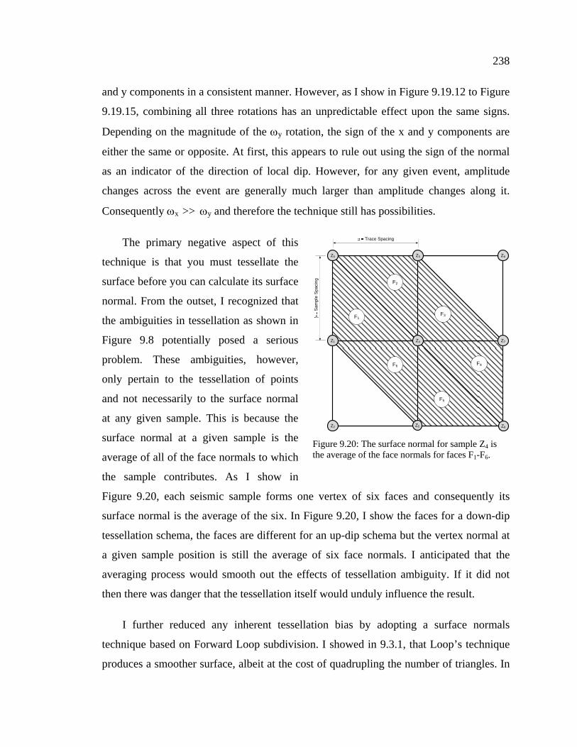
the sample contributes. As I show in
Figure 9.20, each seismic sample forms one vertex of six faces and consequently its
surface normal is the average of the six. In Figure 9.20, I show the faces for a down-dip
tessellation schema, the faces are different for an up-dip schema but the vertex normal at
a given sample position is still the average of six face normals. I anticipated that the
averaging process would smooth out the effects of tessellation ambiguity. If it did not
then there was danger that the tessellation itself would unduly influence the result.
I further reduced any inherent tessellation bias by adopting a surface normals
technique based on Forward Loop subdivision. I showed in 9.3.1, that Loop’s technique
produces a smoother surface, albeit at the cost of quadrupling the number of triangles. In
Z4
Z0 Z6Z3
Z1
Z2 Z5 Z8
Z7
F1
F2
F3
F4
F5
F6
Trace Spacing
Sam
ple
Spac
ing
Figure 9.20: The surface normal for sample Z4 is the average of the face normals for faces F1-F6.
239
Appendix B, however, I develop a technique that uses the same Loop technique to
produce surface normals. This technique only produces normals for the original samples
but I calculate them as if I had subdivided the mesh with Forward Loop subdivision.
Because of the uncertainties and ambiguities inherent in this technique, I had to rely
on empirical evidence to decide if it was useful. To test the technique, I made a small
modification to the pixel shader described in Appendix B. In that shader, I write the x and
y components of the surface normal to a two channel floating point texture. I then use the
texture to calculate lighting during rendering of the seismic data. The shader that I used
for the test replaces the x and y components with a single value. That value is positive
when the sign of the x and y components is the same and negative when they are
opposite. In Figure 9.21, I show an overview of the results; positive values (up-dip) are
colored in yellow whereas negative values (down-dip) are colored in blue.
Figure 9.21: The results of tessellating the data shown in Figure 9.16 using the Loop Adaptive scheme. The coloring shows the sign of the x and y components of the surface normal. Yellow shows where the signs are the same (up-dip) and blue where they are opposite (down-dip).
240
Figure 9.22: The down-dipping flank colored by the calculated dip direction. Blue indicates that the seismic is down-dip whereas yellow indicates that it is up-dip. The yellow spots at the apex of down-dip events indicates that the technique breaks down where it is needed the most.
Figure 9.23: The display as Figure 9.22 but colored with HA1. Compare this image to Figure 9.9 and you will see that the down-dip events are now smoother and more continuous. However, whereas the tessellation in improved, many saw-tooth artifacts remain.
241
This technique indicates the direction of local dip but not the magnitude of that dip.
Its only purpose is to determine whether the seismic at a given sample is up dipping or
down dipping. In that context, the results are generally correct. Where the underlying
seismic data is up-dipping (Figure 9.21-5, 6 &7) the color is primarily yellow and where
it is down-dipping (Figure 9.21-1, 2, 3, 4) the color is primarily blue.
A casual inspection of Figure 9.21 suggests that this technique has promise. If you
inspect the two flanks (down-dip: Figure 9.22 - Figure 9.23, up-dip: Figure 9.24 - Figure
9.25 you will see that this adaptive approach has, in general, improved the display. Most
of the saw-tooth effects on the “worst case” images are gone and the apexes of the events
on both flanks are, for the most part, continuous. However, a closer inspection shows that
the calculation has an inherent weakness when calculating the dip direction at the apex of
an event. For the technique to work, the sign of the x & y components must be
determined by the x-axis rotation (ωx), i.e. the rotation across an event. At the apex of the
event, however, this rotation is close to zero and consequently the sign of the components
is dominated by the y-axis rotation, i.e. the rotation along an event. If you recall, this
rotation produces an opposite effect upon the sign of the x & y components. As a result,
this approach may produce the incorrect results at the apex, where we need it the most,
and the correct result along the flanks, where we need it the least.
You observe this problem on Figure 9.22 and Figure 9.23. Events 1, 2 & 3 in the
images are all steeply down-dip and, as expected, they are generally blue on Figure 9.22.
However, there are a significant number of places along the apex of each event where the
color flips to yellow, indicating an incorrect tessellation. When you look at the
corresponding locations on Figure 9.23, these errors show up as notches across the apex.
The up-dip flank has the same potential apex problem. You can clearly see on Figure
9.24 that there are entire bands of incorrectly tessellated regions along the apex of many
of the events. This is possibly due to the down-dip bias of the Loop schema that I used in
the calculations. Paradoxically, however, when you compare Figure 9.25 with Figure
9.17, you do not see any notches and all of the events appear smooth and continuous.
242
Figure 9.24: The up-dipping flank colored by the calculated dip direction. Note the presence of bands of incorrect dip calculations (blue) at the apex of the events.
Figure 9.25: The same display as Figure 9.24 but colored with HA1. Even though the apexes of the up-dip events are incorrectly tessellated, there are very few tessellation artifacts visible. This suggests that the presence of artifacts is dependant upon both dip magnitude and frequency content.
243
Consider event #5; the color-coding clearly indicates a series of incorrect
tessellations along the apex. Unexpectedly, these errors do not show up as notches on
Figure 9.25 and the apex appears smooth. I have observed the same effect on other
sections but, because of time constraints, I have not studied the exact cause of this
paradox. I believe, however, that it arises from the frequency dependency of tessellation
artifacts. I have observed that, for a given sample interval, higher dominant frequency
events tend to have more severe visual artifacts. Looking at the overview image of this
data (Figure 9.16) it appears that the up-dip events have a lower dominant frequency than
the down-dip events. This is why, in my opinion, there are fewer saw-tooth patterns on
the up-dip events. This is only my opinion, however, and the dependency between
tessellation artifacts and the event dip and dominant frequency, remains to be determined
in a future study.
This was my first adaptive tessellation schema and despite its limitations, it showed
promise. Even with the previously mentioned errors, when you compare Figure 9.23 with
Figure 9.9 (the same data tessellated with an up-dipping schema), it is clear the adaptive
approach improves tessellation. The events are significantly smoother and most of the
saw-tooth artifacts are gone. In the end, I discarded this technique in favor of the
technique that I discuss next. However, even though the technique was far from perfect, it
was still significant because it established that adaptive tessellation would reduce
Although the Loop-Adaptive approach to tessellation substantially reduced
tessellation artifacts, it was subject to errors at the apex of events. In this section, I report
on a second approach to adaptive tessellation, one that does not suffer from the same
defect. This technique, which I call the “Correlative Dip” schema, uses a conventional
approach to determining the local dip at each sample. To determine the dip I use a small
window (± 4 samples) around the sample in question and calculate the normalized cross-
correlation between it and its neighboring trace. This is a real-time process and therefore
efficiency was paramount. With that in mind, I only allowed a ±2 sample shift in the
244
correlation, and I implemented the technique in a pixel shader (see Appendix B for the
actual shader details).
Figure 9.26 shows an overview of the results of applying the correlative dip adaptive
scheme. Again, as in Figure 9.21, the yellow color indicates samples where the seismic is
determined to be up-dipping and blue where it is determined to be down-dipping. I
expected that this approach would reduce or eliminate the previously mentioned
problems with tessellating event apexes and a comparison of Figure 9.21 and Figure 9.26
shows that it does. It is clear from comparing the two that the correlative dip technique is
superior. The blue and yellow colors, which indicate down-dip and up-dip areas
respectively, almost uniformly follow the correct dip alignment and are more consistent
across the apex of events. Clearly, the correlative dip technique is more consistent and
robust at determining local dip than is the Loop Adaptive scheme.
Figure 9.26: The results of tessellating the data shown in Figure 9.16 using the Correlative Dip Adaptive scheme. The coloring shows the sign of the x and y components of the surface normal. Yellow shows where the signs are the same (up-dip) and blue where they are opposite (down-dip). When compared to Figure 9.21, the correlative dip technique is clearly more consistent and robust at determining local dip than is the Loop Adaptive scheme.
245
Figure 9.27: The down-dipping flank colored by the dip direction (correlative dip calculation). Blue indicates that the seismic is down-dip whereas yellow indicates that it is up-dip. Colors now correctly follow the correct dip alignment and are consistent across the apex of events.
Figure 9.28: The same display as Figure 9.27 but colored with HA1. Whereas this approach calculates local dip better than the Loop schema, it does not fully remove apex tessellation artifacts. The remaining artifacts are caused by the steepness of the events, which a low-dip schema cannot handle.
246
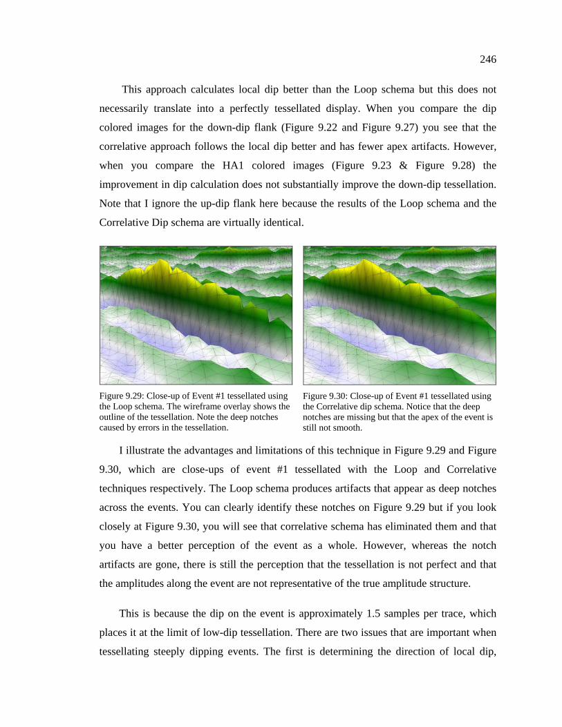
This approach calculates local dip better than the Loop schema but this does not
necessarily translate into a perfectly tessellated display. When you compare the dip
colored images for the down-dip flank (Figure 9.22 and Figure 9.27) you see that the
correlative approach follows the local dip better and has fewer apex artifacts. However,
when you compare the HA1 colored images (Figure 9.23 & Figure 9.28) the
improvement in dip calculation does not substantially improve the down-dip tessellation.
Note that I ignore the up-dip flank here because the results of the Loop schema and the
Correlative Dip schema are virtually identical.
I illustrate the advantages and limitations of this technique in Figure 9.29 and Figure
9.30, which are close-ups of event #1 tessellated with the Loop and Correlative
techniques respectively. The Loop schema produces artifacts that appear as deep notches
across the events. You can clearly identify these notches on Figure 9.29 but if you look
closely at Figure 9.30, you will see that correlative schema has eliminated them and that
you have a better perception of the event as a whole. However, whereas the notch
artifacts are gone, there is still the perception that the tessellation is not perfect and that
the amplitudes along the event are not representative of the true amplitude structure.
This is because the dip on the event is approximately 1.5 samples per trace, which
places it at the limit of low-dip tessellation. There are two issues that are important when
tessellating steeply dipping events. The first is determining the direction of local dip,
Figure 9.29: Close-up of Event #1 tessellated using the Loop schema. The wireframe overlay shows the outline of the tessellation. Note the deep notches caused by errors in the tessellation.
Figure 9.30: Close-up of Event #1 tessellated using the Correlative dip schema. Notice that the deep notches are missing but that the apex of the event is still not smooth.
247
which this approach does very well. The second, however, is determining the magnitude
of the dip and the technique fails in that respect. There are places where the apex of the
event shown in Figure 9.30 jumps two samples between traces and this technique cannot
handle that jump. For that, we need a high-dip schema, which I discuss next.
Still, for low-dip scenarios, this approach meets all of the criteria that I set out at the
beginning of this section. It is robust, fast and I use it throughout the remainder of this
The low-dip correlative dip schema is capable of effectively tessellating dips of ~1-
1.5 samples per trace, which makes it ideal for stratigraphic settings. However, structural
sections may have dips that far exceed that limit and in such cases, the low-dip approach
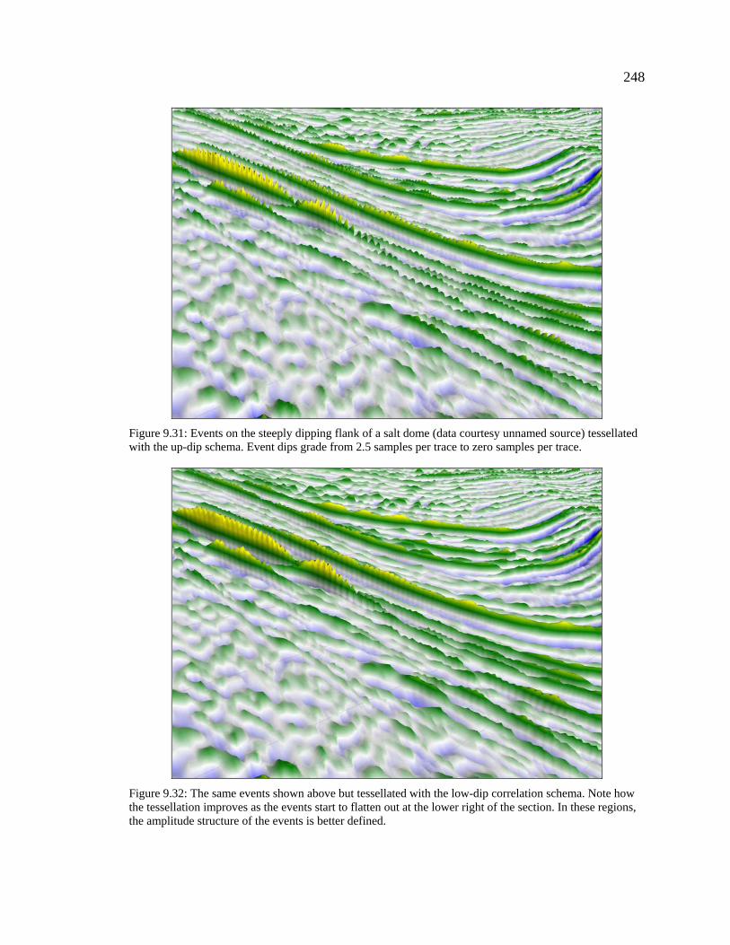
is inadequate. In Figure 9.31 and Figure 9.32, I show an example of what happens to the
tessellation as events become steeper and eventually exceed the one sample per trace
limit. Both of these images show events on the steeply dipping flanks of a salt dome. The
event dips grade from approximately 2.5 samples per trace to effectively zero samples per
trace.
Figure 9.31 shows the data tessellated with an up-dip schema. As one would expect,
the down-dip events on the flank are saw-toothed and it is very difficult to perceive their
amplitude structure. By contrast, Figure 9.32 shows the same data tessellated with the
low-dip schema previously described. If you follow any event from the upper left where
the dips are steepest, to the lower right where they are the shallowest, you will see that
the number of saw-tooth artifacts decreases and the amplitude structure becomes better
defined. However, in the high dip regions, the events are still incorrectly tessellated and
the amplitude structure is very hard to discern.
248
Figure 9.31: Events on the steeply dipping flank of a salt dome (data courtesy unnamed source) tessellated with the up-dip schema. Event dips grade from 2.5 samples per trace to zero samples per trace.
Figure 9.32: The same events shown above but tessellated with the low-dip correlation schema. Note how the tessellation improves as the events start to flatten out at the lower right of the section. In these regions, the amplitude structure of the events is better defined.
249
This degradation of the amplitude structure as an event becomes steeper is typical of
what you see on structural data sets. In this section, I describe an experimental technique
for tessellating these high-dip events, one that corrects most of the remaining problems.
The technique uses the same normalized cross-correlation approach that I used in for the
low-dip schema but with one significant modification. In the low-dip case, I was only
interested in determining the direction of local dip and I expected that those dips would
be small. Consequently, I restricted the cross-correlation to a ±2 sample shift. In this case,
however, I needed to determine the magnitude of the dip and I expected that the dips
would be much steeper. To that effect, I expanded the cross-correlation shift to ±4
samples. I implemented the technique in a pixel shader, which I detail in Appendix B.
In the low-dip case the output from the shader was a simple
+- switch that I used to indicate dip direction. The output from
this shader, however, was a signed number. The sign was the
same dip direction indicator and the number was the local dip in
samples per trace. Calculating the magnitude of the local dip was
only the first step in this technique. The purpose of the low-dip
schema was to determine which of the up-dip or down-dip
schemas illustrated in Figure 9.8 to use for a given sample. In
this case, however, neither schema was appropriate because the
dip magnitude can be greater than one and this causes problems
with the tessellation.
In Figure 9.33, I illustrate what can happen to the
tessellation as the dip magnitude changes. The numbers on the
left side of the image represent the dip magnitude as output by
the shader. As these numbers change from sample to sample, two
problems can occur. The first is that gaps can appear, as I show
by the gray areas. The second is that the tessellation from one
sample can overlap the tessellation from the previous sample(s). In the examples that
follow, I attempted to correct these problems in the cpu code. However, the only way to
Figure 9.33: Errors in high-dip tessellation. Numbers indicate the magnitude of local dip.
250
correct them completely is to either add or remove triangles, as needed, which I could
only do in a geometry shader. Unfortunately, geometry shaders are very new and I
decided to exclude them from this work. Consequently, the problems that I just
mentioned are visible in the images that I show of this technique.
In Figure 9.34, I applied the high-dip schema to the same salt dome events that I
showed previously. As you can see, the saw-tooth artifacts are now gone and it is
possible to follow the amplitude structure of the events from the high dip regions to the
low dip regions. I further illustrate the improvement in tessellation in Figure 9.35 and
Figure 9.36, which are close-ups of the uppermost events. I overlaid the wireframe
tessellation mesh upon the surfaces so that you could see exactly how the two techniques
have gone about determining the surface.
Figure 9.34: The same data shown in Figure 9.32 but tessellated with the High-Dip schema. The saw-tooth artifacts visible on the previous images of this data are gone and the amplitude structure of the events is now clear. The holes in the data occur where the sample-to-sample dip magnitude changes.
251
The dip on these events is ~ 2.5 samples per trace and as a result, the low dip schema
shown on the left is unable to reproduce the amplitude structure along the ridge of the
events. The high dip schema, shown on the right, however, has almost perfectly
reproduced the structure. This proves that we can correctly define the seismic surface
even in the presence of steep dips.
This technique will remain
experimental until I implement it in the
geometry shader. Although it has correctly
defined the high-dip events, the holes and
overlaps in the tessellation, which I
illustrate in Figure 9.37, make it unsuitable
for general use. The holes in the structure
are the most obvious feature of this image
but if you look closely, you will also see
that there are places along the bottom of
the troughs where there are also overlaps in the triangles. Surprisingly, all of these
artifacts are more pronounced at low-dip regions, possibly because they are generated
where the dip changes simply from positive to negative. This occurs most frequently, of
course, for low-dip regions.
Figure 9.35: Close-up of the uppermost events on Figure 9.32. Wireframe outlines the tessellation.
Figure 9.36: Close-up of the uppermost events on Figure 9.34.
Figure 9.37: Section of data showing visible holes caused by errors in high-dip tessellation.
252
Correcting the errors in this technique is a job for the future. Even so, the results
prove that you can correctly define the amplitude structure of steeply dipping
macrostructure events. To put it into practical use, all that remains is to implement the
technique in the geometry shader.
9.3.3 Future Work
One of the stated goals of this thesis is to determine the sciences behind visualization
and the directions of research that we must follow to improve our ability to communicate
seismic information. In this chapter, I introduced the subject of forming the seismic
surface, which is the first of the practical sciences of seismic visualization. This
introduction was necessarily brief and we must do much more work before we can
In particular, I discussed two techniques that we must program on a geometry shader
before we can use them in a real world setting. The first of these was subdivision, which
is the process of resampling the data to provide a smoother surface. The second was the
high-dip tessellation schema that I could only program in a pixel shader. Both of these
techniques generate new triangles and/or drop existing triangles, processes that require
the geometry shader. As the geometry shader becomes available over the next year, I will
develop techniques that both subdivide and perform high-dip tessellation on an “as
needed” basis. The ultimate tessellation schema will be one that analyzes each sample in
context with its neighbors and decides the level of subdivision and the tessellation
schema to apply. Before we can develop that schema, however, we must do more
research on the nature of the seismic surface itself.
Another line of research is the effect that tessellation has upon microstructure. In this
chapter I focused on the effect that tessellation has upon macrostructure and in particular
on the effect that it has on defining the apex or ridge of major seismic events. When we
observe macrostructure events, we primarily focus on the amplitudes along the ridge and
as I showed, tessellation has a major impact on our ability to perceive amplitude
structure. The effect of tessellation on microstructure, however, is harder to define. In
253
many cases, you can only observe microstructure events as perturbations that cross the
macrostructure events. To observe them we must concern ourselves not with just the apex
of the macrostructure events but with their flanks as well. In the following chapter, I
discuss lighting and its effect on our ability to perceive microstructure. Lighting,
however, is based upon the definition of the surface, which is itself based upon
tessellation. Tessellation, then, defines both our ability to perceive macrostructure and
microstructure and we must do much more work before we fully understand its affect on
the latter.
9.4 Macrostructure Examples
In 9.1.3 I stated that visualization has two objectives, the first is to reveal
microstructure, the second is to reveal the amplitude structure of macrostructure events.
Macrostructure events are, by definition, the events that we can see on a wiggle trace
displays. We can see them but our perception of them usually comes from the zero
crossings and we generally perceive simple monochromatic blobs. The peak amplitudes
along the ridge of an event define the amplitude structure of an event but these
amplitudes typically overlap. Consequently, even when we see the amplitude structure,
we only see it over a very limited amplitude range and only over a very few traces.
Variable density displays are capable of showing amplitude variations better than
wiggle trace displays. However, I show in Chapter 12, that human color perception is
very poor (and very personal) and that no combination of colors innately defines high and
low. Using color, we can see gross amplitude changes but unless we know the specific
palette and how we map it to amplitude, we can never know what those changes
represent. Moreover, variable density displays never let us form percepts of amplitudes
and percepts are the desired goal of visualization.
In the following section, I present a series of macrostructure comparisons between
SeisScape displays and wiggle trace displays. The purpose of these comparisons is
twofold. My first purpose is to overcome the unfamiliarity of SeisScape displays. Wiggle
trace displays are already familiar (and comfortable) to any experienced geophysicist but
254
SeisScape displays are new and very different. They are different and consequently they
are challenging because any new technology has a necessary learning curve. We know
what seismic data looks like as a wiggle trace display but we have to learn what it looks
like as a SeisScape display and that poses a challenge. These comparisons address the
learning issue because the wiggle trace displays all show familiar seismic scenarios. I
have inserted numbered reference points into them so that you can relate what you see on
the new SeisScape displays back to what they looked like on the familiar wiggle trace
displays. In this way I hope that the reader will begin the process of learning what
particular seismic expressions look like on SeisScape displays.
The second purpose of these comparisons is to show how much better you perceive
macrostructure on SeisScape displays. They highlight just how much amplitudes actually
change along events. In addition, they show how much better one can perceive low-
amplitude events when they are surrounded by high-amplitude events. Finally, they show
how much more continuous low-amplitude events are on SeisScape displays. In all of the
comparisons the purpose is to focus on the physical structure of the section, the lighting
and coloring are irrelevant.
Typically, wiggle trace displays are displayed flat on computer monitors and that is
how I show them here. You can rotate SeisScape displays to any viewing angle, however,
and depending upon the angle you can see different features of the data. This is one of the
major advantages of SeisScape displays but one that I cannot effectively reproduce on
paper. In these examples, I use a wide range of viewing angles so that the viewer can
develop a sense of what seismic looks like from different visual perspectives. However,
for each SeisScape display, the orientation that I chose is not necessarily the best one for
the particular data set. Other orientations may show the section better.
255
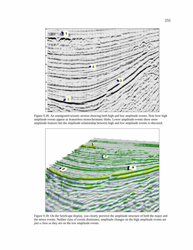
Figure 9.38: An unmigrated seismic section showing both high and low amplitude events. Note how high amplitude events appear as featureless monochromatic blobs. Lower amplitude events show more amplitude features but the amplitude relationship between high and low amplitude events is obscured.
Figure 9.39: On the SeisScape display, you clearly perceive the amplitude structure of both the major and the minor events. Neither class of events dominates, amplitude changes on the high amplitude events are just a clear as they are on the low amplitude events.
256
Figure 9.40: Section of noisy data from the Huallaga area of Peru (data courtesy PeruPetro). There is considerable amplitude contrast between the major and minor events and consequently I had to use a higher trace excursion (3.5) to show the low amplitude events.
Figure 9.41: This section contains significant levels of noise, the degree of which is more apparent on the SeisScape image. The amplitude structure is also clearer, especially between markers 1 and 3.
257
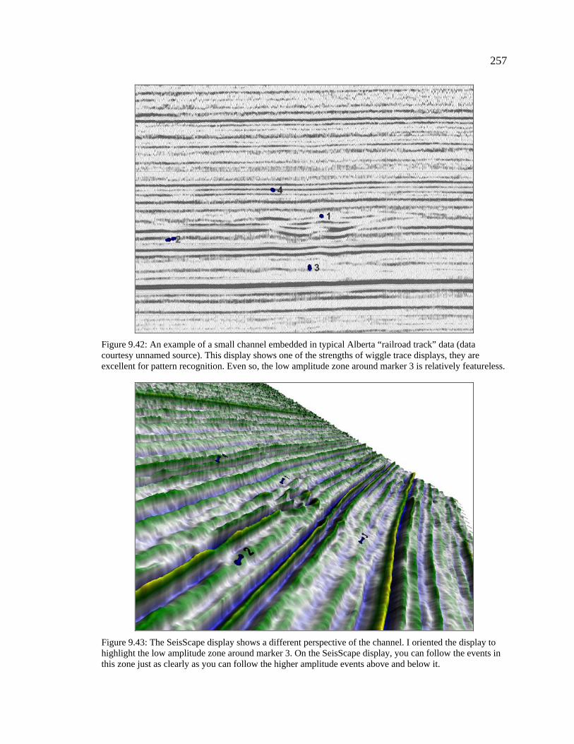
Figure 9.42: An example of a small channel embedded in typical Alberta “railroad track” data (data courtesy unnamed source). This display shows one of the strengths of wiggle trace displays, they are excellent for pattern recognition. Even so, the low amplitude zone around marker 3 is relatively featureless.
Figure 9.43: The SeisScape display shows a different perspective of the channel. I oriented the display to highlight the low amplitude zone around marker 3. On the SeisScape display, you can follow the events in this zone just as clearly as you can follow the higher amplitude events above and below it.
258
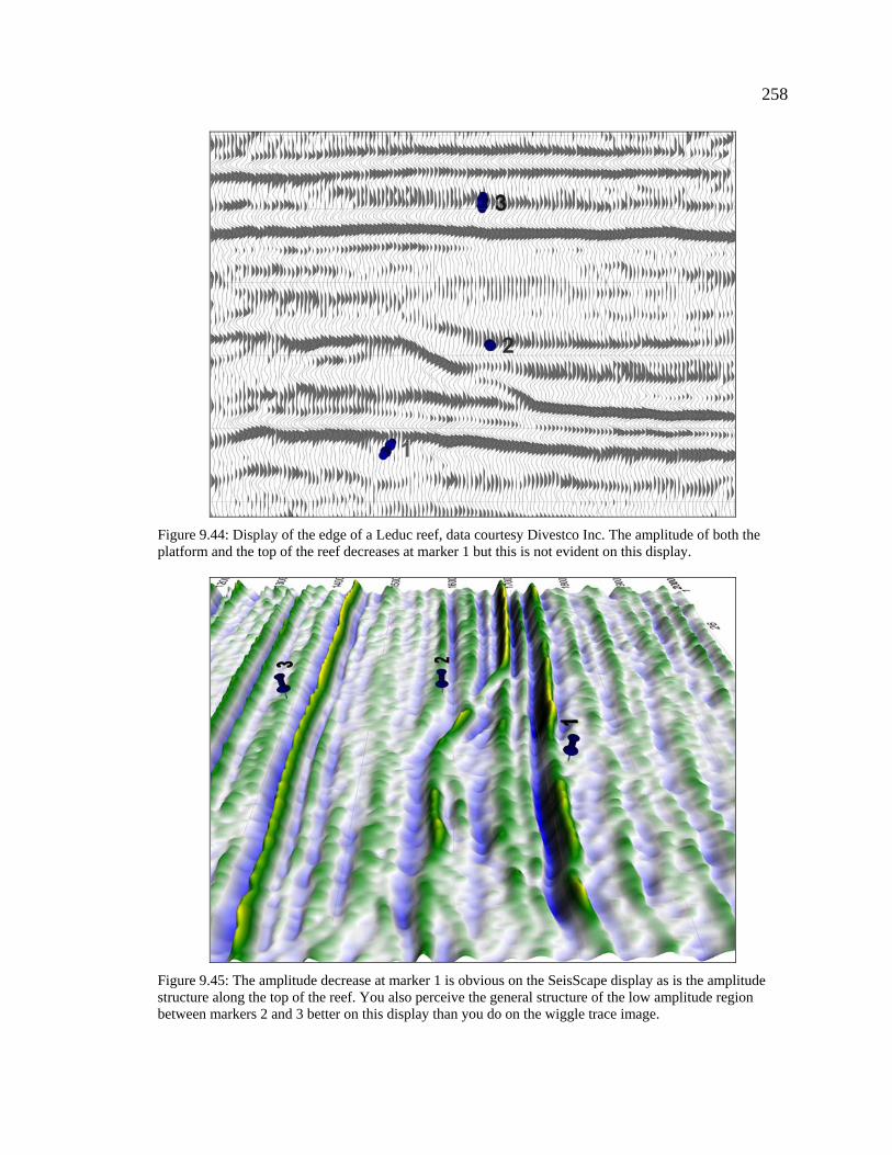
Figure 9.44: Display of the edge of a Leduc reef, data courtesy Divestco Inc. The amplitude of both the platform and the top of the reef decreases at marker 1 but this is not evident on this display.
Figure 9.45: The amplitude decrease at marker 1 is obvious on the SeisScape display as is the amplitude structure along the top of the reef. You also perceive the general structure of the low amplitude region between markers 2 and 3 better on this display than you do on the wiggle trace image.
259
Figure 9.46: Wiggle trace display of a section of Trujillo data. Locations 1, 2 & 3 mark low amplitude features surrounded by higher amplitude events.
Figure 9.47: Details of the seismic structure is a great deal easier to see on this display, especially between markers 1 and 2 and around marker 3. This zone is surrounded by high amplitude events whose amplitudes are also a lot easier to follow on the SeisScape image than they are on the wiggle trace image.
260
Figure 9.48: Typical common offset record containing a series of low amplitude multiples. In the region between 1570 ms to 1740 ms, there is a series of multiples that are much lower amplitude than the primaries and consequently they are hard to follow
Figure 9.49: Even though the multiples are much low-amplitude than the primaries they are just as easy to see on the SeisScape display. The effect of the multiples as they cross the primaries is also a great deal more noticeable on this display.
261
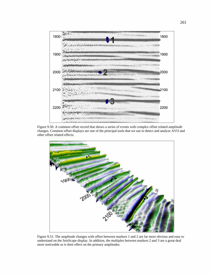
Figure 9.50: A common offset record that shows a series of events with complex offset related amplitude changes. Common offset displays are one of the principal tools that we use to detect and analyze AVO and other offset related effects.
Figure 9.51: The amplitude changes with offset between markers 1 and 2 are far more obvious and easy to understand on the SeisScape display. In addition, the multiples between markers 2 and 3 are a great deal more noticeable as is their effect on the primary amplitudes.
262
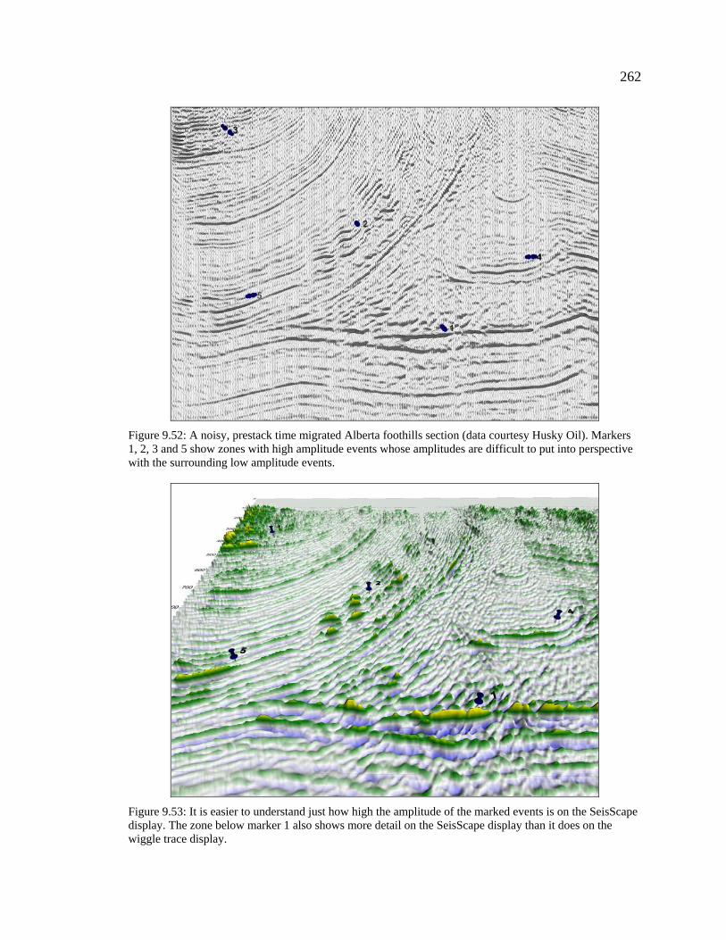
Figure 9.52: A noisy, prestack time migrated Alberta foothills section (data courtesy Husky Oil). Markers 1, 2, 3 and 5 show zones with high amplitude events whose amplitudes are difficult to put into perspective with the surrounding low amplitude events.
Figure 9.53: It is easier to understand just how high the amplitude of the marked events is on the SeisScape display. The zone below marker 1 also shows more detail on the SeisScape display than it does on the wiggle trace display.
263
Figure 9.54: An example of relatively noise free data from the Tambo area of Peru, data courtesy PeruPetro. There is nothing specific to look for in this image. I present it as just a typical seismic section, one that contains both structural and stratigraphic changes.
Figure 9.55: This is a typical orientation for a SeisScape display. It is the orientation that I use the most often when viewing seismic. I present it here just to show how a typical seismic section normally appears on a SeisScape display.
264
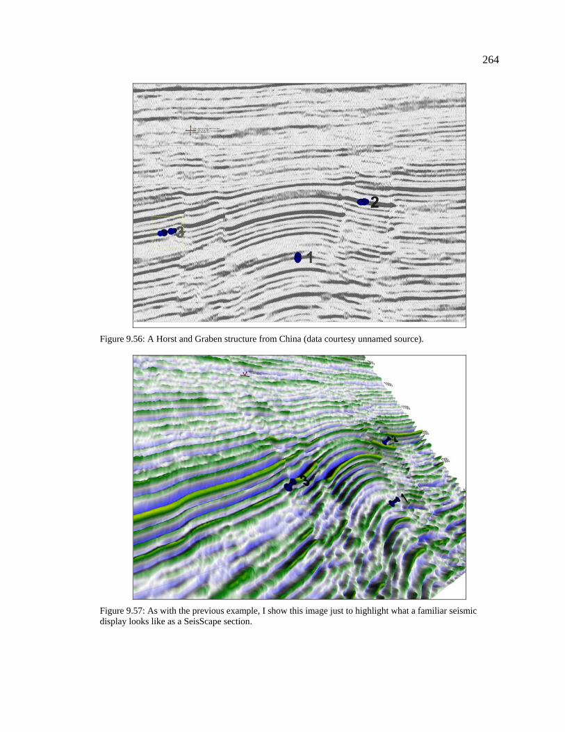
Figure 9.56: A Horst and Graben structure from China (data courtesy unnamed source).
Figure 9.57: As with the previous example, I show this image just to highlight what a familiar seismic display looks like as a SeisScape section.