The synoptic art experience M.W.A. Wijntjes, A. F¨ uzy, M.E.S. Verheij, T. Deetman and S.C. Pont accepted for publication in the Journal of Art and Perception Abstract At the start of the 20th century, Moritz von Rohr invented the synopter: a device that removes 3D depth cues that arise from binocular disparities and vergence. In the absence of these visual cues, the observer is less aware of the physical flatness of the picture. This results in a surprisingly increased depth impression of pictorial space, historically known as the ‘plastic effect’. In this paper we present a practical design to produce a synopter and explore which elements of a painting influence the plastic effect. In the first experiment we showed 22 different paintings to a total of 35 observers, and found that they rate the synoptic effect rather consistent over the various paintings. Subsequent analyses indicated that at least three pictorial cues were relevant for the synoptic effect: figure-ground contrast, compositional depth and shadows. In experiment 2, we used manipulated pictures where we tried to strengthen or weaken these cues. In all three cases we found at least one effect, which confirmed our hypothesis. We also found substantial individual differences: some observers experience little effect, while others are very surprised by the effect. A stereo acuity test revealed that these differences could not be attributed to how well disparities are detected. Lastly, we informally tested our newly designed synopter in musea and found similar idiosyncratic appraisal. But the device also turned out to facilitate discussions among visitors. 1
Transcript
The synoptic art experience
M.W.A. Wijntjes, A. Fuzy, M.E.S. Verheij, T. Deetman and S.C. Pont
accepted for publication in the Journal of Art and Perception
Abstract
At the start of the 20th century, Moritz von Rohr invented the synopter: adevice that removes 3D depth cues that arise from binocular disparities andvergence. In the absence of these visual cues, the observer is less aware ofthe physical flatness of the picture. This results in a surprisingly increaseddepth impression of pictorial space, historically known as the ‘plastic effect’.
In this paper we present a practical design to produce a synopter andexplore which elements of a painting influence the plastic effect. In the firstexperiment we showed 22 different paintings to a total of 35 observers, andfound that they rate the synoptic effect rather consistent over the variouspaintings. Subsequent analyses indicated that at least three pictorial cueswere relevant for the synoptic effect: figure-ground contrast, compositionaldepth and shadows. In experiment 2, we used manipulated pictures wherewe tried to strengthen or weaken these cues. In all three cases we found atleast one effect, which confirmed our hypothesis. We also found substantialindividual differences: some observers experience little effect, while othersare very surprised by the effect. A stereo acuity test revealed that thesedifferences could not be attributed to how well disparities are detected.
Lastly, we informally tested our newly designed synopter in musea andfound similar idiosyncratic appraisal. But the device also turned out tofacilitate discussions among visitors.
1
Introduction
Viewing a picture confronts our visual system with a paradoxical situation.What we see in the picture is often a three dimensional space (pictorialspace), whereas what we see at the picture is a flat surface containing pig-ments or pixels. We are generally aware of this duality although we normallyonly experience one of the two percepts at once. Which of these perceptsprevails depends on the visual cues that make up the 3D (pictorial space)or 2D (physical surface) presentations. For example, when looking at a DeKooning, we might immediately notice the thick paint on the canvas and incombination with the absence of pictorial depth cues we will be more awareof the physical surface than of the pictorial space. On the other hand, amore conventional painting with rich depth cues and smoothly varnishedsurface will likely put us more in the pictorial space mode.
A simple trick to decrease the awareness of the surface is to close one eye.This idea enters psychological literature with an observation of Claparede(1904) but was known long before, most notably by Da Vinci (1888). Inhis notebooks he more then once mentions closing one eye to change theperception of depth. For example, when looking at the real scene, it helpsto close one eye to make it more pictorial, which was recently confirmedexperimentally (Wijntjes, 2014). Da Vinci also acknowledges that this trickworks in the other direction:
It is impossible that painted objects should appear in such reliefas to resemble those reflected in the mirror1, although both areseen on a flat surface, unless they are seen with only one eye;and the reason is that two eyes see one object behind another[...]
Although Da Vinci argued that the visual resemblance between reality andpictures is optimal when closing one eye, this does not necessarily meanthat he was aware that a picture itself appears different when closing oneeye with respect to binocular viewing. Claparede (1904) is often credited tobe the first explicitly describing the paradox in this observation: For realobjects, depth perception is greatly reduced when closing one eye, but forimage perception the opposite occurs (“c’est le contraire qui a lieu: la visionmonoculaire est stereoscopique”). Some years before Claparede, Ebbinghaus(1902) had also described this phenomenon. Interestingly, he explicitly re-ferred to ‘Kunstkenner’ (art connaisseurs) looking with one eye occluded
1Da Vinci very often notes that using a mirror is helpful in many painting problems.
2
by the palm of their hand resulting in “canals, avenues and porticoes thatstretch themselves clearly in the direction of the observer, instead of theupright direction of painting. The illusion of depth is much stronger withone eye than with binocular viewing.”2.
Although the pictorial depth cues are similar for monocular and binocu-lar viewing, the depth cues for the physical surface differ substantially. Withtwo eyes, binocular disparity, vergence and accomodation make the flatnessof the physical surface accessible to the visual system, whereas for monocu-lar viewing disparity and vergence information is absent. Interestingly, andpossibly counterintuitive (hence the ‘paradox’), the perception of the flat-ness of the physical surface seems to penetrate the perception of pictorialspace. The general consensus that emerged after subsequent discussions ofAmes (1925) and Schlosberg (1941) is that the primary reason for the effectto emerge is the ability to ‘localise’ the physical surface. Here, ‘localisation’should be understood in the general sense, so both the location of the sur-face in space but also the loci making up the geometry of the surface (whichis generally flat). Both Ames (1925) and Schlosberg (1941) describe variousways of perturbing the perception of the physical surface. These descriptionslargely overlap. We will discuss these solutions together with an overviewof viewing devices that could be used for these purposes. The list providedby Ames (1925) is used, but we rearranged the order somewhat.
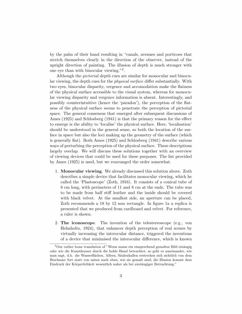
1. Monocular viewing. We already discussed this solution above. Zothdescribes a simple device that facilitates monocular viewing, which hecalled the ‘Plastoscope’ (Zoth, 1916). It consists of a conical tube of8 cm long, with perimeters of 11 and 8 cm at the ends. The tube wasto be made from half stiff leather and the inside should be coveredwith black velvet. At the smallest side, an aperture can be placed,Zoth recommends a 18 by 12 mm rectangle. In figure 1a a replica ispresented that we produced from cardboard and velvet. For reference,a ruler is shown.
2. The iconoscope. The invention of the telestereoscope (e.g., vonHelmholtz, 1924), that enhances depth perception of real scenes byvirtually increasing the interocular distance, triggered the inventionsof a device that minimised the interocular difference, which is known
2Our rather loose translation of ”Wenn mann ein einsprechend gemaltes Bild einaugigoder wie die Kunstkenner durch die hohle Hand betrachtet, so geht es auseinander, wieman sagt, d.h. die Wasserflachen, Alleen, Saulenhallen erstrecken sich sichtlich von demBeschauer fort statt von unten nach oben, wie sie gemalt sind; die Illusion kommt demEindruck der Korperlichkeit wesentlich naher als bei zweiaugiger Betrachtung.”
3
as Javal’s Iconoscope (Ames, 1925). It somewhat resembles the syn-opter, which we will discuss later, although the Iconoscope still resultsin some binocular disparities.
3. Viewing a picture at a large distance. For a picture surfacethat is far away, binocular disparity, vergence and accommodationare too inaccurate to signal the flatness of the surfaces. There is nospecific device that can help here, but of course the common cinemaexperience, where observers are located far away from the screen is atypical example.
4. Looking through a small hole of 2 mm. Reducing the size ofthe pupil increases the depth of field. The ‘artificial pupil’ is a wellknown method in vision science often used to maintain the pupil sizeconstant under a wide variety of illumination conditions. Hennessy,Iida, Shiina, and Leibowitz (1976) showed that with decreasing pupilsizes, accommodation stops to depend on the stimulus distance aftera certain pupil size. At 2 mm the results were already very similar tosmallest size of 0.5 mm. This effect implies that the distance and shapeof the picture surface cannot be accurately signalled for an artificiallysmall pupil of 2 mm.
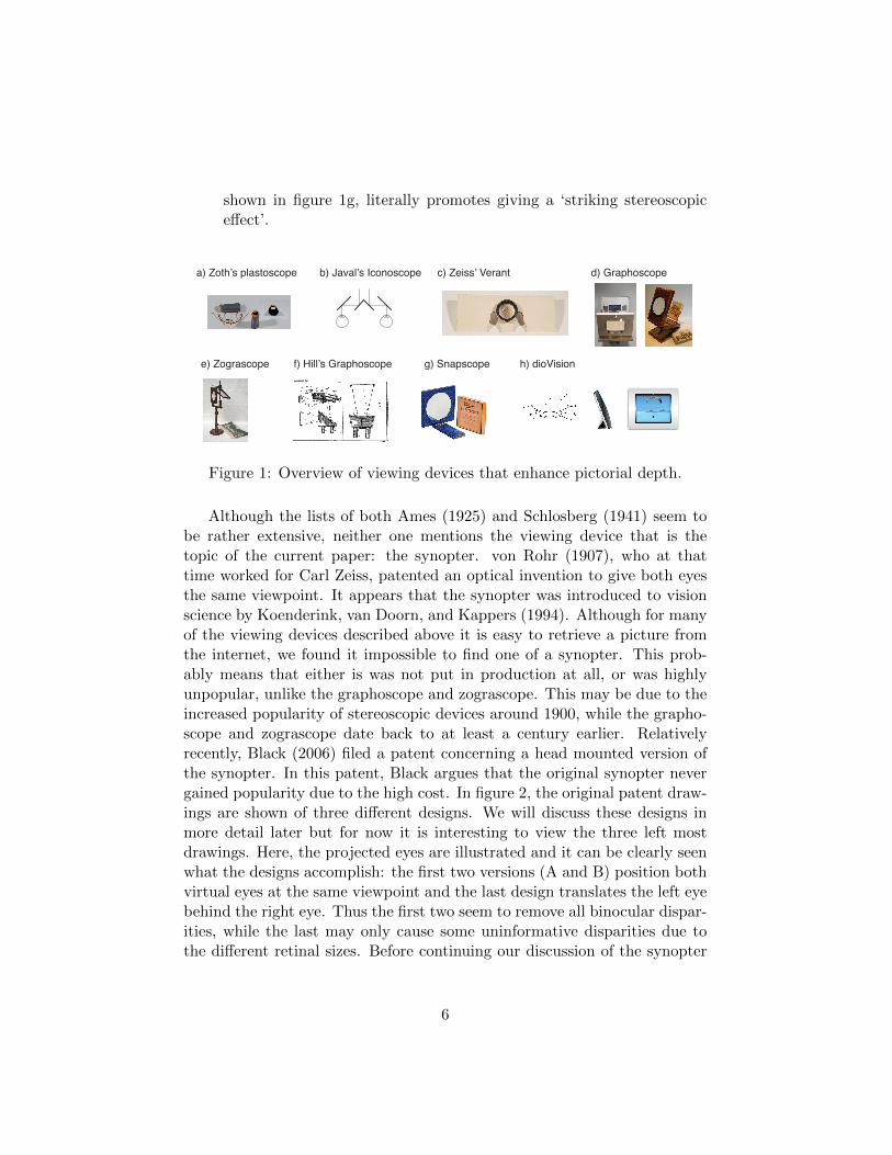
5. Changing the accommodation of the eyes. Various viewing de-vices (including contemporary head mounted displays) make use of alens to project the image optically farther away, e.g. at infinity. Mostnotably, the verant3 lens (Holt, 1904) that von Rohr designed for CarlZeiss is very suited for this task. In figure 1c an original verant lensis shown that we mounted in a plywood casing. This can be used formonocular viewing of pictures or movies. Although the verant lensis very suitable to increase monocular stereopsis (see next section foran explanation of this terminology), it was more commonly used instereoscopes. Another class of viewing devices that relies on lens op-tics which were actually frequently used for single picture viewing arezograscopes and graphoscopes (Kemp, 1990). The difference betweenthese devices is that the zograscope makes use of a mirror. Bothdevices make use of convex lenses that cancel out binocular dispar-ity, vergence and accommodation cues (Koenderink, Wijntjes, & VanDoorn, 2013). Figure 1d shows both a classic graphoscope and ourown version, while in figure 1e a traditional zograscope can be seen.
3From ‘verus’, i.e. ‘true’
4
6. Changing the convergence. The lenses used in graphoscopes andzograscopes effectively put the lines of sight parallel, similar to a sceneat infinity. Instead of a convex lens, it is also possible to use twopairs of prisms as Ames proposed. Hill (1898) had proposed two waysof adjusting the vergence to be parallel: by mirrors and with prisms(figure 1f).
7. Blur the image in one eye Stereo acuity degrades when the retinalimages of both eyes are blurred (Westheimer & Mckee, 1980). It islikely that stereo acuity depends on the weakest link and that blurringthe image in only one eye yields a similar acuity decrease. However,the sharp image in the other eye will dominate the percept (Levelt,1966) and it might well be that the monocular blurring goes unnoticed.
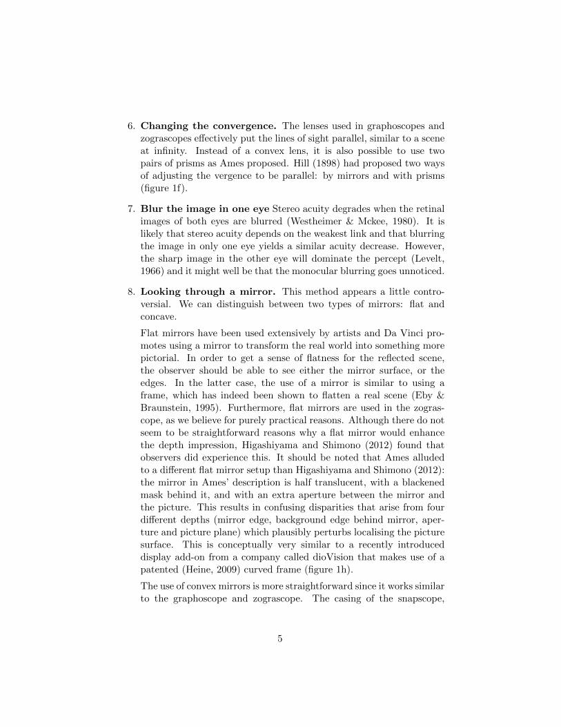
8. Looking through a mirror. This method appears a little contro-versial. We can distinguish between two types of mirrors: flat andconcave.
Flat mirrors have been used extensively by artists and Da Vinci pro-motes using a mirror to transform the real world into something morepictorial. In order to get a sense of flatness for the reflected scene,the observer should be able to see either the mirror surface, or theedges. In the latter case, the use of a mirror is similar to using aframe, which has indeed been shown to flatten a real scene (Eby &Braunstein, 1995). Furthermore, flat mirrors are used in the zogras-cope, as we believe for purely practical reasons. Although there do notseem to be straightforward reasons why a flat mirror would enhancethe depth impression, Higashiyama and Shimono (2012) found thatobservers did experience this. It should be noted that Ames alludedto a different flat mirror setup than Higashiyama and Shimono (2012):the mirror in Ames’ description is half translucent, with a blackenedmask behind it, and with an extra aperture between the mirror andthe picture. This results in confusing disparities that arise from fourdifferent depths (mirror edge, background edge behind mirror, aper-ture and picture plane) which plausibly perturbs localising the picturesurface. This is conceptually very similar to a recently introduceddisplay add-on from a company called dioVision that makes use of apatented (Heine, 2009) curved frame (figure 1h).
The use of convex mirrors is more straightforward since it works similarto the graphoscope and zograscope. The casing of the snapscope,
5
shown in figure 1g, literally promotes giving a ‘striking stereoscopiceffect’.
b) Javal’s Iconoscope d) Graphoscope
e) Zograscope
a) Zoth’s plastoscope c) Zeiss’ Verant
f) Hill’s Graphoscope g) Snapscope h) dioVision
Figure 1: Overview of viewing devices that enhance pictorial depth.
Although the lists of both Ames (1925) and Schlosberg (1941) seem tobe rather extensive, neither one mentions the viewing device that is thetopic of the current paper: the synopter. von Rohr (1907), who at thattime worked for Carl Zeiss, patented an optical invention to give both eyesthe same viewpoint. It appears that the synopter was introduced to visionscience by Koenderink, van Doorn, and Kappers (1994). Although for manyof the viewing devices described above it is easy to retrieve a picture fromthe internet, we found it impossible to find one of a synopter. This prob-ably means that either is was not put in production at all, or was highlyunpopular, unlike the graphoscope and zograscope. This may be due to theincreased popularity of stereoscopic devices around 1900, while the grapho-scope and zograscope date back to at least a century earlier. Relativelyrecently, Black (2006) filed a patent concerning a head mounted version ofthe synopter. In this patent, Black argues that the original synopter nevergained popularity due to the high cost. In figure 2, the original patent draw-ings are shown of three different designs. We will discuss these designs inmore detail later but for now it is interesting to view the three left mostdrawings. Here, the projected eyes are illustrated and it can be clearly seenwhat the designs accomplish: the first two versions (A and B) position bothvirtual eyes at the same viewpoint and the last design translates the left eyebehind the right eye. Thus the first two seem to remove all binocular dispar-ities, while the last may only cause some uninformative disparities due tothe different retinal sizes. Before continuing our discussion of the synopter
6
design, we will first shortly review the theoretical background concerningthe aforementioned depth enhancements.
A
B
C
Figure 2: Original images from von Rohrs’ patent claim. We have reshuffledthe figures to match the order of figure 3 which uses a similar labeling A-C.The labelling ‘Fig.4’ etc refers to the original patent. Von Rohr drew thebasic optics of the three designs in the left column. The drawings in themiddle and right column are practical implementations of these three types.
The ‘plastic’ effect
In the literature, the enhanced depth impression is often referred to as the‘plastic effect’ or ‘monocular stereopsis’. The word ‘plastic’ might not soundvery intuitive, but reading Schlosberg (1941) (“the person stands out clearly,and plastic space can be seen between him and the background”) may clarifythe word use. In German, the word ‘plastic’ also refers to sculpture: theflat picture is transformed into a three dimensional sculpture. Therefore, wecould say that the plastic effect has a double connotation: it refers to thespace between objects, and it refers to the (sculpted) objects themselves.The term ‘monocular stereopsis’ refers to the originally greek meaning of‘stereopsis’ meaning something like solidity or solidness (referring to thethree dimensionality). Thus, stereopsis does not imply binocular disparities,
7
although terms like ‘stereoscopic vision’ often do refer to this. Since themeaning of stereopsis turns out to be ambiguous, and because monocularstereopsis refers to viewing with one eye (which is not always the case inAmes’ list), we will use the term plastic effect. An extra argument forusing the term plastic effect is the double connotation of space and shapeenhancement, which in our view are indeed the most dominant qualitativedifferences between normal viewing, and plastic viewing.
The conventional explanation of the plastic effect is that under nor-mal viewing conditions, the flatness that is encoded by the physiologicalcues diminishes the depth of the pictorial space. Removing these flatnesscues makes the pictorial content more ‘plastic’, more articulated in depth.This is how most authors (e.g., Eaton, 1919; Ames, 1925; Schlosberg, 1941;Hochberg, 1962) explain the effect. Although introspective reports are rel-atively abundant, there are only few experimental studies on the plasticeffect. Two studies on pictorial relief showed that for both the synopter(Koenderink et al., 1994) and zograscope (Koenderink et al., 2013) the depthincreased for most observers. These data are in line with a cue integrationprocess where cues of both the physical and pictorial space are combined insome weighted average fashion. If the physical surface is difficult to perceivebecause the cues like binocular disparity are absent, then only monocularcues contribute to the percept. Recently, Vishwanath and Hibbard (2013)challenged this hypothesis. They performed an experiment in which ob-servers had to adjust the cross-section of a rendered (textured, no shading)cylinder. Contrary to Koenderink et al. (1994) they found no difference indepth scaling between observers looking monocularly through an aperture,and binocular viewing. Nevertheless, they did find various other qualitativedifferences between normal binocular viewing and ‘plastic’ viewing that con-form well with the introspective reports found in earlier literature. Thesefindings point into an interesting but at the same time puzzling direction:the plastic effect seems to occur in a qualitative manner without a quantita-tive increase in depth, or in their words: “perceiving a stronger impression ofstereopsis is not the same thing as perceiving a greater magnitude of depth”.The alternative explanation provided by Vishwanath (2014) is that of ‘abso-lute depth scaling’. Although most depth cues specify relative depth, thereare three cues that specify absolute depth: binocular convergence, verti-cal disparity, and accommodation. Monocular viewing through an aperturecancels out the first two absolute depth cues and leaves accommodationunaffected. The ‘absolute depth scaling’ idea conjectures that the accom-modation signal in isolation is now attributed to the pictorial space, insteadof the picture surface. If we generalise this concept it means that the visual
8
system can encode the absolute depth of a picture with a set of cues. If thisset is reduced up to a certain amount, the residual cues are attributed tothe pictorial objects and this attribution causes the plastic effect.
Plasticity and the perception of art
Whichever theory will prove to be correct, they all share the commonalitythat perception of the pictures’ surface influences the perception of pictorialspace. Until now we have primarily focused on what occurs outside picto-rial space: how the perception of the surface can be modified by the list ofpossibilities provided by Ames (1925) and Schlosberg (1941). The numberof studies on the plastic effect is relatively low, and studies that experi-mentally address the influence of the pictorial content on the plastic effectare practically inexistent. In their mirror study, Higashiyama and Shimono(2012) used 11 photographs and report without much detail that “picturesfor which the plastic effect was well detected contained ample depth cues”.Vishwanath and Hibbard (2013) used six different photographs but alsodid not report detailed information about differences between the stimuli.However, they did address the contribution of a few depth cues by imageblurring and an effect that removed smooth gradients while maintaininghard contrast edges. Both effects were reported to have a significant im-pact on the plastic effect. Lastly, there is abundant historical evidence thata special type of picture was very popular for zograscopic use: colouredengravings (Kaldenbach, 1985; Blake, 2003). Typical examples show a mir-rored upper caption, anticipating on the mirror of the zograscope. Typicalnames for these engravings are ‘Guckkastenblatt’ (German), ‘Vue Perspec-tive’ (French) or ’Perspective view’ (English); note that the latter is toogeneric to perform effective internet search. Although these pictures werespecifically produced to optimise the plastic effect, their style is not repre-sentative for an optimal pictorial design because they are too confined tothe medium: engraving. There is very little shading, hardly any render-ing of material properties and colours are mostly homogenous. This styleis optimal for efficient production, but hardly refers to depth cues that arenormally present in paintings and photographs, except for linear perspective.
The study presented here specifically focusses on the perception of paint-ings. This is interesting for two reasons. Firstly, as we discussed above, thereis little known about the contribution of pictorial cues on the plastic effect.Zoth (1916) observed that the plastic effect even works for ‘schlechte’ (poor)pictures. However, it seems likely that for some pictures the plastic effect isstronger than for others. Indeed, there must at least be some potential for
9
depth increase in the composition. The psychological literature offers ampleoverviews of the common pictorial depth cues that create an impression ofpictorial spaciousness. One way to approach the investigation of the depen-dence of the plastic effect on these canonical depth cues is to independentlymanipulate each of them, and their combinations. Instead of taking thistraditional psychological approach we took a more explorative approach.The rationale behind this is that the pictorial techniques that facilitate theplastic effect may not be completely covered by an a priori list of psycholog-ical depth cues. Furthermore, the use of paintings as stimuli is interestingbecause long before depth perception was studied by psychologists, it wasone of the major topics of investigation among painters. Paintings are notaccidental like snap shot pictures. Instead, they are often the result of thor-ough contemplation. Furthermore, painters are free to create views that arenowhere to be found in reality, yet make perfect sense to our visual system.Therefore, paintings are a rich and inexhaustible source for the study ofvisual perception.
The second reason to use paintings is the very reason that the synopterwas actually designed to be used in art galleries. Zoth (1916) and manyothers referred mostly to viewing art which makes plastic effect devices his-torically closely intertwined with the appreciation of art. The purpose of thecurrent paper is not only the investigation of the plastic effect with respectto different paintings, but also to describe the design of a synopter that canbe used in art galleries and musea. By giving access to a simple synopter de-sign, we modestly intend to revive the use of the synopter as it was originallyintended. Nowadays, museum visitors are assisted by audio tours that helpthem with the iconographical analysis of paintings. The information mayalso contain some references to the pictorial techniques but it does not offeran explicitly deeper experience of pictorial space. The synopter is designedto do exactly that, which could make it a unique additive for a rewardingmuseum visit.
The optics and design of a synopter
Fields of view for various designs
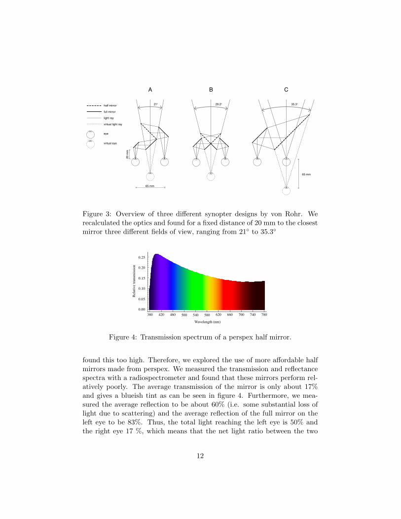
Paintings come in a wide range of sizes and museum visitors look at themfrom various viewing distances. This means that the field of view can varyquite substantially. To get an idea for viewing angles: if a painting is 1 meterwide and viewed at 2 meters distance the field of view is 28◦. In the originalpatent of the synopter, von Rohr presented three designs, as shown in figure
10
2. We calculated the optics to verify these three designs and quantify theviewing angles, which is shown in figure 3. An important free parameter isthe distance between the eye and the closest mirror, which we set at 20 mm.Furthermore, we used an average of 65 mm inter-ocular distance. Basedon these two parameters, the three different designs result in three differentviewing angles of 21◦, 29◦ and 35◦, respectively. We will shortly describethe three designs.
Design A was previously used in psychophysical experiments(Koenderink et al., 1994). Main advantage is that it is easy to constructand that the optical path lengths for both eyes are equal. Disadvantage isthe limited field of view.
In design B, the relatively small field of view is increased almost by afactor 1.5 in comparison to design A. This design is the smallest of all threebut has one major disadvantage. As can be seen in figure 3B, the centralmirrors are split in two: one section is half translucent and the other is a fullmirror. Since the intersection between these two types of mirrors will alwayshave some physical separation, there will be a line visible in the centre ofthe visual field. Especially when producing a low cost product, it is verydifficult to overcome the problem of a visible vertical line. That this designhas the smallest size was likely the reason that Black (2006) used this designin his patent for a head mounted version of the synopter.
The last design has the largest viewing angle but has one significantdisadvantage over the other two designs: the optical path lengths of botheyes are different. The absolute optical path length (length that light travelsfrom the image to the eye) of the left eye is 65 mm (the interocular distance)longer than the right eye. This implies that objects should be positionedat a sufficiently large distance to make the relative retinal size differencessmall. For a viewing distance of 1.5 meter, the relative size difference isabout 4%. We choose to work out this design because it offers the largestfield of view, together with a relatively easy construction. It appears thatalso von Rohr saw most potential in this design since he presented an actualpractical casing for the optics (figure 2C, right).
Mirror characteristics
An ideal half mirror transmits and reflects exactly half of the incident lightequally at all wavelengths. In other words, the ideal half mirror shouldtransmit as a neutral density filter. High quality ‘beamsplitters’ are gener-ally quite expensive, in the order of 100 Euro’s. For academic equipment,these costs are not uncommon, but for a commercially available synopter we
11
half mirror
full mirror
light ray
virtual light ray20
mm
65 mm
65 mm
21o 29.2o 35.3o
eye
virtual eye
A B C
Figure 3: Overview of three different synopter designs by von Rohr. Werecalculated the optics and found for a fixed distance of 20 mm to the closestmirror three different fields of view, ranging from 21◦ to 35.3◦
380 420 460 500 540 580 620 660 700 740 7800.00
0.05
0.10
0.15
0.20
0.25
Wavelength (nm)
Rel
ativ
e tra
nsm
issi
on
Figure 4: Transmission spectrum of a perspex half mirror.
found this too high. Therefore, we explored the use of more affordable halfmirrors made from perspex. We measured the transmission and reflectancespectra with a radiospectrometer and found that these mirrors perform rel-atively poorly. The average transmission of the mirror is only about 17%and gives a blueish tint as can be seen in figure 4. Furthermore, we mea-sured the average reflection to be about 60% (i.e. some substantial loss oflight due to scattering) and the average reflection of the full mirror on theleft eye to be 83%. Thus, the total light reaching the left eye is 50% andthe right eye 17 %, which means that the net light ratio between the two
12
eyes is 1:3. It should be noted that we a posteriori measured the spectra.Looking at these numbers beforehand would possibly have made us doubtto continue with these perspex mirrors. However, we did not know this atthe time of the experiments, and still found that our newly designed syn-opter worked rather well (see the experiments section). At first sight onemight expect that the unequal brightness values in both eyes have a positiveinfluence on the plastic effect. It is possible that unequal brightness valuesperturb the correspondence problem similar to blurring one eye (see previ-ous overview techniques). However, the mirrors already remove binoculardisparities. Therefore it is rather unpredictable what the effect is of unequalbrightness values.
As an extra check and for clarifying purposes, we also made photographsthrough both viewing apertures, which are presented in figure 5. As can beseen, the right eye indeed shows a bluish tint, that we already predictedfrom the transmission spectrum. The pictures through the synopter weretaken with the same shutter/iso/diaphragm settings so the relative imagebrightness difference is roughly indicative for the actual relative brightnessdifference. Indeed, the right eye receives a darker image than the left eye. Iffigure 5A is cross fused, it can be seen that there are no disparities, exceptthe reflection of the nose hole in the mirror (see figure 6) in the left eyeimage. This makes it extra clear that the synopter itself does not introducedisparities. In figure 5B, we have put a toy giraffe in the scene. It isclearly visible that the position of the giraffe does not change with respectto the background for both images. If the synopter is removed (figure 5C),both images have equal brightness and the giraffe has markedly differentpositions. Cross fusing this last image pair will result in a strong stereoscopicimpression where the giraffe comes forward, although the painting itselfmaintains its flatness. It should be noted that the field of view on thepictures is less than the actual field of view due to camera limitations.
3D design
The housing of the optical system was designed to be easily reproducible.We chose a box-shaped design which can be produced with a laser cutter.We include the production drawings as supplementary material to this pa-per. Our current models are cut from 3 mm thick cardboard. A significantdrawback of this material is that it gets charred in the laser cutting process.A good alternative is using plywood. To shield ambient light at the eyes wealso made an eyecup. This can be produced from any deformable material
13
Figure 5: Left: the setup we used to make the photographs through bothpeepholes of the synopter. The camera was on a slider, so two parallel pic-tures were made with a 6.5 cm lateral translation difference. Right: right-leftimage pairs are shown. The placement of the right picture on the left sideand vice versa was on purpose, to allow visual cross fusion for the trainedreader. A) pictures through the synopter without the giraffe object. Theimages differ in brightness and color, as predicted by the mirror character-istics. B) Same images but now with a toy giraffe in front to validate thatthere is no parallax between the two eyes. C) Images taken without the syn-opter. The relative position of the giraffe in the right eye image (shown left)remains unchanged, but in the left eye a paralactic displacement is visible.Cross fusion will reveal a clear binocular stereoscopic impression.
like rubber or cork. In figure 6 an ‘exploded view’ is shown. On top twoslits can be seen that contain the mirrors.
14
Figure 6: The left column shows renderings of the model, including an‘exploded view’. The middle and right columns show photographs of thesynopter used in this research.
Experiment 1
The first experiment consists of data collected during a course given by thefirst author of this paper (MW). The main purpose of this experiment was toverify whether the plastic effect shows a certain degree of consistency withrespect to various paintings. The experiments were performed by students4.The students consisted of two groups (A and B) that each chose differentpaintings and used different participants. Originally, there was also a thirdgroup but they made use of many copy righted materials including pho-tographs. The overall results were similar to the other groups but will notbe reported here.
4All students were notified that they could participate in co-authoring this paper whenthey agreed to help with discussing the manuscript and help with developing supplemen-tary material. Two students agreed, the others appear in the acknowledgements.
15
Methods
Participants
All observers were fellow students or friends of the (student) experimenters.Mean age was about 20 years old. Observers were excluded if they reportedto be stereo blind. Groups A and B performed the experiments with 15 and20 observers, respectively. Thus, a total of 35 observers participated in thefirst experiment.
Stimuli
The two student groups were instructed to select their stimuli from theRijksmuseum website (www.rijksmuseum.nl) where the first author alreadyhad made a pre selection. In general the images were selected to ascertaina variety of depth cues and scene types, although it is difficult to do thisin a systematic manner. Group A used 15 stimuli and group B used 9stimuli. An overview of the paintings is presented in table 1. As can beseen, two paintings were used by both groups, yielding a total stimulus setof 22 different paintings.
Apparatus
The synopter has been described in the previous section. The paintings andphotographs were shown on a computer screen. Screen sizes were approx-imately 30-40 inch diameter and viewing distances were approximately 1.5m.
Procedure
The task of the observers was to assess the strength of the synoptic effect.The mechanism behind the synopter was briefly explained and one or twoexample images were shown. All presentation orders were randomised perobserver. Each observer saw only one presentation of each image. Theobserver was instructed to compare viewing with and without the synopter.While viewing, observers could freely switch between looking through thesynopter and free viewing. Observers estimated the effect on a scale from 1to 9 (group A) or 1 to 7 (groups B).
16
Table 1: Overview of paintings used in the experiments. 1A and 1B referto the two different sets in experiment 1. ∗ indicates that this painting wasedited in experiment 2. In the supplementary material a table is includedwith links to the original works at the Rijksmuseum website. [...] indicatesa cropped title due to space limitations.
# Experiment Artist Title Year
1 (1A, 2∗) Rembrandt Man in Oriental Dress 16532 (1A) W.C. Heda Still Life with a Gilt Cup 16353 (1A, 2) F.C. van Dijck Still Life with Cheese 16154 (1A, 2∗) van Gogh Self-portrait 18875 (1A, 2) P. Claesz. Still Life with a Turkey Pie 16276 (1A, 2∗) Breitner The Singel Bridge [...] 18967 (1A, 2∗) J. Israels Children of the Sea 18728 (1A) Appel The Square Man 19519 (1A, 1B, 2∗) Breitner Girl in a White Kimono 189410 (1A, 2) Kruseman Portrait of Alida Christina Assink 183311 (1A, 1B, 2∗) Voogd Italian Landscape [...] 180712 (1A, 2∗) Coorte Still Life with Asparagus 169713 (1A, 2) Ruisdael The Windmill [...] 1668 - 167014 (1A, 2∗) Post View of Olinda, Brazil 166215 (1A, 2∗) d’ Eyck Still Life with Books in a Niche 1442 - 144516 (1B, 2) Vroom Dutch Ships Running [...] 161717 (1B, 2) Sande Bakhuyzen The Artist Painting a Cow [...] 185018 (1B, 2) Gabriel Duck nests ca. 189019 (1B, 2) Springer The Zuiderhavendijk, Enkhuizen 186820 (1B, 2∗) Weissenbruch Wooded View near Barbizon 190021 (1B, 2∗) Potter Four Cows in a Meadow 165122 (1B, 2∗) Maris Ducks ca. 1880
17
Results
Internal consistency
To assess how similar observers scored on the stimulus set, we calculatedCronbach’s alpha values. This statistic is generally used to quantify theinternal consistency of a group of raters. In the context of our researchthis metric is used to assess whether the effect of the synopter depends onthe pictorial content. The values we found for the two groups were 0.87and 0.72, respectively. As a comparison, random input (N = 1000 for 15observers and 18 paintings) gives a mean Cronbach’s alpha value of -0.17with a standard deviation of 0.56. Thus, values were well above chancelevel. To quantify if there were any outliers, we correlated all observerswith the group means and defined an outlier as someone who correlatednegatively with the group mean. We found 0 and 4 outliers in groups A andB, respectively. We removed this data from the subsequent analysis. NewCronbach’s alpha values were 0.87 and 0.86, respectively.
Pictorial style
Since we found that observers rated the effect consistently, we wanted tounderstand what exactly determines the effect. Since we used unmodifiedimages we did not control for any image cues. In this section we will presentthe ordering of the stimuli according to the mean responses and will analysethese in the discussion section.
We normalised all answers per observers and used these data to calcu-late means and medians. Because the (normalised) data is bounded onecannot assume normal distributions. Therefore, the median would be a bet-ter statistic to quantify the overall effect per painting. However, because thedata is also discrete (whole numbers), the median will also be discrete andthus miss some subtle difference between paintings. Therefore, we orderedthe data according to the mean values (white line) but also displayed themedian values (black line) for reference. The data is shown in figures 7 and8. To get an idea of the variance we plotted box whisker graphs that denotethe four quartiles, i.e. the whiskers each represent 25% of the responses, thebox represent 50% of the responses. Using a standard deviation or likewisestatistic would not be suitable because of the aforementioned boundedness.
Figures 7 and 8 show the average responses per picture, where thumb-nail versions represent the stimuli. By coincidence, the groups choose twooverlapping paintings that can be used to roughly compare the data betweengroups. These paintings are indicated by the dashed boxes. Overall there
18
Effe
ct
0
1
Figure 7: Results of group 1 (N = 15) shown in a box whisker plot. Thegrey bar denotes the second and third quartiles (i.e. 50% of the responses),the ‘whiskers’ denote the maximum scores. The black lines indicate themedian values and the white lines the mean values. The paintings wereordered with respect to the means (white lines). Each painting is shownin thumbnail format at the specific data points. The dashed boxes denotepaintings that were also measured in the other group, which can be used asinter group comparison.
seems to be a considerable amount of variance between and within paint-ings. The effect of the synopter is for some paintings convincingly higherthan for other paintings. Importantly, the overlapping paintings betweenthe groups give a consistent impression. When we compare the groups, wesee that ‘Italian Landscape with Umbrella Pines’ by Hendrik de Voogd isin all groups rated very high while ‘Girl in white kimono’ by Breitner israted very low in groups 1 and 2. Thus, besides the internal consistency asrevealed by the Cronbach alpha values, there also is a certain consistencybetween the two groups.
Discussion
Our first question was whether the synoptic effect was consistent betweendifferent observers while varying from one painting to another. If so, thatwould imply that pictorial content contributes to the synoptic effect. Indeed,we found that the internal consistency was significant as quantified by the
19
Effe
ct
0
1
Figure 8: Results of group 2 (N = 20) shown in a box whisker plot. For anexplanation see caption of figure 7.
Cronbach alpha values. Thus, there was agreement between observers aboutthe strength of the synoptic effect with respect to the various paintings.
Which cues are important for the synoptic experience is difficult to de-termine. A standard approach would be to analyse all paintings in termsof textbook depth cues and model the data with a linear system. Althoughthis sounds attractive, the depth cue combination literature does not offera complete system that covers all possibilities of generating depth in pic-tures. Therefore, we chose to analyse the results in a more explorative waywithout performing any modelling. Because this study is the first of its kindin relating the pictorial content (pictorial cues) to the plastic effect, thisexplorative approach appears more sensible than using a model of which acomplete and formal description is still to be developed.
First painting set
The first group included a Karel Appel painting which, in line with theCobra style, does not include many depth cues. Indeed, observers ratedthis painting to be the weakest of all. Perhaps surprisingly, the next threepaintings in the ordered presentation of figure 7 were all portraits. Althoughclose together in rank order, it should be noted that the average valuesbetween the van Gogh and Rembrandt differs substantially. This differencecan either be due to the higher degree of shading contrast in the Rembrandt,or the contrast between foreground and background: the background of the
20
van Gogh has a similar luminance as the face itself. The full body portrait ofBreitner (Girl in White Kimono), can be compared with a somewhat similarscene painted by Kruseman (Portrait of Alida Christina Assink) which isfour positions higher in the rank order. In the latter there is clearly moreto see, so the chance that something ‘stands out’ in depth is a priori higher.However, besides being more complex, the scene is also more articulated indepth than the Kimono girl who seems to blend in with the pillows behindher. Next we see that four still life paintings all end up quite high in theoverall ranking. All of them contain many objects and are shaded veryexplicitly. Except for the book scene, they also contain a ground plane (thetable) which may serve as a cue for depth perception. The street scene ofBreitner is painted in a very rough style without much detail. Hardly anyshading is present here, but linear perspective is clearly present. In the top 3we find two landscape paintings and one still life. Both landscapes are clearlyorganised in layers, with a foreground and a background that contrasts withthe landscape painting of the mill which is rated 5th. The asparagus areclearly painted with skill, they even appear somewhat translucent5. Butit is difficult to compare this painting with the others. At first sight, itappears as a single, well shaded object with a black background. As such, itis similar to the much lower rated portret of Rembrandt. However, we mayalso regard the asparagus as individual objects that occlude one another.Furthermore, the collection as a whole occludes parts of the table, mostnotably at the edge. This layered, occluded composition is also found in theother paintings that score high.
We conclude that for painting set 1, various cues (from shading to per-spective) may have contributed to the results but there seems to be anadditional role for figure-ground segregation. In the analysis of painting set2 we put extra emphasis on this cue.
Second painting set
In addition to the general rating task, group 2 had asked the observers toindicate in which part of the painting the synoptic effect was particularlystrong. The observers indicated the areas by circling it with a pencil on asmall printed icon of the painting. We manually fitted ellipses around thesketched circlings and plotted them in figure 9. As can be seen, the numberof ellipses (numbers on top of images) increases in approximately the sameorder as the synoptic effect. To understand the role of figure-ground contrast
5Although this could have been caused by zinc white turning translucent over time
21
Figure 9: Annotations of observers indicating in which parts of the paintingthe effect was particularly strong in painting set 2. The images are orderedwith respect to synoptic effect (as in figure 8) and N denotes number ofannotations made by observers.
we took a closer look at some regions of interest were the annotations wereparticularly prominent. In figure 9 we highlighted these areas with a redsquare, results are shown in figure 10.
Interestingly, these areas show various types of figure-ground contrasts.The duck is blended in the grass: similar brush strokes are used for bothsubject and background. Furthermore, the transition between the breast ofthe duck and the grass is similar in brightness. Brush stroke similarities canalso be found in the next two paintings. Although the brightness betweenthe kimono and background is different, the pattern is highly similar. Thesame holds for the forest of Weissenbruch, where trees and background areblended by a similar handling of the brush. An opposite example is the DuckNest of Gabriel where the chick is rendered with thick and directional (vanGogh like) strokes whereas the watery background is painted so thin that we
22
Figure 10: Details of the red squared areas shown in figure 9.
can see the texture of the canvas through it. To a lesser degree we can alsosee this type of figure ground contrast in the cow head of Potter. However,it is not particularly the brushstroke itself, but the tonal variation withsubstantial local contrast that renders the hairy head of the cow, contrastingwith the darker and more homogeneously rendered background of the air andanother cow’s body. The foliage of the sixth painting (Zuiderhavendijk byCornelis Springer), is also depicted in an interesting way: the front leavesare bright and clearly distinguishable with respect to the darker and morevaguely painted foliage on the back. The self portrait of Hendrikus van deSande Bakhuyzen in a Dutch landscape has a more traditional figure groundsegregation accentuated by the atmospheric perspective including the loss ofdetail for distant objects. The sea battle is not such a clear example of figure-ground segregation. It is certainly present, and there are many occlusionswith many objects. Also clear shading gradients on the sails are present.As can be seen in figure 9, the observers themselves were not uniform in
23
choosing a single part of the painting that came forward. Lastly, the ItalianLandscape with Pine Trees is full of colour contrast. Also, the texturesof the foliage that are partly occluded by the stems on the foreground aredifferent than the textures of the stems themselves.
Our analysis indicates that in both painting sets, there seems to beevidence that figure-ground contrast plays a substantial additional role in theplastic effect, besides the more tradition depth cues like shading, shadowingand perspective. To investigate this more thoroughly, we conducted a secondexperiment.
Experiment 2
The purpose of the second experiment was twofold. Firstly, we wanted to as-certain the validity of the results found in the first experiment since that wasperformed by students under conditions that were not optimally controlled.The second reason was to correlate stereo acuity with individual differencesand to test the contribution of various pictorial cues. We investigated thisby manipulating the original stimuli with photo editing software.
Methods
Participants
30 observers volunteered to participate in this experiment, 18 males and 12females. Mean age was 32 years with a minimum of 21 and maximum of 59.All observers had normal or corrected to normal vision.
Stimuli
We used a selection of 20 of the 22 paintings used in experiment 1, as canbe seen in table 1. We wanted to test various hypotheses concerning thepossible contribution of depth cues that we found in the first experiment.Our main focus was to test various forms of figure-ground contrast, as can beseen in the upper two rows of figure 11, where the numbers on the paintingsrefer to table 1. Two paintings were found suitable for increasing figure-ground contrast by adding defocus blur. Both original paintings (7 and 20)were rated low in experiment 1. In both cases we hypothesised that addingblur to the foreground and background would increase the plastic effect.The second figure-ground contrast we manipulated was that of brush stroketechnique. Paintings 1 and 4, both famous self portraits, are rendered in
24
very different brush styles. Both originals scored low in experiment 1. Weexchanged their background textures while maintaining the colour statistics.This results in a relatively homogeneous background for van Gogh, and avery directionally textured background for Rembrandt. The third figure-ground contrast was the manipulation of colour. Painting 14 received highscores in experiment 1, and we hypothesised that the removal of colour maydecrease the clarity of depth layers and thus decrease the plastic effect.
We called the second cue that we considered ‘compositional depth’. Toour surprise, painting 6 (Breitner) received high scores in experiment 1, themedian score was even the highest of group A. This is surprising becausethe painting has little shading and shadowing, and also not much contrastbetween the depth layers. We hypothesised that a potential contributor tothe plastic effect could be the number of objects in the space. Because thislargely has to do with how the scene is composed, we call it ‘compositionaldepth’. The manipulations we performed were removal of all persons behindthe foremost lady in the Breitner (painting 6) and to add many other ducksto the Maris (painting 22). The still life with asparagus (Painting 12) wasmanipulated differently. The original was rated rather high, which couldhave several reasons (including shading and contrast) but also the way it iscomposed. In the original, the asparagus bouquet rests obliquely over thetable’s edge and leans over an isolated asparagus. The reason behind thiscompositional choice was likely to create a three dimensional impression.By removing the supporting asparagus, this depth composition is stronglydegraded. We hypothesised that this would have a negative impact on theplastic effect.
The last four manipulated paintings are concerned with cast shadows.In painting 15 and 9, these cast shadows resemble the function of dropshadows in graphic design: they serve as a distance cue between object andbackground. In painting 15 we removed some of the cast shadows, and inpainting 9 we added a (drop) shadow. We thus expect a weaker plasticeffect in painting 15, and a stronger plastic effect in painting 9. Painting11 shows long cast shadows that originate at the tree roots. The contrastwas adjusted so that these shadows became invisible. As a side effect, thecontrast between trees and background also decreased. In painting 21 weperformed the opposite transformation.
Experimental design
To avoid a certain response bias, we did not let observers directly identifywhich of the original or manipulated stimuli evoked the strongest plastic
25
Figure-ground contrast (colour)
Figure-ground contrast (blur)7 20
Figure-ground contrast (brush stroke)144 1
Compositional depth126 22
Cast shadows I15 9
Cast shadows II11 21
Figure 11: Image manipulations to strengthen (7,20,4,1,22,9,21) or weaken(14,6,12,15,11) the plastic effect.
effect. Instead, we used a between subjects design in which half of the par-ticipants was presented with half of the edited and half of the originals, andthe opposite stimuli for the other half of the participants. We manipulated12 of the 20 stimuli, so each group was presented with 6 edited versions,and 14 originals. Thus, the 8 stimuli that were not edited were shown to allobservers.
Apparatus and procedure
The same synopter was used as in Experiment 1. Observers viewed thestimuli from 1.5 m distance. Their head position was not restrained, theywere sitting behind a table. The screen on which the paintings was pre-sented was a 65 inch (diagonal) Panasonic plasma TV (TX-P65VT30). The
26
resolution of this screen was 1920 by 1080 pixels. The stimuli all had higherresolutions and were down sampled to fit the screen. Although the lightwas half dimmed, the glossy surface of the screen still reflected some of thesurrounding, which was an approximately 30 m2 lab space in which multipleexperimental setups were located.
The observers first gave their informed consent in participating in thisexperiment and then read the instructions. After reading, they receivedadditional verbal information by the experimenter (MW). The mechanismof the synopter was explained to them, that it removed binocular disparityinformation and that this could result in a more enhanced experience ofpictorial depth. Two practice paintings were shown, a still life (painting2 from experiment 1) and a scene with birds by Melchior d’ Hondecoeter.The plastic effect was briefly discussed and they were informed of the kindof effects they could expect, mainly a more pronounced separation betweenforeground and background and an increase of relief of individual objects.
We used the Psychophysics Toolbox (Brainard, 1997; Kleiner, Brainard,& Pelli, 2007; Pelli, 1997) for Matlab to program the experiment. Observerswere allowed to view each stimulus in their own pace, and could press a keyto continue. They were instructed to rate the difference in depth experiencebetween with and without looking through the synopter on a scale between1 (no difference) to 7 (huge difference). Some observers requested to usenon integer values, mostly half integers, to make a finer rating, which wasgranted. The observers were explicitly informed that it was not abnormalto not see any effect, and that they could simply score everything at 1 ifthey failed to see any difference.
After finishing the main experiment, stereo acuity was measured usingthe TNO stereo test. This test allows to measure how accurate binoculardisparities are detected, in logarithmic steps from 480 to 15 arc seconds (i.e.from 0.133◦ to 0.004◦).
Results
In figure 12 the mean ratings of each observer is plotted with respect totheir individual stereo acuities. Red circles denote outliers, which will beexplained later. Since the data is very sparse at most acuity values, wecannot perform regression analysis to quantify if stereo acuity has a positiveimpact on the plastic effect. Nevertheless, we did perform a (signed) Mann-Witney test on two subsets of 30 and 60 arc seconds stereo acuity. Onaverage, there is an expected decline of plastic effect if stereo acuity is lessaccurate but this difference was not significant (p = 0.12).
27
15 30 60 120 240 4800
1
2
3
4
5
6
7
Aver
age
ratin
g
Stereo acuity (arc seconds)
Figure 12: Relation between stereo acuity and overall rating of the plasticeffect. Red circles denote participants that correlated negatively with thegroup means and were discarded in the further analysis.
We performed the consistency analysis on the two separated groups of 15observers that were presented with the same stimulus set. Again, we foundthat some observers correlated negatively with the group mean, which wereleft out of the remaining analysis. These outliers can be identified by thered dots in figure 12. As can be seen, they do not appear overrepresentedat low ratings or low stereo acuity. For the remaining observers we foundCronbach alpha values of 0.80 (n = 12) and 0.58 (n = 11).
In figure 13 the results of image manipulations are presented. Each pairof bars denotes the data from the original (left) en edited (right) stimulus.Mann-Withney tests with directional hypotheses were conducted to quantifysignificant (p < 0.05) differences between original and manipulated, whichwere found in 5 of the 12 cases as indicated by the asterisk signs.
Discussion
As indicated by the relatively low Cronbach alpha value of 0.58, the in-dividual differences seem rather high. It is a little surprising that in thesecond experiment, which was conducted under more controlled conditions,the consistency between observers decreased. This can have several reasons.Firstly, participants of both experiments may differ in homogeneity. In thefirst experiment primarily students participated whereas in the second ex-periment PhD students, postdocs and faculty participated. A second reasoncould be the stimulus set. In experiment 1, observers were shown 15 and9 stimuli, whereas in the second experiment 20 stimuli were used, amongwhich were manipulated versions. Possibly, the configuration of the stimulus
28
1
0
Effe
ct
Figure-ground Compositional depth Shadows
7 20 144 1 126 22 15 9 11 21
+ + + + + + +- - - - -Prediction:
Figure 13: Overview of the effect of various image manipulations on thesynoptic experience. Left bars denote the original stimulus, right bars themanipulated versions. The plus and minus signs indicate the expected dif-ference. Originals are shown in thumbnails, the edited version can be seenin figure 11. Significant differences are marked by a ‘∗’.
set is of influence on the overall consistency. This would explain the largedifference between Cronbach alpha values of the two groups of experiment 2,since the only experimental difference was the set of (manipulated) images.
A low internal consistency is not the only type of individual differencethat can occur in this type of experiment. Instead of observers disagreeingabout which painting evokes the strongest plastic effect, we may also expectthat the overall plastic effect differs between observers. We explicitly in-structed observers to score low when the synopter did not have much effect.As can be seen in figure 12 there is quite some dispersion, with average rat-ings ranging from 1.5 to 4.7. We hypothesised that a possible reason behindthe individual differences could be stereo acuity, but our data no not confirmthis.
The manipulated paintings were reasonably successful in revealing whichpictorial cues are important for the plastic effect. For the interpretation ofthese results it is important to keep in mind that the absence of a significantdifference does not imply that there is no difference6. Thus, the absence ofan effect for the Weissenbruch (painting 20) does not prove blurring fore-ground and background ineffective. On the other hand, the significant dif-ference between the original and manipulated Israels (painting 7) indicatesthat blurring does have an effect. Our other manipulation of the figure-ground contrast also reveals differential synoptic appraisal: substituting thebackground of the Rembrandt portrait into the background of the van Goghportrait increased the depth impression (painting 4), although the reverse
6a null hypothesis can in general not be confirmed, only rejected
29
case showed no effect. Furthermore, removing colour did not have an influ-ence.
As for ‘compositional depth’, we find that indeed emptying the pictorialspace (Breitner, painting 6) reduces the synoptic effect, but that filling inthe space with more ducks (painting 22) did not result in an effect increase.We should admit that our manipulation of the duck painting was a bit bluntand possibly the awkward impression it evokes counteracted the potentialincrease of depth experience. The manipulation we applied to the asparagus(painting 12) was more subtle but also addressed a different type of composi-tional depth because we changed the apparent attitude of a pictorial object.Although the difference was not significant, it should be noted that therewas a substantial difference between the medians in the predicted direction.
Lastly, shadows also contribute to the plastic effect. The first type ofshadows were cast shadows against a vertical background, where objectsand shadows were not always attached. The bookshelf (painting 15) wasnot susceptible to removing the cast shadows whereas the Breitner (painting9) was. This could be due to the manipulations of the bookshelf being toosubtle, or too sparse whereas in the Breitner we added one large and rathersalient drop shadow. The second type of cast shadows (paintings 11 and21) are different because they are cast on the ground plane and are clearlyattached to the casting objects. That the synoptic experience of the paintingwith umbrella pine trees was significantly reduced could indeed have to dowith the cast shadows. On the other hand, the overall contrast of the treesthemselves was also lowered by the manipulations. Addition of shadows onthe cows did not have an effect. Among many potential reasons, one of themcould be that the manipulation was not realistic enough.
General discussion
In this paper we presented a practical synopter design and measured thestrength of the synoptic effect on various paintings. We showed that despitethe low optical quality of the mirrors, our design works very well. Theexperiments revealed that observers tend to agree about which paintingevokes a higher plastic effect than another. At the same time we also foundconsiderable individual differences. In this discussion we will shortly reflecton our results and finish with some notes about actual museum use of thesynopter.
As reviewed in the introduction, a recent paper by Vishwanath (2014)challenged the theory of the plastic effect. Previously, the plastic effect was
30
considered to occur because the physical depth of the picture interferes withthe depth of pictorial space. Vishwanath (2014) opposed this view becausehe did not find an actual quantitative increase of pictorial shape (Vishwanath& Hibbard, 2013), although others before him did find this (Koenderink etal., 1994, 2013). Our data will not resolve this debate, but the overview ofviewing devices given in the introduction in combination with our detailedexplanation of the synopter may turn out valuable for future studies on thistheory. For example, Vishwanaths theory describes that the plastic effectoccurs because of sensory attribution: in his case the accommodation signalis attributed to the pictorial space instead of the picture surface. The reasonwhy the visual system erroneously conducts this attribution is because theother cues that code the absolute distance of the picture surface (verticaldisparity and convergence) are absent. Using a modified version of oursynopter, it is easy to change parallel vergence to a fixed convergence anglethat matches the physical distance of the stimulus picture. This type ofexperimental manipulations may resolve this theoretical debate.
The data of both experiments show that many pictorial cues determinethe strength of the plastic effect. These pictorial cues include, but are notlimited to, depth cues. For example, we showed that removing the back-ground crowd of the lady walking on an Amsterdam bridge (painting 6),reduced the plastic effect. In a sense, we removed the affordance of the plas-tic effect, and this can hardly be called a depth cue. On the other hand, thedrop shadow edit (painting 9) was a clear and successful modification of adepth cue. It should also be mentioned that many depth cues are difficult toadd or remove from a painting. For example, we tried to get rid of the shad-ing on the books (painting 15) but this turned out to be too difficult. Thus,our image manipulations reveal a few interesting pictorial cues that affectplasticity, but are by no means a complete list. The figure-ground contrastwe identified as being effective exists in another style that is ubiquitous inour daily image consumption: photographs with a finite (preferably small)depth of field. This technique is often used by the skilled photographer toaccentuate the main subject of the pictorial narrative, but is rarely usedby painters. This is likely because this technique was never ‘invented’ forperceptual purposes, but was simply a side effect of using a lens to speed upthe long exposure time of pin hole cameras. Livingstone (2002) argued thata blurred background disrupts the correspondence problem for binoculardisparity computations. This implies that the plastic effect may already bepresent for normal binocular viewing. We mimicked this photographic effectin our image manipulations and found that for one painting the synoptereven strengthens this effect. It is worth mentioning that the third student
31
group of experiment 1, of which the data was excluded in this paper due tocopy-righted material, used two photos with a very shallow depth of fieldthat were both rated very high.
We have shown that the synoptic effect depends on the picture, but wealso found that there are considerable individual differences. Stereo acuityappears not to correlate with susceptibility of the plastic effect, so whatdetermines these larges differences between observers? Firstly, we shouldconsider that we measured the subjective impression of an effect that theobservers experience for the first time. Their expectations can be markedlydifferent. During the instructions they were informed that the synoptercould produce a similar effect as a 3D picture or movie (in which binoculardisparities correlate with pictorial depth). This could have raised their ex-pectations too high, at least for some. Others, that were more sceptical atfirst may be positively surprised by the synopter actually working. However,the individual differences may also have a totally different cause and it isvery difficult to experimentally reveal this. What in any case appears to bea constant factor of these idiosyncrasies is that they also occur outside thelab. During demo events of both the European Conference on Visual Per-ception and the annual meeting of the Vision Science Society, we also foundthat more than half of the attendees were immediately enthusiastic whileothers were disappointed. The effect was for some people so strong thatan experienced fellow scientist asked us to measure the disparities betweenthe two images. This person reasoned that since he experienced disparities,there must be actual physical disparities in the stimulation. The introspec-tion of this person is much in line with the theory of Vishwanath (2014)who argues that stereopsis arising from binocular disparities is phenomeno-logically similar to ‘monocular’ stereopsis. Furthermore, the introspectionnicely illustrates how strong the plastic effect can be.
With the exception of the manipulated paintings from experiment 2, allour experiments could have been conducted in musea. We chose to remainin our lab due to practical reasons but we nevertheless performed quitesome informal testing in musea, mostly in the Netherlands. With respectto the stimulus set used in this paper, we found that especially the Breitner(painting 6) was relatively ‘disappointing’ in reality. Although it is alsovisible on the electronic reproduction, the actual painting is rendered withvery visible, rough brush strokes. This immediately gives an awareness ofthe picture surface and makes penetration into pictorial depth more difficultthan on a computer screen. Furthermore, we found that both our monitor aswell as paintings with glass protection were annoying due to the reflections.In this case, the synopter has an opposite effect because it gives the reflection
32
the same disparity as the surface, resulting in perceptual integration insteadof the normal segregation we experience when viewing binocularly.
The effect of visibly thick oil paint strokes and reflection on glass platesare the only ‘negative’7 aspects of seeing painting in reality. In general,we enjoyed looking at real paintings much more than the computer images,the effect appeared much stronger. The pictures we used in the experimentwere all paintings and did not include very abstract art (except for theKarel Appel). During our museum visits we found that also abstract artcan be enjoyed with the synopter, for example we found that a typicalJackson Pollock induced a very spacious impression, like a voluminous cloudof curvilinear lines. On the other hand, during a large Rothko exhibition inDen Haag, we did not see any plastic effect, which is likely due to Rothko’stypical smooth gradients. Furthermore, we found that light box photos (inour case a Jeff Wall exhibition) were very compelling.
Visiting a museum with a synopter will doubtlessly attract attention ofother visitors. Many people asked why we were looking through this box.Explaining and demonstrating the device resulted again in individual differ-ences: some visitors immediately asked if they could buy it at the museumshop while others politely confessed that they did not see any difference. Wefound that the synopter activated spontaneous conversations among museumvisitors. Instead of the normal iconographic discussion (what does the com-position mean) they shift their attention to the perceptual aspects, whichmay be a valuable addition to the understanding of art. Yet, the thresholdof actually using a synopter in a museum is something that deserves futureattention. In a paper about the viewing of art with one eye, Ciuffreda andEngber (2002) concluded:
One is left with the following dilemma at the art museum. Doesone opt to maximise and enhance the visual impact of a paintingbut to do so at the expense of appearing a bit odd and receivingcurious glances from nearby onlookers, or does one perpetuateconventional manners with the resultant loss of artistic visualexcitement?
Although the synopter indeed provokes curious glances, the visual excite-ment that we observed may resolve the dilemma in favour of von Rohr’sinvention and would merit actually producing the device. With the opensource material we provided in the paper, we hope to contribute to this.
7This does not in any way imply a negative appreciation of the art work, it only refersto synoptic effect.
33
Acknowledgements
MW was supported by a grant from by the Dutch Science Foundation(NWO). We would like to thank Eline van Terwisga, Arwin Visser, JornMeinderts, Luuk Roos, Deny Talboom, Eveline van der Sanden, Bart Ver-hees, Elise Zuurbier, Henriette Teeuwen, Priska van Binsberg and ThomasZwart for their contribution in collecting the data. Furthermore, we wouldlike to thank Jan Koenderink for making us aware of the different fields ofview of the various original synopter designs. Lastly, we would like to thankVebjorn Ekroll for tipping us on dioVision.
References
Ames, A. (1925). The illusion of depth from single pictures. Journal of theOptical Society of America, 10 , 137–148.
Black, R. (2006). UK Patent application GB2487358A.Blake, E. C. (2003). Zograscopes, Virtual Reality, and the Mapping of Polite
Society in Eighteenth-Century England. In New media, 1740-1915.Brainard, D. H. (1997). The Psychophysics Toolbox. Spatial Vision, 10 ,
433–436.Ciuffreda, K., & Engber, K. (2002). Is one eye better than two when viewing
d’Oculistique, 132 , 465–466.Da Vinci, L. (1888). The Notebooks of Leonardo Da Vinci (J. P. Richter,
Ed.). Retrieved from http://www.gutenberg.org/ebooks/5000
Eaton, E. M. (1919). The visual perception of solid form. British Journalof Ophthalmology , 3 , 399–408.
Ebbinghaus, H. (1902). Grundzuge der psychologie (Vol. 9) (No. 6). Verlagvon Veit & Comp. doi: 10.1037/h0057450
Eby, D. W., & Braunstein, M. L. (1995). The perceptual flattening of three-dimensional scenes enclosed by a frame. Perception, 24 , 981–993.
Heine, O. (2009). Bildschirm-Betrachtungsvorrichtung fur ein Bildschir-mgerat.
Hennessy, R. T., Iida, T., Shiina, K., & Leibowitz, H. W. (1976). The effectof pupil size on accommodation. Vision research, 16 (6), 587–589.
Higashiyama, A., & Shimono, K. (2012, October). Apparent depth of pic-tures reflected by a mirror: The plastic effect. Attention, Perception,& Psychophysics, 74 (7), 1522–1532.
Hill, H. H. (1898). Improved graphoscope for obtaining stereoscopic effects.
34
Hochberg, J. (1962). The psychophysics of pictorial perception. Audiovisualcommunication review , 10 (5), 22–54.
Holt, E. (1904). Review of: Die von M. von Rohr gegebene Theorie desVeranten, eines Apparats zur Richtigen Betrachtung von Photogra-phien by E. Wandersleb; The Verant, a New Instrument for ViewingPhotographs from the Correct Standpoint by M. von Rohr; Der Ve-rant, ein App. The Journal of Philosophy, Psychology and ScientificMethods, 1 (20), 552–553.
Kaldenbach, C. (1985). Optica prints. Print Quarterly , 2 , 87–104.Kemp, M. (1990). The Science of Art: Optical themes in western art from
Brunelleschi to Seurat. Yale University Press New Haven.Kleiner, M., Brainard, D., & Pelli, D. (2007). What’s new in Psychtoolbox-
3? Perception, 36 (ECVP Abstract Supplement).Koenderink, J., van Doorn, A., & Kappers, A. M. L. (1994). On so-called
paradoxical monocular stereoscopy. Perception, 23 (5), 583–594.Koenderink, J., Wijntjes, M., & Van Doorn, A. (2013). Zograscopic viewing.
i-Perception, 4 (3), 192–206.Levelt, W. (1966). The alternation process in binocular rivalry. British
Journal of Psychology , 57 (3/4), 225–238.Livingstone, M. (2002). Vision and art: The biology of seeing (Vol. 2).
Harry N. Abrams New York.Pelli, D. G. (1997). The VideoToolbox software for visual psychophysics:
Transforming numbers into movies. Spatial Vision, 10 , 433–436.Schlosberg, H. (1941). Stereoscopic depth from single pictures. The Amer-
ican Journal of Psychology , 54 (4), 601–605.Vishwanath, D. (2014, April). Toward a new theory of stereopsis. Psycho-
logical review , 121 (2), 151–78.Vishwanath, D., & Hibbard, P. B. (2013, September). Seeing in 3-d with just
one eye: stereopsis without binocular vision. Psychological science,24 (9), 1673–85.
von Helmholtz, H. (1924). Treatise on physiological optics. Courier DoverPublications.
von Rohr, M. (1907). Reflecting Intruments Annulling the Perception ofDepth in Binocular Vision.
Westheimer, G., & Mckee, S. P. (1980). Stereoscopic acuity with defocusedand spatially filtered retinal images. Journal of the Optical Society ofAmerica A, 70 , 772–778.
Wijntjes, M. (2014). A new view through alberti’s window. Journal of Ex-perimental Psychology: Human Perception and Performance, 40 (2),488.
35
Zoth, O. (1916). Ein einfaches “Plastoskop”. Zeitschrift fur Sinnesphysi-ologie, 49 , 85–88.