27
The Ultimate Holiday Email Marketing + Landing Page Guide
The Ultimate Holiday Email Marketing + Landing Page Guide

Contents
Introduction
Deliver like Santa with optimized email campaigns
Clicks to conversions: the magic of landing pages
5 principles of high-converting landing pages
Creating an irresistibly clickable call to action
Making it work on mobile
Email & landing pages, like two turtle doves
3
4
11
15
21
23
25
THE ULTIMATE HOLIDAY EMAIL MARKETING + LANDING PAGE GUIDE 2
Email marketing and landing pages go together like
hot cocoa and marshmallows
The air is cooler, the atmosphere is merrier, and you probably have more work to do than you have in the past 10 months combined. The holiday rush is here!
When it comes to promoting your holiday offers, email marketing should be one of your go-to tactics. After all, it works: in 2014, 27.3% of e-Commerce sales on Black Friday came from email marketing and over one-third (35%) of holiday shoppers say they used retailers’ emails to keep track of deals.1
This guide is packed with tips for creating holiday emails that your customers and customers-to-be will love. But the truth is, that’s only half the equation for a successful campaign.
Those emails need to lead somewhere. They need to turn a click into a commitment. And that’s where landing pages come in: standalone pages focused solely on convincing the visitor to convert while removing anything that could distract from that goal.
They’re the missing ingredient of so many could’ve-been-great campaigns. The conversion stuffing to campaign turkey. And this guide will teach you the perfect recipe.
1 National Retail Federation "Holiday headquarters" (2015)
Introduction
THE ULTIMATE HOLIDAY EMAIL MARKETING + LANDING PAGE GUIDE 3
`
Deliver like Santa with optimized email campaigns
4THE ULTIMATE HOLIDAY EMAIL MARKETING + LANDING PAGE GUIDE
With email marketing being responsible for driving a huge chunk of holiday revenue, it’s vital that your emails deliver better than Santa.
By creating well optimized emails that have effective
subject lines, are personal, automated and look
fabulous on any device, you’ll create the gift that keeps
on giving - results!
Deliver like Santa with optimized email campaigns
5THE ULTIMATE HOLIDAY EMAIL MARKETING + LANDING PAGE GUIDE
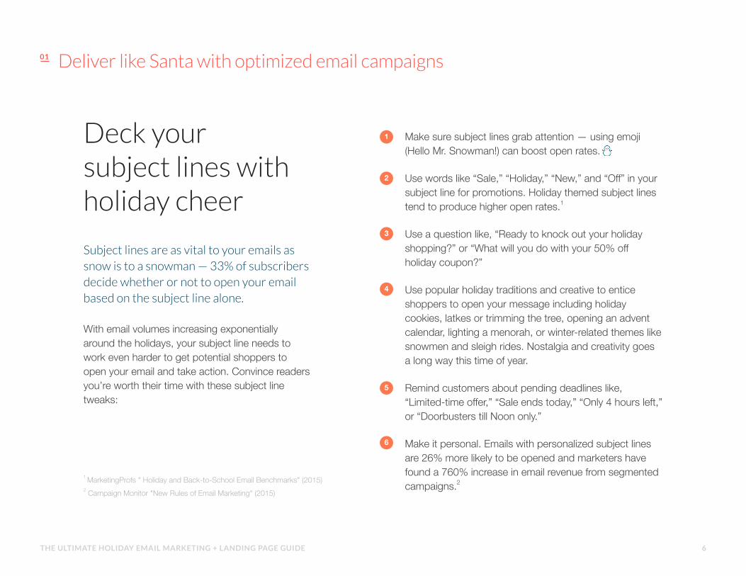
With email volumes increasing exponentially around the holidays, your subject line needs to work even harder to get potential shoppers to open your email and take action. Convince readers you’re worth their time with these subject line tweaks:
1 MarketingProfs " Holiday and Back-to-School Email Benchmarks" (2015) 2 Campaign Monitor "New Rules of Email Marketing" (2015)
Make sure subject lines grab attention — using emoji (Hello Mr. Snowman!) can boost open rates.
Use words like “Sale,” “Holiday,” “New,” and “Off” in your subject line for promotions. Holiday themed subject lines tend to produce higher open rates.1
Use a question like, “Ready to knock out your holiday shopping?” or “What will you do with your 50% off holiday coupon?”
Use popular holiday traditions and creative to entice shoppers to open your message including holiday cookies, latkes or trimming the tree, opening an advent calendar, lighting a menorah, or winter-related themes like snowmen and sleigh rides. Nostalgia and creativity goes a long way this time of year.
Remind customers about pending deadlines like, “Limited-time offer,” “Sale ends today,” “Only 4 hours left,” or “Doorbusters till Noon only.”
Make it personal. Emails with personalized subject lines are 26% more likely to be opened and marketers have found a 760% increase in email revenue from segmented campaigns.2
Subject lines are as vital to your emails as snow is to a snowman — 33% of subscribers decide whether or not to open your email based on the subject line alone.
Deck your subject lines with holiday cheer
1
5
2
6
3
4
Deliver like Santa with optimized email campaigns
6THE ULTIMATE HOLIDAY EMAIL MARKETING + LANDING PAGE GUIDE
Show shoppers you know them better than St. Nick
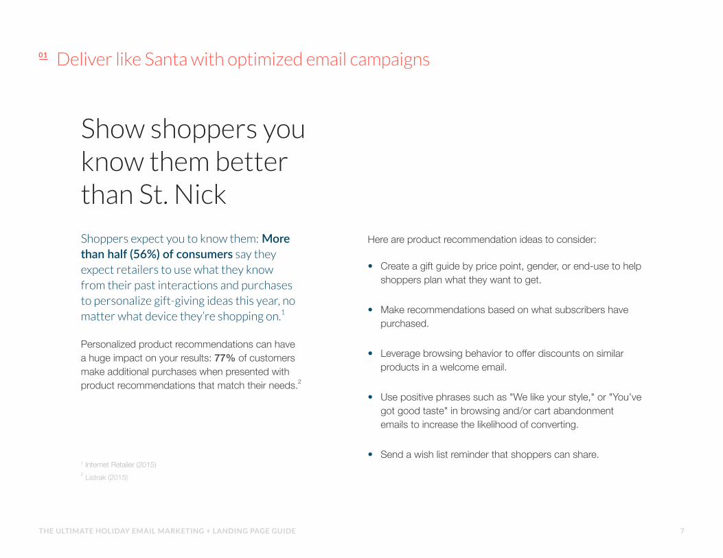
Shoppers expect you to know them: More than half (56%) of consumers say they expect retailers to use what they know from their past interactions and purchases to personalize gift-giving ideas this year, no matter what device they’re shopping on.1
Personalized product recommendations can have a huge impact on your results: 77% of customers make additional purchases when presented with product recommendations that match their needs.2
1 Internet Retailer (2015) 2 Listrak (2015)
Here are product recommendation ideas to consider:
• Create a gift guide by price point, gender, or end-use to help shoppers plan what they want to get.
• Make recommendations based on what subscribers have purchased.
• Leverage browsing behavior to offer discounts on similar products in a welcome email.
• Use positive phrases such as "We like your style," or "You’ve got good taste" in browsing and/or cart abandonment emails to increase the likelihood of converting.
• Send a wish list reminder that shoppers can share.
Deliver like Santa with optimized email campaigns
7THE ULTIMATE HOLIDAY EMAIL MARKETING + LANDING PAGE GUIDE

Check your automated email lists more than twice.
THANK YOU FOR PURCHASING
ABANDONED SHOPPING CART
TRANSACTIONAL EMAILS
Once a shopper has purchased, you can then use an automated email campaign to suggest items on wish lists, other products that relate to the one they just purchased, special offers if they purchase again within a certain amount of time...all designed to compel them to buy again.
1 SmartInsights " Email marketing statistics 2015" (2015) 2 BI Intelligence " Shopping Cart Abandonment" (2014) 3Campaign Monitor "New Rules of Email Marketing" (2015) 4 Shopify " 10 Tips to Boost Product Sales" (2015)
Send emails to re-engage shoppers who abandon their online shopping carts. Approximately $4 trillion worth of merchandise will be abandoned in online shopping carts this year, and about 63% of it is recoverable by savvy online retailers.2
From purchase receipts, confirmations, shipping notifications and password resets, customers need to know where their orders are at any given moment and how to access their account. Open rates for transactional emails are four to eight times higher than traditional emails3. Extra bonus? Adding cross-sell recommendations to shipping confirmation emails can increase transaction rates by 20%.4
Deliver like Santa with optimized email campaigns
Think of email marketing automation as your own staff of email elves. When a trigger that you set occurs, a specific email or set of emails will be sent to subscribers. And just like elves, they’re pretty magical: triggered emails are opened 71% more often than non-triggered ones, and links within them are 102% more likely to be clicked.1
Some examples of automated emails you can send during the holidays include:
8THE ULTIMATE HOLIDAY EMAIL MARKETING + LANDING PAGE GUIDE

Go mobile, or get coal this holiday season.There’s no telling where your subscribers will
be when they open your emails, but there’s a
good chance it will be on a mobile device.
53% of emails are opened on mobile devices. And, one out of four online purchases was made on a mobile device during the holidays last year— up from 18.6% in holiday 2013. Black Friday was “Mobile Friday,” with nearly a third of sales done on phones and tablets.1
1 MarketingLand (2015)
Deliver like Santa with optimized email campaigns
9THE ULTIMATE HOLIDAY EMAIL MARKETING + LANDING PAGE GUIDE
Deliver like Santa with optimized email campaigns
Here are tips for adopting a “mobile-first” mentality to make
sure your emails look awesome on any device shoppers are
using this holiday season:
Use a mobile-friendly email template How do your emails look on mobile devices? Make sure you use a mobile-friendly email template. It’s best to preview how your emails appear on different email clients so you know your email looks fantastic in every inbox.
Keep it brief On a small screen, five or six sentences can look like a novel. You don’t want to overwhelm your subscribers. Keep your email messages short and consumable and link to longer or more detailed content on your website or blog.
Use buttons instead of text links According to a recent MIT study, the average size of an adult index finger is between 1.6cm and 2 cm. If your reader’s finger takes up a significant amount of space on the screen, the worst thing you can do is make them try to click a tiny link. Use call to action buttons to make it easy for subscribers to click-through.
Entice readers with a short summary of your email The preheader is the short summary text that follows the subject line when an email is viewed in the inbox. Readers use this to decide whether or not they should open the email. Use this strategically and maximize the “selling” power of your email content.
1 3
2
4
10THE ULTIMATE HOLIDAY EMAIL MARKETING + LANDING PAGE GUIDE

Clicks to conversions:the magic of landing pages
11THE ULTIMATE HOLIDAY EMAIL MARKETING + LANDING PAGE GUIDE
Clicks to conversions: the magic of landing pages
But wait. Where do you send all that traffic to?A shopping page might be a little premature when the customer is just getting acquainted with the offer. And your homepage is far too busy — how will your customer know which link corresponds with the offer in your email?
What you need is a landing page dedicated solely to your offer, designed specifically to match your email campaign. There are two principles that make landing pages so different — and so much more effective — than other pages on your site:
Attention Ratio
Message Match
1
2
12THE ULTIMATE HOLIDAY EMAIL MARKETING + LANDING PAGE GUIDE

Attention Ratio
Your holiday campaign should have a single conversion goal. So why send traffic to a page full of links that distract from that goal?
Attention ratio is the number of things one can do on the page versus the number of things you actually want them to do. In practice, this usually comes down to “links on your page: calls-to-action on your page.” The closer that ratio is to 1:1, the more likely the user is to convert.
While it can be tempting to have multiple calls-to-action or to include your full site navigation in the hopes of saving a lost conversion, these elements can distract from your primary CTA, or worse, lead the user down the wrong path altogether. Attention ratio = 57:1
Attention ratio = 1:1
1
Clicks to conversions: the magic of landing pages
13THE ULTIMATE HOLIDAY EMAIL MARKETING + LANDING PAGE GUIDE

Message Match
Message match refers to how closely the landing page’s content matches whatever linked to the landing page. That means your landing page’s copy has to echo the copy of your email campaign, and the same goes for how it looks, too.
If your email campaign promises “30% off,” the headline better repeat the words “30% off.” This not only re-enforces your offer, it reassures the visitor immediately that they’re in the right place — or reminds them if they’ve forgotten what they were doing.
When the messages don’t match, the user is forced to closely examine the page to ensure they understand what it is. And chances are, they won’t want to bother.
2
Clicks to conversions: the magic of landing pages
14THE ULTIMATE HOLIDAY EMAIL MARKETING + LANDING PAGE GUIDE

5 principles of high-converting landing pages
15THE ULTIMATE HOLIDAY EMAIL MARKETING + LANDING PAGE GUIDE
1. HeadlineThe attention span of the digitally-connected human has fallen from 12 seconds in the year 2000 to just eight seconds today. Imagine how much shorter it is during the frenetic holiday rush!1
Your page’s headline needs to capture attention and keep it on the page. And the best way to do this — other than ensuring the messages match — is to communicate your product’s unique value proposition.
Conversion copywriting expert Joanna Wiebe outlines the fundamentals of an attention-capturing UVP as:
Specificity: It should be immediately clear what the offer is and how it addresses the needs of the visitor. Resist the urge to hide details behind cute or clever copy!
Succinctness: While your headline should have personality, it should also get to the point. Too-long or confusing headlines are an invitation to your user to hit the Back button.
Focus: While it can be tempting to communicate multiple offers or features, you should instead focus on the one element of your offer that’s sure to resonate with your targeted audience.
1 Microsoft " How does digital affect Canadian attention spans?" (2015) 2 Unbounce "Conversion Marketing Glossary"
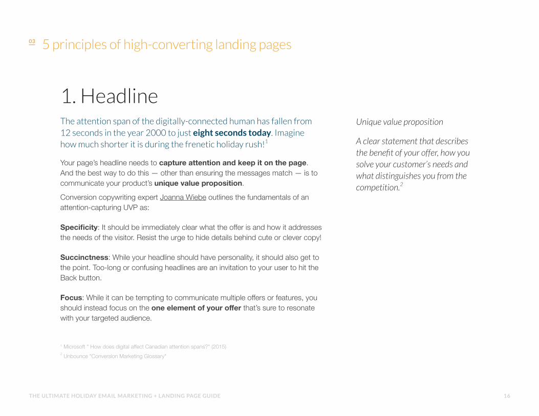
Unique value proposition
A clear statement that describes the benefit of your offer, how you solve your customer’s needs and what distinguishes you from the competition.2
5 principles of high-converting landing pages
16THE ULTIMATE HOLIDAY EMAIL MARKETING + LANDING PAGE GUIDE
5 principles of high-converting landing pages
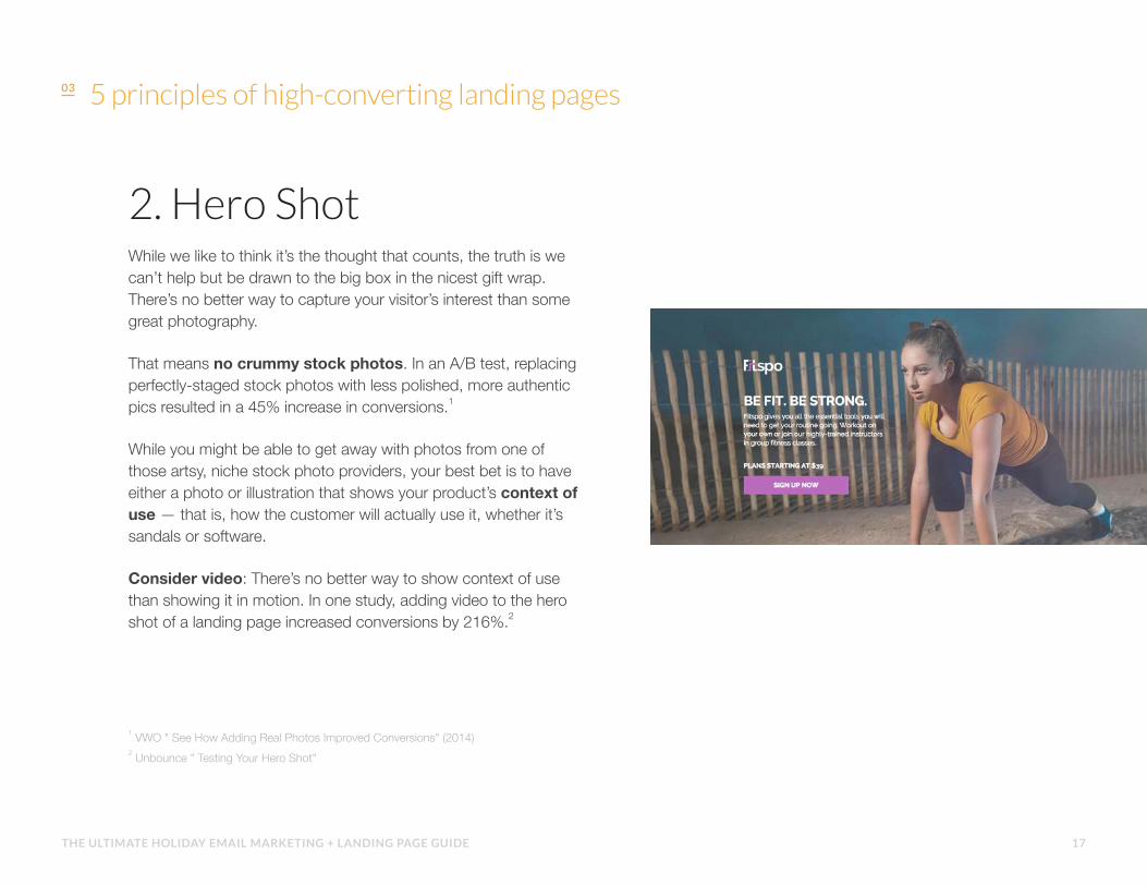
2. Hero ShotWhile we like to think it’s the thought that counts, the truth is we can’t help but be drawn to the big box in the nicest gift wrap. There’s no better way to capture your visitor’s interest than some great photography.
That means no crummy stock photos. In an A/B test, replacing perfectly-staged stock photos with less polished, more authentic pics resulted in a 45% increase in conversions.1
While you might be able to get away with photos from one of those artsy, niche stock photo providers, your best bet is to have either a photo or illustration that shows your product’s context of use — that is, how the customer will actually use it, whether it’s sandals or software.
Consider video: There’s no better way to show context of use than showing it in motion. In one study, adding video to the hero shot of a landing page increased conversions by 216%.2
1 VWO " See How Adding Real Photos Improved Conversions" (2014) 2 Unbounce " Testing Your Hero Shot"
17THE ULTIMATE HOLIDAY EMAIL MARKETING + LANDING PAGE GUIDE

5 principles of high-converting landing pages
3. BenefitsNow that you’ve captured attention with some beautiful packaging, it’s time to get to what’s inside. Benefits will comprise the majority of a page’s content, all to answer the visitor’s question: “What will this do for me?”
A few tips on crafting compelling benefits copy:
• Use bulleted lists in addition to small paragraphs so readers can scan your page and find what’s relevant to them. After all, 79% of readers scan web pages versus reading them word-by-word.1
• Unless you know your audience is looking for specific features by name, focus your language around benefits: the great outcomes that those features enable.
• The best place to find copy inspiration is in the language your customers already use. Talk to them directly, dive deep into messages from your customers, or research what they’re saying about you online.
1 Nielsen Norman Group "Website Reading: It (Sometimes) Does Happen" (2013)
18THE ULTIMATE HOLIDAY EMAIL MARKETING + LANDING PAGE GUIDE
5 principles of high-converting landing pages
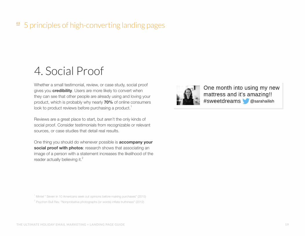
4. Social ProofWhether a small testimonial, review, or case study, social proof gives you credibility. Users are more likely to convert when they can see that other people are already using and loving your product, which is probably why nearly 70% of online consumers look to product reviews before purchasing a product.1
Reviews are a great place to start, but aren’t the only kinds of social proof. Consider testimonials from recognizable or relevant sources, or case studies that detail real results.
One thing you should do whenever possible is accompany your social proof with photos: research shows that associating an image of a person with a statement increases the likelihood of the reader actually believing it.2
1 Mintel " Seven in 10 Americans seek out opinions before making purchases" (2015) 2 Psychon Bull Rev. "Nonprobative photographs (or words) inflate truthiness" (2012)
19THE ULTIMATE HOLIDAY EMAIL MARKETING + LANDING PAGE GUIDE
5 principles of high-converting landing pages
5. Call to ActionYour landing page’s raison d'être, the call to action is essentially what you want your visitor to click in order to complete the conversion goal.
Depending on what type of campaign you’re running, there are two types of CTAs you might use:
Lead Generation
Lead generation forms are used to collect contact information and other demographic data from visitors.
This information is typically then used to deliver marketing messages — like an email nurture campaign — later on. In this case, the call to action is the button that actually submits the form.
Click-Through
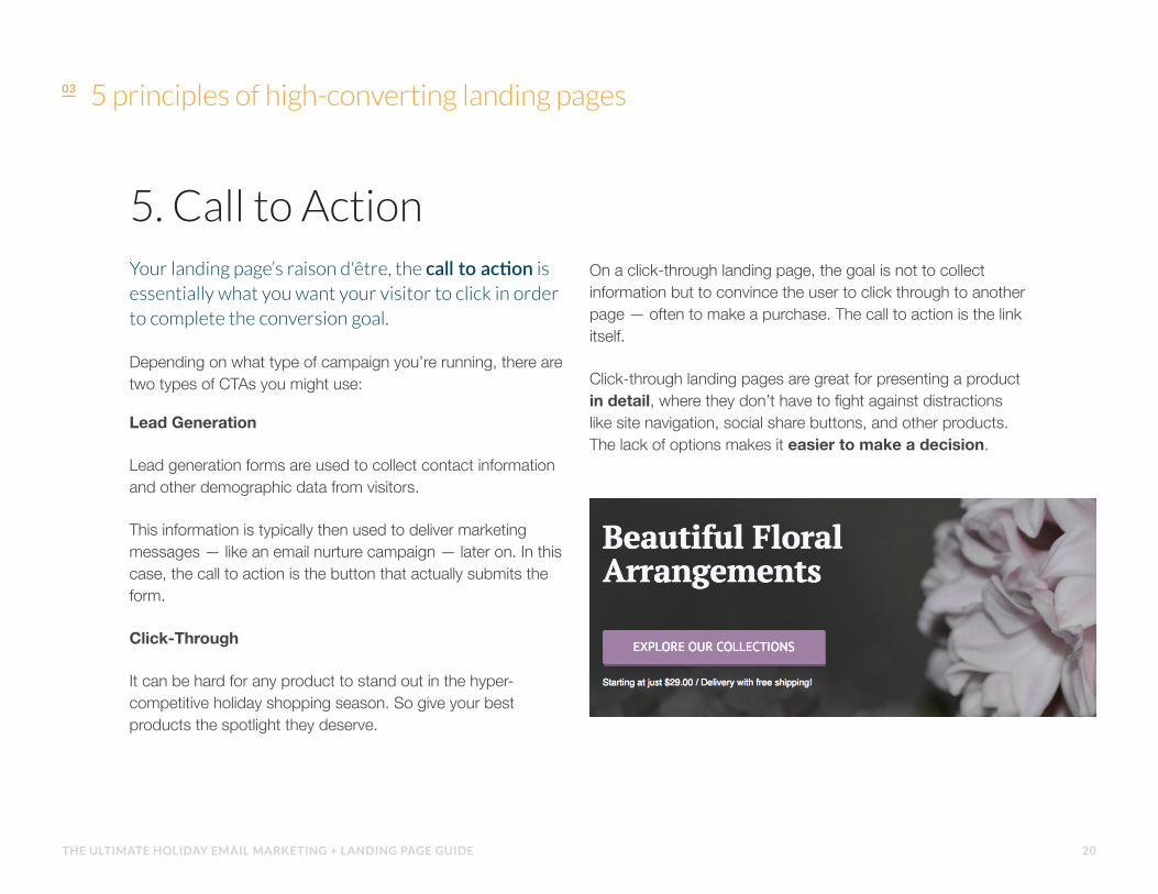
It can be hard for any product to stand out in the hyper-competitive holiday shopping season. So give your best products the spotlight they deserve.
On a click-through landing page, the goal is not to collect information but to convince the user to click through to another page — often to make a purchase. The call to action is the link itself.
Click-through landing pages are great for presenting a product in detail, where they don’t have to fight against distractions like site navigation, social share buttons, and other products. The lack of options makes it easier to make a decision.
20THE ULTIMATE HOLIDAY EMAIL MARKETING + LANDING PAGE GUIDE
Creating an irresistibly clickable call-to-action
21THE ULTIMATE HOLIDAY EMAIL MARKETING + LANDING PAGE GUIDE

Despite the fact that it’s just a button, your page’s call to action has an outsized job to perform.Not only does it need to show to user where to click, it needs to convince the user that clicking is a good idea.
Here are a few best practices that will ensure your calls to action are heeded:
• Make sure it looks clickable. Graphic design has been trending towards minimalism, but we know that buttons that look like buttons are more likely to be clicked.1
• Draw attention with contrast. For better or worse, things that are different tend to stand out — just like Rudolph’s red nose. :o) Color your CTA in a way that makes it stand out against the rest of the page. Complementary colors — like an orange CTA on a purple page — are a great place to start!
1 Nielson Norman Group "Beyond Blue Links: Making Clickable Elements Recognizable" (2015)
• Never ask anyone to “submit”. While what you’re interested in is a conversion, your visitor’s more concerned about what you promised to give them. Try writing your CTA copy from your user’s perspective by completing the sentence “I want to …” with whatever happens after they click the button.
Creating an irresistibly clickable call to action
22THE ULTIMATE HOLIDAY EMAIL MARKETING + LANDING PAGE GUIDE

Making it work on mobile
23THE ULTIMATE HOLIDAY EMAIL MARKETING + LANDING PAGE GUIDE

Making it work on mobile
Don’t ask for more than you need. Shorter forms are generally more likely to be filled out, but nowhere is this more true than on mobile devices; an extra text field or dropdown could be enough to convince your visitor that this just isn’t worth it.
Optimize for speed. Screen space is one limitation, but bandwidth is perhaps an even bigger one: 16% of visitors will abandon your page if it takes between 1–5 seconds to load, and that number spikes to 46% if it takes up to ten seconds.1 So don’t overload your page with data-heavy videos, images, and scripts.
Place contact information above the fold. While adding a phone number worsens the page’s attention ratio, offering a phone number as a more-immediately-gratifying option makes sense for many businesses. But make sure it’s immediately visible when the page is loaded — making your user scroll for it is a good way to make sure they never find it.
Your email campaign looks pristine on any size screen, so of course, your landing page has to match.
There are a few elements unique to landing
pages that you need to consider when
making it mobile-ready:
1 Kissmetrics "How Loading Time Affects Your Bottom Line" (2011)
1
2
3
24THE ULTIMATE HOLIDAY EMAIL MARKETING + LANDING PAGE GUIDE
Email & landing pages, like two turtle doves
25THE ULTIMATE HOLIDAY EMAIL MARKETING + LANDING PAGE GUIDE
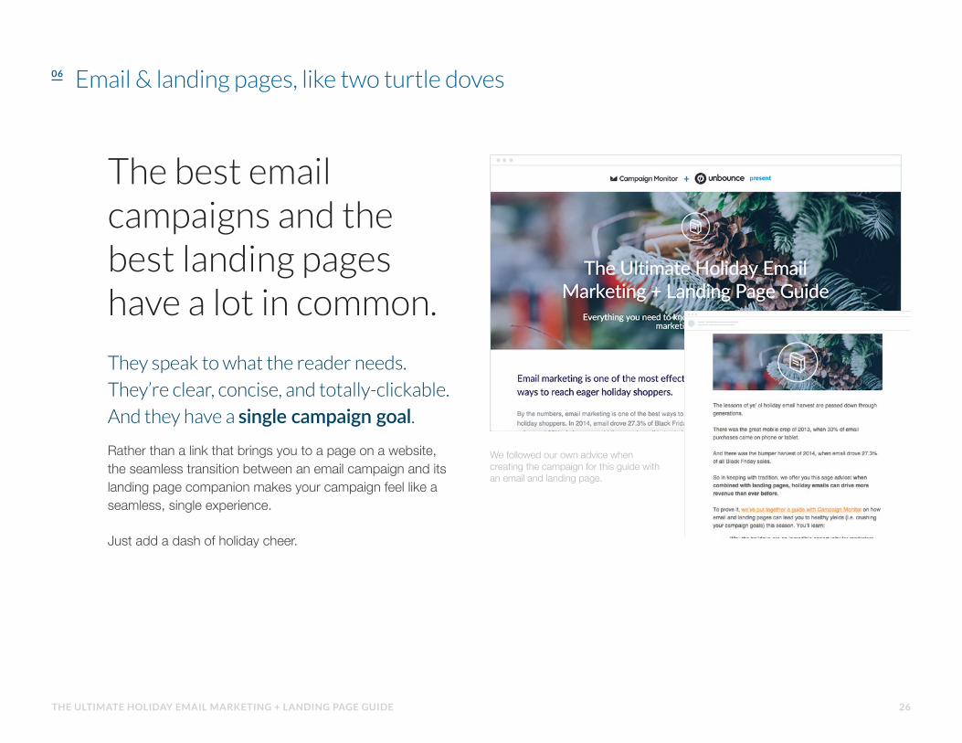
The best email campaigns and the best landing pages have a lot in common.
They speak to what the reader needs.
They’re clear, concise, and totally-clickable.
And they have a single campaign goal.Rather than a link that brings you to a page on a website, the seamless transition between an email campaign and its landing page companion makes your campaign feel like a seamless, single experience.
Just add a dash of holiday cheer.
We followed our own advice when creating the campaign for this guide with an email and landing page.
Email & landing pages, like two turtle doves
26THE ULTIMATE HOLIDAY EMAIL MARKETING + LANDING PAGE GUIDE

www.campaignmonitor.com/signup
SIGN UP
Sign up for a FREE trial with
Campaign Monitor now.
Build high-converting landing pages with
Unbounce. Get started with a FREE 30-day trial
www.unbounce.com/holiday-guide
SIGN UP
Are you ready to start optimizing your email and landing pages? Take what you've learned
in this guide and get started.


