23
| Date post: | 15-Jul-2015 |
| Category: |
Marketing |
| Upload: | scott-williams |
| View: | 220 times |
| Download: | 1 times |
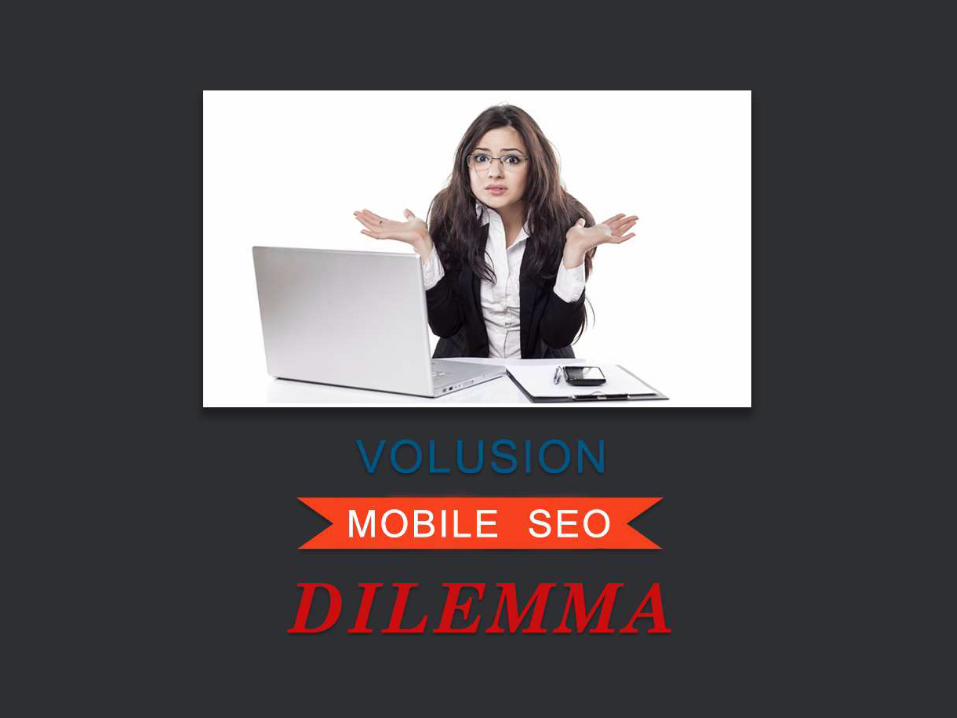
The Volusion Mobile SEO Dilemma
Mobile user experience will play an even greater role in mobile search results as of April 21, 2015.
Not having a "mobile-friendly" website will likely result in the loss of mobile search traffic at a greater level.
Volusion store in particular have some unique challenges.

The Volusion Context
Volusion, like many other ecommerce
platforms,
does not offer a great amount of flexibility.
As a result, it is not as easy to meet the
mobile-friendly guidelines laid out by
Google.
Volusion Mobile Storefront v2
Fall of 2013 - Volusion released version 2 of
their Mobile Storefront.
Despite many improvements, the mobile store
is limited and falls short of the needs of many
modern stores. There are many contexts
where it simply does not function properly for
a store's needs in the way the desktop
version does.
Updated Theme Engine
Spring of 2014 - Volusion announced the
pending arrival of a new "theme engine" that
would power Volusion templates going
forward.
While the release of the new theme engine
was due out at the end of the summer of
2014, it quietly fell off the radar.
There is currently no indication when or if it
will go live.
Responsive Templates
Fall of 2014 - Volusion launched "responsive
templates"
While these templates adapt to various
screen sizes, they are not truly responsive.
It is unclear how much of a stopgap this is.
Will it will last or be scrapped if and when the
theme engine releases?
SEO Implications
Mobile-friendliness is a key factor for
mobile search.
Online stores hosted on the Volusion platform
need to find a way to respond to this latest
change or risk losing mobile search traffic and
revenue.

What are your options?
There are four key options available for your
Volusion store:
1. Use Volusion Mobile Storefront
2. Use a Volusion Responsive Template
3. Migrate to another Platform
4. Do Nothing / Wait

Option #1:
Use the Volusion Mobile Storefront
Benefits:
• Reaches mobile visitors with a version of your store
made just for them
• Enables mobile optimized checkout
• Passes the "mobile friendly" test
• Challenges & Limitations
Option #1:
Use the Volusion Mobile Storefront
Challenges & Limitations:
• Minimal customization available
• Not all web content displays
• Many features are not supported
• Unable to run conversion tracking codes

Option #2:
Use/Customize a Responsive Theme
Benefits:
• Provides a single template for your site
• Creates a responsive site, the Google-preferred
option for your mobile solution
• Passes the "mobile friendly" test
Option #2:
Use/Customize a Responsive Theme
Challenges & Limitations:
• Requires a new template
• Continues to use HTML table code
• Adapts somewhat, but is not truly responsive

Option #3:
Migrate to a Different Platform
Benefits:
• Accessing theme engines that fully support
responsive coding
• Upgrading to a modern platform
• Passing the "mobile friendly" test

Option #3:
Migrate to a Different Platform
Challenges & Limitations:
• Requires a significant investment of time and
resources
• Other platforms may not suit your business processes
like Volusion does
• Business will need to adapt to new systems

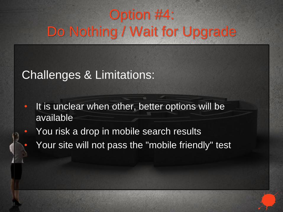
Option #4:
Do Nothing / Wait for Upgrade
Benefits:
• Avoid investing in temporary technology
• Save funds for key improvements
Option #4:
Do Nothing / Wait for Upgrade
Challenges & Limitations:
• It is unclear when other, better options will be
available
• You risk a drop in mobile search results
• Your site will not pass the "mobile friendly" test
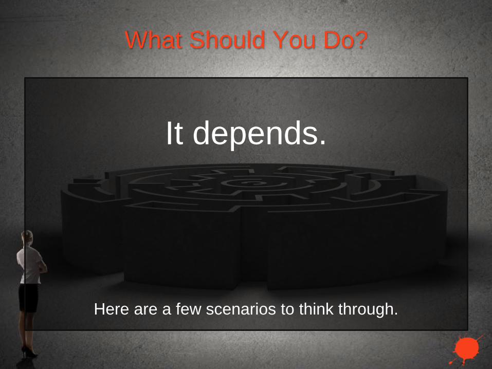
What Should You Do?
It depends.
Here are a few scenarios to think through.

Scenario #1: Minimal Customization
Scenario: Your store is barely customized and you plan
on staying on Volusion for awhile ...
Recommendation: Volusion Responsive Template
If a new, responsive template will require minimal
customization to meet your needs, this might not be a
bad option for you. Generally speaking, the Volusion
responsive templates do not provide enough benefit for
the amount of effort involved in customizing them as they
do not resolve all issues. However, in this scenario it
might just make sense.
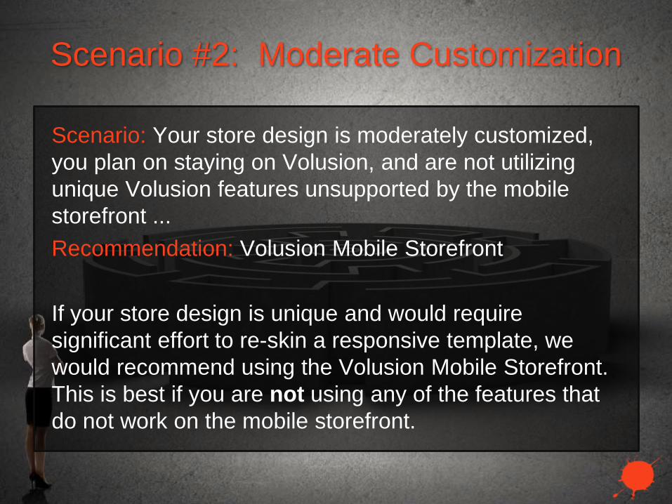
Scenario #2: Moderate Customization
Scenario: Your store design is moderately customized,
you plan on staying on Volusion, and are not utilizing
unique Volusion features unsupported by the mobile
storefront ...
Recommendation: Volusion Mobile Storefront
If your store design is unique and would require
significant effort to re-skin a responsive template, we
would recommend using the Volusion Mobile Storefront.
This is best if you are not using any of the features that
do not work on the mobile storefront.

Scenario #3: Planning on Leaving
Volusion
Scenario: You already plan on leaving Volusion ...
Recommendation: Migrate now & Implement Responsive
Web Design
If you already plan on migrating to another cart but have
not done so for one reason or another, now would be a
good time to make the move and to implement a
responsive web design in the process. The opportunity
cost may justify the expense of migrating. Consider what
you might lose in mobile sales each month versus the
expense of migrating.

Scenario #4: Heavily Customized
Scenario: Your site is heavily customized or the Mobile
Storefront does not work for your store ...
Recommendation: Go Responsive (on Volusion or
Elsewhere)
If mobile drives a higher volume of traffic and is a
valuable source of revenue, then you will want to go
responsive -- either on Volusion or not. If you are
indifferent or frustrated with Volusion, you might consider
investing the same funds into a one-time upgrade onto
another platform.
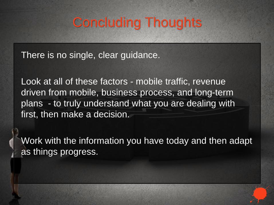
Concluding Thoughts
There is no single, clear guidance.
Look at all of these factors - mobile traffic, revenue
driven from mobile, business process, and long-term
plans - to truly understand what you are dealing with
first, then make a decision.
Work with the information you have today and then adapt
as things progress.

Build > Amplify > Convert
InkblotDigital.com


