444
TIBCO Business Studio™ Forms User’s Guide Software Release 2.5.0 September 2013 Two-Second Advantage ®

Two-Second Adva
TIBCO Business Studio™
Forms User’s GuideSoftware Release 2.5.0September 2013
ntage®

Important Information
SOME TIBCO SOFTWARE EMBEDS OR BUNDLES OTHER TIBCO SOFTWARE. USE OF SUCH EMBEDDED OR BUNDLED TIBCO SOFTWARE IS SOLELY TO ENABLE THE FUNCTIONALITY (OR PROVIDE LIMITED ADD-ON FUNCTIONALITY) OF THE LICENSED TIBCO SOFTWARE. THE EMBEDDED OR BUNDLED SOFTWARE IS NOT LICENSED TO BE USED OR ACCESSED BY ANY OTHER TIBCO SOFTWARE OR FOR ANY OTHER PURPOSE.USE OF TIBCO SOFTWARE AND THIS DOCUMENT IS SUBJECT TO THE TERMS AND CONDITIONS OF A LICENSE AGREEMENT FOUND IN EITHER A SEPARATELY EXECUTED SOFTWARE LICENSE AGREEMENT, OR, IF THERE IS NO SUCH SEPARATE AGREEMENT, THE CLICKWRAP END USER LICENSE AGREEMENT WHICH IS DISPLAYED DURING DOWNLOAD OR INSTALLATION OF THE SOFTWARE (AND WHICH IS DUPLICATED IN THE LICENSE FILE) OR IF THERE IS NO SUCH SOFTWARE LICENSE AGREEMENT OR CLICKWRAP END USER LICENSE AGREEMENT, THE LICENSE(S) LOCATED IN THE “LICENSE” FILE(S) OF THE SOFTWARE. USE OF THIS DOCUMENT IS SUBJECT TO THOSE TERMS AND CONDITIONS, AND YOUR USE HEREOF SHALL CONSTITUTE ACCEPTANCE OF AND AN AGREEMENT TO BE BOUND BY THE SAME.This document contains confidential information that is subject to U.S. and international copyright laws and treaties. No part of this document may be reproduced in any form without the written authorization of TIBCO Software Inc.TIBCO, Two-Second Advantage, TIBCO iProcess, TIBCO Business Studio, TIBCO General Interface, TIBCO ActiveMatrix, and TIBCO Silver are either registered trademarks or trademarks of TIBCO Software Inc. in the United States and/or other countries.Enterprise Java Beans (EJB), Java Platform Enterprise Edition (Java EE), Java 2 Platform Enterprise Edition (J2EE), and all Java-based trademarks and logos are trademarks or registered trademarks of Oracle Corporation in the U.S. and other countries.All other product and company names and marks mentioned in this document are the property of their respective owners and are mentioned for identification purposes only.THIS SOFTWARE MAY BE AVAILABLE ON MULTIPLE OPERATING SYSTEMS. HOWEVER, NOT ALL OPERATING SYSTEM PLATFORMS FOR A SPECIFIC SOFTWARE VERSION ARE RELEASED AT THE SAME TIME. SEE THE README FILE FOR THE AVAILABILITY OF THIS SOFTWARE VERSION ON A SPECIFIC OPERATING SYSTEM PLATFORM.THIS DOCUMENT IS PROVIDED “AS IS” WITHOUT WARRANTY OF ANY KIND, EITHER EXPRESS OR IMPLIED, INCLUDING, BUT NOT LIMITED TO, THE IMPLIED WARRANTIES OF MERCHANTABILITY, FITNESS FOR A PARTICULAR PURPOSE, OR NON-INFRINGEMENT.THIS DOCUMENT COULD INCLUDE TECHNICAL INACCURACIES OR TYPOGRAPHICAL ERRORS. CHANGES ARE PERIODICALLY ADDED TO THE INFORMATION HEREIN; THESE CHANGES WILL BE INCORPORATED IN NEW EDITIONS OF THIS DOCUMENT. TIBCO SOFTWARE INC. MAY MAKE IMPROVEMENTS AND/OR CHANGES IN THE PRODUCT(S) AND/OR THE PROGRAM(S) DESCRIBED IN THIS DOCUMENT AT ANY TIME.THE CONTENTS OF THIS DOCUMENT MAY BE MODIFIED AND/OR QUALIFIED, DIRECTLY OR INDIRECTLY, BY OTHER DOCUMENTATION WHICH ACCOMPANIES THIS SOFTWARE, INCLUDING BUT NOT LIMITED TO ANY RELEASE NOTES AND "READ ME" FILES.Copyright © 1999-2013 TIBCO Software Inc. ALL RIGHTS RESERVED.TIBCO Software Inc. Confidential Information
| iii
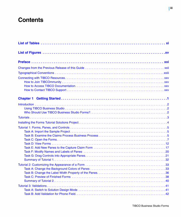
Contents
List of Tables . . . . . . . . . . . . . . . . . . . . . . . . . . . . . . . . . . . . . . . . . . . . . . . . . . . . . . . . . . . . . . . . . . . xi
List of Figures . . . . . . . . . . . . . . . . . . . . . . . . . . . . . . . . . . . . . . . . . . . . . . . . . . . . . . . . . . . . . . . . . .xv
Preface . . . . . . . . . . . . . . . . . . . . . . . . . . . . . . . . . . . . . . . . . . . . . . . . . . . . . . . . . . . . . . . . . . . . . . . xxi
Changes from the Previous Release of this Guide . . . . . . . . . . . . . . . . . . . . . . . . . . . . . . . . . . . . . . . . . . . . . . . xxii
Typographical Conventions . . . . . . . . . . . . . . . . . . . . . . . . . . . . . . . . . . . . . . . . . . . . . . . . . . . . . . . . . . . . . . . . . xxiii
Connecting with TIBCO Resources . . . . . . . . . . . . . . . . . . . . . . . . . . . . . . . . . . . . . . . . . . . . . . . . . . . . . . . . . . . xxvHow to Join TIBCOmmunity . . . . . . . . . . . . . . . . . . . . . . . . . . . . . . . . . . . . . . . . . . . . . . . . . . . . . . . . . . . . . xxvHow to Access TIBCO Documentation. . . . . . . . . . . . . . . . . . . . . . . . . . . . . . . . . . . . . . . . . . . . . . . . . . . . . xxvHow to Contact TIBCO Support . . . . . . . . . . . . . . . . . . . . . . . . . . . . . . . . . . . . . . . . . . . . . . . . . . . . . . . . . . xxv
Chapter 1 Getting Started . . . . . . . . . . . . . . . . . . . . . . . . . . . . . . . . . . . . . . . . . . . . . . . . . . . . . . . . .1
Introduction . . . . . . . . . . . . . . . . . . . . . . . . . . . . . . . . . . . . . . . . . . . . . . . . . . . . . . . . . . . . . . . . . . . . . . . . . . . . . . . 2Using TIBCO Business Studio . . . . . . . . . . . . . . . . . . . . . . . . . . . . . . . . . . . . . . . . . . . . . . . . . . . . . . . . . . . . . 2Who Should Use TIBCO Business Studio Forms?. . . . . . . . . . . . . . . . . . . . . . . . . . . . . . . . . . . . . . . . . . . . . . 2
Tutorials . . . . . . . . . . . . . . . . . . . . . . . . . . . . . . . . . . . . . . . . . . . . . . . . . . . . . . . . . . . . . . . . . . . . . . . . . . . . . . . . . . 3
Installing the Forms Tutorial Solutions Project . . . . . . . . . . . . . . . . . . . . . . . . . . . . . . . . . . . . . . . . . . . . . . . . . . . . . 4
Tutorial 1: Forms, Panes, and Controls . . . . . . . . . . . . . . . . . . . . . . . . . . . . . . . . . . . . . . . . . . . . . . . . . . . . . . . . . . 5Task A: Import the Sample Project . . . . . . . . . . . . . . . . . . . . . . . . . . . . . . . . . . . . . . . . . . . . . . . . . . . . . . . . . . 5Task B: Examine the Claims Process Business Process . . . . . . . . . . . . . . . . . . . . . . . . . . . . . . . . . . . . . . . . . 5Task C: Open the Forms. . . . . . . . . . . . . . . . . . . . . . . . . . . . . . . . . . . . . . . . . . . . . . . . . . . . . . . . . . . . . . . . . . 7Task D: View Forms . . . . . . . . . . . . . . . . . . . . . . . . . . . . . . . . . . . . . . . . . . . . . . . . . . . . . . . . . . . . . . . . . . . . 12Task E: Add New Panes to the Capture Claim Form . . . . . . . . . . . . . . . . . . . . . . . . . . . . . . . . . . . . . . . . . . . 17Task F: Modify Names and Labels of Panes . . . . . . . . . . . . . . . . . . . . . . . . . . . . . . . . . . . . . . . . . . . . . . . . . 20Task G: Drag Controls into Appropriate Panes. . . . . . . . . . . . . . . . . . . . . . . . . . . . . . . . . . . . . . . . . . . . . . . . 21Summary of Tutorial 1. . . . . . . . . . . . . . . . . . . . . . . . . . . . . . . . . . . . . . . . . . . . . . . . . . . . . . . . . . . . . . . . . . . 32
Tutorial 2: Customizing the Appearance of a Form . . . . . . . . . . . . . . . . . . . . . . . . . . . . . . . . . . . . . . . . . . . . . . . . 33Task A: Change the Background Colors of Panes . . . . . . . . . . . . . . . . . . . . . . . . . . . . . . . . . . . . . . . . . . . . . 33Task B: Change the Label Width Property of the Panes. . . . . . . . . . . . . . . . . . . . . . . . . . . . . . . . . . . . . . . . . 36Task C: Preview of Finished Forms . . . . . . . . . . . . . . . . . . . . . . . . . . . . . . . . . . . . . . . . . . . . . . . . . . . . . . . . 38Summary of Tutorial 2. . . . . . . . . . . . . . . . . . . . . . . . . . . . . . . . . . . . . . . . . . . . . . . . . . . . . . . . . . . . . . . . . . . 40
Tutorial 3: Validations . . . . . . . . . . . . . . . . . . . . . . . . . . . . . . . . . . . . . . . . . . . . . . . . . . . . . . . . . . . . . . . . . . . . . . . 41Task A: Switch to Solution Design Mode . . . . . . . . . . . . . . . . . . . . . . . . . . . . . . . . . . . . . . . . . . . . . . . . . . . . 41Task B: Add Validation for Phone Field. . . . . . . . . . . . . . . . . . . . . . . . . . . . . . . . . . . . . . . . . . . . . . . . . . . . . . 42
TIBCO Business Studio Forms
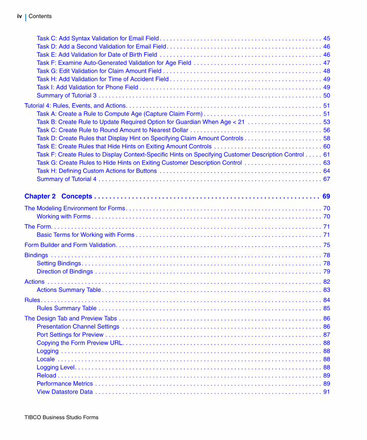
iv | Contents
Task C: Add Syntax Validation for Email Field . . . . . . . . . . . . . . . . . . . . . . . . . . . . . . . . . . . . . . . . . . . . . . . . 45Task D: Add a Second Validation for Email Field . . . . . . . . . . . . . . . . . . . . . . . . . . . . . . . . . . . . . . . . . . . . . . 46Task E: Add Validation for Date of Birth Field . . . . . . . . . . . . . . . . . . . . . . . . . . . . . . . . . . . . . . . . . . . . . . . . 46Task F: Examine Auto-Generated Validation for Age Field . . . . . . . . . . . . . . . . . . . . . . . . . . . . . . . . . . . . . . 47Task G: Edit Validation for Claim Amount Field . . . . . . . . . . . . . . . . . . . . . . . . . . . . . . . . . . . . . . . . . . . . . . . 48Task H: Add Validation for Time of Accident Field . . . . . . . . . . . . . . . . . . . . . . . . . . . . . . . . . . . . . . . . . . . . . 49Task I: Add Validation for Phone Field . . . . . . . . . . . . . . . . . . . . . . . . . . . . . . . . . . . . . . . . . . . . . . . . . . . . . . 49Summary of Tutorial 3 . . . . . . . . . . . . . . . . . . . . . . . . . . . . . . . . . . . . . . . . . . . . . . . . . . . . . . . . . . . . . . . . . . 50
Tutorial 4: Rules, Events, and Actions. . . . . . . . . . . . . . . . . . . . . . . . . . . . . . . . . . . . . . . . . . . . . . . . . . . . . . . . . . 51Task A: Create a Rule to Compute Age (Capture Claim Form) . . . . . . . . . . . . . . . . . . . . . . . . . . . . . . . . . . . 51Task B: Create Rule to Update Required Option for Guardian When Age < 21 . . . . . . . . . . . . . . . . . . . . . . 53Task C: Create Rule to Round Amount to Nearest Dollar . . . . . . . . . . . . . . . . . . . . . . . . . . . . . . . . . . . . . . . 56Task D: Create Rules that Display Hint on Specifying Claim Amount Controls . . . . . . . . . . . . . . . . . . . . . . . 58Task E: Create Rules that Hide Hints on Exiting Amount Controls . . . . . . . . . . . . . . . . . . . . . . . . . . . . . . . . 60Task F: Create Rules to Display Context-Specific Hints on Specifying Customer Description Control . . . . . 61Task G: Create Rules to Hide Hints on Exiting Customer Description Control . . . . . . . . . . . . . . . . . . . . . . . 63Task H: Defining Custom Actions for Buttons . . . . . . . . . . . . . . . . . . . . . . . . . . . . . . . . . . . . . . . . . . . . . . . . 64Summary of Tutorial 4 . . . . . . . . . . . . . . . . . . . . . . . . . . . . . . . . . . . . . . . . . . . . . . . . . . . . . . . . . . . . . . . . . . 67
Chapter 2 Concepts . . . . . . . . . . . . . . . . . . . . . . . . . . . . . . . . . . . . . . . . . . . . . . . . . . . . . . . . . . . . 69
The Modeling Environment for Forms. . . . . . . . . . . . . . . . . . . . . . . . . . . . . . . . . . . . . . . . . . . . . . . . . . . . . . . . . . 70Working with Forms . . . . . . . . . . . . . . . . . . . . . . . . . . . . . . . . . . . . . . . . . . . . . . . . . . . . . . . . . . . . . . . . . . . . 70
The Form. . . . . . . . . . . . . . . . . . . . . . . . . . . . . . . . . . . . . . . . . . . . . . . . . . . . . . . . . . . . . . . . . . . . . . . . . . . . . . . . 71Basic Terms for Working with Forms . . . . . . . . . . . . . . . . . . . . . . . . . . . . . . . . . . . . . . . . . . . . . . . . . . . . . . . 71
Form Builder and Form Validation. . . . . . . . . . . . . . . . . . . . . . . . . . . . . . . . . . . . . . . . . . . . . . . . . . . . . . . . . . . . . 75
Bindings . . . . . . . . . . . . . . . . . . . . . . . . . . . . . . . . . . . . . . . . . . . . . . . . . . . . . . . . . . . . . . . . . . . . . . . . . . . . . . . . 78Setting Bindings. . . . . . . . . . . . . . . . . . . . . . . . . . . . . . . . . . . . . . . . . . . . . . . . . . . . . . . . . . . . . . . . . . . . . . . 78Direction of Bindings . . . . . . . . . . . . . . . . . . . . . . . . . . . . . . . . . . . . . . . . . . . . . . . . . . . . . . . . . . . . . . . . . . . 79
Actions . . . . . . . . . . . . . . . . . . . . . . . . . . . . . . . . . . . . . . . . . . . . . . . . . . . . . . . . . . . . . . . . . . . . . . . . . . . . . . . . . 82Actions Summary Table . . . . . . . . . . . . . . . . . . . . . . . . . . . . . . . . . . . . . . . . . . . . . . . . . . . . . . . . . . . . . . . . . 83
Rules. . . . . . . . . . . . . . . . . . . . . . . . . . . . . . . . . . . . . . . . . . . . . . . . . . . . . . . . . . . . . . . . . . . . . . . . . . . . . . . . . . . 84Rules Summary Table . . . . . . . . . . . . . . . . . . . . . . . . . . . . . . . . . . . . . . . . . . . . . . . . . . . . . . . . . . . . . . . . . . 85
The Design Tab and Preview Tabs . . . . . . . . . . . . . . . . . . . . . . . . . . . . . . . . . . . . . . . . . . . . . . . . . . . . . . . . . . . . 86Presentation Channel Settings . . . . . . . . . . . . . . . . . . . . . . . . . . . . . . . . . . . . . . . . . . . . . . . . . . . . . . . . . . . 86Port Settings for Preview . . . . . . . . . . . . . . . . . . . . . . . . . . . . . . . . . . . . . . . . . . . . . . . . . . . . . . . . . . . . . . . . 87Copying the Form Preview URL. . . . . . . . . . . . . . . . . . . . . . . . . . . . . . . . . . . . . . . . . . . . . . . . . . . . . . . . . . . 88Logging . . . . . . . . . . . . . . . . . . . . . . . . . . . . . . . . . . . . . . . . . . . . . . . . . . . . . . . . . . . . . . . . . . . . . . . . . . . . . 88Locale . . . . . . . . . . . . . . . . . . . . . . . . . . . . . . . . . . . . . . . . . . . . . . . . . . . . . . . . . . . . . . . . . . . . . . . . . . . . . . 88Logging Level. . . . . . . . . . . . . . . . . . . . . . . . . . . . . . . . . . . . . . . . . . . . . . . . . . . . . . . . . . . . . . . . . . . . . . . . . 88Reload . . . . . . . . . . . . . . . . . . . . . . . . . . . . . . . . . . . . . . . . . . . . . . . . . . . . . . . . . . . . . . . . . . . . . . . . . . . . . . 89Performance Metrics . . . . . . . . . . . . . . . . . . . . . . . . . . . . . . . . . . . . . . . . . . . . . . . . . . . . . . . . . . . . . . . . . . . 89View Datastore Data . . . . . . . . . . . . . . . . . . . . . . . . . . . . . . . . . . . . . . . . . . . . . . . . . . . . . . . . . . . . . . . . . . . 91
TIBCO Business Studio Forms

Contents | v
Visibility in the Preview Tab. . . . . . . . . . . . . . . . . . . . . . . . . . . . . . . . . . . . . . . . . . . . . . . . . . . . . . . . . . . . . . . 91
Outline View. . . . . . . . . . . . . . . . . . . . . . . . . . . . . . . . . . . . . . . . . . . . . . . . . . . . . . . . . . . . . . . . . . . . . . . . . . . . . . 94Thumbnail Mode. . . . . . . . . . . . . . . . . . . . . . . . . . . . . . . . . . . . . . . . . . . . . . . . . . . . . . . . . . . . . . . . . . . . . . . 94Tree Mode. . . . . . . . . . . . . . . . . . . . . . . . . . . . . . . . . . . . . . . . . . . . . . . . . . . . . . . . . . . . . . . . . . . . . . . . . . . . 95Using the Outline View with Forms. . . . . . . . . . . . . . . . . . . . . . . . . . . . . . . . . . . . . . . . . . . . . . . . . . . . . . . . . 95Parameters . . . . . . . . . . . . . . . . . . . . . . . . . . . . . . . . . . . . . . . . . . . . . . . . . . . . . . . . . . . . . . . . . . . . . . . . . . . 97Shared Actions . . . . . . . . . . . . . . . . . . . . . . . . . . . . . . . . . . . . . . . . . . . . . . . . . . . . . . . . . . . . . . . . . . . . . . . . 98Rules . . . . . . . . . . . . . . . . . . . . . . . . . . . . . . . . . . . . . . . . . . . . . . . . . . . . . . . . . . . . . . . . . . . . . . . . . . . . . . . 98Managing Form Elements From the Outline View . . . . . . . . . . . . . . . . . . . . . . . . . . . . . . . . . . . . . . . . . . . . . 99Use Business Labels in Outline View . . . . . . . . . . . . . . . . . . . . . . . . . . . . . . . . . . . . . . . . . . . . . . . . . . . . . . 100
Using the Business Object Model . . . . . . . . . . . . . . . . . . . . . . . . . . . . . . . . . . . . . . . . . . . . . . . . . . . . . . . . . . . . 101The Objects in a Business Object Model . . . . . . . . . . . . . . . . . . . . . . . . . . . . . . . . . . . . . . . . . . . . . . . . . . . 101
Cross-Resource References . . . . . . . . . . . . . . . . . . . . . . . . . . . . . . . . . . . . . . . . . . . . . . . . . . . . . . . . . . . . . . . . 107Breakage Mechanisms . . . . . . . . . . . . . . . . . . . . . . . . . . . . . . . . . . . . . . . . . . . . . . . . . . . . . . . . . . . . . . . . . 107Quick Fixes . . . . . . . . . . . . . . . . . . . . . . . . . . . . . . . . . . . . . . . . . . . . . . . . . . . . . . . . . . . . . . . . . . . . . . . . . . 111
Mobile Forms . . . . . . . . . . . . . . . . . . . . . . . . . . . . . . . . . . . . . . . . . . . . . . . . . . . . . . . . . . . . . . . . . . . . . . . . . . . . 114Working with Mobile Forms . . . . . . . . . . . . . . . . . . . . . . . . . . . . . . . . . . . . . . . . . . . . . . . . . . . . . . . . . . . . . 115Mobile Specific Configuration of Controls and Panes. . . . . . . . . . . . . . . . . . . . . . . . . . . . . . . . . . . . . . . . . . 116Rendering of Mobile Forms . . . . . . . . . . . . . . . . . . . . . . . . . . . . . . . . . . . . . . . . . . . . . . . . . . . . . . . . . . . . . 119
Problem Markers . . . . . . . . . . . . . . . . . . . . . . . . . . . . . . . . . . . . . . . . . . . . . . . . . . . . . . . . . . . . . . . . . . . . . . . . . 123Quick Fixes . . . . . . . . . . . . . . . . . . . . . . . . . . . . . . . . . . . . . . . . . . . . . . . . . . . . . . . . . . . . . . . . . . . . . . . . . . 123
Chapter 3 Tasks . . . . . . . . . . . . . . . . . . . . . . . . . . . . . . . . . . . . . . . . . . . . . . . . . . . . . . . . . . . . . . .125
Creating a New Form. . . . . . . . . . . . . . . . . . . . . . . . . . . . . . . . . . . . . . . . . . . . . . . . . . . . . . . . . . . . . . . . . . . . . . 126
Using Drag and Drop Gesture to Customize a Form . . . . . . . . . . . . . . . . . . . . . . . . . . . . . . . . . . . . . . . . . . . . . . 128
Edit or Remove the Validation Script . . . . . . . . . . . . . . . . . . . . . . . . . . . . . . . . . . . . . . . . . . . . . . . . . . . . . . . . . . 132
Working with Bindings, Actions, and Rules . . . . . . . . . . . . . . . . . . . . . . . . . . . . . . . . . . . . . . . . . . . . . . . . . . . . . 133Setting Bindings . . . . . . . . . . . . . . . . . . . . . . . . . . . . . . . . . . . . . . . . . . . . . . . . . . . . . . . . . . . . . . . . . . . . . . 133Setting Actions . . . . . . . . . . . . . . . . . . . . . . . . . . . . . . . . . . . . . . . . . . . . . . . . . . . . . . . . . . . . . . . . . . . . . . . 137Setting Rules . . . . . . . . . . . . . . . . . . . . . . . . . . . . . . . . . . . . . . . . . . . . . . . . . . . . . . . . . . . . . . . . . . . . . . . . 139
Styling Forms Using Cascading Style Sheets . . . . . . . . . . . . . . . . . . . . . . . . . . . . . . . . . . . . . . . . . . . . . . . . . . . 145Setting CSS Classes . . . . . . . . . . . . . . . . . . . . . . . . . . . . . . . . . . . . . . . . . . . . . . . . . . . . . . . . . . . . . . . . . . 145Using an external CSS resource . . . . . . . . . . . . . . . . . . . . . . . . . . . . . . . . . . . . . . . . . . . . . . . . . . . . . . . . . 145Best Practices. . . . . . . . . . . . . . . . . . . . . . . . . . . . . . . . . . . . . . . . . . . . . . . . . . . . . . . . . . . . . . . . . . . . . . . . 145Examples . . . . . . . . . . . . . . . . . . . . . . . . . . . . . . . . . . . . . . . . . . . . . . . . . . . . . . . . . . . . . . . . . . . . . . . . . . . 146
Validating Data in a Form. . . . . . . . . . . . . . . . . . . . . . . . . . . . . . . . . . . . . . . . . . . . . . . . . . . . . . . . . . . . . . . . . . . 147Helping Users with Validation Messages . . . . . . . . . . . . . . . . . . . . . . . . . . . . . . . . . . . . . . . . . . . . . . . . . . . 148Implementing Validations . . . . . . . . . . . . . . . . . . . . . . . . . . . . . . . . . . . . . . . . . . . . . . . . . . . . . . . . . . . . . . . 148Enabling or Disabling a Validation . . . . . . . . . . . . . . . . . . . . . . . . . . . . . . . . . . . . . . . . . . . . . . . . . . . . . . . . 160
Calling External JavaScript Functions . . . . . . . . . . . . . . . . . . . . . . . . . . . . . . . . . . . . . . . . . . . . . . . . . . . . . . . . . 161
Configuring Panes . . . . . . . . . . . . . . . . . . . . . . . . . . . . . . . . . . . . . . . . . . . . . . . . . . . . . . . . . . . . . . . . . . . . . . . . 162
TIBCO Business Studio Forms

vi | Contents
Nesting Panes . . . . . . . . . . . . . . . . . . . . . . . . . . . . . . . . . . . . . . . . . . . . . . . . . . . . . . . . . . . . . . . . . . . . . . . 162Resequencing Tabbed Panes . . . . . . . . . . . . . . . . . . . . . . . . . . . . . . . . . . . . . . . . . . . . . . . . . . . . . . . . . . . 164Resizing a Tabbed Pane . . . . . . . . . . . . . . . . . . . . . . . . . . . . . . . . . . . . . . . . . . . . . . . . . . . . . . . . . . . . . . . 164Viewing Pane and Control Borders . . . . . . . . . . . . . . . . . . . . . . . . . . . . . . . . . . . . . . . . . . . . . . . . . . . . . . . 165
Using Embedded Forms . . . . . . . . . . . . . . . . . . . . . . . . . . . . . . . . . . . . . . . . . . . . . . . . . . . . . . . . . . . . . . . . . . . 166Working with Embedded Forms. . . . . . . . . . . . . . . . . . . . . . . . . . . . . . . . . . . . . . . . . . . . . . . . . . . . . . . . . . 167Working with Embedded Form Parameters . . . . . . . . . . . . . . . . . . . . . . . . . . . . . . . . . . . . . . . . . . . . . . . . . 170Rendering of Embedded Forms. . . . . . . . . . . . . . . . . . . . . . . . . . . . . . . . . . . . . . . . . . . . . . . . . . . . . . . . . . 171Editing Embedded Forms . . . . . . . . . . . . . . . . . . . . . . . . . . . . . . . . . . . . . . . . . . . . . . . . . . . . . . . . . . . . . . 172
Working with the Mappings Tab . . . . . . . . . . . . . . . . . . . . . . . . . . . . . . . . . . . . . . . . . . . . . . . . . . . . . . . . . . . . . 174
Customizing Property Resource Bundles . . . . . . . . . . . . . . . . . . . . . . . . . . . . . . . . . . . . . . . . . . . . . . . . . . . . . . 179The Merging Process. . . . . . . . . . . . . . . . . . . . . . . . . . . . . . . . . . . . . . . . . . . . . . . . . . . . . . . . . . . . . . . . . . 179Customizing Property Resource Bundles . . . . . . . . . . . . . . . . . . . . . . . . . . . . . . . . . . . . . . . . . . . . . . . . . . 180Validations Related to Custom Common Resources . . . . . . . . . . . . . . . . . . . . . . . . . . . . . . . . . . . . . . . . . . 186
Customizing the Form’s Preview Data . . . . . . . . . . . . . . . . . . . . . . . . . . . . . . . . . . . . . . . . . . . . . . . . . . . . . . . . 188Editing the File [form-name].data.json . . . . . . . . . . . . . . . . . . . . . . . . . . . . . . . . . . . . . . . . . . . . . . . . . . . . . 188Configure the Setting in the Properties View . . . . . . . . . . . . . . . . . . . . . . . . . . . . . . . . . . . . . . . . . . . . . . . . 189
Using Form Data Fields . . . . . . . . . . . . . . . . . . . . . . . . . . . . . . . . . . . . . . . . . . . . . . . . . . . . . . . . . . . . . . . . . . . 190What Is a Form Data Field? . . . . . . . . . . . . . . . . . . . . . . . . . . . . . . . . . . . . . . . . . . . . . . . . . . . . . . . . . . . . . 190Configuring a Form Data Field. . . . . . . . . . . . . . . . . . . . . . . . . . . . . . . . . . . . . . . . . . . . . . . . . . . . . . . . . . . 190
Using Numeric Controls . . . . . . . . . . . . . . . . . . . . . . . . . . . . . . . . . . . . . . . . . . . . . . . . . . . . . . . . . . . . . . . . . . . 192What is a Numeric Control?. . . . . . . . . . . . . . . . . . . . . . . . . . . . . . . . . . . . . . . . . . . . . . . . . . . . . . . . . . . . . 192Inserting a Numeric Control . . . . . . . . . . . . . . . . . . . . . . . . . . . . . . . . . . . . . . . . . . . . . . . . . . . . . . . . . . . . . 194Editing a Numeric Control . . . . . . . . . . . . . . . . . . . . . . . . . . . . . . . . . . . . . . . . . . . . . . . . . . . . . . . . . . . . . . 196
Localizing a Form . . . . . . . . . . . . . . . . . . . . . . . . . . . . . . . . . . . . . . . . . . . . . . . . . . . . . . . . . . . . . . . . . . . . . . . . 197Defining Localization Properties Outside the Form . . . . . . . . . . . . . . . . . . . . . . . . . . . . . . . . . . . . . . . . . . . 202
Toggling between Business Analysis and Solution Design Modes . . . . . . . . . . . . . . . . . . . . . . . . . . . . . . . . . . . 205
Migrating from Previous Versions of TIBCO Business Studio Forms . . . . . . . . . . . . . . . . . . . . . . . . . . . . . . . . . 206Migrating from TIBCO Business Studio Version 2.2 and 3.0 to Version 3.1 . . . . . . . . . . . . . . . . . . . . . . . . 206
Chapter 4 Advanced Tasks . . . . . . . . . . . . . . . . . . . . . . . . . . . . . . . . . . . . . . . . . . . . . . . . . . . . . 209
Import the Forms Advanced Samples. . . . . . . . . . . . . . . . . . . . . . . . . . . . . . . . . . . . . . . . . . . . . . . . . . . . . . . . . 210
Using CSS to Customize the Rendering of a Form Control . . . . . . . . . . . . . . . . . . . . . . . . . . . . . . . . . . . . . . . . 211
Creating Custom Add and Delete Buttons for a Grid Pane. . . . . . . . . . . . . . . . . . . . . . . . . . . . . . . . . . . . . . . . . 214
Using Editable List Controls . . . . . . . . . . . . . . . . . . . . . . . . . . . . . . . . . . . . . . . . . . . . . . . . . . . . . . . . . . . . . . . . 216
Changing a Control’s Background Color Based on its Value . . . . . . . . . . . . . . . . . . . . . . . . . . . . . . . . . . . . . . . 218
Controlling the Visibility of a Pane Based on the Value of a Control . . . . . . . . . . . . . . . . . . . . . . . . . . . . . . . . . . 220
Using a Check Box to Set Properties for Another Control . . . . . . . . . . . . . . . . . . . . . . . . . . . . . . . . . . . . . . . . . 222
Using a Business Object Model with Multiple Sub-types . . . . . . . . . . . . . . . . . . . . . . . . . . . . . . . . . . . . . . . . . . 224
Using Enumerations as Choices in an Optionlist or Radiogroup . . . . . . . . . . . . . . . . . . . . . . . . . . . . . . . . . . . . 227
TIBCO Business Studio Forms

Contents | vii
Validating Commonly Used Primitive Types. . . . . . . . . . . . . . . . . . . . . . . . . . . . . . . . . . . . . . . . . . . . . . . . . . . . . 229
Chapter 5 Performance Improvements . . . . . . . . . . . . . . . . . . . . . . . . . . . . . . . . . . . . . . . . . . . .231
Static Rendering . . . . . . . . . . . . . . . . . . . . . . . . . . . . . . . . . . . . . . . . . . . . . . . . . . . . . . . . . . . . . . . . . . . . . . . . . 232How does Static Rendering Improve Performance?. . . . . . . . . . . . . . . . . . . . . . . . . . . . . . . . . . . . . . . . . . . 232When to Use Static Rendering . . . . . . . . . . . . . . . . . . . . . . . . . . . . . . . . . . . . . . . . . . . . . . . . . . . . . . . . . . . 232Configuration of Static Rendering. . . . . . . . . . . . . . . . . . . . . . . . . . . . . . . . . . . . . . . . . . . . . . . . . . . . . . . . . 232Static Rendering Constraints . . . . . . . . . . . . . . . . . . . . . . . . . . . . . . . . . . . . . . . . . . . . . . . . . . . . . . . . . . . . 233
Deferred Rendering and Deferred Initialization . . . . . . . . . . . . . . . . . . . . . . . . . . . . . . . . . . . . . . . . . . . . . . . . . . 238How do Deferred Rendering and Deferred Initialization Improve Performance? . . . . . . . . . . . . . . . . . . . . . 238Configuration of Deferred Rendering and Deferred Initialization . . . . . . . . . . . . . . . . . . . . . . . . . . . . . . . . . 239Deferred Rendering and Deferred Initialization Constraints . . . . . . . . . . . . . . . . . . . . . . . . . . . . . . . . . . . . . 239
Chapter 6 Custom Controls . . . . . . . . . . . . . . . . . . . . . . . . . . . . . . . . . . . . . . . . . . . . . . . . . . . . .241
Overview . . . . . . . . . . . . . . . . . . . . . . . . . . . . . . . . . . . . . . . . . . . . . . . . . . . . . . . . . . . . . . . . . . . . . . . . . . . . . . . 242
Defining Custom Controls . . . . . . . . . . . . . . . . . . . . . . . . . . . . . . . . . . . . . . . . . . . . . . . . . . . . . . . . . . . . . . . . . . 243Working with the Component Library File. . . . . . . . . . . . . . . . . . . . . . . . . . . . . . . . . . . . . . . . . . . . . . . . . . . 245Working with the ControlWrapper. . . . . . . . . . . . . . . . . . . . . . . . . . . . . . . . . . . . . . . . . . . . . . . . . . . . . . . . . 251Using the Custom Control. . . . . . . . . . . . . . . . . . . . . . . . . . . . . . . . . . . . . . . . . . . . . . . . . . . . . . . . . . . . . . . 253
Runtime Life Cycle of Custom Controls . . . . . . . . . . . . . . . . . . . . . . . . . . . . . . . . . . . . . . . . . . . . . . . . . . . . . . . . 254Runtime Life Cycle of Custom Control Used within Grid Pane. . . . . . . . . . . . . . . . . . . . . . . . . . . . . . . . . . . 255
Component Library Model . . . . . . . . . . . . . . . . . . . . . . . . . . . . . . . . . . . . . . . . . . . . . . . . . . . . . . . . . . . . . . . . . . 257Library. . . . . . . . . . . . . . . . . . . . . . . . . . . . . . . . . . . . . . . . . . . . . . . . . . . . . . . . . . . . . . . . . . . . . . . . . . . . . . 257Palette Drawer . . . . . . . . . . . . . . . . . . . . . . . . . . . . . . . . . . . . . . . . . . . . . . . . . . . . . . . . . . . . . . . . . . . . . . . 258Event Type . . . . . . . . . . . . . . . . . . . . . . . . . . . . . . . . . . . . . . . . . . . . . . . . . . . . . . . . . . . . . . . . . . . . . . . . . . 259External Resource . . . . . . . . . . . . . . . . . . . . . . . . . . . . . . . . . . . . . . . . . . . . . . . . . . . . . . . . . . . . . . . . . . . . 260Control Type . . . . . . . . . . . . . . . . . . . . . . . . . . . . . . . . . . . . . . . . . . . . . . . . . . . . . . . . . . . . . . . . . . . . . . . . . 261
Control Wrapper Implementation . . . . . . . . . . . . . . . . . . . . . . . . . . . . . . . . . . . . . . . . . . . . . . . . . . . . . . . . . . . . . 281initialize(). . . . . . . . . . . . . . . . . . . . . . . . . . . . . . . . . . . . . . . . . . . . . . . . . . . . . . . . . . . . . . . . . . . . . . . . . . . . 281refresh() . . . . . . . . . . . . . . . . . . . . . . . . . . . . . . . . . . . . . . . . . . . . . . . . . . . . . . . . . . . . . . . . . . . . . . . . . . . . 282destroy() . . . . . . . . . . . . . . . . . . . . . . . . . . . . . . . . . . . . . . . . . . . . . . . . . . . . . . . . . . . . . . . . . . . . . . . . . . . . 282getValue() . . . . . . . . . . . . . . . . . . . . . . . . . . . . . . . . . . . . . . . . . . . . . . . . . . . . . . . . . . . . . . . . . . . . . . . . . . . 282getFormattedValue() . . . . . . . . . . . . . . . . . . . . . . . . . . . . . . . . . . . . . . . . . . . . . . . . . . . . . . . . . . . . . . . . . . . 283isReady() . . . . . . . . . . . . . . . . . . . . . . . . . . . . . . . . . . . . . . . . . . . . . . . . . . . . . . . . . . . . . . . . . . . . . . . . . . . 283setFocus(). . . . . . . . . . . . . . . . . . . . . . . . . . . . . . . . . . . . . . . . . . . . . . . . . . . . . . . . . . . . . . . . . . . . . . . . . . . 284compare() . . . . . . . . . . . . . . . . . . . . . . . . . . . . . . . . . . . . . . . . . . . . . . . . . . . . . . . . . . . . . . . . . . . . . . . . . . . 284renderStatic() . . . . . . . . . . . . . . . . . . . . . . . . . . . . . . . . . . . . . . . . . . . . . . . . . . . . . . . . . . . . . . . . . . . . . . . . 284
Component Interface . . . . . . . . . . . . . . . . . . . . . . . . . . . . . . . . . . . . . . . . . . . . . . . . . . . . . . . . . . . . . . . . . . . . . . 286generateId() . . . . . . . . . . . . . . . . . . . . . . . . . . . . . . . . . . . . . . . . . . . . . . . . . . . . . . . . . . . . . . . . . . . . . . . . . 286getControl(). . . . . . . . . . . . . . . . . . . . . . . . . . . . . . . . . . . . . . . . . . . . . . . . . . . . . . . . . . . . . . . . . . . . . . . . . . 286getFactory() . . . . . . . . . . . . . . . . . . . . . . . . . . . . . . . . . . . . . . . . . . . . . . . . . . . . . . . . . . . . . . . . . . . . . . . . . 287getForm() . . . . . . . . . . . . . . . . . . . . . . . . . . . . . . . . . . . . . . . . . . . . . . . . . . . . . . . . . . . . . . . . . . . . . . . . . . . 287
TIBCO Business Studio Forms
viii | Contents
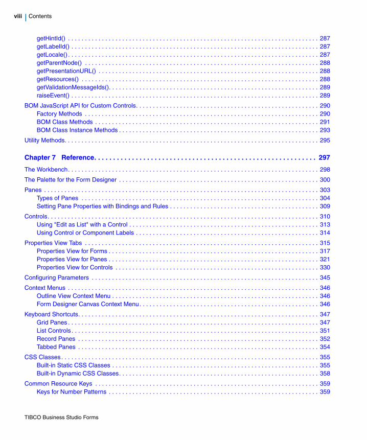
getHintId() . . . . . . . . . . . . . . . . . . . . . . . . . . . . . . . . . . . . . . . . . . . . . . . . . . . . . . . . . . . . . . . . . . . . . . . . . . 287getLabelId() . . . . . . . . . . . . . . . . . . . . . . . . . . . . . . . . . . . . . . . . . . . . . . . . . . . . . . . . . . . . . . . . . . . . . . . . . 287getLocale() . . . . . . . . . . . . . . . . . . . . . . . . . . . . . . . . . . . . . . . . . . . . . . . . . . . . . . . . . . . . . . . . . . . . . . . . . . 287getParentNode() . . . . . . . . . . . . . . . . . . . . . . . . . . . . . . . . . . . . . . . . . . . . . . . . . . . . . . . . . . . . . . . . . . . . . 288getPresentationURL() . . . . . . . . . . . . . . . . . . . . . . . . . . . . . . . . . . . . . . . . . . . . . . . . . . . . . . . . . . . . . . . . . 288getResources() . . . . . . . . . . . . . . . . . . . . . . . . . . . . . . . . . . . . . . . . . . . . . . . . . . . . . . . . . . . . . . . . . . . . . . 288getValidationMessageIds(). . . . . . . . . . . . . . . . . . . . . . . . . . . . . . . . . . . . . . . . . . . . . . . . . . . . . . . . . . . . . . 289raiseEvent() . . . . . . . . . . . . . . . . . . . . . . . . . . . . . . . . . . . . . . . . . . . . . . . . . . . . . . . . . . . . . . . . . . . . . . . . . 289
BOM JavaScript API for Custom Controls. . . . . . . . . . . . . . . . . . . . . . . . . . . . . . . . . . . . . . . . . . . . . . . . . . . . . . 290Factory Methods . . . . . . . . . . . . . . . . . . . . . . . . . . . . . . . . . . . . . . . . . . . . . . . . . . . . . . . . . . . . . . . . . . . . . 290BOM Class Methods . . . . . . . . . . . . . . . . . . . . . . . . . . . . . . . . . . . . . . . . . . . . . . . . . . . . . . . . . . . . . . . . . . 291BOM Class Instance Methods . . . . . . . . . . . . . . . . . . . . . . . . . . . . . . . . . . . . . . . . . . . . . . . . . . . . . . . . . . . 293
Utility Methods. . . . . . . . . . . . . . . . . . . . . . . . . . . . . . . . . . . . . . . . . . . . . . . . . . . . . . . . . . . . . . . . . . . . . . . . . . . 295
Chapter 7 Reference. . . . . . . . . . . . . . . . . . . . . . . . . . . . . . . . . . . . . . . . . . . . . . . . . . . . . . . . . . . 297
The Workbench. . . . . . . . . . . . . . . . . . . . . . . . . . . . . . . . . . . . . . . . . . . . . . . . . . . . . . . . . . . . . . . . . . . . . . . . . . 298
The Palette for the Form Designer . . . . . . . . . . . . . . . . . . . . . . . . . . . . . . . . . . . . . . . . . . . . . . . . . . . . . . . . . . . 300
Panes . . . . . . . . . . . . . . . . . . . . . . . . . . . . . . . . . . . . . . . . . . . . . . . . . . . . . . . . . . . . . . . . . . . . . . . . . . . . . . . . . 303Types of Panes . . . . . . . . . . . . . . . . . . . . . . . . . . . . . . . . . . . . . . . . . . . . . . . . . . . . . . . . . . . . . . . . . . . . . . 304Setting Pane Properties with Bindings and Rules . . . . . . . . . . . . . . . . . . . . . . . . . . . . . . . . . . . . . . . . . . . . 309
Controls. . . . . . . . . . . . . . . . . . . . . . . . . . . . . . . . . . . . . . . . . . . . . . . . . . . . . . . . . . . . . . . . . . . . . . . . . . . . . . . . 310Using "Edit as List" with a Control . . . . . . . . . . . . . . . . . . . . . . . . . . . . . . . . . . . . . . . . . . . . . . . . . . . . . . . . 313Using Control or Component Labels . . . . . . . . . . . . . . . . . . . . . . . . . . . . . . . . . . . . . . . . . . . . . . . . . . . . . . 314
Properties View Tabs . . . . . . . . . . . . . . . . . . . . . . . . . . . . . . . . . . . . . . . . . . . . . . . . . . . . . . . . . . . . . . . . . . . . . 315Properties View for Forms . . . . . . . . . . . . . . . . . . . . . . . . . . . . . . . . . . . . . . . . . . . . . . . . . . . . . . . . . . . . . . 317Properties View for Panes . . . . . . . . . . . . . . . . . . . . . . . . . . . . . . . . . . . . . . . . . . . . . . . . . . . . . . . . . . . . . . 321Properties View for Controls . . . . . . . . . . . . . . . . . . . . . . . . . . . . . . . . . . . . . . . . . . . . . . . . . . . . . . . . . . . . 330
Configuring Parameters . . . . . . . . . . . . . . . . . . . . . . . . . . . . . . . . . . . . . . . . . . . . . . . . . . . . . . . . . . . . . . . . . . . 345
Context Menus . . . . . . . . . . . . . . . . . . . . . . . . . . . . . . . . . . . . . . . . . . . . . . . . . . . . . . . . . . . . . . . . . . . . . . . . . . 346Outline View Context Menu . . . . . . . . . . . . . . . . . . . . . . . . . . . . . . . . . . . . . . . . . . . . . . . . . . . . . . . . . . . . . 346Form Designer Canvas Context Menu. . . . . . . . . . . . . . . . . . . . . . . . . . . . . . . . . . . . . . . . . . . . . . . . . . . . . 346
Keyboard Shortcuts. . . . . . . . . . . . . . . . . . . . . . . . . . . . . . . . . . . . . . . . . . . . . . . . . . . . . . . . . . . . . . . . . . . . . . . 347Grid Panes . . . . . . . . . . . . . . . . . . . . . . . . . . . . . . . . . . . . . . . . . . . . . . . . . . . . . . . . . . . . . . . . . . . . . . . . . . 347List Controls . . . . . . . . . . . . . . . . . . . . . . . . . . . . . . . . . . . . . . . . . . . . . . . . . . . . . . . . . . . . . . . . . . . . . . . . . 351Record Panes . . . . . . . . . . . . . . . . . . . . . . . . . . . . . . . . . . . . . . . . . . . . . . . . . . . . . . . . . . . . . . . . . . . . . . . 352Tabbed Panes . . . . . . . . . . . . . . . . . . . . . . . . . . . . . . . . . . . . . . . . . . . . . . . . . . . . . . . . . . . . . . . . . . . . . . . 354
CSS Classes. . . . . . . . . . . . . . . . . . . . . . . . . . . . . . . . . . . . . . . . . . . . . . . . . . . . . . . . . . . . . . . . . . . . . . . . . . . . 355Built-in Static CSS Classes . . . . . . . . . . . . . . . . . . . . . . . . . . . . . . . . . . . . . . . . . . . . . . . . . . . . . . . . . . . . . 355Built-in Dynamic CSS Classes. . . . . . . . . . . . . . . . . . . . . . . . . . . . . . . . . . . . . . . . . . . . . . . . . . . . . . . . . . . 358
Common Resource Keys . . . . . . . . . . . . . . . . . . . . . . . . . . . . . . . . . . . . . . . . . . . . . . . . . . . . . . . . . . . . . . . . . . 359Keys for Number Patterns . . . . . . . . . . . . . . . . . . . . . . . . . . . . . . . . . . . . . . . . . . . . . . . . . . . . . . . . . . . . . . 359
TIBCO Business Studio Forms

Contents | ix
Keys for Basic Number and Currency Symbols . . . . . . . . . . . . . . . . . . . . . . . . . . . . . . . . . . . . . . . . . . . . . . 360Keys for Duration Control Labels . . . . . . . . . . . . . . . . . . . . . . . . . . . . . . . . . . . . . . . . . . . . . . . . . . . . . . . . . 361Keys for Date-Time Patterns. . . . . . . . . . . . . . . . . . . . . . . . . . . . . . . . . . . . . . . . . . . . . . . . . . . . . . . . . . . . . 363Keys for Optionlist Controls . . . . . . . . . . . . . . . . . . . . . . . . . . . . . . . . . . . . . . . . . . . . . . . . . . . . . . . . . . . . . 366Keys for Built-in Buttons . . . . . . . . . . . . . . . . . . . . . . . . . . . . . . . . . . . . . . . . . . . . . . . . . . . . . . . . . . . . . . . . 366Keys for Grid and Record Panes . . . . . . . . . . . . . . . . . . . . . . . . . . . . . . . . . . . . . . . . . . . . . . . . . . . . . . . . . 367Keys for Built-in Validation Messages. . . . . . . . . . . . . . . . . . . . . . . . . . . . . . . . . . . . . . . . . . . . . . . . . . . . . . 369Keys for List Controls . . . . . . . . . . . . . . . . . . . . . . . . . . . . . . . . . . . . . . . . . . . . . . . . . . . . . . . . . . . . . . . . . . 370Keys for Implicit Validation Messages. . . . . . . . . . . . . . . . . . . . . . . . . . . . . . . . . . . . . . . . . . . . . . . . . . . . . . 371Miscellaneous Keys . . . . . . . . . . . . . . . . . . . . . . . . . . . . . . . . . . . . . . . . . . . . . . . . . . . . . . . . . . . . . . . . . . . 373
Design-time Constraints. . . . . . . . . . . . . . . . . . . . . . . . . . . . . . . . . . . . . . . . . . . . . . . . . . . . . . . . . . . . . . . . . . . . 374
Client-side Validations . . . . . . . . . . . . . . . . . . . . . . . . . . . . . . . . . . . . . . . . . . . . . . . . . . . . . . . . . . . . . . . . . . . . . 375
Scripting. . . . . . . . . . . . . . . . . . . . . . . . . . . . . . . . . . . . . . . . . . . . . . . . . . . . . . . . . . . . . . . . . . . . . . . . . . . . . . . . 376Forms Scripting: Scope of Variables. . . . . . . . . . . . . . . . . . . . . . . . . . . . . . . . . . . . . . . . . . . . . . . . . . . . . . . 376Forms Scripting: Order of Script Execution . . . . . . . . . . . . . . . . . . . . . . . . . . . . . . . . . . . . . . . . . . . . . . . . . 379
API for Scripting . . . . . . . . . . . . . . . . . . . . . . . . . . . . . . . . . . . . . . . . . . . . . . . . . . . . . . . . . . . . . . . . . . . . . . . . . . 381Methods . . . . . . . . . . . . . . . . . . . . . . . . . . . . . . . . . . . . . . . . . . . . . . . . . . . . . . . . . . . . . . . . . . . . . . . . . . . . 381Complex Data . . . . . . . . . . . . . . . . . . . . . . . . . . . . . . . . . . . . . . . . . . . . . . . . . . . . . . . . . . . . . . . . . . . . . . . . 398Factories . . . . . . . . . . . . . . . . . . . . . . . . . . . . . . . . . . . . . . . . . . . . . . . . . . . . . . . . . . . . . . . . . . . . . . . . . . . . 398Packages . . . . . . . . . . . . . . . . . . . . . . . . . . . . . . . . . . . . . . . . . . . . . . . . . . . . . . . . . . . . . . . . . . . . . . . . . . . 399DateTimeUtil Factory . . . . . . . . . . . . . . . . . . . . . . . . . . . . . . . . . . . . . . . . . . . . . . . . . . . . . . . . . . . . . . . . . . 399Duration Class . . . . . . . . . . . . . . . . . . . . . . . . . . . . . . . . . . . . . . . . . . . . . . . . . . . . . . . . . . . . . . . . . . . . . . . 400Utility Methods . . . . . . . . . . . . . . . . . . . . . . . . . . . . . . . . . . . . . . . . . . . . . . . . . . . . . . . . . . . . . . . . . . . . . . . 402
Chapter 8 Tips and Tricks . . . . . . . . . . . . . . . . . . . . . . . . . . . . . . . . . . . . . . . . . . . . . . . . . . . . . . .407
Recommendations for Forms Modeling . . . . . . . . . . . . . . . . . . . . . . . . . . . . . . . . . . . . . . . . . . . . . . . . . . . . . . . . 408
Tips for Using TIBCO Business Studio Forms. . . . . . . . . . . . . . . . . . . . . . . . . . . . . . . . . . . . . . . . . . . . . . . . . . . 412
Index . . . . . . . . . . . . . . . . . . . . . . . . . . . . . . . . . . . . . . . . . . . . . . . . . . . . . . . . . . . . . . . . . . . . . . . . .415
TIBCO Business Studio Forms

x | Contents
TIBCO Business Studio Forms

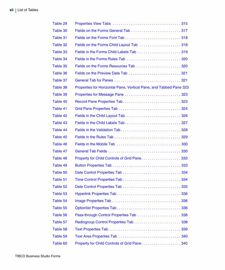
List of Tables | xi
List of Tables
Table 1 General Typographical Conventions . . . . . . . . . . . . . . . . . . . . . xxiii
Table 2 Name Labels . . . . . . . . . . . . . . . . . . . . . . . . . . . . . . . . . . . . . . . . 21
Table 3 Data Field Types . . . . . . . . . . . . . . . . . . . . . . . . . . . . . . . . . . . . . 24
Table 4 Custom Buttons . . . . . . . . . . . . . . . . . . . . . . . . . . . . . . . . . . . . . . 64
Table 5 Manage Form Elements from the Outline View . . . . . . . . . . . . . . 99
Table 6 Validation Messages for BOM Level Multiplicity Constraints . . . 104
Table 7 Mobile Specific Configuration of Pane and Control Properties . 116
Table 8 Edit Binding from the General Properties Tab for a Control. . . . 134
Table 9 Specify Details to Define a New Script Action . . . . . . . . . . . . . . 137
Table 10 Specify Details to Define a New Computation Action . . . . . . . . 138
Table 11 Specify the Details for Rules . . . . . . . . . . . . . . . . . . . . . . . . . . . 139
Table 12 Specify the Action Details for the Script Action . . . . . . . . . . . . . 143
Table 13 Specify the Action Details for the Computation Action. . . . . . . . 143
Table 14 Toolbar Buttons for the Mappings Tab. . . . . . . . . . . . . . . . . . . . 175
Table 15 Example Resource Keys with Overridden Values . . . . . . . . . . . 183
Table 16 Numeric Control Formatting Characters . . . . . . . . . . . . . . . . . . 192
Table 17 Numeric Control Sample Formats . . . . . . . . . . . . . . . . . . . . . . . 193
Table 18 Renaming Locale-specific Properties Files . . . . . . . . . . . . . . . . 200
Table 19 Rendering of Specific Controls . . . . . . . . . . . . . . . . . . . . . . . . . 236
Table 20 Library Element Properties . . . . . . . . . . . . . . . . . . . . . . . . . . . . 257
Table 21 Palette Drawer Properties . . . . . . . . . . . . . . . . . . . . . . . . . . . . . 259
Table 22 Event Type Properties . . . . . . . . . . . . . . . . . . . . . . . . . . . . . . . . 260
Table 23 External Resource Properties . . . . . . . . . . . . . . . . . . . . . . . . . . 261
Table 24 Control Type Properties . . . . . . . . . . . . . . . . . . . . . . . . . . . . . . . 262
Table 25 Factory Methods . . . . . . . . . . . . . . . . . . . . . . . . . . . . . . . . . . . . 290
Table 26 BOM Class Methods . . . . . . . . . . . . . . . . . . . . . . . . . . . . . . . . . 291
Table 27 BOM Class Instance Methods . . . . . . . . . . . . . . . . . . . . . . . . . . 293
Table 28 Form Designer Palette . . . . . . . . . . . . . . . . . . . . . . . . . . . . . . . . 300
TIBCO Business Studio Forms
xii | List of Tables
Table 29 Properties View Tabs . . . . . . . . . . . . . . . . . . . . . . . . . . . . . . . . . 315
Table 30 Fields on the Forms General Tab . . . . . . . . . . . . . . . . . . . . . . . . 317
Table 31 Fields on the Forms Font Tab . . . . . . . . . . . . . . . . . . . . . . . . . . . 318
Table 32 Fields on the Forms Child Layout Tab . . . . . . . . . . . . . . . . . . . . 318
Table 33 Fields in the Forms Child Labels Tab . . . . . . . . . . . . . . . . . . . . . 319
Table 34 Fields in the Forms Rules Tab . . . . . . . . . . . . . . . . . . . . . . . . . . 320
Table 35 Fields on the Forms Resources Tab . . . . . . . . . . . . . . . . . . . . . . 320
Table 36 Fields on the Preview Data Tab . . . . . . . . . . . . . . . . . . . . . . . . . 321
Table 37 General Tab for Panes . . . . . . . . . . . . . . . . . . . . . . . . . . . . . . . . 321
Table 38 Properties for Horizontal Pane, Vertical Pane, and Tabbed Pane 323
Table 39 Properties for Message Pane . . . . . . . . . . . . . . . . . . . . . . . . . . . 323
Table 40 Record Pane Properties Tab. . . . . . . . . . . . . . . . . . . . . . . . . . . . 323
Table 41 Grid Pane Properties Tab . . . . . . . . . . . . . . . . . . . . . . . . . . . . . . 324
Table 42 Fields in the Child Layout Tab. . . . . . . . . . . . . . . . . . . . . . . . . . . 326
Table 43 Fields in the Child Labels Tab . . . . . . . . . . . . . . . . . . . . . . . . . . . 327
Table 44 Fields in the Validation Tab . . . . . . . . . . . . . . . . . . . . . . . . . . . . . 328
Table 45 Fields in the Rules Tab . . . . . . . . . . . . . . . . . . . . . . . . . . . . . . . . 329
Table 46 Fields in the Mobile Tab . . . . . . . . . . . . . . . . . . . . . . . . . . . . . . . 330
Table 47 General Tab Fields . . . . . . . . . . . . . . . . . . . . . . . . . . . . . . . . . . . 330
Table 48 Property for Child Controls of Grid Pane. . . . . . . . . . . . . . . . . . . 333
Table 49 Button Properties Tab . . . . . . . . . . . . . . . . . . . . . . . . . . . . . . . . . 333
Table 50 Date Control Properties Tab . . . . . . . . . . . . . . . . . . . . . . . . . . . . 334
Table 51 Time Control Properties Tab . . . . . . . . . . . . . . . . . . . . . . . . . . . . 334
Table 52 Date Control Properties Tab . . . . . . . . . . . . . . . . . . . . . . . . . . . . 335
Table 53 Hyperlink Properties Tab. . . . . . . . . . . . . . . . . . . . . . . . . . . . . . . 336
Table 54 Image Properties Tab . . . . . . . . . . . . . . . . . . . . . . . . . . . . . . . . . 336
Table 55 Optionlist Properties Tab. . . . . . . . . . . . . . . . . . . . . . . . . . . . . . . 336
Table 56 Pass-through Control Properties Tab . . . . . . . . . . . . . . . . . . . . . 338
Table 57 Radiogroup Control Properties Tab. . . . . . . . . . . . . . . . . . . . . . . 338
Table 58 Text Properties Tab. . . . . . . . . . . . . . . . . . . . . . . . . . . . . . . . . . . 339
Table 59 Text Area Properties Tab . . . . . . . . . . . . . . . . . . . . . . . . . . . . . . 340
Table 60 Property for Child Controls of Grid Pane. . . . . . . . . . . . . . . . . . . 340
TIBCO Business Studio Forms
List of Tables | xiii
Table 61 Layout Tab . . . . . . . . . . . . . . . . . . . . . . . . . . . . . . . . . . . . . . . . . 341
Table 62 Font Tab for Controls . . . . . . . . . . . . . . . . . . . . . . . . . . . . . . . . . 342
Table 63 Validations Tab for Controls . . . . . . . . . . . . . . . . . . . . . . . . . . . . 343
Table 64 Fields in the Controls Rules tab . . . . . . . . . . . . . . . . . . . . . . . . . 344
Table 65 Manage Form Elements from the Outline View . . . . . . . . . . . . . 346
Table 66 Generic Keyboard Shortcuts . . . . . . . . . . . . . . . . . . . . . . . . . . . 347
Table 67 Keyboard Shortcuts for Grid Panes in Display Mode. . . . . . . . . 347
Table 68 Keyboard Shortcuts for Grid Panes in Edit Mode . . . . . . . . . . . 349
Table 69 Keyboard Shortcuts for Grid Pane Column Headers . . . . . . . . . 350
Table 70 Keyboard Shortcuts for Grid Pane Navigation Bar. . . . . . . . . . . 350
Table 71 Keyboard Shortcuts for List Controls in Display Mode. . . . . . . . 351
Table 72 Keyboard Shortcuts for List Controls in Edit Mode . . . . . . . . . . 351
Table 73 Keyboard Shortcuts for List Control Command Bar . . . . . . . . . . 352
Table 74 Keyboard Shortcuts for Record Pane Body . . . . . . . . . . . . . . . . 353
Table 75 Keyboard Shortcuts for Record Pane Navigation Bar . . . . . . . . 353
Table 76 Keyboard Shortcuts for Tabbed Panes . . . . . . . . . . . . . . . . . . . 354
Table 77 Built-in Static CSS Classes . . . . . . . . . . . . . . . . . . . . . . . . . . . . 355
Table 78 Built-in Dynamic CSS Classes . . . . . . . . . . . . . . . . . . . . . . . . . . 358
Table 79 Number Patterns . . . . . . . . . . . . . . . . . . . . . . . . . . . . . . . . . . . . 359
Table 80 Basic Number and Currency Symbols . . . . . . . . . . . . . . . . . . . 360
Table 81 Duration Control Labels . . . . . . . . . . . . . . . . . . . . . . . . . . . . . . . 361
Table 82 Date Time Keys . . . . . . . . . . . . . . . . . . . . . . . . . . . . . . . . . . . . . 363
Table 83 Optionlist Key . . . . . . . . . . . . . . . . . . . . . . . . . . . . . . . . . . . . . . . 366
Table 84 Built-in Button Keys . . . . . . . . . . . . . . . . . . . . . . . . . . . . . . . . . . 366
Table 85 Grid and Record Pane Keys . . . . . . . . . . . . . . . . . . . . . . . . . . . 367
Table 86 Built-in Validation Message Keys. . . . . . . . . . . . . . . . . . . . . . . . 369
Table 87 List Control Keys . . . . . . . . . . . . . . . . . . . . . . . . . . . . . . . . . . . . 370
Table 88 Implicit Validation Messages . . . . . . . . . . . . . . . . . . . . . . . . . . . 371
Table 89 Miscellaneous Resource Keys . . . . . . . . . . . . . . . . . . . . . . . . . . 373
Table 90 Action . . . . . . . . . . . . . . . . . . . . . . . . . . . . . . . . . . . . . . . . . . . . . 377
Table 91 Validation . . . . . . . . . . . . . . . . . . . . . . . . . . . . . . . . . . . . . . . . . . 378
Table 92 FormRunner Class . . . . . . . . . . . . . . . . . . . . . . . . . . . . . . . . . . . 381
TIBCO Business Studio Forms
xiv | List of Tables
Table 93 Form Class . . . . . . . . . . . . . . . . . . . . . . . . . . . . . . . . . . . . . . . . . 382
Table 94 Control Class. . . . . . . . . . . . . . . . . . . . . . . . . . . . . . . . . . . . . . . . 384
Table 95 Pane Class . . . . . . . . . . . . . . . . . . . . . . . . . . . . . . . . . . . . . . . . . 391
Table 96 List Class. . . . . . . . . . . . . . . . . . . . . . . . . . . . . . . . . . . . . . . . . . . 395
Table 97 Iterator Class . . . . . . . . . . . . . . . . . . . . . . . . . . . . . . . . . . . . . . . . 396
Table 98 Logger Class . . . . . . . . . . . . . . . . . . . . . . . . . . . . . . . . . . . . . . . . 397
Table 99 Util Class . . . . . . . . . . . . . . . . . . . . . . . . . . . . . . . . . . . . . . . . . . 402
TIBCO Business Studio Forms

List of Figures | xv
List of Figures
Figure 1 Open Sample Project . . . . . . . . . . . . . . . . . . . . . . . . . . . . . . . . . . . 4
Figure 2 Claim Process No Forms: Process Editor . . . . . . . . . . . . . . . . . . . 6
Figure 3 Form Open. . . . . . . . . . . . . . . . . . . . . . . . . . . . . . . . . . . . . . . . . . . 7
Figure 4 Capture Claim Form, Design Page . . . . . . . . . . . . . . . . . . . . . . . . 8
Figure 5 Capture Claim Form, GWT Preview Page . . . . . . . . . . . . . . . . . . 10
Figure 6 Interview Witness Form, Design Page . . . . . . . . . . . . . . . . . . . . . 11
Figure 7 Interview Witness Form, GWT Preview Page . . . . . . . . . . . . . . . 12
Figure 8 Capture Claim Form, Interface Properties . . . . . . . . . . . . . . . . . . 13
Figure 9 Interview Witness Form, Interface Tab . . . . . . . . . . . . . . . . . . . . 14
Figure 10 Interview Witness Task, Form Detail . . . . . . . . . . . . . . . . . . . . . . 15
Figure 11 Show/Hide the Palette . . . . . . . . . . . . . . . . . . . . . . . . . . . . . . . . . 17
Figure 12 Add New Pane: No Location Selected . . . . . . . . . . . . . . . . . . . . . 18
Figure 13 Placing a New Pane Above the Existing One . . . . . . . . . . . . . . . 19
Figure 14 Untitled Panes Added . . . . . . . . . . . . . . . . . . . . . . . . . . . . . . . . . 20
Figure 15 Customer Name Parameter Defined as Mandatory . . . . . . . . . . . 23
Figure 16 Making the Field CustAge Uneditable . . . . . . . . . . . . . . . . . . . . . 25
Figure 17 Add Values and Labels for Personal Injury . . . . . . . . . . . . . . . . . 26
Figure 18 Add Binding to Configure Pane Visibility . . . . . . . . . . . . . . . . . . . 28
Figure 19 Select Binding Endpoint Page . . . . . . . . . . . . . . . . . . . . . . . . . . . 29
Figure 20 Binding Created for the Visible Property . . . . . . . . . . . . . . . . . . . 29
Figure 21 Adding Binding from the Mappings Tab . . . . . . . . . . . . . . . . . . . . 31
Figure 22 Add a Button . . . . . . . . . . . . . . . . . . . . . . . . . . . . . . . . . . . . . . . . 32
Figure 23 Edit Pane’s Layout . . . . . . . . . . . . . . . . . . . . . . . . . . . . . . . . . . . . 33
Figure 24 Expanded Color Picker . . . . . . . . . . . . . . . . . . . . . . . . . . . . . . . . 34
Figure 25 Child Labels Settings . . . . . . . . . . . . . . . . . . . . . . . . . . . . . . . . . . 36
Figure 26 Edit the Child Labels Settings . . . . . . . . . . . . . . . . . . . . . . . . . . . 37
Figure 27 Tutorial 2: Interview Witness Form Design Page . . . . . . . . . . . . . 38
Figure 28 Tutorial 2: Capture Claim Form, Design Page . . . . . . . . . . . . . . . 39
TIBCO Business Studio Forms

xvi | List of Figures
Figure 29 Change to Solution Design Mode.. . . . . . . . . . . . . . . . . . . . . . . . 41
Figure 30 Define Validation Page . . . . . . . . . . . . . . . . . . . . . . . . . . . . . . . . 42
Figure 31 Completed Validation Definition for the Phone Field. . . . . . . . . . 44
Figure 32 Find Date Field CustAge . . . . . . . . . . . . . . . . . . . . . . . . . . . . . . . 48
Figure 33 Add Binding for the Customer Age Parameter . . . . . . . . . . . . . . 52
Figure 34 Select Event Dialog . . . . . . . . . . . . . . . . . . . . . . . . . . . . . . . . . . . 53
Figure 35 Select the Event Type . . . . . . . . . . . . . . . . . . . . . . . . . . . . . . . . . 53
Figure 36 Rule Details Page . . . . . . . . . . . . . . . . . . . . . . . . . . . . . . . . . . . . 54
Figure 37 New Rule Dialog, Define Actions Page . . . . . . . . . . . . . . . . . . . . 54
Figure 38 Enter the Action Details . . . . . . . . . . . . . . . . . . . . . . . . . . . . . . . . 55
Figure 39 Claim Amount Control, Rules Tab. . . . . . . . . . . . . . . . . . . . . . . . 56
Figure 40 Edit an Event . . . . . . . . . . . . . . . . . . . . . . . . . . . . . . . . . . . . . . . . 57
Figure 41 Round_amount Event Defined . . . . . . . . . . . . . . . . . . . . . . . . . . 58
Figure 42 Choose Hint Property of the AccDescription Control . . . . . . . . . 62
Figure 43 Form Elements . . . . . . . . . . . . . . . . . . . . . . . . . . . . . . . . . . . . . . 71
Figure 44 Preferences Dialog for Errors/Warnings . . . . . . . . . . . . . . . . . . . 75
Figure 45 Properties for Forms Tutorial Solution. . . . . . . . . . . . . . . . . . . . . 76
Figure 46 Add a Binding for a Control Using the General Properties Tab. . 78
Figure 47 Add a Binding for a Parameter Using Parameter Dialog. . . . . . . 79
Figure 48 Add an Action in the Outline View . . . . . . . . . . . . . . . . . . . . . . . . 82
Figure 49 Actions Summary Table . . . . . . . . . . . . . . . . . . . . . . . . . . . . . . . 83
Figure 50 Rules Summary Table. . . . . . . . . . . . . . . . . . . . . . . . . . . . . . . . . 85
Figure 51 Performance Table . . . . . . . . . . . . . . . . . . . . . . . . . . . . . . . . . . . 90
Figure 52 The Performance Metrics Settings . . . . . . . . . . . . . . . . . . . . . . . 91
Figure 53 Invisible and Visible Form Parts . . . . . . . . . . . . . . . . . . . . . . . . . 92
Figure 54 Visibility of a Pane Depending on a Check Box . . . . . . . . . . . . . 93
Figure 55 Outline View , Thumbnail Mode . . . . . . . . . . . . . . . . . . . . . . . . . 94
Figure 56 Outline View, Tree Mode. . . . . . . . . . . . . . . . . . . . . . . . . . . . . . . 95
Figure 57 Using the Outline View with Forms, 1 . . . . . . . . . . . . . . . . . . . . . 95
Figure 58 Using the Outline View with Forms, 2 . . . . . . . . . . . . . . . . . . . . . 96
Figure 59 Parameters in the Outline View. . . . . . . . . . . . . . . . . . . . . . . . . . 97
Figure 60 Parameters Summary Table . . . . . . . . . . . . . . . . . . . . . . . . . . . . 97
TIBCO Business Studio Forms
List of Figures | xvii
Figure 61 The Palette of the Business Object Model Editor. . . . . . . . . . . . 101
Figure 62 Properties of a ZIP Code Primitive Type in the BOM. . . . . . . . . 102
Figure 63 Business Object Model Editor Showing Child Classes . . . . . . . 105
Figure 64 Master-Detail Pane on a Form . . . . . . . . . . . . . . . . . . . . . . . . . . 106
Figure 65 Record Pane with Navigation Enabled. . . . . . . . . . . . . . . . . . . . 106
Figure 66 Clear Forms References Dialog. . . . . . . . . . . . . . . . . . . . . . . . . 108
Figure 67 Delete Resources Dialog . . . . . . . . . . . . . . . . . . . . . . . . . . . . . . 109
Figure 68 Changes to be Performed Options. . . . . . . . . . . . . . . . . . . . . . . 109
Figure 69 Quick Fix Dialog . . . . . . . . . . . . . . . . . . . . . . . . . . . . . . . . . . . . . 111
Figure 70 Repair Reference Dialog . . . . . . . . . . . . . . . . . . . . . . . . . . . . . . 112
Figure 71 Date Spinner . . . . . . . . . . . . . . . . . . . . . . . . . . . . . . . . . . . . . . . 119
Figure 72 Time Spinner . . . . . . . . . . . . . . . . . . . . . . . . . . . . . . . . . . . . . . . 119
Figure 73 Duration Control . . . . . . . . . . . . . . . . . . . . . . . . . . . . . . . . . . . . . 120
Figure 74 Choice Spinner. . . . . . . . . . . . . . . . . . . . . . . . . . . . . . . . . . . . . . 121
Figure 75 Record Panes Display . . . . . . . . . . . . . . . . . . . . . . . . . . . . . . . . 122
Figure 76 New Form Dialog . . . . . . . . . . . . . . . . . . . . . . . . . . . . . . . . . . . . 126
Figure 77 DND Items from the Project Explore . . . . . . . . . . . . . . . . . . . . . 128
Figure 78 DND Items from the Form Designer Outline View . . . . . . . . . . . 129
Figure 79 Form Created Using DND Gestures . . . . . . . . . . . . . . . . . . . . . 130
Figure 80 Open the Edit Validation Script Page. . . . . . . . . . . . . . . . . . . . . 132
Figure 81 General Properties Tab for a Control with No Bindings . . . . . . . 134
Figure 82 Multiple Bindings Added. . . . . . . . . . . . . . . . . . . . . . . . . . . . . . . 135
Figure 83 General Properties Tab for the Parameter . . . . . . . . . . . . . . . . . 136
Figure 84 Adding a New Script Action . . . . . . . . . . . . . . . . . . . . . . . . . . . . 137
Figure 85 Rule: Pick Event Page . . . . . . . . . . . . . . . . . . . . . . . . . . . . . . . . 140
Figure 86 Select Event Page . . . . . . . . . . . . . . . . . . . . . . . . . . . . . . . . . . . 140
Figure 87 Define Actions for the Rule . . . . . . . . . . . . . . . . . . . . . . . . . . . . 141
Figure 88 Define Actions Dialog for the Rule . . . . . . . . . . . . . . . . . . . . . . . 142
Figure 89 The Validations Tab . . . . . . . . . . . . . . . . . . . . . . . . . . . . . . . . . . 149
Figure 90 The Define Validation Dialog . . . . . . . . . . . . . . . . . . . . . . . . . . . 150
Figure 91 The Resource Picker Dialog . . . . . . . . . . . . . . . . . . . . . . . . . . . 152
Figure 92 The Edit Validation Script Dialog . . . . . . . . . . . . . . . . . . . . . . . . 153
TIBCO Business Studio Forms
xviii | List of Figures
Figure 93 The General Tab . . . . . . . . . . . . . . . . . . . . . . . . . . . . . . . . . . . . 155
Figure 94 Defining Custom Validation . . . . . . . . . . . . . . . . . . . . . . . . . . . . 156
Figure 95 Validation Script Example 1 . . . . . . . . . . . . . . . . . . . . . . . . . . . 156
Figure 96 Defining Custom Validation Using Substitution Variables . . . . . 157
Figure 97 Validation Script Example 2 . . . . . . . . . . . . . . . . . . . . . . . . . . . 158
Figure 98 Sample Validation Messages . . . . . . . . . . . . . . . . . . . . . . . . . . 158
Figure 99 The Define Validation Dialog Using External Resources . . . . . 159
Figure 100 Validation Script Example 3 . . . . . . . . . . . . . . . . . . . . . . . . . . . 159
Figure 101 Place Vertical Panes on the Form. . . . . . . . . . . . . . . . . . . . . . . 163
Figure 102 Position the New Pane . . . . . . . . . . . . . . . . . . . . . . . . . . . . . . . 163
Figure 103 New Horizontal Pane is Automatically Created . . . . . . . . . . . . 164
Figure 104 TIBCO Business Studio Forms toolbar . . . . . . . . . . . . . . . . . . . 165
Figure 105 Show Pane and Control Borders. . . . . . . . . . . . . . . . . . . . . . . . 165
Figure 106 Using the Embedded Form Icon . . . . . . . . . . . . . . . . . . . . . . . . 167
Figure 107 Embedded Form Inserted in a Parent Form . . . . . . . . . . . . . . . 169
Figure 108 Set Binding Using the Mappings Tab . . . . . . . . . . . . . . . . . . . . 171
Figure 109 Preview Rendering of the Parent Form . . . . . . . . . . . . . . . . . . . 172
Figure 110 Properties Tab for the Embedded Form . . . . . . . . . . . . . . . . . . 173
Figure 111 Mappings Tab of the Properties View . . . . . . . . . . . . . . . . . . . . 174
Figure 112 The Script Editor in the Mappings Tab . . . . . . . . . . . . . . . . . . . 177
Figure 113 Merging Process . . . . . . . . . . . . . . . . . . . . . . . . . . . . . . . . . . . . 180
Figure 114 Creating a New Properties File . . . . . . . . . . . . . . . . . . . . . . . . . 181
Figure 115 The New File Dialog . . . . . . . . . . . . . . . . . . . . . . . . . . . . . . . . . 182
Figure 116 Sample Resource Entries . . . . . . . . . . . . . . . . . . . . . . . . . . . . . 182
Figure 117 The Project Properties Dialog . . . . . . . . . . . . . . . . . . . . . . . . . . 184
Figure 118 The Pick Resource Dialog. . . . . . . . . . . . . . . . . . . . . . . . . . . . . 185
Figure 119 The Common Properties Preference Page . . . . . . . . . . . . . . . . 186
Figure 120 Numeric Control Property of Text Input Control . . . . . . . . . . . . 194
Figure 121 Add Custom Format File to Resource List . . . . . . . . . . . . . . . . 195
Figure 122 Use Custom Format for Numeric Control . . . . . . . . . . . . . . . . . 196
Figure 123 Base Properties File . . . . . . . . . . . . . . . . . . . . . . . . . . . . . . . . . 197
Figure 124 Business Analysis and Solution Design Modes . . . . . . . . . . . . 205
TIBCO Business Studio Forms

List of Figures | xix
Figure 125 Open the Quick Fix Dialog . . . . . . . . . . . . . . . . . . . . . . . . . . . . . 206
Figure 126 Quick Fix Dialog for Migration . . . . . . . . . . . . . . . . . . . . . . . . . . 207
Figure 127 Properties View for a Pane . . . . . . . . . . . . . . . . . . . . . . . . . . . . 233
Figure 128 Custom Control Architecture . . . . . . . . . . . . . . . . . . . . . . . . . . . 243
Figure 129 Component Library Project . . . . . . . . . . . . . . . . . . . . . . . . . . . . 244
Figure 130 Asset Type Selection Page . . . . . . . . . . . . . . . . . . . . . . . . . . . . 246
Figure 131 Component Library Model . . . . . . . . . . . . . . . . . . . . . . . . . . . . . 248
Figure 132 Library Editor Properties View . . . . . . . . . . . . . . . . . . . . . . . . . . 250
Figure 133 Pick Resource Dialog. . . . . . . . . . . . . . . . . . . . . . . . . . . . . . . . . 252
Figure 134 ControlWrapper Life Cycle . . . . . . . . . . . . . . . . . . . . . . . . . . . . . 254
Figure 135 Eclipse Workbench with Project Claims Process - No Forms . . 298
Figure 136 Form Designer Palette . . . . . . . . . . . . . . . . . . . . . . . . . . . . . . . . 300
Figure 137 Palette not Displayed . . . . . . . . . . . . . . . . . . . . . . . . . . . . . . . . . 302
Figure 138 Palette Displayed . . . . . . . . . . . . . . . . . . . . . . . . . . . . . . . . . . . . 302
Figure 139 Vertical, Horizontal, Tabbed, and Message Panes . . . . . . . . . . 303
Figure 140 Design View . . . . . . . . . . . . . . . . . . . . . . . . . . . . . . . . . . . . . . . . 304
Figure 141 Script and Message Example for a Message Pane . . . . . . . . . . 306
Figure 142 General Properties Tab of Record Pane . . . . . . . . . . . . . . . . . . 307
Figure 143 Properties Tab of Record Pane . . . . . . . . . . . . . . . . . . . . . . . . . 307
Figure 144 Record Pane with Navigation Controls . . . . . . . . . . . . . . . . . . . 308
Figure 145 Properties Tab of Grid Pane . . . . . . . . . . . . . . . . . . . . . . . . . . . 309
Figure 146 Button Type . . . . . . . . . . . . . . . . . . . . . . . . . . . . . . . . . . . . . . . . 313
TIBCO Business Studio Forms

xx | List of Figures
TIBCO Business Studio Forms

| xxi
Preface
TIBCO Business Studio™ Forms provides a powerful means of creating web-based and mobile user interfaces for different TIBCO applications. This guide is intended for business analysts and solution designers responsible for delivering a User Interface within TIBCO products that support the use of TIBCO Business Studio Forms.
Topics
• Changes from the Previous Release of this Guide, page xxii
• Typographical Conventions, page xxiii
• Connecting with TIBCO Resources, page xxv
This software may be available on multiple operating systems. However, not all operating system platforms for a specific software version are released at the same time. Please see the readme file for the availability of this software version on a specific operating system platform.
TIBCO Business Studio Forms

xxii | Changes from the Previous Release of this Guide
Changes from the Previous Release of this Guide
This section itemizes the major changes from the previous release of this guide.
• The location of tutorial samples is updated to http://tap.tibco.com/storefront/sample-evaluations/tibco-business-studio-product-samples/prod16117.html.
• The mention of GI preview is removed as its use is now deprecated.
• The mention of relative bindings is removed as now they are replaced by absolute pane value bindings.
• A new section Validating Data in a Form on page 147 is added in the Tasks chapter.
• The section Using Drag and Drop Gesture to Customize a Form on page 128 is updated to reflect changes in the drop handler.
• A new section Customizing Property Resource Bundles on page 179 is added in the Tasks chapter.
• The Reference on page 297 chapter has been updated to add details for new properties, APIs, common resource keys, and keyboard shortcuts. The reference section on validations is now divided into Design-time Constraints on page 374 and Client-side Validations on page 375.
• A new method, getPresentationURL() on page 288, is added in the Custom Controls chapter.
TIBCO Business Studio Forms
Preface | xxiii
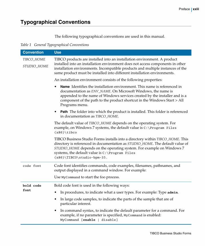
Typographical Conventions
The following typographical conventions are used in this manual.
Table 1 General Typographical Conventions
Convention Use
TIBCO_HOME
STUDIO_HOME
TIBCO products are installed into an installation environment. A product installed into an installation environment does not access components in other installation environments. Incompatible products and multiple instances of the same product must be installed into different installation environments.
An installation environment consists of the following properties:
• Name Identifies the installation environment. This name is referenced in documentation as ENV_NAME. On Microsoft Windows, the name is appended to the name of Windows services created by the installer and is a component of the path to the product shortcut in the Windows Start > All Programs menu.
• Path The folder into which the product is installed. This folder is referenced in documentation as TIBCO_HOME.
The default value of TIBCO_HOME depends on the operating system. For example, on Windows 7 systems, the default value is C:\Program Files (x86)\tibco
TIBCO Business Studio Forms installs into a directory within TIBCO_HOME. This directory is referenced in documentation as STUDIO_HOME. The default value of STUDIO_HOME depends on the operating system. For example on Windows 7 systems, the default value is C:\Program Files (x86)\TIBCO\studio-bpm-35.
code font Code font identifies commands, code examples, filenames, pathnames, and output displayed in a command window. For example:
Use MyCommand to start the foo process.
bold code
font Bold code font is used in the following ways:
• In procedures, to indicate what a user types. For example: Type admin.
• In large code samples, to indicate the parts of the sample that are of particular interest.
• In command syntax, to indicate the default parameter for a command. For example, if no parameter is specified, MyCommand is enabled: MyCommand [enable | disable]
TIBCO Business Studio Forms

xxiv | Typographical Conventions
italic font Italic font is used in the following ways:
• To indicate a document title. For example: See TIBCO ActiveMatrix BusinessWorks Concepts.
• To introduce new terms For example: A portal page may contain several portlets. Portlets are mini-applications that run in a portal.
• To indicate a variable in a command or code syntax that you must replace. For example: MyCommand PathName
Key combinations
Key name separated by a plus sign indicate keys pressed simultaneously. For example: Ctrl+C.
Key names separated by a comma and space indicate keys pressed one after the other. For example: Esc, Ctrl+Q.
The note icon indicates information that is of special interest or importance, for example, an additional action required only in certain circumstances.
The tip icon indicates an idea that could be useful, for example, a way to apply the information provided in the current section to achieve a specific result.
The warning icon indicates the potential for a damaging situation, for example, data loss or corruption if certain steps are taken or not taken.
Table 1 General Typographical Conventions (Cont’d)
Convention Use
TIBCO Business Studio Forms

Preface | xxv
Connecting with TIBCO Resources
How to Join TIBCOmmunityTIBCOmmunity is an online destination for TIBCO customers, partners, and resident experts. It is a place to share and access the collective experience of the TIBCO community. TIBCOmmunity offers forums, blogs, and access to a variety of resources. To register, go to http://www.tibcommunity.com.
How to Access TIBCO DocumentationYou can access TIBCO documentation here:
http://docs.tibco.com
How to Contact TIBCO SupportFor comments or problems with this manual or the software it addresses, contact TIBCO Support as follows:
• For an overview of TIBCO Support, and information about getting started with TIBCO Support, visit this site:
http://www.tibco.com/services/support
• If you already have a valid maintenance or support contract, visit this site:
https://support.tibco.com
Entry to this site requires a user name and password. If you do not have a user name, you can request one.
TIBCO Business Studio Forms

xxvi | Connecting with TIBCO Resources
TIBCO Business Studio Forms

| 1
Chapter 1 Getting Started
The tutorials in this chapter introduce you to the main features of TIBCO Business Studio Forms. For more in-depth information, see the Tasks and Reference chapters in this guide.
The guide assumes you are familiar with the basics of TIBCO Business Studio. If you are new to using TIBCO Business Studio, see TIBCO Business Studio Process Modeling User's Guide for information about important concepts and procedures.
Topics
• Introduction, page 2
• Tutorials, page 3
• Installing the Forms Tutorial Solutions Project, page 4
• Tutorial 1: Forms, Panes, and Controls, page 5
• Tutorial 2: Customizing the Appearance of a Form, page 33
• Tutorial 3: Validations, page 41
• Tutorial 4: Rules, Events, and Actions, page 51
TIBCO Business Studio Forms
2 | Introduction
Introduction
The form-modeling features of TIBCO Business Studio enable you to design, view, and test the forms you need to collect user input. You can create sophisticated forms without programming, and associate them with user tasks in order to provide richer user experiences.
Business analysts can visually change layouts and controls; developers can add validation rules and event scripts to further craft the user experience, and can draw upon the power of Google Web Toolkit™. The inline preview allows developers to test and interact with the running form right within TIBCO Business Studio.
This guide explains how to configure and modify the controls that appear on the form. In this chapter, a series of tutorials is presented to familiarize you with the procedures needed to accomplish these tasks.
Using TIBCO Business StudioThere are several resources available to you from the Welcome page displayed when you first start TIBCO Business Studio. (The Welcome page is also available from the Eclipse Help menu.) These resources include tutorials that explain creating a business process, and samples that illustrate the features of the product as they are typically used in real-world contexts.
Who Should Use TIBCO Business Studio Forms?TIBCO Business Studio Forms is for users of TIBCO Business Studio who are responsible for user interfaces for presenting and capturing information from users. The forms you design are deployed in one of the supported TIBCO runtime environments.
TIBCO Business Studio Forms
| 3
Tutorials
The following tutorials are based on the sample application, Forms Tutorial Solutions, provided with TIBCO Business Studio. The project contains two business processes:
• Claims Process No Forms has no forms associated with it.
• Claims Process With Forms consists of the same business process, but with completed forms associated with the user tasks in the process.
The starting point for the tutorials is the first of these sample business processes. Here, the design of the process has been completed for you, but no forms have been created. By performing all the tutorials in this chapter, you create a revised version of this business process that is substantially the same as the second of the provided versions of the process, that is, the version that includes the forms.
Before you start working with tutorials, you may want to read the section The Workbench on page 298 to familiarize yourself with the Eclipse workbench for modeling forms.
If you are new to using TIBCO Business Studio, consider familiarizing yourself with the process modeling environment of TIBCO Business Studio before beginning the tutorials on forms modeling. TIBCO Business Studio process modeling tutorials can be accessed from the Welcome page, at Help > Welcome.
TIBCO Business Studio Forms

4 | Installing the Forms Tutorial Solutions Project
Installing the Forms Tutorial Solutions Project
The sample projects are available on the TIBCO Access Point site. To download and install the forms tutorial solutions, do the following:
1. Go to http://tap.tibco.com/storefront/sample-evaluations/tibco-business-studio-product-samples/prod16117.html.
2. Click Form Samples to go to the Forms Samples page.
3. Under Forms Tutorial Solution, click Download and Install to get the sample project in your workspace.
To familiarize yourself with the Business Studio Workbench, see The Workbench on page 298.
In the Project Explorer view, drill down by clicking the plus sign icons to examine the contents of the business project.
Figure 1 Open Sample Project
4. Double-click the business process named Claims Process No Forms in the process package ProcessWithNoForms.xpdl to open the process in the Process Editor.
For the remainder of this chapter it is assumed that you are working with this business process, generating and configuring the forms for the two user tasks in the process. However, you can see the final results of the tutorial at any time by opening the business process that already includes the completed forms.
Open the Claims Process With Form process, found in the package of the same name. With the process open in the Process Editor, right-click the user task and click Form > Open.
TIBCO Business Studio Forms
| 5
Tutorial 1: Forms, Panes, and Controls
This tutorial shows how to add panes and controls on a form, and how to move and configure them. This tutorial contains the following tasks:
• Task A: Import the Sample Project on page 5
• Task B: Examine the Claims Process Business Process on page 5
• Task C: Open the Forms on page 7
• Task D: View Forms on page 12
• Task E: Add New Panes to the Capture Claim Form on page 17
• Task F: Modify Names and Labels of Panes on page 20
• Task G: Drag Controls into Appropriate Panes on page 21
Task A: Import the Sample ProjectIf you have not already done so, install the sample project as previously described in Installing the Forms Tutorial Solutions Project on page 4.
Task B: Examine the Claims Process Business Process The Claims Process business process is used to process an insurance claim for an accident. Examine the process in the Process editor.
TIBCO Business Studio Forms
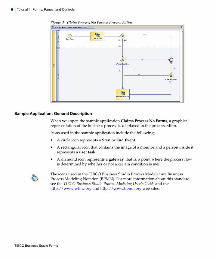
6 | Tutorial 1: Forms, Panes, and Controls
Figure 2 Claim Process No Forms: Process Editor
Sample Application: General Description
When you open the sample application Claims Process No Forms, a graphical representation of the business process is displayed in the process editor.
Icons used in the sample application include the following:
• A circle icon represents a Start or End Event.
• A rectangular icon that contains the image of a monitor and a person inside it represents a user task.
• A diamond icon represents a gateway, that is, a point where the process flow is determined by whether or not a certain condition is met.
The icons used in the TIBCO Business Studio Process Modeler are Business Process Modeling Notation (BPMN). For more information about this standard see the TIBCO Business Studio Process Modeling User's Guide and the http://www.wfmc.org and http://www.bpmn.org web sites.
TIBCO Business Studio Forms

| 7
Task C: Open the FormsTo open the form for a user task, right click the user task and click Form > Open.
Open the Capture Claim Form
There are two main tasks displayed in the Capture Claim business process: Capture Claim and Interview Witness.
To compare them in the form editor, open the Interview Witness form the same way you opened the Capture Claim form:
1. In the Process editor, right-click the Capture Claim task and select Form > Open.
Figure 3 Form Open.
The first time a form is opened, a warning pops up to inform you that “The customized form is no longer being automatically kept in sync with the activity interface.” This is because opening a form, rather than simply previewing it, causes the default form to become a customized form. For the tutorials in this chapter, we customize forms rather than using default forms, so ignore the warnings and click OK when you open a given form for the first time.
Since the tutorials in this Guide concentrate on procedures specific to forms, the data fields required for the Claims Process business process have already been created for you and added as parameters to the two user tasks. These steps are part of the business process modeling procedures that precede form modeling.
TIBCO Business Studio Forms

8 | Tutorial 1: Forms, Panes, and Controls
2. The Capture Claim form in the design view opens, as in Figure 4.
Figure 4 Capture Claim Form, Design Page
TIBCO Business Studio Forms
| 9
There are two tabs on the bottom of the pane, labeled Design and GWT Preview.
3. Click the GWT Preview tab to see the preview, as in Figure 5.
The GWT Preview tab is used to see how the form looks like at runtime. For an explanation of the Design tab, which is used for form modeling, and the preview tabs, which are used to preview and test the form, see The Design Tab and Preview Tabs on page 86.
TIBCO Business Studio Forms

10 | Tutorial 1: Forms, Panes, and Controls
Figure 5 Capture Claim Form, GWT Preview Page
Open the Interview Witness Form
To generate a form for this user task, do the following:
1. In the Process editor, right-click the Interview Witness task and select Form > Open.
TIBCO Business Studio Forms
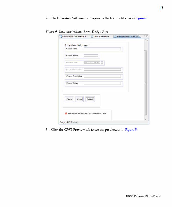
| 11
2. The Interview Witness form opens in the Form editor, as in Figure 6
Figure 6 Interview Witness Form, Design Page
3. Click the GWT Preview tab to see the preview, as in Figure 5.
TIBCO Business Studio Forms

12 | Tutorial 1: Forms, Panes, and Controls
Figure 7 Interview Witness Form, GWT Preview Page
4. If you select the Process editor again and the General tab, you can see the URL for the newly created form in the Form field:form://ProcessPackage/ClaimsProcessNoForms/InterviewWitness/ InterviewWitness.form
Save the process model with this new URL by typing Ctrl+S or clicking Save.
Task D: View FormsBusiness processes modeled with TIBCO Business Studio generally include elements called user tasks and gateways. In this task, examine the user tasks and gateways in the sample business process.
User Tasks
The two main user tasks in the sample business process are the Capture Claim task and the Interview Witness task, which differ in the kinds of user task parameters that are associated with some of the fields on these forms.
TIBCO Business Studio Forms
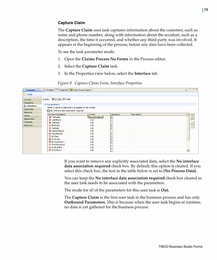
| 13
Capture Claim
The Capture Claim user task captures information about the customer, such as name and phone number, along with information about the accident, such as a description, the time it occurred, and whether any third party was involved. It appears at the beginning of the process, before any data have been collected.
To see the task parameter mode:
1. Open the Claims Process No Forms in the Process editor.
2. Select the Capture Claim task.
3. In the Properties view below, select the Interface tab.
Figure 8 Capture Claim Form, Interface Properties
If you want to remove any explicitly associated data, select the No interface data association required check box. By default, this option is cleared. If you select this check box, the text in the table below is set to [No Process Data].
You can keep the No interface data association required check box cleared as the user task needs to be associated with the parameters.
The mode for all of the parameters for this user task is Out.
The Capture Claim is the first user task in the business process and has only Outbound Parameters. This is because when the user task begins at runtime, no data is yet gathered for the business process.
TIBCO Business Studio Forms
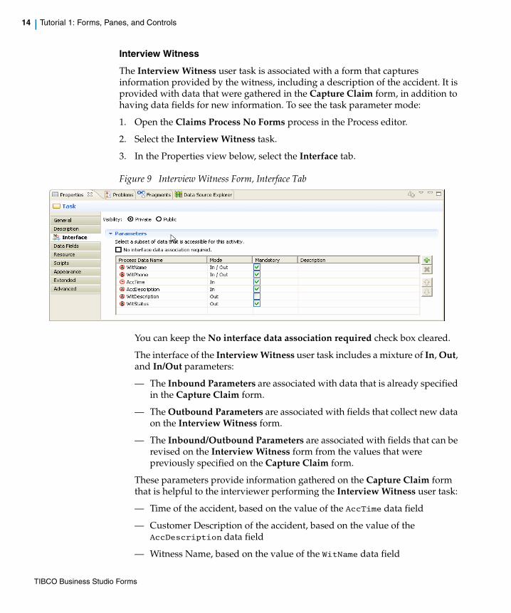
14 | Tutorial 1: Forms, Panes, and Controls
Interview Witness
The Interview Witness user task is associated with a form that captures information provided by the witness, including a description of the accident. It is provided with data that were gathered in the Capture Claim form, in addition to having data fields for new information. To see the task parameter mode:
1. Open the Claims Process No Forms process in the Process editor.
2. Select the Interview Witness task.
3. In the Properties view below, select the Interface tab.
Figure 9 Interview Witness Form, Interface Tab
You can keep the No interface data association required check box cleared.
The interface of the Interview Witness user task includes a mixture of In, Out, and In/Out parameters:
— The Inbound Parameters are associated with data that is already specified in the Capture Claim form.
— The Outbound Parameters are associated with fields that collect new data on the Interview Witness form.
— The Inbound/Outbound Parameters are associated with fields that can be revised on the Interview Witness form from the values that were previously specified on the Capture Claim form.
These parameters provide information gathered on the Capture Claim form that is helpful to the interviewer performing the Interview Witness user task:
— Time of the accident, based on the value of the AccTime data field
— Customer Description of the accident, based on the value of the AccDescription data field
— Witness Name, based on the value of the WitName data field
TIBCO Business Studio Forms
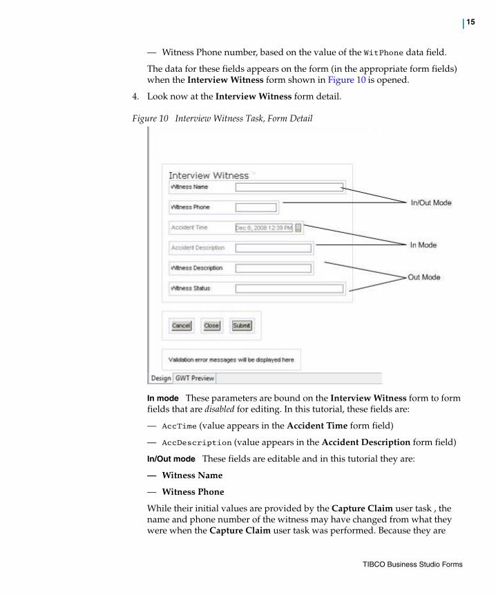
| 15
— Witness Phone number, based on the value of the WitPhone data field.
The data for these fields appears on the form (in the appropriate form fields) when the Interview Witness form shown in Figure 10 is opened.
4. Look now at the Interview Witness form detail.
Figure 10 Interview Witness Task, Form Detail
In mode These parameters are bound on the Interview Witness form to form fields that are disabled for editing. In this tutorial, these fields are:
— AccTime (value appears in the Accident Time form field)
— AccDescription (value appears in the Accident Description form field)
In/Out mode These fields are editable and in this tutorial they are:
— Witness Name
— Witness Phone
While their initial values are provided by the Capture Claim user task , the name and phone number of the witness may have changed from what they were when the Capture Claim user task was performed. Because they are
TIBCO Business Studio Forms
16 | Tutorial 1: Forms, Panes, and Controls
In/Out parameters, their current values appear when the Interview Witness form opens, but the interviewer can edit those values if necessary.
Out mode Two additional user task parameters in the Interview Witness user task are defined as Out mode parameters only are:
— WitDescription (Witness Description), which is the witness’s description of the accident to be specified on the form during the interview
— WitStatus (Witness Status), which is the status of the witness and is set programmatically based on buttons clicked by the interviewer.
Note how Out mode user task parameters correspond to In/Out mode form parameters. This is necessary to allow the form to be opened and saved multiple times. If the form parameter was Out mode, you would lose the previously typed text if you subsequently reopened the form before marking the work item as complete.
Gateways
In addition to the two user tasks, there are three gateways, indicated by diamond-shaped icons in the process diagram. When a gateway is reached, the flow of the process is determined by the value of a data item. This data item is based on information gathered from user input on the form associated with the user task that precedes the gateway:
• The first gateway, after the Capture Claim user task, is determined by the amount of the claim. If the claim is for a sum less than $500, then the process flow continues directly to the End Event. However, if the claim is for $500 or more, then the process flow continues to the next gateway.
• The second gateway is based on whether a witness is available to be interviewed; that is, if the Witness Available check box is selected on the Capture Claim form. If so, the process flow continues to the Interview Witness user task. If not, the process flow continues to the End Event.
• The third gateway is determined by whether the witness is to be interviewed again. If the interviewer clicks Completed, the process proceeds to the End Event. If the interviewer clicks Failed - Try again, the process returns to the Interview Witness user task. But if attempts to contact the witness have failed repeatedly, the interviewer needs to click Failed - Do not try again, and the business process proceeds to the End Event without the witness’s description having been captured on the form.
For more about how to use gateways in a business process, see TIBCO Business Studio Process Modeling User's Guide.
TIBCO Business Studio Forms

| 17
The tutorials that follow explain how to create two forms. By performing these tutorials, you learn about panes, controls, how to configure their properties, and how to enhance your forms with validation scripts and action scripts.
Task E: Add New Panes to the Capture Claim FormWhen forms are first generated, all of the automatically generated controls (corresponding to the user task parameters) appear in a single vertical pane. Creating more panes and moving related controls into each of them helps you organize the information on the form and control its visual layout, enhancing the usability of the form.
In addition to one vertical pane containing all the controls for the user task parameters, the generated form contains a message pane for displaying validation error messages and a horizontal pane for the Cancel, Close, and Submit buttons.
Now we add three new vertical panes in addition to the original vertical pane, and distribute the controls among the four resulting panes as follows:
• Customer Information Controls that gather information about the customer making the claim.
• Accident Information Controls that gather information about the accident.
• Third Party Information Controls that gather information about another person involved in the accident, if any.
• Witness Information Controls for capturing contact information for a witness to the accident, if any.
Create a New Pane
To create new panes and redistribute the controls among them, follow these steps:
1. Click the Design tab for the Capture Claim form on the Form Designer so that the form is visible in the Form Designer.
2. Show the palette, which contains buttons for adding panes and controls to a form. There are two ways to expand the palette:
a. Click the expand arrow that points leftward in the upper right corner. The arrow now points rightward. When expanded by this method, the palette remains visible (as the Palette view which is shared by all graphical editors and external to them) until the arrow is clicked again.
Figure 11 Show/Hide the Palette
b. Select Window > Show View... > Palette to open a Palette View that is shared between all open graphical editors.
TIBCO Business Studio Forms

18 | Tutorial 1: Forms, Panes, and Controls
3. Click the Vertical Pane item in the palette .
4. The Untitled Pane icon is attached to the mouse while you decide where to put the new pane.
Figure 12 Add New Pane: No Location Selected
5. Move the mouse above the existing Pane.
TIBCO Business Studio Forms
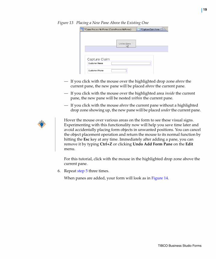
| 19
Figure 13 Placing a New Pane Above the Existing One
— If you click with the mouse over the highlighted drop zone above the current pane, the new pane will be placed above the current pane.
— If you click with the mouse over the highlighted area inside the current pane, the new pane will be nested within the current pane.
— If you click with the mouse above the current pane without a highlighted drop zone showing up, the new pane will be placed under the current pane.
For this tutorial, click with the mouse in the highlighted drop zone above the current pane.
6. Repeat step 5 three times.
When panes are added, your form will look as in Figure 14.
Hover the mouse over various areas on the form to see these visual signs. Experimenting with this functionality now will help you save time later and avoid accidentally placing form objects in unwanted positions. You can cancel the object placement operation and return the mouse to its normal function by hitting the Esc key at any time. Immediately after adding a pane, you can remove it by typing Ctrl+Z or clicking Undo Add Form Pane on the Edit menu.
TIBCO Business Studio Forms

20 | Tutorial 1: Forms, Panes, and Controls
Figure 14 Untitled Panes Added
7. Click the Save icon to save the project.
Task F: Modify Names and Labels of PanesThe values in the Name fields for panes and controls are particularly important and must be typed exactly because they are used in scripts to refer to these objects. Labeling panes to indicate the function of the controls they contain helps users to understand your forms quickly.
1. Click each untitled pane in the form.
2. In the Properties View General tab of each of the untitled panes:
— Click Rename to type the new names in the Name field, and click Finish.
You can also rename from the Outline view, or canvas context menu, or you can also use the standard F2 accelerator key.
— Replace pane labels in the Label field.
Careful labeling at the pane level also allows you to use shorter labels for the controls. For instance, by using the label Customer Information for the pane, you can include controls within it labeled Name and Phone, instead of Customer Name and Customer Phone.
TIBCO Business Studio Forms

| 21
Starting with the top-most pane, use the new names as shown in Table 2.
3. Save the form by typing Ctrl+S or clicking the Save button.
Task G: Drag Controls into Appropriate PanesOnce you have named and labeled the new vertical panes, drag each control to its appropriate pane and position the controls in the order in which they are listed. You can select multiple controls with Shift-Click or Ctrl-Click and drag at once.
Controls are listed below by their default labels; that is, by the text that appears within the control.
Modify these labels in subsequent steps:
1. Drag the following controls into the Customer Information pane:
a. Customer Name
b. Customer Phone
c. Customer Email
d. Birth Date
e. Customer Age
f. Guardian Name
Table 2 Name Labels
Label Name Label
pane3 cust_info_pane Customer Information
pane2 accident_info_pane Accident Information
pane1 third_pt_info_pane Third Party Information
root witness_info_pane Witness Information
Items selected by Shift-Clicking appear in vertical panes in reverse order from the order in which they were clicked. Although controls can easily be rearranged by dragging, you can ensure that they are added in the desired order by first clicking the control that you want positioned lowest, and proceeding in reverse order.
You can add user interface items to an existing form using the drag and drop gestures. See Using Drag and Drop Gesture to Customize a Form, page 128 for details.
TIBCO Business Studio Forms
22 | Tutorial 1: Forms, Panes, and Controls
g. Claim Amount
2. Drag the following controls into the Accident Information pane:
a. Accident Time
b. Personal Injury
c. Accident Description
d. Third Party Involved
e. Witness Available
3. Drag the following controls into the Third Party Information pane:
a. Third Party Name
b. Insurance Name
c. Insurance Number
d. Third Party Amount
4. Leave the following controls into the Witness Information pane:
a. Witness Name
b. Witness Phone
Modify Control Properties: Labels, Required, and Hint Values
The next step is to modify the labels and, in some cases, the Required and Hint properties of the controls by editing values on the controls’ property sheets.
1. Click the Customer Name control.
On the General tab of the control’s Properties View, change the value in the Label field to Name.
Labels are derived from the relevant datum label of the XPDL process.
If the user sets the datum label and Required and Hints properties manually, they will get overwritten next time parameters are synchronized.
The Required check box is already selected as the parameter CustName is defined as Mandatory at user task interface level.
TIBCO Business Studio Forms

| 23
Figure 15 Customer Name Parameter Defined as Mandatory
2. Similarly, change the label Customer Phone to Phone.
3. Add the following text to the Hint field for this control to illustrate the format that our application requires for phone numbers: Example (888) 888-8888.
In a real world situation, the required format for a phone number would be an application-specific requirement.
4. Change the label for Customer Email to Email.
5. Change the label for Birth Date to Date of Birth.
6. Make sure that the Required check box is selected, so that a value is required at runtime for this field.
7. Change the label for Customer Age to Age.
8. The Label and Required properties for the Guardian Name field do not need to be changed. However, you want to add the following text to the Hint field
The hint is intended to assist the user in typing a valid value for a control. It appears underneath the field when the form is rendered at runtime.
You want to require that a value be typed for either the Phone or the Email field, but both values will not be required. This functionality is best configured with a script, which will be presented in a later tutorial. You can leave the Required check box cleared for both Phone and Email.
Since you placed the above controls in a pane labeled Customer Information, it is not necessary to repeat the word Customer in the label for each control. This is generally a good practice because it results in a cleaner, easier-to-use form.
TIBCO Business Studio Forms

24 | Tutorial 1: Forms, Panes, and Controls
for this control to explain that a guardian’s name must be supplied if the customer is under 21 years old: If age is less than 21.
9. Change the label for Accident Time to Time of Accident.
Make sure that the Required check box is selected, so that a value is required at runtime.
10. Change the label for Accident Description to Customer Description.
11. Change the label for Insurance Name to Insurance Company.
12. Add the following text to the Hint field for the Witness Phone control to illustrate the format that our application requires for phone numbers: Example (888) 888-8888.
Modify Control Properties: Type and Enabled
In this step, you will modify other properties of selected controls in order to enhance the functionality of the Capture Claim form. The type of control that is generated from user task parameters, for instance, depends upon the type of the data fields from which those parameters are derived. The eight basic types for data fields in TIBCO Business Studio result in the following control types:
Often the generated control types are best, but there are many other control types to consider. In this part of the tutorial, you will change the type of several controls and configure the properties of the new types.
Table 3 Data Field Types
Data Field Type Control Type
String Text
Decimal Number Text
Integer Number Text
Boolean Checkbox
Datetime Datetime
Date Date
Time Time
Performer Text
TIBCO Business Studio Forms

| 25
The first control you will modify is Date of Birth, which was generated as a Date-Time control. The customer’s date of birth has a bearing on the insurance claim but the time does not. Therefore, you will change the type for this control from Date-Time to Date.
Changing Control Type
1. The type of the Age field is Text, which doesn’t need to be changed. But you want the value for this field to be calculated dynamically at runtime based on the value specified for the Date of Birth field. This means that you do not want a value to be typed by the user.
Disabling aControl
To make the field uneditable, clear the check box for the Enabled property for this control.
Figure 16 Making the Field CustAge Uneditable
2. The type of the Personal Injury field is Text and you will change it to Radiogroup, which ensures that a valid value will be specified, since the value will be chosen from among those you provide.
Click the optionlist for Control Type and select Radiogroup.
3. For a Radiogroup control the values of the radio buttons must be configured.
On the Properties tab, select auto for Choice Layout.
TIBCO Business Studio Forms
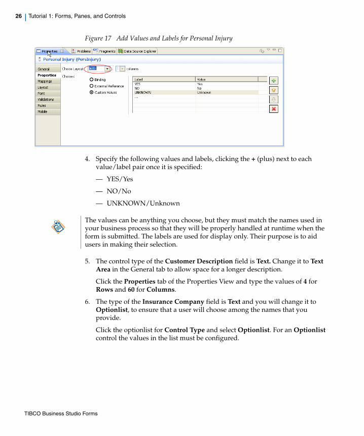
26 | Tutorial 1: Forms, Panes, and Controls
Figure 17 Add Values and Labels for Personal Injury
4. Specify the following values and labels, clicking the + (plus) next to each value/label pair once it is specified:
— YES/Yes
— NO/No
— UNKNOWN/Unknown
5. The control type of the Customer Description field is Text. Change it to Text Area in the General tab to allow space for a longer description.
Click the Properties tab of the Properties View and type the values of 4 for Rows and 60 for Columns.
6. The type of the Insurance Company field is Text and you will change it to Optionlist, to ensure that a user will choose among the names that you provide.
Click the optionlist for Control Type and select Optionlist. For an Optionlist control the values in the list must be configured.
The values can be anything you choose, but they must match the names used in your business process so that they will be properly handled at runtime when the form is submitted. The labels are used for display only. Their purpose is to aid users in making their selection.
TIBCO Business Studio Forms

| 27
7. Click the Properties tab for the Insurance Company control and type the following values and labels, clicking the Add button as needed next to the last value/label pair to add space for an additional empty optionlist value:
— UNKNOWN/Unknown
— GECKO/Gecko
— STATE FIRM/State Firm
— FORMERS/Formers
— FROGRESSIVE/Frogressive
8. If there are any extra labels, remove them by clicking on the Delete (X) button.
Modify Pane Properties: Visibility
Sometimes, the usability of your forms can be enhanced if you hide portions that do not apply to certain instances of the business process. If the relevance of a particular set of controls depends on a condition that is determined at runtime, you can place the dependent controls together in a pane and control the Visible property for that pane.
The tutorial will show you how binding can help configure the visibility of third party information pane based on third party involved parameter value. If there is no third party involved in the accident, the form should not show controls for reporting details about it. You will also configure the Witness Information pane to be visible based on whether the Witness Available parameter value is true or false. If no witness is available, the form should not show controls that gather information about the witness.
In this section you will begin configuring this functionality by binding the Visible property of the panes to corresponding parameter values. Binding can be added either from the General tab using the Add Binding icon or from the Mappings tab of the Properties view.
For information about bindings, see Bindings on page 78.
Bindings are created automatically between the controls and the parameter values when form is generated; for example, a two-way binding between Customer Name(CustName) parameter value and Name(CustName) control value. When a parameter value changes, the control value is updated automatically, and vice versa.
TIBCO Business Studio Forms
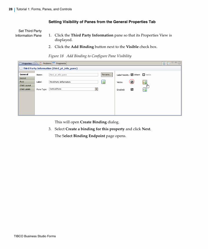
28 | Tutorial 1: Forms, Panes, and Controls
Setting Visibility of Panes from the General Properties Tab
Set Third PartyInformation Pane 1. Click the Third Party Information pane so that its Properties View is
displayed.
2. Click the Add Binding button next to the Visible check box.
Figure 18 Add Binding to Configure Pane Visibility
This will open Create Binding dialog.
3. Select Create a binding for this property and click Next.
The Select Binding Endpoint page opens.
TIBCO Business Studio Forms
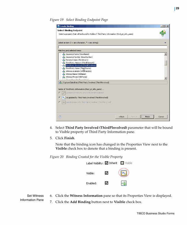
| 29
Figure 19 Select Binding Endpoint Page
4. Select Third Party Involved (ThirdPInvolved) parameter that will be bound to Visible property of Third Party Information pane.
5. Click Finish.
Note that the binding icon has changed in the Properties View next to the Visible check box to denote that a binding is present.
Figure 20 Binding Created for the Visible Property
Set WitnessInformation Pane
6. Click the Witness Information pane so that its Properties View is displayed.
7. Click the Add Binding button next to Visible check box.
TIBCO Business Studio Forms

30 | Tutorial 1: Forms, Panes, and Controls
8. Select Create a binding for this property and click Next.
9. Select the Witness Available (WitAvailable) parameter that will be bound to Visible property of Witness Information pane.
10. Click Finish.
Note that the binding icon has changed to denote that a binding is present.
Setting Visibility of Panes from the Mappings Tab
Perform the following steps to bind the Visible property of the Third Party Information pane to the Third Party Involved (ThirdPInvolved) parameter value using the Mappings tab:
1. Click the Third Party Information pane so that its Properties view is displayed.
2. Click the Mappings tab in the selected pane’s Properties view.
3. In the Mappings tab view, the right pane displays the bindable properties of the selected Third Party Information pane. The left pane displays the bindable source properties to which the target elements are bound. It displays the Third Party Information pane and its ancestors all the way up to the containing form and also includes the form parameters and data fields.
4. Drag the Third Party Involved (ThirdPInvolved) parameter from the source tree and drop it over the Third Party Information pane’s Visible property in the target tree.
5. This creates a bidirectional binding and is represented by a connecting line.
6. You need to edit this binding to change it to an unidirectional binding. Double click the connecting line to open the Edit Binding dialog box.
7. Select is updated by Third Party Involved (ThirdPInvolved) option.
8. Click Finish.
9. The connecting line now has an arrow end-point representing a unidirectional binding.
TIBCO Business Studio Forms

| 31
Figure 21 Adding Binding from the Mappings Tab
Configure the Interview Witness Form
Make the following changes to the Interview Witness form:
1. Add one vertical pane above the Interview Witness pane.
2. Change the new pane’s Name property to witness_info_pane and the Label property to Witness Contact Information.
3. Click the original Interview Witness pane.
4. Change its Name property (root) to accident_info_pane and the Label property to Accident Information.
5. Drag the following controls from the Accident Information pane to the Witness Contact Information pane: Witness Name and Witness Phone.
6. Change the Witness Contact Information pane’s control as follows:
— Witness Name into Name
— Witness Phone into Phone
7. In the Accident Information pane, verify that control labels are:
— Time of Accident (previously Accident Time)
— Customer Description (previously Accident Description)
— Witness Description
— Witness Status
TIBCO Business Studio Forms

32 | Tutorial 1: Forms, Panes, and Controls
8. Change the type of the Customer Description and Witness Description controls from Text to Text Area. On the Properties tab, specify values of 4 for Rows and 60 for Columns for each.
Add a Button
Add a button to the row of buttons at the bottom of the form.
1. Select the button type Close in the Palette and drag it and drop between the Close and Submit buttons in the Navigation pane.
Figure 22 Add a Button
Rename Buttons 2. In the General tab for each of the buttons, type new labels: for buttons, from left to right:
— Cancel leave as is
— Close Change label into Failed - Try Again
— Close (the new button) Specify label as Failed - Do Not Try Again
— Submit into Completed
With their new labels, the configured buttons should now look like this:
Summary of Tutorial 1In this tutorial, you learned how to generate forms from user tasks in a business process, organize and rearrange the objects on a form, and configure the panes and controls on the form by modifying their properties on the property views.
TIBCO Business Studio Forms
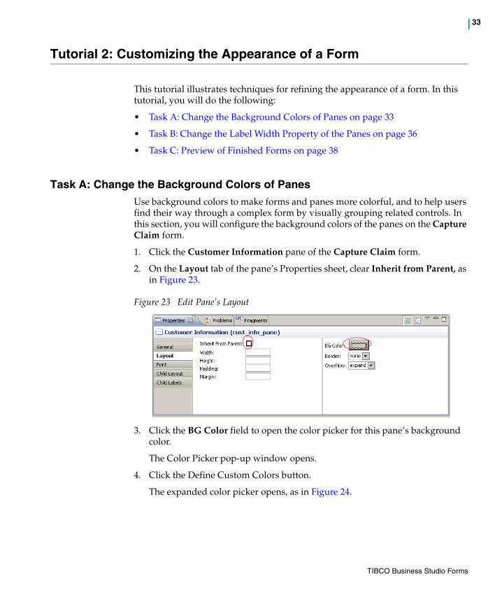
| 33
Tutorial 2: Customizing the Appearance of a Form
This tutorial illustrates techniques for refining the appearance of a form. In this tutorial, you will do the following:
• Task A: Change the Background Colors of Panes on page 33
• Task B: Change the Label Width Property of the Panes on page 36
• Task C: Preview of Finished Forms on page 38
Task A: Change the Background Colors of PanesUse background colors to make forms and panes more colorful, and to help users find their way through a complex form by visually grouping related controls. In this section, you will configure the background colors of the panes on the Capture Claim form.
1. Click the Customer Information pane of the Capture Claim form.
2. On the Layout tab of the pane’s Properties sheet, clear Inherit from Parent, as in Figure 23.
Figure 23 Edit Pane’s Layout
3. Click the BG Color field to open the color picker for this pane’s background color.
The Color Picker pop-up window opens.
4. Click the Define Custom Colors button.
The expanded color picker opens, as in Figure 24.
TIBCO Business Studio Forms

34 | Tutorial 2: Customizing the Appearance of a Form
Figure 24 Expanded Color Picker
5. In the expanded color picker, click one of the undefined (black) squares in the Custom colors group and type the following values in the RGB definition fields:
6. Save the custom color by clicking the Add to Custom Colors button in the color picker. This will make it easier to reuse the color in the Interview Witness form.
7. Click OK to set the Customer Information background to the new color.
Color Property Value
Red 238
Green 238
Blue 238
Be sure to save any custom background colors that you might want to reuse. A saved color will appear in the Custom Colors palette of the color picker, and will be available to panes in other forms in this business process, as well as other panes on the same form.
Note that the Windows color picker saves each custom color to one of the 14 color boxes that are arranged in two rows beneath the Basic colors section. Each of these boxes is black until it is used to hold a custom color. Click one of the unused boxes to hold the custom color before you click Add to Custom Colors, or the color you add may overwrite a color you previously saved.
TIBCO Business Studio Forms

| 35
8. Repeat steps 1 through 5 for the Accident Information pane to set its background color to light blue with these values:
9. Again, save the custom color by clicking the Add to Custom Colors button in the color picker. This color will be reused in the next two panes of this form, as well as in the Interview Witness form.
10. Click OK to set the Accident Information pane’s background to the new color.
11. Click the Third Party Information pane. Use the procedure above to set its color to the saved custom blue.
12. Click the Witness Information pane. Use the procedure above to set its color to the saved custom blue.
13. Click the message pane to set the background color for this pane to pale red with these values:
14. Set the Margin property for the message pane to 20 to allow space between the pane and the buttons.
15. Now that your custom colors are defined, you can quickly set the background colors for the panes of the Interview Witness form.
Color Property Value
Red 194
Green 223
Blue 254
Setting the background of the Third Party Information and Witness Information panes to the same pale blue as that of the Accident Information pane, suggests visually to the user that, although they are shown only when relevant to a particular claim, the two additional panes belong with the Accident Information pane in terms of content and function. Using background colors in this way helps users more quickly comprehend the layout and organization of a form.
Color Property Value
Red 255
Green 128
Blue 128
TIBCO Business Studio Forms

36 | Tutorial 2: Customizing the Appearance of a Form
Set the color to pale gray for the Witness Contact Information pane, blue for the Accident Information pane, and red for the message pane.
16. Set the Margin property for the message pane of the Interview Witness form to 20, as you did with the Capture Claim form’s message pane.
Task B: Change the Label Width Property of the PanesWith the default settings, each pane is set to Use Form Defaults to determine the Child Labels settings for the controls it contains, as shown in Figure 25.
Figure 25 Child Labels Settings
In the above example, then, the Label Width property for controls placed in this pane is not 120 (that is, the value in the Label Width field is ignored), but is based on form settings.
If no width is set at the form level, each vertical pane will align its controls so that all the fields it contains are vertically aligned, though their labels are of differing widths. This is done on a pane-by-pane basis, so that the fields on different panes won’t necessary be vertically aligned.
In this section, you will modify the Child Label properties at the pane level so that all controls on the form have their fields vertically aligned. To do this, you will set the label width (in pixels) for all fields to a length sufficient to contain the longest label. In addition, you will set the label position property to left instead of top so that control labels appear to the left of the control.
Modify the Form Level Child Labels Properties
To edit a form so that the labels are the same width as the control labels:
1. Click the Capture Claim form outside of any pane to select the form itself.
2. Click the Child Labels tab.
TIBCO Business Studio Forms
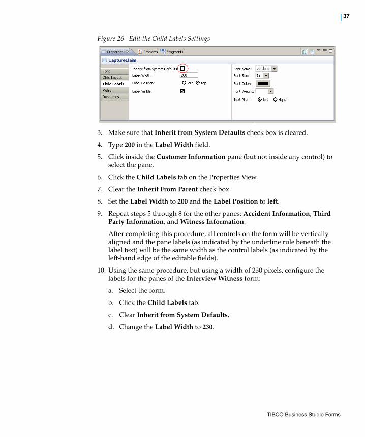
| 37
Figure 26 Edit the Child Labels Settings
3. Make sure that Inherit from System Defaults check box is cleared.
4. Type 200 in the Label Width field.
5. Click inside the Customer Information pane (but not inside any control) to select the pane.
6. Click the Child Labels tab on the Properties View.
7. Clear the Inherit From Parent check box.
8. Set the Label Width to 200 and the Label Position to left.
9. Repeat steps 5 through 8 for the other panes: Accident Information, Third Party Information, and Witness Information.
After completing this procedure, all controls on the form will be vertically aligned and the pane labels (as indicated by the underline rule beneath the label text) will be the same width as the control labels (as indicated by the left-hand edge of the editable fields).
10. Using the same procedure, but using a width of 230 pixels, configure the labels for the panes of the Interview Witness form:
a. Select the form.
b. Click the Child Labels tab.
c. Clear Inherit from System Defaults.
d. Change the Label Width to 230.
TIBCO Business Studio Forms

38 | Tutorial 2: Customizing the Appearance of a Form
11. Using the same procedure, configure the control labels Witness Contact Information and Accident Information on the Interview Witness form:
a. Select each pane in turn and click the Child Labels tab.
b. Clear Inherit From Parent.
c. Set the Label Width to 230.
d. Set the Label Position to left.
All controls on the Interview Witness form will now be vertically aligned and the pane labels will be the same width as the control labels.
Task C: Preview of Finished FormsAfter you have finished all steps described in the first tutorial and tasks A and B, the Interview Witness form appears as displayed in Figure 27.
Figure 27 Tutorial 2: Interview Witness Form Design Page
The Capture Claim form appears as displayed in Figure 28.
TIBCO Business Studio Forms
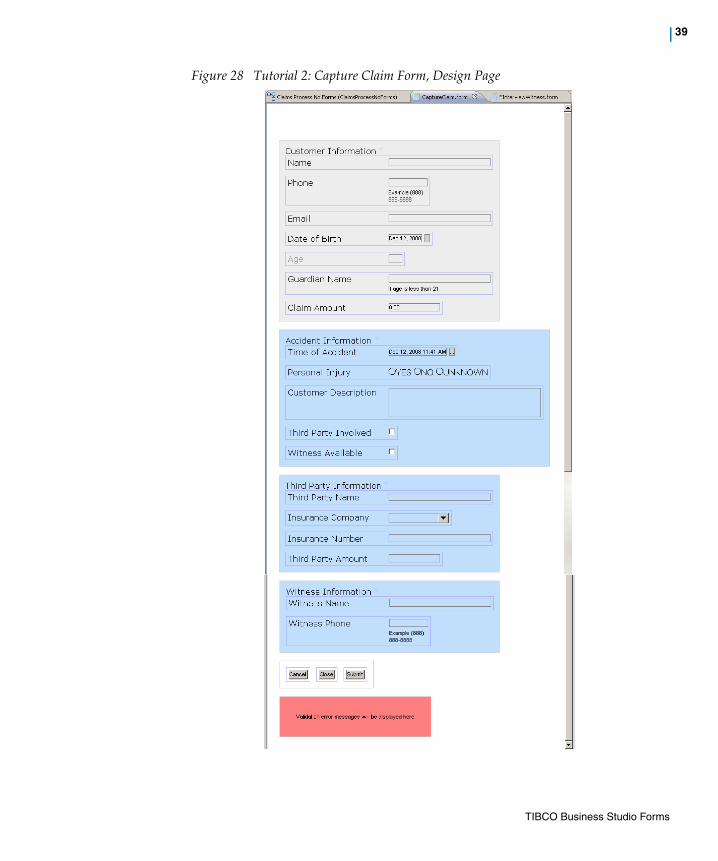
| 39
Figure 28 Tutorial 2: Capture Claim Form, Design Page
TIBCO Business Studio Forms

40 | Tutorial 2: Customizing the Appearance of a Form
Summary of Tutorial 2This tutorial showed how to change some of the visual characteristics of a form to make the form more pleasing in appearance and easier to use. The background color can be used to set off groups of controls that belong together, and the label widths can be adjusted so that all fields on the form are vertically aligned.
TIBCO Business Studio Forms

| 41
Tutorial 3: Validations
This tutorial shows how use scripts to create validation rules for controls. These scripts will validate the data specified by the user at runtime. In this tutorial, you will create validation scripts for individual controls on the Capture Claim form.
To complete this tutorial, follow these steps:
• Task A: Switch to Solution Design Mode on page 41
• Task B: Add Validation for Phone Field on page 42
• Task C: Add Syntax Validation for Email Field on page 45
• Task D: Add a Second Validation for Email Field on page 46
• Task E: Add Validation for Date of Birth Field on page 46
• Task F: Examine Auto-Generated Validation for Age Field on page 47
• Task G: Edit Validation for Claim Amount Field on page 48
• Task H: Add Validation for Time of Accident Field on page 49
• Task I: Add Validation for Phone Field on page 49
Task A: Switch to Solution Design Mode
To change mode from Business Analysis to Solution Design, click the “triangle and rule” toolbar button to open the dropdown list that lets you select the desired mode.
Figure 29 Change to Solution Design Mode.
You must be in the Solution Design mode to create scripts, or to see the Validations tabs in the property sheets.
TIBCO Business Studio Forms

42 | Tutorial 3: Validations
Task B: Add Validation for Phone FieldThis validation script checks the phone number specified by the user to make sure it is in a format that can be properly handled by our business process application.
1. On the Capture Claim form, click the Phone field.
2. Click the Validations tab on the control’s Properties View.
3. Click the Add New Validation button.
The Define Validation page of the Define Validation dialog opens.
Figure 30 Define Validation Page
4. In the Name field type the following:phone_number_syntax
5. Select On Value Change radio button.
6. Type the following JavaScript code in the Script text area:
TIBCO Business Studio Forms

| 43
//Retrieve the phone valuevar phone = this.getValue();if(phone != null && phone != ""){ //verify it is in the format 888-888-8888 var strippedPhone = ''; var strippedPhone = ''; for(var i=0; i<phone.length; i++){ var c = phone.charAt(i); var isNonDigitChar = isNaN(parseInt(c)); if(!isNonDigitChar){ // check if c is a digit strippedPhone += c; } } strippedPhone.length == 10;} else{ true;}
7. Select the Message type as Custom and type the following text in the Message area: Phone number must be of the form: (888) 888-8888.
TIBCO Business Studio Forms

44 | Tutorial 3: Validations
Figure 31 Completed Validation Definition for the Phone Field
TIBCO Business Studio Forms

| 45
An error message will be displayed if text is specified in an invalid format.
8. Click Finish.
Task C: Add Syntax Validation for Email Field1. Click the Email field.
2. Click the Validations tab on the control’s Properties View.
3. Click the Add New Validation button.
The Define Validation dialog opens.
4. In the Name field type the following:email_syntax
5. Click the radio button On Form Submit.
6. Type the following JavaScript code in the Script text area:
var email = this.getValue();if(email != null && email != ""){ //Match format [email protected] var match = RegExp("(.)+@(.)+\\.(.)+").test(email); match;} else{true;}
7. Type the following text in the Message area: Email must be of the form [email protected].
8. Click Finish.
When you select On Value Change, the error message is displayed when the user specifies an invalid value and then clicks in another field, that is, at the moment the Phone field loses focus. The other option is to set the validation script to run when the form is submitted, or when the user has completed the form and clicked the Submit button. Consider which of the two options is more convenient for your user, depending on the nature of the validation. Generally, validations of the syntax of specified values are best performed when the field value is updated.
When more than one control is involved, such as when you want to ensure that at least one of two or more fields are filled in, you can choose On Form Submit. You will see this below, in the validation for the Email field, when you create a validation script to ensure that the user provides either the customer’s phone number or email address, but not necessarily both.
TIBCO Business Studio Forms

46 | Tutorial 3: Validations
Task D: Add a Second Validation for Email Field This validation will ensure that a value is specified for either the Email or Phone field. The user is not required to provide values for both in this application.
1. Click the Email field.
2. Click the Validations tab on the control’s Properties View.
3. Click the Add New Validation button.
The Define Validation dialog opens.
4. In the Name field specify the following:email_or_phone_required
5. Click the radio button On Value Change.
6. Type the following JavaScript code in the Script text area:
//Check one of email and phone fields are enteredif((f.CustPhone == null || f.CustPhone == "") && (f.CustEmail == null || f.CustEmail == "")){ false; } else{ true; }
7. Type the following text in the Message area: Either customer phone number or email address must be entered.
8. Click Finish.
Task E: Add Validation for Date of Birth Field1. Click the Date of Birth field.
2. Click the Validations tab on the control’s Properties View.
3. Click the Add New Validation button.
The Define Validation dialog opens.
4. In the Name field type the following: birth_date_validation
5. Click the radio button On Value Change.
Using names for validation scripts that describe their function makes it easier for another designer to understand the form later if modifications must be made.
TIBCO Business Studio Forms
| 47
6. Type the following JavaScript code in the Script text area:
var date = this.getValue();var now = new Date();//Validate birth date some time before today's date and//within 120 yearsif(date == null || (date < now && now.getFullYear() - date.getFullYear() < 120)){ true;} else{ false; }
7. Type the following text in the Message area: Enter a valid birth date which is a past date and in the range of last 120 years.
8. Click Finish.
Task F: Examine Auto-Generated Validation for Age Field In this task you will examine an auto-generated validation script and edit its error message. Form fields, like the Age field, that are auto-generated from user task parameters that are themselves based on Integer Number data fields include a validation script that checks that the runtime input is a number. The auto-generated script also checks that the value is not longer than 3 digits. The allowed length is based on the length property of the data field from which the control is generated.
To see the Properties View for the CustAge data field:
1. Select the data field in the Project Explorer under the process package for ProcessWithNoForms.
TIBCO Business Studio Forms
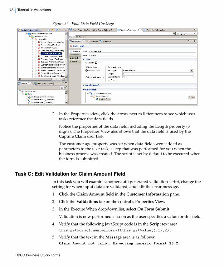
48 | Tutorial 3: Validations
Figure 32 Find Date Field CustAge
2. In the Properties view, click the arrow next to References to see which user tasks reference the data fields.
Notice the properties of the data field, including the Length property (3 digits). The Properties View also shows that the data field is used by the Capture Claim user task.
The customer age property was set when data fields were added as parameters to the user task, a step that was performed for you when the business process was created. The script is set by default to be executed when the form is submitted.
Task G: Edit Validation for Claim Amount FieldIn this task you will examine another auto-generated validation script, change the setting for when input data are validated, and edit the error message.
1. Click the Claim Amount field in the Customer Information pane.
2. Click the Validations tab on the control’s Properties View.
3. In the Execute When dropdown list, select On Form Submit.
Validation is now performed as soon as the user specifies a value for this field.
4. Verify that the following JavaScript code is in the Script text area:this.getForm().numberFormat(this.getValue(),17,2);
5. Verify that the text in the Message area is as follows: Claim Amount not valid. Expecting numeric format 15.2.
TIBCO Business Studio Forms
| 49
Task H: Add Validation for Time of Accident Field 1. Click the Time of Accident field.
2. Click the Validations tab on the control’s Properties View.
3. Click the Add New Validation button.
The Define Validation dialog opens.
4. In the Name field type the following:accident_time_validation
5. Click the radio button On Value Change.
6. Type the following JavaScript code in the Script text area:
//Accident time must not be in the futurevar accTime = this.getValue();var now = new Date();if(now < accTime){ false;} else{ true; }
7. Edit the text in the Message area to the following: Accident time must not be in the future.
8. Click Finish.
Task I: Add Validation for Phone Field 1. In the Witness Information pane, click the Witness Phone field.
2. Click the Validations tab on the control’s Properties View.
3. Click the Add New Validation button.
The Define Validation dialog opens.
4. In the Name field type the following: phone_number_syntax
5. Select the On Value Change. radio button.
6. Type the following JavaScript code in the Script text area:
//Retrieve the phone valuevar phone = this.getValue();if(phone != null && phone != ""){ //verify it is in the format 888-888-8888 var strippedPhone = '';
TIBCO Business Studio Forms
50 | Tutorial 3: Validations
var strippedPhone = ''; for(var i=0; i<phone.length; i++){ var c = phone.charAt(i); var isNonDigitChar = isNaN(parseInt(c)); if(!isNonDigitChar){ // check if c is a digit strippedPhone += c; } } strippedPhone.length == 10;} else{ true;}
7. Type the following text in the Message area: Phone number must be of the form (888) 888-8888.
8. Click Finish.
Summary of Tutorial 3This tutorial showed how to create validations for fields on a form to ensure that valid data are specified by the user at runtime.
TIBCO Business Studio Forms

| 51
Tutorial 4: Rules, Events, and Actions
This tutorial shows how to create rules that fire when a pre-defined event(s) occur and invoke actions associated with them.
The following tasks are explained:
• Task A: Create a Rule to Compute Age (Capture Claim Form), page 51
• Task B: Create Rule to Update Required Option for Guardian When Age < 21, page 53
• Task C: Create Rule to Round Amount to Nearest Dollar, page 56
• Task D: Create Rules that Display Hint on Specifying Claim Amount Controls, page 58
• Task E: Create Rules that Hide Hints on Exiting Amount Controls, page 60
• Task F: Create Rules to Display Context-Specific Hints on Specifying Customer Description Control, page 61
• Task G: Create Rules to Hide Hints on Exiting Customer Description Control, page 63
• Click Finish twice., page 63
Task A: Create a Rule to Compute Age (Capture Claim Form)The rule you will create in this section will:
• Listen for changes in the value of Birth Date (BirthDate) parameter.
• Create a computation action that will compute age based on updates to the value of BirthDate parameter and Customer Age(CustAge) parameters. Since there is already a binding between Customer Age(CustAge) parameter and Age(CustAge) control, the Age control will be automatically updated with the computed value.
1. Select the parameter Customer Age (CustAge) from the Data node of the Outline View on the Capture Claim form.
It is best practice to listen on parameter update events and modify the parameter values as part of rules that will propagate changes through bindings rather than directly updating the control values. This will avoid the need to write the form open scripts when parameter change events occur as part of form initialization.
TIBCO Business Studio Forms
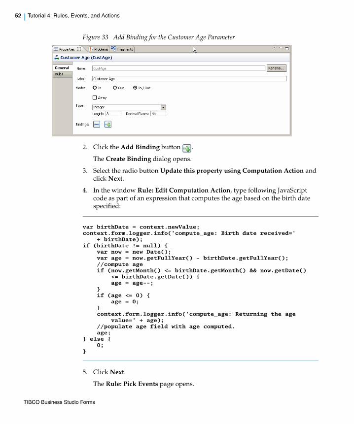
52 | Tutorial 4: Rules, Events, and Actions
Figure 33 Add Binding for the Customer Age Parameter
2. Click the Add Binding button .
The Create Binding dialog opens.
3. Select the radio button Update this property using Computation Action and click Next.
4. In the window Rule: Edit Computation Action, type following JavaScript code as part of an expression that computes the age based on the birth date specified:
var birthDate = context.newValue;context.form.logger.info('compute_age: Birth date received='
+ birthDate);if (birthDate != null) {
var now = new Date();var age = now.getFullYear() - birthDate.getFullYear();//compute ageif (now.getMonth() <= birthDate.getMonth() && now.getDate()
<= birthDate.getDate()) {age = age--;
}if (age <= 0) {
age = 0;}context.form.logger.info('compute_age: Returning the age
value=' + age);//populate age field with age computed.age;
} else {0;
}
5. Click Next.
The Rule: Pick Events page opens.
TIBCO Business Studio Forms

| 53
6. Click (plus) button to select an event.
The Select Event dialog opens.
Figure 34 Select Event Dialog
7. Select Update property of the parameter Birth Date (BirthDate).
8. Click OK.
9. Click Finish.
Task B: Create Rule to Update Required Option for Guardian When Age < 21As part of this task, you will create a rule that updates the required option on the control Guardian Name based on Customer Age parameter value.
1. Select parameter Customer Age (CustAge) from the Data node of Outline View on the Capture Claim form.
2. Click the Rules tab on the Properties View.
Figure 35 Select the Event Type
Test your script by clicking the GWT Preview tab, specifying a value for the birth date, and pressing the Enter key. The calculated age will appear in the Age field.
TIBCO Business Studio Forms

54 | Tutorial 4: Rules, Events, and Actions
3. Click Add button next to the event type Update (update).
The Rule Details page opens.
Figure 36 Rule Details Page
4. Type the following values for the input fields on Rule Details screen and click Next:
— Name: set_guardian_required
— Label: Guardian required when Age < 21.
5. Leave the Update (update) event type in the Rule: Pick Events page unchanged and click Next.
The page Define Actions opens.
Figure 37 New Rule Dialog, Define Actions Page
TIBCO Business Studio Forms
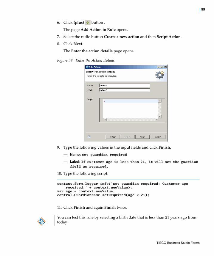
| 55
6. Click (plus) button .
The page Add Action to Rule opens.
7. Select the radio button Create a new action and then Script Action.
8. Click Next.
The Enter the action details page opens.
Figure 38 Enter the Action Details
9. Type the following values in the input fields and click Finish.
— Name: set_guardian_required
— Label: If customer age is less than 21, it will set the guardian field as required.
10. Type the following script:
context.form.logger.info('set_guardian_required: Customer age received:' + context.newValue);
var age = context.newValue;control.GuardianName.setRequired(age < 21);
11. Click Finish and again Finish twice.
You can test this rule by selecting a birth date that is less than 21 years ago from today.
TIBCO Business Studio Forms
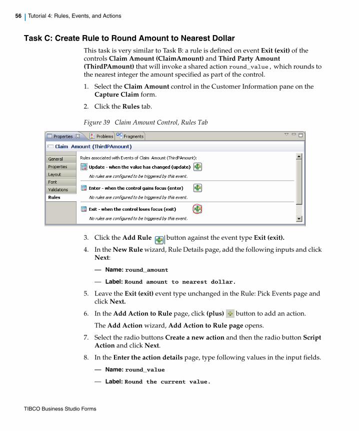
56 | Tutorial 4: Rules, Events, and Actions
Task C: Create Rule to Round Amount to Nearest DollarThis task is very similar to Task B: a rule is defined on event Exit (exit) of the controls Claim Amount (ClaimAmount) and Third Party Amount (ThirdPAmount) that will invoke a shared action round_value, which rounds to the nearest integer the amount specified as part of the control.
1. Select the Claim Amount control in the Customer Information pane on the Capture Claim form.
2. Click the Rules tab.
Figure 39 Claim Amount Control, Rules Tab
3. Click the Add Rule button against the event type Exit (exit).
4. In the New Rule wizard, Rule Details page, add the following inputs and click Next:
— Name: round_amount
— Label: Round amount to nearest dollar.
5. Leave the Exit (exit) event type unchanged in the Rule: Pick Events page and click Next.
6. In the Add Action to Rule page, click (plus) button to add an action.
The Add Action wizard, Add Action to Rule page opens.
7. Select the radio buttons Create a new action and then the radio button Script Action and click Next.
8. In the Enter the action details page, type following values in the input fields.
— Name: round_value
— Label: Round the current value.
TIBCO Business Studio Forms
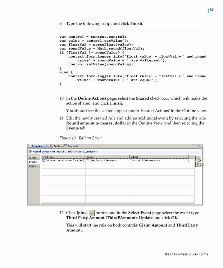
| 57
9. Type the following script and click Finish.
var control = context.control;var value = control.getValue();var floatVal = parseFloat(value);var roundValue = Math.round(floatVal);if (floatVal != roundValue) {
context.form.logger.info('float value' + floatVal + ' and round value' + roundValue + ' are different');
control.setValue(roundValue);} else {
context.form.logger.info('float value' + floatVal + ' and round value' + roundValue + ' are equal');
}
10. In the Define Actions page, select the Shared check box, which will make the action shared, and click Finish.
You should see this action appear under 'Shared Actions' in the Outline view.
11. Edit the newly created rule and add an additional event by selecting the rule Round amount to nearest dollar in the Outline View, and then selecting the Events tab.
Figure 40 Edit an Event
12. Click (plus) button and in the Select Event page select the event type Third Party Amount (ThirdPAmount), Update and click OK.
This will start the rule on both controls: Claim Amount and Third Party Amount.
TIBCO Business Studio Forms
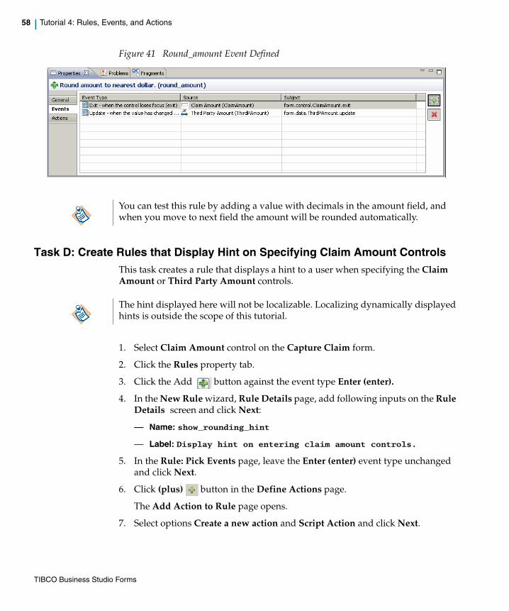
58 | Tutorial 4: Rules, Events, and Actions
Figure 41 Round_amount Event Defined
Task D: Create Rules that Display Hint on Specifying Claim Amount ControlsThis task creates a rule that displays a hint to a user when specifying the Claim Amount or Third Party Amount controls.
1. Select Claim Amount control on the Capture Claim form.
2. Click the Rules property tab.
3. Click the Add button against the event type Enter (enter).
4. In the New Rule wizard, Rule Details page, add following inputs on the Rule Details screen and click Next:
— Name: show_rounding_hint
— Label: Display hint on entering claim amount controls.
5. In the Rule: Pick Events page, leave the Enter (enter) event type unchanged and click Next.
6. Click (plus) button in the Define Actions page.
The Add Action to Rule page opens.
7. Select options Create a new action and Script Action and click Next.
You can test this rule by adding a value with decimals in the amount field, and when you move to next field the amount will be rounded automatically.
The hint displayed here will not be localizable. Localizing dynamically displayed hints is outside the scope of this tutorial.
TIBCO Business Studio Forms

| 59
8. Type the following values in the input fields:
— Name: show_rounding_hint
— Label: Display hint on entering.
9. Type this script and click Finish:
var hint = "The value will be rounded to nearest dollar";
context.control.setHint(hint);
10. In the Define Actions page, select Shared check box against the action.
This will make the action shared.
11. Click Finish.
12. Edit the newly created rule and add an additional event by selecting the rule Display hint on entering claim amount controls in the Outline View, and then selecting the Events tab.
13. Click (plus) button and in the Select Event page select the event type Third Party Amount (ThirdPAmount), Update and click OK.
This will make the rule to be invoked on specifying both the controls Claim Amount and Third Party Amount.
As a result, whenever you specify data for the controls Claim Amount and Third Party Amount, the hint will be displayed.
Note that the control Third Part Amount will be visible only if the third party was involved in the accident, which is not the case in this tutorial. In the step Set Third Party Information Pane on page 28 we decided to make the Third Part Information pane invisible in case there is no third party involved in this accident.
TIBCO Business Studio Forms

60 | Tutorial 4: Rules, Events, and Actions
Task E: Create Rules that Hide Hints on Exiting Amount ControlsThis task creates a rule that hides the hint created in the previous rule as part of Task D when exiting the Claim Amount or Third Party Amount controls.
1. Select Claim Amount control on the Capture Claim form.
2. Click the Rules tab.
3. Click the Add button against the event type Exit (exit).
4. Add the following inputs on the Rule Details screen and click Next:
— Name: hide_rounding_hint
— Label: Hide hint on exiting claim amount controls.
5. In the Rule: Pick Events page, leave the Exit (exit) event type unchanged in the Choose Events page and click Next.
6. Click (plus) button in the Define Actions page.
The Add Action to Rule page opens.
7. Select options Create a new action and Script Action and click Next.
8. Type the following values in the input fields.
— Name: hide_rounding_hint
— Label: Hide hint on exiting.
9. Type this script and click Finish:var hint = "";
context.control.setHint(hint);
10. In the Define Actions page, select Shared check box against the action.
This will make the action shared.
11. Click Finish.
12. Edit the newly created rule and add an additional event by selecting the rule Hide hint on exiting claim amount controls in the Outline View, and then selecting the Events tab.
13. Click (plus) button and in the Select Event page select the event type Third Party Amount (ThirdPAmount), Update and click OK.
This will start the rule when specifying the controls Claim Amount and Third Party Amount.
As a result, whenever you exit the controls Claim Amount and Third Party Amount, the hint will be hidden.
TIBCO Business Studio Forms
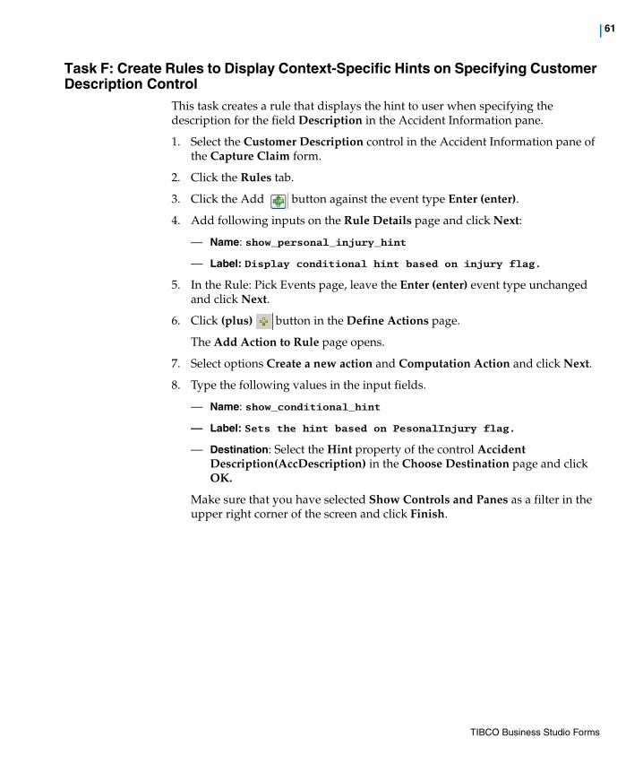
| 61
Task F: Create Rules to Display Context-Specific Hints on Specifying Customer Description Control
This task creates a rule that displays the hint to user when specifying the description for the field Description in the Accident Information pane.
1. Select the Customer Description control in the Accident Information pane of the Capture Claim form.
2. Click the Rules tab.
3. Click the Add button against the event type Enter (enter).
4. Add following inputs on the Rule Details page and click Next:
— Name: show_personal_injury_hint
— Label: Display conditional hint based on injury flag.
5. In the Rule: Pick Events page, leave the Enter (enter) event type unchanged and click Next.
6. Click (plus) button in the Define Actions page.
The Add Action to Rule page opens.
7. Select options Create a new action and Computation Action and click Next.
8. Type the following values in the input fields.
— Name: show_conditional_hint
— Label: Sets the hint based on PesonalInjury flag.
— Destination: Select the Hint property of the control Accident Description(AccDescription) in the Choose Destination page and click OK.
Make sure that you have selected Show Controls and Panes as a filter in the upper right corner of the screen and click Finish.
TIBCO Business Studio Forms

62 | Tutorial 4: Rules, Events, and Actions
Figure 42 Choose Hint Property of the AccDescription Control
9. Type the following expression:
var personalInjury = control.PersInjury.getValue();var hint = '';if (personalInjury == 'YES') {
hint = 'Please describe personal injury.';}hint;
10. Click Finish twice.
As a result of this rule, when option yes is selected for Personal Injury a hint will be displayed when specifying the Description value.
TIBCO Business Studio Forms

| 63
Task G: Create Rules to Hide Hints on Exiting Customer Description ControlThis task creates a rule that hides the hint that is created in the previous rule as part of Task F when exiting the Description control.
1. Select Customer Description control on the form Capture Claim and click the Rules tab.
2. Click the button against the event type Exit (exit).
3. In the Create New Rule wizard, add following inputs in the Rule Details page and click Next:
— Name: hide_conditional_hint
— Label: Hide hint on exiting claim amount controls.
4. Leave the Exit (exit) event type unchanged and click Next.
5. Click (plus) button in the Define Actions page.
The Add Action to Rule page opens.
6. Select options Create a new action and Computation Action and click Next.
7. Type the following values in the input fields.
— Name: hide_conditional_hint
— Label: Hide the hint.
— Destination: Select the Hint property of control Accident Description (AccDescription) and click OK.
— Destination: Select the Hint property of the control Accident Description (AccDescription) in the Choose Destination page and click OK.
Make sure that you have selected Show Controls and Panes as a filter in the upper right corner of the screen and click Finish.
8. Type the following expression: '';
9. Click Finish twice.
Whenever you exit the Customer Description control, its hint will be hidden.
TIBCO Business Studio Forms
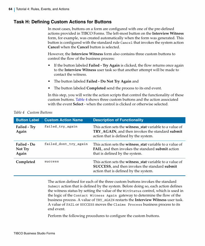
64 | Tutorial 4: Rules, Events, and Actions
Task H: Defining Custom Actions for ButtonsIn most cases, buttons on a form are configured with one of the pre-defined actions provided in TIBCO Forms. The left-most button on the Interview Witness form, for example, was created automatically when the form was generated. This button is configured with the standard rule Cancel that invokes the system action Cancel when the Cancel button is selected.
However, the Interview Witness form also contains three custom buttons to control the flow of the business process:
• If the button labeled Failed - Try Again is clicked, the flow returns once again to the Interview Witness user task so that another attempt will be made to contact the witness.
• The button labeled Failed - Do Not Try Again and
• The button labeled Completed send the process to its end event.
In this step, you will write the action scripts that control the functionality of these custom buttons. Table 4 shows three custom buttons and the action associated with the event Select - when the control is clicked or otherwise selected.
The action defined for each of the three custom buttons invokes the standard Submit action that is defined by the system. Before doing so, each action defines the witness status by setting the value of the WitStatus control, which is used in the logic of the Contact Witness Again gateway to determine the flow of the business process. A value of TRY_AGAIN restarts the Interview Witness user task. A value of FAIL or SUCCESS moves the Claims Process business process to its end event.
Perform the following procedures to configure the custom buttons.
Table 4 Custom Buttons
Button Label Custom Action Name Description of Functionality
Failed - Try Again
failed_try_again This action sets the witness_stat variable to a value of TRY_AGAIN, and then invokes the standard submit action that is defined by the system.
Failed - Do Not Try Again
failed_dont_try_again This action sets the witness_stat variable to a value of FAIL, and then invokes the standard submit action that is defined by the system.
Completed success This action sets the witness_stat variable to a value of SUCCESS, and then invokes the standard submit action that is defined by the system.
TIBCO Business Studio Forms

| 65
Configure the Failed - Try Again Button
1. Open the Interview Witness form in the Form Designer.
2. Click the Failed - Try Again button and view its Properties View.
3. Click the Rules tab on the Properties View.
4. Click the Add button against the event type Select (select).
5. Add following inputs in the Rule Details page and click Next:
— Name: failed_try_again
— Label: Witness status = "TRY_AGAIN"
6. Leave the Select (select) event type unchanged in the Rule: Pick Events page and click Next.
7. Click (plus) button in the Define Actions page.
The Add Action to Rule page opens.
8. Select options Create a new action and Script Action and click Next.
9. Type the following values in the input fields.
— Name: failed_try_again
— Label: Witness status = "TRY_AGAIN"
10. Type this script:this.getForm().getControl("witstatus").setValue("TRY_AGAIN");
this.getForm().invokeAction("submit",this);
11. Click Finish twice.
Configure the Failed - Do Not Try Again Button
1. Open the Interview Witness form in the Form Designer if it is not already open.
2. Click the Failed - Do Not Try Again button and view its Properties View.
3. Click the Rules tab on the Properties View.
4. Click the Add button against the event type Select (select).
5. Add following inputs in the Rule Details page and click Next:
— Name: failed_dont_try_again
— Label: Submit with witness status = "FAILED"
6. Leave the Select(select) event type unchanged in the Choose Events page and click Next.
TIBCO Business Studio Forms
66 | Tutorial 4: Rules, Events, and Actions
7. Click (plus) button in the Define Actions page.
The Add Action to Rule page opens.
8. Select options Create a new action and Script Action and click Next.
9. Type the following values in the input fields.
— Name: failed_dont_try_again
— Label: Submit with witness status = "FAILED"
10. Type this Script:this.getForm().getControl("witstatus").setValue("FAILED");
this.getForm().invokeAction("submit",this);
11. Click Finish twice.
Configure the Completed Button
1. Open the Interview Witness form in the Form Designer.
2. Click the Completed button and view its Properties View.
3. Click the Rules tab on the Properties View.
4. Click the Add button against the event type Select (select).
5. Add following inputs on Rule Details page and click Next:
— Name: success
— Label: Submit with witness status = "SUCCESS"
6. Leave the Select (select) event type unchanged in the Choose Events page and click Next.
7. Click (plus) button in the Define Actions page.
The Add Action to Rule page opens.
8. Select options Create a new action and Script Action and click Next.
9. Type the following values in the input fields.
— Name: success
— Label: Submit with witness status = "SUCCESS"
10. Type this script this.getForm().getControl("witstatus").setValue("SUCCESS");
this.getForm().invokeAction("submit",this);
11. Click Finish twice.
TIBCO Business Studio Forms
| 67
Summary of Tutorial 4In this tutorial, you wrote a number of action scripts that enhance the functionality of the Capture Claim and Interview Witness forms. You learned how to create rules to compute age, update options, round amounts, display hints, hide hints, and so on.
Finally, you learned how to create custom submit buttons that work in conjunction with gateways to control the flow of the business process.
TIBCO Business Studio Forms

68 | Tutorial 4: Rules, Events, and Actions
TIBCO Business Studio Forms

| 69
Chapter 2 Concepts
This section defines concepts and terminology related to creating forms in TIBCO Business Studio.
Topics
• The Modeling Environment for Forms, page 70
• The Form, page 71
• Form Builder and Form Validation, page 75
• Bindings, page 78
• Actions, page 82
• Rules, page 84
• The Design Tab and Preview Tabs, page 86
• Outline View, page 94
• Using the Business Object Model, page 101
• Cross-Resource References, page 107
• Mobile Forms
• Problem Markers, page 123
TIBCO Business Studio Forms

70 | The Modeling Environment for Forms
The Modeling Environment for Forms
This guide concentrates on features and procedures that are specific to creating and deploying forms. The context for performing these tasks is the Modeling perspective of TIBCO Business Studio. An understanding of the terms and concepts explained in the TIBCO Business Studio guides and tutorials on Process Modeling and the Business Object Modeler are useful for performing the procedures used to create and deploy forms.
In addition, familiarity with the basics of the Eclipse environment will make it easier to work with TIBCO Business Studio and Forms. You can refer to The Workbench on page 298 to get a general idea about the Eclipse workbench. You can also see the Concepts chapter in the Workbench User Guide for information about projects, folders, perspectives, views, menus, and toolbars as they are applied in Eclipse. That guide, as well as all guides related to TIBCO Business Studio and your Eclipse environment, can be accessed by clicking Help Contents on the Help menu.
Working with FormsForms can be viewed through the Design and Preview mode, as explained in The Design Tab and Preview Tabs on page 86.
You can use the Outline View for a quick and convenient way to manipulate a form or to navigate within a form, as explained in Outline View on page 94.
The Eclipse Workbench User Guide referred to above describes the ways you can customize your Eclipse environment to suit your personal preferences.
TIBCO Business Studio Forms

| 71
The Form
Forms can be created as a stand-alone resources. A form is a model of a user interface designed for a particular task or type of task. When deployed to an execution environment, the form drives the user interface or interaction with the human who has been assigned the associated task. The user interface helps the user to complete the task quickly and correctly by presenting information that is relevant to the task, asking for information that is required, and validating any information that the user provides. All of these capabilities are modeled within the form in TIBCO Business Studio.
Forms contain user interface controls and panes as well as input and output parameters. They may also contain control validations, bindings, actions, and rules.
Basic Terms for Working with Forms
Form Elements
A form contains two main types of objects in its visual layout: panes and controls. Each pane and control on a form has a Properties View associated with it, where you can view and edit the properties that determine the layout and functionality of that object. See Figure 43 for the form element presentation.
Figure 43 Form Elements
TIBCO Business Studio Forms
72 | The Form
Panes
Panes are used as a mechanism to control the layout of the form.
Several types of panes are found in the palette. Vertical and horizontal panes support the visual alignment of controls as well as other nested panes. When nested inside a special tabbed pane, these panes behave like tab pages. Error messages from control validations are displayed in a Message pane. Panes can also specify the default rendering of controls they contain (called child controls), such as the font and label position.
See Panes on page 303 for more details.
Controls
Controls are user input elements. They include text controls, date and time controls, radio buttons, check boxes, and images. They enable the display and capture of data in different ways. Controls have text labels, and usually have fields that display and accept input from a user. A number of settings can be configured for a control, such as labels, hints, visibility, fonts, and others. Control labels, hints, and choice labels can be localized in properties files.
See Controls on page 310 for more details.
Parameters
Parameters represent the data passed between the form and the containing application. The values of parameters can be bound to the values of controls, or to the other settings on controls and panes. Output parameters can also be mapped to controls. The parameter can be an IN parameter, which means the value is read-only and provided to the form when it is opened. An OUT parameter is provided by the user and sent back to the containing application. A parameter can also be IN/OUT.
Panes and controls may be generated automatically from an underlying Business Object Model (BOM) or an application-specific model in a product making use of TIBCO Business Studio Forms.
Panes and controls can be added manually by clicking the icon for the desired object in the palette and then clicking again in the location where you wish to place the object on the canvas. The object can also be inserted by clicking the item in the palette and dragging it to the desired location in the canvas.
Ergonomic best practice is to use the “click-move-click” gesture instead of “click-drag-drop” in order to avoid strain on the Carpel Tunnel that can cause Repetitive Strain Injury (RSI).
TIBCO Business Studio Forms
| 73
Parameters have unique names within a specific form. Each parameter has a type, which can either be one of the pre-defined primitive types such as Integer or DateTime, or a complex type defined by the user in a BOM.
For more details, see Configuring Parameters on page 345.
Validations
Validations are used to check the validity of data specified by the user and specify an appropriate message to display to the user in the event the validation fails. Validations are executed either when the form is submitted or when the value of the control is updated.
Errors and warnings that result from validation are displayed in the Problems view. Validation messages can be localized.
See Form Builder and Form Validation on page 75 for more details.
Bindings
Bindings are used to synchronize values within a form, such as binding the value of a parameter to the value of a control, or using the value of one control to update the visible flag on another control or pane.
See Bindings on page 78 for more details
Actions
An action is a unit of executable functionality. Actions have names and can be executed from rules or scripts. Predefined system actions include submit, reset, and validate.
Developers may create two types of custom actions: Script Actions and Computation Actions.
A script action invokes an arbitrary JavaScript that could be used exercise some business logic or update other parts of the form. A computation action evaluates a JavaScript expression and updates a specified property in the form with the result of that expression.
Custom actions can be flagged as “shared” allowing them to be used in multiple rules
See Actions on page 82 for more details.
TIBCO Business Studio Forms
74 | The Form
Rules
Rules are used to encapsulate business logic that is to be executed at certain points within the form. A rule specifies one or more actions that are to be executed in response to one or more event triggers within the form.
See Rules on page 84 for more details.
TIBCO Business Studio Forms
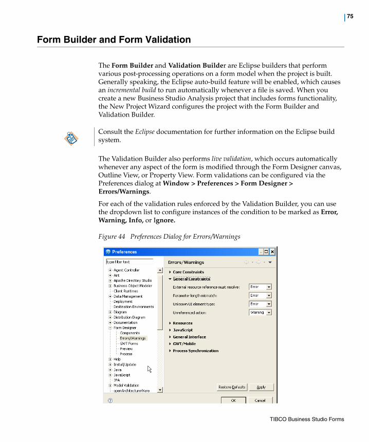
| 75
Form Builder and Form Validation
The Form Builder and Validation Builder are Eclipse builders that perform various post-processing operations on a form model when the project is built. Generally speaking, the Eclipse auto-build feature will be enabled, which causes an incremental build to run automatically whenever a file is saved. When you create a new Business Studio Analysis project that includes forms functionality, the New Project Wizard configures the project with the Form Builder and Validation Builder.
The Validation Builder also performs live validation, which occurs automatically whenever any aspect of the form is modified through the Form Designer canvas, Outline View, or Property View. Form validations can be configured via the Preferences dialog at Window > Preferences > Form Designer > Errors/Warnings.
For each of the validation rules enforced by the Validation Builder, you can use the dropdown list to configure instances of the condition to be marked as Error, Warning, Info, or Ignore.
Figure 44 Preferences Dialog for Errors/Warnings
Consult the Eclipse documentation for further information on the Eclipse build system.
TIBCO Business Studio Forms
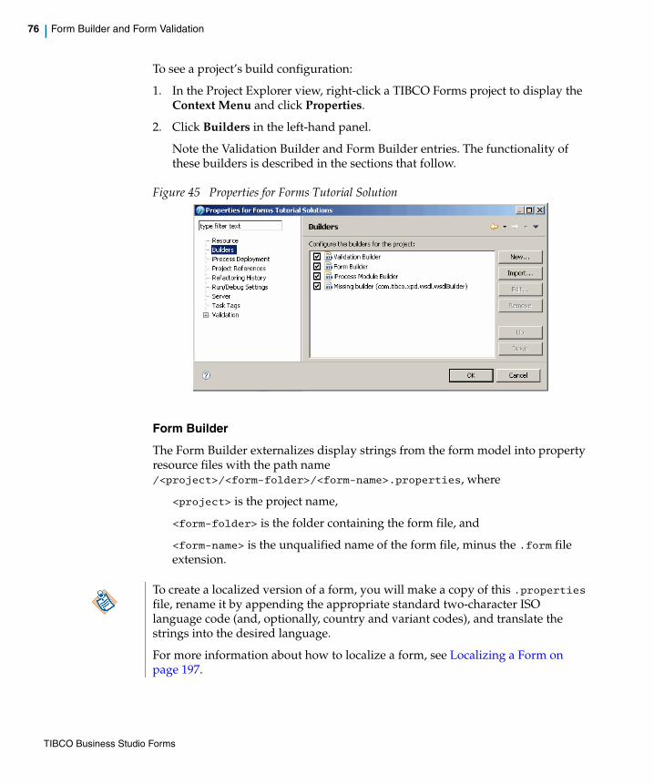
76 | Form Builder and Form Validation
To see a project’s build configuration:
1. In the Project Explorer view, right-click a TIBCO Forms project to display the Context Menu and click Properties.
2. Click Builders in the left-hand panel.
Note the Validation Builder and Form Builder entries. The functionality of these builders is described in the sections that follow.
Figure 45 Properties for Forms Tutorial Solution
Form Builder
The Form Builder externalizes display strings from the form model into property resource files with the path name /<project>/<form-folder>/<form-name>.properties, where
<project> is the project name,
<form-folder> is the folder containing the form file, and
<form-name> is the unqualified name of the form file, minus the .form file extension.
To create a localized version of a form, you will make a copy of this .properties file, rename it by appending the appropriate standard two-character ISO language code (and, optionally, country and variant codes), and translate the strings into the desired language.
For more information about how to localize a form, see Localizing a Form on page 197.
TIBCO Business Studio Forms

| 77
Validation Builder
The Validation Builder performs these functions:
• Analyses the form model for general syntactical and semantic errors and inconsistencies.
• Applies constraints specific to the target platform/version.
• Reports any such problems as problem markers, which show up in the Problems View. To make it easier to locate problems, the problem markers for errors also appear as decorator icons adjacent to the offending form element in the Project Explorer, the Outline View, and in the Form Designer. For more information about problem markers, see Problem Markers on page 123.
TIBCO Business Studio Forms

78 | Bindings
Bindings
TIBCO Business Studio Forms uses bindings to update properties in the runtime forms data model by connecting attribute values of parameters, controls, and panes. A binding will always have two endpoints.
Absolute Bindings
An absolute binding can connect the value of a control to the value of a parameter’s data field, or to one of the child attributes or objects of that parameter.
Setting BindingsDepending on the properties to be connected, bindings can be added from the General Properties tab of a control, pane, or a parameter. An optionlist and radiogroup, a URL and URL Text of Hyperlink, and the URL of an Image control can also have bindings which you can establish from the Properties tab of these controls. You can also use the Mappings tab to view, edit, and create bindings.
Set a Binding Between Controls
The General Properties tab for controls, shown in Figure 46, provides a mechanism for setting bindings between the value or property of one control and the value or property of another control or parameter.
Click the icon to launch a wizard that allows you set a binding for the given property or update that property using a rule that specifies a computation action.
Figure 46 Add a Binding for a Control Using the General Properties Tab
TIBCO Business Studio Forms

| 79
When you define a binding for a control, its value is used to update the secondary properties of another control such as Label, Hint, and so on. Note that the update is one way only, that is, the secondary properties cannot use bindings to update the value of the initially selected control.
Set a Binding Between a Control and a Parameter
To connect a control with a parameter, you can use either the General tab of a control, as in Figure 46, or the parameter dialog for that parameter, as in Figure 47.
Figure 47 Add a Binding for a Parameter Using Parameter Dialog
For information on working with bindings, see Setting Bindings on page 133.
Set a Binding from the Mappings Tab
You can use the Mappings tab of the Properties view for selected element in the Form Designer canvas to set bindings. See Working with the Mappings Tab for further details.
Direction of BindingsA binding has one of three directions:
• Updated By : This signifies that the targeted value will be updated when the other value is updated.
However, if the target value changes for any reason, the other value in the binding will not be affected.
• Update : Updates to this value will cause the other value in the binding to be updated.
TIBCO Business Studio Forms
80 | Bindings
Note that control and parameter values can update other properties, but properties such as control visibility, enabled, required, label, and hint cannot update other values in a binding.
• Synchronizes With : With this type of binding, updates to either value will cause the other value to be updated to the same value. Each end of the binding must be either a control or parameter value.
TIBCO Business Studio Forms
| 81
Assign Binding Both Ways
Two ways binding can be added for controls (only for values) as follows:
1. Add a text control textinput1.
2. Add another text control textinput2.
3. Go to Properties tab of the control textinput1 and click the binding icon for the Value field.
4. Search for textinput2 control in the list and expand the items under it.
5. Click the Value field of the textinput2 control. You will be able to assign a binding both ways.
TIBCO Business Studio Forms

82 | Actions
Actions
Actions are invoked from Rules in response to form events or programmatically from within a script. An action can be private to a single rule, or shared amongst multiple rules.
TIBCO Business Studio Forms uses three types of actions:
• System actions These actions, also called built-in actions, are pre-defined and are used for common tasks such as Submit, Close, Cancel, Reset, Validate, and Apply.
• Script actions Use JavaScript to create additional custom actions. Script actions run a specified script, with no other action attached to it.
• Computation actions These actions will update a specified value or property with the result of an expression written in Javascript. The destination of a computation action can be the value of a parameter or control, or a secondary property such as label or hint of a control, or a visible flag for a pane, and so on. After the script in the computation action is run, it produces a value that can be used by another action.
Actions can be flagged as “shared” allowing them to be used in multiple rules.
To add an action, right click the Shared Actions system group in the Outline View.
Figure 48 Add an Action in the Outline View
To add and configure actions, see Setting Actions on page 137.
To associate actions with rules, see Setting Rules on page 139.
System actions can be used also by the users working in Business Analysis mode, while the scripted actions and computation action can be developed only by the users working in Solution Design mode. Once actions have been defined within a form by a developer, business analysts can re-use them for similar purposes in their projects.
TIBCO Business Studio Forms

| 83
Actions Summary TableThe Actions summary table provides a useful overview of the shared actions. To see each shared action in the current project, select the Shared Actions node in the Outline View.
Figure 49 Actions Summary Table
This table displays the following columns:
• Name Name of the action. To edit the name, click on the ellipsis (...) button, which appears when the name is selected. Edit the name using the Enter the Name page.
• Label Label of the action.
• Edit Displays the text Edit as a hyperlink. When clicked, it will navigate to the configuration property screen for that Action.
• Type non-editable field that shows either ScriptAction or ComputationAction.
• Detail non-editable detail of the Action specific to the action type.
— ScriptAction display as much script as fits in the column, with “...” at the end if truncated.
— ComputationActions display [property] updated by expression: [script].
TIBCO Business Studio Forms
84 | Rules
Rules
Rules provide a way to model the behavior or presentation logic of the form with minimal coding. This makes the logic easier to identify and maintain by both developers and business analysts.
Rules consist of events and actions. For example, the rule “Guardian required when Age < 21” is modeled as:
Event: CustAge updated
Action: GuardianName.Required = (CustAge < 21)
Whenever Customer Age changes, the Guardian Name field is marked as required only if Customer Age is less than 21
Rules are associated with events and actions as follows:
• Events are used to trigger the rules, to define when the actions are performed. For any rules that are triggered by the same event, they will be executed in the order in which they are defined in the form model.
• Actions define what will be performed. They can be individually enabled or disabled in the rule. The actions within a rule will also execute in the order defined in the form model.
You can add and edit rules in TIBCO Business Studio Forms as described in the following sections:
• Add a Rule Using the Outline View on page 139 To associate rules with events and actions, select the appropriate Events or Actions tab.
• Add a Rule Using the Rule Wizard on page 144 When using the Rule Wizard, you can also remove the rule.
• To select actions and events to associate with a specific rule, see Setting Rules on page 139.
Business analysts can add rules, edit their general properties and descriptions, and add events. They cannot create new actions, but they can re-use the already defined shared actions.
TIBCO Business Studio Forms

| 85
Rules Summary TableThe summary table for Rules provides a useful overview of the rules.
To see each rule in the current project, select the Rules node in the Outline View.
Figure 50 Rules Summary Table
This table displays the following columns:
• Name Name of the rule. To edit the name, click on the ellipsis (...) button, which appears when the name is selected. Edit the name using the Enter the Name page.
• Label Editable Label of the rule.
• Edit Displays the text Edit as a hyperlink. When clicked, will navigate to the configuration property screen for that rule.
• Enabled Displays a check box. If selected, then the rule is enabled.
• Events Non-editable, drop-down list of events that trigger this rule; for example, Form Open, Update of Control FirstName (firstName).
• Actions Non-editable, drop-down list of actions that are invoked by this rule. Each item will be in the form of [Action Label] (Action Name).
The standard cancel, close, and submit actions destroys the form. You need to ensure that any user-defined actions for the Cancel, Close, and Submit button click event should precede their respective standard actions.
TIBCO Business Studio Forms
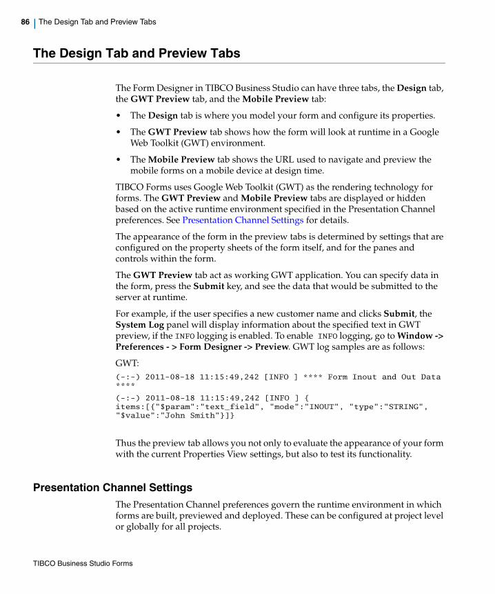
86 | The Design Tab and Preview Tabs
The Design Tab and Preview Tabs
The Form Designer in TIBCO Business Studio can have three tabs, the Design tab, the GWT Preview tab, and the Mobile Preview tab:
• The Design tab is where you model your form and configure its properties.
• The GWT Preview tab shows how the form will look at runtime in a Google Web Toolkit (GWT) environment.
• The Mobile Preview tab shows the URL used to navigate and preview the mobile forms on a mobile device at design time.
TIBCO Forms uses Google Web Toolkit (GWT) as the rendering technology for forms. The GWT Preview and Mobile Preview tabs are displayed or hidden based on the active runtime environment specified in the Presentation Channel preferences. See Presentation Channel Settings for details.
The appearance of the form in the preview tabs is determined by settings that are configured on the property sheets of the form itself, and for the panes and controls within the form.
The GWT Preview tab act as working GWT application. You can specify data in the form, press the Submit key, and see the data that would be submitted to the server at runtime.
For example, if the user specifies a new customer name and clicks Submit, the System Log panel will display information about the specified text in GWT preview, if the INFO logging is enabled. To enable INFO logging, go to Window -> Preferences - > Form Designer -> Preview. GWT log samples are as follows:
GWT:(-:-) 2011-08-18 11:15:49,242 [INFO ] **** Form Inout and Out Data ****
(-:-) 2011-08-18 11:15:49,242 [INFO ] { items:[{"$param":"text_field", "mode":"INOUT", "type":"STRING", "$value":"John Smith"}]}
Thus the preview tab allows you not only to evaluate the appearance of your form with the current Properties View settings, but also to test its functionality.
Presentation Channel SettingsThe Presentation Channel preferences govern the runtime environment in which forms are built, previewed and deployed. These can be configured at project level or globally for all projects.
TIBCO Business Studio Forms

| 87
To configure Presentation Channel at project level perform the following steps:
1. Select the project in the Project Explorer, and click File > Properties.
2. In the navigation pane on the left side of the Properties dialog, click Presentation Channels, and select the Enable project specific settings check box.
3. Double-click Default Channel (or other presentation channel you are using, if applicable) to edit the list of included channel types. You can have the following setting:
— By default, Google Web Toolkit (GWT) environment is enabled. Workspace Google Web Toolkit, Openspace Google Web Toolkit, and Openspace Email check boxes are selected (GWT Preview tab is displayed)
— To enable the Openspace Mobile environment, select the Openspace Mobile check box (Mobile Preview tab is displayed)
4. Click Finish and OK when you are done to close the dialogs. In Google Web Toolkit (GWT) environment, the changes take effect immediately just by refreshing or reactivating the preview tab.
To configure Presentation Channel globally, go to Window > Preferences > Presentation Channels. The Default Channel (Default) is displayed in the right side pane. Double-click Default Channel to edit the list of included channel types. The changes made at this level will apply to all projects that do not have the Enabled project specific settings check box enabled.
For more information on Presentation Channels, see the TIBCO Business Studio Process Modeling Guide.
Port Settings for PreviewYou can set the port used to serve up the preview of forms for both the internal preview tabs and the preview of mobile forms from external applications or devices. By default, this is set to 8888. You can change the port if there is a conflict with another application using port 8888 on your machine.
If multiple form designers are working on the same project or projects, they should all have the same Presentation Channels configured in their respective workspaces.
TIBCO Business Studio Forms

88 | The Design Tab and Preview Tabs
To change the port, go to Window > Preferences > Forms Designer > Preview. If you change it to a value of 0, then an arbitrary, available port number will be used.
Copying the Form Preview URLBy clicking the button in the main toolbar, you can copy the form preview URL to the system clipboard. You can then paste the URL in any browser to preview the form. This way you can see how the form is rendered in other browsers on a specific platform apart from the built-in browser used in Eclipse.
LoggingA system log pane for the preview tabs is provided to display trace and debug messages from the system as well as any logging messages from your JavaScript code.
The logging window displays the log output generated by the application, filtered according to the verbosity level set by the Logging Level drop-down list.
Locale Choose the locale from the drop-down list: English, Chinese, French, German, Spanish, and so on. Changing this setting will only have an effect if locale-specific resource bundles are defined for the form. For more info about localizing a form, please refer to Localizing a Form on page 197.
Logging LevelChoose the log level by clicking the appropriate button (GWT):
• FATAL
• ERROR
• WARN
• INFO The default logging level
If you are using external devices such as mobile forms to test forms via the mobile index, it is recommended to keep this as a fixed port number so that you will be able to keep bookmarks to the mobile test index.
The locale selected applies only to the form, not to the other components in the preview tab for instance the log window, locale drop-down, and so on.
TIBCO Business Studio Forms

| 89
• DEBUG
• TRACE
The verbosity (detail) of logging increases with the logging level in cumulative fashion. For example, the WARN level will also show all ERROR and FATAL messages; INFO will also show WARN messages; and so on.
You can choose the logging level in the preview pane using context.form.log or context.form.logger. The logger API is available in all the script contexts and it allows the user to log at all logging levels. See API for Scripting for details of log and logger APIs. The logging level specified will apply only to that specific preview session. Messages logged by user scripts will be shown in the DEBUG log level.
You can change the default logging level used in the preview tabs in the user preferences, under Window > Preferences > Form Designer > Preview.
For the GWT preview, the setting made in Preferences will be the lowest level of logging available in preview. For example, if the logging level is set to INFO in the Preferences, you will not be able to change to DEBUG in the preview pane.
At runtime, when GWT Forms are used, you can enable logging by using a URL parameter log_level. You need to set the value of the log_level parameter to any one of the logging levels mentioned above. The specified log level and all above it will be enabled in that case. For example, if you access Openspace as: http://<server>:<port>/openspace?log_level=INFO
You will be able to see all INFO, WARN, ERROR and FATAL messages in the log viewer.
ReloadClick the Reload button in the GWT preview and in Mobile preview mode to close the current form and reload it.
Performance MetricsClick the Performance Metrics button in GWT preview to view the form load timings. The performance table is displayed with the timings for the following operations:
• Overall Form Load Time - The time taken to load the form completely. It starts from the time a form is requested from the server and finishes at the time the form is loaded completely. This includes the Form Open scripts if any.
• Form Rendering Time - The total time taken to render the form after form model and various external resources are loaded. This does not include the
TIBCO Business Studio Forms

90 | The Design Tab and Preview Tabs
time taken for creating the various form elements, but includes the time taken for attaching the widgets, initializing the bindings and loading the initial data to the form.
• Resource Loading Time - The total time taken for various form resources to load. The resources include the various external resources configured on the form and the generated BOM JavaScript files. The external resources include JavaScript, CSS, image and property bundles referenced from the Resources tab in the Properties view of the form.
• Datastore Initialization Time - The time taken for initializing the form elements from the initial data provided to the form.
• Model Initialization Time - The time taken to create and initialize the various form elements like the parameters, panes, and controls. It does not include the time taken to load them with the initial data.
Figure 51 Performance Table
You can use this information to analyze the load timings of various forms.
By default, the performance metrics option is enabled in GWT preview. To change the default settings, go to Windows -> Preferences -> Form Designer -> GWT Forms and clear the Collect performance metrics check box.
TIBCO Business Studio Forms
| 91
Figure 52 The Performance Metrics Settings
At runtime (Openspace, Workspace or a Custom Client Application), if you would like to collect performance metrics, pass in a url parameter tibco_instr with a value true. For example: http://<server>:<host>/workspace/workspace.html?tibco_instr=true
This enables you to view the performance metrics anytime during the form's life cycle. You can view the performance metrics by pressing ALT+F12 and close the dialog using the Close button or by pressing the ESC key.
View Datastore DataClick the View Datastore Data button in GWT preview mode to preview the current state of the form data that would be submitted to the server. You can click this button at any point during form usage.
Visibility in the Preview TabAll panes and controls are visible in the Design tab so that you can edit them, even if they are configured to be initially invisible at runtime. Below, for instance, is a form as it appears in the Design tab. (The example used here is a part of the Capture Claim form from the tutorials in Chapter 1, Getting Started.)
TIBCO Business Studio Forms
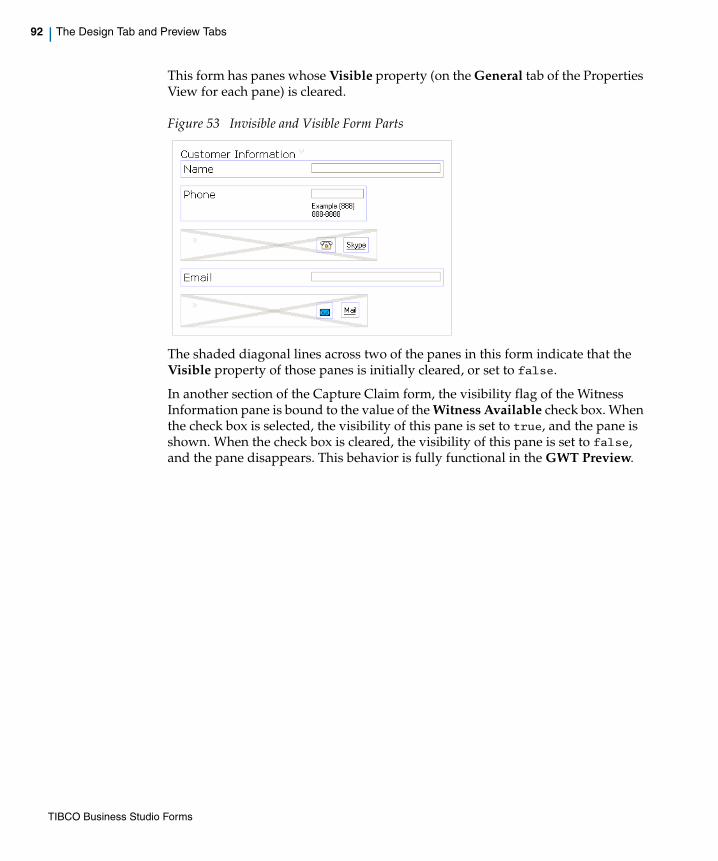
92 | The Design Tab and Preview Tabs
This form has panes whose Visible property (on the General tab of the Properties View for each pane) is cleared.
Figure 53 Invisible and Visible Form Parts
The shaded diagonal lines across two of the panes in this form indicate that the Visible property of those panes is initially cleared, or set to false.
In another section of the Capture Claim form, the visibility flag of the Witness Information pane is bound to the value of the Witness Available check box. When the check box is selected, the visibility of this pane is set to true, and the pane is shown. When the check box is cleared, the visibility of this pane is set to false, and the pane disappears. This behavior is fully functional in the GWT Preview.
TIBCO Business Studio Forms

| 93
Figure 54 Visibility of a Pane Depending on a Check Box
To see this example, open the FormsTutorialSolutions project in the Project Explorer, as described in Chapter 1, Getting Started. Open the Capture Claim form and click one of the preview tabs. Notice the bottom portion of this form as it initially appears in the preview tab. Try selecting and clearing the Witness Available check box to observe the change in the visibility of the Witness Information pane.
TIBCO Business Studio Forms

94 | Outline View
Outline View
While the Project Explorer provides an easy way to find, select, and open project resources, the Outline View provides a quick and convenient way to navigate within a particular model, such as a form.
If the Outline View is not visible, open it by selecting Window > Show View > Outline. (If Outline is not among the view choices, click Window > Show View > Other > General > Outline.) The default area for the Outline View is the lower left corner of the Eclipse workbench but, as with other views, it can be moved to another area by dragging its title bar.
There are two modes for using the Outline View: as a hierarchical tree with expandable nodes, or as a thumbnail graphical image of the form. Switch between the two modes by clicking the button for the desired mode in the upper right corner of the Outline View.
Thumbnail ModeThe thumbnail mode shows the entire form scaled down to fit within the space designated to the Outline View. When a form cannot be entirely rendered within the canvas, a blue-shaded rectangle appears in the Outline View representing the visible portion. You can drag this rectangle with the mouse to make a different portion of the form visible in the canvas. This is a good way to move quickly from one section to another of a large form.
The Outline View is shown in Figure 55 in thumbnail mode
Figure 55 Outline View , Thumbnail Mode
TIBCO Business Studio Forms

| 95
Tree ModeThe hierarchical tree mode contains nodes for the form’s elements. At the top level is a node for the form itself. The top-level nodes under the form are for the data interface to the form, shared actions, rules, and the root panes.
In the tree mode, clicking on an item in the Outline View causes the Properties View for that item to appear in the Properties tab , and causes that item to be selected in the canvas as well, if it is a visible object. This is a good way to move quickly to a particular Properties View. Items can be copied and pasted within the Outline View, as well as rearranged by using drag-and-drop.
The Outline View is shown in Figure 56 in tree mode.
Figure 56 Outline View, Tree Mode
Using the Outline View with FormsWhen a form is open in the Form Designer, the Outline View’s tree mode shows the elements that have been placed on the form, and provides a convenient way to select a pane or control and display its Properties View in the Properties view.
Figure 57 Using the Outline View with Forms, 1
When the check box called checkbox1 is clicked for instance, as in Figure 57, the checkbox1 control is selected on the canvas, and the Properties view displays the Properties View for that control, as in Figure 58.
TIBCO Business Studio Forms

96 | Outline View
Figure 58 Using the Outline View with Forms, 2
There are situations where you may also find it easier to re-arrange the order of controls and panes in the form using the Outline View instead of the canvas, such as moving a control or pane to different locations in a large form where it is difficult to view the whole form in the canvas at once.
Although the order of Parameters, Shared Actions, and Rules in the form model does not have a bearing on the execution of the form, you have the option to arrange the order of these objects in the Outline View to aide in readability, or to group by functionality. By default, items are added to these nodes in the order they were originally added to the model.
Clicking on the Data node will show a summary table of all the parameters defined in the form. From this table, you can edit some of the properties, add new parameters, and navigate to the detailed Properties View of any of the parameters. Similar tables are displayed when clicking on either the Shared Actions or Rules nodes.
TIBCO Business Studio Forms

| 97
ParametersClicking a parameter causes the Properties View for that parameter to appear in the Properties tab. Right-clicking a parameter brings up a Context Menu that allows you to delete, copy, or rename the parameter in the data model.Right-clicking on the Data node provides an option to add a new parameter.
Parameters are shown under the Data node, the first node beneath the node for the form itself in the Outline View, as in Figure 59.
Figure 59 Parameters in the Outline View
For more details, see Configuring Parameters on page 345.
Parameters Summary Table
The Parameters summary table provides an overview of the parameters. To see each parameter in the current project, select the Data node in the Outline View.
Figure 60 Parameters Summary Table
The Parameters summary table has the following fields:
Clicking a parameter in the tree mode of the Outline View is the only way to access the Properties View for the parameter.
TIBCO Business Studio Forms
98 | Outline View
• Name Name of the Parameter. To edit the name, click on the ellipsis (...) button, which appears when the name is selected. Edit the name using the Enter the Name page.
• Label Editable Label of the parameter.
• Edit Displays the text Edit as a hyperlink. When clicked, will navigate to the configuration property screen for that Parameter.
• Mode Displays either IN, OUT, or INOUT. Specifies the direction of data flow for this parameter with respect to the Form.
• Type Displays the primitive type of the parameter. When selected, a dropdown list becomes available to choose among the following types: Text, Boolean, Date Time, Date, and Time.
• Length Editable field for setting the length. It is active only if the selected type supports the length setting. Otherwise displays NA.
• Decimal Places Editable field for setting the decimal places attribute. It is active only if the selected type supports the decimal places setting. Otherwise displays NA.
• Array Check box that sets the array attribute of the parameter.
Shared ActionsActions available to all Rules are listed under the Shared Actions node. Right-clicking the Actions node icon brings up a Context Menu that allows you to add a new action to this group.
To read an overview, see Actions on page 82.
To learn how to add actions to a form, see Setting Actions on page 137.
RulesRules are listed under the Rules node. Right-clicking the Rules node icon brings up a Context Menu that allows you to add a new rule to the form. You can add a rule that is either enabled or disabled using this interface.
To read an overview, see Rules on page 84.
To learn how to add rules to a form, see Setting Rules on page 139.
TIBCO Business Studio Forms
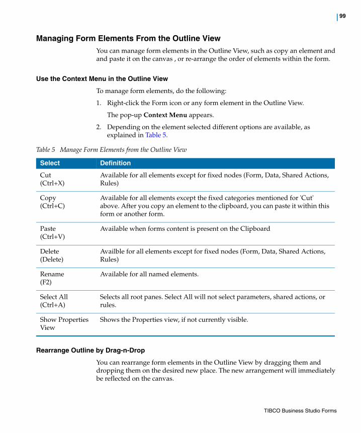
| 99
Managing Form Elements From the Outline ViewYou can manage form elements in the Outline View, such as copy an element and and paste it on the canvas , or re-arrange the order of elements within the form.
Use the Context Menu in the Outline View
To manage form elements, do the following:
1. Right-click the Form icon or any form element in the Outline View.
The pop-up Context Menu appears.
2. Depending on the element selected different options are available, as explained in Table 5.
Rearrange Outline by Drag-n-Drop
You can rearrange form elements in the Outline View by dragging them and dropping them on the desired new place. The new arrangement will immediately be reflected on the canvas.
Table 5 Manage Form Elements from the Outline View
Select Definition
Cut(Ctrl+X)
Available for all elements except for fixed nodes (Form, Data, Shared Actions, Rules)
Copy(Ctrl+C)
Available for all elements except the fixed categories mentioned for 'Cut' above. After you copy an element to the clipboard, you can paste it within this form or another form.
Paste(Ctrl+V)
Available when forms content is present on the Clipboard
Delete(Delete)
Availble for all elements except for fixed nodes (Form, Data, Shared Actions, Rules)
Rename(F2)
Available for all named elements.
Select All(Ctrl+A)
Selects all root panes. Select All will not select parameters, shared actions, or rules.
Show Properties View
Shows the Properties view, if not currently visible.
TIBCO Business Studio Forms

100 | Outline View
Use Business Labels in Outline ViewThe User Preference controls the display of labels throughout the Forms Designer. This is specified using the option Include type name in labels, which improves accessibility by helping to distinguish the type of control or pane in various dialogs, instead of just relying on the icon. For more details on using this option, see Using the Option Include Type Name in Labels on page 314.
For more details about Labels, see Label on page 312.
TIBCO Business Studio Forms

| 101
Using the Business Object Model
The business object model provides a way to define in business terms the Classes, Attributes, Primitive Types, Operations, Associations, and so on that describe a business or organization. In terms of forms design, the business object model is a powerful and convenient way of defining primitive and complex types.
A business object model is defined using the Business Object Model Editor. For complete information on using this editor to create business object models, see the TIBCO Business Studio Business Object Modeler User’s Guide. Information on business object models in the present guide is limited to instructions for creating classes and other objects in the business object model to define complex data types, and using these data types in forms modeling.
The Objects in a Business Object ModelObjects are added to a business object model in the Business Object Model Editor much as panes and controls are added to forms, either by clicking the desired object in the palette and then clicking in the desired location on the canvas of the editor, or by dragging and dropping the object onto the canvas. Objects that can be placed into a business object model include the Elements (Package, Class, Primitive Type, and Enumeration), Children (Attribute and Enum Literal), and Relationships (Generalization and Composition).
Figure 61 The Palette of the Business Object Model Editor
TIBCO Business Studio Forms

102 | Using the Business Object Model
The objects in the palette are of several kinds, each distinguished by an icon and color, which will appear (as an aid to the identifying the object) in various places throughout the Business Studio interface, including in the title bars of the objects on the canvas. The objects most important for creating complex types to be used in forms modeling are described in this section.
Elements
Class A container for a complex data object. Classes contain children, such as attributes and enum literals. A class from the BOM can later be specified as the type for a data field in the Forms Editor.
Primitive Type An object of one of the BOM Primitive Types (Integer, Boolean, Date, Time, Integer, and so on), or of the type of a previously-defined primitive type object.
In the latter case, the previously-defined primitive type might be, for instance, a zip code object that was defined as an integer with a pattern (specified in the Advanced tab of the object’s Properties view) as a regular expression) that limits its value to 5 single-digit integers. Figure 62 shows the Advanced tab of the Properties view for a primitive type called ZIP Code. The Pattern value restricts valid entries to five integers. This restriction will be enforced at runtime.
Figure 62 Properties of a ZIP Code Primitive Type in the BOM
Enumeration A data type that can contain a list of values. Selecting this type enables you to specify a set of enumerated values. For example, an enumeration called Color might have the values Red, Blue, and Green.
A pattern that has been specified as a restriction for a data type in the BOM does not appear in the Forms modeling environment. For instance, if a ZIP Code primitive type is defined in the BOM as requiring a value of five single-digit integers, and that primitive type is included in an Address class in the BOM which, in turn, is used as a data type for a form parameter, the default generated form will not display the restriction in the Validations tab of the zip code text control’s Properties view. Nonetheless, the restriction will be enforced at runtime, and cannot be modified or overwritten by different restrictions defined in the Forms Editor on the text control’s Properties view.
TIBCO Business Studio Forms

| 103
An enumeration from the BOM can be included as an attribute for a class in the BOM or be specified later as the type for a data field in the Forms Editor. On the default generated form, this type will be rendered by default as an optionlist. (The control type could later be changed in the form control’s Properties view to a radiogroup, or other control type.)
Children
Attribute Attributes are data members that make up a class. By default, new attributes are created with the primitive BOM type text. A different data type can be chosen in the attribute’s Properties view, either another primitive type, or an existing class or enumeration. Each attribute type ends up corresponding to a different control type in a generated form.
The attributes in a class can be re-ordered in the Attributes tab of the class’s Properties view using the up and down arrows. Their order in the BOM determines the order in which they appear in the default form.
Enum Literal These are the values within an enumeration. For example, an enumeration called Color might have the enum literals with the names Red, Blue, and Green.
The enum literals in an enumeration can be re-ordered in the Enum Literals tab of the enumeration’s Properties view using the up and down arrows. Their order in the BOM determines the order in which they appear in the default form.
Relationships
Generalization This is a relationship of inheritance: a class that is related to an existing class by generalization will inherit the qualities of the existing class, and hence will contain members of the same type as the existing class.
Composition This relationship indicates that the child class is wholly contained within the parent class.
Multiplicity of Relationships
Relationships between BOM classes have a multiplicity, for instance, one-to-one (1..1), zero-to-many (0..*), or one-to-many (1..*). You can also have a finite lower or upper multiplicity bound like one-to-finite upper bound (1..m), finite lower bound-to-finite upper bound (n..m), or exactly finite bound (n). On a generated form, a particular pane type is rendered for a child class based on the multiplicity value.
TIBCO Business Studio Forms
104 | Using the Business Object Model
If a Student class, for instance, has a child class called Courses, with a 0..* relationship (meaning that one student can have many courses), the Course class will be rendered as a grid pane. The attributes of the Course class (for instance, course number, course name, time, room number, and so on.) will appear as columns in the grid pane. Each course for a given student will be represented by a row in the grid pane.
Implicit Validations
The multiplicity constraints defined in the BOM are reflected in the implicit validations. The validation messages conform to the following:
Table 6 Validation Messages for BOM Level Multiplicity Constraints
These apply for both primitive attributes and complex children.
Master-Detail Panes
If a child class has a relationship to the parent class that allows multiple instances of the child class, and the child class itself contains a child class with multiple attributes, the two child classes will be rendered on the default form in a master-detail pane.
Multiplicity Constraint Validation Message
One-to-many (1..*) Must contain at least one value.
One-to-finite upper bound(1..m)
Must contain between one and {m} values.
Finite lower bound-to-finite upper bound (n..m)
Must contain between {n} and {m} values.
Zero-to-finite upper bound (0..m)
Must contain between zero and {m} values.
Exactly one (1) Must contain exactly one value.
Exactly equal to the finite bound (n)
Must contain exactly {n} values.
The implicit validations for multiplicity constraints are configured to execute on form submit.
TIBCO Business Studio Forms

| 105
The first child, the master pane, will be rendered in the form as a grid pane, and the second child, the detail pane, will appear as a vertical pane which can be used for editing all attributes of both child classes.
In this case, the grid pane will be read-only, but a row can be selected for editing in the vertical pane (detail) by clicking that row in the grid pane (master).
As an example, a Student class might be the parent of a child class called Course. Each student could have zero-to-many courses. The course class, in turn, might have a child class called Course Details. The BOM diagram is shown in Figure 63.
Figure 63 Business Object Model Editor Showing Child Classes
The business object model shown in Figure 63 would be rendered in a form with a master-detail pane for the Course and Course Details classes, as shown in Figure 64.
If you want the detail pane to be generated as a record pane, go to Preferences > Form Designer > Generator, and select the check box Generate master-detail configuration with record pane for details.
By default, the check box is cleared, and the detail pane is generated as a vertical pane. This information applies to the default forms and newly generated forms. The forms that are already generated, remain unaffected.
TIBCO Business Studio Forms
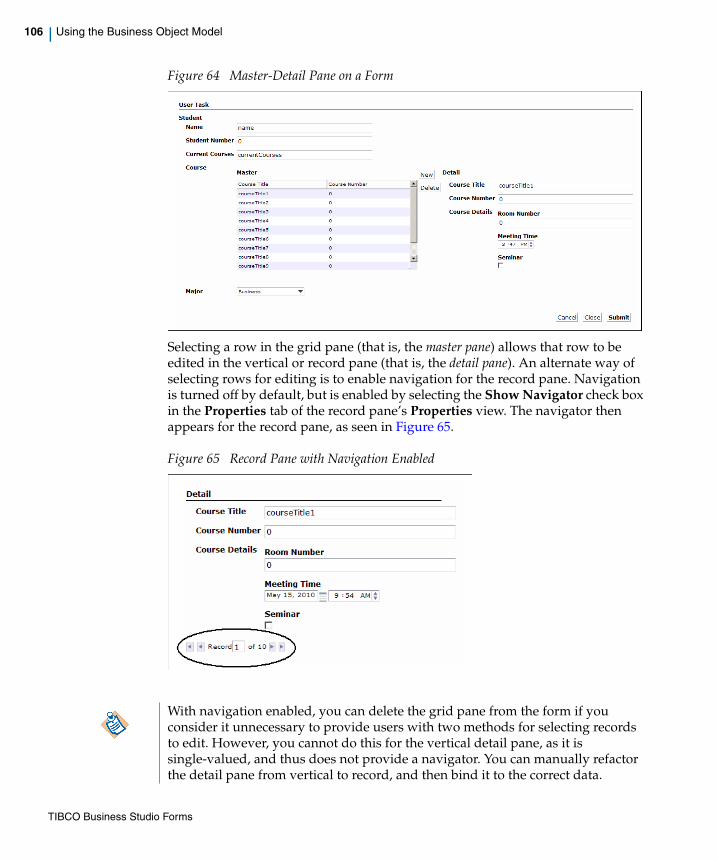
106 | Using the Business Object Model
Figure 64 Master-Detail Pane on a Form
Selecting a row in the grid pane (that is, the master pane) allows that row to be edited in the vertical or record pane (that is, the detail pane). An alternate way of selecting rows for editing is to enable navigation for the record pane. Navigation is turned off by default, but is enabled by selecting the Show Navigator check box in the Properties tab of the record pane’s Properties view. The navigator then appears for the record pane, as seen in Figure 65.
Figure 65 Record Pane with Navigation Enabled
With navigation enabled, you can delete the grid pane from the form if you consider it unnecessary to provide users with two methods for selecting records to edit. However, you cannot do this for the vertical detail pane, as it is single-valued, and thus does not provide a navigator. You can manually refactor the detail pane from vertical to record, and then bind it to the correct data.
TIBCO Business Studio Forms

| 107
Cross-Resource References
The Business Studio workspace acts as a container for resources such as projects, folders, and files, each of which corresponds to a directory or file in the operating system’s underlying file system. Workspace files can contain models (such as forms or business object models), which are comprised of model elements (such as panes and controls or classes and properties).
A form can refer to model elements in other resources in the Business Studio workspace, for example:
• A user task or its parameters
• A business object model class or its properties
• An embedded form or its parameters
These references are often many-to-many, with one form referencing many external model elements and resources, each of which could potentially be referenced from multiple forms, business object models, processes and so on. These external references are known as cross-resource references.
Since the referenced model elements reside in independently modifiable files such references are susceptible to breakage if proper working procedures are not observed. When Business Studio detects breakages, it creates unresolved reference problem markers on the referencing forms.
This section talks about the different breakage mechanisms and the quick fixes available to resolve the problem markers.
Breakage MechanismsThere are several ways in which a cross-resource references can be broken. Some examples are listed below:
• The referenced model element could be deleted
• The referenced model element could be renamed
• The element’s containing resource, folder or project could be deleted, renamed or moved elsewhere.
When such changes are made using Business Studio, it attempts to prevent reference breakage by cascading such updates through all references. For example:
• In the case of rename and move of an element or a containing resource, the references are all automatically updated to point to the new element name or workspace location.
TIBCO Business Studio Forms

108 | Cross-Resource References
• In the case of deletion of a cross-referenced workspace resource, Business Studio presents a confirmation dialog offering the choice of clearing or retaining the references or cancelling the delete command. Clearing the references means that the connections between referenced and referencing elements are permanently severed and can only be restored manually.
We now discuss some breakage scenarios in detail.
Deleting an Embedded Form
When an embedded form is deleted, you are offered a choice of either clearing the reference or retaining it.
• Clearing the references to a deleted embedded form leaves the embedded form panes in an invalid state because they no longer point to a form to embed.
• Conversely, retaining the references means that the referencing forms are left pointing at a resource or model element that no longer exists in the workspace, which will cause unresolved reference problem markers to appear.
The confirmation dialog presented by Business Studio when any form-referenced resource is deleted can be suppressed by selecting the Do not ask this question again check box on the Clear Forms References dialog.
Figure 66 Clear Forms References Dialog
In this case, in future by default the references will all be cleared.
In most cases such changes might prevent the referencing forms from working as intended and can cause other problem markers to appear if it places the forms into an invalid state.
TIBCO Business Studio Forms

| 109
If necessary, you can still use the Preview button (as shown in Figure 67) and deselect any Clear forms references to deleted elements changes (as shown in Figure 68).
Figure 67 Delete Resources Dialog
Figure 68 Changes to be Performed Options
Please note, whether it is appropriate to clear or retain the references depends on your intentions.
• If you are deleting the resource because it is no longer required you should probably clear the references. In this case you would have to edit the forms to restore functionality.
• If you are deleting the resource with the intention of reinstating it later, it is probably appropriate to retain the references. However, if you do this the form will be left in an unusable state and all manner of errors and problems would ensue if you tried to work with it.
Making Changes to Business Studio Resources
Cross-resource references can also get broken by editing, renaming, moving or deleting resources without Business Studio’s knowledge, for example by changing the files directly in the underlying file system.
TIBCO Business Studio Forms

110 | Cross-Resource References
References can also get broken by making changes in one workspace and copying only a subset of the affected resources into another workspace.
The basic principle is that related projects and the resources they contain are densely interconnected and should therefore be treated as an indivisible whole, managed exclusively from within Business Studio.
Problems with Business Studio Project Export/Import Wizard
Some development teams try to use the Eclipse File System or Business Studio Project Export/Import wizards to share projects or individual files and folders.
For example - if you move or rename a BOM file that is referenced from another project, this will update all forms references including those in referencing projects. If you then export just the project containing the changed BOM and import it to another workspace, the referencing forms in the target workspace will acquire unresolved reference problem markers because they will still be pointing to the old BOM file name or location.
If you have to use project export/import, you are recommended always to transfer a consistent set of projects, where all dependencies can be resolved from within the export/import location. Similarly, when importing projects, be sure to import all their dependencies as well.
Remember that you will be unable to import a project that already exists in the workspace and that the existing project may be inconsistent with the remaining visible incoming projects.
Advantages of Using Eclipse Team Providers
There is really only one satisfactory way for a development team to share resources, which is to place all projects under version control managed by an Eclipse team provider.
These practices are strongly discouraged but unfortunately it may not always be obvious that a given action runs the risk of breaking a reference.
This practice is not recommended, as project-level exchange is at once too coarse-grained for convenient team development (where different developers make incremental changes to individual resources) and/or too fine-grained to maintain the integrity of cross-resource references and dependencies.
TIBCO Business Studio Forms

| 111
Business Studio bundles the Subclipse team provider for Subversion for this purpose. Many other version control systems have Eclipse team providers, which may or may not work well with Business Studio projects. Business Studio assumes optimistic version control concurrency semantics, so it does not support team providers which create read-only working copies or require an explicit working copy lock prior to editing (such as Perforce).
Even so, team members must take care not to do things which affect resources being modified by other team members – if this happens a merge conflict will result. The most reliable way to resolve a merge conflict is the ‘optimistic locking’ approach of rejecting one change set in its entirety then reapplying the rejected changes to the accepted change set. Otherwise, you will be faced with a tricky, error-prone textual merge of complex XML model files.
Quick FixesIf a reference does get broken, Business Studio provides several quick fixes.
• Reload the working copy quick fix removes stale unresolved reference problem markers.
• Clear the reference quick fix simply clears the offending reference.
• Repair the reference quick fix helps you to locate a suitable replacement model element.
Figure 69 Quick Fix Dialog
Reload the working copy - Quick Fix
This quick fix is used to remove the unresolved reference markers that can sometimes linger after the missing resource has been reinstated; this can sometimes happen during project import.
TIBCO Business Studio Forms
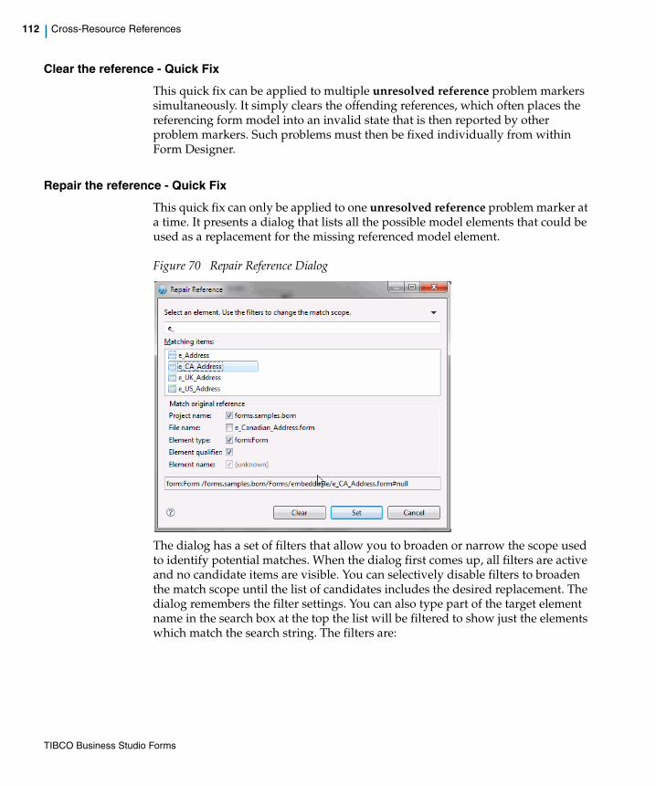
112 | Cross-Resource References
Clear the reference - Quick Fix
This quick fix can be applied to multiple unresolved reference problem markers simultaneously. It simply clears the offending references, which often places the referencing form model into an invalid state that is then reported by other problem markers. Such problems must then be fixed individually from within Form Designer.
Repair the reference - Quick Fix
This quick fix can only be applied to one unresolved reference problem marker at a time. It presents a dialog that lists all the possible model elements that could be used as a replacement for the missing referenced model element.
Figure 70 Repair Reference Dialog
The dialog has a set of filters that allow you to broaden or narrow the scope used to identify potential matches. When the dialog first comes up, all filters are active and no candidate items are visible. You can selectively disable filters to broaden the match scope until the list of candidates includes the desired replacement. The dialog remembers the filter settings. You can also type part of the target element name in the search box at the top the list will be filtered to show just the elements which match the search string. The filters are:
TIBCO Business Studio Forms

| 113
Project name
When this filter is active the list shows only matching items from the same project as that containing the originally referenced element. If no project of that name exists in the workspace you will have to deselect this filter to see anything at all.
File name
When this filter is active the list shows only items which reside in a file of the same unqualified name as that containing the originally referenced element. If no file of that name exists in the workspace you will have to deselect this filter to see anything at all.
Element type
When this filter is active the list shows only items which have the same type as the originally referenced element. For example, if the originally referenced element was a BOM class, the list will only show BOM classes. It is recommended to leave this filter enabled.
Element qualifier
When this filter is active the list shows only items which have the same qualifier name as the originally referenced element. For example, if the originally referenced element was a BOM type or property, the qualifier is the containing BOM package, so the list will only show BOM types or properties from a BOM package of the same qualified name as the original.
Element name
When this filter is active the list shows only items which have the same unqualified element name as the originally referenced element. For example, if the originally referenced element was a BOM type or property, the element name is the unqualified BOM type or property name (not the label).
Selecting the desired replacement and pressing the OK button closes the dialog and updates the form to point to the selected element, and the unresolved reference marker goes away. If the chosen item is in an unreferenced project the wizard requests permission to add a project reference.
Alternatively, pressing the Clear button closes the dialog and clears the unresolved reference – see the description for the Clear the reference quick fix.
TIBCO Business Studio Forms

114 | Mobile Forms
Mobile Forms
TIBCO Forms is designed to provide rendering suitable to the device used to access it. Mobile forms functionality of TIBCO Forms ensures optimized rendering on mobile devices. In TIBCO Forms version 2.2.0, the support is limited to the Apple iPhone and iPod touch.
You can design mobile forms by configuring the controls specifically for mobile usage. The Mobile Preview tab is provided to view mobile forms at design time: you can type the URL specified in the Mobile Preview tab in the mobile device’s web browser to access the form.
Most of the functionality available on the desktop version of forms is supported on the mobile version. However, there are some features which are not supported currently and few controls behave differently on mobile devices. The limitations are as follows:
Unsupported Functionality
• The settings on the Layout tab and the Font tab in the Properties view of controls are not supported.
• The settings on the Child Labels tab and the Child Layout tab in the Properties view of the pane is not supported.
• The Label Visibility flag on the General tab in the Properties view of controls and panes is not supported.
• The Hint field on the General tab in the Properties view of controls is not supported.
• The Maximum Length and Display Length fields on the Properties tab in the Properties view for text controls are not supported.
• The Pass-through control is not supported.
• The Multi-select Grid panes are not supported.
Modified Functionality
Some of the panes and controls function differently when they are rendered on a mobile device. See Rendering of Mobile Forms for more details.
Due to space limitations on a mobile screen, mobile forms are displayed one pane at a time. If the form has nested panes, they are shown as links. You can use the Back button on the form to navigate back to the containing panes in the form.
TIBCO Business Studio Forms

| 115
• Horizontal panes are displayed as vertical panes
• Message panes are ignored. Messages are displayed under each control instead of the message panes. If the control is inside a nested pane, the pane links in the form indicates errors if there are errors inside its controls.
• Grid Panes are edited only via master-detail pane pattern.
• Certain data entry controls such as Date, Time, DateTime, Duration, and Optionlist behave differently.
Working with Mobile FormsThis section explains how to enable Mobile forms, mobile specific configurations required, and the way mobile forms are rendered on mobile devices.
How to Enable Mobile Forms?
You can enable mobile forms globally within the workspace or for specific projects in your workspace.
You have to enable the Openspace Mobile channel type to activate mobile forms. To enable the Openspace Mobile channel globally within the workspace, perform the following steps:
1. Go to Windows > Preferences > Presentation Channels.
2. The Default Channel (Default) is displayed in the right pane.
3. Select the Default Channel (Default) and click button.
The Presentation Channel dialog is displayed.
4. Select the Openspace Mobile check box from the list.
5. Click Finish.
6. Click Project > Clean to clean the project. This will activate mobile forms.
Once mobile forms are activated, you will be able to see the Mobile Preview Tab in the editor.
You can enable the Openspace Mobile channel locally within a project by going to Context Menu > Properties > Presentation Channels > Enable project specific settings.
Previewing Mobile Forms
The Mobile Preview tab provides the URL used to navigate and preview the forms on mobile at design time. The URL is in the following format: http://<host>:<port>/forms/mobile
TIBCO Business Studio Forms

116 | Mobile Forms
where:
• <host> is the name or IP address of the machine on which TIBCO Business Studio is running.
• <port> is the forms preview port. By default the port is 8888. To change the port, goto Window > Preferences > Forms Designer > Preview.
Type this URL in an iPhone, iPod touch, or the iPhone emulator available from Apple. This URL takes you to a page that provides a list of the projects in the workspace. You can click the required project to drill down to a list of the forms available in the selected project.
Mobile Specific Configuration of Controls and PanesWhen you are designing a form for mobile devices, the following pane and control properties can be configured:
The iPhone emulator runs only on Mac OS. There are no viable emulators available in Windows. You can use the desktop version of Safari to view forms on a Windows machine. However, certain controls (Date, Time, Date Time and single select Optionlist) do not function in the desktop version of Safari.
Table 7 Mobile Specific Configuration of Pane and Control Properties
Property Configuration and Behavior
Short Label Used to specify a short label which is displayed instead of the label for the mobile rendering of the form. All controls and panes support a Short Label. To set the Short Label, go to the Mobile tab in the Properties view of the component and specify the Short Label. The Short Label can be updated via the API, bindings, or computation actions.
TIBCO Business Studio Forms
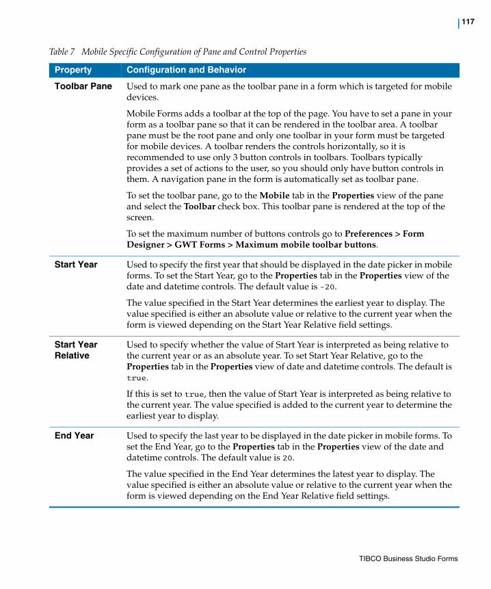
| 117
Toolbar Pane Used to mark one pane as the toolbar pane in a form which is targeted for mobile devices.
Mobile Forms adds a toolbar at the top of the page. You have to set a pane in your form as a toolbar pane so that it can be rendered in the toolbar area. A toolbar pane must be the root pane and only one toolbar in your form must be targeted for mobile devices. A toolbar renders the controls horizontally, so it is recommended to use only 3 button controls in toolbars. Toolbars typically provides a set of actions to the user, so you should only have button controls in them. A navigation pane in the form is automatically set as toolbar pane.
To set the toolbar pane, go to the Mobile tab in the Properties view of the pane and select the Toolbar check box. This toolbar pane is rendered at the top of the screen.
To set the maximum number of buttons controls go to Preferences > Form Designer > GWT Forms > Maximum mobile toolbar buttons.
Start Year Used to specify the first year that should be displayed in the date picker in mobile forms. To set the Start Year, go to the Properties tab in the Properties view of the date and datetime controls. The default value is -20.
The value specified in the Start Year determines the earliest year to display. The value specified is either an absolute value or relative to the current year when the form is viewed depending on the Start Year Relative field settings.
Start Year Relative
Used to specify whether the value of Start Year is interpreted as being relative to the current year or as an absolute year. To set Start Year Relative, go to the Properties tab in the Properties view of date and datetime controls. The default is true.
If this is set to true, then the value of Start Year is interpreted as being relative to the current year. The value specified is added to the current year to determine the earliest year to display.
End Year Used to specify the last year to be displayed in the date picker in mobile forms. To set the End Year, go to the Properties tab in the Properties view of the date and datetime controls. The default value is 20.
The value specified in the End Year determines the latest year to display. The value specified is either an absolute value or relative to the current year when the form is viewed depending on the End Year Relative field settings.
Table 7 Mobile Specific Configuration of Pane and Control Properties
Property Configuration and Behavior
TIBCO Business Studio Forms

118 | Mobile Forms
End Year Relative
Used to specify whether the value of End Year is interpreted as being relative to the current year or as an absolute year. To set End Year Relative, go to the Properties tab in the Properties view of date and datetime controls. The default is true.
If this is set to true, then the value of End Year is interpreted as being relative to the current year. The value specified will be added to the current year in determining the latest year to display.
Minute Increment
Used to specify the increment to use when displaying the choice for minutes in a time or datetime control. To set Minute Increment, go to the Properties tab in the Properties view of time and datetime controls. The default value is 15 and the maximum value is 60.
For example, a value of 10 will display choices of 0, 10, 20, 30, 40, 50. A value of 60 will only display 0 as a choice.
Table 7 Mobile Specific Configuration of Pane and Control Properties
Property Configuration and Behavior
TIBCO Business Studio Forms
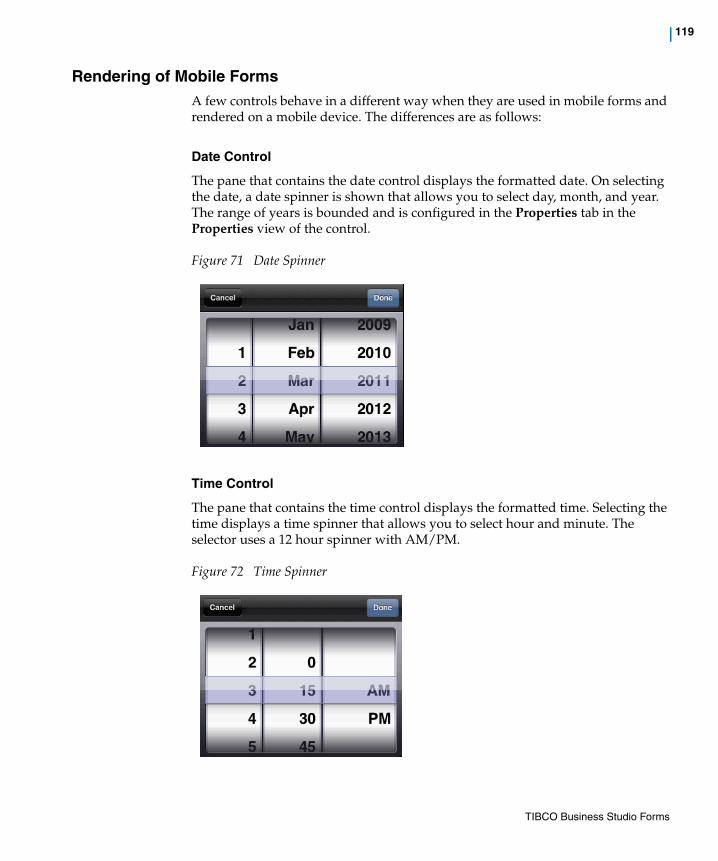
| 119
Rendering of Mobile FormsA few controls behave in a different way when they are used in mobile forms and rendered on a mobile device. The differences are as follows:
Date Control
The pane that contains the date control displays the formatted date. On selecting the date, a date spinner is shown that allows you to select day, month, and year. The range of years is bounded and is configured in the Properties tab in the Properties view of the control.
Figure 71 Date Spinner
Time Control
The pane that contains the time control displays the formatted time. Selecting the time displays a time spinner that allows you to select hour and minute. The selector uses a 12 hour spinner with AM/PM.
Figure 72 Time Spinner
TIBCO Business Studio Forms

120 | Mobile Forms
Datetime Control
The pane that contains the datetime control displays the formatted date and time. On selecting datetime, you go to the next screen where the date and time are displayed as two separate links. You can click on the date and time links to set them individually. Clicking the Back button will take you back to the previous screen.
Duration Control
The pane that contains the duration control displays a read-only summary of the information. Clicking on the control displays a detail screen where values can be specified for each of the fields.
Figure 73 Duration Control
Image Control
The pane containing the image control has a link for the image. Clicking on the link takes you to the next screen that displays the full image.
Optionlist Control (Single Value)
The pane that contains an Optionlist control shows the label of the selected option, clicking on which shows a choice spinner from which you can select a choice.
TIBCO Business Studio Forms
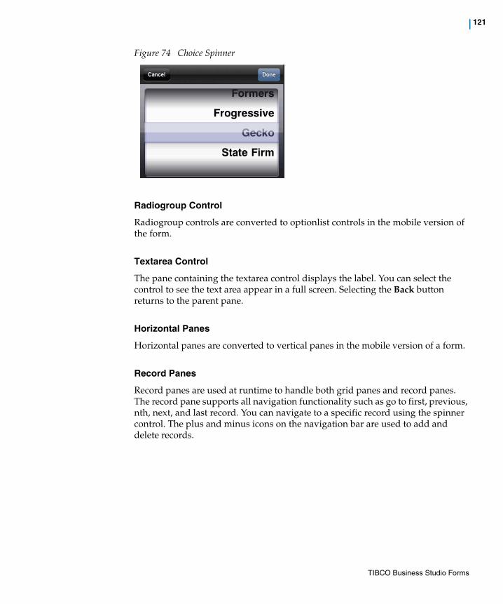
| 121
Figure 74 Choice Spinner
Radiogroup Control
Radiogroup controls are converted to optionlist controls in the mobile version of the form.
Textarea Control
The pane containing the textarea control displays the label. You can select the control to see the text area appear in a full screen. Selecting the Back button returns to the parent pane.
Horizontal Panes
Horizontal panes are converted to vertical panes in the mobile version of a form.
Record Panes
Record panes are used at runtime to handle both grid panes and record panes. The record pane supports all navigation functionality such as go to first, previous, nth, next, and last record. You can navigate to a specific record using the spinner control. The plus and minus icons on the navigation bar are used to add and delete records.
TIBCO Business Studio Forms
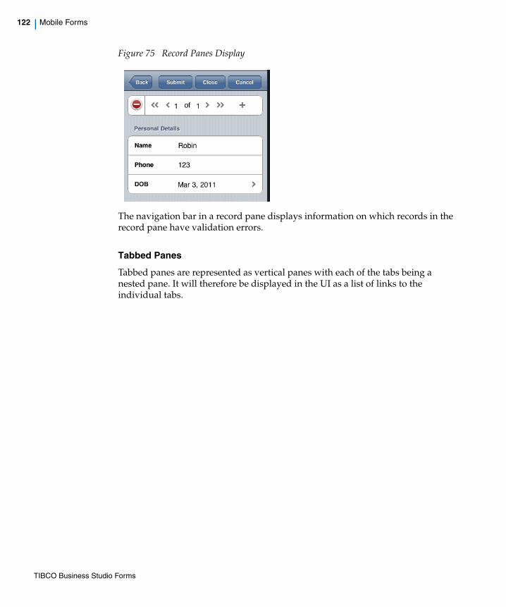
122 | Mobile Forms
Figure 75 Record Panes Display
The navigation bar in a record pane displays information on which records in the record pane have validation errors.
Tabbed Panes
Tabbed panes are represented as vertical panes with each of the tabs being a nested pane. It will therefore be displayed in the UI as a list of links to the individual tabs.
TIBCO Business Studio Forms
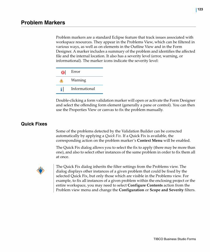
| 123
Problem Markers
Problem markers are a standard Eclipse feature that track issues associated with workspace resources. They appear in the Problems View, which can be filtered in various ways, as well as on elements in the Outline View and in the Form Designer. A marker includes a summary of the problem and identifies the affected file and the internal location. It also has a severity level (error, warning, or informational). The marker icons indicate the severity level:
Double-clicking a form validation marker will open or activate the Form Designer and select the offending form element (generally a pane or control). You can then use the Properties View or canvas to fix the problem manually.
Quick FixesSome of the problems detected by the Validation Builder can be corrected automatically by applying a Quick Fix. If a Quick Fix is available, the corresponding action on the problem marker’s Context Menu will be enabled.
The Quick Fix dialog allows you to select the fix to apply (there may be more than one), and also to select other instances of the same problem in order to fix them all at once.
Error
Warning
Informational
The Quick Fix dialog inherits the filter settings from the Problems view. The dialog displays other instances of a given problem that could be fixed by the selected Quick Fix, but only those which are visible in the Problems view. For example, to fix all instances of a given problem within the enclosing project or the entire workspace, you may need to select Configure Contents action from the Problem view menu and change the Configuration or Scope and Severity filters.
TIBCO Business Studio Forms

124 | Problem Markers
TIBCO Business Studio Forms

| 125
Chapter 3 Tasks
This section describes common tasks performed using TIBCO Business Studio Forms.
Topics
• Creating a New Form, page 126
• Using Drag and Drop Gesture to Customize a Form, page 128
• Edit or Remove the Validation Script, page 132
• Working with Bindings, Actions, and Rules, page 133
• Styling Forms Using Cascading Style Sheets, page 145
• Validating Data in a Form, page 147
• Calling External JavaScript Functions, page 161
• Configuring Panes, page 162
• Using Embedded Forms, page 166
• Working with the Mappings Tab, page 174
• Customizing Property Resource Bundles, page 179
• Customizing the Form’s Preview Data, page 188
• Using Form Data Fields, page 190
• Using Numeric Controls, page 192
• Localizing a Form, page 197
• Toggling between Business Analysis and Solution Design Modes, page 205
• Migrating from Previous Versions of TIBCO Business Studio Forms, page 206
TIBCO Business Studio Forms

126 | Creating a New Form
Creating a New Form
There are several ways to create a new form in TIBCO Business Studio.
• Go to the context menu of the Forms special folder, or any folder under the Forms special folder in the Project Explorer and click New > Form.
• On the File menu, click New > Other > TIBCO Forms > Form.
• Go to the context menu of a user task in a business process and click Form > Open.
• On the General tab of a user task’s Properties view, select the Form... radio button.
Of these approaches, the first two are equivalent. Both of these approaches trigger the opening of the New Form dialog as shown in Figure 76.
Figure 76 New Form Dialog
TIBCO Business Studio Forms
| 127
You need to specify the Form type on the New Form dialog. The type of form that is selected here determines the components that are initially part of the form model. The form types details are as follows:
• Process task: This creates a form that is the same as one created from a User Task in a process definition. It will contain a root pane, a toolbar with Cancel, Close, and Submit buttons, and a messages pane for displaying error messages.
• Pageflow task: This creates a form that is the same as one created from a User Task in a Pageflow Process. The only difference to a Process task form is that the toolbar contains only Cancel and Submit buttons. The Close operation is not supported in pageflows since there is no way to re-open a step in a pageflow once it has been closed.
• Embeddable: This creates a form that is suitable for embedding within another form. This will only contain a single root pane. This is because the parent form would typically contain the toolbar and messages pane, so these components are not needed in an embeddable form.
The other two approaches are equivalent. They will generate a form that has parameters and a user interface component corresponding to each of the parameters in the user task interface. For more information on creating a new form for a user task, refer BPM Implementation Guide, Chapter 4, Using Forms for User Tasks.
TIBCO Business Studio Forms
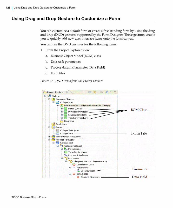
128 | Using Drag and Drop Gesture to Customize a Form
Using Drag and Drop Gesture to Customize a Form
You can customize a default form or create a free standing form by using the drag and drop (DND) gestures supported by the Form Designer. These gestures enable you to quickly add new user interface items onto the form canvas.
You can use the DND gestures for the following items:
• From the Project Explorer view:
a. Business Object Model (BOM) class
b. User task parameters
c. Process datum (Parameter, Data Field)
d. Form files
Figure 77 DND Items from the Project Explorer View
TIBCO Business Studio Forms

| 129
• From the Form Designer Outline view:
a. BOM property
b. Form datum (Parameter, Data Field)
Figure 78 DND Items from the Form Designer Outline View
The drop gesture results in the creation of any or all of the following, as appropriate:
• A matching form parameter is created, if no matching parameter exists. This applies only to the Project Explorer drags.
• A suitable user interface component (control or pane with child components) is created, if none already exists.
• Bindings from the new or implied form datum and its children to the generated user interface component and its children are created.
The BOM property can only be dropped onto a pane that is associated with a BOM class that actually owns or inherits the dropped property.
Using the DND gesture for BOM property is very helpful in restoring any missing user interface items in the form.
TIBCO Business Studio Forms
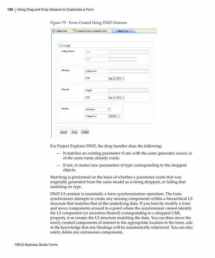
130 | Using Drag and Drop Gesture to Customize a Form
Figure 79 Form Created Using DND Gestures
For Project Explorer DND, the drop handler does the following:
— It matches an existing parameter if one with the same generator source or of the same name already exists.
— If not, it creates new parameters of type corresponding to the dropped objects.
Matching is performed on the basis of whether a parameter exists that was originally generated from the same model as is being dropped, or failing that matching on type.
DND UI creation is essentially a form synchronization operation. The form synchronizer attempts to create any missing components within a hierarchical UI structure that matches that of the underlying data. If you heavily modify a form and move components around to a point where the synchronizer cannot identify the UI component (or ancestors thereof) corresponding to a dropped UML property, it re-creates the UI structure matching the data. You can then move the newly created components of interest to the appropriate location in the form, safe in the knowledge that any bindings will be automatically refactored. You can also safely delete any extraneous components.
TIBCO Business Studio Forms

| 131
The new form model elements are created by the standard form generator and thus follow the same generation rules. If attached to an existing generated form structure, they also become candidates for subsequent sync validation and synchronization.
When dragging from Project Explorer view it is important to drag the most appropriate model element. For example, if you are working on a form for a user task, drag the user task parameter, or (if these are not explicitly modelled) drag the process parameter or data field. If you are working on an embeddable form, drag the BOM class. Note that dragging a BOM class onto a form intended for use with a user task may produce a deceptively correct-looking User Interface. However, this interface is with the BOM class rather than the user task parameter, process parameter, or process data field. This may lead to ambiguity and unexpected results in subsequent synchronization operations.
TIBCO Business Studio Forms

132 | Edit or Remove the Validation Script
Edit or Remove the Validation Script
Validation scripts can be edited or removed by any form designer who is using the Solution Design mode by doing the following:
1. With the form open in the Form Designer, select the control whose validation you wish to edit or delete.
2. Select the Validations tab.
3. To change the execution time, click on the Execute When field, which opens a dropdown list. Select from the list between On Form Submit and On Control Change.
4. Click the Delete button to remove the validation, or
Click the ellipsis button (...) next to the existing script to open the Edit Validation Script page.
Figure 80 Open the Edit Validation Script Page
5. Specify your edits in the Script field as necessary.
6. Click Finish.
If the user is in the Business Analysis mode, the Validations tab will not appear on the control’s Properties View. For information on toggling between modes, see Toggling between Business Analysis and Solution Design Modes on page 205.
TIBCO Business Studio Forms

| 133
Working with Bindings, Actions, and Rules
This section explains how to set bindings, actions, and rules.
Setting BindingsFor an overview of bindings and their use in TIBCO Business Studio Forms, see Bindings on page 78. For most controls, many properties on the Properties View can be initialized by an inbound parameter or expression.
The properties that may be initialized in this way are identified by the presence of a Add Binding icon to the right of the field where the property’s value is set.
As explained in Setting Bindings on page 78, you can add a binding in one of the following ways:
• From the General Properties tab for a control
• From the parameter dialog for a specific parameter
• From the Mappings tab of the Properties view for the selected element
You can also set bindings from the Properties tab of the properties sheet for some controls, such as hyperlink.
Add a Binding from the General Properties Tab for a Control
The General tab of the Properties View for a control may contain the binding icons indicating that a parameter or expression can be bound to any of the following properties: Label, Hint, Value, Visible, Enabled, and Required, which each can have only one binding or computation action.
The value property can have multiple bindings and/or computation actions. For details about these properties, see Properties View for Controls on page 330.
TIBCO Business Studio Forms
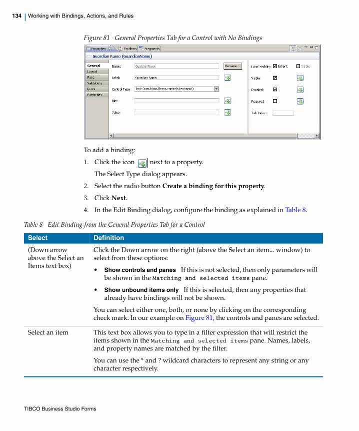
134 | Working with Bindings, Actions, and Rules
Figure 81 General Properties Tab for a Control with No Bindings
To add a binding:
1. Click the icon next to a property.
The Select Type dialog appears.
2. Select the radio button Create a binding for this property.
3. Click Next.
4. In the Edit Binding dialog, configure the binding as explained in Table 8.
Table 8 Edit Binding from the General Properties Tab for a Control
Select Definition
(Down arrow above the Select an Items text box)
Click the Down arrow on the right (above the Select an item... window) to select from these options:
• Show controls and panes If this is not selected, then only parameters will be shown in the Matching and selected items pane.
• Show unbound items only If this is selected, then any properties that already have bindings will not be shown.
You can select either one, both, or none by clicking on the corresponding check mark. In our example on Figure 81, the controls and panes are selected.
Select an item This text box allows you to type in a filter expression that will restrict the items shown in the Matching and selected items pane. Names, labels, and property names are matched by the filter.
You can use the * and ? wildcard characters to represent any string or any character respectively.
TIBCO Business Studio Forms
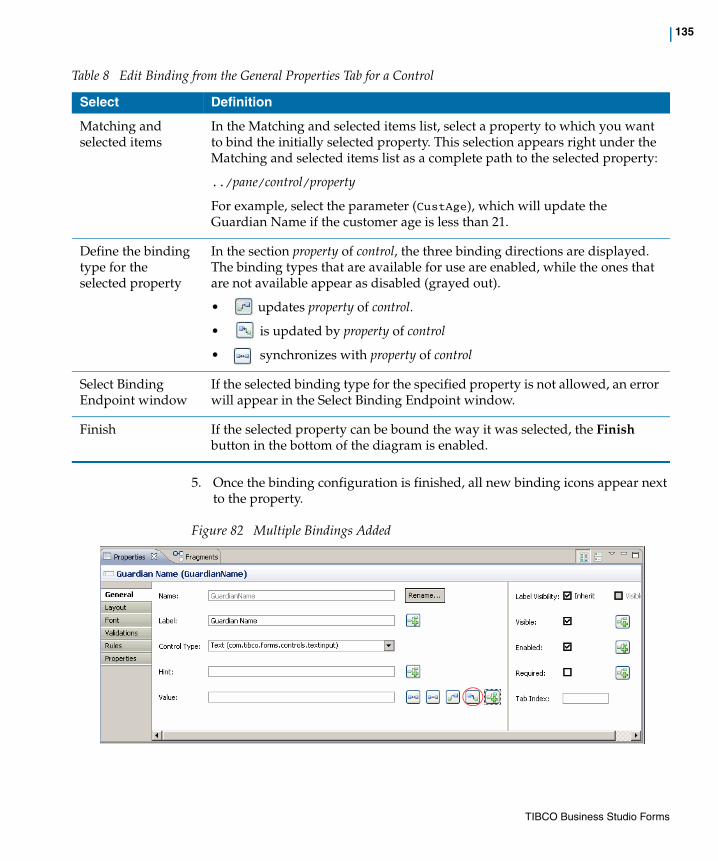
| 135
5. Once the binding configuration is finished, all new binding icons appear next to the property.
Figure 82 Multiple Bindings Added
Matching and selected items
In the Matching and selected items list, select a property to which you want to bind the initially selected property. This selection appears right under the Matching and selected items list as a complete path to the selected property:
../pane/control/property
For example, select the parameter (CustAge), which will update the Guardian Name if the customer age is less than 21.
Define the binding type for the selected property
In the section property of control, the three binding directions are displayed. The binding types that are available for use are enabled, while the ones that are not available appear as disabled (grayed out).
• updates property of control.
• is updated by property of control
• synchronizes with property of control
Select Binding Endpoint window
If the selected binding type for the specified property is not allowed, an error will appear in the Select Binding Endpoint window.
Finish If the selected property can be bound the way it was selected, the Finish button in the bottom of the diagram is enabled.
Table 8 Edit Binding from the General Properties Tab for a Control
Select Definition
TIBCO Business Studio Forms
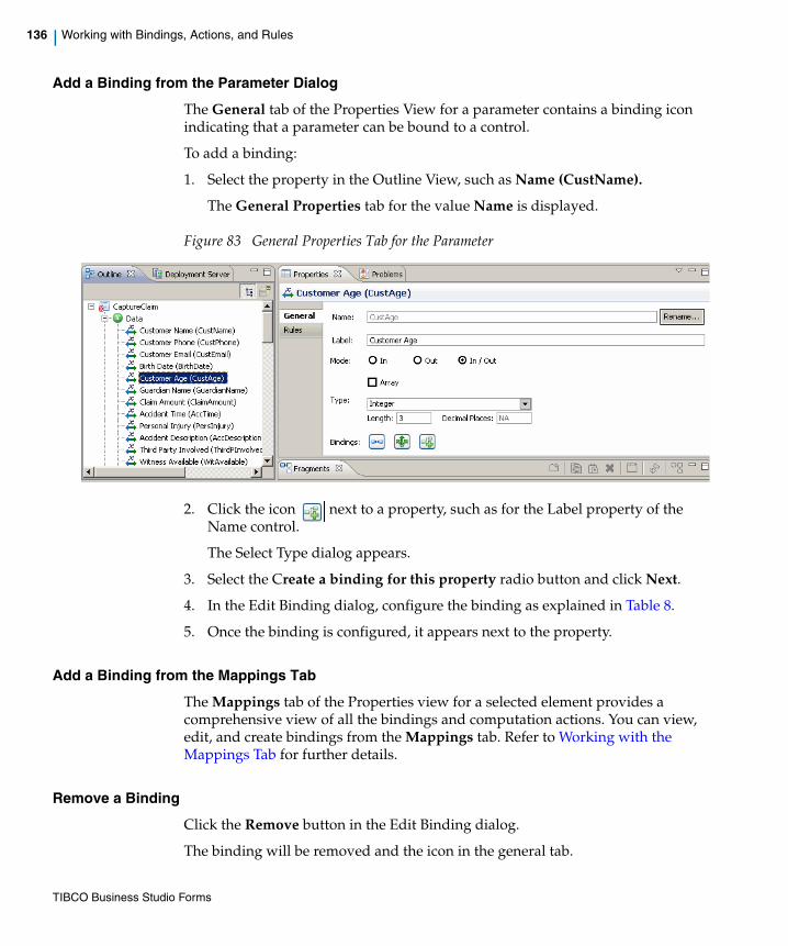
136 | Working with Bindings, Actions, and Rules
Add a Binding from the Parameter Dialog
The General tab of the Properties View for a parameter contains a binding icon indicating that a parameter can be bound to a control.
To add a binding:
1. Select the property in the Outline View, such as Name (CustName).
The General Properties tab for the value Name is displayed.
Figure 83 General Properties Tab for the Parameter
2. Click the icon next to a property, such as for the Label property of the Name control.
The Select Type dialog appears.
3. Select the Create a binding for this property radio button and click Next.
4. In the Edit Binding dialog, configure the binding as explained in Table 8.
5. Once the binding is configured, it appears next to the property.
Add a Binding from the Mappings Tab
The Mappings tab of the Properties view for a selected element provides a comprehensive view of all the bindings and computation actions. You can view, edit, and create bindings from the Mappings tab. Refer to Working with the Mappings Tab for further details.
Remove a Binding
Click the Remove button in the Edit Binding dialog.
The binding will be removed and the icon in the general tab.
TIBCO Business Studio Forms
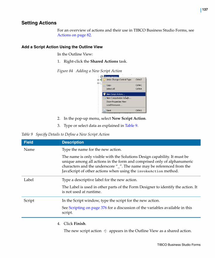
| 137
Setting Actions For an overview of actions and their use in TIBCO Business Studio Forms, see Actions on page 82.
Add a Script Action Using the Outline View
In the Outline View:
1. Right-click the Shared Actions task.
Figure 84 Adding a New Script Action
2. In the pop-up menu, select New Script Action.
3. Type or select data as explained in Table 9.
4. Click Finish.
The new script action appears in the Outline View as a shared action.
Table 9 Specify Details to Define a New Script Action
Field Description
Name Type the name for the new action.
The name is only visible with the Solutions Design capability. It must be unique among all actions in the form and comprised only of alphanumeric characters and the underscore “_”. The name may be referenced from the JavaScript of other actions when using the invokeAction method.
Label Type a descriptive label for the new action.
The Label is used in other parts of the Form Designer to identify the action. It is not used at runtime.
Script In the Script window, type the script for the new action.
See Scripting on page 376 for a discussion of the variables available in this script.
TIBCO Business Studio Forms

138 | Working with Bindings, Actions, and Rules
Add a Computation Action Using the Outline View
In the Outline View:
1. Right-click the Shared Actions task.
2. In the pop-up menu, select New Computation Action.
3. In the Enter the Action Details dialog, type or select data as explained in Table 10.
4. Click Finish.
The new script action appears in the Outline View as a shared action.
Table 10 Specify Details to Define a New Computation Action
Field Description
Name Type the name for the new action.
The name is only visible when the Solutions Design mode is active. The name must be unique among all actions in form and must be comprised only of alphanumeric characters and the underscore “_”. The name may be referenced from the JavaScript of other actions when using the invokeAction method.
Label Type a descriptive label for the new action.
The Label is used in other parts of the Form Designer to identify the action. It is not used at runtime.
Destination Click the Browse icon (...) to select a property to update with the results of the script evaluation.
Once you select the value, it will appear in the Destination window, such as Value of Claim Amount (ClaimAmount).
Expression Type the script that will be evaluated in order to update the property selected in the Destination field.
This is a JavaScript expression. The expression may contain multiple lines, but the last line in the script must be an expression that will be used to update the destination.
Note: Do not use a return, since you are not writing a function.
TIBCO Business Studio Forms
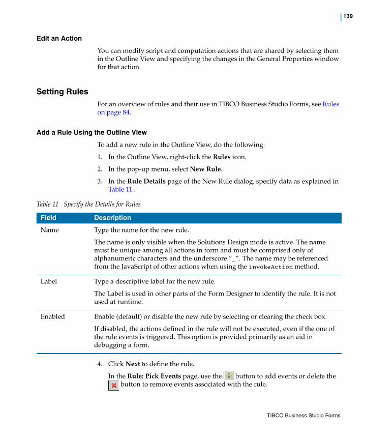
| 139
Edit an Action
You can modify script and computation actions that are shared by selecting them in the Outline View and specifying the changes in the General Properties window for that action.
Setting RulesFor an overview of rules and their use in TIBCO Business Studio Forms, see Rules on page 84.
Add a Rule Using the Outline View
To add a new rule in the Outline View, do the following:
1. In the Outline View, right-click the Rules icon.
2. In the pop-up menu, select New Rule.
3. In the Rule Details page of the New Rule dialog, specify data as explained in Table 11..
4. Click Next to define the rule.
In the Rule: Pick Events page, use the button to add events or delete the button to remove events associated with the rule.
Table 11 Specify the Details for Rules
Field Description
Name Type the name for the new rule.
The name is only visible when the Solutions Design mode is active. The name must be unique among all actions in form and must be comprised only of alphanumeric characters and the underscore “_”. The name may be referenced from the JavaScript of other actions when using the invokeAction method.
Label Type a descriptive label for the new rule.
The Label is used in other parts of the Form Designer to identify the rule. It is not used at runtime.
Enabled Enable (default) or disable the new rule by selecting or clearing the check box.
If disabled, the actions defined in the rule will not be executed, even if the one of the rule events is triggered. This option is provided primarily as an aid in debugging a form.
TIBCO Business Studio Forms
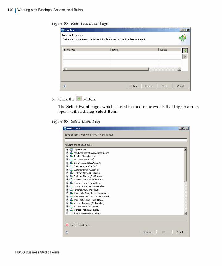
140 | Working with Bindings, Actions, and Rules
Figure 85 Rule: Pick Event Page
5. Click the button.
The Select Event page , which is used to choose the events that trigger a rule, opens with a dialog Select Item.
Figure 86 Select Event Page
TIBCO Business Studio Forms
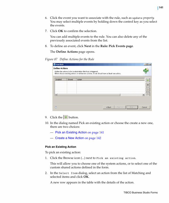
| 141
6. Click the event you want to associate with the rule, such as update property. You may select multiple events by holding down the control key as you select the events.
7. Click OK to confirm the selection.
You can add multiple events to the rule. You can also delete any of the previously associated events from the list.
8. To define an event, click Next in the Rule: Pick Events page.
The Define Actions page opens.
Figure 87 Define Actions for the Rule
9. Click the button.
10. In the dialog named Pick an existing action or choose the create a new one, there are two choices:
— Pick an Existing Action on page 141
— Create a New Action on page 142
Pick an Existing Action
To pick an existing action:
1. Click the Browse icon (...) next to Pick an existing action.
This will allow you to choose one of the system actions, or to select one of the custom shared actions defined in the form.
2. In the Select Item dialog, select an action from the list of Matching and selected items and click OK.
A new row appears in the table with the details of the action.
TIBCO Business Studio Forms
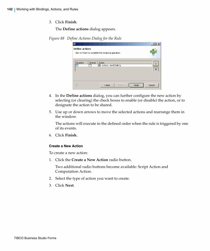
142 | Working with Bindings, Actions, and Rules
3. Click Finish.
The Define actions dialog appears.
Figure 88 Define Actions Dialog for the Rule
4. In the Define actions dialog, you can further configure the new action by selecting (or clearing) the check boxes to enable (or disable) the action, or to designate the action to be shared.
5. Use up or down arrows to move the selected actions and rearrange them in the window.
The actions will execute in the defined order when the rule is triggered by one of its events.
6. Click Finish.
Create a New Action
To create a new action:
1. Click the Create a New Action radio button.
Two additional radio buttons become available: Script Action and Computation Action.
2. Select the type of action you want to create.
3. Click Next.
TIBCO Business Studio Forms

| 143
4. If you selected the Script Action, specify the data as in Table 12.
If you selected the Computation Action, specify the data as in Table 13.
Table 12 Specify the Action Details for the Script Action
Field Description
Name Type the name for the new rule.
The name is only visible when the Solutions Design mode is active. The name must be unique among all actions in form and must be comprised only of alphanumeric characters and the underscore “_”. The name may be referenced from the JavaScript of other actions when using the invokeAction method.
Label Type a descriptive label for the new rule.
The Label is used in other parts of the Form Designer to identify the rule. It is not used at runtime.
Script Type the script to run.
Table 13 Specify the Action Details for the Computation Action
Field Description
Name Type the name for the new rule.
The name is only visible when the Solutions Design mode is active. The name must be unique among all actions in form and must be comprised only of alphanumeric characters and the underscore “_”. The name may be referenced from the JavaScript of other actions when using the invokeAction method.
Label Type a descriptive label for the new rule.
The Label is used in other parts of the Form Designer to identify the rule. It is not used at runtime.
Destination Click the Browse icon (...) to select a value of the property to update based on the script evaluation.
Once you select the value, it will appear in the Destination window, such as Value of Claim Amount (ClaimAmount).
Expression Type the script that will be evaluated in order to update the property selected in the Destination field.
TIBCO Business Studio Forms

144 | Working with Bindings, Actions, and Rules
5. Select the “Shared” check box on the actions dialog to create shared actions from your new custom actions. This makes actions visible under shared actions in the Outline View and available for use in other rules.
Add a Rule Using the Rule Wizard
In addition to adding new rules through the Outline View, you can also create a computation rule (a rule with a computation action) directly from property you want to create a computation rule for. To do so, follow these steps:
1. Click the Add a binding or rule icon next to a property, such as for the Value property of the Name control.
2. In the Select Type dialog, select the Update this property using a Computation Action radio button.
3. Click Next.
In the Provide Expression dialog, provide the script. Note that in this case, there is no option to select the destination, since the destination is implicit on where you are adding the computation action.
4. Click Next.
In the Events Configuration dialog, use the button to add events or the button to remove events associated with the rule.
5. Click the button.
The Event Picker, which is used to choose the events that trigger a rule, opens with a dialog Select Item.
6. Click the event you want to associate with the rule.
7. Click OK to confirm the selection.
You can add multiple events to associate with the rule. You can also delete any of the previously selected events from the list.
8. Click Finish when you are done configuring the rule.
When you have finished a rule icon appears next to the property and allows easy editing of the compute action.
Additionally, the rule appears in the Outline View and can be edited as a regular rule.
TIBCO Business Studio Forms
| 145
Styling Forms Using Cascading Style Sheets
While you can control some layout and font properties via the form model Property tabs, it is also possible to specify additional CSS classes that are applied to form components at the form, pane, and control level. This approach provides more flexibility and opportunities for reuse of style information above manually setting properties at the Form model level.
Setting CSS ClassesThe General property sheet for the form, panes and controls includes an input box to specify the CSS class for the given component. The value can be either a single value, or a space-separated list of CSS classes. When the component is rendered in the web page, the CSS classes specified here will be added to the HTML along with other built-in CSS classes. The value of the CSS class for a form, pane or control can also be updated via bindings, computation actions, or set via the API.
Using an external CSS resource The Resources property sheet for a form allows one or more external CSS files to be referenced from the form. When added as an external reference, the CSS will be loaded prior to the form being loaded. To load an external CSS file in a Form:
• Place the CSS resource within the "Presentation Resources" special folder.
• Select the root of the form by either clicking in the background of the canvas or selecting the root node in the outline view.
• Select the "External Resources" property tab.
• Click the "+" button to add a reference to the CSS.
See Scripting on page 376 for lists of the built-in static and dynamic CSS classes.
Best Practices• Use .TibcoForms in class selectors.
The root node of each form will specify a class TibcoForms. This allows one to write CSS selectors that are specific to Forms and will not conflict with other elements on the page. For example, suppose you have a CSS class highlight that you apply to a pane. The corresponding CSS rule may be written as follows:
.TibcoForms .highlight {background-color: yellow;}
TIBCO Business Studio Forms

146 | Styling Forms Using Cascading Style Sheets
This will ensure that the highlight class will only get applied to elements within a form.
• Share CSS between forms.
You can share the same CSS between multiple forms to cut down on duplication. Just add a reference to the shared CSS from one or more forms.
ExamplesA vertical pane might make use of a set of classes such as the following:
pane pane-verticalpane-labelpane-content
component control-textinput requiredlabelcontainer
widget-texthint
component control-datelabelcontainer
widget-datehint
You might make use of the following selectors:
.pane-vertical .hint Applies to hints within vertical panes
.control-date .label Applies to labels of Date controls
.pane-vertical .required Applies to required controls within a vertical pane
.pane-vertical .pane-horizontal .label Applies to the labels in horizontal panes nested within vertical panes.
TIBCO Business Studio Forms
| 147
Validating Data in a Form
TIBCO Forms supports runtime validation of data as the user fills up the forms. You can configure validations for the fields defined on the form. You can configure the validations to occur either when the user changes a field value, or when the user submits the form.
Validations help users to specify correct data, thereby enhancing the overall experience. On the server side, the submitted data are validated against the restrictions specified in the business object models used within the form.
You can write validation scripts for each control as well as each pane on a form. Validation scripts usually run when users update data or submit the form. The scripts need to be written to explicitly return a Boolean or an Array.
• If the returned value for all validation scripts on the form is true, the form data are valid.
• If the returned value for one or more validation scripts is false, the validation error messages are displayed on the form in a special pane called a Messages pane. Users can click the error message to navigate to the first instance of the error in the form.
• If the validation expression evaluates to an array of strings, it indicates a failed validation. In this case, the Messages pane substitutes each indexed parameter marker in the validation message template with the corresponding array element.
The Messages pane displays the validation messages. You can specify a validation message either using a key reference from the External Resources of a *.properties file or as a Custom Message.
By default, the Messages pane opens at the bottom of the form when a validation fails. By manually adding a Messages pane to the form, you can configure the font and layout properties of the pane, and place it anywhere other than the default position.
TIBCO Forms does not validate controls and panes that are invisible, disabled, have any empty value, or that are contained within a pane that is invisible or disabled. Only collection panes are validated even if they are empty.
TIBCO Business Studio Forms

148 | Validating Data in a Form
Helping Users with Validation MessagesGood validation messages help users complete the forms faster and without any error in the specified data. This section summarizes how the users get to see the error messages for different types of controls and panes.
If you configure validation messages for each control, the user gets the validation message for the control after specifying data and moving on to the next control. If you configure the validation to occur on submitting the form, the validation message appears after the user clicks Submit to submit the form.
Clicking the message associated with an individual control sets the focus on that control. Record and Grid panes automatically navigate to the correct page in order to show the invalid control. If you configure validation for the entire pane, the focus of the screen shifts to the beginning of the pane in case of a failed validation.
Implementing ValidationsYou can add, edit, or remove validation scripts only when using the Solution Design capability. If the Solution Design capability is disabled, the Validations tab does not appear on the Properties view of a control. The following section describes the steps to perform such tasks.
For information about invoking validations programmatically, see validate in the API reference.
Adding a Validation
1. With the form open in the Form Designer, click the control or pane where you wish to add new validations.
The Properties view shows the properties for that control or pane. You can view the validation script for any control or pane by clicking the control or pane, and clicking the Validations tab in the Properties view of the control or the pane. See Chapter 7, Reference for a detailed description of each property available on the Validations tab.
TIBCO Business Studio Forms

| 149
Figure 89 The Validations Tab
2. Click the button to add a new validation.
The Define Validation dialog opens.
TIBCO Business Studio Forms
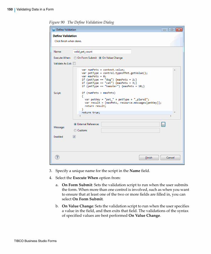
150 | Validating Data in a Form
Figure 90 The Define Validation Dialog
3. Specify a unique name for the script in the Name field.
4. Select the Execute When option from:
a. On Form Submit: Sets the validation script to run when the user submits the form. When more than one control is involved, such as when you want to ensure that at least one of the two or more fields are filled in, you can select On Form Submit.
b. On Value Change: Sets the validation script to run when the user specifies a value in the field, and then exits that field. The validations of the syntax of specified values are best performed On Value Change.
TIBCO Business Studio Forms

| 151
5. If you are defining a validation on a pane or control that supports multiple values (for example, grid panes, list controls, and multi-select optionlists), select Validate As List to control how the validation is run.
6. Specify the validation script in the Script text area.
7. Select the type of Message from:
— External Reference: Picks the validation message from an external *.properties resource. You can define validation messages at the form level in an external resource file with validation_ as a prefix in the key, and share the file across forms or projects. Also, the default implicit validations can reference messages in the common resource bundle. External reference validation messages can use substitution variables to include runtime data values in an externalized static text string.
— Custom: Allows you to specify custom text message or a message that contains substitution variables, for example: “Sorry, you cannot have more than {0} {1}”. You can dynamically determine the validation message at the runtime using substitution variables.
8. If you select the Message type as External Reference, click the button to open the Resource Picker dialog. Select a validation message from all the available validation_* resource keys, and click OK.
If you select Validate As List, then the validation runs just once for the entire list of items, and context.value contains an Array (for primitive values) or a list (for multi-valued pane validations). If you do not select Validate As List, then the validation runs once for each item in the multi-valued control or pane, with context.value set to a new item each time the validation is invoked.
The Resource Picker dialog displays a filtered list of only validation_* resource keys.
TIBCO Business Studio Forms

152 | Validating Data in a Form
Figure 91 The Resource Picker Dialog
See Example 3: Validation Message Referenced from External Resource for details.
9. If you select the Message type as Custom with substitution variables, ensure that the validation script expression evaluates to an array of strings.
The length of the array must be equal to the number of substitution variables in the message. See Example 2: Custom Validation Message with Substitution Variables for details.
10. Confirm that the Enabled check box is selected, and click Finish to complete the process of defining a validation.
Editing a Validation
1. In the Properties view of the control or the pane, click the Validations tab.
Figure 89 displays the validations defined for a control or a pane.
TIBCO Business Studio Forms

| 153
2. From the Validations tab of the Properties view, edit the Name, Execute When, Message Type, Message, and List fields.
3. Select the script you wish to edit.
A cell editor button appears next to the script.
4. Click the button.
The Edit Validation Script dialog opens.
Figure 92 The Edit Validation Script Dialog
5. Edit the code in the Script field, and click Finish.
If the message is an external reference, a cell editor appears on clicking in the message cell. Clicking the cell editor opens the Resource Picker, from where you can select an appropriate message key.
The script editor provides content-assist editing. On typing the beginning of a legal value, such as “control.”, a pop-up window appears listing the available completion proposals. If you type CTRL+Space, a list displays containing all the top-level variables that are available in the given context.
TIBCO Business Studio Forms

154 | Validating Data in a Form
Edit Validation Script Dialog
In this cell editor dialog, you can edit the script that determines whether the data submitted are valid, or you can modify the error message that appears when users submit invalid data. The final expression in the validation script must evaluate to true (if the data are valid), false (if the data are invalid), or an array of strings (if the data are invalid and the validation message contains substitution variables).
You can use the notation this in your script to refer to the control or pane during a given validation invocation. A validation script, for instance, might contain a statement such as the following:
this.getValue() == "New York";
You can also use the context object provided while executing the validation to retrieve the value of the given control or pane:
context.value == "New York";
You can refer to any control by using the “control.” notation, or to a pane using "pane." notation. To refer to the value of a control, use the latter notation in conjunction with the Control.getValue() method:
control.city_name.getValue() == "New York";
Example 1: Custom Validation Message
In this example, the text field has the name petNumber.
Validation scripts must have no side effects. Do not set the value of controls nor make any modifications to the form model from within a validation script.
TIBCO Business Studio Forms

| 155
Figure 93 The General Tab
This means that the value submitted for this text field by a user can be referenced in the validation script by the expression control.petNumber.getvalue().
1. In the Define Validation dialog, specify the value in the Script field.
TIBCO Business Studio Forms
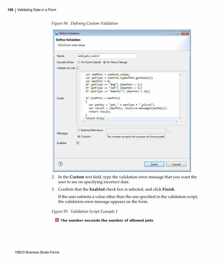
156 | Validating Data in a Form
Figure 94 Defining Custom Validation
2. In the Custom text field, type the validation error message that you want the user to see on specifying incorrect data.
3. Confirm that the Enabled check box is selected, and click Finish.
If the user submits a value other than the one specified in the validation script, the validation error message appears on the form.
Figure 95 Validation Script Example 1
TIBCO Business Studio Forms
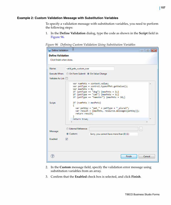
| 157
Example 2: Custom Validation Message with Substitution Variables
To specify a validation message with substitution variables, you need to perform the following steps:
1. In the Define Validation dialog, type the code as shown in the Script field in Figure 96.
Figure 96 Defining Custom Validation Using Substitution Variables
2. In the Custom message field, specify the validation error message using substitution variables from an array.
3. Confirm that the Enabled check box is selected, and click Finish.
TIBCO Business Studio Forms
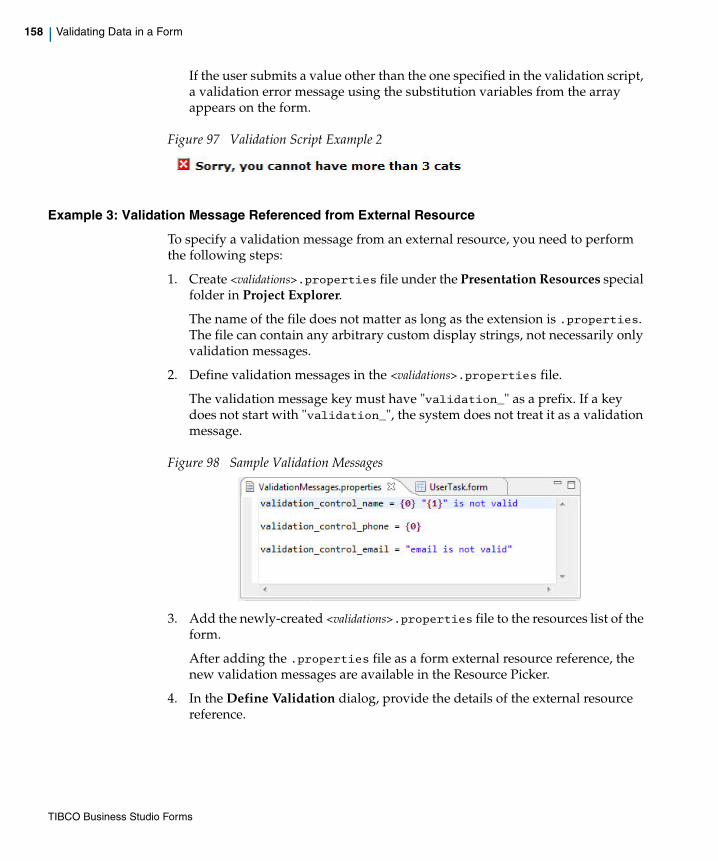
158 | Validating Data in a Form
If the user submits a value other than the one specified in the validation script, a validation error message using the substitution variables from the array appears on the form.
Figure 97 Validation Script Example 2
Example 3: Validation Message Referenced from External Resource
To specify a validation message from an external resource, you need to perform the following steps:
1. Create <validations>.properties file under the Presentation Resources special folder in Project Explorer.
The name of the file does not matter as long as the extension is .properties. The file can contain any arbitrary custom display strings, not necessarily only validation messages.
2. Define validation messages in the <validations>.properties file.
The validation message key must have "validation_" as a prefix. If a key does not start with "validation_", the system does not treat it as a validation message.
Figure 98 Sample Validation Messages
3. Add the newly-created <validations>.properties file to the resources list of the form.
After adding the .properties file as a form external resource reference, the new validation messages are available in the Resource Picker.
4. In the Define Validation dialog, provide the details of the external resource reference.
TIBCO Business Studio Forms

| 159
Figure 99 The Define Validation Dialog Using External Resources
5. Click Finish.
If the user submits a value other than the one specified in the validation script, the validation error message from the external resource file appears on the form.
Figure 100 Validation Script Example 3
You can localize the validation error messages. See Localizing a Form on page 197.
TIBCO Business Studio Forms

160 | Validating Data in a Form
Enabling or Disabling a ValidationYou can enable or disable a validation at the time of defining it, or after defining it. If disabled, the validation definition remains in the form model, but is not invoked at runtime. This may be useful during troubleshooting of a form.
• When defining a validation, you can enable it or disable it by using the Enabled check box on the Define Validation dialog.
• You can enable or disable a defined validation by using the Enabled check box in the Validations tab of the Properties view.
TIBCO Business Studio Forms

| 161
Calling External JavaScript Functions
Often, a single JavaScript function is useful for many different forms. Typical utility functions that are candidates for reuse are those for validating common types of input, such as phone numbers and zip codes, or for making calls to external services, for instance, to dynamically obtain lists of data. It is not necessary to rewrite or copy these functions from one form to another.
To facilitate reuse, common JavaScript can be placed in one or more JavaScript files external to the form. These JavaScript files will be deployed to the WebDAV server with your form files, and can be used by multiple forms in the browser client.
To use an external JavaScript file in a form, you need to add it to the form resources. Once added, the JavaScript files will get deployed automatically when the form is deployed, and loaded at runtime before the form is loaded.
TIBCO Business Studio Forms
162 | Configuring Panes
Configuring Panes
This section describes special procedures for the sizing, re-sequencing, and nesting of panes.
Nesting PanesPanes may be nested within other panes to achieve specialized layouts. In particular, panes with different layout directions can be nested to achieve column- or row-wise layouts.
Creating Columns with Nested Panes
To create a multi-column layout by nesting two vertical panes, side-by-side, within a horizontal parent pane, follow these steps:
1. Place groups of controls into two separate vertical panes, each representing a separate column.
2. Drag the second pane to a position next to the first pane, so that you see a dotted line appear. The dotted line means that a horizontal pane will be automatically created for you to hold the two vertical panes.
As you drag the pane, you will see feedback on the new position of the pane prior to releasing the mouse button.
3. If you want more than two vertical columns, drag additional panes, one at a time, next to the right-most vertical pane within the new horizontal parent pane.
Positioning Controls into a Multi-Column Layout
A multi-column layout is created by positioning multiple vertical panes within a horizontal pane. The creation of a two-column layout is used here to demonstrate this technique.
1. Vertical panes A, B, C, and D are placed on the form, one beneath the other.
TIBCO Business Studio Forms

| 163
Figure 101 Place Vertical Panes on the Form
2. Drag the Pane B up and to the right, close enough so that a colored background appears around Pane A.
Figure 102 Position the New Pane
TIBCO Business Studio Forms
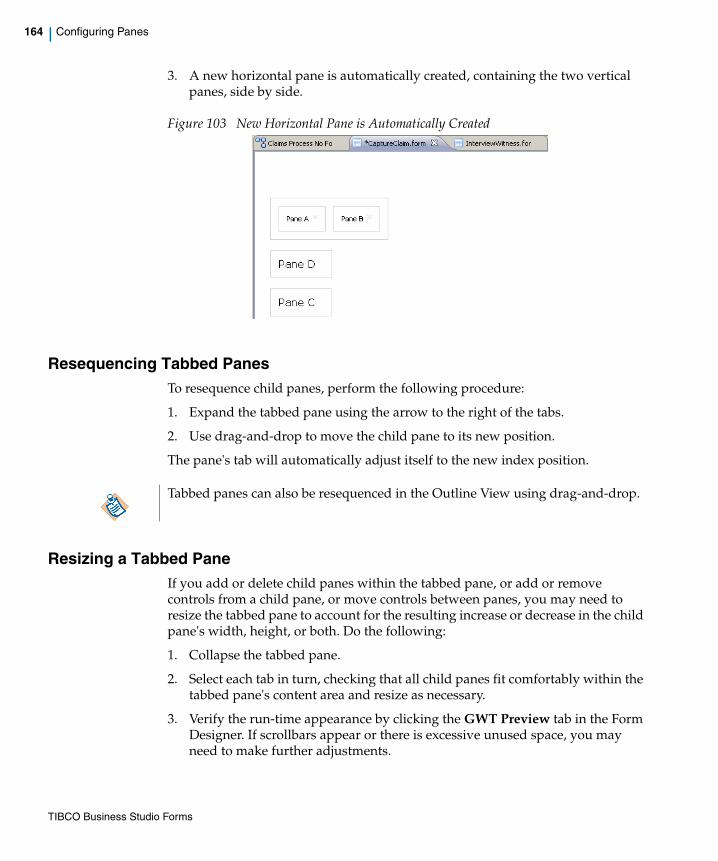
164 | Configuring Panes
3. A new horizontal pane is automatically created, containing the two vertical panes, side by side.
Figure 103 New Horizontal Pane is Automatically Created
Resequencing Tabbed PanesTo resequence child panes, perform the following procedure:
1. Expand the tabbed pane using the arrow to the right of the tabs.
2. Use drag-and-drop to move the child pane to its new position.
The pane's tab will automatically adjust itself to the new index position.
Resizing a Tabbed PaneIf you add or delete child panes within the tabbed pane, or add or remove controls from a child pane, or move controls between panes, you may need to resize the tabbed pane to account for the resulting increase or decrease in the child pane's width, height, or both. Do the following:
1. Collapse the tabbed pane.
2. Select each tab in turn, checking that all child panes fit comfortably within the tabbed pane's content area and resize as necessary.
3. Verify the run-time appearance by clicking the GWT Preview tab in the Form Designer. If scrollbars appear or there is excessive unused space, you may need to make further adjustments.
Tabbed panes can also be resequenced in the Outline View using drag-and-drop.
TIBCO Business Studio Forms

| 165
Viewing Pane and Control BordersThe controls and panes on a form, including nested panes, are sometimes clearer and easier to distinguish from one another when viewed with borders around them. The borders do not appear at runtime (or in the GWT Preview mode), but only in Design mode. It is a matter of personal preference whether to display the borders in Design mode.
To switch between showing and hiding borders around controls and panes, click the Toggle Pane and Control Borders button at the far right of the TIBCO Business Studio Forms toolbar.
Figure 104 TIBCO Business Studio Forms toolbar
To control whether borders are shown by default:
1. Click Window > Preferences to open the Preferences dialog.
2. Click Form Designer in the left navigation pane.
Figure 105 Show Pane and Control Borders
3. Select or clear the Show pane and control borders check box as desired, and click OK.
Borders will appear or disappear as selected.
TIBCO Business Studio Forms
166 | Using Embedded Forms
Using Embedded Forms
The Embedded Forms feature enables you to embed one form within another. You can use this design technique to create smaller reusable fragments of a form separately, which can then be embedded in a parent form.
For example: you have to design a form for delivery of goods to customers. In such a form, different types of address information is required, such as delivery address and personal address. If you design a normal form, you have to create the same set of address fields at two places. By using the embedded forms feature, you can create a reusable embeddable form with the address fields and embed this form at multiple locations in the parent form.
Prerequisites of an Embeddable Form
An embeddable form has no navigation or message panes, as navigation and messaging are taken care of by the parent form.
If you want to embed an existing form within another form, it is advisable to make the following changes to make the existing form suitable for embedding:
• Remove the navigation and messages panes from the embeddable form.
• If the embeddable form has any dynamic behavior that must be exposed to the parent form, you must tie the dynamic behavior to parameters on the embedded form, which can then be updated by parent forms.
In the Embedded Forms topic the following terms are used frequently:
Embeddable Form A form that has been designed to be embedded is referred to as an embeddable form.
Embedded Form Once a form is embedded within the parent form, it is referred to as an embedded form.
TIBCO Business Studio Forms

| 167
Working with Embedded FormsThis section describes the creation of embeddable forms and different gestures for embedding a form.
To Create an Embeddable Form
Perform the following steps to create an embeddable form from the Project Explorer:
1. Go to the Forms folder, or any folder under the Forms folder in the Project Explorer and click Context Menu > New > Form. The New Form dialog opens.
2. On the New Form dialog box, specify the File name. Select the Form type as Embeddable.
3. Click OK.
This newly created form will only have a single root pane. Messages and navigation panes are not created.
To Embed a Form by Using the Embedded Form Icon
1. Select the embedded form icon from the Palette and drop it in the required location on the Form Designer canvas.
Figure 106 Using the Embedded Form Icon
TIBCO Business Studio Forms

168 | Using Embedded Forms
2. The Select the form to embed dialog is displayed. All the forms available in all the projects in the workspace are listed in the dialog. Select the required form.
3. The Embedded Form dialog appears asking you to map the embedded form parameters in the ‘Mapping’ property section. Click Yes to continue or No to skip the parameter binding. See Working with Embedded Form Parameters for the details of parameter binding.
To Embed a Form from the Project Explorer
You can embed any form within the project or any project on which the existing project depends.
Perform the following steps to embed a form from Project Explorer:
1. Select the form from the Project Explorer and drop it in the required location on the Form Designer canvas or Outline view.
2. The form is embedded within the form. An embedded form is represented as a pane containing a form icon, labelled with the name of the embedded form.
If the selected form is from another project, you are prompted to add the other project as a reference.
TIBCO Business Studio Forms
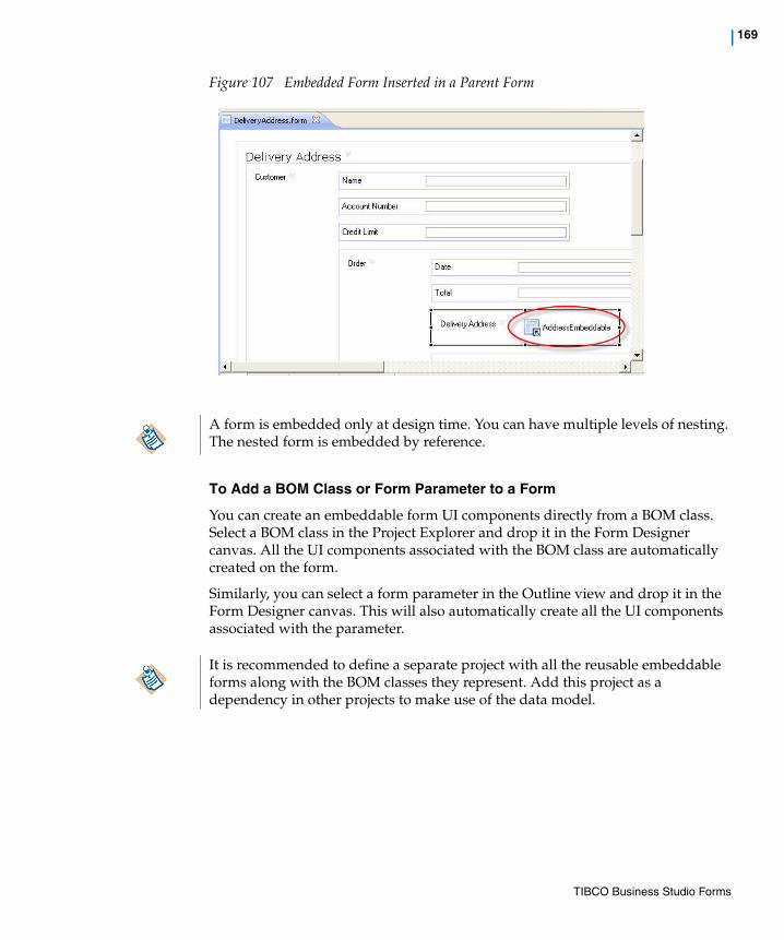
| 169
Figure 107 Embedded Form Inserted in a Parent Form
To Add a BOM Class or Form Parameter to a Form
You can create an embeddable form UI components directly from a BOM class. Select a BOM class in the Project Explorer and drop it in the Form Designer canvas. All the UI components associated with the BOM class are automatically created on the form.
Similarly, you can select a form parameter in the Outline view and drop it in the Form Designer canvas. This will also automatically create all the UI components associated with the parameter.
A form is embedded only at design time. You can have multiple levels of nesting. The nested form is embedded by reference.
It is recommended to define a separate project with all the reusable embeddable forms along with the BOM classes they represent. Add this project as a dependency in other projects to make use of the data model.
TIBCO Business Studio Forms
170 | Using Embedded Forms
Working with Embedded Form ParametersOnce a form is embedded within a parent form, the embedded form parameters can be accessed only via the parent form. An embedded form exposes an interface that consists of its parameters. The panes and controls in an embedded form are generally bound or otherwise mapped to its parameters. These parameters in the embedded form are in turn mapped to parameters, data fields, controls, or panes in the parent form.
For example: we have an embeddable form which contains a single pane that is bound to a parameter of particular type defined as a BOM class. This form is embedded in a parent form. You bind an embedded form parameter to one of the parent form’s IN OUT parameters of the same type. When the parent form is loaded with an instance of that parameter, the embedded form is updated via the binding. This is one of the mechanisms by which information is exchanged between the parent form and the embedded form
There are many ways in which data can be exchanged between the parent and the embedded forms:
1. Using absolute bindings from parent form panes or parameters
2. Using computation actions
3. Using the API in script actions
For details of how to set bindings and actions, see Working with Bindings, Actions, and Rules.
Accessing Embedded Form Parameters
You can access the embedded form parameters using action scripts and computation actions.
The parameters of the embedded form appear as Data Fields in the deployed copy of the parent form. The names of these parameters are scoped by the name of the embedded form.
Example:data.get<EmbeddedFormName>_<ParamName>();
For example, data.getCustomerForm_Customer();
Set Bindings from the Mappings Tab
To set the bindings from the Mapping tab, perform the following steps:
1. In the Form Designer canvas or Outline view, select the embedded form.
2. Go to the Mappings tab in the Properties view of the parent form.
TIBCO Business Studio Forms

| 171
3. All the parent form parameters are displayed in the left pane. The right pane displays each embedded form, along with the parameters defined in that embedded form.
4. Drag the required parent form parameter and drop it onto the embedded form parameter to bind it. This creates the required binding, which is represented by a connecting line between the parameters.
Figure 108 Set Binding Using the Mappings Tab
Rendering of Embedded FormsOn the Form Designer canvas, an embedded form is represented as a pane containing a form icon. When the builder runs, it creates a deployable copy of the parent form. Each embedded form pane is replaced by the contents of its respective embeddable form, recursively.
At preview and runtime, the GWT implementation renders the deployable copy of the parent form.
TIBCO Business Studio Forms
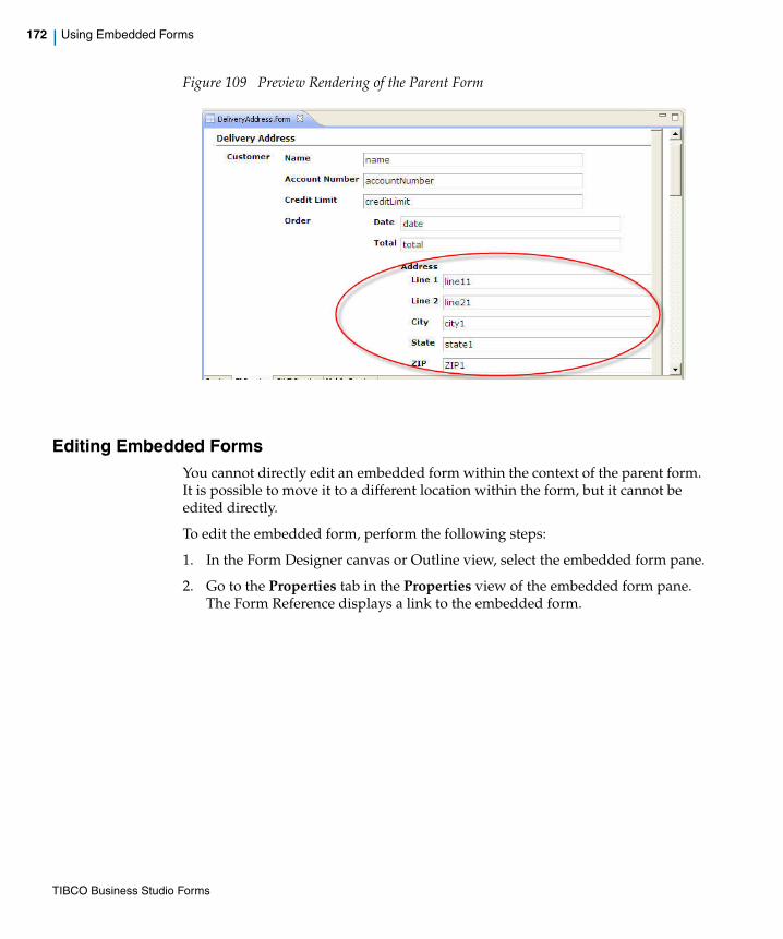
172 | Using Embedded Forms
Figure 109 Preview Rendering of the Parent Form
Editing Embedded FormsYou cannot directly edit an embedded form within the context of the parent form. It is possible to move it to a different location within the form, but it cannot be edited directly.
To edit the embedded form, perform the following steps:
1. In the Form Designer canvas or Outline view, select the embedded form pane.
2. Go to the Properties tab in the Properties view of the embedded form pane. The Form Reference displays a link to the embedded form.
TIBCO Business Studio Forms

| 173
Figure 110 Properties Tab for the Embedded Form
3. Click the link to open the embedded form in the Form Designer.
4. Click the button to change the embedded form.
5. Update the embedded form using the Form Designer.
The updates are available in the parent forms without having to re-embed the form.
The changes made in the embedded form can be seen in preview and at runtime after the parent form is redeployed.
TIBCO Business Studio Forms

174 | Working with the Mappings Tab
Working with the Mappings Tab
The Mappings tab of the Properties view provides a global view of all the bindings and computation actions related to the selected element in the Form Designer canvas or Outline view.
You can view, edit, and create mappings from the Mappings tab. It displays the values of the source and target fields of the existing mappings in the left and right trees respectively.
Figure 111 Mappings Tab of the Properties View
The details are as follows:
• The right pane displays the bindable properties of the selected target element.
• The left pane displays the bindable source properties to which the target elements are bound. It displays the selected object and its ancestors all the way up to the containing form and also includes the form parameters and data fields.
• The connecting lines represent the existing mappings between the source and target properties.
The term mappings used in this topic, is a generic word which covers both bindings and computation actions.
TIBCO Business Studio Forms

| 175
• The arrow end-point represents unidirectional mappings.
• The red triangle at one end-point of the connecting line represents collapsed mappings.
The default view of the Mappings tab is focussed on the mappings of the selected element.
A set of buttons and filters are provided in the toolbar. Each of these filters has a corresponding toolbar button and a toolbar menu item: both are associated with same filter action. The buttons control the depth to which the source and target trees are expanded. The filters help you to control the properties to be displayed in the source and target panes. The details are explained in Table 14.
Table 14 Toolbar Buttons for the Mappings Tab
Button Description
Expands the source and target trees just to the extent required to reveal all the existing mappings.
Expands both the source and target trees to the maximum possible extent.
Collapses both the source and target trees to the maximum possible extent.
Deletes all the bindings and computation actions related to the selected element.
This filter shows only the selected element and its related ancestors. By default this filter is enabled. When disabled, unrelated components are also visible but initially shown collapsed. You can expand these unrelated nodes manually.
This filter hides the descendents of the selected pane in the target tree. By default this filter is enabled. When disabled, all the target pane’s children are visible but initially shown collapsed. You can expand the child nodes manually.
This filter shows only the bindable value in the target tree. By default this filter is enabled. When disabled, the other bindable properties of the selected element are also displayed in the target tree.
TIBCO Business Studio Forms

176 | Working with the Mappings Tab
Coloration Feedback
The connecting lines representing the existing mapping can be difficult to understand especially if there are many mappings between the elements of the source and target tree. The coloration feedback is very useful in such scenario as it allows you to see at a glance which mappings are defined within a given component tree. Some examples are listed below:
• When you select a bindable element in the source or target tree, all mappings involving that element and its visible children are highlighted in bold. In Figure 111, when you select Customer_order_item_SKU/Value node in the target tree, the corresponding binding is highlighted in bold. This is especially helpful when the ‘show only source ancestors’ and ‘hide target descendants’ filters are disabled.
• When you click a collapsed mapping (represented by a red triangle), it automatically expands and displays both of the end-points of the mapping.
The Mappings tab’s user interface (UI) simplifies tasks such as property binding and creating computation actions. The following sections describes the operations that can be performed using the Mappings tab.
Settings Bindings
1. In the Form Designer canvas or Outline view, select the target element.
2. Go to the Mappings tab in the Properties view of the selected element.
3. Drag the property of a component, parameter or data field from the source tree and drop it over the property of a component in the target tree to which you want to bind it.
4. This creates the required binding, which is represented by a connecting line between the properties.
5. You can also create a binding in the opposite direction i.e. from the target tree to the source tree.
Adding Computation Actions
1. In the Form Designer canvas or Outline view, select the component or element for which you want to add a computation action.
2. Go to the Mappings tab in the Properties view of the selected element.
3. Click the New Computation Action node in the source tree. By clicking on this node, you can specify the name of the computation action in direct edit mode.
4. Press Enter to commit the newly created computation action name and display the Rule Details page of the New Rule dialog. Follow the instructions
TIBCO Business Studio Forms
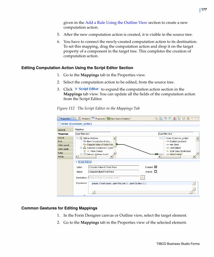
| 177
given in the Add a Rule Using the Outline View section to create a new computation action.
5. After the new computation action is created, it is visible in the source tree.
6. You have to connect the newly-created computation action to its destination. To set this mapping, drag the computation action and drop it on the target property of a component in the target tree. This completes the creation of computation action.
Editing Computation Action Using the Script Editor Section
1. Go to the Mappings tab in the Properties view.
2. Select the computation action to be edited, from the source tree.
3. Click to expand the computation action section in the Mappings tab view. You can update all the fields of the computation action from the Script Editor.
Figure 112 The Script Editor in the Mappings Tab
Common Gestures for Editing Mappings
1. In the Form Designer canvas or Outline view, select the target element.
2. Go to the Mappings tab in the Properties view of the selected element.
TIBCO Business Studio Forms

178 | Working with the Mappings Tab
3. Select the mapping to be edited and use one of the following ways to invoke the Edit Binding or Edit Computation Action dialog:
a. Double-click the selected mapping.
b. Select a mapping and press Enter.
c. Select a mapping and execute Context Menu > Edit.
4. The Edit Binding or Edit Computation Action dialog is displayed. See Working with Bindings, Actions, and Rules for details.
When you create mappings from the Mappings Tab, it prevents you from creating invalid mappings. Look for the following cursor feedback when you drag a property between trees:
• - Not valid binding.
• - Valid binding
TIBCO Business Studio Forms
| 179
Customizing Property Resource Bundles
In TIBCO Forms, you can configure the resource keys in the Property Resource Bundles or .properties files. You can override the values of the existing resource keys, and also add new resource keys. Such customizations may be necessary for:
• Changing the value of a resource key, for example the default date format used by all the controls
• Adding a new locale for adding a new language that is not already listed in the default locales
• Adding new resource keys, for example new numeric formats
• Adding a new .properties file that is automatically added to all the forms in a project, or to all the projects in a workspace
• Using implicit validations that use the messages specified in the common resource bundle
It is possible to do such customizations at the project level and also at the workspace level.
For information on the default common resources, see Common Resource Keys on page 359.
The Merging ProcessTIBCO Forms creates a merged bundle of common resources from the overridden resource keys and the default resource keys from the base bundle. This merged bundle resides in the Presentation Resources folder.
The entries in your <custom>.properties file are compared with the existing entries in the default common.properties file. If a resource key already exists in the default file, its value in the <custom>.properties file is used in the merged bundle. If the resource key is not in the default common.properties file, it is added to the new merged file.
If the custom bundle does not specify a file for a specific locale, the entire file from the default bundle is passed on to the merged bundle. Similarly, you can also specify a new locale that is not a part of the default bundle.
Figure 113 illustrates the merging process.
The .common sub-folder is hidden by default. To display it, you need to disable the .*resources Project Explorer filter.
TIBCO Business Studio Forms
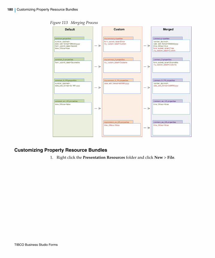
180 | Customizing Property Resource Bundles
Figure 113 Merging Process
Customizing Property Resource Bundles1. Right click the Presentation Resources folder and click New > File.
TIBCO Business Studio Forms

| 181
Figure 114 Creating a New Properties File
The New File dialog appears.
2. In the New File dialog, name the file with .properties as its extension, and click Finish.
In the example, the name of the file is Customer_Specific and the extension is .properties.
TIBCO Business Studio Forms

182 | Customizing Property Resource Bundles
Figure 115 The New File Dialog
3. In the new .properties file, type the resource entries that you wish to add or override.
Figure 116 Sample Resource Entries
In this example, following is the new resource key:— validation_PetCount
TIBCO Business Studio Forms
| 183
The Table 15 lists the existing resource keys with their default values and their new values.
The merged common resources bundle now consists of the old resource keys with the new overridden values along with the new resource keys.
4. Do one of the following to specify the new common resources bundle in the Common Properties of the Form Designer:
— At the project level
a. In the Project Explorer, right click the project, and select Properties.
OR
Click the Project menu, and select Properties.
The Properties for project name dialog opens.
b. In the left pane, click the Form Designer arrow to expand it, and select Common Properties.
Table 15 Example Resource Keys with Overridden Values
Resource Key Default Value Overridden Value
dpane_new_label Add a new record Add a new report
time_24hour true false
form_submit_label Submit Enter
TIBCO Business Studio Forms

184 | Customizing Property Resource Bundles
Figure 117 The Project Properties Dialog
c. Select the Enable project specific settings check box.
d. Click the Browse button next to the Common Properties File.
The Pick Resource dialog opens.
You can also specify the properties file at the workspace level from this dialog. To do that, click the Configure Workspace Settings link.
When opened this way, the dialog shows filtered options, and it only shows the Form Designer and Common Properties file.
TIBCO Business Studio Forms
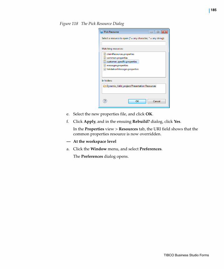
| 185
Figure 118 The Pick Resource Dialog
e. Select the new properties file, and click OK.
f. Click Apply, and in the ensuing Rebuild? dialog, click Yes.
In the Properties view > Resources tab, the URI field shows that the common properties resource is now overridden.
— At the workspace level
a. Click the Window menu, and select Preferences.
The Preferences dialog opens.
TIBCO Business Studio Forms

186 | Customizing Property Resource Bundles
Figure 119 The Common Properties Preference Page
b. Click the Form Designer arrow to expand it, and select Common Properties.
c. Click the Browse button next to the Common Properties File.
The Pick Resource dialog opens as shown in Figure 118.
d. Select the new properties file, and click OK.
e. Click Apply, and in the ensuing Rebuild? dialog, click Yes.
Validations Related to Custom Common ResourcesThere are default validations available on custom common resources. They have following objectives:
You can also specify the properties file at the project level from this dialog. To do that, click the Configure Project Specific Settings link.
In the Project Specific Configuration dialog, selecting the project name opens the Preferences dialog for that project.
TIBCO Business Studio Forms

| 187
• To check if the project has a project reference to the project containing the common properties override
• To check if an override is set at the project level or workspace level
• To check if the properties override file actually exists
• To warn about any form that uses a form-level common properties override
If you see such validation messages, you may want to do one of the following:
• Adding the missing project reference
• Creating the missing common.properties file
• Removing the common properties override from the preference node
• Removing the common properties override from the form
TIBCO Business Studio Forms

188 | Customizing the Form’s Preview Data
Customizing the Form’s Preview Data
By default, when a form is previewed, sample data is included for each control to give a better idea of how the form will appear to a user at runtime. This section explains how to customize the preview data that appears, rather than using the default data generated for each control type.
Editing the File [form-name].data.jsonTo customize the preview data for a form:
1. In the Project Explorer, find the file that contains the preview data. The default location of this file is: [project-name] > Forms > ProcessPackage > [business-process-name] > [user-task-name] > [form-name].data.json
2. Right-click the .data.json file and click Copy. Then, in the same location in the Project Explorer, right-click and click Paste. The Name Conflict dialog will appear asking you to type a new name for the file. Keep the extension .data.json, and supply a different filename. Do not delete the original preview data file.
3. Right-click your newly-named custom preview data file, and click Open With > Text Editor.
4. Edit the file, providing your desired values for the preview data in place of the default values in the file.
Example of Default Preview Data File
{ items: [{ $param:'AnotherDemo', $value:{$type:'com.example.demo.Demo',normalText:"normalText",list:["list"],duration:"",attribute1:["2010-05-16"]}},{ $param:'Demo', $value:{$type:'com.example.demo.Demo',normalText:"normalText",list:["list"],duration:"",attribute1:[
Do not edit the original .data.json file. This is a generated file, and if you edit it, your customizations will be overwritten when the file is regenerated.
Also, be sure to maintain the file extension, .data.json. Otherwise, you’re customized preview data file will not be accessible by the form.
TIBCO Business Studio Forms

| 189
"2010-05-16"]}}]}
Example of Customized Preview Data File
{ items: [{ $param:'AnotherDemo', $value: {$type:'com.example.demo.Demo',normalText: "My Sample Data",list:["list", "John", "George", "Ringo"],duration: "P4Y",attribute1:["2010-05-07", "2010-02-11"]}},{ $param:'Demo', $value: {$type:'com.example.demo.Demo',
normalText: "normalText", list:["list"],duration: "",attribute1:["2010-05-07"]}
}]}
Configure the Setting in the Properties ViewOnce you have created a custom preview data file, you can configure the form to use this file rather than the default file (or no file at all) for preview data.
To configure the Preview Data File setting for the form:
1. In the Properties view for the form, click the Preview Data tab.
2. Select one of the following radio buttons:
a. None Select this option if you prefer that no data be displayed initially for the controls when the form is previewed.
b. Default Select this option if you want to use the default data for each control on the form.
c. Custom Select this option if you want to use your customized .data.json file for the preview data values. The Custom radio button is paired with an optionlist that shows all the .data.json files associated with the current form. Select the custom preview data file you want to use from the optionlist.
TIBCO Business Studio Forms

190 | Using Form Data Fields
Using Form Data Fields
Form data fields are used to store data that is needed only for the lifetime of the form.
What Is a Form Data Field?User task parameters offer a way to associate a user task with process data fields so that data that is available to the entire process can be used, viewed, or modified through the form associated with the user task. But in some cases, you want to track data that is useful for the functioning of the form, but is unrelated to other tasks in the process and is not needed by the server. In such a case, instead of using parameters, you can create one or more form data fields to store that data for the lifetime of the form.
The same data types available for parameters are also available for form data fields. The key difference between a form data field and a parameter is that a form data field has no Mode property (In, Out, or In/Out). Since a parameter’s Mode property is used to specify the way parameter data interacts with the larger business process, it has no relevance to form data fields.
As an example of how a form data field might be used, suppose there is a set of panes in the form that are invisible, and you want them to become visible when a certain value is specified (or other action is taken) by the user who is interacting with the form. In this case, you can use a form data field to track which of those panes are visible. In effect, the form data field functions as a global variable within the context of the form.
Another example would be to use a form data field with a form containing a wizard pane where you want to track which page of the wizard is currently visible to the user.
Configuring a Form Data FieldTo create a form data field follow these steps.
1. Open the form in the Form Editor view, if it is not already open.
TIBCO Business Studio Forms
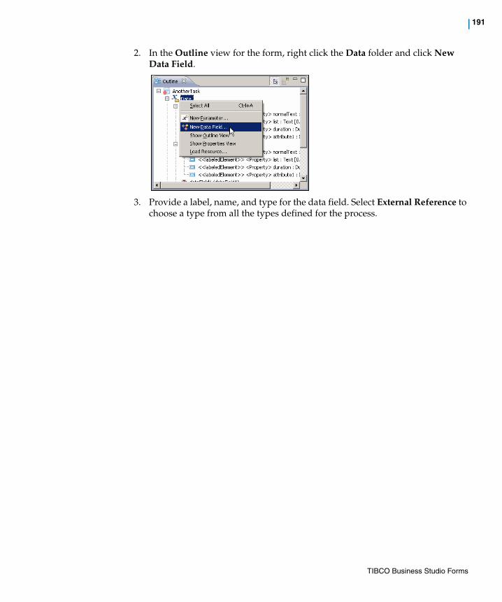
| 191
2. In the Outline view for the form, right click the Data folder and click New Data Field.
3. Provide a label, name, and type for the data field. Select External Reference to choose a type from all the types defined for the process.
TIBCO Business Studio Forms

192 | Using Numeric Controls
Using Numeric Controls
A numeric control is not a distinct control type, but is a special property that can be enabled for a text input control. It is used to display data in a specified format so that it is easier to read.
What is a Numeric Control?The numeric control property of a text control enables you to specify the display format of numeric and currency values. It only changes the way the control value is displayed and does not affect the way the value is edited or saved.
To define a format, you can use the following pattern:PosPrefix PosFormat PosSuffix;NegPrefix NegFormat NegSuffix
The above pattern defines a format for positive numbers (PosPrefix PosFormat PosSuffix) and a format for negative numbers (NegPrefix NegFormat NegSuffix) separated by a semicolon (;).
The format can include the formatting characters shown in Table 16. Each character is replaced with locale-specific text when the number is formatted.
The spaces between prefix, format, and suffix are used only for clarity and should not be included in the actual format.
Table 16 Numeric Control Formatting Characters
Character Description
0 (Digit) Used to signify the minimum number of digits to be displayed. Each instance of the character represents a position for one digit. If no value exists in a position, a zero (0) is displayed. This character is not valid within prefix or suffix.
Left of the decimal point: leading 0's are shown.
Right of the decimal point: trailing 0's are shown.
# (Optional Digit)
Used to signify the minimum number of digits to be displayed. Each instance of the character represents a position for one digit. If no value exists in a position, a blank space is displayed. This character is not valid within prefix or suffix.
Left of the decimal point: leading 0's are not shown.
Right of the decimal point: trailing 0's are not shown
TIBCO Business Studio Forms

| 193
Some sample formats are listed in Table 17:
. (Decimal separator)
Used as a numeric or monetary decimal separator. This character is not valid within prefix or suffix and is localized based on the locale settings.
- (Minus sign) Used to indicate a negative number. This character is only valid in the prefix or suffix.
, (Grouping separator)
Used to group the number format. The grouping separator must not be used to the right of the decimal point in a number format.
This character is localized and is not valid within prefix or suffix.
; Separates positive and negative sub-patterns. This character is not valid within number format, prefix or suffix.
¤ Currency sign (Unicode code point-\u00A4). This character is valid only within prefix or suffix and is replaced by the localized currency symbol.
Table 16 Numeric Control Formatting Characters
Character Description
Table 17 Numeric Control Sample Formats
Number Format Pattern Displayed
0 0 0
0 #
123 0 123
1234.123 #,###.0000 1,234.1230
1234.123 #,###.00 1,234.12
1234567.123 #,###.00 1,234,567.12
1234.123 000,000.00 001,234.12
1234.12345 #,##0.00## 1,234.1234
1234.123 #,##0.00## 1,234.123
TIBCO Business Studio Forms

194 | Using Numeric Controls
Inserting a Numeric ControlTo insert a numeric control, perform the following steps:
1. Select a text input control from the Palette and drop it in the form.
2. Go to the Properties tab in the Properties view for the text input control and select the Numeric check box. This enables the Format options.
3. You must specify the display format. The options are as follows:
a. External Reference: Select a format from an external resource. See Inserting External Reference Format
b. Custom: Define a custom format. See Inserting a Custom Format
Figure 120 Numeric Control Property of Text Input Control
Inserting External Reference Format
By selecting the External Reference option, you can use one of the predefined formats from the common resource bundle. To use an external reference format, perform the following steps:
1. Select External Reference under the Format options.
2. Click the icon to display the Resource Picker.
3. Select a format from the list and click OK.
You can also create your own custom formats and add them to the Resource Picker list.
The new custom formats must be placed under the Presentation Resources special folder.
TIBCO Business Studio Forms
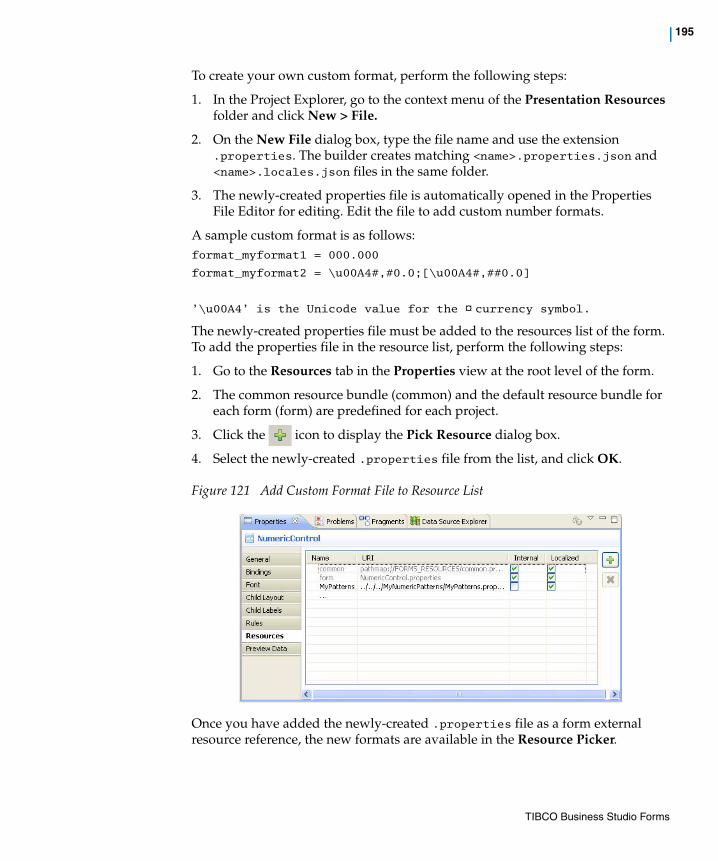
| 195
To create your own custom format, perform the following steps:
1. In the Project Explorer, go to the context menu of the Presentation Resources folder and click New > File.
2. On the New File dialog box, type the file name and use the extension .properties. The builder creates matching <name>.properties.json and <name>.locales.json files in the same folder.
3. The newly-created properties file is automatically opened in the Properties File Editor for editing. Edit the file to add custom number formats.
A sample custom format is as follows: format_myformat1 = 000.000
format_myformat2 = \u00A4#,#0.0;[\u00A4#,##0.0]
’\u00A4’ is the Unicode value for the ¤ currency symbol.
The newly-created properties file must be added to the resources list of the form. To add the properties file in the resource list, perform the following steps:
1. Go to the Resources tab in the Properties view at the root level of the form.
2. The common resource bundle (common) and the default resource bundle for each form (form) are predefined for each project.
3. Click the icon to display the Pick Resource dialog box.
4. Select the newly-created .properties file from the list, and click OK.
Figure 121 Add Custom Format File to Resource List
Once you have added the newly-created .properties file as a form external resource reference, the new formats are available in the Resource Picker.
TIBCO Business Studio Forms
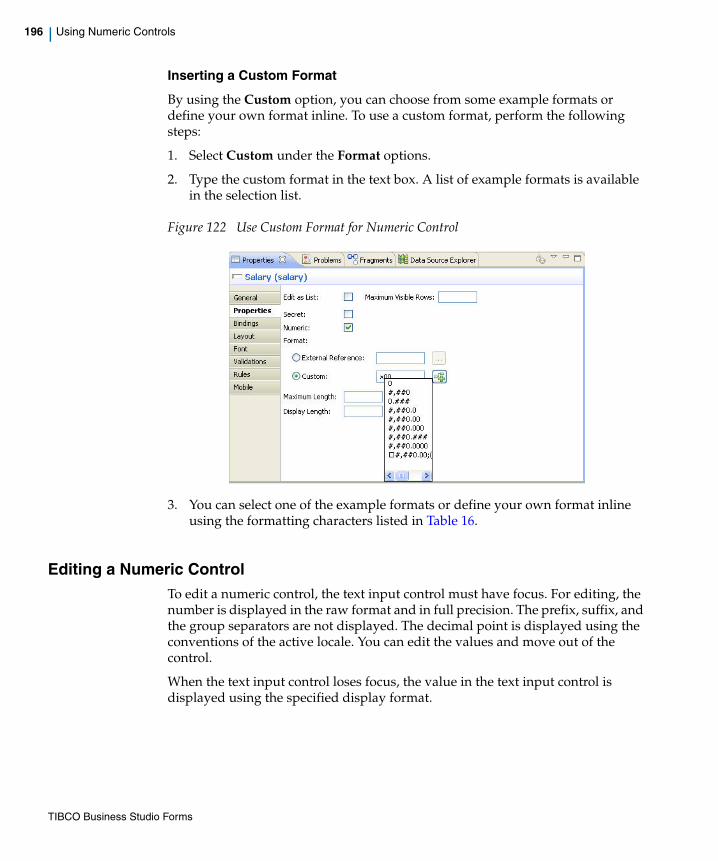
196 | Using Numeric Controls
Inserting a Custom Format
By using the Custom option, you can choose from some example formats or define your own format inline. To use a custom format, perform the following steps:
1. Select Custom under the Format options.
2. Type the custom format in the text box. A list of example formats is available in the selection list.
Figure 122 Use Custom Format for Numeric Control
3. You can select one of the example formats or define your own format inline using the formatting characters listed in Table 16.
Editing a Numeric ControlTo edit a numeric control, the text input control must have focus. For editing, the number is displayed in the raw format and in full precision. The prefix, suffix, and the group separators are not displayed. The decimal point is displayed using the conventions of the active locale. You can edit the values and move out of the control.
When the text input control loses focus, the value in the text input control is displayed using the specified display format.
TIBCO Business Studio Forms
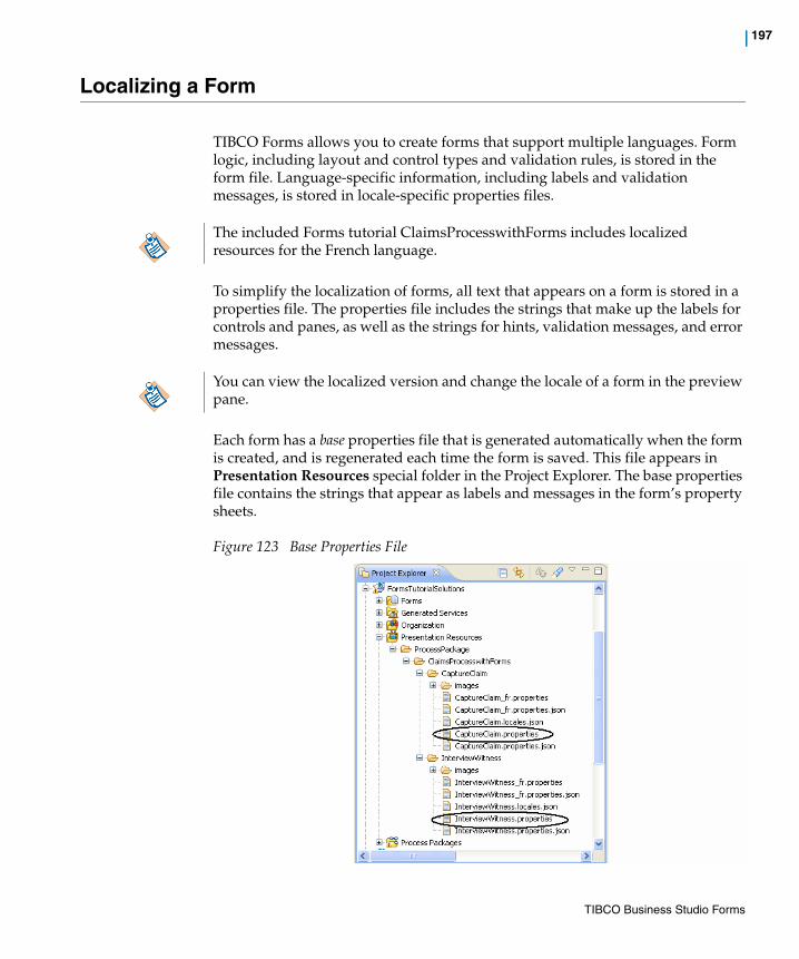
| 197
Localizing a Form
TIBCO Forms allows you to create forms that support multiple languages. Form logic, including layout and control types and validation rules, is stored in the form file. Language-specific information, including labels and validation messages, is stored in locale-specific properties files.
To simplify the localization of forms, all text that appears on a form is stored in a properties file. The properties file includes the strings that make up the labels for controls and panes, as well as the strings for hints, validation messages, and error messages.
Each form has a base properties file that is generated automatically when the form is created, and is regenerated each time the form is saved. This file appears in Presentation Resources special folder in the Project Explorer. The base properties file contains the strings that appear as labels and messages in the form’s property sheets.
Figure 123 Base Properties File
The included Forms tutorial ClaimsProcesswithForms includes localized resources for the French language.
You can view the localized version and change the locale of a form in the preview pane.
TIBCO Business Studio Forms

198 | Localizing a Form
To create a localized version of a form, you will make a copy of the base properties file, rename it, and edit the strings it contains.
The renamed locale-specific versions of the properties file will not be automatically regenerated, and thus your locale-specific strings will not be lost when the form is saved.
To create a locale-specific Properties file:
1. Select the <form>.properties file from the Presentation Resources special folder in the Project Explorer. Make a copy of this file for each locale.
2. Rename the copy, using the naming conventions for languages and regions. See To create language-specific and country-specific properties files: for more details.
3. For every new properties file created in the Presentation Resources folder, the builder automatically creates a matching <file>.properties.json file at the same location.
4. Open a locale-specific version of the properties file in the Properties File editor and manually translate the strings into the desired language.
5. Click Project > Clean to clean and rebuild the project. This updates the <form>.locales.json file with the details of the language in which the form has been localized. For example, if you create DemoForm_fr.properties file, then the Demoform.locales.json will contain ["fr"]. This file is updated when the you rebuild the project after creating a new locale-specific version of the properties file.
6. Run the JDK command-line tool native2ascii, using the locale-specific properties file as input, to ensure that the file contains only ISO_8859-1-encoded characters:
The native2ascii command-line tool is available in the directory %JDK_HOME%\bin.
Do not edit the strings in the base properties file itself. Any changes you make to this file will be lost as soon as the project is built (which is to say, as soon as you save the form, with the default setting, where auto-build is enabled). To change the labels and messages for the base version of the form, use the form’s property sheets instead. The changes you make in the property sheets will appear in the base properties file when the form is saved.
TIBCO Business Studio Forms

| 199
7. Move the completed locale-specific version or versions into the same directory where you found the original base properties file.
8. Save the locale-specific version and deploy the form into the runtime environment.
To create language-specific and country-specific properties files:
The language specific properties file is a copy of the base properties file. This file is renamed using the naming conventions for languages and regions.
Each localized language is represented by a two-letter code, in the format ll, where ll is a lowercase, two-letter ISO 639 language code. For a list of language codes, visit the following web site:
http://www.loc.gov/standards/iso639-2/langhome.html
Each country is represented by a two-letter code, in the format CC, where CC is an uppercase, two-letter ISO 3166 country code. For a list of country codes, visit the following web site:
http://www.iso.org/iso/english_country_names_and_code_elements
You can find the directory that contains all the properties files by using the context menu of one of the form’s files in the Project Explorer (for instance, the base properties file) and clicking Properties to open the properties dialog. The path to the selected form resource is shown as Location:
TIBCO Business Studio Forms
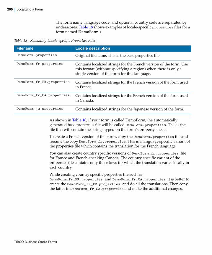
200 | Localizing a Form
The form name, language code, and optional country code are separated by underscores. Table 18 shows examples of locale-specific properties files for a form named DemoForm.)
As shown in Table 18, if your form is called DemoForm, the automatically generated base properties file will be called DemoForm.properties. This is the file that will contain the strings typed on the form’s property sheets.
To create a French version of this form, copy the DemoForm.properties file and rename the copy DemoForm_fr.properties. This is a language specific variant of the properties file which contains the translation for the French language.
You can also create country specific versions of DemoForm_fr.properties file for France and French-speaking Canada. The country specific variant of the properties file contains only those keys for which the translation varies locally in each country.
While creating country specific properties file such as DemoForm_fr_FR.properties and DemoForm_fr_CA.properties, it is better to create the DemoForm_fr_FR.properties and do all the translations. Then copy the latter to DemoForm_fr_CA.properties and make the additional changes.
Table 18 Renaming Locale-specific Properties Files
Filename Locale description
DemoForm.properties Original filename. This is the base properties file.
DemoForm_fr.properties Contains localized strings for the French version of the form. Use this format (without specifying a region) when there is only a single version of the form for this language.
DemoForm_fr_FR.properties Contains localized strings for the French version of the form used in France.
DemoForm_fr_CA.properties Contains localized strings for the French version of the form used in Canada.
DemoForm_ja.properties Contains localized strings for the Japanese version of the form.
TIBCO Business Studio Forms
| 201
Finally, in both DemoForm_fr_FR.properties and DemoForm_fr_CA.properties delete all the entries whose keys and values are identical to those in DemoForm_fr.properties.
If you want to make changes to the labels or messages in the base properties file of your form, and you want corresponding changes to appear in the language specific versions of the properties file, you must make the latter changes manually by editing the strings in the language-specific version of the properties files. An alternative way of doing these changes is as follows:
a. You can select both the base properties and your language specific properties file in Project Explorer and use Context Menu > Compare With > Each Other to open them side-by-side in the Property Compare editor.
b. Use the Copy All Non-Conflicting Changes or Copy Current Change (From ... To ...) actions to add new keys and delete old keys from your localized version. For new keys and those with updated values you can provide a new translation.
To choose a locale-specific version of a form at run time:
When localized versions of a form exist along with the base version in the runtime environment, the runtime will choose the locale-specific version that corresponds to the locale that is set on the user’s system. If no version is present on the runtime server for that locale, the base version will be used.
You can use the Form.setLocale(String) and Form.getLocale() methods to change the locale settings of the form.
The hierarchy in which the keys are resolved is as follows:
• The keys are first resolved in country specific versions of the properties file such as DemoForm_fr_FR.properties and DemoForm_fr_CA.properties.
• The keys not provided in the country specific versions are resolved in the language specific version of the properties file such as DemoForm_fr.properties.
• The keys not provided in the language specific version are resolved in the base properties file such as DemoForm.properties.
If the property keys are very similar, the Property Compare editor sometimes misidentifies change types. It is up to you to inspect each change and decide whether the default merge action proposed by the editor is appropriate. If not, you can manually add, delete or amend the localized keys and values instead of using the Copy Current Change (From ... To ...) action.
TIBCO Business Studio Forms

202 | Localizing a Form
Defining Localization Properties Outside the FormIn addition to creating localized versions of a form’s base properties file, TIBCO Forms supports the creation and localization of additional properties files whose scope is not limited to a given form. These can be referenced by a form and, in fact, shared by any number of different forms within the same or other projects.
To create a localization properties file outside the form, follow these steps:
1. Create a new resource file, with the extension .properties, within the folder /<project>/Presentation Resources in the Project Explorer. (Note that this is unlike the base properties file, which is also contained in the Presentation Resources folder, but is within a sub-folder for resources specific to the form, a sub-folder named with the name of the form.)
2. Edit the properties file by adding key-value pairs in the format <key> = <value>, each on a separate line. For example:
mykey1 = My Key Onemykey2 = My Key Two
The format is that of a standard Java resources file, identical to the generated base properties file found in the form folder.
3. Copy the new resource file and save it with the same name but with an underscore and the locale code added before the file extension. For instance, if you wish to create a French version of a properties file named myResources.properties, save the first file as myResources_fr.properties.
4. In the key-value pairs of the localized version of the properties file, translate or edit the values as desired, while leaving the keys unchanged.
5. The localized version is now available, and can be used as shown in the example that follows.
Example: Using a Localization Properties File Defined Outside the Form
This example shows how a localized properties file might be used within a form. In the example, a button is created that changes the label for a text field. The value for the label is localized using properties files external to the form’s own properties files.
1. Add a text field and a button to a form.
TIBCO Business Studio Forms
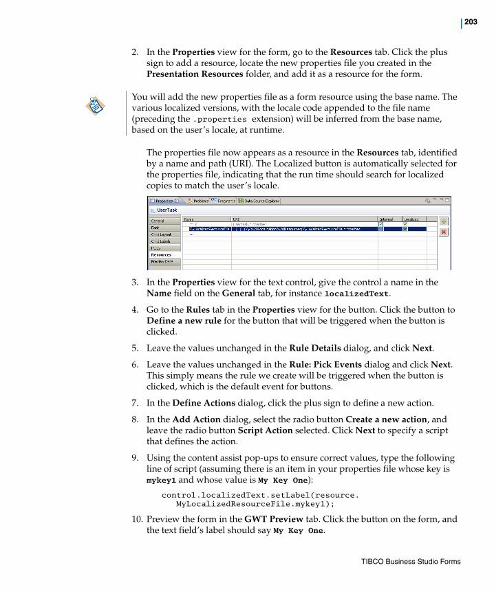
| 203
2. In the Properties view for the form, go to the Resources tab. Click the plus sign to add a resource, locate the new properties file you created in the Presentation Resources folder, and add it as a resource for the form.
The properties file now appears as a resource in the Resources tab, identified by a name and path (URI). The Localized button is automatically selected for the properties file, indicating that the run time should search for localized copies to match the user’s locale.
3. In the Properties view for the text control, give the control a name in the Name field on the General tab, for instance localizedText.
4. Go to the Rules tab in the Properties view for the button. Click the button to Define a new rule for the button that will be triggered when the button is clicked.
5. Leave the values unchanged in the Rule Details dialog, and click Next.
6. Leave the values unchanged in the Rule: Pick Events dialog and click Next. This simply means the rule we create will be triggered when the button is clicked, which is the default event for buttons.
7. In the Define Actions dialog, click the plus sign to define a new action.
8. In the Add Action dialog, select the radio button Create a new action, and leave the radio button Script Action selected. Click Next to specify a script that defines the action.
9. Using the content assist pop-ups to ensure correct values, type the following line of script (assuming there is an item in your properties file whose key is mykey1 and whose value is My Key One):
control.localizedText.setLabel(resource.MyLocalizedResourceFile.mykey1);
10. Preview the form in the GWT Preview tab. Click the button on the form, and the text field’s label should say My Key One.
You will add the new properties file as a form resource using the base name. The various localized versions, with the locale code appended to the file name (preceding the .properties extension) will be inferred from the base name, based on the user’s locale, at runtime.
TIBCO Business Studio Forms
204 | Localizing a Form
11. While still in preview mode, scroll down to the area immediately below the form and change the locale used for the preview from Default Locale to French - France.
12. Click the button on the form again, and the text field’s label should now show the localized French text for the button’s label.
At runtime, the locale of an actual user is set on the user’s system or in the user’s browser. The locale setting currently is not available for the GWT Preview.
TIBCO Business Studio Forms
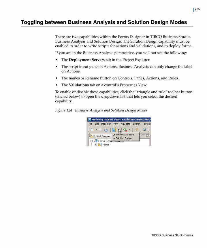
| 205
Toggling between Business Analysis and Solution Design Modes
There are two capabilities within the Forms Designer in TIBCO Business Studio, Business Analysis and Solution Design. The Solution Design capability must be enabled in order to write scripts for actions and validations, and to deploy forms.
If you are in the Business Analysis perspective, you will not see the following:
• The Deployment Servers tab in the Project Explorer.
• The script input pane on Actions. Business Analysts can only change the label on Actions.
• The names or Rename Button on Controls, Panes, Actions, and Rules.
• The Validations tab on a control’s Properties View.
To enable or disable these capabilities, click the “triangle and rule” toolbar button (circled below) to open the dropdown list that lets you select the desired capability.
Figure 124 Business Analysis and Solution Design Modes
TIBCO Business Studio Forms
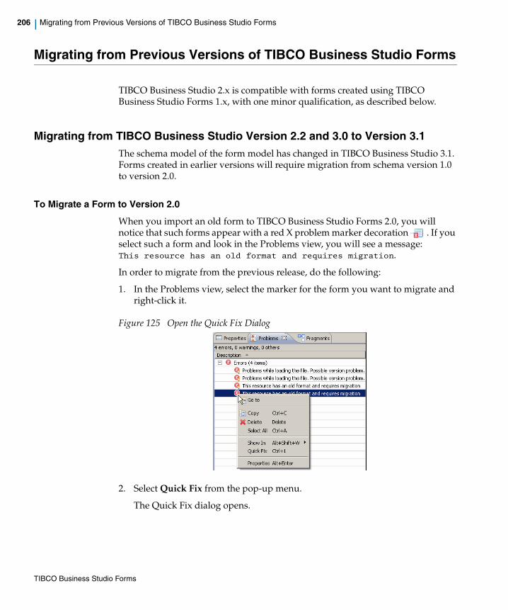
206 | Migrating from Previous Versions of TIBCO Business Studio Forms
Migrating from Previous Versions of TIBCO Business Studio Forms
TIBCO Business Studio 2.x is compatible with forms created using TIBCO Business Studio Forms 1.x, with one minor qualification, as described below.
Migrating from TIBCO Business Studio Version 2.2 and 3.0 to Version 3.1The schema model of the form model has changed in TIBCO Business Studio 3.1. Forms created in earlier versions will require migration from schema version 1.0 to version 2.0.
To Migrate a Form to Version 2.0
When you import an old form to TIBCO Business Studio Forms 2.0, you will notice that such forms appear with a red X problem marker decoration . If you select such a form and look in the Problems view, you will see a message:This resource has an old format and requires migration.
In order to migrate from the previous release, do the following:
1. In the Problems view, select the marker for the form you want to migrate and right-click it.
Figure 125 Open the Quick Fix Dialog
2. Select Quick Fix from the pop-up menu.
The Quick Fix dialog opens.
TIBCO Business Studio Forms
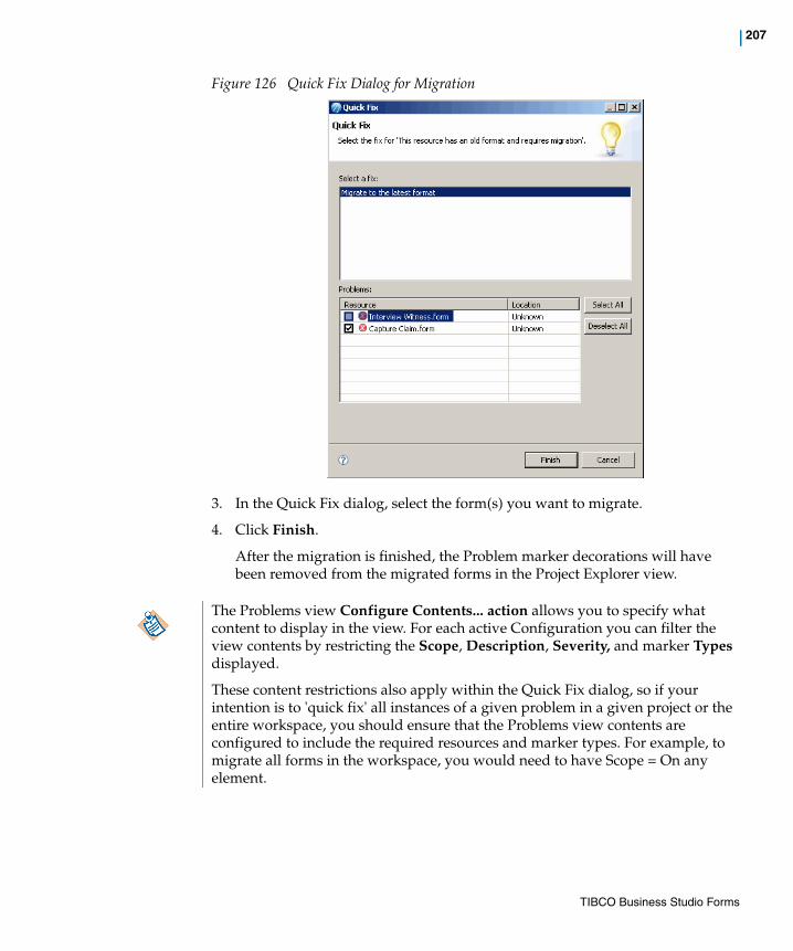
| 207
Figure 126 Quick Fix Dialog for Migration
3. In the Quick Fix dialog, select the form(s) you want to migrate.
4. Click Finish.
After the migration is finished, the Problem marker decorations will have been removed from the migrated forms in the Project Explorer view.
The Problems view Configure Contents... action allows you to specify what content to display in the view. For each active Configuration you can filter the view contents by restricting the Scope, Description, Severity, and marker Types displayed.
These content restrictions also apply within the Quick Fix dialog, so if your intention is to 'quick fix' all instances of a given problem in a given project or the entire workspace, you should ensure that the Problems view contents are configured to include the required resources and marker types. For example, to migrate all forms in the workspace, you would need to have Scope = On any element.
TIBCO Business Studio Forms
208 | Migrating from Previous Versions of TIBCO Business Studio Forms
Changes in Migrated Forms
You will notice the following are changes within the migrated forms:
• Mapping In and Mapping Out expressions will be replaced with bindings where possible.
• If a Mapping In expression did more than just assign the value of a parameter, that Mapping In expression will be replaced with a computation action rule triggered by the Form open event.
• If a Mapping Out expression did more than just assign the value of a control, that Mapping Out expression will be replaced with a computation action rule triggered on Form submit event.
• Event handlers on controls or the form are migrated to rules triggered on the specific control or the form.
• Actions are migrated to script actions.
• If the special file <project>/<form folder>/META-INF/form_ext.js is detected during migration, it is added as a JavaScript resource.
• Validations such as during form submit no longer execute validations for controls that are invisible, or are inside panes that are invisible.
• This release includes additional design-time checks. You may see problem markers appear in migrated forms that were not seen in earlier versions of TIBCO Business Studio.
TIBCO Business Studio Forms
| 209
Chapter 4 Advanced Tasks
This section describes advanced tasks you can perform using TIBCO Business Studio Forms.
Topics
• Import the Forms Advanced Samples, page 210
• Using CSS to Customize the Rendering of a Form Control, page 211
• Creating Custom Add and Delete Buttons for a Grid Pane, page 214
• Using Editable List Controls, page 216
• Changing a Control’s Background Color Based on its Value, page 218
• Controlling the Visibility of a Pane Based on the Value of a Control, page 220
• Using a Check Box to Set Properties for Another Control, page 222
• Using a Business Object Model with Multiple Sub-types, page 224
• Using Enumerations as Choices in an Optionlist or Radiogroup, page 227
• Validating Commonly Used Primitive Types, page 229
TIBCO Business Studio Forms
210 | Import the Forms Advanced Samples
Import the Forms Advanced Samples
The advanced samples are available on the TIBCO Access Point site. To download and install the advanced samples, do the following:
1. Go to http://tap.tibco.com/storefront/sample-evaluations/tibco-business-studio-product-samples/prod16117.html.
2. Under PRODUCT SAMPLES, click View all Product Samples.
3. Click Form Samples to go to the Forms Samples page.
4. Under Forms Advanced Samples, click Download and Install to get the sample in your workspace.
TIBCO Business Studio Forms

| 211
Using CSS to Customize the Rendering of a Form Control
TIBCO Business Studio Forms supports the use of Cascading Style Sheets (CSS) for customizing how form controls are rendered. This section shows how to use CSS with Business Studio Forms to apply styling to a form control.
Task Customize the rendering of a control using CSS.
Sample Project To view the sample for this task, import the advanced sample projects as described in Import the Forms Advanced Samples on page 210. The sample form and CSS file for the task described in this section are contained in the forms.samples.layout sample project.
• The form (ControlRendering.form) is at the following location:forms.samples.layout/Forms/CSS Samples/ControlRendering/
• The CSS file (ControlRendering.css) is at the following location:forms.samples.layout/Presentation Resources/css/
You can double-click the form and CSS filenames (as well as those of other project resources) in the Project Explorer to open them in the editor. There, you can examine their contents and use them as models for your own projects.
Explanation This task covers the case where you want to apply special styling to a specific control in a form.
In order to design the rendering of a control, it is useful to know how the control is rendered in the browser. TIBCO Forms makes use of CSS classes attached to the HTML DOM nodes in order to control rendering. Generally, it is not necessary to know which actual HTML elements are being used in the rendering, and as a practice you should try to use only the CSS classes in devising CSS selectors in your stylesheets, as this approach is the most portable across different target platforms.
Shown here is a representation of the CSS classes that are used to render a control, and their relationship to one another within the nested DOM:
—component, customclass—label—container
—control—hint
See Chapter 7, Reference for a detailed description of the CSS classes used in rendering forms.
The customclass is the name of a CSS class specified in the design time model.
To implement this task, perform these steps:
TIBCO Business Studio Forms
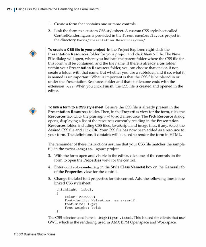
212 | Using CSS to Customize the Rendering of a Form Control
1. Create a form that contains one or more controls.
2. Link the form to a custom CSS stylesheet. A custom CSS stylesheet called ControlRendering.css is provided in the forms.samples.layout project in the directory Forms/Presentation Resources/css/
The remainder of these instructions assume that your CSS file matches the sample file in the forms.samples.layout project.
3. With the form open and visible in the editor, click one of the controls on the form to open the Properties view for the control.
4. Enter control-rendering in the Style Class Name(s) box on the General tab of the Properties view for the control.
5. Change the label font properties for this control. Add the following lines in the linked CSS stylesheet:
.highlight .label,{
color: #FF0000;font-family: Helvetica, sans-serif;font-size: 12px;font-weight: bold;
}
The CSS selector used here is .highlight .label. This is used for clients that use GWT, which is the rendering used in AMX BPM Openspace and Workspace.
To create a CSS file in your project In the Project Explorer, right-click the Presentation Resources folder for your project and click New > File. The New File dialog will open, where you indicate the parent folder where the CSS file for this form will be contained, and the file name. If there is already a css folder within your Presentation Resources folder, you can choose that one or, if not, create a folder with that name. But whether you use a subfolder, and if so, what it is named is unimportant. What is important is that the CSS file be placed in or under the Presentation Resources folder and that its filename ends with the extension .css. When you click Finish, the CSS file is created and opened in the editor.
To link a form to a CSS stylesheet Be sure the CSS file is already present in the Presentation Resources folder. Then, in the Properties view for the form, click the Resources tab. Click the plus sign (+) to add a resource. The Pick Resource dialog opens, displaying a list of the resources currently residing in the Presentation Resources folder, including CSS files, JavaScript, and image files, if any. Select the desired CSS file and click OK. Your CSS file has now been added as a resource to your form. The definitions it contains will be used to render the form in HTML.
TIBCO Business Studio Forms

| 213
6. Put a border around the highlighted control and change the background color. Add the following lines to the linked CSS stylesheet:
.highlight,{
border-style:solid;border-width: thin;background-color: #DDFFDD;
}
TIBCO Business Studio Forms
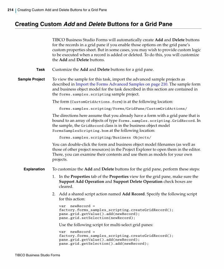
214 | Creating Custom Add and Delete Buttons for a Grid Pane
Creating Custom Add and Delete Buttons for a Grid Pane
TIBCO Business Studio Forms will automatically create Add and Delete buttons for the records in a grid pane if you enable those options on the grid pane’s custom properties sheet. But in some cases, you may wish to provide custom logic to be executed when a record is added or deleted. To do this, you will customize the Add and Delete buttons.
Task Customize the Add and Delete buttons for a grid pane.
Sample Project To view the sample for this task, import the advanced sample projects as described in Import the Forms Advanced Samples on page 210. The sample form and business object model for the task described in this section are contained in the forms.samples.scripting sample project.
The form (CustomGridActions.form) is at the following location:
forms.samples.scripting/Forms/GridPane/CustomGridActions/
The directions here assume that you already have a form with a grid pane that is bound to an array of objects of type forms.samples.scripting.GridRecord. In the sample, the GridRecord class is in the business object model FormsSamplesScripting.bom at the following location:
forms.samples.scripting/Business Objects/
You can double-click the form and business object model filenames (as well as those of other project resources) in the Project Explorer to open them in the editor. There, you can examine their contents and use them as models for your own projects.
Explanation To customize the Add and Delete buttons for the grid pane, perform these steps:
1. In the Properties tab of the Properties view for the grid pane, make sure the Support Add Operation and Support Delete Operation check boxes are cleared.
2. Add a shared script action named Add Record. Specify the following script for this action:
var newRecord = factory.forms_samples_scripting.createGridRecord();pane.grid.getValue().add(newRecord);pane.grid.setSelection(newRecord);
Use the following script for multi-select grid panes:
var newRecord = factory.forms_samples_scripting.createGridRecord();pane.grid.getValue().add(newRecord);pane.grid.getSelection().add(newRecord);
TIBCO Business Studio Forms

| 215
3. Add a shared script action named Delete Record. Specify the following script for this action:
var selection = pane.grid.getSelection();if (selection!=null) {
var rc = confirm("Delete the current record?");if (rc==true) {
var list = pane.grid.getValue();list.remove(selection);
}}
Use the following script for multi-select grid panes:
var selection = pane.grid.getSelection();if (selection!=null) {
var rc = confirm("Delete the current record?");if (rc==true) {
var list = pane.grid.getValue();for (var i=selection.size()-1; i>=0; i--) {
var sel = selection.get(i);selection.remove(i);list.remove(sel);
}}
}
4. Now add two buttons to the form, one for adding the record, the other for deleting a record, and hook them up to the new actions using appropriate rules.
The shared script actions and rules described here can be examined in the Properties view by clicking their names in the Outline view of the sample project’s CustomGridActions form:
TIBCO Business Studio Forms

216 | Using Editable List Controls
Using Editable List Controls
This task shows how to bind editable list controls to data parameters of the primitive array data type.
If you have data parameters of the primitive array data type, you can bind the editable list controls to them. You can create action scripts for adding items or for deleting items from the list control. You can also add scripts for validating the values provided in the list control.
Task Use editable list controls in a form.
Sample Project To view the sample for this task, import the advanced sample projects as described in Import the Forms Advanced Samples on page 210. The sample form and business object model for the task described in this section are contained in the forms.samples.controls project.
The form (ListControl.form) is at the following location:
forms.samples.controls/Forms/listControl/
You can double-click the form’s filename (as well as those of other project resources) in the Project Explorer to open it in the editor. There, you can examine it and use it as a model for your own projects.
Explanation To create editable list controls on the form, perform these steps:
1. Add new data parameters strArray, intArray, and decArray of the respective types Text, Integer, and Decimal. All of these should be of array type.
2. Add three Text controls with labels Text List, Integer List, and Decimal List in to the form. Set the names of these controls to textList, integerList, and decimalList.
For each of these controls:
Go to the Properties tab and select the Edit as List check box.
Go to the General tab and add a new binding for the Value that points to the value of the respective data parameter array.
3. In the form preview, you will see the three editable list controls.
4. Add a new button Add Item to the form.
Add a new rule for this button and associate following action script for the Select event of this button. This script will add the last item into the list.
var list = control.textList.getValue();list.push("New Value");control.textList.setValue(list);
TIBCO Business Studio Forms
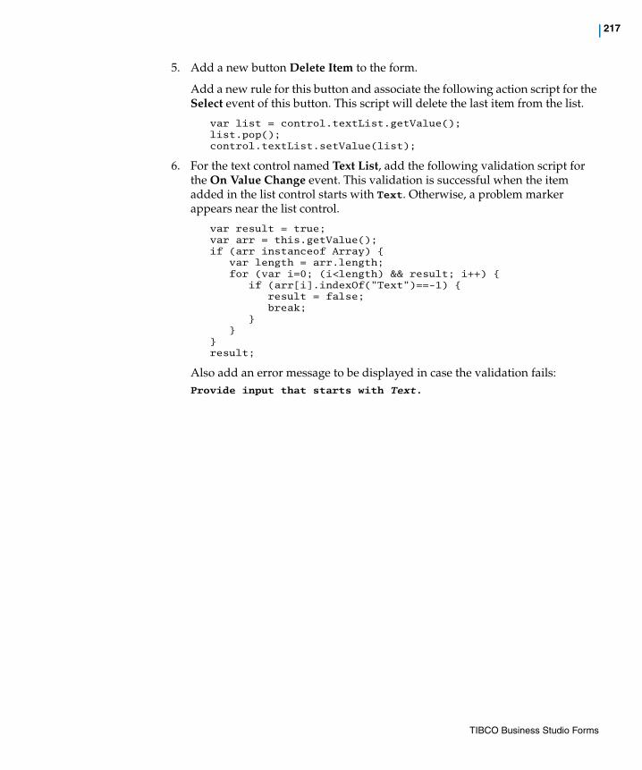
| 217
5. Add a new button Delete Item to the form.
Add a new rule for this button and associate the following action script for the Select event of this button. This script will delete the last item from the list.
var list = control.textList.getValue();list.pop();control.textList.setValue(list);
6. For the text control named Text List, add the following validation script for the On Value Change event. This validation is successful when the item added in the list control starts with Text. Otherwise, a problem marker appears near the list control.
var result = true;var arr = this.getValue();if (arr instanceof Array) {
var length = arr.length;for (var i=0; (i<length) && result; i++) {
if (arr[i].indexOf("Text")==-1) {result = false;break;
} }
}result;
Also add an error message to be displayed in case the validation fails:Provide input that starts with Text.
TIBCO Business Studio Forms

218 | Changing a Control’s Background Color Based on its Value
Changing a Control’s Background Color Based on its Value
This task shows how to customize the background color of a control using a computation action and CSS classes.
Task Change the background color of a control based on its value.
Sample Project To view the sample for this task, import the advanced sample projects as described in Import the Forms Advanced Samples on page 210. The sample form and CSS file for the task described in this section are contained in the forms.samples.controls project.
The form (SetBackgroundColorForControl.form) is at the following location:
forms.samples.controls/Forms/setBGColor/
The CSS file (custom.css) is at the following location:
forms.samples.controls/Presentation Resources/css/
You can double-click the form and CSS filenames (as well as those of other project resources) in the Project Explorer to open them in the editor. There, you can examine their contents and use them as models for your own projects.
Explanation This topic covers the case where you want to apply a background color to a given control in a form based on the control’s value.
In order to implement this task, you will need to know:
a. How to specify a custom CSS document and refer it in the form.
b. How to add a computation action that is targeted to a property of the control
To implement the task, perform these steps:
1. Create a form with one or more controls.
2. Add following classes to the custom CSS document and refer to the document in the form
.normalbg,{
background-color: #808080;}.warningbg,{
background-color: #00FF00;}.problembg,{
background-color: #FF0000;}
TIBCO Business Studio Forms
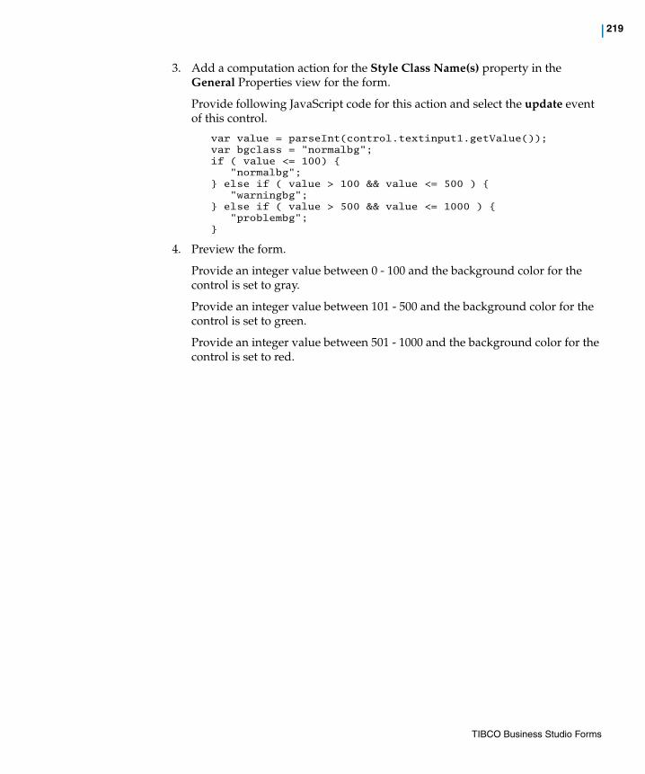
| 219
3. Add a computation action for the Style Class Name(s) property in the General Properties view for the form.
Provide following JavaScript code for this action and select the update event of this control.
var value = parseInt(control.textinput1.getValue());var bgclass = "normalbg";if ( value <= 100) {
"normalbg";} else if ( value > 100 && value <= 500 ) {
"warningbg";} else if ( value > 500 && value <= 1000 ) {
"problembg";}
4. Preview the form.
Provide an integer value between 0 - 100 and the background color for the control is set to gray.
Provide an integer value between 101 - 500 and the background color for the control is set to green.
Provide an integer value between 501 - 1000 and the background color for the control is set to red.
TIBCO Business Studio Forms
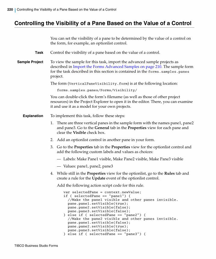
220 | Controlling the Visibility of a Pane Based on the Value of a Control
Controlling the Visibility of a Pane Based on the Value of a Control
You can set the visibility of a pane to be determined by the value of a control on the form, for example, an optionlist control.
Task Control the visibility of a pane based on the value of a control.
Sample Project To view the sample for this task, import the advanced sample projects as described in Import the Forms Advanced Samples on page 210. The sample form for the task described in this section is contained in the forms.samples.panes project.
The form (VerticalPaneVisibility.form) is at the following location:
forms.samples.panes/Forms/Visibility/
You can double-click the form’s filename (as well as those of other project resources) in the Project Explorer to open it in the editor. There, you can examine it and use it as a model for your own projects.
Explanation To implement this task, follow these steps:
1. There are three vertical panes in the sample form with the names pane1, pane2 and pane3. Go to the General tab in the Properties view for each pane and clear the Visible check box.
2. Add an optionlist control in another pane in your form.
3. Go to the Properties tab in the Properties view for the optionlist control and add the following custom labels and values as choices:
— Labels: Make Pane1 visible, Make Pane2 visible, Make Pane3 visible
— Values: pane1, pane2, pane3
4. While still in the Properties view for the optionlist, go to the Rules tab and create a rule for the Update event of the optionlist control.
Add the following action script code for this rule.
var selectedPane = context.newValue;if ( selectedPane == "pane1") {//Make the pane1 visible and other panes invisible.pane.pane1.setVisible(true);pane.pane2.setVisible(false);pane.pane3.setVisible(false);
} else if ( selectedPane == "pane2") {//Make the pane2 visible and other panes invisible.pane.pane1.setVisible(false);pane.pane2.setVisible(true);pane.pane3.setVisible(false);
} else if ( selectedPane == "pane3") {
TIBCO Business Studio Forms

| 221
//Make the pane2 visible and other panes invisible.pane.pane1.setVisible(false);pane.pane2.setVisible(false);pane.pane3.setVisible(true);
}
5. When you load the form, all three of the panes are invisible. After selecting a value in the optionlist control, the related pane is made visible in the form. The other two panes remain invisible.
TIBCO Business Studio Forms

222 | Using a Check Box to Set Properties for Another Control
Using a Check Box to Set Properties for Another Control
This section explains how to use a check box to set certain properties, such as visibility, enabled, and required for another control.
Task Set the value of a visibility, enabled, or required flag for a given control at run-time based on the value of a checkbox control.
Sample Project forms.samples.controls/Forms/Visibility/VisibilityBinding
To view the sample for this task, import the advanced sample projects as described in Import the Forms Advanced Samples on page 210. The sample form for the task described in this section is contained in the forms.samples.controls project.
The form (VerticalBinding.form) is at the following location:
forms.samples.controls/Forms/visibility/
You can double-click the form’s filename (as well as those of other project resources) in the Project Explorer to open it in the editor. There, you can examine it and use it as a model for your own projects.
Explanation To set up the visibility flag of a text control based on the checkbox control value, perform the following steps:
1. Add a checkbox (Checkbox1) and a text control (Text Control1) into a vertical pane within the form.
2. Go to the General properties for the checkbox control.
Create a binding for the Value attribute of the checkbox and set it to the Visible property of the text control. The direction of this binding is from the check box Value to the Visible property of the text control.
3. When you load the form, the check box is in cleared condition and Text Control1 is invisible. If you select the checkbox control, Text Control1 becomes visible in the form.
To set up the enabled flag of a text control based on the checkbox control value, perform the following steps.
1. Add a checkbox (Checkbox2) and a text control (Text Control2) into a vertical pane within the form.
2. Go to the General properties for the checkbox control.
Create a binding for the Value attribute of the checkbox and set it to the Enable property of the text control. The direction of this binding is from the check box Value to the Enable property of the text control.
TIBCO Business Studio Forms

| 223
3. When you load the form, the check box is in cleared condition and Text Control2 is in a disabled state. If you select the checkbox control, Text Control2 is enabled on the form.
To set up the required flag of a text control based on the checkbox control value, perform the following steps.
1. Add a checkbox (Checkbox3) and a text control (Text Control3) into a vertical pane with the form.
2. Go to the General properties for the checkbox control.
Create a binding for the Value attribute of the checkbox and set it to the Required property of the text control. The direction of this binding is from the check box Value to the Required property of the text control.
3. When you load the form, Text Control3 is marked as Not Required. If you select the checkbox control, Text Control3 is marked as Required on the form.
TIBCO Business Studio Forms

224 | Using a Business Object Model with Multiple Sub-types
Using a Business Object Model with Multiple Sub-types
This task illustrates the use of forms with extended classes in a business object model.
Task Create a complex business object model that has extended classes, containing multiple sub-types, to be used with associated forms.
Sample Project To view the sample for this task, import the advanced sample projects as described in Import the Forms Advanced Samples on page 210. The sample forms and business object model for the task described in this section are contained in the forms.samples.bom sample project.
There are two forms for this task:— CapturePerson.form
— DisplayAddressBook.form
The forms are in subfolders, each corresponding to the form name, at the following location:
forms.samples.bom/Forms/BOMHowTo/BOMHowToProcess
The business object model (FormsSamplesBOM.bom) is at the following location:
forms.samples.bom/Business Objects/
You can double-click the forms and business object model filenames (as well as those of other project resources) in the Project Explorer to open them in the editor. There, you can examine their contents and use them as models for your own projects.
Explanation The business object model FormsSamplesBOM.bom models a Person class, an Address class, and three extensions thereof: CanadianAddress, UKAddress, and USAddress.
There is a composition aggregation Person::address : Address[1]. There is also AddressBook class with a composition aggregation AddressBook::address : Address[*]. (There are also some other types in the business object model that are not used in the present task, but pertain to other advanced task examples that also use this business object model.)
There are two forms to illustrate the use of subclasses, CapturePerson.form and DisplayAddressBook.form.
The CapturePerson form
This form shows an instance of a Person together with his or her address. The form contains a separate pane per Address class. The form configures itself
TIBCO Business Studio Forms

| 225
dynamically to accommodate inbound address that are instances of Address or instances of a subclass thereof.
1. In the Form Designer, use Form > Properties view > Preview Data > Custom to select test data containing persons with a CanadianAddress, UKAddress, and USAddress, respectively, and observe the different results under the GWT Preview tab. Note how the form displays a Xx Address(person_xxAddress) pane containing the fields appropriate to the Address subclass in question, including fields inherited from the base class Address and additional fields defined in the subclass.
2. The Address Type optionlist provides a means to change the address type on the fly. In the Properties tab of the Properties view for this control, Custom Values are the fully qualified class names of all available address classes together with appropriate labels.
Changing the selection of the Address Type optionlist fires the Change Address Type rule, which contains two actions.
3. The Change Address Type action determines whether the person's current address type matches the optionlist value. If it does not, it creates a new address and replaces the old address with the new one, preserving the values of inherited fields.
4. The Configure Address Panes action refreshes the user interface to match the address type in the model. It shows the pane appropriate to the address type and hides the others. It sets the value of the visible address pane to the address and the values of the invisible panes to null.
5. The Form Load rule fires when the form is loaded and initializes the value of the Address Type optionlist. This in turn fires the Change Address Type rule to configure the user interface to suit the initial address type.
6. Bindings on controls within the four address panes propagate values between the fields and the model.
The DisplayAddressBook form
This form shows an instance of an AddressBook together with the addresses within it, using a master-detail configuration. The form contains a grid pane to display the fields inherited from the base Address class and the details pane contains a separate pane per Address class. As before, the form configures itself dynamically to accommodate inbound addresses that are instances of Address or instances of a subclass thereof.
1. In the Form Designer, use Form > Properties view > Preview Data > Custom to select the MixedAddressTypes test data, which include an Address, a CanadianAddress, a UKAddress, and a USAddress.
TIBCO Business Studio Forms
226 | Using a Business Object Model with Multiple Sub-types
Observe the results under the GWT Preview tabs. Note how the form displays the address detail pane appropriate to the subclass of the currently selected row in the grid pane.
Note also that this example uses an address pane pattern whereby the Address (addressBook_address) pane always provides the fields inherited from the base class Address and the subclass-specific Xx Address (addressBook_xxAddress) panes provide only the additional fields defined by the subclass. One could regard this as a UI inheritance pattern.
2. The Address Master (addressBook_address__master) grid pane provides a means to create a new address of a user-selected class.
3. The Change Address Selection rule is triggered by a change in the grid pane selection. It contains a Configure Address Panes action much like the previous example.
The address pane labels are not visible in the canvas, so use the Outline view to locate them.
TIBCO Business Studio Forms
| 227
Using Enumerations as Choices in an Optionlist or Radiogroup
This section illustrates the use of enumerations in a business object model and associated forms.
Task Specify choices for optionlists or radiogroups in the form with enumerations defined in the business object model.
Sample Project To view the sample for this task, import the advanced sample projects as described in Import the Forms Advanced Samples on page 210. The sample forms and business object model for the task described in this section are contained in the forms.samples.bom sample project.
The form for this task (CapturePreferences.form) is at the following location:
forms.samples.bom/Forms/BOMHowTo/BOMHowToProcess/CapturePreferences/
The business object model (FormsSamplesBOM.bom) is at the following location:
forms.samples.bom/Business Objects/
You can double-click the form and business object model filenames (as well as those of other project resources) in the Project Explorer to open them in the editor. There, you can examine their contents and use them as models for your own projects.
Explanation The business object model in the forms.sample.bom project models a Person class, a Preferences class, and three enumerations, Gender, Colour, and Beverage. There is a unidirectional composition association Person::preferences : Preferences[0..1]. (There are also some other types in the business object model that are not used in the present task, but pertain to other advanced task examples that also use this business object model.)
The CapturePreferences form shows a Person, his or her personal details, and preferences.
The Gender radiogroup choices are defined by the Person::gender : Gender[1] BOM feature, and the control is flagged as required to reflect the non-optional multiplicity of the feature. In the Properties tab of the Properties view, you can see the external reference to the Gender enumeration and the choice labels and values implied by that enumeration's literals. Note how the enumeration literals' labels and values in the business object model are automatically reused in the form.
TIBCO Business Studio Forms

228 | Using Enumerations as Choices in an Optionlist or Radiogroup
The Favourite Colour optionlist is bound to the corresponding Preferences::favouriteColour : Colour[1] feature. As above, the feature is mandatory and the control is flagged as required. The choices are defined by the literals of the Colour enumeration.
The Favourite Drink optionlist is bound to the corresponding Preferences::favouriteDrink : Beverage[0..1] feature. Again, choice labels and values come from the BOM. This time, however, the feature is optional and the control is not flagged as required. Note that the Properties tab shows an additional choice (unset); this is only generated for a control that is not required.
TIBCO Business Studio Forms

| 229
Validating Commonly Used Primitive Types
Primitive types can be validated by using pattern restrictions in a business object model and associated forms.
Task Validate commonly-used primitive types by using pattern restrictions in the business object model.
Sample Project To view the sample for this task, import the advanced sample projects as described in Import the Forms Advanced Samples on page 210. The sample forms and business object model for the task described in this section are contained in the forms.samples.bom sample project.
The form for this task (CapturePersonalDetails.form) is at the following location:
forms.samples.bom/Forms/BOMHowTo/BOMHowToProcess/CapturePersonalDetails/
The business object model (FormsSamplesBOM.bom) is at the following location:
forms.samples.bom/Business Objects/
You can double-click the form and business object model filenames (as well as those of other project resources) in the Project Explorer to open them in the editor. There, you can examine their contents and use them as models for your own projects.
Explanation The business object model in the forms.sample.bom project models a PatternConstraints class, which makes use of the primitive types E-Mail Address, Post Code, ZIP Code, Social Security Number, Social Insurance Number, National Insurance Number, NA Telephone Number, and UK
TIBCO Business Studio Forms
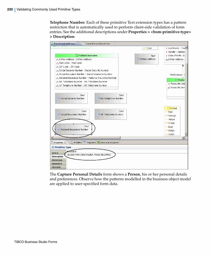
230 | Validating Commonly Used Primitive Types
Telephone Number. Each of these primitive Text extension types has a pattern restriction that is automatically used to perform client-side validation of form entries. See the additional descriptions under Properties > <bom-primitive-type> > Description:
The Capture Personal Details form shows a Person, his or her personal details and preferences. Observe how the patterns modelled in the business object model are applied to user-specified form data.
TIBCO Business Studio Forms

| 231
Chapter 5 Performance Improvements
This section describes different ways of improving the performance of forms in TIBCO Business Studio.
Topics
• Static Rendering
• Deferred Rendering and Deferred Initialization
TIBCO Business Studio Forms
232 | Static Rendering
Static Rendering
There are certain cases where the information displayed within a pane is read-only, and the end user does not need to edit the values in the pane. In such scenarios, you may gain a performance boost in the load time of the form by marking the pane to use static rendering.
How does Static Rendering Improve Performance?When a pane is marked to use static rendering, the following optimizations are applied:
• Faster Rendering: Form uses an optimized rendering of the controls and markup within the pane which helps the form to render faster.
• Reduced Load Time: For a pane having multiple child controls and child panes, individual objects are not instantiated for each child. This reduces the load time considerably. The drawback is that it is not possible to reference those objects using JavaScript in form actions.
When to Use Static Rendering The use of static rendering may not make a big difference in simple and small panes. The difference in load time is more pronounced as the panes get larger in terms of child controls and child panes.
Using static rendering can be useful in the following scenarios:
• Panes that need to display a large amount of non-editable information.
• Non-editable grid panes, such as those used in a master-detail implementation. It is possible to select individual rows, and the data within the pane are refreshed if the underlying records are modified. However, the static grid pane renders faster than the corresponding editable grid pane.
Configuration of Static RenderingPanes support the static rendering functionality. You can configure this feature using the options available on the Properties tab in the Properties view of a pane.
Although the static rendering feature helps to enhance the performance of forms it imposes constraints on model validations. The runtime functionality of static panes is also restricted. Refer to Static Rendering Constraints on page 233 for details.
TIBCO Business Studio Forms

| 233
Figure 127 Properties View for a Pane
• Static Rendering: Check box used to mark a pane to use static rendering. If selected, the pane is rendered as static pane. This property can be set only at design-time. It is not possible to convert a pane to static at runtime.
• Text Only: Check box used to mark a static pane to use text-only rendering. If selected, the pane is rendered as plain text, with no control widgets. This check box is enabled only if the Static Rendering check box is selected.
Static Rendering Constraints
Model Validations
Panes with the Static Rendering property set to true have the following constraints on model validation:
• Static panes are only supported for the GWT desktop runtime.
• Static panes are only supported for grid, vertical, and horizontal panes. Any pane marked as static can contain only these types of panes.
• Controls and panes within static panes cannot be referenced using JavaScript. These controls and panes do not show up in content assist, and any references to these components in JavaScript or computation actions display an error-level problem marker.
• Panes and controls, except button controls, contained within a static pane do not raise events, and thus cannot be used to trigger rules. Events for components within a static pane do not show up as choices for rules.
• Controls and panes within static panes do not support computation actions.
TIBCO Business Studio Forms
234 | Static Rendering
• Controls and panes within static panes do not support validations.
• Controls and panes within static panes do not support bindings to properties. However, binding to the following features are supported:
— Values
— Choice values
— Labels of optionlist
— Radiogroup
— Hyperlink
— Linktext
— Image URL
• Panes contained within static panes are also considered static panes.
• Tab order is ignored on controls within static panes.
• Values on controls and panes in static panes support absolute bindings and absolute ancestor pane value bindings to data fields and parameters. Bindings to other controls in the form are flagged with an error-level problem marker.
• Static panes cannot contain tabbed, grid, record, or message panes.
• Static panes cannot contain embedded forms.
• The Static Rendering property setting is ignored by the Mobile runtime. A warning-level problem marker is shown if a pane has the Static Rendering property set to true and any of the presentation channels uses Mobile rendering.
Runtime Functionality
For static panes, contents of the pane are rendered in simple HTML using streamlined JavaScript generated at design-time.
Top-level static panes can be referenced in form action scripts, computation action destinations, and bindings. But, nested panes and nested controls cannot be referenced.
TIBCO Business Studio Forms

| 235
• Validation markers are not displayed on controls in static panes.
— Initial data are assumed to be valid.
— For master-detail configurations, the grid pane can be updated using a non-static detail pane, but validation markers are only shown in the detail pane.
— Data can be changed using the data API.
• ’Required value’ indicators are not displayed on controls in static panes.
• Controls in static panes are completely static. It is possible to set a Style Class Name on a static pane and the child components, but the value is fixed at design-time.
Pane Value Update
When the value of a static pane is updated using either script, binding or computation action, the content of the pane is regenerated using the same JavaScript initially used to render the pane.
Static Grid Panes
Static grid panes support the following functionality:
• Row selection
• Pagination
• Adding records
• Deleting records
The values updated using the data API are not validated if they are shown only within a static pane.
Static panes should only be used in cases where you are assured that all required values have already been filled out, or when the user has an alternate method of specifying data, such as master-detail configurations. An example would be a step in a process where a user confirms previously specified data before proceeding.
A control within a static pane will not be refreshed when the underlying data value is updated if the control is directly bound to either of the following:
• A primitive parameter or data field.
• A primitive attribute of a data field.
TIBCO Business Studio Forms

236 | Static Rendering
• Sorting
The following functionality is not supported in static grid panes:
• Editing
• Validations on controls
• Computation actions on controls
A static grid pane is rendered as a compact non-editable grid pane, with the values represented as plain text.
It is possible to use a static grid pane as a part of a master-detail configuration. The non-static detail pane can be bound to the selection of the grid pane as is currently done. When a value is changed in the detail pane, the corresponding row in the static grid pane is re-rendered using the original generated JavaScript.
Tabbed Panes
Although tabbed panes cannot be marked as static, child panes that are vertical, horizontal, or grid panes can be marked as static.
Localization
Static panes support localization and will be regenerated if the form locale is updated.
Renderings for Specific Controls
Most controls in a static pane are rendered in the same fashion as in a normal pane, but are rendered in a read-only fashion.
If the Text Only property is set to true, then the value of each control is rendered as plain text. The values are formatted appropriately according to the type (as listed in Table 19). The control widgets are not rendered. Although, the rendering of images, hyperlinks, buttons, and pass-through controls is the same as in a static pane.
The following table lists how specific controls in a static pane are rendered:
Table 19 Rendering of Specific Controls
Control Rendering in Static Panes
Text Rendered as a read-only text input.
Text-Secret Rendered as a read-only secret text input (values are obscured).
TIBCO Business Studio Forms
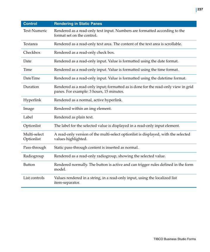
| 237
Text-Numeric Rendered as a read-only text input. Numbers are formatted according to the format set on the control.
Textarea Rendered as a read-only text area. The content of the text area is scrollable.
Checkbox Rendered as a read-only check box.
Date Rendered as a read-only input. Value is formatted using the date format.
Time Rendered as a read-only input. Value is formatted using the time format.
DateTime Rendered as a read-only input. Value is formatted using the datetime format.
Duration Rendered as a read-only input; formatted as is done for the read-only view in grid panes. For example: 3 hours, 15 minutes.
Hyperlink Rendered as a normal, active hyperlink.
Image Rendered within an img element.
Label Rendered as plain text.
Optionlist The label for the selected value is displayed in a read-only input element.
Multi-select Optionlist
A read-only version of the multi-select optionlist is displayed, with the selected values highlighted.
Pass-through Static pass-through content is inserted as normal.
Radiogroup Rendered as a read-only radiogroup, showing the selected value.
Button Rendered normally. The button is active and can trigger rules defined in the form model.
List controls Values rendered in a string, in a read-only input, using the localized list item-separator.
Control Rendering in Static Panes
TIBCO Business Studio Forms

238 | Deferred Rendering and Deferred Initialization
Deferred Rendering and Deferred Initialization
The key limiting factor in the user experience with forms is the initial load time for complex forms. There can be a noticeable delay especially in cases where the user interface is initially hidden within the tabs of a tabbed pane. In such scenarios using either deferred rendering or deferred initialization of panes can help to achieve a quicker initial load-time. By using these features, the rendering of panes on a page is deferred until after the basic framework of the form is loaded and is operational.
How do Deferred Rendering and Deferred Initialization Improve Performance?When a pane is marked to use deferred rendering or deferred initialization, the following optimizations are applied:
• Deferred Rendering: The rendering of the pane is deferred till the pane is made visible by the user. The panes that are visible at initial load-time are rendered when:
— The form is completely initialized.
— Form open event has fired.
— All the form open rules have been executed.
In tabbed panes, the rendering of each tab is deferred until the user clicks on the tab to view the contents.
• Deferred Initialization: The deferred initialization feature can only be used for panes that are marked to use deferred rendering. The children of the pane marked to use deferred initialization are not initialized until the pane needs to be rendered. This means that the pane object itself is always instantiated and available, but any nested children are not initialized.
Deferred initialization imposes restrictions on the types of references that can be made to the child controls of the pane. Refer to Deferred Rendering and Deferred Initialization Constraints on page 239 for details.
TIBCO Business Studio Forms

| 239
Configuration of Deferred Rendering and Deferred InitializationPanes support the deferred rendering and deferred initialization functionality. You can configure these features on the Properties view of a pane. Both the options are available on the Properties tab.
• Defer Rendering: Check box used to mark a pane to use deferred rendering. If selected, the user interface for the pane is not rendered until the pane is made visible. This property can be set only at design-time and it cannot be updated using bindings or using the API.
• Defer Initialization: Check box used to mark a pane to use deferred initialization. This check box is enabled only if the Defer Rendering check box is selected. If selected, the children of the pane are not initialized until the pane needs to be rendered.
Deferred Rendering and Deferred Initialization Constraints
Model Validations
• Deferred rendering of a pane is supported for the GWT runtime.
• When a pane is marked for deferred initialization, all references to child or nested controls of that pane are flagged with an error-level problem marker. This includes references in script or computation actions. The following quick fixes are available:
— Remove deferred initialization.
— Use Defer Rendering only.
TIBCO Business Studio Forms

240 | Deferred Rendering and Deferred Initialization
• Panes marked for deferred initialization cannot contain embedded forms, either directly or in any of the nested panes. This is indicated by an error-level problem marker. The following quick fixes are available:
— Remove deferred initialization.
— Use Defer Rendering only.
Runtime Functionality
Handling Bindings to Deferred Panes and Child Controls
• If the Defer Initialization check box is cleared, then bindings, script references, and computation action references to the pane and its children are not affected.
• If the Defer Initialization check box is selected, then any references to child or nested controls using scripts or computation actions are flagged with an error-level problem marker. You can make use of events tied to the pane and its children in rule definitions. Binding to panes are always active and working but the bindings to child and nested controls are inactive until the pane and child controls have been fully initialized.
• If the Defer Rendering check box is selected, and the Defer Initialization check box is cleared, bindings to panes and controls are active even if the pane is not currently rendered. The internal model of the pane or child controls can be updated using scripts, bindings, or computation actions. The effects of such updates are visible after the pane is rendered.
Handling Validations in Deferred Panes
An un-rendered pane is treated the same as an invisible pane with respect to the suppression of validation checking.
Loading Deferred Panes
Panes marked to use deferred rendering display a spinning wheel to indicate that the content is being initialized. This loading indicator is visible only if there is a noticeable delay in rendering the pane.
TIBCO Business Studio Forms

| 241
Chapter 6 Custom Controls
This chapter describes the process of integrating custom controls in TIBCO Business Studio.
Topics
• Overview, page 242
• Defining Custom Controls, page 243
• Runtime Life Cycle of Custom Controls, page 254
• Component Library Model, page 257
• Control Wrapper Implementation, page 281
• Component Interface, page 286
• BOM JavaScript API for Custom Controls, page 290
• Utility Methods, page 295
TIBCO Business Studio Forms

242 | Overview
Overview
TIBCO Business Studio supports integration of third-party custom controls. This enables customers to provide configuration information about any third party widgets and the Form Designer can expose those controls in the palette. Users designing forms can work with these extended controls in the same fashion that they work with the set of built-in controls.
TIBCO Business Studio Forms

| 243
Defining Custom Controls
There are two key items that a developer needs to provide for the definition of a custom control.
• A ControlWrapper is a JavaScript class that either implements the runtime functionality of the control, or wraps a third-party library.
Figure 128 provides a look at how the ControlWrapper exposes the implementation of a third-party library as a Custom Control within Forms.
Figure 128 Custom Control Architecture
It is also possible to provide the entire implementation of a custom control within a ControlWrapper with no reliance on a third-party library. However, that is not the typical case.
TIBCO Business Studio Forms

244 | Defining Custom Controls
• The custom control definition must be specified in a component library file. The component library file provides information on how to display and configure instances of the custom control in the Form Designer. The information will also be used at runtime in order to determine the capabilities of the control.
Figure 129 provides a description of the various design-time and runtime artifacts that go into a Components Library project.
Figure 129 Component Library Project
TIBCO Business Studio Forms
| 245
Working with the Component Library FileA special folder of type Components is used to store component library files. A library file defines a set of custom controls which are available in the Forms Designer palette.
The option to create the Components special folder is presented at the time of new project creation.
The detailed steps for defining custom controls are as follows:
1. Click File > New > BPM Developer Project. The New BPM Developer Project dialog opens.
2. Specify the Project name and select the BPM check box as the Destination Environments. Click Next.
3. The Form Component Library option is provided on the Asset Type Selection page. Specify the asset types as displayed in the following figure.
A Business Object Model asset is only required if you wish to add or use model types that will be used in the component library.
TIBCO Business Studio Forms
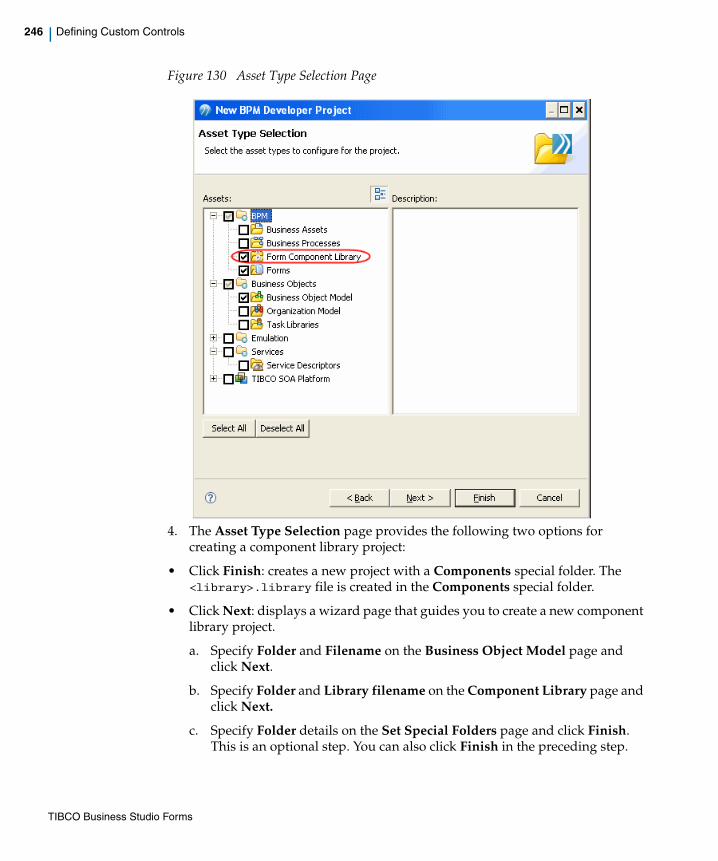
246 | Defining Custom Controls
Figure 130 Asset Type Selection Page
4. The Asset Type Selection page provides the following two options for creating a component library project:
• Click Finish: creates a new project with a Components special folder. The <library>.library file is created in the Components special folder.
• Click Next: displays a wizard page that guides you to create a new component library project.
a. Specify Folder and Filename on the Business Object Model page and click Next.
b. Specify Folder and Library filename on the Component Library page and click Next.
c. Specify Folder details on the Set Special Folders page and click Finish. This is an optional step. You can also click Finish in the preceding step.
TIBCO Business Studio Forms
| 247
Creates a new project with a Components special folder. The .library file is created based on the details provided in the wizard.
The contents of the Components special folder are:
— .library file: the .library file contains the configuration information for a set of custom controls. For example: MyComponents.library.
— icons folder: the icons folder contains sample design-time icons for the custom controls.
5. Right-click the <library>.library file, and select Open. The library file is opened in the Component Library Editor for editing.
An overview of the various parts of the Component Library Model is provided in Figure 131.
You can designate a normal folder as a Components special folder as well, using a similar 'Special Folders > Use as Components Folder' technique as with other special folder types.
TIBCO Business Studio Forms

248 | Defining Custom Controls
Figure 131 Component Library Model
TIBCO Business Studio Forms
| 249
The editor supports editing of the .library file, and provides an easy way to specify the configuration details for each custom control definition.
6. Select the <Library> node to view and edit the configuration details for the library element in the Properties view. Refer to Library, page 257 section for a detailed description.
The library element can have the following child elements:
— Palette Drawer: a Library has a single Palette Drawer element. Refer to Palette Drawer, page 258 section for the details.
— Event Type: a Library can have multiple Event Type elements. Refer to Event Type, page 259 section for the details.
— External Resource: a Library can have multiple External Resource elements. Refer to External Resource, page 260 section for the details.
— Control Type: a Library can have multiple Control Type elements. Refer to Control Type, page 261 section for the details.
7. To add Event Type and External Resource elements at the Library level:
— Event Type: select the Library element, right-click, and select New Child > Event Type. A new Event Type element is added.
— External Resource: select the Library element, right-click, and select New Child > External Resource.
A new External Resource element is added. An External Resource defined at the Library level applies to all Control Types defined in the Library. It gets loaded into the page if the form uses at least one control type from the library.
The .library file displays a problem marker for defining the Constructor Class property.
By default, the following elements are added to the Library root element:
• Palette Drawer
• Control Type
The other supported elements can be added according to your requirements.
TIBCO Business Studio Forms
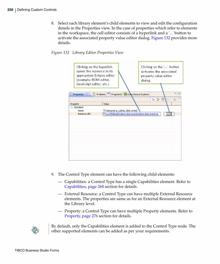
250 | Defining Custom Controls
8. Select each library element’s child elements to view and edit the configuration details in the Properties view. In the case of properties which refer to elements in the workspace, the cell editor consists of a hyperlink and a '...' button to activate the associated property value editor dialog. Figure 132 provides more details.
Figure 132 Library Editor Properties View
9. The Control Type element can have the following child elements:
— Capabilities: a Control Type has a single Capabilities element. Refer to Capabilities, page 268 section for details.
— External Resource: a Control Type can have multiple External Resource elements. The properties are same as for an External Resource element at the Library level.
— Property: a Control Type can have multiple Property elements. Refer to Property, page 276 section for details.
By default, only the Capabilities element is added to the Control Type node. The other supported elements can be added as per your requirements.
TIBCO Business Studio Forms

| 251
10. To add External Resource and Property elements at the Control Type level:
— External Resource: select the Control Type element, right-click and select New Child > External Resource. A new External Resource element is added. An External Resource defined at the Control Type level is guaranteed to be loaded into the page only when a form uses this control type from the library.
— Property: select the Control Type element, right-click and select New Child > Property. A new Property element is added.
11. Select each Control Type’s child elements to view and edit the configuration details in the Properties view.
Working with the ControlWrapperTo add a reference to a ControlWrapper class:
1. Create a folder in the Presentation Resources folder and place the .js file with the JavaScript wrapper implementation in this folder.
2. Select the External Resource element (either at the Control Type level or Library level) to view the configuration options in the Properties view.
3. Click the picker provided for the Relative URI property. The Pick Resource dialog lists the JavaScript files available in the Presentation Resources folder.
TIBCO Business Studio Forms
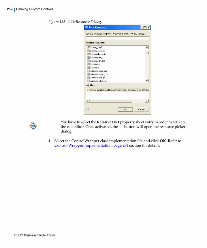
252 | Defining Custom Controls
Figure 133 Pick Resource Dialog.
4. Select the ControlWrapper class implementation file and click OK. Refer to Control Wrapper Implementation, page 281 section for details.
You have to select the Relative URI property sheet entry in order to activate the cell editor. Once activated, the '...' button will open the resource picker dialog.
TIBCO Business Studio Forms

| 253
Using the Custom ControlOnce the custom component definition is complete, the project with the component library file has to be added as a project reference in a Forms project. The icons for the custom components are displayed in the Form Designer palette.
The Form Designer supports the following functionality when working with custom controls:
1. Click the custom control type in the palette, move the mouse to the desired position on the form canvas, then click to create the new control instance.
2. Controls of other types can be refactored to custom control types by changing the control type field on the General Properties tab for the control.
3. The Form Designer Properties tab presents a table for editing the extended properties defined for the custom control.
4. The preview makes use of the custom controls.
5. Custom control libraries are made available by adding a reference to the library project.
6. All built-in control functionality is available, unless specifically prevented by the custom control type definition. For example: validation, labels, hints, visibility, and data binding.
7. Deployment of custom controls is handled the same as for other BPM projects.
When adding a project reference to a library project, forms that are open in the referring project will not immediately reflect the new palette drawers available from that project. You will need to close and re-open those forms in order to see the new palette drawers.
TIBCO Business Studio Forms
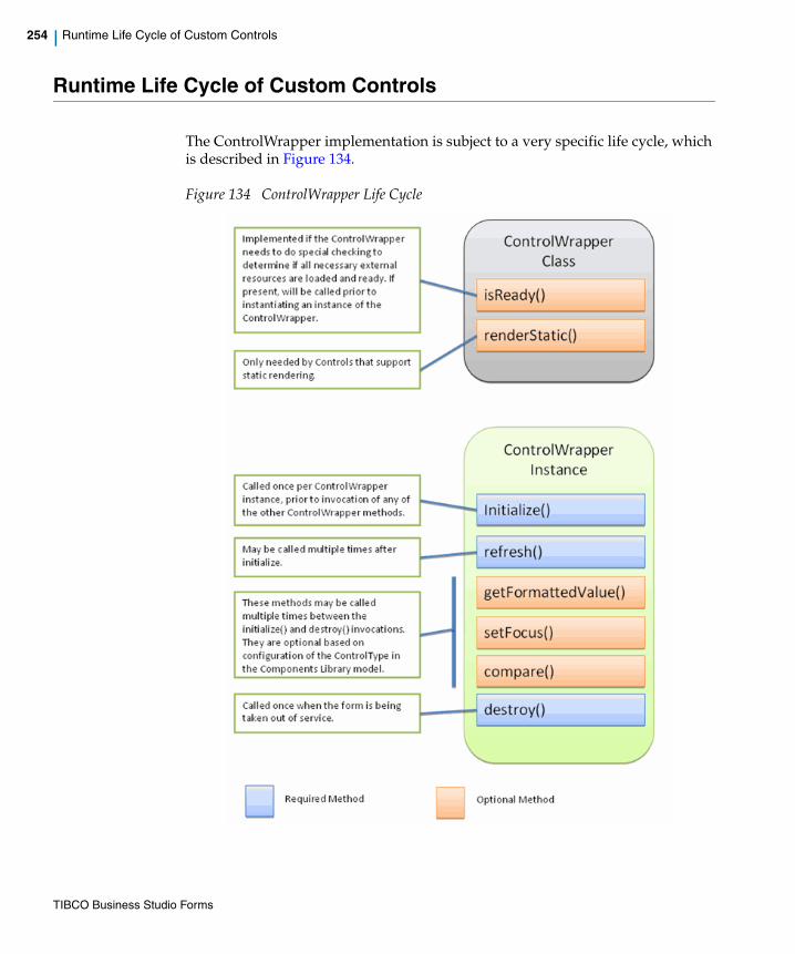
254 | Runtime Life Cycle of Custom Controls
Runtime Life Cycle of Custom Controls
The ControlWrapper implementation is subject to a very specific life cycle, which is described in Figure 134.
Figure 134 ControlWrapper Life Cycle
TIBCO Business Studio Forms

| 255
Preparation
The forms runtime repeatedly calls the ControlWrapper's isReady() method until it returns true.
Initialization
The forms runtime calls the constructor function to create an instance of the ControlWrapper and then calls the initialize() method on this instance.
Refresh
Whenever you update the configuration or value of the control, the form invokes the ControlWrapper.refresh() method to give the ControlWrapper a chance to update the rendering of the control.
Destruction
When the form is being taken out of service, it invokes the destroy() method on the ControlWrapper.
Runtime Life Cycle of Custom Control Used within Grid PaneUsing a custom control within a grid pane uses a specialized life cycle. It depends on the supported Render Modes of the Control Type and the Always Render setting on the Control.
Preparation
The forms runtime repeatedly calls the ControlWrapper's isReady() method until it returns true.
Initialization
When you configure the control in the Always Render mode, the form creates an instance of the ControlWrapper for each cell in the grid table. Users can view the rendering that happens at this point.
If a control is within a static pane, the form does not create an instance of the ControlWrapper. Instead, it invokes the renderStatic() for the ControlWrapper to get the markup used in the static mode.
TIBCO Business Studio Forms
256 | Runtime Life Cycle of Custom Controls
When you do not configure the control in the Always Render mode (default), the form creates a single ControlWrapper instance that is shared between the cells in a grid table column. Users cannot view the rendering that happens at this point. The form does not attach the parent node to the DOM at this point but invokes the ControlWrapper.getFormattedValue() method for each visible cell in the column of the grid table.
Refresh
When you configure the control in the Always Render mode, the form calls the refresh() method as soon as the value or other configuration settings are changed.
When you do not configure the control in the Always Render mode and focus on a cell to edit the value, the form calls the ControlWrapper.refresh() method to allow the ControlWrapper to update the rendering and reflect the current value being edited. If you change any of the configuration settings after the last refresh(), the wrapper is notified through the updates argument.
Sorting
If a control manages a complex value, the static compare() method on the ControlWrapper class is called each time user sorts the grid on that column.
Destruction
When you configure the control in Always Render mode, the form invokes the destroy() method on all instances of the ControlWrapper when the form is being taken out of service or on the specific instance when that row is deleted from the table.
If you do not configure the control in the Always Render mode, the form invokes the destroy() method on the shared instance of the ControlWrapper only when the form is being taken out of service.
TIBCO Business Studio Forms

| 257
Component Library Model
LibraryThe Library is the root element in the component library definition. A detailed description of the properties is provided in the following table:
Table 20 Library Element Properties
Property Type Initial Value Description
Name String Library file base name
Library name.
Qualifier String Generated based on containing project identifier and the nsPrefix
The qualifier should be unique within the workspace.
XML Namespace Prefix
String <libraryName>. toLowerCase()
Used in form models when referencing Control Types in this model. This is pre-populated based on the original name of the library file and usually does not need to be changed (it can be manually abbreviated to something short and intuitive).
XML Namespace URI
URI Generated based on the library name
Defines a unique namespace URI reference that is used in referring to form definitions. This is pre-populated based on the original name of the library file and usually does not need to be changed (it can be manually changed to conform to your organization's end-point naming policy).
Drawer Palette Drawer Provides basic information about the drawer in which custom controls in this library will be displayed in the Form Designer palette.
TIBCO Business Studio Forms

258 | Component Library Model
Palette DrawerThere is a single Palette Drawer for each library file. All controls defined in a library file are displayed in this drawer in the Form Designer palette beneath the built-in drawers of Panes, Controls, and Action Buttons.
The detailed description of the properties is provided in the following table:
Event Event Type Defines custom events that are raised by one or more control types defined in this library. The multiplicity of this property is 0..* (that is, the library can contain zero or more event types).
Note: An Event Type is added to the model using the context menu (right-click) on the Library element.
Resource External Resource
The external resources can contain JavaScript, CSS, image files, or localized properties. All external resources defined in the library are loaded when one of the control types defined in it is loaded by the form. The multiplicity of this property is 0..* (that is, the library can contain zero or more external resources).
Note: An External Resource is added to the model using the context menu (right-click) on the Library element.
Component Control Type Specifies the Control Type schema. All Control Types specified here appear in the Palette Drawer defined for this Library and can be used in forms. The multiplicity of this property is 1..* (that is, the library can contain one or more Control Types).
Note: A Control Type is added to the model using the context menu (right-click) on the Library element.
Property Type Initial Value Description
TIBCO Business Studio Forms
| 259
Table 21 Palette Drawer Properties
Event TypeCustom controls can raise any of the built-in events (for example: Update, Enter, Exit, Select) or can raise custom events that do not correspond to the semantics of any of the built-in events. Individual control types can declare the events they support from the union of built-in events and those defined at the library level.
A detailed description of the Event Type properties is provided in the following table:
Property Type Initial Value Description
Name String drawer.<libraryName> Defines a unique name for the drawer. The name must begin with "drawer." and must be unique within the workspace. This property is pre-populated based on the original name of the library file and usually need not be changed.
Label String Generated based on library name.
Label applied in the form designer.
Order Integer 0 Specifies the order in which the drawer is added to the palette. Higher numbered drawers appear later in the palette. Any drawers that have the same order are arranged alphabetically by label. Custom drawers are always below the built-in drawers.
TIBCO Business Studio Forms
260 | Component Library Model
Table 22 Event Type Properties
External ResourceAn External Resource can be defined at two levels:
— Library level: in this case, it applies to all control types defined in the library and these External Resources are loaded when at least one Control Type in this library is used by the form.
— Control Type level: in this case, it applies only to the specific Control Type and is loaded only if this Control Type is used by the form.
Property Type Restrictions Description
Name String • Unique within library.
• Cannot be set to a same name as any of the built-in event names:
— close
— doubleclick
— enter
— exit
— localize
— open
— select
— submit
— update
• Cannot begin with tibco_, to ensure no conflict with built-in events specified by TIBCO.
Specifies the name of the custom event. This is used at design time to configure the events that trigger a rule. At runtime, it is used in the ControlWrapper to specify which event is being raised by the custom control.
Label String Label used in the Form Designer for the Event Type.
TIBCO Business Studio Forms
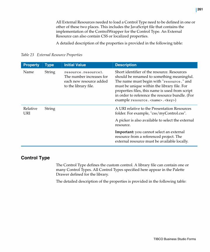
| 261
All External Resources needed to load a Control Type need to be defined in one or other of these two places. This includes the JavaScript file that contains the implementation of the ControlWrapper for the Control Type. An External Resource can also contain CSS or localized properties.
A detailed description of the properties is provided in the following table:
Table 23 External Resource Properties
Control TypeThe Control Type defines the custom control. A library file can contain one or many Control Types. All Control Types specified here appear in the Palette Drawer defined for the library.
The detailed description of the properties is provided in the following table:
Property Type Initial Value Description
Name String resource.resource1. The number increases for each new resource added to the library file.
Short identifier of the resource. Resources should be renamed to something meaningful. The name must begin with "resource." and must be unique within the library file. For properties files, this name is used from script in order to reference the resource bundle. (For example resource.<name>.<key>)
Relative URI
String A URI relative to the Presentation Resources folder. For example, "css/myControl.css".
A picker is also available to select the external resource.
Important: you cannot select an external resource from a referenced project. The external resource must be available locally.
TIBCO Business Studio Forms

262 | Component Library Model
Table 24 Control Type Properties
Property Type Restrictions / Initial Value Description
Canvas Icon String Must be a valid relative URI that resolves to an image file in the Components special folder.
(Required) Provides the special folder relative URI of the icon that is used when rendering the component in the Form Designer canvas. The icon has to be placed within the Components special folder and it can be an image of type .png, .gif, or .bmp. This icon is used only at design-time.
When a library is first created, a set of initial icons is provided in the icons folder. These icons can be used as placeholders for the three icons needed on a Control Type until a more specific set of icons can be provided.
Constructor Class
String Must be a valid JavaScript expression that yields a constructor function object when evaluated at runtime.
(Required) Refers to the name of the JavaScript constructor that implements the ControlWrapper interface. The JavaScript file that defines this constructor should be specified as an External Resource reference either at the Library level or the Control Type level.
Data Type Classifier Must be a BOM Primitive Type, Enumeration, or Class
Defines the type of the value managed by this Control Type. This is a reference to one of the following types:
• A built-in BOM Primitive Type
• An Enumeration
• A Class
The Data Type determines what can be bound to the value of controls of this Control Type in the Form model. If the BOM Primitive Type of "Object" is specified for the Data Type, then it allows any complex object to be bound to the value of instances of the Control Type.
TIBCO Business Studio Forms

| 263
Event Event Type Reference
Can only reference a built-in Event Type, or Event Types specified in this Library file.
Specifies which Event Types can be raised by this Control Type. The runtime ControlWrapper can only raise an event of a given type if it has been declared in the Control Type model. The events specified here will be available in the Form Designer to add as triggers on Rules defined in the Form.
Handles Enter Key
Boolean This is set to true if the underlying widget provides a key handler for the Enter key. The form needs to know this in order to prevent a primary button (for example, 'Submit') from being activated by an Enter keystroke when the custom control has the input focus.
Hint String (Required) Short description of the Control Type, which is used as a hower help on the icon in the palette.
Label String The library designer should ensure that this is unique within the Library.
(Required) Label used in the Forms Designer palette.
Multi-valued Boolean Indicates whether the value managed by this Control Type is multi-valued. If true, then the value for the control can only be bound to multi-valued values. When this is true, it is up to the implementation of the control to manage multiple values. For a multi-valued control with a simple data type, the runtime value will be set as a JavaScript array. When the control is managing multi-valued structured types, the values will be provided in a list.
Property Type Restrictions / Initial Value Description
TIBCO Business Studio Forms
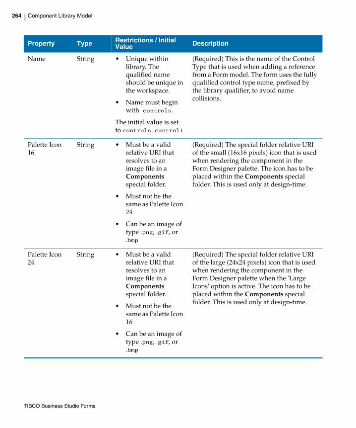
264 | Component Library Model
Name String • Unique within library. The qualified name should be unique in the workspace.
• Name must begin with controls.
The initial value is set to controls.control1
(Required) This is the name of the Control Type that is used when adding a reference from a Form model. The form uses the fully qualified control type name, prefixed by the library qualifier, to avoid name collisions.
Palette Icon 16
String • Must be a valid relative URI that resolves to an image file in a Components special folder.
• Must not be the same as Palette Icon 24
• Can be an image of type .png, .gif, or .bmp
(Required) The special folder relative URI of the small (16x16 pixels) icon that is used when rendering the component in the Form Designer palette. The icon has to be placed within the Components special folder. This is used only at design-time.
Palette Icon 24
String • Must be a valid relative URI that resolves to an image file in a Components special folder.
• Must not be the same as Palette Icon 16
• Can be an image of type .png, .gif, or .bmp
(Required) The special folder relative URI of the large (24x24 pixels) icon that is used when rendering the component in the Form Designer palette when the 'Large Icons' option is active. The icon has to be placed within the Components special folder. This is used only at design-time.
Property Type Restrictions / Initial Value Description
TIBCO Business Studio Forms
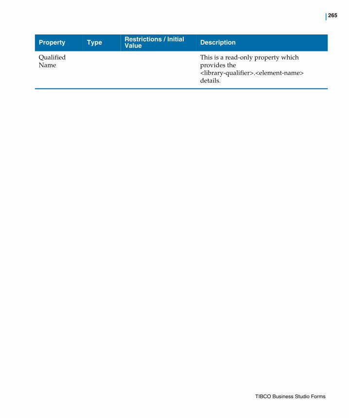
| 265
Qualified Name
This is a read-only property which provides the <library-qualifier>.<element-name> details.
Property Type Restrictions / Initial Value Description
TIBCO Business Studio Forms
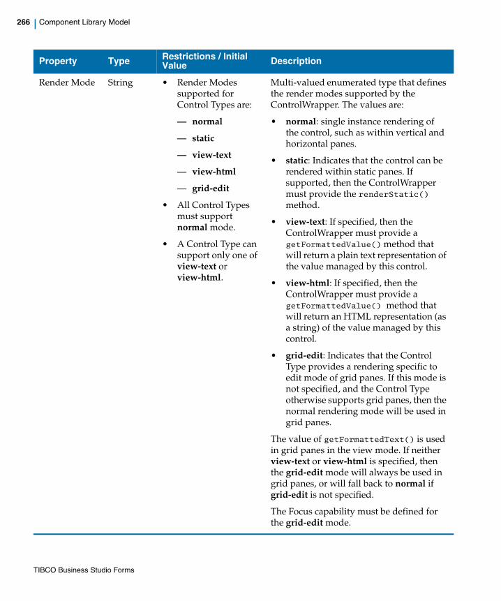
266 | Component Library Model
Render Mode String • Render Modes supported for Control Types are:
— normal
— static
— view-text
— view-html
— grid-edit
• All Control Types must support normal mode.
• A Control Type can support only one of view-text or view-html.
Multi-valued enumerated type that defines the render modes supported by the ControlWrapper. The values are:
• normal: single instance rendering of the control, such as within vertical and horizontal panes.
• static: Indicates that the control can be rendered within static panes. If supported, then the ControlWrapper must provide the renderStatic() method.
• view-text: If specified, then the ControlWrapper must provide a getFormattedValue() method that will return a plain text representation of the value managed by this control.
• view-html: If specified, then the ControlWrapper must provide a getFormattedValue() method that will return an HTML representation (as a string) of the value managed by this control.
• grid-edit: Indicates that the Control Type provides a rendering specific to edit mode of grid panes. If this mode is not specified, and the Control Type otherwise supports grid panes, then the normal rendering mode will be used in grid panes.
The value of getFormattedText() is used in grid panes in the view mode. If neither view-text or view-html is specified, then the grid-edit mode will always be used in grid panes, or will fall back to normal if grid-edit is not specified.
The Focus capability must be defined for the grid-edit mode.
Property Type Restrictions / Initial Value Description
TIBCO Business Studio Forms

| 267
Supported Parent Pane
Pane Type Reference
Only one of Supported Parent Pane or Unsupported Parent Pane references can be used within a given Control Type.
Specifies a list of pane types that are supported as a direct parent by this Control Type. A control of this Control Type can only be added to panes of types on this list. If neither Supported Parent Pane or Unsupported Parent Pane restrictions are specified, then it is legal to add an instance of this Control Type into any type of pane that will accept it as a child.
Some pane types restrict the type of children they support. For example, grid panes don't allow panes as children; tabbed panes only allow panes as children; an embedded form pane is only allowed to refer another form in the workspace.
Note: No Control Types are supported in the Message Pane. You will not be able to place any Control Type in a Message pane even if it is selected as one of the Supported Parent Pane types.
Supported Type Conversion
Control Type Reference
Only one of Supported Type Conversion or Unsupported Type Conversion references can be used within a given Control Type.
Specifies an explicit list of Control Types to which an instance in a form may be refactored. If not specified, an instance of this Control Type may be refactored to any Control Type. For example: a third party date picker may only permit itself to be refactored to one of the built-in date-time control types.
Unsupported Parent Pane
Pane Type Reference
Only one of supported Parent Pane or unsupported Parent Pane references can be used within a given Control Type.
Specifies a list of pane types that this Control Type does not support as a direct parent. If a pane is included in this list, then it is not possible to place a control of this type into an instance of that pane. If neither Supported Parent Pane or Unsupported Parent Pane restrictions are specified, then it is legal to add an instance of this Control Type into any type of pane that will accept it as a child.
Property Type Restrictions / Initial Value Description
TIBCO Business Studio Forms
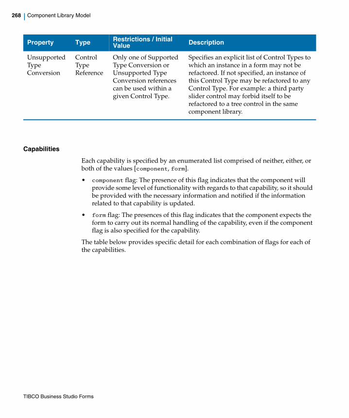
268 | Component Library Model
Capabilities
Each capability is specified by an enumerated list comprised of neither, either, or both of the values [component, form].
• component flag: The presence of this flag indicates that the component will provide some level of functionality with regards to that capability, so it should be provided with the necessary information and notified if the information related to that capability is updated.
• form flag: The presences of this flag indicates that the component expects the form to carry out its normal handling of the capability, even if the component flag is also specified for the capability.
The table below provides specific detail for each combination of flags for each of the capabilities.
Unsupported Type Conversion
Control Type Reference
Only one of Supported Type Conversion or Unsupported Type Conversion references can be used within a given Control Type.
Specifies an explicit list of Control Types to which an instance in a form may not be refactored. If not specified, an instance of this Control Type may be refactored to any Control Type. For example: a third party slider control may forbid itself to be refactored to a tree control in the same component library.
Property Type Restrictions / Initial Value Description
TIBCO Business Studio Forms

| 269
Property Description Form Flag
Component Flag Outcome
Disabled The form will not have enough information to know how to disable a widget within the custom control. If a Control Type is to support the setting of a disabled state, then it will have to handle the update of this property at runtime.
true true This is the typical case. Here, the Form will apply or remove the "disabled" CSS class at the control level, and requests the ControlWrapper to refresh its rendering of the enablement state. The form notifies the ControlWrapper that the enablement state has changed by calling its refresh() method with the updates argument containing the feature name "enabled".
true false The form will apply or remove the "disabled" CSS class at the control level but does not notify the ControlWrapper of enablement changes.
false (default)
true (default)
No CSS class will be applied at the control level but the form notifies the ControlWrapper of enablement changes.
false false The control does not handle the disabled state.
TIBCO Business Studio Forms
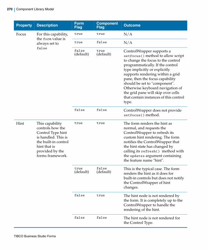
270 | Component Library Model
Focus For this capability, the form value is always set to false
true true N/A
true false N/A
false (default)
true (default)
ControlWrapper supports a setFocus() method to allow script to change the focus to the control programmatically. If the control type implicitly or explicitly supports rendering within a grid pane, then the focus capability should be set to "component". Otherwise keyboard navigation of the grid pane will skip over cells that contain instances of this control type.
false false ControlWrapper does not provide setFocus() method.
Hint This capability controls how the Control Type hint is handled. This is the built-in control hint that is provided by the forms framework.
true true The form renders the hint as normal, and requests the ControlWrapper to refresh its custom hint rendering. The form notifies the ControlWrapper that the hint state has changed by calling its refresh() method with the updates argument containing the feature name "hint".
true (default)
false (default)
This is the typical case. The form renders the hint as it does for built-in controls but does not notify the ControlWrapper of hint changes.
false true The hint node is not rendered by the form. It is completely up to the ControlWrapper to handle the rendering of the hint.
false false The hint node is not rendered for the Control Type.
Property Description Form Flag
Component Flag Outcome
TIBCO Business Studio Forms
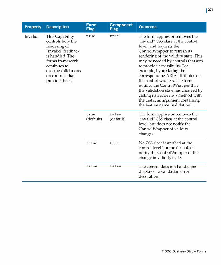
| 271
Invalid This Capability controls how the rendering of "Invalid" feedback is handled. The forms framework continues to execute validations on controls that provide them.
true true The form applies or removes the "invalid" CSS class at the control level, and requests the ControlWrapper to refresh its rendering of the validity state. This may be needed by controls that aim to provide accessibility. For example, by updating the corresponding ARIA attributes on the control widgets. The form notifies the ControlWrapper that the validation state has changed by calling its refresh() method with the updates argument containing the feature name "validation".
true (default)
false (default)
The form applies or removes the "invalid" CSS class at the control level, but does not notify the ControlWrapper of validity changes.
false true No CSS class is applied at the control level but the form does notify the ControlWrapper of the change in validity state.
false false The control does not handle the display of a validation error decoration.
Property Description Form Flag
Component Flag Outcome
TIBCO Business Studio Forms
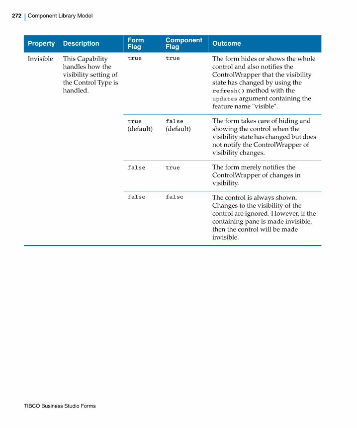
272 | Component Library Model
Invisible This Capability handles how the visibility setting of the Control Type is handled.
true true The form hides or shows the whole control and also notifies the ControlWrapper that the visibility state has changed by using the refresh() method with the updates argument containing the feature name "visible".
true (default)
false (default)
The form takes care of hiding and showing the control when the visibility state has changed but does not notify the ControlWrapper of visibility changes.
false true The form merely notifies the ControlWrapper of changes in visibility.
false false The control is always shown. Changes to the visibility of the control are ignored. However, if the containing pane is made invisible, then the control will be made invisible.
Property Description Form Flag
Component Flag Outcome
TIBCO Business Studio Forms

| 273
Label This Capability controls how the control label is handled. This is the built-in control label that is provided by the forms framework. Note that when a custom control is rendered in a grid pane, the column label will always be provided by the form.
true true The form renders the label as normal, and also requests the ControlWrapper to refresh its rendering of the label. The form notifies the ControlWrapper that the label value has changed by calling its refresh() method with the updates argument containing the feature name "label".
true (default)
false (default)
The form renders the label as it does for built-in controls but does not notify the ControlWrapper of label changes.
false true The label is not rendered by the form and the form notifies the ControlWrapper of label changes. It is completely up to the ControlWrapper to handle the rendering of the label. In vertical panes, this setting will result in control being rendered completely to the left, aligned with the labels of other controls that rely on the form to render the label.
false false The label is not rendered for the control.
Property Description Form Flag
Component Flag Outcome
TIBCO Business Studio Forms

274 | Component Library Model
Read Only
The form does not have enough information to know how to set a widget within the custom control as read only. If a Control Type supports the setting of a read only state, then this property is handled at runtime.
true true The form applies or removes the "read-only" CSS class at the control level, and requests the ControlWrapper to refresh its rendering of the read-only state. The form notifies the ControlWrapper that the read-only state has changed by calling its refresh() method with the updates argument containing the feature name "readOnly".
true false The form applies or removes the "read-only" CSS class at the control level, but does not notify the ControlWrapper of changes to the read-only setting.
false (default)
true
(default)The CSS class is not applied at the control level, but the form notifies the ControlWrapper of the change of read-only state.
false false The control does not handle the read-only state.
Property Description Form Flag
Component Flag Outcome
TIBCO Business Studio Forms
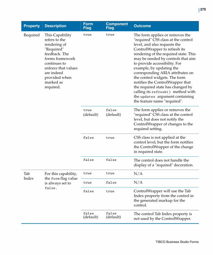
| 275
Required This Capability refers to the rendering of "Required" feedback. The forms framework continues to enforce that values are indeed provided when marked as required.
true true The form applies or removes the "required" CSS class at the control level, and also requests the ControlWrapper to refresh its rendering of the required state. This may be needed by controls that aim to provide accessibility. For example, by updating the corresponding ARIA attributes on the control widgets. The form notifies the ControlWrapper that the required state has changed by calling its refresh() method with the updates argument containing the feature name "required".
true (default)
false (default)
The form applies or removes the "required" CSS class at the control level, but does not notify the ControlWrapper of changes to the required setting.
false true CSS class is not applied at the control level, but the form notifies the ControlWrapper of the change in required state.
false false The control does not handle the display of a "required" decoration.
Tab Index
For this capability, the form flag value is always set to false.
true true N/A
true false N/A
false true ControlWrapper will use the Tab Index property from the control in the generated markup for the control.
false (default)
false (default)
The control Tab Index property is not used by the ControlWrapper.
Property Description Form Flag
Component Flag Outcome
TIBCO Business Studio Forms
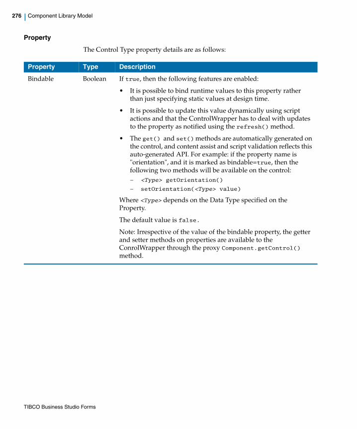
276 | Component Library Model
Property
The Control Type property details are as follows:
Property Type Description
Bindable Boolean If true, then the following features are enabled:
• It is possible to bind runtime values to this property rather than just specifying static values at design time.
• It is possible to update this value dynamically using script actions and that the ControlWrapper has to deal with updates to the property as notified using the refresh() method.
• The get() and set() methods are automatically generated on the control, and content assist and script validation reflects this auto-generated API. For example: if the property name is "orientation", and it is marked as bindable=true, then the following two methods will be available on the control: — <Type> getOrientation()
— setOrientation(<Type> value)
Where <Type> depends on the Data Type specified on the Property.
The default value is false.
Note: Irrespective of the value of the bindable property, the getter and setter methods on properties are available to the ConrolWrapper through the proxy Component.getControl() method.
TIBCO Business Studio Forms

| 277
Data Type Classifier Defines the type of the value for this property. This is a reference either to a built-in BOM Primitive Type, or to a Class or Enumeration defined in a BOM file in the Library project. The Data Type will determine what can be bound to the value property in the form model.
When a property type is defined as a specific Class, then it will limit bindings of that property to objects of that type or a specialization of that type defined in the model. If the Data Type is set to BomPrimitiveTypes::Object, then the property can be bound to an object of any complex type. However, in this case it will be the responsibility of the person designing the form to ensure that the binding is to a value that can actually be used by the custom control.
The use case for supporting complex objects for properties includes the use of complex third party controls such as tables and trees. For example, you could define a "Selection" property on a tree control that will be set to the object currently selected by the user. It would still be up the person designing the form to make sure the selected object is used correctly in the rest of the form, for example, by setting it as the value on a pane that can edit that particular type of object.
Default Value Literal
String Provides a default value to use for this property if nothing is provided in the form model.
The value must be a valid literal representation for the property's data type.
Property Type Description
TIBCO Business Studio Forms

278 | Component Library Model
Externalize Boolean Indicates the Property provides a value which could vary based on locale. A setting of true here will cause the value to be externalized within the form-level resource bundle that is generated automatically.
In addition, the property editor generated for instances of this control will expose the following two settings:
• A property where the user can specify a value directly.
• Allow the user to select a reference to a resource bundle key. Only one of these settings will be allowed.
If the property is both externalized and multi-valued, then the user will only be able to specify values directly into the list editor associated with the property. These values will be written to the form-level resource bundle and can then be translated into locale-specific bundles. In this version, you will not be able to specify a resource bundle reference for multi-valued, externalized properties.
The default value is false.
Label String Label used in the Form Designer when exposing this property in the property sheet editor.
Multi-valued Boolean Indicates whether the value for this property is multi-valued. If true, then the value for this property can only be bound to multi-valued values.
The default value is false.
Property Type Description
TIBCO Business Studio Forms

| 279
Name String This name is used to expose get() and set() methods on the form Control object, and is used when providing updates to the ControlWrapper using the refresh() method.
This property has the following restrictions:
• Unique among Property names of the same Control Type.
• Must be an NCName (that is, a legal, 'non-colonized' XML name)
• Cannot be set to any of the names in the following restricted list:
— [n/N]ame
— [f/F]orm
— [c/C]loneIndex
— [c/C]ontrolType
— [p/P]arent
— [l/L]abel
— [s/S]hortLabel
— [h/H]int
— [e/E]nabled
— [v/V]isible
— [r/R]equired
— [c/C]lassName
— [r/R]eadOnly
— [b/B]ackgroundColor
— [f/F]ontColor
— [f/F]ontSize
— [f/F]ontName
— [f/F]ontWeight
— [v/V]isualProperty
— [f/F]ocus
— [s/S]tringValue
— [v/V]alue
Property Type Description
TIBCO Business Studio Forms

280 | Component Library Model
Description String Provides the descriptive message to display in the status line when the property is selected in the Properties tab in Form Designer.
Required Boolean Whether a value must be provided for the property. Combined with multi-valued, determines the multiplicity of the generated structural feature whose value will be set when editing the property in the Form Designer Properties tab:
The multiplicity constraint is enforced by the property cell editors and form validation rules. The default value is false.
Property Type Description
TIBCO Business Studio Forms

| 281
Control Wrapper Implementation
Each custom control needs to have an implementation of the ControlWrapper interface. This takes the form of a JavaScript class definition that includes the methods necessary to implement the custom Control Type life cycle. The constructor is a no-argument function, with the rest of the interface implemented as function properties on the prototype for this constructor function.
initialize()The initialize() method must be implemented by the ControlWrapper. It is invoked once per control instance. It is invoked after all the Control Type resource dependencies have been loaded, but before the form data model has been initialized. Any configuration properties that are defined statically will be provided at this time, although any properties that support binding or API support may be updated after the initialize() method is called. The implementation needs to add the markup to the DOM at this point for the given renderMode, although there are cases when the control is being rendered in a grid pane where the markup needs to be handled in the refresh() method.
MethodArguments:
• component: an object of type Component. Component represents the form-level Control or Pane object that hosts this custom control. The form model objects obtained through the component represent read-only versions of the form models. The initial configuration of the control can be accessed using the control object in the component, including any custom properties defined by the Control Type.
• renderMode: This is a string that specifies the mode in which the control is to be rendered. The possible values are:
— normal
— grid-edit
For Control Types that specify any of the renderModes static, view-text, and view-html, those modes will not be passed into the initialize() method, but will instead be handled as follows:
— static: If the control is being rendered in a static pane, then no instance of the control wrapper is instantiated and the renderStatic() method defined on the ControlWrapper Class is called instead.
— view-text and view-html: The form will access the getFormattedValue() method of the ControlWrapper when a view-only version of the control is needed.
TIBCO Business Studio Forms

282 | Control Wrapper Implementation
Once a control instance has been asked to render in a particular mode, that instance will not be asked to render in a different mode.
refresh()This method must be implemented by the ControlWrapper. It is invoked for rendering of the control in the same Render Mode as originally specified in initialize(). This method is only called after the initialize() method, and is called at any point when the control configuration or value has been updated. This method will be called at least once after initializing.
Functionality for Grid Panes
For Control Type instances that are being rendered in a grid pane, this method is called once each time a different cell in the grid pane is edited. In those cases, it is not always necessary to regenerate the entire DOM structure of the control. You can update the existing DOM structure which was previously rendered, based on any updates to the configuration or value of the control. This is applicable only if the control is not in the Always Render mode.
Method Argument • updates: This is an array that contains the names of configuration properties updated since the last initialize() or refresh() method invocation. For example: if the array contains the value myProperty, then that means the value of the custom property named myProperty has been updated since the last refresh(). The full set of configuration properties can always be accessed using the control in the component object passed to the ControlWrapper in the intialize() method. There is a set of built-in keys that can reference properties common to all controls: "label", "hint", "required", "enabled", "readOnly", "visible", "locale", and "validation". The updates array can also contain the custom property names, if the value of any of those properties changed since the last refresh() method call.
destroy()This method must be implemented by the ControlWrapper. This method is invoked when the control instance is being taken out of service.
getValue()This method returns the value modified or rendered by this control. For complex types, this is the JavaScript BOM object that corresponds to the instance type.
TIBCO Business Studio Forms

| 283
Method Returnvalue
• Returns the control value
getFormattedValue()This is an optional method that returns a simple read-only rendering of the value managed by this control. This method only needs to be implemented if either the view-text or view-html render modes are supported. At most, one of these modes can be supported.
• view-text: The return value of this method will be plain text that is rendered in the DOM within a DOM Text mode.
• view-html: The return value is a string representation of HTML markup and is treated as such when added to the DOM.
See the com.tibco.forms.extension package for a set of built-in utilities for formatting values of various types.
Method Argument • value: This is the value to be formatted.
Method ReturnValue
• Returns the formatted control value as text or html.
isReady()This method returns true if the ControlWrapper is ready to be initialized. This method is repeatedly called until it returns true or the loading of the form times out. This gives the wrapper a chance to check whether necessary libraries are loaded prior to initialization. If only the needed libraries are specified directly in the Components Library model, then it should be always safe to return true from this method. However, some frameworks, such as GWT and Dojo, will load additional files that are not loaded directly by the Forms framework. For these cases, the wrapper should perform a check. For example: by checking for the existence of a needed function or class, before returning true.
Method ReturnValue
Returns a boolean value.
This must be a static method on the ControlWrapper.
TIBCO Business Studio Forms
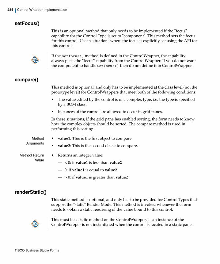
284 | Control Wrapper Implementation
setFocus()This is an optional method that only needs to be implemented if the "focus" capability for the Control Type is set to "component". This method sets the focus for this control. Use in situations where the focus is explicitly set using the API for this control.
compare()This method is optional, and only has to be implemented at the class level (not the prototype level) for ControlWrappers that meet both of the following conditions:
• The value edited by the control is of a complex type, i.e. the type is specified by a BOM class.
• Instances of the control are allowed to occur in grid panes.
In these situations, if the grid pane has enabled sorting, the form needs to know how the complex objects should be sorted. The compare method is used in performing this sorting.
MethodArguments
• value1: This is the first object to compare.
• value2: This is the second object to compare.
Method ReturnValue
• Returns an integer value:
— < 0: if value1 is less than value2
— 0: if value1 is equal to value2
— > 0: if value1 is greater than value2
renderStatic()This static method is optional, and only has to be provided for Control Types that support the "static" Render Mode. This method is invoked whenever the form needs to obtain a static rendering of the value bound to this control.
If the setfocus() method is defined in the ControlWrapper, the capability always picks the "focus" capability from the ControlWrapper. If you do not want the component to handle setFocus() then do not define it in ControlWrapper.
This must be a static method on the ControlWrapper, as an instance of the ControlWrapper is not instantiated when the control is located in a static pane.
TIBCO Business Studio Forms

| 285
The value returned by the control is added as HTML to the form. Any user input values should be escaped appropriately to avoid them being interpreted as HTML.
MethodArguments
• value: This is the value that needs to be formatted.
• label: (Type String) - The label to be rendered for the static control.
• hint: (Type String) - The hint to be rendered for the static control.
• labelId: (Type String) - Identifier of the label as rendered by the form. This is useful for accessibility.
• propertySet: (Type Associative Array) - Initial configuration of the control, including custom properties configured in the Form Designer. The key is the name of the property as defined in the Control Type.
• resource: (Type Object) - The same as retrieved from the Component.getResources() method.
• textOnly: (Type Boolean) - If true, then the pane this is being rendered in is expecting a text-only rendering of the value. That is, no rendering of a widget that displays the value.
• parentPaneType: (Type String) - This is the string that represents the type of pane. This is equal to the value returned from the Pane.getPaneType() method. A ControlWrapper identifies the rendering on a grid pane using the parentPaneType argument.
• logger: (Type logger Object) - This is the same logger object available in Form action scripts. The logger object helps to log messages to the form log. View the form log at preview time by using the appropriate logging level in the Windows -> Preferences -> Form Designer -> Preview page. Enable logging at runtime by using the query parameter log_level with an appropriate value: TRACE, DEBUG, INFO, WARN, ERROR, FATAL. For example: http://<server>:<port>/openspace?log_level=INFO. See Table 98, Logger Class for the list of available methods.
Method ReturnValue
• Returns an HTML string.
TIBCO Business Studio Forms
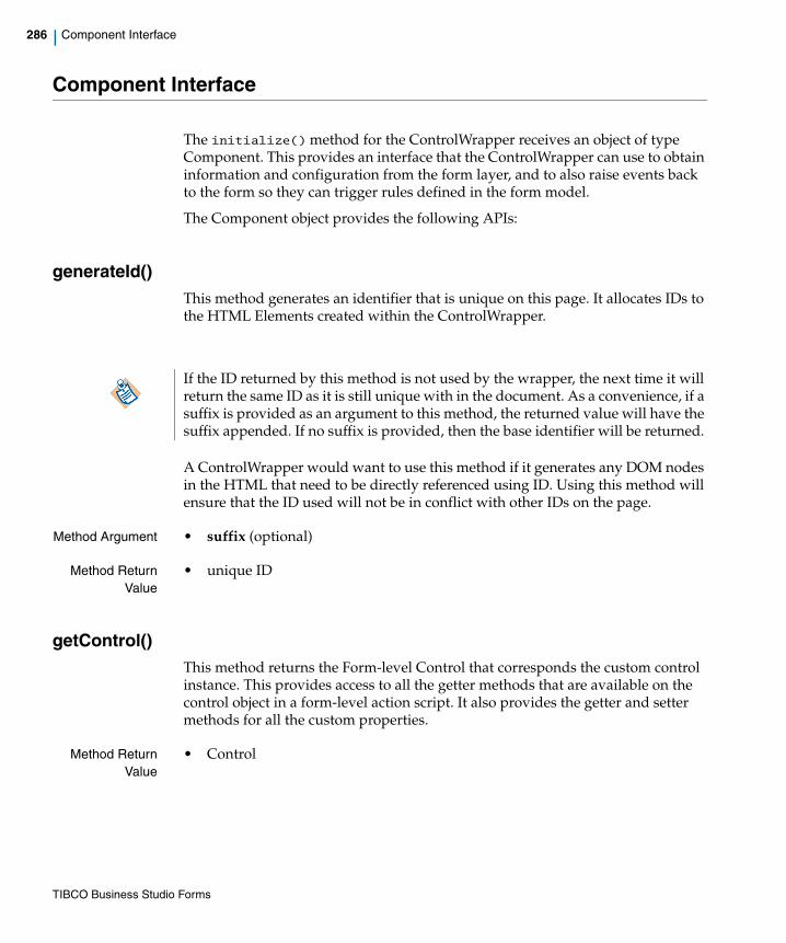
286 | Component Interface
Component Interface
The initialize() method for the ControlWrapper receives an object of type Component. This provides an interface that the ControlWrapper can use to obtain information and configuration from the form layer, and to also raise events back to the form so they can trigger rules defined in the form model.
The Component object provides the following APIs:
generateId()This method generates an identifier that is unique on this page. It allocates IDs to the HTML Elements created within the ControlWrapper.
A ControlWrapper would want to use this method if it generates any DOM nodes in the HTML that need to be directly referenced using ID. Using this method will ensure that the ID used will not be in conflict with other IDs on the page.
Method Argument • suffix (optional)
Method ReturnValue
• unique ID
getControl()This method returns the Form-level Control that corresponds the custom control instance. This provides access to all the getter methods that are available on the control object in a form-level action script. It also provides the getter and setter methods for all the custom properties.
Method ReturnValue
• Control
If the ID returned by this method is not used by the wrapper, the next time it will return the same ID as it is still unique with in the document. As a convenience, if a suffix is provided as an argument to this method, the returned value will have the suffix appended. If no suffix is provided, then the base identifier will be returned.
TIBCO Business Studio Forms

| 287
getFactory()This method returns the factory object that is available within Form action scripts. This will allow wrappers to create new objects as part of their functionality. This object will expose factories that are in the library project as well as those available from the Forms project using the custom control and any in referenced projects, recursively.
Method ReturnValue
• Object
getForm()This method returns the Form that contains the custom component.
Method ReturnValue
• Form
getHintId()This method returns the ID of the DOM node which renders the standard, form-supplied hint for this control. It is useful in situations where the hint needs to be referenced for accessibility purposes. For example: by using the ID in corresponding ARIA attributes on the control widgets.
Method ReturnValue
• String
getLabelId()This method returns the ID of the DOM node which renders the standard, form-supplied label for this control. It is useful in situations where the label needs to be referenced for accessibility purposes. For example: by using the ID in corresponding ARIA attributes on the control widgets.
Method ReturnValue
• String
getLocale()This method returns the String representation of the locale in which the control should be rendered.
TIBCO Business Studio Forms

288 | Component Interface
Method ReturnValue
• String
getParentNode()This method returns the parent DOM node into which this control should render its contents.
Method ReturnValue
• DOM Element Node
getPresentationURL()This method returns the base URL of the Presentation Resources folder of the project, in which a custom control is defined.
For example, if a project contains myimage.gif located at project/Presentation Resources/images, you can compute the URL of this image using:
var mypath = component.getPresentationURL() + "/images/myimage.gif";
Method ReturnValue
• The base URL without a trailing path separator
getResources()This method returns an object that provides access to all localized resource bundles defined at the library level and the component level for this particular Component. Resources are accessed using the resource name and individual keys. For example: for a resource with name resource.myName created at the library or at the component level that has a key called myLabelKey in it, its value can be retrieved using:
var resources = component.getResources();
var myLabel = resources.myName.myLabelKey;
The resources returned correspond to the locale in effect for the form when rendered.
Method ReturnValue
• Object
TIBCO Business Studio Forms
| 289
getValidationMessageIds()This method returns an array of DOM identifiers which represents any validation messages currently in effect for this control. There is one ID for each message pane in the form. Useful in situations where the messages need to be referenced for accessibility purposes. If null, then there are currently no validation errors reported against this control. If the array is non-null but empty, this signifies that there are errors, but no messages are displayed because the Form does not contain a Messages pane.
Method ReturnValue
• String
raiseEvent()This method is invoked by the ControlWrapper when it needs to propagate an event back to the Form layer. Most controls should raise at least the update event in order to notify the form layer that the control value has changed. It is not necessary to raise an update event when updating the attribute value of a complex object or updating the list for a multi-valued complex type. The BOM JavaScript representations of these objects handle the updates internally.
MethodArguments
• eventName: Name of the event as configured in the component metadata. This name should correspond to one of the events specified as supported by the component type. Built-in events include close, doubleclick, enter, exit, localize, open, select, submit, and update.
• eventValue: Object that differs depending on the event being raised. For update events, this is the new value. Other events do not need an eventValue. Any custom-defined events ignore the eventValue.
TIBCO Business Studio Forms
290 | BOM JavaScript API for Custom Controls
BOM JavaScript API for Custom Controls
In order to support more complex custom control use cases, the JavaScript API documented for the auto-generated BOM JavaScript classes has been augmented to provide a reflective API. This allows controls to write code that can introspect objects and provide an auto-generated UI based on the type of object. For example, this would enable implementation of controls such as a tree control that can provide a user interface based on the structure of arbitrary objects. The API described here is currently only supported for use within Custom Controls.
Factory MethodsThe following methods are available in the factory that is available for each BOM package.
Table 25 Factory Methods
Method Return Value Description
create(className)
• className is a fully-qualified name of the BOM JavaScript class. This must be a class managed by the given factory.
Object Creates an instance of the given class.
ControlWrapper uses this method to support cases where the type of object being managed by a complex custom control is not known at design time.
From form action methods, the specific createXXX() method for a given class should be used.
getClass(className)
• className is a fully-qualified name of the BOM JavaScript class. This must be a class managed by the given factory.
Object Returns the class object for the class with the given name.
TIBCO Business Studio Forms
| 291
BOM Class Methods The following methods are available on the class object returned from the getClass(className) method of a factory, or the getClass() method of a BOM JavaScript object instance.
Table 26 BOM Class Methods
Method Return Value Description
getAttributeNames() String[] Returns a JavaScript string array containing the names of all attributes for this class. These are names as defined in the BOM for this class and all of its super-classes. For complex children, these will correspond to the name of the association endpoint for the child.
This array should not be modified.
This array is the union of attribute names retrieved using getPrimitiveAttributeNames() and getComplexAttributeNames().
getPrimitiveAttribute Names()
String[] Returns a JavaScript string array. These are attributes with simple data types; i.e., primitive types and enumerations. These are names as defined in the BOM for this class and all of its super-classes. This includes both single- and multi-valued attributes.
This array should not be modified.
getComplexAttribute Names()
String[] Returns a JavaScript string array containing the names of all complex children of this class. These are names of the association endpoints for these children as defined in the BOM for this class and all of its super-classes. This includes both single- and multi-valued attributes.
This array should not be modified.
TIBCO Business Studio Forms

292 | BOM JavaScript API for Custom Controls
getAttributeType (attName)
• attName: name of attribute.
String Returns the type for given attribute. This will either be the fully-qualified class name as defined in the BOM if the attribute is complex, or will be one of the following primitive types:
• BomPrimitiveTypes.Boolean
• BomPrimitiveTypes.Dates
• BomPrimitiveTypes.DateTime
• BomPrimitiveTypes.DateTimeTZ
• BomPrimitiveTypes.Decimal
• BomPrimitiveTypes.Duration
• BomPrimitiveTypes.ID
• BomPrimitiveTypes.Integer
• BomPrimitiveTypes.Text
• BomPrimitiveTypes.Time
• BomPrimitiveTypes.URI
isAttributeMultivalued (attName)
• attName: name of attribute.
Boolean Returns true if the attribute with the given name is a multi-valued attribute as defined in the BOM.
isAttributePrimitive (attName)
• attName: name of attribute.
Boolean Returns true if the attribute with the given name is of a primitive type or enumeration. If it returns true, it will be a member of the array returned from getPrimitiveAttributeNames().
Method Return Value Description
TIBCO Business Studio Forms
| 293
BOM Class Instance MethodsThe following methods are available on each instance of a BOM JavaScript class.
Table 27 BOM Class Instance Methods
Method Return Value Description
getAttributeValue (attName)
• attName: name of attribute.
Object Returns the value of the attribute with the given name. The return type depends on the type of attribute being retrieved. It will be one of the following:
• attName is primitive and single-valued: returns a value of type String, Number, Date, or Duration, depending on the specific type of attribute.
• attName is primitive and multi-valued: returns a JavaScript array containing the underlying values.
• attName is complex and single-valued: returns an instance of the BOM JavaScript class associated with the attribute.
• attName is complex and multi-valued: returns a List object containing the underlying values.
The method throws an exception if the underlying class does not support an attribute with the given name.
TIBCO Business Studio Forms

294 | BOM JavaScript API for Custom Controls
setAttributeValue (attName, value)
• attName: name of attribute.
• value: new value of attribute.
Void Sets the value associated with the given attribute name. The type of object depends on the attribute being set:
• attName is primitive and single-valued: should be a value of type String, Number, Date, or Duration, depending on the specific type of attribute.
• attName is primitive and multi-valued: should be a JavaScript array containing the underlying values.
• attName is complex and single-valued: should be an instance of the BOM JavaScript class associated with the attribute.
• attName is complex and multi-valued: unsupported. In this case, the List object obtained from the object should be updated directly with additions or deletions.
The method throws an exception in the following scenarios:
• if the underlying class does not support an attribute with the given name.
• if an attempt is made to set the value of a complex multi-valued attribute.
Method Return Value Description
TIBCO Business Studio Forms
| 295
Utility Methods
A set of JavaScript methods are provided by the forms framework to aid custom control developers. These are for use by the custom control wrappers. See Utility Methods, page 402 for the complete list of API methods.
TIBCO Business Studio Forms

296 | Utility Methods
TIBCO Business Studio Forms
| 297
Chapter 7 Reference
This section describes various details of the modeling environment, including the controls that can be placed on a form, the properties associated with each type of control, the validation errors that can appear in the Problems view, and the use of scripts to extend the functionality of your forms.
Topics
• The Workbench, page 298
• The Palette for the Form Designer, page 300
• Panes, page 303
• Controls, page 310
• Properties View Tabs, page 315
• Configuring Parameters, page 345
• Context Menus, page 346
• Keyboard Shortcuts, page 347
• CSS Classes, page 355
• Common Resource Keys, page 359
• Design-time Constraints, page 374
• Client-side Validations, page 375
• Scripting, page 376
• API for Scripting, page 381
TIBCO Business Studio Forms
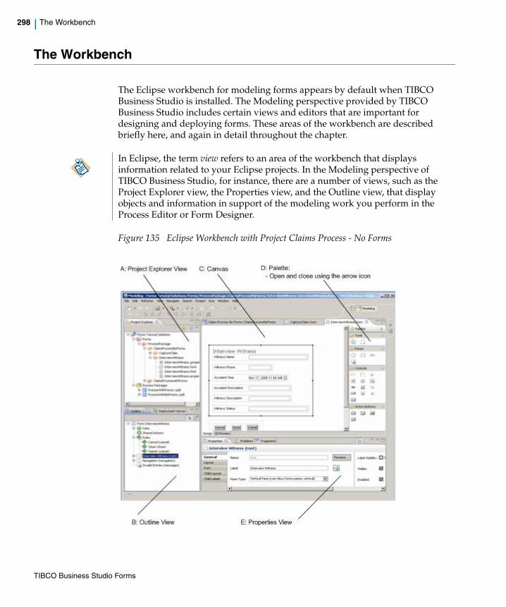
298 | The Workbench
The Workbench
The Eclipse workbench for modeling forms appears by default when TIBCO Business Studio is installed. The Modeling perspective provided by TIBCO Business Studio includes certain views and editors that are important for designing and deploying forms. These areas of the workbench are described briefly here, and again in detail throughout the chapter.
Figure 135 Eclipse Workbench with Project Claims Process - No Forms
In Eclipse, the term view refers to an area of the workbench that displays information related to your Eclipse projects. In the Modeling perspective of TIBCO Business Studio, for instance, there are a number of views, such as the Project Explorer view, the Properties view, and the Outline view, that display objects and information in support of the modeling work you perform in the Process Editor or Form Designer.
TIBCO Business Studio Forms

| 299
• A: Project Explorer The Project Explorer view shows your TIBCO Business Studio projects and all project resources, including Process Packages, Business Assets, and Forms, arranged in hierarchical tree structures.
• B: Outline The Outline view shows non-visual and visual elements of the form including form parameters, shared actions, rules, controls and panes.
For more details, see Outline View on page 94 and Outline View Context Menu on page 346.
• C: Canvas The Canvas is where you create your forms. On creating a form, you notice two tabs at the bottom: a Design tab for modeling forms, and GWT Preview tab for viewing and testing the forms.
For more details on working in the modeling or preview mode, see The Design Tab and Preview Tabs on page 86 and Form Designer Canvas Context Menu on page 346.
• D: Palette The palette is a part of the Form Designer and provides tools for adding panes and controls to a form, and for selecting objects on a form. Click on the small arrowhead above the Palette in the upper right corner to open the palette. The arrow is a toggle between a visible and a hidden palette.
There is also the detachable Palette view (Window > Show View... > Palette). This palette is very useful to save space when working on multiple processes and/or forms.
For more details, see The Palette for the Form Designer on page 300
• E: Properties The Properties view shows the properties of a selected object on a form, such as a pane or a control, and allows you to edit the values of those properties.
For more details, see
— Properties View Tabs on page 315
— Properties View for Forms on page 317
— Properties View for Panes on page 321
— Properties View for Controls on page 330
TIBCO Business Studio Forms

300 | The Palette for the Form Designer
The Palette for the Form Designer
To create a form, add parameters to a user task from the existing process data fields. Right-click the user task, and select Forms > Open. To modify the form, add or move panes and controls using the tools on the palette.
The palette for the Form Designer looks as shown in Figure 136.
Figure 136 Form Designer Palette
When you hover the mouse over the icons in the palette, a pop-up tool tip describes the tool indicated by the mouse point. The palette contains tools as described in Table 28.
Table 28 Form Designer Palette
To add a pane or control, click the tool on the palette for a specific object, position your mouse pointer in the appropriate location on the Form Designer, and click to place the object on the form. (To move a pane or control already on the form, use either the drag-and-drop or cut-and-paste techniques.)
Palette Item Description
Select Allows you to select objects.
TIBCO Business Studio Forms

| 301
Marquee Allows you to select several objects by drawing a box around them.
Vertical Pane Adds a Vertical Pane, whose children are arranged vertically.
Horizontal Pane Adds a Horizontal Pane, whose children are arranged horizontally.
Tabbed Pane Adds a Tabbed Pane, whose sub-panes are represented as clickable tabs.
Message Pane Adds a Message Pane for displaying error messages.
Record Pane Adds a Record Pane to edit a list of complex objects, one record at a time.
Grid Pane Adds a Grid Pane to work with list of complex objects.
Embedded Form Allows you to embed another form within the parent form.
Text Adds a Text control for typing a single line of text.
Text Area Adds a Textarea control for typing multiple lines of text.
CheckBox Adds a Checkbox control for making a binary (yes or no) choice.
Date Adds a Date control for specifying or picking a calendar date.
Time Adds a Time control for specifying or picking a time.
Date-Time Adds a Date-Time control for specifying or picking a calendar date and time.
Duration Add a Duration control for specifying duration using a configurable set of units.
Hyperlink Adds a Hyperlink control that renders a clickable hyperlink.
Image Adds an Image control that renders an image.
Label Adds a Label control that renders a non-editable label.
Optionlist Adds an Optionlist control for picking from a list of options.
Pass-through Adds a Pass-through control that renders HTML markup.
Radiogroup Adds a Radiogroup control for picking one of a set of mutually exclusive options.
Button Adds a Button control to the form.
Cancel Button Adds a Cancel Button for discarding the changes and closing the form.
Submit Button Adds a Submit Button for submitting the changes and closing the form.
Palette Item Description
TIBCO Business Studio Forms

302 | The Palette for the Form Designer
The Palette View
To expand the palette, hover the button over Palette to the right of the Form Designer. To add a pane or a control on the form, click the appropriate button. After adding the controls, the palette collapses to its original state automatically.
Another way to keep the palette from taking up extra space in the Form Designer is to use the Palette view, which opens the palette as an ordinary Eclipse view. When doing this, the Palette view appears by default as a tab along with the Properties view and Problems tabs, but it can be dragged to other locations. The Palette view is then shared between all open graphical editor instances, hiding local fly-out palettes in any open graphical editors.
Open the Palette view by clicking Window > Show View > Palette. If you close the Palette view (by clicking its close box), the fly-out palette returns for the graphical editor instances where it was previously displayed.
Figure 137 Palette not Displayed
The arrow now points rightward. When expanded by this method, the palette remains visible (as the Palette view) until the arrow is clicked again.
Figure 138 Palette Displayed
Close Button Adds a Close Button for applying the changes and closing the form.
Palette Item Description
TIBCO Business Studio Forms

| 303
Panes
Panes serve as containers for controls or for other panes, and provide a means of controlling the visual layout of objects on a form. Like controls, panes have attributes such as a label, background color, and visibility. Use the child properties of a pane to arrange and display the controls in the pane.
Figure 139 Vertical, Horizontal, Tabbed, and Message Panes
Nesting Panes
Panes can be nested inside other panes for greater flexibility in the positioning of controls. For instance, you can place two vertical panes within a single horizontal pane. This results in a two-column layout of controls for the portion of the form defined by the horizontal (parent) pane.
All types of panes, except for tabbed panes, can be nested to create tabs. Panes can also be rearranged by dragging and dropping within the form Outline view.
It is strongly encouraged to avoid nesting panes to an extreme number of levels, since this complicates the form model and can affect performance.
TIBCO Business Studio Forms
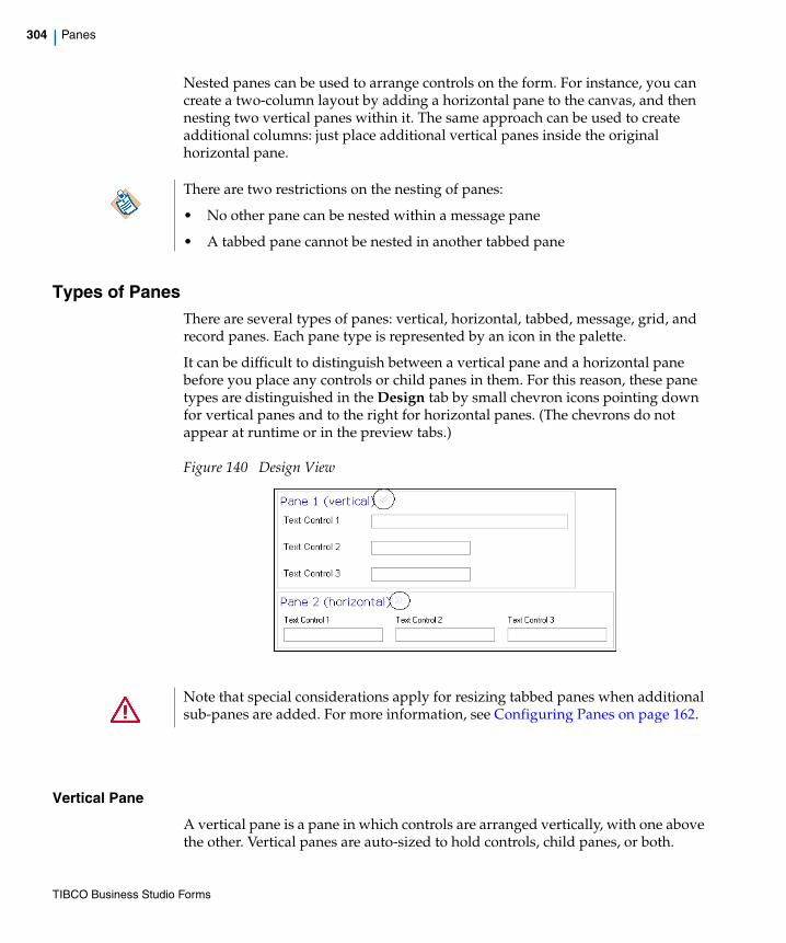
304 | Panes
Nested panes can be used to arrange controls on the form. For instance, you can create a two-column layout by adding a horizontal pane to the canvas, and then nesting two vertical panes within it. The same approach can be used to create additional columns: just place additional vertical panes inside the original horizontal pane.
Types of PanesThere are several types of panes: vertical, horizontal, tabbed, message, grid, and record panes. Each pane type is represented by an icon in the palette.
It can be difficult to distinguish between a vertical pane and a horizontal pane before you place any controls or child panes in them. For this reason, these pane types are distinguished in the Design tab by small chevron icons pointing down for vertical panes and to the right for horizontal panes. (The chevrons do not appear at runtime or in the preview tabs.)
Figure 140 Design View
Vertical Pane
A vertical pane is a pane in which controls are arranged vertically, with one above the other. Vertical panes are auto-sized to hold controls, child panes, or both.
There are two restrictions on the nesting of panes:
• No other pane can be nested within a message pane
• A tabbed pane cannot be nested in another tabbed pane
Note that special considerations apply for resizing tabbed panes when additional sub-panes are added. For more information, see Configuring Panes on page 162.
TIBCO Business Studio Forms
| 305
Horizontal Pane
A horizontal pane is a pane in which controls or child panes are arranged horizontally, with one next to the other. Horizontal panes are auto-sized to hold the controls or child panes within them.
Tabbed Pane
Tabbed panes provide a means of stacking a set of related panes such that one pane at a time is visible. Each pane has a corresponding tab, which are arranged in sequence along one of the tabbed pane’s vertical or horizontal edges.
The direct children of a tabbed pane must be panes, not controls. The canvas prevents you from inadvertently placing controls directly inside a tabbed pane. Clicking on or otherwise selecting a tab activates its associated pane (make it visible). This “select-tab-to-activate-pane” behavior is common to both design time and runtime. At design time, however, a tabbed pane offers additional capabilities to aid in the design process:
• Add a new child pane A special button positioned at the end of the tab collection. Click this button to add a new child pane to the tabbed pane.
• Expand/collapse the tabbed pane A special toggle button positioned after the new pane button, that toggles the state of the tabbed pane between a collapsed state and an expanded state. The collapsed state has one pane visible whereas the expanded state has all child panes visible side-by-side. In the expanded state, the tabbed pane behaves similar to a horizontal or vertical pane. You can add, move, and delete controls on the expanded pane. The expanded state is particularly useful when you want to rearrange or delete child panes or move controls between panes.
Message Pane
A message pane is used to display validation error messages. Message panes cannot contain panes or controls. A message pane displays the message typed in the Message field of a control’s Define Validation dialog if the validation script in the Script field returns a value of false.
The following example shows a typical validation script and message for a Text control.
Keyboard Access Change between tabs without a mouse by using the left and right arrows.
While adding controls to tabbed panes, keep the pane expanded.
TIBCO Business Studio Forms

306 | Panes
Figure 141 Script and Message Example for a Message Pane
The appearance of a message pane, the label font and layout, can be configured through the Properties view for the pane.
Record Pane
A record pane is used to edit a list of complex objects, one record at a time. It supports the ability to view and edit the contents of one element of an array of complex objects. A set of navigation controls is provided to support moving between the records in the list. The record pane uses the same layout as the vertical pane.
The record pane displays the contents of a list of objects. The contents of the list in a record pane is linked with the list in one of the following ways:
• The pane value is bound to a multi-valued complex parameter.
• The pane value is bound to a multi-valued child of a complex object.
• The value of the pane is updated with a list of complex objects via an API function call.
• The value of the pane is updated with a list of complex objects via a computation action.
For either of the latter two approaches, the Pane Data Type property needs to be set in the form model to the type of object that is set on the pane with a list.
TIBCO Business Studio Forms

| 307
Figure 142 General Properties Tab of Record Pane
The Properties tab of a record pane’s Properties view displays a set of properties. You can refer to Properties View for Panes section for the complete listing of the Properties tab.
Figure 143 Properties Tab of Record Pane
TIBCO Business Studio Forms
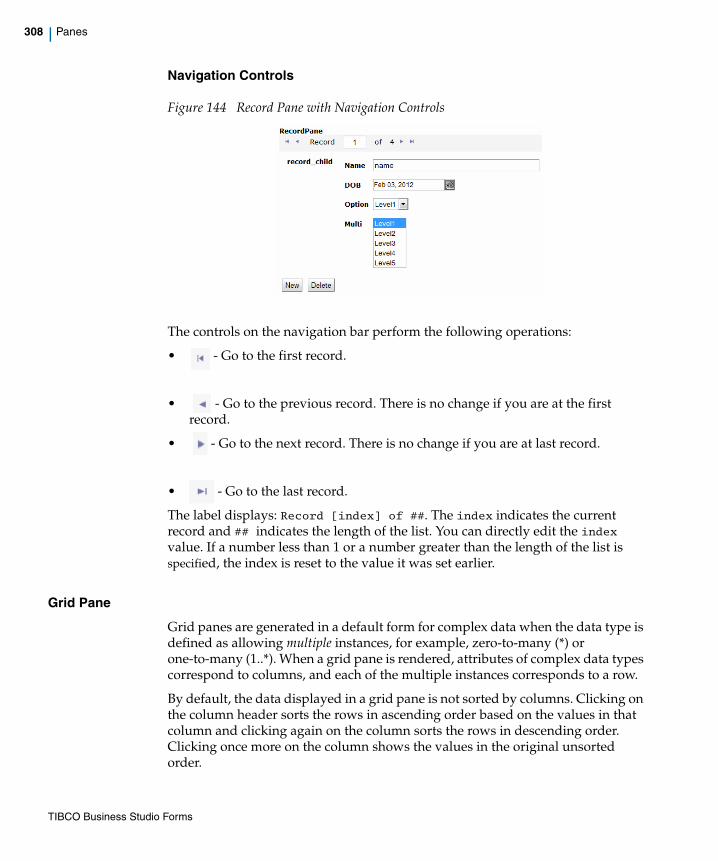
308 | Panes
Navigation Controls
Figure 144 Record Pane with Navigation Controls
The controls on the navigation bar perform the following operations:
• - Go to the first record.
• - Go to the previous record. There is no change if you are at the first record.
• - Go to the next record. There is no change if you are at last record.
• - Go to the last record.
The label displays: Record [index] of ##. The index indicates the current record and ## indicates the length of the list. You can directly edit the index value. If a number less than 1 or a number greater than the length of the list is specified, the index is reset to the value it was set earlier.
Grid Pane
Grid panes are generated in a default form for complex data when the data type is defined as allowing multiple instances, for example, zero-to-many (*) or one-to-many (1..*). When a grid pane is rendered, attributes of complex data types correspond to columns, and each of the multiple instances corresponds to a row.
By default, the data displayed in a grid pane is not sorted by columns. Clicking on the column header sorts the rows in ascending order based on the values in that column and clicking again on the column sorts the rows in descending order. Clicking once more on the column shows the values in the original unsorted order.
TIBCO Business Studio Forms
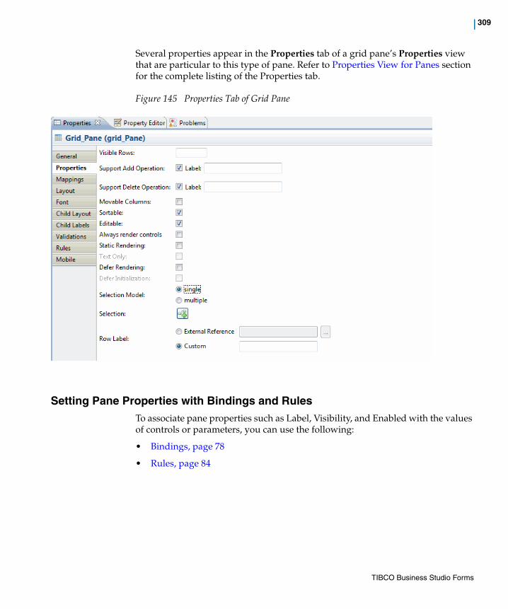
| 309
Several properties appear in the Properties tab of a grid pane’s Properties view that are particular to this type of pane. Refer to Properties View for Panes section for the complete listing of the Properties tab.
Figure 145 Properties Tab of Grid Pane
Setting Pane Properties with Bindings and RulesTo associate pane properties such as Label, Visibility, and Enabled with the values of controls or parameters, you can use the following:
• Bindings, page 78
• Rules, page 84
TIBCO Business Studio Forms
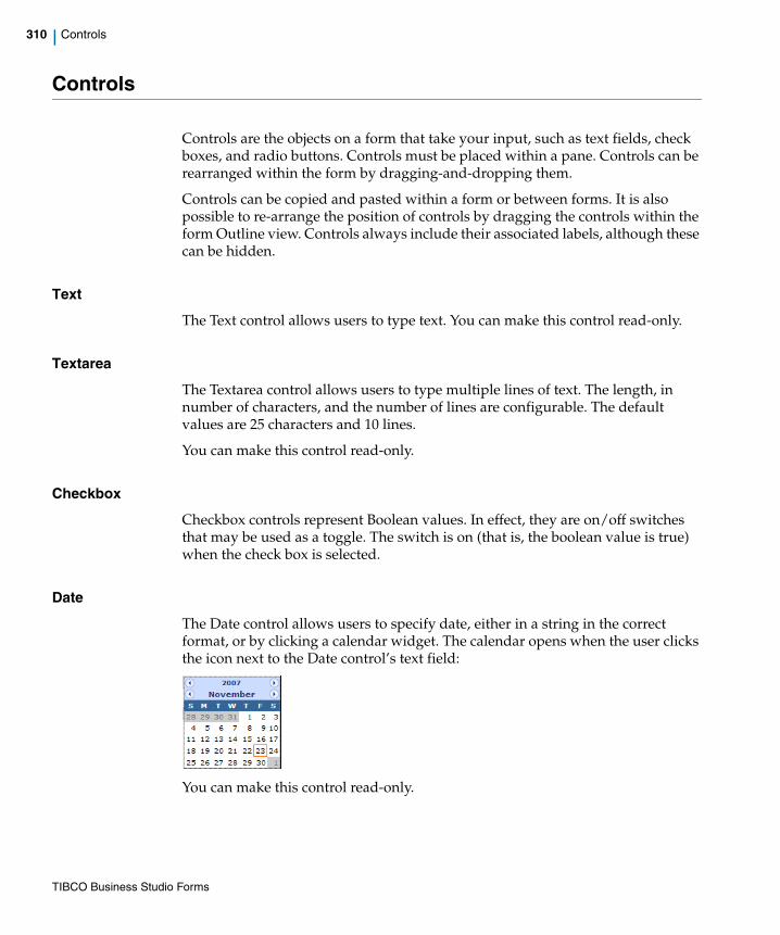
310 | Controls
Controls
Controls are the objects on a form that take your input, such as text fields, check boxes, and radio buttons. Controls must be placed within a pane. Controls can be rearranged within the form by dragging-and-dropping them.
Controls can be copied and pasted within a form or between forms. It is also possible to re-arrange the position of controls by dragging the controls within the form Outline view. Controls always include their associated labels, although these can be hidden.
Text
The Text control allows users to type text. You can make this control read-only.
Textarea
The Textarea control allows users to type multiple lines of text. The length, in number of characters, and the number of lines are configurable. The default values are 25 characters and 10 lines.
You can make this control read-only.
Checkbox
Checkbox controls represent Boolean values. In effect, they are on/off switches that may be used as a toggle. The switch is on (that is, the boolean value is true) when the check box is selected.
Date
The Date control allows users to specify date, either in a string in the correct format, or by clicking a calendar widget. The calendar opens when the user clicks the icon next to the Date control’s text field:
You can make this control read-only.
TIBCO Business Studio Forms

| 311
Time
The Time control has up and down arrows for incrementing the hour or minute value, or for toggling between AM and PM. The value that is changed by clicking the arrow depends on whether the cursor is in the hour field, the minute field, or the AM/PM field. You can also specify a time by keying in a string in the correct format.
You can make this control read-only.
Date-Time
The Date-Time control allows users to input a date and time. The date portion of the control has a calendar widget for selecting a date with the mouse. The time portion has up and down arrows for incrementing the hour or minute value, or for toggling between AM and PM. The value that is changed by clicking the arrow depends on whether the cursor is in the hour field, the minute field, or the AM/PM field. You can also specify a date and time by keying in a string in the correct format.
You can make this control read-only.
Duration
The Duration control allows the users to specify a duration using a configurable set of units. The Properties tab of the Properties view for the Duration control allows you to select which units are displayed for parameters of type Duration. The supported units are:
• Years
• Months
• Days
• Hours
• Minutes
• Seconds
• Milliseconds
Any combination of these units can be enabled.
You can make this control read-only.
To avoid any loss of information throughout a process, it is best to edit Duration values using the same set of units in all forms that modifies the underlying Duration parameter. This holds as well for scripts that create or modify Duration objects.
TIBCO Business Studio Forms
312 | Controls
Hyperlink
The Hyperlink control allows the Form Designer to place a clickable hyperlink on the form.
Image
The Image control allows the Form Designer to place an image on the form, referenced by a URL.
Label
The Label control allows you to display static text that the user cannot edit. Note that the label control still has its own label field that is used to identify the value being rendered by the label control.
Optionlist
The Optionlist control allows the Form Designer to create a drop-down list.
Pass-through
The Pass-through control is a widget that allows users to specify a block of arbitrary HTML into a form. Specify the HTML fragment in the large editing box on the Properties property sheet. The markup is inserted directly into the browser DOM at runtime.
The binding dialog allows you to set the markup via a binding or computation action, just as with other form values. (Bindings allow you to tie the value of an item, such as a control, to the value of something else in the form, without coding.) You do not need to configure bindings or computation actions, however, in order for the Pass-through control to work.
Radiogroup
The Radiogroup control allows users to choose among the listed options. Only one option (one radio button) can be selected at one time.
Button
There are various kinds of buttons on the palette: Button, Cancel Button, Submit Button, and Close Button.
TIBCO Business Studio Forms
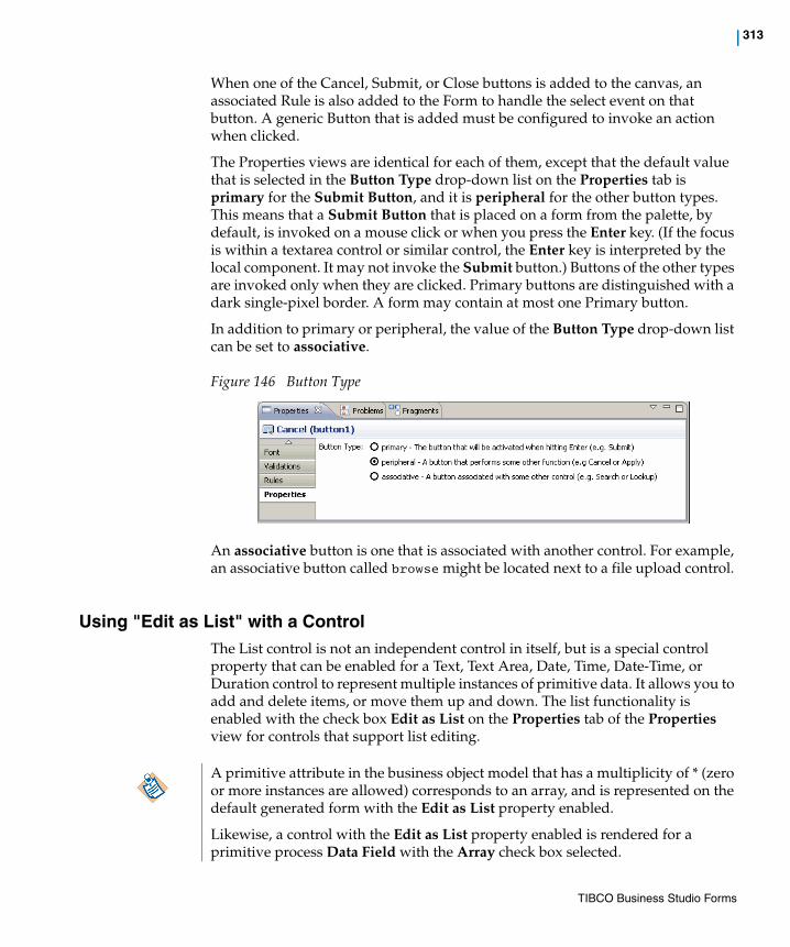
| 313
When one of the Cancel, Submit, or Close buttons is added to the canvas, an associated Rule is also added to the Form to handle the select event on that button. A generic Button that is added must be configured to invoke an action when clicked.
The Properties views are identical for each of them, except that the default value that is selected in the Button Type drop-down list on the Properties tab is primary for the Submit Button, and it is peripheral for the other button types. This means that a Submit Button that is placed on a form from the palette, by default, is invoked on a mouse click or when you press the Enter key. (If the focus is within a textarea control or similar control, the Enter key is interpreted by the local component. It may not invoke the Submit button.) Buttons of the other types are invoked only when they are clicked. Primary buttons are distinguished with a dark single-pixel border. A form may contain at most one Primary button.
In addition to primary or peripheral, the value of the Button Type drop-down list can be set to associative.
Figure 146 Button Type
An associative button is one that is associated with another control. For example, an associative button called browse might be located next to a file upload control.
Using "Edit as List" with a ControlThe List control is not an independent control in itself, but is a special control property that can be enabled for a Text, Text Area, Date, Time, Date-Time, or Duration control to represent multiple instances of primitive data. It allows you to add and delete items, or move them up and down. The list functionality is enabled with the check box Edit as List on the Properties tab of the Properties view for controls that support list editing.
A primitive attribute in the business object model that has a multiplicity of * (zero or more instances are allowed) corresponds to an array, and is represented on the default generated form with the Edit as List property enabled.
Likewise, a control with the Edit as List property enabled is rendered for a primitive process Data Field with the Array check box selected.
TIBCO Business Studio Forms
314 | Controls
Using Control or Component LabelsYou can give a label to each control or component. Sensible labels help users understand the control or the component easily. Labels are shown together with the names of the controls. Users in the Business Analysis mode cannot see the physical name, which is used only by the users in scripts and is visible in property editors.
Consistent Use of Labels
The same labels must be used through the Forms Designer UI for consistency, including in the Outline view, pickers, wizards, and property views.
Labels for Rules and Actions
Rules and Actions show the label description even if they are long. For example,Guardian required for underage drivers (guardian_required)
Get employee details (svc_empdetails)
Using the Option Include Type Name in Labels
When using this option, search expression should start with an asterisk (*) if the text you're trying to match is not at the beginning of the label. This is applicable to the various picker UIs such as the Binding picker, Event picker, and so on.
For example, when you are binding the value of a control to synchronize with a parameter that has a name CustPhone and a label Customer Phone, and if you want to search that parameter with a keyword Phone, type the keyword expression as *Phone. This shows all the items that have the text Phone in their labels.
Similarly, if you are a user with the Solution Design capability and you want to search the parameter by name, you need to type the keyword expression as *CustPhone.
TIBCO Business Studio Forms

| 315
Properties View Tabs
Forms, panes, and controls can be configured by specifying or modifying values in Properties views. Each form, as well as each of its panes and controls, has a Properties view with a set of tabs, and each tab provides access to a group of properties.
The tabs on a Properties view provide easy access to the many properties you can set for the objects on a form. Properties tabs are provided for: Forms, Data, Parameter, Shared Actions, Rules, Pane, and Controls.
See Table 29 for details.
Table 29 Properties View Tabs
Properties View Tabs Description
Forms
General Tab Specify a CSS class to be used for styling at the form level.
Mappings Tab Shows a global view of all the bindings and computation actions in the form.
Font Tab Settings for font properties at the form level, which may be inherited by objects on the form.
Child Layout Tab Settings for layout properties of top-level panes, which inherit from the form.
Child Labels Tab Setting for label properties of top-level panes, which inherit from the form.
Rules Tab Shows the rules to be triggered by a form event.
Resources Tab Shows resources associated with the form, such as JavaScript files and images.
Preview Data Tab Setting for a preview data file, either none (no data appear initially for the controls), default, or custom (to assign a custom preview data file to the form).
Panes
General Tab General properties of the pane.
TIBCO Business Studio Forms

316 | Properties View Tabs
Properties Tab Visual properties of the pane, inherited from the containing pane or form by default which, in turn, overrides the system defaults.
Mappings Tab Shows a global view of all the bindings and computation actions related to the pane.
Layout Tab Layout properties for the pane, inherited from the parent pane by default.
Font Tab Font settings, used if the Form Designer does not want the pane to inherit these properties from the containing parent form or pane.
Child Layout Settings for layout properties of those objects that inherit from this pane.
Child Labels Setting for label properties of those objects that inherit from this pane.
Validations Tab For writing scripts that run when the form is submitted or updated, and to check whether you have provided valid input for the pane.
This tab is not visible when in Business Analysis mode.
Rules Tab The Rules tab lists the Rules triggered by each of the events supported by the pane, and provides a mechanism to create new Rules for that the pane.
Mobile Tab Used for mobile specific configurations.
Controls
General Tab General properties of a control.
Properties Tab Properties that are specific to the type of the control being configured. Fields on this tab vary between control types. Some control types do not have a properties tab.
Mappings Tab Shows a global view of all the bindings and computation actions related to a control.
Layout Tab Layout properties for the control, inherited from the parent pane by default.
Font Tab Font properties for the control, inherited from the parent pane by default.
Table 29 Properties View Tabs
Properties View Tabs Description
TIBCO Business Studio Forms

| 317
Properties View for FormsThe Properties view for a form contains eight tabs: General, Mappings, Font, Child Layout, Child Labels, Rules, Resources, and Preview Data. The form Properties view can be found by selecting the root-most element in the Outline view or clicking outside the panes of the form.
General Tab
The setting in this tab is used to specify one or more CSS classes for styling the form.
Table 30 Fields on the Forms General Tab
Mappings Tab
This tab is used to view, edit, and create mappings for the form. You can refer to Working with the Mappings Tab section for further details.
Validations Tab For writing scripts that run when the form is submitted or updated, and to check whether you have provided valid input for the control.
This tab is not visible when in Business Analysis mode.
Rules Tab The Rules tab lists the Rules triggered by each of the events supported by the Control, and provides a mechanism to create new Rules for that control.
Mobile Tab The Mobile tab is used for mobile specific configurations.
Table 29 Properties View Tabs
Properties View Tabs Description
Property Description
Style Class Name or Names
Field for indicating the name of a CSS class within a CSS file that has been associated with the form. The CSS class is used for styling at the form level.
TIBCO Business Studio Forms
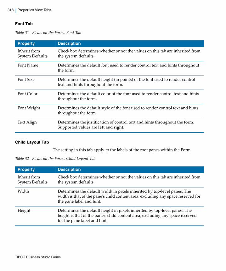
318 | Properties View Tabs
Font Tab
Table 31 Fields on the Forms Font Tab
Child Layout Tab
The setting in this tab apply to the labels of the root panes within the Form.
Table 32 Fields on the Forms Child Layout Tab
Property Description
Inherit from System Defaults
Check box determines whether or not the values on this tab are inherited from the system defaults.
Font Name Determines the default font used to render control text and hints throughout the form.
Font Size Determines the default height (in points) of the font used to render control text and hints throughout the form.
Font Color Determines the default color of the font used to render control text and hints throughout the form.
Font Weight Determines the default style of the font used to render control text and hints throughout the form.
Text Align Determines the justification of control text and hints throughout the form. Supported values are left and right.
Property Description
Inherit from System Defaults
Check box determines whether or not the values on this tab are inherited from the system defaults.
Width Determines the default width in pixels inherited by top-level panes. The width is that of the pane's child content area, excluding any space reserved for the pane label and hint.
Height Determines the default height in pixels inherited by top-level panes. The height is that of the pane's child content area, excluding any space reserved for the pane label and hint.
TIBCO Business Studio Forms
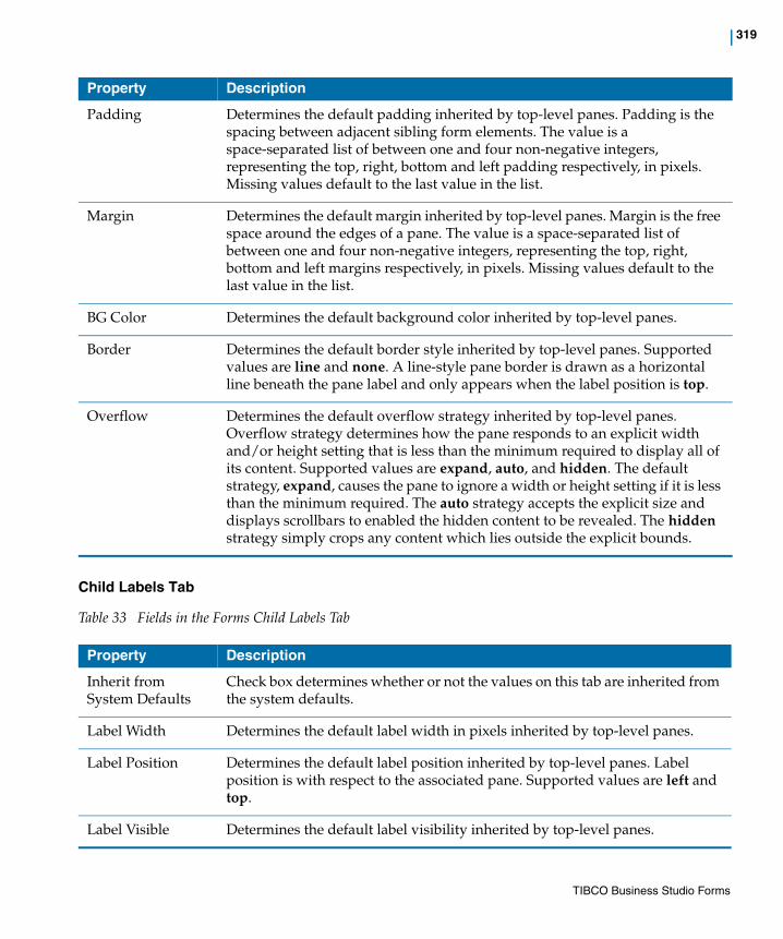
| 319
Child Labels Tab
Table 33 Fields in the Forms Child Labels Tab
Padding Determines the default padding inherited by top-level panes. Padding is the spacing between adjacent sibling form elements. The value is a space-separated list of between one and four non-negative integers, representing the top, right, bottom and left padding respectively, in pixels. Missing values default to the last value in the list.
Margin Determines the default margin inherited by top-level panes. Margin is the free space around the edges of a pane. The value is a space-separated list of between one and four non-negative integers, representing the top, right, bottom and left margins respectively, in pixels. Missing values default to the last value in the list.
BG Color Determines the default background color inherited by top-level panes.
Border Determines the default border style inherited by top-level panes. Supported values are line and none. A line-style pane border is drawn as a horizontal line beneath the pane label and only appears when the label position is top.
Overflow Determines the default overflow strategy inherited by top-level panes. Overflow strategy determines how the pane responds to an explicit width and/or height setting that is less than the minimum required to display all of its content. Supported values are expand, auto, and hidden. The default strategy, expand, causes the pane to ignore a width or height setting if it is less than the minimum required. The auto strategy accepts the explicit size and displays scrollbars to enabled the hidden content to be revealed. The hidden strategy simply crops any content which lies outside the explicit bounds.
Property Description
Property Description
Inherit from System Defaults
Check box determines whether or not the values on this tab are inherited from the system defaults.
Label Width Determines the default label width in pixels inherited by top-level panes.
Label Position Determines the default label position inherited by top-level panes. Label position is with respect to the associated pane. Supported values are left and top.
Label Visible Determines the default label visibility inherited by top-level panes.
TIBCO Business Studio Forms
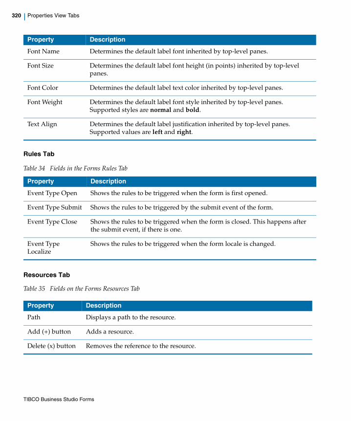
320 | Properties View Tabs
Rules Tab
Resources Tab
Table 35 Fields on the Forms Resources Tab
Font Name Determines the default label font inherited by top-level panes.
Font Size Determines the default label font height (in points) inherited by top-level panes.
Font Color Determines the default label text color inherited by top-level panes.
Font Weight Determines the default label font style inherited by top-level panes. Supported styles are normal and bold.
Text Align Determines the default label justification inherited by top-level panes. Supported values are left and right.
Table 34 Fields in the Forms Rules Tab
Property Description
Event Type Open Shows the rules to be triggered when the form is first opened.
Event Type Submit Shows the rules to be triggered by the submit event of the form.
Event Type Close Shows the rules to be triggered when the form is closed. This happens after the submit event, if there is one.
Event Type Localize
Shows the rules to be triggered when the form locale is changed.
Property Description
Property Description
Path Displays a path to the resource.
Add (+) button Adds a resource.
Delete (x) button Removes the reference to the resource.
TIBCO Business Studio Forms
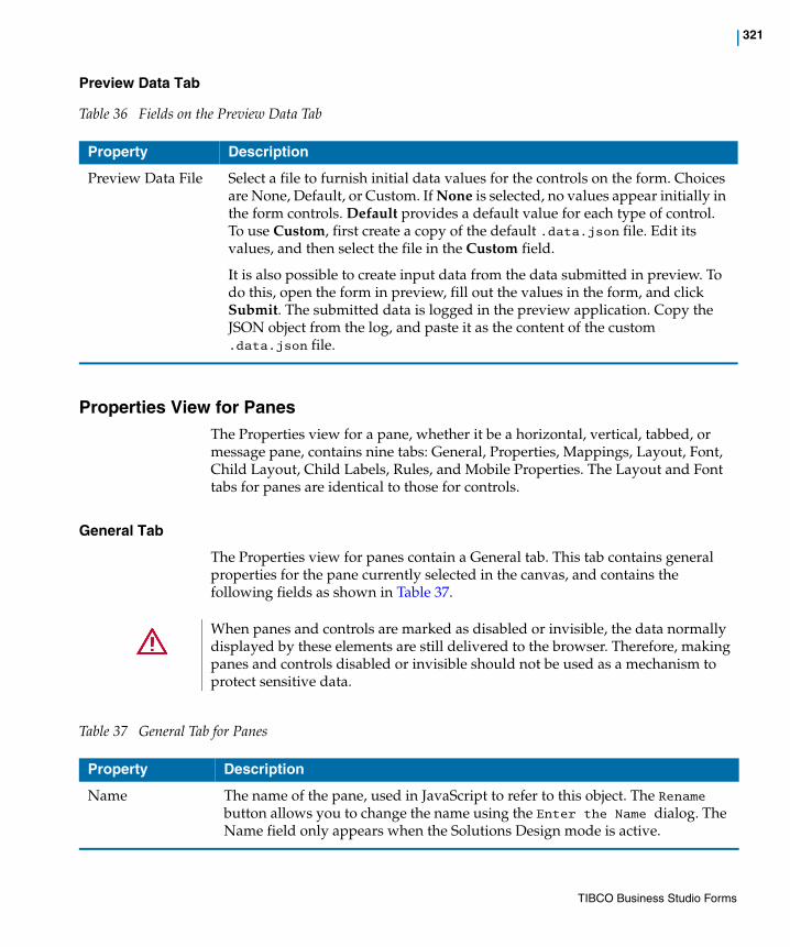
| 321
Preview Data Tab
Table 36 Fields on the Preview Data Tab
Properties View for PanesThe Properties view for a pane, whether it be a horizontal, vertical, tabbed, or message pane, contains nine tabs: General, Properties, Mappings, Layout, Font, Child Layout, Child Labels, Rules, and Mobile Properties. The Layout and Font tabs for panes are identical to those for controls.
General Tab
The Properties view for panes contain a General tab. This tab contains general properties for the pane currently selected in the canvas, and contains the following fields as shown in Table 37.
Table 37 General Tab for Panes
Property Description
Preview Data File Select a file to furnish initial data values for the controls on the form. Choices are None, Default, or Custom. If None is selected, no values appear initially in the form controls. Default provides a default value for each type of control. To use Custom, first create a copy of the default .data.json file. Edit its values, and then select the file in the Custom field.
It is also possible to create input data from the data submitted in preview. To do this, open the form in preview, fill out the values in the form, and click Submit. The submitted data is logged in the preview application. Copy the JSON object from the log, and paste it as the content of the custom .data.json file.
When panes and controls are marked as disabled or invisible, the data normally displayed by these elements are still delivered to the browser. Therefore, making panes and controls disabled or invisible should not be used as a mechanism to protect sensitive data.
Property Description
Name The name of the pane, used in JavaScript to refer to this object. The Rename button allows you to change the name using the Enter the Name dialog. The Name field only appears when the Solutions Design mode is active.
TIBCO Business Studio Forms

322 | Properties View Tabs
Properties Tab
The Properties tab contains special fields that pertain specifically to the type of pane being configured. Thus the Properties tabs on the Properties view for panes differ in their fields.
The horizontal pane, vertical pane, tabbed pane, and message pane have a common set of properties on the Properties tab. The grid pane and record pane have some additional properties.
The following sections describes the Properties tab for these panes separately.
Label The label for the pane that appears on the form (if the Label Visibility > Visible check box is selected). This property is bindable.
See Setting Bindings on page 133 and Setting Rules on page 139 for more details.
Pane Type A drop-down list showing the type of the pane. Allows you to select another type. If the object is a Vertical Pane, for instance, this setting can be used to change it to a Horizontal Pane.
Style Class Names Specify a CSS class to be used for styling at the pane level.
Pane Data Type Specifies the type of object that is set on the pane.
Label Visibility Determines whether the pane’s label is visible. This value can either be inherited from the parent object of the pane, or set explicitly on the pane.
Visible Determines whether the pane (together with its child elements) is visible. This value can be changed at runtime via scripting. This property is bindable.
See Setting Bindings on page 133 and Setting Rules on page 139 for more details.
Enabled Determines whether the controls within the pane can be modified or not. This value can be changed at runtime via scripting. This property is bindable.
See Setting Bindings on page 133 and Setting Rules on page 139 for more details.
Property Description
TIBCO Business Studio Forms

| 323
Properties Tab for the Horizontal Pane, Vertical Pane, and Tabbed Pane
Properties Tab for the Message Pane
Properties Tab for the Record Pane
Table 38 Properties for Horizontal Pane, Vertical Pane, and Tabbed Pane
Property Description
Static Rendering
Check box to enable static rendering for a pane. The information displayed within a static pane is displayed as read-only and you cannot modify the data. This property can be set only at design-time. It is not possible to convert a pane to static at runtime.
Text Only Check box to render a static pane as plain text, without any control widgets.This property is enabled only if the Static Rendering property is selected.
Defer Rendering
Check box to defer the rendering of a pane until it is made visible. If the pane is visible at the time of loading, then it is rendered once the form is completely initialized and the Form Open event is fired. This property can be set only at design-time and it cannot be updated using bindings or using the API.
Defer Initialization
Check box to defer the initialization of the children of the pane until the pane is rendered. This means that the pane object itself is always instantiated and available, but any nested child is not initialized until the pane is about to be rendered. This property is enabled only if the Defer Rendering property is selected.
Table 39 Properties for Message Pane
Property Description
Suppress Validation Messages
Check box to suppress the display of messages from the modeled pane and control validations. The default value is false, in which case the message pane displays all messages, both modeled validations and those programmatically added using the API. If true, the message pane displays only programmatically added messages.
Table 40 Record Pane Properties Tab
Property Description
Support Add Operation (and Label)
Check box to render a button in the record pane that can add a new record to the end of the list being managed by the record pane. The default label is New, but can be overridden by providing a new value in the Label input box.
TIBCO Business Studio Forms

324 | Properties View Tabs
Properties Tab for the Grid Pane
Support Delete Operation (and Label)
Check box to render a button in the record pane that can delete the currently viewed record. The default label is Delete, but can be overridden by providing a new value in the Label input box.
Show Navigator
Check box to display the navigation bar with the record pane, allowing navigation across the set of records in the record pane.
Selection Click to specify the binding endpoint for a record pane. This can also be used when record pane is used in conjunction with a grid pane to offer a master/detail view of a list of objects. In such a scenario, the selection of the grid pane is bound to the selection of the record pane, and the value of the grid pane is bound to the value of the record pane. Whenever you select a different row in the grid pane, the corresponding record is shown in detail in the record pane.
Defer Rendering
Check box to defer the rendering of a pane until it is made visible. If the pane is visible at the time of loading, then it is rendered once the form is completely initialized and the Form Open event is fired. This property can be set only at design-time and it cannot be updated using bindings or using the API.
Defer Initialization
Check box to defer the initialization of the children of the pane until the pane needs to be rendered. This means that the pane object itself is always instantiated and available, but any nested child is not initialized until the pane is about to be rendered. This property is enabled only if the Defer Rendering property is selected.
Table 40 Record Pane Properties Tab
Property Description
Table 41 Grid Pane Properties Tab
Property Description
Visible Rows Specify the maximum number of visible rows.
Support Add Operation
Check box to render a button in the record pane that can add a new record to the end of the list being managed by the record pane. The default label is New, but can be overridden by providing a new value in the Label input box.
Support Delete Operation
Check box to render a button in the record pane that can delete the currently viewed record. The default label is Delete, but can be overridden by providing a new value in the Label input box.
TIBCO Business Studio Forms
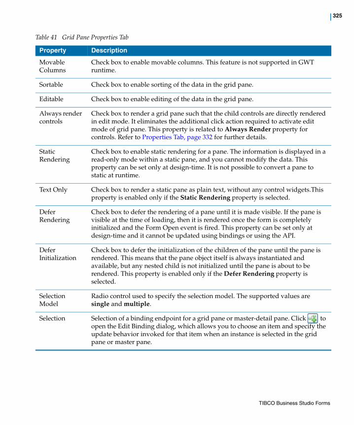
| 325
Movable Columns
Check box to enable movable columns. This feature is not supported in GWT runtime.
Sortable Check box to enable sorting of the data in the grid pane.
Editable Check box to enable editing of the data in the grid pane.
Always render controls
Check box to render a grid pane such that the child controls are directly rendered in edit mode. It eliminates the additional click action required to activate edit mode of grid pane. This property is related to Always Render property for controls. Refer to Properties Tab, page 332 for further details.
Static Rendering
Check box to enable static rendering for a pane. The information is displayed in a read-only mode within a static pane, and you cannot modify the data. This property can be set only at design-time. It is not possible to convert a pane to static at runtime.
Text Only Check box to render a static pane as plain text, without any control widgets.This property is enabled only if the Static Rendering property is selected.
Defer Rendering
Check box to defer the rendering of a pane until it is made visible. If the pane is visible at the time of loading, then it is rendered once the form is completely initialized and the Form Open event is fired. This property can be set only at design-time and it cannot be updated using bindings or using the API.
Defer Initialization
Check box to defer the initialization of the children of the pane until the pane is rendered. This means that the pane object itself is always instantiated and available, but any nested child is not initialized until the pane is about to be rendered. This property is enabled only if the Defer Rendering property is selected.
Selection Model
Radio control used to specify the selection model. The supported values are single and multiple.
Selection Selection of a binding endpoint for a grid pane or master-detail pane. Click to open the Edit Binding dialog, which allows you to choose an item and specify the update behavior invoked for that item when an instance is selected in the grid pane or master pane.
Table 41 Grid Pane Properties Tab
Property Description
TIBCO Business Studio Forms

326 | Properties View Tabs
Mappings Tab
The Properties view for panes contain a Mappings tab. This tab is used to view, edit, and create mappings for the selected pane. You can refer to Working with the Mappings Tab section for further details.
Layout Tab
Same as for controls. See Layout Tab on page 341.
Font Tab
Same as for controls. See Font Tab on page 342.
Child Layout
Table 42 Fields in the Child Layout Tab
Row Label Used to specify the row label template resource and type. The available options are:
• External Reference: to pick the row label from an external resource. You need to define the row labels in the <row_labels>.properties file. The resource key for the row label must follow the naming convention <component-name>[.property].<featureName>, and end with .rowLabel or _rowLabel.
For example, pane.grid.property.rowLabel=Attr1 {0}.
Resources that do not follow these conventions are not displayed in the Resource Picker.
• Custom: to specify a user-defined row label
By default, the value of the first column of the grid pane is used as the row label.
Note: This property is available only at accessible runtime.
Table 41 Grid Pane Properties Tab
Property Description
Property Description
Inherit fromSystem Defaults
Check box determines whether or not the values on this tab are inherited from the system defaults.
TIBCO Business Studio Forms

| 327
Child Labels
The settings in this property tab pertain to the child controls and panes of this pane. They have no effect on the label of the pane itself.
Table 43 Fields in the Child Labels Tab
Width Determines the width of child objects of this pane.
Height Determines the height of child objects of this pane.
Padding Sets the white-space gap between the outer edge of the child objects of this pane and their inner content. Specified as one to four implied pixel values applied in this order: top, right, bottom, and left. For example, 8 pixels of padding could be specified as 8, or as four space-separated values: 8 8 8 8.
Margin Sets the gap between the border of the pane’s child objects and their parent or sibling panes. Specified as one to four implied pixel values applied in this order: top, right, bottom, and left. For example, 4 pixels for margins could be specified as 4, or as four space-separated values: 4 4 4 4.
BG Color Determines the background color of child objects of this pane.
Border Sets a border around child objects of the pane. Possible values are none and line.
Overflow Determines how child objects of the pane behave when their content exceeds their dimensions. Possible values are expand, auto, and hidden.
Property Description
Property Description
Inherit From Parent
Specifies whether the layout properties of the pane are inherited. If the Inherit From Parent check box is selected, all fields are disabled for editing. Clearing the Inherit From Parent field allows you to edit all fields on this tab.
Label Width Determines the width of the label in pixels.
Label Position Determines the label position inherited by child controls and panes. Label position is with respect to the associated control or pane. Supported values are left and top.
Label Visible Determines the label visibility inherited by child controls and panes.
Font Name Determines the label font face name inherited by child controls and panes.
TIBCO Business Studio Forms

328 | Properties View Tabs
Validations Tab
The Validations tab lists the validation scripts defined for the pane, and provides a mechanism to create new validation for that pane.
Font Size Determines the label font height (in points) inherited by child controls and panes.
Font Color Determines the label text color inherited by child controls and panes.
Font Weight Determines the label font style inherited by child controls and panes. Supported styles are normal and bold.
Text Align Determines the label justification inherited by child controls and panes. Supported values are left and right.
Property Description
Table 44 Fields in the Validation Tab
Fields Description
Name The name of the validation.
Execute When When the validation is executed. The options are:
• On Form Submit
• On Value Change
Script The validation script.
Message Type The type of validation message. The options are:
• External Reference
• Custom
Message The validation message that is displayed in the message pane if your entry is invalid. This is either a static message defined in the validation, or a reference to a resource key, where the key begins with "validation_".
TIBCO Business Studio Forms
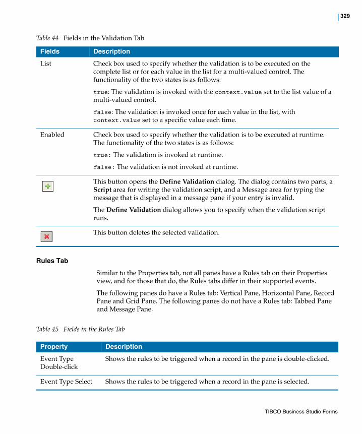
| 329
Rules Tab
Similar to the Properties tab, not all panes have a Rules tab on their Properties view, and for those that do, the Rules tabs differ in their supported events.
The following panes do have a Rules tab: Vertical Pane, Horizontal Pane, Record Pane and Grid Pane. The following panes do not have a Rules tab: Tabbed Pane and Message Pane.
Table 45 Fields in the Rules Tab
List Check box used to specify whether the validation is to be executed on the complete list or for each value in the list for a multi-valued control. The functionality of the two states is as follows:
true: The validation is invoked with the context.value set to the list value of a multi-valued control.
false: The validation is invoked once for each value in the list, with context.value set to a specific value each time.
Enabled Check box used to specify whether the validation is to be executed at runtime. The functionality of the two states is as follows:
true: The validation is invoked at runtime.
false: The validation is not invoked at runtime.
This button opens the Define Validation dialog. The dialog contains two parts, a Script area for writing the validation script, and a Message area for typing the message that is displayed in a message pane if your entry is invalid.
The Define Validation dialog allows you to specify when the validation script runs.
This button deletes the selected validation.
Table 44 Fields in the Validation Tab
Fields Description
Property Description
Event Type Double-click
Shows the rules to be triggered when a record in the pane is double-clicked.
Event Type Select Shows the rules to be triggered when a record in the pane is selected.
TIBCO Business Studio Forms
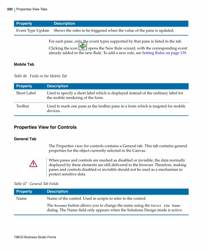
330 | Properties View Tabs
For each pane, only the event types supported by that pane is listed in the tab.
Clicking the icon opens the New Rule wizard, with the corresponding event already added to the new Rule. To add a new rule, see Setting Rules on page 139.
Mobile Tab
Table 46 Fields in the Mobile Tab
Properties View for Controls
General Tab
The Properties view for controls contains a General tab. This tab contains general properties for the object currently selected in the Canvas.
Event Type Update Shows the rules to be triggered when the value of the pane is updated.
Property Description
Property Description
Short Label Used to specify a short label which is displayed instead of the ordinary label for the mobile rendering of the form.
Toolbar Used to mark one pane as the toolbar pane in a form which is targeted for mobile devices.
When panes and controls are marked as disabled or invisible, the data normally displayed by these elements are still delivered to the browser. Therefore, making panes and controls disabled or invisible should not be used as a mechanism to protect sensitive data.
Table 47 General Tab Fields
Property Description
Name Name of the control. Used in scripts to refer to the control.
The Rename button allows you to change the name using the Enter the Name dialog. The Name field only appears when the Solutions Design mode is active.
TIBCO Business Studio Forms
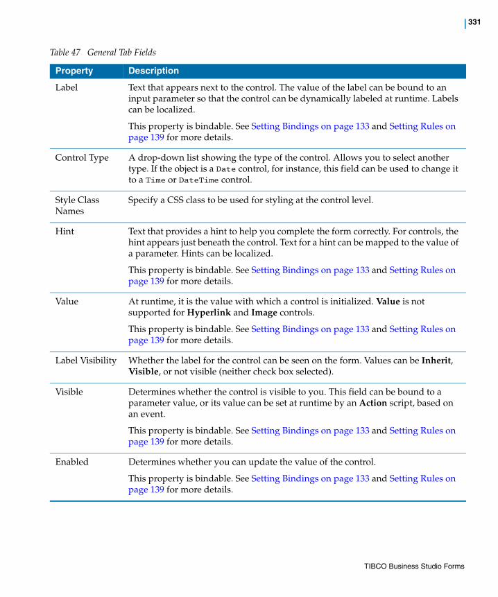
| 331
Label Text that appears next to the control. The value of the label can be bound to an input parameter so that the control can be dynamically labeled at runtime. Labels can be localized.
This property is bindable. See Setting Bindings on page 133 and Setting Rules on page 139 for more details.
Control Type A drop-down list showing the type of the control. Allows you to select another type. If the object is a Date control, for instance, this field can be used to change it to a Time or DateTime control.
Style Class Names
Specify a CSS class to be used for styling at the control level.
Hint Text that provides a hint to help you complete the form correctly. For controls, the hint appears just beneath the control. Text for a hint can be mapped to the value of a parameter. Hints can be localized.
This property is bindable. See Setting Bindings on page 133 and Setting Rules on page 139 for more details.
Value At runtime, it is the value with which a control is initialized. Value is not supported for Hyperlink and Image controls.
This property is bindable. See Setting Bindings on page 133 and Setting Rules on page 139 for more details.
Label Visibility Whether the label for the control can be seen on the form. Values can be Inherit, Visible, or not visible (neither check box selected).
Visible Determines whether the control is visible to you. This field can be bound to a parameter value, or its value can be set at runtime by an Action script, based on an event.
This property is bindable. See Setting Bindings on page 133 and Setting Rules on page 139 for more details.
Enabled Determines whether you can update the value of the control.
This property is bindable. See Setting Bindings on page 133 and Setting Rules on page 139 for more details.
Table 47 General Tab Fields
Property Description
TIBCO Business Studio Forms

332 | Properties View Tabs
Mappings Tab
The Properties view for controls contain a Mappings tab. This tab is used to view, edit, and create mappings for the selected control. You can refer to Working with the Mappings Tab section for further details.
Properties Tab
The Properties tab contains special fields that pertain specifically to the type of control being configured. Thus, not all controls have a Properties tab on their Properties view, and for those that do, the Properties tabs differ in their fields.
The following controls do have a Properties tab: Button, Date, Time, Date-Time, Hyperlink, Image, Optionlist, Passthrough, Radiogroup, Text, and Text Area. The following controls do not have a Properties tab: Check box and Label.
Required Indicates whether you must provide a value for this control in order for the form to be successfully validated. At runtime, required fields are preceded by an asterisk, to indicate that the field is required. If you do not provide a value for a control that is required, the form cannot be submitted. This property is bindable. See Setting Bindings on page 133 and Setting Rules on page 139 for more details.
Tab Index Determines the position of the element in the tabbing order for the form. The tabbing order determines the order in which elements on the form receive focus when the tab key is used to navigate from one element to another. This attribute is valid for all controls except Image and Label controls, where focus is irrelevant. See the note Tabbing Navigation, page 332, for more details.
Table 47 General Tab Fields
Property Description
Tabbing Navigation The Tab Index attribute can be used to determine the order in which elements receive focus as you navigate from field to field through a form with the tab key. The tabbing navigation behavior for a form is as follows:
1. Those elements on the form that support the Tab Index attribute, and assign a positive value to it, are navigated first. Navigation proceeds from the element with the lowest Tab Index value to the element with the highest value. Values need not be sequential, nor must they begin with any particular value. Elements that have identical Tab Index values are navigated in the order in which they appear on the form.
2. Those elements that do not support the Tab Index attribute, or support it and assign it a value of “0,” are navigated next. These elements are navigated in the order in which they appear in the Outline view.
TIBCO Business Studio Forms

| 333
The following controls have an extra property on the Properties tab only if the control is a child of a grid pane: Date, Time, Date-Time, Optionlist, Radiogroup, Text, and Text Area.
The property details is as follows:
Table 48 Property for Child Controls of Grid Pane
The details of the Properties tab for each controls that have this tab is described separately below.
Properties Tab for the Button Control
Property Description
Always Render in Grid Pane
Check box to render the grid pane child controls directly in edit mode. This property is related to Always render controls property for grid pane. If the Always render controls property is set to true, then all the controls on a grid pane are directly rendered in edit mode. However, if the Always render controls property is set to false, then the Always Render property setting on each control determines whether or not the control is rendered in edit mode. Refer to Properties Tab for the Grid Pane, page 324 for further details.
This property is only supported in GWT runtime.
Table 49 Button Properties Tab
Property Description
Button Type Radiogroup list that allows the Form Designer to configure the type of button. Possible values are primary, peripheral, and associative. There are four kinds of buttons on the palette: Button (generic), Cancel Button, Submit Button, and Close Button.
The Properties tab is identical for each of them, except that the default value in the Button Type drop-down list is primary for the Submit button, and peripheral for the other button types. This means that a Submit button that is placed on a form from the palette, by default, is invoked on a mouse click or when you press the Enter key. Buttons of the other types are invoked only when they are clicked or otherwise selected.
TIBCO Business Studio Forms

334 | Properties View Tabs
Properties Tab for the Date Control
Properties Tab for the Time Control
Table 50 Date Control Properties Tab
Property Description
Edit as List Check box to enable the Date control to represent multiple date values. It enables you to add and delete items, or move them up and down.
Maximum Visible Rows
Specify the maximum number of visible rows.
Start Year Specify the first year that should be displayed in the date picker in mobile forms. The default value is -20.
This is a mobile forms specific configuration. See Mobile Specific Configuration of Controls and Panes for more details.
Start Year Relative
Check box used to specify whether the value of Start Year is interpreted as being relative to the current year or as an absolute year. The default value is true.
This is a mobile forms specific configuration. See Mobile Specific Configuration of Controls and Panes for more details.
End Year Specify the last year to be displayed in the date picker in mobile forms. The default value is 20.
This is a mobile forms specific configuration. See Mobile Specific Configuration of Controls and Panes for more details.
End Year Relative
Check box to specify whether the value of End Year is interpreted as being relative to the current year or as an absolute year. The default value is true.
This is a mobile forms specific configuration. See Mobile Specific Configuration of Controls and Panes for more details.
Table 51 Time Control Properties Tab
Property Description
Edit as List Check box to enable the Time control to represent multiple time values. It enables you to add and delete items, or move them up and down.
Maximum Visible Rows
Specify the maximum number of visible rows.
TIBCO Business Studio Forms
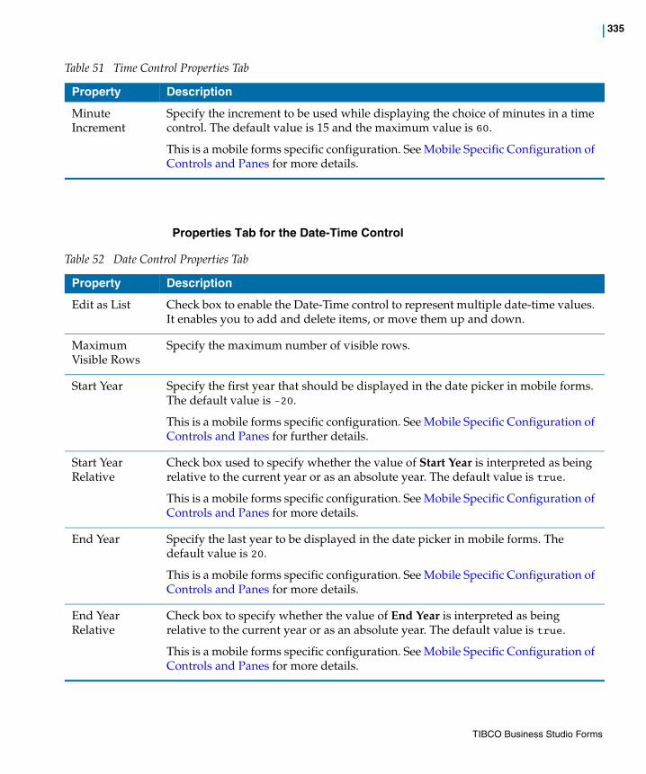
| 335
Properties Tab for the Date-Time Control
Minute Increment
Specify the increment to be used while displaying the choice of minutes in a time control. The default value is 15 and the maximum value is 60.
This is a mobile forms specific configuration. See Mobile Specific Configuration of Controls and Panes for more details.
Table 51 Time Control Properties Tab
Property Description
Table 52 Date Control Properties Tab
Property Description
Edit as List Check box to enable the Date-Time control to represent multiple date-time values. It enables you to add and delete items, or move them up and down.
Maximum Visible Rows
Specify the maximum number of visible rows.
Start Year Specify the first year that should be displayed in the date picker in mobile forms. The default value is -20.
This is a mobile forms specific configuration. See Mobile Specific Configuration of Controls and Panes for further details.
Start Year Relative
Check box used to specify whether the value of Start Year is interpreted as being relative to the current year or as an absolute year. The default value is true.
This is a mobile forms specific configuration. See Mobile Specific Configuration of Controls and Panes for more details.
End Year Specify the last year to be displayed in the date picker in mobile forms. The default value is 20.
This is a mobile forms specific configuration. See Mobile Specific Configuration of Controls and Panes for more details.
End Year Relative
Check box to specify whether the value of End Year is interpreted as being relative to the current year or as an absolute year. The default value is true.
This is a mobile forms specific configuration. See Mobile Specific Configuration of Controls and Panes for more details.
TIBCO Business Studio Forms
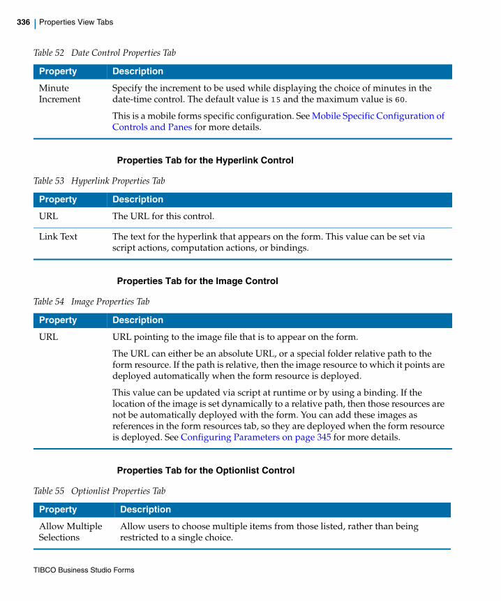
336 | Properties View Tabs
Properties Tab for the Hyperlink Control
Properties Tab for the Image Control
Properties Tab for the Optionlist Control
Minute Increment
Specify the increment to be used while displaying the choice of minutes in the date-time control. The default value is 15 and the maximum value is 60.
This is a mobile forms specific configuration. See Mobile Specific Configuration of Controls and Panes for more details.
Table 52 Date Control Properties Tab
Property Description
Table 53 Hyperlink Properties Tab
Property Description
URL The URL for this control.
Link Text The text for the hyperlink that appears on the form. This value can be set via script actions, computation actions, or bindings.
Table 54 Image Properties Tab
Property Description
URL URL pointing to the image file that is to appear on the form.
The URL can either be an absolute URL, or a special folder relative path to the form resource. If the path is relative, then the image resource to which it points are deployed automatically when the form resource is deployed.
This value can be updated via script at runtime or by using a binding. If the location of the image is set dynamically to a relative path, then those resources are not be automatically deployed with the form. You can add these images as references in the form resources tab, so they are deployed when the form resource is deployed. See Configuring Parameters on page 345 for more details.
Table 55 Optionlist Properties Tab
Property Description
Allow Multiple Selections
Allow users to choose multiple items from those listed, rather than being restricted to a single choice.
TIBCO Business Studio Forms
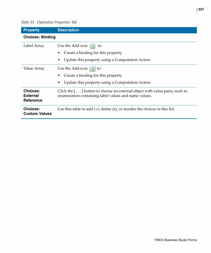
| 337
Choices: Binding
Label Array Use the Add icon to:
• Create a binding for this property
• Update this property using a Computation Action
Value Array Use the Add icon to:
• Create a binding for this property
• Update this property using a Computation Action
Choices: External Reference
Click the [...] button to choose an external object with value pairs, such as enumeration containing label values and name values.
Choices: Custom Values
Use this table to add (+), delete (x), or reorder the choices in this list.
Table 55 Optionlist Properties Tab
Property Description
TIBCO Business Studio Forms

338 | Properties View Tabs
Properties Tab for the Pass-through Control
Properties Tab for the Radiogroup Control
Table 56 Pass-through Control Properties Tab
Property Description
Markup Used to specify a block of HTML fragment. This markup is inserted directly into the browser DOM at runtime.
Click icon to set the markup via a binding or computation action.
Table 57 Radiogroup Control Properties Tab
Property Description
Format Choose the format for this control: auto, columns, horizontal, or vertical
Columns Choose number of columns to display the radio buttons: 1, 2, or more
Choice Layout
Layout type Select one of the following:
• Auto
• Columns
• Horizontal
• Vertical
Columns Select number of columns.
Choices: Bindings
Label Array Use the Add icon to:
• Create a binding for this property
• Update this property using a Computation Action
Value Array Use the Add icon to:
• Create a binding for this property
• Update this property using a Computation Action
Choices: External Reference
TIBCO Business Studio Forms
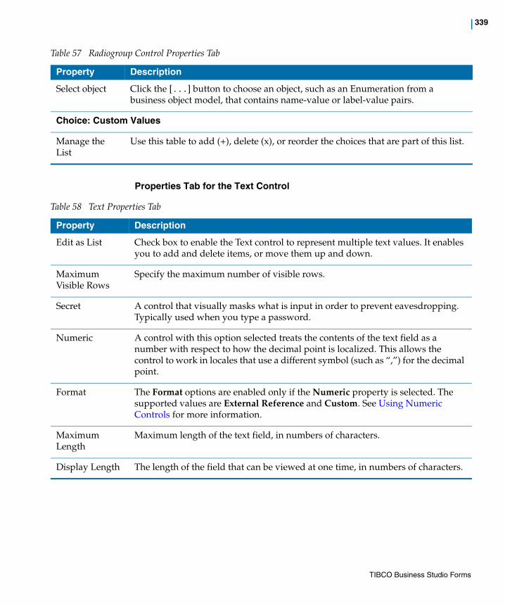
| 339
Properties Tab for the Text Control
Select object Click the [...] button to choose an object, such as an Enumeration from a business object model, that contains name-value or label-value pairs.
Choice: Custom Values
Manage the List
Use this table to add (+), delete (x), or reorder the choices that are part of this list.
Table 57 Radiogroup Control Properties Tab
Property Description
Table 58 Text Properties Tab
Property Description
Edit as List Check box to enable the Text control to represent multiple text values. It enables you to add and delete items, or move them up and down.
Maximum Visible Rows
Specify the maximum number of visible rows.
Secret A control that visually masks what is input in order to prevent eavesdropping. Typically used when you type a password.
Numeric A control with this option selected treats the contents of the text field as a number with respect to how the decimal point is localized. This allows the control to work in locales that use a different symbol (such as “,”) for the decimal point.
Format The Format options are enabled only if the Numeric property is selected. The supported values are External Reference and Custom. See Using Numeric Controls for more information.
Maximum Length
Maximum length of the text field, in numbers of characters.
Display Length The length of the field that can be viewed at one time, in numbers of characters.
TIBCO Business Studio Forms

340 | Properties View Tabs
Properties Tab for the Text Area Control
The following controls have an extra property on the Properties tab only if the control is a child of a grid pane: Date, Time, Date-Time, Optionlist, Radiogroup, Text, and Text Area.
The property details are as follows:
Table 60 Property for Child Controls of Grid Pane
Table 59 Text Area Properties Tab
Property Description
Edit as List Check box to enable the Text Area control to represent multiple text values. It enables you to add and delete items, or move them up and down.
Maximum Visible Rows
Specify the maximum number of visible rows.
Rows Determines the number of lines that can be typed in the textarea control.
Columns Determines the number of characters that can be typed in a single line of the textarea control.
Maximum Length
Maximum length of the text area, in numbers of characters.
Property Description
Always Render
Check box to render the grid pane child controls directly in edit mode. This property is linked to Always render controls property of grid pane. If the Always render controls property is set to true, then all the controls on a grid pane are directly rendered in edit mode. However, if the Always render controls property is set to false, then the Always Render property setting on each control determines whether or not the control is rendered in edit mode. Refer to Properties Tab for the Grid Pane, page 324 for further details.
This property is only supported in GWT runtime.
TIBCO Business Studio Forms

| 341
Layout Tab
All Properties views for controls contain a Layout tab, and all Layout tabs contain the same fields. The following fields appear on the Layout tab for forms and for all panes and controls.
Table 61 Layout Tab
Property Description
Inherit From Parent
Specifies whether the layout properties of the control are inherited. If the Inherit check box is selected, all fields are disabled for editing. Clearing the Inherit field allows you to edit all fields on this tab.
Width Width of the pane or control. The width is that of the content area. For panes, this is the area occupied by child panes and controls; for controls, it is the area occupied by the control body, excluding label and hint areas.
Height Height of the pane or control. The height is that of the content area. For panes, this is the area occupied by child panes and controls; for controls, it is the area occupied by the control body, excluding label and hint areas.
BG Color Background color for the object being configured.
Padding Sets the white-space gap between the outer edge of the object and its inner content. Specified as one to four implied pixel values applied in this order: top, right, bottom, and left. For example, 8 pixels of padding could be specified as 8, or as four space-separated values: 8 8 8 8.
Margin Sets the gap between the object’s border and its parent or sibling objects. Specified as one to four implied pixel values applied in this order: top, right, bottom, and left. For example, 4 pixels for margins could be specified as 4, or as four space-separated values: 4 4 4 4.
Border Sets a border around the object. Possible values are none and line.
TIBCO Business Studio Forms
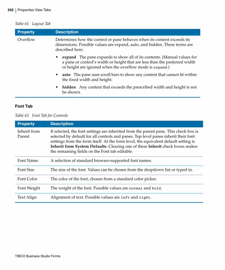
342 | Properties View Tabs
Font Tab
Overflow Determines how the control or pane behaves when its content exceeds its dimensions. Possible values are expand, auto, and hidden. These terms are described here:
• expand The pane expands to show all of its contents. (Manual values for a pane or control’s width or height that are less than the preferred width or height are ignored when the overflow mode is expand.)
• auto The pane uses scroll bars to show any content that cannot fit within the fixed width and height.
• hidden Any content that exceeds the prescribed width and height is not be shown.
Table 62 Font Tab for Controls
Property Description
Inherit from Parent
If selected, the font settings are inherited from the parent pane. This check box is selected by default for all controls and panes. Top level panes inherit their font settings from the form itself. At the form level, the equivalent default setting is Inherit from System Defaults. Clearing one of these Inherit check boxes makes the remaining fields on the Font tab editable.
Font Name A selection of standard browser-supported font names.
Font Size The size of the font. Values can be chosen from the dropdown list or typed in.
Font Color The color of the font, chosen from a standard color picker.
Font Weight The weight of the font. Possible values are normal and bold.
Text Align Alignment of text. Possible values are left and right.
Table 61 Layout Tab
Property Description
TIBCO Business Studio Forms
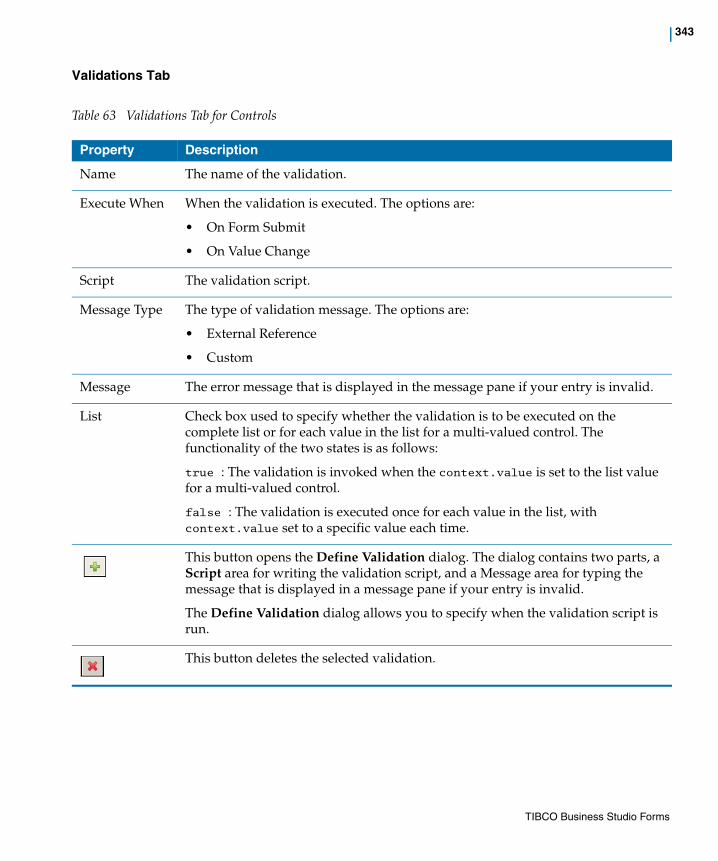
| 343
Validations Tab
Table 63 Validations Tab for Controls
Property Description
Name The name of the validation.
Execute When When the validation is executed. The options are:
• On Form Submit
• On Value Change
Script The validation script.
Message Type The type of validation message. The options are:
• External Reference
• Custom
Message The error message that is displayed in the message pane if your entry is invalid.
List Check box used to specify whether the validation is to be executed on the complete list or for each value in the list for a multi-valued control. The functionality of the two states is as follows:
true : The validation is invoked when the context.value is set to the list value for a multi-valued control.
false : The validation is executed once for each value in the list, with context.value set to a specific value each time.
This button opens the Define Validation dialog. The dialog contains two parts, a Script area for writing the validation script, and a Message area for typing the message that is displayed in a message pane if your entry is invalid.
The Define Validation dialog allows you to specify when the validation script is run.
This button deletes the selected validation.
TIBCO Business Studio Forms

344 | Properties View Tabs
Rules Tab
The Rules tab lists the Rules triggered by each of the events supported by the Control, and provides a mechanism to create new Rules for that control.
For each Control, only the event types supported by that control is listed in the tab.
Clicking the icon opens the New Rule wizard, with the corresponding event already added to the new Rule. To add a new rule, see Setting Rules on page 139.
Mobile Tab
The Mobile tab is used for mobile specific configuration.
Table 64 Fields in the Controls Rules tab
Property Description
Event Type Enter Shows the rules to be triggered when the control gains focus.
Event Type Exit Shows the rules to be triggered when the control looses focus.
Event Type Update Shows the rules to be triggered when the value of the control changes.
Event Type Select Shows the rules to be triggered when the control is selected, such as when a button is clicked.
Property Description
Short Label Specify a short label which is displayed instead of the Label for the mobile rendering of the form.
TIBCO Business Studio Forms
| 345
Configuring Parameters
To configure a parameter, you need to define the following:
• Name This field is only seen if the Solution Design capability is enabled. The Rename button shows a rename dialog.
• Label Business name of the parameter.
• Mode In The value is treated as read-only.
• Mode Out There is no value provided at form load, but the form may provide a value during submit.
• Mode In/Out The value may be read and written.
• Type One of the following
— Text Supporting single-line and multiple-line strings
— Integer Supporting 32-bit integers
— Decimal Supporting 64-bit double precision floating point numbers
— Boolean
— Date Supporting localized display
— Time Supporting localized display
— DateTime Supporting localized display. Precision to number of seconds.
Length is only used for Text, Integer and Decimal types.
Decimal Places is only used for the Decimal type.
• Bindings Shows bindings and computation actions involving this parameter.
TIBCO Business Studio Forms
346 | Context Menus
Context Menus
Context menus are available in the Outline view as well as in the Form Designer canvas.
Outline View Context MenuYou can use a context menu from the Outline view.
For more details, see Use the Context Menu in the Outline View on page 99.
Form Designer Canvas Context MenuYou can also use a context menu from the canvas:
1. Right-click the form icon or any form element in the Outline view.
The pop-up context menu appears.
2. Depending on the element selected different options are available, as explained in Table 65.
Table 65 Manage Form Elements from the Outline View
Select Definition
Cut(Ctrl+X)
Available for all elements except for fixed categories (Data, Shared Actions, Rules)
Copy(Ctrl+C)
Available for all elements. After you copy an element to the clipboard, you can paste it within this form or another form.
Paste(Ctrl+V)
Available when content is available on clipboard
Delete Available for all elements except for fixed nodes (Data, Shared Actions, Rules) and for the form itself
Rename Available for all elements except for fixed categories (Data, Shared Actions, Rules), as well as for added actions and rules
Select All(Ctrl+A)
Selects all root panes. Select All does not select parameters, shared actions, or rules.
Show Properties view
Shows the Properties view, if not previously visible.
TIBCO Business Studio Forms
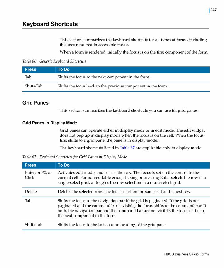
| 347
Keyboard Shortcuts
This section summarizes the keyboard shortcuts for all types of forms, including the ones rendered in accessible mode.
When a form is rendered, initially the focus is on the first component of the form.
Grid PanesThis section summarizes the keyboard shortcuts you can use for grid panes.
Grid Panes in Display Mode
Grid panes can operate either in display mode or in edit mode. The edit widget does not pop up in display mode when the focus is on the cell. When the focus first shifts to a grid pane, the pane is in display mode.
The keyboard shortcuts listed in Table 67 are applicable only to display mode.
Table 66 Generic Keyboard Shortcuts
Press To Do
Tab Shifts the focus to the next component in the form.
Shift+Tab Shifts the focus back to the previous component in the form.
Table 67 Keyboard Shortcuts for Grid Panes in Display Mode
Press To Do
Enter, or F2, or Click
Activates edit mode, and selects the row. The focus is set on the control in the current cell. For non-editable grids, clicking or pressing Enter selects the row in a single-select grid, or toggles the row selection in a multi-select grid.
Delete Deletes the selected row. The focus is set on the same cell of the next row.
Tab Shifts the focus to the navigation bar if the grid is paginated. If the grid is not paginated and the command bar is visible, the focus shifts to the command bar. If both, the navigation bar and the command bar are not visible, the focus shifts to the next component in the form.
Shift+Tab Shifts the focus to the last column heading of the grid pane.
TIBCO Business Studio Forms

348 | Keyboard Shortcuts
Grid Panes in Edit Mode
When in edit mode, the controls in each cell are displayed as editable when the cell has the focus. If a control is disabled or read-only, then it continues to display the text version of the control value. Note that the grid pane does not handle any of these keys if the active cell editor handles the keystroke. For example, the textarea controls handle Up/Down Arrow keys. Pressing these keys affects the textarea and not the grid pane.
Up Arrow key Shifts the focus to the same cell in the previous row. If the focus is on the first visible row of the table, and the paginated grid pane has a previous page, the focus shifts to the same cell in the last row of the previous page. If the focus is already on the first visible row of the first page, it remains on the same cell.
Down Arrow key
Shifts the focus to the same cell in the next row. If the focus is on the last visible row of the table, and the paginated grid pane has a next page, the focus shifts to the same cell in the first row of the next page. If the focus is already on the last visible row of the last page, it remains on the same cell.
Left Arrow key Shifts the focus to the previous focusable cell in the same row. If none of the previous cells in the same row is focusable, the focus shifts to the last focusable cell in the previous row.
Right Arrow key
Shifts the focus to the next focusable cell in the same row. If none of the next cells in the same row is focusable, the focus shifts to the first focusable cell in the next row.
Page Up key Displays the previous page of rows when the grid pane is paginated. The focus stays on the same cell on the displayed page of records.
Page Down key
Displays the next page of rows when the grid pane is paginated. The focus stays on the same cell on the displayed page of records.
Home key Shifts the focus to the first column of the first visible row.
End key Shifts the focus to the first column of the last visible row.
Ctrl+Home Shifts the focus to the first column of the first row in the entire record set.
Ctrl+End Shifts the focus to the first column of the last row in the entire record set.
Table 67 Keyboard Shortcuts for Grid Panes in Display Mode
Press To Do
TIBCO Business Studio Forms

| 349
The keyboard shortcuts listed in Table 68 are applicable only to edit mode.
Grid Pane Column Headers
The heading for each column is rendered as an HTML anchor tag. As they are rendered as hyperlinks, each column heading is a tab stop when traversing the form. For sortable grids, pressing the Enter key activates the hyperlink, and sorts the rows on that column between three possible states: unsorted (the default), sorted ascending, and sorted descending.
Table 68 Keyboard Shortcuts for Grid Panes in Edit Mode
Press To Do
Enter, or Escape, or Ctrl+Enter
Activates display mode, and updates the value. Validations run, and the focus remains on the recently edited cell, which is now in display mode.
The Enter key within a textarea or list control is not handled by the grid pane. For such cases, use Ctrl+Enter to activate display mode.
Tab Shifts the focus to the next cell. The grid pane remains in edit mode, and the editor for the next cell is activated. If the focus is currently on a cell in the last column, the focus shifts to the first column of the next row. If the focus is on the last cell of the last visible row, the focus shifts to the grid navigation bar, or the next component in the form if the grid pane is not paginated.
Shift+Tab Shifts the focus to the previous cell. The grid pane remains in edit mode, and the editor for the previous cell is enabled. If the focus is in the first cell of the first visible row, it shifts to the grid column headers.
Up Arrow key, or Ctrl+Up Arrow key
Shifts the focus to the cell in the same column in the previous row.
Grid panes do not handle the Up Arrow key within a few controls, such as Textarea, Optionlist, Radiogroup, or List control. For such cases, use Ctrl+Up Arrow key.
Down Arrow key
Shifts the focus to the cell in the same column in the next row.
Grid panes do not handle the Up Arrow key within a few controls, such as Textarea, Optionlist, Radiogroup, or List control. For such cases, use Ctrl+Down Arrow key.
Page Up key Displays the previous page of rows. The focus shifts to the upper-left cell of the new page of records.
Page Down key
Displays the next page of rows. The focus shifts to the upper-left cell of the new page of records.
TIBCO Business Studio Forms

350 | Keyboard Shortcuts
The keyboard shortcuts listed in Table 69 are applicable only to the grid pane column headers.
Grid Pane Navigation Bar
For grid panes with more rows than a single page can accommodate, a navigation bar appears at the bottom of the grid pane. By using it, you can go to the first, previous, next, or last page of the pane. If you press Tab when the focus is on the navigation bar, the focus shifts to the "First" or the "Next" arrows. The "First" and "Previous" arrows are disabled when the first page of the grid pane is displayed. Similarly, the "Next" and the "Last" arrows are disabled when the last page is displayed.
The keyboard shortcuts listed in Table 70 are applicable only to the grid pane navigation bar.
Table 69 Keyboard Shortcuts for Grid Pane Column Headers
Press To Do
Tab Shifts the focus to the next heading in the grid pane header row. If the focus is on the heading of the last column, it shifts the focus to the first cell in the grid pane content.
Shift+Tab Shifts the focus to the previous heading in the grid pane header row. If the focus is on the heading of the first column, it shifts to the previous component in the form.
Enter Changes the sorting state of the column to the next state. The states are ascending, descending, or unsorted (original).
Table 70 Keyboard Shortcuts for Grid Pane Navigation Bar
Press To Do
Tab Shifts the focus either to the next arrow on the navigation bar, or to the New and Delete buttons if they are enabled. If there is no arrow or button available, the focus shifts to the next component in the form after the grid pane.
Shift+Tab Shifts the focus to the previous arrow on the navigation bar. If there is no arrow available, the focus shifts to the last cell in the last row of the grid pane.
Left Arrow, and Right Arrow keys
Shift the focus within the arrows on the navigation bar.
Enter Invokes the currently focused arrow on the navigation bar.
TIBCO Business Studio Forms

| 351
List ControlsThis section summarizes the keyboard shortcuts you can use for list controls.
List Controls in Display Mode
Similar to grid panes, list controls are either in display mode or in edit mode. If you press Tab when the focus is on a list control, the control is rendered in display mode, and the focus shifts to the first item in the list.
The keyboard shortcuts listed in Table 71 are applicable only to list controls in display mode.
List Controls in Edit Mode
The keyboard shortcuts listed in Table 72 are applicable only to list controls in edit mode.
Table 71 Keyboard Shortcuts for List Controls in Display Mode
Press To Do
Enter, or Click Activates edit mode, and maintains the focus on the current value.
Delete Deletes the selected item in the list. The focus shifts to the next item in the list, or to the Add button.
Tab Shifts the focus to the list control command bar.
Shift+Tab Shifts the focus to the previous component in the form.
Up Arrow key Shifts the focus to the previous item in the list.
Down Arrow key
Shifts the focus to the next item in the list.
Home Shifts the focus to the first item in the list.
End Shifts focus to the last item in the list.
Table 72 Keyboard Shortcuts for List Controls in Edit Mode
Press To Do
Enter, or Escape
Activates display mode, and maintains the focus on the current value.
Ctrl+Enter Activates display mode when editing a text area in the list.
TIBCO Business Studio Forms

352 | Keyboard Shortcuts
List Control Command Bar
The keyboard shortcuts listed in Table 73 are applicable only to the list control command bar.
Record PanesThis section summarizes the keyboard shortcuts you can use for record panes.
The keyboard navigation is just the same within a record pane. There are a few more keyboard shortcuts listed in the next sub-sections.
Tab Shifts the focus to the next value in the list. If the focus is already on the last value, it shifts to the list control command bar.
Shift+Tab Shifts the focus to the previous value in the list. If the focus is already on the first value in the list, it shifts to the previous component in the form.
Up Arrow key Shifts the focus to the previous value in the list. If the focus is already on the first value, it remains on that value.
Down Arrow key
Shifts the focus to the next value in the list. If the focus is already on the last value, it remains on that value.
Table 72 Keyboard Shortcuts for List Controls in Edit Mode
Press To Do
Table 73 Keyboard Shortcuts for List Control Command Bar
Press To Do
Tab Shifts the focus to the next component in the form after the list control.
Shift+Tab Shifts the focus back to the content of the list control.
Left Arrow, and Right Arrow keys
Shift the focus within the control buttons (that is, add, delete, up, and down) in the list control command bar.
Enter Invokes the currently focused control button.
TIBCO Business Studio Forms

| 353
Record Pane Body
The keyboard shortcuts listed in Table 74 are applicable only to the record pane body.
Record Pane Navigation Bar
If you press Tab when focus is on the component before a record pane, the focus shifts to the central text field in the navigation bar, which displays the current record number.
The keyboard shortcuts listed in Table 75 are applicable only to the record pane navigation bar.
Table 74 Keyboard Shortcuts for Record Pane Body
Press To Do
Page Up key Displays the previous record in the list without shifting the focus. If the displayed record is the first one, there is no change.
Page Down key
Displays the next record in the list without shifting the focus. If the displayed record is the last one, there is no change.
Tab Shifts the focus to the next control within the record pane.
Shift+Tab If pressed when the first control has the focus, it shifts the focus to the central text field in the navigation bar, which displays the current record number.
Table 75 Keyboard Shortcuts for Record Pane Navigation Bar
Press To Do
Tab Shifts the focus to the first component in the record pane.
Shift+Tab Shifts the focus to the previous component in the form.
Left Arrow, and Right Arrow keys
Shift the focus within the control buttons (that is, first, previous, current, next, and last) in the navigation bar.
Enter Invokes the currently focused control button.
TIBCO Business Studio Forms

354 | Keyboard Shortcuts
Tabbed PanesThis section summarizes the keyboard shortcuts you can use for tabbed panes.
Table 76 Keyboard Shortcuts for Tabbed Panes
Press To Do
Tab If you press Tab when the focus is on the component before a Tabbed Pane, the focus shifts on the currently active tab. If you press Tab when the focus is on a tab in the tab bar, the focus shifts to the first control in the body of the currently active tab pane.
Shift+Tab Shifts the focus back to the previous component in the form.
Left Arrow / Right Arrow
Shift the focus within the tabs in the tabbed pane.
Space Makes the currently focused tab active.
TIBCO Business Studio Forms

| 355
CSS Classes
TIBCO Business Studio Forms supports the use of Cascading Style Sheets (CSS) for customizing how form is rendered. This approach provides more flexibility and opportunities for reuse of style information than manually setting properties at the form model level.
This section lists the built-in CSS classes you can use. For general information on how to use CSS in TIBCO Business Studio Forms, see Styling Forms Using Cascading Style Sheets on page 145.
Built-in Static CSS ClassesWhen a form is rendered, there are a set of built-in CSS classes that are used at the Form, Pane, and Control level. You can use these CSS classes in defining custom rendering for these types of objects. The classes shown in this table are always rendered in the HTML DOM.
Table 77 Built-in Static CSS Classes
CSS Class Description
TibcoForms Applied at the root node of the form.
pane Applied at the root node of each pane.
pane-vertical Applied at the root node of each vertical pane, along with the pane class.
pane-horizontal Applied at the root node of each horizontal pane, along with the pane class.
pane-tabbed Applied at the root node of each tabbed pane, along with the pane class.
pane-grid Applied at the root node of each grid pane, along with the pane class.
pane-grid-content Applied to the underlying HTML table that contains the header row and values of a grid pane.
pane-grid-content-header-row Applied to the row in the grid pane that contains column headers.
TIBCO Business Studio Forms

356 | CSS Classes
pane-grid-sortable Applied to the header row of a grid pane whose columns are sortable.
pane-grid-sort-asc Applied to the header label of a column that is currently sorted in ascending order.
pane-grid-sort-desc Applied to the header label of a column that is currently sorted in descending order.
pane-grid-content-odd-row Applied to odd rows in a grid pane
pane-grid-content-even-row Applied to even rows in a grid pane
pane-messages Applied at the root node of each messages pane, along with the pane class.
pane-record Applied at the root node of each record pane, along with the pane class.
pane-label Applied at the node that contains the label of a pane. This is nested within the node that has the pane class set.
pane-content Applied at a node that contains all the child controls and panes of the parent pane.
component Applied at a the root node of each control or pane that is a child of a pane. So each node that has a class pane-content contains 0 or more nodes with a class component.
label Applied at a node within a component. Contains the label for the control or pane.
container Applied at a node within a component. Contains the content of the control or pane.
control-widget Applied on the specific element used for the control, such as an <input> element for text controls. This is a descendent of the node that contains the container class.
Table 77 Built-in Static CSS Classes
CSS Class Description
TIBCO Business Studio Forms
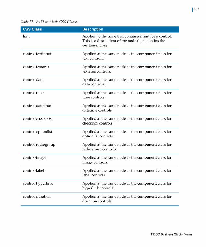
| 357
hint Applied to the node that contains a hint for a control. This is a descendent of the node that contains the container class.
control-textinput Applied at the same node as the component class for text controls.
control-textarea Applied at the same node as the component class for textarea controls.
control-date Applied at the same node as the component class for date controls.
control-time Applied at the same node as the component class for time controls.
control-datetime Applied at the same node as the component class for datetime controls.
control-checkbox Applied at the same node as the component class for checkbox controls.
control-optionlist Applied at the same node as the component class for optionlist controls.
control-radiogroup Applied at the same node as the component class for radiogroup controls.
control-image Applied at the same node as the component class for image controls.
control-label Applied at the same node as the component class for label controls.
control-hyperlink Applied at the same node as the component class for hyperlink controls.
control-duration Applied at the same node as the component class for duration controls.
Table 77 Built-in Static CSS Classes
CSS Class Description
TIBCO Business Studio Forms
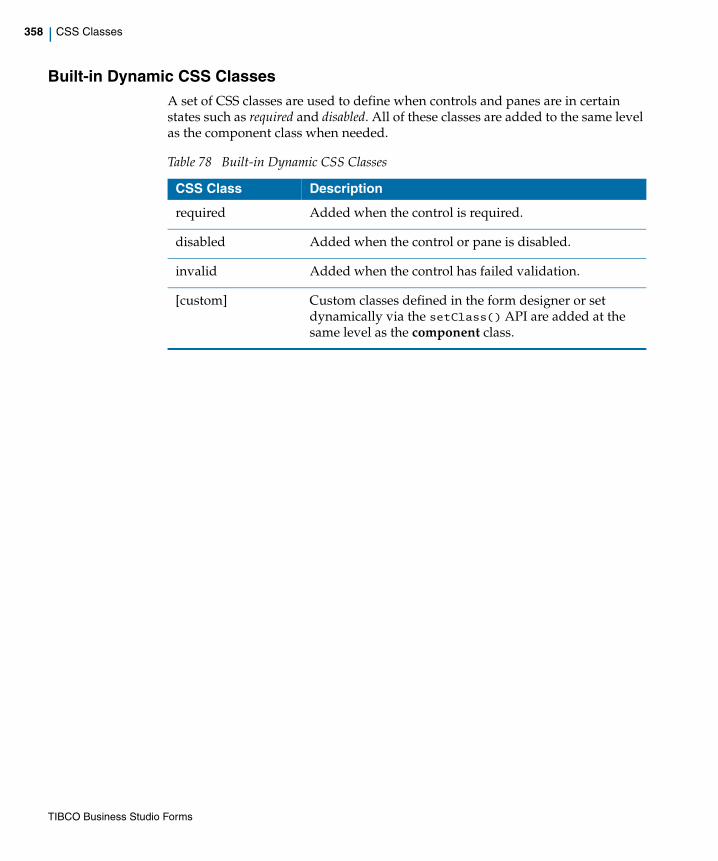
358 | CSS Classes
Built-in Dynamic CSS ClassesA set of CSS classes are used to define when controls and panes are in certain states such as required and disabled. All of these classes are added to the same level as the component class when needed.
Table 78 Built-in Dynamic CSS Classes
CSS Class Description
required Added when the control is required.
disabled Added when the control or pane is disabled.
invalid Added when the control has failed validation.
[custom] Custom classes defined in the form designer or set dynamically via the setClass() API are added at the same level as the component class.
TIBCO Business Studio Forms

| 359
Common Resource Keys
This section lists all the resource keys that are provided as a part of the common resources bundle. The keys are grouped into their basic functional areas, and the default values in the base bundle are given for reference.
For the details on how to override the default values or add new resource keys to the bundle, see Customizing Property Resource Bundles on page 179.
Keys for Number PatternsThis section lists the resource keys for formatting values in number controls.
The number control shows resource keys that begin with "format_". You can override their values, and also add new keys that begin with "format_".
For more information on how to specify a number format, see Using Numeric Controls on page 192.
Table 79 Number Patterns
For these resource keys, the number grouping separator is always represented as the comma meta-character, and the decimal separator is always represented as the period meta-character. The actual grouping and separator characters are translated separately, exactly once. It is not necessary to translate these grouping and separator meta-characters at every place where they appear.
Resource Key Reference Value Description
format_currency \u00A4#,##0.00;
(\u00A4#,##0.00)
Specifies a basic currency format. The unicode character \u00A4 represents a currency symbol, which is substituted at runtime.
For example: $123,344.89 for positive numbers, ($34,121.00) for negative numbers
format_integer #,##0 Basic grouped integer format.
For example: 123,456
format_integer_ungrouped
0 Basic ungrouped integer format.
For example: 123456
TIBCO Business Studio Forms

360 | Common Resource Keys
Keys for Basic Number and Currency SymbolsThis section lists the resource keys for values that get substituted in the numeric formats.
For example, number_grouping substitutes the "," character in the numeric formats.
Table 80 Basic Number and Currency Symbols
format_decimal #,##0.### Basic decimal format.
For example: 123,456.123
format_decimal_1 #,##0.0 Decimal format showing exactly one decimal place.
For example: 123.1
format_decimal_2 #,##0.00 Decimal format showing exactly 2 decimal places.
For example: 123.10
format_decimal_3 #,##0.000 Decimal format showing exactly 3 decimal places.
For example: 123.100
format_decimal_4 #,##0.0000 Decimal format showing exactly 4 decimal places.
For example: 123.1000
format_decimal_ungrouped
0.### Basic ungrouped decimal format.
For example: 123456.123
Resource Key Reference Value Description
Resource Key Reference Value Description
number_decimal . The decimal point that is substituted for the "." meta-character.
number_grouping , The grouping separator that is substituted for the "," meta-character.
TIBCO Business Studio Forms

| 361
Keys for Duration Control LabelsThis section lists the resource keys for the labels of duration controls.
For example, duration_label_years substitutes "Years" in the text input field.
Table 81 Duration Control Labels
number_zero 0 The character to be used as the leading zero in numeric formats.
currency_symbol $ Must be translated only for specific countries. The currency symbol that is substituted for \u00A4.
currency_decimal . Used when the currency format is used.
currency_grouping , Used when the currency format is used.
currency_code USD The standard 3-letter currency code.
Resource Key Reference Value Description
Resource Key Reference Value Description
duration_label_years Years Labels the text input field as "Years".
duration_label_months Months Labels the text input field as "Months".
duration_label_days Days Labels the text input field as "Days".
duration_label_hours Hours Labels the text input field as "Hours".
duration_label_minutes Minutes Labels the text input field as "Minutes".
duration_label_seconds Seconds Labels the text input field as "Seconds".
duration_label_milliseconds
Milliseconds Labels the text input field as "Milliseconds".
format_duration_years {0} years Used for the text representation of duration, where {0} is greater than 1.
For example: "2 years"
format_duration_months {0} months Used for the text representation of duration, where {0} is greater than 1
TIBCO Business Studio Forms

362 | Common Resource Keys
format_duration_days {0} days Used for the text representation of duration, where {0} is greater than 1.
format_duration_hours {0} hours Used for the text representation of duration, where {0} is greater than 1.
format_duration_minutes {0} minutes Used for the text representation of duration, where {0} is greater than 1.
format_duration_seconds {0} seconds Used for the text representation of duration, where {0} is greater than 1.
format_duration_milliseconds
{0} milliseconds Used for the text representation of duration, where {0} is greater than 1.
format_duration_years_singular
{0} year Used for the text representation of duration, where {0} is equal to 1.
format_duration_months_singular
{0} month Used for the text representation of duration, where {0} is equal to 1
format_duration_days_singular
{0} day Used for the text representation of duration, where {0} is equal to 1.
format_duration_hours_singular
{0} hour Used for the text representation of duration, where {0} is equal to 1.
format_duration_minutes_singular
{0} minute Used for the text representation of duration, where {0} is equal to 1.
format_duration_seconds_singular
{0} second Used for the text representation of duration, where {0} is equal to 1.
format_duration_milliseconds_singular
{0} millisecond Used for the text representation of duration, where {0} is equal to 1.
duration_separator , Separates the values in the text representation of duration.
duration_order yMdHmsS The order in which the specific duration units appear in the text representation of duration, where y = years, M = months, d = days, H = hours, m = minutes, s = seconds, S = milliseconds.
Resource Key Reference Value Description
TIBCO Business Studio Forms

| 363
Keys for Date-Time PatternsThis section lists the resource keys for date-time controls.
Table 82 Date Time Keys
duration_items_display_sep
\ /\ Separates the values in the text representation of list items.
Note: All the other list controls use "items_display_sep" as defined in List Control Keys on page 370. This new separator is necessary to separate duration items in a list, because the "duration_separator" that formats a duration value also uses a "," in the base bundle.
Resource Key Reference Value Description
Resource Key Reference Value Description
date_month_abbrev ['Jan','Feb','Mar','Apr','May','Jun','Jul','Aug','Sep','Oct','Nov','Dec']
Used for the short names of the months in a calendar control. Specified as a JavaScript array.
date_month ['January','February','March','April','May','June','July','August','September','October','November','December']
Used for the long names of the months in a calendar control. Specified as a JavaScript array.
date_month_narrow ['J','F','M','A','M','J','J','A','S','O','N','D']
Used for narrow, one letter abbreviations of the months in a calendar control. Specified as a JavaScript array.
date_day_abbrev ['Sun','Mon','Tue','Wed','Thu','Fri','Sat']
Used for the short names of the days of the week in a calendar control. Always begins with Sunday. Specified as a JavaScript array.
Note: You can specify the first day of the week for a locale by using date_first_day_of_week as listed in this table.
TIBCO Business Studio Forms

364 | Common Resource Keys
date_day ['Sunday','Monday','Tuesday','Wednesday','Thursday','Friday','Saturday']
Used for the long names of the days of the week in a calendar control. Always begins with Sunday. Specified as a JavaScript array.
Note: You can specify the first day of the week for a locale by using date_first_day_of_week.
date_day_narrow ['S','M','T','W','T','F','S']
Used for the narrow, one-letter abbreviations of the days of the week in a calendar control. Always begins with Sunday. Specified as a JavaScript array.
Note: You can specify the first day of the week for a locale by using date_first_day_of_week.
date_era_long ['Before Christ','Anno Domini']
Used for the complete text of era names in formatted dates.
For example: Before Christ
date_era ['BC','AD'] Used for the short forms of era names in formatted dates.
For example: BC
time_ampm ['AM','PM'] Used for the Latin abbreviations for the 12-hour clock convention.
datetime_date_label Date Labels the date portion of a date-time control.
datetime_time_label Time Labels the time portion of a date-time control.
accessible_date_label {0} (enter as {1}) Accessible Forms: Used to augment the label for date, time, and date-time controls. {0} is substituted with the original control label, and {1} is substituted with the edit format used for the control.
date_today Today Used in the Date Picker. Clicking this label takes the date control to today's date.
Resource Key Reference Value Description
TIBCO Business Studio Forms
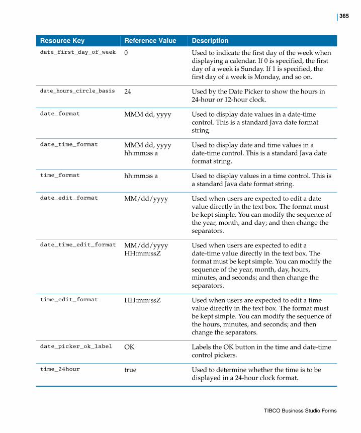
| 365
date_first_day_of_week 0 Used to indicate the first day of the week when displaying a calendar. If 0 is specified, the first day of a week is Sunday. If 1 is specified, the first day of a week is Monday, and so on.
date_hours_circle_basis 24 Used by the Date Picker to show the hours in 24-hour or 12-hour clock.
date_format MMM dd, yyyy Used to display date values in a date-time control. This is a standard Java date format string.
date_time_format MMM dd, yyyy hh:mm:ss a
Used to display date and time values in a date-time control. This is a standard Java date format string.
time_format hh:mm:ss a Used to display values in a time control. This is a standard Java date format string.
date_edit_format MM/dd/yyyy Used when users are expected to edit a date value directly in the text box. The format must be kept simple. You can modify the sequence of the year, month, and day; and then change the separators.
date_time_edit_format MM/dd/yyyy HH:mm:ssZ
Used when users are expected to edit a date-time value directly in the text box. The format must be kept simple. You can modify the sequence of the year, month, day, hours, minutes, and seconds; and then change the separators.
time_edit_format HH:mm:ssZ Used when users are expected to edit a time value directly in the text box. The format must be kept simple. You can modify the sequence of the hours, minutes, and seconds; and then change the separators.
date_picker_ok_label OK Labels the OK button in the time and date-time control pickers.
time_24hour true Used to determine whether the time is to be displayed in a 24-hour clock format.
Resource Key Reference Value Description
TIBCO Business Studio Forms

366 | Common Resource Keys
Keys for Optionlist ControlsThis section lists the resource key for drop-down list controls.
Table 83 Optionlist Key
Keys for Built-in ButtonsThis section lists the resource keys for built-in buttons.
Table 84 Built-in Button Keys
Resource Key Reference Value Description
option_select_label - Select - The value initially displayed in a drop-down list before the user makes a selection.
Resource Key Reference Value Description
form_cancel_label Cancel Labels the Cancel button that is generated by default or is added from the palette.
form_submit_label Submit Labels the Submit button that is generated by default or is added from the palette.
form_close_label Close Labels the Close button that is generated by default or is added from the palette.
spinner_done_label Done Mobile Forms: Indicates that the user has picked a value.
spinner_cancel_label Cancel Mobile Forms: Indicates that the user has cancelled the operation of picking a value.
screen_back_label Back Mobile Forms: Returns to the previously viewed screen.
screen_add_list_item_label
+ Mobile Forms: Label on the button to add a new value or a new record. Must be a single character.
TIBCO Business Studio Forms

| 367
Keys for Grid and Record PanesThis section lists the resource keys for grid panes and record panes.
Table 85 Grid and Record Pane Keys
Resource Key Reference Value Description
pane_new_label New Used as the default label for adding a new record to a collection pane representing a composition reference.
You can override it on specific instances of grid or record panes.
pane_delete_label Delete Used as the default label for deleting an existing record from a collection pane representing a composition reference.
You can override it on specific instances of grid or record panes.
pane_add_label Add Used as the default label for adding a reference to an existing object to a collection pane representing a non-aggregation reference.
You can override it on specific instances of grid or record panes.
pane_remove_label Remove Used as the default label for removing a reference to an existing object from a collection pane representing a non-aggregation reference.
You can override it on specific instances of grid or record panes.
msgd_pane_confirm_delete_label
Delete {0} selected records?
Used as a confirmation message when users delete multiple records from a multi-select grid pane.
msgd_pane_confirm_delete_label
Delete the selected record?
Used as a confirmation message when users delete a record from a grid pane.
grid_pane_page_info \ {0} - {1} of {2}\ Gives pagination information of the grid pane navigation bar. It shows the number of active records and the total number of records.
For example: 11-20 of 35
TIBCO Business Studio Forms

368 | Common Resource Keys
rp_confirm_delete_label Delete the current record?
Used as a confirmation message when users delete the displayed record from a record pane.
nav_first_label First Used as the hover help for the record and grid pane control button that navigates users to the first page of records in a paginated grid pane, or to the first record in a record pane.
nav_last_label Last Used as the hover help for the record and grid pane control button that navigates users to the last page of records in a paginated grid pane, or to the last record in a record pane.
nav_next_label Next Used as the hover help for the record and grid pane control button that navigates users to the next page of records in a paginated grid pane, or to the next record in a record pane.
nav_previous_label Previous Used as the hover help for the record and grid pane control button that navigates users to the previous page of records in a paginated grid pane, or to the previous record in a record pane.
record_record_label Record Used only in the record pane navigation panel. Used in combination with record_record_of_label to display "Record x of y" on the User Interface, where x is a drop-down list showing the current record, and y is the total number of records.
record_record_of_label of Used only in the record pane navigation panel. Used in combination with record_record_label to display "Record x of y" on the User Interface, where x is a drop-down list showing the current record, and y is the total number of records.
record_pane_record_info Record {0} of {1} Used only in the record pane navigation panel. Appears in the title of the record number field in the navigation panel.
Resource Key Reference Value Description
TIBCO Business Studio Forms

| 369
Keys for Built-in Validation MessagesThis section lists the resource keys for built-in validation messages.
Table 86 Built-in Validation Message Keys
accessible_gd_pane_select_row_label
Select row to edit or delete
Accessible Forms: The label for radiogroup/checkbox of the grid pane selection cell in accessible runtime. Rendered as offscreen text.
accessible_gd_pane_select_all_rows_label
Select all rows Accessible Forms: The label for radiogroup/checkbox of the multi-select grid pane selection header in accessible runtime. Rendered as offscreen text.
accessible_gd_pane_normal_col_header_label
Click to sort in ascending order
Accessible Forms: The label used in the header of a grid pane in accessible runtime when sorting is not in effect.
accessible_gd_pane_asc_ord_col_header_label
Sorted in ascending order. Click to sort in descending order.
Accessible Forms: The label used in the header of a grid pane in accessible runtime when the column is sorted in ascending order.
accessible_gd_pane_desc_ord_col_header_label
Sorted in descending order. Click to remove sorting.
Accessible Forms: The label used in the header of a grid pane in accessible runtime when the column is sorted in descending order.
Resource Key Reference Value Description
Resource Key Reference Value Description
form_validation_error_message
Error in script for validation {0} of Control {1} ({2})\: {3}
Used to display a message for a script error while running a validation. {0} is the name of the validation. {1} is the name of the control. {2} and {3} are debugging messages.
form_action_error_message
Error in script for action {0} ({1})\: {2}
Used to display a message for a script error while running an action. {0} is the name of the action. {1} and {2} are debugging messages.
TIBCO Business Studio Forms
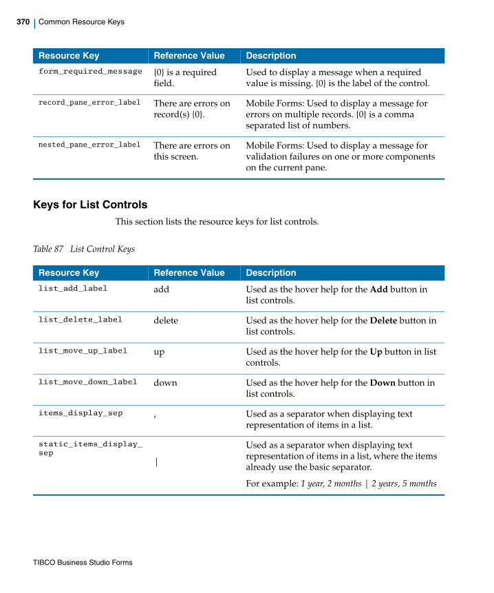
370 | Common Resource Keys
Keys for List ControlsThis section lists the resource keys for list controls.
Table 87 List Control Keys
form_required_message {0} is a required field.
Used to display a message when a required value is missing. {0} is the label of the control.
record_pane_error_label There are errors on record(s) {0}.
Mobile Forms: Used to display a message for errors on multiple records. {0} is a comma separated list of numbers.
nested_pane_error_label There are errors on this screen.
Mobile Forms: Used to display a message for validation failures on one or more components on the current pane.
Resource Key Reference Value Description
Resource Key Reference Value Description
list_add_label add Used as the hover help for the Add button in list controls.
list_delete_label delete Used as the hover help for the Delete button in list controls.
list_move_up_label up Used as the hover help for the Up button in list controls.
list_move_down_label down Used as the hover help for the Down button in list controls.
items_display_sep , Used as a separator when displaying text representation of items in a list.
static_items_display_sep
|
Used as a separator when displaying text representation of items in a list, where the items already use the basic separator.
For example: 1 year, 2 months | 2 years, 5 months
TIBCO Business Studio Forms
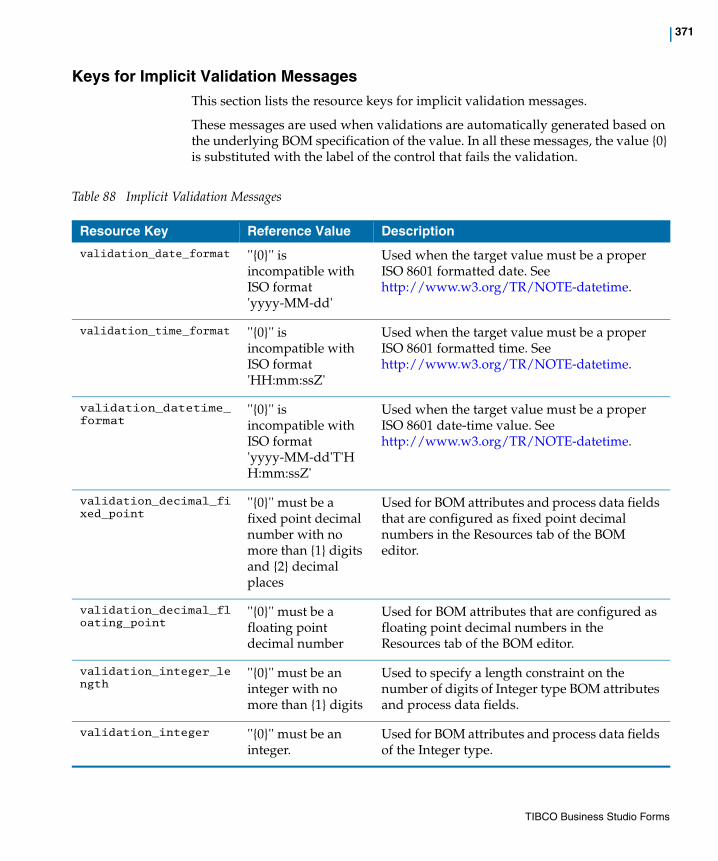
| 371
Keys for Implicit Validation MessagesThis section lists the resource keys for implicit validation messages.
These messages are used when validations are automatically generated based on the underlying BOM specification of the value. In all these messages, the value {0} is substituted with the label of the control that fails the validation.
Table 88 Implicit Validation Messages
Resource Key Reference Value Description
validation_date_format ''{0}'' is incompatible with ISO format 'yyyy-MM-dd'
Used when the target value must be a proper ISO 8601 formatted date. See http://www.w3.org/TR/NOTE-datetime.
validation_time_format ''{0}'' is incompatible with ISO format 'HH:mm:ssZ'
Used when the target value must be a proper ISO 8601 formatted time. See http://www.w3.org/TR/NOTE-datetime.
validation_datetime_format
''{0}'' is incompatible with ISO format 'yyyy-MM-dd'T'HH:mm:ssZ'
Used when the target value must be a proper ISO 8601 date-time value. See http://www.w3.org/TR/NOTE-datetime.
validation_decimal_fixed_point
''{0}'' must be a fixed point decimal number with no more than {1} digits and {2} decimal places
Used for BOM attributes and process data fields that are configured as fixed point decimal numbers in the Resources tab of the BOM editor.
validation_decimal_floating_point
''{0}'' must be a floating point decimal number
Used for BOM attributes that are configured as floating point decimal numbers in the Resources tab of the BOM editor.
validation_integer_length
''{0}'' must be an integer with no more than {1} digits
Used to specify a length constraint on the number of digits of Integer type BOM attributes and process data fields.
validation_integer ''{0}'' must be an integer.
Used for BOM attributes and process data fields of the Integer type.
TIBCO Business Studio Forms

372 | Common Resource Keys
validation_text_length ''{0}'' must be a value with no more than {1} characters
Used for BOM attributes of the Text type that have a length constraint.
validation_lower_limit_inclusive
''{0}'' must be a number greater than or equal to {1}
Used for numbers that have a lower limit specified (including the limit value).
validation_lower_limit ''{0}'' must be a number greater than {1}
Used for numbers that have a lower limit specified (excluding the limit value).
validation_upper_limit_inclusive
''{0}'' must be a number less than or equal to {1}
Used for numbers that have an upper limit specified (including the limit value).
validation_upper_limit ''{0}' must be a number less than {1}
Used for numbers that have a lower limit specified (excluding the limit value).
validation_multiplicity_maximum
''{0}'' must contain at most {1} values
Used when an upper limit is specified for child multiplicity.
For example: 0..5
validation_multiplicity_exact
''{0}'' must contain exactly {1} values
Used when an exact number is specified for child multiplicity, and the number is greater than 1.
For example: 3
validation_multiplicity_minimum
''{0}'' must contain at least {1} value(s)
Used when only lower limit is specified for child multiplicity, without an upper limit.
For example: 1..* or 3..*
validation_multiplicity_range
''{0}'' must contain between {1} and {2} values
Used when an exact multiplicity range is specified with both a lower and an upper limit. Both the numbers must be non-zero and the upper limit must be greater than the lower limit.
For example: 1..5 or 2..4
validation_numeric ''{0}'' must be a number
Used for BOM attributes and process data fields of the Integer or Decimal type.
Resource Key Reference Value Description
TIBCO Business Studio Forms
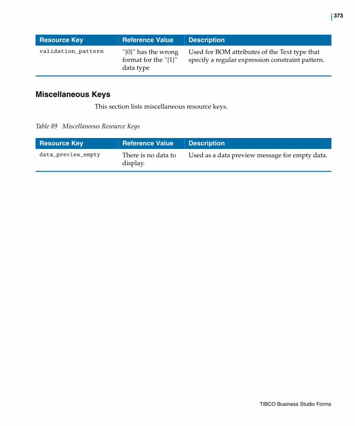
| 373
Miscellaneous KeysThis section lists miscellaneous resource keys.
Table 89 Miscellaneous Resource Keys
validation_pattern ''{0}'' has the wrong format for the ''{1}'' data type
Used for BOM attributes of the Text type that specify a regular expression constraint pattern.
Resource Key Reference Value Description
Resource Key Reference Value Description
data_preview_empty There is no data to display.
Used as a data preview message for empty data.
TIBCO Business Studio Forms

374 | Design-time Constraints
Design-time Constraints
The Validation Builder applies the following categories of rules to all form models:
• Core
• General
• Resources
• JavaScript
• Forms Synchronization
• Components
• GWT/Mobile
You can change the configuration of these issues from the Errors/Warnings page in the Form Designer on the Preferences dialog. For more information, see Form Builder and Form Validation on page 75.
TIBCO Business Studio Forms

| 375
Client-side Validations
A component is validated depending on how you configure validations:
— on value change
— on form submission
The following table specifies how validations occur based on the configuration:
If you configure a validation on form submission, it occurs when the user submits the form, or when the validate(true) API is called on the component, or parent pane, or the form.
If a validation configured on form submission fails for a component, the runtime invokes all the validations of that component on its value change until all the validations pass again. In such a case, it does not consider if the validation is configured on form submission or on value change. The validation messages displayed for controls as the result of a failed form submission disappear after the user provides a valid value.
Runtime Constraints On Value Change On Form Close On Form Submit
BOM Constraint
User-defined
(On Value Change)
User-defined
(On Form Submit)
Required
TIBCO Business Studio Forms
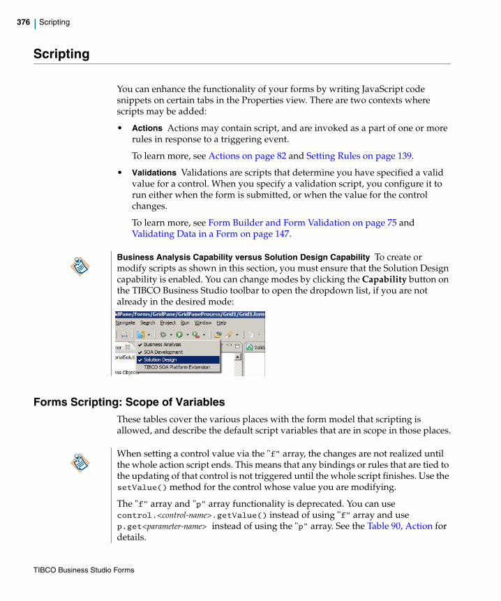
376 | Scripting
Scripting
You can enhance the functionality of your forms by writing JavaScript code snippets on certain tabs in the Properties view. There are two contexts where scripts may be added:
• Actions Actions may contain script, and are invoked as a part of one or more rules in response to a triggering event.
To learn more, see Actions on page 82 and Setting Rules on page 139.
• Validations Validations are scripts that determine you have specified a valid value for a control. When you specify a validation script, you configure it to run either when the form is submitted, or when the value for the control changes.
To learn more, see Form Builder and Form Validation on page 75 and Validating Data in a Form on page 147.
Forms Scripting: Scope of VariablesThese tables cover the various places with the form model that scripting is allowed, and describe the default script variables that are in scope in those places.
Business Analysis Capability versus Solution Design Capability To create or modify scripts as shown in this section, you must ensure that the Solution Design capability is enabled. You can change modes by clicking the Capability button on the TIBCO Business Studio toolbar to open the dropdown list, if you are not already in the desired mode:
When setting a control value via the "f" array, the changes are not realized until the whole action script ends. This means that any bindings or rules that are tied to the updating of that control is not triggered until the whole script finishes. Use the setValue() method for the control whose value you are modifying.
The "f" array and "p" array functionality is deprecated. You can use control.<control-name>.getValue() instead of using "f" array and use p.get<parameter-name> instead of using the "p" array. See the Table 90, Action for details.
TIBCO Business Studio Forms

| 377
Table 90 Action
Variable Description
context read-only. This is a data structure that provides access to the context under which the action is invoked. There are 6 fields available within this variable:
• context.control: The control object that was the source of the event that triggered the rule. If the source was not a control, then this field is null.
• context.form: The form object where the event originated.
• context.oldValue: Provides the old value if this is a control or parameter update event.
• context.newValue: Provides the new value if this is a control or parameter update event.
• context.pane: The pane object that was the source of the event that triggered the rule. If the source was not a pane, then this field is null.
• context.record: This field is provided within the computation actions where the destination control or pane is under a collection pane (grid or record pane). The record corresponds to the object in the destination control's (or pane's) parent pane value. For example, when you are computing the value of a control at the 6th row of a grid pane, the record points to the complex object at index 5 of the grid pane value. This field can also be used within validations.
control Use control.<control-name> to access any control defined within the form.
data Use data.get<param-name> to access the values of form parameters or data fields. This method returns either a primitive value for simple types such as Text and Boolean, or instances of objects when the type is defined in a BOM. For primitive types, data.set<param-name> is also available.
factory Use factory.<package-name> to access factories based on packages defined within the business object models available to the form. These factories allow you to create new instances of classes defined in that package.
pane Use pane.<pane-name> to access any pane defined within the form.
pkg Use pkg.<package-name> to access package objects based on packages defined within the business object models available to the form. The package object allows you access definitions of Enumerations defined within the package.
TIBCO Business Studio Forms
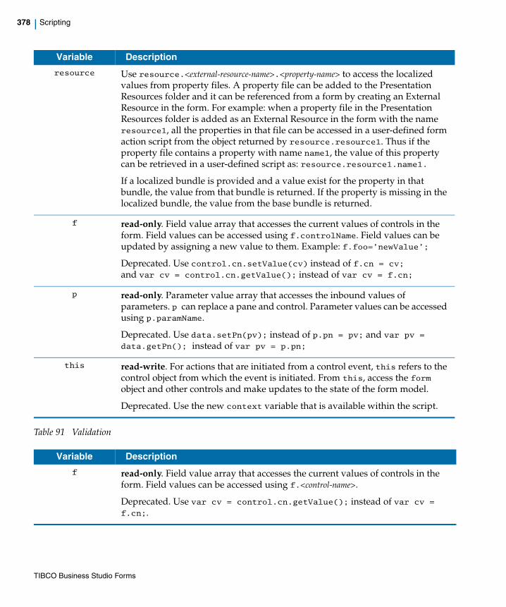
378 | Scripting
Table 91 Validation
resource Use resource.<external-resource-name>.<property-name> to access the localized values from property files. A property file can be added to the Presentation Resources folder and it can be referenced from a form by creating an External Resource in the form. For example: when a property file in the Presentation Resources folder is added as an External Resource in the form with the name resource1, all the properties in that file can be accessed in a user-defined form action script from the object returned by resource.resource1. Thus if the property file contains a property with name name1, the value of this property can be retrieved in a user-defined script as: resource.resource1.name1.
If a localized bundle is provided and a value exist for the property in that bundle, the value from that bundle is returned. If the property is missing in the localized bundle, the value from the base bundle is returned.
f read-only. Field value array that accesses the current values of controls in the form. Field values can be accessed using f.controlName. Field values can be updated by assigning a new value to them. Example: f.foo=’newValue’;
Deprecated. Use control.cn.setValue(cv) instead of f.cn = cv;
and var cv = control.cn.getValue(); instead of var cv = f.cn;
p read-only. Parameter value array that accesses the inbound values of parameters. p can replace a pane and control. Parameter values can be accessed using p.paramName.
Deprecated. Use data.setPn(pv); instead of p.pn = pv; and var pv = data.getPn(); instead of var pv = p.pn;
this read-write. For actions that are initiated from a control event, this refers to the control object from which the event is initiated. From this, access the form object and other controls and make updates to the state of the form model.
Deprecated. Use the new context variable that is available within the script.
Variable Description
f read-only. Field value array that accesses the current values of controls in the form. Field values can be accessed using f.<control-name>.
Deprecated. Use var cv = control.cn.getValue(); instead of var cv = f.cn;.
Variable Description
TIBCO Business Studio Forms

| 379
Forms Scripting: Order of Script Execution
The scripts specified in the form model are executed in the following order during the different form life-cycle events.
When the Form is opened
• Form Open event is published.
When the Submit button is clicked
1. Control validation scripts are executed.
2. Form Submit event is published.
3. Form Close event is published.
When the Close button is clicked
• Form Close event is published.
this read-only. Refers to the control object upon which the validation is configured. From this, access the form object and other controls, although no updates to the form model are allowed within a form validation script.
Deprecated. Use context.value to get the value of the control being validated.
context read-only. Within the scope of a validation script, the context variable supports only the following field:
context.value: This is equal to the value of the control being validated. If the control is multi-valued, such as a text control with the list setting enabled, then the validation is run once for each value in the list.
resource User-defined validation scripts can retrieve localized values from property files using the resource variable. The resource details provided in Table 90, Action are also applicable for validation scripts.
Variable Description
Errors in user-provided scripts are caught and logged at the error level at runtime and shown in the preview page logging area in the Form Designer.
TIBCO Business Studio Forms
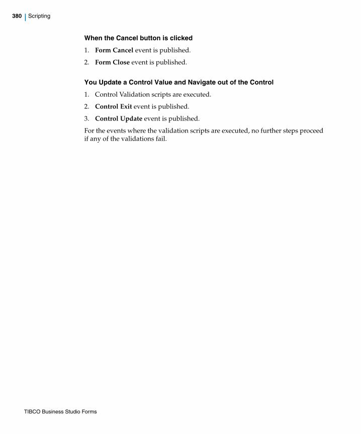
380 | Scripting
When the Cancel button is clicked
1. Form Cancel event is published.
2. Form Close event is published.
You Update a Control Value and Navigate out of the Control
1. Control Validation scripts are executed.
2. Control Exit event is published.
3. Control Update event is published.
For the events where the validation scripts are executed, no further steps proceed if any of the validations fail.
TIBCO Business Studio Forms

| 381
API for Scripting
This section describes API methods that can be used in your JavaScript scripts for accessing the form model at runtime.
MethodsThe following tables describe the API for scripting.
Table 92 FormRunner Class
The API described here can be used for writing validations as well as actions. Updating form fields or their properties using set methods is allowed only in the context of actions. Validation scripts cannot modify the fields or their properties.
Method Return Value Description
renderStaticView() Void Renders a tree representation of the data provided in the InitialData parameter.
The API has following parameters:
• initialData: specifies the JSON representation of the initial data that are provided to the form.
• bomJSPath: specifies the root folder path used for loading the BOM JavaScript files used by the form.
For example: http://10.97.110.17:8080/bpmresources/1.0.0.201107291435
• locale: specifies the locale to be used in the runtime form with the <lc>[_<CC>] format, where [] denotes optionality.
For example: "en_US". The locale needs to be represented such that <lc> is a valid two-character lower case ISO-639 language code, and, if present, the optional <CC> is a valid two-character upper case ISO-3166 country code. Both '_' and '-' are supported as delimiters.
• parentNodeId: specifies the DOM identifier of the node to which the form must be added. The value cannot be null.
TIBCO Business Studio Forms
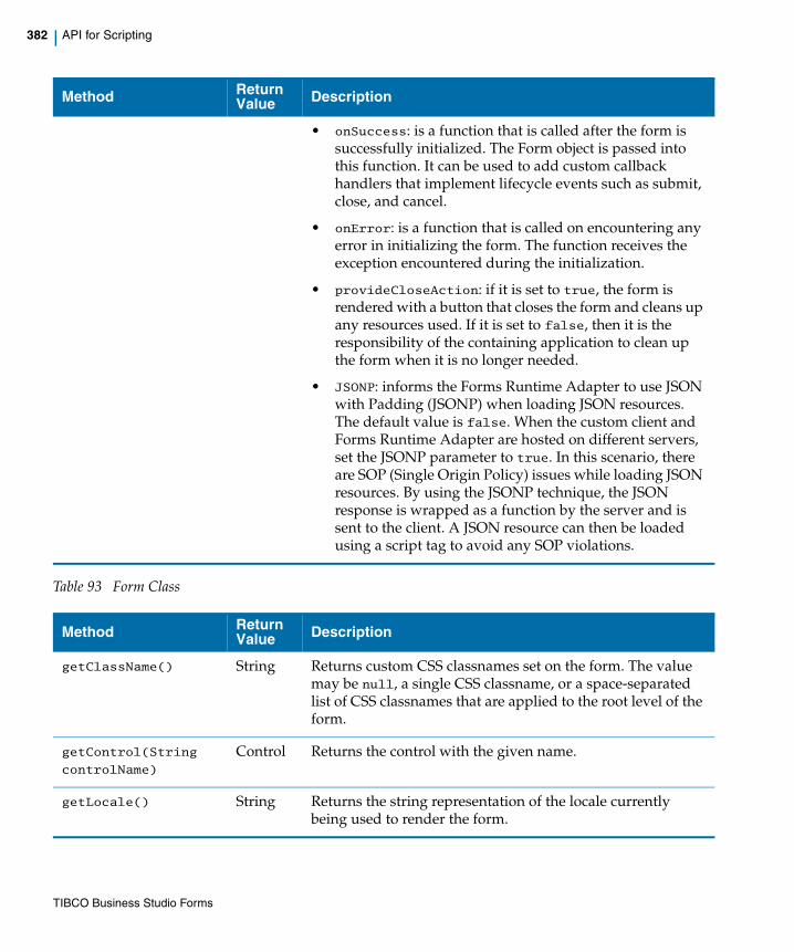
382 | API for Scripting
Table 93 Form Class
• onSuccess: is a function that is called after the form is successfully initialized. The Form object is passed into this function. It can be used to add custom callback handlers that implement lifecycle events such as submit, close, and cancel.
• onError: is a function that is called on encountering any error in initializing the form. The function receives the exception encountered during the initialization.
• provideCloseAction: if it is set to true, the form is rendered with a button that closes the form and cleans up any resources used. If it is set to false, then it is the responsibility of the containing application to clean up the form when it is no longer needed.
• JSONP: informs the Forms Runtime Adapter to use JSON with Padding (JSONP) when loading JSON resources. The default value is false. When the custom client and Forms Runtime Adapter are hosted on different servers, set the JSONP parameter to true. In this scenario, there are SOP (Single Origin Policy) issues while loading JSON resources. By using the JSONP technique, the JSON response is wrapped as a function by the server and is sent to the client. A JSON resource can then be loaded using a script tag to avoid any SOP violations.
Method Return Value Description
getClassName() String Returns custom CSS classnames set on the form. The value may be null, a single CSS classname, or a space-separated list of CSS classnames that are applied to the root level of the form.
getControl(String
controlName)
Control Returns the control with the given name.
getLocale() String Returns the string representation of the locale currently being used to render the form.
Method Return Value Description
TIBCO Business Studio Forms
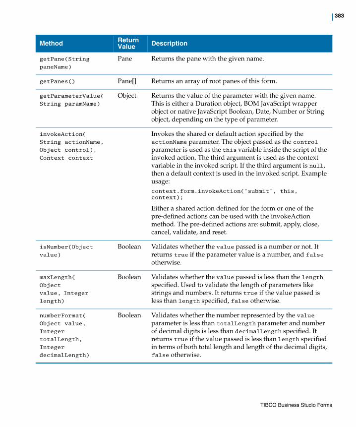
| 383
getPane(String
paneName)
Pane Returns the pane with the given name.
getPanes() Pane[] Returns an array of root panes of this form.
getParameterValue(
String paramName)
Object Returns the value of the parameter with the given name. This is either a Duration object, BOM JavaScript wrapper object or native JavaScript Boolean, Date, Number or String object, depending on the type of parameter.
invokeAction(
String actionName,
Object control),
Context context
Invokes the shared or default action specified by the actionName parameter. The object passed as the control parameter is used as the this variable inside the script of the invoked action. The third argument is used as the context variable in the invoked script. If the third argument is null, then a default context is used in the invoked script. Example usage:context.form.invokeAction(’submit’, this, context);
Either a shared action defined for the form or one of the pre-defined actions can be used with the invokeAction method. The pre-defined actions are: submit, apply, close, cancel, validate, and reset.
isNumber(Object
value)
Boolean Validates whether the value passed is a number or not. It returns true if the parameter value is a number, and false otherwise.
maxLength(
Object
value, Integer
length)
Boolean Validates whether the value passed is less than the length specified. Used to validate the length of parameters like strings and numbers. It returns true if the value passed is less than length specified, false otherwise.
numberFormat(
Object value,
Integer
totalLength,
Integer
decimalLength)
Boolean Validates whether the number represented by the value parameter is less than totalLength parameter and number of decimal digits is less than decimalLength specified. It returns true if the value passed is less than length specified in terms of both total length and length of the decimal digits, false otherwise.
Method Return Value Description
TIBCO Business Studio Forms
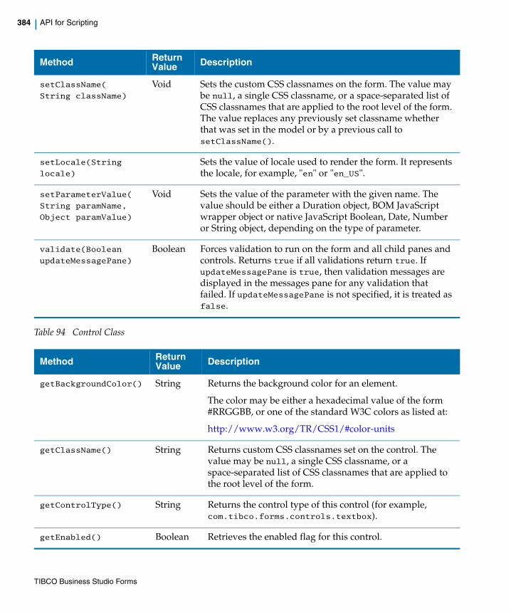
384 | API for Scripting
Table 94 Control Class
setClassName(
String className)
Void Sets the custom CSS classnames on the form. The value may be null, a single CSS classname, or a space-separated list of CSS classnames that are applied to the root level of the form. The value replaces any previously set classname whether that was set in the model or by a previous call to setClassName().
setLocale(String
locale)
Sets the value of locale used to render the form. It represents the locale, for example, "en" or "en_US".
setParameterValue(
String paramName,
Object paramValue)
Void Sets the value of the parameter with the given name. The value should be either a Duration object, BOM JavaScript wrapper object or native JavaScript Boolean, Date, Number or String object, depending on the type of parameter.
validate(Boolean
updateMessagePane)
Boolean Forces validation to run on the form and all child panes and controls. Returns true if all validations return true. If updateMessagePane is true, then validation messages are displayed in the messages pane for any validation that failed. If updateMessagePane is not specified, it is treated as false.
Method Return Value Description
getBackgroundColor() String Returns the background color for an element.
The color may be either a hexadecimal value of the form #RRGGBB, or one of the standard W3C colors as listed at:
http://www.w3.org/TR/CSS1/#color-units
getClassName() String Returns custom CSS classnames set on the control. The value may be null, a single CSS classname, or a space-separated list of CSS classnames that are applied to the root level of the form.
getControlType() String Returns the control type of this control (for example, com.tibco.forms.controls.textbox).
getEnabled() Boolean Retrieves the enabled flag for this control.
Method Return Value Description
TIBCO Business Studio Forms
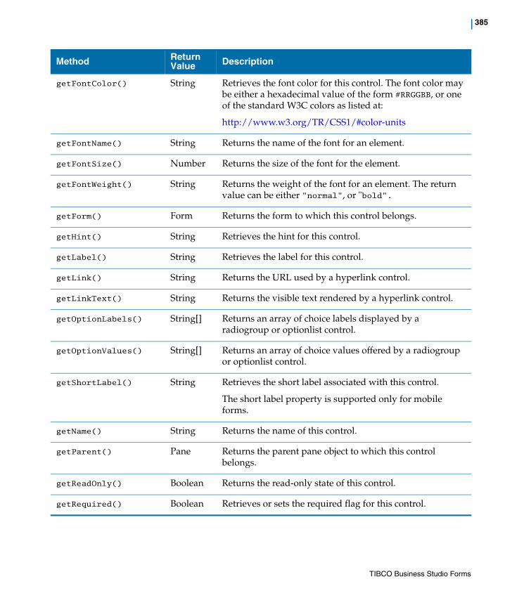
| 385
getFontColor() String Retrieves the font color for this control. The font color may be either a hexadecimal value of the form #RRGGBB, or one of the standard W3C colors as listed at:
http://www.w3.org/TR/CSS1/#color-units
getFontName() String Returns the name of the font for an element.
getFontSize() Number Returns the size of the font for the element.
getFontWeight() String Returns the weight of the font for an element. The return value can be either "normal", or "bold".
getForm() Form Returns the form to which this control belongs.
getHint() String Retrieves the hint for this control.
getLabel() String Retrieves the label for this control.
getLink() String Returns the URL used by a hyperlink control.
getLinkText() String Returns the visible text rendered by a hyperlink control.
getOptionLabels() String[] Returns an array of choice labels displayed by a radiogroup or optionlist control.
getOptionValues() String[] Returns an array of choice values offered by a radiogroup or optionlist control.
getShortLabel() String Retrieves the short label associated with this control.
The short label property is supported only for mobile forms.
getName() String Returns the name of this control.
getParent() Pane Returns the parent pane object to which this control belongs.
getReadOnly() Boolean Returns the read-only state of this control.
getRequired() Boolean Retrieves or sets the required flag for this control.
Method Return Value Description
TIBCO Business Studio Forms
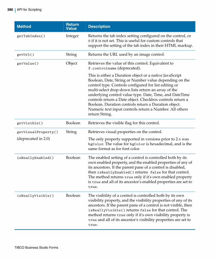
386 | API for Scripting
getTabIndex() Integer Returns the tab index setting configured on the control, or 0 if it is not set. This is useful for custom controls that support the setting of the tab index in their HTML markup.
getUrl() String Returns the URL used by an image control.
getValue() Object Retrieves the value of this control. Equivalent to f.controlname (deprecated).
This is either a Duration object or a native JavaScript Boolean, Date, String or Number value depending on the control type. Controls configured for list editing or multi-select drop-down lists return an array of the underlying control value type. Date, Time, and DateTime controls return a Date object. Checkbox controls return a Boolean. Duration controls return a Duration object. Numeric text input controls return a Number. All others return String.
getVisible() Boolean Retrieves the visible flag for this control.
getVisualProperty()
(deprecated in 2.0)
String Retrieves visual properties on the control.
The only property supported in versions prior to 2.x was bgColor. The value for bgColor is hexadecimal, and is the same format as for font color.
isReallyEnabled() Boolean The enabled setting of a control is controlled both by its own enabled property, and the enabled properties of any of its ancestors. If the parent pane of a control is disabled, then isReallyEnabled() returns false for that control. The method returns true only if it's own enabled property is true and all of its ancestor's enabled properties are set to true.
isReallyVisible() Boolean The visibility of a control is controlled both by its own visibility property, and the visibility properties of any of its ancestors. If the parent pane of a control is not visible, then isReallyVisible() returns false for that control. The method returns true only if it's own visibility property is true and all of its ancestor's visibility properties are set to true.
Method Return Value Description
TIBCO Business Studio Forms
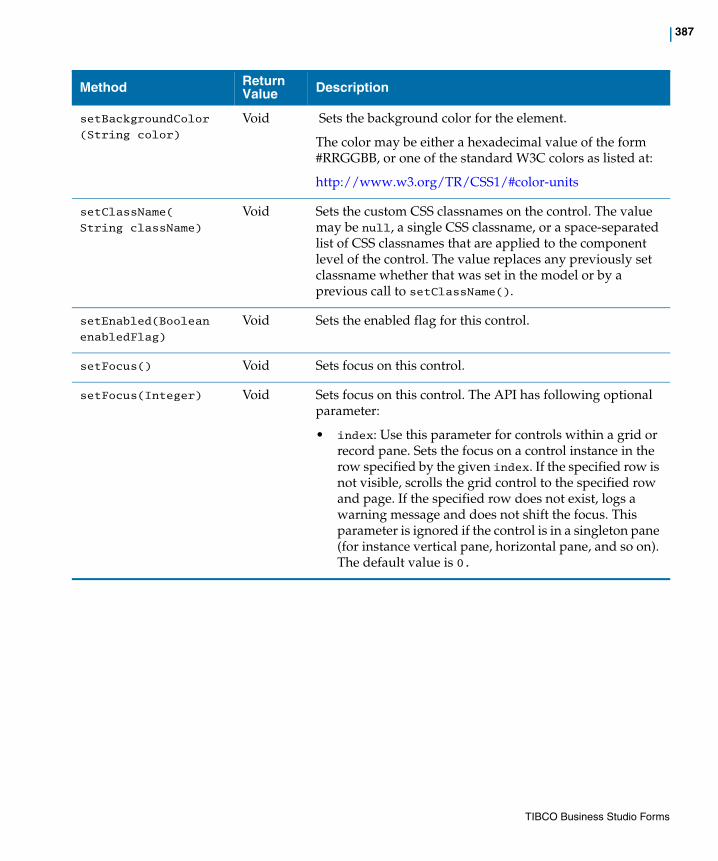
| 387
setBackgroundColor
(String color)
Void Sets the background color for the element.
The color may be either a hexadecimal value of the form #RRGGBB, or one of the standard W3C colors as listed at:
http://www.w3.org/TR/CSS1/#color-units
setClassName(
String className)
Void Sets the custom CSS classnames on the control. The value may be null, a single CSS classname, or a space-separated list of CSS classnames that are applied to the component level of the control. The value replaces any previously set classname whether that was set in the model or by a previous call to setClassName().
setEnabled(Boolean
enabledFlag)
Void Sets the enabled flag for this control.
setFocus() Void Sets focus on this control.
setFocus(Integer) Void Sets focus on this control. The API has following optional parameter:
• index: Use this parameter for controls within a grid or record pane. Sets the focus on a control instance in the row specified by the given index. If the specified row is not visible, scrolls the grid control to the specified row and page. If the specified row does not exist, logs a warning message and does not shift the focus. This parameter is ignored if the control is in a singleton pane (for instance vertical pane, horizontal pane, and so on). The default value is 0.
Method Return Value Description
TIBCO Business Studio Forms
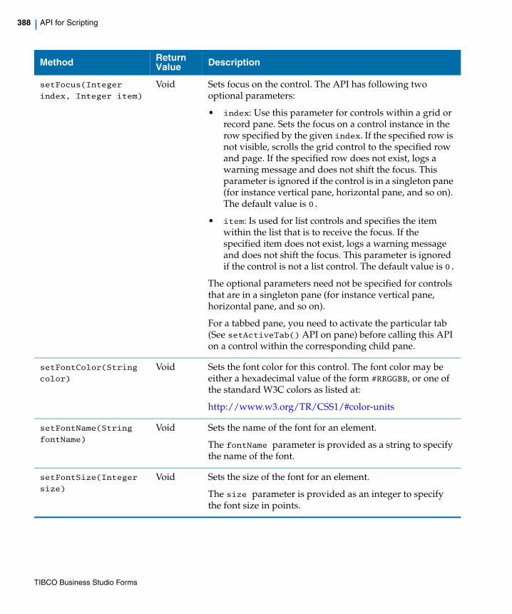
388 | API for Scripting
setFocus(Integer
index, Integer item)
Void Sets focus on the control. The API has following two optional parameters:
• index: Use this parameter for controls within a grid or record pane. Sets the focus on a control instance in the row specified by the given index. If the specified row is not visible, scrolls the grid control to the specified row and page. If the specified row does not exist, logs a warning message and does not shift the focus. This parameter is ignored if the control is in a singleton pane (for instance vertical pane, horizontal pane, and so on). The default value is 0.
• item: Is used for list controls and specifies the item within the list that is to receive the focus. If the specified item does not exist, logs a warning message and does not shift the focus. This parameter is ignored if the control is not a list control. The default value is 0.
The optional parameters need not be specified for controls that are in a singleton pane (for instance vertical pane, horizontal pane, and so on).
For a tabbed pane, you need to activate the particular tab (See setActiveTab() API on pane) before calling this API on a control within the corresponding child pane.
setFontColor(String
color)
Void Sets the font color for this control. The font color may be either a hexadecimal value of the form #RRGGBB, or one of the standard W3C colors as listed at:
http://www.w3.org/TR/CSS1/#color-units
setFontName(String
fontName)
Void Sets the name of the font for an element.
The fontName parameter is provided as a string to specify the name of the font.
setFontSize(Integer
size)
Void Sets the size of the font for an element.
The size parameter is provided as an integer to specify the font size in points.
Method Return Value Description
TIBCO Business Studio Forms
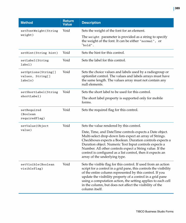
| 389
setFontWeight(String
weight)
Void Sets the weight of the font for an element.
The weight parameter is provided as a string to specify the weight of the font. It can be either "normal", or "bold".
setHint(String hint) Void Sets the hint for this control.
setLabel(String
label)
Void Sets the label for this control.
setOptions(String[]
values, String[]
labels)
Void Sets the choice values and labels used by a radiogroup or optionlist control. The values and labels arrays must have the same length. The values array must not contain any null elements.
setShortLabel(String
shortLabel)
Void Sets the short label to be used for this control.
The short label property is supported only for mobile forms.
setRequired
(Boolean
requiredFlag)
Void Sets the required flag for this control.
setValue(Object
value)
Void Sets the value rendered by this control.
Date, Time, and DateTime controls expects a Date object. Multi-select drop-down lists expect an array of Strings. Checkboxes expects a Boolean. Duration controls expects a Duration object. Numeric Text Input controls expects a Number. All other controls expect a String value. If the control is configured as a list control, then it expects an array of the underlying type.
setVisible(Boolean
visibleFlag)
Void Sets the visible flag for this control. If used from an action script for a control in a grid pane, this controls the visibility of the entire column represented by this control. If you update the visibility property of a control in a grid pane using a computation action, the setting applies to each cell in the column, but does not affect the visibility of the column itself.
Method Return Value Description
TIBCO Business Studio Forms
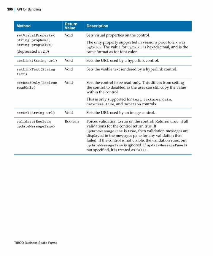
390 | API for Scripting
setVisualProperty(
String propName,
String propValue)
(deprecated in 2.0)
Void Sets visual properties on the control.
The only property supported in versions prior to 2.x was bgColor. The value for bgColor is hexadecimal, and is the same format as for font color.
setLink(String url) Void Sets the URL used by a hyperlink control.
setLinkText(String
text)
Void Sets the visible text rendered by a hyperlink control.
setReadOnly(Boolean
readOnly)
Void Sets the control to be read-only. This differs from setting the control to disabled as the user can still copy the value within the control.
This is only supported for text, textarea, date, datetime, time, and duration controls.
setUrl(String url) Void Sets the URL used by an image control.
validate(Boolean
updateMessagePane)
Boolean Forces validation to run on the control. Returns true if all validations for the control return true. If updateMessagePane is true, then validation messages are displayed in the messages pane for any validation that failed. If the control is not visible, the validation runs, but updateMessagePane is ignored. If updateMessagePane is not specified, it is treated as false.
Method Return Value Description
TIBCO Business Studio Forms
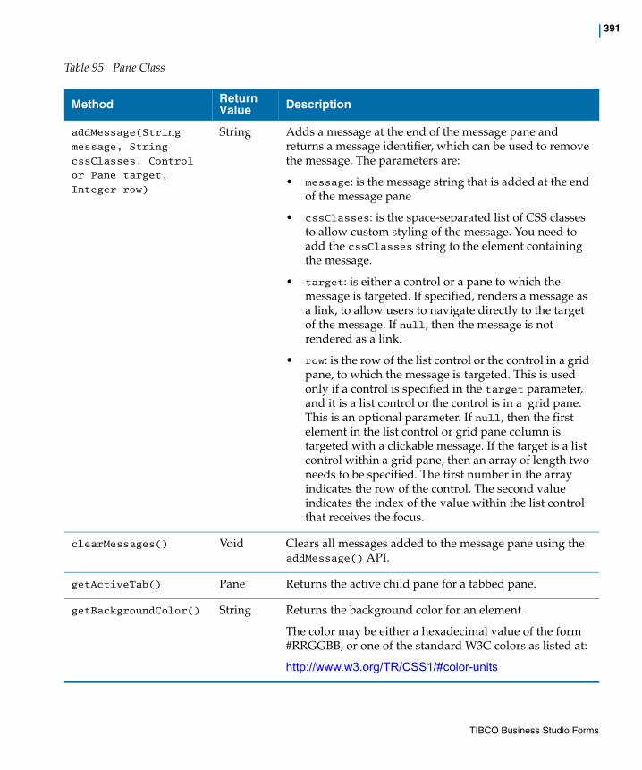
| 391
Table 95 Pane Class
Method Return Value Description
addMessage(String
message, String
cssClasses, Control
or Pane target,
Integer row)
String Adds a message at the end of the message pane and returns a message identifier, which can be used to remove the message. The parameters are:
• message: is the message string that is added at the end of the message pane
• cssClasses: is the space-separated list of CSS classes to allow custom styling of the message. You need to add the cssClasses string to the element containing the message.
• target: is either a control or a pane to which the message is targeted. If specified, renders a message as a link, to allow users to navigate directly to the target of the message. If null, then the message is not rendered as a link.
• row: is the row of the list control or the control in a grid pane, to which the message is targeted. This is used only if a control is specified in the target parameter, and it is a list control or the control is in a grid pane. This is an optional parameter. If null, then the first element in the list control or grid pane column is targeted with a clickable message. If the target is a list control within a grid pane, then an array of length two needs to be specified. The first number in the array indicates the row of the control. The second value indicates the index of the value within the list control that receives the focus.
clearMessages() Void Clears all messages added to the message pane using the addMessage() API.
getActiveTab() Pane Returns the active child pane for a tabbed pane.
getBackgroundColor() String Returns the background color for an element.
The color may be either a hexadecimal value of the form #RRGGBB, or one of the standard W3C colors as listed at:
http://www.w3.org/TR/CSS1/#color-units
TIBCO Business Studio Forms

392 | API for Scripting
getControls() Control[] Returns an array of controls that are direct children of this pane.
getEnabled() Boolean Retrieves the enabled flag for this pane.
getFontColor() String Retrieves the font color for this pane. The font color may be either a hexadecimal value of the form #RRGGBB, or one of the standard W3C colors as listed at:
http://www.w3.org/TR/CSS1/#color-units
getFontName() String Returns the name of the font for an element.
getFontSize() Number Returns the size of the font for the element.
getFontWeight() String Returns the weight of the font for an element. The return value can be either "normal", or "bold".
getForm() Form Returns the form object to which this pane belongs.
getLabel() String Retrieves the label for this pane.
getName() String Returns the name of the pane.
getPanes() Pane[] Returns an array of panes that are direct children of this pane.
getPaneType() String Returns the pane type of this pane (for example, "com.tibco.forms.panes.vertical").
getParent() Pane or Form
Returns the parent pane or form object to which this pane belongs.
getSelection() List or Object
Returns the object currently selected in the grid or record pane. If the grid supports multiple selections, then this is a list that contains the selected records.
getValue() List or Object
For grid and record panes returns a list. Returns null or a complex object value for other pane types.
getVisible() Boolean Retrieves the visible flag for this pane.
Method Return Value Description
TIBCO Business Studio Forms
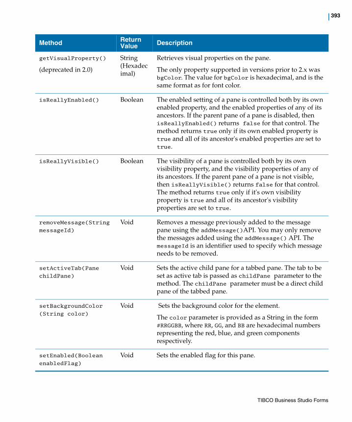
| 393
getVisualProperty()
(deprecated in 2.0)
String(Hexadecimal)
Retrieves visual properties on the pane.
The only property supported in versions prior to 2.x was bgColor. The value for bgColor is hexadecimal, and is the same format as for font color.
isReallyEnabled() Boolean The enabled setting of a pane is controlled both by its own enabled property, and the enabled properties of any of its ancestors. If the parent pane of a pane is disabled, then isReallyEnabled() returns false for that control. The method returns true only if its own enabled property is true and all of its ancestor's enabled properties are set to true.
isReallyVisible() Boolean The visibility of a pane is controlled both by its own visibility property, and the visibility properties of any of its ancestors. If the parent pane of a pane is not visible, then isReallyVisible() returns false for that control. The method returns true only if it's own visibility property is true and all of its ancestor's visibility properties are set to true.
removeMessage(String
messageId)
Void Removes a message previously added to the message pane using the addMessage()API. You may only remove the messages added using the addMessage() API. The messageId is an identifier used to specify which message needs to be removed.
setActiveTab(Pane
childPane)
Void Sets the active child pane for a tabbed pane. The tab to be set as active tab is passed as childPane parameter to the method. The childPane parameter must be a direct child pane of the tabbed pane.
setBackgroundColor
(String color)
Void Sets the background color for the element.
The color parameter is provided as a String in the form #RRGGBB, where RR, GG, and BB are hexadecimal numbers representing the red, blue, and green components respectively.
setEnabled(Boolean
enabledFlag)
Void Sets the enabled flag for this pane.
Method Return Value Description
TIBCO Business Studio Forms

394 | API for Scripting
setFontColor(String
color)
Void Sets the font color for this pane. The font color may be either a hexadecimal value of the form #RRGGBB, or one of the standard W3C colors as listed at:
http://www.w3.org/TR/CSS1/#color-units
setFontName(String
fontName)
Void Sets the name of the font for an element.
The fontName parameter is provided as a string to specify the name of the font.
setFontSize(Integer
size)
Void Sets the size of the font for an element.
The size parameter is provided as an integer to specify the font size in points.
setFontWeight(String
weight)
Void Sets the weight of the font for an element.
The weight parameter is provided as a string to specify the weight of the font. It can be either "normal", or "bold."
setLabel(String
label)
Void Sets the label for this pane.
setSelection(
List selection |
Object selection)
Void Valid only for grid and record panes. Sets the selected row or record of the pane to the object passed into the method. Passing null or an empty list clears the selection. If the selection is not present in the list managed by the pane, then this has no effect.
setValue(
List value |
Object value)
Void Sets the value bound to the pane. For grid panes and record panes, this is a list of objects that represents either the rows or records represented by the panes. Other pane types pass a single value.
setVisible(Boolean
visibleFlag)
Void Sets the visible flag for this pane.
setVisualProperty(
String propName,
String propValue)
(deprecated in 2.0)
Void Sets visual properties on the pane.
The only property supported in versions prior to 2.x was bgColor. The value for bgColor is hexadecimal, and is the same format as for font color.
Method Return Value Description
TIBCO Business Studio Forms

| 395
Table 96 List Class
validate(Boolean
updateMessagePane)
Boolean Forces validation to run on the pane and all child panes and controls. Returns true if all validations return true. If updateMessagePane is true, then validation messages are displayed in the messages pane for any validation that failed. If updateMessagePane is not specified, it is treated as false
Method Return Value Description
add(Object element) Boolean Adds the specified element to the end of the list. If the element already exists on the list, an exception is thrown.
add(Integer Index,
Object element)
Void Inserts the element at the specified index. If the element already exists on the list or if the index is out of range, an exception is thrown.
clear() Void Removes all the elements from the list.
contains(Object
element)
Boolean Returns true if the specified element is part of the list, and false otherwise.
get(Integer index) Object Returns the element at the given index.
isEmpty() Boolean Returns true if there are no elements in the list, and false otherwise.
iterator() Iterator Returns an iterator over the elements in the list in proper sequence. This can be used to iterate over the items of the given list. The API methods supported by the Iterator class are listed in Table 98.
remove(Integer
index)
Boolean Removes the element at the specified index from the list. If the index is out of range, an exception is thrown.
remove(Object
element)
Boolean Removes the first occurrence of the specified element from the list, if it is present.
set(Integer index,
Object element)
Object Replaces the element at the specified index in the list with the new specified element. If the index is out of range, an exception is thrown.
Method Return Value Description
TIBCO Business Studio Forms
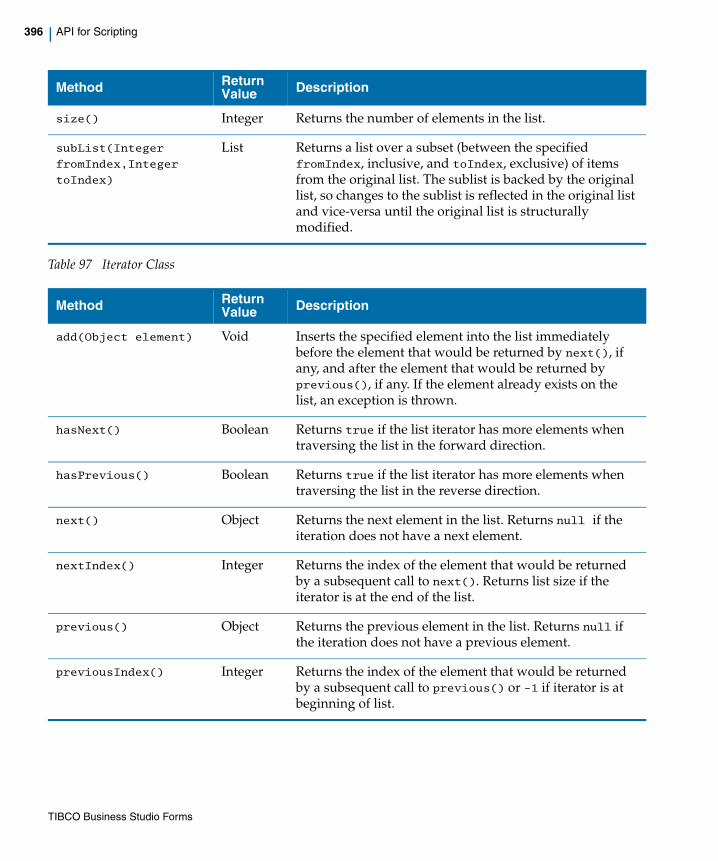
396 | API for Scripting
Table 97 Iterator Class
size() Integer Returns the number of elements in the list.
subList(Integer
fromIndex,Integer
toIndex)
List Returns a list over a subset (between the specified fromIndex, inclusive, and toIndex, exclusive) of items from the original list. The sublist is backed by the original list, so changes to the sublist is reflected in the original list and vice-versa until the original list is structurally modified.
Method Return Value Description
add(Object element) Void Inserts the specified element into the list immediately before the element that would be returned by next(), if any, and after the element that would be returned by previous(), if any. If the element already exists on the list, an exception is thrown.
hasNext() Boolean Returns true if the list iterator has more elements when traversing the list in the forward direction.
hasPrevious() Boolean Returns true if the list iterator has more elements when traversing the list in the reverse direction.
next() Object Returns the next element in the list. Returns null if the iteration does not have a next element.
nextIndex() Integer Returns the index of the element that would be returned by a subsequent call to next(). Returns list size if the iterator is at the end of the list.
previous() Object Returns the previous element in the list. Returns null if the iteration does not have a previous element.
previousIndex() Integer Returns the index of the element that would be returned by a subsequent call to previous() or -1 if iterator is at beginning of list.
Method Return Value Description
TIBCO Business Studio Forms
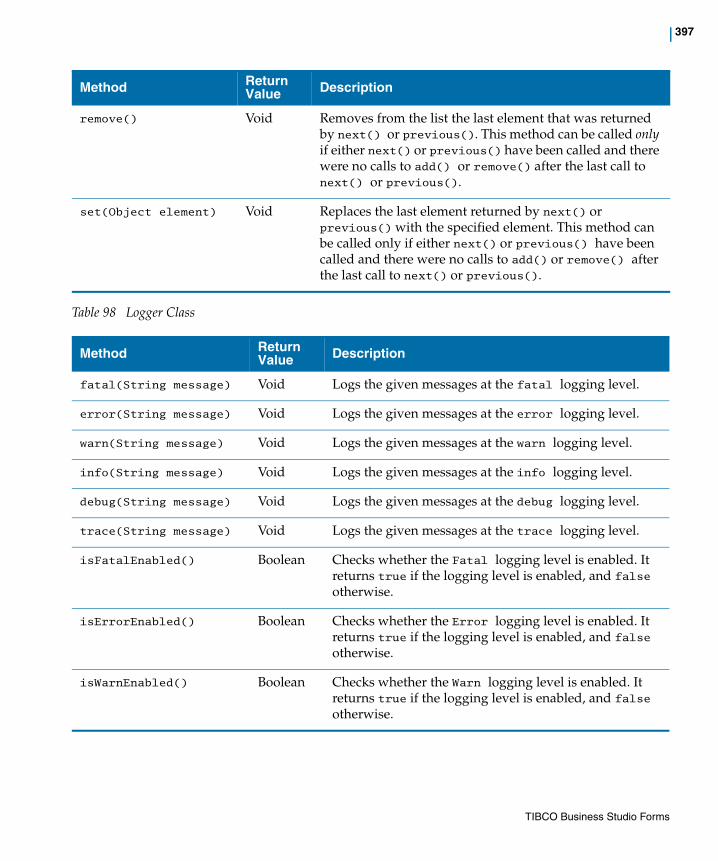
| 397
Table 98 Logger Class
remove() Void Removes from the list the last element that was returned by next() or previous(). This method can be called only if either next() or previous() have been called and there were no calls to add() or remove() after the last call to next() or previous().
set(Object element) Void Replaces the last element returned by next() or previous() with the specified element. This method can be called only if either next() or previous() have been called and there were no calls to add() or remove() after the last call to next() or previous().
Method Return Value Description
fatal(String message) Void Logs the given messages at the fatal logging level.
error(String message) Void Logs the given messages at the error logging level.
warn(String message) Void Logs the given messages at the warn logging level.
info(String message) Void Logs the given messages at the info logging level.
debug(String message) Void Logs the given messages at the debug logging level.
trace(String message) Void Logs the given messages at the trace logging level.
isFatalEnabled() Boolean Checks whether the Fatal logging level is enabled. It returns true if the logging level is enabled, and false otherwise.
isErrorEnabled() Boolean Checks whether the Error logging level is enabled. It returns true if the logging level is enabled, and false otherwise.
isWarnEnabled() Boolean Checks whether the Warn logging level is enabled. It returns true if the logging level is enabled, and false otherwise.
Method Return Value Description
TIBCO Business Studio Forms
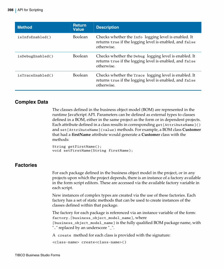
398 | API for Scripting
Complex DataThe classes defined in the business object model (BOM) are represented in the runtime JavaScript API. Parameters can be defined as external types to classes defined in a BOM, either in the same project as the form or in dependent projects. Each attribute defined in a class results in corresponding get[AttributeName]() and set[AttributeName](value) methods. For example, a BOM class Customer that had a firstName attribute would generate a Customer class with the methods:
String getFirstName();void setFirstName(String firstName);
FactoriesFor each package defined in the business object model in the project, or in any projects upon which the project depends, there is an instance of a factory available in the form script editors. These are accessed via the available factory variable in each script.
New instances of complex types are created via the use of these factories. Each factory has a set of static methods that can be used to create instances of the classes defined within that package.
The factory for each package is referenced via an instance variable of the form: factory.[business_object_model_name], where [business_object_model_name] is the fully qualified BOM package name, with "." replaced by an underscore "_".
A create method for each class is provided with the signature:
<class-name> create<class-name>()
isInfoEnabled() Boolean Checks whether the Info logging level is enabled. It returns true if the logging level is enabled, and false otherwise.
isDebugEnabled() Boolean Checks whether the Debug logging level is enabled. It returns true if the logging level is enabled, and false otherwise.
isTraceEnabled() Boolean Checks whether the Trace logging level is enabled. It returns true if the logging level is enabled, and false otherwise.
Method Return Value Description
TIBCO Business Studio Forms

| 399
For example, suppose the package com.example.customer contains classes for Customer and Address. We would create instances of each of these objects using the following:
var address = factory.com_example_customer.createAddress();var customer = factory.com_example_customer.createCustomer();
A factory is only available for packages that directly contain class definitions. For example, there would not be a factory for the com.example package if there were no classes defined directly in that package.
The content assist in any script editor displays the available factories after typing factory. Only factories for packages in the current project or referenced projects is displayed.
PackagesThere is also a corresponding package instance available in the pkg variable.
The naming of the instance of this package follows the same rule as for factories.
Enumerations defined in the package can be retrieved as read-only arrays using a method with the pattern get[enumName](). So, for example, if the com.example.customer package contains an enumeration named ServiceLevel that contains the Enum Literals GOLD, SILVER, BRONZE, then you could access an array containing these three values using:
pkg.com_example_customer.getServiceLevel()
DateTimeUtil FactoryThere is a built-in factory named DateTimeUtil. This factory provides access to methods used in creating Duration objects:
Method Return Value Description
createDuration(Boolean isPositive, Integer years, Integer months, Integer days, Integer hours, Integer minutes, Integer seconds)
Duration Creates a Duration object that can then be used to set as a value on duration controls, the value on parameters or data fields of type Duration, or as attributes of complex objects with type Duration.
Example usage:var duration = factory.DateTimeUtil.createDuration(true,1,3,12,12,32,20);
TIBCO Business Studio Forms
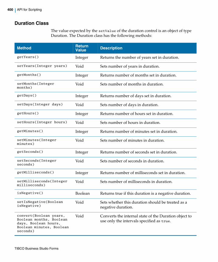
400 | API for Scripting
Duration ClassThe value expected by the setValue of the duration control is an object of type Duration. The Duration class has the following methods:
Method Return Value Description
getYears() Integer Returns the number of years set in duration.
setYears(Integer years) Void Sets number of years in duration.
getMonths() Integer Returns number of months set in duration.
setMonths(Integer months)
Void Sets number of months in duration.
getDays() Integer Returns number of days set in duration.
setDays(Integer days) Void Sets number of days in duration.
getHours() Integer Returns number of hours set in duration.
setHours(Integer hours) Void Sets number of hours in duration.
getMinutes() Integer Returns number of minutes set in duration.
setMinutes(Integer minutes)
Void Sets number of minutes in duration.
getSeconds() Integer Returns number of seconds set in duration.
setSeconds(Integer seconds)
Void Sets number of seconds in duration.
getMilliseconds() Integer Returns number of milliseconds set in duration.
setMilliseconds(Integer milliseconds)
Void Sets number of milliseconds in duration.
isNegative() Boolean Returns true if this duration is a negative duration.
setIsNegative(Boolean isNegative)
Void Sets whether this duration should be treated as a negative duration.
convert(Boolean years, Boolean months, Boolean days, Boolean hours, Boolean minutes, Boolean seconds)
Void Converts the internal state of the Duration object to use only the intervals specified as true.
TIBCO Business Studio Forms
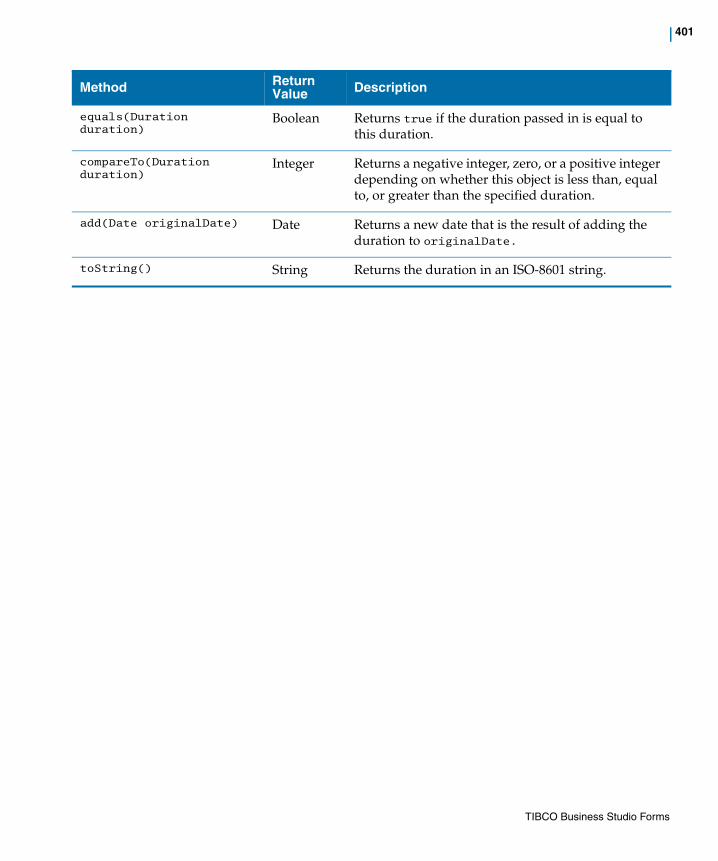
| 401
equals(Duration duration)
Boolean Returns true if the duration passed in is equal to this duration.
compareTo(Duration duration)
Integer Returns a negative integer, zero, or a positive integer depending on whether this object is less than, equal to, or greater than the specified duration.
add(Date originalDate) Date Returns a new date that is the result of adding the duration to originalDate.
toString() String Returns the duration in an ISO-8601 string.
Method Return Value Description
TIBCO Business Studio Forms

402 | API for Scripting
Utility MethodsThe following table describes the Util class API methods for scripting.
Table 99 Util Class
Method Return Value Description
tibco.forms.Util.compare(String value1, String value2)
• value1: first value to compare
• value2: second value to compare
Integer Compares two strings lexicographically and returns an integer that represents the comparison between the values:
• returns < 0: value1 less than value2.
• returns 0: value1 equal to value2.
• returns > 0: value1 greater than value2.
This method is for use by the custom control wrappers only and is not supported in JavaScript Editor.
tibco.forms.Util.escapeHtml(String text)
• text: text to be escaped
String Escapes HTML markup in the given text value so it can safely be embedded in the browser without the content being interpreted as HTML. Returns the escaped text value as a string.
This method is for use by the custom control wrappers only and is not supported in JavaScript Editor.
tibco.forms.Util.formatDate (String formatString, Object|String date)
• formatString: a format string that conforms to the Java date format syntax, as used in the Forms framework
• date: either a Date object or a string that conforms to the ISO-8601 date format
String Formats a date value according to the input format. Returns a formatted date value as a string.
This method is for use by the custom control wrappers only and is not supported in JavaScript Editor.
TIBCO Business Studio Forms

| 403
tibco.forms.Util.formatNumber (String formatString, Number|String number)
• formatString: a format string that conforms to the Java number format syntax, as used in the Forms framework
• number: a JavaScript number or a string containing a numeric value
String Formats a number object according to the input value. Returns a formatted number as a string.
This method is for use by the custom control wrappers only and is not supported in JavaScript Editor.
tibco.forms.Util.substitute (String template, Object args)
• template: containing substitution variables of the form {0}, {1}, .. {n}
• args: string array containing values to substitute into the template. The first value in the array replaces {0} in the template, the second replaces {1}, and so on.
String Substitutes arguments into a string template. This is useful when generating markup for controls that need an initial DOM structure before being instantiated. This is common with libraries such as jQuery or YUI.
Returns a string with values substituted in the template.
This method is for use by the custom control wrappers only and is not supported in JavaScript Editor.
tibco.forms.Util.checkDateFormat (String value)
• value: string containing the date value
Boolean Checks whether the date passed as a string is in the forms date edit format (that is, ISO-8601 date format) or not.
It returns true if the date is in the required edit format, and false otherwise.
tibco.forms.Util.checkTimeFormat (String value)
• value: string containing the time value
Boolean Checks whether the time passed as a string is in the forms time edit format (that is, ISO-8601 time format) or not.
Returns true if the time is in the required edit format, and false otherwise.
Method Return Value Description
TIBCO Business Studio Forms
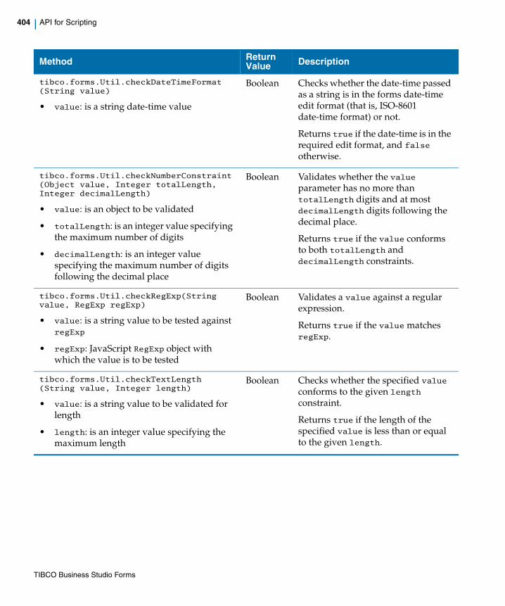
404 | API for Scripting
tibco.forms.Util.checkDateTimeFormat (String value)
• value: is a string date-time value
Boolean Checks whether the date-time passed as a string is in the forms date-time edit format (that is, ISO-8601 date-time format) or not.
Returns true if the date-time is in the required edit format, and false otherwise.
tibco.forms.Util.checkNumberConstraint (Object value, Integer totalLength, Integer decimalLength)
• value: is an object to be validated
• totalLength: is an integer value specifying the maximum number of digits
• decimalLength: is an integer value specifying the maximum number of digits following the decimal place
Boolean Validates whether the value parameter has no more than totalLength digits and at most decimalLength digits following the decimal place.
Returns true if the value conforms to both totalLength and decimalLength constraints.
tibco.forms.Util.checkRegExp(String value, RegExp regExp)
• value: is a string value to be tested against regExp
• regExp: JavaScript RegExp object with which the value is to be tested
Boolean Validates a value against a regular expression.
Returns true if the value matches regExp.
tibco.forms.Util.checkTextLength (String value, Integer length)
• value: is a string value to be validated for length
• length: is an integer value specifying the maximum length
Boolean Checks whether the specified value conforms to the given length constraint.
Returns true if the length of the specified value is less than or equal to the given length.
Method Return Value Description
TIBCO Business Studio Forms
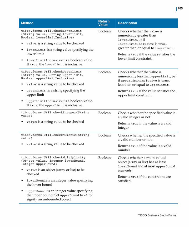
| 405
tibco.forms.Util.checkLowerLimit (String value, String lowerLimit, Boolean lowerLimitInclusive)
• value: is a string value to be checked
• lowerLimit: is a string value specifying the lower limit
• lowerLimitInclusive: is a boolean value. If true, the lowerLimit is inclusive.
Boolean Checks whether the value is numerically greater than lowerLimit, or if lowerLimitInclusive is true, greater than or equal to lowerLimit.
Returns true if the value satisfies the lower limit constraint.
tibco.forms.Util.checkUpperLimit (String value, String upperLimit, Boolean upperLimitInclusive)
• value: is a string value to be checked
• upperLimit: is a string specifying the upper limit
• upperLimitInclusive: is a boolean value. If true, the upperLimit is inclusive.
Boolean Checks whether the value is numerically less than upperLimit, or if upperLimitInclusive is true, less than or equal to upperLimit.
Returns true if the value satisfies the upper limit constraint.
tibco.forms.Util.checkInteger(String value)
• value: is a string value to be checked
Boolean Checks whether the specified value is a valid integer or not.
Returns true if the value is a valid integer.
tibco.forms.Util.checkNumeric(String value)
• value: is a string value to be checked
Boolean Checks whether the specified value is a valid number or not.
Returns true if the value is a valid number.
tibco.forms.Util.checkMultiplicity (Object value, Integer lowerBound, Integer upperBound)
• value: is an object (array or list) to be checked
• lowerBound:is an integer value specifying the lower bound
• upperBound: is an integer value specifying the upper bound. Set upperBound to -1 to signify an unbounded object.
Boolean Checks whether a multi-valued object (array or list) has at least lowerBound and at most upperBound elements.
Returns true if the constraints are satisfied.
Method Return Value Description
TIBCO Business Studio Forms

406 | API for Scripting
TIBCO Business Studio Forms

| 407
Chapter 8 Tips and Tricks
This chapter contains tips for working with TIBCO Forms.
Topics
• Recommendations for Forms Modeling, page 408
• Tips for Using TIBCO Business Studio Forms, page 412
TIBCO Business Studio Forms
408 | Recommendations for Forms Modeling
Recommendations for Forms Modeling
The following recommendations generally give the best results when modeling large and complex forms. Procedures are presented in the order they would normally be performed.
Group Related Controls Together in Vertical Panes
When a form is first generated, it contains one large pane with all the controls for the selected user task parameters.
Begin by organizing large areas. Don’t worry initially about configuring individual panes and controls. Concentrate on putting controls into panes with other, related controls. The positioning of the panes can best be done after this step is accomplished.
1. Create a vertical pane for each group of related controls. Do not nest this pane inside another pane. Don’t worry about multiple columns initially.
2. Give each pane a label, based on the function of the controls it will contain.
3. Drag the controls into the pane.
4. Repeat this procedure as needed for each group of related controls.
5. Modify the labels of the controls on each pane.
Use the Visibility Property to Simplify User Experience
If you expect to have a number of controls that are irrelevant to certain users or not applicable in certain situations, group these fields together in a vertical pane. You can set the visibility property of this pane to false conditionally. The condition could be determined by another control. For example, a pane containing a set of controls for previous order information could be made visible or invisible depending on the runtime value of a radio control.
If “Ongoing Customer” is selected, the pane labeled Previous Orders, and all of its controls, would be visible, but that pane would be invisible if “New Customer” were selected.
In addition, the form contains a message pane (for error messages) and a navigation pane (for the Cancel, Close, and Submit buttons). These objects are created with default settings that do not normally need to be modified.
TIBCO Business Studio Forms

| 409
Configure the Pane Type Property (optional)
If desired, change vertical panes to horizontal or tabbed panes by configuring the Pane Type property on the General tab of the pane’s Properties View.
Modify Excessively Long Forms
An extremely long form requires unwanted scrolling to be viewed or filled in and adversely affects the user’s experience. To minimize the length of a form:
1. Create multiple columns.
a. Place groups of controls into two or more separate vertical panes, each representing a separate column. Drag the second pane to a position next to the first pane, so that you see a dotted line appear. The dotted line means that a horizontal pane will be created to contain the two vertical panes.
b. If you want more than two vertical columns, drag additional panes, one at a time, next to the right-most vertical pane within the new horizontal parent pane.
c. If you want to have other groups of fields in the second column, rather than adding another column next to the existing columns, you will probably want to first create an additional horizontal pane to hold them. Then place new vertical panes within this horizontal parent pane, and add the additional controls to the vertical panes. This ensures that the added controls are aligned vertically and horizontally.
You can create, for instance, two columns out of four modules by first creating two horizontal panes, one above the other, and placing two vertical panes inside each of them. Your controls would be place within the four vertical panes.
In this way, the default tab sequence will be left-to-right, and then top-to-bottom, the way you read a book, which is the tabbing behavior expected by most users.
2. Use tabbed panes in place of vertical panes. See the section, Create Tabbed Panes.
Expand Narrow Panes to Avoid Wrong Placement at Run Time
When there are two or more narrow root-level panes with a combined fixed width that is less than the available space into they are rendered, at runtime such panes may be rendered next to each other instead of on top of each other.
To avoid improper pane placement in this case, you can do one of the following:
• Increase the width of these panes so that there is not enough room left for them to be rendered side by side
TIBCO Business Studio Forms

410 | Recommendations for Forms Modeling
• Set the overflow attribute for the panes to expand, so that the panes expand and fill the available space.
Create Tabbed Panes
Use tabbed panes only when there is information that is seldom used. Because they are partially hidden and can be hard to find, user interface specialists often recommend that they be avoided or used cautiously.
Add a Tab to an Existing Tabbed Pane
If you want to add a tab to an existing tabbed pane, click the button for adding a new child pane. This button is circled in the diagram below:
Additional Recommendations
• During the early stages of form modeling, work with the labels, but don’t resize panes or controls (excepting tabbed panes). Accept the default sizes until they are positioned correctly relative to each other.
Better advice is to leave the panes to size themselves automatically. Only set an explicit size if there is a compelling reason to do so.
Vertical and horizontal panes are automatically resized so that the panes or controls they contain fit properly.
TIBCO Business Studio Forms

| 411
• Assign meaningful pane, control, parameter, action, and rule names before creating bindings and other scripts.
TIBCO Business Studio Forms

412 | Tips for Using TIBCO Business Studio Forms
Tips for Using TIBCO Business Studio Forms
The following suggestions relate to creating and enhancing your forms.
How can I create a Form that is not associated with any business process?
Right-click Forms in the Project Explorer, click New, and click Form. Alternatively, on the File menu, click New > Other to open the New dialog box. Expand TIBCO Forms by clicking the plus icon, and click Form.
How can I create multiple columns of controls on a Form?
Create a horizontal pane, and place two or more vertical panes inside of it. Then add controls to the vertical (child) panes. Each vertical pane will contain a column of controls.
How can I align the labels between different panes, for example, when there are several panes that are direct children of a root pane?
To align the label width for all panes to achieve a uniform and consistent appearance, set an explicit child label width for all panes whose labels should be aligned.
How can I create option lists or radio buttons using array type parameters?
In the properties tab of the option list or radio button Properties View, create Label Array and Value Array Choice Bindings. Note that if different parameters are selected for Values and Labels, you must ensure that the number of items in both the arrays are equal.
How can I reuse similar behavior between different controls?
Do not reference the control by name in your shared action scripts, but rather use the context.control object that represents the source control of the fired event.
How can I use part of the parameter value as a value for a control?
While capturing input values for items like social security numbers, different controls can be used to capture different parts of the same value.
For example a value of parameter ssn, say, 888-78-9898, can be captured in three text fields. First, a text control named ssn_part1 takes input for the first part, 888.
TIBCO Business Studio Forms

| 413
Second, a text control called ssn_part2 takes input for the second part, 7. Finally, a text control called ssn_part3 takes input for the last part 9898.
This can be achieved by providing a scriptlet that returns different parts of the parameter value. In this example the three expressions would be p.ssn.substring(0,3), p.ssn.substring(5,7), p.ssn.substring(8,12). Each of these scripts would be provided in their own computation actions within a rule that fires when the underlying parameter is updated.
Similarly, a scriptlet that assembles the values of 3 controls can be used as an expression for a parameter.
In the above example this expression would be:f.ssn_part1 + "-" + f.ssn_part2 + "-" + f.ssn_part3;
TIBCO Business Studio Forms

414 | Tips for Using TIBCO Business Studio Forms
TIBCO Business Studio Forms
| 415
Index
A
Actions 73, 82Add a Computation Action Using the Outline
View 138Add a Rule Using the New Rule Wizard 144Add a Rule Using the Outline View 139Add a Script Action Using the Outline View 137Add a Second Validation for Email Field 46Add New Panes to the Capture Claim Form 17Add Syntax Validation for Email Field 45Add Validation for Date of Birth Field 46Add Validation for Phone Field 42Add Validation for Time of Accident Field 49Add Validation for Witness Phone Field 49Adding a Tab to an Existing Tabbed Pane 410Additional Recommendations 410
B
Basic Terms for Working with Forms 71Button 310
C
Calling External JavaScript Functions 161Change the Background Colors of Panes 33Change the Label Width Property of the Panes 36changes from the previous release xxiiChanges in Migrated Forms 208Changing Control Type 25CheckBox 310Child Label Properties Tab for Forms 319Child Label Tab for Panes 327Child Layout Tab for Forms 318
Child Layout Tab for Panes 326Choosing a locale-specific version of a form at
run-time 201Concepts 69, 241Configure the Completed Button 66Configure the Failed - Do Not Try Again Button 65Configure the Failed - Try Again Button 65Configure the Interview Witness Form 31Configure the Pane Type Property (optional) 409Configuring Panes 162Controls 72, 75, 310Create a New Action 142Create a New Pane 17Create a Rule to Compute Age (Capture Claim
Form) 51Create Rule to Round Amount to Nearest Dollar 56Create Rule to Update Required Option for Guardian
When Age 53Create Rules that Display Context-Specific Hints on
Entering Accident Description Control 61Create Rules that Display Hint on Entering Claim
Amount Controls 58Create Rules that Hide Hints on Exiting Accident
Description Control 63Create Rules that Hide Hints on Exiting Amount
Controls 60Creating a New Form 211Creating Columns with Nested Panes 162Creating Tabbed Panes 410customer support xxiii, xxv
D
Date 310Date-Time 311Define Validation Dialog 154Defining Custom Actions for Buttons 64
TIBCO Business Studio Forms

416 | Index
Disabling a Control 25Drag Controls into Appropriate Panes 21
E
Edit an Action 139Edit Validation for Claim Amount Field 48Examine Auto-Generated Validation for Age Field 47Examine the Claims Process Business Process 5
F
Font Tab for Controls 342Font Tab for Panes 326Form Builder 76Form Controls 75Forms Scripting
Scope of Variables 376
G
General Tab for Controls 330General Tab for Panes 321Getting Started 1Group related controls together in vertical panes 408
H
Horizontal Pane 305How to Contact TIBCO Support xxiiiHyperlink 311
I
Image 312
Import the sample Project 5
L
Layout Tab for Controls 341Layout Tab for Panes 322Localizing a Form 197
M
Message Pane 305Migrating from Previous Versions of TIBCO Business
Studio Forms 206Modify Control Properties
Labels, Required, and Hint Values 22Type and Enabled 24
Modify Excessively Long Forms 409Modify Names and Labels of Panes 20Modify Pane Properties
Visibility 27Modify the Form Level Child Labels Properties 36
N
Nesting Panes 162, 303
O
Outline View 94
P
Panes 72, 75, 303Parameters 72, 97Pass-through 312
TIBCO Business Studio Forms

Index | 417
Pick an Existing Action 141Positioning Controls into a Multi-Column Layout 162Preview of Finished Forms 38Problem Markers 123, 123, 232, 242Properties Tab for Controls 322, 332Properties View for Controls 330Properties View for Panes 321Properties View for the Option List Control 336Properties View for the Radio Control 338Properties View for the Text Area Control 340Properties View for the Text Control 339Properties View Tabs 315
Q
Quick Fixes 123
R
Radio 312Recommendations for Forms Modeling 408Reference 297Resequencing Tabbed Panes 164Resizing a Tabbed Pane 164Rules 84Rules Tab for Controls 344
S
Sample ApplicationGeneral Description 6
Setting Actions 137Setting Rules 139Setting Visibility of Panes 28, 30Steps to create a locale-specific Properties file 198Summary of Tutorial 1 32Summary of Tutorial 2 40Summary of Tutorial 3 50Summary of Tutorial 4 67
support, contacting xxiii, xxvSwitch to Solution Design Mode 41
T
Tabbed Pane 305Tasks 125, 209technical support xxiii, xxvText 310Text Area 310The Form 71, 197The Form Builder and Form Validation 75The Modeling Environment for Forms 70, 192The Palette for the Form Designer 300The Palette View 302Thumbnail Mode 94TIBCO Business Studio Documentation xxiiiTIBCO_HOME xxiiiTime 311Tips for Using TIBCO Business Studio Forms 412To Migrate a Form to the Version 2.2.0 206Tree Mode 95Tutorial 1
Forms, Panes, and Controls 5Tutorial 2
Customizing the Appearance of a Form 33Tutorial 3
Validations 41Tutorial 4
Rules, Events, and Actions 51Typographical Conventions xxiii
U
Updating Forms Using Synchronize Parameters 147Use the Visibility property to simplify the user
experience 408Using Business Studio 2Using the Outline view with forms 95
TIBCO Business Studio Forms

418 | Index
V
Validating Data in a Form 147Validation Builder 77Validations 73Validations Tab for Controls 343Vertical Pane 304View Forms 12
Capture Claim 13Gateways 16Interview Witness 14User Tasks 12
Viewing Pane and Control Borders 165
TIBCO Business Studio Forms


