31
Time to catch up? Living standards in the downturn and recovery Matthew Whittaker March 2015 @resfoundation 1
| Date post: | 17-Jul-2015 |
| Category: |
News & Politics |
| Upload: | resolutionfoundation |
| View: | 930 times |
| Download: | 0 times |

Time to catch up? Living standards in the downturn and recovery
Matthew Whittaker
March 2015
@resfoundation
1

Six year pay squeeze appears to have ended, but nominal growth remains subdued
2
Average earnings finally
overtook inflation
towards the end of 2014
With inflation
set to fall further in 2015,
projections point to a
period of strong real-terms
growth

Relatively little difference in experience across the earnings distribution
3
Hourly pay fell furthest among
the highest paid workers in the period 2009-2014, but the overall trend
was surprisingly uniform

Biggest distinction has been by age and sex – with men and younger workers faring worst
4
The 12.5% reduction
among 22-29 year-olds
means median pay has fallen below its 2000
level
The gender pay gap has
continued to narrow, though
only because men’s pay has
fallen faster than women’s
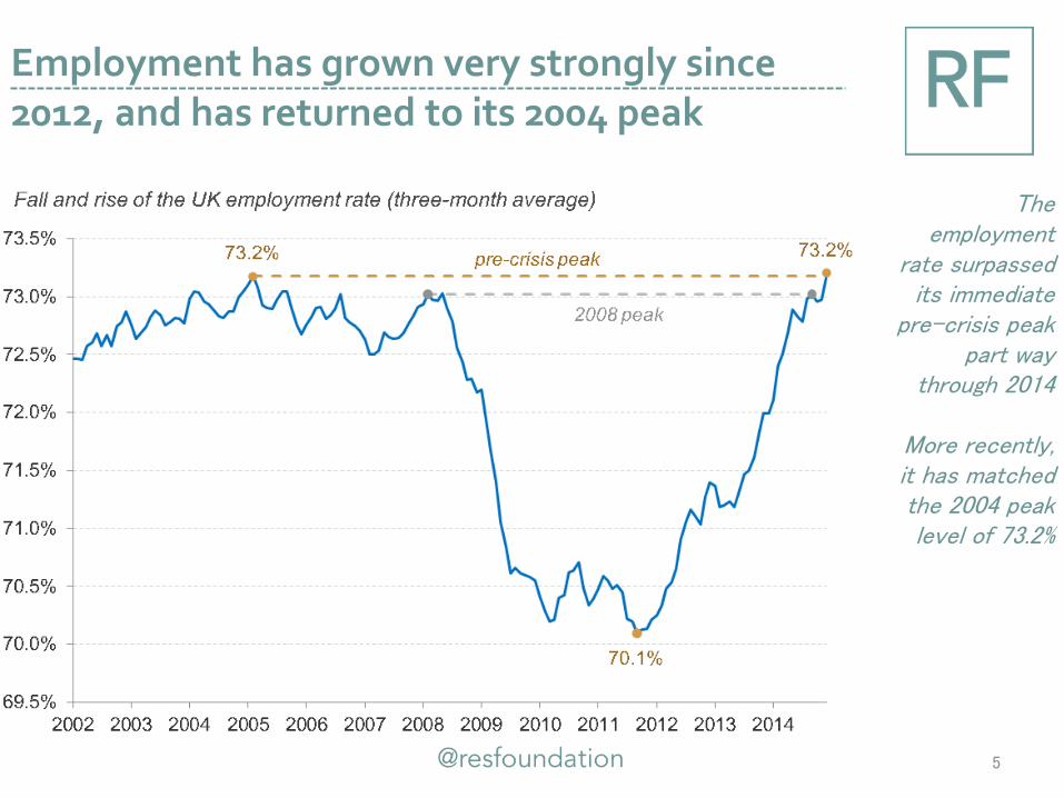
Employment has grown very strongly since 2012, and has returned to its 2004 peak
5
The employment
rate surpassed its immediate
pre-crisis peak part way
through 2014
More recently, it has matched the 2004 peak level of 73.2%

Though surge in lower-paid jobs was one factor dragging on average pay growth in 2014
6
Compositional changes in the labour market
invariably provide a boost to
average pay growth, as the
workforce becomes more
qualified
But rapid increases in lower-paid
occupations and workers provided
a rare drag in 2014

Some have pointed to relatively solid wage growth among those remaining in work
7
Median pay among those who have remained in the same job for a year or longer
has tended to continue to rise in recent years
Leading some to conclude that a
majority of those in continuous
employment have had real-terms
pay rises

But a majority of such workers have continued to face real-terms wage reductions
8
But the change in the median is
different from the median
change. Capturing the
experiences of individuals
instead, we find a majority had pay
cuts in 2013
Using updated ONS data, we estimate that
around ½ had pay rises in 2014

With huge variations in experience being recorded
9
The pattern of large pay rises
spread relatively evenly across
the earnings distribution helps
explain why the median change is
consistently lower than the change in the
median for this group of
employees

Timely but flawed National Accounts data shows some improvement in average incomes
10
The RHDI measure is the
timeliest we have, but it
includes many things that
people wouldn’t
recognise as “household
income”
Official projections
suggest it will return to its
pre-crisis peak early in 2015

With more authoritative survey data showing a similar pattern for median incomes
11
By using outturn labour market
data, we project the trajectory of
median household
income between 2012-13 and
2014
It implies median income is
approaching its 2007-08 level,
though it remains around 3% below
the 2009-10 peak

But average incomes appear to be recovering more slowly
12
Mean household
income increased by
just 0.2% between 2012-
13 and 2014, leaving it more than 3% below
its 2007-08 level
And more than
5% below its peak in 2009-
10

The period contrasts with the turn of the century, when incomes were growing strongly
13
The introduction of the National Minimum Wage
and the development of
tax credits helped to boost incomes in the
lower part of the distribution in
this period
More generally, growth was
strong across the distribution

Though many households faced a slowdown in growth in advance of the financial crisis
14
From 2003, income growth slowed down in
most parts of the distribution
Incomes fell
within the bottom 10 per
cent, but continued to
grow relatively strongly in the
top 10 per cent

Incomes subsequently fell across the board, but higher income households fared worst
15
Incomes fell furthest towards
the top of the distribution in the early part of the
downturn, reflecting falling
wages and changes in tax
Incomes towards the bottom were
protected to some degree by
automatic stabilisers
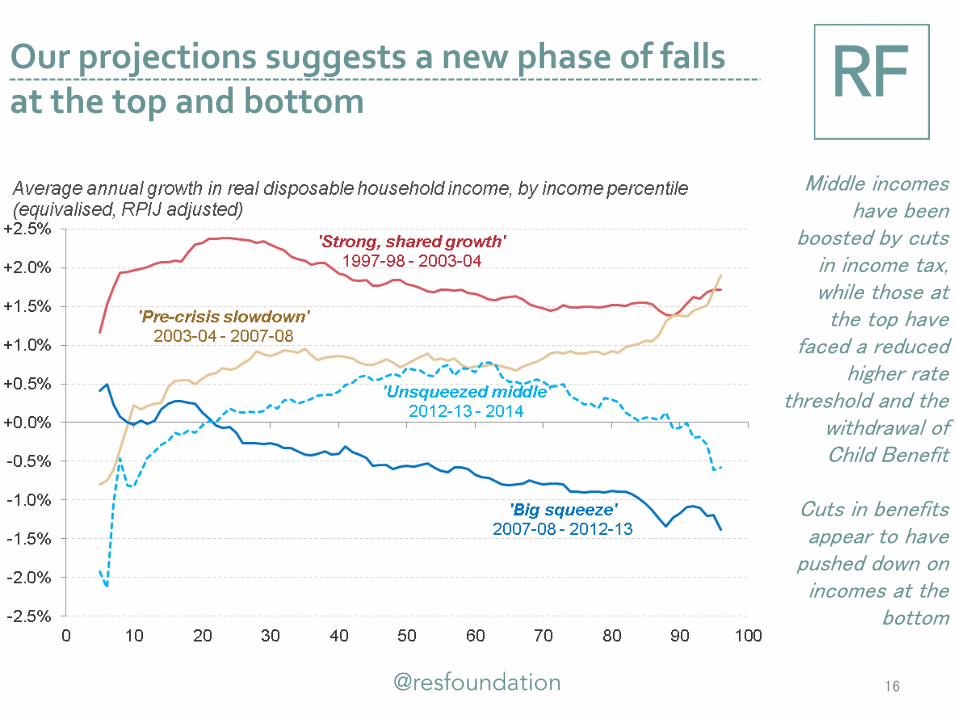
Our projections suggests a new phase of falls at the top and bottom
16
Middle incomes have been
boosted by cuts in income tax, while those at the top have
faced a reduced higher rate
threshold and the withdrawal of Child Benefit
Cuts in benefits appear to have
pushed down on incomes at the
bottom

These trends have altered the shares of income accounted for by different parts of the distribution
17

The top 10% of households account for the same share of income as the entire bottom half
18
The bottom half of households accounted for around half as much income
as their population size would suggest
In contrast, the top 10 per cent
accounted for around 2½
times their population
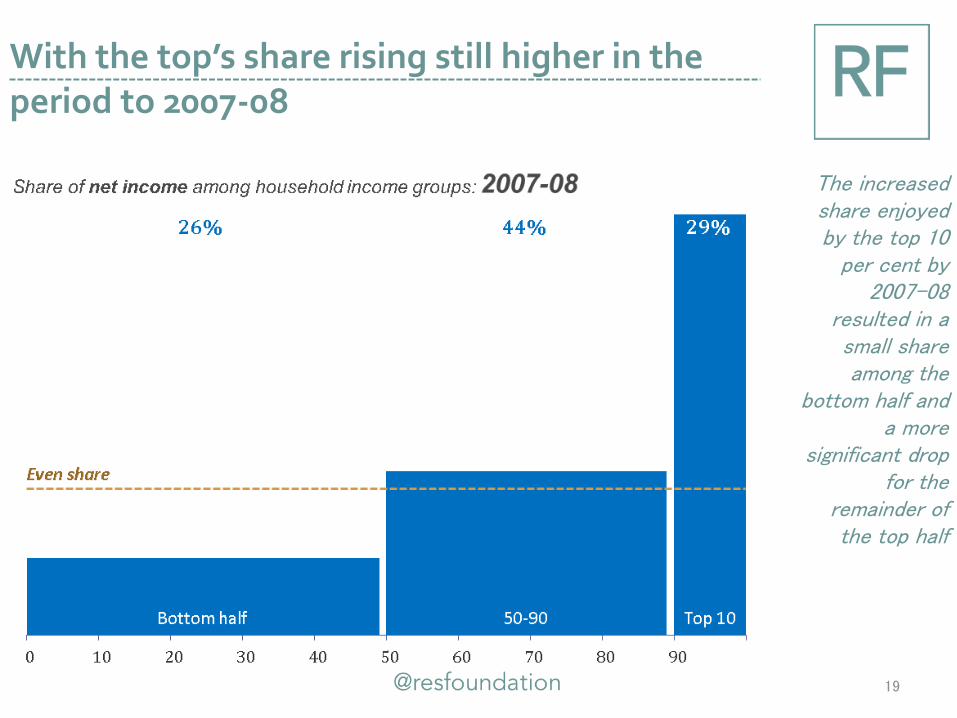
With the top’s share rising still higher in the period to 2007-08
19
The increased share enjoyed by the top 10
per cent by 2007-08
resulted in a small share among the
bottom half and a more
significant drop for the
remainder of the top half

Before falling slightly in the aftermath of the financial crisis
20
The reduction in income share experienced by the top 10 per
cent since 2007-08 has been shifted
primarily to the bottom half

The share of the top 1% is over six times the population accounted for by the group
21

The share of the top 1% is over six times the population accounted for by the group
22
We estimate that the top 1
per cent accounted for a little over 6 per cent of all net
income in 2014
The entire bottom half
accounted for just over 4
times more, at 28 per cent

Which is not much changed from the mid-1990s
23
The ratio of bottom half to top 1 per cent
was very slightly higher
in the mid-1990s,
suggesting top-to-bottom
inequality has fallen a little in the intervening
period

Though it is lower than the ratio of over 8 that was recorded just before the crisis
24
But just before the crisis the ratio stood at
around just 3½ times
That is, the top
1 per cent accounted for
just over 8 per cent of all
income while the bottom half
accounted for 26 per cent

Inequality has been largely flat since 1994, with the exception of the very top
25
There has been relatively little
movement in the gap between the bottom and the
middle
But the very top accounted for a steadily growing share over the course of the
1990s and 2000s, prior to the sharp
reversal from 2008-09

Working-age incomes have been hit much harder than pensioner ones
26
Labour market trends and benefit cuts have pushed down on working-
age incomes, though income tax
cuts and falling mortgage
repayments have boosted some
Pensioner incomes
have been protected by the triple lock and by
rising employment and lower falls in
wages

And there has been significant variation across countries and regions
27
Median incomes have risen by 4% in the North East but fallen by the same
amount in Northern Ireland,
despite both starting the period from similar (low)
levels
Of the four regions starting the period with
higher than typical median income, the South East has fared worst
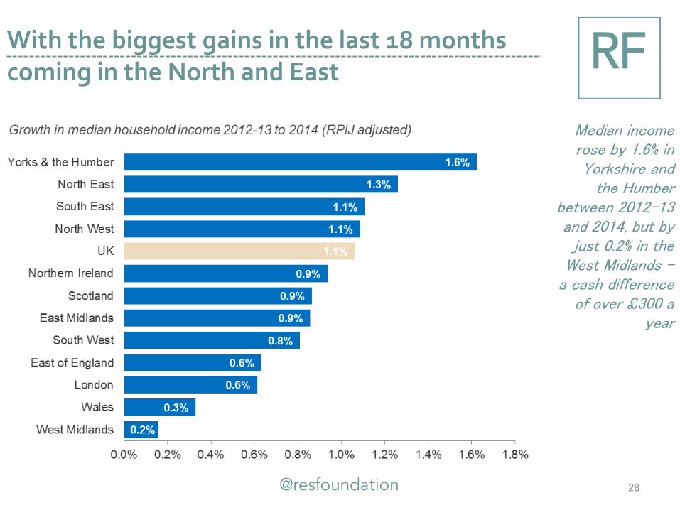
With the biggest gains in the last 18 months coming in the North and East
28
Median income rose by 1.6% in Yorkshire and
the Humber between 2012-13 and 2014, but by
just 0.2% in the West Midlands –
a cash difference of over £300 a
year

• Pay falls have been relatively uniform across the earnings distribution, but have hit men and the young hardest
• With inflation falling, there are clear signs of improvement in average pay
• But a significant number continue to face pay cuts and it will take a number of years to restore pre-crisis earnings levels
29
Living standards in the downturn and recovery: pay
• Strong employment growth, tax cuts and cuts to working-age benefits have produced varying experiences in relation to household incomes
• Incomes fell across the distribution after 2007, but the top experienced the biggest reductions
• More recently, we estimate that the middle has seen some recovery while incomes at the bottom and top have continued to fall
• Median income is likely to return to its 2007 level this year, but this stat won’t chime with experience for many
30
Living standards in the downturn and recovery: incomes

• We estimate trends in household income between 2012-13 and 2014 in order to roll forward the latest Family Resources Survey data.
• We use outturn data from the quarterly Labour Force Survey (pooled over four quarters) in order to determine pay trends (at the individual level) and changes in population, family status and work status (at the household level) in that period.
• On pay, we establish more than 100 clusters of individuals based on combining different age, industry and occupation profiles (e.g. one cluster covers 16-24 year-olds working in low-skilled jobs in the primary industry sector). We calculate average change in pay in each of these clusters and apply it to the same set of clusters for individuals in the 2012-13 Family Resources Survey.
• On population, we create a similar number of clusters, this time split by age, work status (FT/PT/unemployed etc), occupation and family status (working couple/retired etc). Again, we apply the changes (this time in their share of the total household population) recorded between 2012-13 and 2014 to the Family Resources Survey.
• We then run our 2012-13 and 2014 household data through the IPPR tax-benefit model in order to determine the change in net household income for each household. By applying these changes to the 2012-13 Family Resources Survey we are able to determine trends by percentile, by age and region.
31
ANNEX Explaining our ‘nowcasting’ methodology


