Saludos amigo hace poco me sucedio lo mismo con una imàgen, al momento de tirar el renderme sacaba del programa, empece a indagar y al cambiar la configuraciòn del driver del OpenGL a Direct 3D me dejo trabajar y sacar la imàgen a un excelente tamaño. Prueben a versi tambien les resulta Users of other apps/renderers, I am starting to put pertinent info at the bottom of the page Have you ever wondered why your GI renderings start out so dark? Well, in fact they are not so dark. The problem lies with the display device (the CRT or LCD) and that the software is not making adjustments for the gamma that the displays put on our images. That gamma is specifically called �sRGB . Technical information about sRGB can be found at that site. Let's take a look at what your monitor does to image data you send it. This is called non-linear a display. The spotted green line here is the data you are feeding the display and the solid green line is what response the monitor has normally. What's important to note here is that this correction is not just for filmic response. In fact, it has almost nothing to do with filmic response. It's essentially correcting for the display. Those of you working for video (aka not film) don't worry. This applies to you as well. The rec.709 curve is -very- similar in nature. Ok, that's nice and all but now you want to know how to solve this problem. Yes, it's a problem :) Well, friends, we apply a curve that takes the data and "linearizes" it. That
Saludos amigo hace poco me sucedio lo mismo con una imàgen, al momento de tirar el render
me sacaba del programa, empece a indagar y al cambiar la configuraciòn del driver del
OpenGL a Direct 3D me dejo trabajar y sacar la imàgen a un excelente tamaño. Prueben a ver si tambien les resulta
Users of other apps/renderers, I am starting to put pertinent info at the bottom of the page
Have you ever wondered why your GI renderings start out so dark? Well, in fact theyare not so dark. The problem lies with the display device (the CRT or LCD) and that thesoftware is not making adjustments for the gamma that the displays put on our images.
That gamma is specifically called �sRGB . Technical information about sRGB can befound at that site.
Let's take a look at what your monitor does to image data you send it. This is callednon-linear a display. The spotted green line here is the data you are feeding the displayand the solid green line is what response the monitor has normally.
What's important to note here is that this correction is not just for filmic response. Infact, it has almost nothing to do with filmic response. It's essentially correcting for thedisplay. Those of you working for video (aka not film) don't worry. This applies to youas well. The rec.709 curve is -very- similar in nature.
Ok, that's nice and all but now you want to know how to solve this problem. Yes, it's a problem :) Well, friends, we apply a curve that takes the data and "linearizes" it. That
means we negate what the monitor does. Here is the curve. Once again, the spotted lineis the data we are sending to the display. The solid line, this time, is the correction that'smade for the non-linear display.
To explain a bit further...sRGB is the correction your software makes for the non-linear response that your monitor has. Your digital camera applies an sRGB lookup to your
photographs but you may not even know it. So, when you work in true linear space youare actually working in a space that represents more what light does in the real world.Let's show you what I mean by that with yet more graphs but with a gradient this time.
This is a 0 to 1 ramp with 32 steps. Notice the 0.5 value is in the middle. This is theoriginal image data as sent to your monitor. This is a linear image!
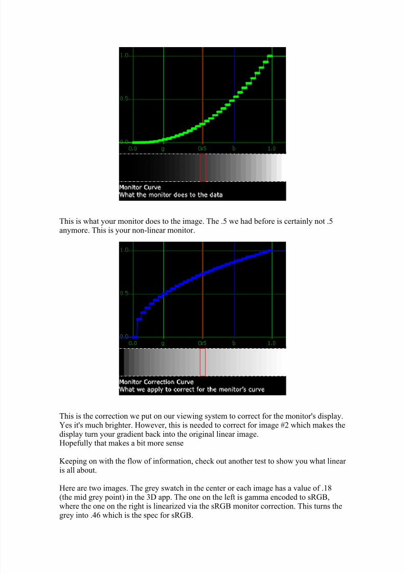
This is what your monitor does to the image. The .5 we had before is certainly not .5anymore. This is your non-linear monitor.
This is the correction we put on our viewing system to correct for the monitor's display.Yes it's much brighter. However, this is needed to correct for image #2 which makes thedisplay turn your gradient back into the original linear image.Hopefully that makes a bit more sense
Keeping on with the flow of information, check out another test to show you what linear is all about.
Here are two images. The grey swatch in the center or each image has a value of .18(the mid grey point) in the 3D app. The one on the left is gamma encoded to sRGB,where the one on the right is linearized via the sRGB monitor correction. This turns thegrey into .46 which is the spec for sRGB.
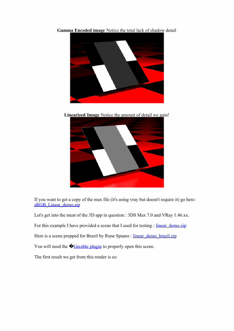
Now, we must linearize this image if we are to get more of a photographic response.
What am I talking about? Well, look at the amount of light hitting those objects. Itseems that with 1000 GI bounces that we'd see a bit more detail right?!? YES! Let's get
to that stage now.
First go to Customize -> Preferences -> Gamma tab and change the values to:
This allows us to see correct linear values in the material editor and the original maxrender view.
* Brazil users, you're pretty much done. Go to the end of this page for the rest of theBrazil settings.* Mental Ray users - you are done! Now you're working in a more correct linear method.* Scanline render users - you are also done. You're linear all the way now.
Now, for the VRay part, go to the VRay renderer menu and in the Frame Buffer rollout
Why did we do this? Well, the VRay vfb allows us to do some post render color correction to the image. Thanks to Vlado and the rest of the dev team for these changes!
Next be sure to turn off any color clamping in the GBuffer/Color Mapping rollout:
Now, do a quick render to get your VRay vfb up. Once you do we need to turn on a fewthings.
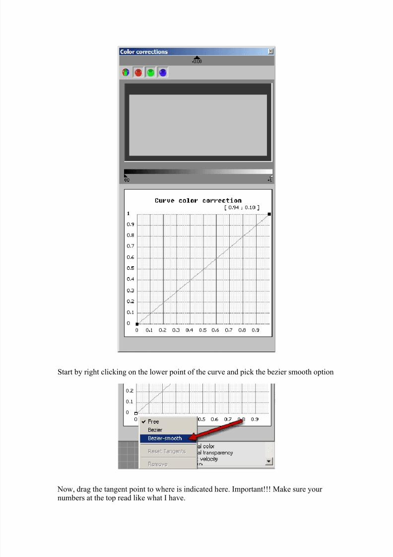
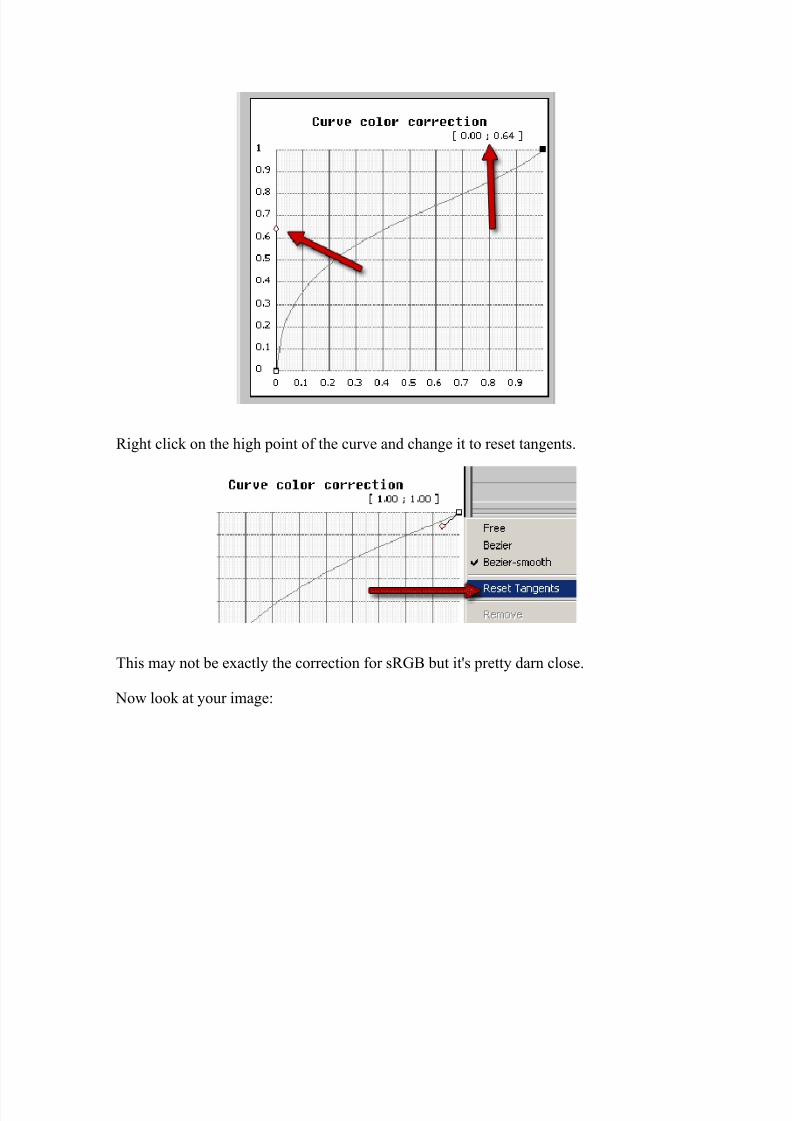
First, click on the curve correction and then open the color correction panel
The basic color correction panel looks like this. We'll be changing that of course...
What we've done is apply the correction for sRGB on your image (aka we've linearizedthe image). The viewer is doing this because that's its job. This is a linear response andalso shows the HUGE amount of detail truly visible in this render.
We are now looking at an image that is perceptually linear. You'll notice that withouttons of multiplying of the colors using the Color Mapping option we get a lot of detailin the dark areas.
So, there you go. Working in linear space means that you get a more realistic look andthat your lighting will actually be more correct and true to what a real camera does. Thisshould allow you to achieve your desired results with more ease and possibly faster render times too.
Maya / Mental RayFor you Mental Ray/Maya users, go to the Render Globals and click the mental ray tab.Go to Framebuffer Attributes and change a few things:
BrazilIn the Brazil render settings, go to the General Ottions rollout and make sure your setting match this
Now, inside the vfb, open up the exposure/color panelSet the gamma to 2.2
In March 2004, Rob Nederhorst posted an interesting thread on the support
forum of Vray and a couple of other forums about working in linear space.
Although the thread answered a couple of questions it also generated a lot of
questions and confusion about this workflow. In the following article, I have tried
to summarize these as well as take away any doubt people might have after
reading the article. I have written it in interview style, which I hope, makes it
better readible.
O.K., I calibrated my monitor with a hardware calibrator, selected a gamma of 2.2and a whitepoint of 6500K. Now the article suggest to do the gamma correction in 3dsmax again, what's happening here?
In fact, you are mixing up two things. First of all, hardware calibration of your monitoris a very good first step. When you are working with an LCD screen, calibration is even
more essential. If you don't have a calibrator yourself, consider to borrow one, or at
least use this guide to do basic calibration. When calibrating your monitor, set your
whitepoint to 6500K (most monitors have an option to choose a whitepoint).
Calibrating your monitor is important to match your monitor gamma to a certain
standard. For Windows based systems, this standard gamma is 2.2. When you have
calibrated your monitor with a hardware calibrator, the accompanying software will
create an ICC profile. This profile helps to output the right colors on your screen, when
your screen is offered an image from the web or other applications. In fact it transforms
Now you may think that you don't need gamma correction. That's probably because you
have been using all sorts of tricks for years to get the desired result. (Tricks like adding
linear falloff lights, or lights without decay, bright multipliers etc. etc.) All these tricks
you have been using were to get a more realistic result, and without knowing, you were
actually trying to correct for your monitors gamma!
Great, so far I understand it. I read somewhere that CCD's in digital cameras alsohave a linear gamma, but I never needed to correct them when viewing them onscreen. Why is that then?
This question actually supports the idea why you should use gamma correction. When
you take a picture with your digital camera, light is captured with a CCD (well, in most
digital cameras it is). This CCD has in itself, a linear response curve, or in other words,
a linear gamma. This raw linear data is then mapped to a different gamma (2.2) and
colorspace, most likely sRGB or Adobe RGB. Professional image editing software that works with ICC profiles, can read the profile that is attached to your camera's picture,
and can interpret it right to display the correct tones and colors on your monitor (if it is
calibrated correctly!)
So how about pictures on the internet then?
Although the majority of internet users will never have calibrated their monitor or
know anything about color management, cameras (and probably many internet
publishing software packages) will do some basic correction without telling the user. As
I mentioned earlier, a standard CRT monitor will probably be about gamma 2.5.
Therefore it is advisable if you publish pictures which need to look correct for the
majority of internet users, you convert your images for publishing to a gamma 2.5
profile (look for Native PC profile on that page).
Right. So to summarize, it's just about setting the display gamma in 3dsmax to 2.2 inorder to display the linear rendering data correctly on my monitor?
That's true, but there is a little more to take care of. If you have paid attention and
understand all concepts, you will know that there is a last step that has to be taken for
making correct renderings: You need to correct your materials and textures. You willneed to tell 3dsmax that the textures you use have already been gamma corrected. This
can be done either globally or locally. Globally it can be assigned in gamma tab:
In the most ideal situation (figure 3) you keep all your data linear and only correct the
output to your display. The data is not touched, no gamma correction is burned in. Only in the very end, when publishing on internet for example, you will covert (a copy) to a