Availability TMS ASP.NET iPhone Controls Pack is available as asp.net components for Visual Studio. TMS ASP.NET iPhone Controls Pack is available for Visual Studio 2010 and requires ASP.NET 4.0 TMS ASP.NET iPhone Controls Pack has been designed for and tested with: ASP.NET 4.0 on Windows 7. Current version of TMS ASP.NET iPhone Controls Pack has been designed for and tested with iPhone 3, 3G, 3GS, 4, 4S, iPad 1, 2, Android. Please note the TMS ASP.NET iPhone Controls Pack is not intended to be used in common desktop browsers like Internet Explorer, FireFox, Chrome, Safari …
TMS ASP.NET iPhone Controls Pack
DEVELOPERS GUIDE
4
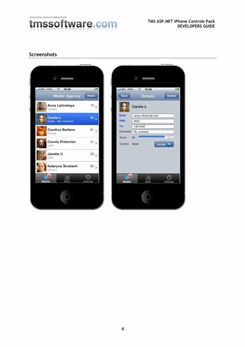
Screenshots
TMS ASP.NET iPhone Controls Pack
DEVELOPERS GUIDE
5
TMS ASP.NET iPhone Controls Pack
DEVELOPERS GUIDE
6
TMS ASP.NET iPhone Controls Pack
DEVELOPERS GUIDE
7
Getting started
I. Installation 1. From the Visual Studio IDE menu, choose Tools, Choose Toolbox Items 2. Switch to the .NET Framework Components tab 3. Choose Browse and pick TMSiPhoneControls.DLL from the installation folder 4. After pressing OK in the Choose Toolbox Items the controls are added to the ToolBox
II. Using the iPhoneList and iPhoneHeader
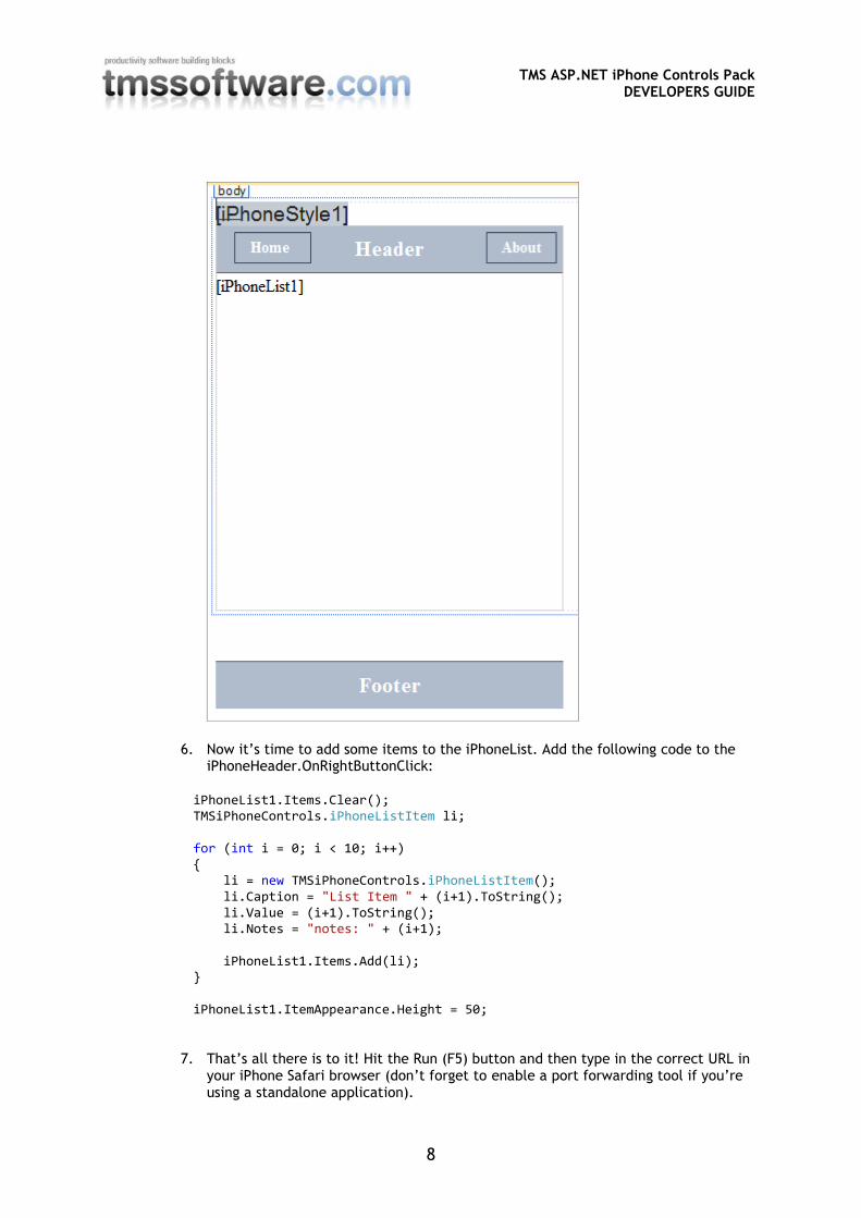
1. Start by adding an iPhoneStyle control on the form.
This way we make sure the application will use the default iPhone/iPad web page configuration, background color and font settings.
2. Then add an iPhonePanel on the form. The form size is automatically adjusted to the width and height of the iPhone/iPad screen size.
3. Select the iPhonePanel and add an iPhoneHeader, iPhoneFooter and an iPhoneList control. These controls have to be correctly aligned. The header at the top, the footer at the bottom and the list in the middle. This can be done by adding a table with 3 rows to the aspx file.
4. Change the iPhoneHeader1.RightButton.Caption value to “Load”. 5. This is what your design time form should look like:
TMS ASP.NET iPhone Controls Pack
DEVELOPERS GUIDE
8
6. Now it’s time to add some items to the iPhoneList. Add the following code to the iPhoneHeader.OnRightButtonClick:
iPhoneList1.Items.Clear(); TMSiPhoneControls.iPhoneListItem li; for (int i = 0; i < 10; i++) { li = new TMSiPhoneControls.iPhoneListItem(); li.Caption = "List Item " + (i+1).ToString(); li.Value = (i+1).ToString(); li.Notes = "notes: " + (i+1); iPhoneList1.Items.Add(li); } iPhoneList1.ItemAppearance.Height = 50;
7. That’s all there is to it! Hit the Run (F5) button and then type in the correct URL in your iPhone Safari browser (don’t forget to enable a port forwarding tool if you’re using a standalone application).
TMS ASP.NET iPhone Controls Pack
DEVELOPERS GUIDE
9
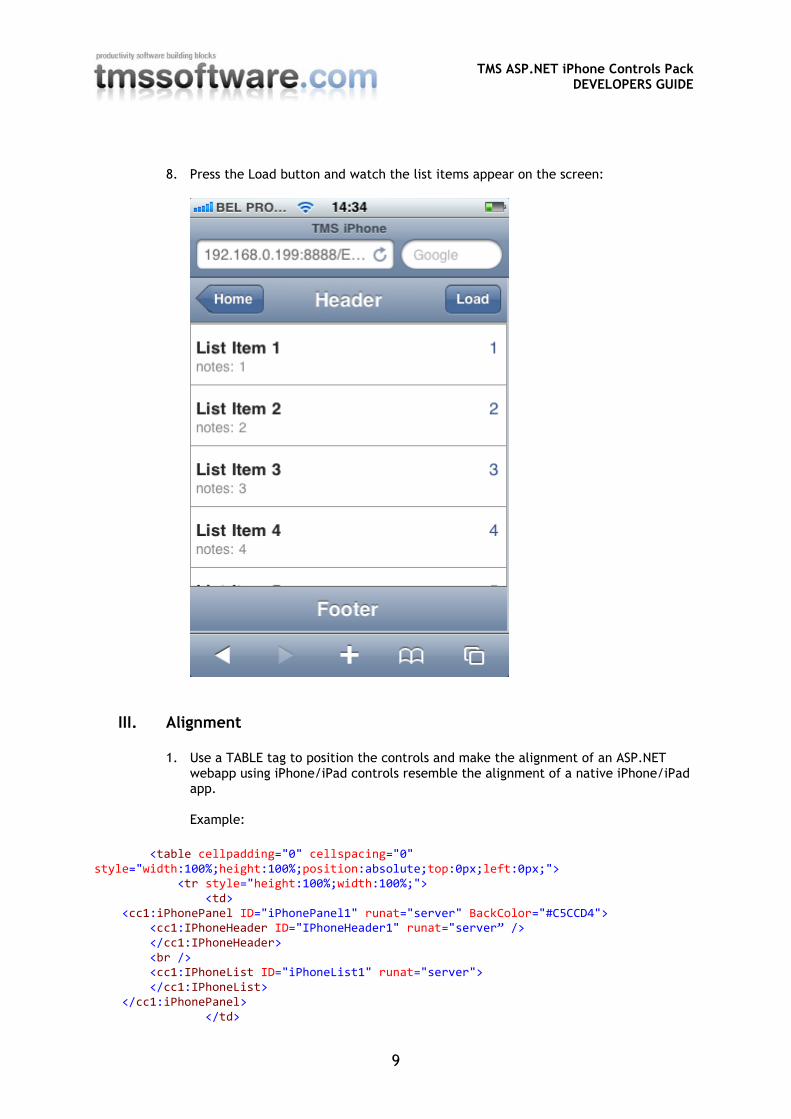
8. Press the Load button and watch the list items appear on the screen:
III. Alignment
1. Use a TABLE tag to position the controls and make the alignment of an ASP.NET webapp using iPhone/iPad controls resemble the alignment of a native iPhone/iPad app. Example:
2. For a full working example refer to the Demo included with the TMS ASP.NET iPhone
Controls Pack that uses this technique to create both an iPhone and an iPad style layout
TMS ASP.NET iPhone Controls Pack
DEVELOPERS GUIDE
11
List of included components
iPhoneButton
iPhoneEdit
iPhoneEmailLabel
iPhoneFooter
iPhoneGeolocation
iPhoneHeader
iPhoneList
iPhoneLocationLabel
iPhoneMenu
iPhoneOnOffButton
iPhonePageFlip
iPhonePanel
iPhonePhoneLabel
iPhonePopup
iPhoneScrollPanel
iPhoneSMSLabel
iPhoneSpinner
iPhoneStyle
TMS ASP.NET iPhone Controls Pack
DEVELOPERS GUIDE
12
iPhoneTrackbar
TMS ASP.NET iPhone Controls Pack
DEVELOPERS GUIDE
13
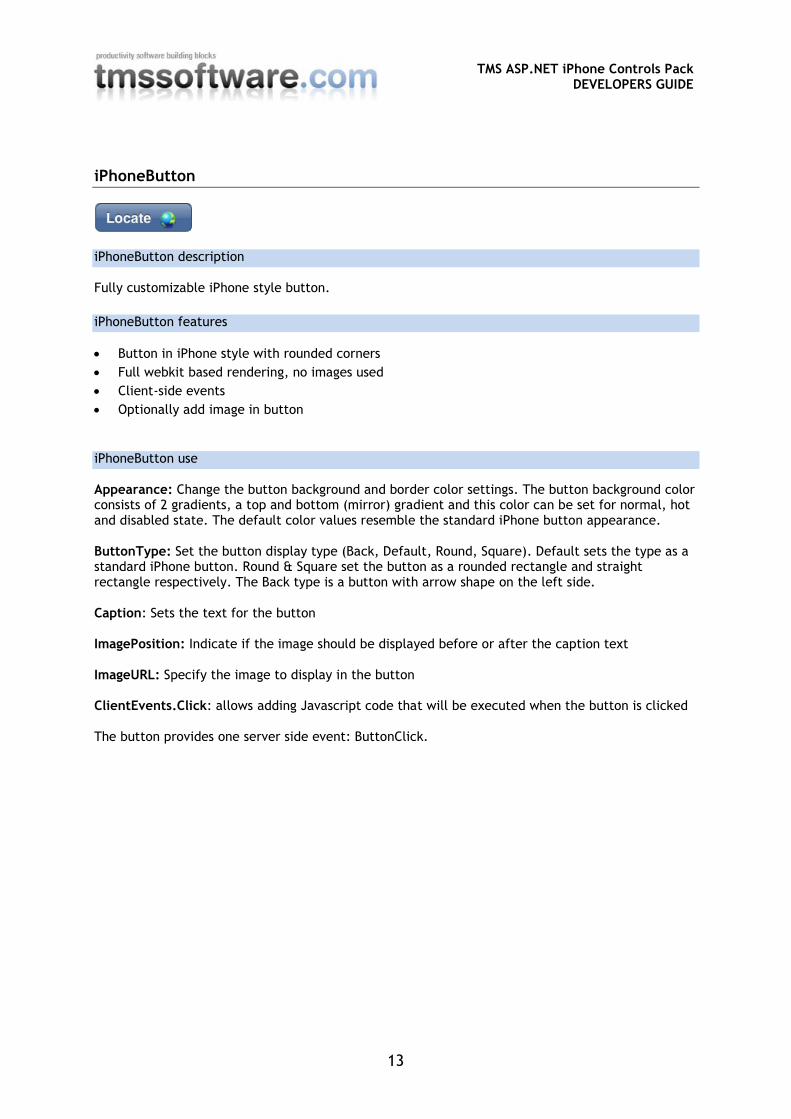
iPhoneButton
iPhoneButton description
Fully customizable iPhone style button.
iPhoneButton features
Button in iPhone style with rounded corners
Full webkit based rendering, no images used
Client-side events
Optionally add image in button
iPhoneButton use
Appearance: Change the button background and border color settings. The button background color consists of 2 gradients, a top and bottom (mirror) gradient and this color can be set for normal, hot and disabled state. The default color values resemble the standard iPhone button appearance. ButtonType: Set the button display type (Back, Default, Round, Square). Default sets the type as a standard iPhone button. Round & Square set the button as a rounded rectangle and straight rectangle respectively. The Back type is a button with arrow shape on the left side. Caption: Sets the text for the button ImagePosition: Indicate if the image should be displayed before or after the caption text ImageURL: Specify the image to display in the button ClientEvents.Click: allows adding Javascript code that will be executed when the button is clicked The button provides one server side event: ButtonClick.
TMS ASP.NET iPhone Controls Pack
DEVELOPERS GUIDE
14
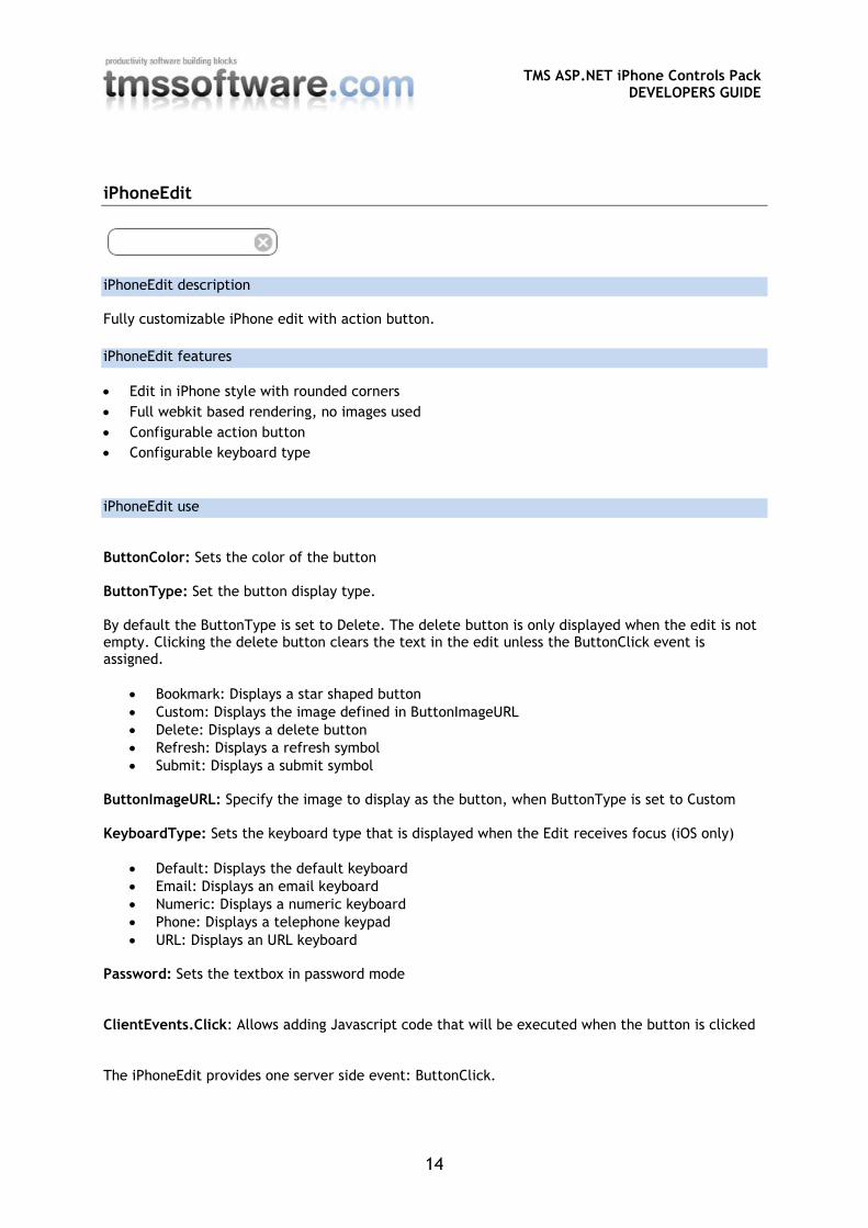
iPhoneEdit
iPhoneEdit description
Fully customizable iPhone edit with action button.
iPhoneEdit features
Edit in iPhone style with rounded corners
Full webkit based rendering, no images used
Configurable action button
Configurable keyboard type
iPhoneEdit use
ButtonColor: Sets the color of the button ButtonType: Set the button display type. By default the ButtonType is set to Delete. The delete button is only displayed when the edit is not empty. Clicking the delete button clears the text in the edit unless the ButtonClick event is assigned.
Bookmark: Displays a star shaped button
Custom: Displays the image defined in ButtonImageURL
Delete: Displays a delete button
Refresh: Displays a refresh symbol
Submit: Displays a submit symbol ButtonImageURL: Specify the image to display as the button, when ButtonType is set to Custom KeyboardType: Sets the keyboard type that is displayed when the Edit receives focus (iOS only)
Default: Displays the default keyboard
Email: Displays an email keyboard
Numeric: Displays a numeric keyboard
Phone: Displays a telephone keypad
URL: Displays an URL keyboard Password: Sets the textbox in password mode ClientEvents.Click: Allows adding Javascript code that will be executed when the button is clicked The iPhoneEdit provides one server side event: ButtonClick.
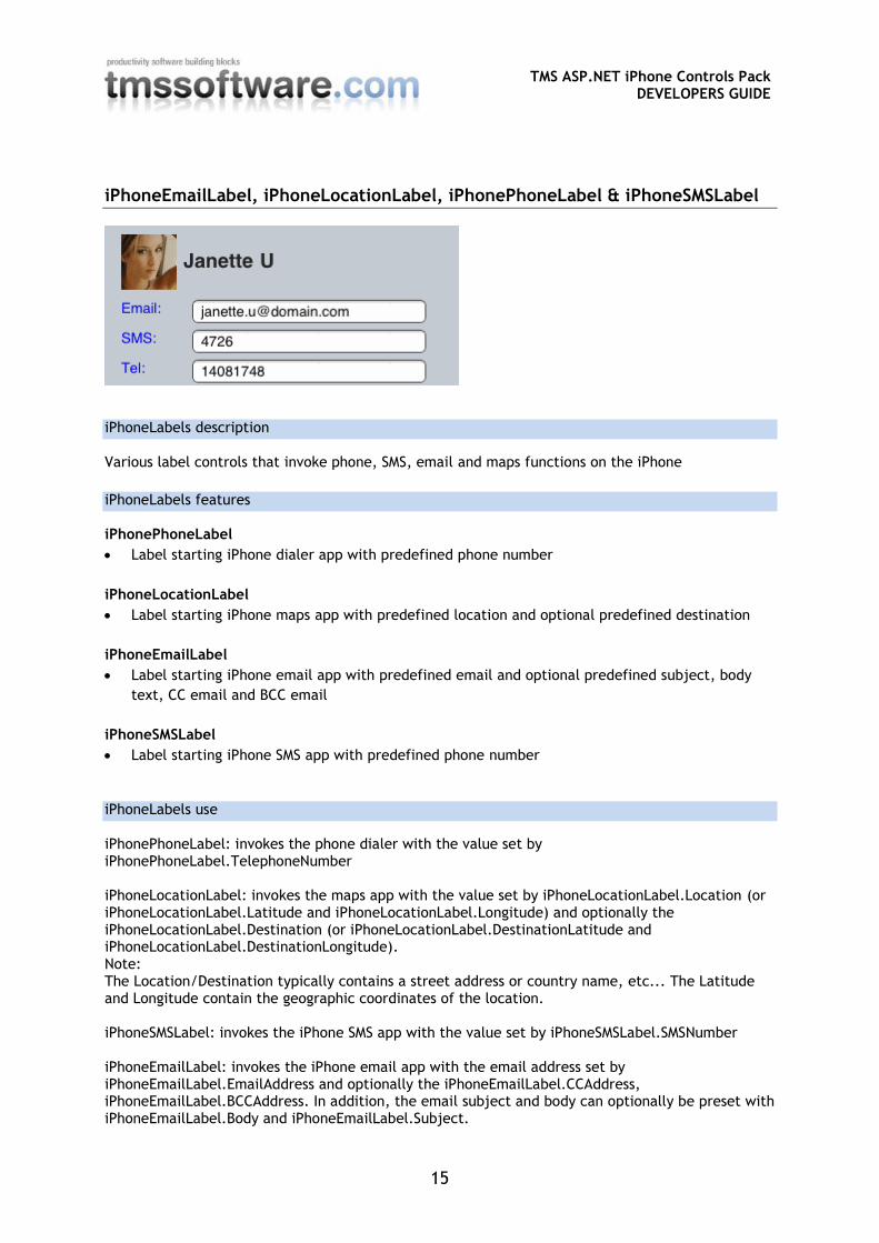
Various label controls that invoke phone, SMS, email and maps functions on the iPhone
iPhoneLabels features
iPhonePhoneLabel
Label starting iPhone dialer app with predefined phone number
iPhoneLocationLabel
Label starting iPhone maps app with predefined location and optional predefined destination
iPhoneEmailLabel
Label starting iPhone email app with predefined email and optional predefined subject, body
text, CC email and BCC email
iPhoneSMSLabel
Label starting iPhone SMS app with predefined phone number
iPhoneLabels use
iPhonePhoneLabel: invokes the phone dialer with the value set by iPhonePhoneLabel.TelephoneNumber iPhoneLocationLabel: invokes the maps app with the value set by iPhoneLocationLabel.Location (or iPhoneLocationLabel.Latitude and iPhoneLocationLabel.Longitude) and optionally the iPhoneLocationLabel.Destination (or iPhoneLocationLabel.DestinationLatitude and iPhoneLocationLabel.DestinationLongitude). Note: The Location/Destination typically contains a street address or country name, etc... The Latitude and Longitude contain the geographic coordinates of the location. iPhoneSMSLabel: invokes the iPhone SMS app with the value set by iPhoneSMSLabel.SMSNumber iPhoneEmailLabel: invokes the iPhone email app with the email address set by iPhoneEmailLabel.EmailAddress and optionally the iPhoneEmailLabel.CCAddress, iPhoneEmailLabel.BCCAddress. In addition, the email subject and body can optionally be preset with iPhoneEmailLabel.Body and iPhoneEmailLabel.Subject.
TMS ASP.NET iPhone Controls Pack
DEVELOPERS GUIDE
16
If no caption text is specified, the predefined phone number (iPhonePhoneLabel, iPhoneSMSLabel), the predefined email address (iPhoneEmailLabel) or the predefined location (iPhoneLocationLabel) will be displayed instead. Example: iPhonePhoneLabel1.Caption = "My friend"; iPhonePhoneLabel1.TelephoneNumber = "001 800 123456"; This will display as “My friend” and when clicked will start the phone dialer with number 001 800 123456.
TMS ASP.NET iPhone Controls Pack
DEVELOPERS GUIDE
17
iPhoneGeolocation
iPhoneGeolocation description
Retrieves the current geographic location.
iPhoneGeolocation features
Non visual component to retrieve the current geographic location
Retrieve location as a street address or as latitude/longitude coordinates
iPhoneGeolocation use
- Call the iPhoneGeolocation.RetrieveLocation method (for example through a button’s Click event).
- When the location has been found, the iPhoneGeolocation.LocationRetrieved event is triggered. The current geographic location is now available from the event’s parameters: Location (street address), Latitude and Longitude (geographic coordinates).
TMS ASP.NET iPhone Controls Pack
DEVELOPERS GUIDE
18
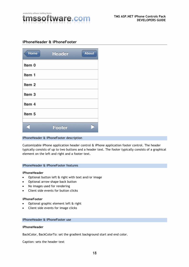
iPhoneHeader & iPhoneFooter
iPhoneHeader & iPhoneFooter description
Customizable iPhone application header control & iPhone application footer control. The header
typically consists of up to two buttons and a header text. The footer typically consists of a graphical
element on the left and right and a footer text.
iPhoneHeader & iPhoneFooter features
iPhoneHeader
Optional button left & right with text and/or image
Optional arrow shape back button
No images used for rendering
Client side events for button clicks
iPhoneFooter
Optional graphic element left & right
Client side events for image clicks
iPhoneHeader & iPhoneFooter use
iPhoneHeader BackColor, BackColorTo: set the gradient background start and end color. Caption: sets the header text
TMS ASP.NET iPhone Controls Pack
DEVELOPERS GUIDE
19
LeftButton, RightButton: Configure the left hand side and right hand side button respectively. See the iPhoneButton section for further information. ClientEvents: contains the JavaScript code that can be specified that is executed when either the left or right button is clicked. The header provides following events: LeftButtonClick, RightButtonClick: event triggered when one of the buttons is triggered with a page refresh. iPhoneFooter BackColor, BackColorTo: set the gradient background start and end color. Caption: sets the footer text LeftImageURL, RightImageURL: Specify the image to use on the left hand side and right hand side respectively. ClientEvents: contains the JavaScript code that can that is executed when either the left or right graphic is clicked. LeftImageClick, RightImageClick: event triggered when one of the images is triggered with a page refresh.
TMS ASP.NET iPhone Controls Pack
DEVELOPERS GUIDE
20
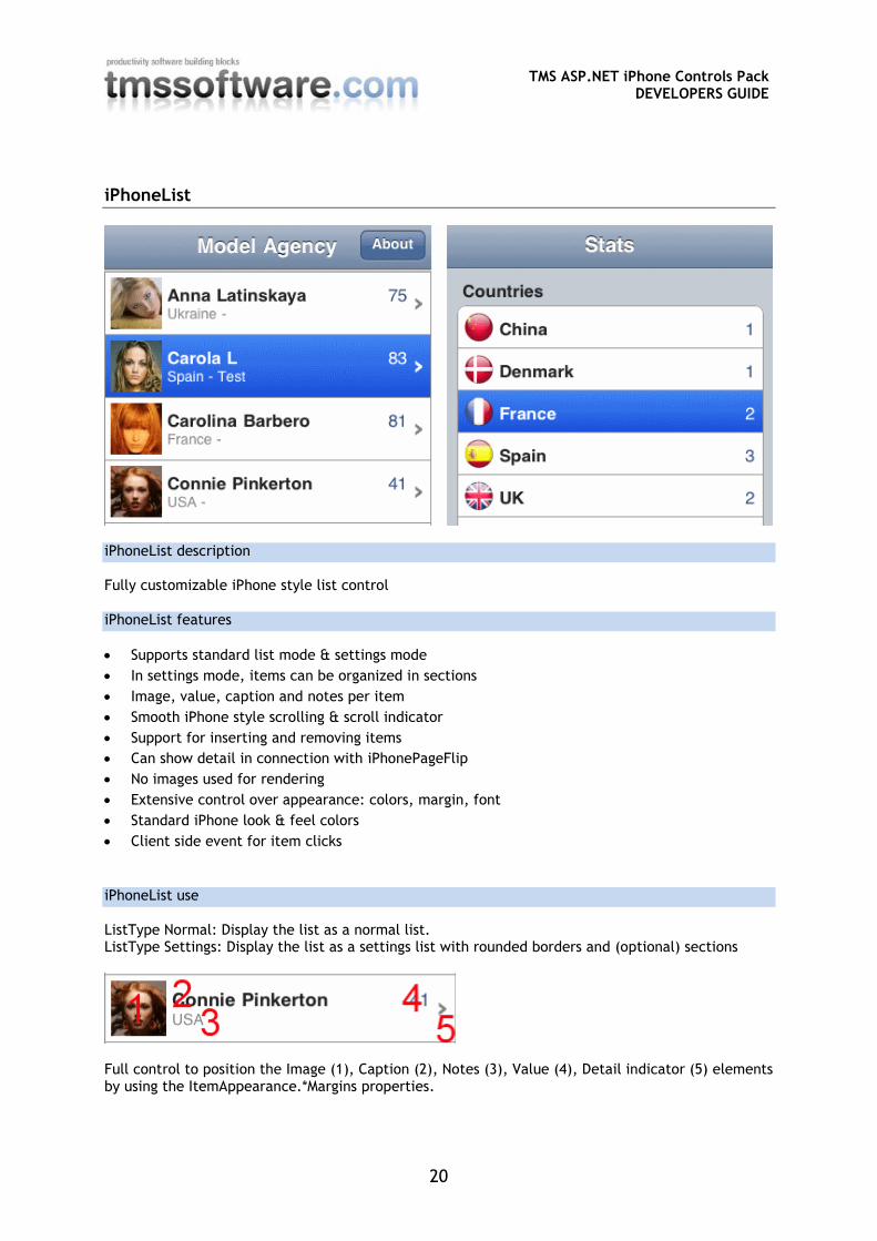
iPhoneList
iPhoneList description
Fully customizable iPhone style list control
iPhoneList features
Supports standard list mode & settings mode
In settings mode, items can be organized in sections
Image, value, caption and notes per item
Smooth iPhone style scrolling & scroll indicator
Support for inserting and removing items
Can show detail in connection with iPhonePageFlip
No images used for rendering
Extensive control over appearance: colors, margin, font
Standard iPhone look & feel colors
Client side event for item clicks
iPhoneList use
ListType Normal: Display the list as a normal list. ListType Settings: Display the list as a settings list with rounded borders and (optional) sections
Full control to position the Image (1), Caption (2), Notes (3), Value (4), Detail indicator (5) elements by using the ItemAppearance.*Margins properties.
TMS ASP.NET iPhone Controls Pack
DEVELOPERS GUIDE
21
The iPhoneList.ItemAppearance controls how each item in the list looks. BackColor/BackColorTo set the gradient start and end color for an item. The SelectedBackColor, SelectedBackColorTo set the gradient start and end color for a selected item. The fonts for caption, notes and value are also controlled by CaptionFont, NotesFont and ValueFont under iPhoneList.ItemAppearance. The items in the iPhoneList are organized via a collection: iPhoneList.Items. The item in this collection has following properties: iPhoneListItem: Caption: sets the caption text Data: additional data associated with the item maintained in a collection of strings Detail: when true, an indicator ‘>’ is shown that indicates a detail screen is available Image: sets the URL of the image to be shown in the item Name: sets the name of the item Notes: sets the optionally displayed notes Section: when true, the item represents a section title in an iPhoneList with ListType = ListTypeEnum.Settings Tag: holds an integer value associated with the item Value: sets the value of the item as string The iPhoneList can display a typical “See more” button below the last item if not all collection items are currently displayed in the list (The initial number of items displayed can be set with InitialItemCount). After clicking this button, additional items will be inserted in the list (Configure the number of items that are inserted after every click with LoadAdditionalItemsCount). The iPhoneList exposes following events: ImageClick: event triggered when the item image is clicked ItemClick: event triggered when the item is clicked LoadAdditionalItems: event triggered when the “See more” button is clicked. If this event is assigned, no additional items will be added this allows for adding custom code. GetItemProps: event triggered every time an item is ready to be rendered in the browser. The item properties (Caption, Notes, Value, Image and Detail) can be changed here. Example: This adds an item to the list via code: TMSiPhoneControls.iPhoneListItem li; li.Caption = "New item"; li.Value = "value"; li.Notes = "This is the description of the item"; li.Detail = true; // show the detail indicator IPhoneList1.Items.Add(li);
TMS ASP.NET iPhone Controls Pack
DEVELOPERS GUIDE
22
iPhoneMenu
iPhoneMenu description
Fully customizable iPhone application menu control
iPhoneMenu features
Collection of menu items with text
iPhone style status indicator per item
Client side JavaScript events
iPhoneMenu use
iPhoneMenu consists of a horizontal series of menu items. The menu item has an image and a
caption text. Optionally, a menu item can show a status indicator (red circular indicator). The
status indicator is fully updatable. The menu can have one selected menu item, set by
iPhoneMenu.SelectedIndex. The menu items are organized in a collection: iPhoneMenu.Items. This is
a collection of iPhoneMenuItem instances:
TiPhoneMenuItem
Caption: sets the text for the menu item
Image: sets the URL of the image to be shown in the item
IndicatorCaption: sets the value of the optional status indicator
IndicatorVisible: when true, the indicator is shown at the top right for the menu item
Name: sets the name of the menu item
SelectedImage: alternate image shown for a menu item in selected state
Tag: holds an integer value associated with the item
The iPhoneMenu exposes following events:
ItemClick: triggered event when the menu item is clicked
ClientEvents.ItemClick: this sets the JavaScript code that will be executed when the menu item is
clicked (the item index parameter is available through a JavaScript variable called “index”)
Example:
This code snippet shows how a click on the 2nd menu item sets the indicator on the first menu item:
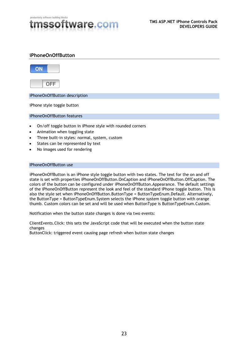
On/off toggle button in iPhone style with rounded corners
Animation when toggling state
Three built-in styles: normal, system, custom
States can be represented by text
No images used for rendering
IPhoneOnOffButton use
iPhoneOnOffButton is an iPhone style toggle button with two states. The text for the on and off state is set with properties iPhoneOnOffButton.OnCaption and iPhoneOnOffButton.OffCaption. The colors of the button can be configured under iPhoneOnOffButton.Appearance. The default settings of the iPhoneOnOffButton represent the look and feel of the standard iPhone toggle button. This is also the style set when iPhoneOnOffButton.ButtonType = ButtonTypeEnum.Default. Alternatively, the ButtonType = ButtonTypeEnum.System selects the iPhone system toggle button with orange thumb. Custom colors can be set and will be used when ButtonType is ButtonTypeEnum.Custom. Notification when the button state changes is done via two events: ClientEvents.Click: this sets the JavaScript code that will be executed when the button state changes ButtonClick: triggered event causing page refresh when button state changes
TMS ASP.NET iPhone Controls Pack
DEVELOPERS GUIDE
24
iPhonePageFlip
iPhonePageFlip description
Control that allows switching between two associated panels with various animation types.
iPhonePageFlip features
Webkit based animation between panels
Client-side animation
Different animation types configuration
iPhonePageFlip use
Setting up and configuring the iPhonePageFlip is done in following way: Configure the iPhonePageFlip control: Add two IPhonePanel controls to the form. Add the required controls to both panels. Assign the front (first) panel to the FrontPanel property. Assign the back (second/detail) panel to the BackPanel property. Change the duration (in ms) of the animation by setting the AnimationSpeed property. Change the type of animation by setting the AnimationType property. Decide which panel is initially displayed by setting the ActivePanel property to Front or Back. Switch between FrontPanel and BackPanel: Starting the animation to switch from one assigned panel to another panel can be done in JavaScript code or via handling a server event: Using an event from any control on your form: Call iPhonePageFlip.SlideToBack to switch to the BackPanel. Call iPhonePageFlip.SlideToFront to switch to the FrontPanel. Using a ClientEvent from any control on your form: Add the string CONTROLIDback(); to your script event to switch to the BackPanel. Add the string CONTROLIDfront(); to your script event to switch to the FrontPanel. (Where “CONTROLID” is the ClientID of the IPhonePageFlip control)
TMS ASP.NET iPhone Controls Pack
DEVELOPERS GUIDE
25
iPhonePanel
iPhonePanel description
This panel has the size of the standard iPhone/iPad screen. This allows designing the panel in the Visual Studio IDE taking the sizes of the target screen in account.
iPhonePanel features
Panel for easy design time configuration of iPhone/iPad size screens
iPhonePanel use
Using iPhonePanel is similar to using a standard ASP.NET Panel. The advantage of the iPhonePanel is that it shows in the IDE the size of the panel as it will show on the iPhone/iPad as well as allowing specifying a runtime only client-alignment of the panel with a non-aligned design time behavior. This non-aligned design time behavior allows putting multiple panels on a single form at design time and at runtime switch between client-aligned panels. Specify the iPhonePanel size by setting iPhonePanel.Device to iPad or iPhone and iPhonePanel.DeviceOrientation to Horizontal or Vertical.
TMS ASP.NET iPhone Controls Pack
DEVELOPERS GUIDE
26
iPhonePopup
iPhonePopup description
iPhone / iPad style popup control
iPhonePopup features
Full webkit based rendering, no images used
Built-in configurable collection of iPhone / iPad style buttons
Can host custom content by adding a Panel that can contain any control
Extensive control over positioning
iPhonePopup use
Initializing the iPhonePopup control:
TMS ASP.NET iPhone Controls Pack
DEVELOPERS GUIDE
27
- Add the required buttons with their Caption text to the Buttons collection - Optionally configure a popup Caption text - Optionally configure the positioning ArrowPosition and PositionType properties - Initially the iPhonePopup will be hidden. Set the ShowPopup property to true using an event
of any other control on the form to display the popup. Set the ShowPopup to false to hide the popup.
ArrowPosition: Used to configure the position of the arrow on the side of the iPhonePopup. This property also determines on what side of the control set in the PositionControl property the iPhonePopup is displayed. PositionType: Used to determine if the iPhonePopup is positioned based on it’s absolute Top and Left values (Absolute) or based on the position of the PositionControl (AtControl) Example:
- Set PositionType to AtControl - Set PositionControl to a TextBox control on your form - Set ArrowPosition to TopLeft to display the popup at the bottom left corner of the TextBox
control and the arrow will be positioned in the top left corner of the popup, pointing at the TextBox control.
ContentPanel: Select any panel on your form to display it’s content in the iPhonePopup. Note: the buttons from the Buttons collection will be hidden when a ContentPanel is assigned. Example: Add an iPhoneSpinner control on the ContentPanel to create a DatePicker or TimePicker control. ButtonClick, ClientEvents.ButtonClick: These events will fire when a button has been clicked and provide a button index parameter. (For the ClientEvents.ButtonClick the button index parameter is available through a JavaScript variable called “index”) Tip: Show or hide the iPhonePopup by using ClientEvents: You can use JavaScript to show or hide the iPhonePopup with the following calls: POPUPIDShow();
POPUPIDHide();
(Where “POPUPID” is the ClientID of the control in uppercase)
TMS ASP.NET iPhone Controls Pack
DEVELOPERS GUIDE
28
iPhoneScrollPanel
iPhoneScrollPanel description
Panel for displaying scrollable content.
iPhoneScrollPanel features
Smooth iPhone style scrolling & scroll indicator
iPhoneScrollPanel use
Using iPhoneScrollPanel is similar to using a standard ASP.NET Panel. The advantage of the iPhoneScrollPanel is that it allows clipping of the content and provides smooth iPhone style scrolling and scroll indicator. EnableHorizontalScrolling: Vertical scrolling is always enabled, while horizontal scrolling is disabled by default but can be activated by setting the EnableHorizontalScrolling property to True. It’s typically used client aligned inside an iPhonePanel which can already contain a iPhoneHeader and iPhoneFooter or iPhoneMenu. Thanks to the scrolling functionality the Header and Footer or Menu will remain at a fixed position.
TMS ASP.NET iPhone Controls Pack
DEVELOPERS GUIDE
29
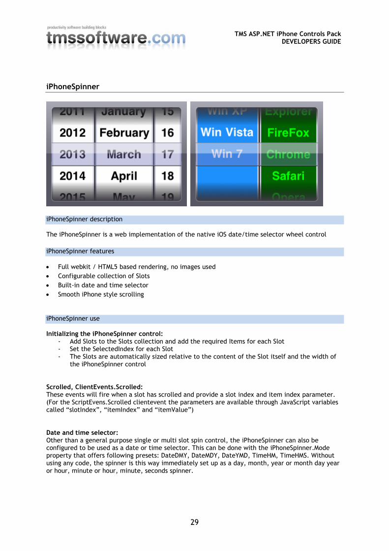
iPhoneSpinner
iPhoneSpinner description
The iPhoneSpinner is a web implementation of the native iOS date/time selector wheel control
iPhoneSpinner features
Full webkit / HTML5 based rendering, no images used
Configurable collection of Slots
Built-in date and time selector
Smooth iPhone style scrolling
iPhoneSpinner use
Initializing the iPhoneSpinner control: - Add Slots to the Slots collection and add the required Items for each Slot - Set the SelectedIndex for each Slot - The Slots are automatically sized relative to the content of the Slot itself and the width of
the iPhoneSpinner control Scrolled, ClientEvents.Scrolled: These events will fire when a slot has scrolled and provide a slot index and item index parameter. (For the ScriptEvens.Scrolled clientevent the parameters are available through JavaScript variables called “slotIndex”, “itemIndex” and “itemValue”) Date and time selector: Other than a general purpose single or multi slot spin control, the iPhoneSpinner can also be configured to be used as a date or time selector. This can be done with the iPhoneSpinner.Mode property that offers following presets: DateDMY, DateMDY, DateYMD, TimeHM, TimeHMS. Without using any code, the spinner is this way immediately set up as a day, month, year or month day year or hour, minute or hour, minute, seconds spinner.
TMS ASP.NET iPhone Controls Pack
DEVELOPERS GUIDE
30
iPhoneStyle
iPhoneStyle description
Holds meta tags for controlling if an application runs full screen, defines the optional application icon on the iPhone and the optional splash screen.
iPhoneStyle features
Non visual component to define different global iPhone application settings
Can define iPhone/iPad application button icon
Can define iPhone application splash screen
iPhoneStyle use
Drop the iPhoneStyle component on the form. Following control is possible: BackColor, BackColorTo: set the application gradient background start and end color. Font: the font settings will be applied to all other controls on the form, except for controls where the font settings are already configured on the control itself. FullScreen: Boolean; when true, the application will run full screen if started from an iPhone button HideAddressBar: Boolean; when true, the browser address bar is hidden IconImage: sets the URL for the image that will be used for the iPhone button from where the web application can be started. StartupImage: set the URL for the image that can be used as splash screen to start the application StatusBarStyle: allows selecting a default color or semitransparent black statusbar on the iPhone UsePrecomposedIcon: Boolean; when true, the image specified in IconImage will not be changed. When false, the image specified in IconImage will have the typical iPhone button rounded borders and glow effect applied. FullScreen, IconImage, StartupImage and StatusBarStyle can only be used when the application is started from an iPhone button (i.e. this will not work when the application is started from a link or bookmark in the iPhone browser). HideAddressBar can only be used when Fullscreen is false.
TMS ASP.NET iPhone Controls Pack
DEVELOPERS GUIDE
31
iPhoneTrackbar
iPhoneTrackbar description
iPhone style trackbar
iPhoneTrackbar features
Full webkit based rendering, no images
Display the dynamically updated position value
iPhoneTrackbar use
The iPhoneTrackbar is very similar to a standard TrackBar. It has a MinimumValue and MaximumValue and a ThumbPosition. The thumb can be moved between the minimum and maximum. Optionally an automatically updated label with the position value can be displayed when ShowValue is true, the value will be formatted and positioned using the settings from ValueFormat and ValuePosition respectively. Changes in the trackbar at runtime trigger several events: JavaScript events with event handlers defined under ClientEvents: Drag: holds the JavaScript executed while the thumb is being dragged. EndDrag: holds the JavaScript executed when the thumb is released StartDrag: holds the JavaScript executed when the thumb is first clicked to start dragging Events: Drag: event triggered while the thumb is being dragged. DragEnd: event triggered when the thumb is released DragStart: event triggered when the thumb is first clicked to start dragging