17
October 2017 FEDERAL RESERVE BANK OF MINNEAPOLIS QUARTERLY REVIEW QR Top Income Inequality in the 21st Century: Some Cautionary Notes Fatih Guvenen Greg Kaplan
October 2017
FEDERAL RESERVE BANK OF MINNEAPOLIS QUARTERLY REVIEW QRTop Income Inequality in the 21st Century: Some Cautionary Notes
Fatih GuvenenGreg Kaplan

FEDERAL RESERVE BANK OF MINNEAPOLIS
Quarterly Review Vol. 38, No.1
ISSN 0271-5287
https://doi.org/10.21034/qr.3811
This publication primarily presents economic research aimed at improving policymaking by the Federal Reserve System and other governmental authorities.
The views expressed herein are those of the authors and not necessarily those of the Federal Reserve Bank of Minneapolis or the Federal Reserve System.
SENIOR VICE PRESIDENT AND DIRECTOR OF RESEARCH: Mark L. J. WrightEDITOR: Terry FitzgeraldARTICLE AND PRODUCTION EDITOR: Joan Gieseke TECHNICAL SUPPORT: Shawn Hewitt, Thomas E. Price
The Quarterly Review is published by the Research Division of the Federal Reserve Bank of Minneapolis.This has become an occasional publication; however, it continues to be known as the Quarterly Review for citation purposes. Subscriptions are available free of charge. To subscribe to the journal and be automatically notified whenever a new issue is published, please sign up at https://www.minneapolis.org/research/
Quarterly Review articles that are reprints or revisions of papers published elsewhere may not be reprinted without the written permission of the original publisher. All other Quarterly Review articles may be reprinted without charge. If you reprint an article, please fully credit the source—the Minneapolis Federal Reserve Bank as well as the Quarterly Review—and include with the reprint a version of the standard Federal Reserve disclaimer (italicized above). Also, please send one copy of any publication that includes a reprint to the Research Division of the Federal Reserve Bank of Minneapolis.

Contents
Top Income Inequality in the 21st Century: Some Cautionary Notes........................................................2
A revisit of recent empirical evidence about the rise in top income inequality in the United States
Top Income Inequality in the 21st Century:Some Cautionary Notes∗
Fatih GuvenenConsultantResearch DivisionFederal Reserve Bank of Minneapolis,University of Minnesota, and NBER
Greg KaplanUniversity of Chicago and NBER
Summary
We revisit recent empirical evidence about the rise in top income inequality in the UnitedStates, drawing attention to some key issues that we believe are critical for an informeddiscussion about changing inequality since 1980. Our goal is to inform researchers, policy-makers, and journalists who are interested in top income inequality. Our analysis is based ona reexamination of publicly available detailed statistics from two administrative data sources:(i) Internal Revenue Service (IRS) data on total incomes (labor income plus capital income),reported in Saez (2012), and (ii) individual-level micro data on labor income (wage plusself-employment income) from the U.S. Social Security Administration (SSA), reported inGuvenen, Kaplan, and Song (2014). Reexamining these statistics reveals four findings.
In the final two decades of the 20th century (1981–2000):
1. The rise in top income inequality revealed in SSA and IRS data track each other veryclosely, except for the two-year period between 1986 and 1988 (see point 2). This isdespite nontrivial differences between the two data sources in the definition of income(labor versus total) and the unit of analysis (individual versus tax unit).
2. Between 1986 and 1988, IRS data show a large jump in top income shares, which isnot evident in SSA data. This jump has been previously noted by researchers and islikely a consequence of income shifting from the corporate sectors to pass-throughentities in the wake of the Tax Reform Act of 1986.
∗For helpful discussions, we thank Mark Aguiar, Jim Poterba, and Eric Zwick. The views expressed hereinare those of the authors and not necessarily those of the Federal Reserve Bank of Minneapolis, the FederalReserve System, or the Social Security Administration.
2

Top Income Inequality in the 21st Century
Guvenen and Kaplan
Figure 1Top income shares, 1917–2012
05
1015
20P
erce
nt
1920 1930 1940 1950 1960 1970 1980 1990 2000 2010year
Top 1 percent Top 0.1 percent
Notes: Data from Saez (2012). Total income excluding capital gains.
So far in the 21st century (2001–2012):
3. IRS and SSA data reveal diverging patterns in top income shares; the IRS data show asteady increase, whereas the SSA data show no increase at all. The difference is dueto the increasing importance of income accruing to pass-through entities (partnershipsand S-corporations), which is included in the IRS measure of total income but not ineither the IRS or SSA measure of labor income.
4. Moreover, the bulk of this growth in income from pass-through entities was con-centrated at the very top of the distribution — above the 99.99th percentile, a groupthat contains only about 12,000 households. The share of incomes above the 99thpercentile (around $372,000 in 2012) but below the 99.99th percentile (around $7.2million in 2012) has barely changed in the last two decades.
Background
Top income inequality in the United States, as measured by the share of incomes accruing toindividuals in the top percentiles of the income distribution, has risen dramatically in thelast half century. Figure 1, which is based on data from Saez (2012), is a typical example ofthe evidence that is used to illustrate this trend. The figure shows that after bottoming out inthe 1960s, the top 1 percent and top 0.1 percent shares of total income (excluding capitalgains) have been rising steadily for the last 40 years.1 This trend has motivated research ontop income inequality to a phenomenal extent; a vast number of recent papers, too numerousto list, study its policy implications, theoretical underpinnings, and statistical deconstruction.That top income inequality is increasing in the United States has become almost gospel inacademic and policy debate on the topic of income distribution.
Our goal in this article is to highlight some features of the recent evidence on top incomesthat researchers, journalists, and policy analysts should bear in mind as the discussion ofthis issue evolves. We do not deny that dramatic changes have taken place in the distributionof incomes; the evidence in Figure 1 is indisputable. Instead, in typical economist fashion,we want to emphasize some caveats that we think are particularly important for guiding
3

FEDERAL RESERVE BANK OF MINNEAPOLIS
QR
the search for useful theories of changes in top inequality, for framing further empiricalinvestigation of top incomes, and for contextualizing the debate over the appropriate policyresponse. The caveats that we emphasize pertain to subtleties in both words of the phrase“top incomes.”
First, the precise definition of “income” is critical for the inferences one makes aboutrecent trends in top inequality. Much of the remainder of this article focuses on illustratingthe differences in trends for alternative measures of income. We start in the following sectionon data sources by highlighting the different trends in top income shares calculated fromSSA data on wage, salary, and self-employment income versus those calculated from IRSdata on total incomes as in Figure 1. The SSA data show a much smaller increase in topincome shares relative to the IRS data and no increase at all since 2000. We then show in thesection “Wage Income versus Total Income,” which begins on page 8, that the difference inthe trends in the two series is due to the different definition of income. The increase in topincome shares observed in the IRS data since 1981 is mostly a reflection of an increase inentrepreneurial income, and most of that increase is due to income accruing to flow-throughentities, such as S-corporations and partnerships. This is important because the incomeaccruing to these entities is sensitive to changes in tax policy, such as the Tax Reform Actof 1986 (TRA86) (Feenberg and Poterba 1993; Gordon and Slemrod 2002). Indeed, theincrease in top income shares in the two years immediately following TRA86 is larger thanthe entire increase in top income shares over the period from 1981 to 2000 with these twoyears excluded. It is thus difficult to know how much of the increase in measured income offlow-through entities reflects a true increase in incomes versus income shifting between thecorporate and personal sectors.
Second, the precise definition of the “top” of the income distribution is critical for thediscussion of top income inequality. Researchers variously adopt the top 10 percent, 1percent, 0.1 percent, or 0.01 percent as their preferred definition of the top of the incomedistribution. This choice is often determined primarily by which of the definitions producesstatistics that better highlight the points they wish to make. In the section “The Top versusthe Very Top” beginning on page 10, we show that almost all of the post-2000 increase inthe top 1 percent income share is due to an increase in the income of the top 0.01 percentincome share. This means that the recent increase in top income inequality is primarily aphenomenon that is about incomes above the 99.99th percentile, rather than a phenomenonthat is about incomes between the 99th and 99.99th percentiles.
To put these differences in perspective, observe that in 2012, the 90th percentile ofthe total income distribution was $112,000, the 99th percentile was $372,000, the 99.9thpercentile was $1.55 million, and the 99.99th percentile was $7.2 million. This is a widerange of income levels even within the top 1 percent. Households with earnings at each ofthese income levels come from different backgrounds, work in different occupations, obtaintheir income from different sources, face different investment opportunities, and are subjectto different types of risk. It is unlikely that a single mechanism simultaneously describes theevolution of incomes at this wide range of levels.
A simple but often underemphasized point is that changes in top income shares can bedriven by changes in incomes at either the top or the bottom of the distribution. In the section“The Bottom 99 Percent” (see page 12), we undertake a decomposition to better understandwhich of these changes are more important for the observed trends. We find that both slower
4
Top Income Inequality in the 21st Century
Guvenen and Kaplan
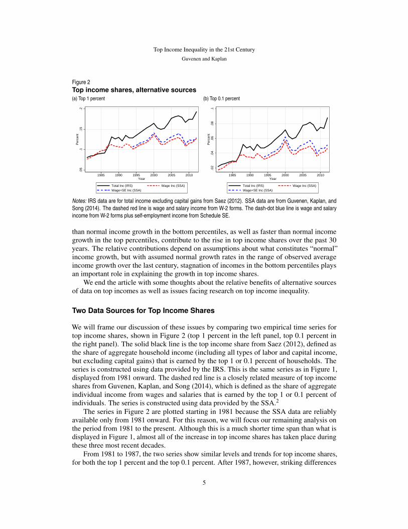
Figure 2Top income shares, alternative sources(a) Top 1 percent
.05
.1.1
5.2
Per
cent
1985 1990 1995 2000 2005 2010Year
Total Inc (IRS) Wage Inc (SSA)Wage+SE Inc (SSA)
(b) Top 0.1 percent
.02
.04
.06
.08
.1P
erce
nt
1985 1990 1995 2000 2005 2010Year
Total Inc (IRS) Wage Inc (SSA)Wage+SE Inc (SSA)
Notes: IRS data are for total income excluding capital gains from Saez (2012). SSA data are from Guvenen, Kaplan, andSong (2014). The dashed red line is wage and salary income from W-2 forms. The dash-dot blue line is wage and salaryincome from W-2 forms plus self-employment income from Schedule SE.
than normal income growth in the bottom percentiles, as well as faster than normal incomegrowth in the top percentiles, contribute to the rise in top income shares over the past 30years. The relative contributions depend on assumptions about what constitutes “normal”income growth, but with assumed normal growth rates in the range of observed averageincome growth over the last century, stagnation of incomes in the bottom percentiles playsan important role in explaining the growth in top income shares.
We end the article with some thoughts about the relative benefits of alternative sourcesof data on top incomes as well as issues facing research on top income inequality.
Two Data Sources for Top Income Shares
We will frame our discussion of these issues by comparing two empirical time series fortop income shares, shown in Figure 2 (top 1 percent in the left panel, top 0.1 percent inthe right panel). The solid black line is the top income share from Saez (2012), defined asthe share of aggregate household income (including all types of labor and capital income,but excluding capital gains) that is earned by the top 1 or 0.1 percent of households. Theseries is constructed using data provided by the IRS. This is the same series as in Figure 1,displayed from 1981 onward. The dashed red line is a closely related measure of top incomeshares from Guvenen, Kaplan, and Song (2014), which is defined as the share of aggregateindividual income from wages and salaries that is earned by the top 1 or 0.1 percent ofindividuals. The series is constructed using data provided by the SSA.2
The series in Figure 2 are plotted starting in 1981 because the SSA data are reliablyavailable only from 1981 onward. For this reason, we will focus our remaining analysis onthe period from 1981 to the present. Although this is a much shorter time span than what isdisplayed in Figure 1, almost all of the increase in top income shares has taken place duringthese three most recent decades.
From 1981 to 1987, the two series show similar levels and trends for top income shares,for both the top 1 percent and the top 0.1 percent. After 1987, however, striking differences
5

FEDERAL RESERVE BANK OF MINNEAPOLIS
QR
Figure 3Units of observation
11.
21.
41.
6In
dex,
198
1=1
1985 1990 1995 2000 2005 2010year
Individuals meeting min earns criteria Number of tax unitsNumber of tax returns
Note: Data from Saez (2012) and Guvenen, Kaplan, and Song (2014).
between the two series emerge. The IRS series show a distinct jump between 1987 and 1988,followed by a steady, almost linear, increase in the income shares of both top groups. Butthe SSA data show only a very small increase in the income shares of these groups, almostall of which took place during a brief period in the late 1990s. Since 2000, if there is anytrend at all in the SSA data, it is downward.
The different trends in these two series for top income shares post-2000 have importantimplications, particularly with regard to appropriate policy responses. With this in mind, theremainder of this article focuses on understanding why and where these two measures of topincome inequality differ in recent years. We delay our thoughts on the relative merits of thetwo data sources and the implications of the different trends until the final section, at whichpoint the likely reasons for the discrepancy will be clearer.
Two main differences between the IRS and SSA income data could account for thedifferent recent trends in Figure 2: the unit of observation and the definition of income.
In the IRS data, the unit of observation is a tax unit, whereas in the SSA data, the unitof observation is an individual. Moreover, the two series in Figure 2 are each based onselected subsamples from the respective data sources. The SSA series in Figure 2 comesfrom Guvenen, Kaplan, and Song (2014), which is based on a subsample of individualswho meet the following two criteria: (i) the individual must be between 25 and 60 yearsold, and (ii) the individual must have annual earnings that exceed a time-varying minimumthreshold that is equal to the earnings one would obtain by working for 520 hours (13 weeksat 40 hours per week) at one-half of the federal minimum wage of that year.3 Excludingindividuals with low annual earnings is common practice in empirical analyses of earningsinequality. The IRS series is constructed by Saez (2012) by scaling the number of tax unitsup to the total population using U.S. Census Bureau population estimates and setting incomefor nonfilers equal to 20 percent of average income.
A consequence of the different units of observation is that the two data sources dealwith the very bottom of the income distribution in different ways. As shown in Figure 3,the trends in these two alternative units of observation differ substantially over the period1981–2012. Trends in top income shares are determined by trends in incomes at both the topand bottom of the distribution, so one might be concerned that the different unit of analysis
6
Top Income Inequality in the 21st Century
Guvenen and Kaplan
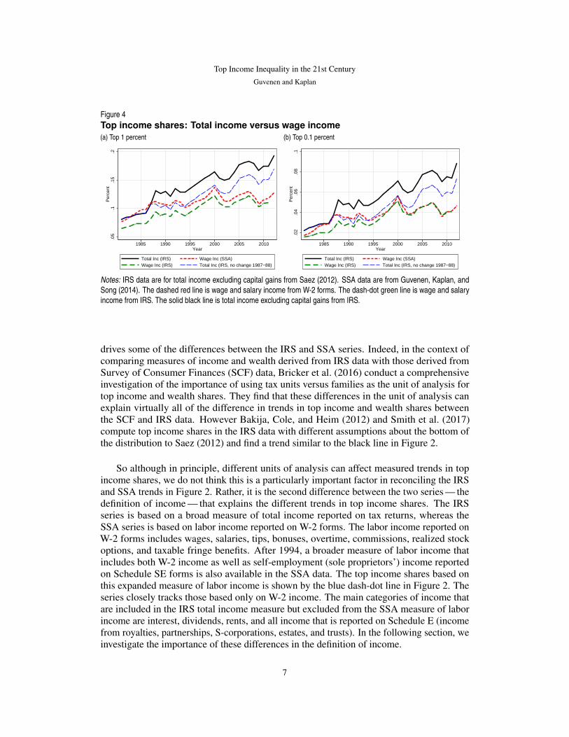
Figure 4Top income shares: Total income versus wage income(a) Top 1 percent
.05
.1.1
5.2
Per
cent
1985 1990 1995 2000 2005 2010Year
Total Inc (IRS) Wage Inc (SSA)Wage Inc (IRS) Total Inc (IRS, no change 1987−88)
(b) Top 0.1 percent
.02
.04
.06
.08
.1P
erce
nt
1985 1990 1995 2000 2005 2010Year
Total Inc (IRS) Wage Inc (SSA)Wage Inc (IRS) Total Inc (IRS, no change 1987−88)
Notes: IRS data are for total income excluding capital gains from Saez (2012). SSA data are from Guvenen, Kaplan, andSong (2014). The dashed red line is wage and salary income from W-2 forms. The dash-dot green line is wage and salaryincome from IRS. The solid black line is total income excluding capital gains from IRS.
drives some of the differences between the IRS and SSA series. Indeed, in the context ofcomparing measures of income and wealth derived from IRS data with those derived fromSurvey of Consumer Finances (SCF) data, Bricker et al. (2016) conduct a comprehensiveinvestigation of the importance of using tax units versus families as the unit of analysis fortop income and wealth shares. They find that these differences in the unit of analysis canexplain virtually all of the difference in trends in top income and wealth shares betweenthe SCF and IRS data. However Bakija, Cole, and Heim (2012) and Smith et al. (2017)compute top income shares in the IRS data with different assumptions about the bottom ofthe distribution to Saez (2012) and find a trend similar to the black line in Figure 2.
So although in principle, different units of analysis can affect measured trends in topincome shares, we do not think this is a particularly important factor in reconciling the IRSand SSA trends in Figure 2. Rather, it is the second difference between the two series — thedefinition of income — that explains the different trends in top income shares. The IRSseries is based on a broad measure of total income reported on tax returns, whereas theSSA series is based on labor income reported on W-2 forms. The labor income reported onW-2 forms includes wages, salaries, tips, bonuses, overtime, commissions, realized stockoptions, and taxable fringe benefits. After 1994, a broader measure of labor income thatincludes both W-2 income as well as self-employment (sole proprietors’) income reportedon Schedule SE forms is also available in the SSA data. The top income shares based onthis expanded measure of labor income is shown by the blue dash-dot line in Figure 2. Theseries closely tracks those based only on W-2 income. The main categories of income thatare included in the IRS total income measure but excluded from the SSA measure of laborincome are interest, dividends, rents, and all income that is reported on Schedule E (incomefrom royalties, partnerships, S-corporations, estates, and trusts). In the following section, weinvestigate the importance of these differences in the definition of income.
7

FEDERAL RESERVE BANK OF MINNEAPOLIS
QR
Wage Income versus Total Income
A useful starting point to help clarify the role of the broader definition of income in the IRSdata compared with the SSA data is to restrict the IRS definition of income to include onlywage and salary income, so that it coincides with the SSA definition. Using data reportedin Saez (2012), Figure 4 plots this series (green dash-dot line) alongside the correspondingseries based on total income from the IRS data (black solid line) and wage and salary incomefrom the SSA data (red dashed line), for the top 1 percent share (left panel) and top 0.1percent share (right panel). From the mid-1990s onward, the IRS and SSA series for wageand salary income follow very similar trends. For the top 0.1 percent share, the two series liealmost on top of each other.
The data in Figure 4 are strong evidence that the absence of a trend in top income sharesin the SSA data is not due to anything particular about SSA data per se, since the sameconclusion is evident in the corresponding series from the IRS data. Rather, it appears thatthe steady increase in top income shares in the IRS data is due to sources of income otherthan those that are reported on W-2 forms (or Schedule SE forms, given the findings reportedin Figure 2). There is, however, a small difference in the trends in the two series for top wageand salary income shares before 1995, which is likely attributable to the aforementioneddifferences in the way that low-income individuals are treated in the two series (see Figure3).
Thus, the large and widening gap between the commonly reported IRS measure of topincome shares and the SSA measure we report here is due to differences between the wage,salary, and self-employment income measured in the SSA data and the broader measure ofincome measured in the IRS data. Given that the recent rise in top income shares is not fromlabor income, which components of income are driving this increase?
Four main components of income are included in the total income measure but areexcluded from the wage and salaries measure: (i) entrepreneurial income, (ii) dividends,(iii) interest, and (iv) rents. Figure 5 shows the share of total income that is accounted forby each of these categories of income accruing to the top 1 percent (left panel) and top 0.1percent (right panel). Over this period, the category that has shown the biggest increase isentrepreneurial income (solid red line). With the exception of the mid-2000s, which sawa brief rise in interest and dividend income, essentially all of the differential trend in topshares between wage and salary income and total income can be attributed to the sharp risein the share of entrepreneurial income of top earners in total income.
So what exactly is “entrepreneurial” income? The series for entrepreneurial incomecomes from Saez (2012) and is defined as the sum of profits from S-corporations, profitsfrom partnerships, profits from sole proprietorship businesses (Schedule C income), and farmincome. Profits from S-corporations and partnerships constitute income that is generated byentities referred to as “pass-through” businesses. Cooper et al. (2016) undertake a compre-hensive investigation in order to trace the pass-through income to its ultimate originatorsand conclude that at least half of the post-1980 rise in the top 1 percent income share can beaccounted for by pass-through entities. Precisely because S-corporation income is the largestcategory and largest driver of income growth among the top percentiles, Smith et al. (2017)conduct a detailed investigation of recent trends in ownership of S-corporations. Theirfindings, together with the trends in Figure 4 and Figure 5, strongly suggest that pass-through
8

Top Income Inequality in the 21st Century
Guvenen and Kaplan
Figure 5Breakdown of top income shares(a) Top 1 percent
0.0
2.0
4.0
6.0
8.1
Per
cent
1985 1990 1995 2000 2005 2010Year
Wage Entrep. DividendInterest Rent
(b) Top 0.1 percent
0.0
1.0
2.0
3.0
4P
erce
nt
1985 1990 1995 2000 2005 2010Year
Wage Entrep. DividendInterest Rent
Note: Share of total income accruing to components of income among top percentile groups.
entities account for almost all of the rise in entrepreneurial incomes in the top percentiles.Moreover, it is clear from Figure 5 that the period from 1986 to 1988 is particularly
important in accounting for the overall change in entrepreneurial income among the toppercentiles over the last three decades. This finding is concerning because these are theyears immediately following TRA86. It is well documented that because of the significantreduction in personal income tax rates that were part of TRA86, noncorporate pass-throughentities such as S-corporations became a more attractive corporate structure than corporateentities such as C-corporations (see Auerbach and Poterba 1987; Auerbach and Slemrod1997; and Gordon and Slemrod 2002). For example, Auerbach and Slemrod (1997) providea comprehensive overview of TRA86 and note the sharp increase in S-corporations in theimmediate wake of the reform.
This raises the question of how much of the increase in top incomes from 1986 to1988 reflects an actual increase in income versus how much is simply a shift of incomethat was previously labeled as corporate income to personal income — a concern that hasbeen previously raised by Feenberg and Poterba (1993) and Gordon and Slemrod (2002).A back-of-the-envelope, but not unreasonable, upper bound on the effects of TRA86 ontop income shares is to assume that all of the 1987–1988 increase in top shares was dueto income shifting. The blue dashed line in Figure 4 shows how the IRS series for topshares based on total income would look under this assumption. With the 1987–1988 jumpremoved, both the top 1 percent and top 0.1 percent shares from the IRS total income data(blue dashed line) lie essentially on top of the corresponding shares from the SSA wageand salaries data (red dashed line) all the way up to 2000. The difference in the 1987–1988growth in the top 1 percent income share between the IRS data and the SSA data accountsfor 91 percent of the difference in the growth of the top 1 percent share over the period1981 to 2000. For the top 0.1 percent share, the difference between the two series in the1987–1988 change is larger than the difference between the two series in the change over theentire period 1981–2000. For the full period 1981 to 2012, the 1987–1988 change accountsfor 35 percent and 37 percent of the difference between the two series in the top 1 percentand top 0.1 percent share growth, respectively.
In summary, essentially all of the increase in top income shares in IRS data over the
9

FEDERAL RESERVE BANK OF MINNEAPOLIS
QR
Figure 6Top income shares excluding incomes above 99.99th percentile(a) Top 1 percent
.05
.1.1
5.2
Per
cent
1985 1990 1995 2000 2005 2010year
Share based on all incomeShare based on income excl. top 0.01%
(b) Top 0.1 percent
.02
.04
.06
.08
.1P
erce
nt
1985 1990 1995 2000 2005 2010year
Share based on all incomeShare based on income excl. top 0.01%
Note: Share of total income accruing to components of income among top percentile groups.
last 30 years is due to an increase in entrepreneurial income, in particular income earned bypass-through entities such as S-corporations. For the period from 1981 to 2000, the effects ofincome shifting due to TRA86 likely explain the majority of the additional top share growthobserved in the IRS total income data compared with the SSA wage and salary data. Forthe period post-2000, top income shares computed using only wage, salary, and ScheduleSE income are either flat or declining, whereas top shares based on a broader measure ofincome show a continued increase. Almost all of this recent increase is due to an increase inthe share of income accruing to S-corporations, whereas capital income such as interest anddividends have played a very minor role.
The Top versus the Very Top
The previous section showed that the post-2000 increase in the top 1 percent and top 0.1percent shares of total income is mostly attributable to an increase in income earned bypass-through businesses such as S-corporations and partnerships. In this section, we showthat this increase in top shares is primarily due to an increase in average incomes at the verytop, above the 99.99th percentile, of the distribution and is not due to a broad-based increasein average incomes among the top 1 percent. For perspective, recall that in 2012 the 99.99thpercentile of the total income distribution was $7.2 million, with about 12,000 householdsearning above this threshold in the entire U.S. economy.
The contribution of this very small group to rising top income shares is most easily seenby recomputing the trends by excluding these households. As seen in Figure 6, when weexclude households with income exceeding the 99.99th percentile (green dashed lines), theincome shares of the top 1 percent and top 0.1 percent display a much smaller increase. From2000 to 2012, the top 1 percent share grew by 2.8 percentage points, and the top 0.1 percentshare grew by 1.7 percentage points. With the top 0.01 percent of households excluded fromthe analysis, the top 1 percent share grew by 1.9 percentage points, and the top 0.1 percentshare grew by only 0.5 percentage point over this period.
Alternatively, we can decompose top income shares to quantify the relative importanceof changes at the very top of the distribution. Let total incomes be denoted by Y , and let yp
10

Top Income Inequality in the 21st Century
Guvenen and Kaplan
Figure 7Decomposition of top income shares(a) Top 1 percent
0.2
.4.6
.8P
erce
nt
1985 1990 1995 2000 2005 2010year
Above 99.99 percentileBetween 99.9 and 99.99 percentileBetween 99 and 99.9 percentile
(b) Top 0.1 percent
.3.4
.5.6
.7P
erce
nt
1985 1990 1995 2000 2005 2010year
Above 99.99 percentileBetween 99.9 and 99.99 percentile
Note: Proportion of top income shares due to incomes in different categories within the top 1 percent.
be the pth percentile of the income distribution. Then the share of income accruing to thetop pth percentile, sp, is given by
sp =E [Y |Y > yp] p
E [Y ].
If q > p is a higher percentile in the distribution, then we can decompose the top pthincome share sp as
sp =E [Y |Y > yq] q
E [Y ]+
E [Y |yp < Y ≤ yq] (p− q)
E [Y ]
=
(E [Y |Y > yq]
E [Y |Y > yp]
q
p+
E [Y |yp < Y ≤ yq]
E [Y |Y > yp]
p− q
p
)sp.
The first term in parentheses is the fraction of the top pth income share that is due to incomesabove the qth percentile, and the second term in parentheses is the fraction of the top pthincome share that is due to incomes between the pth and qth percentile.
The results of this decomposition, displayed in Figure 7, suggest that the overwhelmingmajority of the increase in top income shares is concentrated in incomes above the 99.99thpercentile of the income distribution. In 1981, income earned by the top 0.01 percentaccounted for less than 30 percent of the income earned by the top 0.1 percent. In 2012, thetop 0.01 percent accounted for over 45 percent of the income earned by the top 0.1 percent.This shift in the composition of income among the top 0.1 percent has meant that althoughthere has been a continued increase in the top 0.01 percent share of total income since 2000,the increase in the share of incomes accruing to the second 0.09 percent has been muchsmaller over this period.
11

FEDERAL RESERVE BANK OF MINNEAPOLIS
QR
The Bottom 99 Percent
It is often overlooked that the evolution of top income shares reflects changes at both thetop of the income distribution and the bottom of the income distribution. An increase inthe top 1 percent share could be due either to faster than normal income growth amongthe top 1 percent or to slower than normal income growth among the bottom 99 percent.Since each of these possibilities suggests different policy responses and different avenues fortheoretical investigations, in this section we suggest a decomposition to quantify the relativeimportance of average income dynamics in the top and bottom of the distribution. Of course,any decomposition of this type is sensitive to the definition of “normal income growth,” sowe present results for various alternatives.
We start by defining qp as the following monotonic transformation of the share of incomeaccruing to the top pth percentile, sp,
qp ≡ log (sp)− log (1− sp)− logp
1− p
= logE [Y |Y > Y p]− logE [Y |Y < Y p] .
These transformed top income shares follow a trend similar to the top income shares inFigure 2. We can decompose the change in the transformed top income shares as
∆qp = (∆ logE [Y |Y > Y p]− g)︸ ︷︷ ︸fast growth above Y p
+ (g −∆ logE [Y |Y < Y p])︸ ︷︷ ︸slow growth below Y p
.
The first term is the component of the change in the top income share that is due to faster thannormal income growth among the top pth percent, and the second term is the component ofthe change in the top income share that is due to slower than normal income growth amongthe bottom (1− p)th percent. Normal income growth is denoted by g.
Table 1 reports the results of this decomposition for the period 1981 to 2012 underalternative assumptions about normal income growth g. With assumed normal incomegrowth over this period of 2 percent, the decomposition suggests that around half of theincrease in the top 1 percent income share is due to faster than normal income growth amongthe top 1 percent, and the other half is due to slower than normal growth among the bottom99 percent. For the top 0.1 percent income share, approximately 70 percent of the increase isdue to faster than normal income growth among the top 0.1 percent, and the remaining 30percent is due to slower than normal income growth among the bottom 99.9 percent.
Assuming faster normal annual income growth than 2 percent delivers a decompositionin which stagnation in the bottom percentiles contributes more to the increase in top incomeshares, whereas assuming slower normal income growth leads to a decomposition in whichacceleration in the top percentiles contributes more. Annual growth rates in average totalincomes (excluding capital gains) have fluctuated a lot over the last century. Over the 30years immediately prior to 1981, average annual income growth was around 1.7 percent;from 1933 to 1981, average growth was 2.8 percent; and from 1913 to 1981, average growthwas 1.5 percent. With assumed normal growth rates anywhere in this range, stagnation ofincomes in the bottom percentiles plays an important role in explaining the growth in topincome shares.
12

Top Income Inequality in the 21st Century
Guvenen and Kaplan
Table 1Decomposition of growth in top income shares, 1981–2012
NormalIncome Growth(per annum) (%)
Growth in Top 1% Share Growth in Top 0.01% Share
Slow Growth Fast Growth Slow Growth Fast Growthat Bottom (%) at Top (%) at Bottom (%) at Top (%)
1.0 17 83 8 921.5 32 68 18 822.0 47 53 29 712.5 77 23 39 613.0 92 8 50 50
Taking Stock
Since 2000, different measures of top income inequality have exhibited very different trends.Top income shares based on measures of total income show a continued rise, whereas topincome shares based on wage and salary income show no increase in inequality post-2000.The most important difference between these two measures of income is the income thataccrues to S-corporations. Moreover, the majority of the recent increase in top income sharesis due to an increase in average earnings at very high income levels, much higher than thatassumed in typical discussions of top income inequality. Once incomes above the 99.99thpercentile are excluded (around $7 million in 2012), we see that little continued growth intop income shares has taken place in the last 20 years. Put simply, so far in the 21st century,all the action in top income shares has been S-corporation income at very, very high incomelevels.
What does this all mean for researchers and policymakers who are interested in thecauses and consequences of changes in inequality?
First, when we discuss inequality, even inequality at the top, we must be clear aboutexactly which part of the distribution we are talking about. Different data sets and differentincome concepts are appropriate for different parts of the distribution. For example, whendiscussing individuals with the very highest incomes, it is crucial to use data that includeS-corporation and partnership income; these are available in IRS data but not in SSA data.At the same time, it is important to not lump all individuals in the top 1 percent or top decilewith these very, very high earners. Individuals above the 90th or 99th percentile, but belowthe 99.99th or 99.9th percentile, have seen trends in income growth that are very differentfrom those of individuals at the very top, and their incomes tend to be driven mostly by wage,salary, and Schedule SE income.
Second, in discussions of income inequality, we should always be aware of the unitof analysis. The unit of analysis in the IRS data is fundamentally a tax unit, which is notnecessarily a unit that we care about for welfare and policy purposes. Tax units are a legalconstruct that respond strongly to changes in incentives, individual incomes, and aggregateeconomic conditions, and many individuals in the United States are not part of any tax unitsince they do not file tax returns. On the other hand, the unit of observation in the SSA datais an individual, which is essentially exogenous to tax policy and economic conditions. Thisdistinction is particularly important for the bottom of the distribution. Hence, for discussionsof inequality that compare individuals with high (but not super-high) incomes to individuals
13

FEDERAL RESERVE BANK OF MINNEAPOLIS
QR
in the bottom half of the distribution, the SSA data may be more appropriate than the IRSdata.
Third, we need to be careful about the impact that tax incentives have on the allocationof incomes to different sources. We have seen that the most important component of incomethat is included in the IRS total income measure but missing from the SSA labor incomemeasure is S-corporation income. But interpreting trends in the S-corporation component isextremely difficult. Feenberg and Poterba (1993), Gordon and Slemrod (2002), and Cooperet al. (2016) warn that much of the recent increase in S-corporation income is income thatpreviously accrued to C-corporations. Such income is not “new” income earned by topearners but simply income that was previously labeled as corporate income rather thanhousehold income. A large amount of this relabeling occurred in the wake of the reductionsin personal income tax rates that were part of the TRA86. This income shifting potentiallyaccounts for all of the increase in S-corporation income at the top of the distribution prior to2000.
Focusing on W-2 income largely avoids the issue of income moving between the corpo-rate and personal sectors but misses the income sources where all the action at the top of thedistribution has been so far in the 21st century. Moreover, W-2 income is not completelyimmune from income-shifting activities. When an entity switches from a C-corporation to anS-corporation, some of the income that was previously paid to owners as W-2 income will bereclassified as S-corporation income. This could lead to a fall in W-2 income that may partlyaccount for the slight downward trend (or lack of an upward trend) post-2000 in top wageand salary income shares. We think that further investigation of these issues — for example,the ongoing work by Smith et al. (2017) — is tremendously important for understanding thetrends in top income shares in the 21st century.
Notes
1. Throughout the article, we exclude capital gains from our definition of total income.2. The IRS data come from Table A1 from Saez (2012). The SSA data are based on data from a
10 percent random sample from the Master Earnings File. See this article and Guvenen, Kaplan, andSong (2014) for more details of the data. Neither series includes nonwage (fringe) benefits that havebeen growing over this period.
3. In 2012, the minimum earnings threshold corresponded to annual earnings of $1,885.
References
Auerbach, Alan J., and James M. Poterba. 1987. “Why Have Corporate Tax Revenues Declined?”Working Paper 2118, National Bureau of Economic Research.
Auerbach, Alan J., and Joel Slemrod. 1997. “The Economic Effects of the Tax Reform Act of 1986.”Journal of Economic Literature 35 (2): 589–632.
Bakija, John, Adam Cole, and Bradley Heim. 2012. “Jobs and Income Growth of Top Earners andthe Causes of Changing Income Inequality: Evidence from U.S. Tax Return Data.” Workingpaper, Williams College.
Bricker, Jesse, Alice Henriques, Jacob Krimmel, and John Sabelhaus. 2016. “Measuring Incomeand Wealth at the Top Using Administrative and Survey Data.” Brookings Papers on EconomicActivity 2016 (1): 261–331.
14
Top Income Inequality in the 21st Century
Guvenen and Kaplan
Cooper, Michael, John McClelland, James Pearce, Richard Prisinzano, Joseph Sullivan, Danny Yagan,Owen Zidar, and Eric Zwick. 2016. “Business in the United States: Who Owns It, and HowMuch Tax Do They Pay?” Tax Policy and the Economy 30 (1): 91–128.
Feenberg, Daniel R., and James M. Poterba. 1993. “Income Inequality and the Incomes of VeryHigh-Income Taxpayers: Evidence from Tax Returns.” Tax Policy and the Economy 7:145–177.
Gordon, Roger H., and Joel B. Slemrod. 2002. “Are ‘Real’ Responses to Taxes Simply IncomeShifting between Corporate and Personal Tax Bases?” In Does Atlas Shrug? The EconomicConsequences of Taxing the Rich, edited by Joel B. Slemrod. Cambridge: Harvard UniversityPress.
Guvenen, Fatih, Greg Kaplan, and Jae Song. 2014. “The Glass Ceiling and The Paper Floor: GenderDifferences among Top Earners, 1981–2012.” Working Paper 20560, National Bureau ofEconomic Research.
Saez, Emmanuel. 2012. “Striking It Richer: The Evolution of Top Incomes in the United States.”Working paper, University of California at Berkeley.
Smith, Matthew, Danny Yagan, Owen Zidar, and Eric Zwick. 2017. “Capitalists in the 21st Century.”Technical report, University of Chicago.
15


