Working Paper 15408http://www.nber.org/papers/w15408
NATIONAL BUREAU OF ECONOMIC RESEARCH1050 Massachusetts Avenue
Cambridge, MA 02138October 2009
This paper is in preparation for submission to the Journal of Economic Literature. We are gratefulto Facundo Alvaredo, and editor Roger Gordon for helpful comments and discussions. The views expressedherein are those of the author(s) and do not necessarily reflect the views of the National Bureau ofEconomic Research.
NBER working papers are circulated for discussion and comment purposes. They have not been peer-reviewed or been subject to the review by the NBER Board of Directors that accompanies officialNBER publications.
Top Incomes in the Long Run of HistoryAnthony B. Atkinson, Thomas Piketty, and Emmanuel SaezNBER Working Paper No. 15408October 2009JEL No. H2,N10,O15
ABSTRACT
This paper summarizes the main findings of a recent literature that has constructed top income sharestime series over the long-run for more than 20 countries using income tax statistics. Top incomes representa small share of the population but a very significant share of total income and total taxes paid. Hence,aggregate economic growth per capita and Gini inequality indexes are very sensitive to excludingor including top incomes. We discuss the estimation methods and issues that arise when constructingtop income share series, including income definition and comparability over time and across countries,tax avoidance and tax evasion. We provide a summary of the key empirical findings. Most countriesexperience a dramatic drop in top income shares in the first part of the 20th century in general dueto shocks to top capital incomes during the wars and depression shocks. Top income shares do notrecover in the immediate post war decades. However, over the last 30 years, top income shares haveincreased substantially in English speaking countries and in India and China but not in continentalEurope countries or Japan. This increase is due in part to an unprecedented surge in top wage incomes.As a result, wage income comprises a larger fraction of top incomes than in the past. Finally, we discussthe theoretical and empirical models that have been proposed to account for the facts and the mainquestions that remain open.
Anthony B. AtkinsonDept. of EconomicsOxford UnviersityManor Road Building, Manor Rd.Oxford, OX1 3BJ, United [email protected]
Emmanuel SaezDepartment of EconomicsUniversity of California, Berkeley549 Evans Hall #3880Berkeley, CA 94720and [email protected]
1
1. INTRODUCTION There has been a marked revival of interest in the study of the distribution
of top incomes using income tax data. Beginning with the research by Piketty of
the long-run distribution of top incomes in France (Piketty 2001, 2003), there has
been a succession of studies, constructing top income share time series over the
long-run for more than 20 countries to date. In using data from the income tax
records, these studies use similar sources and methods as the pioneering study
by Kuznets (1953) for the United States. It is surprising that Kuznets’ lead was
not followed and that for many years the income tax data were under-utilised.
This means however that the findings of recent research are of added interest,
since the new data provide estimates covering nearly all of the twentieth century
– a length of time series unusual in economics.
The recent research covers a wide variety of countries, and opens the
door to the comparative study of top incomes using income tax data. In contrast
to existing international databases, generally restricted to the post-1970 or post-
1980 period, the top income data cover a much longer period, which is important
because structural changes in income and wealth distributions often span several
decades. In order to properly understand such changes, one needs to be able to
put them into broader historical perspective. Moreover, the tax data typically
allow us to decompose income inequality into labor income and capital income
components. Economic mechanisms can be very different for the distribution of
labor income (demand and supply of skills, labor market institutions, etc.) and the
distribution of capital income (capital accumulation, credit constraints, inheritance
law and taxation, etc.), so that it is difficult to test these mechanisms using data
on total incomes.
This paper surveys the methodology, main findings, and perspectives
emerging from this collective research project on the dynamics of income
distribution. Starting with Piketty (2001), those studies have been published
separately as monographs or journal articles. Recently, those studies have been
gathered in two edited volumes (Atkinson and Piketty 2007, 2010), which contain
2
22 country specific chapters along with a general summary chapter (Atkinson,
Piketty, Saez, 2010), and a methodological chapter (Atkinson 2007) upon which
this survey draws extensively.1
We focus on the data series produced in this project on the grounds that
they are fairly homogenous across countries, annual, long-run, and broken down
by income source for most countries. They cover 22 countries, including many
European countries (France, Germany, Netherlands, Switzerland, UK, Ireland,
Norway, Sweden, Finland, Portugal, Spain, Italy), Northern America (United
States and Canada), Australia and New Zealand, one Latin American country
(Argentina), and five Asian countries (Japan, India, China, Singapore, Indonesia).
They cover periods that range from 15 years (China) and 30 years (Italy) to 120
years (Japan) and 132 years (Norway). Hence they offer a unique opportunity to
better understand the dynamics of income and wealth distribution and the
interplay between inequality and growth. The complete database is posted online
in excel format in an electronic appendix to the paper as well as on our web-
pages.
To be sure, our series also suffer from important limitations, and we
devote considerable space to a discussion of these. First, the series measure
only top income shares and hence are silent on how inequality evolves in the
bottom of the distribution. Second, the definition of income and the unit of
observation (the individual vs. the family) vary across countries making
comparability of levels across countries more difficult. Third, even within a
country, there might be biases that arise because of changes in tax legislation
that affect the definition of taxable income, although most studies try and correct
for such changes to create homogenous series. Finally and perhaps most
important, our series might be biased because of tax avoidance and tax evasion.
Many of the studies spend considerable time exploring in detail how tax
legislation changes can affect the series. The series created can therefore also
1 The reader is also referred to the valuable survey by Leigh (2009). Shorter summaries have also been presented in Piketty (2005, 2007), Piketty and Saez (2006), and Saez (2006)..
3
be used to tackle the classical public economics issue of the response of taxable
income to changes in tax law.
We obtain three main empirical results. First, most countries experienced
a sharp drop in top income shares in the first half of the 20th century. In most of
those countries, the fall in top income shares is concentrated around key
episodes such as the World Wars or the Great Depression. In some countries
however, especially those which stayed outside World War II, the fall is more
gradual during the period. In all countries for which income composition data are
available, in the first part of the century, top percentile incomes were
overwhelmingly composed of capital income (as opposed to labor income).
Therefore, the fall in the top percentile share is primarily a capital income
phenomenon: top income shares fall because of a reduction in top wealth
concentration. In contrast, upper income groups below the top percentile such as
the next 4% or the second vingtile, which are comprised primarily of labor
income, fall much less than the top percentile during the first half the 20th century.
By 1949, the dispersion in top percentile income shares across countries
had become surprisingly small. In the second half of the twentieth century, top
percentile shares experienced a U-shape pattern, with further declines during the
immediate post-war decades followed by increases in recent decades. However,
the degree of the U-shape varies dramatically across countries. In all the
Western English speaking countries (in Europe, North America, and Australia
and New Zealand), and in China and India, there was a substantial increase in
top income shares in recent decades, with the United States leading the way
both in terms of timing and magnitude of the increase. Southern European
countries and Nordic countries in Europe also experience an increase in top
percentile shares although less in magnitude than in English speaking countries.
In contrast, Continental European countries (France, Germany, Netherlands,
Switzerland) and Japan experience a very flat U-shape with either no or modest
increases in top income shares in recent decades.
Third, as was the case for the decline in the first half of the century, the
increase in top income shares in recent decades has been quite concentrated
4
with most of the gains accruing to the top percentile with much more modest
gains (or even none at all) for the next 4% or the second vingtile. However, in
most countries, a significant portion of the gains are due to an increase in top
labor incomes, and especially wages and salaries. As a result, the fraction of
labor income in the top percentile is much higher today in most countries than
earlier in the 20th century.
The rest of this paper is organized as follows. In section 2, we provide
motivation for the study of top incomes. In section 3, we present the methodology
used to construct the database using tax statistics, and discuss in details the key
issues and limitations. Section 4 presents a summary of the main descriptive
findings. Section 5 discusses the theoretical and empirical models that have
been proposed to account for the facts while Section 6 discusses how those
models and explanations fit with the empirical findings. An electronic appendix
gathers in excel format all the series discussed in the paper.
2. MOTIVATION The share of total income going to top income groups has risen dramatically in
recent decades in the United States (US), and many other (but not all) countries.
Taking the US case, we see from Figure 1 the changes since 1917 in the top
decile (pre-tax) income share (from Piketty and Saez, 2003, series including
capital gains updated to 2007). After a precipitous (10 percentage point) decline
during World War II and stability in the post-war decades, the top decile share
has surged (a rise of more than 10 percentage points) since the 1970s and
reached almost 50% by 2007, the highest level on record. Figure 2 breaks down
the top decile into the top percentile, the next 4% (top 5% excluding the top 1%),
and the second vingtile (top 10% excluding the top 5%). It shows that most of the
changes in the top decile are due to dramatic changes in the top percentile which
rose from 8.9% in 1976 to 23.5% in 2007. As shown on Figure 3, the share of an
even wealthier group - the top 0.1% - has more than quadrupled from 2.6% to
12.3% over this period. Figure 3 also displays the composition of top 0.1%
incomes and shows that, although the levels of the top 0.1% income share is as
5
high today as in the pre-Great Depression era, wages and salaries now form a
much greater fraction of top incomes than in the past.
Why do these increases at the top matter? Several answers can be given.
The most general is that people have a sense of fairness and care about the
distribution of economic resources across individuals in society. As a result, all
advanced economies have set in place redistributive policies such as taxation--
and in particular progressive taxation, and transfer programs, which effectively
redistribute a significant share of National Product across income groups.
Importantly, different parts of the distribution are interdependent. Here we
consider three more specific economic reasons why we should be interested in
the top income groups: their impact on overall growth and resources, their impact
on overall inequality, and their global significance.
Impact on overall growth and resources The textbook definition of income by economists refers to “command over
resources”. Are however the rich sufficiently numerous and sufficiently in receipt
of income that they make an appreciable difference to the overall control of
resources? First, although the top 1% is by definition only a small share of the
population, it does capture more than a fifth of total income--23.5% in the United
States as of 2007. Second and even more important, the surge in top incomes
over the last 30 years has a dramatic impact on measured economic growth. As
shown in Table 1, US real income per family grew at a modest 1.2% annual rate
from 1976 to 2007. However, when excluding the top 1%, the average real
income of the bottom 99% grew at an annual rate of only 0.6% which implies that
the top 1% captured 58% of real economic growth per family during that period
(column 4 in Table 1). The effects of the top 1% on growth can be seen even
more dramatically in two contrasting recent periods of economic expansion,
1993–2000 (Clinton administration expansion) and 2002-2007 (Bush
administration expansion). Table 1 shows that, during both expansions, the real
incomes of the top 1 percent grew extremely quickly at an annual rate over 10.1
and 10.3 percent respectively. However, while the bottom 99 percent of incomes
6
grew at a solid pace of 2.7 percent per year from 1993–2000, these incomes
grew only 1.3 percent per year from 2002–2007. Therefore, in the economic
expansion of 2002-2007, the top 1 percent captured over two-thirds (65%) of
income growth. Those results may help explain the gap between the economic
experiences of the public and the solid macroeconomic growth posted by the
U.S. economy from 2002 to the peak of 2007. Those results may also help
explain why the dramatic growth in top incomes during the Clinton administration
did not generate much public outcry while there has been an extraordinary level
of attention to top incomes in the US press and in the public debate in recent
years.
Such changes also matter in international comparisons. For example,
average real incomes in the US grew by 29.8% from 1975 to 2005 while they
grew only by 19.3% in France during the same period (Piketty 2001, and Landais
2007), showing that the macro-economic performance in the US was better than
the French one during this period. Excluding the top percentile, average US real
incomes grew only 16.5% during the period while average French real incomes
still grew 19.7%. Therefore, to a first approximation, the better macro-economic
performance of the US versus France was entirely absorbed by the top percentile
with the remaining 99% US families doing no better than the French.
More concretely, we can ask whether increased taxes on the top income
group would yield appreciable revenue that could be deployed to fund public
goods or redistribution? This question is of particular interest in the current US
policy debate where large government deficits will require raising tax revenue in
coming years. The standard response by many economists in the past has been
that “the game is not worth the candle”. Indeed, net of all federal taxes, in 1976
the top percentile received only 5.8% of total pre-tax income, an amount equal to
24% of all federal taxes (individual, corporate, estate taxes and social security
and health contributions) in that year. However, by 2007, net of all federal taxes,
the top percentile received 17.3% of total pre-tax income, or about 74% of all
7
federal taxes raised in 2007.2 Therefore, it is clear that the surge in the top
percentile share has greatly increased the “tax capacity” at the top of the income
distribution. In budgetary terms, this cannot be ignored.3
Impact on Overall Inequality It might be thought that top shares have little impact on overall inequality. If we
draw a Lorenz curve, defined as the share of total income accruing to those
below percentile p, as p goes from 0 (bottom of the distribution) to 1 (top of the
distribution), then the top 1% would be scarcely be distinguishable on the
horizontal axis from the vertical endpoint, and the top 0.1% even less so. The
most commonly used summary measure of overall inequality, the Gini coefficient,
is more sensitive to transfers at the centre of the distribution than at the tails.
(The Gini coefficient is defined as twice the area between the Lorenz curve and
the 45 degree line.)
But top shares can materially affect overall inequality, as may be seen
from the following calculation. If we treat the very top group as infinitesimal in
numbers, but with a finite share S* of total income, then the Gini coefficient can
be approximated by S* + (1-S*) G, where G is the Gini coefficient for the rest of
the population (Atkinson 2007). This means that, if the Gini coefficient for the rest
of the population is 40%, then a rise of 14 percentage points in the top share, as
happened with the share of the top 1% in the US from 1976 to 2006, causes a
rise of 8.4 percentage points in the overall Gini. This is larger than the official Gini
increase from 39.8% to 47.0% over the 1976-2006 period based on US
household income in the Current Population Survey (US Census Bureau, 2008,
Table A3). 4
2 The 5.8% and 17.3% figures are based on average tax rates by income groups presented in Piketty and Saez (2006). We exclude the corporate tax and the employer portion of payroll taxes as the pre-tax income share series are based on market income after corporate taxes and employer payroll taxes. We have 5.8%=8.8%*(1-0.262-0.016/2-.068) and 17.3%=23.5%*(1-.225-0.03/2-0.022). The percentage of all federal taxes is obtained using total federal average tax rates which are 24.7% and 23.7% in 1976 and 2007 from Piketty and Saez (2006). 3 We discuss in Section 5 the important issue of the behavioral responses of top incomes to taxes. 4 The relation between top shares and overall inequality is explored further by Leigh (2007).
8
Top Incomes in a Global Perspective The analysis so far has considered the role of top incomes in a purely national
context, but it is evident that the rich, or at least the super-rich, are global
players. What however is their quantitative significance on a world scale? Does
it matter if the share of the top 1% in the US doubles? The top 1% in the US
constitutes 1.5 million tax units. How do they fit into a world of some 6 billion
people? According to the estimates of Bourguignon and Morrisson (2002), the
world Gini coefficient went from 61% in 1910 to 64% in 1950 and then to 65.7%
in 1992, as displayed in Figure 4 (full triangle series, right y-axis). How did the
evolution of top income shares in richer countries which fell during the first part of
the 20th century and increased sharply in some countries in recent decades affect
this picture? To address this question, Atkinson (2007) defines the “globally rich”
as those with more than 20 times the mean world income, which in 1992 was
essentially $100,000. Atkinson uses the distribution of income among world
citizens constructed by Bourguignon and Morrisson (2002) combined with a
Pareto imputation for the top of the distribution5 to estimate the number of
“globally rich.” In 1992 there were an estimated 7.4 million people with incomes
above this level, more than a third of them in the United States. They constituted
0.14% of the world population, but received 5.4% of total world income. As
shown on Figure 4 (left y-axis), as a proportion of the world population the
globally rich fell from 0.23% in 1910 to 0.1% in 1970, mirroring the decline in top
income shares recorded in individual countries. Therefore, although overall
inequality among world citizens increased, there was a compression at the top of
the world distribution. But from 1970 we see a reversal, and a rise in the
proportion of globally rich above the 1950 level. The number of globally rich
doubled in the United States between 1970 and 1992, which accounts for half of
5 The Pareto parameter is estimated using the ratio of the top 5% income share to the top decile income share (see equation (4) below), both being reported in Bourguignon and Morrisson (2002). Because those top income shares are often based on survey data (and not tax data), they likely underestimate the magnitude of the changes at the very top.
9
the worldwide increase in the number of “globally rich” and hence makes a
perceptible difference to the world distribution.
Summary There are a number of reasons for studying the development of top income
shares. Understanding the extent of inequality at the top and the relative
importance of different factors leading to increasing top shares is important in the
design of public policy. Concern about the rise in top shares in a number of
countries has led to proposals for higher top income tax rates; other countries are
considering limits on remuneration and bonuses. The global distribution is
coming under increasing scrutiny as globalization proceeds.
3. METHODOLOGY AND LIMITATIONS 3.1 METHODOLOGY Tax data are the only distributional data source that is consistently available on a
long-run basis. Progressive income tax systems in most countries date back to
the nineteenth century or the early years of the twentieth century (1913 in the
US, 1914 in France), but their interest for research purposes began when the tax
administration started compiling and publishing tabulations based on the
exhaustive set of income tax returns.6 These tabulations generally report for a
large number of income brackets the corresponding number of taxpayers, as well
as their total income and tax liability. They are usually broken down by income
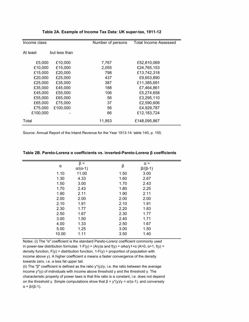
source: capital income, wage income, business income, etc. Table 2A shows an
example of such a table from the British super-tax data for fiscal year 1911-12.
These data were used by Bowley (1914), but it was not until the pioneering
contribution of Kuznets (1953), that researchers began to combine the tax data with
6 The first income tax distribution published for the UK related to 1801 (see Stamp, 1916) but no further figures on total income are available for the nineteenth century on account of the move to a schedular system. The publication of regular UK distributional data only commenced with the introduction of supertax in 1909.
10
external estimates of the total population and the total income to estimate top
income shares.7
The data in Table 2A illustrate the three methodological problems
addressed in this section when estimating top income shares. The first is the
need to relate the number or persons to a control total to define how many tax
filers represent a given fractile such as the top percentile. In the case of the UK in
1911-12, only a very small fraction of the population is subject to the super-tax :
less than 12,000 taxpayers out of total population of over 20 millions tax units,
i.e. less than 0.1%. The second issue concerns the definition of income and the
relation to an income control total used as the denominator in the top income
share estimation. The third problem is that, for much of the period, the only data
available are tabulated by ranges so that interpolation estimation is required.
Micro data only exist in recent decades. Note also that the tabulated data vary
considerably in the number of ranges, and the information provided for each
range.
Pareto Interpolation The basic data are in the form of grouped tabulations, as in Table 2A, where the
intervals do not in general coincide with the percentage groups of the population
with which we are concerned (such as the top 1%). We have therefore to
interpolate in order to arrive at values for summary statistics such as the shares
of total income. Moreover, some authors have extrapolated upwards into the
open upper interval, and downwards below the lowest range tabulated. The
Pareto law for top incomes is given by the following (cumulative) distribution
function F(y) for income y:
1-F(y) = (k/y)α (k>0, α>1), (1)
7 Before Kuznets, tax statistics had been used primarily to estimate Pareto parameters as this does not require estimating total population and total income controls (see below). The drawback is that Pareto parameters only capture dispersion of incomes in the top tail and do not relate top incomes to average incomes as top income shares do.
11
where k and α are given parameters, α is called the Pareto parameter. The
corresponding density function is given by f(y)=αkα/y(1+α). The key property of
Pareto distributions is that the ratio of average income y*(y) of individuals with
income above y to y does not depend on the income threshold y:
That is, if β=2, the average income of individuals with income above $100 000 is
$200 000, and the average income of individuals with income above $1 million is
$2 million. Intuitively, a higher β means a fatter upper tail of the distribution.
From now on, we refer to β as the inverted Pareto coefficient. Throughout this
paper, we choose to focus on the inverted Pareto coefficient β (which has more
intuitive economic appeal) rather than the standard Pareto coefficient α. Note
that there exists a one-to-one, monotonically decreasing relationship between the
α and β coefficients, i.e. β=α/(α-1) and α=β/(β-1) (see Table 2B).
Vilfredo Pareto (1896, 1896-1897) in the 1890s using tax tabulations from
Swiss cantons found that this law approximates remarkably well the top tails of
the income or wealth distributions. Since Pareto, raw tabulations by brackets
produced by tax administrations have often been used to estimate Pareto
parameters.8 A number of the top income studies conclude that the Pareto
approximation works remarkably well today, in the sense that for a given country
and a given year, the β coefficient is fairly invariant with y. However a key
difference with the early Pareto literature, which was implicitly looking for some
universal stability of income and wealth distributions, is that our much larger time
span and geographical scope allows us document the fact that Pareto
coefficients vary substantially over time and across countries.
8 There also exists a voluminous theoretical literature trying to explain why Pareto laws fit the top tails of income and wealth distributions. We survey some of these theoretical models in section 5 below. Pareto laws have also been applied in several areas outside income and wealth distribution (see e.g., Gabaix (2009) for a recent survey).
12
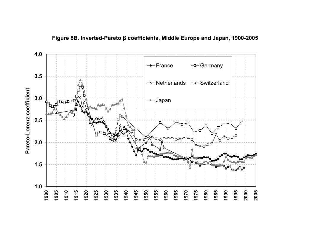
From this viewpoint, one additional advantage of using the β coefficient is
that a higher β coefficient generally means larger top income shares and higher
income inequality (while the reverse is true with the more commonly used α
coefficient). For instance, in the United States, the β coefficient (estimated at the
top percentile threshold and excluding capital gains) increased gradually from
1.69 in 1976 to 2.89 in 2007 as top percentile income share surged from 7.9% to
18.9%..9 In a country like France, where the β coefficient has been stable around
1.65-1.75 since the 1970s, the top percentile income share has also been stable
around 7.5%-8.5%, except at the very end of the period.10 In practice, we shall
see that β coefficients typically vary between 1.5 and 3: values around 1.5-1.8
indicate low inequality by historical standards (with top 1% income shares
typically between 5% and 10%), while values around or above 2.5 indicate very
high inequality (with top 1% income shares typically around 15%-20% or higher).
In the case of the U.K. in 1911-12, a high inequality country, one can easily
compute from Table 2A that the average income of taxpayers above £5,000 was
£12,390, i.e. the β coefficient was equal to 2.48.11
In practice, it is possible to verify whether Pareto (or split histogram)
interpolations are accurate when large micro tax return data with over-sampling
at the top are available as is the case in the United States since 1960. Those
direct comparisons show that errors due to interpolations are typically very small
if the number of brackets is sufficiently large and if income amounts are also
reported. In the end, the error due to Pareto interpolation is dwarfed by various
adjustments and imputations required for making series homogeneous, or errors
in the estimation of the income control total (see below).
9 See Table A24 in the electronic appendix. When we include capital gains, the rise of the β coefficient is even more dramatic, from 1.82 in 1976 to 3.42 in 2007. 10 See Table A24. 11 The stability of β coefficients (for a given country and a given year) only holds for top incomes, typically within the top percentile. For incomes below the top percentile, the β coefficient takes much higher values (for very small incomes it goes to infinity). Within the top percentile, the β coefficient varies slightly, and falls for the very top incomes (at the level of the single richest taxpayer, β is by definition equal to 1), but generally not before the top 0.1% or top 0.01% threshold. In the example of Table 2, one can easily compute that the β coefficient gradually falls from 2.48 at the £5,000 threshold to 2.28 at the £10,000 threshold and 1.85 at the £100,000 threshold (with only 66 taxpayers left).
13
Control Total for Population In some countries, such as Canada, New Zealand from 1963, or the
United Kingdom from 1990, the tax unit is the individual. In that case, the natural
control total is the adult population defined as all residents at or above a certain
age cut-off, and the top percentile share will measure the share of total income
accruing to the top percentile of adult individuals. In other countries, tax units are
families. In the United Kingdom, for example, the tax unit until 1990 was defined
as a married couple living together, with dependent children (without independent
income), or as a single adult, with dependent children, or as a child with
independent income. The control total used by Atkinson (2005) for the UK
population for this period is the total number of people aged 15 and over minus
the number of married females. In the United States, married women can file tax
separate returns, but the number is “fairly small (about 1% of all returns in 1998)”
(Piketty and Saez, 2003). Piketty and Saez therefore treat the data as relating to
families, and take as a control total the sum of married males and all non married
individuals aged 20 and over.
What difference does it make to use the individual unit versus the family
unit? If we treat all units as weighted equally (so couples do not count twice) and
take total income, then the impact of moving from a couple-based to an
individual-based system depends on the joint distribution of income. A useful
special case is where the marginal distributions are such that the upper tail is
Pareto in form. Suppose first that all rich people are either unmarried or have
partners with zero income. The number of individuals with incomes in excess of
$Y is the same as the number of families and their total income is the same. The
overall income control total is unchanged, but the total number of individuals
exceeds the total number of tax units (by a factor written as (1+m)). This means
that to locate the top p%, we now need to go further down the distribution, and,
given the Pareto assumption, the share rises by a factor (1+m)1−1/α. With α = 2
and m = 0.4, this equals 1.18. On the other hand, if all rich tax units consist of
couples with equal incomes, then the same amount (and share) of total income is
14
received by 2/(1+m) times the fraction of the population. In the case of the Pareto
distribution, this means that the share of the top 1% is reduced by a factor
(2/(1+m))1−1/α. With α = 2 and m = 0.4, this equals 1.2. We have therefore likely
bounds on the effect of moving to an individual basis. If the share of the top 1% is
10%, then this could be increased to 11.8% or reduced to 8.3%. The location of
the actual figure between these bounds depends on the joint distribution, and this
may well have changed over the century.
Saez and Veall (2005) in the case of Canada can compute top wage
income shares both on an individual and family base since 1982. They find that
individual based top shares are slightly higher (by about 5%). Most importantly,
the family based and individual based top shares track each other extremely
closely. Similarly, Kopczuk, Saez, and Song (2009) compute individual based top
wage income shares and show that they track also very closely the family based
wage income shares estimated by Piketty and Saez (2003). This shows that
changes in the correlation of earnings across spouses have played a negligible
role in the surge in top wage income shares in North America. However, shifting
from family to individual units does have an impact on the level of top income
shares and creates a discontinuity in the series.12
Control Total for Income The aim is to relate the amounts recorded in the tax data (numerator of
the top share) to a comparable control total for the full population (denominator of
the top share). This is a matter that requires attention, since different methods
are employed, which may affect comparability overtime and across countries.
One approach starts from the income tax data and adds the income of those not
covered (the “non-filers”). This approach is used for example for the UK
(Atkinson 2005), and the US (Piketty and Saez 2003) for the years since 1944.
The approach in effect takes the definition of income embodied in the tax
12 Most studies correct for such discontinuities by correcting series to eliminate the discontinuity. Absent overlapping data at both the family and individual levels, such a correction has to be based on strong assumptions (for example that the rate of growth in income shares around the
15
legislation, and the resulting estimates will change with variations in the tax law.
For example, short-term capital gains have been included to varying degrees in
taxable income in the UK. A second approach, pioneered by Kuznets (1953),
starts from an external control total, typically derived from the national accounts.
This approach is followed for example in France (Piketty 2001, 2003), or the US
for the years prior to 1944. The approach seeks to adjust the tax data to the
same basis, correcting for example for missing income and for differences in
timing. In this case, the income of non-filers appears as a residual. This approach
has a firmer conceptual base, but there are significant differences between
income concepts used in national accounts and those used for income tax
purposes.
The first approach estimates the total income that would have been
reported if everybody had been required to file a tax return. Requirements to file
a tax return vary across time and across countries. Typically most countries have
moved from a situation at the beginning of the last century when a minority filed
returns to a situation today where the great majority are covered. For example, in
the US, “before 1944, because of large exemption levels, only a small fraction of
individuals had to file tax returns” (Piketty and Saez, 2003, page 4). It should be
noted that taxpayers might not need to make a tax return to appear in the
statistics. Where there is tax collection at source, as with Pay-As-You-Earn
(PAYE) in the UK, many people do not file a tax return, but are covered by the
pay records of their employers. Estimates of the income of non-filers may be
related to the average income of filers. For the US, Piketty and Saez (2003) for
the period since 1944 impute to non-filers a fixed fraction equal to 20% of filers’
average income. In some cases, estimates of the income of non-filers already
exist. Atkinson (2005) makes use of the work of the Central Statistical Office for
the UK.
The second approach starts from the national accounts totals for personal
income. In the case of the US, Piketty and Saez use for the period 1913-1943 a
discontinuity is equal to the average rate of growth the year before and the year after the discontinuity). We flag in Table 3 studies where no correction for such discontinuities are made.
16
control total equal to 80% of (total personal income less transfers). In Canada,
Saez and Veall (2005) use this approach for the entire period 1920-2000. How
do these national income based calculations relate to the totals in the tax data?
In answering this question, it may be helpful to bear in mind the different stages
set out schematically below:
Personal sector total income (PI)
minus Non-Household income (Non-profit institutions such as charities,
life assurance funds)
equals Household sector total income
minus Items not included in tax base (e.g. employers’ social security
contributions and – in some countries – employees’ social security
contributions, imputed rent on owner-occupied houses, and non-
taxable transfer payments)
equals Household Gross Income Returnable to Tax Authorities
minus Taxable income not declared by filers
minus Taxable Income of those not included in tax returns (“non-filers”)
equals Declared Taxable Income of Filers.
The use of national accounts totals may be seen as moving down from the top
rather than moving up from the bottom by adding the estimated income of non-
filers. The percentage formulae can be seen as correcting for the non-household
elements and for the difference between returnable income and the national
accounts definition. Some of the items, such as social security contributions, can
be substantial. Piketty and Saez base their choice of percentage for the US on
the experience for the period 1944-1998, when they applied estimates of the
income of non-filers.
Given the increasing significance of some of the items (such as
employers’ contributions), and of the non-household institutions, such as pension
funds, it is not evident that a constant percentage is appropriate. Since transfers
were also smaller at the start of the twentieth century, total household returnable
17
income was then closer to total personal income. Atkinson (2007) compares the
two methods in the case of the United Kingdom. He shows that the total income
estimated from the first method by estimating the income of non-filers trends
slightly downwards relative to personal income minus transfers from around 90%
in the first part of the 20th century to around 85% in the last part of the century.
Furthermore, there are substantial short term variations especially during world
war episodes when the national accounts figures appear to be relatively higher
by as much as 15-20%. Some countries do not have developed national
accounts, especially in the earlier periods covered by tax statistics. In that case,
the total income control is chosen as a fixed percentage of GDP, where the
percentage is calibrated using later periods when National accounts are more
developed.
Need for a control total for income is of course avoided if we examine the
“shares within shares” which depend solely on population totals and the income
distribution within the top, measured by the Pareto coefficient as shown in
equation (4). This gives a measure of the degree of inequality among the top
incomes that may be more robust but does not compare top incomes to the
average as top income shares do.
Adjustments for Income Definition In a number of cases, the definition of taxable income or the definition of income
used to present the tabulations changes over time. To obtain homogeneous
series, such changes need to be corrected for. The most common change in the
presentation of tabulations is due to shifts from net income (income after
deductions) to gross income (income before deductions). When composition
information on the amount of deductions by income brackets is available, the
series estimated can be corrected for such changes. If we assume that ranking of
individuals by net income and gross income are approximately the same, the
correction can be made by simply adding back average deductions bracket by
bracket to go from net incomes to gross incomes.
18
It is also of interest to estimate both series including capital gains and
series excluding capital gains (see below). This can also be done if data on
amounts of capital gains are available by income brackets. Because capital gains
can be quite important at the top (see Figure 3), ranking of individuals might
change significantly when including or excluding capital gains. The ideal is
therefore to have access to micro-data to create tabulations both including and
excluding capital gains. The micro-data can also be used to assess how ranking
changes when excluding capital gains and hence develop simple rules of thumb
to construct series excluding capital gains when starting with series including
capital gains (or vice-versa). This is done in Piketty and Saez (2003) for the
period before 1960, the first year when micro-data become available in the
United States.
Other Studies As mentioned above, Kuznets (1953) first developed the methodology of
combining national accounts with tax statistics to estimate top income shares.
Before Kuznets, studies using tax statistics were limited to the estimation of
Pareto parameters (starting with Pareto, 1897 and followed by numerous studies
across many countries and time periods) or to situations where the coverage of
tax statistics was substantial or could be supplemented with additional income
data (as in Scandinavian countries, the Netherlands, the German states, or the
United Kingdom as we mentioned above). Therefore, there exist a number of
older studies in those countries computing top income shares from tax statistics.
In general, those studies are limited to a few years. Those studies are surveyed
in Lindert (2000) for the US and UK and Morrisson (2000) for Europe. They are
also discussed in each modern study country by country. We mention the most
important of those studies at the bottom of Table 3. The only country for which no
modern study exists and older studies exist is Denmark. Those studies for
Denmark show that top incomes shares fell substantially (as in other Nordic
countries) in the first half of the 20th century till at least 1963 (Sorensen, 1993).
19
We also mention in Table 3 other important recent country specific
contributions, including those by Merz, Hirschel, and Zwick (2005) and by Bach,
Corneo, and Steiner (2008) of Germany, by Gustafsson and Jansson (2007) of
Sweden, and by Guilera (2008) of Portugal.13
Table 3 provides a synthetic summary of the key features of the estimates for all
the studies to date.
Table 3. Key features of estimates for each country
France UK US Canada Australia References Piketty (2001,
1921-2002 (plus State of Victoria for 1912-1923). (82 years)
Extent of coverage
Initially under 5%.
Initially only top 0.1%.
Initially only around 1%.
Initially around 5%.
Initially around 10%.
Unit of analysis
Family. Family to 1989; individual from 1990.
Family. Individual. Individual.
Population definition
Total number of families calculated from number of households and household composition data.
Aged 15 and over; before 1990 total number of families calculated from population aged 15 and over minus number of married women.
Total number of families calculated as married men plus non married men and women aged 20and over.
Aged 20 and over.
Aged 15 and over.
Method of calculating control totals for income
From national accounts.
Addition of estimated income of non-filers.
From 1944, addition of income of non-filers = 20% average
80% (personal income – transfers) from
Total income constructed from national accounts.
13 This survey does not cover the estimates for former British colonial territories being prepared as part of a project being carried out by Atkinson (apart from Singapore, shown in Table 3). This project has assembled data for some 20 former colonies covering the periods before and after independence. Data for French colonies and Brazil are being examined by Facundo Alvaredo.
20
income; before 1944 80% (personal income –transfers) from national accounts.
national accounts.
Income definition
Gross income, net of employee social security contributions.
Prior to 1975 income net of certain deductions; from 1975 total income.
Gross income, adjusted for net income deductions.
Gross income, adjusted for the grossing up of dividend income.
Actual gross income; adjustment made to taxable income prior to 1957.
Treatment of capital gains
Capital gains excluded.
Included where taxable under income tax, prior to introduction of separate Capital Gains Tax.
Capital gains excluded in main series.
Capital gains excluded in main series.
Included where taxable under income tax.
Breaks in series?
Up to 1920 includes what is now Republic of Ireland; change in income definition in 1975; change to individual basis in 1990.
Method of interpolation
Pareto Mean split histogram Micro-tax data used from 1995
Pareto Pareto Mean split histogram
Special features
Share of employee contributions has grown. Interest income has been progressively eroded from the progressive income tax base.
Evidence from super-tax and surtax, and from income tax surveys.
Other References
Bowley (1914, 1920), Procopovitch (1926) Royal Commission (1977)
Kuznets (1953), Poterba and Feenberg (1993)
Table 3. Key features of estimates for each country (continued 1)
21
New Zealand Germany Netherlands Switzerland Ireland References
Atkinson and Leigh (2008)
Dell (2007) Salverda and Atkinson (2007), Atkinson and Salverda (2005)
1891-1918 (annual), 1925-1938 (annual or biennial), 1950-1998 (triennial). (57 years)
1914-1999 (missing years in 1940s, 1950s, 1960s, 1970s and 1980s). (55 years)
1933-1995/96 (apart from 1933 based on income in 2 years). (31 years)
1922-2000 (1954-1963 missing). (68 years)
Extent of coverage
Initially less than 10%.
In 1914 covered 23%.
In 1933, 14% covered; increases to 33% in 1939 and over 50% from mid-1960s.
Varies; only top 0.1% for much of earlier period; top 0.1% missing in 1990s.
Unit of analysis
Family until 1952, then individual from 1953.
Family. Family. Family. Family
Population definition
Aged 15 and over; before 1953 total number of tax units calculated from population aged 15 and over minus number of married women.
(From 1925) total number of family calculated from population aged 21 and over minus number of married couples.
Total number of families calculated from population aged 15 and over minus number of married women.
Total number of families calculated from population aged 20 and over minus number of married women.
Total number of families calculated from population aged 18 and over minus number of married women.
Method of calculating control totals for income
95% of total income constructed from national accounts.
90% of net primary income of households from national accounts minus employers’ contributions.
Addition of estimated income of non-filers.
From 1971 20% average income imputed to non-filers; prior to 1971 total income defined as 75% net national income.
80% of (total personal income – state transfers – employers’ contributions)
Income definition
Assessable income to 1940; total income from 1945.
After deduction of costs associated with specific income source.
Gross income.
Income before deductions.
Net; also gross from 1989.
Treatment of capital
Included where taxable.
Included where taxable.
Not included. Excluded. Not included.
22
gains Breaks in series?
Assessable income up to 1940; change to individual basis in 1953.
Changes in geographical boundaries.
Three different sources, with breaks in 1950 and 1977.
None indicated.
Different sources: surtax statistics and income tax enquiries.
Method of interpolation
Mean split histogram
Pareto Mean split histogram
Pareto Pareto
Special features
Need to combine Lohnsteuer and Einkommensteuer data.
Treatment of tax evasion through Swiss accounts.
Other References
Procopovitch (1926), Mueller (1959), Mueller and Geisenberger (1972), Jeck (1968, 1970), Kraus (1981), Kaeble (1986), Dumke (1991), Merz, Hirschel, and Zwick (2005), and by Bach, Corneo, and Steiner (2008)
Hartog and Veenbergen (1978)
Table 3. Key features of estimates for each country (continued 2)
India China Japan Indonesia Singapore References Banerjee and
Piketty (2005)
Piketty and Qian (2009)
Moriguchi and Saez (2008)
Leigh and van der Eng (2009)
Atkinson (2010)
Years covered
1922-1988 (71 years)
1986-2003 (18 years)
1886-2005 (119 years, 1946 missing)
1920-1939 1982-2004 (survey data) 1990-2003 (tax data) (34 years of tax data)
1947-2005 (57 years)
Extent of coverage
Initially under 1%.
Full urban population (household survey)
Initially only around 0.1%
Initially around 1%, Recent period 0.1%
Initially around 1%.
Unit of analysis
Individual Both individual and household series
Individual Households. Individual.
Population 40% of total Urban Aged 20and over Total number Resident
23
definition population (corresponds roughly to all adults with positive income)
population included in the survey
of households from population statistics.
population aged 15 and over.
Method of calculating control totals for income
Equal to 70% of National Income from national accounts.
Based on the full population household survey
From National accounts: wages + personal capital income + unincorporated business income (excluding imputed rents)
1920-1939: from estimates of aggregate personal income 1982-2004: income from survey
Total income constructed from national accounts as 75% of Indigenous Gross National Income
Income definition
Gross income
Gross income (includes transfers)
Gross income (significant capital income base erosion after 1946)
Net income after personal allowances (farm income excluded)
Gross income
Treatment of capital gains
Capital gains excluded
Capital gains not measured in survey data and hence excluded
Capital gains excluded in main series.
Capital gains excluded
Capital gains excluded
Breaks in series?
No estimates from 1940 to 1981
Method of interpolation
Pareto Pareto Pareto Pareto Mean split histogram
Special features
Urban Household surveys used (not tax statistics)
Pre-1946, income tax based on households but virtually all income earned by the head
1982-2004 estimates based on survey. Tax based estimates for 1990-2003 also available (but much lower)
Other References
Table 3. Key features of estimates for each country (continued 3)
Argentina Sweden Finland Norway References
Alvaredo (2010) Roine and Waldenstrom (2008)
Jantti, Riihela, Sullstrom, Tuomala (2010)
Aaberge and Atkinson (2010)
Years covered
1932-1973 (missing years). 1997-2004 (39 years)
1903-2006 (missing years) (75 years)
1920-2004 (85 years)
1875-2006 (missing years) (67 years)
24
Extent of coverage
Top 1%. Top 10% Top 5% Top 10%
Unit of analysis
Individual Family initially, then individual
Family or individual (several periods)
Family but separate taxation possible and becomes most prevalent
Population definition
Population aged 20 and over from National Census
Up to 1951: families (married couples + singles aged 16 and over) After 1951: individuals aged 16 and over
Adult population aged 16 and above
Adult population aged 16 and above
Method of calculating control totals for income
Total income constructed from national accounts initially as 60% of GDP
Up to 1942, 89% of personal sector income from National Account. After 1942, by adding income of non-filers
Total income constructed by adding income of non-filers
Total income constructed from national accounts initially as 72% of household income
Income definition
Gross income. Gross income including transfers (series excluding transfers also estimated)
1920-1992: taxable income 1949-2003: Gross income (two overlapping series)
Gross income including transfers
Treatment of capital gains
Excluded Both series including and excluding capital gains presented
Excluded Included.
Breaks in series?
Gradual shift from family to individual taxation from 1952 to 1971
Changes from family to individual taxation. Overlapping series for taxable vs. gross income.
Method of interpolation
Pareto Pareto Mean split histogram Survey data (linked to tax statistics) used for 1966-2004
Mean split histogram Micro-tax data used after 1966
Special features
Comparison to household surveys provided for recent period
top shares spike in 2005 because of dividend tax reform producing income shifting
Other References
Bentzel (1952) Kraus (1981) Gustafsson and Jansson (2007)
Hjerppe and Lefgren (1974)
Okonomisk Utsyn (1900-1950)
Table 3. Key features of estimates for each country (continued 4)
Spain Portugal Italy References Alvaredo and Alvaredo (2009) Alvaredo and Pisano
25
Saez (2009) (2010) Years covered
1933-2005 (gap 1962-1980 except 1971) (49 years)
1936-2005 (1983-1988 missing) (64 years)
1974-2004 (29 years)
Extent of coverage
Top .01% initially Top 10% since 1981
Top 0.1% initially Top 10%
Unit of analysis
Individual Family Individual
Population definition
Population aged 20 and over from National Census
Population aged 20 and over minus married women from census statistics
Population aged 20 and over from National Census
Method of calculating control totals for income
Total income constructed from national accounts initially as 66% of GDP and later refined
Total income constructed from national accounts initially as 66% of GDP and later refined
Total income constructed primarily from national accounts: wages, pensions, 50% of business income, and capital income from tax returns
Income definition
Gross income. Gross income Gross income but excluding interest income
Treatment of capital gains
Excluded (series with capital gains also estimated after 1981)
Excluded Excluded
Breaks in series?
Significant change in income tax scope after 1978 Change from family to individual taxation in 1988 (corrected for)
Method of interpolation
Pareto Pareto Pareto
Special features
Top wage income series also constructed after 1981
Top wage income series also constructed after 1964
Other References
Guilera (2008)
3.2 POSSIBLE LIMITATIONS Top income share series are constructed using tax statistics. The use of tax data
is often regarded by economists with considerable disbelief. In the UK, Richard
26
Titmuss wrote in 1962 a book-length critique of the income tax-based statistics
on distribution, concluding, ‘we are expecting too much from the crumbs that fall
from the conventional tables’ (1962: 191). More recently, compilers of databases
on income inequality have tended to rely on household survey data, dismissing
income tax data as unrepresentative.
These doubts are well justified for at least two reasons. The first is that tax
data are collected as part of an administrative process, which is not tailored to
our needs, so that the definition of income, of income unit, etc. are not
necessarily those that we would have chosen. This causes particular difficulties
for comparisons across countries, but also for time-series analysis where there
have been substantial changes in the tax system, such as the moves to and from
the joint taxation of couples. Secondly, it is obvious that those paying tax have a
financial incentive to present their affairs in a way that reduces tax liabilities.
There is tax avoidance and tax evasion. The rich, in particular, have a strong
incentive to understate their taxable incomes. Those with wealth take steps to
ensure that the return comes in the form of asset appreciation, typically taxed at
lower rates or not at all. Those with high salaries seek to ensure that part of their
remuneration comes in forms, such as fringe benefits or stock-options which
receive favorable tax treatment. Both groups may make use of tax havens that
allow income to be moved beyond the reach of the national tax net.
These shortcomings limit what can be said from tax data, but this does not
mean that the data are worthless. Like all economic data they measure with error
the ‘true’ variable in which we are interested. As with all data, there are potential
sources of bias, but, as in other cases, we can say something about the possible
direction and magnitude of the bias. Moreover, we can compensate for some of
the shortcomings of the income tax data. It is true that income tax data cover only
the taxpaying population, which, in the early years of income tax, was typically only
a small fraction of the total population. As a result, tax data cannot be used to
describe the whole distribution, but we can estimate the upper part of the Lorenz
curve, i.e., top income shares.
27
But why not use household surveys, which cover the whole (non-
institutional) population? Why use income tax data? There are two main answers.
The first is that household surveys themselves are not without shortcomings. These
include sampling error, which may be sizeable with the typical sample sizes for
surveys, whereas tax data drawn from administrative records are based on very
much larger samples. Indeed, in some cases the tax statistics relate to the whole
universe of taxpayers. Household surveys suffer from differential non-response and
incomplete response (these two being the survey counterpart of tax evasion). Such
problems particularly affect the top income ranges, as is recognized in studies that
combine household survey data with information on upper income ranges from tax
sources (see, for example, in the UK, Brewer et al. 2008). The second answer is
that household surveys are a fairly recent innovation. Household surveys only
became regular in most countries in the 1970s or later, and in a number of cases
they are held at intervals rather than annually. The beauty of income tax evidence
is that it is available for long runs of years, typically on an annual basis, and that
it is available for wide variety of countries.
Comparison with household survey data: case study of the US
The important recent study by Burkhauser et al. (2009) tries to reconcile
the Piketty and Saez (2003) top income share series, estimated with tax
statistics, with top income shares measured using CPS data but following the
same methodology as in Piketty and Saez (2003) in terms of income definition
and family unit. Burkhauser et al. (2009) find that their CPS based top income
share series match the Piketty and Saez (2003) series very closely for the
second vingtile and the next 4% (i.e., the top decile excluding the top percentile).
As depicted on Figure 5A, the top 1% share measured by the CPS also appears
to follow the same qualitative trend as the top 1% share from tax data. However
there are important quantitative differences that remain, especially comparing the
CPS series with the tax series including realized capital gains (which are not
measured in the CPS questionnaire). Four points are worth noting.
28
First, the top 1% share measured by the CPS is consistently lower than
the top 1% income share measured with tax data. This is due to the fact that (a)
the CPS does not record important income sources at the top (such as realized
capital gains or stock option gains), (b) CPS incomes are by design recorded
with top code,14 (c) there might be under-reporting of incomes at the top in the
CPS (i.e. some top income individuals might decide to under report their true
income, even in the absence of uncertainty about the income concept).
Second, the CPS top 1% income share increased less than the tax based
top 1% income shares from 1976 to 2006. The increase is 6.9 points in the CPS,
while it is 14.0 points in the tax data including capital gains and 10.1 points in the
tax data excluding capital gains.
Third, almost half of the increase in the CPS top 1% share is due to a
large 3.4 percentage point jump from 1992 to 1993 which is due entirely to
changes in measurement methodology (in particular, a substantial increase in the
internal top code).15 Therefore, erasing this jump and doing a proportional
adjustment in pre-1993 series, the actual increase in the CPS top 1% share
would be only 4.1 points (Table 4, Panel A).
Fourth, there is a concern that tax based top income shares also
exaggerate the increase because of income shifting toward the individual tax
base following the tax rate reductions on the 1980s. Indeed, the series excluding
capital gains does display a large 4.0 point upward jump from 1986 to 1988. As is
well known (Feenberg and Poterba, 1993, Saez, 2004), almost one-half of this
jump is due to a shift from corporate income toward individual business income
due to the Tax Reform Act of 1986.16 However, corporate retained earnings
14 Burkhauser et al. (2009) use the internal CPS. The internal CPS is further top coded for confidentiality reasons before being publicly disclosed. However, even the internal CPS remains top coded by design. Such top codes are necessary in survey data to avoid having a handful of reporting errors having significant effects on aggregate statistics. 15 Burkhauser et al. (2009) correct for such top coding issues using parametric imputations with a GB distribution fitted on the full distribution. We believe that a specific Pareto imputation for the top tail, as done in the top income studies we discuss here, would be much preferable. 16 TRA 1986 made it more advantageous for closely held businesses to shift from corporate to pass-through entities taxed solely at the individual level. The remaining half of the jump in top shares is due primarily to a temporary surge in top wage incomes, possibly as business owners cashed in their previous accumulated profits as wage income (Gordon and Slemrod, 2000).
29
translate into capital gains that are eventually realized and reported on individual
tax returns. Therefore, in the medium run, this shift will be matched by an
equivalent reduction in capital gains. Indeed, the top 1% income share series
including capital gains display no notable discontinuity around the TRA 1986
episode (the CPS top income shares increase as fast as the tax return based top
income share including capital gains in the medium run from 1985 to 1990).17
Therefore, from 1976 to 2006 and erasing the 1992-1993 measurement
discontinuity in the CPS, the CPS top 1% share effectively misses 10.4 points of
the surge of the top 1% income share relative to income tax data including
realized capital gains (the most economically meaningful series to capture total
real top incomes). As we show on Figure 5B and Table 4 (Panel B), this has a
substantial impact on the official CPS Gini coefficient series over the 1976 to
2006 period. Three points are worth noting on Figure 5B.
First, as mentioned above, the official CPS Gini increased from 39.8% in
1976 to 47.0% in 2006 and this increase includes a 2 percentage jump from 1992
to 1993 due to the measurement change discussed above, so that the real
increase in the Gini is only 5.3 points over the period (Table 4). Second, when
excluding the top 1%, the Gini for the bottom 99% households displays no
discontinuity at all from 1992 to 1993 which shows that the discontinuity is
entirely due to measurement changes within the top 1%.18 The Gini for the
bottom 99% increases only by 3.2 points from 1976 to 2006. Third, when
correcting the Gini coefficient using the differential in top 1% shares between the
tax data (either including or excluding capital gains) and Burkhauser et al. (2009),
the Gini coefficient increases by 10.8 and 8.8 points respectively over the 1976-
2006 period. Using our preferred series including capital gains, the increase in
17 The top income share including capital gains is abnormally high in 1986 because of very large capital gain realizations in that year to avoid the higher capital gain tax rates after TRA 1986, a well established finding clearly visible on Figure 3. 18 We have estimated the Gini for the bottom 99% using the Atkinson (2007) formula G=(1-S)G0+S from Atkinson (2007) where G is the Gini for the full population (Official CPS series), G0 the Gini for the bottom 99%, and S is the top 1% income share estimated by Burkhauser et al. (2009). This method is not perfect because the official CPS Gini is based on households and income including cash transfers while Burkhauser et al. top 1% income share is based on families and excludes cash transfers.
30
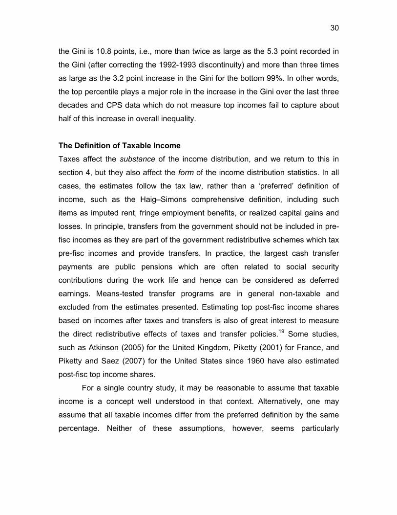
the Gini is 10.8 points, i.e., more than twice as large as the 5.3 point recorded in
the Gini (after correcting the 1992-1993 discontinuity) and more than three times
as large as the 3.2 point increase in the Gini for the bottom 99%. In other words,
the top percentile plays a major role in the increase in the Gini over the last three
decades and CPS data which do not measure top incomes fail to capture about
half of this increase in overall inequality.
The Definition of Taxable Income Taxes affect the substance of the income distribution, and we return to this in
section 4, but they also affect the form of the income distribution statistics. In all
cases, the estimates follow the tax law, rather than a ‘preferred’ definition of
income, such as the Haig–Simons comprehensive definition, including such
items as imputed rent, fringe employment benefits, or realized capital gains and
losses. In principle, transfers from the government should not be included in pre-
fisc incomes as they are part of the government redistributive schemes which tax
pre-fisc incomes and provide transfers. In practice, the largest cash transfer
payments are public pensions which are often related to social security
contributions during the work life and hence can be considered as deferred
earnings. Means-tested transfer programs are in general non-taxable and
excluded from the estimates presented. Estimating top post-fisc income shares
based on incomes after taxes and transfers is also of great interest to measure
the direct redistributive effects of taxes and transfer policies.19 Some studies,
such as Atkinson (2005) for the United Kingdom, Piketty (2001) for France, and
Piketty and Saez (2007) for the United States since 1960 have also estimated
post-fisc top income shares.
For a single country study, it may be reasonable to assume that taxable
income is a concept well understood in that context. Alternatively, one may
assume that all taxable incomes differ from the preferred definition by the same
percentage. Neither of these assumptions, however, seems particularly
31
satisfactory, and use of taxable income may well affect the conclusions drawn
about changes over time. When we come to a cross-country comparison, there
seems an even stronger case for adopting a definition of income that is common
across countries and that does not depend on the specificities of the tax law in
each country. Approaching a common definition of income does however pose
considerable problems, as illustrated by the treatment of transfers (which have
grown very considerably in importance over the century), by capital gains, by the
interrelation with the corporate tax system, and by tax deductions. The studies for
the USA and Canada subtract social security transfers on the grounds that they
are either partially or totally exempt from tax. In other countries, such as
Australia, New Zealand, Norway, and the UK, the tax treatment of transfers
differs, with typically more transfers being brought into taxation over time.
Perhaps the most important aspect that affects the comparability of series
over time within each country has been the erosion of capital income from the
progressive income tax base. Early progressive income tax systems included a
much larger fraction of capital income than most present progressive income tax
systems. Indeed, over time, many sources of capital income, such as interest
income, or returns on pension funds, have been either taxed separately at flat
rates or fully exempted, and hence have disappeared from the tax base. Some
early income tax systems (such as France from 1914 to 1964) also included
imputed rents of homeowners in the tax base, but today imputed rents are
typically excluded. As a result of this imputed rent exclusion and the development
of numerous other forms of legally tax-exempt capital income, the share of
capital income that is reportable on income tax returns, and hence included in the
series presented, has significantly decreased over time. To the extent that such
excluded capital income accrues disproportionately to top income groups, this
will lead to an underestimation of top income shares. Ideally, one would want to
impute excluded capital income back to each income group. Because of lack of
data, such an imputation is very difficult to fully carry out. Some of the studies
19 Taxes and transfers might also have indirect redistributive effects through behavioral responses. For example, high income earners might work less and hence earn less if taxes
32
discuss whether the exclusion of capital income affects the series. For example,
Moriguchi and Saez (2008), in the case of Japan, use survey data to estimate
how interest income—today almost completely excluded from the comprehensive
income tax base in Japan—is distributed across income groups. In the case of
France, Piketty (2001, 2003) has shown that the long-run decline of top income
shares was robust, in the sense that even an upper bound imputation of today’s
tax-exempt capital incomes to today’s reported top incomes would be largely
insufficient to undo the observed fall. In the estimates of top shares for Norway
(Aaberge and Atkinson, 2010) a calculation has been made of income including
the “full” return to stocks, but no systematic attempt has been made to impute full
capital income on a comparable basis over time and across countries. We view
this as one of the main shortcomings—probably the main shortcoming—of our
data set. As we shall see in sections below, this limits the extent to which one
can use our data set to rigorously test the theoretical economic mechanisms at
play.
The treatment of capital gains and losses also differs across time and
across countries. For a number of countries, series both including an excluding
capital gains have been produced (see Table 3). As shown in Figure 6, the
effects of the inclusion of capital gains on the share of the top percentile is often
substantial. In the case of Sweden, Roine and Waldenström (2008) note that
‘over the past two decades the general picture turns out to depend crucially on
how income from capital gains is treated. If we include capital gains, Swedish
income inequality has increased quite substantially; when excluding them, top
income shares have increased much less.’
Income tax systems differ in the extent of their provisions allowing the
deduction of such items as interest paid, depreciation, pension contributions,
alimony payments, and charitable contributions. Income from which these
deductions have been subtracted is often referred to as ‘net income’. (We are not
referring here to personal exemptions.) The aim is in general to measure gross
income before deductions, but this is not always possible. The French estimates
increase. We come back to this important point in Section 5.
33
show income after deducting employee social security contributions. In a number
of countries, the earlier income tax distributions refer to income after these
deductions, but the later distributions refer to gross income. In the USA, the
income tax returns prior to 1944 showed the distribution by net income, after
deductions. Piketty and Saez (2003) apply adjustment factors to the threshold
levels and mean incomes for the years 1913–43 to create homogeneous series.
The areas highlighted above—transfers, tax-exempt capital income,
capital gains, and deductions—may all give rise to cross-country differences and
to lack of comparability over time in the income tax data. Any user needs to take
them into account. We have tried to flag those items for each study in Table 3.
The same applies to tax evasion, to which we devote the next sub-section.
Tax Avoidance and Tax Evasion As highlighted above, the standard objection to the use of income tax data to
study the distribution of income is that tax returns are largely works of fiction, as
taxpayers seek to avoid and evade being taxed. The under-reporting of income
can affect cross-country comparisons where there are differences in prevalence
of evasion and can affect measurement of trends where the extent of evasion
has changed over time.
It is not a coincidence that the development of income taxation follows a
very similar path across the countries studied. All countries start with progressive
taxes on comprehensive income using high exemption levels which limits the tax
to only a small group at the top of the distribution. Indeed, at an early stage of
industrial development, when a substantial fraction of economic activity takes
place in small informal businesses, it is just not possible for the government to
enforce a comprehensive income tax on a wide share of the population.20
However, even in early stages of economic development, Alvaredo and Saez
(2009) note ‘the incomes of high income individuals are identifiable because they
derive their incomes from large and modern businesses or financial institutions
20 Even today in the most advanced economies, small informal businesses can escape the individual income taxes.
34
with verifiable accounts, or from highly paid (and verifiable) salaried positions, or
property income from publicly known assets (such as large land estates with
regular rental income)’.21 Comprehensive income taxes are extended to larger
groups only when economic development has reduced the number of untaxable
informal income earners to a reasonably small fraction of the population.
Therefore, it is conceivable that the early progressive income taxes, upon which
statistics those studies are based, captured reasonably well most components of
top incomes.
The extent of contemporary tax evasion is considered specifically in a
number of studies. In the case of Sweden, Roine and Waldenström (2008)
conclude that overall evasion is modest (around 5 per cent of all incomes) and
that there is no reason to believe that under-reporting has changed dramatically
over time. A speculative reason for this may be that while the incentives to under-
report have increased as tax rates have gone up over time the administrative
control over tax compliance has also been improved. The Nordic countries may
well be different. In the case of Italy, Alvaredo and Pisano (2010) note the
widespread view of tax evasion being much higher than in other OECD countries.
Audits and subsequent scandals involving show-business people, well-known
fashion designers, and sport stars help support this idea among the general
public, even when they also provide evidence about the fact that top income
earners are very visible for the tax administration. The evidence for Italy does
indeed suggest that evasion is important among small businesses and the self-
employed (traditionally numerous in Italy), for whom there is no double reporting,
but that for wages, salaries, and pensions at the top of the distribution there is
little room for evading those income components that must be reported
independently by employers or the paying authorities. They conclude that the
evasion from self-employment and small business income is unlikely to account
for the gap in top incomes between Italy and Anglo-Saxon countries.
21 Indeed, before comprehensive taxation starts, most countries had already adopted schedular separate taxes on specific income sources such as wages and salaries, profits from large businesses, rental income from large estates. Such schedular taxes emerge when economic development makes enforcement feasible.
35
Another source of evidence is provided by tax amnesties, and Alvaredo
(2010) discusses the results for Argentina. Information from the 1962 tax
amnesty (which attempted to uncover all income that had been evaded by
taxpayers between 1956 and 1961) suggested under-reporting of between 27
and 40 per cent. However, it varied with income. Evasion shows a lower impact
at the bottom (where income from wage source dominates) and at the top of the
tax scale (where inspections from the tax administration agency might be more
frequent and enforcement through other taxes higher). The evidence may be
indirect. In the case of India, Banerjee and Piketty (2005) note the innovations in
tax collection that may have affected the prevalence of filing. They investigate the
impact by considering the evolution of wage income, where taxes are typically
deducted at source, so that no change would be observed if all that was
happening was improved collection. They conclude that there was a ‘real’
increase in top incomes. As in other studies (such as that for Australia in
Atkinson and Leigh, 2007), this is corroborated by independent evidence about
what happened to top salaries.
It is important to remember that, while taxpayers may have a strong
incentive to evade, the taxing authorities have a strong incentive to enforce
collection. This takes the form of both sticks and carrots. For example, the Inland
Revenue Authority of Singapore devotes considerable resources to enforcing tax
collection, but also provides positive encouragement to tax compliance through
emphasizing the role of taxes in financing key government services such as
schools. The resources allocated to tax administration have been substantial: for
example, in Spain in the pre-1960 period the administration was able to audit a
very significant fraction (10–20 per cent) of individual tax returns. The tax
authorities may also be expected to target their enforcement activities on those
with higher potential liabilities. The scope for evasion may therefore be less for
the very top incomes than for those close to the tax threshold, as Leigh and van
Eng (2009) note to be the case in Indonesia.
One important route to avoiding personal income tax is for income to be
sheltered in companies. The extent to which this is possible depends on the
36
personal tax law and on the taxation of corporations. One key feature is the
extent to which there is an imputation system, under which part of any
corporation tax paid is treated as a pre-payment of personal income tax.
Payment of dividends can be made more attractive by the introduction of an
imputation system, as in the UK in 1973, Australia in 1987, and New Zealand in
1989, in place of a ‘classical’ system where dividends are subject to both
corporation and personal income tax. Insofar as capital gains are missing from
the estimates (as discussed above) but dividends are covered, a switch towards
(away from) dividend payment will increase (reduce) the apparent top income
shares. This needs to be taken into account when interpreting the results. That is
why estimating series including realized capital gains is valuable in order to
assess the contribution of retained profits of corporations on top individual
incomes. When realized capital gains are untaxed and hence not observed, it is
important to assess the effects of attributing retained profits to top incomes. For
example, in the UK, Atkinson (2005) examined the consequences of the large
increase after the Second World War in the proportion of profits retained by
companies. The attribution of the retained profits to top income groups would
have reduced the magnitude of the fall in the share of the top 1 per cent between
1937 and 1957 but still left a very considerable reduction.
The reported shares of top incomes can also be affected by shifts
between incorporated and non-incorporated activities. This has been modeled by
Gordon and Slemrod (2000) and others. As discussed above, the US 1986 tax
reform lowered the top individual tax rate below the corporate tax rate, inducing
shifts of business income from the corporate tax base to the individual tax base.
This can be visible as a surge of business income from 1986 to 1988 in top
incomes as depicted on Figure 3. Eventually however, retained profits of
corporations are received by individuals either as dividends or realized capital
gains so that income including capital gains should not be affected by such shifts
between the corporate and individual sector in the long-run.
The potential impact is particularly marked in the case of the dual income
tax introduced in Nordic countries. The tax reform in Finland in 1993 combined
37
progressive taxation of earned income with a flat rate of tax on capital income
and corporate profits, with a full imputation system applied to the taxation of
distributed profits. Under the dual income tax, capital income is taxed at a lower
rate than the top marginal tax rate on labor income. As discussed in the case of
Finland by Jantti et al. (2010), the 1993 tax reform led to an increasing trend of
the share of capital income (dividends) and declining share of entrepreneurial
income. This can be interpreted as an indication of a tax-induced shift in
organizational form and the choice of tax regime. Alvaredo and Saez (2009)
provide a model of the incentive to adopt a (wealth tax) exempt organizational
form and examine the effect of the wealth tax reform undertaken in Spain in
1994. Their empirical estimates suggest that there is a very large shifting effect:
the fraction of businesses benefiting from the exemption jumps from one-third to
about two-thirds for the top 1 per cent.
Note also that changes in tax laws can also produce significant
intertemporal shifting of income, which can create spikes in top income shares.
For example, the 1986 tax reform in the US actually increased the tax rate on
realized capital gains in 1987, leading to a surge in realizations in 1986 before
the tax increase started, making top income shares spike in that year, as can
clearly be seen on Figure 3. More recently, Norway increased the tax on
dividends in 2006 leading to a one time spike in dividend distributions in year
2005 to take advantage of the lower rates and leading to a 50% increase in the
top 1% share in 2005, followed by a 50% drop in 2006 (see Figure 7C below).
Recent high-profile cases have drawn attention to tax avoidance by
relocation or tax evasion by sending money abroad.. In their study of
Switzerland, Dell, Piketty, and Saez (2007) investigated the issue of tax evasion
by foreigners relocating to that country or through Swiss bank accounts. They
found that the fraction of taxpayers in Switzerland with income abroad or non-
resident taxpayers had increased in recent years but remains below 20 per cent
even at the very top of the Swiss distribution, suggesting that the migration to
Switzerland of the very wealthy is a limited phenomenon. They similarly conclude
that the amount of capital income earned through Swiss accounts and not
38
reported is small in relation to the total incomes of top income recipients in other
countries. In the case of Sweden, Roine and Waldenström (2008) make
ingenious estimates of ‘capital flight’ since the early 1980s using unexplained
residual capital flows (‘net errors and omissions’) published in official balance of
payments statistics. To get a sense of the order of magnitude by which this
‘missing wealth’ would change top income shares in Sweden, they add all of the
returns from this capital first to the incomes of the top decile and then to the top
percentile. For the years before 1990, there is no effect on top income shares by
adding income from offshore capital holdings since they are simply too small.
However, after 1990, and especially after 1995, when adding all of them to the
top decile, income shares increase moderately (by approximately 3 per cent).
When instead adding everything to the incomes of the top percentile, the income
shares increase by about 25 per cent which is equivalent to an increased share
from about 5.7 to 7.0 per cent. While this is a notable change, it does not raise
Swedish top income shares above those in France (about 7.7 per cent in 1998),
the UK (12.5 per cent in 1998), or the USA (15.3 per cent in 1998).
To sum up, the different pieces of evidence indicate that tax evasion and
tax avoidance need to be taken seriously and can quantitatively affect the
conclusions drawn. They need to be borne in mind when considering the results,
but they are not so large as to mean that the tax data should be rejected out of
hand. Our view is that legally tax-exempt capital income poses more serious
problems than tax evasion and tax avoidance per se.
Income Mobility A classical objection to inequality measures based on annual cross sectional
income is that individuals move up or down the distribution of income overtime. If
individuals can use credit markets to smooth fluctuations in income, then annual
income might not be a good measure of economic welfare. Therefore, analyzing
income mobility is valuable although it requires access to panel data. Saez and
Veall (2005) and Kopcuzk, Saez, and Song (2009) have analyzed jointly
inequality and mobility for at the top of the individual wage earnings distributions
39
in Canada and the United States. They found that mobility, measured as the
probability to drop out of the top percentile from one year to the next, has been
remarkably stable over the last decades even though top wage earnings shares
surged in both countries. As a result, increased mobility did not mitigate
increases in annual top earnings shares. It would be valuable to extend such
mobility analyzes at the top of the distribution to other countries and to total
income (instead of just wage earnings).
4 A SUMMARY OF THE MAIN FINDINGS We depict in Figure 7 the annual top 1% income share series for 22 individual
countries grouped in four panels as follows: A. Western English speaking
countries (US, Canada, UK, Ireland, Australia, New Zealand), B. Continental
Central European countries (France, Germany, Netherlands, Switzerland) and
Japan, C. Nordic European countries (Norway, Sweden, Finland) and Southern
European countries (Portugal, Spain, Italy), D. Developing countries (China,
India, Singapore, Indonesia, Argentina). As we shall see, the grouping is made
not only on cultural or geographical proximity, but also on proximity of the
historical evolution of top income shares. In all cases, we have used series
excluding realized capital gains (as only a subset of countries present series
including capital gains, and in those cases, series excluding capital gains have
also been produced). We have used the same y-axis scale in all four panels to
facilitate comparisons across panels. Western English Speaking countries in
Panel A display a clear U-shape over the century. Continental central European
countries and Japan in Panel B display an L-shape over the century. Nordic and
Southern European countries display a pattern in between a U and a L shape in
Panel C as the drop in the early part of the period is much more pronounced than
the rebound in the late part of period. Finally, developing countries in Panel D
also display a U/L shape pattern although there is substantial heterogeneity in
this group.
40
Let us summarize first the evidence in the middle of the twentieth century.
The first columns in Table 5 show the position in 1949 (1950).22 We take this
year as one for which we have estimates for all except four of the twenty-two
countries, and as one when most countries had begun to return to normality after
the Second World War (for Germany and the Netherlands we take 1950).
Moreover, it was before the 1950–1 commodity price boom that affected top
shares in Australia, New Zealand, and Singapore.
If we start with the top 1 per cent—the group on which attention is
commonly focused and which is depicted on Figure 7—then we can see from
Table 5 that the shares of total gross income are strikingly similar when we take
account of the possible margins of error. There are 18 countries for which we
have estimates. If we take 10 per cent as the central value (the median is in fact
around 10.8), then 12 of the 18 lie within the range 8 to 12 per cent (i.e. with an
error margin of ± 20 per cent). In countries as diverse as India, Norway, France,
New Zealand, and the USA, the top 1 per cent had on average between 8 to 12
times average income. Three countries were only just below 8 per cent: Japan,
Finland, and Sweden. The countries above the range were Ireland, Argentina,
and (colonial) Indonesia. The top 1 per cent is of course just one point on the
distribution. If we look at the top 0.1 per cent, shown in Table 5 for 18 countries
(Portugal replacing Finland), then we find that again 12 lie within a (± 20 per
cent) range around 3.25 per cent from 2.6 to 3.9 per cent. Leaving out the three
outliers at each end, the top 0.1 per cent had between 26 and 39 times the
average income.
We also report in Table 5 the inverse Pareto–Lorenz coefficients β
associated to the upper tail of the observed distribution in the various countries in
1949 and 2005. Recall from equation (2) that β measures the average income of
people above y, relative to y and provides a direct intuitive measure of the
fatness of the upper tail of the distribution. Coming back to 1949, we find that 10
of the 20 countries for which β coefficient values are shown in Table 5 lie
22 In the case of New Zealand, we have used the estimates of Atkinson and Leigh (2008: table 1) that adjust for the change in the tax unit in 1953. For Indonesia we have taken the 1939 estimate
41
between 1.88 and 2.00 in 1949. Countries as different as Spain, Norway, the
USA, and (colonial) Singapore had Pareto coefficients that differed only in the
second decimal place. As of 1949, the only countries with β coefficients above
2.5 were Argentina and India.
1949 is of interest not just for being mid-century, but also because later
years did not exhibit the degree of similarity described above. The right-hand part
of Table 5 assembles estimates for 2005 (or a close year). The central value for
the share of the top 1 per cent is not too different from that in 1949: 9 per cent.
But we now find more dispersion. For the top 1 per cent, 9 out of 21 countries lie
outside the range of ± 20 per cent. Leaving out the two outliers at each end, the
top 0.1 per cent had between 13 and 56 times the average income (in 1949
these figures had been 20 and 52). In terms of the β coefficients only 4 of the 22
countries had values between 1.88 and 2.00. Of the countries present in 1949,
five now have values of β in excess of 2.5.
Before 1949 Before examining the recent period in detail, we look at the first half of the
century (and back into the nineteenth century). What happened before 1949 is
relevant for several reasons. The behavior of the income distribution in today’s
rich countries may provide a guide as to what can be expected in today’s fast-
growing economies. We can learn from nineteenth-century data, such as those
for Norway or Japan, that cover the period of industrialization. Events in today’s
world economy may resemble those in the past. If we are concerned as to the
distributional impact of recession, then there may be lessons to be learned from
the 1930s.
The data assembled here provide evidence about the inter-war period for
19 of the 22 countries; and for 5 of the countries we have more than one
observation before the First World War. In Table 7 we have assembled the
changes in the shares of the top 1 per cent and top 0.1 per cent for certain key
and for Ireland that for 1943.
42
periods, such as the world wars, and the crash of 1929–32, as well as for the
whole period up to 1949.
The first striking conclusion is that the top shares in 1949 were much
lower than thirty years earlier (1919) in the great majority of countries. Of the 18
countries for which we can make the comparison with 1919 (or in some cases
with the early 1920s), no fewer than 13 showed a strong decline in top income
shares. In only 1 case (Indonesia) was there an increase in the top shares. In
half of the countries, the fall caused the shares to be at least halved between
1919 and 1949. For countries where one can compare 1949 with 1913–14, the
fall generally seems at least as large.
What happened before 1914? In five cases, shown in italics, we have data
for a number of years before the First World War. Naturally the evidence has to be
treated with caution and has evident limitations: for example, the German figures
relate only to Prussia. But it is interesting that in the two Nordic countries (Sweden
and Norway) the top shares seems to have fallen somewhat at the very beginning
of the twentieth century, a period when they might have been in the upward part of
the Kuznets inverted-U. As is noted in Aaberge and Atkinson (2010) for Norway
and Roine and Waldenstrom (2008) for Sweden, at that time Norway and Sweden
were largely agrarian economies. In neither Japan nor the UK is there evidence
of a trend in top shares. Given the scarcity of reliable income data for the pre-
1914 period, using wealth data is probably the most promising way to go in order
to put the First World War shocks into a long-run historical perspective. Using
large samples of Parisian and national estate tax returns over the 1807–1994
period, Piketty, Postel-Vinay, and Rosenthal (2006) have found that wealth
concentration rose continuously during the 1807–1914 period (with an
acceleration of the trend in the last three to four decades prior to 1914), and that
the downturn did not start until the First World War. Due to the lack of similar
wealth series for other countries, it is difficult to know whether this is a general
pattern. But for all countries where some pre-1914 evidence does exists,
available information suggests that the sharp decline in wealth concentration did
43
not start before 1914—or at least that the trend was much more moderate prior
to the First World War.
The Post-War Picture Returning to more recent times, we can see that there was considerable diversity
of experience over the period from 1949 to the beginning of the twenty-first
century. If we ask in how many cases the share of the top 1 per cent rose or fell
by more than 2 percentage points between 1949 and 2005 (bearing in mind that
two-thirds were in the range 8 to 12 per cent in 1949), then we find the 17
countries more or less evenly divided: 6 had a fall of 2 points or more, 5 had a
rise of 2 points or more, and 6 had a smaller or no change. If we ask in how
many cases the inverted-Pareto–Lorenz β coefficient changed by more than 0.1,
then this was true of 15 out of 20 countries in Table 5, with 12 showing a rise (a
move to greater concentration). Examination of the annual top 1% share data for
individual countries in depicted on Figures 7A-D confirms that during the 50+
years since 1949 individual countries followed different time paths.
Can we nonetheless draw any common conclusions? Is it for example the
case that all were following a U-shape, and that the differences when comparing
2005 and 1949 arise simply because some countries are further advanced? Is
the USA leading the way, with other countries lagging? In Table 7, we summarize
the time paths from 1949 to 2005 for the sixteen countries for which we have
fairly complete data over this period for the share of the top 1 per cent and top
0.1 per cent. In focusing on change, we are not interested in small differences
after the decimal points. The criterion applied in the case of the share of the top 1
per cent is that used above: a change of 2 percentage points or more. For the
share of the top 0.1 per cent, we apply a criterion of 0.65 percentage points (i.e.
scaled by 3.25/10). In applying this, we consider only sustained changes. This
means that we do not recognize changes due to tax reforms that distort the
figures, as in the case of Norway (Aarberge and Atkinson, 2010) or New Zealand
(Atkinson and Leigh, 2008), those due to the commodity price boom of the early
44
1950s, as for Australia, New Zealand, and Singapore, or other changes that are
not maintained for several years.
Applying this criterion, there is just one case—Finland—where there is a
pattern of rise/fall/rise. The share of the top 1 per cent in Finland rose from below
8 per cent in 1949 (it has been lower before then) to around 10 per cent in the
early 1960s. Of the remaining 15 countries, one can distinguish a group of 6 ‘flat’
countries (France, Germany, Switzerland, the Netherlands, Japan, Singapore),
and a group of 9 ‘U-shaped’ countries (UK, USA, Canada, Australia, New
Zealand, India, Argentina, Sweden, Norway). The ten countries belonging to the second group appear to fit, to varying
degrees, the U-shape hypothesis that top shares have first fallen and then risen
over the post-war period. In most countries, the initial fall was of limited size. As
may be seen from Table 7, the initial falls in top shares were less marked in the
USA, Canada, and New Zealand than in the UK, Australia, and India. The share
of the top 1 per cent was much the same in the USA and UK in 1949 but in the
UK the share then halved over the next quarter century, whereas in the USA it
fell by only a little over a quarter.
The frontier between the U-shaped countries and the flat countries is
somewhat arbitrary and should not be overstressed. In France, after an initial
reduction in concentration, the top 1% income share has begun to rise since the
late 1990s (Figure 7B). In Japan and Singapore, the rebound in recent years is
even more pronounced (Figures 7B and 7D). The only three countries with no
sign of a rise in income concentration during the most recent period, namely
Switzerland, Germany, and the Netherlands, are countries where our series stop
in the late 1990s. There exists some reasonable presumption that when data
become available for the 2000s, these countries might also display an upward
trend. Finally, note that Switzerland and especially Germany have always been
characterized by significantly larger concentration at the top than other
continental European countries. This is also apparent in the observed patterns of
Pareto β coefficients, which more generally depict the same contrast between L-
shaped and U-shaped countries as top income shares (see Figures 8A and 8B).
45
What about countries for which we have only a shorter time series? The
time series for China is indeed short, but there too the top of the distribution is
heading for greater concentration. For instance, the top 1% income share in
China have gradually risen from 2.6% in 1986 to 5.9% in 2003 (Figure 7D). This
is still a very low top 1% share by international and historical standards, but the
trend is strong (and the levels are probably underestimated due to the fact that
China’s estimates are based on survey data and not tax data, see Piketty and
Qian 2009). China has a way to go, but the degree of concentration is heading in
the direction of the values in OECD countries. Regarding the other countries with
limited time coverage (Spain, Portugal, and Italy), one also observes a significant
rise in income concentration during the most recent period.
Are Top Incomes Different? In Table 8 we assemble the findings for the ‘next 4 per cent’ (those in the second
to fifth percentile groups) and the ‘second vingtile group’ (those in the sixth to
tenth percentile groups). The values are shown for three of the dates we have
highlighted: around 1919 (or at the eve of the First World War, when available),
1949, and 2005. We have added, in the final column, text comments about these
groups. In three cases, the data do not allow us to estimate shares below that of
the top 1 per cent, so that there are 19 countries shown.
In many cases—15 out of 19—the top 1 per cent are different, in the
sense that the changes in income concentration have particularly affected this
group. For some countries, the ‘next 4 per cent’ exhibit some of the same
features as the top 1 per cent (as in the UK in recent decades), so that it would
be fairer to talk of concentration among the top 5 per cent, but typically the
second vingtile group does not share the same experience. In other cases, like
China, it is a matter of degree. But this is not universal, and in Table 7 we have
shown in italics the four cases (Germany, Japan, Singapore, and Portugal) where
there have been changes in the next 4 per cent and below.
Being in the top 1 per cent does not necessarily imply being rich, and
there are also marked differences within this group. The very rich are different
46
from the rich. We have earlier considered the top 0.1 per cent (in Table 5), and a
number of the studies examine the top 0.01 per cent. Banerjee and Piketty
(2005) show that in India in the 1990s it was only the top 0.1 per cent who
enjoyed a growth rate of income faster than that of GDP per capita, in contrast to
the situation in the 1980s when there was faster growth for the whole top
percentile.
Composition of Top Incomes In the United States, Piketty and Saez (2003) found that a substantial fraction of the
rise in top incomes was due to a surge in top wage incomes.23 Evidence from more
recent years displayed on Figure 3 shows that top capital incomes have also
increased significantly so that the initial conclusion of Piketty and Saez (2003) ‘top
executives (the “working rich”) replaced top capital owners (the “rentiers”) at the top
of the income hierarchy during the twentieth century’ based on data up to 1998
needs to be qualified. In France (Piketty 2003), the top capital incomes had not
been able to recover from a succession of adverse shocks over the period 1914 to
1945; progressive income and inheritance taxation had prevented the re-
establishment of large fortunes.
Data on the composition of top incomes are only available for around half of
the countries studied here, but a number record the decline of capital incomes and
the rise of top earnings. The Japanese data show that ‘the dramatic fall in income
concentration at the top was primarily due to the collapse of capital income during
the Second World War’ (Moriguchi and Saez, 2008). In the Netherlands, ‘capital
and wage incomes have traded places within the top shares [although] the
increased role of the latter has not been able to prevent the decline or the stability
of the top shares’ (Salverda and Atkinson, 2007). In Canada, ‘the income
composition pattern has changed significantly from 1946 to 2000. . . . the share of
wage income has increased for all groups, and this increase is larger at the very
top. . . . The share of capital income [excluding capital gains] has fallen very
23 Analyzing US estate tax data up to 2000, Kopczuk and Saez (2004) show that top wealth shares have increased much less than top income shares.
47
significantly for the very top groups’ (Saez and Veall, 2005). The Italian data
(Alvaredo, 2010) only start in 1974 and the rise in top shares is modest: the share
of the top 1 per cent rose from around 7 per cent in the mid 1970s to around 9 per
cent in 2004. But the Italian data show a rise in the role of wage income in the very
top groups. In 1976, earnings accounted for less than 10 per cent of the income of
the top 0.01 per cent, but by 2004 this had increased to over 20 per cent. Over the
same period, the share of capital income more or less halved. In Spain, a similar
calculation (from figures that omit capital gains) shows that in 1981, earnings
accounted for less than 20 per cent of the income of the top 0.01 per cent, but by
2004 this had increased to 40 per cent.
At the same time, the picture is not totally uniform. A major difference
between the Nordic countries and the USA is the continuing importance in the
former of capital income. In Sweden, Roine and Waldenström (2008) find that
‘between 1945 and 1978 the wage share at all levels of top incomes became more
important . . . But in 2004 the pattern is back to that of 1945 in terms of the
importance of capital, in particular when we include realized capital gains’. The
conclusions reached regarding Finland stress that ‘the main factor that has driven
up the top 1 per cent income share in Finland after the mid 1990s is an
unprecedented increase in the fraction of capital income’ (Jantti et al. 2010). This
may reflect differences in reporting behavior following tax reforms, but it is not
totally a difference between Nordic countries and the Anglo-Saxons. In Australia,
Atkinson and Leigh (2007) found that ‘the proportion of salary and wage income for
top income groups in 2000 was quite similar to the proportion in 1980’. In the UK, it
is true that the major themes have been the fall in capital incomes over the first
three-quarters of the twentieth century and the subsequent rise in top earnings, but
minor themes have been an earlier fall on the share of top earners and a partial
restoration of capital incomes since 1979.
5 SEEKING POSSIBLE EXPLANATIONS: THEORETICAL MODELS AND EMPIRICAL SPECIFICATIONS
48
From the data on the changes in the upper part of the income distribution
assembled for these 22 countries, certain possible explanations stand out. We
have drawn attention to the falls in top income shares in countries fighting in the
First and Second World Wars (and that some, but not all, non-combatant
countries, were less strongly hit, or even saw an increase in top shares).
According to Moriguchi and Saez (2008), ‘the defining event for the evolution of
income concentration in Japan was a historical accident, namely the Second
World War’ (see Figure 7B). Less momentous, but still distinctive, was the
commodity price boom of 1950, which saw a rise in top shares in Australia, New
Zealand, and Singapore (See Figures 7A,D). In these cases, a single event is
sufficiently large for us to be content with a single variable analysis. Moreover,
there is unlikely to be reverse causality, with the fall or rise in shares causing the
wars or the commodity boom. In general, however, explanations are likely to be multivariate, and we are
confronted with the task of seeking to separate different influences. Piketty
(2007) suggested that the database could be exploited as a cross-country panel,
and this approach has been adopted by Roine, Vlachos, and Waldenström
(2009) and Atkinson and Leigh (2007b). The former authors find, for example,
that growth in GDP per head is associated with increases in top income shares
and that financial development is pro-rich in the early stages of a country’s
development.
Multivariate statistical analysis may help us disentangle some of the
factors at work. In particular, a number of the studies, following Piketty (2001,
2003), highlight the role of progressive income taxation. But how can we be sure
that there is a causal path from progressive taxation to reduced top income
shares? In the UK, high top rates of income tax were first introduced during the
First World War. Could these tax rates, and the reduction in top shares, not be
seen as both resulting from third factors associated with the war and its
aftermath, such as the loss of overseas income? Statistical analysis seeks to
separate out the independent variation in different variables. For example, the
UK was a combatant in the First World War but not the Netherlands. It may
49
therefore be informative to compare the two countries, both of which had
progressive income taxes. At the same time, there are possible third factors.
Both the UK and the Netherlands faced similar global economic conditions that
may have independently affected top shares. In the same way, policies other
than progressive taxation may matter. First World War tax increases in the UK
had been initiated by Liberal governments which pursued other redistributive
policies apart from income taxation such as measures to prevent profiteering in
the First World War. In the recent period, the tax cuts of the 1980s in the US and
UK took place under Reagan and Thatcher who also pushed for liberalization of
capital markets and privatization, both of which could have increased top income
shares. There is also the possibility of reverse causality. The increases in top
incomes as a result of changed executive remuneration policies may have
increased political pressure for cutting top taxes. We need therefore a
simultaneous, as well as multivariate, model.
Statistical analysis can help us identify independent variation, but it rarely
proves fully conclusive. The conclusions that we draw inevitably involve elements
of judgement. Judgement may be influenced by historical narrative. Piketty
reached his conclusion regarding the role of progressive income taxation in
France after an extensive discussion of the economic history of France over the
twentieth century. While it would be reinforced by regression analysis in which
the relevant tax rate variable had a highly (statistically) significant coefficient of a
plausible magnitude, the conclusion was based on a reading of the events of the
period. In the same way, the individual studies reviewed here provide each a
historical narrative that in itself is part of the evidence. A number of studies, such
as that on Japan, contain evidence from a range of sources: income tax data,
wealth data, estate data, and wage data. Combining these disparate sets of
information is not a purely mechanical operation, and these narratives are of
course subjective, reflecting the standpoints of the authors. Again they cannot be
definitive. But equally they cannot be dismissed out of hand, and they play a
significant role in our summary of major mechanisms in the next section.
50
A second set of considerations that led to the judgment concerning the
importance of progressive taxation in France was based on economic theory,
notably simulation models of capital accumulation. This brings us to the question
as to how closely theoretical models of income distribution are linked to empirical
tests of different explanations. In the income inequality literature, this link has
typically been rather loose (see Atkinson and Brandolini 2006 for a survey).
Theoretical models are invoked, but to produce a list of explanatory variables
rather than to generate an estimating equation. The functional form is not
specified, so that it is not clear how the explanatory variables should enter the
estimating equation or what should be the form of the variable to be explained.
Modeling Sectoral Shifts Building a link between theory and empirical specification is not straightforward,
as may be illustrated by reference to the most popular model in the income
distribution literature: the Kuznets inverse-U curve. Recall that this curve is based
on the structural change that takes place in an economy as it is transformed from
largely agricultural (traditional) to industrial (modern). Before using this model, we
should point out that its popularity seems to far exceed its demonstrated
empirical relevance. As witnessed by the U-shape patterns for top income shares
depicted on Figure 7, the inverse-U has little purchase in explaining top income
shares. As far as top income shares are concerned, the basic problem with the
Kuznets model is that it focuses essentially on labor income, whereas it is clear
that we need to consider both labor and capital income, and their changing roles.
Indeed it is with capital incomes that we start, since historically they accounted
for the bulk of top incomes.
Modeling Capital Incomes In the first part of his Presidential Address, Kuznets (1955) evokes two ‘groups of
forces in the long-term operation of developed countries [that] make for widening
inequality in the distribution of income’ (p. 7). The first of these is the
concentration of savings in the upper income brackets and the cumulative effect
51
on asset holding. Subsequently, Meade (1964) developed a theory of individual
wealth holding, allowing for accumulation and transmission of wealth via
inheritance. Stiglitz (1969) went on to show, in a general equilibrium setting, that
with equal division of estates at death, a linear savings process, and persistent
differences in earnings across generations, in the long run the steady-state
distribution of wealth simply mirrors the distribution of earnings. To explain the
extent of inequality we have to have appeal to explanations of the distribution of
earnings. Alternative assumptions about bequests can however generate long-
run equilibria where there is inequality of wealth even where earnings are equal.
Stiglitz shows how the operation of primogeniture (leaving all wealth to one child)
can lead in equilibrium to a stable distribution with a Pareto upper tail, with the
Pareto coefficient
α = log[1+n] / log[1+sr(1–t)] (5)
where sr(1–t) is the rate of accumulation out of wealth, s being the savings rate, r
being the rate of return, t the tax rate, and n is the rate of population growth
(Atkinson and Harrison 1978: 213). For stability, the population growth rate has
to exceed the rate of accumulation by the wealthy, so it follows that α is greater
than 1. The faster the rate of accumulation, the closer α is to 1. Equation (5)
provides an answer to the question as to how we should specify the empirical
model.. Approximating log(1+x) by x, we should regress 1/α (or β) on sr(1–t)/n.
This provides a natural way of testing the impact of progressive income taxation.
However, this is deceptive, since it assumes (a) that the parameters are
constant over time, and (b) that the primogeniture assumption is remotely
plausible. The first of these concerns might be met by using a moving average of
past tax rates. In countries such as the UK where the top tax rate was cut from
98 per cent to 40 per cent in the first half of the 1980s, there would then be a
continuing rise in top income shares until the new equilibrium was approached.
The assumption about the division of estates is not plausible. Primogeniture may
have applied in aristocratic England, but it was not legally permissible in most
European countries (and, after 1947, Japan) and it never became widely
established in the United States. On the other hand, the model can be re-
52
interpreted in a more realistic manner. Suppose that only a fraction p of
individuals are altruistic toward their children, while the others are selfish (leaving
nothing), then if altruism is uncorrelated across generations the model is formally
extremely close to the Stiglitz model as having an altruistic parent is equivalent to
being the older sibling, and an equation similar to (5) will hold in equilibrium.
More recently, Benhabib and Bisin (2007) have proposed a model with
idiosyncratic rate of return on wealth across individuals and generations in an
infinite horizon model. Such a model also generates a Pareto distribution for
wealth which depends both on the capital income and estate tax rates.
The models of top incomes described above relate to capital income; we
need now to consider possible explanations in terms of earned incomes.
Modeling Top Earnings The dominant paradigm in labor economics explains rising wage dispersion in
terms of skill-biased technical change. While we agree that this literature offers
important insights about the premium to college education (see, for example,
Katz and Autor 1999), we do not feel that it has a great deal to say about what is
happening at the very top of the earnings distribution because dramatic changes
have taken place within the top decile of the earnings distribution, i.e., within
college educated workers. Empirically, labor economists have discussed the top
decile as a proportion of the median, but we are interested in what happens to
the top percentile and within the top percentile group. The skill-bias explanation
has little to say directly about why the top percentile has increased relative to the
top decile.
There are in fact a number of earlier theories that are directly relevant to
top earnings. One such set of theories is those dealing with executive
remuneration in a hierarchical structure. The model advanced by Simon (1957)
and Lydall (1959) generates an approximately Pareto tail to the earnings
distribution, with a inverse Pareto exponent given by
β = log[1+ increment with promotion]/log[span of managerial control] (6)
53
In this form, the model is purely mechanical, but it offers a vehicle by which we
may introduce a number of explanatory variables, including technological
change, taxation, and changes in the size distribution of firms and other
organizations. Tournament theory (Lazear and Rosen 1981), for example, has
provided an explanation of the size of the necessary increment. If one considers
the position of people at a particular level in an organization, deciding whether or
not to be a candidate for promotion to the next rank, then they are comparing the
certainty of their present position with the risk of taking a new position in which
they may fail, and lose their job. The higher-rank job also involves greater effort.
In the very simplest case, the worker weighs the mean gain against the risk.
A second explanation of the rise in top earnings shares in a number of
countries in the second half of the post-war period is provided by the ‘superstar’
theory of Rosen (1981). The expansion of scale associated with globalization and
with increased communication opportunities has raised the rents of those with
the very highest abilities. Where the ‘reach’ of the top performer is extended by
technical changes such as those in Information and Communications
Technologies (ICT), and by the removal of trade barriers, then the earnings
gradient becomes steeper. Moreover, Frank and Cook (1995) argue that the
winner-take-all pay-off structure has spread beyond fields like sport and
entertainment: ‘it is fair to say that virtually all top-decile earners in the United
States are participants in labor markets in which rewards depend heavily on
relative performance’ (Frank 2000: 497). This could explain the rise in the β
coefficient) in the past quarter century. Indeed Rosen made precisely this
prediction in 1981, referring back to Marshall’s Principles, where Marshall
identifies ‘the development of new facilities for communication, by which men,
who have once attained a commanding position, are enabled to apply their
constructive or speculative genius to undertakings vaster, and extending over a
wider area, than ever before’ (1920: 685). As captured in the title of the book by
Frank and Cook (1995), it is a Winner-Take-All Society, and this suggests that it
can usefully be modeled as an extreme value process. The distribution of
54
earnings in this case is given by the maximum values generated by the results of
many separate ‘competitions’. If we limit attention to those values exceeding
some specified threshold, then for a sufficiently high threshold the distribution
function takes on the generalized Pareto form (Embrechts, Klüppelberg, and
Mikosch 1997: 164 or Coles 2001: 75), which has a Pareto upper tail.
Finally, considerable attention has been devoted to the effects of marginal
tax rates—and especially top marginal tax rate—on the earnings distribution.
Higher top marginal tax rates can reduce top reported earnings through three
main channels. First, top earners may work less and hence earn less—the
classical supply side channel. Second, top earners may substitute taxable cash
compensation with other forms of compensation such as non-taxable fringe
benefits, deferred stock-option or pension compensation—the tax-shifting
channel.24 Third, because the marginal productivity of top earners, such as top
executives, is not perfectly observed, top earners might be able to increase their
pay by exerting effort to influence corporate boards. High top tax rates might
discourage such efforts aimed at extracting higher compensation.25
The central concept capturing all those behavioral responses to taxation is
the elasticity of reported earnings with respect to the net-of-tax rate (defined as
one minus the marginal tax rate). There is a large literature (surveyed in Saez,
Slemrod, and Giertz 2009) which attempts to estimate this elasticity. In general,
the literature estimates this elasticity based on the sum of labor and capital
income although, as we discussed above, the effects of tax rates on capital
income might have a fairly long lag.
With a constant and uniform elasticity e, and a marginal tax rate t, by
definition, reported earnings will be: z=z0(1–t)e ,where z0 is reported income when
24 The taxation of stock options varies substantially across countries, In the United States, profits from stock-option exercises are included in wages and salaries for tax purposes and hence captured in the estimates. In other countries, such as France, profits from stock options are taxed separately and hence are not included in the estimates. 25 The welfare consequences of taxation differ widely across the three channels. The first channel creates pure tax distortions. In the second channel, the tax distortion is reduced by ‘fiscal externalities’ as tax shifting might generate deferred tax revenue as well. In the third channel, taxes can actually correct a negative externality if the contract between the executive and the board does not take into account the best interests of shareholders and other wage earners.
55
the marginal tax rate is zero. Therefore, the top income share will be proportional
to (1–tT)e/(1–tM)e
where tT is the top group marginal tax rate on earnings and tM is the average
marginal tax rate on earnings. Therefore, top income shares, combined with
information on marginal tax rates by income groups, can be used to test this
theory and estimate the elasticity e with a log-form regression specification of the
form:
log(Top Income Share) = α + e log(1–tT) + ε,
As discussed below, Saez (2004) proposes such an exercise with US data from
1960 to 2000. Atkinson and Leigh (2007b) and Roine, Vlachos, and Waldenström
(2009) combine data from several countries (and include several other variables)
to test this relationship. In all those studies, top marginal tax rates do seem to
negatively affect top income shares, although causality is difficult to establish.
Another limiting factor to extend such an analysis is the absence of systematic
series on marginal tax rates by income groups.26
Combining Capital and Earned Income In order to explain the shifting mix of capital and earned income, we need to
bring the two income sources together in a single model. This crucially depends
on their joint distribution. Are those with large capital incomes also those with
high salaries, accumulating assets over their careers? Or are there, as assumed
in classical distribution theories, separate classes of ‘workers’ and ‘capitalists’?
The latter case, with two distinct groups with high incomes, is the easier to
handle. We can consider the upper tail of the income distribution being formed as
a mixture of the two upper tails. Where however people receive both earned and
capital income, we have to make assumptions about their correlation. Where
they are independent, we have the convolution of the two distributions. However,
26 Top marginal income tax rates may not approximate well effective marginal tax rates in upper income groups because of various exemptions, special provisions, the presence of other taxes such as social security contributions, or local income taxes. When top tax rates were extremely
56
this approach does not offer any obvious simple functional forms (since we are
adding not multiplying the two components). Moreover, it seems more realistic to
assume some positive degree of correlation. In the extreme case where people
are ranked the same in the two distributions, we can form the combined
distribution by inverting the cumulative distribution. Expressing y as a function of
(1–F), we have in the case of the Pareto distribution, y = [A/(1–F)]1/α. So that, if
we add earned and capital income, we have total income as
[A/(1–F)]1/αl + [B/(1–F)]1/αk (7)
Where αk < αl , the ratio of capital to earned income rises as we move up the
distribution.
The different elements may be brought together in a simple
decomposition. Taking for illustration the share of the top 1%, this can be broken
down as follows:
Share of top 1% =
Proportion of earned income × Share of top 1% of earners
× Alignment coefficient for earnings
+
Proportion of capital income × Share of top 1% with capital income
× Alignment coefficient for capital income (8)
The ‘alignment coefficient’ for earnings (capital income) is the share in earnings
(capital income) of the top 1 per cent of income recipients divided by the share of
top 1 per cent of earners (capital income recipients). Since the top 1 per cent of
earners (capital income recipients) are not necessarily in the top 1 per cent of
income recipients, the alignment coefficient is by definition less than or equal to
1. It is equal to 1 in the case discussed at the end of the previous paragraph, but
in a class model where no workers are in the top 1 per cent the coefficient is
zero. Evidence about the degree of alignment in the case of Sweden is provided
by Roine and Waldenstrom (2008), which show the distribution of wealth both
high, the fraction of taxpayers in the top bracket was often extremely small as well so that the marginal tax rate in the top 1% was substantially lower than the top marginal tax rate.
57
ranked by wealth and by total income. They show that the share in total wealth of
the top 1 per cent is some 5 to 10 percentage points lower when ranked by total
income, but the two series move closely together over time.
The above examples give some idea of the strength of assumptions that is
necessary to bridge the gap between theoretical models and empirical
specification. For some readers the assumptions required may indeed be a
bridge too far, and proof that we have simply to accept ad hoc specifications.
Other readers however may see the formulation as solid ground in shifting sands,
even if some way removed from where we would like to be. Our view is that
micro-based models, in particular micro-based formulae for (inverse) Pareto
coefficients, probably provide the most promising strategy to develop convincing
empirical tests of the determinants and consequences of income and wealth
concentration—probably more promising than standard cross-country
regressions. However our data set, especially because of its lack of systematic
decomposition between labor income and capital income components, and of
systematic series on labor and capital tax rates, is unfortunately insufficient to do
this in a fully satisfactory manner at this stage.
6 SEEKING POSSIBLE EXPLANATIONS: MAJOR THEMES In this section we consider some of the major explanatory factors suggested by
the theoretical models described in the previous section and by the country
accounts proposed in the individual country studies we have reviewed.
6.1 Politics and Political Economy The periods covered by our top income data have seen great changes in the
political landscape. In 1900, all but 4 of the 22 countries analyzed were ruled by
monarchies (the exceptions were Argentina, France, Switzerland, and the USA).
Before the First World War, a quarter of the world’s population lived as part of the
British Empire. When the League of Nations was founded in 1920, there were
just forty-two member countries. Of the twenty-two countries studied, six have
58
gained their independence since 1900. Many of the countries saw significant
changes in their boundaries, such as the partition of India, and the division and
reunification of Germany. Most of the countries were combatants in either the
First or Second World Wars, and all were affected by these wars. The countries
analyzed include four of the six that founded the European Union, and ten are
current members of the EU. In Table 9, we have summarized some of the main
events that affected the twenty-two countries during the period since 1900.
The most momentous events were the world wars, and for most countries
these were associated with falls in the top income shares. Starting with the Second
World War, for fourteen countries we can observe the shares before and after entry
into the war. Of these, one showed an increase: Argentina, where the top income
shares were buoyed by expanded food exports to combatant countries (Alvaredo,
2010). The remaining thirteen all saw the top shares fall (for Germany no
comparison is possible). The falls were again large: the share of the top 0.1 per
cent fell by a third or more in France, the USA, Canada, the Netherlands, Japan,
and Norway. For the First World War, we have fewer observations. The top shares
rose in the Netherlands, which was a non-combatant, but they fell in all of the three
combatants in Table 6 for whom data exist: Japan, the UK, and the USA.
What caused the falls in top shares during world wars? Two forces seem
to have been in operation. The first, and probably much the most important, was
the loss of capital income. For France, Piketty stresses that ‘the physical
destructions induced by both World Wars were truly enormous in France. . . .
about one-third of the capital stock was destroyed during the First World War,
and about two-thirds during the Second World War’ (Volume I, p. 56). This was
followed in 1945 by nationalization and a capital levy. The UK lost during the
wars much of its capital income from abroad. In 1910 UK net property income
from abroad represented 8 per cent of GNP; by 1920 it had fallen to 4.5 per cent;
in 1938 it was close to 4 per cent, but by 1948 it had fallen to under 2 per cent
(Feinstein 1972: table 1). In the case of Japan, Moriguchi and Saez attribute the
precipitous fall in income concentration during the Second World War primarily to
the collapse of capital income due to wartime regulations, inflation, and wartime
59
destruction. They go on to argue that the change in the institutional structure
under the Allied occupational reforms made the one-time income de-
concentration difficult to reverse. The reductions in capital incomes also reflected
the rise in corporate taxes during the wars and the restrictions on the payment of
dividends.
The second mechanism by which world wars led to falls in top shares is
via an equalization of earned incomes. In the USA, Goldin and Margo (1992)
have applied the term ‘the Great Compression’ to the narrowing in the United
States wage structure in the 1940s: ‘when the United States emerged from war
and depression, it had not only a considerably lower rate of unemployment, it
also had a wage structure more egalitarian than at any time since’ (1992: 2). The
war economy imposed wage controls, under the National War Labor Board, as
described by Piketty and Saez (2003). In Japan, the share in total wages of the
top 5 per cent wage earners fell from 19 per cent in 1939 to 9 per cent in 1944
(Moriguchi and Saez, 2008).
Along with wars went changes in political regimes, either as a
consequence or as a cause. The countries studied include five that were
governed by dictatorships or military rule during the period covered by our data:
Argentina, Germany, Indonesia, Portugal, and Spain. It is not possible in all
cases to use the top income series to investigate their distributional impact, since
the dictatorship coincided with the virtual absence of data (Argentina and
Indonesia). But for some countries conclusions can be drawn. Of Germany, Dell
writes: ‘when the Nazis came to power in 1933, the top decile had been
thoroughly equalized . . . The effect of Nazi economic administration changed
radically this outcome . . . In a period of time of only five years, the pre-First
World War shares were nearly recovered’ (Dell (2007), p. 374). In contrast, in the
case of Spain, Alvaredo and Saez (2009) find that the top income shares fell
during the first decade of the Franco dictatorship. They also conclude that the
transition from dictatorship to democracy was not associated with a significant
change in top shares. This latter finding in turn may be contrasted with that for
Portugal, where Alvaredo (2010) finds a downward jump in top shares after 1970,
60
and particularly 1974. He notes that this ‘coincided with the final period of the
dictatorship and could be attributed to the loss of the African colonies and to the
leftward movement of the revolutionary government after 1974, when a process
of nationalizations broke up the concentration of economic power in the hands of
the financial-industrial groups’.
Within democracies, the top shares may be affected by changes over time
in political partisanship. It is naturally tempting to relate the observed changes
over time to political variables. For example, top income shares in the US and the
UK start to increase during the Reagan and Thatcher administrations (Figure
7A). Scheve and Stasavage (2009) use a panel of top income data for thirteen
countries, but cannot find any strong effect of partisanship. This will doubtless be
further explored. Political variables may be more relevant to explaining differences
across countries, reflecting political climate and traditions. As is noted by Roine
and Waldenström (2009), a distinction is often drawn between liberal (Anglo-
states, and social democratic (Scandinavian) welfare states. This makes it
interesting to compare top income shares in Sweden and Norway with those in
the USA/UK and in France and Germany as we did in the panels of Figure 7.
Finally, a major change in political regime is the end of colonial rule. The
twenty-two countries include three for which we have data before and after
independence. In the case of Indonesia, however, there is too large a gap in time
to draw conclusions. In India, as with Indonesia, independence coincided with the
end of the Second World War, so that it is hard to distinguish the effect of
independence per se. Only for Singapore do we have observations for a post-war
colonial period. Here, as shown in Atkinson (2010), there is little evidence of a
decisive break in the top income series with self-government.
Table 9 Summary of major political changes over period since 1900 across countries
Country Main events
(first
61
observation)
France
1905
Combatant in First World War 1914–18
Occupied during Second World War
UK
1908
Combatant in First World War 1914–18
Combatant in Second World War 1939–45
US
1913
Combatant in First World War 1917–18
Combatant in Second World War 1941–5
Canada
1920
Combatant in First World War 1914–18
Combatant in Second World War 1939–45
Australia
1921
Combatant in First World War 1914–18
Combatant in Second World War 1939–45
New
Zealand
1921
Combatant in First World War 1914–18
Combatant in Second World War 1939–45
Germany
1896
(Prussia)
Combatant in First World War 1914–18.
Republic 1918 with reduced territory.
Hitler Chancellor 1933.
Combatant in Second World War 1939–45.
Occupied and Federal Republic 1949.
Re-unified 1990.
Netherlands
1914
Occupied in Second World War
Switzerland
1933
Ireland
1922
Irish Free State 1922.
Neutral in Second World War.
India
1922
Combatant in First World War 1914–18
Combatant in Second World War 1939–45
Partition and independence in 1947
China
62
1986
Japan
1886
Combatant in First World War 1914–18
Combatant in Second World War 1941–5
Occupied until 1952.
Indonesia
1920
Dutch colony.
Occupied during Second World War.
Independence in 1945.
Military rule (Suharto) 1966–98.
Singapore
1947
British colony.
Internal self-government 1959. Joined Malaysia 1963.
Expelled from Malaysia and fully independent from 1965.
Argentina
1932
Neutral in Second World War.
Peron Presidency 1946, deposed in 1955 (brief return in 1974).
Military coups d’état in 1930, 1943, 1955,
1962, 1966, and 1976.
Sweden
1903
Neutral in both world wars.
Finland
1920
After declaration of independence from Russia and civil war,
Finland became a republic in 1919.
Engaged in Winter War 1939–40, Continuation War 1941–4,
and Lapland War 1944–5.
Ceded around 10% of territory to Russia in treaty of 1947.
Norway
1875
Separated from Sweden in 1905.
Neutral in First World War. Occupied in Second World War.
Spain
1933
Spanish Civil War 1936–9. Franco dictatorship.
Neutral in Second World War.
Democracy restored in 1976.
Portugal
1936
Salazar dictatorship.
Neutral in Second World War.
Democracy restored in 1974 following the peaceful ‘Carnation’
revolution.
63
Italy
1974
6.2 Macroeconomics and Financial Crises
Today there is much interest in looking back to the Great Depression. What were
the distributional consequences of major recession? Was it bad for top income
shares? Among the thirteen countries for which we have data, the period 1928–
31(2) saw a rise in top shares in Canada (top 1 per cent), India, Indonesia, and
Ireland, and no change in Finland and Germany. The remaining seven all saw top
shares reduced. The top 0.1 per cent lost a fifth or more of their income share in
Australia, France, the Netherlands, New Zealand, the UK, and the USA. In many
countries, therefore, the depression reduced inequality at the top.
How far is this borne out by the historical accounts for individual countries?
For the USA, Piketty and Saez (2003) find that the share of the top 0.01 per cent
fell sharply from 1929 to 1932, in the sense that their average income went from
300 times the mean to 200 times. In the UK the same group saw their average
income fall from 300 to 230 times. In the Netherlands, the top 0.05 per cent saw
their share fall from 5.6 to 3.4 per cent. In contrast, the fall in Japan in top shares
was much smaller. In the case of Sweden, Roine and Waldenström (2008) draw
attention to the depression hitting Sweden later in 1931 (although they note that
the depression of the 1920s was more severe), and in particular the dramatic
collapse of the industrial empire controlled by the Swedish industrialist Ivar
Kreuger in 1932. They show that between 1930 and 1935 there was a drop from
50 per cent to 43 per cent in the top percentile wealth share but an even larger
drop in the wealth of the top one percent of income earners, from 38 per cent in
1930 to 26 per cent in 1934.
1929, like 2008, combined the onset of a wide recession with a financial
crisis. What can we say about the latter from other episodes of financial crisis? In
the case of Norway, there are grounds for believing that the Kristiania crash in
1899 led to a fall on top income shares (Aaberge and Atkinson, 2010). Much
more recently, however, the Norwegian banking crisis of 1988–92 does not
64
appear to have led to a fall in top shares, although it may have postponed the
increases associated with financial market liberalization. It is possible that today’s
financial crises are different from those in the past in their distributional
consequences. In the case of Singapore, top income shares rose following the
financial crisis of 1996–7, even if they have fallen back to some extent
subsequently. In Indonesia (Leigh and van der Eng, 2008), there are some
similarities.
Turning to the wider macroeconomic determinants of top shares, we saw
in our discussion of the theoretical models that an important role is potentially
played by the relative shares of earned and capital income. These are related to,
but not identical to, factor shares in GNP. As is shown by Piketty for France, the
capital share in household income follows a different path from the corporate
share in value added. The same is demonstrated for the US by Piketty and Saez
(2003). The two shares are not the same, since between households and the
total economy stand various institutions, including the company sector (which
retains profits), pension funds (which own shares), and the government (which
levies taxes and receives profit income). The dividends paid to pension funds, for
example, generate the income which is then paid to pensioners, in whose hands
it is treated as deferred earnings, so that—in these statistics—it does not appear
as unearned income. It is nonetheless interesting to examine the relation
between factor shares and top incomes.
The separation of national and household income is one reason why the
decline of top capital incomes may have taken place even if the factor share of
capital has remained unchanged. This point is made forcefully for France by
Piketty (2001, 2003). Profits may be retained within the company sector and
rents may be accruing to owner-occupiers or public authorities rather than to
private landlords. (These are, of course, a reminder of the incompleteness of the
measure of income in the income tax data.) On the other hand, in some other
countries there is a correlation. Roine and Waldenström (2008) plot for Sweden
the changes in the capital share of value added and the evolution of the top 1 per
cent income share. The series are strongly correlated over the whole period, but
65
with a clear difference between the first and second half of the century. Between
1907 and 1950 the correlation is 0.94, while it drops to 0.55 between 1951 and
2000. This indicates that, at least during the first fifty years, even short-term
fluctuations of top incomes follow the fluctuations of the capital share of value
added as a share of GDP. They also find a downward trend in the capital share
of value added over the first eighty years.
6.3 Global Forces The top income data are particularly valuable for examining global forces,
since our observations span a wide variety of periods, including the previous
globalization of the nineteenth century and the protectionism of the inter-war
years. Series covering twenty-two countries, with much of the data on a near-
annual basis, allow us to explore the common economic influences on the
evolution of top shares and possible interdependencies. Important among the
common forces are the degree of integration of capital markets and the
movements in major commodity prices.
One line of approach is to contrast the time variation of different income
groups. A common feature to most of the studies has been the difference
between the time paths of the very top groups and the paths followed by those
just below the top. The top 1 per cent, and certainly the top 0.1 per cent, are
different from the next 9 per cent (9.9 per cent). It is indeed interesting to ask
whether the top 0.1 per cent are more like their counterparts in other countries
than they are like the next 9.9 per cent in their own country. If we consider
possible explanatory variables, then the most obvious candidates are the rate of
return, movements in commodity prices (to which we have already made
references), and, in recent years, the international market for managers and for
superstars.
In addition to global correlations, there are other cross-country
commonalities applying to pairs of countries or to subsets of the world economy.
Saez and Veall (2005) use the top income share in the USA as an explanatory
variable in a regression explaining the top income share in Canada. Leigh and
66
van der Eng (2008) show the correlation between the top income share in
Indonesia and those in other countries. They conclude that the correlation is
highest with another developing country—India—but note that the correlation
with Argentina is negative.
This appears a rich seam for future exploration.
6.4 Progressive Taxation In the study of France that initiated the recent series of top income studies,
Piketty (2001, 2003) highlighted the role of progressive income taxation: ‘how
can one account for the fact that large fortunes never recovered from the 1914–
45 shocks, while smaller fortunes did recover perfectly well? The most natural
and plausible candidate for an explanation seems to be the creation and
development of the progressive income tax’. It should be stressed here that this
conclusion refers to the impact on the distribution of gross income: i.e. income
before the deduction of income tax. (See Table 4.2 in Atkinson (2007b) for the
UK for one of the few tables that relate to the distribution of income after tax.)
Evidence about the impact of taxation is discussed in many of the studies.
In the case of Sweden, Roine and Waldenström (2008) conclude that
‘Progressive taxation hence seems to have been a major contributing factor in
explaining the evolution of Swedish top incomes in the post-war period. However,
given that much of the fall in top incomes happens before taxes reach extreme
levels and largely as a result of decreasing income from wealth, an important
effect of taxation in terms of top income shares has been to prevent the
accumulation of new fortunes’ (p. 382). In the case of Finland, Jäntti, Riihelä,
Sullström, and Tuomala conclude that the decline in income tax progressivity
since the mid 1990s is a central factor explaining the increase of top income
shares in Finland. In the case of Switzerland, a country that has never imposed
very high rates of taxation, Dell, Piketty, and Saez (2007) conclude that the
observed stability of top shares is consistent with the explanation of trends
elsewhere in terms of tax effects.
67
Outside Europe, Moriguchi and Saez (2008) recall in the case of Japan
‘that the enormous fortunes that generated the high top 1 per cent income share
in the pre-Second World War period had been accumulated at the time when
progressive income tax hardly existed and capitalists could reinvest almost all of
their incomes for further capital accumulation’ (p. 728). They go on to say that the
fiscal environment faced by Japanese capitalists after the Second World War
was vastly different: the top marginal tax rate for individual income tax stayed at
60–75 per cent from 1950 until the 1988 tax reform. Progressive taxation
hindered the re-accumulation of large wealth, resulting in more equal distribution
of capital income. This is the same mechanism that Piketty had earlier identified
in France, and was highlighted in the case of the USA by Piketty and Saez
(2003). Noting that ‘it is difficult to prove in a rigorous way that the dynamic
effects of progressive taxation on capital accumulation and pre-tax inequality
have the right quantitative magnitude and account for the observed facts’ (p. 23),
they conclude that the interpretation seems reasonable on a priori grounds.
On the other hand, there are different findings in some countries. Saez
and Veall (2005) devote a whole section of their study of Canada to the role of
taxation and the consequences of the drop in marginal tax rates since the 1960s.
They conclude that ‘the concentration of the surge in the last decade and among
only the very top income shares suggests that tax changes in Canada cannot be
the sole cause’ (p. 847). Their econometric analysis finds that ‘Canadian top
income changes are much more strongly associated with similar US changes
than with Canadian tax developments’. The econometric research of Leigh and
van der Eng (2009) for Indonesia does not find conclusive evidence of a link with
marginal tax rates. Alvaredo (2009) notes that in Portugal the top tax rate has
been constant at a new lower rate for a long period, during which top shares
continued to rise. The same is true for the UK (Atkinson, 2007), where top shares
rose steadily over the twenty years since the top rate of income tax was reduced
to 40 per cent.
As these latter cases bring out, a key element in assessing the effect of
taxation concerns the timing of the impact. Is the current income share a function
68
of the current tax rate or of the past tax rates? The answer depends on the
underlying behavioral model. The models used by Saez (2004) to examine the
relation between marginal tax rates and reported incomes are based on current
tax rates. On the other hand, models of wealth accumulation typically treat the
change in wealth as a function of the current tax rate. In this case, the present
top income shares may reflect a weighted average of past tax rates. Piketty
(2001, 2003) provides numerical simulations with a fixed saving rate model,
which indicate that substantial capital taxes are a serious obstacle to the
recovery of wealth holdings from negative shocks, and that the barriers would be
further raised if the reduction in the rate of return were to reduce the propensity
to save.
7 CONCLUSION In this paper we have argued that the study of top incomes is important from the
standpoint of overall inequality and of the design of public policy. The tax data,
on which the studies reviewed here are based, are subject to serious limitations,
which we have examined at length. The data can however, in our judgment, be
used for distributional analysis, and they are the only source covering such a
long run of years. The data cover much of the twentieth century, including the
Great Depression, the Golden Age, and the Roaring Nineties. In some cases, the
data reach back before the First World War and into the nineteenth century. The
estimates presented here are designed to be broadly comparable and provide
evidence for more than 20 countries, containing more than half of the world’s
population.
It will be clear to the reader that much remains to be done. Major
countries, such as Brazil and Russia, are still missing from the database; and
Latin America is represented only by Argentina. Only a start has so far been
made on testing different explanations and on evaluating the impact of policy.
We hope however to have demonstrated the potential of the field and we hope
that the data will provide a rich source for future researchers.
69
REFERENCES Aaberge, Rodolph, and Anthony B. Atkinson (2010) “Top Incomes in Norway,” in Atkinson, A. B. and T. Piketty eds. Top Incomes over the Twentieth Century: A Global Perspective. Oxford: Oxford University Press. Alvaredo, Facundo (2009) “Top Incomes and Earnings in Portugal 1936-2005,” Explorations in Economic History, 46(4), 404-417. Alvaredo, Facundo (2010) “The Rich in Argentina over the Twentieth Century,” in Atkinson, A. B. and T. Piketty eds. Top Incomes over the Twentieth Century: A Global Perspective. Oxford: Oxford University Press. Alvaredo, Facundo and Elena Pisano (2010) “The Top Incomes in Italy 1974-2004,” in Atkinson, A. B. and T. Piketty eds. Top Incomes over the Twentieth Century: A Global Perspective. Oxford: Oxford University Press. Alvaredo, Facundo and Emmanuel Saez (2009) “Income and Wealth Concentration in Spain in a Historical and Fiscal Perspective”, Journal of the European Economic Association 7(5), 1140-1167. Atkinson, Anthony B. (2005) “Top Incomes in the UK over the Twentieth Century,” Journal of the Royal Statistical Society, 168(2): 325-343. Atkinson, Anthony B. (2007). ‘Measuring Top Incomes: Methodological Issues’, in Atkinson, A. B. and T. Piketty eds. Top Incomes over the Twentieth Century: A Contrast between Continental European and English-Speaking Countries. Oxford: Oxford University Press. Atkinson, Anthony B. (2007b). ‘The Distribution of Top Incomes in the United Kingdom 1908-2000’, in Atkinson, A. B. and T. Piketty eds. Top Incomes over the Twentieth Century: A Contrast between Continental European and English-Speaking Countries. Oxford: Oxford University Press. Atkinson, Anthony B. (2010) “Top incomes in a rapidly growing economy: Singapore,” in Atkinson, A. B. and T. Piketty eds. Top Incomes over the Twentieth Century: A Global Perspective. Oxford: Oxford University Press. Atkinson, Anthony B. and A. Brandolini (2006). ‘The Panel-of-Countries Approach to Explaining Income Inequality’, in S. L. Morgan, D. B. Grusky, and G. S. Fields (eds.) Mobility and Inequality. Stanford, Calif.: Stanford University Press. Atkinson, Anthony B. and A. J. Harrison (1978). The Distribution of Personal Wealth in Britain. Cambridge: Cambridge University Press.
70
Atkinson, Anthony B. and Andrew Leigh (2007). ‘The Distribution of Top Incomes in Australia’ Economic Record, 83: 247-26. Atkinson, Anthony B. and Andrew Leigh (2007b). ‘The Distribution of Top Incomes in Five Anglo-Saxon Countries over the Twentieth Century’. Canberra: Australian National University, mimeo. Atkinson, Anthony B. and Andrew Leigh (2008). ‘Top Incomes in New Zealand 1921–2005: Understanding the Effects of Marginal Tax Rates, Migration Threat, and the Macroeconomy’, Review of Income and Wealth, 54(2): 149–65. Atkinson, Anthony B. and Thomas Piketty (2007). Top Incomes over the Twentieth Century: A Contrast between Continental European and English-Speaking Countries. (Volume 1) Oxford: Oxford University Press. Atkinson, Anthony B. and Thomas Piketty (2010). Top Incomes over the Twentieth Century: A Global Perspective. (Volume 2) Oxford: Oxford University Press. Atkinson, Anthony B., Thomas Piketty, and Emmanuel Saez (2010) “Top Incomes in the Long-run of History”, draft, April 2009, Chapter 13 in A. B. Atkinson and T. Piketty, eds. Top Incomes: A Global Perspective, Oxford: Oxford University Press. Atkinson, Anthony B. and Salverda, Wiemer (2005), “Top Incomes in the Netherlands and the United Kingdom over the Twentieth Century”, Journal of the European Economic Association, 3: 883-913. Autor, D. H., L. F. Katz, and M. S. Kearney (2006). ‘The Polarization of the U.S. Labour Market’, American Economic Review, Papers and Proceedings, 96: 189–94. Bach, S., G. Corneo, and V. Steiner (2008). ‘Effective Taxation of Top Incomes in Germany, 1992–2002’, DIW Discussion Paper 767, Berlin. Banerjee, Abhijit and Thomas Piketty (2005) “Top Indian Incomes, 1922-2000,” World bank Economic Review, 19: 1-20. Benhabib, Jess and Alberto Bisin (2007) “The distribution of wealth and redistributive policies,” NYU Working Paper. Bentzel, R. (1952) Inkomstfördelningen i Sverige, Industriens Utredninginstitut, Paris. Bourguignon, Francois and Christian Morrisson (2002) “Inequality among World Citizens: 1820-1992”, American Economic Review, vol 92: 727-744.
71
Bowley, A. L. (1914) “The British Super-Tax and the Distribution of Income”, Quarterly Journal of Economics, 28, 255-268. Bowley, A. L. (1920), The Change in the Distribution of National Income, 1880-1913, Oxford. Brewer, M., A. Muriel, D. Phillips, and L. Sibieta (2008). Poverty and Inequality in the UK: 2008. London: Institute for Fiscal Studies. Burkhauser, Richard V., Shuaizhang Feng, Stephen P. Jenkins, and Jeff Larrimore (2009) “Recent Trends in Top Income Shares in the USA: Reconciling Estimates from March CPS and IRS Tax Return Data”, Cornell University Working Paper, July. Coles, S. (2001). An Introduction to Statistical Modeling of Extreme Values. London: Springer Verlag. Dell, Fabien (2007) “Top Incomes in Germany Throughout the Twentieth Century: 1891-1998”, Chapter 9 in A. B. Atkinson and T. Piketty, eds. Top Incomes over the Twentieth Century: A Contrast Between European and English Speaking Countries, Oxford: Oxford University Press, 365-425. Dell, Fabien, Thomas Piketty, and Emmanuel Saez (2007) “The Evolution of Income and Wealth Concentration in Switzerland over the 20th Century”, Chapter 11 in A. B. Atkinson and T. Piketty, eds. Top Incomes over the Twentieth Century: A Contrast Between European and English Speaking Countries, Oxford: Oxford University Press, 472-500. Dumke, R. (1991) “Income inequality and industrialization in Germany 1850–1913: the Kuznets hypothesis re-examined.” In: Y. Brenner, H. Kaelble and M. Thomas, Editors, 117–148. Embrechts, P., C. Klüppelberg, and T. Mikosch (1997). Modelling Extremal Events. Berlin: Springer Verlag. Feenberg, Daniel R and Poterba, James M, (1993) “Income Inequality and the Incomes of Very High-Income Taxpayers: Evidence from Tax Returns”, in J Poterba, editor, Tax Policy and the Economy, vol. 7, MIT Press, Cambridge, 145-177. Feinstein, C. H. (1972). Statistical Tables of National Income, Expenditure and Output of the U.K. 1855–1965. Cambridge: Cambridge University Press. Frank, R. H. (2000). ‘Progressive Taxation and the Incentive Problem’, in J. B. Slemrod (ed.) Does Atlas Shrug? New York: Russell Sage Foundation: 490-507.
72
Frank, R. H. and P. J. Cook (1995). The Winner Take-All Society. New York: Free Press. Gabaix, Xavier (2009) “Power Laws in Economics and Finance,” forthcoming in Annual Review of Economics. Goldin, C. and R. Margo (1992). ‘The Great Compression: The Wage Structure in the United States at Mid-Century’, Quarterly Journal of Economics, 107: 1–34. Goode, R. (1964). The Individual Income Tax. Washington, DC: Brookings Institution. Gordon, R. and J. Slemrod (2000). ‘Are Real Responses to Taxes Simply Income Shifting between Corporate and Personal Tax Bases?’, in J. Slemrod (ed.) Does Atlas Shrug? The Economic Consequences of Taxing the Rich. Cambridge: Cambridge University Press. Guilera, J. (2008). ‘Top Income Shares in Portugal over the Twentieth Century’, Documents de Treball de la Facultat de Ciències Econòmiques I Empresarials, E08/195, Universitat de Barcelona. Gustafsson, B. and B. Jansson (2007). ‘Top Incomes in Sweden during Three-Quarters of a Century: A Micro-Data Approach’, IZA Discussion Paper 2672, IZA Bonn. Hartog, J. and J. Veenbergen, (1978) “Dutch treat: long-run changes in personal income distribution”, De Economist 126, 521–549. Hjerppe, R. and J. Lefgren, (1974), “Suomen tulonja kaufman kehityksesta 1881–1967,” Kansantaloudellinen aikakauskirja 70, 97–119. Jäntti, M., M. Riihelä, R. Sullström and M. Tuomala (2010) “Trends in top income shares in Finland,” Atkinson, A. B. and T. Piketty eds. Top Incomes over the Twentieth Century: A Global Perspective. Oxford: Oxford University Press. Jeck, A. (1968) “The trends of income distribution in West Germany.” In: J. Marchal and B. Ducros, Editors, The Distribution of National Income, Macmillan, Cambridge. Jeck, A. (1970), Wachstum und Verteilung des Volkseinkommens – Untersuchungen und Materialienzur Entwicklung der Einkommensverteilung in Deutschland, 1870-1913, Tübingen. Kaelble, H. (1986) Industrialization and social inequality in the nineteenth century Europe, Berg, London. Katz, L. F. and D. H. Autor (1999). ‘Changes in the Wage Structure and Earnings Inequality’, in O. Ashenfelter and D. Card (eds.) Handbook of Labor Economics, volume 3A. Amsterdam: North-Holland.
73
Kopczuk, Wojciech, and Emmanuel Saez (2004) “Top Wealth Shares in the United States, 1916-2000: Evidence from Estate Tax Returns”, National Tax Journal, 57(2), Part 2, 445-487. Kopczuk, Wojciech, Emmanuel Saez, and Jae Song (2009) “Earnings Inequality and Mobility in the United States: Evidence from Social Security Data since 1937”, forthcoming Quarterly Journal of Economics. Kraus, F. (1981) “The Historical Development of Income Inequality in Western Europe and the United States.” In: P. Flora and A. Heidenheimer, Editors, The Development of Welfare States in Europe and America, Transaction Books, Leamington Spa, 187–236. Kuznets, Simon (1953). Shares of Upper Income Groups in Income and Savings. New York: National Bureau of Economic Research. Kuznets, Simon (1955). ‘Economic Growth and Income Inequality’, American Economic Review, 45: 1–28. Landais, Camille (2007). ‘Les Hauts Revenus en France 1998–2006: une explosion des inégalités?’, Paris School of Economics Working Paper. Lazear, Edward P. and Sherwin Rosen (1981). ‘Rank-Order Tournaments as Optimum Labor Contracts’, Journal of Political Economy, 89: 841–64. Leigh, Andrew (2007). ‘How Closely do Top Income Shares Track Other Measures of Inequality?’, Economic Journal, 117: F619–F633. Leigh, Andrew (2009). ‘Top Incomes’, in W. Salverda, B. Nolan, and T. Smeeding (eds.) The Oxford Handbook of Economic Inequality. Oxford: Oxford University Press. Leigh, Andrew and Pierre van der Eng (2009). ‘Inequality in Indonesia: What Can We Learn from Top Incomes?’, Journal of Public Economics, 93(1-2): 209–212. Leigh, Andrew and Alberto Posso (2009) ‘Top Incomes and National Savings’ Review of Income and Wealth, 55(1): 57-74 Lindert, Peter (2000), “Three Centuries of Inequality in Britain and America” in A B Atkinson and F Bourguignon, editors, Handbook of Income Distribution, Elsevier Science, Amsterdam, 167-216. Lydall, H. F. (1959). ‘The Distribution of Employment Incomes’, Econometrica, 27: 110–15.
74
Marshall, A. (1920). Principles of Economics, 8th edn. London: Macmillan. Meade, J. E. (1964). Efficiency, Equality and the Ownership of Property. London: Allen & Unwin. Merz, J., D. Hirschel, and M. Zwick (2005). ‘Struktur und Verteilung hoher Einkommen: Mikroanalysen auf der Basis der Einkommensteuerstatistik’, Beitrag zum zweiten Armuts- und Reichtumsbericht 2004 der Bundesregierung. Moriguchi, Chiaki and Emmanuel Saez (2008) “The Evolution of Income Concentration in Japan, 1885-2005: Evidence from Income Tax Statistics”, Review of Economics and Statistics 90(4), 713-734. Morrisson, Christian (2000) “Historical perspectives on income distribution : the case of Europe” in A B Atkinson and F Bourguignon, editors, Handbook of Income Distribution, Elsevier Science, Amsterdam, 217-260. Mueller, J. (1959) “Trends in the distribution of income by size in Germany, 1873–1913,” Meeting of the International Association of Research on Income and Wealth at Portoroz Yugoslavia. Mueller, J.H. and S. Geisenberger (1972), Die Einkommenstruktur in verschiedenen deutschen Ländern, 1874-1914, Duncker & Humblot. Nolan, Brian (2007). ‘Long-Term Trends in Top Income Shares in Ireland’, in Atkinson, A. B. and T. Piketty eds. Top Incomes over the Twentieth Century: A Contrast between Continental European and English-Speaking Countries. Oxford: Oxford University Press. Office for National Statistics, 2001, New Earnings Survey 2001, ONS website. Office for National Statistics, 2003. Økonomisk Utsyn 1900–1950 (Copenhagen). Pareto, Vilfredo (1896), “La courbe de la répartition de la richesse”, Ecrits sur la courbe de la répartition de la richesse, (writings by Pareto collected by G. Busino, Librairie Droz, 1965), 1-15. Pareto, Vilfredo (1896-1897), Cours d’Economie Politique (2 volumes) (edited by G. Busino, Librairie Droz, 1964) Piketty, Thomas (2001). Les Hauts Revenus en France au 20ème siècle. Paris: Grasset. Piketty, Thomas (2003). ‘Income Inequality in France, 1901–1998’, Journal of Political Economy, 111: 1004–42.
75
Piketty, Thomas (2005). “Top Income Shares in the Long Run: An Overview”, Journal of the European economic association, 3-4(3), 1-11. Piketty, Thomas (2007). ‘Top Incomes Over the Twentieth Century: A Summary of Main Findings’, in Atkinson, A. B. and T. Piketty eds. Top Incomes over the Twentieth Century: A Contrast between Continental European and English-Speaking Countries. Oxford: Oxford University Press. Piketty, Thomas, G. Postel-Vinay, and J. L. Rosenthal (2006). ‘Wealth Concentration in a Developing Economy: Paris and France, 1807–1994’, American Economic Review. Piketty, Thomas and Nancy Qian (2009) “Income inequality and progressive income taxation in China and India: 1986-2015,” American Economic Journal: Applied Economics. Piketty, Thomas and Emmanuel Saez (2003). "Income Inequality in the United States, 1913-1998." Quarterly Journal of Economics 118(1): 1-39. Piketty, Thomas and Emmanuel Saez (2006). ‘The Evolution of Top Incomes: A Historical and International Perspective’, American Economic Review, Papers and Proceedings, 96: 200–5. Piketty, Thomas and Emmanuel Saez (2007) “How Progressive is the U.S. Federal Tax System? A Historical and International Perspective”, Journal of Economic Perspectives, 21(1), 3-24. Procopovitch, S.N. (1926), “The Distribution of National Income”, Economic Journal, 36, 141, 69-82. Roine, Jesper and Waldenström, Daniel (2008). “The evolution of top incomes on an egalitarian society: Sweden, 1903-2004”, Journal of Public Economics, 92: 366-387. Roine, Jesper, Jonas Vlachos, and Daniel Waldenström (2009). ‘The Long-Run Determinants of Inequality: What Can we Learn from Top Income Data?’, Journal of Public Economics, 93: 974-988. Rosen, Sherwin (1981). ‘The Economics of Superstars’, American Economic Review, 71: 845–58.
Royal Commission on the Distribution of Income and Wealth, (1977) Report No. 5, Third Report of the Standing Reference, HMSO, Cambridge.
76
Saez, Emmanuel (2004). ‘Reported Incomes and Marginal Tax Rates, 1960–2000: Evidence and Policy Implications’, in J. Poterba (ed.) Tax Policy and the Economy, 18. Cambridge, Mass.: MIT Press.
Saez, Emmanuel (2006). “Income Concentration in a Historical and International Perspective”, in eds. Alan Auerbach, David Card, John Quigley, Public Policy and Income Distribution, (New York: Russell Sage Foundation), 221-258.
Saez, Emmanuel, Joel Slemrod, and Seth Giertz (2009). ‘The Elasticity of Taxable Income with Respect to Marginal Tax Rates: A Critical Review’, NBER Working Paper No. 15012, in preparation for the Journal of Economic Literature.
Saez, Emmanuel and Michael Veall (2005) “The Evolution of High Incomes in Northern America: Lessons from Canadian Evidence”, American Economic Review, 95(3), 831-849.
Salverda, Wiemer and A. B. Atkinson, (2007). ‘Top Incomes in the Netherlands over the Twentieth Century’, in Atkinson, A. B. and T. Piketty eds. Top Incomes over the Twentieth Century: A Contrast between Continental European and English-Speaking Countries. Oxford: Oxford University Press. Scheve, K. and D. Stasavage (2009). ‘Institutions, Partisanship, and Inequality in the Long Run’, World Politics, 61. Schnitzer, M. (1974) Income Distribution: A Comparative Study of the US, Sweden, West Germany, the UK and Japan, Praeger, Paris. Simon, H. (1957). ‘The Compensation of Executives’, Sociometry, 20: 32–5. Sorensen, R. (1993) “Changes in the personal income distribution. In: K. Persson,” Editor, The Economic Development of Denmark and Norway since 1870, Elgar, Madison. Stiglitz, J. E. (1969). ‘Distribution of Income and Wealth among Individuals’, Econometrica, 37: 382–97. Tinbergen, J. (1975). Income Distribution: Analysis and Policies. Amsterdam: North-Holland. Titmuss, R. M. (1962). Income Distribution and Social Change. London: Allen & Unwin. US Census Bureau (2008), Current Population Reports, Series P60-231, “Selected Measures of Household Income Dispersion, 1967-2007”, Washington DC. Vaughan, R. N. (1993). ‘On the Microfoundations of Wealth Distribution Functions’, in E. N. Wolff (ed.) Research on Economic Inequality, iv: Studies in the Distribution of Household Wealth. Greenwich, Conn.: JAI Press.
FIGURE 1The Top Decile Income Share in the United States, 1917-2007
Source: Piketty and Saez (2003), series updated to 2007. Income is defined as market income including realized capital gains (excludes government transfers).In 2007, top decile includes all families with annual income above $109,600.
25%
30%
35%
40%
45%
50%19
17
1922
1927
1932
1937
1942
1947
1952
1957
1962
1967
1972
1977
1982
1987
1992
1997
2002
2007
Shar
e of
tota
l inc
ome
goin
g to
Top
10%
FIGURE 2Decomposing the Top Decile US Income Share into 3 Groups, 1913-2007
Source: Piketty and Saez (2003), series updated to 2007. Income is defined as market income including capital gains (excludes all government transfers).Top 1% denotes the top percentile (families with annual income above $398,900 in 2007)Top 5-1% denotes the next 4% (families with annual income between $155,400 and $398,900 in 2007)Top 10-5% denotes the next 5% (bottom half of the top decile, families with annual incomebetween $109,600 and $155,400 in 2007).
0%
5%
10%
15%
20%
25%
1913
1918
1923
1928
1933
1938
1943
1948
1953
1958
1963
1968
1973
1978
1983
1988
1993
1998
2003
Shar
e of
tota
l inc
ome
accr
uing
to e
ach
grou
p
Top 1% (incomes above $398,900 in 2007)Top 5-1% (incomes between $155,400 and $398,900)Top 10-5% (incomes between $109,600 and $155,400)
FIGURE 3The Top 0.1% Income Share and Composition, 1916-2007
Source: Piketty and Saez (2003), series updated to 2007.The Figure displays the top 0.1% income share and its composition.Income is defined as market income including capital gains (excludes all government transfers).Salaries include wages and salaries, bonus, exercised stock-options, and pensions.Business income includes profits from sole proprietorships, partnerships, and S-corporations.Capital income includes interest income, dividends, rents, royalties, and fiduciary income.Capital gains includes realized capital gains net of losses.
0%
2%
4%
6%
8%
10%
12%19
16
1921
1926
1931
1936
1941
1946
1951
1956
1961
1966
1971
1976
1981
1986
1991
1996
2001
2006
Capital GainsCapital IncomeBusiness IncomeSalaries
FIGURE 4The Globally Super Rich and Worldwide Gini, 1910-1992
Fraction super rich (from US) series is defined as the number of US citizens with income above 20 times the world mean divided bythe world citizens. Estimated by Atkinson (2007) using Bourguignon and Morrisson (2002) series.Worldwide Gini series is the Gini coefficient among world citizens estimated by Bourguigon and Morrisson (2002).
Sources: Fraction super rich series is defined as the fraction of citizens in the world with income above 20 times the world mean.Estimated by Atkinson (2007) using Bourguignon and Morrisson (2002) series.
0.00%
0.05%
0.10%
0.15%
0.20%
0.25%19
10
1915
1920
1925
1930
1935
1940
1945
1950
1955
1960
1965
1970
1975
1980
1985
1990
% o
f Wor
ld w
ith in
com
e ab
ove
20 ti
mes
wor
ld m
ean
45%
50%
55%
60%
65%
70%
Wor
ldw
ide
Gin
i Coe
ffici
ent
Fraction super rich
Fraction super rich (from US)
World Gini
Average Income Real Annual
Growth
Top 1% Incomes Real Annual
Growth
Bottom 99% Incomes Real
Annual Growth
Fraction of total growth captured by
top 1%(1) (2) (3) (4)
Period 1976-2007 1.2% 4.4% 0.6% 58%
Clinton Expansion 1993-2000 4.0% 10.3% 2.7% 45%
Bush Expansion 2002-2007 3.0% 10.1% 1.3% 65%
Computations based on family market income including realized capital gains (before individual taxes).Incomes are deflated using the Consumer Price Index (and using the CPI-U-RS before 1992).Column (4) reports the fraction of total real family income growth captured by the top 1%.For example, from 2002 to 2007, average real family incomes grew by 3.0% annually but 65% of that growthaccrued to the top 1% while only 35% of that growth accrued to the bottom 99% of US families.Source: Piketty and Saez (2003), series updated to 2007 in August 2009 using final IRS tax statistics.
Table 1. Top Percentile Share and Average Income Growth in the US
Income class Number of persons Total Income Assessed
Notes: (i) The "α" coefficient is the standard Pareto-Lorenz coefficient commonly usedin power-law distribution formulas: 1-F(y) = (A/y)α and f(y) = αAα/y1+α (A>0, α>1, f(y) = density function, F(y) = distribution function, 1-F(y) = proportion of population with income above y). A higher coefficient α means a faster convergence of the density towards zero, i.e. a less fat upper tail. (ii) The "β" coefficient is defined as the ratio y*(y)/y, i.e. the ratio between the average income y*(y) of individuals with income above threshold y and the threshold y. The characteristic property of power laws is that this ratio is a constant, i.e. does not dependon the threshold y. Simple computations show that β = y*(y)/y = α/(α-1), and converselyα = β/(β-1).
Table 2A. Example of Income Tax Data: UK super-tax, 1911-12
Table 2B. Pareto-Lorenz α coefficients vs. inverted-Pareto-Lorenz β coefficients
(1) (2) (3) (4)
A. Top percentile Income Shares
CPS dataTax data excluding K
gainsTax data including K
gains
1976 6.7% 7.9% 8.9%2006 13.7% 18.0% 22.8%
Raw point increase 6.9 10.1 14.0Point increase (removing the '92-'93 CPS discontinuity) 4.1Point increase (removing the TRA'86 discontinuity) 7.0
Raw point increase 7.2 3.2 8.8 10.8Point increase (removing the '92-'93 CPS discontinuity) 5.3 3.2Point increase (removing the TRA'86 discontinuity) 7.0
Table 4. Inequality changes from 1976 to 2006, CPS vs. Tax Data Comparison
Panel A presents top 1% income shares in 1976 and 2006 from CPS (estimated by Burkauser et al. 2009 replicating the method of Piketty and Saez (2003)with CPS data) in col. (1), tax data excluding realized capital gains (from Piketty and Saez, 2003) in col. (3), tax data including realized capital gains (fromPiketty and Saez, 2003) in col. (4). The next row shows the percentage increase from 1976 to 2006 for all three series. The CPS raw series displays a largediscontinuity from 1992 to 1993 due to changes in measurement of top incomes (see Figure 4A). Therefore, we also present in the next row the percentageincrease when eliminating this discontinuity (using a proportional adjustment to series before 1993 so that the top 1% share is constant from 1992 to 1993).
The tax data series excluding capital gains displays a significant increase from 1986 to 1988 due to the Tax Reform Act of 1986 (see Figure 4A graphs andnotes). Therefore, we recompute the percentage increase in top shares removing this discontinuity in col. (4) by assuming that top 1% income shares basedon tax data grew at the same rate as raw CPS top income shares from 1986 to 1988 (and using again a proportional adjustment in series before 1988). Thetax data series including capital gains does not display a discontinuity around TRA 1986 (actually, CPS based top shares grow faster during the period 1985-1990 than tax based top shares including capital gains).
Panel B presents Gini Coefficients in 1976 and 2006 from CPS (from the official CPS series from the Census Bureau, see Figure 4B) in col. (1). Column (2)presents the Gini coefficients excluding the top 1% (as in Figure 4B). Columns (3) and (4) present the Gini coefficient adjusted for the difference in the top1% share based on CPS data (Burkhauser et al. 2009) and the top 1% share based on tax data (excluding capital gains in col. (3) and including capital gainsin col. (4)). The next row shows the percentage point increase from 1976 to 2006 in all four series. The CPS raw series displays a large discontinuity from1992 to 1993 due to changes in measurement of top incomes (see Figure 4A). Therefore, we also present in the next row the percentage point increasewhen eliminating this discontinuity (using a proportional adjustment to series before 1993 so that the Gini series is constant from 1992 to 1993). The next rowalso presents the percentage point increase in the Gini coefficient when correcting the top 1% income share excluding capital gains for the increase from1986 to 1988 (as done in Panel A).
FIGURE 5AComparing Top 1% Income Share from Tax and CPS data
Top 1%: CPS data series is from Burkhauser et al. (2009). Series display a 3.5 percentage point jump upward from 1992 to 1993 dueentirely to changes in measurement and survey collection methods. Burkhauser et al. (2009) use CPS data to replicate Piketty andSaez (2003) using the same family unit definition and same income definition. CPS data do not include any information on capitalgains.
Sources: Top 1% income share series based on tax data is from Piketty and Saez (2003), updated to 2007. Series excluding capitalgains display a sharp increase from 1986 to 1988 due to the Tax Reform Act of 1986 which resulted (a) a shift from corporate incometoward individual business income, (b) a surge in top wage incomes. Before TRA 1986, small corporations retained earnings andprofits accrued to shareholders as capital gains eventually realized and reported on individual tax returns. Therefore, income includingcapital gains does not display a discontinuity around TRA 1986 (1986 is artificially high due to high capital gains realizations beforecapital gains tax rates when up in 1987).
0%
5%
10%
15%
20%
25%
1967
1969
1971
1973
1975
1977
1979
1981
1983
1985
1987
1989
1991
1993
1995
1997
1999
2001
2003
2005
2007
Top
1% in
com
e sh
are
Tax data including K gains
Tax data excluding K gains
CPS data
FIGURE 5BCPS Gini Coefficients: correcting top 1% with tax data
Official CPS data series is the official Gini coefficient estimated from CPS data by the Bureau of Census (Current Population Reports,Series P60-231). The unit of analysis is the household (not the family) and income includes cash transfers. The discontinuity from1992 to 1993 is due to changes in measurement and survey collection methods.
Adjusted tax data series adjusts the CPS Gini coefficient for the rise in the top percentile share in the tax data not captured by theCPS. Defining as D the difference in the top percentile shares from tax data (from Piketty and Saez, 2003) and the CPS data (fromBurkhauser et al. 2009), the adjusted Gini is computed as (1-D)*G+D where G is the Offical CPS Gini series (displayed in the graph).We have made those corrections both using the tax data series including capital gains and using tax data series excluding capitalgains. Again, the fact that the discontinuity from 1992 to 1993 disappears in those corrected series confirms that the discontinuity inthe official CPS Gini series is entirely due to changes in the measurement of top incomes within the top 1%. The Gini correction using series including capital gains is the most meaningful economically because (a) realized capital gains are asignificant source of income at the top (as many corporations retain substantial earnings or distribute profits using share repurchasesinstead of dividends), (b) top 1% income share series including capital gains are not affected as much by tax manipulation around TRA1986 (as explained in the notes to Figure 4A).
CPS data (bottom 99%) series report the Gini coefficient based on CPS data but excluding the top 1%. We have computed thoseseries using the formula G=(1-S)G0+S from Atkinson (2007) where G is the Gini for the full population (Official CPS series), G0 theGini for the bottom 99%, and S is the top 1% income share (from Burkhauser et al. 2009, depicted on Figure 4A). Note that thediscontinuity from 1992 to 1993 vanishes entirely for the bottom 99% Gini demonstrating that the discontinuity in the Gini is entirelydue to changes in the measurement and censoring of top incomes within the top 1%.
30%
35%
40%
45%
50%
55%
1967
1969
1971
1973
1975
1977
1979
1981
1983
1985
1987
1989
1991
1993
1995
1997
1999
2001
2003
2005
2007
Gin
i Coe
ffici
ent
adjusted with tax data including K gainsadjusted with tax data excluding K gainsOfficial CPS seriesCPS data (bottom 99%)
Figure 6. Effect of capital gains on share of top percentile, 1949-2006
Notes:(1) 1939 for Indonesia, 1943 for Ireland,1950 for Germany and the Netherlands, 1954 for Spain
(2) 1995 for Switzerland, 1998 for Germany, 1999 for Netherlands, 1999-2000 for India2000 for Canada and Ireland, 2002 for Australia, 2003 for Indonesia and Portugal2004 for Argentina, Italy, Norway and Sweden
(3) β coefficients are calculated using share of top 0.1% in top 1% (see Tables 13A.23 and 13A.24), with the following exceptions:(i) β coefficient for Finland in 1949 calculated using share of top 1% in top 5%(ii) β coefficient for Spain in 1949 calculated using share of top 0.01% in top 0.05%(iii) β coefficient for Portugal in 1949 calculated using share of top 0.01% in top 0.1%(iv) β coefficient for Ireland in 2000 calculated using share of top 0.5% in top 1%
XX SAEZ: Indonesia 2005 does not make sense: top 0.1% share way too low relative to b. I have deleted it.
Table 5. Comparative top income sharesAround 1949 Around 2005
Country Share of top 1 per cent Share of top 0.1 per cent
France1928-31: lose 2 points 1928-31: lose a fifthWW2: lose 4 points WW2: halved1949 = half of 1914 1949 = a third of 1919
UK- WW1: lose a fifth- 1928-31: lose a fifth- WW2: lose 30 per cent
1949 = half of 1914 1949 = 40 per cent of 1919Pre-WW1: no obvious trend
US WW1: lose 3 points WW1: lose a third1928-31: lose 4 points 1928-31: lose a thirdWW2: lose 3 points WW2: lose a third1949 = 70 per cent of 1919 1949 = half of 1919
Canada1928-31: gain 1 point 1928-31: no changeWW2: lose 6 points WW2: halved1949 = ¾ of 1920 1949 = half of 1920
Australia1928-31: lose 2½ points 1928-31: lose a quarterWW2: lose 1 point WW2: lose a quarter1949 same as 1921 1949 = 85 per cent of 1921
New Zealand1928-30: lose 1 point 1928-30: lose a fifthWW2: lose 2 points WW2: lose a quarter1949 = ⅔ of 1921 1949 = half of 1921
Germany1928-32: no change 1928-32: no change1933-38: gain 5 points 1933-38: gain 3 points1950 = ⅔ of 1938 1950 = half of 1938Prussia: 1914 unchanged relative to 1881 Prussia: 1914 unchanged relative to 1881(Germany 1925 = 60% of Prussia 1914) (Germany 1925 = half of Prussia 1914)
NetherlandsWW1: gain 3 points WW1: gain a quarter1928-32: lose 4 points 1928-32: lose a thirdWW2: lose 5 points WW2: lose a third1950 = 60 per cent of 1914 1950 = 45 per cent of 1914
SwitzerlandWW2: lose 1 point WW2: lose a fifth1949 is unchanged relative to 1933 1949 is unchanged relative to 1933
Table 6. Summary of changes in shares of top 1 per cent and 0.1 per cent before 1949
Ireland28-32: gain 40 per centWW2: lose a fifth1949 same as 1922
India28-31: gain 2 points 28-31: gain a fifth WW2: lose 5 points WW2: lose a quarter1949 is unchanged relative to 1922 1949 is unchanged relative to 1922
JapanWW1: lose 3 points WW1: lose a tenth28-31: lose 1 point 28-31: lose a tenthWW2: lose 9 points WW2: lose two-thirds1949 = 40 per cent of 1914 1949 = quarter of 19141914 is unchanged relative to 1886 1914 is unchanged relative to 1886
Indonesia28-32: gain 5 points 28-32: gain 15 per cent1939 = 8 points higher than 1921 1939 = quarter higher than 1921
ArgentinaWW2: gain of 2 points WW2: gain of fifth1949 is unchanged relative to 1932 1949 is unchanged relative to 1932
Sweden1949 is a third of 1912 1949 is a fifth of 19121912 = ¾ of 1903 1912 unchanged relative to 1903
Finland28-30: no changeWW2: loss of 5 points1949 = half 1920
NorwayWW2: lose 4 points WW2: lose 40 per cent1949 = ¾ of 19131913 = ⅔ of 1875
Spain1949 = 60 per cent of 1933
Portugal1949 = ⅔ of 1936
Notes(1) WW1 denotes the First World War; WW2 denotes the Second World War(2) "No change" means change less than 2 percentage points for top 1 per cent; less than 0.65 percentage point for top 0.1 per cent.(2) Data coverage incomplete for part of the period for Argentina
Country Share of top 1 per cent Share of top 0.1 per cent
FranceNo change. Rose 1 point between 1998 and 2005.
Fell 1 point between 1949 and early 1980s. Rose 0.4 point between 1998 andf 2005.
UK Fell 6; rose 7½ points. Fell 2; rose 3 points.US Fell 3; rose 10 points. Fell 1; rose 6 points.Canada Fell 3; rose 6 points (up to 2000). Fell 1; rose 3½ points (up to 2000).Australia Fell 7; rose 4 points. Fell 2; rose 1½ points.New Zealand Fell 3; rose 4 points. Fell 1; rose 1½ points.Germany No sustained change. No sustained change.Netherlands Fell 6½ points (up to 1999). Fell 3 points (up to 1999).Switzerland No sustained change. No sustained change.India Fell 7½; rose 4½ points (up to 1999). Fell 4; rose 2½ points (up to 1999).Japan No sustained change up to 1999; rose 1½
points between 1999 and 2005.No sustained change up to 1999; rose ¾ point between 1999 and 2005.
SingaporeNo sustained change from 1960 to 1998; rose 2 points between 1998 and 2005.
No sustained change from 1960 to 1990s; rose 2 points between 1990s and 2005.
Argentina Fell 12; rose 4 points. Fell 5½; rose 3 points.Sweden Fell 3½; rose 2 points. Fell 1¼; rose 1¼ points.Finland Rose 2 points up to early 1960s; fell 6 points;
rose 3½ points.Norway Fell 4½; rose 8 points. Fell 1¾; rose 4½ points.
Notes(1) "No change" means change less than 2 percentage points for top 1 per cent; less than 0.65 percentage point for top 0.1 per cent.
(2) Data coverage incomplete for part of the period for Argentina
Table 7. Summary of changes in shares of top 1 per cent and 0.1 per cent between 1949 and 2005
Country "Next 4 per cent" "Second vintile" Text comments
Table 8. Summary of changes in shares of top "next 4 per cent" and "second vintile"
"The secular decline of the top decile income share is almost entirely due to very high incomes" (Vol 1, 48).
"The highlights the 'localised nature of redistribution'" (Vol 1, 96).
After 1958, "the downward trend continued for the next 4% but not for the second vintile" (Vol 1, 320).
The "upturn during the last two decades is concentrated in the top percentile" (Vol 1, 232).
After 1953, "the share of the [second] vintile was not much reduced" (Vol 1, 343).
The next 4% and the second vintile "account for a relatively small fraction of the total fluctuation of the top decile income share" (Vol 1, 146).
"The bottom part of the top decile does not exhibit the same stability as the upper part. … From the early 1960s … the share of the bottom 9% of the top decile has been constantly growing" (Vol 1, 377).
"The two bottom groups [the next 4% and the second vintile] are remarkably stable over the period" (Vol 1, 488).
"Most of the inter-war decline of the top 10% is restricted to the top 1%, while its post-war decline is broader and covers the upper vintile as a whole" (Vol 1, 444).
"a much sharper rise [from 1990 to 2000] the higher one goes up the distribution" (Vol 1, 515).
"Whereas the share of the top 1 per cent rose by some 7 percentage points between 1991 and 2004, the share of the next 4 per cent increased by only about 2 percentage points, and there was virtually no rise in the share of those in the [second vintile]" (xxx).
"in Portugal, all groups within the top decile display important increases" (xxx).
"the increase in income concentration which took place in Italy since the mid 1980s has been a phenomenon happening within the top 5% of the distribution" (xxx).
"the rise in income inequality was so much concentrated withintop incomes in both countries [China and India]" (xxx).
"the income de-concentration phenomenon that took place during the Second World War was limited to within the top 1% …[From 1992 to 2005 there has been] a sharp increase [in the share of the next 4%]" (xxx).
"Looking first at the decline over the first eighty years of the century, we see that virtually all of the fall in the top decile income share is due to a decrease in the very top of the distribution. The income share for the lower half of the top decile (P90–95) has been remarkably stable" (xxx).
"Over a thirty year period there was broad stability of the very top income shares. Ar the same time there was some change lower down the distribution" (xxx).
"the increase in income concentration which took place in Spain since 1981 has been a phenomenon concentrated within the top 1% of the distribution" (xxx).
"Compared with top one per cent group, the income shares of percentile groups within the rest of the 10 per cent has risen relatively modestly over the last ten years".(xxx)
Figure 7A. Top 1% share: English Speaking countries (U-shaped), 1910-2005
0
5
10
15
20
25
30
1910
1915
1920
1925
1930
1935
1940
1945
1950
1955
1960
1965
1970
1975
1980
1985
1990
1995
2000
2005
Top
Perc
entil
e Sh
are
(in p
erce
nt)
United States United Kingdom
Canada Australia
Ireland New Zealand
Figure 7B. Top 1% Share: Middle Europe and Japan (L-shaped), 1900-2005
0
5
10
15
20
25
30
1900
1905
1910
1915
1920
1925
1930
1935
1940
1945
1950
1955
1960
1965
1970
1975
1980
1985
1990
1995
2000
2005
Top
Perc
entil
e Sh
are
(in p
erce
nt)
France Germany
Netherlands Switzerland
Japan
Figure 7C. Top 1% Share: Nordic and Southern Europe (U/L-shaped),1900-2006
0
5
10
15
20
25
30
1900
1905
1910
1915
1920
1925
1930
1935
1940
1945
1950
1955
1960
1965
1970
1975
1980
1985
1990
1995
2000
2005
Top
Perc
entil
e Sh
are
(in p
erce
nt)
Sweden Finland Norway
Spain Portugal Italy
Figure 7D. Top 1% Share: Developing countries, 1920-2005