Francis Bacon Study After Velázquez's Portrait of Pope Innocent X, 1953 JIM DEMETRION: I'm Jim Demetrion. I was formerly Director at the Art Center here from about 1969 to 1984. This is a painting by the British artist, painter Francis Bacon. The picture is called Study After Velázquez's Portrait of Pope Innocent X. It was painted in 1953 and the image of the pope, especially in this pose, comes up very, very often in Bacon's work. He was obsessed with a painting done 300 years earlier, a painting by Diego Velázquez which he claims never to have seen. But he did see many, many reproductions the work was reproduced over and over again and he had them pinned all over his studio walls. What you see here is a figure of great authority, a pope, who in his own realm could do just about anything he might wish. But the pope here is seems to be not in full control. I mean, the image is of a man who is screaming and one wonders what he is screaming at. And you look at him and he's kind of hemmed in. And then that hemming in feeling is even more greatly enhanced by the fact that you’ve got these odd yellow-gold colored tubular elements that hem him in. It's almost like he's in, the pope's almost in an electric chair. And then on top of all that you've got these striations, these vertical stripes almost very thinly painted. You can't see the pope completely, you're looking through something, maybe it's a curtain or a drape or whatever it is that's transparent. And there's that element that's separating you from the pope as well. Sometimes you always can't rely on what artists say about their own work, but he always denied that he was interested in anything at all except the formal qualities of the painting. That we shouldn't read too much into the scream. Keep in mind that 1953 was not that far after the end of World War II. We learned more about the Holocaust then and you look at the picture and you see these little red spatters of paint on the white part of the pope's garment. You know, they can be interpreted as blood. Is the pope screaming at something that he has seen? Is he screaming at something he has perpetrated advertently or inadvertently? The pope during World War II was thought to have not done enough to help. You can get many interpretations of it.
Transcript
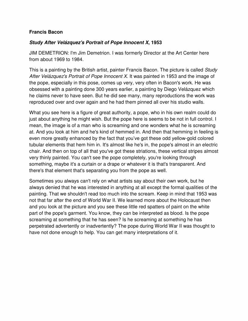
Francis Bacon
Study After Velázquez's Portrait of Pope Innocent X, 1953
JIM DEMETRION: I'm Jim Demetrion. I was formerly Director at the Art Center here
from about 1969 to 1984.
This is a painting by the British artist, painter Francis Bacon. The picture is called Study
After Velázquez's Portrait of Pope Innocent X. It was painted in 1953 and the image of
the pope, especially in this pose, comes up very, very often in Bacon's work. He was
obsessed with a painting done 300 years earlier, a painting by Diego Velázquez which
he claims never to have seen. But he did see many, many reproductions the work was
reproduced over and over again and he had them pinned all over his studio walls.
What you see here is a figure of great authority, a pope, who in his own realm could do
just about anything he might wish. But the pope here is seems to be not in full control. I
mean, the image is of a man who is screaming and one wonders what he is screaming
at. And you look at him and he's kind of hemmed in. And then that hemming in feeling is
even more greatly enhanced by the fact that you’ve got these odd yellow-gold colored
tubular elements that hem him in. It's almost like he's in, the pope's almost in an electric
chair. And then on top of all that you've got these striations, these vertical stripes almost
very thinly painted. You can't see the pope completely, you're looking through
something, maybe it's a curtain or a drape or whatever it is that's transparent. And
there's that element that's separating you from the pope as well.
Sometimes you always can't rely on what artists say about their own work, but he
always denied that he was interested in anything at all except the formal qualities of the
painting. That we shouldn't read too much into the scream. Keep in mind that 1953 was
not that far after the end of World War II. We learned more about the Holocaust then
and you look at the picture and you see these little red spatters of paint on the white
part of the pope's garment. You know, they can be interpreted as blood. Is the pope
screaming at something that he has seen? Is he screaming at something he has
perpetrated advertently or inadvertently? The pope during World War II was thought to
have not done enough to help. You can get many interpretations of it.
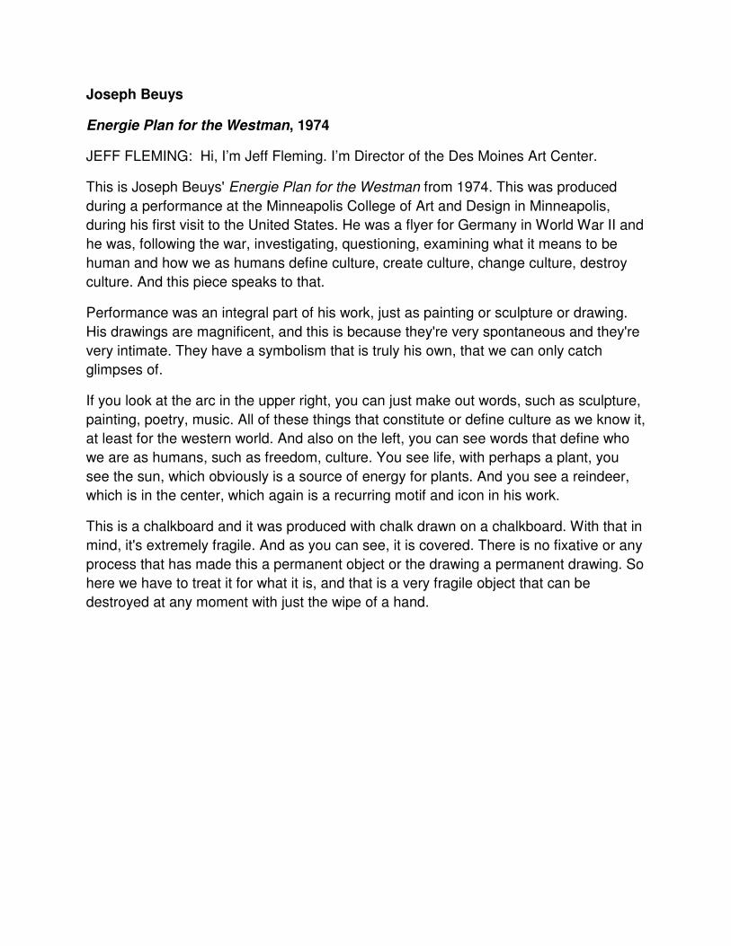
Joseph Beuys
Energie Plan for the Westman, 1974
JEFF FLEMING: Hi, I’m Jeff Fleming. I’m Director of the Des Moines Art Center.
This is Joseph Beuys' Energie Plan for the Westman from 1974. This was produced
during a performance at the Minneapolis College of Art and Design in Minneapolis,
during his first visit to the United States. He was a flyer for Germany in World War II and
he was, following the war, investigating, questioning, examining what it means to be
human and how we as humans define culture, create culture, change culture, destroy
culture. And this piece speaks to that.
Performance was an integral part of his work, just as painting or sculpture or drawing.
His drawings are magnificent, and this is because they're very spontaneous and they're
very intimate. They have a symbolism that is truly his own, that we can only catch
glimpses of.
If you look at the arc in the upper right, you can just make out words, such as sculpture,
painting, poetry, music. All of these things that constitute or define culture as we know it,
at least for the western world. And also on the left, you can see words that define who
we are as humans, such as freedom, culture. You see life, with perhaps a plant, you
see the sun, which obviously is a source of energy for plants. And you see a reindeer,
which is in the center, which again is a recurring motif and icon in his work.
This is a chalkboard and it was produced with chalk drawn on a chalkboard. With that in
mind, it's extremely fragile. And as you can see, it is covered. There is no fixative or any
process that has made this a permanent object or the drawing a permanent drawing. So
here we have to treat it for what it is, and that is a very fragile object that can be
destroyed at any moment with just the wipe of a hand.
Cecily Brown
Half-Bind, 2005
JEFF FLEMING: This is Cecily Brown's Half-Bind from 2005. It's a very lush and
painterly canvas. Cecily Brown's work always includes the figure, often in a sexual
connotation. Here we have a female figure sitting on a rock, perhaps a figure looking at
her from the side. She's in the forest, where the leaves and the environment are all
merging together into very complex and beautiful and lush patterns. You can also
assume, just barely, that this female figure is swinging on a swing. You can see the
chains of which is holding the seat of the swing within this forest. And you can barely
make out the head at the lower left of a gentleman that might be, I assume it’s a
gentleman, that might be pushing the swing and/or perhaps spying upon her from the
side.
This is a particularly active painting. We see pink and oranges and flesh tones, which of
course alludes to the figure. But we also see the purples and greens and reds and lush
colors, and all of these combine into a moving, energetic, vibrant presentation, a really a
living canvas.
She works in a variety of sizes, from the very intimate to very, very large-scale
canvases such as this one. The size obviously makes it a grand presentation and an
overwhelming presentation. It's larger than the viewer, which has an impact, even a
psychological impact upon the viewer, when you engage a work this large and this
active and this vibrant.
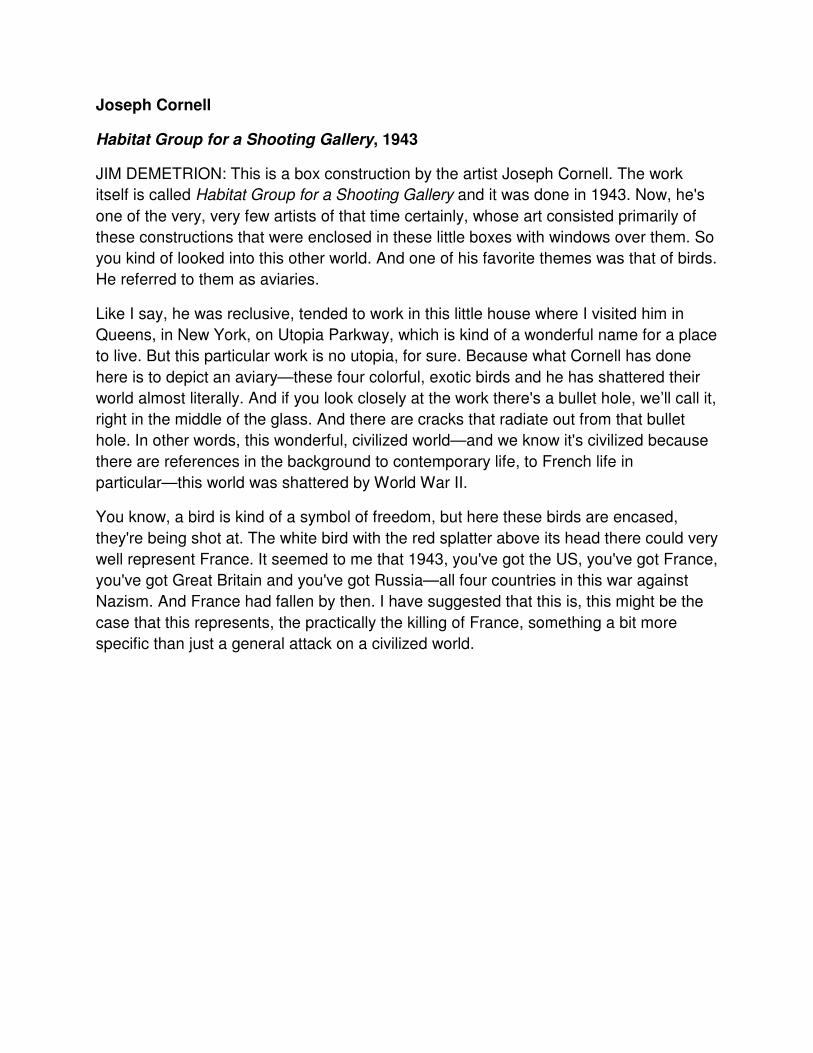
Joseph Cornell
Habitat Group for a Shooting Gallery, 1943
JIM DEMETRION: This is a box construction by the artist Joseph Cornell. The work
itself is called Habitat Group for a Shooting Gallery and it was done in 1943. Now, he's
one of the very, very few artists of that time certainly, whose art consisted primarily of
these constructions that were enclosed in these little boxes with windows over them. So
you kind of looked into this other world. And one of his favorite themes was that of birds.
He referred to them as aviaries.
Like I say, he was reclusive, tended to work in this little house where I visited him in
Queens, in New York, on Utopia Parkway, which is kind of a wonderful name for a place
to live. But this particular work is no utopia, for sure. Because what Cornell has done
here is to depict an aviary—these four colorful, exotic birds and he has shattered their
world almost literally. And if you look closely at the work there's a bullet hole, we’ll call it,
right in the middle of the glass. And there are cracks that radiate out from that bullet
hole. In other words, this wonderful, civilized world—and we know it's civilized because
there are references in the background to contemporary life, to French life in
particular—this world was shattered by World War II.
You know, a bird is kind of a symbol of freedom, but here these birds are encased,
they're being shot at. The white bird with the red splatter above its head there could very
well represent France. It seemed to me that 1943, you've got the US, you've got France,
you've got Great Britain and you've got Russia—all four countries in this war against
Nazism. And France had fallen by then. I have suggested that this is, this might be the
case that this represents, the practically the killing of France, something a bit more
specific than just a general attack on a civilized world.
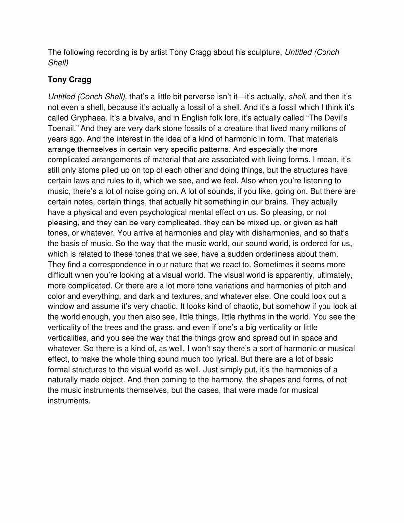
The following recording is by artist Tony Cragg about his sculpture, Untitled (Conch
Shell)
Tony Cragg
Untitled (Conch Shell), that’s a little bit perverse isn’t it—it’s actually, shell, and then it’s
not even a shell, because it’s actually a fossil of a shell. And it’s a fossil which I think it’s
called Gryphaea. It’s a bivalve, and in English folk lore, it’s actually called “The Devil’s
Toenail.” And they are very dark stone fossils of a creature that lived many millions of
years ago. And the interest in the idea of a kind of harmonic in form. That materials
arrange themselves in certain very specific patterns. And especially the more
complicated arrangements of material that are associated with living forms. I mean, it’s
still only atoms piled up on top of each other and doing things, but the structures have
certain laws and rules to it, which we see, and we feel. Also when you’re listening to
music, there’s a lot of noise going on. A lot of sounds, if you like, going on. But there are
certain notes, certain things, that actually hit something in our brains. They actually
have a physical and even psychological mental effect on us. So pleasing, or not
pleasing, and they can be very complicated, they can be mixed up, or given as half
tones, or whatever. You arrive at harmonies and play with disharmonies, and so that’s
the basis of music. So the way that the music world, our sound world, is ordered for us,
which is related to these tones that we see, have a sudden orderliness about them.
They find a correspondence in our nature that we react to. Sometimes it seems more
difficult when you’re looking at a visual world. The visual world is apparently, ultimately,
more complicated. Or there are a lot more tone variations and harmonies of pitch and
color and everything, and dark and textures, and whatever else. One could look out a
window and assume it’s very chaotic. It looks kind of chaotic, but somehow if you look at
the world enough, you then also see, little things, little rhythms in the world. You see the
verticality of the trees and the grass, and even if one’s a big verticality or little
verticalities, and you see the way that the things grow and spread out in space and
whatever. So there is a kind of, as well, I won’t say there’s a sort of harmonic or musical
effect, to make the whole thing sound much too lyrical. But there are a lot of basic
formal structures to the visual world as well. Just simply put, it’s the harmonies of a
naturally made object. And then coming to the harmony, the shapes and forms, of not
the music instruments themselves, but the cases, that were made for musical
instruments.
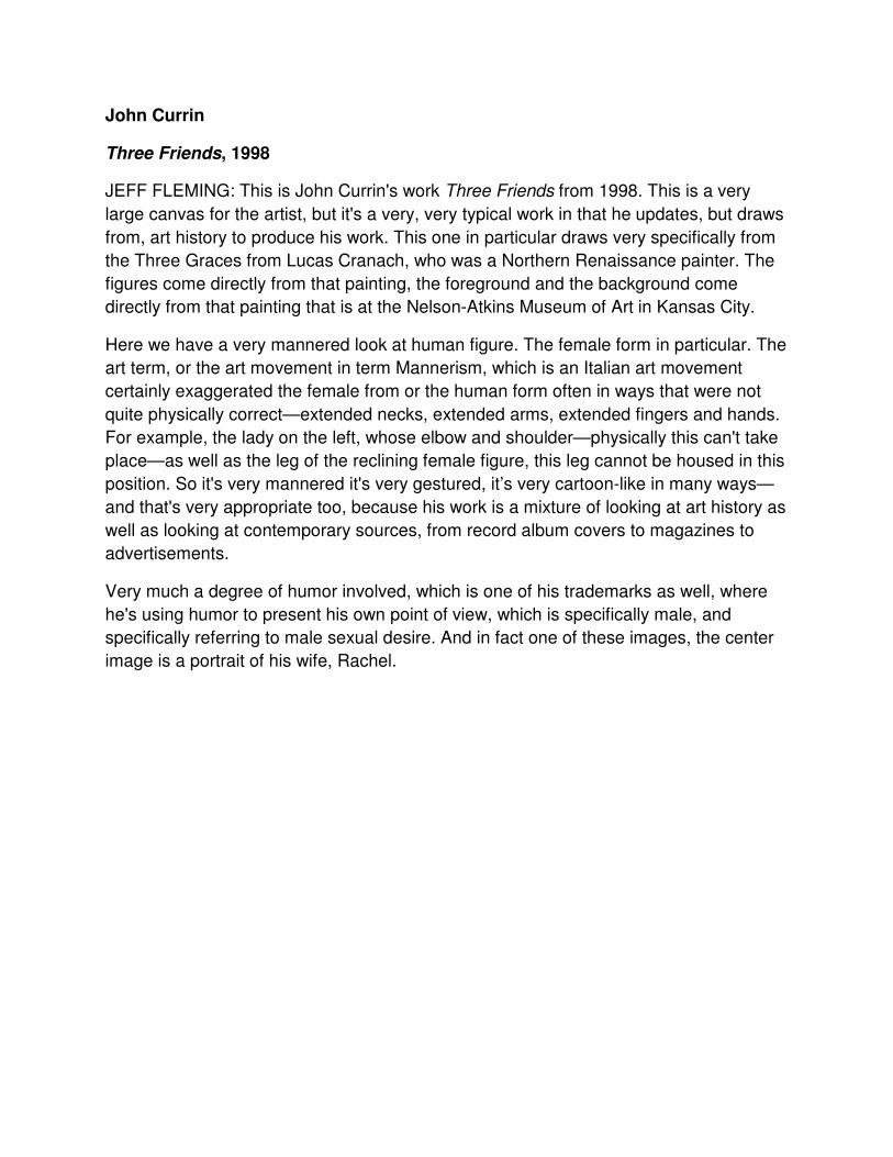
John Currin
Three Friends, 1998
JEFF FLEMING: This is John Currin's work Three Friends from 1998. This is a very
large canvas for the artist, but it's a very, very typical work in that he updates, but draws
from, art history to produce his work. This one in particular draws very specifically from
the Three Graces from Lucas Cranach, who was a Northern Renaissance painter. The
figures come directly from that painting, the foreground and the background come
directly from that painting that is at the Nelson-Atkins Museum of Art in Kansas City.
Here we have a very mannered look at human figure. The female form in particular. The
art term, or the art movement in term Mannerism, which is an Italian art movement
certainly exaggerated the female from or the human form often in ways that were not
quite physically correct—extended necks, extended arms, extended fingers and hands.
For example, the lady on the left, whose elbow and shoulder—physically this can't take
place—as well as the leg of the reclining female figure, this leg cannot be housed in this
position. So it's very mannered it's very gestured, it’s very cartoon-like in many ways—
and that's very appropriate too, because his work is a mixture of looking at art history as
well as looking at contemporary sources, from record album covers to magazines to
advertisements.
Very much a degree of humor involved, which is one of his trademarks as well, where
he's using humor to present his own point of view, which is specifically male, and
specifically referring to male sexual desire. And in fact one of these images, the center
image is a portrait of his wife, Rachel.
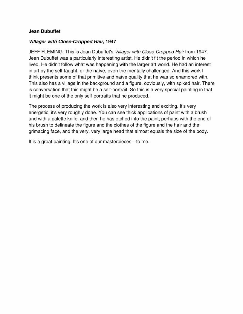
Jean Dubuffet
Villager with Close-Cropped Hair, 1947
JEFF FLEMING: This is Jean Dubuffet's Villager with Close-Cropped Hair from 1947.
Jean Dubuffet was a particularly interesting artist. He didn't fit the period in which he
lived. He didn't follow what was happening with the larger art world. He had an interest
in art by the self-taught, or the naïve, even the mentally challenged. And this work I
think presents some of that primitive and naïve quality that he was so enamored with.
This also has a village in the background and a figure, obviously, with spiked hair. There
is conversation that this might be a self-portrait. So this is a very special painting in that
it might be one of the only self-portraits that he produced.
The process of producing the work is also very interesting and exciting. It's very
energetic, it's very roughly done. You can see thick applications of paint with a brush
and with a palette knife, and then he has etched into the paint, perhaps with the end of
his brush to delineate the figure and the clothes of the figure and the hair and the
grimacing face, and the very, very large head that almost equals the size of the body.
It is a great painting. It's one of our masterpieces—to me.
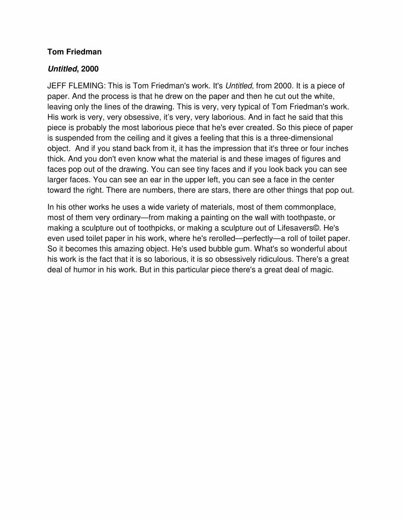
Tom Friedman
Untitled, 2000
JEFF FLEMING: This is Tom Friedman's work. It's Untitled, from 2000. It is a piece of
paper. And the process is that he drew on the paper and then he cut out the white,
leaving only the lines of the drawing. This is very, very typical of Tom Friedman's work.
His work is very, very obsessive, it’s very, very laborious. And in fact he said that this
piece is probably the most laborious piece that he's ever created. So this piece of paper
is suspended from the ceiling and it gives a feeling that this is a three-dimensional
object. And if you stand back from it, it has the impression that it's three or four inches
thick. And you don't even know what the material is and these images of figures and
faces pop out of the drawing. You can see tiny faces and if you look back you can see
larger faces. You can see an ear in the upper left, you can see a face in the center
toward the right. There are numbers, there are stars, there are other things that pop out.
In his other works he uses a wide variety of materials, most of them commonplace,
most of them very ordinary—from making a painting on the wall with toothpaste, or
even used toilet paper in his work, where he's rerolled—perfectly—a roll of toilet paper.
So it becomes this amazing object. He's used bubble gum. What's so wonderful about
his work is the fact that it is so laborious, it is so obsessively ridiculous. There's a great
deal of humor in his work. But in this particular piece there's a great deal of magic.
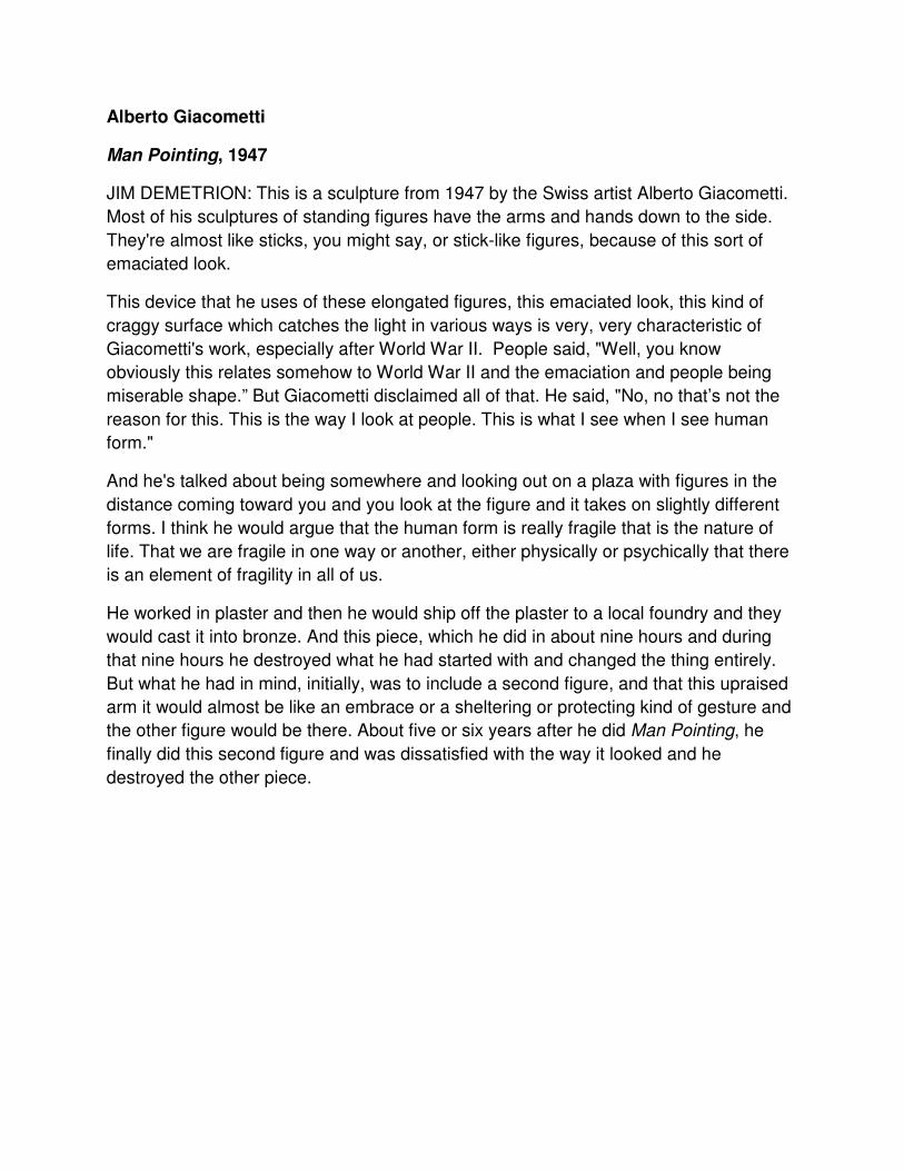
Alberto Giacometti
Man Pointing, 1947
JIM DEMETRION: This is a sculpture from 1947 by the Swiss artist Alberto Giacometti.
Most of his sculptures of standing figures have the arms and hands down to the side.
They're almost like sticks, you might say, or stick-like figures, because of this sort of
emaciated look.
This device that he uses of these elongated figures, this emaciated look, this kind of
craggy surface which catches the light in various ways is very, very characteristic of
Giacometti's work, especially after World War II. People said, "Well, you know
obviously this relates somehow to World War II and the emaciation and people being
miserable shape.” But Giacometti disclaimed all of that. He said, "No, no that’s not the
reason for this. This is the way I look at people. This is what I see when I see human
form."
And he's talked about being somewhere and looking out on a plaza with figures in the
distance coming toward you and you look at the figure and it takes on slightly different
forms. I think he would argue that the human form is really fragile that is the nature of
life. That we are fragile in one way or another, either physically or psychically that there
is an element of fragility in all of us.
He worked in plaster and then he would ship off the plaster to a local foundry and they
would cast it into bronze. And this piece, which he did in about nine hours and during
that nine hours he destroyed what he had started with and changed the thing entirely.
But what he had in mind, initially, was to include a second figure, and that this upraised
arm it would almost be like an embrace or a sheltering or protecting kind of gesture and
the other figure would be there. About five or six years after he did Man Pointing, he
finally did this second figure and was dissatisfied with the way it looked and he
destroyed the other piece.
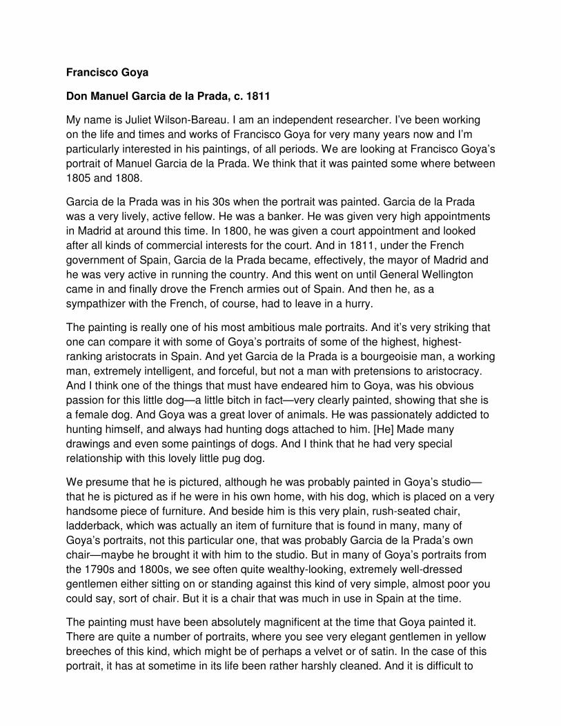
Francisco Goya
Don Manuel Garcia de la Prada, c. 1811
My name is Juliet Wilson-Bareau. I am an independent researcher. I’ve been working
on the life and times and works of Francisco Goya for very many years now and I’m
particularly interested in his paintings, of all periods. We are looking at Francisco Goya’s
portrait of Manuel Garcia de la Prada. We think that it was painted some where between
1805 and 1808.
Garcia de la Prada was in his 30s when the portrait was painted. Garcia de la Prada
was a very lively, active fellow. He was a banker. He was given very high appointments
in Madrid at around this time. In 1800, he was given a court appointment and looked
after all kinds of commercial interests for the court. And in 1811, under the French
government of Spain, Garcia de la Prada became, effectively, the mayor of Madrid and
he was very active in running the country. And this went on until General Wellington
came in and finally drove the French armies out of Spain. And then he, as a
sympathizer with the French, of course, had to leave in a hurry.
The painting is really one of his most ambitious male portraits. And it’s very striking that
one can compare it with some of Goya’s portraits of some of the highest, highest-
ranking aristocrats in Spain. And yet Garcia de la Prada is a bourgeoisie man, a working
man, extremely intelligent, and forceful, but not a man with pretensions to aristocracy.
And I think one of the things that must have endeared him to Goya, was his obvious
passion for this little dog—a little bitch in fact—very clearly painted, showing that she is
a female dog. And Goya was a great lover of animals. He was passionately addicted to
hunting himself, and always had hunting dogs attached to him. [He] Made many
drawings and even some paintings of dogs. And I think that he had very special
relationship with this lovely little pug dog.
We presume that he is pictured, although he was probably painted in Goya’s studio—
that he is pictured as if he were in his own home, with his dog, which is placed on a very
handsome piece of furniture. And beside him is this very plain, rush-seated chair,
ladderback, which was actually an item of furniture that is found in many, many of
Goya’s portraits, not this particular one, that was probably Garcia de la Prada’s own
chair—maybe he brought it with him to the studio. But in many of Goya’s portraits from
the 1790s and 1800s, we see often quite wealthy-looking, extremely well-dressed
gentlemen either sitting on or standing against this kind of very simple, almost poor you
could say, sort of chair. But it is a chair that was much in use in Spain at the time.
The painting must have been absolutely magnificent at the time that Goya painted it.
There are quite a number of portraits, where you see very elegant gentlemen in yellow
breeches of this kind, which might be of perhaps a velvet or of satin. In the case of this
portrait, it has at sometime in its life been rather harshly cleaned. And it is difficult to
read the quality of the kind of material from which the clothes are actually made. But
nevertheless, they are striking. They still describe the shape and the shapely legs of the
sitter very well. And it is hoped, in fact, that this picture can go through some sort of
conservation process, and be enhanced. Because one of the things that one notices is
that the top hat on the chair doesn’t actually sit down on the chair. It seems to be sort of
levitating, almost floating, above the rush-seated area of the chair. And this is probably
because some glazing and shadows—transparent shadows—were removed in a
cleaning process, probably many, many years ago.
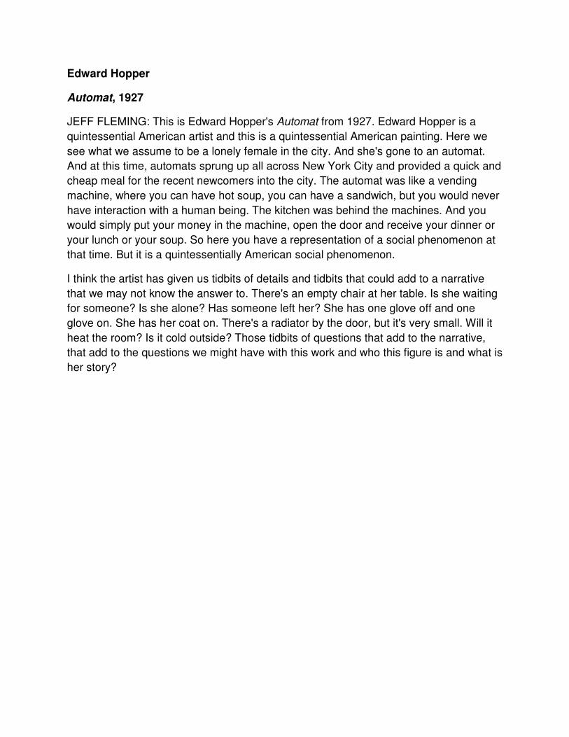
Edward Hopper
Automat, 1927
JEFF FLEMING: This is Edward Hopper's Automat from 1927. Edward Hopper is a
quintessential American artist and this is a quintessential American painting. Here we
see what we assume to be a lonely female in the city. And she's gone to an automat.
And at this time, automats sprung up all across New York City and provided a quick and
cheap meal for the recent newcomers into the city. The automat was like a vending
machine, where you can have hot soup, you can have a sandwich, but you would never
have interaction with a human being. The kitchen was behind the machines. And you
would simply put your money in the machine, open the door and receive your dinner or
your lunch or your soup. So here you have a representation of a social phenomenon at
that time. But it is a quintessentially American social phenomenon.
I think the artist has given us tidbits of details and tidbits that could add to a narrative
that we may not know the answer to. There's an empty chair at her table. Is she waiting
for someone? Is she alone? Has someone left her? She has one glove off and one
glove on. She has her coat on. There's a radiator by the door, but it's very small. Will it
heat the room? Is it cold outside? Those tidbits of questions that add to the narrative,
that add to the questions we might have with this work and who this figure is and what is
her story?
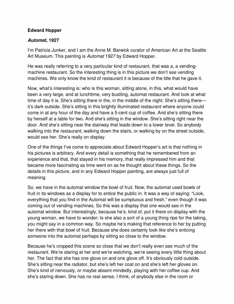
Edward Hopper
Automat, 1927
I’m Patricia Junker, and I am the Anne M. Barwick curator of American Art at the Seattle
Art Museum. This painting is Automat 1927 by Edward Hopper.
He was really referring to a very particular kind of restaurant, that was a, a vending-
machine restaurant. So the interesting thing is in this picture we don’t see vending
machines. We only know the kind of restaurant it is because of the title that he gave it.
Now, what’s interesting is: who is this woman, sitting alone, in this, what would have
been a very large, and at lunchtime, very bustling, automat restaurant. And look at what
time of day it is. She’s sitting there in the, in the middle of the night. She’s sitting there—
it’s dark outside. She’s sitting in this brightly illuminated restaurant where anyone could
come in at any hour of the day and have a 5-cent cup of coffee. And she’s sitting there
by herself at a table for two. And she’s sitting in the window. She’s sitting right near the
door. And she’s sitting near the stairway that leads down to a lower level. So anybody
walking into the restaurant, walking down the stairs, or walking by on the street outside,
would see her. She’s really on display.
One of the things I’ve come to appreciate about Edward Hopper’s art is that nothing in
his pictures is arbitrary. And every detail is something that he remembered from an
experience and that, that stayed in his memory, that really impressed him and that
became more fascinating as time went on as he thought about these things. So the
details in this picture, and in any Edward Hopper painting, are always just full of
meaning.
So, we have in the automat window the bowl of fruit. Now, the automat used bowls of
fruit in its windows as a display for to entice the public in. It was a way of saying: “Look,
everything that you find in the Automat will be sumptuous and fresh,” even though it was
coming out of vending machines. So this was a display that one would see in the
automat window. But interestingly, because he’s, kind of, put it there on display with the
young woman, we have to wonder: Is she also a sort of a young thing ripe for the taking,
you might say in a common way. So maybe he’s making that reference to her by putting
her there with that bowl of fruit. Because she does certainly look like she’s enticing
someone into the automat perhaps by sitting so close to the window.
Because he’s cropped this scene so close that we don’t really even see much of the
restaurant. We’re staring at her and we’re watching, we’re seeing every little thing about
her. The fact that she has one glove on and one glove off. It’s obviously cold outside.
She’s sitting near the radiator, but she’s left her coat on and she’s left her gloves on.
She’s kind of nervously, or maybe absent-mindedly, playing with her coffee cup. And
she’s staring down. She has no real sense, I think, of anybody else in the room or
anything going on outside or any passersby in any part of the restaurant. And so she’s
either completely lost in herself, or she’s so self-conscious that she’s kind of looking
down in hopes that no one is looking at her. I always feel that way when I’m dining
alone in a restaurant myself, so I can understand, I think, what she might, what a
woman like her would be feeling.
This is the beginning of the Edward Hopper that we know and love, though in 1927
nobody recognized that. Nobody saw this for the major new direction that it was in his
art. When he showed this painting in 1927, he was still known as a landscape painter
and primarily as a watercolorist and so his fame had come in 1924 with a lot of his
watercolor paintings of Gloucester, of old houses in Gloucester. In 1927, when he had
his next show in New York, he included four oil paintings, including this one, which was
the largest of the four in the show. So he was obviously intending this to be a major
statement. Critics really loved the watercolors. They loved the etchings from years
earlier, that he’d also included in the show, but they thought that the paintings really
lacked something. And they said particularly of this one that it lacked any sort of sense
of control over the composition. And I think maybe they’re talking about all the
emptiness and the fact that the fruit bowl is kind of off-center and behind her. They
really were kinda missing the point. And no one really appreciated, I think, where
Hopper was going in his art. So in 1927, though this painting was bought in 1927 by a
famous collector, it took several years for Hopper to gain his reputation on paintings like
this. And then two years later he paints “Chop Suey” another restaurant picture, which is
almost its pair. And so the rest is history. He quickly then became famous for pictures
like this. And these are the pictures that we know and love today.
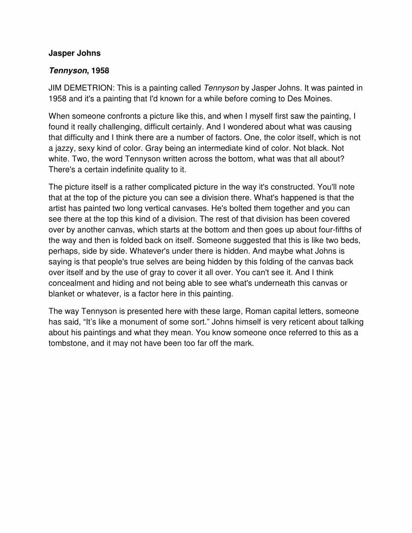
Jasper Johns
Tennyson, 1958
JIM DEMETRION: This is a painting called Tennyson by Jasper Johns. It was painted in
1958 and it's a painting that I'd known for a while before coming to Des Moines.
When someone confronts a picture like this, and when I myself first saw the painting, I
found it really challenging, difficult certainly. And I wondered about what was causing
that difficulty and I think there are a number of factors. One, the color itself, which is not
a jazzy, sexy kind of color. Gray being an intermediate kind of color. Not black. Not
white. Two, the word Tennyson written across the bottom, what was that all about?
There's a certain indefinite quality to it.
The picture itself is a rather complicated picture in the way it's constructed. You'll note
that at the top of the picture you can see a division there. What's happened is that the
artist has painted two long vertical canvases. He's bolted them together and you can
see there at the top this kind of a division. The rest of that division has been covered
over by another canvas, which starts at the bottom and then goes up about four-fifths of
the way and then is folded back on itself. Someone suggested that this is like two beds,
perhaps, side by side. Whatever's under there is hidden. And maybe what Johns is
saying is that people's true selves are being hidden by this folding of the canvas back
over itself and by the use of gray to cover it all over. You can't see it. And I think
concealment and hiding and not being able to see what's underneath this canvas or
blanket or whatever, is a factor here in this painting.
The way Tennyson is presented here with these large, Roman capital letters, someone
has said, “It’s like a monument of some sort.” Johns himself is very reticent about talking
about his paintings and what they mean. You know someone once referred to this as a
tombstone, and it may not have been too far off the mark.
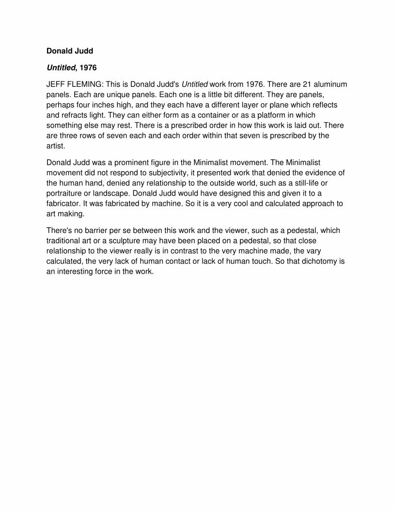
Donald Judd
Untitled, 1976
JEFF FLEMING: This is Donald Judd's Untitled work from 1976. There are 21 aluminum
panels. Each are unique panels. Each one is a little bit different. They are panels,
perhaps four inches high, and they each have a different layer or plane which reflects
and refracts light. They can either form as a container or as a platform in which
something else may rest. There is a prescribed order in how this work is laid out. There
are three rows of seven each and each order within that seven is prescribed by the
artist.
Donald Judd was a prominent figure in the Minimalist movement. The Minimalist
movement did not respond to subjectivity, it presented work that denied the evidence of
the human hand, denied any relationship to the outside world, such as a still-life or
portraiture or landscape. Donald Judd would have designed this and given it to a
fabricator. It was fabricated by machine. So it is a very cool and calculated approach to
art making.
There's no barrier per se between this work and the viewer, such as a pedestal, which
traditional art or a sculpture may have been placed on a pedestal, so that close
relationship to the viewer really is in contrast to the very machine made, the vary
calculated, the very lack of human contact or lack of human touch. So that dichotomy is
an interesting force in the work.
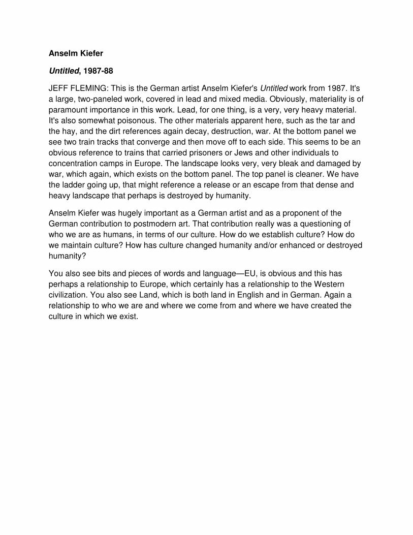
Anselm Kiefer
Untitled, 1987-88
JEFF FLEMING: This is the German artist Anselm Kiefer's Untitled work from 1987. It's
a large, two-paneled work, covered in lead and mixed media. Obviously, materiality is of
paramount importance in this work. Lead, for one thing, is a very, very heavy material.
It's also somewhat poisonous. The other materials apparent here, such as the tar and
the hay, and the dirt references again decay, destruction, war. At the bottom panel we
see two train tracks that converge and then move off to each side. This seems to be an
obvious reference to trains that carried prisoners or Jews and other individuals to
concentration camps in Europe. The landscape looks very, very bleak and damaged by
war, which again, which exists on the bottom panel. The top panel is cleaner. We have
the ladder going up, that might reference a release or an escape from that dense and
heavy landscape that perhaps is destroyed by humanity.
Anselm Kiefer was hugely important as a German artist and as a proponent of the
German contribution to postmodern art. That contribution really was a questioning of
who we are as humans, in terms of our culture. How do we establish culture? How do
we maintain culture? How has culture changed humanity and/or enhanced or destroyed
humanity?
You also see bits and pieces of words and language—EU, is obvious and this has
perhaps a relationship to Europe, which certainly has a relationship to the Western
civilization. You also see Land, which is both land in English and in German. Again a
relationship to who we are and where we come from and where we have created the
culture in which we exist.
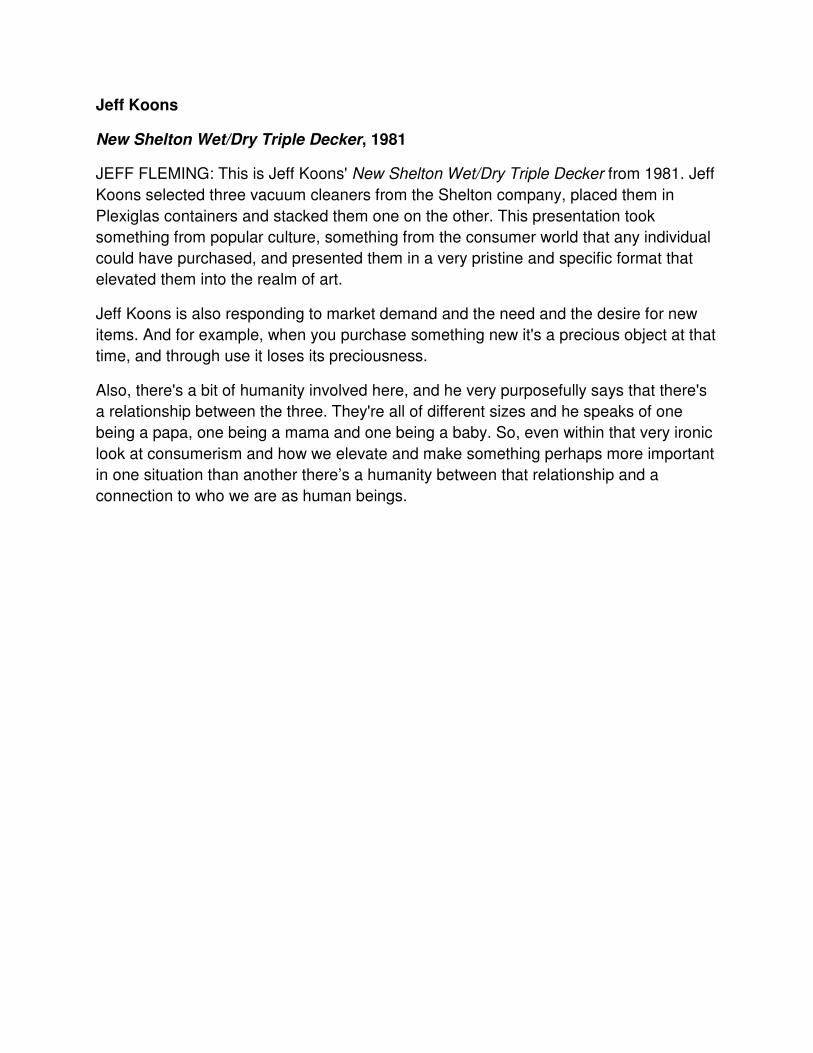
Jeff Koons
New Shelton Wet/Dry Triple Decker, 1981
JEFF FLEMING: This is Jeff Koons' New Shelton Wet/Dry Triple Decker from 1981. Jeff
Koons selected three vacuum cleaners from the Shelton company, placed them in
Plexiglas containers and stacked them one on the other. This presentation took
something from popular culture, something from the consumer world that any individual
could have purchased, and presented them in a very pristine and specific format that
elevated them into the realm of art.
Jeff Koons is also responding to market demand and the need and the desire for new
items. And for example, when you purchase something new it's a precious object at that
time, and through use it loses its preciousness.
Also, there's a bit of humanity involved here, and he very purposefully says that there's
a relationship between the three. They're all of different sizes and he speaks of one
being a papa, one being a mama and one being a baby. So, even within that very ironic
look at consumerism and how we elevate and make something perhaps more important
in one situation than another there’s a humanity between that relationship and a
connection to who we are as human beings.
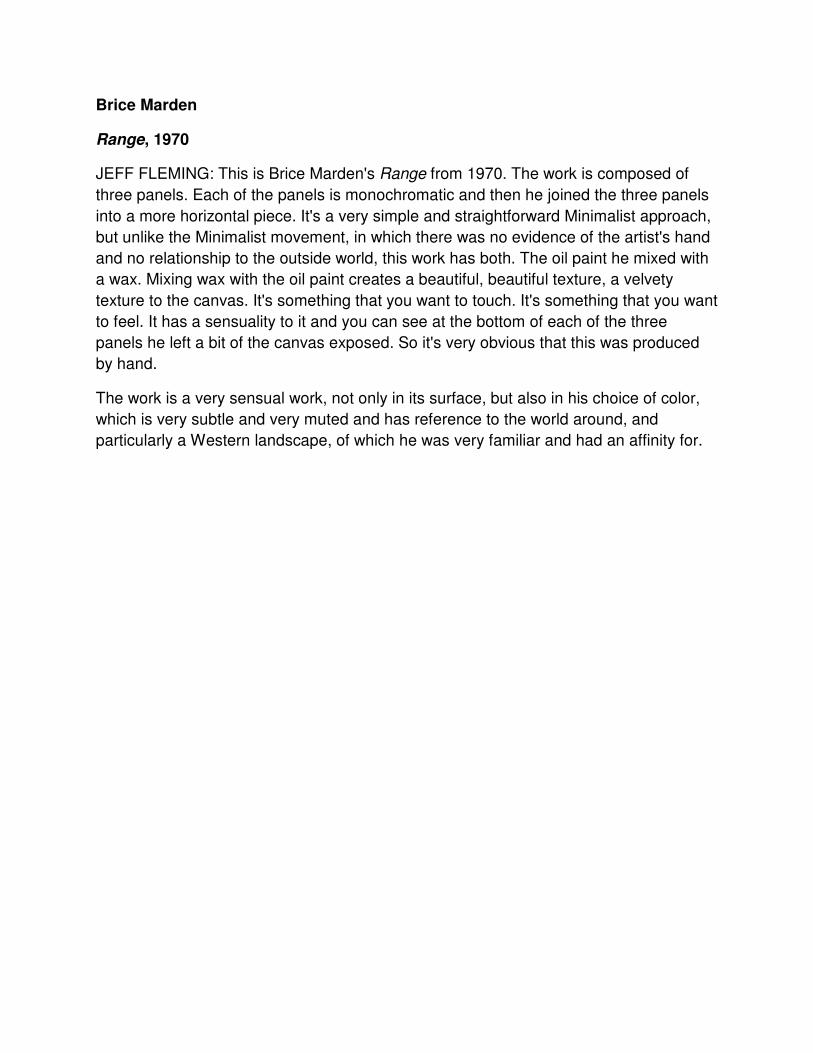
Brice Marden
Range, 1970
JEFF FLEMING: This is Brice Marden's Range from 1970. The work is composed of
three panels. Each of the panels is monochromatic and then he joined the three panels
into a more horizontal piece. It's a very simple and straightforward Minimalist approach,
but unlike the Minimalist movement, in which there was no evidence of the artist's hand
and no relationship to the outside world, this work has both. The oil paint he mixed with
a wax. Mixing wax with the oil paint creates a beautiful, beautiful texture, a velvety
texture to the canvas. It's something that you want to touch. It's something that you want
to feel. It has a sensuality to it and you can see at the bottom of each of the three
panels he left a bit of the canvas exposed. So it's very obvious that this was produced
by hand.
The work is a very sensual work, not only in its surface, but also in his choice of color,
which is very subtle and very muted and has reference to the world around, and
particularly a Western landscape, of which he was very familiar and had an affinity for.
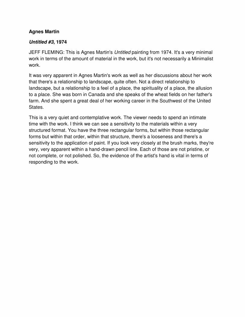
Agnes Martin
Untitled #3, 1974
JEFF FLEMING: This is Agnes Martin's Untitled painting from 1974. It's a very minimal
work in terms of the amount of material in the work, but it's not necessarily a Minimalist
work.
It was very apparent in Agnes Martin's work as well as her discussions about her work
that there's a relationship to landscape, quite often. Not a direct relationship to
landscape, but a relationship to a feel of a place, the spirituality of a place, the allusion
to a place. She was born in Canada and she speaks of the wheat fields on her father's
farm. And she spent a great deal of her working career in the Southwest of the United
States.
This is a very quiet and contemplative work. The viewer needs to spend an intimate
time with the work. I think we can see a sensitivity to the materials within a very
structured format. You have the three rectangular forms, but within those rectangular
forms but within that order, within that structure, there's a looseness and there's a
sensitivity to the application of paint. If you look very closely at the brush marks, they're
very, very apparent within a hand-drawn pencil line. Each of those are not pristine, or
not complete, or not polished. So, the evidence of the artist's hand is vital in terms of
responding to the work.
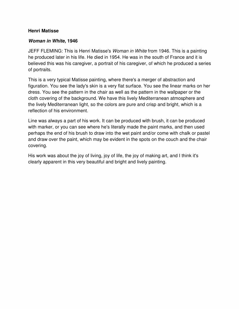
Henri Matisse
Woman in White, 1946
JEFF FLEMING: This is Henri Matisse's Woman in White from 1946. This is a painting
he produced later in his life. He died in 1954. He was in the south of France and it is
believed this was his caregiver, a portrait of his caregiver, of which he produced a series
of portraits.
This is a very typical Matisse painting, where there's a merger of abstraction and
figuration. You see the lady's skin is a very flat surface. You see the linear marks on her
dress. You see the pattern in the chair as well as the pattern in the wallpaper or the
cloth covering of the background. We have this lively Mediterranean atmosphere and
the lively Mediterranean light, so the colors are pure and crisp and bright, which is a
reflection of his environment.
Line was always a part of his work. It can be produced with brush, it can be produced
with marker, or you can see where he's literally made the paint marks, and then used
perhaps the end of his brush to draw into the wet paint and/or come with chalk or pastel
and draw over the paint, which may be evident in the spots on the couch and the chair
covering.
His work was about the joy of living, joy of life, the joy of making art, and I think it's
clearly apparent in this very beautiful and bright and lively painting.
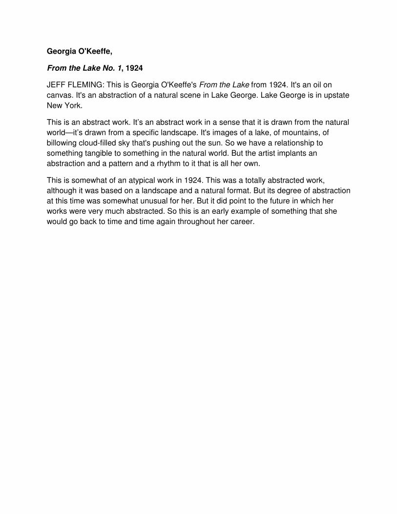
Georgia O'Keeffe,
From the Lake No. 1, 1924
JEFF FLEMING: This is Georgia O'Keeffe's From the Lake from 1924. It's an oil on
canvas. It's an abstraction of a natural scene in Lake George. Lake George is in upstate
New York.
This is an abstract work. It’s an abstract work in a sense that it is drawn from the natural
world—it’s drawn from a specific landscape. It's images of a lake, of mountains, of
billowing cloud-filled sky that's pushing out the sun. So we have a relationship to
something tangible to something in the natural world. But the artist implants an
abstraction and a pattern and a rhythm to it that is all her own.
This is somewhat of an atypical work in 1924. This was a totally abstracted work,
although it was based on a landscape and a natural format. But its degree of abstraction
at this time was somewhat unusual for her. But it did point to the future in which her
works were very much abstracted. So this is an early example of something that she
would go back to time and time again throughout her career.
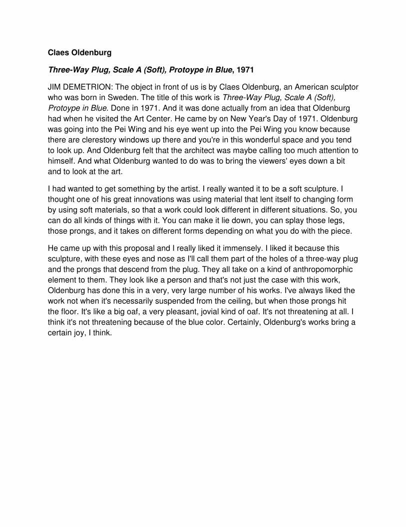
Claes Oldenburg
Three-Way Plug, Scale A (Soft), Protoype in Blue, 1971
JIM DEMETRION: The object in front of us is by Claes Oldenburg, an American sculptor
who was born in Sweden. The title of this work is Three-Way Plug, Scale A (Soft),
Protoype in Blue. Done in 1971. And it was done actually from an idea that Oldenburg
had when he visited the Art Center. He came by on New Year's Day of 1971. Oldenburg
was going into the Pei Wing and his eye went up into the Pei Wing you know because
there are clerestory windows up there and you're in this wonderful space and you tend
to look up. And Oldenburg felt that the architect was maybe calling too much attention to
himself. And what Oldenburg wanted to do was to bring the viewers' eyes down a bit
and to look at the art.
I had wanted to get something by the artist. I really wanted it to be a soft sculpture. I
thought one of his great innovations was using material that lent itself to changing form
by using soft materials, so that a work could look different in different situations. So, you
can do all kinds of things with it. You can make it lie down, you can splay those legs,
those prongs, and it takes on different forms depending on what you do with the piece.
He came up with this proposal and I really liked it immensely. I liked it because this
sculpture, with these eyes and nose as I'll call them part of the holes of a three-way plug
and the prongs that descend from the plug. They all take on a kind of anthropomorphic
element to them. They look like a person and that's not just the case with this work,
Oldenburg has done this in a very, very large number of his works. I've always liked the
work not when it's necessarily suspended from the ceiling, but when those prongs hit
the floor. It's like a big oaf, a very pleasant, jovial kind of oaf. It's not threatening at all. I
think it's not threatening because of the blue color. Certainly, Oldenburg's works bring a
certain joy, I think.
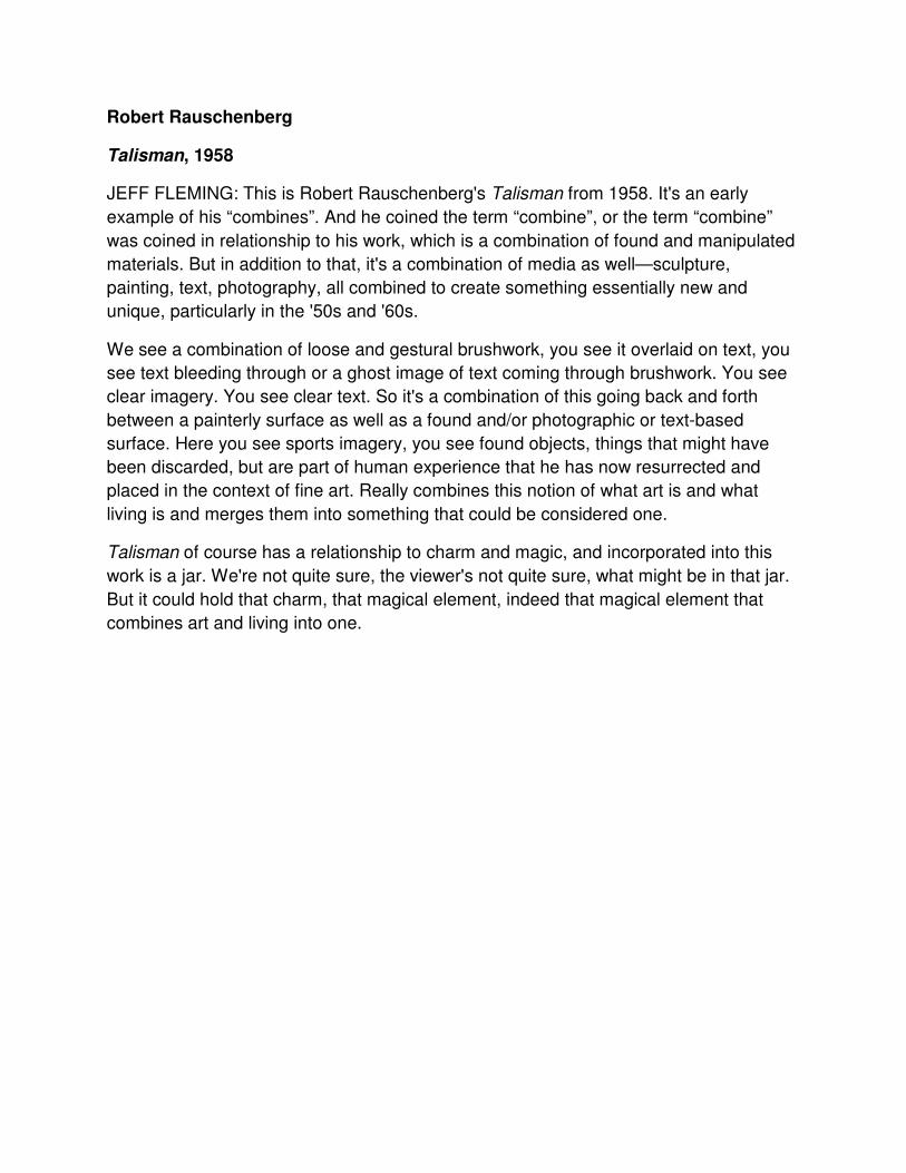
Robert Rauschenberg
Talisman, 1958
JEFF FLEMING: This is Robert Rauschenberg's Talisman from 1958. It's an early
example of his “combines”. And he coined the term “combine”, or the term “combine”
was coined in relationship to his work, which is a combination of found and manipulated
materials. But in addition to that, it's a combination of media as well—sculpture,
painting, text, photography, all combined to create something essentially new and
unique, particularly in the '50s and '60s.
We see a combination of loose and gestural brushwork, you see it overlaid on text, you
see text bleeding through or a ghost image of text coming through brushwork. You see
clear imagery. You see clear text. So it's a combination of this going back and forth
between a painterly surface as well as a found and/or photographic or text-based
surface. Here you see sports imagery, you see found objects, things that might have
been discarded, but are part of human experience that he has now resurrected and
placed in the context of fine art. Really combines this notion of what art is and what
living is and merges them into something that could be considered one.
Talisman of course has a relationship to charm and magic, and incorporated into this
work is a jar. We're not quite sure, the viewer's not quite sure, what might be in that jar.
But it could hold that charm, that magical element, indeed that magical element that
combines art and living into one.
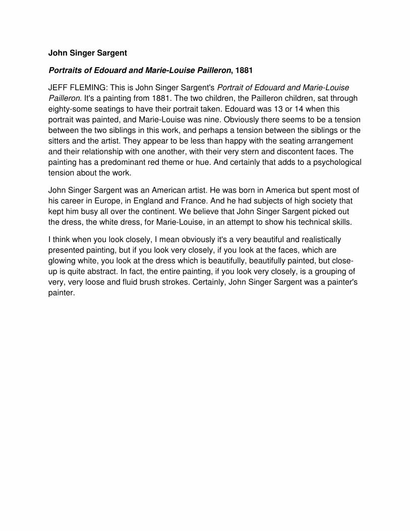
John Singer Sargent
Portraits of Edouard and Marie-Louise Pailleron, 1881
JEFF FLEMING: This is John Singer Sargent's Portrait of Edouard and Marie-Louise
Pailleron. It's a painting from 1881. The two children, the Pailleron children, sat through
eighty-some seatings to have their portrait taken. Edouard was 13 or 14 when this
portrait was painted, and Marie-Louise was nine. Obviously there seems to be a tension
between the two siblings in this work, and perhaps a tension between the siblings or the
sitters and the artist. They appear to be less than happy with the seating arrangement
and their relationship with one another, with their very stern and discontent faces. The
painting has a predominant red theme or hue. And certainly that adds to a psychological
tension about the work.
John Singer Sargent was an American artist. He was born in America but spent most of
his career in Europe, in England and France. And he had subjects of high society that
kept him busy all over the continent. We believe that John Singer Sargent picked out
the dress, the white dress, for Marie-Louise, in an attempt to show his technical skills.
I think when you look closely, I mean obviously it's a very beautiful and realistically
presented painting, but if you look very closely, if you look at the faces, which are
glowing white, you look at the dress which is beautifully, beautifully painted, but close-
up is quite abstract. In fact, the entire painting, if you look very closely, is a grouping of
very, very loose and fluid brush strokes. Certainly, John Singer Sargent was a painter's
painter.
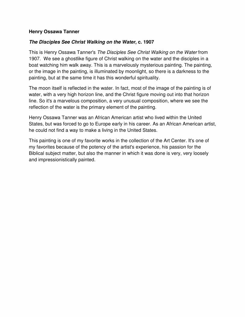
Henry Ossawa Tanner
The Disciples See Christ Walking on the Water, c. 1907
This is Henry Ossawa Tanner's The Disciples See Christ Walking on the Water from
1907. We see a ghostlike figure of Christ walking on the water and the disciples in a
boat watching him walk away. This is a marvelously mysterious painting. The painting,
or the image in the painting, is illuminated by moonlight, so there is a darkness to the
painting, but at the same time it has this wonderful spirituality.
The moon itself is reflected in the water. In fact, most of the image of the painting is of
water, with a very high horizon line, and the Christ figure moving out into that horizon
line. So it's a marvelous composition, a very unusual composition, where we see the
reflection of the water is the primary element of the painting.
Henry Ossawa Tanner was an African American artist who lived within the United
States, but was forced to go to Europe early in his career. As an African American artist,
he could not find a way to make a living in the United States.
This painting is one of my favorite works in the collection of the Art Center. It's one of
my favorites because of the potency of the artist's experience, his passion for the
Biblical subject matter, but also the manner in which it was done is very, very loosely
and impressionistically painted.
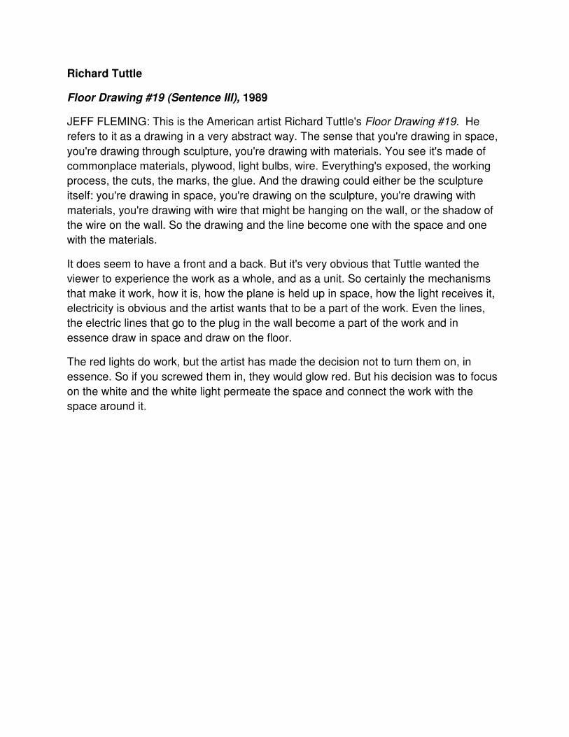
Richard Tuttle
Floor Drawing #19 (Sentence III), 1989
JEFF FLEMING: This is the American artist Richard Tuttle's Floor Drawing #19. He
refers to it as a drawing in a very abstract way. The sense that you're drawing in space,
you're drawing through sculpture, you're drawing with materials. You see it's made of
commonplace materials, plywood, light bulbs, wire. Everything's exposed, the working
process, the cuts, the marks, the glue. And the drawing could either be the sculpture
itself: you're drawing in space, you're drawing on the sculpture, you're drawing with
materials, you're drawing with wire that might be hanging on the wall, or the shadow of
the wire on the wall. So the drawing and the line become one with the space and one
with the materials.
It does seem to have a front and a back. But it's very obvious that Tuttle wanted the
viewer to experience the work as a whole, and as a unit. So certainly the mechanisms
that make it work, how it is, how the plane is held up in space, how the light receives it,
electricity is obvious and the artist wants that to be a part of the work. Even the lines,
the electric lines that go to the plug in the wall become a part of the work and in
essence draw in space and draw on the floor.
The red lights do work, but the artist has made the decision not to turn them on, in
essence. So if you screwed them in, they would glow red. But his decision was to focus
on the white and the white light permeate the space and connect the work with the
space around it.
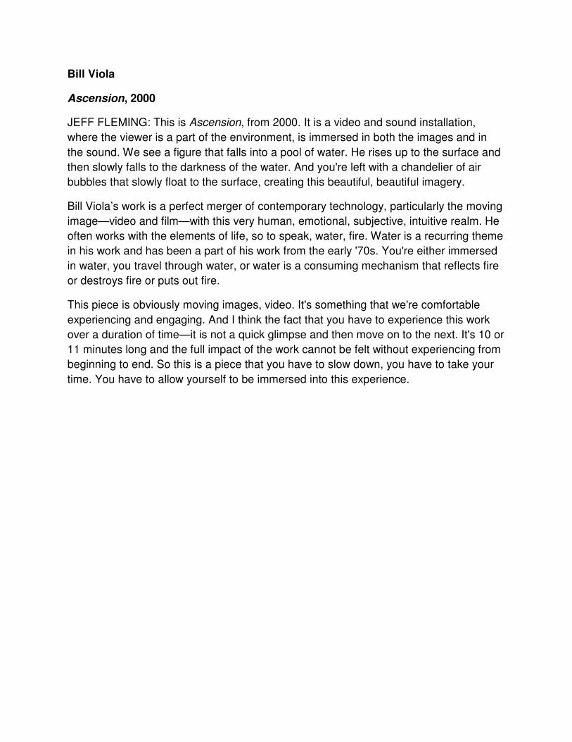
Bill Viola
Ascension, 2000
JEFF FLEMING: This is Ascension, from 2000. It is a video and sound installation,
where the viewer is a part of the environment, is immersed in both the images and in
the sound. We see a figure that falls into a pool of water. He rises up to the surface and
then slowly falls to the darkness of the water. And you're left with a chandelier of air
bubbles that slowly float to the surface, creating this beautiful, beautiful imagery.
Bill Viola’s work is a perfect merger of contemporary technology, particularly the moving
image—video and film—with this very human, emotional, subjective, intuitive realm. He
often works with the elements of life, so to speak, water, fire. Water is a recurring theme
in his work and has been a part of his work from the early '70s. You're either immersed
in water, you travel through water, or water is a consuming mechanism that reflects fire
or destroys fire or puts out fire.
This piece is obviously moving images, video. It's something that we're comfortable
experiencing and engaging. And I think the fact that you have to experience this work
over a duration of time—it is not a quick glimpse and then move on to the next. It's 10 or
11 minutes long and the full impact of the work cannot be felt without experiencing from
beginning to end. So this is a piece that you have to slow down, you have to take your
time. You have to allow yourself to be immersed into this experience.
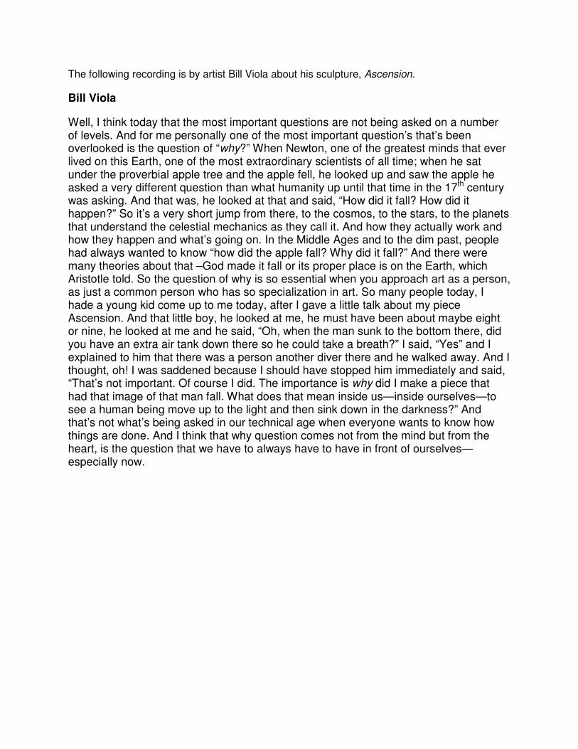
The following recording is by artist Bill Viola about his sculpture, Ascension.
Bill Viola
Well, I think today that the most important questions are not being asked on a number of levels. And for me personally one of the most important question’s that’s been overlooked is the question of “why?” When Newton, one of the greatest minds that ever lived on this Earth, one of the most extraordinary scientists of all time; when he sat under the proverbial apple tree and the apple fell, he looked up and saw the apple he asked a very different question than what humanity up until that time in the 17th century was asking. And that was, he looked at that and said, “How did it fall? How did it happen?” So it’s a very short jump from there, to the cosmos, to the stars, to the planets that understand the celestial mechanics as they call it. And how they actually work and how they happen and what’s going on. In the Middle Ages and to the dim past, people had always wanted to know “how did the apple fall? Why did it fall?” And there were many theories about that –God made it fall or its proper place is on the Earth, which Aristotle told. So the question of why is so essential when you approach art as a person, as just a common person who has so specialization in art. So many people today, I hade a young kid come up to me today, after I gave a little talk about my piece Ascension. And that little boy, he looked at me, he must have been about maybe eight or nine, he looked at me and he said, “Oh, when the man sunk to the bottom there, did you have an extra air tank down there so he could take a breath?” I said, “Yes” and I explained to him that there was a person another diver there and he walked away. And I thought, oh! I was saddened because I should have stopped him immediately and said, “That’s not important. Of course I did. The importance is why did I make a piece that had that image of that man fall. What does that mean inside us—inside ourselves—to see a human being move up to the light and then sink down in the darkness?” And that’s not what’s being asked in our technical age when everyone wants to know how things are done. And I think that why question comes not from the mind but from the heart, is the question that we have to always have to have in front of ourselves—especially now.
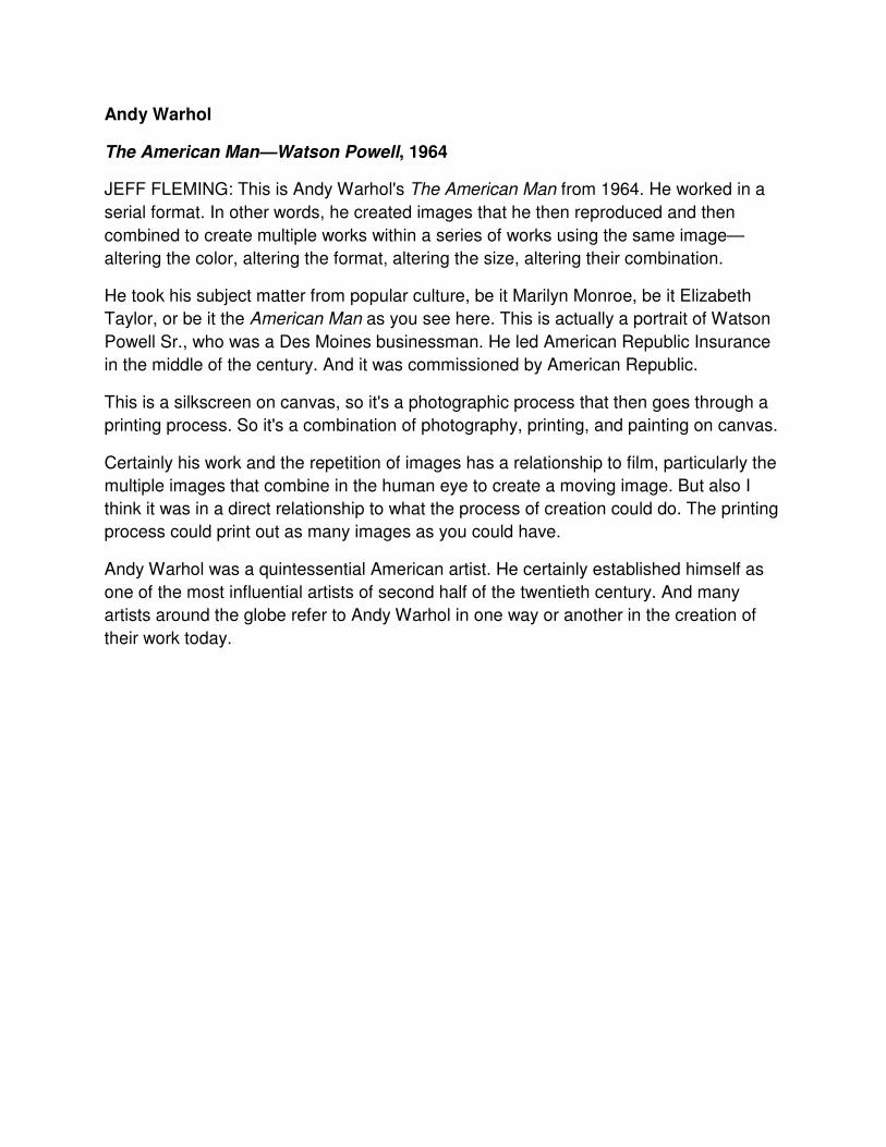
Andy Warhol
The American Man—Watson Powell, 1964
JEFF FLEMING: This is Andy Warhol's The American Man from 1964. He worked in a
serial format. In other words, he created images that he then reproduced and then
combined to create multiple works within a series of works using the same image—
altering the color, altering the format, altering the size, altering their combination.
He took his subject matter from popular culture, be it Marilyn Monroe, be it Elizabeth
Taylor, or be it the American Man as you see here. This is actually a portrait of Watson
Powell Sr., who was a Des Moines businessman. He led American Republic Insurance
in the middle of the century. And it was commissioned by American Republic.
This is a silkscreen on canvas, so it's a photographic process that then goes through a
printing process. So it's a combination of photography, printing, and painting on canvas.
Certainly his work and the repetition of images has a relationship to film, particularly the
multiple images that combine in the human eye to create a moving image. But also I
think it was in a direct relationship to what the process of creation could do. The printing
process could print out as many images as you could have.
Andy Warhol was a quintessential American artist. He certainly established himself as
one of the most influential artists of second half of the twentieth century. And many
artists around the globe refer to Andy Warhol in one way or another in the creation of