40
Trendimi’s Colour Guide trendi Influence with clever use of colour

Trendimi’s Colour Guide trendi
Influence with clever use of colour

TRENDIMI’S COLOUR GUIDE
02
The world of beauty, fashion and event management is fast paced and constantly changing. Instead of running to keep up, stay ahead. Our course eBooks are the ideal, customised resource to keep at your side and refer to anywhere, anytime.
They are focused and informative guides which, when used alongside the full suite of rich online course content including videos and exams, help to highlight and reinforce core concepts.
They are also perfect as a stand-alone toolas they contain all the written and illustrated course content. You’re equipped with the relevant, practical guidance that helps you put your learning into practice. You’ll feel reassured to have help at your fingertips at all times. This creates a springboard from which you canmove onto bigger and better things!
Personal Image and Beauty Expert is packed with expert tricks and tips to help you to become a professional stylist. From body shape to make up, you’ll learn to see people (including yourself!) objectively, how to highlight attractive features and send less flattering attributes into the shadows.
Fashion Store Assistant and Personal Shopper is a must if you want to work with custom-ers. Discover really useful inside knowledge on professional styling from the fashion and beauty world. Turn pro in no time with simple, effective tech-niques to help people transform appearances and get noticed.
Make-up Artist is an exciting, focused course on all aspects of using make up to both enhance looks and direct attention where you want it. Essential for everyone with an interest in image.
Gel Manicure and Nail Artist takes you through the most up to date techniques and styles in gel nails and manicuring that are in huge demand. Be prepared for all requests with this clearly explained and illustrated reference book.
Extensions & Hair Styling Expert is your permanent tutor on the techniques needed to create the newest trends in up styles and extensions. Hair styling is one of the most important aspects of image and this eBook is crammed full of

trendi
03
information on all aspects of hair care, grooming and styling.
Wedding Planner contains so muchrelevant wedding planning information you’ll want to take it everywhere with you. Planning the ceremony, dressing the wedding party, fine tuning details for the reception and managing the budg-et and are clearly outlined. You’ll also learn the essentials for starting and marketing your own wedding planner business. This exciting profession is made easy with the hands on tips and readymade tools this eBook gives you.
Event Planner is full of industry specific knowledge on how to successfully plan and manage a wide range of events. Your eBook will remind you how to win contracts, manage budgets, assess venues and establish the correct etiquette. It includes charts, checklists and a real life case study. It’s a must for all event planners!
Marketing Your Business This is aneBook to keep at arm’s reach and refer to of-ten. Marketing is an essential and ongoing part of every business. Invest in this eBook so you have at your fingertipsinvaluable guidance on creating a marketing plan, low cost marketing, brand building, use of social media and much more.
Starting Your Business guides you, module by module, through all the important areas to consider when starting your own business. We’re upfront about the challenges and show you how to tackle them. This eBook is like your entre-preneurial consultant by your side at all times.
You can access your eBooks on your mobile, tablet, laptop or PC and they’re ideal for printing.
Keep up with the hottest beauty news and headline grabbing celebrity fash-ion by following us on social media. We’ll also keep you up to date with details of course updates and the latest happenings at Trendimi. Enjoy your eBooks!

TRENDIMI’S COLOUR GUIDE
04
INDEX OF CONTENTS
1 Impact of Colour 1.1 Colour evokes emotion – use it
2 Understand colour2.1 Colour wheel2.2 Colour chart
3 Let’s get technical – hue, value and chroma
4. Warm or cool?
5 Use colour combinations effectively 5.1 Harmonious combinations:5.2 Striking combinations
6 Meaning of colours
7 Using colour as a make-up artist, hair stylist or nail artist 7.1 Why getting the tones, tints and shades right is everything!7.2 Check your client’s personal tones 7.3 Seasons colour palettes
8 Using colour as a stylist or personal shopper8.1 How colours can affect appearance
9 Using colour as an Event Planner

trendi
05
TRENDIMI’S COLOUR GUIDE

TRENDIMI’S COLOUR GUIDE
06
Influence with clever use of colour
Colour is a universal language that infiltrates every area of our lives. It can impact in both subtle and powerful ways, depending on its use. Learn to speak the language of colour fluently and use it skilfully to achieve different kinds of effects.
1. Impact of Colour
Mark Rothko is one of the most famous American post war artists. He was one of a group of painters known as Abstract Expressionists. During the 1950s and 60s he became famous for his paintings that used colour to evoke a range of emotions.
Rothko’s work was influenced by mythology and by psychology, par-ticularly the writings of Freud and Jung. His paintings were completely abstract- not depicting anything mate-rial – but, using large rectangles of col-our on more colour, they worked with proportion and layering and each cap-tured different moods and effects in viewers. He was the first artist to bring such acknowledgement and accept-ance that colour has a profound effect on the psyche and the emotions.
1.1Colour evokes emotion – use itAs studies have found that most deci-sions are influenced 80% by emotion and 20% by intellect or reasoning and colour has such an influential role in evoking emotion, it’s really worthwhile paying attention to the choice of colours in many aspects of life, especially in your business.

trendi
07
2. Understand colour
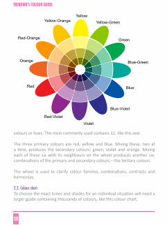
One of the biggest and first scientific discoveries into our understanding of colour was by Sir Isaac Newton in the 17th century. He experimented with light rays and found that when sunlight is directed through a prism it refracts into a range of colours: red, orange, yellow, green, blue, indigo and violet. Each colour has a distinctive wavelength and range.
2.1 Colour wheelWhen designers are working with colour, they use a colour wheel as a refer-ence tool that helps to understand the relationships of colour. A wheel can contain 6, 12, 24, 48 or more
TRENDIMI’S COLOUR GUIDE
TRENDIMI’S COLOUR GUIDE
08
colours or hues. The most commonly used contains 12, like this one.
The three primary colours are red, yellow and blue. Mixing these, two at a time, produces the secondary colours: green, violet and orange. Mixing each of these six with its neighbours on the wheel produces another six, combinations of the primary and secondary colours – the tertiary colours.
The wheel is used to clarify colour families, combinations, contrasts and harmonies.
2.2. Colour chart To choose the exact tones and shades for an individual situation will need a larger guide containing thousands of colours, like this colour chart.
Yellow-GreenYellow
Green
Blue-Green
Blue
Blue-Violet
Violet
Red-Violet
Red
Red-Orange
Orange
Yellow-Orange

trendi
09
3. Let’s get technical – hue, value and chroma
At the beginning of the 20th century, American colour theorist Albert Mun-sell created a system for giving definition to three dimensions of colour – hue, value and chroma. This language and method of measuring colour makes it clear and easy to understand the personality of colours and helps to make confident choices.
HUEThe hueis the pure colour like red, yellow, blue, green, violet and orange. Hues can be blended in infinite ways to produce an endless number of hues.
TRENDIMI’S COLOUR GUIDE

TRENDIMI’S COLOUR GUIDE
10
VALUEWhen you add either white, black or grey to a hue or colour, this changes the amount of light the colour reflects or absorbs. White lightens, black darkens. The lightness or darkness of a colour is called the valueand indicates how far from either black or white the colour is.Lighter colours, closer to white, have a higher value than darker colours which are closer to black.
Pure colours also have different values, for example yellow has a higher val-ue as it’s the closest to white. Violet has a lower value as it’s closer to black.
To further help to distinguish the values of colours, they can be divided into three categories:
1. Tint: Adding white to the hue produces a tint, circle 1 in this wheel. 2. Tone: Adding grey to the hue produces a tone, circle 2 in this wheel.3. Shade: Adding black to the hue produces a shade, circle 3 in this wheel.
trendi
11
Items, garments or furniture in bright, intense colours will appear larger than the same item in a duller shade. Things of higher value, that is lighter and closer to white, will appear to expand and advance. Things of lower val-ue, that is darker and closer to black, will appear to recede or reduce in size.
CHROMAChroma describes the purity, brightness or intensity of a colour. Pure hues, the outer circle of tabs on the colour wheel, have the maximum chroma. Colours with high chroma are described as bright, vivid, bold, rich and bril-liant. The more a colour is changed by adding white, black or grey, the more it becomes muted, soft, misty, dull, pale, dark or drab.
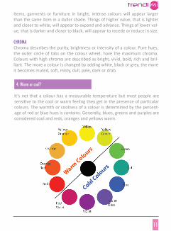
4. Warm or cool?
It’s not that a colour has a measurable temperature but most people are sensitive to the cool or warm feeling they get in the presence of particular colours. The warmth or coolness of a colour is determined by the percent-age of red or blue hues is contains. Generally, blues, greens and purples are considered cool and reds, oranges and yellows warm.

TRENDIMI’S COLOUR GUIDE
12
When considering either a warm or cool colour, take into account the vary-ing tones, tints and shades in that colour family and also consider the the social and psychological effects of different colours. See section 6, Meaning of colours.
5. Using colour combinations effectively
Once you know how to work with colour, you can use it to create either har-monious or striking combinations, depending on what you’d like to achieve.
5.1 Harmonious combinations:Colours of different tones, tints or shades from the same family can create a pleasing, easy blend. This is called a monochromatic combination.
Of course, each individual hue will have varying degrees of intensity and value which contribute to the effect of its ‘temperature’.
Warmth or coolness also have a spacial effect. Cooler colours tend to feel like they are receding, making a space seem larger or more open, warm colours tend to feel like they are advancing, making a space seem smaller or cosier. Again, the value and intensity of the colour will have a part to play in the special effect.

trendi
13
TRENDIMI’S COLOUR GUIDE

TRENDIMI’S COLOUR GUIDE
14
Another harmonious blend is to combine colours that are grouped together on the colour wheel. This is called an analogous combination.

trendi
15
TRENDIMI’S COLOUR GUIDE
TRENDIMI’S COLOUR GUIDE
16
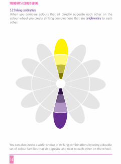
5.2 Striking combinationsWhen you combine colours that sit directly opposite each other on the colour wheel you create striking combinations that are complimentary to each other.
You can also create a wider choice of striking combinations by using a double set of colour families that sit opposite and next to each other on the wheel.

trendi
17
TRENDIMI’S COLOUR GUIDE
TRENDIMI’S COLOUR GUIDE
18
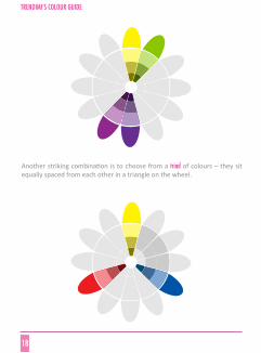
Another striking combination is to choose from a triad of colours – they sit equally spaced from each other in a triangle on the wheel.

trendi
19
Here you can see some groupings of complimentary and harmonious colours:
6. Meaning of colours
Colours have distinct personalities, psychological effects and meaning. These can vary according to culture.
REDRed is the colour of energy, drive, excitement, passion and aggression. It’s stimulating and draws attention. It stands out. Studies have found it can in-crease blood pressure and pulse. It helps to inspire confidence, enthusiasm and also a sense of strength and security.
Red is commonly used to signify danger but is also associated with life – the colour of blood. It’s not a colour most people would choose to paint a child’s bedroom but may be the perfect choice for a business logo.
Hue
Sky Blue
Egg Yellow
Bright Red
Sea Green
Purple
Complimentary colours (opposite)
Yellow, orange , lime
Blue, purple, sea green
Green, blue, emerald
Red, pink, purple
Green, aquamarine, orange, yellow
Harmonious colours (next to)
Emerald green, purple, pink
Lime green, orange, pink
Orange, yellow, purple, blue, sea green
Yellow, blue, orange
Blues, reds

RED
TRENDIMI’S COLOUR GUIDE
20
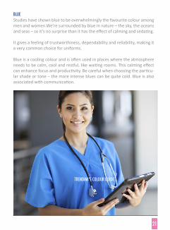
BLUE Studies have shown blue to be overwhelmingly the favourite colour among men and women.We’re surrounded by blue in nature – the sky, the oceans and seas – so it’s no surprise than it has the effect of calming and sedating.
It gives a feeling of trustworthiness, dependability and reliability, making it a very common choice for uniforms.
Blue is a cooling colour and is often used in places where the atmosphere needs to be calm, cool and restful, like waiting rooms. This calming effect can enhance focus and productivity. Be careful when choosing the particu-lar shade or tone – the more intense blues can be quite cold. Blue is also associated with communication.
TRENDIMI’S COLOUR GUIDE
21

TRENDIMI’S COLOUR GUIDE
22
YELLOWYellow is the colour of optimism, cheerfulness and laughter. The presence of yellow actually stimulates the release of serotonin, the feel good hormone. It’s generally a positive, energetic and uplifting colour and can enhance crea-tivity, memory and communication. If it’s too intense it can be a little fiery.
GREENWe are surrounded by green in nature and as a result it has firmly taken its place as the colour and symbol of all things natural and eco friendly. It’s also accepted as a colour of peace, tranquillity and harmony.
The broad range of greens is almost always soothing and refreshing. For this reason it’s often used in areas associated with healthcare. It has a relaxing effect, both mentally and physically and can help reduce anxiety and allevi-ate depression.
It can represent growth and good luck but also envy.
ORANGEOrange is usually seen as a very expressive colour. People tend to either love it or hate it. It’s a strong fiery colour, being close to red. It’s warm and fun. It has a flamboyant personality and not one to choose when calmness is needed. It’s more likely to be suited to socialisation and activity.
The energy of orange lends to ambition, energy and new directions. When it’s toned down or tinted with white it can be reflective of colours in nature and these shades give a more harmonious, peaceful feel, like peach, ter-racotta and rusts.
PURPLEA combination of red and blue, purple can have qualities of both – stimulat-ing or calming. It has traditionally been connected with royalty, privilege and wealth. It can be a favourite of people who are very creative or eccentric. It has been shown to help brain activity when problem solving.

trendi
23
Purple can give an air of mystery and wisdom. It’s often associated with spir-ituality and some find it uplifting.
PINKThe closer to red a pink is, the more it will represent red’s qualities – ener-getic and passionate. The vibrant, electric pinks are stimulating and exciting but not as assertive and aggressive as red can be.
The misty, lighter pinks are definitely the colour of romance, softness and femininity. The passion of red is diluted with white and tones down the ef-fect to a calm, relaxed softness. There’s a delicate energy about pale pink and this would not be a suitable choice for attending a job interview.
BROWNAgain, a colour of nature, brown represents reliability and stability. Earthy colours are always calm and reassuring and brown can also represent friend-ship and good relations. It’s soothing and natural. It gives a feeling of order and wholesomeness. It’s a commonly used neutral colour, particularly in a wide range of tints.
WHITEParticularly in the western world, white signifies purity and cleanliness. As it reflects every colour and absorbs none, it’s the perfect choice for the colour of neutrality.
It can represent a blank canvas, a clean slate, new beginnings. It’s fresh and non judgemental. It can also be sophisticated and creative.
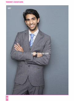
GREYGrey is a very popular neutral colour and often chosen as a backdrop to al-low other colours, shapes and textures to be seen without distraction.
It’s often seen as denoting wisdom, dignity and authority, possibly because of the connection to greying of hair due to ageing. It can be drab and dull but also classic and sophisticated. It often represents knowledge and intellect.
TRENDIMI’S COLOUR GUIDE
24
GREY
TRENDIMI’S COLOUR GUIDE

trendi
25
BLACKBlack absorbs every colour and reflects none. It’s a very strong colour and often gives an impression of power and authority. It can be associated with evil and fear.
Absorbing all colours and showing none could also represent an unwilling-ness to show personality, a hiding of oneself. This can give a restful feeling to people who find it a strain to give too much of themselves and want to be inconspicuous.
It’s often chosen as a night time colour and can be sophisticated and sleek. It’s a contracting colour and is a popular choice in clothes as it tends to reduce the appearance of size and outline.
7. Using colour as a make-up artist, hair stylist or nail artist
Using the correct colour palette is crucial when choosing make up, hair col-our and nail colour. Shades that enhance tones and features help clients look their absolute best. The wrong colours can drain the natural glow of a face. An unsuitable palette won’t blend features harmoniously.
Everyone has a unique combination of tones – eye colour, hair colour and skin tone. This means that on each person, some tones will look great and lift the features. Other shades will do the opposite.
7.1 Why getting the tones, tints and shades right is everything!• You need to know whether you’re choosing from a palette of ‘warm’ or
‘cool’ colours so you work with the natural palette of tones, not against them.
• The right make up really does affect eye colour. Experiment and see!• Wearing harmonious make up shades can help skin look smoother. • Before recommending a hair colour to a client, identify whether you need
a warm or cool palette and then refine your choices further. • The face portrays moods and feelings. Make up shades can contribute to
looking light and happy or stern and dull.

TRENDIMI’S COLOUR GUIDE
26
• Hair colour can be made a friend or an enemy depending on your choice of make-up shade on the face, eyes and lips.
• Nail colour should compliment make-up and hair shades to harmonise the overall appearance.
• Complimentary and harmonising tones will help a face to look healthy and sparkling.
7.2 Check your client’s personal tones • To choose the colours that suit your client best, do a personal colour
analysis.• You need to analyse your clients face in good, natural light. Outside is
ideal. The skin must be freshly cleansed and free of all products and make up. Tie her hair back from her face.
• Put a white garment over her clothes to prevent what she’s wearing inter-fering with her natural tones.
• If the tones are of yellow, green or gold, she has warm tones.• If the tones are more pink, red or white, she has cool tones. • If you’re unsure, here’s a trick: warm skin tones blend more harmoniously
with gold; cool tones blend best with silver. • Cool and warm toned people can be further divided into the season’s
colours that suit them best; 1. Cool tones – summer or winter colours.2. Warm tones – spring or autumn colours

trendi
27
TRENDIMI’S COLOUR GUIDE

TRENDIMI’S COLOUR GUIDE
28
Winter
7.3 Season colour palettes
TRENDIMI’S COLOUR GUIDE

trendi
29
“Winter’ skin” can be as pale as porcelain or an olive colour. The tones in the face will be pink or blue. ‘Winter’ skinned people often have dark hair and eyes. Asian people fall into this group, as well as Scandinavians with blonde hair.
The colours that best suit winter skins are intense, rich colours such as black, navy, red and pink. They can also wear light yellows or white. You should avoid choosing beige, orange and gold.
Winter colour palettes:
TRENDIMI’S COLOUR GUIDE
30
Autumn
TRENDIMI’S COLOUR GUIDE

trendi
31
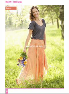
Autumn’ skins are warm and people who fall into this group have a golden skin tone. Many red head and brunettes with brown eyes are in this group. You’ll often see people with black or blonde hair with golden tones also. Earth tones work well with this skin tone - camel, beige, khaki, orange, gold or dark brown.
Avoid white and black, they will make autumn toned people look tired. Stay away from pastels also.
Autumn colour palettes:

TRENDIMI’S COLOUR GUIDE
32
Summer
TRENDIMI’S COLOUR GUIDE

trendi
33
As ‘winter’ skin tones have dark hair, ‘summer’ skin tones usually have blonde or light brown hair and pale eyes. The best colours for ‘summer’ skins are pale yellow, purples and mauves and pastel shades. Avoid orange but, in general, go for earth tones.
Summer colour palettes:

TRENDIMI’S COLOUR GUIDE
34
Spring
TRENDIMI’S COLOUR GUIDE
trendi
35
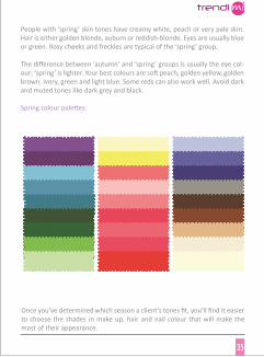
People with ‘spring’ skin tones have creamy white, peach or very pale skin. Hair is either golden blonde, auburn or reddish-blonde. Eyes are usually blue or green. Rosy cheeks and freckles are typical of the ‘spring’ group.
The difference between ‘autumn’ and ‘spring’ groups is usually the eye col-our; ‘spring’ is lighter. Your best colours are soft peach, golden yellow, golden brown, ivory, green and light blue. Some reds can also work well. Avoid dark and muted tones like dark grey and black.
Spring colour palettes:
Once you’ve determined which season a client’s tones fit, you’ll find it easier to choose the shades in make up, hair and nail colour that will make the most of their appearance.

TRENDIMI’S COLOUR GUIDE
36
8. Using colour as a stylist or personal shopper
Before you begin styling or shopping for a client (or for yourself) one of the first things you need to do is to plan the correct range of colours you’ll choose from. This is the aspect that probably has the most impact on overall appearance and on whether your client will look amazing or underwhelm-ing. Getting the colour harmony right will help anyone you work with look great. People who remark on their great ‘look’ might not be able to put their finger on what it is, but you’ll know the secrets!
Study sections 7.2 & 7.3 and apply these practices to clients to identify the most suitable palette of shades you need to work with. As well as applying the rules, use your common sense and observation and individualise a pal-ette for each person. Even when someone generally falls into one season’s palette, there can be exceptions to the colour rules – a shade or two from a different palette could look well on her or some from her most suited sea-son might not.
As an example of putting this into practice, pinks can be both warm and cool. Warm pinks have a peachierundertone; cool pinks have a bluer undertone, like a purplish pink. Greens can also be cool or warm. A warm green has a more yellowish undertone; a cool green has a bluer undertone. Experiment with subtle differences in tones to see which ones work best.
8.1 How colours can affect appearance:• Wearing the wrong colours can be ageing.• Choosing the right shades can help eye colour to stand out and sparkle. • Some shades will have a slimming effect.• The wrong shades can add an illusion of weight.• Balancing colours can help people look more dynamic, brighter and posi-
tive.• Colours that invite the hair tone to blend in enhance overall appearance. • Shades that clash with the natural tones can make people look stressed
and unhealthy.

trendi
37
TRENDIMI’S COLOUR GUIDE
TRENDIMI’S COLOUR GUIDE
38
9. Using colour as an Event Planner
There are many aspects of your business that can benefit from using colour cleverly.
Examples – using colour in your event business
A.You’re meeting an important potential client, you are a bank manager or attending an interview. How should you dress? The colours you wear and also the colours you’re surrounded by at a meet-ing have a sub conscious impact on you and your clients. Give yourself the advantage of making that effect positive and productive. These points guide you to which colours to make most noticeable, not worn top to toe. Combine your predominant choice with harmonising shades.
• Dress to balance your own mood. Are you feeling anxious, down or tired? Then wear lighter, brighter colours as they help lift your mood. Bear in mind which season’s shades suit you and let your intuition guide you to which particular one you need to help you feel lighter. Dark and neutral colours could make it harder for you to feel more positive and energetic. If, on the other hand, you’re feeling over excited, choose neutral or darker shades for a calming effect.
• Are you meeting a male or female? Women tend to react more positively to blue toned colours, like pure blues, pinks with blue undertones, blue-reds, blue-greens. Men are more enlivened by colours with warmer, yel-low undertones like a yellowish green, oranges and peaches.
• What’s your intended outcome from today’s meeting?
• If you want to build trust and credibility, choose blue.• If you want to show how approachable and friendly you are, choose
green or tan.• To show confidence, either blue or green is good, not too pale. • Mid greens portray dependability.

• Reds help you come across as assertive but be sure this is appropriate. Red is a strong colour and can focus too much attention on you instead of your client.
• To set a neutral stage, beige or grey won’t give any particular message, allowing you to direct the meeting with your prepared content.
• Dark colours like navy and black are strong and show you’re in control. This could work in your favour if your client is trying to decide between you and a competitor. Lighter colours are less assertive but this may suit introverted clients better.
• If you want to come across as inspiring or creative, a bright colour like cerise will do the trick
The above points can actually be applied to most business meetings.
B. You’re planning a corporate event and will be attending group meetings. How can colour help you make the right impression?
• You need to come across as being in control and authoritative so choose darker colours like dark blue or dark grey.
• If you really need to be noticed or have something important to get across, wear red.
C. You’re specialising in wedding planning. How can you use colour to attract clients?• Romantic colours are the definite choice. They may be clichéd but, take
it from us, if you change to unconventional colours, you won’t appeal to people with a wedding in mind! Choose peaches, pinks, creams and white. If you’re choosing more than one colour, use your colour wheel to decide what works.
• Softer, paler colours in your promotional material are inviting. They help you seem approachable and understanding.
• If you’re setting up a stall at a bridal fair, use soft, misty fabric and light, delicate shades.
• Fill your portfolio with sample invitations that use the typical colours chosen by wedding couples, creams and whites, embellished with silver, gold and pastels.
trendi
39

40
trendi
TRENDIMI’S COLOUR GUIDE


