40
© 2009 IBM Corporation Can You See It? Visualising Your Data For Impact Mark Tristam Lawrence @mtlawrence Learning Intelligence Leader, Global Business Services #PADDHR 10 April, 2014
| Date post: | 13-Jul-2015 |
| Category: |
Business |
| Upload: | mark-lawrence |
| View: | 324 times |
| Download: | 0 times |
© 2009 IBM Corporation
Can You See It?Visualising Your Data For Impact
Mark Tristam Lawrence @mtlawrenceLearning Intelligence Leader, Global Business Services #PADDHR
10 April, 2014

© 2014 IBM Corporation2
“Daddy, how much do you love me?”
A. “Infinity plus infinity”
B. “More than most”
C. “This much”
D. “Right now?”
E. “110%”
IBM Presentation Template Full Version#PADDHR

© 2014 IBM Corporation3
“Daddy, how much do you love me?”
A. “Infinity plus infinity” ? + ?
B. “More than most” ?
C. “This much”
D. “Right now?” ?
E. “110%” ???!!
IBM Presentation Template Full Version#PADDHR

© 2014 IBM Corporation
#PADDHR
Video Source: Andrew Marritt. Reprinted with permission. Visit www.OrganizationView.com for more information.
23 Sec

© 2014 IBM Corporation
#PADDHR
http://www.infovis.info/visuals/Gallery_of_Data_Visualization/Re-Visions_Minard/napon.gif

© 2014 IBM Corporation
#PADDHR
http://www.senchalabs.org/philogl/PhiloGL/examples/worldFlights/

© 2014 IBM Corporation
#PADDHR
Global Human Capital Trends 2014: Engaging the 21st-century workforce
A report by Deloitte Consulting LLP and Bersin by Deloitte
© 2014 IBM Corporation
#PADDHR

© 2014 IBM Corporation
Outline
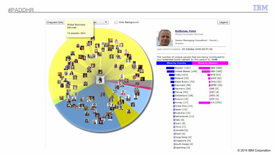
Death by ToolsetIt’s a competitive marketplace, and growing – choose wisely
The Value of VisualisationSome examples of good and bad visualisations
Psychology and ScienceHow, and why, does it work?
Four Pillars of VisualisationA framework for you to take away and put to use
#PADDHR

© 2014 IBM Corporation
Why Now?#PADDHR

© 2014 IBM Corporation
Growing Market Competitiveness
Magic Quadrant for Business Intelligence and Analytics Platforms, 2014
•New : split between “BI and Analytics Platforms” and “Advanced Analytics Platforms”
•Data Discovery as a response to data explosion
•Suggestion that traditional BI (OLAP and ad hoc querying) has reached a plateau
https://www.gartner.com/technology/reprints.do?id=1-1QLGACN&ct=140210&st=sb
#PADDHR

© 2014 IBM Corporation
Growth in Choice#PADDHR
© 2014 IBM Corporation
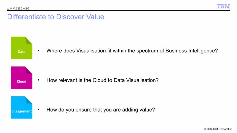
Differentiate to Discover Value
• Where does Visualisation fit within the spectrum of Business Intelligence?
• How relevant is the Cloud to Data Visualisation?
• How do you ensure that you are adding value?Engagement
Data
Cloud
#PADDHR

© 2014 IBM Corporation
Data: Business Intelligence Spectrum
Architect
Data ScientistETL OLAP Business Analyst
Visualisation
Business-User
Data
#PADDHR

© 2014 IBM Corporation
Cloud: Visualisation InfrastructureCloud
#PADDHR

© 2014 IBM Corporation
#PADDHR
Get Interactive!
http://www.theguardian.com/world/interactive/2011/mar/22/middle-east-protest-interactive-timeline
Cloud

© 2014 IBM Corporation
Cla
ssro
omeL
earn
ing
Engagement: Aesthetic = EffectiveEngagement ?#PADDHR

© 2014 IBM Corporation
What about Infographics?
Created by Mark Tristam Lawrence, IBMinfogr.am
#PADDHR
Engagement

© 2014 IBM Corporation
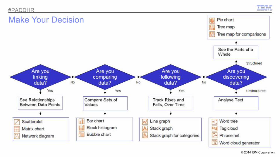
Visualisation Types
Need Option Need Option
See Relationships Between Data Points
Track Rises and Falls, Over Time
Compare Sets of Values
See the Parts of a Whole
‘Many Eyes’ visualisation options
(Courtesy of Noah Iliinsky, IBM)
Analyse Text
Think about what you want to achieve
#PADDHR

© 2014 IBM Corporation
How Do We Make Decisions?
“Let the dataset change your mindset”
(Hans Rosling)
“Bias” is the conflict between intuition and logic
• ‘Attentional Blindness’
• ‘Confirmation Bias’
• ‘Risk Aversion’
#PADDHR
© 2014 IBM Corporation
Make Your Decision#PADDHR

© 2014 IBM Corporation
Pre-Attentive Processing
“It is easy to spot a hawk in a sky full of pigeons”(Colin Ware)
Sat
urat
ion
Col
our
Pos
ition
Siz
eS
hape
Enc
losu
reM
arki
ngs
Line
Wid
thO
rient
atio
n
#PADDHR
Diagram Source: TDWI, 2011. Reprinted with permission. Visit tdwi.org for more information.

© 2014 IBM Corporation
An Experiment
Numberphile’s Sarah Wiseman explains: https://www.youtube.com/watch?v=kCSzjExvbTQ
55%!
#PADDHR

© 2014 IBM Corporation
Positioning…
ZMost Important
(Topic 1)
Supporting(Topic 1 or 3)
Secondary focus(Topic 2)
Least Important(Topic 2 or 4)
#PADDHR

© 2014 IBM Corporation
…Layout
KPI
KPI
Supporting Detail
#PADDHR
© 2014 IBM Corporation
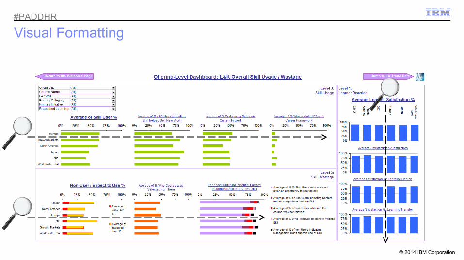
Visual Formatting#PADDHR

© 2014 IBM Corporation
35 Sec
#PADDHR

© 2014 IBM Corporation
Less Is More…#PADDHR

© 2014 IBM Corporation
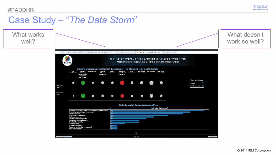
Case Study:“The Data Storm – Retail And The Big Data Revolution”
#PADDHR

© 2014 IBM Corporation
Case Study – “The Data Storm”
What works well?
What doesn’t work so well?
#PADDHR

© 2014 IBM Corporation
Case Study – “The Data Storm”
What works well?
What doesn’t work so well?
#PADDHR
© 2014 IBM Corporation
Case Study – “The Data Storm”
What works well?
What doesn’t work so well?
#PADDHR

© 2014 IBM Corporation
Case Study – “The Data Storm”Conclusions
•Sharp, contrasting and ‘slick’ graphics•Appealing banner•Uncluttered and mostly fits to one screen•Clear signposting for downloading data•Text highlights helps to focus attention•Abilities to choose filters are clear•Available on internet browser, via multiple devices and ability to share via social media
•Poor prioritisation or positioning of charts•Use of inefficient visualisation types•Inefficient use of space•Inconsistent dimensions and design•Unverifiable textual highlights•Hidden navigational links•Missing confirmation of limits set•Missing confirmation, or explanation, of measures
What works well?
What doesn’t work so well?
Even using a tool like Tableau (which suggests visualisation types based upon the type of data it finds), there is no guarantee that your visualisation will be perfect! You need to follow a structured model.
#PADDHR
© 2014 IBM Corporation
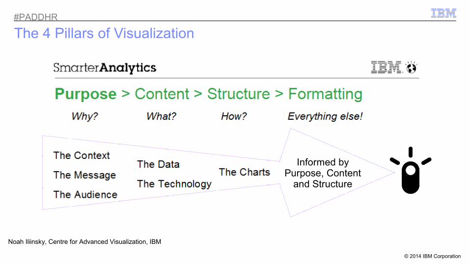
The 4 Pillars of Visualization
Informed by Purpose, Content
and Structure
Noah Iliinsky, Centre for Advanced Visualization, IBM
#PADDHR
© 2014 IBM Corporation
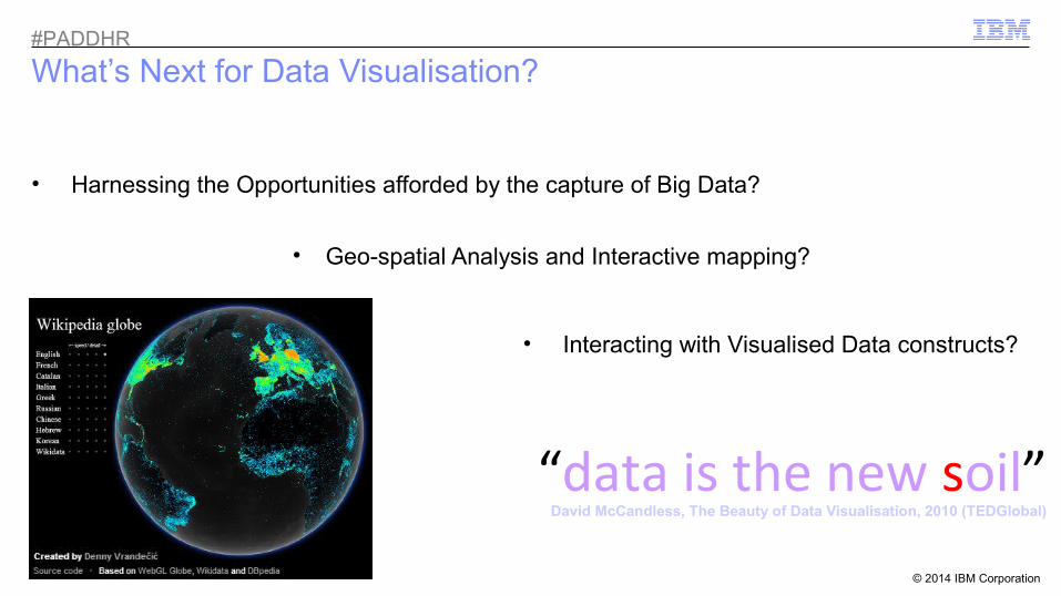
What’s Next for Data Visualisation?
• Harnessing the Opportunities afforded by the capture of Big Data?
• Geo-spatial Analysis and Interactive mapping?
• Interacting with Visualised Data constructs?
“data is the new soil”David McCandless, The Beauty of Data Visualisation, 2010 (TEDGlobal)
#PADDHR

© 2014 IBM Corporation
Visualisation ‘White Papers’
Choosing Visual Properties For Successful Visualizations
• Creating Effective Visualizations• Choosing the right visual propertiesLearn how to properly choose the visual property (position, shape, size, color and others) to encode the
different types of data that will be presented in a visualization. http://bit.ly/successfulvis
Choosing A Successful Structure For Your Visualization
• Know your purpose• Select how much data you need
The structure defines the landscape for presenting your data and consequently defines what sort of information will be most readily available from your visualization.
https://ibm.biz/structurevis
#PADDHR

© 2014 IBM Corporation
References
Additional Research and Articles:Gartner: Magic Quadrant for Business Intelligence and Analytics Platforms
https://www.gartner.com/technology/reprints.do?id=1-1QLGACN&ct=140210&st=sb
Gartner: Magic Quadrant for Advanced Analytics Platformshttp://www.gartner.com/technology/reprints.do?id=1-1QXWE6S&ct=140219&st=sb.
The Data Storm | An Economist Intelligence Unit Report Commissioned By Wipro
http://public.tableausoftware.com/views/The-data-storm_0/Home
Be Inspired:Play with the example visualisations in Google WebGL
http://www.chromeexperiments.com/globe
Imagine the possibilities with Dr Jo-Ann Kuchera Morin’s tour of the “Allosphere” (University of California)
http://www.ted.com/talks/joann_kuchera_morin_tours_the_allosphere
Eminent #dataviz:•Stephen Few (perceptualedge.com/)
–Show Me The Numbers (2nd ed., Analytics Press, 2012)
•Ed Tufte (edwardtufte.com/)–The Visual Display Of Quantitative Information (2nd ed., Graphics Press, 2012)
•Nathan Yau (flowingdata.com/)–Visualize This: The Flowing Data Guide to Design, Visualization, and Statistics (John Wiley & Sons, 2011)
•Hans Rosling (gapminder.org/)
Some notable IBMers I’d recommend:•Noah Iliinsky (complexdiagrams.com/) @noahi
•Jonathan Sidhu @jmsidhu
•Graham Wills (workingvis.com/) @GrahamWills
•Steve McDougal @mcdouster
#PADDHR

© 2009 IBM Corporation
Can you see it, now?
Mark Tristam Lawrence +44 (0)7917 270138Learning Intelligence Leader, Global Business Services
@mtlawrence#PADDHR

© 2009 IBM Corporation
Appendices

© 2014 IBM Corporation
A note on the novelty value of Infographics
Do we think the audience were really assessing the content, or the visual impact?
#PADDHR


