33
TurfView Power The Dashboard Instructions November 2012 Update
| Date post: | 16-Dec-2015 |
| Category: |
Documents |
| Upload: | philomena-perkins |
| View: | 215 times |
| Download: | 1 times |

TurfView PowerThe Dashboard
InstructionsNovember 2012 Update

1 Starting the Dashboard
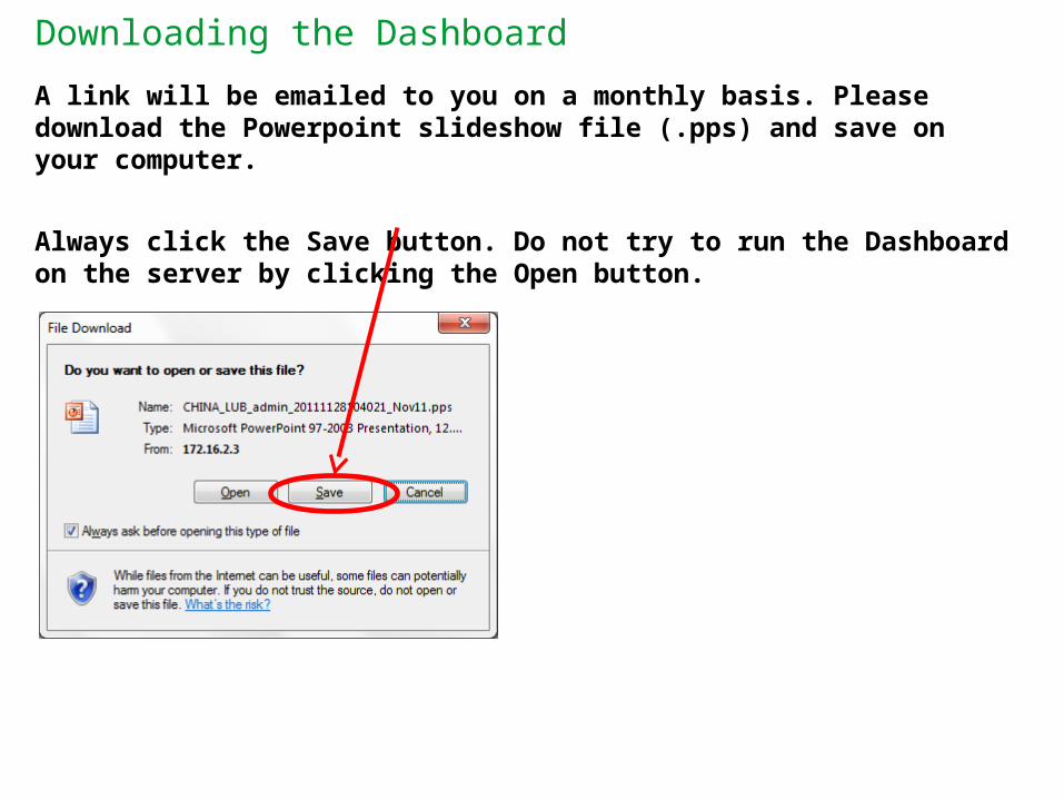
Downloading the Dashboard
A link will be emailed to you on a monthly basis. Please download the Powerpoint slideshow file (.pps) and save on your computer.
Always click the Save button. Do not try to run the Dashboard on the server by clicking the Open button.
Starting the Dashboard
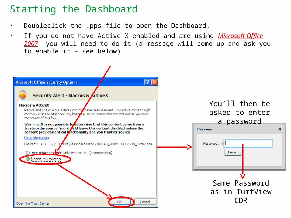
• Doubleclick the .pps file to open the Dashboard.
• If you do not have Active X enabled and are using Microsoft Office 2007, you will need to do it (a message will come up and ask you to enable it – see below)
Same Password as in TurfView CDR
You’ll then be asked to enter a password
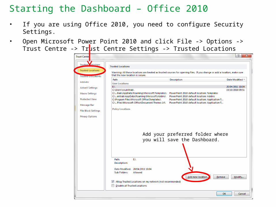
Starting the Dashboard – Office 2010
• If you are using Office 2010, you need to configure Security Settings.
• Open Microsoft Power Point 2010 and click File -> Options -> Trust Centre -> Trust Centre Settings -> Trusted Locations
Add your preferred folder where you will save the Dashboard.
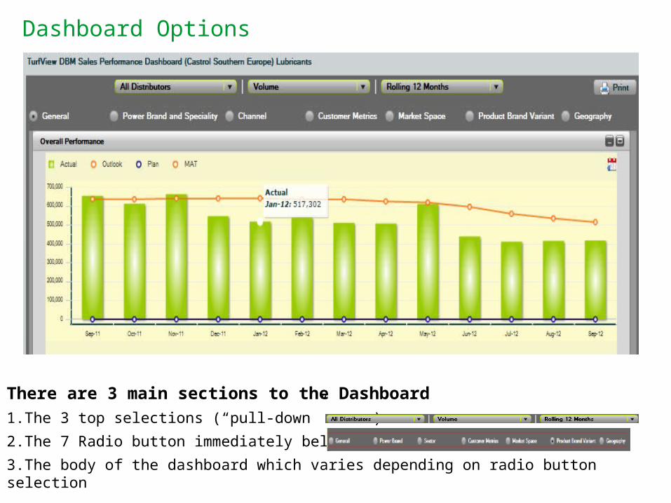
Dashboard Options
There are 3 main sections to the Dashboard
1.The 3 top selections (“pull-down” menus)
2.The 7 Radio button immediately below are
3.The body of the dashboard which varies depending on radio button selection
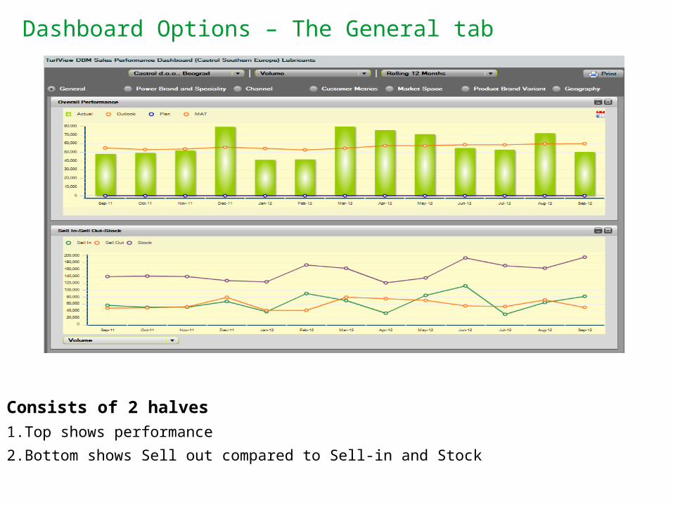
Dashboard Options – The General tab
Consists of 2 halves
1.Top shows performance
2.Bottom shows Sell out compared to Sell-in and Stock
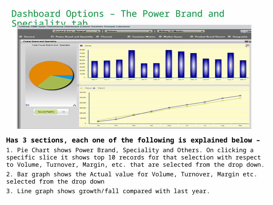
Dashboard Options – The Power Brand and Speciality tab
Has 3 sections, each one of the following is explained below –
1. Pie Chart shows Power Brand, Speciality and Others. On clicking a specific slice it shows top 10 records for that selection with respect to Volume, Turnover, Margin, etc. that are selected from the drop down.
2. Bar graph shows the Actual value for Volume, Turnover, Margin etc. selected from the drop down
3. Line graph shows growth/fall compared with last year.
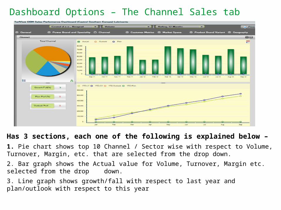
Dashboard Options – The Channel Sales tab
Has 3 sections, each one of the following is explained below –
1. Pie chart shows top 10 Channel / Sector wise with respect to Volume, Turnover, Margin, etc. that are selected from the drop down.
2. Bar graph shows the Actual value for Volume, Turnover, Margin etc. selected from the drop down.
3. Line graph shows growth/fall with respect to last year and plan/outlook with respect to this year
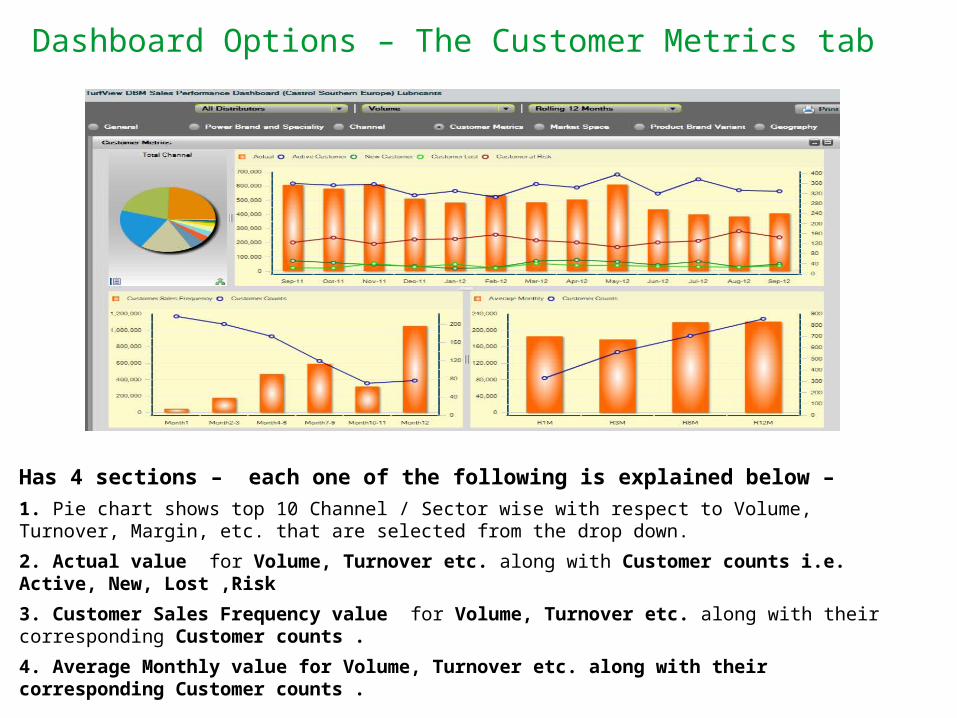
Dashboard Options – The Customer Metrics tab
Has 4 sections – each one of the following is explained below –
1. Pie chart shows top 10 Channel / Sector wise with respect to Volume, Turnover, Margin, etc. that are selected from the drop down.
2. Actual value for Volume, Turnover etc. along with Customer counts i.e. Active, New, Lost ,Risk
3. Customer Sales Frequency value for Volume, Turnover etc. along with their corresponding Customer counts .
4. Average Monthly value for Volume, Turnover etc. along with their corresponding Customer counts .
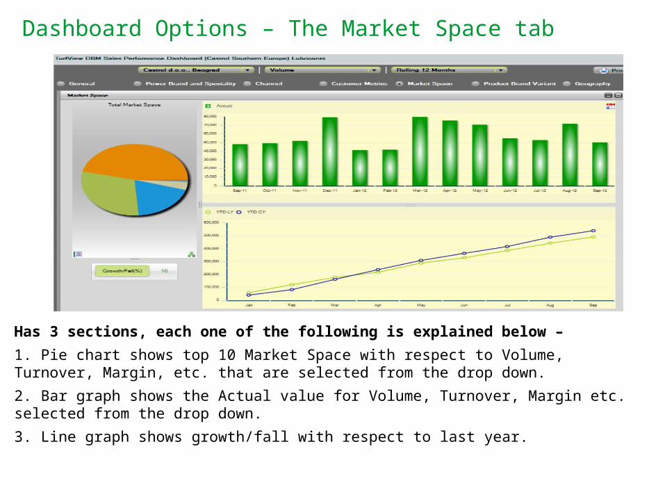
Dashboard Options – The Market Space tab
Has 3 sections, each one of the following is explained below –
1. Pie chart shows top 10 Market Space with respect to Volume, Turnover, Margin, etc. that are selected from the drop down.
2. Bar graph shows the Actual value for Volume, Turnover, Margin etc. selected from the drop down.
3. Line graph shows growth/fall with respect to last year.
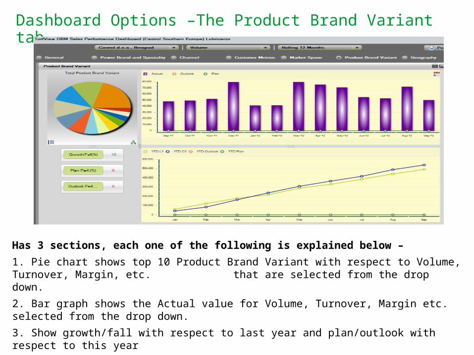
Dashboard Options –The Product Brand Variant tab
Has 3 sections, each one of the following is explained below –
1. Pie chart shows top 10 Product Brand Variant with respect to Volume, Turnover, Margin, etc. that are selected from the drop down.
2. Bar graph shows the Actual value for Volume, Turnover, Margin etc. selected from the drop down.
3. Show growth/fall with respect to last year and plan/outlook with respect to this year
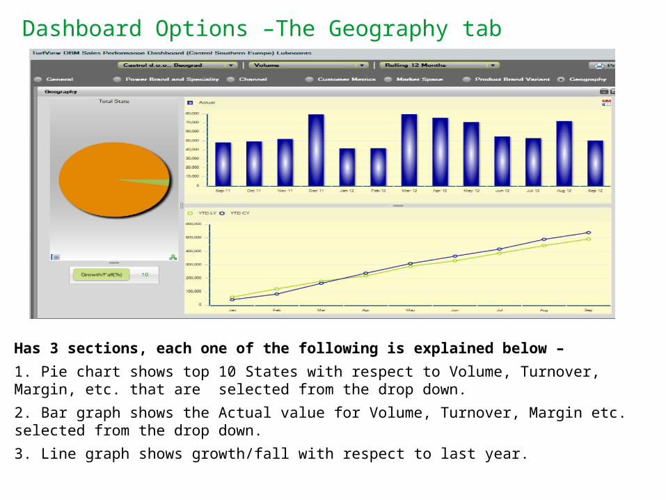
Dashboard Options –The Geography tab
Has 3 sections, each one of the following is explained below –
1. Pie chart shows top 10 States with respect to Volume, Turnover, Margin, etc. that are selected from the drop down.
2. Bar graph shows the Actual value for Volume, Turnover, Margin etc. selected from the drop down.
3. Line graph shows growth/fall with respect to last year.

2 Using the Dashboard
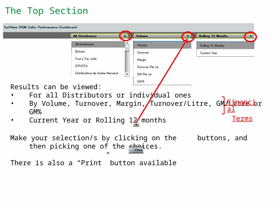
The Top Section
Results can be viewed:• For all Distributors or individual ones• By Volume, Turnover, Margin, Turnover/Litre, GM/Litre or GM%• Current Year or Rolling 12 months
Make your selection/s by clicking on the buttons, and then picking one of the choices.
There is also a “Print” button available
FinancialTerms
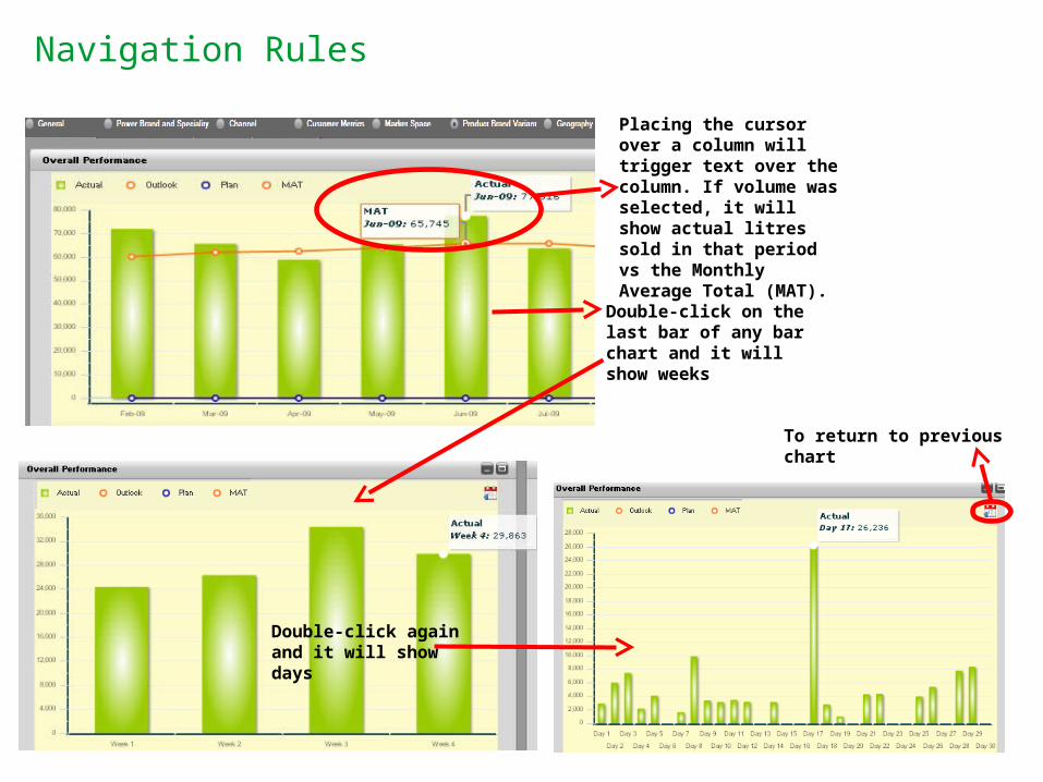
Navigation Rules
To return to previous chart
Placing the cursor over a column will trigger text over the column. If volume was selected, it will show actual litres sold in that period vs the Monthly Average Total (MAT).
Double-click on the last bar of any bar chart and it will show weeks
Double-click again and it will show days
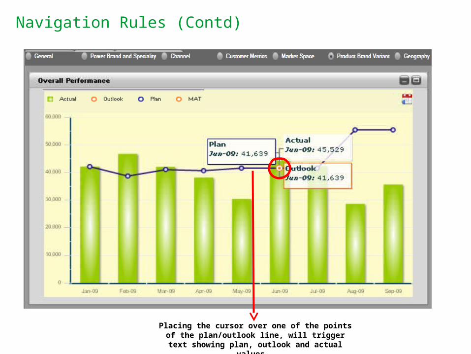
Navigation Rules (Contd)
Placing the cursor over one of the points of the plan/outlook line, will trigger text showing plan,
outlook and actual values.
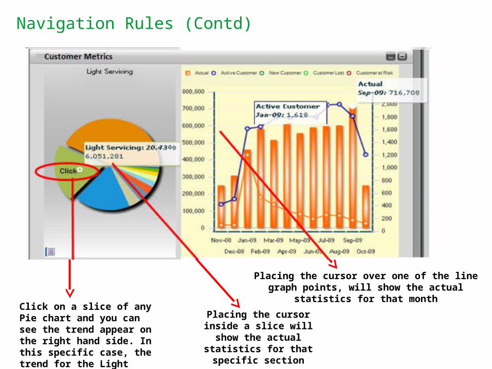
Navigation Rules (Contd)
Click on a slice of any Pie chart and you can see the trend appear on the right hand side. In this specific case, the trend for the Light Servicing sector
Placing the cursor inside a slice will show the actual statistics for
that specific section
Placing the cursor over one of the line graph points, will show the actual statistics for that month
Click
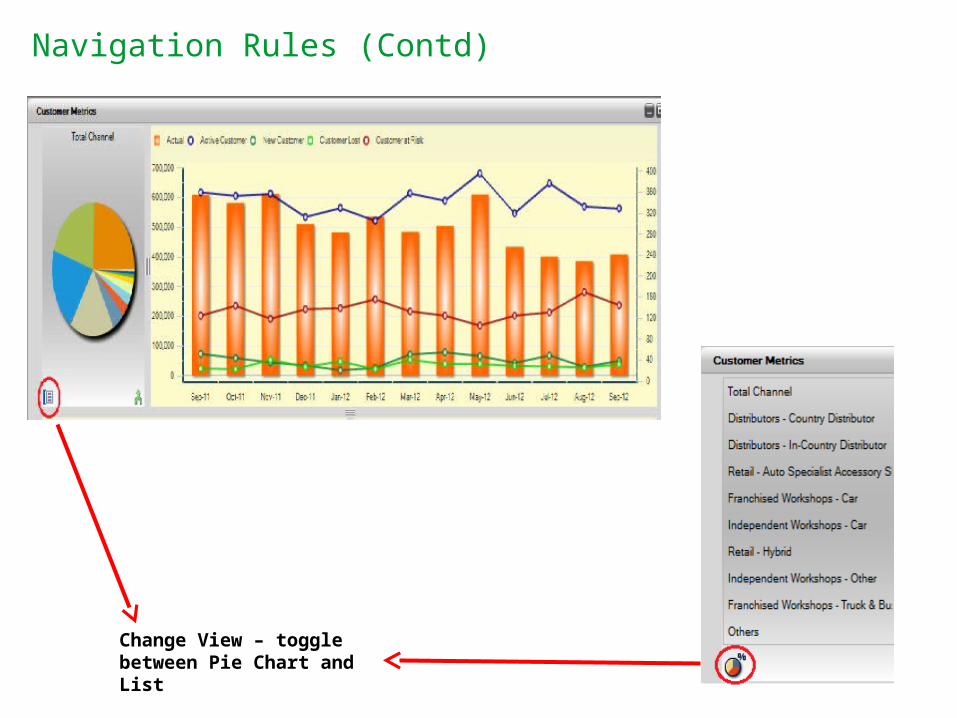
Navigation Rules (Contd)
Change View – toggle between Pie Chart and List
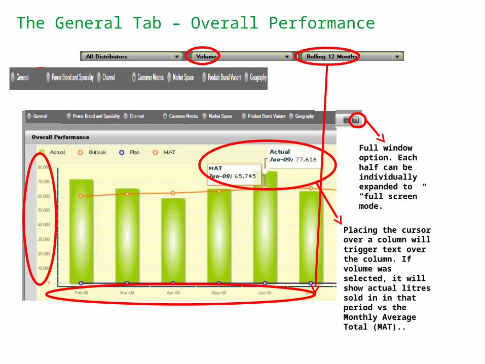
The General Tab – Overall Performance
Placing the cursor over a column will trigger text over the column. If volume was selected, it will show actual litres sold in in that period vs the Monthly Average Total (MAT)..
Full window option. Each half can be individually expanded to “full screen” mode.
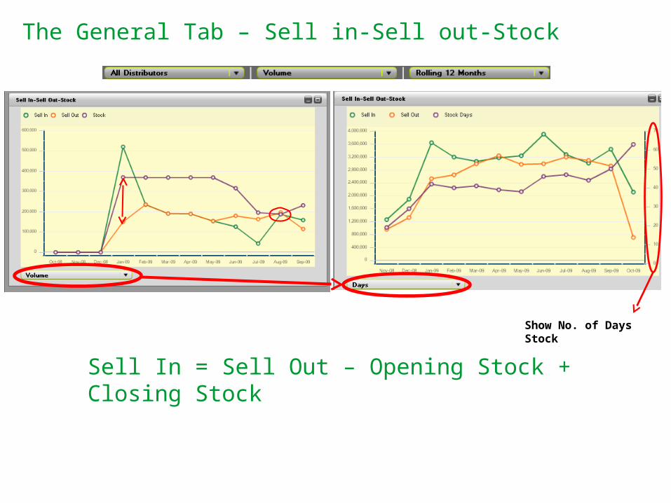
The General Tab – Sell in-Sell out-Stock
Sell In = Sell Out – Opening Stock + Closing Stock
Show No. of Days Stock
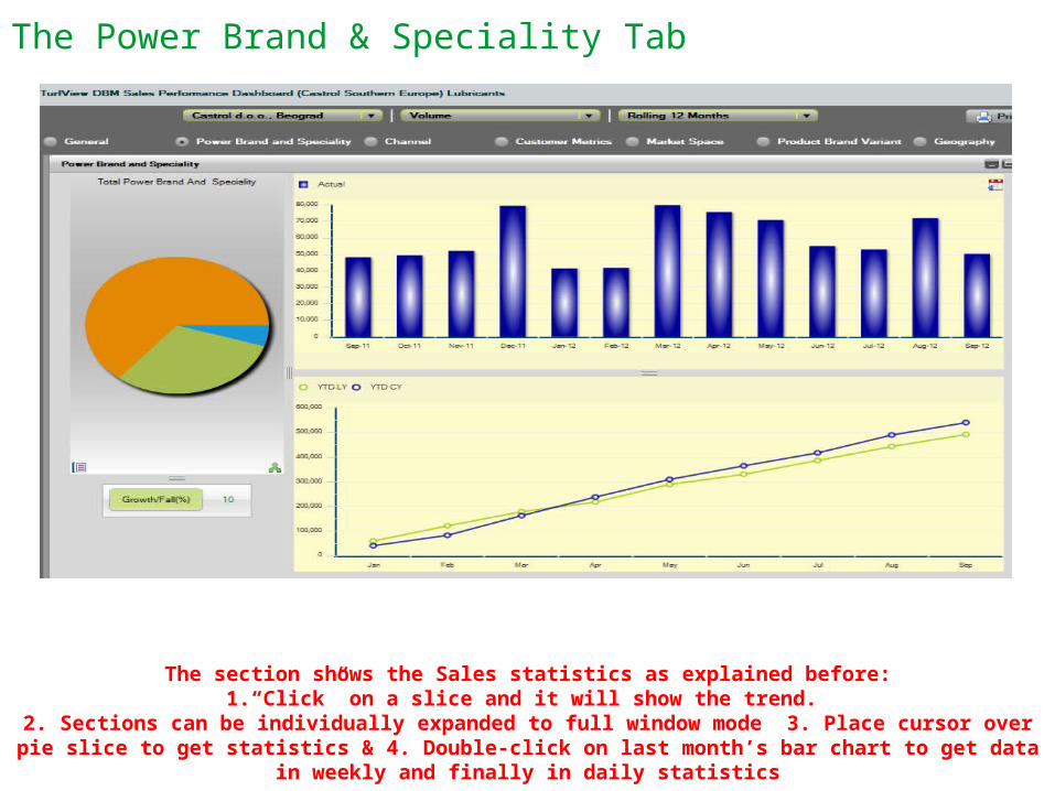
The Power Brand & Speciality Tab
The section shows the Sales statistics as explained before:1.“Click” on a slice and it will show the trend.
2. Sections can be individually expanded to full window mode 3. Place cursor over pie slice to get statistics & 4. Double-click on last month’s bar chart to get data in weekly and finally in daily statistics
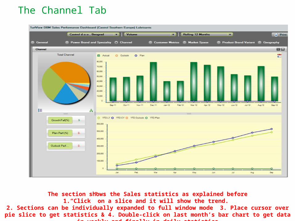
The Channel Tab
The section shows the Sales statistics as explained before1.“Click” on a slice and it will show the trend.
2. Sections can be individually expanded to full window mode 3. Place cursor over pie slice to get statistics & 4. Double-click on last month’s bar chart to get data in weekly and finally in daily statistics
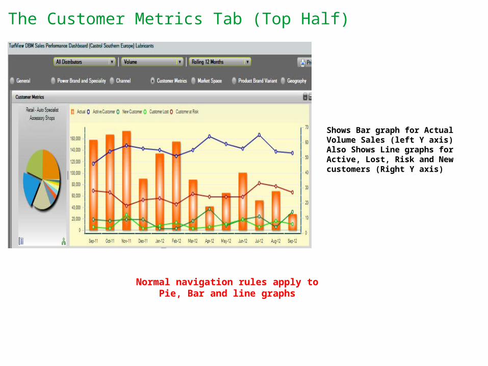
The Customer Metrics Tab (Top Half)
Shows Bar graph for Actual Volume Sales (left Y axis)Also Shows Line graphs for Active, Lost, Risk and New customers (Right Y axis)
Normal navigation rules apply to Pie, Bar and line graphs
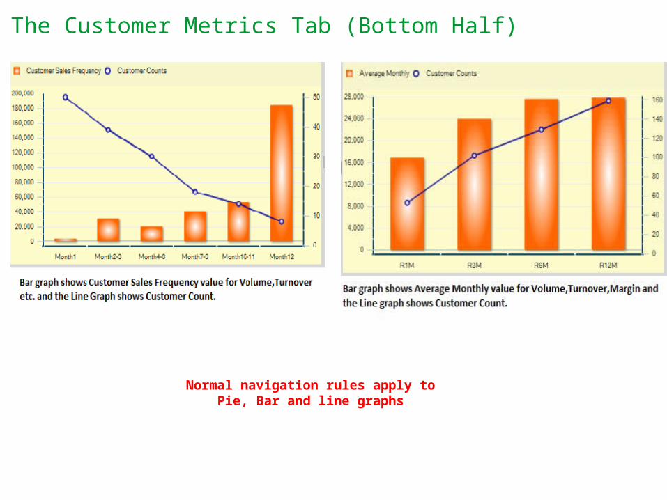
The Customer Metrics Tab (Bottom Half)
Normal navigation rules apply to Pie, Bar and line graphs
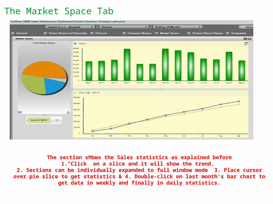
The Market Space Tab
The section shows the Sales statistics as explained before1.“Click” on a slice and it will show the trend.
2. Sections can be individually expanded to full window mode 3. Place cursor over pie slice to get statistics & 4. Double-click on last month’s bar chart to get data in weekly and finally in daily
statistics.
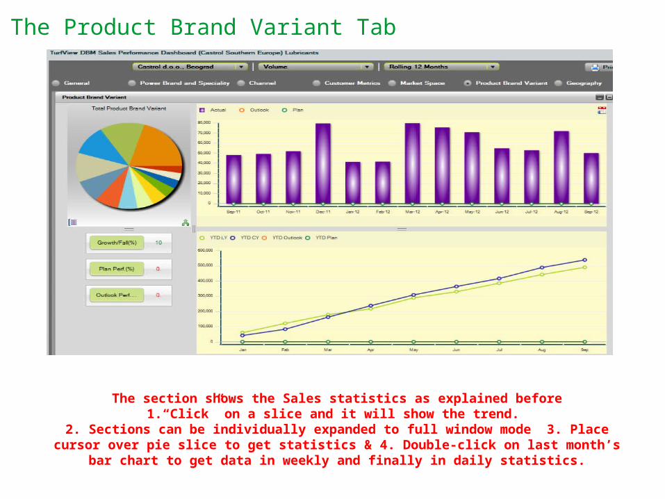
The Product Brand Variant Tab
The section shows the Sales statistics as explained before1.“Click” on a slice and it will show the trend.
2. Sections can be individually expanded to full window mode 3. Place cursor over pie slice to get statistics & 4. Double-click on last month’s bar chart to get data in weekly and finally in
daily statistics.
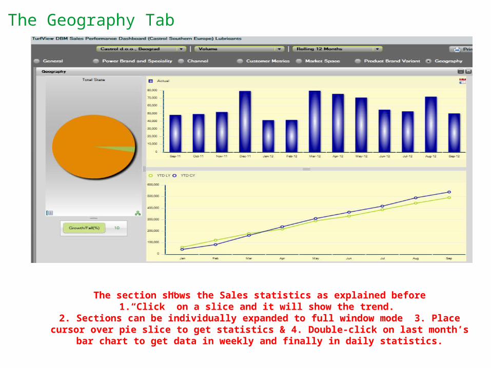
The Geography Tab
The section shows the Sales statistics as explained before1.“Click” on a slice and it will show the trend.
2. Sections can be individually expanded to full window mode 3. Place cursor over pie slice to get statistics & 4. Double-click on last month’s bar chart to get data in weekly and finally in
daily statistics.
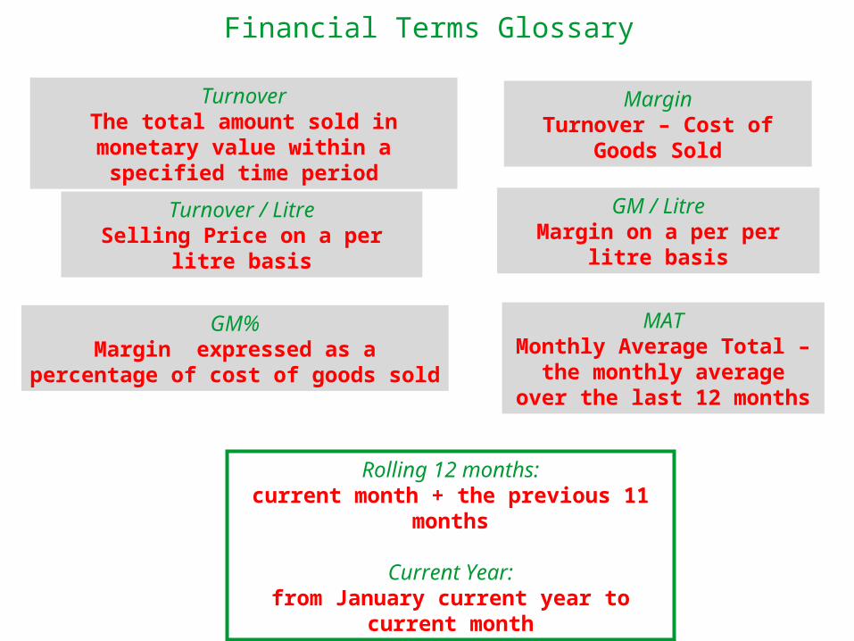
Financial Terms Glossary
Rolling 12 months:current month + the previous 11 months
Current Year:from January current year to current month
TurnoverThe total amount sold in monetary value within a
specified time period
MarginTurnover – Cost of Goods Sold
Turnover / LitreSelling Price on a per litre basis
GM / LitreMargin on a per per litre basis
GM%Margin expressed as a percentage of cost of
goods sold
MATMonthly Average Total – the
monthly average over the last 12 months
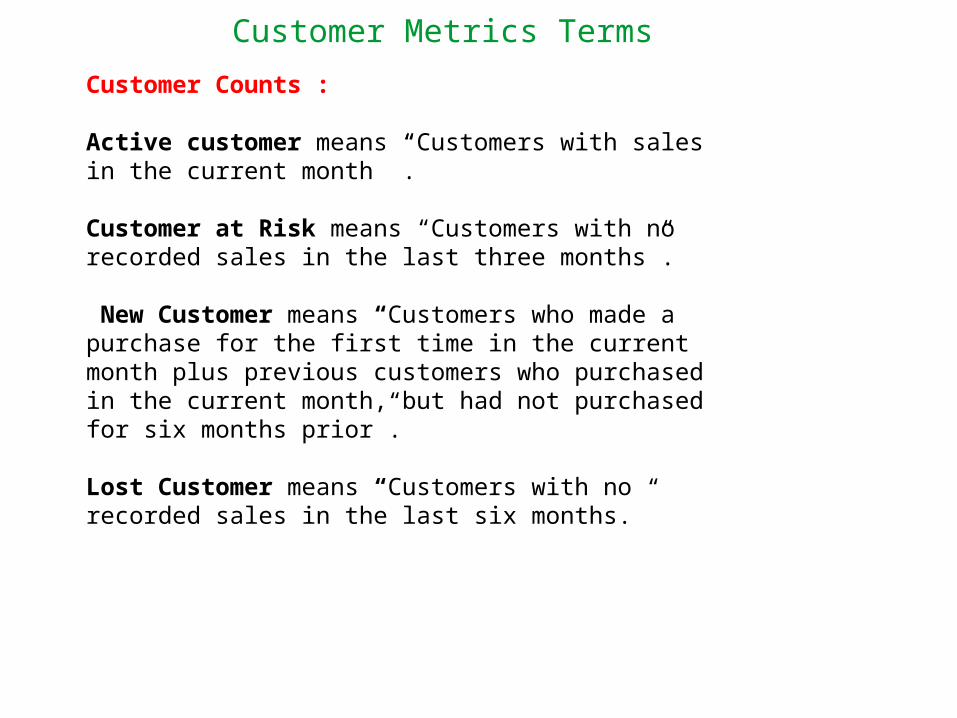
Customer Metrics Terms
Customer Counts :
Active customer means “Customers with sales in the current month ”.
Customer at Risk means “Customers with no recorded sales in the last three months”.
New Customer means “Customers who made a purchase for the first time in the current month plus previous customers who purchased in the current month, but had not purchased for six months prior”.
Lost Customer means “Customers with no recorded sales in the last six months.”
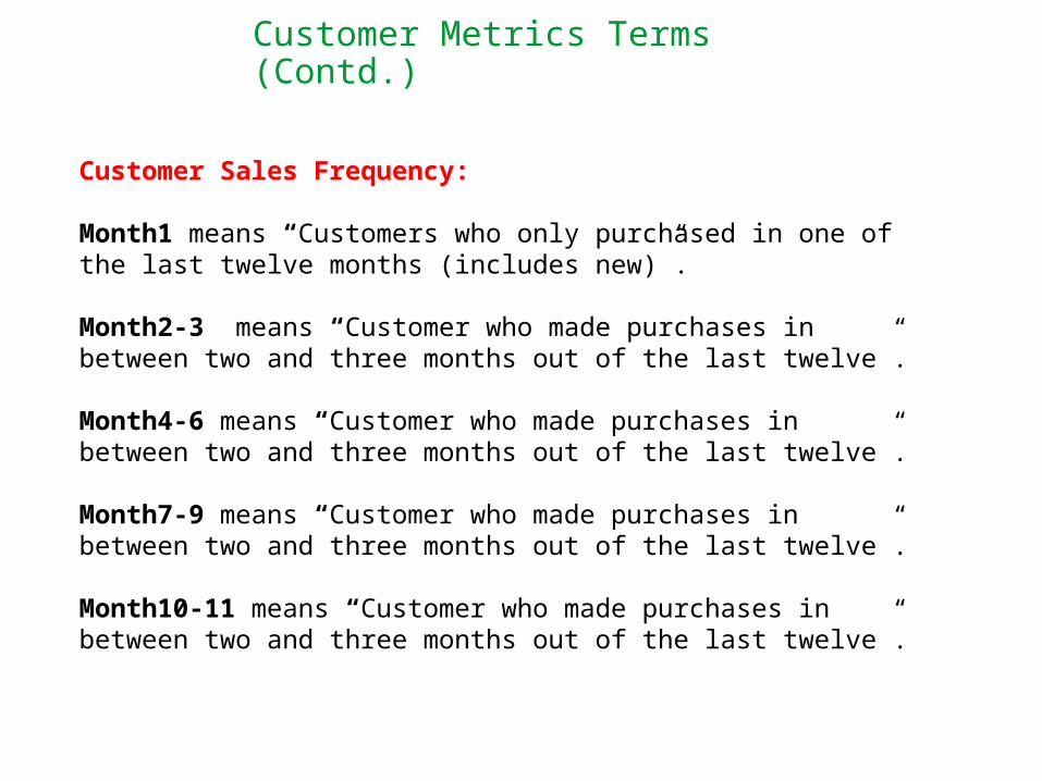
Customer Metrics Terms (Contd.)
Customer Sales Frequency:
Month1 means “Customers who only purchased in one of the last twelve months (includes new)”.
Month2-3 means “Customer who made purchases in between two and three months out of the last twelve”.
Month4-6 means “Customer who made purchases in between two and three months out of the last twelve”.
Month7-9 means “Customer who made purchases in between two and three months out of the last twelve”.
Month10-11 means “Customer who made purchases in between two and three months out of the last twelve”.
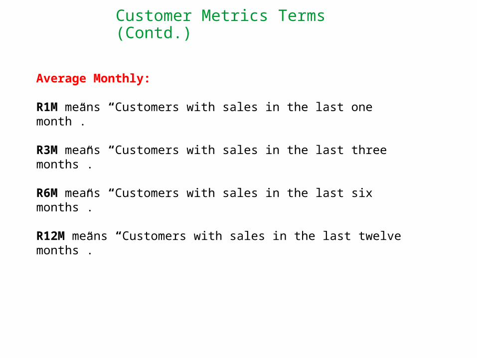
Customer Metrics Terms (Contd.)
Average Monthly:
R1M means “Customers with sales in the last one month”.
R3M means “Customers with sales in the last three months”.
R6M means “Customers with sales in the last six months”.
R12M means “Customers with sales in the last twelve months”.