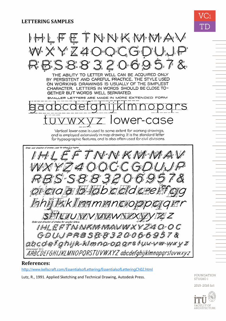
TYPOGRAPHY BASICS FREEHAND LETTERING BASICS The ANSI standards include uppercase letters and lowercase characters. The height of lowercase letters is 2/3 of height of general drawing letter. PENCILS Guidelines should be drawn with sharp and hard pencils like H and 2H type. The lettering should be very dark and intense like HB type. Practice with different types of pencils until you find the one that makes your lettering look best. Pencil should be positioned with right angle in the hand. LETTERING HEIGHT 3 mm. 5 mm. 7 mm.
Transcript
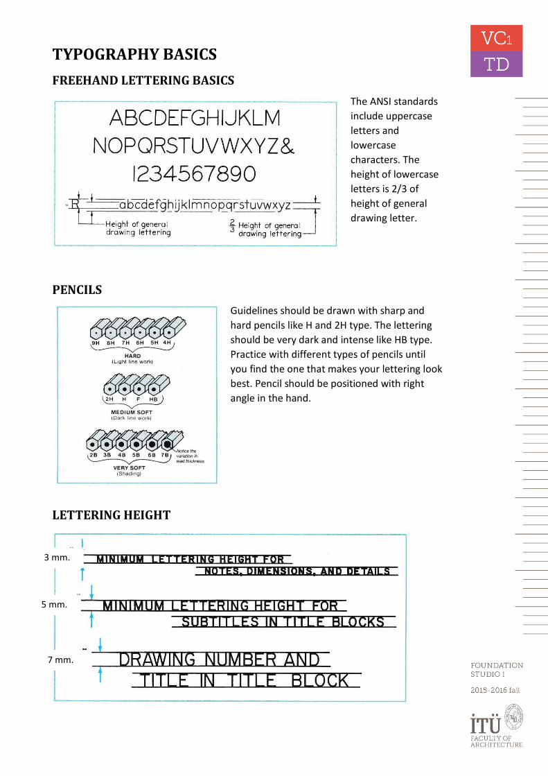
TYPOGRAPHY BASICS
FREEHAND LETTERING BASICS
The ANSI standards
include uppercase
letters and
lowercase
characters. The
height of lowercase
letters is 2/3 of
height of general
drawing letter.
PENCILS
Guidelines should be drawn with sharp and
hard pencils like H and 2H type. The lettering
should be very dark and intense like HB type.
Practice with different types of pencils until
you find the one that makes your lettering look
best. Pencil should be positioned with right
angle in the hand.
LETTERING HEIGHT
3 mm.
5 mm.
7 mm.
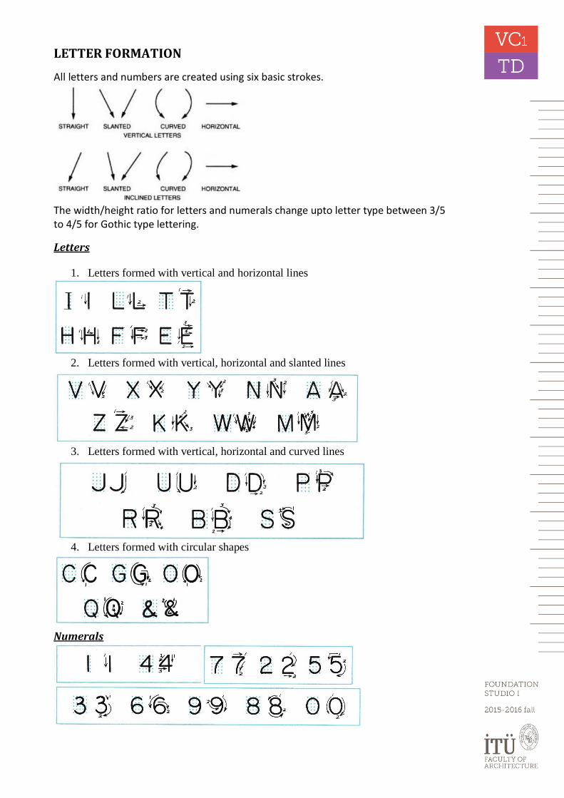
LETTER FORMATION
All letters and numbers are created using six basic strokes.
The width/height ratio for letters and numerals change upto letter type between 3/5 to 4/5 for Gothic type lettering.
Letters
1. Letters formed with vertical and horizontal lines
2. Letters formed with vertical, horizontal and slanted lines
3. Letters formed with vertical, horizontal and curved lines
4. Letters formed with circular shapes
Numerals
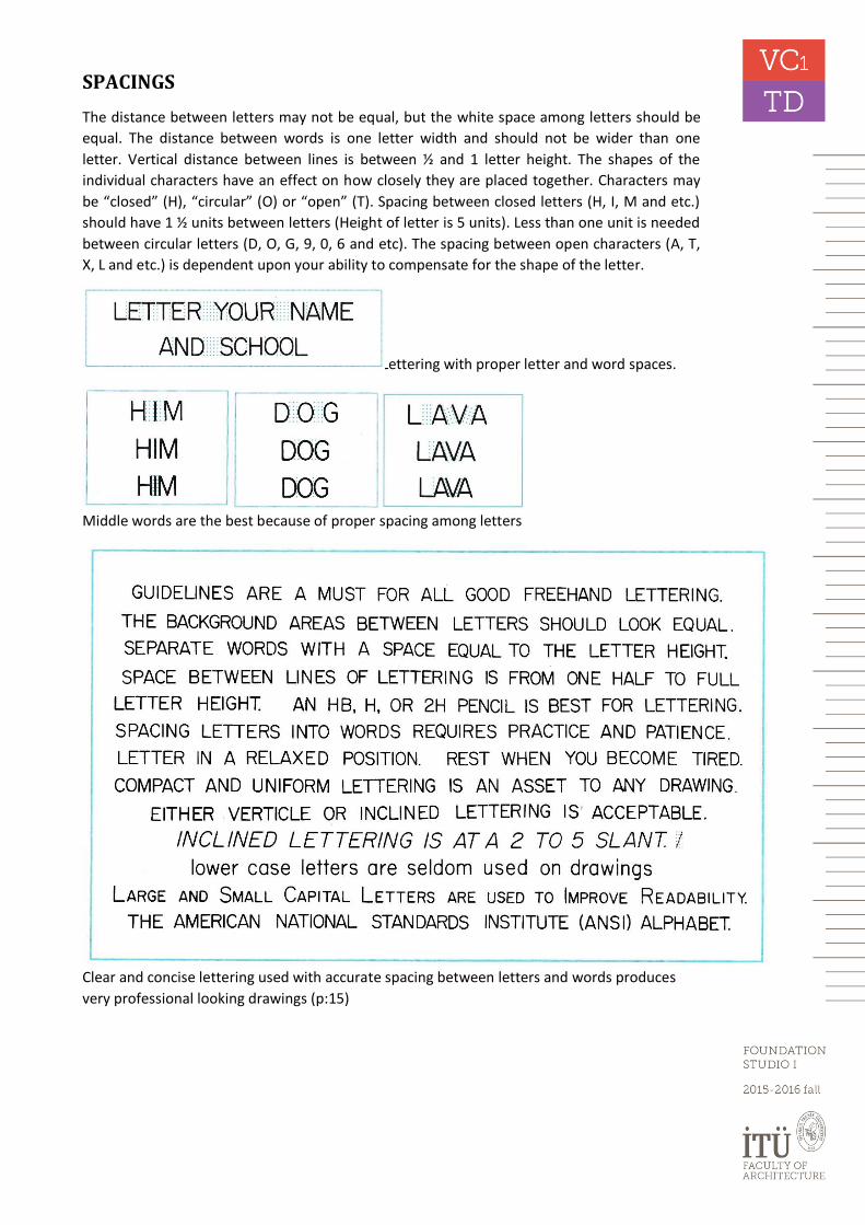
SPACINGS
The distance between letters may not be equal, but the white space among letters should be
equal. The distance between words is one letter width and should not be wider than one
letter. Vertical distance between lines is between ½ and 1 letter height. The shapes of the
individual characters have an effect on how closely they are placed together. Characters may
be “closed” (H), “circular” (O) or “open” (T). Spacing between closed letters (H, I, M and etc.)
should have 1 ½ units between letters (Height of letter is 5 units). Less than one unit is needed
between circular letters (D, O, G, 9, 0, 6 and etc). The spacing between open characters (A, T,
X, L and etc.) is dependent upon your ability to compensate for the shape of the letter.
Lettering with proper letter and word spaces.
Middle words are the best because of proper spacing among letters
Clear and concise lettering used with accurate spacing between letters and words produces