37
designing for usability five dimensions of prototyping fidelity - intro about me - overview: prototypes as designers, dimensions, examples
| Date post: | 15-Apr-2017 |
| Category: |
Technology |
| Upload: | 500-startups |
| View: | 1,745 times |
| Download: | 2 times |

designing for usabilityfive dimensions of prototyping fidelity
- intro about me - overview: prototypes as designers, dimensions, examples
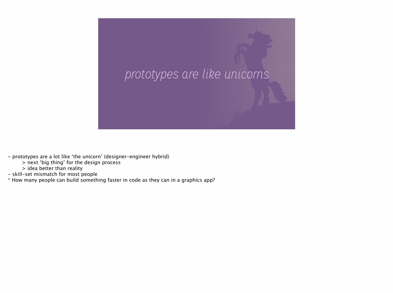
prototypes are like unicorns
- prototypes are a lot like ‘the unicorn’ (designer-engineer hybrid) > next ‘big thing’ for the design process > idea better than reality - skill-set mismatch for most people * How many people can build something faster in code as they can in a graphics app?
so what about the rest of us?
- take stock of your skill set - find specific problems to prototype - build a solution that is just as specific - don’t get lost in the weeds - best prototypes explore things ‘photoshop’ can’t

5 dimensions of prototyping
- new to me > but, good mental framework - this is like the good/fast/cheap triangle

visualsketch of pixel-perfect mock?
- simple, visual fidelity
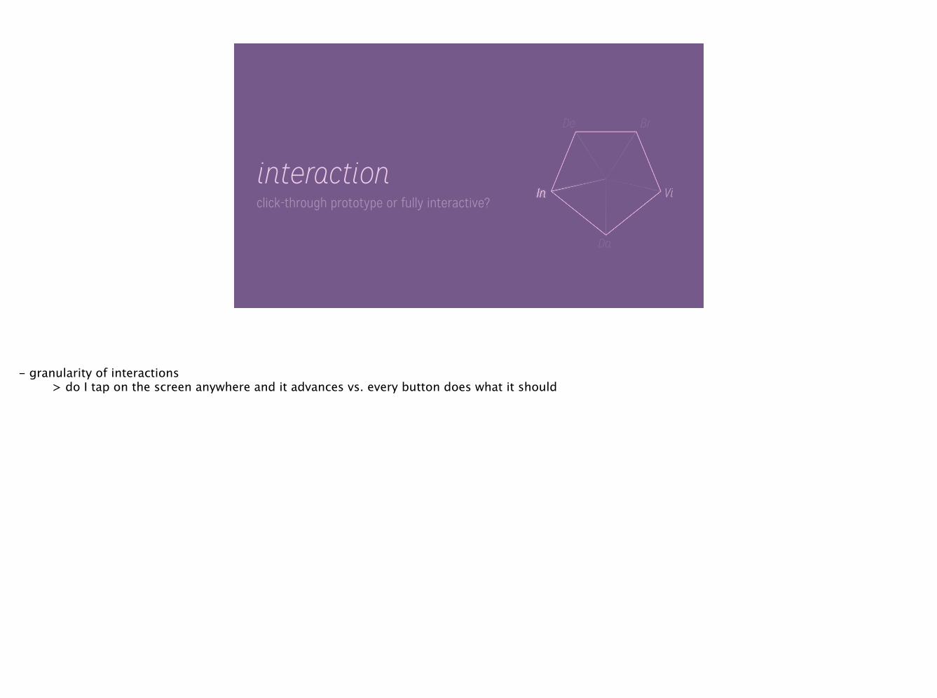
interactionclick-through prototype or fully interactive?
- granularity of interactions > do I tap on the screen anywhere and it advances vs. every button does what it should
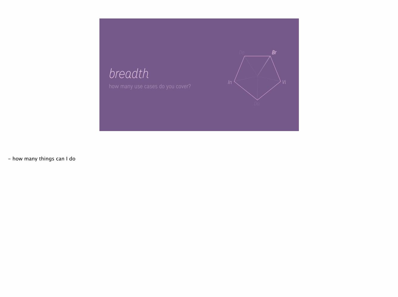
breadthhow many use cases do you cover?
- how many things can I do

depthhappy path, or all the edge cases?
- validation errors, loading states, etc…

datalorem ipsum or real data?
- using real data -> better yet user’s data - most often overlooked
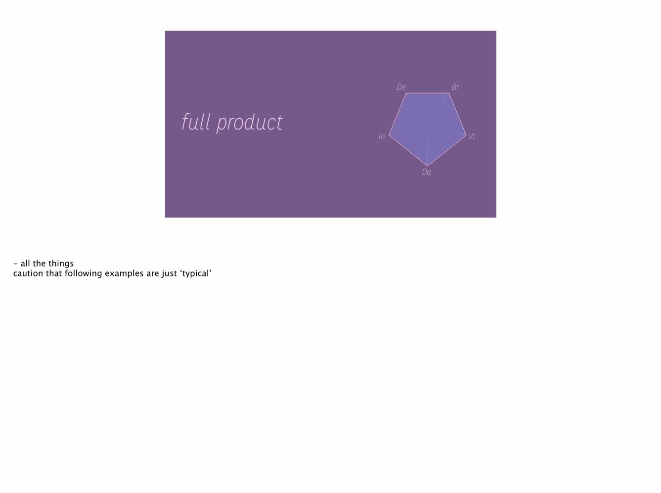
full product
- all the things caution that following examples are just ‘typical’

paper
- basic visuals - potential for good breadth - fast to get up and running

motionafter effects, quartz composer
- animation tests, transitions - can be high on data/interactivity, typically is not
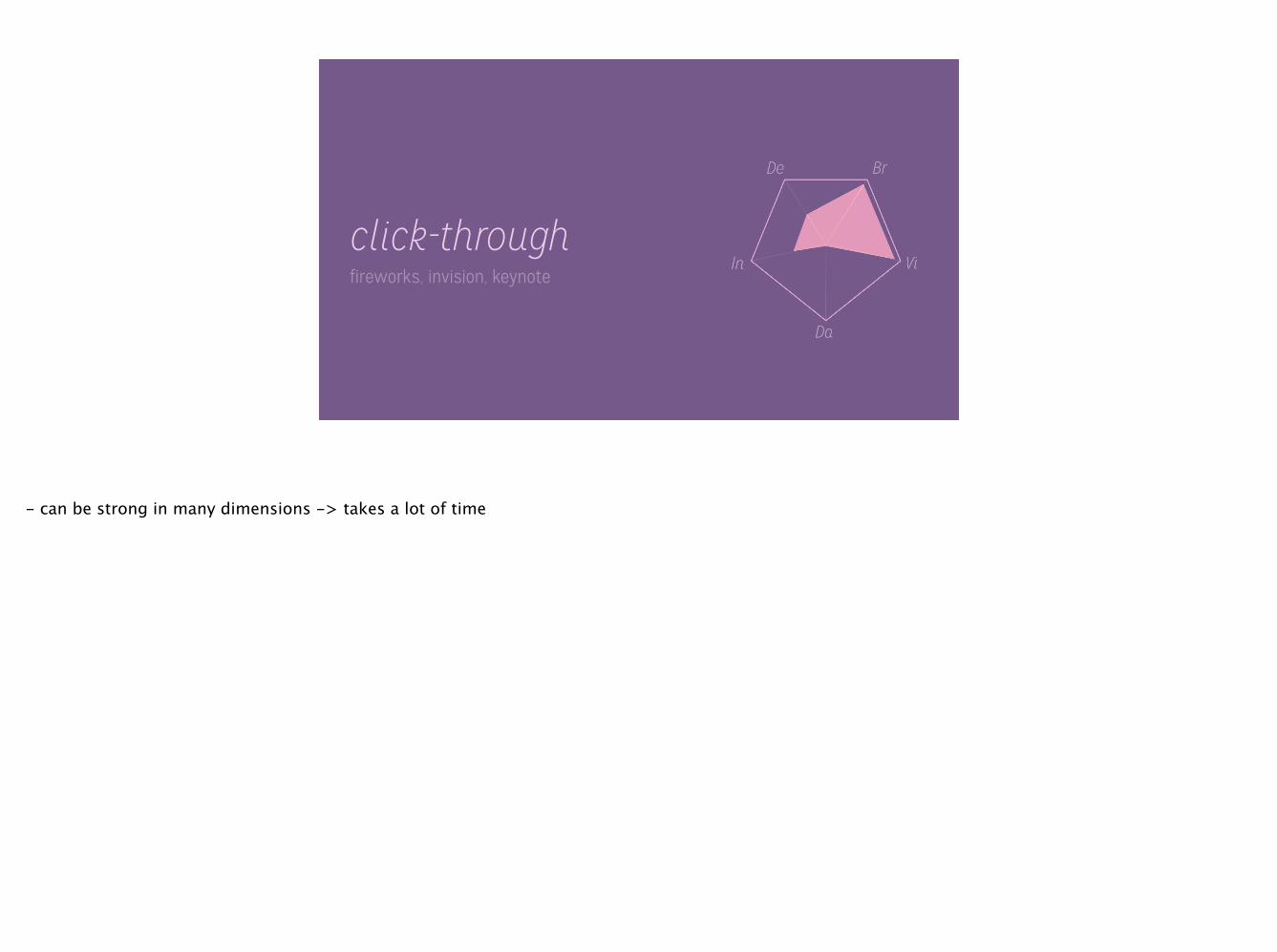
click-throughfireworks, invision, keynote
- can be strong in many dimensions -> takes a lot of time

examples
- examples are of all very focused prototypes - solves problems faster than photoshop

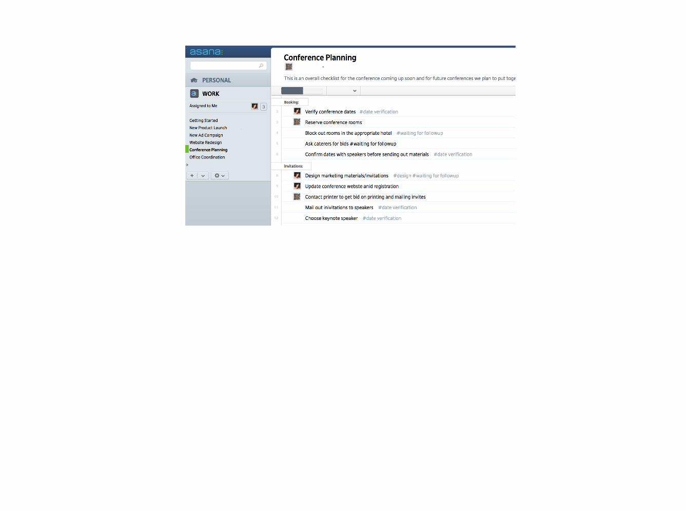
font prototype
- needed to test fonts quickly in situ - fast html prototype - bare-bones implementation
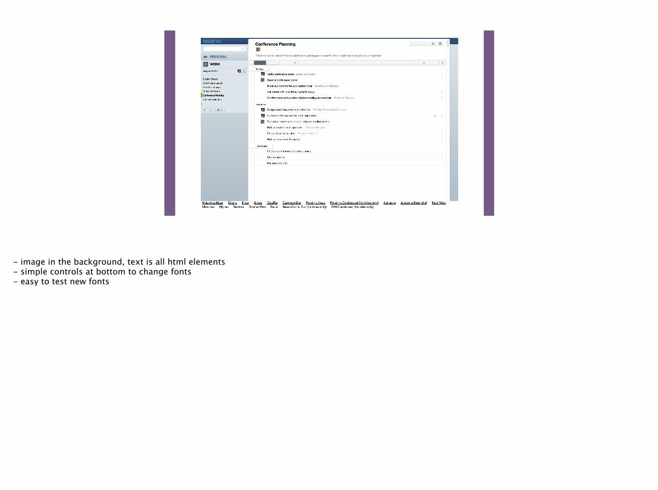
- image in the background, text is all html elements - simple controls at bottom to change fonts - easy to test new fonts


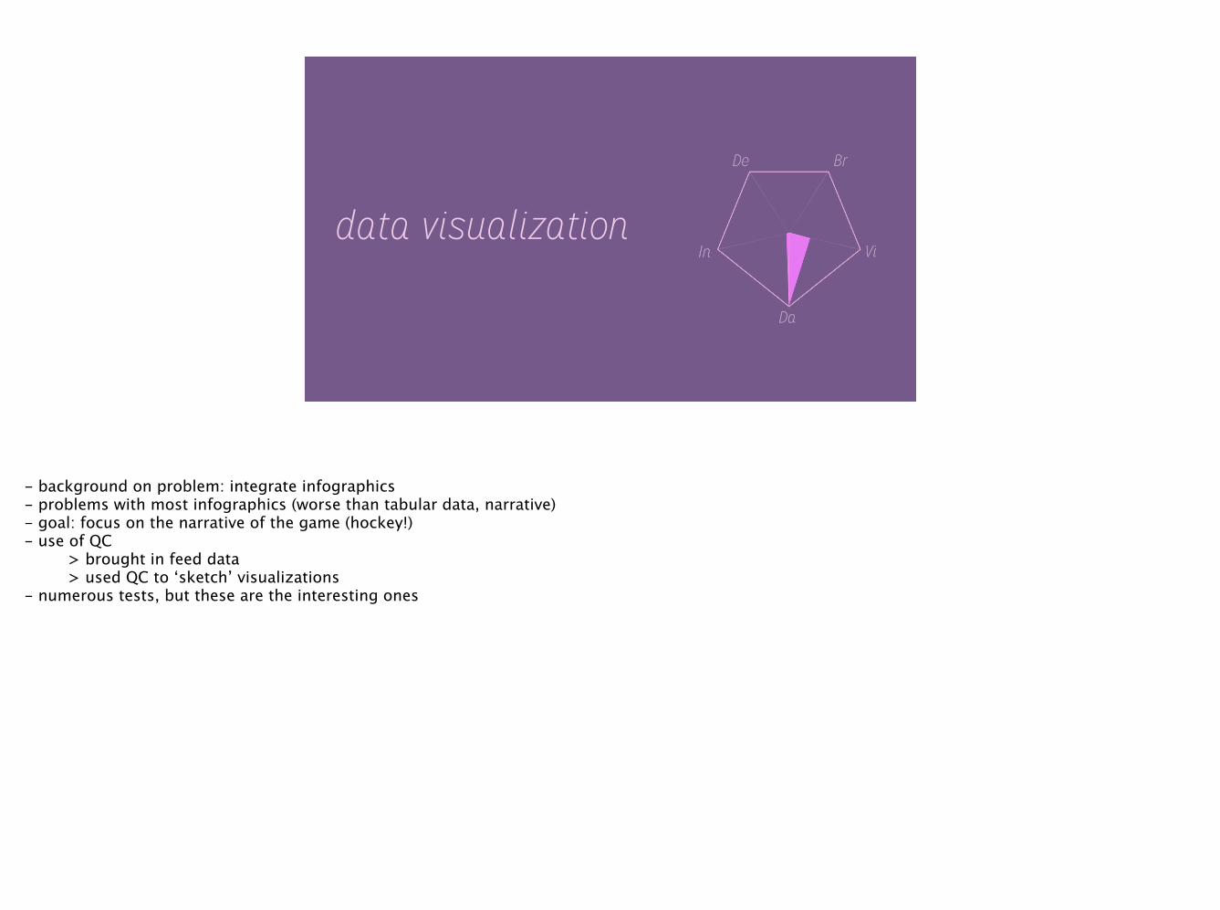
data visualization
- background on problem: integrate infographics - problems with most infographics (worse than tabular data, narrative) - goal: focus on the narrative of the game (hockey!) - use of QC > brought in feed data > used QC to ‘sketch’ visualizations - numerous tests, but these are the interesting ones
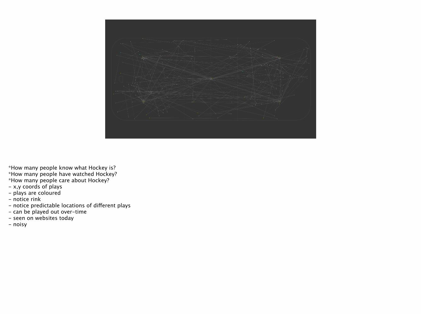
*How many people know what Hockey is? *How many people have watched Hockey? *How many people care about Hockey? - x,y coords of plays - plays are coloured - notice rink - notice predictable locations of different plays - can be played out over-time - seen on websites today - noisy
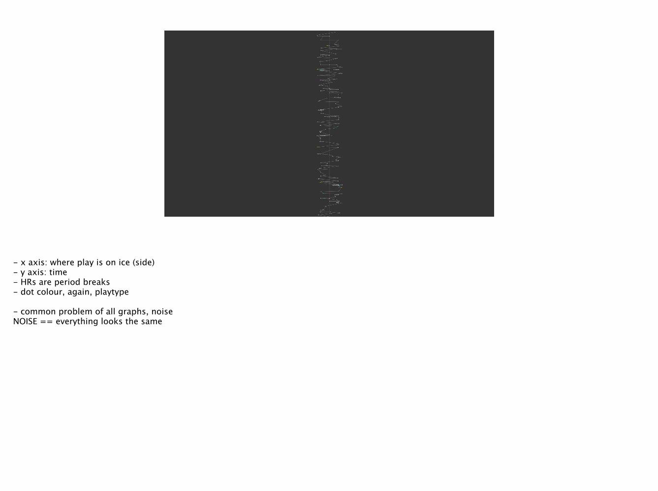
- x axis: where play is on ice (side) - y axis: time - HRs are period breaks - dot colour, again, playtype !- common problem of all graphs, noise NOISE == everything looks the same
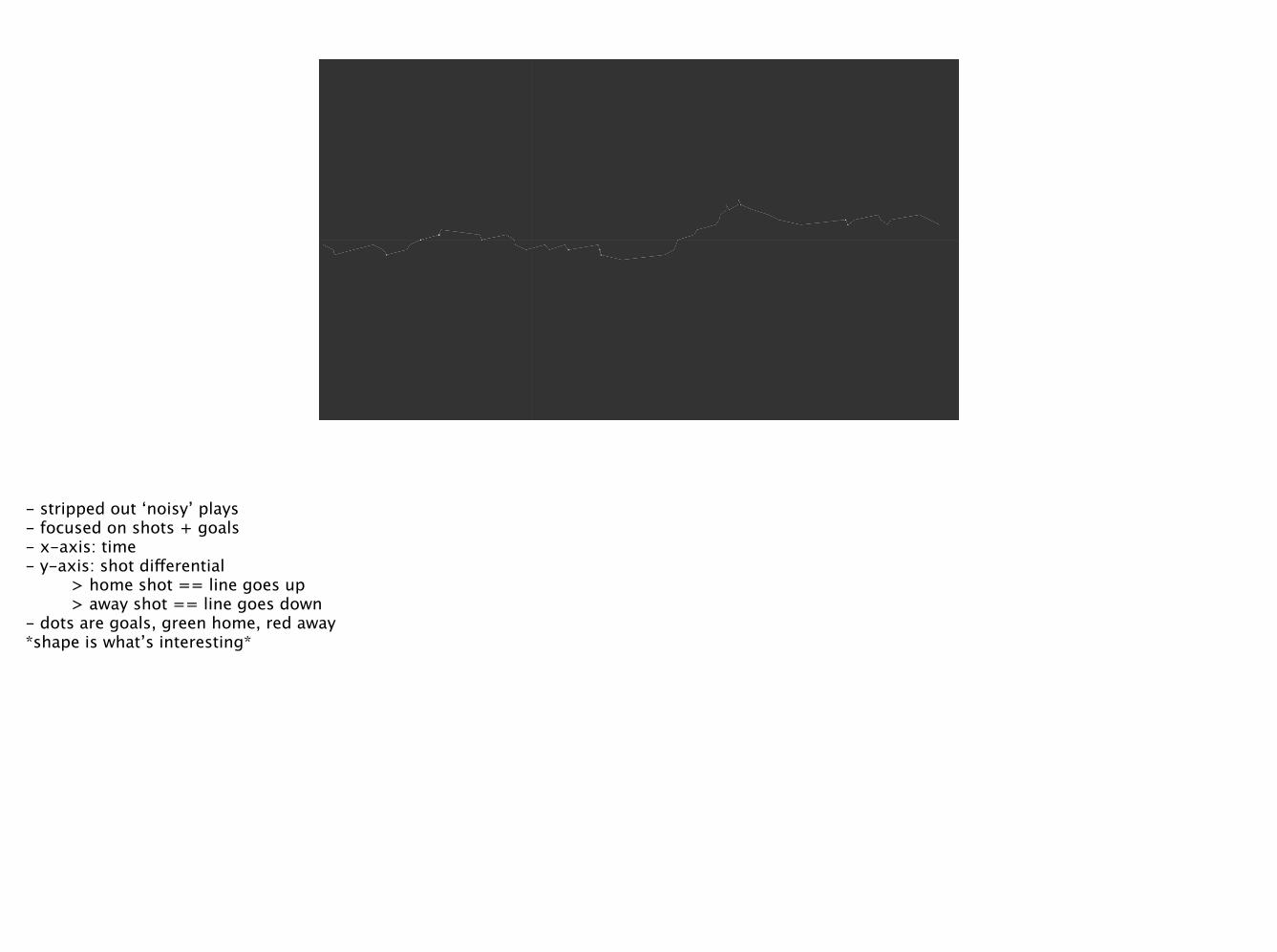
- stripped out ‘noisy’ plays - focused on shots + goals - x-axis: time - y-axis: shot differential > home shot == line goes up > away shot == line goes down - dots are goals, green home, red away *shape is what’s interesting*

another balanced game

a super back-and-forth game * note stripped out overtime in example*
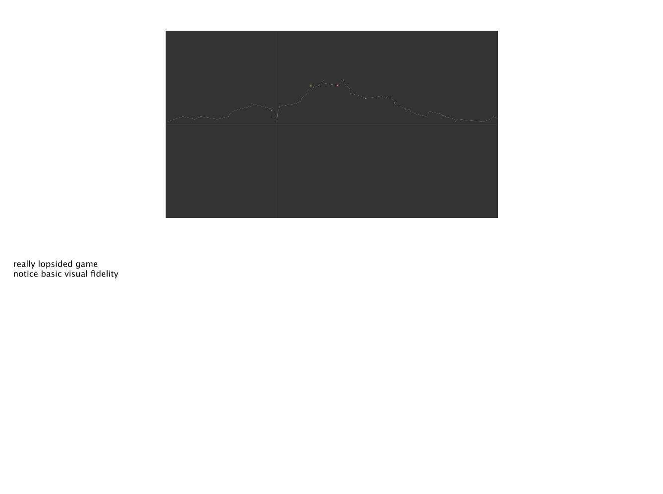
really lopsided game notice basic visual fidelity
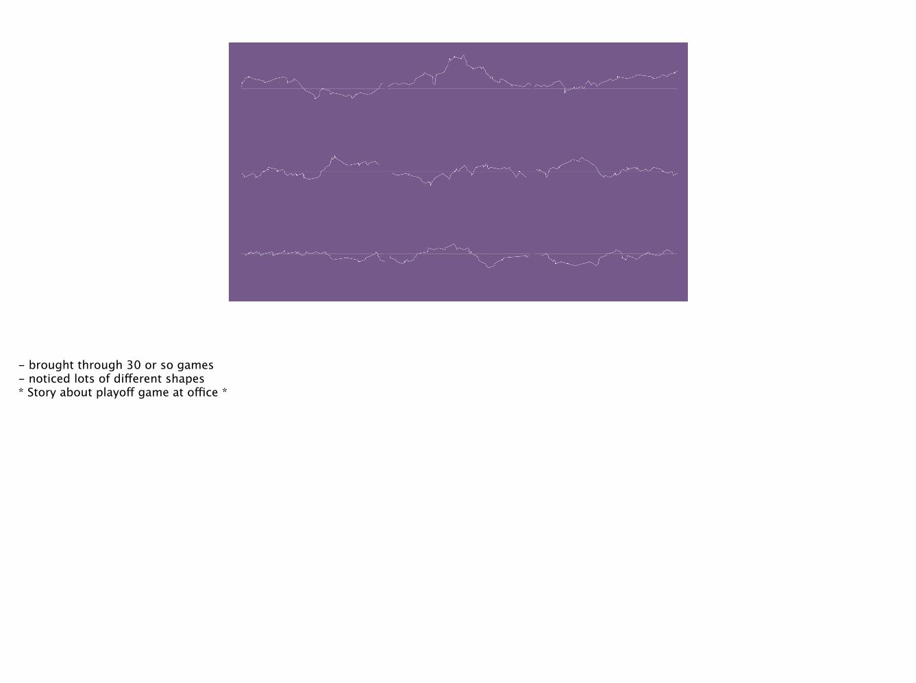
- brought through 30 or so games - noticed lots of different shapes * Story about playoff game at office *
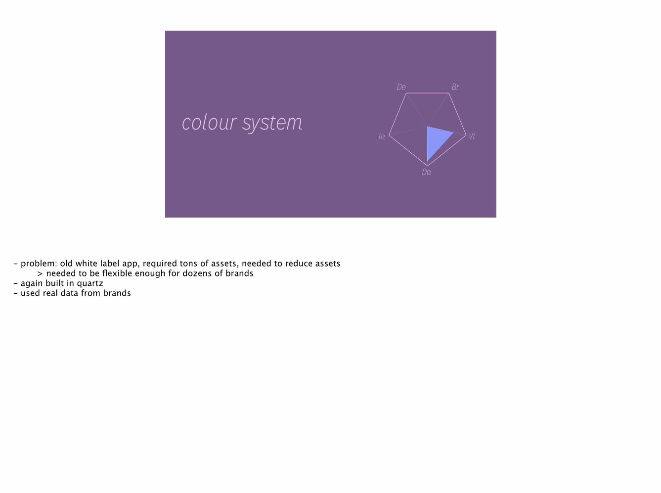
colour system
- problem: old white label app, required tons of assets, needed to reduce assets > needed to be flexible enough for dozens of brands - again built in quartz - used real data from brands

Old: 100+ assets + 2 colours Goal: 1-5 assets, 2 colours
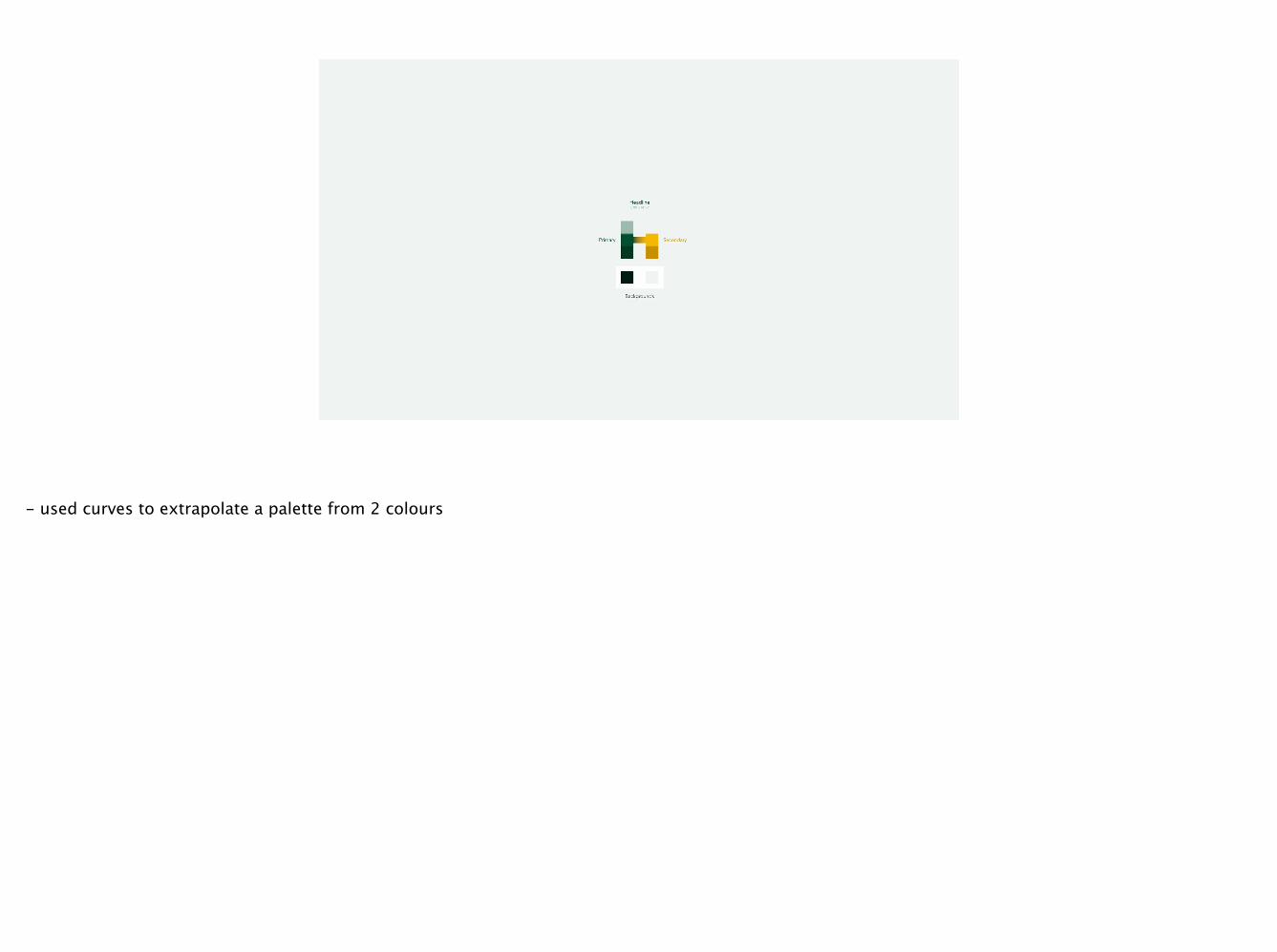
- used curves to extrapolate a palette from 2 colours
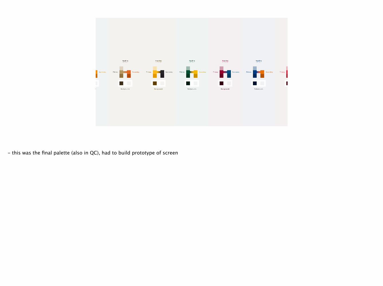
- this was the final palette (also in QC), had to build prototype of screen
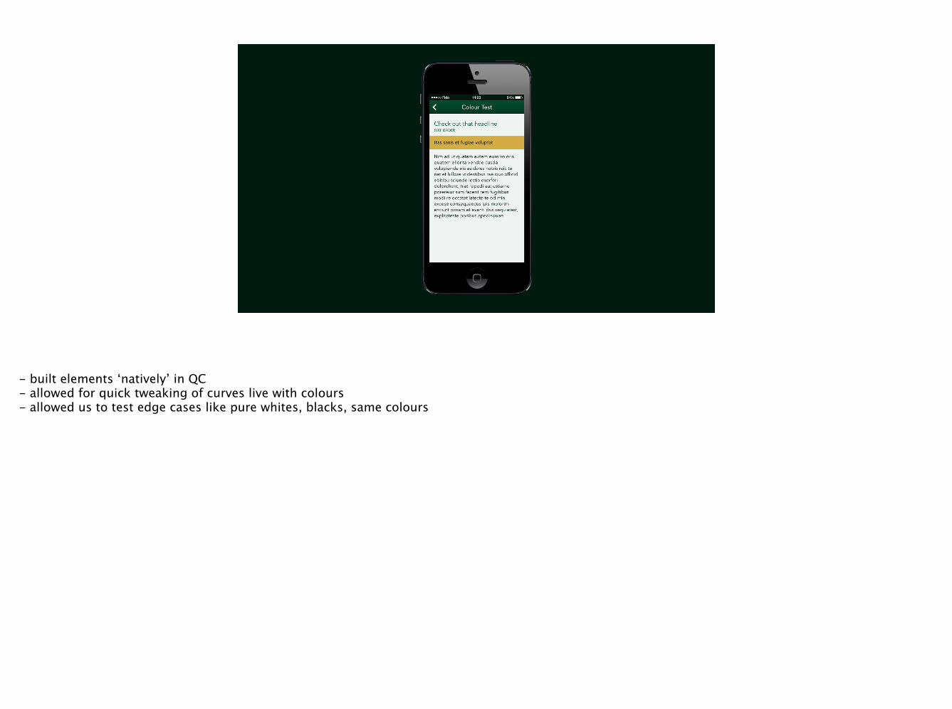
- built elements ‘natively’ in QC - allowed for quick tweaking of curves live with colours - allowed us to test edge cases like pure whites, blacks, same colours
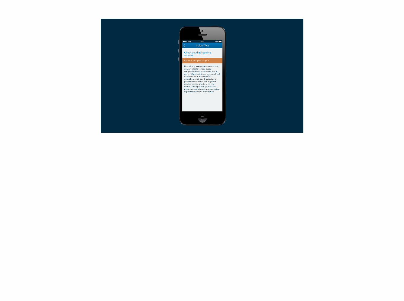
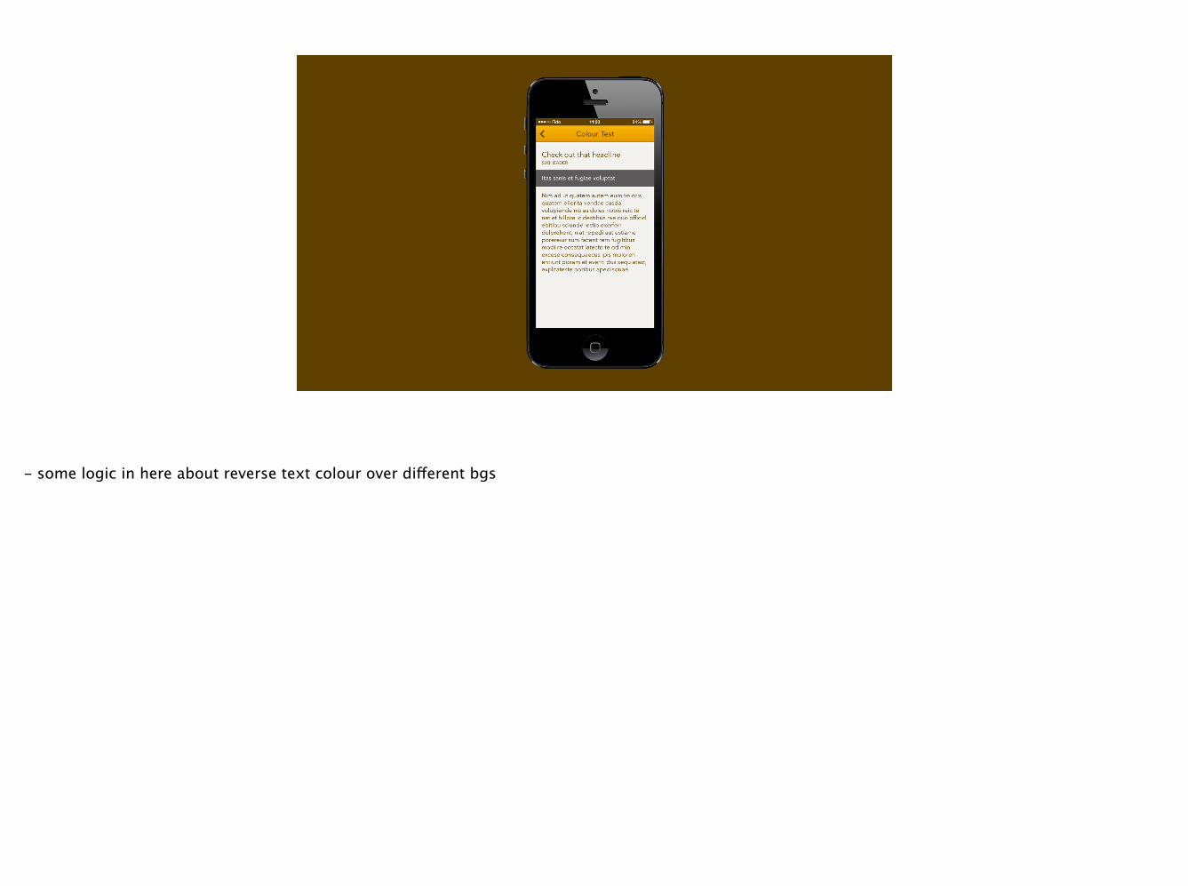
- some logic in here about reverse text colour over different bgs
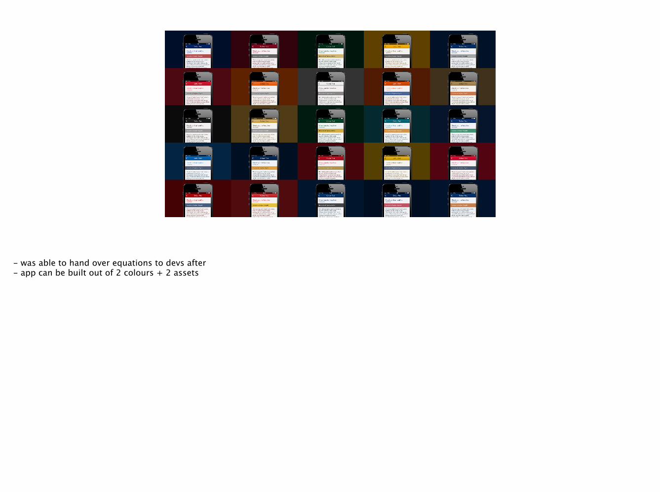
- was able to hand over equations to devs after - app can be built out of 2 colours + 2 assets
• don’t build more than you need
• answer questions that aren’t easilysolved with mockups
• use the technique that fits the task
every prototype is different

questions?
@tysonkallberg


