U N I T I n this unit of Core-Plus Mathematics, you will explore principles and techniques for organizing and summarizing data. Whether the data are the results of a science experiment, from a test of a new medical procedure, from a political poll, or from a survey of what consumers prefer, the basic principles and techniques of analyzing data are much the same: make a plot of the data; describe its shape, center, and spread with numbers and words; and interpret your results in the context of the situation. If you have more than one distribution, compare them. Key ideas of data analysis will be developed through your work in two lessons. 2 Lessons 1 Exploring Distributions Plot single-variable data using dot plots, histograms, and relative frequency histograms. Describe the shape and center of distributions. 2 Measuring Variability Calculate and interpret percentiles, quartiles, deviations from the mean, and standard deviation. Calculate and interpret the five-number summary and interquartile range and construct and interpret box plots. Predict the effect of linear transformations on the shape, center, and spread of a distribution. PATTERNS IN PATTERNS IN DATA DATA NOAA
Transcript
UNIT
In this unit of Core-Plus Mathematics, you will
explore principles and techniques for organizing and summarizing data. Whether the data are the results of a science experiment, from a test of a new medical procedure, from a political poll, or from a survey of what consumers prefer, the basic principles and techniques of analyzing data are much the same: make a plot of the data; describe its shape, center, and spread with numbers and words; and interpret your results in the context of the situation. If you have more than one distribution, compare them.
Key ideas of data analysis will be developed through your work in two lessons.
2
Lessons1 Exploring Distributions
Plot single-variable data using dot plots, histograms, and relative frequency histograms. Describe the shape and center of distributions.
2 Measuring Variability
Calculate and interpret percentiles, quartiles, deviations from the mean, and standard deviation. Calculate and interpret the five-number summary and interquartile range and construct and interpret box plots. Predict the effect of linear transformations on the shape, center, and spread of a distribution.
PATTERNS IN PATTERNS IN DATADATA
NOAA
LESSON
74 UNIT 2
1
Exploring Distributions
The statistical approach to problem solving includes refining the question you want to answer, designing a study, collecting the data, analyzing the data collected, and reporting your conclusions in the context of the original question. For example, consider the problem described below.
A Core-Plus Mathematics teacher in Traverse City, Michigan, was interested in whether eye-hand coordination is better when students use their dominant hand than when they use their nondominant hand. She refined this problem to the specific question of whether students can stack more pennies when they use their dominant hand than when they use their nondominant hand. In her first-hour class, she posed the question:
How many pennies can you stack using your dominant hand?
In her second-hour class, she posed this question:
How many pennies can you stack using your nondominant hand?
Diane Moore, Getty Images
LESSON 1 • Exploring Distributions 75
In this lesson, you will learn how to make and interpret graphical displays of data so they can help you make decisions involving data.
Think About This Situation
Examine the distribution of the number of pennies stacked by students in the first-hour class using their dominant hand.
a How many students were in the first-hour class? What percentage of the students stacked 40 or more pennies using their dominant hand?
b What do you think the plot for the second-hour class might look like?
c Check your conjecture in Part b by having your class stack pennies using your nondominant hands. Make a plot of the numbers stacked by your class using the same scale as that for the dominant hand plot above.
d Compare the shape, center, and spread of the plot from your class with the plot of the first-hour class on the previous page. What conclusions, if any, can you draw?
e Why might comparing the results of first- and second-hour students not give a good answer to this teacher’s question? Can you suggest a better design for her study?
In both classes, students were told: “You can touch pennies only with the one hand you are using; you have to place each penny on the stack without touching others; and once you let go of a penny, it cannot be moved. Your score is the number of pennies you had stacked before a penny falls.”
Students in each class counted the number of pennies they stacked and prepared a plot of their data. The plot from the first-hour class is shown below. A value on the line between two bars (such as stacking 24 pennies) goes into the bar on the right.
Dominant Hand
76 UNIT 2 • Patterns in Data
IInvest invest iggationation 11 Shapes of Distributions Shapes of Distributions
Every day, people are bombarded by data on television, on the Internet, in newspapers, and in magazines. For example, states release report cards for schools and statistics on crime and unemployment, and sports writers report batting averages and shooting percentages. Making sense of data is important in everyday life and in most professions today. Often a first step to understanding data is to analyze a plot of the data. As you work on the problems in this investigation, look for answers to this question:
How can you produce and interpret plots of data and use those plots to compare distributions?
1 As part of an effort to study the wild black bear population in Minnesota, Department of Natural Resources staff anesthetized and then measured the lengths of 143 black bears. (The length of a bear is measured from the tip of its nose to the tip of its tail.) The following dot plots (or number line plots) show the distributions of the lengths of the male and the female bears.
a. Compare the shapes of the two distributions. When asked to compare, you should discuss the similarities and differences between the two distributions, not just describe each one separately.
i. Are the shapes of the two distributions fundamentally alike or fundamentally different?
ii. How would you describe the shapes?
b. Are there any lengths that fall outside the overall pattern of either distribution?
c. Compare the centers of the two distributions.
d. Compare the spreads of the two distributions.
2 When describing a distribution, it is important to include information about its shape, its center, and its spread.
Kennan Ward/CORBIS
LESSON 1 • Exploring Distributions 77
a. Describing shape. Some distributions are approximately normal or mound-shaped, where the distribution has one peak and tapers off on both sides. Normal distributions are symmetric—the two halves look like mirror images of each other. Some distributions have a tail stretching towards the larger values. These distributions are called skewed to the right or skewed toward the larger values. Distributions that have a tail stretching toward the smaller values are called skewed to the left or skewed toward the smaller values.
A description of shape should include whether there are two or more clusters separated by gaps and whether there are outliers. Outliers are unusually large or small values that fall outside the overall pattern.
• How would you use the ideas of skewness and outliers to describe the shape of the distribution of lengths of female black bears in Problem 1?
b. Describing center. The measure of center that you are most familiar with is the mean (or average).
• How could you estimate the mean length of the female black bears?
c. Describing spread. You may also already know one measure of spread, the range, which is the difference between the maximum value and the minimum value:
range = maximum value - minimum value
• What is the range of lengths of the female black bears?
d. Use these ideas of shape, center, and spread to describe the distribution of lengths of the male black bears.
Measures of center (mean and median) and measures of spread (such as the range) are called summary statistics because they help to summarize the information in a distribution.
3 In the late 1940s, scientists discovered how to create rain in times of drought. The technique, dropping chemicals into clouds, is called “cloud seeding.” The chemicals cause ice particles to form, which become heavy enough to fall out of the clouds as rain.
To test how well silver nitrate works in causing rain, 25 out of 50 clouds were selected at random to be seeded with silver nitrate. The remaining 25 clouds were not seeded. The amount of rainfall from each cloud was measured and recorded in acre-feet (the amount of water to cover an acre 1 foot deep). The results are given in the following dot plots.
Basler Turbo
78 UNIT 2 • Patterns in Data
a. Describe the shapes of these two distributions.
b. Which distribution has the larger mean?
c. Which distribution has the larger spread in the values?
d. Does it appear that the silver nitrate was effective in causing more rain? Explain.
Dot plots can be used to get quick visual displays of data. They enable you to see patterns or unusual features in the data. They are most useful when working with small sets of data. Histograms can be used with data sets of any size. In a histogram, the horizontal axis is marked with a numerical scale. The height of each bar represents the frequency (count of how many values are in that bar). A value on the line between two bars (such as 100 on the following histogram) is counted in the bar on the right.
4 Pollstar estimates that revenue from all major North American concerts in 2005 was about $3.1 billion. The histogram below shows the average ticket price for the top 20 North American concert tours.
Concert Tours
a. For how many of the concert tours was the average price $100 or more?
b. Barry Manilow had the highest average ticket price.
i. In what interval does that price fall?
LESSON 1 • Exploring Distributions 79
ii. The 147,470 people who went to Barry Manilow concerts paid an average ticket price of $153.93. What was the total amount paid (gross) for all of the tickets?
c. The lowest average ticket price was for Rascal Flatts.
i. In what interval does that price fall?
ii. Their concert tour sold 807,560 tickets and had a gross of $28,199,995. What was the average price of a ticket to one of their concerts?
d. Describe the distribution of these average concert ticket prices.
5 Sometimes it is useful to display data showing the percentage or proportion of the data values that fall into each category. A relative frequency histogram has the proportion or percentage that fall into each bar on the vertical axis rather than the frequency or count. Shown below is the start of a relative frequency histogram for the average concert ticket prices in Problem 4.
a. Since prices between $30 and $40 happened 3 out of 20 times, the
relative frequency for the first bar is 3 _ 20 or 0.15. Complete a copy
of the table and relative frequency histogram. Just as with the histogram, an average price of $50 goes into the interval 50–60 in the table.
Average Price (in $) Frequency Relative Frequency
30–40 3 3 _ 20 = 0.15
40–50
50–60
60–70
70–80
80–90
90–100
100–110
110–120
120–130
130–140
140–150
150–160
Total
Concert Tours
80 UNIT 2 • Patterns in Data
b. When would it be better to use a relative frequency histogram for the average concert ticket prices rather than a histogram?
6 To study connections between a histogram and the corresponding relative frequency histogram, consider the histogram below showing Kyle’s 20 homework grades for a semester. Notice that since each bar represents a single whole number (6, 7, 8, 9, or 10), those numbers are best placed in the middle of the bars on the horizontal axis. In this case, Kyle has one grade of 6 and five grades of 7.
a. Make a relative frequency histogram of these grades by copying the histogram but making a scale that shows proportion of all grades on the vertical axis rather than frequency.
b. Compare the shape, center, and spread of the two histograms.
7 The relative frequency histograms below show the heights (rounded to the nearest inch) of large samples of young adult men and women in the United States.
Heights of Young Adult Men
Heights of Young Adult Women
Homework Grades
LESSON 1 • Exploring Distributions 81
a. About what percentage of these young men are 6 feet tall? About what percentage are at least 6 feet tall?
b. About what percentage of these young women are 6 feet tall? About what percentage are 5 feet tall or less?
c. If there are 5,000 young men in this sample, how many are 5 feet, 9 inches tall? If there are 5,000 young women in this sample, how many are 5 feet, 9 inches tall?
d. Walt Disney World recently advertised for singers to perform in Beauty and the Beast—Live on Stage. Two positions were Belle, with height 5'5"–5'8", and Gaston, with height 6'1" or taller. What percentage of these young women would meet the height requirements for Belle? What percentage of these young men would meet the height requirements for Gaston? (Source: corporate.disney.go.com/auditions/disneyworld/roles_dancersinger.html)
Producing a graphical display is the first step toward understanding data. You can use data analysis software or a graphing calculator to produce histograms and other plots of data. This generally requires the following three steps.
• After clearing any unwanted data, enter your data into a list or lists.
• Select the type of plot desired.
• Set a viewing window for the plot. This is usually done by specifying the minimum and maximum values and scale on the horizontal (x) axis. Depending on the type of plot, you may also need to specify the minimum and maximum values and scale on the vertical (y) axis. Some calculators and statistical software will do this automatically, or you can use a command such as ZoomStat.
Examples of the screens involved are shown here. Your calculator or software may look different.
Choosing the width of the bars (Xscl) for a histogram determines the number of bars. In the next problem, you will examine several possible histograms of the same set of data and decide which you think is best.
Producing a Plot Enter Data Select Plot Set Window
8 The following table gives nutritional information about some fast-food sandwiches: total calories, amount of fat in grams, and amount of cholesterol in milligrams.
a. Use your calculator or data analysis software to make a histogram of the total calories for the sandwiches listed. Use the values Xmin = 300, Xmax = 1100, Xscl = 100, Ymin = -2, Ymax = 10, and Yscl = 1. Experiment with different choices of Xscl. Which values of Xscl give a good picture of the distribution?
b. Describe the shape, center, and spread of the distribution.
c. If your calculator or software has a “Trace” feature, use it to display values as you move the cursor along the histogram. What information is given for each bar?
d. Investigate if your calculator or data analysis software can create a relative frequency histogram.
How Fast-Food Sandwiches Compare
Company Sandwich Total Calories Fat(in grams)
Cholesterol (in mg)
McDonald’s Cheeseburger 310 12 40
Wendy’s Jr. Cheeseburger 320 13 40
McDonald’s Quarter Pounder 420 18 70
McDonald’s Big Mac 560 30 80
Burger King Whopper Jr. 390 22 45
Wendy’s Big Bacon Classic 580 29 95
Burger King Whopper 700 42 85
Hardee’s 1/3 lb Cheeseburger 680 39 90
Burger King Double Whopper w/Cheese 1,060 69 185
Hardee’s Charbroiled Chicken Sandwich 590 26 80
Hardee’s Regular Roast Beef 330 16 40
Wendy’s Ultimate Chicken Grill 360 7 75
Wendy’s Homestyle Chicken Fillet 540 22 55
Burger King Tendercrisp Chicken Sandwich 780 45 55
McDonald’s McChicken 370 16 50
Burger King Original Chicken Sandwich 560 28 60
Subway 6" Chicken Parmesan 510 18 40
Subway 6" Oven Roasted Chicken Breast 330 5 45
Arby’s Regular Roast Beef 320 13 45
Arby’s Super Roast beef 440 19 45
Lois Ellen Frank/CORBIS
LESSON 1 • Exploring Distributions 83
Summarize the Mathematics
Check Your UnderstandingCheck Your UnderstandingConsider the amount of fat in the fast-food sandwiches listed in the table on page 82.
a. Make a dot plot of these data.
b. Make a histogram and then a relative frequency histogram of these data.
c. Write a short description of the distribution so that a person who had not seen the distribution could draw an approximately correct sketch of it.
IInvest invest iggationation 22 Measures of Center Measures of Center
In the previous investigation, you learned how to describe the shape of a distribution. In this investigation, you will review how to compute the two most important measures of the center of a distribution—the mean and the median—and explore some of their properties. As you work on this investigation, think about this question:
How do you decide whether to use the mean or median in summarizing a set of data?
9 Now consider the amounts of cholesterol in the fast-food sandwiches.
a. Make a histogram of the amounts. Experiment with setting a viewing window to get a good picture of the distribution.
b. Describe the distribution of the amount of cholesterol in these sandwiches.
c. What stands out as the most important thing to know for someone who is watching cholesterol intake?
In this investigation, you explored how dot plots and histograms can help you see the shape of a distribution and to estimate its center and spread.
a What is important to include in any description of a distribution?
b Describe some important shapes of distributions and, for each, give a data set that would likely have that shape.
c Under what circumstances is it best to make a histogram rather than a dot plot? A relative frequency histogram rather than a histogram?
Be prepared to share your ideas and reasoning with the class.
84 UNIT 2 • Patterns in Data
Here, for your reference, are the definitions of the median and the mean.
• The median is the midpoint of an ordered list of data—at least half the values are at or below the median and at least half are at or above it. When there are an odd number of values, the median is the one in the middle. When there are an even number of values, the median is the average of the two in the middle.
• The mean, or arithmetic average, is the sum of the values divided by the number of values. When there are n values, x1, x2, … , xn, the formula for the mean − x is
− x = x1 + x2 + � + xn
__ n , or − x = Σx _ n .
The second formula is written using the Greek letter sigma, Σ, meaning “sum up.” So Σ x means to add up all of the values of x. Writing Σ x is a shortcut so you don’t have to write out all of the xs as in the first formula.
1 Refer back to the penny-stacking experiment described on pages 74–75. The table below gives the number of pennies stacked by the first-hour class in Traverse City with their dominant hand.
a. Compute the median and the mean for these data. Why does it make sense that the mean is smaller than the median?
b. Now enter into a list in your calculator or statistical software the data your class collected on stacking pennies with your nondominant hand. Learn to use your calculator or statistical software to calculate the mean and median.
c. Compare the mean and median of the dominant hand and nondominant hand distributions. When stacking pennies, does it appear that use of the dominant or nondominant hand may make a difference? Explain your reasoning.
d. In what circumstances would you give the mean when asked to summarize the numbers of stacked pennies in the two experiments? The median?
2 Without using your calculator, find the median of these sets of consecutive whole numbers.
a. 1, 2, 3, … , 7, 8, 9
b. 1, 2, 3, … , 8, 9, 10
c. 1, 2, 3, … , 97, 98, 99
d. 1, 2, 3, … , 98, 99, 100
e. Suppose n numbers are listed in order from smallest to largest. Which of these expressions gives the position of the median in the list?
n _ 2 n _ 2 + 1 n + 1
_ 2
LESSON 1 • Exploring Distributions 85
3 Now examine this histogram, which shows a set of 40 integer values.
a. What is the position of the median when there are 40 values? Find the median of this set of values. Locate the median on the horizontal axis of the histogram.
b. Find the area of the bars to the left of the median. Find the area of the bars to the right of the median. How can you use area to estimate the median from a histogram?
4 The mean lies at the “balance point” of the plot. That is, if the histogram were made of blocks stacked on a lightweight tray, the mean is where you would place one finger to balance the tray. Is the median of the distribution below to the left of the mean, to the right, or at the same place? Explain.
5 The histogram at the right shows the ages of the 78 actresses whose performances won in the Best Leading Role category at the annual Academy Awards (Oscars) 1929–2005. (Ages were calculated by subtracting the birth year of the actress from the year of her award.)
a. Describe the shape of this distribution.
b. Estimate the mean age and the median age of the winners. Write a sentence describing what each tells about the ages.
c. Use the “Estimate Center” custom tool to check your estimate of the mean.
6 Find the mean and median of the following set of values: 1, 2, 3, 4, 5, 6, 70.
a. Remove the outlier of 70. Then find the mean and median of the new set of values. Which changed more, the mean or the median?
Age of Best Actress
86 UNIT 2 • Patterns in Data
b. Working with others, create three different sets of values with one or more outliers. For each set of values, find the mean and median. Then remove the outlier(s) and find the mean and median of the new set of values. Which changed more in these cases?
c. In general, is the mean or the median more resistant to outliers (or, less sensitive to outliers)? That is, which measure of center tends to change less if an outlier is removed from a set of values? Explain your reasoning.
d. The median typically is reported as the measure of center for house prices in a region and also for family incomes. For example, you may see statements like this: “The Seattle Times analyzed county assessor’s data on 83 neighborhoods in King County and found that last year a household with median income could afford a median-priced home in 49 of them.” Why do you think medians are used in this story rather than means? (Source: seattletimes.nwsource.com/homes/html/affo05.html)
7 Make a copy of each of the distributions below. For each distribution, indicate the relationship you would expect between the mean and median by marking and labeling their approximate positions on the distribution.
a.
b.
c.
8 In a competitive candy sale, the six students in the Drama Club at Sparta High School sold a mean of 14 bars each; the eight students in the Math Club sold a mean of 11 bars each.
a. The winner of the competition is the club that sells more candy bars. Which club was the winner?
b. Construct an example, giving the number of bars sold by each student, where the median for the six students in the Drama Club is 14 bars, the median for the eight students in the Math Club is 11 bars, and the Drama Club wins the competition.
c. Now construct an example where the median for the six students in the Drama Club is 14 bars, the median for the eight students in the Math Club is 11 bars, but the Math Club is the winner this time.
Tim Fuller
LESSON 1 • Exploring Distributions 87
d. Does knowing only the two medians let you determine which club won? Does knowing only the two means?
e. Which of the following formulas would you use to find the total (or sum) of a set of numbers if you know the mean − x and the number of values n?
total = − x _ n total = n · − x total = − x + n total = − x – n · − x
9 When a distribution has many identical values, it is helpful to record them in a frequency table, which shows each value and the number of times (frequency or count) that it occurs. The following frequency table gives the number of goals scored per game during a season of 81 soccer matches. For example, the first line means that there were 5 matches with no goals scored.
Goals per Match
Goals Scored
Number of Matches (frequency)
Goals Scored
Number of Matches (frequency)
0 5 5 8
1 7 6 5
2 28 7 1
3 10 8 1
4 15 9 1
a. What is the median number of goals scored per match?
b. What is the total number of goals scored in all matches?
c. What is the mean number of goals scored per match?
d. Think about how you computed the mean number of goals per match in Part c. Which of the following formulas summarizes your method?
Σ goals scored
__ 10 = .0 + 1 + 2 + … + 8 + 9
__ 10
Σ number of matches __ 10 =
.5 + 7 + 28 + … + 1 + 1 ___ 10
Σ goals scored
__ Σ number of matches =
0 + 1 + 2 + … + 8 + 9 ___ 5 + 7 + 28 + … + 1 + 1
Σ(goals scored)(number of matches)
___ Σ number of matches
= 0 · 5 + 1 · 7 + 2 · 28 + … + 8 · 1 + 9 · 1
____ 5 + 7 + 28 + … + 1 + 1
Owen Humphreys/AP/Wide World Photos
88 UNIT 2 • Patterns in Data
10 Suppose that, to estimate the mean number of children per household in a community, a survey was taken of 114 randomly selected households. The results are summarized in this frequency table.
Household Size
Number of Children
Number ofHouseholds
0 15
1 22
2 36
3 21
4 12
5 6
7 1
10 1
a. How many of the households had exactly 2 children?
b. Make a histogram of the distribution. Estimate the mean number of children per household from the histogram.
c. Calculate the mean number of children per household. You can do this on some calculators and spreadsheet software by entering the number of children in one list and the number of households in another list. The following instructions work with some calculators.
• Enter the number of children in L1 and the number of households in L2.
• Position the cursor on top of L3 and type L1 L2. Then press . What appears in list L3?
• Using the sum of list L3, and the sum of list L2, find the mean number of children per household.
d. How will a frequency table of the number of children in the households of the students in your class be different from the one above? To check your answer, make a frequency table and describe how it differs from the one from the community survey. Would your class be a good sample to use to estimate the mean number of children per household in your community?
LESSON 1 • Exploring Distributions 89
Summarize the Mathematics
Type of Job Number Employed Individual Salary
President/Owner 1 $210,000
Business Manager 1 70,000
Supervisor 2 55,000
Foreman 5 36,000
Machine Operator 50 26,000
Clerk 2 24,000
Custodian 1 19,000
a. What percentage of employees earn over $31,000?
b. What is the median salary? Write a sentence interpreting this median.
c. Verify whether the reported mean salary is correct.
d. Suppose that the company decides not to include the owner’s salary. How will deleting the owner’s salary affect the mean? The median?
e. In a different company of 54 employees, the median salary is $24,000 and the mean is $26,000. Can you determine the total payroll?
Check Your UnderstandingCheck Your UnderstandingLeslie, a recent high school graduate seeking a job at United Tool and Die, was told that “the mean salary is over $31,000.” Upon further inquiry, she obtained the following information about the number of employees at various salary levels.
Whether you use the mean or median depends on the reason that you are computing a measure of center and whether you want the measure to be resistant to outliers.
a In what situations would you use the mean to summarize a set of data? The median?
b Describe how to estimate the mean and median from a histogram.
c Describe how to find the mean and median from a frequency table.
d What is the relationship between the sum of the values and their mean?
Be prepared to share your examples and ideas with the class.
Jeff Greenberg/PhotoEdit
On Your Own
90 UNIT 2 • Patterns in Data
Applications
1 The following table gives average hourly compensation costs for production workers from 24 countries. Hourly compensation costs include hourly salary, vacation, holidays, benefits, and other costs to the employer.
a. What is the average yearly compensation cost for a Japanese worker who gets paid for a 40-hour week, 52 weeks a year?
b. Make a dot plot of the costs. Describe how U.S. average hourly compensation costs compare to those of the other countries.
c. Make a histogram of the average hourly compensation costs. Write a summary of the information conveyed by the histogram.
2 In 2004, a family of four was considered to be living in poverty if it had income less than $18,850 per year. The percentage of persons who live below the poverty level varies from state to state. The histogram shows these percentages for the fifty states in 2004.
Percentage of Persons Under Poverty Level, by State
Average Hourly Compensation Costs for Production Workers (in U.S. dollars for selected countries, 2004)
Country Cost Country Cost Country Cost Country Cost
Australia 23.09 Finland 30.67 Japan 21.90 Spain 17.10
Austria 28.29 France 23.89 Mexico 2.50 Sweden 28.42
Brazil 3.03 Hong Kong 5.51 New Zealand 12.89 Taiwan 5.97
Canada 21.42 Ireland 21.94 Norway 34.64 United Kingdom 24.71
Denmark 33.75 Italy 20.48 Singapore 7.45 United States 23.17
Source: U.S. Bureau of Labor Statistics, www.bls.gov/news.release/ichcc.t02.htm
Justin Guariglia/CORBIS
LESSON 1 • Exploring Distributions 91
On Your Owna. In how many states do at least 17% of the people live in poverty?
In how many states do 15% or more of the people live in poverty?
b. The highest poverty rate is in Mississippi. In what interval does that rate fall? The population of Mississippi is about 2,794,925, and 603,954 live in poverty. Compute the poverty rate for Mississippi. Is this consistent with the interval you selected?
c. The lowest poverty rate is 7.6%, in New Hampshire. About 94,924 people live in poverty in New Hampshire. About how many people live in New Hampshire?
d. About 37,161,510 people in the United States, or 13.1%, are in poverty. Where would this rate fall on the histogram? About how many people live in the United States?
e. Describe the distribution of these percentages.
3 Make a rough sketch of what you think each of the following distributions would look like. Describe the shape, center, and spread you would expect.
a. the last digits of the phone numbers of students in your school
b. the heights of all five-year-olds in the United States (Hint: the mean is about 44 inches)
c. the weights of all dogs in the United States
d. the ages of all people who died last week in the United States
4 The two distributions below show the highest and the lowest temperatures on record at 289 major U.S. weather-observing stations in all 50 states, Puerto Rico, and the Pacific Islands.
a. Yuma, Arizona, has the highest maximum temperature ever recorded at any of these stations. In what interval does that temperature fall? The coldest ever temperature was recorded at McGrath, Alaska. What can you say about that temperature?
b. About how many stations had a record minimum temperature from –40°F up to –30°F? About how many had a record maximum temperature less than 90°F?
c. Describe the shapes of the two distributions. What might account for the cluster in the tail on the right side of the distribution of minimum temperatures?
e. Which distribution has the greater spread of temperatures?
d. Without computing, estimate the mean temperature in each distribution.
Martin B. Withers/Frank Lane Picture Agency/CORBIS
92 UNIT 2 • Patterns in Data
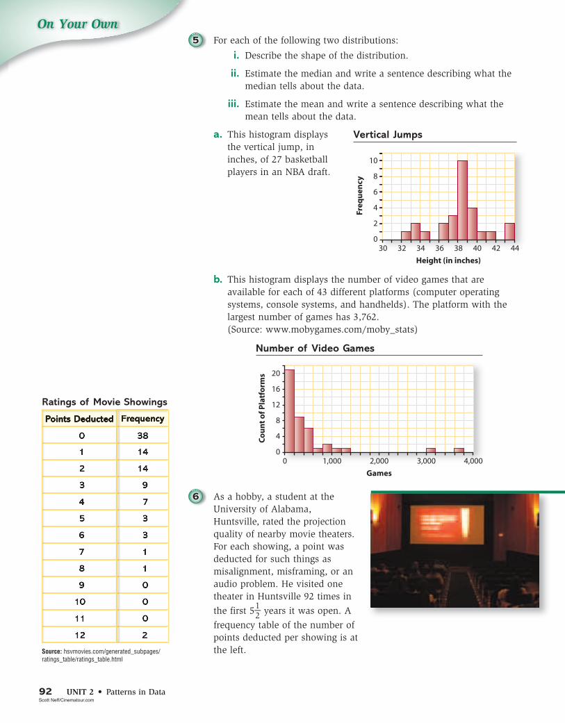
On Your Own5 For each of the following two distributions:
i. Describe the shape of the distribution.
ii. Estimate the median and write a sentence describing what the median tells about the data.
iii. Estimate the mean and write a sentence describing what the mean tells about the data.
a. This histogram displays the vertical jump, in inches, of 27 basketball players in an NBA draft.
b. This histogram displays the number of video games that are available for each of 43 different platforms (computer operating systems, console systems, and handhelds). The platform with the largest number of games has 3,762. (Source: www.mobygames.com/moby_stats)
Number of Video Games
6 As a hobby, a student at the University of Alabama, Huntsville, rated the projection quality of nearby movie theaters. For each showing, a point was deducted for such things as misalignment, misframing, or an audio problem. He visited one theater in Huntsville 92 times in
the first 5 1 _ 2 years it was open. A
frequency table of the number of points deducted per showing is at the left.Source: hsvmovies.com/generated_subpages/
ratings_table/ratings_table.html
Vertical Jumps
Ratings of Movie Showings
Points Deducted Frequency
0 38
1 14
2 14
3 9
4 7
5 3
6 3
7 1
8 1
9 0
10 0
11 0
12 2
Scott Neff/Cinematour.com
LESSON 1 • Exploring Distributions 93
On Your Owna. Without sketching it, describe the shape of this distribution.
b. Find the median number and the mean number of points deducted for this theater (which was a relatively good one and given an A rating). Is the mean typical of the experience you would expect to have in this theater? Explain your answer.
7 Suppose your teacher grades homework on a scale of 0 to 4. Your grades for the semester are given in the following table.
Homework Grades
Grade Frequency
0 5
1 7
2 9
3 10
4 16
a. What is your mean homework grade?
b. When computing your final grade in the course, would you rather have the teacher use your median grade? Explain.
c. Suppose that your teacher forgot to record one of your grades in the table above. After it is added to the table, your new mean is 2.50. What was that missing grade?
Connections
8 The two histograms below display the heights of two groups of tenth-graders.
a. Compare their shapes, centers, and spreads.
b. Remake the histogram on the right so that the bars have the same 2-inch width as the one on the left. Now compare the two histograms once again.
Heights of Group I Heights of Group II
94 UNIT 2 • Patterns in Data
On Your Own9 Another measure of center that you may have previously learned is
the mode. It is the value or category that occurs the most frequently. The mode is most useful with categorical data, data that is grouped into categories. The following table is from a study of the passwords people use. For example, only 2.3% of all passwords that people generate refer to a friend.
Entity Referred to Percentage of All Passwords
Self 66.5
Relative 7.0
Animal 4.7
Lover 3.4
Friend 2.3
Product 2.2
Location 1.4
Organization 1.2
Activity 0.9
Celebrity 0.1
Not specified 4.3
Random 5.7
Source: “Generating and remembering passwords,” Applied Cognitive Psychology 18. 2004.
a. What is the modal category?
b. Use this category in a sentence describing this distribution of types of passwords.
c. When someone says that a typical family has two children, is he or she probably referring to the mean, median, or mode? Explain your reasoning.
10 Suppose that x1 = 2, x2 = 10, x3 = 5, and x4 = 6. Compute:
a. Σ x b. Σ x2
c. Σ(x – 2) d. Σ 1
_ x
11 Matt received an 81 and an 83 on his first two English tests.
a. If a grade of B requires a mean of at least 80, what must he get on his next test to have a grade of B?
b. Suppose, on the other hand, that a grade of B requires a median of at least 80. What would Matt need on his next test to have a grade of B?
LESSON 1 • Exploring Distributions 95
On Your Own12 The scatterplot below shows the maximum and minimum record
temperatures for the 289 stations from Applications Task 4. What information is lost when you see only the histograms? What information is lost when you see only the scatterplot?
13 The term median is also used in geometry. A median of a triangle is the line segment joining a vertex to the midpoint of the opposite side. The diagram below shows one median of �ABC.
a. On a copy of the diagram, draw the other medians of this triangle.
b. On a sheet of posterboard, draw and cut out a right triangle and a triangle with an obtuse angle. Then draw the three medians of each triangle.
c. What appears to be true about the medians of a triangle?
d. Try balancing each posterboard triangle on the tip of a pencil. What do you notice?
e. Under what condition(s) will the median of a set of data be the balance point for a histogram of that data? Give an example.
Reflections
14 Distributions of real data tend to follow predictable patterns.
a. Most distributions of real data that you will see are skewed right rather than skewed left. Why? Give an example of a distribution not in this lesson that is skewed left.
b. If one distribution of real data has a larger mean than a second distribution of similar data, the first distribution tends also to have the larger spread. Find examples in this lesson where that is the case.
B
M
A C
96 UNIT 2 • Patterns in Data
On Your Own15 Sometimes a distribution has two distinct peaks. Such a distribution
is said to be bimodal. Bimodal distributions often result from the mixture of two populations, such as adults and children or men and women. Some distributions have no peaks. These distributions are called rectangular distributions.
a. Give an example of a bimodal distribution from your work in this lesson.
b. Describe a different situation that would yield data with a bimodal distribution.
c. Describe a situation that would yield data with a rectangular distribution.
d. The following photo shows a “living histogram” of the heights of students in a course on a college campus. How would you describe the shape of this distribution? Why might this be the case?
Source: The Hartford Courant, “Reaching New Heights,” November 23, 1996. Photo by K. Hanley.
16 Suppose that you want to estimate the total weekly allowance received by students in your class.
a. Should you start by estimating the mean or the median of the weekly allowances?
b. Make a reasonable estimate of the measure of center that you selected in Part a and use it to estimate the total weekly allowance received by students in your class.
17 A soccer goalie’s statistics for the last three matches are: saved 9 out of 10 shots on goal, saved 8 out of 9 shots on goal, and saved 3 out of 5 shots on goal.
a. Which of the following computations gives the mean percentage saved per match?
20 _ 24 = 83%
9 _ 10 + 8 _ 9 + 3 _ 5 _ 3 ≈ 79.6%
b. What does the other computation tell you?
Brian L. Joiner
LESSON 1 • Exploring Distributions 97
On Your Own
Extensions
18 To test the statement, “The mean of a set of data is the balance point of the distribution,” first get a yardstick and a set of equal weights, such as children’s cubical blocks or small packets of sugar.
a. Place two weights at 4 inches from one end and two weights at 31 inches. If you try to balance the yardstick with one finger, where should you place your finger?
b. What if you place one weight at 4 inches and two weights at 31 inches?
c. Experiment by placing more than three weights at various positions on the yardstick and finding the balance point.
d. What rule gives you the balance point?
19 In this lesson, you saw that for small data sets, dot plots provide a quick way to get a visual display of the data. Stemplots (or stem-and-leaf plots) provide another way of seeing patterns or unusual features in small data sets. The following stemplot shows the amount of money in cents that each student in one class of 25 students carried in coins. The stems are the hundreds and tens digits and the leaves are the ones digits.
a. How many students had less than 30¢ in coins?
b. Where would you record the amount for another student who had $1.37 in coins? Who had 12¢?
c. Stemplots make it easy to find the median. What was the median amount of change?
On Your Own20 Sometimes a back-to-back stemplot is useful when comparing two
distributions. The back-to-back stemplot below shows the ages of the 78 actors and 78 actresses who have won an Academy Award for best performance. The tens digit of the age is given in the middle column and the ones digit is given in the left column for actors and in the right column for actresses. The youngest actor to win an Academy Award was 29, and the youngest actress was 21. This stemplot has split stems where, for example, the ages from 20 through 24 are put on the first stem, and the ages from 25 through 29 are put on the second stem. (Source: www.oscars.com; www.imdb.com)
a. What would have happened if the stems hadn’t been split?
b. An article on salon.com in March 2000 reported a study that was published in the journal Psychological Reports. The article discusses only the difference in the mean ages. For example,
“The study, from the journal Psychological Reports, says the average age of a best actress winner in the past 25 years is 40.3. The average age for men is 45.6—a five-year difference.
“While the gap isn’t enormous, it is significant, and for actors it grew even larger when nominees, rather than just winners, were analyzed.”
Do you think the means are the best ways to compare the ages? If not, explain what measure of center would be better to use and why.
c. Write a paragraph giving your interpretation of the data. (The stemplot includes all winners, not just those from 1975 to 2000, so you will get different values for the means than those reported.)
On Your Own21 Read the following table about characteristics of public high schools
in the United States.
National Public High School Characteristics 2002–2003
Characteristic Mean Median
Enrollment size 754 493
Percent minority 31.0 17.9
Source: Pew Hispanic Center analysis of U.S. Department of Education, Common Core of Data (CCD), Public Elementary/Secondary School Universe Survey, 2002–03. The High Schools Hispanics Attend: Size and Other Key Characteristics, Pew Hispanic Center Report, November 1, 2005.
a. The mean high school size is larger than the median. What does this tell you about the distribution of the sizes of high schools?
b. There are about 17,505 public high schools in the United States. About how many high school students are there in these schools?
c. A footnote to the table above says, “The mean school characteristics are the simple average over all high schools. These are not enrollment weighted. A small high school receives the same weight as a large high school.” Suppose that there are four high schools in a district, with the following enrollments and percent minority.
High School Enrollment Percent Minority
Alpha 1,000 14
Beta 1,500 20
Gamma 2,000 15
Delta 3,500 35
i. What is the median percent minority if computed as described above? Interpret this percent in a sentence.
ii. What is the mean percent minority if computed as described above? Interpret this percent in a sentence.
iii. What percentage of students in the district are minority? Interpret this percent in a sentence.
d. From the information in the first table and in Part b, can you determine the percentage of U.S. public high school students who are minority? Explain.
22 Examine the Fastest-Growing Franchise data set in your data analysis software. That data set includes the rank, franchise name, type of service, and minimum startup costs for the 100 fastest growing franchises in the United States. (Source: www.entrepreneur.com)
Entrepreneur.com
100 UNIT 2 • Patterns in Data
On Your Owna. What kinds of businesses occur most often in that list? What are
some possible reasons for their popularity?
b. Use data analysis software to make an appropriate graph for displaying the distribution of minimum startup costs.
c. Describe the shape, center, and spread of the distribution. Use the “Estimate Center” custom tool.
d. Why might a measure of center of minimum startup costs be somewhat misleading to a person who wanted to start a franchise?
23 The relative frequency table below shows (roughly) the distribution of the proportion of U.S. households that own various numbers of televisions.
Household Televisions
Number of Televisions, x
Proportion ofHouseholds, p
1 0.2
2 0.3
3 0.3
4 0.1
5 0.1
a. What is the median of this distribution?
b. To compute the mean of this distribution, first imagine that there are only 10 households in the United States. Convert the relative frequency table to a frequency table and compute the mean.
c. Now imagine that there are only 20 households in the United States. Convert the relative frequency table to a frequency table and compute the mean.
d. Use the following formula to compute the mean directly from the relative frequency table.
− x = x1 · p1 + x2 · p2 + x3 · p3 + ... + xk · pk or − x = Σ xi · pi
e. Explain why this formula works.
24 Suppose your grade is based 50% on tests, 30% on homework, and 20% on the final exam. So far in the class you have 82% on the tests and 90% on homework.
a. Compute your overall percentage (called a weighted mean) if you get 65% on the final exam. If you get 100% on the final exam.
b. Your teacher wants to use a spreadsheet to calculate weighted means for the students in your class in order to assign grades. She uses column A for names, column B for test score, column C for homework percentage, column D for final exam, and column E for the weighted mean. Give the function she would use to calculate the values in column E.
LESSON 1 • Exploring Distributions 101
On Your Own25 Many people who have dropped out of the traditional school setting
earn an equivalent to a high school diploma. A GED (General Educational Development Credential) is given to a person who passes a test for a course to complete high school credits.
There were 501,000 people in the United States and its territories who received GEDs in 2000. The following table gives the breakdown by age of those taking the test.
Age 19 yrs and under 20–24 yrs 25–29 yrs 30–34 yrs 35 yrs
and over
% of GED Takers 42% 26% 11% 8% 14%
Taking the GED
Source: American Council on Education, General Educational Development Testing Service, Who took the GED? Statistical Report, August 2001.
a. Estimate the median age of someone who takes the test and explain how you arrived at your estimate.
b. Estimate the mean age of someone who takes the test and explain how you arrived at your estimate.
Review
26 Given that 4.2 · 5.5 = 23.1, use mental computation to evaluate each of the following.
a. – 4.2 · 5.5 b. – 4.2(–5.5) c. 23.1 _
-5.5
d. 4.2(–55) e. -23.1 _ 2.1
27 When an object is dropped from some high spot, the distance it falls is related to the time it has been falling by the formula d = 4.9t2, where t is time in seconds and d is distance in meters. Suppose a ball falls 250 meters down a mineshaft. To estimate the time, to the nearest second, it takes for the ball to fall this distance:
a. What possible calculator or computer tools could you use?
b. Could you answer this question without the aid of technology tools? Explain.
c. What solution method would you use? Why?
d. What is your estimate of the time it takes for the ball to fall the 250 meters?
e. How could you check your estimate?
Alamy Images
102 UNIT 2 • Patterns in Data
On Your Own28 Consider the square shown at the right.
a. Find the area of square ABCD.
b. Find the length of −−
BD .
c. Find the area of �BDC.
29 Evaluate each expression when x = 3.
a. 2x b. 5 · 2x c. (5 · 2)x
d. (–x)2 e. (–2)x + 1 f. –2x + 1
30 If the price of an item that costs $90 in 2005 increases to $108 by 2006, we say that the percent increase is 20%.
a. Assuming that the percent increase is the same from 2006 to 2007, what will be the cost of this same item in 2007?
b. If this percent increase continues, how long will it take for the price to double?
c. Use the words NOW and NEXT to write a rule that shows how to use the price of the item in one year to find the price of the item in the next year.
31 Trace each diagram onto your paper and then complete each shape so the indicated line is a symmetry line for the shape.
a. b. c.
32 The temperature in Phoenix, Arizona, on one October day is shown in the graph below.
a. What was the high temperature on this day and approximately when did it occur?
b. What was the low temperature on this day and approximately when did it occur?
c. During what part(s) of the day was the temperature less than 75°?
d. During what time period(s) was the temperature increasing? Decreasing? How is this reflected in the graph?
LESSON 2 • Measuring Variability 103
LESSON
2Measuring
Variability
The observation that no two snowflakes are alike is somewhat amazing. But in fact, there is variability in nearly everything. When a car part is manufactured, each part will differ slightly from the others. If many people measure the length of a room to the nearest millimeter, there will be many slightly different measurements. If you conduct the same experiment several times, you will get slightly different results. Because variability is everywhere, it is important to understand how variability can be measured and interpreted.
People vary too and height is one of the more obvious variables. The growth charts on page 105 come from a handbook for doctors. The plot on the left gives the mean height of boys at ages 0 through 14 and the plot on the right gives the mean height for girls at the same ages.
Michel Tcherevkoff/The Image Bank/Getty Images
104 UNIT 2 • Patterns in Data
In this lesson, you will learn how to find and interpret measures of position and measures of variability in a distribution.
IInvest invest iggationation 11 Measuring Position Measuring Position
If you are at the 40th percentile of height for your age, that means that 40% of people your age are your height or shorter than you are and 60% are taller. Percentiles, like the median, describe the position of a value in a distribution. Your work in this investigation will help you answer this question:
How do you find and interpret percentiles and quartiles?
The physical growth charts on page 105 display two sets of curved lines. The curved lines at the top give height percentiles, while the curved lines at the bottom give weight percentiles. The percentiles are the small numbers 5, 10, 25, 50, 75, 90, and 95 on the right ends of the curved lines.
Think About This Situation
Use the plots above to answer the following questions.
a Is it reasonable to call a 14-year-old boy “taller than average” if his height is 170 cm? Is it reasonable to call a 14-year-old boy “tall” if his height is 170 cm? What additional information about 14-year-old boys would you need to know to be able to say that he is “tall”?
b From what you know about people’s heights, is there as much variability in the heights of 2-year-old girls as in the heights of 14-year-old girls? Can you use this chart to answer this question?
c During which year do children grow most rapidly in height?
Heights from Birth to 14 Years of Age
Michael A. Keller/zefa/CORBIS
LESSON 2 • Measuring Variability 105
1 Suppose John is a 14-year-old boy who weighs 45 kg (100 pounds). John is at the 25th percentile of weight for his age. Twenty-five percent of 14-year-old boys weigh the same or less than John and 75% weigh more than John. If John’s height is 170 cm (almost 5'7"), he is at the 75th percentile of height for his age. Based on the information given about John, how would you describe John’s general appearance?
2 Growth charts contain an amazing amount of information. Use the growth charts to help you answer the following questions.
a. What is the approximate percentile for a 9-year-old girl who is 128 cm tall?
b. What is the 25th percentile of height for 4-year-old boys? The 50th percentile? The 75th percentile?
c. About how tall does a 12-year-old girl have to be so that she is as tall or taller than 75% of the girls her age? How tall does a 12-year-old boy have to be?
d. How tall would a 14-year-old boy have to be so that you would consider him “tall” for his age? How did you make this decision?
e. According to the chart, is there more variability in the heights of 2-year-old girls or 14-year-old girls?
f. How can you tell from the height and weight chart when children are growing the fastest? When is the increase in weight the greatest for girls? For boys?
Boys’ Physical Growth Percentiles, (2 to 20 Years)
Girls’ Physical Growth Percentiles, (2 to 20 Years)
106 UNIT 2 • Patterns in Data
3 Some percentiles have special names. The 25th percentile is called the lower or first quartile. The 75th percentile is called the upper or third quartile. Find the heights of 6-year-old girls on the growth charts.
a. Estimate and interpret the lower quartile.
b. Estimate and interpret the upper quartile.
c. What would the middle or second quartile be called? What is its percentile?
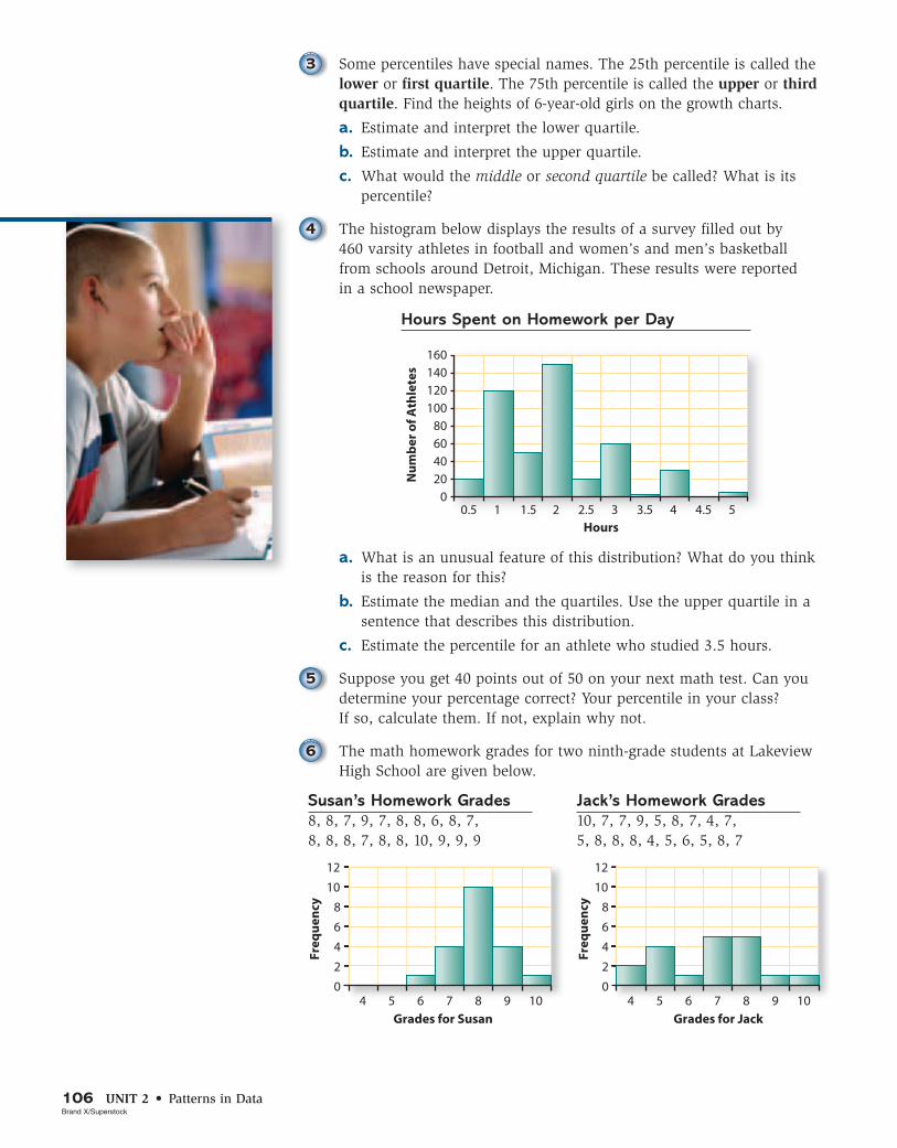
4 The histogram below displays the results of a survey filled out by 460 varsity athletes in football and women’s and men’s basketball from schools around Detroit, Michigan. These results were reported in a school newspaper.
a. What is an unusual feature of this distribution? What do you think is the reason for this?
b. Estimate the median and the quartiles. Use the upper quartile in a sentence that describes this distribution.
c. Estimate the percentile for an athlete who studied 3.5 hours.
5 Suppose you get 40 points out of 50 on your next math test. Can you determine your percentage correct? Your percentile in your class? If so, calculate them. If not, explain why not.
6 The math homework grades for two ninth-grade students at Lakeview High School are given below.
a. Which of the students has greater variability in his or her grades?
b. Put the 20 grades for Susan in an ordered list and find the median.
i. Find the quartiles by finding the medians of the lower and upper halves.
ii. Mark the positions of the median and quartiles on your ordered list of grades.
c. Jack has 19 grades. Put them in an ordered list and find the median.
i. To find the first and third quartiles when there are an odd number of values, one strategy is to leave out the median and then find the median of the lower values and the median of the upper values. Use this strategy to find the quartiles of Jack’s grades.
ii. Mark the positions of the median and quartiles on your ordered list of Jack’s grades.
d. For which student are the lower and upper quartiles farther apart? What does this tell you about the variability of the grades of the two students?
Check Your UnderstandingCheck Your UnderstandingThe table on page 108 gives the price per ounce of each of the 16 sunscreens rated as giving excellent protection by Consumer Reports.
a. Find the median and quartiles of the distribution. Explain what the median and quartiles tell you about the distribution.
b. Which sunscreen is at about the 70th percentile in price per ounce?
In this investigation, you learned how percentiles and quartiles are used to locate a value in a distribution.
a What information does a percentile tell you? Give an example of when you would want to be at the 10th percentile rather than at the 90th. At the 90th percentile rather than at the 10th percentile.
b What does the lower quartile tell you? The upper quartile? The middle quartile?
Be prepared to share your ideas and reasoning with the class.
Jeff Greenberg/Alamy Images
108 UNIT 2 • Patterns in Data
Best Sunscreens
Brand Price Per Ounce
Banana Boat Baby Block Sunblock $1.13
Banana Boat Kids Sunblock 0.90
Banana Boat Sport Sunblock 0.92
Banana Boat Sport Sunscreen 4.91
Banana Boat Ultra Sunblock 0.91
Coppertone Kids Sunblock With Parsol 1789 1.25
Coppertone Sport Sunblock 4.79
Coppertone Sport Ultra Sweatproof Dry 2.02
Coppertone Water Babies Sunblock 1.17
Hawaiian Tropic 15 Plus Sunblock 0.81
Hawaiian Tropic 30 Plus Sunblock 0.90
Neutrogena UVA/UVB Sunblock 2.17
Olay Complete UV Protective Moisture 1.59
Ombrelle Sunscreen 2.17
Rite Aid Sunblock 0.50
Walgreens Ultra Sunblock 0.68
Source: www.consumerreports.org
IInvest invest iggationation 22 Measuring and Displaying Measuring and Displaying Variability: The Five-Number Variability: The Five-Number Summary and Box PlotsSummary and Box Plots
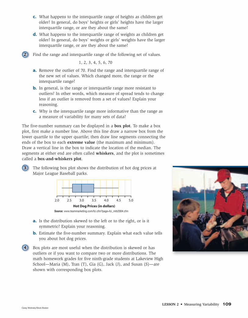
The quartiles together with the median give a good indication of the center and variability (spread) of a set of data. A more complete picture of the distribution is given by the five-number summary, the minimum value, the lower quartile (Q1), the median (Q2), the upper quartile (Q3), and the maximum value. The distance between the first and third quartiles is called the interquartile range (IQR = Q3 – Q1).
As you work on the following problems, look for answers to these questions:
How can you use the interquartile range to measure variability?
How can you use plots of the five-number summary to compare distributions?
1 Refer back to the growth charts on page 105.
a. Estimate the five-number summary for 13-year-old girls’ heights. For 13-year-old boys’ heights.
b. Estimate the interquartile range of the heights of 13-year-old girls. Of 13-year-old boys. What do these IQRs tell you about heights of 13-year-old girls and boys?
LESSON 2 • Measuring Variability 109
c. What happens to the interquartile range of heights as children get older? In general, do boys’ heights or girls’ heights have the larger interquartile range, or are they about the same?
d. What happens to the interquartile range of weights as children get older? In general, do boys’ weights or girls’ weights have the larger interquartile range, or are they about the same?
2 Find the range and interquartile range of the following set of values.
1, 2, 3, 4, 5, 6, 70
a. Remove the outlier of 70. Find the range and interquartile range of the new set of values. Which changed more, the range or the interquartile range?
b. In general, is the range or interquartile range more resistant to outliers? In other words, which measure of spread tends to change less if an outlier is removed from a set of values? Explain your reasoning.
c. Why is the interquartile range more informative than the range as a measure of variability for many sets of data?
The five-number summary can be displayed in a box plot. To make a box plot, first make a number line. Above this line draw a narrow box from the lower quartile to the upper quartile; then draw line segments connecting the ends of the box to each extreme value (the maximum and minimum). Draw a vertical line in the box to indicate the location of the median. The segments at either end are often called whiskers, and the plot is sometimes called a box-and-whiskers plot.
3 The following box plot shows the distribution of hot dog prices at Major League Baseball parks.
a. Is the distribution skewed to the left or to the right, or is it symmetric? Explain your reasoning.
b. Estimate the five-number summary. Explain what each value tells you about hot dog prices.
4 Box plots are most useful when the distribution is skewed or has outliers or if you want to compare two or more distributions. The math homework grades for five ninth-grade students at Lakeview High School—Maria (M), Tran (T), Gia (G), Jack (J), and Susan (S)—are shown with corresponding box plots.
a. On a copy of the plot, make a box plot for Susan’s homework grades.
b. Why do the plots for Maria and Tran have no whisker at the upper end?
c. Why is the lower whisker on Gia’s box plot so long? Does this mean there are more grades for Gia in that whisker than in the shorter whisker?
d. Which distribution is the most symmetric? Which distributions are skewed to the left?
e. Use the box plots to determine which of the five students has the lowest median grade.
f. Use the box plots to determine which students have the smallest and largest interquartile ranges.
i. Does the student with the smallest interquartile range also have the smallest range?
ii. Does the student with the largest interquartile range also have the largest range?
g. Based on the box plots, which of the five students seems to have the best record?
5 You can produce box plots on your calculator by following a procedure similar to that for making histograms. After entering the data in a list and specifying the viewing window, select the box plot as the type of plot desired.
a. Use your calculator to make a box plot of Susan’s grades from Problem 4.
b. Use the Trace feature to find the five-number summary for Susan’s grades. Compare the results with your computations in the previous problem.
Math Homework Grades
LESSON 2 • Measuring Variability 111
Summarize the Mathematics
In this investigation, you learned how to use the five-number summary and box plots to describe and compare distributions.
a What is the five-number summary and what does it tell you?
b Why does the interquartile range tend to be a more useful measure of variability than the range?
c How does a box plot convey the shape of a distribution?
d What does a box plot tell you that a histogram does not? What does a histogram tell you that a box plot does not?
Be prepared to share your ideas and reasoning with the class.
6 Resting pulse rates have a lot of variability from person to person. In fact, rates between 60 and 100 are considered normal. For a highly conditioned athlete, “normal” can be as low as 40 beats per minute. Pulse rates also can vary quite a bit from time to time for the same person. (Source: www.nlm.nih.gov/medlineplus/ency/article/003399.htm)
a. Take your pulse for 20 seconds, triple it, and record your pulse rate (in number of beats per minute).
b. If you are able, do some mild exercise for 3 or 4 minutes as your teacher times you. Then take your pulse for 20 seconds, triple it, and record this exercising pulse rate (in number of beats per minute). Collect the results from all students in your class, keeping the data paired (resting, exercising) for each student.
c. Find the five-number summary of resting pulse rates for your class. Repeat this for the exercising pulse rates.
d. Above the same scale, draw box plots of the resting and exercising pulse rates for your class.
e. Compare the shapes, centers, and variability of the two distributions.
f. What information is lost when you make two box plots for the resting and exercising pulse rates for the same people?
g. Make a scatterplot that displays each person’s two pulse rates as a single point. Can you see anything interesting that you could not see from the box plots?
h. Make a box plot of the differences in pulse rates, (exercising - resting). Do you see anything you didn’t see before?
CORBIS
112 UNIT 2 • Patterns in Data
Check Your UnderstandingCheck Your UnderstandingPeople whose work exposes them to lead might inadvertently bring lead dust home on their clothes and skin. If their child breathes the dust, it can increase the level of lead in the child’s blood. Lead poisoning in a child can lead to learning disabilities, decreased growth, hyperactivity, and impaired hearing. A study compared the level of lead in the blood of two groups of children—those who were exposed to lead dust from a parent’s workplace and those who were not exposed in this way.
The 33 children of workers at a battery factory were the “exposed” group. For each “exposed” child, a “matching” child was found of the same age and living in the same area, but whose parents did not work around lead. These 33 children were the “control” group. Each child had his or her blood lead level measured (in micrograms per deciliter).
Blood Lead Level (in micrograms per deciliter)
Exposed Control Exposed Control
10 13 34 25
13 16 35 12
14 13 35 19
15 24 36 11
16 16 37 19
17 10 38 16
18 24 39 14
20 16 39 22
21 19 41 18
22 21 43 11
23 10 44 19
23 18 45 9
24 18 48 18
25 11 49 7
27 13 62 15
31 16 73 13
34 18
Source: “Lead Absorption in children of employees in a lead-related industry,” American Journal of Epidemiology 155. 1982.
a. On the same scale, produce box plots of the lead levels for each group of children. Describe the shape of each distribution.
b. Find and interpret the median and the interquartile range for each distribution.
When describing distributions in Lesson 1, you identified any outliers—values that lie far away from the bulk of the values in a distribution. You should pay special attention to outliers when analyzing data.
As you work on this investigation, look for answers to this question:
What should you do when you identify one or more outliers in a set of data?
1 Use the algorithm below to determine if there are any outliers in the resting pulse rates of your class from Problem 6 (page 111) of the previous investigation.
Step 1: Find the quartiles and then subtract them to get the interquartile range, IQR.
Step 2: Multiply the IQR by 1.5.
Step 3: Add the value in Step 2 to the third quartile.
Step 4: Check if any pulse rates are larger than the value in Step 3. If so, these are outliers.
Step 5: Subtract the value in Step 2 from the first quartile.
Step 6: Check if any pulse rates are smaller than the value in Step 5. If so, these are outliers.
2 Reproduced below is the dot plot of lengths of female bears from Lesson 1.
a. Do there appear to be any outliers in the data?
b. The five-number summary for the lengths of female bears is:
minimum = 36, Q1 = 56.5, median = 59, Q3 = 61.5, maximum = 70.
i. Use the steps above to identify any outliers on the high end.
ii. Are there any outliers on the low end?
c. The box plot below (often referred to as a modified box plot) shows how the outliers in the distribution of the lengths of female bears may be indicated by a dot. The whiskers end at the last length that is not an outlier. What lengths of female bears are outliers?
114 UNIT 2 • Patterns in Data
3 In the Check Your Understanding of Investigation 1 (page 107), you found that the quartiles for the price per ounce of sunscreens with excellent protection were Q1 = $0.90 and Q3 = $2.095.
a. Identify any outliers in the distribution of price per ounce of these sunscreens.
b. Make a modified box plot of the data, showing any outliers.
c. Here is the box plot of the prices per ounce for the sunscreens that offered less than excellent protection. Compare this distribution with the distribution from Part b.
i. Do you tend to get better protection when you pay more?
ii. Do you always get better protection when you pay more?
4 Jolaina found outliers by using a box plot. She measured the length of the box and marked off 1 box length to the right of the original box and 1 box length to the left of the original box. If any of the values extended beyond these new boxes, these points were considered outliers.
a. Jolaina had a good idea but made one mistake. What was it? How can Jolaina correct her mistake?
b. Using the corrected version of Jolaina’s method, determine if there should be any outliers displayed by these box plots.
i.
ii.
LESSON 2 • Measuring Variability 115
c. Jolaina then made symbolic rules for finding possible outliers in a data set. She says that outliers are values that are
larger than Q3 + 1.5 · (Q3 – Q1) = Q3 + 1.5 · IQR
or smaller than Q1 – 1.5 · (Q3 – Q1) = Q1 – 1.5 · IQR.
Are Jolaina’s formulas correct? If so, use them to determine if there are any outliers in the data on lengths of female bears in Problem 2. If not, correct the formulas and then use them to find if there are any outliers in these data.
Whether to leave an outlier in the analysis depends on close inspection of the reason it occurred. If it was the result of an error in data collection or if it is fundamentally unlike the other values, it should be removed from the data set. If it is simply an unusually large or small value, you have two choices:
• Report measures of center and measures of variability that are resistant to outliers, such as the median, quartiles, and interquartile range.
• Do the analysis twice, with and without the outlier, and report both.
5 Decide what you would do about possible outliers in each of these situations.
a. The District of Columbia has a far higher number of physicians per 100,000 residents than does any state. That rate, shown on the box plot below, is 683 physicians per 100,000 residents. Why might you not want to include the District of Columbia in this data set of the 50 states?
b. The box plots below show the number of grams of fat in chicken (C) and beef (B) sandwiches. Check the table of data on page 82 and identify the sandwich that is the outlier.
i. Do you know of any reason to exclude it from the analysis?
ii. Compute the mean and median of the grams of fat in the beef sandwiches only. Now compute them excluding the outlier. How much does the outlier affect them?
116 UNIT 2 • Patterns in Data
Summarize the Mathematics
Check Your UnderstandingCheck Your UnderstandingRefer back to the data on lead levels in the two groups of children on page 112. Use the five-number summary you calculated to complete the following tasks.
a. Identify any outliers in these two distributions. What should you do about them?
b. Make a box plot that shows any outliers.
IInvest invest iggationation 44 Measuring Variability: Measuring Variability: The Standard DeviationThe Standard Deviation
In the previous investigation, you learned how to use the five-number summary and interquartile range (IQR) to describe the variability in a set of data. The IQR is based on the fact that half of the values fall between the upper and lower quartiles. Because it ignores the tails of the distribution, the IQR is very useful if the distribution is skewed or has outliers.
For data that are approximately normal—symmetric, mound-shaped, without outliers—a different measure of spread called the standard deviation is typically used. As you work on the problems of this investigation, keep track of answers to this question:
How can you determine and interpret the standard deviation of an approximately normal distribution?
The standard deviation s is a distance that is used to describe the variability in a distribution. In the case of an approximately normal distribution, if you start at the mean and go the distance of one standard deviation to the left and one standard deviation to the right, you will enclose the middle 68% (about two-thirds) of the values. That is, in a distribution that is approximately normal, about two-thirds of the values lie between − x - s and − x + s.
Most calculators and statistical software show outliers on modified box plots with a dot.
a Describe in words the rule for identifying outliers. Describe it geometrically. Finally, write the formula.
b How do you decide what to do when you find an outlier in a set of data?
Be prepared to share your ideas and reasoning with the class.
LESSON 2 • Measuring Variability 117
1 On each of the following distributions, the arrows enclose the middle two-thirds of the values. For each distribution:
i. Estimate the mean − x .
ii. Estimate the distance from the mean to one of the two arrows. This distance is (roughly) the standard deviation.
a. Heights of a large sample of young adult women in the United States
Heights of Young Adult Women
b. Heights of a large sample of young adult men in the United States
Heights of Young Adult Men
118 UNIT 2 • Patterns in Data
c. Achievement test scores for all ninth graders in one high school
Achievement Test Scores
d. Use the “Estimate Center and Spread” custom tool to check your estimates of the mean and standard deviation in Parts a–c.
2 The sophomores who took the PSAT/NMSQT test in 2004 had a mean score of 44.2 on the mathematics section, with a standard deviation of 11.1. The distribution of scores was approximately normal. The highest possible score was 80 and the lowest was 20. (Source: www.collegeboard.com/researchdocs/2004_psat.html)
a. Sketch the shape of the histogram of the distribution of scores, including a scale on the x-axis.
b. A sophomore who scored 44 on this exam would be at about what percentile?
c. A sophomore who scored 33 on this exam would be at about what percentile?
d. A sophomore who scored 55 on this exam would be at about what percentile?
Another measure of where a value x lies in a distribution is its deviation from the mean.
deviation from mean = value – mean = x – − x
3 In 2003, LeBron James was a first-round draft pick and NBA Rookie of the Year. The following table gives the number of points he scored in the seven games he played in the first month of his freshman season at St. Vincent-St. Mary High School in Akron, Ohio. That season he led his high school team to a perfect 27-0 record and the Division III state title.
LESSON 2 • Measuring Variability 119
a. Find the mean number of points scored per game.
i. For each game, find the deviation from the mean.
ii. For which game(s) is James’s total points farthest from the mean?
iii. For which game(s) is James’s total points closest to the mean?
b. For which game would you say that he has the most “typical” deviation (not unusually far or unusually close to the mean)?
c. In James’s rookie season with the Cleveland Cavaliers, he averaged 20.9 points per game.
i. The highest number of points he scored in a game that season was 20.1 points above his season average. How many points did he score in that game?
ii. In his first game in his rookie season for the Cavaliers, he scored 25 points. What was the deviation from his season average for that game?
iii. In one game that season, James had a deviation from his season average of -12.9 points. How many points did he score in that game?
4 The fact that the mean is the balance point of the distribution is related to a fact about the sum of all of the deviations from the mean.
a. Find the sum of the deviations in Problem 3.
b. Make a set of values with at least five different values. Find the mean and the deviations from the mean. Then find the sum of the deviations from the mean.
c. Check with classmates to see if they found answers similar to yours in Parts a and b. Then make a conjecture about the sum of the deviations from the mean for any set of values.
d. Complete the rule below. (Recall that the symbol Σ means to add up all of the following values. In this case, you are adding up all of the deviations from the mean.)
Σ(x - − x ) =
e. Using the data sets from Parts a and b, do you think there is a rule about the sum of the deviations from the median? Explain your reasoning.
While the standard deviation is most useful when describing distributions that are approximately normal, it also is used for distributions of other shapes. In these cases, the standard deviation is given by a formula. The formula is based on the deviations of the values from their mean.
5 Working in groups of four to six, measure your handspans. Spread your right hand as wide as possible, place it on a ruler, and measure the distance from the end of your thumb across to the end of your little finger. Measure to the nearest tenth of a centimeter.
a. Find the mean of the handspans of the students in your group. Find the deviation from the mean of each student’s handspan. Check that the sum of the deviations is 0.
b. Roughly, what is a typical distance from the mean for your group?
c. Compute the standard deviation of your group’s handspans by using the steps below. Fill in a copy of the chart as you work, rounding all computations to the nearest tenth of a centimeter.
• In the first column, fill in your group’s handspans.
• Write the mean of your group’s handspans on each line in the second column.
• Write the deviations from the mean in the third column.
• Write the squares of these deviations in the last column.
• Find the sum of the squared deviations.
• Divide by the number n in your group minus one.
• Take the square root. This final number is the standard deviation.
Span Mean Deviation (Span - Mean)
Squared Deviation (Span - Mean)2
Add the squared deviations:
Divide the sum by n - 1:
Take the square root:
d. Have each group write its mean and standard deviation on a piece of paper. Give them to one person who will mix up the papers and write the paired means and standard deviations where everyone in your class can see them. Try to match each pair of statistics with the correct group.
e. Kelsi wrote this sentence: The handspans of our group average 21.2 cm with a handspan typically being about 2.6 cm from average. Write a similar sentence describing your group’s handspans.
Tim Fuller
LESSON 2 • Measuring Variability 121
6 Now consider how standard deviation can be used in the comparison of performance data. Here are Susan’s and Jack’s homework grades.
a. Find the set of deviations from the mean for Susan and the set of deviations for Jack. Who tends to deviate the most from his or her mean?
b. Roughly, what is a typical distance from the mean for Susan? For Jack?
c. Compute the standard deviation of each set of grades. Were these close to your estimates of a typical distance from the mean in Part b?
d. Which student had the larger standard deviation? Explain why that makes sense.
e. Write a sentence about Susan’s homework grades that is similar to Kelsi’s statement in Problem 5 Part e. Write a similar sentence about Jack’s homework grades.
7 Think about the process of computing the standard deviation.
a. What is accomplished by squaring the deviations before adding them?
b. What is accomplished by dividing by the number of deviations (minus 1)?
c. What is accomplished by taking the square root?
d. What unit of measurement should be attached to the standard deviation of a distribution?
8 Look back at your calculations of the standard deviation in Problem 5. Which of the following is the formula for the standard deviation, s?
s =
√ ����
Σ(x - − x 2)
_ n - 1 s =
√ ����
Σ(x - − x )2
_ n - 1 s =
√ ����
(Σ x - − x )2
_ n - 1 s =
√ �����
Σ ( x - − x _ n - 1
) 2
9 Without calculating, match the sets of values below, one from column A and one from column B, that have the same standard deviations.
Column A Column B
a. 1, 2, 3, 4, 5 f. 10, 10, 10, 10, 10
b. 2, 4, 6, 8, 10 g. 4, 6, 8, 10, 12
c. 2, 2, 2, 2, 2 h. 4, 5, 6, 7, 8
d. 2, 6, 6, 6, 10 i. 16, 16, 20, 24, 24
e. 2, 2, 6, 10, 10 j. 4, 8, 8, 8, 12
10 Consider the heights of the people in the following two groups.
• the members of the Chicago Bulls basketball team, and
• the adults living in Chicago.
a. Which group would you expect to have the larger mean height? Explain your reasoning.
122 UNIT 2 • Patterns in Data
Summarize the Mathematics
b. Which group would you expect to have the larger standard deviation? Explain.
11 Graphing calculators and statistical software will automatically calculate the standard deviation.
a. Enter the handspans for your entire class into a list and use your calculator or software to find the mean − x and the standard deviation s. Write a sentence using the mean and standard deviation to describe the distribution of handspans.
b. Which handspan is closest to one standard deviation from the mean?
c. If the distribution is approximately normal, determine how many handspans of your class should be in the interval − x - s to − x + s. How many handspans actually are in this interval?
d. Is the standard deviation of the class larger or smaller than the standard deviation of your group? What characteristic of the class handspans compared to the group handspans could explain the difference?
12 Find the standard deviation of the following set of values.
1, 2, 3, 4, 5, 6, 70
a. Remove the outlier of 70. Then find the standard deviation of the new set of values. Does the standard deviation appear to be resistant to outliers?
b. Test your conjecture in Part a by working with others to create three different sets of values with one or more outliers. In each case, find the standard deviation. Then remove the outlier(s) and find the standard deviation of the new set of values. Summarize your findings, telling exactly what it is about the formula for the standard deviation that causes the results.
In this investigation, you learned how to find and interpret the standard deviation.
a What does the standard deviation tell you about a distribution that is approximately normal? Compare this to what the interquartile range tells you.
b Describe in words how to find the standard deviation.
c Which measures of variation (range, interquartile range, standard deviation) are resistant to outliers? Explain.
d If a deviation from the mean is positive, what do you know about the value? If the deviation is negative? If the deviation is zero? What do you know about the sum of all of the deviations from the mean?
Be prepared to share your thinking and description with the class.
LESSON 2 • Measuring Variability 123
Check Your UnderstandingCheck Your UnderstandingUse the following data on U.S. weather to check your understanding of the standard deviation.
a. The histogram below shows the percentage of time that sunshine reaches the surface of the Earth in January at 174 different major weather-observing stations in all 50 states, Puerto Rico, and the Pacific Islands. The two stations with the highest percentages are Tucson and Yuma, Arizona. The station with the lowest percentage is Quillayute, Washington.
i. Estimate the mean and standard deviation of these percentages, including the units of measurement.
ii. About how many standard deviations from the mean are Tucson and Yuma?
iii. Use the “Estimate Center and Spread” custom tool to check your estimates of the mean and standard deviation.
January Sunshine
b. The normal monthly precipitation (rain and snow) in inches for Concord, New Hampshire, and for Portland, Oregon, is given in the table below.
i. Using the same scale, make histograms of the precipitation for each of the cities. By examining the plots, how do you think the mean monthly amount of precipitation for the cities will compare? The standard deviation?
ii. Calculate the mean and standard deviation of the normal monthly precipitation for each city. Write a comparison of the rainfall in the two cities, using the mean and the standard deviation.
Jan Feb Mar Apr May June July Aug Sept Oct Nov Dec
Like all events in life, data do not always come in the most convenient form. For example, sometimes you may want to report measurements in feet rather than meters or percentage correct rather than points scored on a test. Transforming data in this way has predictable effects on the shape, center, and spread of the distribution. As you work on the following problems, look for answers to this question:
What is the effect on a distribution of adding or subtracting a constant to each value and of multiplying
or dividing each value by a positive constant?
1 Select 10 members of your class to measure the length of the same desk or table to the nearest tenth of a centimeter. Each student should do the measurement independently and not look at the measurements recorded by other students.
a. As a class, make a dot plot of the measurements.
b. Calculate the mean − x and standard deviation s of the measurements. Mark the mean on the dot plot. Then mark − x + s and − x - s.
c. What does the standard deviation tell you about the precision of the students’ measurements?
2 Suppose that a group of 10 students would have gotten exactly the same measurements as your class did in Problem 1, except the end of their ruler was damaged. Consequently, their measurements are exactly 0.2 cm longer than yours.
a. What do you think they got for their mean and standard deviation?
b. Using lists on your calculator, transform your list of measurements into theirs. If M stands for the original measurement and D stands for the corresponding measurement made with the damaged ruler, write a rule that describes how you made this transformation.
c. Make a dot plot of the transformed measurements and compare its shape to the plot made in Problem 1.
d. Compute the mean and standard deviation of the transformed measurements.
e. How is the mean of the transformed measurements related to the original mean?
f. How is the standard deviation of the transformed measurements related to the original standard deviation?
3 Now examine the effect of transforming the measurements in Problem 1 from centimeters to inches.
a. Let C stand for a measurement in centimeters and I stand for a measurement in inches. Write a rule that you can use to transform the measurements in Problem 1 from centimeters to inches. (Note: There are approximately 2.54 centimeters in an inch.)
LESSON 2 • Measuring Variability 125
b. Make a dot plot of the transformed data and compare its shape to the plot made in Problem 1.
c. Compute the mean and the standard deviation of the transformed measurements.
d. Write a rule that relates the mean of the transformed measurements − x T to the original mean − x .
e. Write a rule that relates the standard deviation of the transformed measurements sT to the original standard deviation s.
f. Suppose that one student mistakenly multiplied by 2.54 when transforming the measurements. What do you think this student got for the mean and standard deviation of the transformed measurements? Check your prediction.
4 Ms. Brenner polled her mathematics classes to find out the hourly wage of students who had baby-sitting jobs. The results are shown in the following table and histogram.
a. Use the histogram to estimate the average hourly wage of these students. Estimate the standard deviation. Using the values in the table, compute the mean and standard deviation. How close were your estimates?
b. Write a sentence or two describing the distribution. Use the mean and standard deviation in your description.
126 UNIT 2 • Patterns in Data
c. Keri decided that it was too much work to enter the decimal point in the wages each time in her calculator list, so she entered each wage without it.
i. Will the shape of her histogram be different from the given histogram? Explain.
ii. Predict the mean and standard deviation for Keri’s wage data. Check your predictions.
d. Suppose each student gets a 4% raise. How will the shape of the histogram of the new hourly wages be different from the original one? Predict the mean and standard deviation for the new wages of the students. Check your predictions.
e. Suppose that instead of a 4% raise, each student gets a raise of 25¢ per hour. Will the shape of the histogram of the new hourly wages be different from the original one? How will the mean and standard deviation change?
f. Let WO represent the original hourly wage and WN represent the new hourly wage. Write a rule that can be used to compute the new wage from the original wage
i. for the case of a 4% raise, and
ii. for the case of a 25¢ per hour raise.
5 Now try to generalize your discoveries in Problems 2–4. Consider a set of data that has mean − x and standard deviation s.
a. Suppose you add the same positive number d to each value. Use the histogram below to explain why the shape of the distribution does not change, the mean of the transformed data will be − x + d, and the standard deviation will remain s.
LESSON 2 • Measuring Variability 127
b. Write a summary statement about shape, center, and spread similar to that in Part a for the case of subtracting the same positive number from each value. Illustrate this by showing the effect of such a transformation on a histogram.
c. Write a summary statement similar to that in Part a for the case of multiplying each value by a positive number. Explain how the effect of such a transformation is illustrated by the histogram below.
d. Write a similar statement for the case of dividing each value by a positive number. Illustrate this by showing the effect of such a transformation by drawing on a histogram.
e. Does the name “slide” or “stretch” best describe the transformation in Part a? In Part b? In Part c? In Part d?
6 One of the most common transformations is changing points scored to percentages such as on tests. The following display gives the points scored by a class of 32 students on a test with 75 possible points.
Test Scores
a. Kim earned a score of 54 and Jim earned a score of 65. Change their scores to percentages (to the nearest tenth of a percent) of the possible points.
b. Describe the transformation you used by writing a formula. Be sure to define your variables.
c. Make a new table of summary statistics, using the percentages rather than the number of points scored.
Summary Statistics
Mean 59.34
Median 62
Stand Dev 11.29
IQR 16
128 UNIT 2 • Patterns in Data
Summarize the Mathematics
Check Your UnderstandingCheck Your UnderstandingIn the Carlyle family, the mean age is 26 with a standard deviation of 22.3 years.
a. What will be their mean age in 5 years? Their standard deviation in 5 years?
b. What is their mean age now in months? Their standard deviation in months?
c. The ages of the people in the Carlyle family are 1, 5, 9, 28, 31, 50, and 58.
i. Compute the mean and standard deviation of their ages in 5 years. Was your prediction in Part a correct?
ii. Compute the mean and standard deviation of their current ages in months. Was your prediction in Part b correct?
In this investigation, you discovered that transforming each value of a set of data affects the shape of the distribution, its center, and its spread in predictable ways.
a What is the effect on the mean of transforming a set of data by adding or subtracting the same number to each value? What is the effect on the standard deviation? On the shape of the distribution? Explain why this is the case.
b What is the effect on the mean of transforming a set of data by multiplying or dividing each value by the same positive number? What is the effect on the standard deviation? On the shape of the distribution? Explain why this is the case.
Be prepared to share your ideas and reasoning with the class.
H.G. Rossi/zefa/CORBIS
On Your Own
LESSON 2 • Measuring Variability 129
Applications
1 The table below gives the percentiles of recent SAT mathematics scores for national college-bound seniors. The highest possible score is 800 and the lowest possible score is 200. Only scores that are multiples of 50 are shown in the table, but all multiples of 10 from 200 to 800 are possible.
College-Bound Seniors
SAT Math Score Percentile SAT Math Score Percentile
750 98 450 28
700 93 400 15
650 85 350 7
600 74 300 3
550 60 250 1
500 43 200 0
Source: 2005 College-Bound Seniors Total Group Profile Report, The College Board
a. What percentage of seniors get a score of 650 or lower on the mathematics section of the SAT?
b. What is the lowest score a senior could get on the mathematics section of the SAT and still be in the top 40% of those who take the test?
c. Estimate the score a senior would have to get to be in the top half of the students who take this test.
d. Estimate the 25th and 75th percentiles. Use these quartiles in a sentence that describes the distribution.
2 In a physical fitness test, the median time it took a large group of students to run a mile was 10.2 minutes. The distribution had first and third quartiles of 7.1 minutes and 13.7 minutes. Faster runners (shorter times) were assigned higher percentiles.
a. Sheila’s time was at the 25th percentile. How long did it take Sheila to run the mile?
b. Mark was told that his time was at the 16th percentile. Write a sentence that tells Mark what this means.
Mary Langenfeld Photo
130 UNIT 2 • Patterns in Data
On Your Own3 The histogram below gives the marriage rate per 1,000 people for
49 U.S. states in 2004. (Nevada, with a rate of 62 marriages per 1,000 people, was left off so the plot would fit on the page.)
Marriage Rate
a. Hawaii had about 1,262,840 residents and 28,793 marriages. What is the marriage rate per 1,000 residents for Hawaii? Where is Hawaii located on the histogram?
b. New York had about 130,744 marriages and 19,227,088 residents. What is the marriage rate per 1,000 residents for New York? Where is it located on the histogram?
c. Why do you think that Nevada’s rate of 62 marriages per 1,000 people can’t be interpreted as “62 out of every 1,000 residents of Nevada were married in 2004”?
d. The quartiles, including the median, divide a distribution, as closely as possible, into four equal parts. Estimate the median and lower and upper quartiles of the distribution and make a box plot of the distribution. Include Nevada in the distribution.
e. Now estimate the percentile for the following states.
i. Tennessee, with a marriage rate of 11.4
ii. Minnesota, with a marriage rate of 6.0
4 Suppose that you want to estimate the thickness of a piece of paper in your textbook. Compress more than a hundred pages from the middle of the book and measure the thickness to the nearest half of a millimeter. Divide by the number of sheets of paper. Round the result to four decimal places.
a. How can you determine the number of sheets of paper by using the page numbers?
b. Make ten more estimates, taking a different number of pages each time. Record your measurements on a dot plot.
c. What is the median of your measurements? What is the interquartile range?
d. Write a sentence or two reporting what you would give as an estimate of the thickness of the piece of paper.
LESSON 2 • Measuring Variability 131
On Your Own5 The table below gives the price and size of 20 different boxed
assortments of chocolate as reported in Consumer Reports.
Boxed Assortments of Chocolate
Brand Price (in $) Size (in oz) Cost per oz
John & Kira’s Jubilee Wood Gift Box 65 18 3.69
Martine’s Gift Box Assorted with Creams 63 16 3.93
Norman Love Confections 37 8 4.62
Candinas 40 16 2.50
La Maison du Chocolat Coffret Maison with assorted chocolates 76 21 3.59
Moonstruck Classic Truffle Collections 70 20 3.50
Jacques Torres Jacques’ Assortment 43 16 2.69
Fran’s Assorted Truffles Gift Box 58 16 3.63
Godiva Gold Ballotin 35 16
Leonidas Pralines General Assortment 16 1.75
See’s Famous Old Time Assorted 13 16
Ethel M Rich Deluxe Assortment 26 16 1.62
Lake Champlain Selection Fine Assorted 40 18 2.22
Rocky Mountain Chocolate Factory Gift Assortment Regular 19 14.5 1.31
Hershey’s Pot of Gold Premium Assortment 8 14.1 0.57
a. The cost per ounce is missing for Godiva and for See’s. The price is missing for Leonidas Pralines. Compute those values.
b. The histogram to the right shows the cost-per-ounce data. Examine the histogram and make a sketch of what you think the box plot of the same data will look like. Then, make the box plot and check the accuracy of your sketch.
c. Identify any outliers in the cost-per-ounce data.
d. What information about boxed assortments of chocolate can you learn from the histogram that you cannot from the box plot? What information about boxed assortments of chocolate can you learn from the box plot that you cannot from the histogram?
e. Why is it more useful to plot the cost-per-ounce data than the price data?
Boxed Assortments of Chocolate
132 UNIT 2 • Patterns in Data
On Your Own6 The table below shows the total points scored during the first eight
years of the NBA careers of Kareem Abdul-Jabbar and Michael Jordan.
Two Shooting Stars
Kareem Abdul-Jabbar Michael Jordan
Year Points Scored Year Points Scored
1970 2,361 1985 2,313
1971 2,596 1986 2,408
1972 2,822 1987 3,041
1973 2,292 1988 2,868
1974 2,191 1989 2,633
1975 1,949 1990 2,753
1976 2,275 1991 2,580
1977 2,152 1992 2,404
a. Which player had the higher mean number of points per year?
b. What summary statistics could you use to measure consistency in a player? Which player was more consistent according to each of your statistics?
c. Use the rule to determine if there are any outliers for either player.
d. Jordan had an injury in 1986. If you ignore his performance for that year, how would you change your answers to Parts a and b?
7 The histogram below gives the scores of the ninth-graders at Lakeside High School on their high school’s exit exam.
Exit Exam Scores
a. Estimate the mean and the standard deviation of the scores.
b. Estimate the percentile of a student whose score is one standard deviation below the mean. Then estimate the percentile corresponding to a score one standard deviation above the mean.
LESSON 2 • Measuring Variability 133
On Your Own8 The numbers below are the play times (using the battery) in
hours of 19 models of MP3 players. (Source: Consumer Reports, December 2005)
a. Compute the median and interquartile range and the mean and standard deviation of the play times.
b. One MP3 player has a play time of 10 hours. What is the deviation from the mean for that MP3 player?
c. Remove the 63 from the list and recompute the summary statistics in Part a.
d. How do you think the play times should be summarized? Explain.
9 In an experiment to compare 2 fertilizers, 12 trees were treated with Fertilizer A, and a different 12 trees were treated with Fertilizer B. The table below gives the number of kilograms of oranges produced per tree.
Fertilizer A Fertilizer B
3 14
14 116
19 33
0 40
96 10
92 72
11 8
24 10
5 2
31 13
84 15
15 44
Kilograms of Oranges per Tree
a. Make a back-to-back stemplot of the number of kilograms of oranges produced by trees with Fertilizer A and with Fertilizer B. (See pages 97 and 98 for examples of stemplots.)
b. Use the stemplot to estimate the mean of each group.
c. Which group appears to have the larger standard deviation? How can you tell?
d. Compute the mean and standard deviation of each group. How close were your estimates in Part b?
Ausloeser/zefa/CORBIS
134 UNIT 2 • Patterns in Data
On Your Owne. What are the shape, mean, and standard deviation of the
distribution of the number of pounds of oranges for Fertilizer A? For Fertilizer B? (There are about 2.2 pounds in a kilogram.)
f. Is a scatterplot an appropriate plot for these data? Why or why not?
10 All 36 members of the Caledonia High School softball team reported the number of hours they study in a typical week. The numbers are given below.
a. Estimate the mean and standard deviation of the distribution from the histogram.
b. Compute the mean and standard deviation of the distribution. How close were your estimates in Part a?
c. Akemi is the student who studies 40 hours a week. She is thinking of quitting the softball team. How will the mean and standard deviation change if Akemi quits and her number of hours is removed from the set of data?
d. Describe two ways to find the mean and standard deviation of the number of hours studied per semester (20 weeks) by these students. Find the mean and standard deviation using your choice of method.
e. The softball coach expects team members to practice a total of 10 hours. If practice hours are added to the weekly study hours for each student, how will the mean and standard deviation change?
LESSON 2 • Measuring Variability 135
On Your Own
Connections
11 Consider the box plot below.
a. What does the “n = 20” below the plot mean?
b. About how many scores are between 50 and 80? Between 80 and 100? Greater than 80?
c. Is it possible for the box plot to be displaying the scores below? Explain your reasoning.
d. Create a set of scores that could be the ones displayed by this box plot.
12 The box plots below represent the amounts of money (in dollars) carried by the people surveyed in four different places at a mall.
Amounts of Money Carried By Mall Shoppers
a. Which group of people has the smallest range? The largest?
b. Which group of people has the smallest interquartile range? The largest?
c. Which group of people has the largest median amount of money?
d. Which distribution is most symmetric?
e. Which group of people do you think might be high school students standing in line for tickets at a movie theater on Saturday night? Explain your reasoning.
136 UNIT 2 • Patterns in Data
On Your Ownf. Match each of the groups A, B, C, and D with its histogram below.
13 The histogram below (reprinted from page 92) displays the number of video games that are available for 43 different platforms. The mean number of video games per platform is about 426, with a standard deviation of about 751.
Number of Video Games
a. Do about 68% of the platforms fall within one standard deviation of the mean?
b. Why aren’t the mean and standard deviation very informative summary statistics for these data?
14 Give counterexamples that show the statements below are not true in general.
a. If two sets of numbers have the same range, you should consider them to have the same variability.
b. If two sets of numbers have the same mean and the same standard deviation, they have the same distribution.
15 Refer to Problem 1 of Investigation 5 (page 124) for the 10 measurements of a desk or table.
a. Find the median and interquartile range of the original measurements.
b. Find the median and interquartile range after each measurement is transformed to inches.
i. How do the median and interquartile range of the transformed data compare to those of the original data?
ii. In general, what is the effect on the median and interquartile range if you divide each value in a data set by the same number?
LESSON 2 • Measuring Variability 137
On Your Ownc. Find the median and interquartile range after adding 0.2 cm to
each original measurement.
i. How do the median and interquartile range of the transformed data compare to those of the original data?
ii. In general, what is the effect on the median and interquartile range of adding the same number to each value of a data set? Explain your reasoning.
Reflections
16 On page 112, you read about a study of lead in the blood of children. Each child who had been exposed to lead on the clothing of a parent was paired with a child who had not been exposed. A complete analysis should take this pairing into account. One way of doing that is to subtract the lead level of the control child from the lead level of the exposed child.
a. Find these differences and make a box plot of the differences.
b. If the exposure to lead makes no difference in the level of lead in the blood, where would the box plot be centered?
c. What conclusion can you draw from examining the box plot of the differences?
d. What additional information does this analysis take into account that the analysis in the Check Your Understanding did not?
e. Another way to look at these data is to make a scatterplot. What can you learn from the scatterplot below that you could not see from the other plots?
Blood Lead Level (in micrograms per deciliter)
138 UNIT 2 • Patterns in Data
On Your Own17 These box plots represent
the scores of 80 seniors and 80 juniors on a fitness test. List the characteristics you know will be true about a box plot for the combined scores of the seniors and the juniors. For example, what will the minimum be?
Fitness Test Scores
18 John Tukey, the same statistician who invented stemplots and box plots, established the standard rule for identifying possible outliers. When asked why he used 1.5 rather than some other number, he replied that 1 was too small and 2 was too big. Explain what he meant.
19 There are 15 outliers on the low end plus 2 outliers on the high end in the box plot below that shows the maximum temperatures ever recorded at the 289 U.S. weather stations in the 50 states, Puerto Rico, and the Pacific Islands.
Maximum Recorded Temperature at U.S. Weather Stations
a. Study the histogram of the maximum temperatures. How can you tell from this histogram that there are outliers?
b. What are some geographical explanations for why there are so many outliers?
20 Is a minimum or a maximum value always an outlier? Is an outlier always a maximum or minimum value? Explain your answers.
Dennis MacDonald/Alamy Images
LESSON 2 • Measuring Variability 139
On Your Own21 List the summary statistics that do not change when the same number
is added to, or subtracted from, each value in a set of data. What do these statistics have in common?
22 When Nikki looked at the summary statistics for the 32 student tests in Problem 6 of Investigation 5 on page 127, she said, “These statistics can’t be right. One standard deviation either side of the
mean captures 2 _ 3 of the data and the IQR captures 50% of the data.
So, the standard deviation should be larger than the IQR.” Do you agree or disagree? Explain your reasoning.
Extensions
23 If your family has records of your growth, plot your own height over the years on a copy of the appropriate National Center for Health Statistics growth chart. How much has the percentile for your age varied over your lifetime?
24 Consider the position of the lower quartile for data sets with n values.
a. When n is odd and the values are placed in order from smallest to largest, explain why the position of the lower quartile is
n + 1
_ 4 .
b. What is the position of the lower quartile when n is even?
25 Examine the 1999 U.S. Population by Race data set in your data analysis software. That data set includes the percentage of the population in each state and the District of Columbia who are Hispanic, Black, American Indian, Native Alaskan, Asian, or Pacific Islander. It also indicates which presidential candidate got the majority of votes cast in the 2000 presidential election in each state.
United States of America
CPMP-Tools
140 UNIT 2 • Patterns in Data
On Your Owna. Which state has the largest percentage of people who are Hispanic,
Black, American Indian, Native Alaskan, Asian, or Pacific Islander? The largest number?
b. If you find the mean of these 51 percentages, will that necessarily give you the percentage for the United States as a whole? Give a small example to illustrate your answer.
c. Make box plots of the percentages for states that favored Bush in the 2000 election and for the states (and Washington, D.C.) that favored Gore.
d. Describe the differences between the box plots. Why do you think there are these differences?
e. What other plot could be used to compare the two distributions? Make this plot that shows the two distributions. Can you see anything interesting that you could not see from the box plots?
f. Write a brief report that compares the two distributions. Explain your choice of summary statistics.
26 Madeline thought that a good measure of spread would be simply to
• find the deviations from the mean,
• take the absolute value of each one, and
• average them.
Madeline calls her method the MAD: Mean Absolute Deviation.
a. Use Madeline’s method and the table below to find the MAD for these numbers:
1, 4, 6, 8, 9, 14
Number Mean (Number - Mean) �Number - Mean�
Add the absolute differences:
Divide the sum by n:
b. Why does Madeline have to take the absolute value before averaging the numbers?
c. Write a formula using Σ that summarizes Madeline’s method.
LESSON 2 • Measuring Variability 141
On Your Ownd. Compute the standard deviation of the number above. How does
the standard deviation compare to the MAD?
e. Madeline has indeed invented an appealing measure for describing spread. However, the MAD does not turn out to be as useful a summary statistic as the standard deviation, so it does not have a central place in the theory or practice of statistics. Does your calculator or statistical software have a function for the MAD?
27 Suppose each of the 32 students at Price Lab School tried to cut a square out of cardboard that was 24.6 mm on each side. A histogram of the actual perimeters of their squares is displayed below. The mean perimeter was 98.42 mm.
Square Perimeters
a. What might explain the variability in perimeters?
b. An interval one standard deviation above and below the mean is marked by arrows on the histogram. Use it to estimate the standard deviation.
c. Estimate the percentage of the perimeters that are within one standard deviation of the mean.
d. Estimate the percentage of the perimeters that are within two standard deviations of the mean. (For a normal distribution, this is about 95%.)
Tim Fuller
142 UNIT 2 • Patterns in Data
On Your Own28 The following are the resting pulse rates of a group of parents of
a. Describe the distribution of the parents’ pulse rates.
b. Dion’s mother thinks she may have lost count since her pulse rate was the lowest, 60. Does her reported pulse rate look unusually low to you? Explain.
c. The teacher said that anyone with a resting rate of more than two standard deviations from the mean should repeat the test to check the results. How many students had their parents repeat the test? Did Dion’s mother need to repeat the test?
d. The parents did two minutes of mild exercise, then counted their rates again. This time the mean was 90, and the standard deviation was 12.4. Cleone’s mother had a pulse rate of 95 after exercising.
i. Is her rate unusually high? How can the standard deviation help explain your answer?
ii. What would your conclusion be about Cleone’s mother’s pulse rate if the standard deviation was 1.24?
Review
29 The number 20,000 can be written as 2(10,000) = 2 · 104 and 2,000,000 can be written as 2(1,000,000) = 2 · 106.
a. On your calculator when you multiply 20,000 by 2,000,000 you get “4E10.” What does this mean?
b. Predict what you will get when you use your calculator to multiply 2,000,000 by 4,000,000.
c. Predict what you will get when you use your calculator to multiply 2,400,000 by 20,000. What rule does the calculator appear to be using to format the answer?
Aaron Haupt/Stock Boston
LESSON 2 • Measuring Variability 143
On Your Own30 If 10% of a number is 20, use mental computation to find the
following.
a. 30% of the number b. 150% of the number
c. One half of the number d. 35% of the number
31 Using a protractor, draw and label each angle. If you do not have a protractor, place a sheet of paper over the protractor to the right.
a. m∠BAC = 90° b. m∠FDE = 30° c. m∠PQR = 120°
d. m∠XZY = 65° e. m∠STV = 180°
32 Find results for each of these calculations.
a. 12 – (–8) b. –3 – 7 c. –3 – (–7)
d. 8 – 12 e. –8 + (–12) f. 2.5 – (–1.3)
33 An amusement park reports an increase of 21 bungee customers from Saturday to Sunday. If this represents an increase of 7% in the number of customers:
a. What would a 1% increase be?
b. What would a 10% increase be?
c. What would a 5.1% increase be?
d. What was the original number of customers?
e. What is 5.1% of your answer for Part d?
f. What is 7% of your answer for Part d?
34 Use a protractor (or place a sheet of paper over the protractor in Task 31) to help you draw two lines � � AB and � � CD that intersect at point O so that m∠AOC = 52°. Label your diagram. What are the measures of ∠COB, ∠BOD, and ∠DOA?
35 Express each of these fractions in equivalent simplest form.
a. -12
_ -30 b. 20
_ -12 c. 5 - 8
_ 9 - 5
d. -5 - 8 _
-5 - (-8) e. 78 - 6 _
9 - (-18) f. 5 - 7
_ 10 + 14
36 Mike has the following coins in his pocket: a penny, a nickel, a dime, and a quarter. Two of these coins fall out of his pocket. What is the probability that their total value is less than fifteen cents?
37 Suppose that you have twelve 1-inch square tiles.
a. Sketch diagrams of all possible ways that you can arrange the tiles so that they form a rectangle. Each rectangle must be completely filled in with tiles.
b. Find the perimeter of each rectangle in Part a.
38 Without computing, determine if each expression is greater than 0, equal to 0, or less than 0.
a. –5.75(–0.35) b. (–1.56)4 – 123
c. –5,768 + 10,235 d. 783(-52.6)
_ -12.85
Looking Back
LESSON
144 UNIT 2
3
In this unit, you learned how to display data using dot plots, histograms, and box plots.
Examination of these plots gave you information about the shape, the center, and the variability (spread) of the
distributions.
You also learned how to compute and interpret common measures of center (mean and median) and common measures of variability (interquartile range and standard deviation).
Finally, you explored the effects on a distribution of transforming by adding a constant and by multiplying by a positive constant. While exploring the following data set you will review these key ideas.
A California psychologist, Robert V. Levine, noticed that the pace of life varies from one U.S. city to another and decided to quantify that impression.
For each city, he measured
• how long on average it took bank clerks to make change,
• the average walking speed of pedestrians on an uncrowded downtown street during the summer, and
• the speaking rate of postal clerks asked to explain the difference between regular mail, certified mail, and insured mail.
These three measurements were combined into one total score for each city, given in the table at the top of the next page. A higher total score means a faster pace of life.
Michael Dwyer/Alamy Images
LESSON 3 • Looking Back 145
1 The histogram below shows the distribution of the total scores for the pace of life in the 36 cities.
Pace of Life in U.S. Cities
a. Describe the shape of the distribution.
b. Estimate the five-number summary from the histogram.
Pace of Life in U.S. Cities
Total Score City Region Total Score City Region
83 Boston NE 75 Houston SO
76 Buffalo NE 79 Atlanta SO
71 New York NE 67 Louisville SO
75 Worcester NE 58 Knoxville SO
80 Providence NE 70 Chattanooga SO
79 Springfield, MA NE 54 Shreveport SO
78 Paterson, NJ NE 67 Dallas SO
62 Philadelphia NE 70 Nashville SO
73 Rochester NE 66 Memphis SO
79 Columbus MW 60 San Jose WE
66 Canton MW 79 Salt Lake City WE
60 Detroit MW 72 Bakersfield WE
74 Youngstown MW 61 San Diego WE
72 Indianapolis MW 59 San Francisco WE
72 Chicago MW 61 Oxnard WE
77 Kansas City MW 61 Fresno WE
68 East Lansing MW 50 Sacramento WE
68 St. Louis MW 45 Los Angeles WE
Source: The Pace of Life, American Scientist, 78. September–October 1990.
146 UNIT 2 • Patterns in Data
c. The mean of the distribution is 68.5.
i. What is the deviation from the mean for Philadelphia? For New York?
ii. Which of the 36 cities has a total score that is the largest deviation from the mean?
d. Without computing, is the standard deviation closer to 5, or 10, or 20? Explain.
2 The box plots below show the nine cities in each of three regions: the Midwest, the South, and the West.
Pace of Life by Geographic Region
a. The box plot for the Northeast is missing. Find the five-number summary for the Northeast and determine if there are any outliers. Then make the box plot, showing any outliers.
b. If the cities selected are typical, in which region of the country is the pace of life fastest? Explain your reasoning.
c. Without computing, how can you tell which region has the largest standard deviation? Compute and interpret the standard deviation for that region.
3 Suppose that each city’s total score was transformed to its mean score by dividing by 3.
a. The average of the distribution of total scores is 68.5 and the median is 70. Find the mean and median of the distribution of mean scores.
b. How would each measure of spread change, if at all?
LESSON 3 • Looking Back 147
Summarize the Mathematics
Check Your UnderstandingCheck Your UnderstandingWrite, in outline form, a summary of the important mathematical concepts and methods developed in this unit. Organize your summary so that it can be used as a quick reference in future units and courses.
Patterns in data can be seen in graphical displays of the distribution and can be summarized using measures of center and spread.
a Describe the kinds of information you can get by examining:
i. a dot plot,
ii. a histogram and a relative frequency histogram, and
iii. a box plot.
b Describe the most common measures of center, how to find them, and what each one tells you.
c Describe the most common measures of variability, how to find them, and what each one tells you.
d What measures can you use to tell someone the position of a value in a distribution?
e How do you identify outliers and what should you do once you identify them? Which summary statistics are resistant to outliers?
f What is the effect on measures of center of transforming a set of data by adding a constant to each value or multiplying each value by a positive constant? On measures of variation?
Be prepared to share your ideas and reasoning with the class.