39
Getting started writing Ubuntu apps
| Date post: | 20-Feb-2017 |
| Category: |
Engineering |
| Upload: | xiaoguo-liu |
| View: | 399 times |
| Download: | 0 times |

Getting started writing Ubuntu apps
ubuntu app development> the platform
Ubuntu app development> QML - a quick overview

Native language

(c) 2013 Canonical
QML structure
> Brief example of QML notation:
Rectangle {
id: canvas
width: 200
height: 200
color: "blue"
}
> QML is declarative. You point out what kind of object you need and then specify all its attributes.> The Ubuntu SDK will auto-complete available attribute and method names, etc.
> Specifiying an “id” lets you refer to the object elsewhere.

(c) 2013 Canonical
QML structure
> Objects can be nested:
Rectangle {
id: rect
width: 300
height: 300
color: "orange"
Image {
id: logo
source: "calculator.svg"
anchors.centerIn: parent
height: rect.height / 2
width: rect.width / 2
}
}
> Note how ‘rect’ is referred to in the definition of the Image object.

(c) 2013 Canonical
QML structure
QML imports
> To use functionality and assets (like JavaScript bits) from certain modules in your app, you need to first import the module
> You can do this by adding a line like the following at the top of your code:
import <ModuleIdentifier> <Version.Number> [as <Qualifier>]
> For example:
import QtQuick 2.0
The <Version.Number> is a version of the form MajorVersion.MinorVersion
which specifies which definitions of various object types and JavaScript
resources will be made available due to the import.
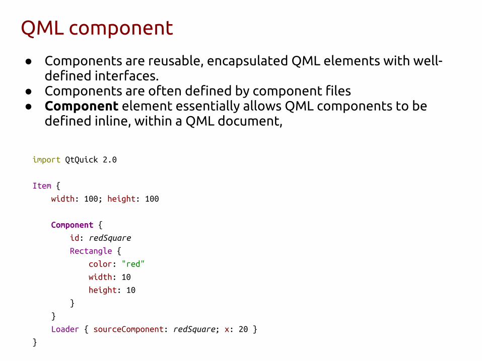
QML component
● Components are reusable, encapsulated QML elements with well-defined interfaces.
● Components are often defined by component files● Component element essentially allows QML components to be
defined inline, within a QML document,
import QtQuick 2.0
Item {
width: 100; height: 100
Component {
id: redSquare
Rectangle {
color: "red"
width: 10
height: 10
}
}
Loader { sourceComponent: redSquare; x: 20 }
}

Binding Property Values
● Property values can be bound to other values○ Automatically updated
● Use parent for accessing parent or a given id to○ access another element (like sibling)
Rectangle {
width: 400
height: 2 * 100
color: "lightblue"
Image {
width: parent.width
source: "download.png"
}
}

Creating Property Bindings from JavaScript
● A property with a binding is automatically updated as necessary. However, if the property is later assigned a static value from a JavaScript statement, the binding will be removed.
Rectangle {
width: 100; height: width * 2
focus: true
Keys.onSpacePressed: {
height = width * 3 // Now the binding is removed!
}
}
● Correct way
Rectangle {
width: 100; height: width * 2
focus: true
Keys.onSpacePressed: {
height = Qt.binding(function() { return width * 3 })
}
}

Binding QML types
TextEdit { id: myTextField; text: "Please type here..." } Binding { target: app; property: "enteredText"; value: myTextField.text }
"Single-branch" conditional binding
// produces warning: "Unable to assign [undefined] to double value"
value: if (mouse.pressed) mouse.mouseX
Binding on value { when: mouse.pressed value: mouse.mouseX }

Startup Scripts
● Sometimes it is necessary to run a piece of code at application startup○ Or more specifically, when a component is instantiated
● Having this code as a global piece of script in an external script file is not a good idea○ All relevant pieces of the QML scope chain might not be fully
initialized when the code is run● The best solution is to use the attached property onCompleted of the
Component element ○ Executed once the component has been fully initialized
Page {
Rectangle {
width: 400; height: 2 * 100
color: "lightblue"
}
Component.onCompleted: {
console.log ("You can initialize state here..")
}
} http://goo.gl/XvUn4t

QML signalsBorderImage {
id: buttonImage
source: mouseArea.pressed ? pressedImage : normalImage
property string normalImage: "balloons/button_unpressed.png"
property string pressedImage: "balloons/button_pressed.png"
property alias text : buttonText.text
signal clicked();
Text {
id: buttonText
anchors.centerIn: parent
font.pixelSize: 20
text: "text"
}
MouseArea {
id: mouseArea
anchors.fill: parent
onClicked: buttonImage.clicked()
}
}
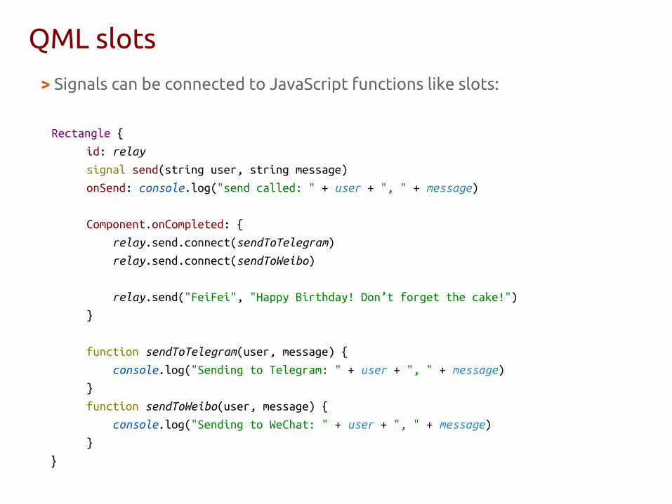
QML slots
> Signals can be connected to JavaScript functions like slots:
Rectangle { id: relay
signal send(string user, string message)
onSend: console.log("send called: " + user + ", " + message)
Component.onCompleted: {
relay.send.connect(sendToTelegram)
relay.send.connect(sendToWeibo)
relay.send("FeiFei", "Happy Birthday! Don’t forget the cake!")
}
function sendToTelegram(user, message) {
console.log("Sending to Telegram: " + user + ", " + message)
}
function sendToWeibo(user, message) {
console.log("Sending to WeChat: " + user + ", " + message)
}
}

Using Connections to connect signals to slots
import QtQuick 2.0
import Ubuntu.Components 1.1
Rectangle {
id: rect
width: 300
height: 300
color: "orange"
function hello() {
console.log("Hello world!")
}
MouseArea {
id: mouseArea
anchors.fill: parent
}
Connections {
target: mouseArea
onClicked : hello()
}
}
(c) 2013 Canonical
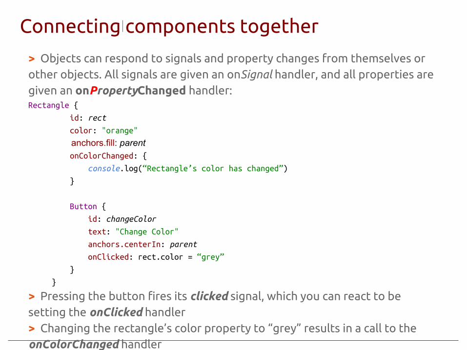
Connecting components together
> Objects can respond to signals and property changes from themselves or other objects. All signals are given an onSignal handler, and all properties are given an onPropertyChanged handler:Rectangle {
id: rect
color: "orange"
anchors.fill: parent onColorChanged: {
console.log(“Rectangle’s color has changed”)
}
Button {
id: changeColor
text: "Change Color"
anchors.centerIn: parent
onClicked: rect.color = “grey”
}
}
> Pressing the button fires its clicked signal, which you can react to be setting the onClicked handler> Changing the rectangle’s color property to “grey” results in a call to the onColorChanged handler

Animation
NumberAnimation { id: ani; targets: image; properties: "x"; to: 600; duration: 2000; running: false }
Image { id: image; width: 200; height: 200
source: "images/sample.jpg"
MouseArea { anchors.fill: parent
onClicked: { // image.x = 600 ani.running = true } } Behavior on x { NumberAnimation {duration: 2000 } } }
PropertyAnimation { id: animateColor; target: flashingblob; properties: "color"; to: "green"; duration: 2000 }
Provides a way to animate changes to a property's value

States and transitions
● States manage named items● Represented by the State
element● Each item can define a set of
states○ With the states property○ Current state is set with the
state property● Properties are set when a state is
entered● Can also
○ Modify anchors○ Change the parents of items○ Run scripts
● default state is “”
● The Transition element provides a way of adding animations to state changes
● By specifying the to and from properties you can explicitly specify the states the transition is associated with
● A transition can be set to be reversible (default false)
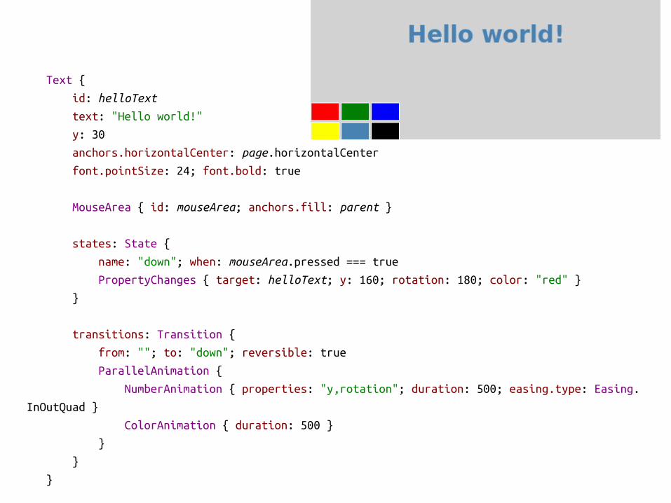
Text {
id: helloText
text: "Hello world!"
y: 30
anchors.horizontalCenter: page.horizontalCenter
font.pointSize: 24; font.bold: true
MouseArea { id: mouseArea; anchors.fill: parent }
states: State {
name: "down"; when: mouseArea.pressed === true
PropertyChanges { target: helloText; y: 160; rotation: 180; color: "red" }
}
transitions: Transition {
from: ""; to: "down"; reversible: true
ParallelAnimation {
NumberAnimation { properties: "y,rotation"; duration: 500; easing.type: Easing.
InOutQuad }
ColorAnimation { duration: 500 }
}
}
}

QML applicationimport QtQuick 2.0
import Ubuntu.Components 1.1
MainView {
objectName: "mainView"
// Note! applicationName needs to match the "name" field of the click manifest
applicationName: "com.ubuntu.developer.liu-xiao-guo.chinamobiledev"
width: units.gu(100)
height: units.gu(75)
Page {
title: i18n.tr("China Mobile")
Column {
Button {
objectName: "button"
width: parent.width
text: i18n.tr("Tap me!")
onClicked: {
label.text = i18n.tr("..world!")
}
}
}
}
}
“applicationName” is the app namespace, which is used in the app store and in directory names of the apps as well!

● Unlike a property definition, which allocates a new, unique storage space for the property, a property alias connects the newly declared property, called the aliasing property as a direct reference to an existing property, the aliased property.
Property alias
Cell.qml
import QtQuick 2.0
Item { id: container property alias cellColor: rectangle.color signal clicked(color cellColor)
width: 40; height: 25
Rectangle { id: rectangle border.color: "white" anchors.fill: parent }
MouseArea { anchors.fill: parent onClicked: container.clicked(container.cellColor) }}
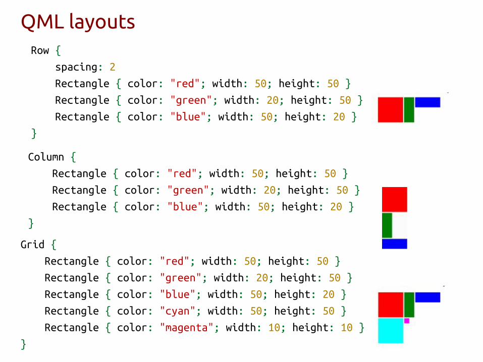
QML layoutsRow {
spacing: 2
Rectangle { color: "red"; width: 50; height: 50 }
Rectangle { color: "green"; width: 20; height: 50 }
Rectangle { color: "blue"; width: 50; height: 20 }
}
Grid {
Rectangle { color: "red"; width: 50; height: 50 }
Rectangle { color: "green"; width: 20; height: 50 }
Rectangle { color: "blue"; width: 50; height: 20 }
Rectangle { color: "cyan"; width: 50; height: 50 }
Rectangle { color: "magenta"; width: 10; height: 10 }
}
Column {
Rectangle { color: "red"; width: 50; height: 50 }
Rectangle { color: "green"; width: 20; height: 50 }
Rectangle { color: "blue"; width: 50; height: 20 }
}

Anchor Layout 1/3 ● Each QML item can be thought of as having 6 invisible
anchor and 4 margin lines

● The anchors are used for specifying relative positions of items● As well as offsets and margins
Anchor Layout 2/3
Rectangle { id: rect1; ... }
Rectangle { id: rect2; anchors.left: rect1.right; anchors.top: rect1.
bottom; ... }
Rectangle { id: rect1; ... }
Rectangle { id: rect2; anchors.left: rect1.right; ... }
Rectangle { id: rect1; x: 0; ... }
Rectangle { id: rect2; anchors.left: rect1.right; anchors.right: rect3.left;
... }
Rectangle { id: rect3; x: 150; ... }
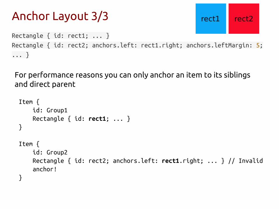
Anchor Layout 3/3
Rectangle { id: rect1; ... }
Rectangle { id: rect2; anchors.left: rect1.right; anchors.leftMargin: 5;
... }
For performance reasons you can only anchor an item to its siblings and direct parent
Item {id: Group1Rectangle { id: rect1; ... }
}
Item {id: Group2Rectangle { id: rect2; anchors.left: rect1.right; ... } // Invalid anchor!
}

QML canvas Rectangle { width: 200; height: 200 border.color: "black"; border.width: 2 Canvas { anchors.fill: parent onPaint: { var ctx = getContext("2d") // setup the stroke ctx.lineWidth = 4 ctx.strokeStyle = "blue" // setup the fill ctx.fillStyle = "steelblue" // begin a new path to draw ctx.beginPath() // top-left start point ctx.moveTo(50,50) // upper line ctx.lineTo(150,50) // right line ctx.lineTo(150,150) // bottom line ctx.lineTo(50,150) // left line through path closing ctx.closePath() // fill using fill style ctx.fill() // stroke using line width and stroke style ctx.stroke() } }}
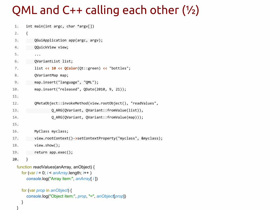
QML and C++ calling each other (½)1. int main(int argc, char *argv[])
2. {
3. QGuiApplication app(argc, argv);
4. QQuickView view;
5. ...
6. QVariantList list;
7. list << 10 << QColor(Qt::green) << "bottles";
8. QVariantMap map;
9. map.insert("language", "QML");
10. map.insert("released", QDate(2010, 9, 21));
11.
12. QMetaObject::invokeMethod(view.rootObject(), "readValues",
13. Q_ARG(QVariant, QVariant::fromValue(list)),
14. Q_ARG(QVariant, QVariant::fromValue(map)));
15.
16. MyClass myclass;
17. view.rootContext()->setContextProperty("myclass", &myclass);
18. view.show();
19. return app.exec();
20. }
function readValues(anArray, anObject) { for (var i = 0; i < anArray.length; i++ ) console.log("Array item:", anArray[ i ])
for (var prop in anObject) { console.log("Object item:", prop, "=", anObject[prop]) } }
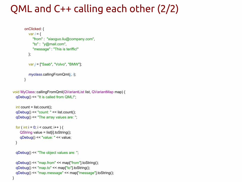
QML and C++ calling each other (2/2)
void MyClass::callingFromQml(QVariantList list, QVariantMap map) { qDebug() << "It is called from QML!";
int count = list.count(); qDebug() << "count: " << list.count(); qDebug() << "The array values are: ";
for ( int i = 0; i < count; i++ ) { QString value = list[i].toString(); qDebug() << "value: " << value; }
qDebug() << "The object values are: ";
qDebug() << "map.from" << map["from"].toString(); qDebug() << "map.to" << map["to"].toString(); qDebug() << "map.message" << map["message"].toString();}
onClicked: { var i = { "from" : "[email protected]", "to" : "[email protected]", "message" : "This is teriffic!" };
var j = ["Saab", "Volvo", "BMW"];
myclass.callingFromQml(j, i); }

Where to find the QML APIs? http://developer.ubuntu.com/api/qml/current/Graphical Interface
● Qt.labs.folderlistmodel
● Qt.labs.settings
● QtQuick
● QtQuick.Particles
● QtQuick.Window
● QtQuick.XmlListModel
● QtTest
● Ubuntu.Components
● Ubuntu.Components.ListItems
● Ubuntu.Components.Pickers
● Ubuntu.Components.Popups
● Ubuntu.Components.Styles
● Ubuntu.Components.Themes
● Ubuntu.Layouts
● Ubuntu.PerformanceMetrics
● Ubuntu.Test
● Ubuntu.Web
● UbuntuUserInterfaceToolkit
Platform Services
● QtContacts
● QtLocation
● QtOrganizer
● U1db
● Ubuntu.Content
● Ubuntu.DownloadManager
● Ubuntu.OnlineAccounts
● Ubuntu.OnlineAccounts.Client
● qtpim
Device and Sensors
● QtFeedback
● QtSensors
● Ubuntu.Connectivity
Multimedia
● QtAudioEngine
● QtMultimedia
● qtmultimedia
Language Types
● QtQml
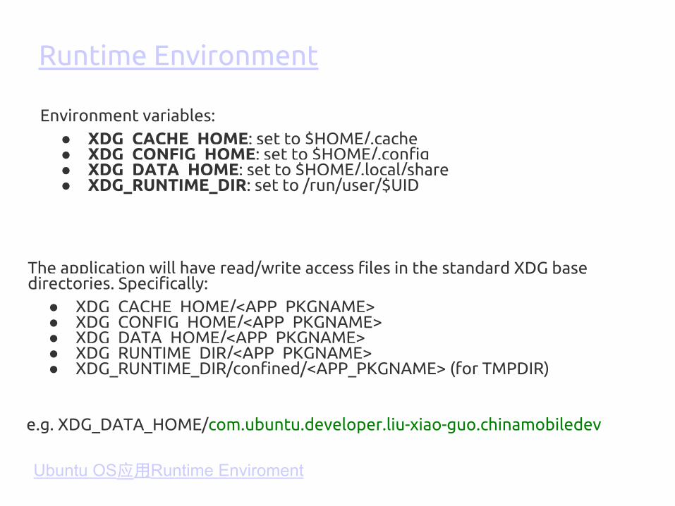
The application will have read/write access files in the standard XDG base directories. Specifically:
● XDG_CACHE_HOME/<APP_PKGNAME>● XDG_CONFIG_HOME/<APP_PKGNAME>● XDG_DATA_HOME/<APP_PKGNAME>● XDG_RUNTIME_DIR/<APP_PKGNAME>● XDG_RUNTIME_DIR/confined/<APP_PKGNAME> (for TMPDIR)
Environment variables:● XDG_CACHE_HOME: set to $HOME/.cache● XDG_CONFIG_HOME: set to $HOME/.config● XDG_DATA_HOME: set to $HOME/.local/share● XDG_RUNTIME_DIR: set to /run/user/$UID
Runtime Environment
e.g. XDG_DATA_HOME/com.ubuntu.developer.liu-xiao-guo.chinamobiledev
Ubuntu OS应用Runtime Enviroment

Security policy for click packages 1/3
● Untrusted by the OS: Ubuntu Software Store apps run in a restricted sandbox as defined in Application Confinement. Reviews of apps can be shallow, but as a result AppStore apps are considered untrusted. Untrusted applications:
○ can freely access their own data○ cannot access other applications’ data○ cannot access user data○ cannot access privileged portions of the OS○ cannot access privileged APIs, such as Telephony○ may access sensitive APIs with user permission, such as Location
or Online Accounts.○ are not typically supported by Ubuntu or Canonical
https://developer.ubuntu.com/en/publish/security-policy-groups/http://blog.csdn.net/ubuntutouch/article/details/41281971https://developer.ubuntu.com/en/apps/platform/guides/app-confinement/

● Trusted by the OS: software installed as part of the base OS or part of the Ubuntu archive are considered trusted by the OS. These applications typically do not run under confinement. User applications trusted by the OS:
○ can typically access any resources or data available within the user’s session
○ have limited access to system services and data as defined by the OS (ie, traditional filesystem permissions, PolicyKit, etc)
○ are supported by Ubuntu and/or Canonical and may receive security and high impact bug fixes based on the software’s support status.
Security policy for click packages 2/3

Security policy for click packages 3/3
Policy groups - apps may use any API that complies with the defined policy:
ubuntu app development> the platform
ubuntu app development> some design building blocks

Ubuntu UI Toolkit Gallery
(c) 2013 Canonical
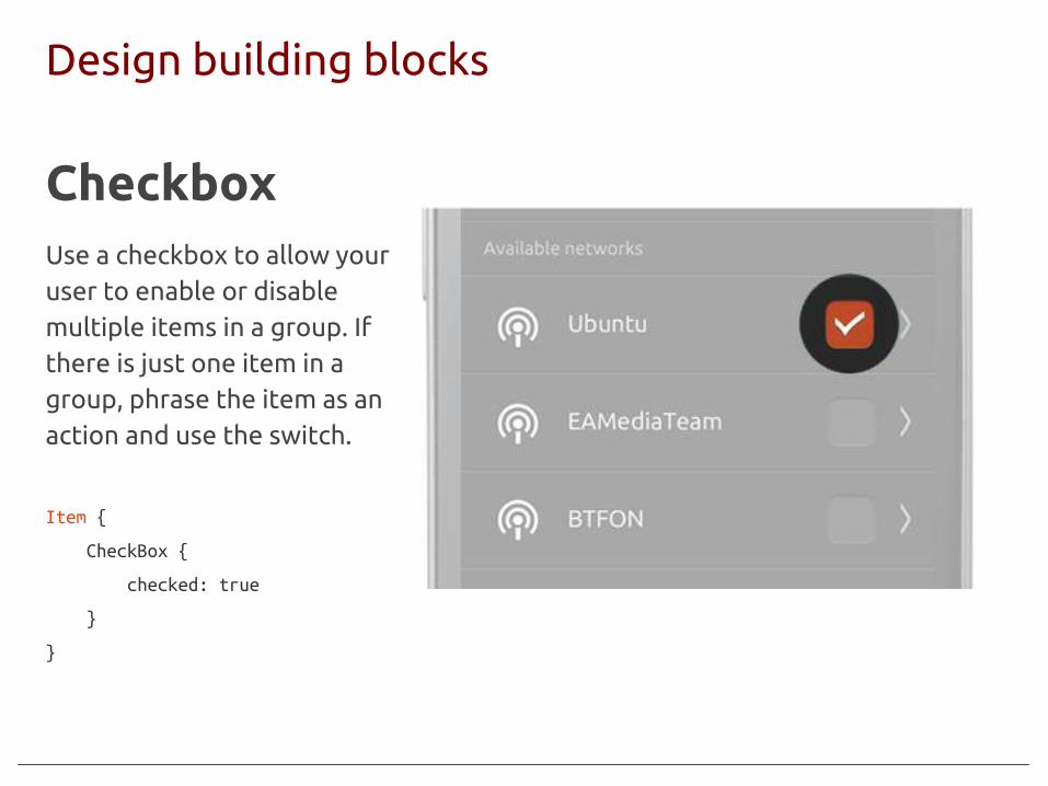
Design building blocks
CheckboxUse a checkbox to allow your user to enable or disable multiple items in a group. If there is just one item in a group, phrase the item as an action and use the switch.
(c) 2013 Canonical
Item {
CheckBox {
checked: true
}
}
(c) 2013 Canonical
Design building blocks
(c) 2013 Canonical
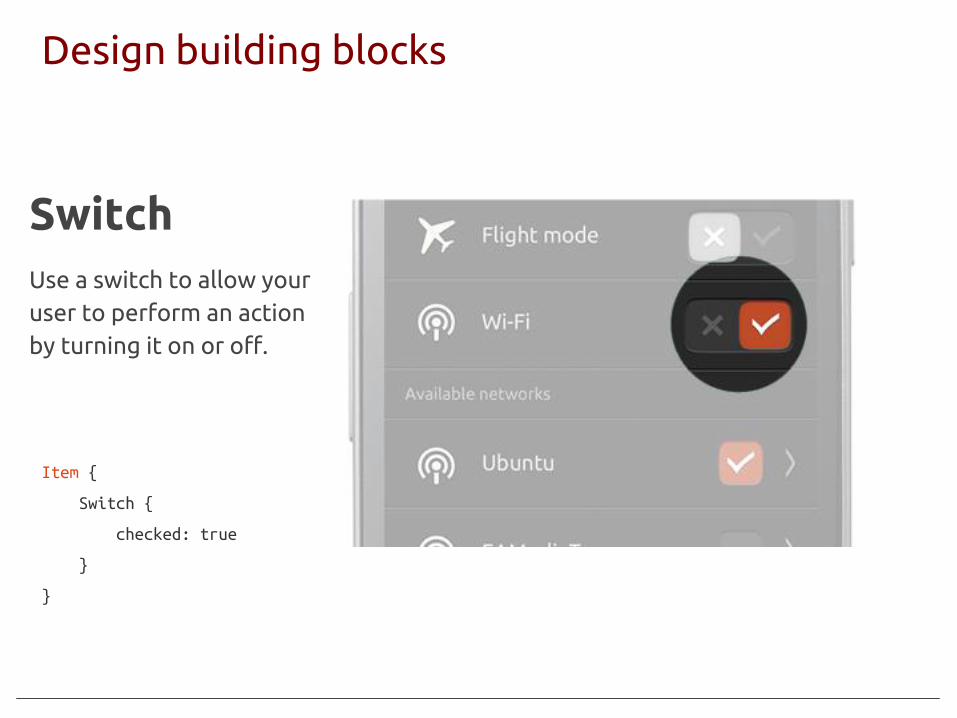
Item {
Switch {
checked: true
}
}
SwitchUse a switch to allow your user to perform an action by turning it on or off.

(c) 2013 Canonical
Design building blocks
(c) 2013 Canonical
Column {
Button {
text: "Send"
onClicked: print("clicked text-only Button")
}
Button {
iconName: "compose"
gradient: UbuntuColors.greyGradient
onClicked: print("clicked icon-only Button")
}
Button {
iconName: "compose"
text: "Icon on left"
iconPosition: "left"
onClicked: print("clicked text and icon Button")
}
}
Button
(c) 2013 Canonical
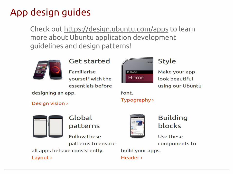
App design guides
(c) 2013 Canonical
Check out https://design.ubuntu.com/apps to learn more about Ubuntu application development guidelines and design patterns!

References:
● http://cn.developer.ubuntu.com● http://blog.csdn.net/foruok/ - a good resource for QML● http://blog.csdn.net/ubuntutouch/● http://developer.ubuntu.com/● http://design.ubuntu.com/apps● http://qmlbook.org/ - a book about Qt 5● http://developer.ubuntu.com/apps/qml/tutorial/● http://developer.ubuntu.com/api/qml/development/● Ubuntu 手机开发培训准备
- http://blog.csdn.net/ubuntutouch/article/details/42393075
● http://www.heilqt.com/


