College of Education School of Continuing and Distance Education 2014/2015 – 2016/2017 UGRC 120 Numeracy Skills Session 5 STATISTICAL DISPLAY OF DATA: TABLES, GRAPHS & CHARTS Lecturer: Dr. Ezekiel N. N. Nortey/Mr. Enoch Nii Boi Quaye, Statistics Contact Information: [email protected]/[email protected]
Transcript
College of Education
School of Continuing and Distance Education 2014/2015 – 2016/2017
UGRC 120
Numeracy Skills
Session 5
STATISTICAL DISPLAY OF DATA: TABLES, GRAPHS & CHARTS
• This session introduces the student to types of variables, the kind of data they generate and their respective graphical display charts and tabular analysis.
• We will get acquainted with how to organize data pictorially to reveal details of concealing features that are not explicit in any dataset. Some assignments will involve the use of Microsoft Excel tools.
Dr. Ezekiel N. N. Nortey, Department Of Statistics Slide 2
Goals and Objectives
At the end of the session, the student will be able to:
• Organize and present data in the form of tables, graphs and charts.
• Develop frequency distribution tables and draw graphs of numerical data.
• Develop frequency distribution tables and draw graphs of categorical data.
• Determine the appropriateness and relevance of the use of each type of graph or chat.
Dr. Ezekiel N. N. Nortey, Department of Statistics Slide 3
Session Outline
The key topics to be covered in the session are as follows:
• Charts: Simple Bar, Pie, Multiple and Composite (or Stacked) Bar with Excel Illustrations
• Histograms and Cumulative Frequency Curves with Excel Illustrations
• Relevance/Appropriateness of use of Graphs and Charts
Dr. Ezekiel N. N. Nortey, Department of Statistics Slide 4
Reading List
• Refer to Unit 4 of:
Nortey, E. and Afrim, J. (2013). Numeracy skills: The basics and beyond. Accra: Dieco Ventures.
• Refer to Chapter 1 of:
Mendenhall, W., Beaver, R. J. and Beaver ,B. M. (2009). Introduction to probability and statistics. USA: Brooks/Cole
Dr. Ezekiel N. N. Nortey, Department of Statistics Slide 5
DATA, DATA TYPES AND FREQUENCY DISTRIBUTIONS
Topic One
Dr. Ezekiel N. N. Nortey, Department of Statistics Slide 6
INTRODUCTION
• The ability to present the data that a student is working with is very important for the purpose of providing a vivid picture of what the data is saying.
• Various tables and graphs have been developed for giving this vivid picture of what the data is saying.
• The main illustrative tools used in this regard are bar and pie charts for qualitative data and frequency distribution, the histogram, the frequency polygon and the cumulative frequency curve for quantitative data.
Dr. Ezekiel N. N. Nortey, Department of Statistics Slide 7
PRIMARY / RAW DATA
• What is Data?
• Primary data is data that has been collected but which has not been organized numerically e.g. the set of 90 Level 100 students collected from an alphabetical listing of all Level 100 University of Ghana students’ records.
– Similarly the set of 100 primary school pupils collected from the University of Ghana Basic Schools is an example of raw data.
Dr. Ezekiel N. N. Nortey, Department of Statistics Slide 8
DATA TYPES
• There are two main types of data. They are Qualitative and Quantitative data.
– Categorical or qualitative data have values that can only be placed into mutually exclusive categories, such as “yes” and “no.”
– Numerical or quantitative data have values that represent quantities
Dr. Ezekiel N. N. Nortey, Department of Statistics Slide 9
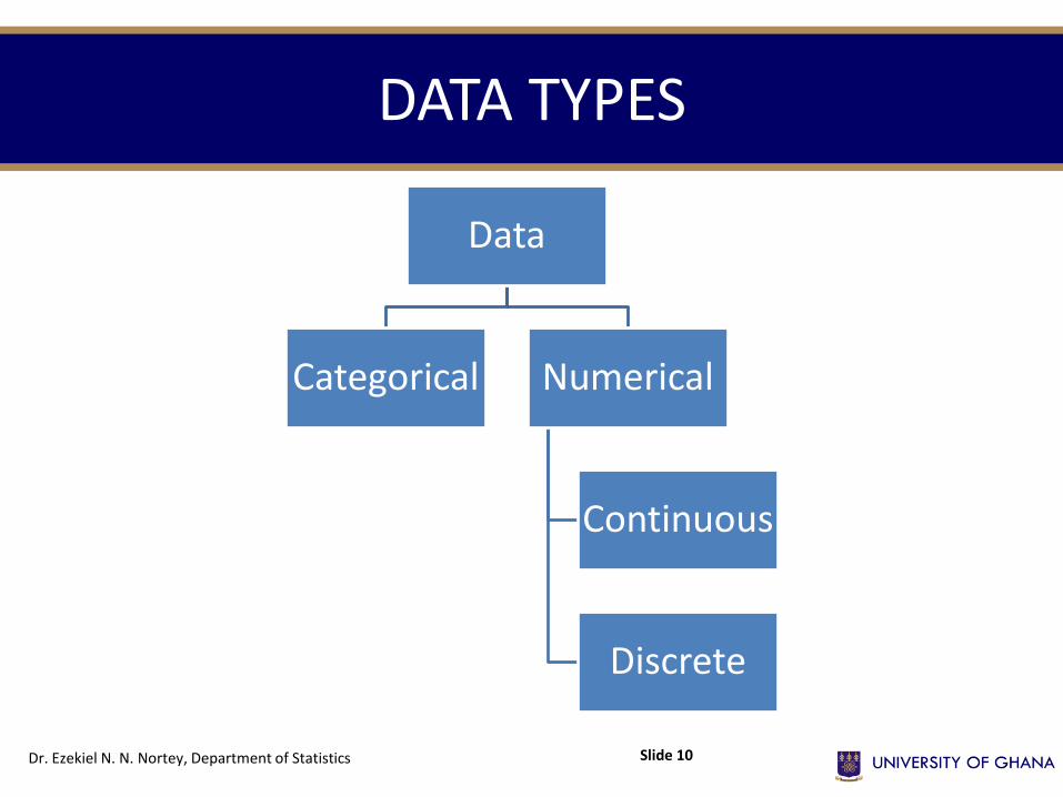
DATA TYPES
Dr. Ezekiel N. N. Nortey, Department of Statistics Slide 10
Data
Categorical Numerical
Continuous
Discrete
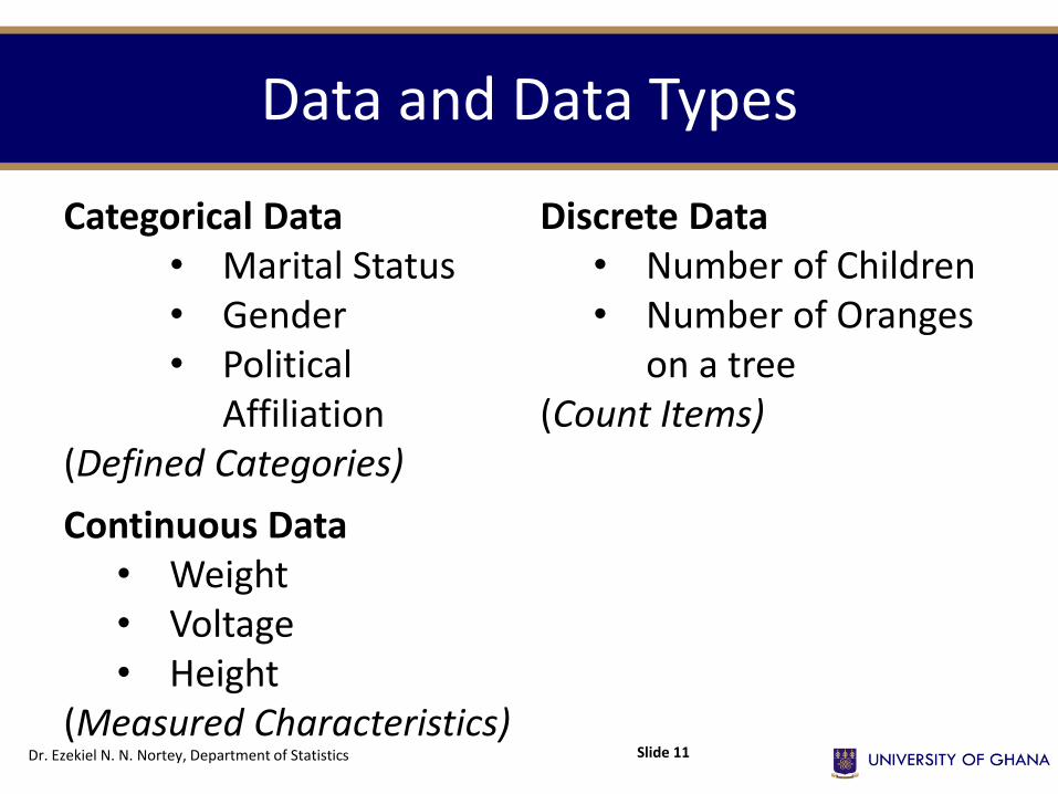
Data and Data Types
Categorical Data • Marital Status • Gender • Political
Affiliation (Defined Categories)
Discrete Data • Number of Children • Number of Oranges
on a tree (Count Items)
Continuous Data • Weight • Voltage • Height
(Measured Characteristics) Dr. Ezekiel N. N. Nortey, Department of Statistics Slide 11
Data and Data Types
Refer to “session 5 examples and activities” NOW and complete Activity 1.1
Dr. Ezekiel N. N. Nortey, Department of Statistics Slide 12
Activity 1.1
• Refer to “session 5 examples and activities” NOW and complete Activity 1.1
Dr. Ezekiel N. N. Nortey, Department of Statistics Slide 13
ARRAYS
• When the raw numerical data are arranged in either ascending or descending order of magnitude they are called arrays e.g. 2, 5, 10, 12 (ascending) or 12, 10, 5, 2 (descending).
– Ascending order of magnitude means that you are starting with the smallest number.
– Descending order of magnitude is when you start with the highest number first.
Dr. Ezekiel N. N. Nortey, Department of Statistics Slide 14
RANGE
• The difference between the largest and smallest values in the data set is called the range of the data.
– For example in the array above the largest number is 12 and the smallest is 2, therefore, the range is 12 – 2 = 10.
Dr. Ezekiel N. N. Nortey, Department of Statistics Slide 15
Frequency Distribution for Categorical Data
• A table depicting all categories and their corresponding frequency is known as a Frequency Distribution, Frequency Table or Summary Table.
Refer to “session 5 examples and activities” NOW and take a look at a sample frequency distribution table
Dr. Ezekiel N. N. Nortey, Department of Statistics Slide 16
Frequency Distribution for Numerical Data
What is a Frequency Distribution?
• A table of data made up of classes/categories together with corresponding class frequencies is called a frequency distribution or frequency table.
– When we need to summarize large masses of raw data it is often useful to distribute the data into classes or categories and to determine the number of individuals belonging to each class/category, called the class frequency.
Dr. Ezekiel N. N. Nortey, Department of Statistics Slide 17
Frequency Distribution for Numerical Data
• Table 2 from the reference you just made is called GROUPED DATA.
• Grouping tends to destroy much of the original detail of the data,
– its advantage is that a clear overall picture is obtained and certain valid relationships are made evident.
Dr. Ezekiel N. N. Nortey, Department of Statistics Slide 18
Frequency Distribution for Numerical Data
• To form a frequency distribution from raw data,
– we tally each observation with either a mark or stoke; every fifth mark or stoke across the first four marks or strokes giving us a frequency of five at a time.
– This facilitates the counting process
• Refer to “session 5 examples and activities” NOW and take a look at Table 3 showing tallies of frequencies.
Dr. Ezekiel N. N. Nortey, Department of Statistics Slide 19
Class Intervals and Class Limits
• In Table 4, (from the reference you just did)
– 20 – 29 is called the class interval (made up of all the values from 20 to 29).
– The values 20 and 29 are called class limits.
– The value 20 is the lower class limit and 29 is the upper class limit.
– This indicates the first number and the last number in a class respectively.
Dr. Ezekiel N. N. Nortey, Department of Statistics Slide 20
Class Boundaries or Exact Limits
From initial reference,
• If grades are recorded to the nearest whole number, the class interval 20 – 29 in theory includes all the values from 19.5 𝑡𝑜 29.5.
• These are called the class boundaries or exact limits. Sometimes class boundaries are used to symbolize the classes.
• Thus the class boundaries in Table 4 could be indicated as follows: 19.5 – 29.5 , 29.5 – 39.5 , 39.5 – 49.5 , etc.
Dr. Ezekiel N. N. Nortey, Department of Statistics Slide 21
Class Boundaries or Exact Limits
• Refer to “session 5 examples and activities” NOW and complete Activity 1.2
Dr. Ezekiel N. N. Nortey, Department of Statistics Slide 22
Class Width or size of Class Interval (𝒄)
• The width of a class interval is the difference between the lower and upper class boundaries and is often called the class width or the size of the class interval.
• If all the class intervals of a frequency table have equal widths, the common width is denoted by “𝑐”.
– The c is also equal to the difference between any two successive lower class limits or any two successive upper class limits.
– The class width may also be obtained for any particular class by subtracting the lower class boundary from the upper class boundary.
Dr. Ezekiel N. N. Nortey, Department of Statistics Slide 23
Class Width or size of Class Interval (𝒄)
• Refer to “session 5 examples and activities” NOW and complete Activity 1.3
Dr. Ezekiel N. N. Nortey, Department of Statistics Slide 24
Class Mark/Class Midpoint
• The class mark is the midpoint of the class interval.
• It is the sum of the lower and upper class limits divided by 2.
• It is also called the class midpoint. It is denoted by x.
• Refer to “session 5 examples and activities” NOW and complete Activity 1.4
Dr. Ezekiel N. N. Nortey, Department of Statistics Slide 25
Relative Frequency Distribution
• In a frequency distribution, if the frequency in each class interval is converted into a proportion by dividing each by the total frequency, we get a series of proportions called relative frequencies.
• A distribution presented with relative frequencies, is called a relative frequency distribution. The sum of all relative frequencies in a distribution is 1.
Dr. Ezekiel N. N. Nortey, Department of Statistics Slide 26
Percentage Relative Frequency Distribution
• When all relative frequencies are multiplied by 100, they are converted to percentage relative frequency.
• The ensuing distribution is thus called the Percentage Relative Frequency distribution.
• The sum of all percentage relative frequencies in a distribution is 100.
Dr. Ezekiel N. N. Nortey, Department of Statistics Slide 27
STEM-AND-LEAF DISPLAYS Topic Two
Dr. Ezekiel N. N. Nortey, Department of Statistics Slide 28
INTRODUCTION
• A stem-and-leaf display organizes data into groups (called stems) so that the values within each group (the leaves) branch out to the right on each row.
• The values in the stem are arranged vertically in ascending order from top to bottom. Each data value is split into two values, one part called the stem and the other part called the leaf.
• The normal practice of splitting a numeric value is that, all digits preceding the last digit is taken as the stem and the last digit of the number is taken as the leaf.
Dr. Ezekiel N. N. Nortey, Department of Statistics Slide 29
STEM-AND-LEAF DISPLAY
• E.g. the number 25 has a stem of 2 and a leaf of 5, the number 128 will then have a stem value of 12 and a leaf value of 8. We note that the definition we give to splitting the values in a particular data set must be the same for all values in the data set.
• Refer to “session 5 examples and activities” NOW and take a look at Example 1.1
• Refer to “session 5 examples and activities” NOW and complete Activity 1.5
Dr. Ezekiel N. N. Nortey, Department of Statistics Slide 30
STEM-AND-LEAF DISPLAY
• The Stem-and-leaf display has the advantage of retaining the actual values in the display as well as shows the distribution of the values.
– This makes it the preferred choice when organizing a data set that contains only few observations.
• However, when the number of observations in the data set is large, it is cumbersome to display and therefore is less preferred to other tabular forms.
Dr. Ezekiel N. N. Nortey, Department of Statistics Slide 31
ONE & MULTI-DIMENSIONAL TABLES
Topic Three
Dr. Ezekiel N. N. Nortey, Department of Statistics Slide 32
The Construction of a Frequency Table/Distribution
The following are a helpful guide for the construction of a frequency table/distribution
1. Given the specified class interval (C.I.), and starting from the lowest or highest value, write out the classes with each class distinct from each other.
2. Distribute the individual values into each class/category. This is done by putting a slash adjacent to the class. This process is called tallying, as discussed in Section 1.
Dr. Ezekiel N. N. Nortey, Department of Statistics Slide 33
The Construction of a Frequency Table/Distribution
3. Count the number of slashes to give the total number of cases for each class. This is called the class frequency denoted by (f).
4. Indicate the total number of cases for the whole table. This is denoted by N. The total of the frequencies must equal the total number of cases in the raw data.
Dr. Ezekiel N. N. Nortey, Department of Statistics Slide 34
The Construction of a Frequency Table/Distribution
• Refer to “session 5 examples and activities” NOW and take a look at Example 1.2
• Refer to “session 5 examples and activities” NOW and take a look at the excel application of the topic under discussion.
• Refer to “session 5 examples and activities” NOW and complete Activity 1.6
Dr. Ezekiel N. N. Nortey, Department of Statistics Slide 35
CHARTS: SIMPLE BAR, PIE, MULTIPLE & COMPOSITE BAR GRAPHS
Topic Four
Dr. Ezekiel N. N. Nortey, Department of Statistics Slide 36
SIMPLE BAR CHART
• In a bar chart, a bar shows each category, the length of which represents the amount, frequency or percentage of values falling into a category.
• Refer to “session 5 examples and activities” NOW and take a look at Example 1.3
Dr. Ezekiel N. N. Nortey, Department of Statistics Slide 37
PIE CHART
• The pie chart is a “sectioned” circle segmented into slices that represent categories (variables in a dataset). The size of each slice of the pie varies according to the percentage in each category.
• Refer to “session 5 examples and activities” NOW and take a look at Example 1.4
Dr. Ezekiel N. N. Nortey, Department of Statistics Slide 38
MULTIPLE BAR CHART
• In a multiple bar chart, bars are drawn adjoining themselves to show each category, sub categories. It is usually employed when we want to display multi-dimensional chart.
• Refer to “session 5 examples and activities” NOW and take a look at Example 1.5
• Refer to “session 5 examples and activities” NOW and complete Activity 1.7
Dr. Ezekiel N. N. Nortey, Department of Statistics Slide 39
COMPOSITE (STACKED) BAR CHART
• In a composite (or Stacked) bar chart, bars are drawn to show each category, with sub categories stacked on top of each other in each of the bars. Similar to the multiple bar chart, it is usually employed when we want to display multi-dimensional chart.
• Refer to “session 5 examples and activities” NOW and practice with Example 1.6
• Refer to “session 5 examples and activities” NOW and complete Activity 1.8
Dr. Ezekiel N. N. Nortey, Department of Statistics Slide 40
HISTOGRAM & CUMULATIVE FREQUENCY CURVE
Topic Five
Dr. Ezekiel N. N. Nortey, Department of Statistics Slide 41
THE HISTOGRAM
• A histogram is a set of adjoining vertical bars whose areas are proportional to the frequencies represented by the bars.
• A histogram is drawn by taking the class intervals on the horizontal axis (or x-axis) and the frequencies on the vertical axis (y-axis).
• When the class intervals are of equal width, the height of a bar corresponds to the frequency of that class.
Dr. Ezekiel N. N. Nortey, Department of Statistics Slide 42
THE HISTOGRAM
• The class intervals with the highest frequency will have the highest bar and the highest concentration of observations. This is also called the modal class.
• Refer to “session 5 examples and activities” NOW and practice with Example 1.7
Dr. Ezekiel N. N. Nortey, Department of Statistics Slide 43
Frequency and Cumulative Frequency Polygon
• A polygon is formed by having the midpoint of each class represent the data in that class and then connecting the sequence of midpoints at their respective class percentages.
• The cumulative percentage polygon, or ogive, displays the variable of interest along the 𝑋 𝑎𝑥𝑖𝑠, and the cumulative percentages along the 𝑌 𝑎𝑥𝑖𝑠.
• Refer to “session 5 examples and activities” NOW and complete Activity 1.9
Dr. Ezekiel N. N. Nortey, Department of Statistics Slide 44
Advantages of the Frequency Polygon
• Most people prefer the frequency polygon to the histogram because:
– They think that it gives a clear picture of the shape of the contours;
– Also, the frequency polygon makes it possible to make comparisons to some baseline.
Dr. Ezekiel N. N. Nortey, Department of Statistics Slide 45
The Cumulative Frequency
• Cumulative frequency is the total number of cases that are added up higher or lower than a particular score or value.
– For example a Professor might want to know what number or percentage of the final examination scores was higher than 50.
– To answer this question we use a graph of the cumulative frequency distribution.
– To do this we cumulate the frequencies to see how many items or cases lie more than or less than a particular value.
Dr. Ezekiel N. N. Nortey, Department of Statistics Slide 46
The Cumulative Frequency
• A cumulative frequency distribution shows the relation between a class interval and the frequency at or below its upper or lower class boundaries.
• The cumulative frequency distribution is constructed by adding the frequencies of scores in any class interval to the frequencies of all the class intervals below it on the scale of measurement.
Dr. Ezekiel N. N. Nortey, Department of Statistics Slide 47
The Cumulative Frequency
• Refer to “session 5 examples and activities” NOW and practice with Example 1.8
• Refer to “session 5 examples and activities” NOW and complete Activity 1.10
Dr. Ezekiel N. N. Nortey, Department of Statistics Slide 48
CUMULATIVE FREQUENCY POLYGON (Ogive)
• A graph showing the cumulative frequency “less than” or “more than” any exact limit is called a 𝒄𝒖𝒎𝒖𝒍𝒂𝒕𝒊𝒗𝒆 𝒇𝒓𝒆𝒒𝒖𝒆𝒏𝒄𝒚 𝒑𝒐𝒍𝒚𝒈𝒐𝒏 or 𝒐𝒈𝒊𝒗𝒆.
• In plotting the graph of the cumulative frequency the exact limits are used rather than the class midpoints.
• The graph of the cumulative frequency allows researchers to make graphic approximation and arithmetic interpolation of values not shown in the cumulative distribution.
Dr. Ezekiel N. N. Nortey, Department of Statistics Slide 49
CUMULATIVE FREQUENCY POLYGON (Ogive)
• Refer to “session 5 examples and activities” NOW and complete Activity 1.11
Dr. Ezekiel N. N. Nortey, Department of Statistics Slide 50
RELEVANCE/APPROPRIATENESS OF USE OF GRAPHS AND CHARTS
Topic Six
Dr. Ezekiel N. N. Nortey, Department of Statistics Slide 51
PRINCIPLES OF EXCELLENT GRAPHS
1. The graph should not distort the data.
2. The graph should not contain unnecessary adornments (sometimes referred to as chart junk).
3. The scale on the vertical axis should begin at zero.
4. All axes should be properly labeled.
5. The graph should contain a title.
6. The simplest possible graph should be used for a given set of data.
Dr. Ezekiel N. N. Nortey, Department of Statistics Slide 52
CHART NORMS • Simplicity and Neatness:
– The chart should not include unnecessary information and should deal with the relevant data for the relevant purpose only. The form should be attractive and easily understandable.
• Size and Proportion: – It should be neither too large nor too small. The size depends on
the data and other details. The proportion of its height to width should be reasonable. Often, it is taken as 1 : 1.5.
• Accuracy: – Conscious and unconscious misrepresentation should be
avoided.
• Emphasis: – Colours, heavy, light and dotted lines may be suitably used. The
materials should be chosen carefully and skilfully.
Dr. Ezekiel N. N. Nortey, Department of Statistics Slide 53
CONSTRUCTION OF A CHART
• The above norms should be kept in mind when constructing a chart. With proper scales on the x-axis and y-axis, it is possible to show useful information in a convenient form. A title, possibly a subtitle, scale headings and proper labelling should accompany every chart drawn.
Refer to “session 5 examples and activities” NOW and complete Activity 1.12
• Complete Assignment 6 and submit
.
Dr. Ezekiel N. N. Nortey, Department of Statistics Slide 54


![ResearchEffects of methods of descending stairs forwards ... · stairs due to an increased knee joint flexion angle [5]. Although OA patients are advised to avoid ascending and descending](https://static.documents.pub/doc/80x56/5f3f4cb66e7a0d6c891adf7f/researcheffects-of-methods-of-descending-stairs-forwards-stairs-due-to-an-increased.jpg)


