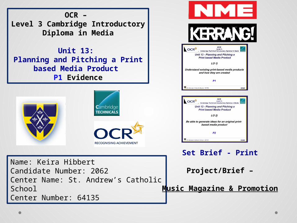
OCR – Level 3 Cambridge Introductory Diploma in Media Unit 13: Planning and Pitching a Print based Media Product P1 Evidence Name: Keira Hibbert Candidate Number: 2062 Center Name: St. Andrew’s Catholic School Center Number: 64135 Set Brief - Print Project/Brief – Music Magazine & Promotion
9.Codes and conventions10. Technological convergence
11.Target audience12. Psychographics
13. Competition - NME vs KERRANG!14. Print sales
15. KERRANG information16. Bauer publisher information17. Bauer information continued
18. NME market position19. Production process
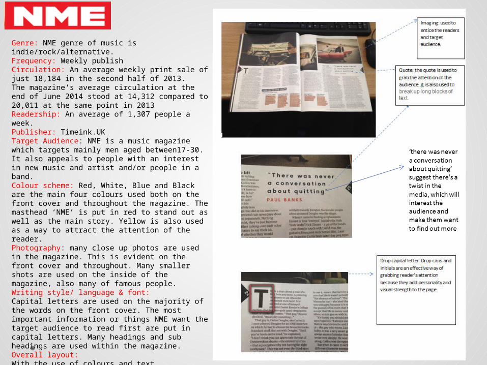
Genre: NME genre of music is indie/rock/alternative.Frequency: Weekly publishCirculation: An average weekly print sale of just 18,184 in the second half of 2013. The magazine's average circulation at the end of June 2014 stood at 14,312 compared to 20,011 at the same point in 2013Readership: An average of 1,307 people a week.Publisher: Timeink.UKTarget Audience: NME is a music magazine which targets mainly men aged between17-30. It also appeals to people with an interest in new music and artist and/or people in a band.Colour scheme: Red, White, Blue and Black are the main four colours used both on the front cover and throughout the magazine. The masthead ‘NME’ is put in red to stand out as well as the main story. Yellow is also used as a way to attract the attention of the reader.Photography: many close up photos are used in the magazine. This is evident on the front cover and throughout. Many smaller shots are used on the inside of the magazine, also many of famous people.Writing style/ language & font:Capital letters are used on the majority of the words on the front cover. The most important information or things NME want the target audience to read first are put in capital letters. Many headings and sub headings are used within the magazine. Overall layout:With the use of colours and text styles/fonts, the overall layout of the magazine is slightly informal and very much appeals to men in the 20s. a slightly glossy front cover is used and this also helps capture the reader eye. The layout of the magazine was well thought out and includes everything that the target audience would want from a magazine of this genre such as gig announcements and interviews.
Purpose
Denotations and Connotations
• The denotations of the magazine masthead is NME. The masthead is very bold and bright by the use of the colour red and capital letters. The colour red is used because it catches the eyes of the audience and connotes a deeper meaning of rage and love. The ‘rage’ could come into the equation by some of the music that is involved in NME. ‘love’ could come in by the love of music and for the bands specified. It could also grab the attention of the targeted audience by tying in the past, present and future. They do this to emphasize that they are very passionate towards the bands and music NME promote from all time eras.
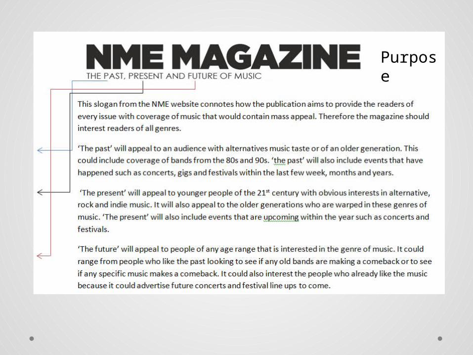
• The denotations of the strapline is a subsidiary heading or caption. for NME this is found just under the masthead or somewhere around the cover page. The strapline is used to show a slogan that the magazine go by. For NME the slogan is ‘the past, present and future of music’ it is very rarely placed under the masthead which could show a bit of rebellion. This could tie in with the genre of the magazine ‘rock, alternative, indie’ because they aren't following the usual structure or format of a magazine.
• The denotations of main headline and feature is to get the gist of the story or article that follows and what the magazine is based on. In this version of the magazine the main headline is in bold, black, capital letters. This could connote that because of the subject ‘joy division 30 years of unknown pleasures’ it means he has dark secrets and everything is a mystery, thus using the colour black to represent a hole that needs filling. The capital letters are used to emphasise on the ‘unknowing’ to make the audience feel intrigued and want to learn about his past. This could also tie into the main image on the front cover. This main image is for impact and to show that they are the main feature. This is also in black and white to make it seem mysterious and like a blank canvas to make the headline stand out more because its so out there and bold.
Publisher
Circulation: An average weekly print sale of just 18,184 in the second half of 2013. • The magazine's average circulation
at the end of June 2014 stood at 14,312 compared to 20,011 at the same point in 2013
Timeinc.uk is a local media institution founded by Henry Luce and Briton Hadden in 1968. In 1998, IPC Magazines Ltd was subject to a management buyout financed by Cinven, a venture capital group, and the company was renamed IPC Media. Cinven then sold the company to Time Inc.
• Values: ‘The values of our reach and the passion of our people—and we don’t take them for granted. We support programs that benefit the communities in which we operate in the U.S. and around the world’.
• Time Inc. is one of the largest branded media companies in the world reaching more than 130 million people each month across multiple platforms
• The verbal code ‘time’ connotes a clock or that everything changes. because they cover so many topics and choice which time.inc is always following and up to date with, also time is changing constantly. It also represents the present as being between the past and the future. It lastly could show that because they are linked to so may different time zones and countries that time is never the same and that things are also happening and that there's always something going on somewhere in the world.
The socio economic groups are between A, B and C1 as they all have jobs so can spend their spare income on the magazine.
The language of NME magazine is aimed at the younger generation. The text is quite formal and the use of words is suitable for older teenagers and young adults but not too formal but can be understood by the
audience.
Contents PageMasthead-Contents title takes centre role on the page clearly stating ‘contents’ having the NME logo in its usual red and white font- which remind the reader what magazine they are reading, giving the
magazine promotion.
Categories-Purpose to give the reader a bit of information on what's inside and where to find it.The magazine has kept usual codes and conventions by using grids on their contents page, dividing the separate subjects and the page look more interesting.
Sub-lines-Gives the readers more specific detail on the individual features and articles within the
magazine.
Main image-Main image relates to the featured article on the cover, shows importance of the article by making it the main image.
Colour scheme- The colour scheme stays consistent with the front cover page, the white background is successfully portrayed as it does not distract the readers and to keep the attention on the articles and features.
Quote: the quote is used to grab the attention of the audience. it is also used to break up long blocks of text.
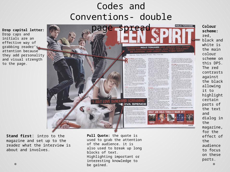
Codes and Conventions- double page spread
Drop capital letter: Drop caps and initials are an effective way of grabbing reader’s attention because they add personality and visual strength to the page.
Some parts of writing and highlighting is put in the colour red. This is to make certain stories or comments stand out from the main story and to highlight them so that the audience reads them.
Used media to promote and connect
www.nme.com/
Target Audience• NME is a music magazine which targets mainly men aged
between17-30. It also appeals to people with an interest in new music and artist and/or people in a band.
• Katz- in NME magazine the audience learns information about the bands involved and written about inside that they may not know in every day to day business. They also learn what sort of people the band members can be and who they really and their values, they may even get to ‘know’ them on a different and personal level because they may have the same issues as one another or the audience may look up to the people featured out of admiration.
• Maslow- NME magazine would come under the survivors and explores hierarchy. This is because when you buy an NME magazine you know full well that they will cover everything you need to know about the subject of the interview and who are featured in the magazine. I know this because in my addition of September the 6th 2014 ‘Interpol’ there is a whole double page spread on them and the quote ‘there was never a conversation about quitting’. NME magazine also comes under explorers because they are influenced by social change and this could attract explorers because they cover past, present and future music, allowing the audience of explorers to find out everything the need on specific bands and occasions upcoming.
• Hartley- the genre of NME magazine NME is indie/ rock/ alternative. The age range of the magazine is men around 17-30 and girls of an interest in the band members and alternative music.
• Psychographics- NME magazine would come under the survivors and explores hierarchy. This is because when you buy an NME magazine you know full well that they will cover everything you need to know about the subject of the interview and who are featured in the magazine. I know this because in my addition of September the 6th 2014 ‘Interpol’ there is a whole double page spread on them and the quote ‘there was never a conversation about quitting’. NME magazine also comes under explorers because they are influenced by social change and this could attract explorers because they cover past, present and future music, allowing the audience of explorers to find out everything the need on specific bands and occasions upcoming.
NME socio- economic groups
• Time.inc have the same interest in genre of rock, indie and alterative music as Kerrang magazine, published by Bauer, and are competing against each other to have the best selling magazine.
• Kerrang! magazines Circulation in January - June 2014 was peaking at 33, 024 and their Readership just before the Christmas of 2013 was 293,000.
• Kerrang! is currently in a higher position of being the best selling magazine from NME due to the data of circulation and readership on them both. NMEs Circulation was on An average weekly print sale of just 18,184 in the second half of 2013. NMEs Readership was An average of 1,307 people a week. Compared to Kerrang, NME is quite a way behind.
Print sales • According to figures released today by the Audit Bureau of Circulations, the
average joint digital and print circulation of the NME was down 18.8 per cent period on period, falling to 15,830 in the first six months of 2014.
• The title's average print sale during the first half of the year was down 21.3 per cent period on period to just 14,312 – the decline year on year was 28.5 per cent.
• Of those music titles that declare ABC figures today, NME had the smallest average circulation in print and overall. However, the NME's digital edition recorded a rise in circulation of 16.1 per cent period on period to an average of 1,518 in the first half of 2014.
• Kerrang! was down 12.2 per cent year on year to 33,024, a drop of 6 per cent period on period.
• Of the two film titles that declared circulation figures today, Bauer's Empire had a joint average circulation of 147,980 in the first half of the year, up 2 per cent on the previous six-month reporting period.
• However, Empire's average print circulation of 134,907 between January and July was down 15.7 per cent year on year and 7 per cent period on period.
• Purpose- The purpose of KERRANG! Is for entertainment. ‘everything that rocks’ is the slogan for KERRANG! And also connotes that the purpose is to enlighten people about the rock life and different bands and events.
• Target audience- The main target audience of KERRANG! is younger people including young adults and teenagers between 14-25 . These target audience are best suited to the magazine due to the rebellious side of life which this category of people are linked into and can be associated with. This is a key audience as they have money and time to spend on KERRANG! The gender is unisex however most people would associate something like kerrang! To be mainly for males.
• Also KERRANG promote video games which are stereotypically directed toward males for example the ‘ps4’ and ‘destiny’.
• The socio-economic class is gothic and rebellious punk attitude which also does associate with younger people this gives KERRANG! the upper hand with a set target audience.
• Psychographics- much like NME, KERRANG magazine would come under the survivors and explores hierarchy. This is because when you buy a KERRANG magazine due to its focus on punk, gothic and rock genre you know full well that they will cover everything you need to know about the subject of the interview and who are featured in the magazine. KERRANG magazine also comes under explorers because they are influenced by social change and this could attract explorers because they cover past, present and future music, allowing the audience of explorers to find out everything the need on specific bands and occasions upcoming.
• The UK’s biggest magazine for rock.• Promotes rock festivals• Does a give away every week mainly posters.• First issue: 6 June 1981• Editor: James McMahon• KERRANG! Radio has won many awards• In its time from Media Brand of the Year to Station of the Year – it
took home 21 industry awards in its launch year alone.• The Radio brand takes its passion for a true alternative to pop
music from KERRANG! Magazine.• ‘ KERRANG! radio listeners are sharp, rejoice in their individuality
and are above all passionate about their music’• Has a wide range of technology to promote their products e.g.
• EditorJames McMahon • FrequencyWeekly • The UK’s biggest magazine for rock.• Promotes rock festivals• Does a give away every week mainly posters.• PublisherBauer Media Group • Total circulation (June 2013)30,300• FounderAlan Lewis • First issue6 June 1981 • CountryUnited Kingdom • Based inLondon • LanguageEnglish • Websitekerrang.com • Target audience- The main target audience of KERRANG! is younger people including young adults and
teenagers between 14-25 . These target audience are best suited to the magazine due to the rebellious side of life which this category of people are linked into and can be associated with. This is a key audience as they have money and time to spend on KERRANG! The gender is unisex however most people would associate something like Kerrang! To be mainly for males.
• Content - The content is full of information on new stories about different bands and what new thing have happened also there are prize entry's which also get the fans involved also with events and tickets for rock festivals. KERRANG! Also include interviews, videos, pictures, rock news and advertisement for KERRANG! Products and other services. All of this content is what makes the consumer want to buy the product because there is a lot to see and read which makes it and enjoyable experience.
KERRANG! Form & Style
• Form and style - The style of KERRANG is outgoing and rebellious showing the confidence of the magazine and also the styles of the bands are reflected on the website with a gothic/punk feel to it, expressing the rock theme even more and reflecting on the magazines targeted audience and their personalities. The style is dark and cluttered with lots of information, which may not appeal to a lot of people however, to people who favour rock music up against pop would enjoy this and would take the time to consider the text.
Puff Looks like a sticker- added extras to appeal to the audience. Shows its something for everyone
BarcodeIssue numberPriceDateWeb address
Eye contactSeductively entices the audience 9’Male Gaze’ – Laura Mulvey – 1975) and grabs their attention. The connotes to the use of eye contact and looking straight down the lens enables the targeted audience to get a personal feel towards the magazine because it looks like the subject is directly looking at you.
BannerHighlights inside content
Colour schemeYellow, black and white I the colour scheme throughout the magazine. It stands out and catches your eyes from the contrast of the bright yellow to the dark black.
MastheadImportant for the magazines identity. Relates to heavy metal and rock because it had the appearance of being smashed which portrays its genre. The verbal code ‘KERRANG!’ connotes to play a power chord on an electric guitar. They show this through the way they design the masthead. For example looking ‘smashed’ this could show the vibrations coming off an electric guitar chord once its been struck.
Drop capital letter:Drop caps and initials are an effective way of grabbing reader’s attention because they add personality and visual strength to the page.
Pull Quote: the quote is used to grab the attention of the audience. it is also used to break up long blocks of text. Highlighting important or interesting knowledge to be gained.
Colour scheme: red, black and white is the main colour scheme on this DPS. The red contrasts against the black allowing it to highlight certain parts of the text and dialog in the magazine, for the effect of the audience to focus on these parts.
Codes and Conventions- double page spread
Stand first: intro to the magazine and set up to the reader what the interview is about and involves.
• Bauer use social media to promote and enlarge their company also they have published many successful magazine and radio companies e.g. KERRANG! and Q.
• Bauer are a multimillion pound company with a huge annual turnover, this makes the company a very prestige and expensive publisher for a company. It also makes them more known to the public eye enabling them to have superiority over rival publishers as they can promote more and publish more to become more known.
http://www.bauermedia.co.uk/
• Bauer Media UK reaches over 22 million UK consumers every week through a portray of world-class, brands including heat, Kiss, Grazia, Empire, Magic and Absolute Radio. This makes Bauer a very special company with a huge amount of responsibility.
• Bauer was founded in 1875 • One of the country’s biggest and successful publishers.• Bauer media is the biggest publishing company in Europe.• 300 magazines in 15 countries, as well as online, TV and radio stations.• Bauer Media is a division of the Bauer Media Group• business is built on influential media brands with millions of personal relationships
with engaged readers and listeners.• connect audiences with excellent content through their broad multi-touch point brand
platforms• Bauer Media goes over 80 influential brand names covering a large range of peoples
interests .• In 1996, they acquired digital music TV channel ‘The Box’, as a route into the small
screen business, which has grown into Box Television.• Their wide portfolio of interesting brands gives them advantages over pure play
magazine or radio competitors.
• The verbal code of their slogan denotes “We think Popular”, which connotes that they only try to be the best of the best out of publishers, aiming their work at top clients with money and good promotion skills allowing them to be known by others and have a wider market area.
Production process1. Date of publication 2. Managing the schedule– this is an extremely important step that you should not take for granted when it comes to the
production of a magazine. If you want your magazine to be produced successfully then you must properly manage the schedule. Your schedule should be made in such a way that there are provisions for certain mishaps so that even when these mishaps occur, you can always meet the deadline. This is the reason why a proper management of the schedule is very vital.
3. Editorial and budgetary decision- the next step that is taken during the production process of a magazine is the editorial decision. The editorial decisions involve the magazine’s editorial team assembling and deciding what topics will be covered in the next issue of the magazine. Here, the editorial team basically talks about the various contents that will make up the magazine. After deciding which types of article ideas or topics, news stories, illustrations and photographs will be used in the magazine, the team now makes the budgetary decisions. Here, they look at the money that is available to them and how it will be spent towards the production of the magazine. Having done this, it is now time to move on to the next stage.
4. Content Acquisition -the content acquisition process is arguably the most important step because without content we simply cannot have the magazine in the first place. Content therefore is king. There are two major ways that content can be gathered for a magazine. The first is through in-house staff writers and the second way is through external writers that are commissioned to write on topics that are specialist in nature. It is at this stage that artwork and graphics are also worked on. The artwork is defined as illustrations and pictures that are going to be placed in the magazine. Graphics are the pictures or images that are designed with a computer program.
5. Sub-editing: this is the next step to be taken. Sub editing focuses on one major thing, which is quality control. If the media organization is big enough to have a sub-editor, then he is going to be responsible for this job; if there is no sub-editor, then the editor does this job. This step involves the following important things:
• Checking of the accuracy of all facts in the articles• Making sure that words are properly spelled• Making sure that grammar and punctuation are used correctly• Making sure that all articles follow the house-style• Working on the page layout.6. Page Layout :in big publications, there is a special team responsible for page layouts called the layout staff. Their job is to typeset and layout the various pages that come together to make the magazine. In performing this task, they use very powerful Desktop Publishing (DTP) programs such as InDesign or Pagemaker to get the job done. It is at this stage that adverts from advertisers are placed into the content. 7. File emailed to printer-After the proofreading stage, the DTP file of the entire magazine is sent to the printer whose job will be to print the magazine. It is at this point the popular term ‘pre-press’ comes in. Pre-press is defined as the process of checking to make sure that you are sending all the fonts and images needed for the magazine with your file. Once this stage is over, the printing company takes over. But before the printing company prints the hundreds or thousands of copies requested by the publication, the company first prints a few copies and sends them to the publication’s editor for checking once again. This is called the printer’s proofs. If the editor and his team are satisfied with the printer’s proofs, then the green light is given to the printer for mass printing to commence. Each copy the printer prints is the final finished product – the magazine that readers are going to have in their hands to read. 8. Distribution - this is the last stage of the entire process. The printing company, having finished with the printing of the magazines will package them neatly and send them to a warehouse. From the warehouse, the magazines are then distributed and then sold to the public.
You can buy NME and Kerrang! in almost every retail store and any major supermarkets such as Tesco, Asda, WHSmith and
HMV.
Unit 13 – Planning & Pitching a Print Based Media Product
Contents
• Mind map 1• Mood board 1
• Mood board explanation 1• Mast head ideas + connotations
• Font Ideas For Masthead• Summary of ideas (A.I.R)
• Mind map 2• Mood board 2
• Mood board explanation 2• Hand drawn drafts
• Summary of ideas (Simpatico)• Summary of Ideas Continued
• conclusion
Mind Map
My Magazine Ideas
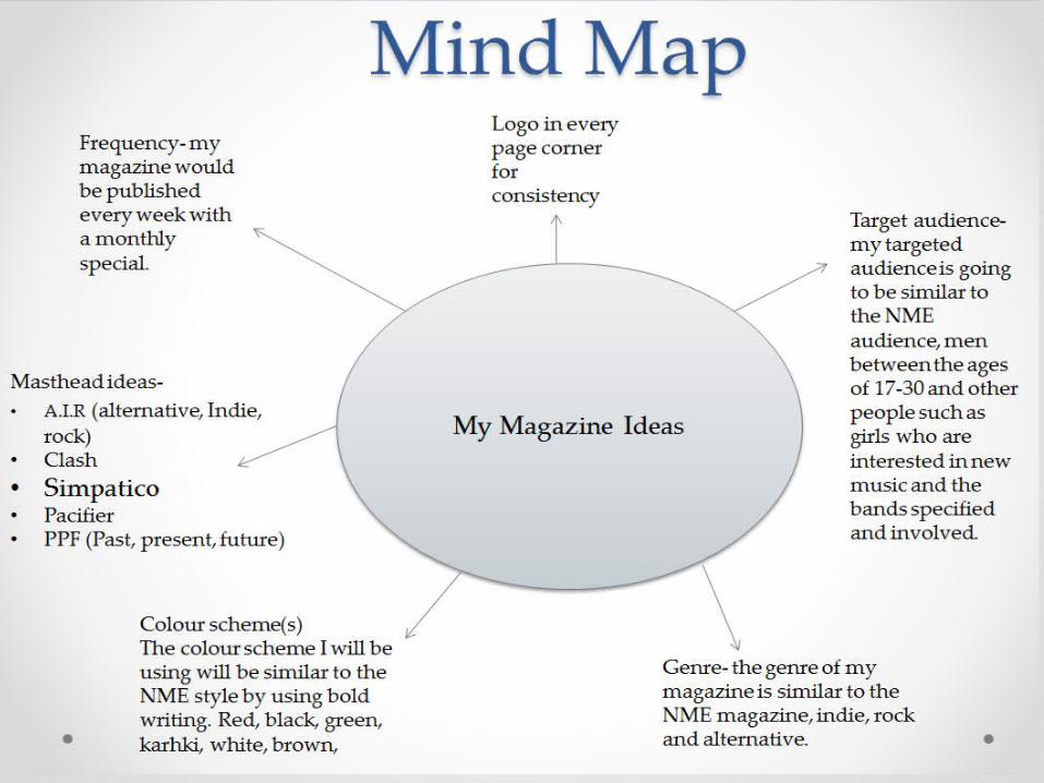
Target audience- my targeted audience is going to be similar to the NME audience, men between the ages of 17-30 and other people such as girls who are interested in new music and the bands specified and involved.
Frequency- my magazine would be published every week with a monthly special.
• My first mood board supports my A.I.R idea. I chose these images because they represent the genre of the magazine I want to produce and that I am copying (NME). The genres that I tried to match pictures with are indie, rock and alternative. By experience of being the target audience myself to NME magazine I used my experience and knowledge to chose appropriate images that suits all three of the genres and the magazine itself.
Mast head ideas + connotations
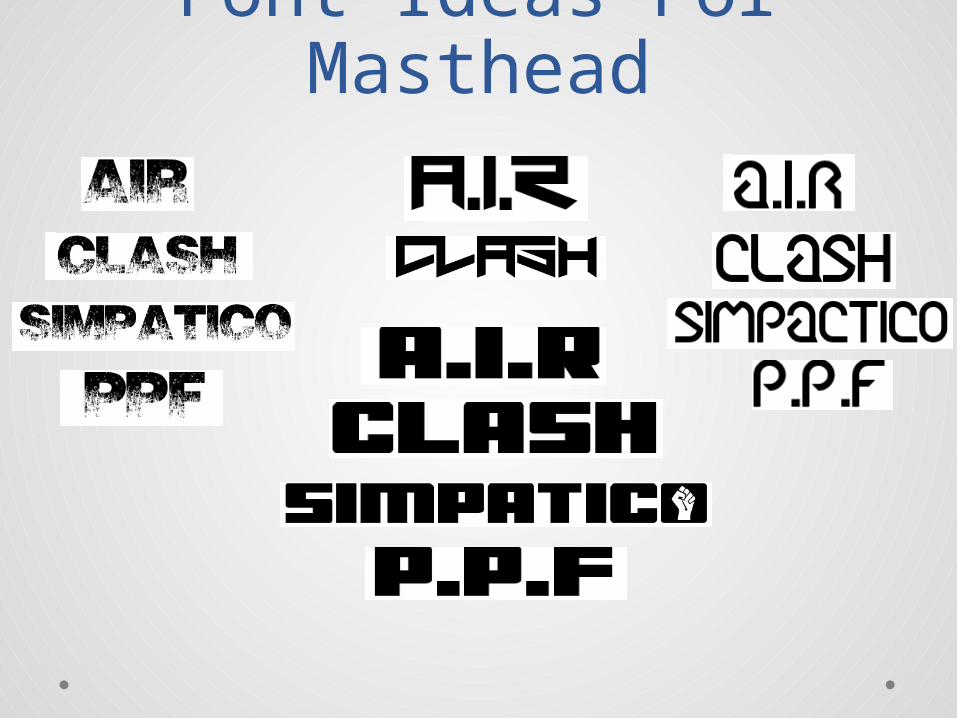
• A.I.R (alternative, Indie, rock)- I like this abbreviation of ‘AIR’ for my magazines masthead because it perfectly links in with the genre of indie, rock and alternative. This would suit my magazine because I am running along the same line as NME masthead and theme which has three letters as an abbreviation.
• Clash- I like this idea for a name of the masthead of my magazine because it shows the subject and the music inside, clashes with other current magazines such as pop, classic, R&B and other ‘indie, rock and alternative genres. This is because they are outgoing and like to be different and view there opinions, much like NME.
• Simpatico- I chose this to be an option for the masthead and name of my magazine because it’s a catchy name which would be remembered, it also symbolises that the magazine is easy and chilled like the music specified, that everyone loves and wants to buy and read about.
• Pacifier- ‘someone who tries to bring peace’ this would be good for the masthead and name of my magazine because the bands that are interviewed and talked about in ‘NME’ and my magazine are calming and peaceful, they aren't too out there or disturbing, which is like there fans and the target audience.
• PPF (Past, present, future)- this abbreviation would be a good name for my magazine and masthead because like the ‘AIR’ idea it links perfectly in with the genre and slogan, which interests my targeted audience and could expand who wants to buy the magazine because it specifies what it actually involves.
Font Ideas For Masthead
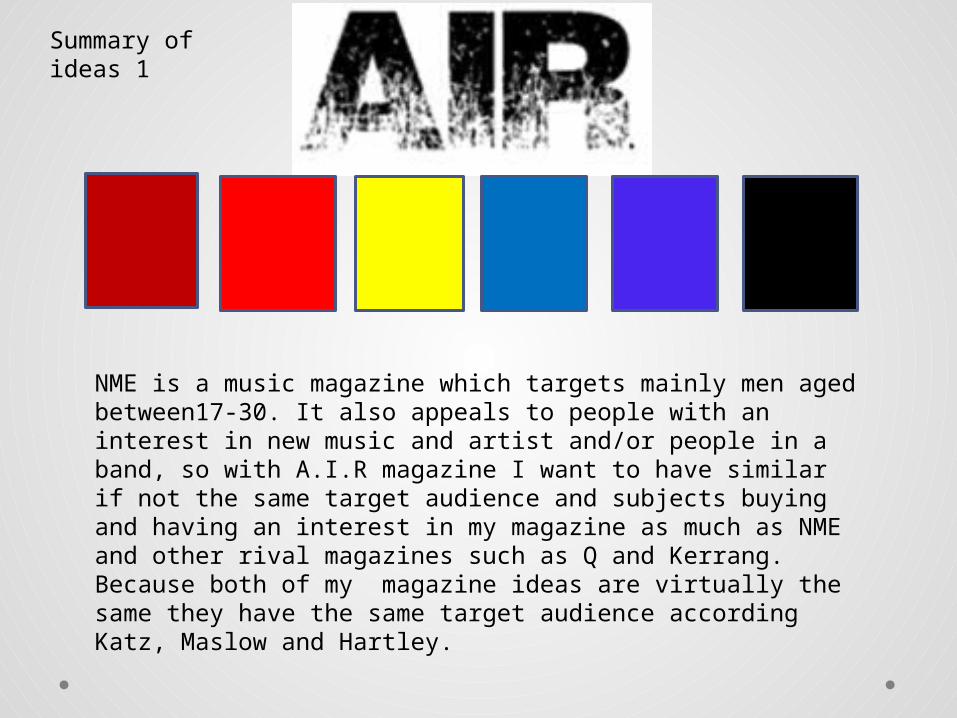
NME is a music magazine which targets mainly men aged between17-30. It also appeals to people with an interest in new music and artist and/or people in a band, so with A.I.R magazine I want to have similar if not the same target audience and subjects buying and having an interest in my magazine as much as NME and other rival magazines such as Q and Kerrang.Because both of my magazine ideas are virtually the same they have the same target audience according Katz, Maslow and Hartley.
• My second mood board that supports my simpatico idea, is very similar to my fist idea of A.I.R. this is because the genre of my music and the original magazine I am copying, NME , is all very much the same, and has the same taste, target audience and design. notice there is a lot of grey, black and white. These colours are used a lot in this genre because it emphasizes the images and create an intense connection with the audience through emotion, making them interested. I am also a fan things stand out more.
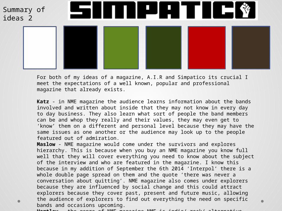
For both of my ideas of a magazine, A.I.R and Simpatico its crucial I meet the expectations of a well known, popular and professional magazine that already exists.
Katz - in NME magazine the audience learns information about the bands involved and written about inside that they may not know in every day to day business. They also learn what sort of people the band members can be and whop they really and their values, they may even get to ‘know’ them on a different and personal level because they may have the same issues as one another or the audience may look up to the people featured out of admiration.Maslow - NME magazine would come under the survivors and explores hierarchy. This is because when you buy an NME magazine you know full well that they will cover everything you need to know about the subject of the interview and who are featured in the magazine. I know this because in my addition of September the 6th 2014 ‘Interpol’ there is a whole double page spread on them and the quote ‘there was never a conversation about quitting’. NME magazine also comes under explorers because they are influenced by social change and this could attract explorers because they cover past, present and future music, allowing the audience of explorers to find out everything the need on specific bands and occasions upcoming.Hartley - the genre of NME magazine NME is indie/ rock/ alternative. the age range of the magazine is men around 17-30 and girls of an interest in the band members and alternative music.
Summary of ideas 2
Summary of Ideas Continued
The similarities between NME magazine and my very own magazine (A.I.R) will not differ that much in design or format. I will be using similar font styles (bold and in capitals) because they are eye catching and stand out. This font style links into my chosen genre of indie, rock and alternative because it bold and out there which makes it stand out from the others and connotes its individuality.
Conclusion• In conclusion the magazine I chose to be creating
in A.I.R magazine. I chose this name because its more relevant to the genre ‘A-alternative. I- indie. R-rock.’ I also chose this abbreviation because its very similar to the NME magazines. My audience that I will be targeting is men aged between17-30, also people with an interest in new music and artist and/or people in a band. The colour scheme is mainly black, white and red with other colours such as yellow and blue to highlight certain aspects.
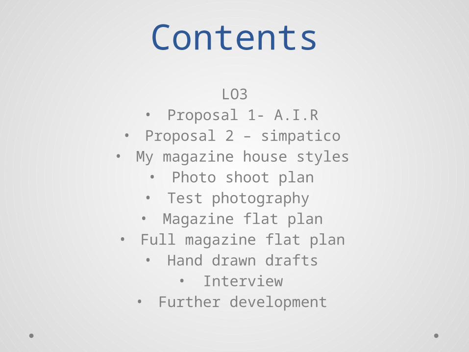
ContentsLO3
• Proposal 1- A.I.R• Proposal 2 – simpatico
• My magazine house styles• Photo shoot plan• Test photography • Magazine flat plan
• Full magazine flat plan• Hand drawn drafts
• Interview• Further development
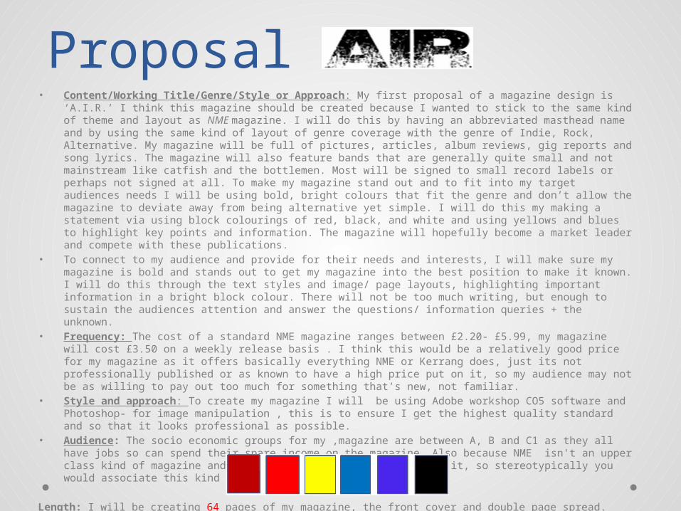
Proposal 1• Content/Working Title/Genre/Style or Approach: My first proposal of a magazine design is ‘A.I.R.’ I think
this magazine should be created because I wanted to stick to the same kind of theme and layout as NME magazine. I will do this by having an abbreviated masthead name and by using the same kind of layout of genre coverage with the genre of Indie, Rock, Alternative. My magazine will be full of pictures, articles, album reviews, gig reports and song lyrics. The magazine will also feature bands that are generally quite small and not mainstream like catfish and the bottlemen. Most will be signed to small record labels or perhaps not signed at all. To make my magazine stand out and to fit into my target audiences needs I will be using bold, bright colours that fit the genre and don’t allow the magazine to deviate away from being alternative yet simple. I will do this my making a statement via using block colourings of red, black, and white and using yellows and blues to highlight key points and information. The magazine will hopefully become a market leader and compete with these publications.
• To connect to my audience and provide for their needs and interests, I will make sure my magazine is bold and stands out to get my magazine into the best position to make it known. I will do this through the text styles and image/ page layouts, highlighting important information in a bright block colour. There will not be too much writing, but enough to sustain the audiences attention and answer the questions/ information queries + the unknown.
• Frequency: The cost of a standard NME magazine ranges between £2.20- £5.99, my magazine will cost £3.50 on a weekly release basis . I think this would be a relatively good price for my magazine as it offers basically everything NME or Kerrang does, just its not professionally published or as known to have a high price put on it, so my audience may not be as willing to pay out too much for something that’s new, not familiar.
• Style and approach: To create my magazine I will be using Adobe workshop CO5 software and Photoshop- for image manipulation , this is to ensure I get the highest quality standard and so that it looks professional as possible.
• Audience: The socio economic groups for my ,magazine are between A, B and C1 as they all have jobs so can spend their spare income on the magazine. Also because NME isn't an upper class kind of magazine and neither are the people featured in it, so stereotypically you would associate this kind of magazine in the A-B category.
Length: I will be creating 64 pages of my magazine, the front cover and double page spread. These will all be A 4 sized and 8.5 inches width and 11.2 inches height.
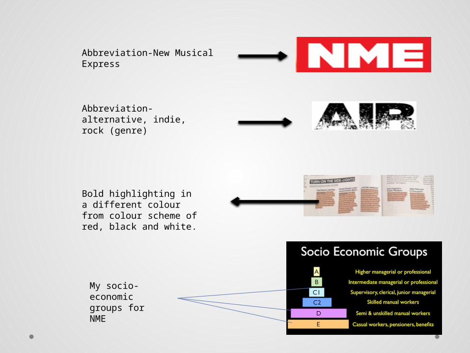
Abbreviation-New Musical Express
Abbreviation- alternative, indie, rock (genre)
Bold highlighting in a different colour from colour scheme of red, black and white.
My socio-economic groups for NME
Proposal 2 • Content/Working Title/Genre: My second proposal of a magazine idea is ‘Simpatico’ I think this is
would be a good choice of a design because much like my first idea with ‘A.I.R.’ I will have to some extent the same layout as NME, with a few differentiations and same genre- indie/rock/alternative, just different colour scheme and meaning to the masthead name. the meaning to my masthead ‘simpatico’ is because its easy and calm, everyone ‘gets along with it’ like the genres and topics/music involved. magazine will be full of pictures, articles, album reviews, gig reports and song lyrics. The publication will also feature bands that are generally quite small and not mainstream. Most will be signed to small record labels or perhaps not signed at all. The magazine will hopefully become a market leader and compete with these publications.
• Because both of my ideas are very similar they both have the same expectations and needs either through presentation or target audience. My targeted audience is mainly men aged between17-30. It also appeals to people with an interest in new music and artist and/or people in a band.
• Style or Approach/ frequency: The price of this magazine will slightly differ from my first idea, this is because I don’t think will look as higher quality due to the colour scheme, making it not look as professional or eye catching. I will be selling my ‘Simpatico’ magazine for £2.50 on a weekly release basis. I think this price is suitable for my magazine because it offers what any other magazine offers but maybe not as high quality, or as much attention to detail as ‘A.I.R.’ also people may not be so willing to pay out too much for something that’s new and not familiar. To create my magazine I will be using Adobe workshop CS5 software and Photoshop- for image manipulation , this is to ensure I get the highest quality standard and so that it looks professional as possible.
• Audience: The socio economic groups for my ,magazine are between A, B and C1 as they all have jobs so can spend their spare income on the magazine. Also because NME isn't an upper class kind of magazine and neither are the people featured in it, so stereotypically you would associate this kind of magazine in the A-B category.
Length: I will be creating 64 pages of my magazine, the front cover and double page spread. These will all be A 4 sized and 8.5 inches width and 11.2 inches height.
2nd magazine Overview
• Content/Working Title/Genre: My second proposal of a magazine idea is ‘Simpatico’ I think this is would be a good choice of a design because much like my first idea with ‘A.I.R.’ I will have to some extent the same layout as NME, with a few differentiations and same genre- indie/rock/alternative, just different colour scheme and meaning to the masthead name. the meaning to my masthead ‘simpatico’ is because its easy and calm, everyone ‘gets along with it’ like the genres and topics/music involved. magazine will be full of pictures, articles, album reviews, gig reports and song lyrics. The publication will also feature bands that are generally quite small and not mainstream. Most will be signed to small record labels or perhaps not signed at all.
• Because both of my ideas are very similar they both have the same expectations and needs either through presentation or target audience. My targeted audience is mainly men aged between17-30. It also appeals to people with an interest in new music and artist and/or people in a band.
• Style or Approach/ frequency: The price of this magazine will slightly differ from my first idea, this is because I don’t think will look as higher quality due to the colour scheme, making it not look as professional or eye catching. I will be selling my ‘Simpatico’ magazine for £2.50 on a weekly release basis. I think this price is suitable for my magazine because it offers what any other magazine offers but maybe not as high quality, or as much attention to detail as ‘A.I.R.’ also people may not be so willing to pay out too much for something that’s new and not familiar. To create my magazine I will be using Adobe workshop CS5 software and Photoshop- for image manipulation , this is to ensure I get the highest quality standard and so that it looks professional as possible.
• Audience: The socio economic groups for my ,magazine are between A, B and C1 as they all have jobs so can spend their spare income on the magazine. Also because NME isn't an upper class kind of magazine and neither are the people featured in it, so stereotypically you would associate this kind of magazine in the A-B category.
• Length: I will be creating 64 pages of my magazine, the front cover and double page spread. These will all be A 4 sized and 8.5 inches width and 11.2 inches height.
For both of my ideas of a magazine, A.I.R and Simpatico its crucial I meet the expectations of a well known, popular and professional magazine that already exists.
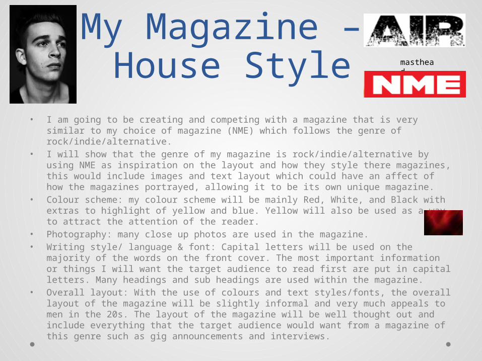
My Magazine – House Style
• I am going to be creating and competing with a magazine that is very similar to my choice of magazine (NME) which follows the genre of rock/indie/alternative.
• I will show that the genre of my magazine is rock/indie/alternative by using NME as inspiration on the layout and how they style there magazines, this would include images and text layout which could have an affect of how the magazines portrayed, allowing it to be its own unique magazine.
• Colour scheme: my colour scheme will be mainly Red, White, and Black with extras to highlight of yellow and blue. Yellow will also be used as a way to attract the attention of the reader.
• Photography: many close up photos are used in the magazine.• Writing style/ language & font: Capital letters will be used on the majority of the
words on the front cover. The most important information or things I will want the target audience to read first are put in capital letters. Many headings and sub headings are used within the magazine.
• Overall layout: With the use of colours and text styles/fonts, the overall layout of the magazine will be slightly informal and very much appeals to men in the 20s. The layout of the magazine will be well thought out and include everything that the target audience would want from a magazine of this genre such as gig announcements and interviews.
masthead
Photo shoot plan• Project: the images for my magazine will be either head shots, or full body
shot so that it makes a statement and make the subject stand out more depending on what the subject is and who they are and if they are in a group. My images will be a mixture between black and white, dark colours and normal colours, nothing too bright (pink) or out of place for my genre. The aim is for the viewer to be intrigued by the images on the front cover and inside the magazine because they will tell a story within them selves. The mood of the images should be set using light and colouring which could determine the emotion of the subject of what the topic is about.
• Project Description: I will be creating a magazine based on music and the genre of alternative, indie and rock. The magazine I have used for inspirations is NME, I chose this magazine because its on I choose to read over others such as Q and Kerrang, this is because it gives my all the information I need to know about articles, album reviews, gig reports and song lyrics. also bands that are generally quite small and not mainstream like catfish and the bottlemen.
• My aim is to create a well selling magazine that my target audience will appreciate and pick over any other magazine within the same genre and market. I will aim to do this by having eye catching house styles and pictures that intrigue my targeted audience. I will be using my imagery in a way where they don’t over power the information and writing within, but help make it flow and create an image in the audiences head.
• Photographer: Keira Hibbert
Test photography
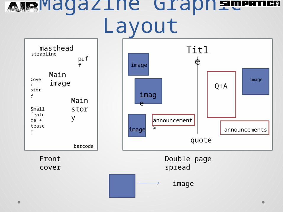
Magazine Graphic Layout
Front cover Double page spread
mastheadstrapline
barcode
Main image
Cover story
puff
Main story Small
feature + teaser
Title
image
image
image
image
quote
Q+A
announcements
announcements
image
Magazine flat planmasthead
Phone advert
index
subscription
Cover story Awards
+ nominations
newsNME radio
article
Main image
article
headline Headlin
e image
headline
article
Article 1
Article 2
Headline
article
headline
article
title
infoinfo
title
article
inte
rvie
w
advert
text
headline
article
headline
article
title
article
Double page spread
title
articlearticle
Newspaper advert for free CD
title
Book promotion
Double page spreadalbums
Information + text
Double page continued
Skins- TV promo
text
text
HMV advert
Headline
text
CD page
Gig promo
headline Top
charts
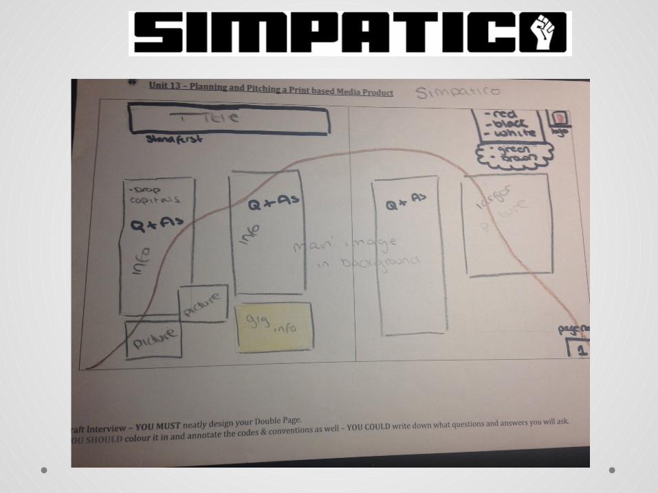
Hand Drawn Drafts
Main image and story
slogan
masthead
Cover lines
Small feature + teaser
imagesquote Page
number
Questions and answers to interview
Gig announcements
Album launch
Drop capitals
Stand first
barcode
Cover story
Puff promotion
Interview• Where did the name come from?-The name comes from my first recollection of hearing music. I spent the first 2/3 years of my life travelling around Australia with my Mum and Dad and my first remembrance of music was being outside a cafe on the harbor and seeing a busker playing. He used to play half empty wine bottles like a drum kit! he was called Catfish the Bottleman. I just thought it was really fitting to name the band that when we eventually made one.• Do you think the style of music you play, and the way you play it, has
changed much since first meeting at school in Wales?-Yeah! When we first started we could all hardly play at all and just used to play like terrible Beatles covers. When we got a bit tighter as a band and started to actually learn how to play I got really into writing and I just used to sit write all day.• Who are your main influences and inspirations?-lyrics mean more to me than music so the things that influence me are the people around me. Stuff our Tour Manager just random drunken one liners you over hear. So I'm more influenced by the people and happenings around me. I’m inspired by my Granddad and the music he liked and his aspirations.
• Do you like the type of crowds and fans you are attracting?- Most defiantly! Couldn’t ask for better fans! They go crazy and support us
through everything. Even the ones who have been there from the start.. Just following us around the country. Means the world.
• When was your first album released?- 'Homesick‘ September 2014• Where were you formed?- band that formed in Llandudno, North Wales.• Who are your main influences and inspirations? - Lyrics mean more to me than music so the things that influence me are the
people around me. Stuff our Tour Manager just random drunken one liners you over hear. So I'm more influenced by the people and happenings around me. I’m inspired by my Granddad and the music he liked and his aspirations.
• When was your first album released? - Our first album 'Homesick‘ was released in September 2014! I have never been so excited in my entire life! never did I think we would get this far..This quick! • What was the worst lie ever told? The worst lie I’ve ever told was…-I don't know about the worst, but one of the best off the top of my head was that I was in the Vaccines to the security when they supported Arctic Monkeys a few years back. We were playing across the road from them and I just thought after sound check, "I might just blag this y'know!" So they let me through and I went and invited them to come see us across the road and watched them both tear a sold out arena up.
Further development possibilities
• Later issues- in the future I hope my magazine will prosper and be very successful. To ensure this happens and continues I will keep my magazine packed full of information targeted specifically towards my audience with updates on gigs and band information, plus general indie, rock, alternative music updates such as this years new popular bands and line ups for festivals such as Reading and V festival. I will hopefully start up a website and have an online monthly issue as well as weekly hard copies.
Contents• Pitch
• Environment• Ethical and Legal and Regulatory
• IPSO• IPSO continued• Copyright laws
• Watermark protection• 2nd magazine Overview
• Colour scheme
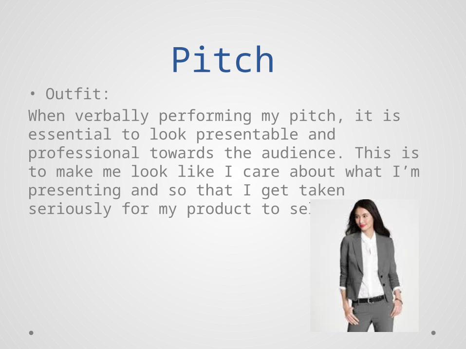
Pitch • Outfit:When verbally performing my pitch, it is essential to look presentable and professional towards the audience. This is to make me look like I care about what I’m presenting and so that I get taken seriously for my product to sell.
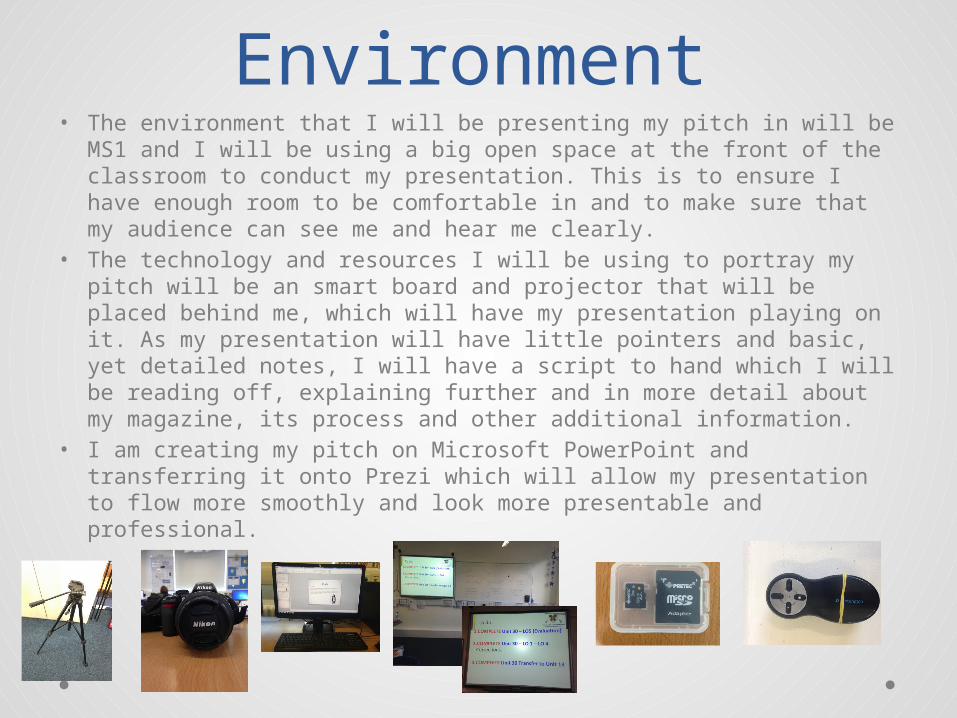
Environment• The environment that I will be presenting my pitch in will be MS1
and I will be using a big open space at the front of the classroom to conduct my presentation. This is to ensure I have enough room to be comfortable in and to make sure that my audience can see me and hear me clearly.
• The technology and resources I will be using to portray my pitch will be an smart board and projector that will be placed behind me, which will have my presentation playing on it. As my presentation will have little pointers and basic, yet detailed notes, I will have a script to hand which I will be reading off, explaining further and in more detail about my magazine, its process and other additional information.
• I am creating my pitch on Microsoft PowerPoint and transferring it onto Prezi which will allow my presentation to flow more smoothly and look more presentable and professional.
Procedure:• 1. Our remit• 2. Who can complain?• 3. Delayed complaints• 4. Submitting a complaint
Our remit- Most of the complaints IPSO receives relate to editorial material published by member publications, whether in print or on their websites. This includes:•Articles;•Images (including video);•Audio material on newspaper and magazine websites;•Readers' letters;•Edited or moderated reader comments on newspaper and magazine websites.
Who can complain- IPSO will take forward complaints from any individual or organisation that an inaccuracy has been published on a general point of fact. Where an inaccuracy relates to a specific individual or organisation, we may be able to take forward a complaint from a third party, but will need to consider the position of the directly affected party in deciding whether it is appropriate to do so.
Delayed complaints-IPSO is able to consider complaints within four months from the date of the conduct complained about, or publication of the article. IPSO is not able to investigate complaints about material published over 12 months before the date of the complaint, even where it remains published on the publication's website.
Submitting a complaint- note that if IPSO believes that your complaint raises a potential breach of the Editors' Code, we will send the detail of your complaint to the publication, which will then have the opportunity to resolve the matter directly. This is to ensure the swift resolution of substantive complaints wherever possible.
• 1. Initial assessment-assess whether it falls within our remit and whether it raises a possible breach of the Code. If not, the Complaints Officer handling your complaint will write to you to explain the reasons why we are unable to take your concerns forward.
• 2. Referral to the publication-If your complaint raises a possible breach of the Code, and you have not previously exhausted the publication's own complaints procedure, we will pass on the detail of your complaint to the editor, who should seek to resolve the matter directly with you. IPSO can take over the handling of your concerns either once the publisher's internal complaints procedures have been exhausted, or if the matter has not been resolved after 28 days
• 3. The investigation-You will be provided with a copy of the publication's response to your complaint, and given the opportunity to comment on this. We will also seek to mediate an outcome to your complaint which is satisfactory to you, if appropriate.
• 4. Adjudication by the Complaints Committee-If your complaint remains unresolved, the Complaints Committee will decide whether there has been a breach of the Editors' Code. In line with our commitment to transparency, the Complaints Committee will take into account only information which has been seen by both sides to the complaint, and will publish its decision setting out whether the Editors’ Code has been breached, and why, on our website.
• 5. Remedies-If the Complaints Committee determines that the Code has been breached, it can require the publication of its upheld adjudication and/or a correction. The nature, extent and placement of corrections and adjudications will be determined by the Complaints Committee.
• 6. Review of the process-If your complaint proceeds through steps 2 through 5 but you are unhappy with the process by which the decision of the Complaints Committee was made, you may request a review by the Complaints Reviewer. IPSO will then decide whether to refer the complaint to the Complaints Reviewer. If the referral is made, the Reviewer will review the process by which the decision was made, and inform the Complaints Committee within 14 days whether it considers that the process was substantially flawed
• 7. Complaints which are not pursued-IPSO expects both publications and complainants to cooperate with it in the prompt consideration of complaints. Should we not receive an initial response to correspondence, we will generally contact you with a further request for a reply within a specified time period. If we do not receive a substantive reply within the specified period, we may close your complaint as not pursued. Alternatively, the Committee may proceed to consideration of the complaint without the benefit of your comments.
• 8. Unacceptable behaviour by complainants and vexatious complaints-IPSO does not expect its staff to tolerate unacceptable behaviour by complainants. Unacceptable behaviour may involve vexatious or disproportionate pursuit of a complaint. It also extends to any other behaviour that, because of its frequency or nature, hinders IPSO’s ability to handle complaints effectively, including:
• I. using abusive, offensive, aggressive, racist or foul language in conversation or correspondence with staff;• ii. harassing, verbally abusing or seeking to intimidate staff;• iii. engaging in unreasonably protracted or repetitive communications with staff;• iv. attending IPSO’s offices and seeking to speak with a member of staff without an appointment;• v. repeatedly refusing requests by staff to follow IPSO’s procedures, despite having been provided with appropriate information about
these procedures;• vi. making persistent and/or unreasonable demands of staff and/or the complaints process.• e)IPSO reserves the right to take appropriate action in cases where complainants are exhibiting unacceptable behaviour, including by
restricting the manner in which complainants may communicate with IPSO’s staff or declining to further consider a complaint.
Copyright Laws
Copyright is a legal right created by the law of a country, that grants the creator of an original work exclusive rights to its use and distribution, usually for a limited time, with the intention of enabling the creator to receive compensation for their intellectual effort.
Copyright law originated in the United Kingdom from a concept of common law; the Statute of Anne 1709. It became statutory with the passing of the Copyright Act 1911. The current act is the Copyright, Designs and Patents Act 1988.
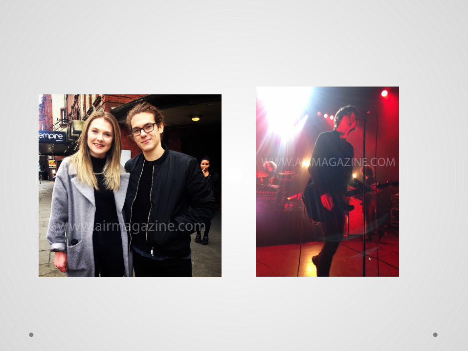
• The risks of copyright AIR magazine could face would be the logo being potentially used or involved in other sources without permission.
It could also have its interviews used or ‘stolen’ without permission.
Copyright is important to creators like writers and artists as well as those such as publishers that own rights, as it provides them with a legal right of ownership of the work that they produce. This means that creators of an original piece of work can have some control over how it is used, which is not only fair but necessary for them to make a living from their talent and efforts. When they have the means to make a living from their work then they can continue to invest their time, and, in the case of publishers, their money into the production of new work.
Watermark protection• The first step is to ensure that your photos are copyrighted.
Fortunately, in most countries this happens automatically when the photo is created, including in the US, UK, EU and Canada. No action is required on your part, and you will have all necessary legal rights to recover any lost fees from unauthorized use.
• Photo Watermarks. These are a good way to make it clear that you are serious about copyright protection. They also make it more likely that you will receive credit even when an image has been copied without your permission.
• big problem with watermarks is that they can distract from your image — potentially negating the reason for sharing it in the first place. On the other hand, if the watermark is too subtle, then this also often means it can be easily edited out. A visible watermark is therefore only appropriate for certain types of online images, such as demo photos sent to clients, or computer graphics intended for sale.