UNIT II HUMAN COMPUTER INTERACTION User Interface Design Process – Obstacles –Usability –Human Characteristics In Design – Human Interaction Speed –Business Functions –Requirement Analysis – Direct –Indirect Methods – Basic Business Functions – Design Standards – System Timings – Human Consideration In Screen Design – Structures Of Menus – Functions Of Menus–Contents Of Menu– Formatting – Phrasing The Menu – Selecting Menu Choice–Navigating Menus– Graphical Menus. User Interface Design Process - User interface design process describes the development steps in creation of graphical systems or website’s screen and pages. - It enables all the interface design activities to be addressed easily, clearly, sequentially. Several critical general aspects of the design process include. 1. Obstacles in the development path. 2. Pitfalls in the development path. 3. Guidelines to be followed for entire design process. 1 .Obstacles in the development path: The following list outs the general observations about design. 1. Nobody ever gets its right the first time. 2. Designer need good tools. 3.Even if you have made the best system humanly possible, people will still make mistakes when using it. 4. Development is chock-full of surprises. 5. Good design requires living in a sea of changes.
Transcript
UNIT II
HUMAN COMPUTER INTERACTION
User Interface Design Process – Obstacles –Usability –Human Characteristics In Design – Human Interaction Speed –Business Functions –Requirement Analysis – Direct –Indirect Methods – Basic Business Functions – Design Standards – System Timings –Human Consideration In Screen Design – Structures Of Menus – Functions Of Menus–Contents Of Menu– Formatting – Phrasing The Menu – Selecting Menu Choice–Navigating Menus– Graphical Menus.
User Interface Design Process
- User interface design process describes the development steps in creation of graphical systems or website’s screen and pages.
- It enables all the interface design activities to be addressed easily, clearly, sequentially.
Several critical general aspects of the design process include.
1. Obstacles in the development path.
2. Pitfalls in the development path.
3. Guidelines to be followed for entire design process.
1 .Obstacles in the development path:
The following list outs the general observations about design.
1. Nobody ever gets its right the first time.2. Designer need good tools.3. Even if you have made the best system humanly possible, people will still make mistakes
when using it. 4. Development is chock-full of surprises. 5. Good design requires living in a sea of changes. 6. Making contracts to ignore change will never eliminate the need for change. 7. Designers need good tools
2. Pitfalls in the design process:
Pitfalls exists because of a flawed design process including a failure address critical design issues, such as improper focus of attention or development team organization failures .
The common pitfalls are:
1. No early analysis and understanding of the user’s needs and expectations.
2. Little or no creation of design element prototype.
3. No usability testing.
4. Poor communication between members of the development team.
5. No common design team vision of user interface design goals.
Five Commandments in entire Design process:
Pitfalls can be eliminated if the following design commandments remain foremost in the designer’s mind.
1. Gain a complete understanding of users and their tasks:
- Today people expect a level of design sophistication from all interfaces, including websites.
- The product, system or website must be geared to people’s needs not those of the developers.
2. Solicit early and ongoing user involvement:
- Involving the users in design from the beginning provides a direct channel to the knowledge they posses about jobs, tasks and needs,
- Involvements also allow the developer to identify a person’s resistance to change, a common human trait.
3. Perform Rapid prototyping and testing:
- Prototyping and testing product will quickly identify problems and allow developing solutions.
- Prototyping and testing must be continuously performed during all the stages of development to uncover all potential defects.
4. Modify and iterate the design as much as necessary:
- Problems detected in one stage may force the developer to revisit a previous stage. This is normal and should be expected.
- Establish user performance, acceptance criteria; continue testing and modifying until all design goals are met.
5. Integrate the design of all the system components:
- A system is being constructed, not simply software.
- Concurrent development of all pieces will point out possible problems earlier in the design process, allowing them to be effectively addressed.
Usability:
Usability possesses these five quality components:
- Learnability: How easy is it for users to accomplish basic tasks the first time they
encounter the design?
- Efficiency: Once users have learned the design, how quickly can they perform tasks?
- Memorability: When users return to the design after a period of not using it, how easily
can they reestablish proficiency?
- Errors: How many errors do users make, how severe are these errors, and how easily can
they recover from the errors?
- Satisfaction: How pleasant is it to use the design?
The following dimensions of usability have been described by Quesenbery (2003).
- Effective. The completeness and accuracy with which users achieve their goals.
- Efficient. The speed (with accuracy) with which users can complete their tasks.
- Engaging. The degree to which the tone and style of the interface makes the product
pleasing or satisfying to use.
- Error tolerant. How well the design prevents errors and helps with recovery from those
that do occur.
- Easy to learn. How well the product supports both initial orientation and deepening
understanding of its capabilities.
Common Usability Problems: - Ambiguous menus and icons - Languages that permit only single-direction movement through a system - Input and direct manipulation limits - Highlighting and selection limitations
- Unclear step sequences - More steps to manage the interface than to perform tasks - Complex linkage between and within applications - Inadequate feedback and confirmation - Lack of system anticipation and intelligence - Inadequate error messages, help, tutorials, and documentation
Some Practical Measures of Usability • Are people asking a lot of questions or often reaching for a manual?• Are frequent exasperation responses heard?• Are there many irrelevant actions being performed?• Are there many things to ignore?
Some Objective Measures of Usability: - How effective is the interface? Can the required range of tasks be accomplished? - How learnable is the interface? - How flexible is the interface? - What are the attitudes of the users?
Possible Usability Measurement Criteria1. Time to complete a task.2. Percentage of task completed.3. Percentage of task completed per unit time (speed metric).4. Ratio of successes to failures.5. Time spent on errors.6. Percentage of number of errors.7. Percentage of number of competitors that do this better than the current product.8. Number of commands used.9. Frequency of help or documentation use.10. Time spent using help or documentation.11. Percentage of favorable to unfavorable user commands.12. Number of repetitions of failed commands.13. Number of runs of success and of failures.14. Number of times the interface misleads the user.15. Number of good and bad features recalled by users.16. Number of available commands not invoked.17. Number of regressive behaviors.18. Number of users preferring your system.19. Number of times users need to work around a problem.20. Number of times the user is distracted from a work task.21. Number of times the user loses control of a system.22. Number of times the user expresses frustration or satisfaction.
Human characteristics in Design: The following attributes that have an important influence on interface and screen design.
Perception.
- Perception is our awareness and understanding of the elements and objects of the environment through the physical sensation of our various senses like sight, sound, and smell.
- Perception is influenced, in part, by experience.
- Other perceptual characteristics include the following:
1. Proximity: our eyes and mind see objects as belonging together if they are near each other in space.
2. Similarity: Our eyes and mind see objects as belonging together if they share a common visual property, such as color, size, shape and brightness.
3. Matching patterns: We respond similarly to the same shape in different sizes.
4. Unity: objects that form closed shapes are perceived as a group.
5. Continuity: shortened lines may be automatically extended.
Memory:- Memory is not the most stable of human attributes.- Memory is divided into 2 types :
1. Short term memory.
- It receives information from either the senses or the long term memory but usually cannot receive from both at once, the senses being processed separately.
- Information stored within 10 to 30 seconds.
2. Long term memory:
- It contains the knowledge we possess.
- Information received in short term memory is transferred to it and encoded. This process is called learning.
- Learning is improved if the information being transferred from short term memory has structure and is meaningful.
• Sensory storage :
- Sensory storage is the buffer where the automatic processing of information collected from our senses takes place.
- It is an unconscious process, large, attentive to the environment, quick to detect changes, and constantly being replaced by newly gathered stimuli.
• Fovea and peripheral vision:
- Fovea vision is used to focus directly on something.
- Peripheral vision senses anything in the area surrounding the location we are looking at.
- It maintains co – operative and competitive relationship.
• Information processing:
- The information that our senses collect that is important enough to do something about then has to be processed in some meaningful way.
Two levels of information processing:
1. Higher level. - is identified with consciousness and working memory. It is limited, slow, and sequential, and is used for reading and understanding.
2. Lower level. - There exists a lower level of information processing, and the limit of its capacity is unknown. This lower level processes familiar information rapidly, in parallel with the higher level, and without conscious effort.
• Mental Models- A mental model is simply an internal representation of a person’s current
understanding of something. - Mental models are gradually developed in order to understand something, explain
things, make decisions, do something, or interact with another person.- Mental models also enable a person to predict the actions necessary to do things if
the action has been forgotten.• Movement Control
- Once the data has been perceived and an appropriate action decided upon a response must be made; in many cases the response is a movement.
- In computer systems movements include such activities as pressing keyboard keys, moving the screen pointer by pushing a mouse or rotating a trackball.
• Learning
- Learning, as has been said, is the process of encoding in long-term memory information
• It clearly differentiates humans from machines.
• It gives enough time for people to improve their performance in almost any task.
Skill
- The goal of human performance is to perform skillfully. To do so requires linking inputs and responses into a sequence of action
- The essence of skill is performance of actions or movements in the correct time sequence with adequate precision.
- Skills are hierarchical in nature, and many basic skills may be integrated to form increasingly complex ones
- Lower-order skills tend to become routine and may drop out of consciousness.
• Performance Load
- The greater the effort to perform a task, the less likely the task will be accomplished successfully, or even at all.
- Cognitive load is the amount of mental activity required to perform a task or achieve an objective
- Kinematic load is the degree of physical activity or effort necessary to perform a task or achieve an objective
• Individual Differences:
- In reality, there is no average user. - Human characteristic is that we all differ—in looks, feelings, motor abilities,
intellectual abilities, learning abilities and speed, and so on.- Design must provide for the needs of all potential users.
Human interaction speeds:It describes the speed at which people can perform using various communication methods
Reading Listening Speaking Keying Hand printing
1. Reading :- The average adult reading speed in the order of 250 – 300 words per minute.- Non – traditional reading methods have been explored in research lab.
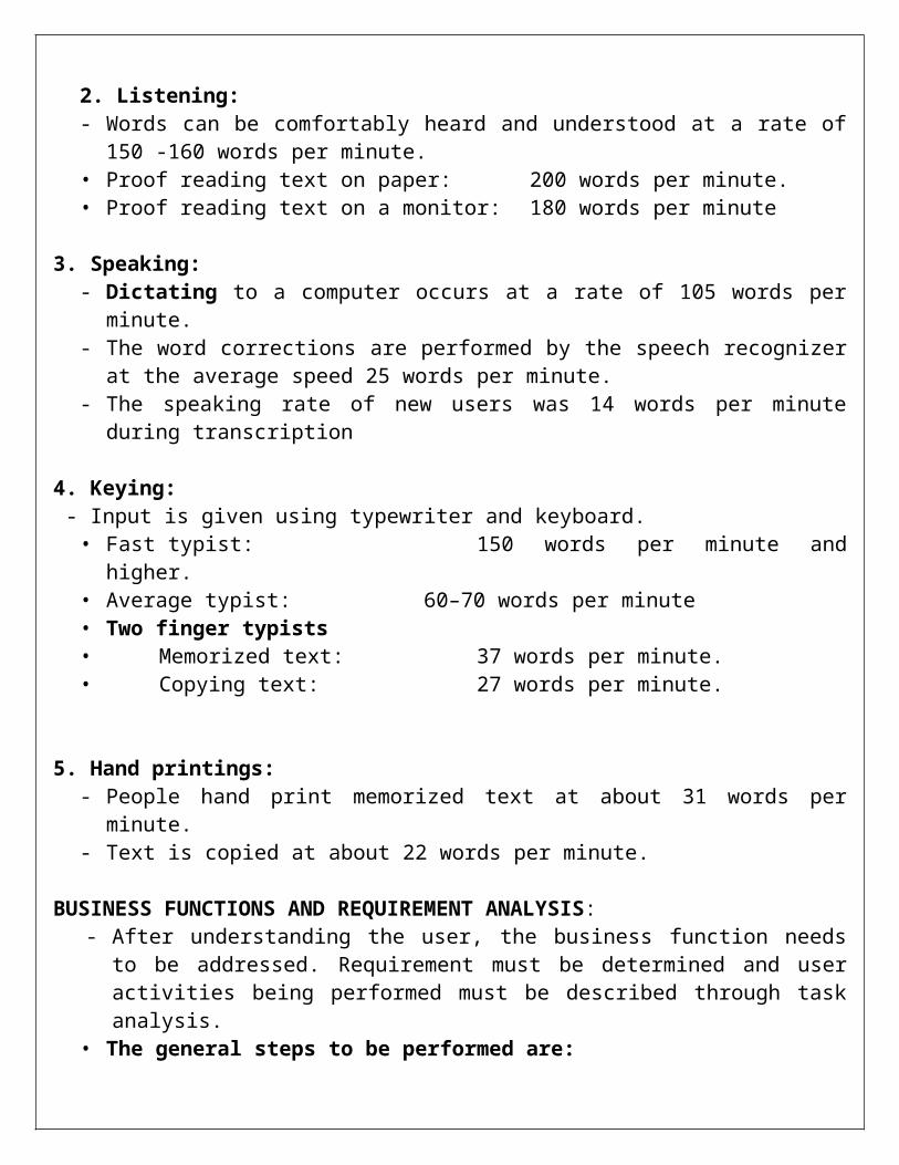
2. Listening:- Words can be comfortably heard and understood at a rate of 150 -160 words per minute.• Proof reading text on paper: 200 words per minute.• Proof reading text on a monitor: 180 words per minute
3. Speaking: - Dictating to a computer occurs at a rate of 105 words per minute.- The word corrections are performed by the speech recognizer at the average speed 25
words per minute.- The speaking rate of new users was 14 words per minute during transcription
4. Keying: - Input is given using typewriter and keyboard.• Fast typist: 150 words per minute and higher.• Average typist: 60–70 words per minute• Two finger typists • Memorized text: 37 words per minute.• Copying text: 27 words per minute.
5. Hand printings:- People hand print memorized text at about 31 words per minute. - Text is copied at about 22 words per minute.
BUSINESS FUNCTIONS AND REQUIREMENT ANALYSIS:- After understanding the user, the business function needs to be addressed. Requirement
must be determined and user activities being performed must be described through task analysis.
• The general steps to be performed are:• Perform a business definition and requirements analysis.• Determine basic business functions.• Describe current activities through task analysis.• Develop a conceptual model of the system.• Establish design standards or style guides.• Establish system usability design goals.• Define training and documentation needs.
Business Definition and Requirements Analysis • The objective of this phase is to establish the need for a system. A requirement is an
objective that must be met.
• A product description is developed and refined, based on input from users or marketing. There are many techniques for capturing information for determining requirements
Two types of techniques for determining are:1. Direct method.2. Indirect method.
1. DIRECT METHODS - The advantage of direct method is , it gets the direct input, from the user. Person to
person encounters permit multiple channels of communication.
The following techniques are recommended direct methods.Individual Face-to-Face Interview
• A one-on-one visit with the user to obtain information. It may be structured or somewhat open-ended.
• A formal questionnaire should not be used, however. Useful topics to ask the user to describe in an interview include:
• The activities performed in completing a task or achieving a goal or objective.• The methods used to perform an activity.
Advantages - Advantages of a personal interview are that you can give the user your full
attention, can easily include follow-up questions to gain additional information.- It gives more time to discuss topics in detail.- It derives a deeper understanding of your users, their experiences, attitudes, beliefs,
and desires.Disadvantages
- costly and time-consuming to conduct- Someone skilled in interviewing techniques should perform them.
Telephone Interview or Survey - This interview is conducted using the telephone.- It must have structured and be well planned.- Arranging the interview in advance allow the user to prepare for it.
Advantage:- Telephone interviews are less expensive and less invasive than personal interviews. - They can be used much more frequently and are extremely effective for very specific
information.Disadvantage
- Impossible to see the body language cues.- It is difficult to contact the right person for the telephone interviewer.
Traditional Focus Group - A small group of users and a moderator brought together to verbally discuss the
requirements
- The purpose of a focus group is to probe user’s experiences, attitudes, beliefs, and desires, and to obtain their reactions to ideas or prototypes
Setting up focus group involves the following:– Establish the objectives of the session.– Select participants representing typical users, or potential users.– Write a script for the moderator to follow.– Find a skilled moderator to facilitate discussion, to ensure that the discussion
remains focused on relevant topics, and to ensure that everyone participates.
Facilitated Team Workshop • A facilitated, structured workshop held with users to obtain requirements information. • Similar to the traditional Focus Group• Like focus groups, they do require a great deal of time to organize and run.
Observational Field Study • Users are observed and monitored for an extended time to learn what they do.• Observation, however, can be time-consuming and expensive.• Video recording of the observation sessions will permit detailed task analysis.
Requirements Prototyping • A demo, or very early prototype, is presented to users for comments concerning
functionality.User-Interface Prototyping • A demo, or early prototype, is presented to users to uncover user-interface issues and
problemsUsability Laboratory Testing • Users at work are observed, evaluated, and measured in a specially constructed
laboratory.• Usability tests uncover what people actually do, not what they think they do a common
problem with verbal descriptionsCard Sorting for Web Sites
- A technique to establish groupings of information for Web sites- It is normally used only after gathering.- Content topics are placed on individual index card and the users are asked to sort the
cards into grouping that are meaningful to them.
INDIRECT METHODS - An indirect method of requirements determination is one that places an
intermediary between the developer and the user. - This intermediary may be electronic or another person
• Problems of Indirect Method - First, there may be a filtering or distortion of the message, either intentional or
unintentional.
- Next, the intermediary may not possess a complete, or current, understanding of user’s needs, passing on an incomplete or incorrect message.
- Finally, the intermediary may be a mechanism that discourages direct user-developer contact for political reasons.
• MIS Intermediary - A company representative defines the user’s goals and needs to designers and
developers.- This representative may come from the Information Services department itself, or
he or she may be from the using department.
• Paper Survey or Questionnaire - A survey or questionnaire is administered to a sample of users using
traditional mail methods to obtain their needs.- Questionnaires have the potential to be used for a large target audience
located most anywhere, and are much cheaper than customer visits.- They generally, however, have a low return rate- Questionnaires should be relatively short and created by someone
experienced in their design. • Electronic Survey or Questionnaire
A survey or questionnaire is administered to a sample of users using e-mail or the Web to obtain their needs
In creating an electronic survey:- Determine the survey objectives.- Determine where you will find the people to complete the survey.- Create a mix of multiple choice and open-ended questions requiring short answers
addressing the survey objectives.
• Electronic Focus Group • A small group of users and a moderator discuss the requirements online using
workstations.• All comments ideas and suggestions are available in hardcopy form for easier
analysis.• It generates more ideas in a shorter time.
• Marketing and Sales • Company representatives who regularly meet customers obtain suggestions or needs,
current and potential.• Support Line • Information collected by the unit that helps customers with day-to-day problems is
analyzed (Customer Support, Technical Support, Help Desk, etc.).
• E-Mail or Bulletin Board • Problems, questions, and suggestions from users posted to a bulletin board or through e-
mail are analyzed. • User Group • Improvements are suggested by customer groups who convene periodically to discuss
software usage. They require careful planning.• Competitor Analyses • A review of competitor’s products or Web sites is used to gather ideas, uncover design
requirements and identify tasks.• Trade Show • Customers at a trade show are presented a mock-up or prototype and asked for
comments. • Other Media Analysis • An analysis of how other media, print or broadcast, present the process, information, or
subject matter of interest.• System Testing • New requirements and feedback are obtained from ongoing product testing
DETERMINING BASIC BUSINESS FUNCTIONS- A detailed description of what the product will do is prepared. Major system functions
are listed and described, including critical system inputs and outputs. A flowchart of major functions is developed.
The process the developer will use is summarized as follows:– Gain a complete understanding of the user’s mental model based upon:
• The user’s needs and the user’s profile.• A user task analysis.
– Develop a conceptual model of the system based upon the user’s mental model.• This includes:
» Defining objects.» Developing metaphors.
Understanding the User’s Mental Model- A goal of task analysis, and a goal of understanding the user, is to gain a picture of the
user’s mental model.- A mental model is an internal representation of a person’s current conceptualization and
understanding of something.
Developing Conceptual Models • The output of the task analysis is the creation, by the designer, of a conceptual
model for the user interface. A conceptual model is the general conceptual framework through which the system’s functions are presented.
• Such a model describes how the interface will present objects, the relationships between objects, the properties of objects, and the actions that will be performed.
Guidelines for Designing Conceptual Models- Reflect the user’s mental model not the designer’s: A user will have different
expectations and levels of knowledge than the designer. So, the mental models of the user and designer will be different.
- The user is concerned with the task to be performed, the business objectives that must be fulfilled.
Draw physical analogies or present metaphors:- Replicate what is familiar and well known.- Duplicate actions that are already well learned.
Comply with expectancies, habits, routines, and stereotypes: - Use familiar associations, avoiding the new and unfamiliar.- With color, for example, accepted meanings for red, yellow, and green are
already well established.- Use words and symbols in their customary ways.
Provide action-response compatibility:- All system responses should be compatible with the actions.
Provide proper and correct feedback: - Be generous in providing feedback.- Keep a person informed of what is happening, and what has happened, at all
times, including: • Provide visible results of actions.• Display actions in progress.• Provide a continuous indication of status.
Developing Metaphors • A metaphor is a concept where one’s body of knowledge about one thing is used to
understand something else.• Metaphors act as building blocks of a system, aiding understanding of how a system
works and is organized.• A common metaphor in a graphical system is the desktop and its components,
– Choose the analogy that works best for each object and its actions.– Use real-world metaphors.– Use simple metaphors.– Use common metaphors.– Multiple metaphors may coexist.
Design Standards or Style Guides:- A design standard or style guide documents an agreed-upon way of doing
something.- It also defines the interface standards, rules, guidelines, and conventions that must
be followed in detailed design
Value of Standards and Guidelines:- This is valuable to users because the standards and guidelines:
– Allow faster performance.– Reduce errors.– Reduce training time.– Foster better system utilization.– Improve satisfaction.
Document Design- Include checklists to present principles and guidelines.- Provide a rationale for why the particular guidelines should be used.- Provide a rationale describing the conditions under which various design alternatives are
appropriate.- Include concrete examples of correct design.
HUMAN CONSIDERATION IN SCREEN DESIGN:
- The usage of screen and a system is affected by many factors. These include how much information is presented on the screen, how a screen is organized. The language used on the screen.
- Unclear captions and badly worded questions. These cause hesitation, and rereading, in order to determine what is needed or must be provided
- Improper type and graphic emphasis. Important elements are hidden
What Screen Users Want
• An orderly, clean, clutter-free appearance.• An obvious indication of what is being shown and what should be done with it.• Expected information located where it should be.• A clear indication of what relates to what, including options, headings, captions, data, and
so forth.• Plain, simple English.• A simple way of finding out what is in a system and how to get it out.
ORGANIZING SCREEN ELEMENTS CLEARLY AND MEANINGFULLY
• Visual clarity is achieved when the display elements are organized and presented in meaningful and understandable ways.
• A clear and clean organization makes it easier to recognize screen’s essential elements and to ignore its secondary information when appropriate.
Consistency
• Provide real-world consistency. Reflect a person’s experiences, expectations, work conventions, and cultural conventions.
• Provide internal consistency.
• Operational and navigational procedures.• Visual identity or theme.• Component.
Ordering of Screen Data and Content
• Divide information into units those are logical, meaningful, and sensible.• Keep minimum amount of information that the user can retain in short term memory. • Organize by the degree interrelationship between data or information• Provide an ordering of screen units of information and elements that is prioritized
according to the user’s expectations and needs.Screen Navigation and Flow
• Provide an ordering of screen information and elements that:
– Is rhythmic, guiding a person’s eye through the display.– In establishing eye movement through a screen, also consider that the eye tends to
move sequentially, for example:— From dark areas to light areas.
Visually Pleasing Composition
• Provide visually pleasing composition with the following qualities:
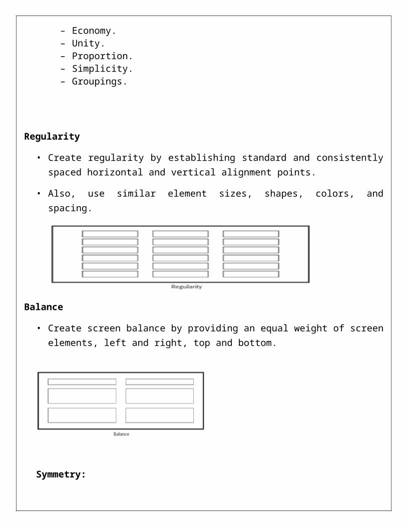
• Create regularity by establishing standard and consistently spaced horizontal and vertical alignment points.
• Also, use similar element sizes, shapes, colors, and spacing.
Balance
• Create screen balance by providing an equal weight of screen elements, left and right, top and bottom.
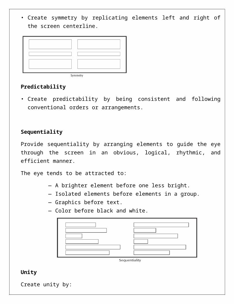
Symmetry:
• Create symmetry by replicating elements left and right of the screen centerline.
Predictability
• Create predictability by being consistent and following conventional orders or arrangements.
Sequentiality
Provide sequentiality by arranging elements to guide the eye through the screen in an obvious, logical, rhythmic, and efficient manner.
The eye tends to be attracted to:
— A brighter element before one less bright.— Isolated elements before elements in a group.— Graphics before text.— Color before black and white.
Unity
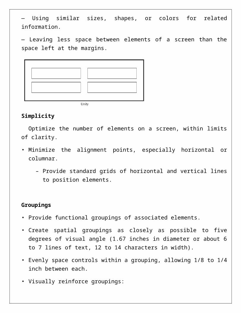
Create unity by:
— Using similar sizes, shapes, or colors for related information.
— Leaving less space between elements of a screen than the space left at the margins.
Simplicity
Optimize the number of elements on a screen, within limits of clarity.
• Minimize the alignment points, especially horizontal or columnar.
– Provide standard grids of horizontal and vertical lines to position elements.
Groupings
• Provide functional groupings of associated elements.
• Create spatial groupings as closely as possible to five degrees of visual angle (1.67 inches in diameter or about 6 to 7 lines of text, 12 to 14 characters in width).
• Evenly space controls within a grouping, allowing 1/8 to 1/4 inch between each.
• Visually reinforce groupings:
— Provide adequate separation between groupings through liberal use of white space.
Amount of Information
• Present the proper amount of information for the task.
— Too little is inefficient.
— Too much is confusing.
• Present all information necessary for performing an action or making a decision on one screen, whenever possible.
Web Page Size
• Minimize page length.— Restrict to two or three screens of information.• Place critical or important information at the very top so it is always viewable when the
page is opened.Scrolling and paging:
Scrolling:— Avoid scrolling to determine a page’s contents.— Minimize vertical page scrolling.— When vertical scrolling is necessary to view an entire page:
Provide contextual cues within the page that it must be scrolled to view its entire contents.
Provide a unique and consistent “end of page” structure.— Avoid horizontal page scrolling.
Paging:— Encourage viewing a page through “paging.”— Create a second version of a Web site, one consisting of individual screens that are viewed through “paging.”
Distinctiveness
Individual screen controls, and groups of controls, must be perceptually distinct.— Screen controls:
• Should not touch a window border.• Should not touch each other.
— Field and group borders:• Should not touch a window border.• Should not touch each other.
— Buttons:• Should not touch a window border.• Should not touch each other.
A button label should not touch the button border. Adjacent screen elements must be displayed in colors or shades of sufficient contrast with
one another.
Presenting Information Simply and Meaningfully
• Provide legibility.— Information is noticeable and distinguishable.
• Provide readability.— Information is identifiable, interpretable, and attractive.
• Present information in usable form.— Translations, transpositions, and references to documentation should not be required
to interpret and understand information.• Utilize contrasting display features.
— To attract and call attention to different screen elements.• Create visual lines.
— Implicit and explicit, to guide the eye.• Be consistent.
— In appearance and procedural usage.
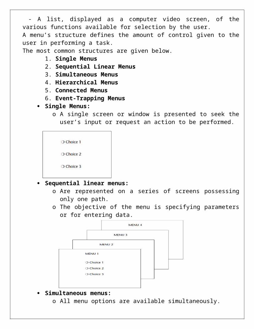
STRUCTURE OF MENUS: - A list, displayed as a computer video screen, of the various functions available for selection by the user.A menu’s structure defines the amount of control given to the user in performing a task.The most common structures are given below.
1. Single Menus2. Sequential Linear Menus 3. Simultaneous Menus 4. Hierarchical Menus 5. Connected Menus 6. Event-Trapping Menus
Single Menus: o A single screen or window is presented to seek the user’s input or request an
action to be performed.
Sequential linear menus: o Are represented on a series of screens possessing only one path. o The objective of the menu is specifying parameters or for entering data.
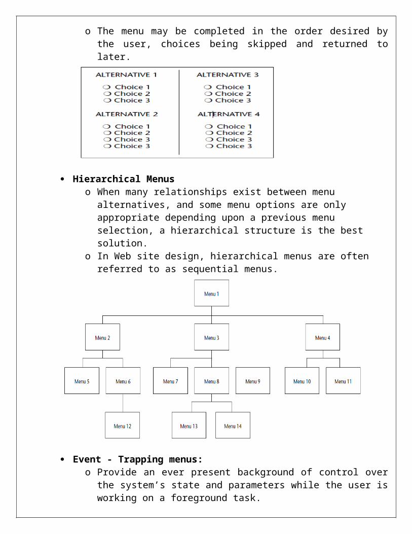
Simultaneous menus:
o All menu options are available simultaneously. o The menu may be completed in the order desired by the user, choices being
skipped and returned to later.
Hierarchical Menus o When many relationships exist between menu alternatives, and some menu
options are only appropriate depending upon a previous menu selection, a hierarchical structure is the best solution.
o In Web site design, hierarchical menus are often referred to as sequential menus.
Event - Trapping menus: o Provide an ever present background of control over the system’s state and
parameters while the user is working on a foreground task. The functions of event trapping menus are:
They may immediately change some parameter in the current environment They may take the user out of the current environment to perform a function They may exit the current environment and allow user to move to a totally new environment
Connected Menus:o Connected menus are networks of menus all interconnected in some manner. o Movement through a structure of menus is not restricted to a hierarchical
tree, but is permitted between most or all menus in the network. o From the user’s perspective there is no top-down traversal of the menu
system, but an almost unhindered wandering between any two menus of interest.
o A connected menu system may be cyclical, with movement permitted in either direction between menus, or a cyclical, with movement permitted in only one direction.
o These menus also vary in connectivity, the extent to which menus are linked by multiple paths.
Functions of Menus: Navigation to a new menu
o Each user selection causes another menu in a hierarchical menu tree to be displayed.
o The purpose of each selection is to steer the user toward an objective or goal. Execute an action or procedure
o A user selection directs the computer to implement an action or perform a procedure.
o The action may be something like opening or closing a file, copying text, or sending a message.
o In some cases, execution may only occur after a hierarchical menu tree is navigated.
o In other cases, actions may be performed as successive hierarchical menus are encountered and traversed.
Displaying informationo The main purpose of selecting a menu choice may simply be to display
information.o The user may be searching for specific information in a database or
browsing the Web.o The user’s focus is primarily on the information desired and less on the
selection function. Data or parameter input
o Each selection specifies a piece of input data for the system or provides a parameter value.
o Data or values may be input on a single menu or spread over a hierarchy of menus.
Content of Menus A menu consists of four elements, its context, its title, its choice descriptions, and its
completion instructions.
Menu Context A menu’s context provides information to keep the user oriented. Feedback is necessary that tells users where they are in a process, what their past choices
were, and possibly how much farther they still have to navigate Verbal linkage, spatial linkage, or both may be used to provide navigation feedback. Verbal linkage involves providing, on the current menu screen, a listing of choices made
on previous menus that have led to this position. It also involves assuring the user that the displayed menu is the menu desired
Spatial linkage can be accomplished by graphic methods. Each succeeding menu screen can be displayed overlapping the previous menu screen so a succession of choices can be seen in a single view.
Menu Title A menu’s title provides the context for the current set of choices. The title must
reflect the choice selected on the previously displayed menu.
Choice Descriptions Choice descriptions are the alternatives available to the user. These descriptions can range from a mnemonic, numeric, or alphabetized listing of
choices to single words or phrases to full sentences or more.
Completion Instructions Completion instructions tell users how to indicate their choices Explicit instructions may be needed for first time or casual users of a system.
Experienced users will find overly verbose instructions unnecessary. The needs of all system users, and the nature of the system, must again be
considered in creating this kind of on-screen guidance.
Formatting menus: Guidelines for formatting: Consistency:
Provide consistency with the user’s expectations. Provide consistency in menu: Formatting, including organization, presentation, and choice ordering. Phrasing, including titles, choice descriptions, and instructions. Choice selection methods Navigation schemes.
Display: if continual or frequent references to menu options are necessary, permanently display the menu in an area of the screen that will not obscure other screen data If only occasional references to menu options are necessary, the menu may be presented on demand. Critical options should be continuously displayed.
Presentation: Ensure that a menu and its choices are obvious to the user by presenting them with a unique and consistent structure, location, and display technique. Ensure that other system components do not possess the same visual qualities as menu choices.
Organization: Provide a general menu display Match the menu structure to the structure of the task Minimize the number of menu levels within limits of clarity Be conservative in the number of menu choices presented on a screen Provide decreasing direction menus, if sensible Never require menus to be scrolled Provide users with an easy way to restructure a menu according to how work is accomplished.
Complexity: Provide both simple and complex menus. Simple: a minimal set of actions and menus Complex: a complete set of actions and menus.
Item arrangement: align alternatives or choices into single columns whenever possible if a horizontal orientation of descriptions must be maintained, organize for left to right reading.
Ordering: Order lists of choices by their natural order for lists associated with numbers, use numeric order.
Groupings: create groupings of items that are logical, distinctive, meaningful, and mutually exclusive Categorize them. Present no more than six or seven groupings on the screen
Order categorized groupings in a meaningful way. Create arbitrary visual groupings. Separate groupings Provide immediate access to critical or frequently chosen items
Line separators Separate vertically arrayed groupings with subtle solid lines. Separate vertically arrayed sub groupings with subtle dotted or dashed lines. For sub groupings within a category. Left-justify the lines under the first letter of the columnized choice descriptions. Right-justify the lines under the last letter of the longest choice descriptions. For independent groupings: Extend the line to the left and right menu borders
Phrasing the menu: A menu must communicate to the user information about:
- The nature and purpose of the menu itself - The nature and purpose of each presented choice - How the proper choice may be selected.
SELECTING MENU CHOICES
Initial Cursor Positioning If one option has a significantly higher probability of selection, position the cursor at that
option. If repeating the previously selected option has the highest probability of occurrence,
position the cursor at this option. If no option has a significantly higher probability of selection, position the cursor at the
first option.
Choice Selection Pointers:
— Select the choice by directly pointing at it with a mechanical device such as a mouse or trackball pointer, or light pen, or pointing with one’s finger.— Visually indicate:
• Which options can be selected?• When the option is directly under the pointer and can be selected.
— Visually distinguish single- and multiple-choice menu alternatives.— If pointing with a mechanical device is the selection method used:
• The selectable target area should be at least twice the size of the active area of the pointing device or displayed pointer. In no case should it be less than 6 millimetres square.
• Adequate separation must be provided between adjacent target areas.— If finger pointing is the selection method used:
• The touch area must be a minimum of 20 to 30 millimetres square.• The touch area must encompass the entire caption plus one character around it.
Keyboard:— If moving the cursor to a menu choice:
• The up and down arrow keys should move the cursor up or down vertically oriented menu options.• The left and right cursor keys should move the cursor left or right between horizontally oriented menu options.
— If keying a choice identifier value within an entry field:• Locate the entry field at the bottom of the last choice in the array of choices.• Uppercase, lowercase, and mixed -case typed entries should all be acceptable.
Selection/execution:— Provide separate actions for selecting and executing menu options.— Indicate the selected choice through either:
• Highlighting it with a distinctive display technique.• Modifying the shape of the cursor.
— Permit unselecting choice before execution.• If a menu is multiple choices, permit all options to be selected before execution.
Combining techniques:— Permit alternative selection techniques, to provide flexibility.
Defaults Provide a default whenever possible. Display as bold text.
Unavailable Choices Unavailable choices should be dimmed or “greyed out.” Do not add or remove items from a menu unless the user takes explicit action to add or
remove them through the application.
Mark Toggles or Settings Purpose:
— Use to designate that an item or feature is active or inactive over a relatively long period of time.
— Use to provide a reminder that an item or feature is active or inactive.
Guidelines:— Position the indicator directly to the left of the option.
— For situations where several nonexclusive choices may be selected, consider including one alternative that deselects all the items and reverts the state to the “normal” condition.
Toggled Menu Items Purpose:
— Use to designate two opposite commands that are accessed frequently.
— Use when the menu item displayed will clearly indicate that the opposite condition currently exists.
Guidelines:— Provide a meaningful, fully spelled-out description of the action.
— Begin with a verb that unambiguously represents the outcome of the command.
— Use mixed-case letters, with the first letter of each word capitalized.
NAVIGATING MENUS:Navigation is an efficient navigational structure, is the most important element in system
usability. A simple and clear navigational structure is the backbone which all system features is draped. A system’s organizational structure and its navigational tools influence the system’s navigational ease of use.
Web site navigation problems: Technical issues. Usage problems.
Navigation goals: A well designed navigational system facilitates quick and easy navigation between
components. A good navigational scheme and navigational tools will minimize, if not eliminate, the problems associated with cognitive or mental overload and feelings of disorientation.
Control: For multilevel menus, provide one simple action to
Return to the next higher-level menu. Return to the main menu
provide multiple path ways through a menu hierarchy whenever possible
Menu navigation aids: To aid menu navigation and learning, provide an easily accessible:
Menu maps Look ahead’s Navigation history
Website navigation: Web site Navigation focuses specifically on website navigation design it will review
website organizational schemes, the navigational components including browser command button, links, website toolbars and command but and the characteristics and the components of a website.
Website organization: Divide the content into logical units, fragments, or chunks. Establish a hierarchy of generality or importance Structure the relationships among content fragments, units, or chunks. Create a well-balanced hierarchical tree.
Kinds of Graphical Menus: Menu bar
To identify and provide access to common and frequently used actions Pull-down menu
For frequently used application actions that take place in a wide variety of different windows
Cascading menu To simplify a higher-level menu
Pop-up menu For frequent users and frequently used contextual commands
Tear-off menu For items sometimes frequently or infrequently selected
Iconic menu To designate applications available and special functions within an
application Pie Menu
A pie menu is a circular representation of menu items that can be used as an alternative to a pull-down or pop-up menu.