1 Toxic Air Pollution is Linked to Higher Cancer Rates among Impoverished Communities in Louisiana Short Title: Toxic Air Pollution and Cancer in Louisiana Kimberly A. Terrell, Ph.D. 1 and Gianna St. Julien 2 1 Research Scientist and Senior Program Coordinator, Environmental Law Clinic, Tulane University School of Law. New Orleans, Louisiana, USA; Adjunct Faculty, Department of Biology, University of Memphis. Memphis, Tennessee, USA; Adjunct Faculty, School of Renewable Natural Resources. Louisiana State University. Baton Rouge, Louisiana, USA. 2 Clinical Research Coordinator, Environmental Law Clinic, Tulane University School of Law. New Orleans, Louisiana, USA. Abstract Despite the intense debate surrounding Cancer Alley and environmental racism in Louisiana, there is a lack of environmental health research in this state. The few studies that exist of cancer and toxic air pollution in Louisiana have been industry-funded and/or limited in statistical power by small population size. These limitations reduce (or may reduce) the likelihood of detecting any cancer-pollution link that exists. We investigated the relationship between toxic air pollution and cancer in Louisiana using the most recent cancer incidence rates available from the Louisiana Tumor Registry (2008-2017). To account for cancer latency, we used historical pollution data, specifically, Cancer Risk (due to toxic air pollution), from the U.S. Environmental Protection Agency’s 2005 National Air Toxics Assessment (NATA). We used Cancer Risk values for point sources, which are industrial plants, electrical utilities, large waste incinerators, and other sources with a specific point location of emissions, but excludes airports and homes, as well as fires, vehicles, and other mobile sources. Our analysis included 5-year estimates (2011-2015) of race (% Black) and poverty from the U.S. Census Bureau’s American Community Survey. All data were at the census tract level. Using linear regression and stepwise AIC model selection, we evaluated cancer rates relative to each variable and to all combinations of variable interactions. The top-performing model included the direct effects of poverty (P < 0.0001) and pollution (P = 0.0008), as well as interactions between pollution and poverty (P = 0.0003) and between race (% Black) and poverty (P = 0.004). Further analysis found that higher pollution levels were linked to higher cancer rates among the most (i.e. top 25%) impoverished census tracts (P = 0.0004), but not among the other census tracts. A simple correlation test between pollution values and cancer rates was non-significant, meaning that the link between pollution and cancer was apparent only when poverty was considered. Our analysis provides evidence of a statewide link between cancer rates and toxic air pollution in Louisiana and suggests that toxic air pollution is a contributing factor to the state’s cancer burden. These findings validate the firsthand knowledge of Louisiana residents from impoverished and industrialized neighborhoods who have long maintained that their communities are overburdened with cancer.
Transcript
1
Toxic Air Pollution is Linked to Higher Cancer Rates among Impoverished Communities in Louisiana
Short Title: Toxic Air Pollution and Cancer in Louisiana
Kimberly A. Terrell, Ph.D.1 and Gianna St. Julien2
1Research Scientist and Senior Program Coordinator, Environmental Law Clinic, Tulane University School
of Law. New Orleans, Louisiana, USA; Adjunct Faculty, Department of Biology, University of Memphis.
Memphis, Tennessee, USA; Adjunct Faculty, School of Renewable Natural Resources. Louisiana State
University. Baton Rouge, Louisiana, USA.
2Clinical Research Coordinator, Environmental Law Clinic, Tulane University School of Law. New Orleans,
Louisiana, USA.
Abstract
Despite the intense debate surrounding Cancer Alley and environmental racism in Louisiana, there is a
lack of environmental health research in this state. The few studies that exist of cancer and toxic air
pollution in Louisiana have been industry-funded and/or limited in statistical power by small population
size. These limitations reduce (or may reduce) the likelihood of detecting any cancer-pollution link that
exists. We investigated the relationship between toxic air pollution and cancer in Louisiana using the most
recent cancer incidence rates available from the Louisiana Tumor Registry (2008-2017). To account for
cancer latency, we used historical pollution data, specifically, Cancer Risk (due to toxic air pollution), from
the U.S. Environmental Protection Agency’s 2005 National Air Toxics Assessment (NATA). We used Cancer
Risk values for point sources, which are industrial plants, electrical utilities, large waste incinerators, and
other sources with a specific point location of emissions, but excludes airports and homes, as well as fires,
vehicles, and other mobile sources. Our analysis included 5-year estimates (2011-2015) of race (% Black)
and poverty from the U.S. Census Bureau’s American Community Survey. All data were at the census tract
level. Using linear regression and stepwise AIC model selection, we evaluated cancer rates relative to each
variable and to all combinations of variable interactions. The top-performing model included the direct
effects of poverty (P < 0.0001) and pollution (P = 0.0008), as well as interactions between pollution and
poverty (P = 0.0003) and between race (% Black) and poverty (P = 0.004). Further analysis found that
higher pollution levels were linked to higher cancer rates among the most (i.e. top 25%) impoverished
census tracts (P = 0.0004), but not among the other census tracts. A simple correlation test between
pollution values and cancer rates was non-significant, meaning that the link between pollution and cancer
was apparent only when poverty was considered. Our analysis provides evidence of a statewide link
between cancer rates and toxic air pollution in Louisiana and suggests that toxic air pollution is a
contributing factor to the state’s cancer burden. These findings validate the firsthand knowledge of
Louisiana residents from impoverished and industrialized neighborhoods who have long maintained that
their communities are overburdened with cancer.
2
Introduction
Clients of the Tulane Environmental Law Clinic, including residents of Cancer Alley, Mossville, and other
industrialized communities, have long maintained that their communities are overburdened with cancer
and other health problems from chronic pollution exposure. While continually dismissed by industry,1
state decision-makers,2 and local politicians,3 these concerns are not baseless. More pounds of industrial
toxic air pollution are released each year in Louisiana than in any other state in the nation.4 Our clients
who live in industrialized communities have firsthand experiences with higher-than-normal cancer
prevalence among their family members, friends, and neighbors. Yet, despite this basis for concern,
neither the Department of Environmental Quality (LDEQ) nor the Louisiana Department of Health (LDH)
has ever published a systematic evaluation of pollution and cancer risk across Louisiana. Understanding
this relationship is essential to environmental justice because Black communities in Louisiana are
overburdened by both pollution and cancer.5
The LDEQ has repeatedly used data from the Louisiana Tumor Registry – the state cancer database – to
justify further industrial development in Louisiana’s industrialized communities. Specifically, LDEQ has
dismissed concerns about toxic air pollution in particular communities on the basis that the local cancer
rate is not statistically higher than the Louisiana average.6 This approach is scientifically flawed for multiple
reasons. Most fundamentally, the approach fails to include any measure of pollution exposure or to
recognize that industrialized communities across Louisiana are represented in the state average, which
itself is abnormally high. Louisiana has the 7th highest cancer rate in the United States.7 While multiple
factors contribute to cancer disparities, there is no scientific reason to exclude Louisiana’s extreme
industrial pollution from the list of potential causes. Further, LDEQ’s approach to public health
inappropriately puts the burden of proof on the community rather than the polluter. In other words, there
is no evidence that it is safe to locate industrial plants near communities, yet LDEQ maintains there is no
1 For example, see Formosa Plastics (FG LA LLC) Environmental Assessment Statement to LDEQ. January 27, 2019. Page 8. Doc ID 11457119. 2 For example, see LDEQ Basis for Decision and Response to Comments regarding Formosa Plastics air permit approval. January 6, 2020. Pages 17, 18, 49, 54, 65, 118, 121, 122. Doc ID 11998452. 3 For example, see the letter from Louisiana parish presidents (Ascension, St. James, and St. Charles parishes) to President Joseph Biden. June 2, 2021. 4 Based on 2017 – 2019 values for TRI Pounds of air releases, from EPA Risk Screening Environmental Indicators Database. Available at https://edap.epa.gov/public/extensions/EasyRSEI/EasyRSEI.html# 5 Terrell, K. and W. James, 2021. Racial Disparities in Air Pollution Burden and COVID-19 Deaths in Louisiana, USA, in the Context of Long-Term Changes in Fine Particulate Pollution. Environmental Justice. September 2, 2020. https://doi.org/10.1089/env.2020.0021. 6 LDEQ Basis for Decision and Response to Comments regarding Formosa Plastics air permit approval. January 6, 2020. Pages 17, 18, 49, 54, 65, 118, 121, 122. Doc ID 11998452. See also LDEQ Response to Comments. Pin Oak Terminal. 2580-00051-V0. AI 144688. Doc ID 11078480. Page 6. 7 Louisiana ranked 7 out of 52 for age-adjusted incidence of cancer (all sites) from 2013-2017. Louisiana rate: 481.0. U.S. rate: 448.7. Rates are per 100,000 population. National Cancer Institute. Incidence Rates Table. Accessed June 18, 2021.
evidence that this practice is unsafe.8 Scientists (including co-author Terrell) have informed LDEQ that
there are many reasons why an effect of pollution exposure can go undetected, particularly in small
populations.9 Yet the agency has not corrected its approach to industrial permitting.
The Louisiana Tumor Registry itself has adopted questionable practices with respect to Louisiana’s
industrialized communities. Specifically, the Registry’s annual reports provide cancer rates for the
“Industrial Corridor,” a subjectively defined area in southeast Louisiana that corresponds to West Baton
Rouge, East Baton Rouge, Iberville, Ascension, St. James, St. John, and St. Charles parishes. (Louisiana
parishes are equivalent to counties). This definition omits the neighboring parishes of Jefferson, Orleans,
St. Bernard, and Plaquemines, which are similarly impacted by industrial pollution and are typically
considered to be part of “Cancer Alley.”10 The definition also ignores heavily industrialized communities
in other parts of the state, including Mossville, Lake Charles, Shreveport, and Alexandria. In fact, of the 10
parishes in Louisiana with the highest Cancer Hazard from industrial pollution, only four are included in
the Tumor Registry’s definition of the Industrial Corridor.11
Like LDEQ, the Tumor Registry lacks any measure of pollution exposure in its analyses. Instead, the
Registry simply reports region-wide cancer rates for the so-called Industrial Corridor.12 Because these
values are not statistically elevated compared to the corresponding state averages, the report implies that
industrial pollution is not a significant driver of cancer in Louisiana – a baseless and potentially dangerous
conclusion. In fact, the LDEQ has copied and pasted these findings into air permitting decisions.13 The
misuse of cancer data by industry, LDEQ, and the Registry itself has resulted in profound distrust of the
Louisiana Tumor Registry by many residents and environmental advocates. Yet, despite the widespread
misuse of Louisiana cancer data, the dataset itself is scientifically sound and represents a valuable
resource for public health research and advocacy.
We evaluated the relationship between cancer rates and toxic air pollution in Louisiana using data from
the Louisiana Tumor Registry and the Environmental Protection Agency, as well as demographic data from
8 LDEQ Basis for Decision and Response to Comments regarding Formosa Plastics air permit approval. January 6, 2020. Pages 17, 18, 49, 54, 65, 118, 121, 122. Doc ID 11998452. See also LDEQ Response to Comments. Pin Oak Terminal. 2580-00051-V0. AI 144688. Doc ID 11078480. Page 6. 9 Letter from Edward Peters and Kimberly Terrell to LDEQ Secretary Chuck Carr Brown. RE: LDEQ Approval of Formosa Plastics Plant Contradicted Basic Public Health Principles. March 4, 2021. Doc ID 12606364. 10 Wesley James, Chunrong Jia, and Satish Kedia. “Uneven Magnitude of Disparities in Cancer Risks from Air Toxics.” International Journal of Environmental Research and Public Health 9 (Dec 2012): 4365–4385. See also An Environmental Justice Assessment of the Mississippi River Industrial Corridor in Louisiana, Using a Gis-Based Approach.” Applied Ecology and Environmental Research 11 (2013): 681–697. 11 Cancer Hazard is a measure of the amount of cancer-causing pollution released by industrial facilities, as reported by the Environmental Protection Agency’s Toxic Release Inventory. In 2019, the top 10 parishes were: Iberville, Ascension, Caddo, St. Bernard, Jefferson, East Baton Rouge, St. Mary, St. James, Ouachita, and Calcasieu. 12 Maniscalco L, Yi Y, Zhang L, Lefante C, Hsieh MC, Wu XC (eds). Cancer in Louisiana, 2013-2017. New Orleans: Louisiana Tumor Registry, 2020. Vol. 35. 13 LDEQ Response to Comments. Pin Oak Terminal. 2580-00051-V0. AI 144688. Doc ID 11078480. Page 6. See also LDEQ Basis for Decision and Response to Comments regarding Formosa Plastics air permit approval. January 6, 2020. Page 65. Doc ID 11998452.
the U.S. Census Bureau. Our goal was to better understand the drivers of cancer rates in Louisiana and to
determine whether the firsthand experiences of industrialized communities are supported by Tumor
Registry data. Because we relied entirely on publicly available datasets compiled by state or federal
institutions, our analysis can be independently reproduced. The combined dataset and R code are
available upon request.
Methods
We evaluated the relationship between levels of toxic air pollution and cancer incidence rates among
Louisiana census tracts using publicly-available datasets.
Mapping
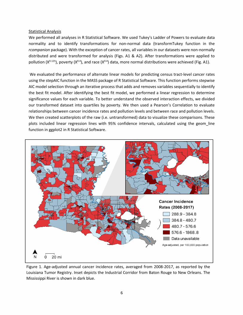
We mapped each dataset using QGIS Version 3.18 to visualize the geographic patterns of cancer (Fig. 1),
toxic air pollution (Fig. 2), and race and poverty (Fig. 3) among Louisiana census tracts. Each dataset is
broken down by percentile. Additionally, we mapped smoking and obesity data at the finest geographic
resolution available (i.e. parish level; Fig. 4), since those factors are commonly cited as explanations for
Louisiana’s cancer burden.
Cancer Incidence Rates
We obtained 10-year average annual cancer rates for all malignant tumors combined from the Louisiana
Tumor Registry’s most recent annual report, published in 2021 and reflecting cases diagnosed in 2008-
2017.14 Cancer incidence rates were available for 932 of 1,148 census tracts in Louisiana (Fig. 1). These
rates are age adjusted and presented per 100,000 population. For simplicity, we subsequently refer to
cancer incidence rates as “cancer rates.”
Pollution Levels
We used estimates of pollution-related cancer risk from the Environmental Protection Agency (EPA)’s
2005 National Air Toxics Assessment (NATA), which reflects pollution levels in 2005 (Fig. 2). Because EPA
updates its methodology each time it publishes the NATA (typically once every 3 years), the 2005 NATA
provided more refined methodology compared to previous NATAs (1996, 1999, and 2002), while still
allowing a reasonable time gap relative to the cancer rate dataset (2008-2017) to help account for cancer
latency.15 Additionally, in selecting the dataset, we considered that changes in census tract boundaries
occur during each decennial census (e.g. 1990, 2000, and 2010). To account for these changes, we
excluded significantly-changed census tracts from our analysis, as described below.
We used NATA’s Point Source Cancer Risk because the Industrial Corridor/Cancer Alley is characterized
by a high density of point sources of pollution (i.e. chemical and petrochemical facilities). The NATA Point
14 Maniscalco L, Yi Y, Zhang L, Lefante C, Hsieh MC, Wu XC (eds). Cancer Incidence in Louisiana by Census Tract, 2008-2017. New Orleans: Louisiana Tumor Registry, March 2021. 15 Diana L. Nadler, Igor G. Zurbenko, "Estimating Cancer Latency Times Using a Weibull Model", Advances in Epidemiology, vol. 2014, Article ID 746769, 8 pages, 2014. https://doi.org/10.1155/2014/746769.
Source category represents stationary sources for which locations are known, including industrial plants,
electric utilities, and large waste incinerators.16 This NATA category does not include airports, homes,
wildfires, vehicles, or other mobile or diffuse sources of pollution. For simplicity, we subsequently refer
to Point Source Cancer Risk as “pollution level” or “toxic air pollution.” Because our analysis relies on
historical pollution values, but there is significant interest in current pollution levels, we also mapped
Point Source Cancer Risk from the most recent (2014) NATA (Fig. 2). Importantly, the results of different
NATAs are not directly comparable due to methodological changes over time.17 We did not use the 2014
data in any statistical analysis; rather, we mapped the data for visualization only.
Demographic and Health Indicators
As demographic predictors of cancer rates, our analysis included the percentage of Black residents (i.e.
African-American alone or African-American mixed with another race) and the percentage of residents
living below the federal poverty threshold, from the U.S. Census Bureau’s 2011-2015 American
Community Survey (Fig. 3). While smoking and obesity are also important risk factors for cancer, to our
knowledge, these data are not available at the census tract level for Louisiana. To explore the potential
for geographic patterns in smoking and obesity that could confound our analysis, we mapped parish-level
smoking and obesity data from the 2011 Louisiana County Health Rankings.18 These rankings use 2003-
2009 smoking data from the U.S. Centers for Disease Control (CDC)’s Behavioral Risk Factor Surveillance
System and 2008 obesity data from the CDC’s National Center for Chronic Disease Prevention and Health
Protection. We use historical smoking and obesity data because current cancer rates reflect historical risk
factors. Because the data were not available at the census tract level, we could not include smoking or
obesity in our statistical analysis; rather, we mapped the data for visualization only (Fig. 4).
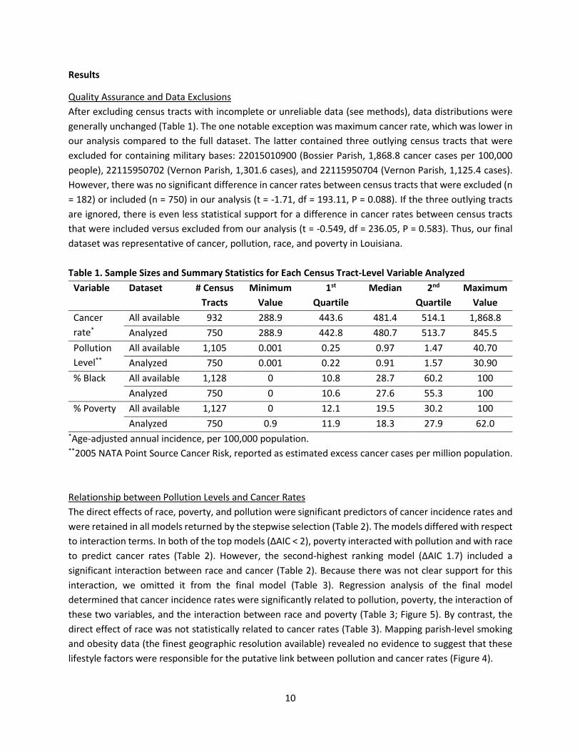
Data Exclusions
Our analysis excluded census tracts for which cancer rates were not available from the Louisiana Tumor
Registry (n = 216 out of 1,148 total). Additionally, we excluded tracts that the Tumor Registry designated
as containing military bases (n = 27), because military personnel are likely to have different exposure
histories compared to permanent residents. We also excluded census tracts (n = 155) with geographic
boundaries that had changed substantially between the 2000 Census and 2010 Census, as identified by
the U.S. Census Bureau.19 This exclusion was necessary because we used a pollution dataset that was
based on the 2000 Census and a cancer dataset that was based on the 2010 Census. After these exclusions,
there were 750 census tracts remaining in the final dataset. Estimates of cancer risk from EPA’s 2005
National Air Toxics Assessment were available for all of these tracts.
16 EPA. An Overview of Methods for EPA’s National-Scale Air Toxics Assessment. January 31, 2011. Page 19. Available at https://www.epa.gov/sites/production/files/2015-10/documents/2005-nata-tmd.pdf. Note Footnote b in Exhibit 2-1. See also EPA. 2014 National Air Toxics Assessment Technical Support Document. August 2018. Page 10. 17 EPA. 2014 National Air Toxics Assessment Technical Support Document. August 2018. Table 1-1. Pages 5-6. 18 University of Wisconsin Population Health Institute. 2011 County Health Rankings. Available at https://www.countyhealthrankings.org/app/louisiana/2021/downloads. 19 Available at https://www.census.gov/geographies/reference-files/2010/geo/relationship-files.html#par_textimage_19960473. Accessed Feb 18, 2020.
However, there was no significant difference in cancer rates between census tracts that were excluded (n
= 182) or included (n = 750) in our analysis (t = -1.71, df = 193.11, P = 0.088). If the three outlying tracts
are ignored, there is even less statistical support for a difference in cancer rates between census tracts
that were included versus excluded from our analysis (t = -0.549, df = 236.05, P = 0.583). Thus, our final
dataset was representative of cancer, pollution, race, and poverty in Louisiana.
Table 1. Sample Sizes and Summary Statistics for Each Census Tract-Level Variable Analyzed
Variable Dataset # Census
Tracts
Minimum
Value
1st
Quartile
Median 2nd
Quartile
Maximum
Value
Cancer
rate*
All available 932 288.9 443.6 481.4 514.1 1,868.8
Analyzed 750 288.9 442.8 480.7 513.7 845.5
Pollution
Level**
All available 1,105 0.001 0.25 0.97 1.47 40.70
Analyzed 750 0.001 0.22 0.91 1.57 30.90
% Black All available 1,128 0 10.8 28.7 60.2 100
Analyzed 750 0 10.6 27.6 55.3 100
% Poverty All available 1,127 0 12.1 19.5 30.2 100
Analyzed 750 0.9 11.9 18.3 27.9 62.0 *Age-adjusted annual incidence, per 100,000 population. **2005 NATA Point Source Cancer Risk, reported as estimated excess cancer cases per million population.
Relationship between Pollution Levels and Cancer Rates
The direct effects of race, poverty, and pollution were significant predictors of cancer incidence rates and
were retained in all models returned by the stepwise selection (Table 2). The models differed with respect
to interaction terms. In both of the top models (ΔAIC < 2), poverty interacted with pollution and with race
to predict cancer rates (Table 2). However, the second-highest ranking model (ΔAIC 1.7) included a
significant interaction between race and cancer (Table 2). Because there was not clear support for this
interaction, we omitted it from the final model (Table 3). Regression analysis of the final model
determined that cancer incidence rates were significantly related to pollution, poverty, the interaction of
these two variables, and the interaction between race and poverty (Table 3; Figure 5). By contrast, the
direct effect of race was not statistically related to cancer rates (Table 3). Mapping parish-level smoking
and obesity data (the finest geographic resolution available) revealed no evidence to suggest that these
lifestyle factors were responsible for the putative link between pollution and cancer rates (Figure 4).
11
Figure 5. Relationships among toxic air pollution, cancer rates, poverty, and race for Louisiana census tracts
(n = 750). The same dataset is presented in both panels, with a smaller scale on the bottom panel to better
distinguish data points. Solid gray line indicates U.S. average cancer rate (448.7); dashed gray line indicates
Louisiana average (481.0).
12
Analysis by Poverty Quartiles
Higher pollution levels were correlated with higher cancer rates for the most impoverished quartile of the
dataset, but not for the other quartiles (Table 4; Fig. 6). Similarly, race (% Black) was correlated with cancer
rates for the most impoverished quartile, but not for the other quartiles (Table 5, Fig. 7). For the overall
dataset (n = 750 tracts), a simple correlation test between pollution and cancer incidence rates was non-
significant (t = 1.18, df = 748, P = 0.240). This result indicates that the relationship between pollution and
cancer incidence rates was only apparent when accounting for poverty.
Table 2. Results of Stepwise Model Selection for 2008-2017 Census Tract-Level Cancer Rates.*
Main Effects Interaction Terms AIC ΔAIC Rank
Race
Poverty
Pollution
Race × Poverty
Poverty × Pollution
5910.6 0 1
Race × Poverty
Poverty × Pollution
Race × Pollution
5912.3 1.7 2
Race × Poverty
Poverty × Pollution
Race × Pollution
Race × Poverty × Pollution
5914.3 3.7 3
Race × Poverty
Race × Pollution
5915.9 5.3 4
Race × Pollution
Poverty × Pollution
5918.8 8.2 5
* See methods for data sources and transformations. The best-supported models (ΔAIC < 2) are
emphasized in bold text.
Table 3. Significance of Predictors from Final Model (2008-2017 Census Tract-Level Cancer Rates).
To our knowledge, this analysis represents the first statewide assessment of the relationship between
cancer incidence rates and toxic air pollution in Louisiana. We found that higher levels of toxic air pollution
were linked to higher cancer rates among Louisiana’s most impoverished communities. There are multiple
ways in which poverty could increase health risks from toxic air pollution, for example, by reducing access
to preventative medical care, or by increasing pollution exposure for people who live in older/rundown
buildings, where air pollution may enter through gaps in walls or windows. Additionally, we found that
predominantly Black, impoverished communities generally had higher cancer rates than predominantly
White, impoverished communities. Collectively, our findings illustrate that race, poverty, and toxic air
pollution interact in complex ways to affect health outcomes in Louisiana. These findings are consistent
with the firsthand experiences of Black residents from impoverished, industrialized neighborhoods who
have long maintained that their communities are overburdened with cancer from toxic pollution.
It is important to recognize that the lack of a statistical relationship between two factors is not evidence
that those factors are unrelated. In this case, the lack of a statistically significant relationship between
toxic air pollution and cancer rates among more affluent communities does not imply that pollution is safe
for these communities. Rather, based on the current dataset, we cannot determine whether pollution
levels are linked to cancer among more affluent communities. This concept relates to fundamental
principles of statistics, namely that the null (i.e. default) hypothesis is no effect. In the analysis presented
here, the default hypothesis was no link between pollution levels and cancer rates. The statistical test
16
determined whether or not there was sufficient evidence to reject the default hypothesis and conclude
that a link exists. Typically, a P-value above 0.05 indicates that the default hypothesis cannot be rejected
and we cannot conclude that a link exists. This threshold corresponds to only a 5% chance of a false
positive if we concluded that a link exists. Thus, a conclusion of “insufficient evidence for a link” can be
made, even when there is more support for a link than against it. A solid understanding of statistics is
important to interpreting cancer rate data and to understanding why the default assumption should be
that industrialization of communities is unsafe, especially because there is no safe level of exposure to
cancer-causing toxic air pollutants.20
Our findings highlight some of the many problems with relying solely on annual reports from the Louisiana
Tumor Registry to make conclusions about health risks from industrial pollution. Not only do Louisiana
Tumor Registry reports lack pollution data, but they also lack poverty data. Our study determined that the
link between pollution and cancer was only apparent among the most impoverished communities.
Because poverty rates and other cancer risk factors vary widely across the Industrial Corridor (Fig. 3), it is
not surprising that average cancer rates in this area also vary widely (Fig. 1). Similarly, even though
virtually all census tracts in the Industrial Corridor face higher-than-average cancer risk from toxic air
pollution (Fig. 2), there is still substantial variation in pollution exposure within the Industrial Corridor.
There are well over 100 industrial facilities across this region, each of which emits a unique combination
of pollutants, with large clusters of facilities near some neighborhoods, and no facilities near other
neighborhoods. Further, as discussed above, some of the most heavily industrialized communities in
Louisiana (e.g. Mossville) occur outside the so-called Industrial Corridor. Given these collective realities,
the LDEQ’s practice of pointing to Industrial Corridor cancer rates as evidence against pollution-related
cancer risk is naïve and scientifically unsound.
Overall, our analysis provides compelling evidence that toxic air pollution is a significant driver of cancer
rates in Louisiana. There is no evidence that lifestyle factors contributed to this finding. In fact, many
industrialized parishes in Louisiana have a relatively low prevalence of smoking, while obesity is a problem
throughout the state (Fig. 4). Analogous to pollution exposure, smoking and obesity are likely to vary
within parishes; but there is no apparent reason why these factors would be more prevalent among
industrialized census tracts, especially given that our analysis accounted for poverty and race. Certainly,
smoking and obesity are important risk factors for cancer; however, these factors do not adequately
explain the geographic pattern of cancer in Louisiana (i.e. census tract averages). We found that this
geographic pattern is partly explained by the racial composition, poverty status, and the burden of toxic
air pollution in a given community (i.e. census tract). Our analysis contributes to the growing body of
evidence that Black and Brown communities in Louisiana are overburdened with the negative effects of
toxic air pollution from petrochemical facilities and other sources. Environmental justice requires that
LDEQ acknowledge the health risks of toxic pollution and address the disproportionate burden of heavy
industry on impoverished and black communities in Louisiana.
20 U.S. Centers for Disease Control, National Institute for Occupational Safety and Health. NIOSH Evaluation of its Cancer and REL Policies. Available at https://www.cdc.gov/niosh/topics/cancer/policy.html. Accessed June 20, 2021.