3 CHAPTER Using Cascading Style Sheets Cascading Style Sheets (CSS) provide a flexible way to control the look or presentation of your Web pages. Small changes to a single CSS style sheet can dramatically change the appearance of many Web pages. This easy method for controlling the design of your pages allows you to rapidly implement changes to the look and feel of your website. The CSS elements are often called style rules and can be inserted directly in a Web page or separately in an external file. There are three different methods by which CSS styles can inserted in a Web page: inline style, embedded or internal style, and external style. There is a fourth method that uses the @import directive to import an external style sheet into another style sheet, similarly to how the include statement is used in PHP. Although we will not discuss this method in detail, we’ll show an example of using it later in this chapter. Each method has its own advantages and disadvantages. However, the rule of precedence is an important concept, and CSS rules must be coded in a logical order, as CSS styles will cascade down from one style sheet to another. In this chapter, we will discuss and learn some of the most common CSS styles and how they can be inserted into a Web page using the three different methods. What Is CSS? In a nutshell, CSS is a simple language that defines style constructs to format the appearance of a Web page. The style rules define a set of formatting instructions (one or more property-value pairs) that affect the HTML elements in a Web page. CSS is a presentational language, in contrast with HTML, which is a semantic language. CSS is a presentational language because it configures, formats, and styles the HTML elements to give the Web page its visual appearance. HTML, in contrast, is a semantic language, which means that an element describes its meaning associated with the content to a user agent such as a Web browser, a screen reader, or a Web crawler (discussed in Chapter 13). In other words, you will not find a loop statement or a function in CSS. It is the perfect complement language to HTML and was designed primarily to work with HTML.
Transcript
3C h a p t e r
Using Cascading Style Sheets
Cascading Style Sheets (CSS) provide a flexible way to control the look or presentation of your Web pages. Small changes to a single CSS style sheet can dramatically change the appearance of many Web pages. This easy method for controlling the design of your pages allows you to rapidly implement changes to the look and feel of your website. The CSS elements are often called style rules and can be inserted directly in a Web page or separately in an external file.
There are three different methods by which CSS styles can inserted in a Web page: inline style, embedded or internal style, and external style. There is a fourth method that uses the @import directive to import an external style sheet into another style sheet, similarly to how the include statement is used in PHP. Although we will not discuss this method in detail, we’ll show an example of using it later in this chapter. Each method has its own advantages and disadvantages. However, the rule of precedence is an important concept, and CSS rules must be coded in a logical order, as CSS styles will cascade down from one style sheet to another. In this chapter, we will discuss and learn some of the most common CSS styles and how they can be inserted into a Web page using the three different methods.
What Is CSS?In a nutshell, CSS is a simple language that defines style constructs to format the appearance of a Web page. The style rules define a set of formatting instructions (one or more property-value pairs) that affect the HTML elements in a Web page. CSS is a presentational language, in contrast with HTML, which is a semantic language. CSS is a presentational language because it configures, formats, and styles the HTML elements to give the Web page its visual appearance. HTML, in contrast, is a semantic language, which means that an element describes its meaning associated with the content to a user agent such as a Web browser, a screen reader, or a Web crawler (discussed in Chapter 13). In other words, you will not find a loop statement or a function in CSS. It is the perfect complement language to HTML and was designed primarily to work with HTML.
50 • Developing Business Applications for the Web
The CSS style rules and standards are set and maintained by the World Wide Web Consortium (W3C), which introduced the first version (or level) of CSS, CSS1, in 1996 followed by CSS2 in 1998 and CSS3 in 2005. Each newer level of CSS is built over the previous level. At the time this was written, CSS Level 3 (CSS3) was still the most up-to-date version used in today’s Web development. Even though CSS3 was released more than a decade ago, many new properties and rules have been gradually introduced. This chapter covers many of the standard CSS properties and rules and some of the new CSS3 properties.
How Cascading Style Sheets WorkA CSS style rule contains two parts: selector and declaration. A selector can be any HTML tag (such as p, h1, or div) or a user-defined selector such as a class or an id. We will discuss class and id selectors later in this chapter. The declaration is a list of property-value pairs that are associated with the selector. A property is any construct such as font-size, color, or position with values like 12px, red, or relative, respectively.
Figure 3.1 shows the syntax for defining a CSS rule.
selector { property : value; }
Figure 3.1: Syntax for a CSS style rule
A selector can have more than one property-value pair. Each pair must be separated by a semi-colon (;) and should start on a new line, as shown in Figure 3.2.
selector {
property1 : value1;
property2 : value2;
property3 : value3;
}
Figure 3.2: Syntax for a CSS style rule with multiple property-value pairs
When defining the style for an element (such as a <p> tag), the element’s tag is listed without the angle brackets (< >) and followed by braces ({}). Within these braces, any available property can be defined. Each property is followed by a colon (:) and then by its associated value. Each value is followed by a semicolon (;). You may list additional properties as needed. The ending brace is coded after all the listed properties. The example in Figure 3.3 defines style rules for the paragraph (p) and heading (h1) selectors.
p {
color: purple;
Continued
Chapter 3 Using Cascading Style Sheets • 51
padding: 7px;
text-align: center;
}
h1 {
color: green;
padding: 7px;
text-align: center;
}
Figure 3.3: CSS style rules for the p and h1 selectors
CSS is a flexible language and follows similar rules to those of HTML. As you’ve seen in the previous examples, style rules can be written in a single line or multiple lines because white spaces are ignored. In addition, style rules can be applied to more than one element. To apply the same style rules to multiple elements, simply separate each selector with a comma. If you look at our example in Figure 3.3, you see that both selectors have an identical list of properties. Since they are the same, we can apply the style rules to both selectors and save a few lines of code. Figure 3.4 shows the result of combining both selectors within the same style rules.
h1, p {
color: green;
padding: 7px;
text-align: center;
}
Figure 3.4: A CSS style rule applied to two selectors
If you want the h1 selector from the previous example to have a different font-style (such as italics) but want to retain the same rules, then you can define h1 again as a separate selector and apply just the font-style, as shown in Figure 3.5.
h1, p {
color: purple;
padding: 7px;
text-align: center;
}
h1 { font-style: italic; }
Figure 3.5: Multiple CSS style rules applied to the same selector
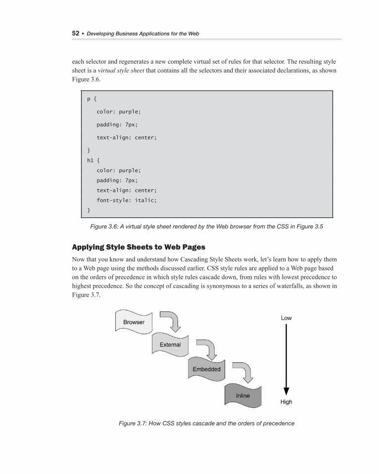
A question you might have is “How does the Web browser know which selector to use?” What’s really happening behind the scenes is that the Web browser collects all the CSS style rules created for
52 • Developing Business Applications for the Web
each selector and regenerates a new complete virtual set of rules for that selector. The resulting style sheet is a virtual style sheet that contains all the selectors and their associated declarations, as shown Figure 3.6.
p {
color: purple;
padding: 7px;
text-align: center;
}
h1 {
color: purple;
padding: 7px;
text-align: center;
font-style: italic;
}
Figure 3.6: A virtual style sheet rendered by the Web browser from the CSS in Figure 3.5
Applying Style Sheets to Web PagesNow that you know and understand how Cascading Style Sheets work, let’s learn how to apply them to a Web page using the methods discussed earlier. CSS style rules are applied to a Web page based on the orders of precedence in which style rules cascade down, from rules with lowest precedence to highest precedence. So the concept of cascading is synonymous to a series of waterfalls, as shown in Figure 3.7.
Figure 3.7: How CSS styles cascade and the orders of precedence
Chapter 3 Using Cascading Style Sheets • 53
As illustrated in Figure 3.7, a Web browser applies style rules from the top down, or from lowest to highest precedence. Generally, all modern Web browsers have their own style rules built into them. This ensures that any Web pages that do not have any custom styles created could still be rendered in a manner that is presentable to the end user. Thus, an embedded style will override any styles defined before it but will be superseded by an inline style. Of course, there are always exceptions to some rules, and such is the case with CSS orders of precedence. Even though precedence is applied here, the manner in which one style sheet overrides another is dependent on how the style sheets are placed logically within the Web page. We’ll discuss this topic in more detail later in this chapter. Next, we will learn how to apply style rules using the inline, embedded, and external styles.
Note: Since the Web browser has its own set of default styles built into it, its built-in styles will automatically be applied to a Web page—the programmer has no control over these styles. Thus, we will not discuss how to apply these styles to a Web page.
Creating an Inline Style SheetInline styles have the highest orders of precedence, and they are the last to be interpreted by the browser. Inline styles are applied directly and specifically to only a single element using the style attribute. For example, Figure 3.8 shows how a style rule is applied to a <p> tag to display the content in Georgia font in color purple.
<p style="font-family: Georgia; color: purple;">This is an Inline Style.
</p>
Figure 3.8: An inline style rule applied to a p element
An advantage of inline styles is made clear during the development phase, in which style rules can be applied quickly and directly to the tags. Doing it this way saves the developer the time of scrolling up and down the HTML document or switching between the external style sheet and HTML document to write the style rules in the style sheet. Another advantage of inline styles is that they enable you to override a remote style rule that you don’t have access to or control over. The main disadvantage of inline styles is that, because they can be applied only to a single tag, making changes to such styles can be tedious and inefficient for the programmer. It’s no easy task when there are tens and hundreds of individual tags that need to be changed. For this reason, using inline styles is not the preferred method of styling a Web page.
Creating an Embedded Style SheetAn embedded style sheet is a list of style rules that are embedded internally within the Web page and can only be applied to a single document. Although a style sheet can be inserted anywhere within the head or body sections of the Web page, the style sheet is typically inserted in the head section using the <style> element. Don’t confuse the <style> element with the style attribute discussed earlier. Style rules are encapsulated between the <style> and </style> tags. Figure 3.9 shows how an embedded style sheet is incorporated into a Web page, and Figure 3.10 shows the result rendered in the browser.
54 • Developing Business Applications for the Web
<!DOCYTYPE html>
<html>
<head>
<title>Belhur Publishing</title>
<meta charset="utf-8"/>
<style>
p {
padding: 7px;
text-align: center;
}
h1 {
text-style: italic;
font-family: Georgia;
text-align: center;
}
</style>
</head>
<body>
<h1>Belhur Publishing</h1>
<p>Belhur Publishing was established in 2016 as a joint effort between
MC Press, Laura Ubelhor, and Christian Hur.</p>
</body>
</html>
Figure 3.9: An embedded style sheet
Figure 3.10: A Web page result of the embedded style sheet shown in Figure 3.9
Style rules can be embedded multiple times within a Web page. For example, the embedded style sheet in Figure 3.9 could be separated out to two separate sections and inserted at two different locations within the same document, as shown in Figure 3.11. However, the Web page would be
Chapter 3 Using Cascading Style Sheets • 55
formatted and displayed exactly the same as shown in Figure 3.10. Although the Web page appears flawlessly on the browser window, it’s bad practice to include embedded style sheets within the body section. In an HTML5 document, embedded style sheets must be coded within the head section only.
<!DOCYTYPE html>
<html>
<head>
<title>Belhur Publishing</title>
<meta charset="utf-8"/>
<style>
h1 {
text-style: italic;
font-family: Georgia;
text-align: center;
}
</style>
</head>
<body>
<h1>Belhur Publishing</h1>
<style>
p {
padding: 7px;
text-align: center;
}
</style>
<p>Belhur Publishing was established in 2016 as a joint effort between
MC Press, Laura Ubelhor, and Christian Hur.</p>
</body>
</html>
Figure 3.11: Two style rules embedded in separate locations within the same Web page
The embedded style is much more convenient and efficient than the inline style because it can be applied to multiple elements from one central location. While an inline style is more targeted to a specific tag, the embedded style is targeted to multiple tags at once.
Creating an External Style SheetAn external CSS style sheet is a text file that ends in the .css suffix. The main advantage of using an external style sheet is that it can be applied to any Web pages on the site. Programmers appreciate this single point of control. An external style sheet is often named theme.css or main.css. “Theme” is
56 • Developing Business Applications for the Web
a good choice for the filename, since a style sheet can create the visual theme for a website. All you need to do is have all the pages in your website reference the same CSS style sheet.
You can attach an external style sheet to your Web page using the <link> tag. The code snippet in Figure 3.12 shows an example of such a link. When the HTML page is opened, the browser will search the theme.css style sheet to find rules for handling the content of the page.
<link href="theme.css" rel="stylesheet" />
Figure 3.12: Linking to an external style sheet
To see how this works, let’s create a very simple external style sheet called theme.css. Like HTML, an external style sheet can be created by using any text editor tool, such as Notepad++, or by using a sophisticated tool in a Web design product such as Adobe Dreamweaver or Microsoft Expression. Figure 3.13 shows the code for a basic theme.css style sheet using NotePad++.
Figure 3.13: A basic style sheet for four HTML tags
The example in Figure 3.13 shows an external style sheet with five lines of code. The first line of code illustrates how comments are coded. Any text between the /* and */ tags is ignored by the Web browser. The other four lines of code are style rules for the HTML <body> element, the <h1> and <h3> heading elements, and the paragraph <p> element. As discussed earlier, HTML elements are commonly used as CSS selectors but without the “<>” brackets. Notice also that the <style> and </
style> tags are not present, as discussed earlier. This is because HTML tags are not allowed. The <style> tags are used only within an HTML page to embed an internal style sheet. An external style sheet can contain only comments, style rules, and special directives (such as media query and import, which will be discussed briefly later in this chapter). As the HTML document is rendered, the styles are read in from the style sheet and applied. There other ways to define styles, such as using style classes, which we will discuss later in this chapter.
Chapter 3 Using Cascading Style Sheets • 57
In theme.css, each of the four element styles sets the default font family for that element. In the body style, the font family is set to Arial. If Arial is not available on the user’s computer, one of the alternate fonts listed will be used. Simply list all the fonts in order of preference. The first one available on the user’s computer will be used. If none of the listed fonts are available, the default font of the user’s browser will be used. The h1 and h3 styles define the font family as Times New Roman. When the name of a font family contains two or more words, such as “Times New Roman,” it should be enclosed with a pair of double quotation marks. The fourth style is for the paragraph tag (p). This style sets the default font to Courier New.
A wide variety of fonts is available. Monospace fonts such as Courier New use the exact same width for every letter. This makes them very attractive when you need to get text to line up a certain way.
Figure 3.14 shows the code for a sample Web page that links to the theme.css style sheet. The Web page is shown in Figure 3.15.
<!DOCTYPE html>
<html>
<head>
<title>Belhur Publishing</title>
<meta charset="utf-8" />
<link rel="style sheet" href="theme.css"/>
</head>
<body>
<h1>Belhur Publishing</h1>
<h3>Corporate Overview</h3>
<p>Belhur Publishing takes pride in providing learning solutions for
students and those who want to advance their Web development skills. First
steps are important, and we have taken great care in offering materials,
education, and inspiration to assist individuals to move forward and
learn.</p>
Belhur Publishing was established in 2016 as a joint effort between MC
Press, Laura Ubelhor, and Christian Hur.
</body>
</html>
Figure 3.14: The HTML code for a Web page using an external style sheet
58 • Developing Business Applications for the Web
Figure 3.15: Sample font families using an external style sheet
Notice in Figure 3.14 that within the <body> element, there are three child elements (h1, h3, p) and a paragraph. In general, the innermost, or child, element will inherit properties from a parent element, but the child also has the option to override those properties. For example, both <body> and <p> element styles attempt to change the font family, but the <p> tag takes precedence, since it is the innermost tag. Therefore, the text in the <p> tag appears in Courier New instead of Arial.
Importing Style Sheets
Briefly, a fourth method of incorporating style sheets in a Web page is to import an external style sheet into the Web page by using the @import directive. The external style sheet being imported must be inserted into either an embedded style sheet or into another external style sheet. Also, the @import directive must be inserted before all other style rules in the style sheet. While external style sheets can be incorporated into a Web page using <link> tags, the reason a developer would instead want to import an external style sheet is to combine multiple external style sheets into a single style sheet.
The advantages of combining multiple style sheets into one are portability and maintainability. For example, you might want to develop a Web application to accommodate multiple languages. This example involves style sheet dependency where one style sheet depends on another style sheet. Thus, the most logical approach is to create a master (or default) style sheet (for formatting the overall layout of the site) and individual language style sheets (for formatting different language texts). Then instead of incorporating the master and language style sheets into the Web document using two separate link tags, the developer could just import the master style sheet into the language style sheet, thereby maintaining only a single link tag.
The disadvantage of using @import is that it can have a negative impact on Web page performance. Style sheets that are incorporated using the <link> tags are downloaded and processed simultaneously (in parallel); therefore, page loading time is much faster. On the other hand, style sheets that are incorporated using the @import directive are downloaded and processed sequentially, thus preventing other style sheets from loading and causing the page to load much more slowly. Figure 3.16 shows how two external style sheets are incorporated into a Web page via the @import directive.
Chapter 3 Using Cascading Style Sheets • 59
<!DOCYTYPE html>
<html>
<head>
<title>Belhur Publishing</title>
<meta charset="utf-8"/>
<style>
@import url(theme.css);
@import url(shop.css);
h1 { color: blue; }
p { font-family: Arial; }
</style>
</head>
<body>
Figure 3.16: Importing two external style sheets via the @import directive
Exploring CSS Style Rules and PropertiesBy now, you should be familiar with how CSS works and the methods of incorporating style sheets into a Web page. Now that we’ve taken these first steps into CSS, the next step is to explore some of the major CSS style rules and their properties that developers use to configure and format Web-based applications.
How Do You Style Text Using CSS?In addition to the font-family property, you can also set the font size, font style, or font weight. Alternatively, you can set the font property, which has several values, including style, variant, weight, size, and family.
{font-family: font1,font2,... font-size:size font-style:normal italic oblique font-weight:normal bold bolder lighter number font:style weight size family }
60 • Developing Business Applications for the Web
Most of the properties have specific options to choose from. For example, font-weight can use relative terms such as lighter, normal, bold, or bolder. These choices are displayed here in bold text. Other properties allow more varied values. These are displayed here in bold italics. For example, font-weight accepts a numeric value that is a multiple of 100, from 100 to 900. A value of 100 is the lightest (thinnest) font weight, while 900 is the heaviest (thickest).
The font-size property requires a value that may be followed by a code such as 12px, which means 12 pixels wide. The available size codes are:
z em: the width of the letter m in the current font z ex: the width of the letter x in the current font z cm: centimeters z mm: millimeters z pc: picas (1 pica = 4.216 mm) z pt: points (1 point = 1/12 pica) z in: inches z px: pixels
Using the em and ex sizes allows you to define the size of certain portions of text without needing to know the underlying size of the font. Specifying a value of .5em, for example, means you want the font to be 50 percent smaller than the current text size for the letter m. Similarly, to define a size 20 percent greater than the current text size of the letter x, use a value of 1.2ex. Avoiding hard-coded font sizes provides better support for users who have adjusted their own font sizes.
Use the font-style to determine whether the text should be printed in its normal form, italics, or as oblique text. (Oblique prints “slanted” text that, to the untrained eye, looks the same as italics.)
There are a number of other text properties not directly associated with a font. These include color, direction, line-height, letter-spacing, text-align, text-decoration, text-indent, text-shadow, text-transform, Unicode-bidi, white-space, and word-spacing.
{color:color
rgb(r,g,b)
#rrggbb
direction:ltr
rtl
line-height:normal
number
percent
letter-spacing:normal
number
Chapter 3 Using Cascading Style Sheets • 61
text-align:left
right
center
justify
text-decoration:
none
underline
overline
line-through
blink
text-indent: number
percent
text-shadow: color
horizontal-distance
vertical-distance
blur radius
text-transform:none
capitalize
uppercase
lowercase
white-space: normal
pre
nowrap
word-spacing:normal
number
Unicode-bidi:normal
embed
bidi-override
}
Color may be coded as a specific name, such as blue or red, as an RGB hexadecimal (hex) value, or as RGB decimal values. Color names are easy to use, but not all browsers present the colors in exactly the same way. The 16 standard HTML colors are shown in Table 3.1, together with their hex values. You can find more colors in Appendix E, included in the downloadable book materials available at https://goo.gl/2uYjHb.
Examples of hex values are #000000 (black), #C0C0C0 (silver), and #FFFFFF (white). Each hex code is made up of a pound sign (#) followed by three hex values (00 through FF), representing the red, green, and blue values of the color. Most programmers know that hex is a base-16 number system, where 0=0 and F=15. So, a hex code of #3366CC has 33 for the red value, 66 for the green, and CC for the blue, resulting in a medium grayish-blue.
62 • Developing Business Applications for the Web
Table 3.1: Standard color names and hex codes
Color Name Hex Code
Aqua #00FFFF
Black #000000
Blue #0000FF
Fuchsia #FF00FF
Gray #808080
Green #008000
Lime #00FF00
Maroon #800000
Navy #000080
Olive #808000
Purple #800080
Red #FF0000
Silver #C0C0C0
Teal #008080
Yellow #FFFF00
White #FFFFFF
The direction property can be set to left-to-right (ltr) which is the default, or right-to-left (rtl). Line-
height can be set to normal, a specific number, or a percentage.
Letter-spacing controls the space between text characters. This property can be set to either normal or a specific number.
The text-align property can be set to left, right, center, or justify.
Text-decoration lets you add an underline or overline effect to the text. You can also cause the text to appear with a line through it. This is often used to represent deleted text. A blinking effect can also be added.
The text-indent property sets the amount of indention for the first line of text in the paragraph. It can be entered either as a fixed amount or as a percentage.
Text-shadow sets the color for a shadow effect added to the text. Horizontal and vertical distance properties indicate the offset distance of the shadow effect from the text. This property is not supported by many browsers at this time.
Use the text-transform option to force the text to appear in upper case or lower case, or to capitalize the first letter of every word.
Chapter 3 Using Cascading Style Sheets • 63
White-space controls the way in which the browser handles the white space within the HTML text. Setting it to pre causes the text to be handled as if the HTML <pre> tag were specified. Using the nowrap value indicates that the text should never wrap down to the next line. It will continue on the same line until the end of the text or a line-break tag (<br/>).
The word-spacing property sets the distance between each word in the text. Set this to a specific size.
If you use the rtl directional text, you can set the Unicode-bidi property to bidi-override, causing the first letter of text to be printed at the right margin, with each following character moving closer to the left margin. Otherwise, rtl will simply cause the text to be aligned on the right margin. For an example of this, consider the code in Figure 3.17. If the style sheet in Figure 3.18 is applied, the sentence is printed right to left, as shown in Figure 3.19. The text is aligned on the right margin by default.
<p>this text prints right to left</p>
Figure 3.17: The HTML code to print a line of text
p {direction:rtl; unicode-bidi:bidi-override;}
Figure 3.18: The style sheet code that controls the text in Figure 3.17
Figure 3.19: Right-to-left text
This example might be a bit silly, as it is rare that you would need to print text right to left. However, most of the other font properties, such as color assignment and weight, don’t show up well in printed material.
What Properties Control the Arrangement of an Element?Typically, each element on a Web page is assigned a rectangular section or “box” known as the CSS box model, as shown in Figure 3.20. The box model is composed of four concentric boxes: content, padding, border, and margin. Properties that affect the general positioning and arrangement of content on the page manipulate the format of these boxes. As a general rule, these boxes are not visible.
64 • Developing Business Applications for the Web
Figure 3.20: The CSS box model
The content box is the actual content of an element, such as the text or content between the <p> and </p> tags. The padding box is the space between the edge of the content and the inner edge of the border. The border box extends from the outer edge of the padding area to the inner edge of margin. Finally, the margin box is the space between the outer edge of the border and the next element on the page. The following tags describe how these four sections can be manipulated to control the size and appearance of elements on a Web page.
Use the padding properties to control the spacing around an element.
{padding-bottom:size auto padding-left: size auto padding-right: size auto
padding-top: size auto padding: top right bottom left }
Padding refers to the internal space between the content of an element and the element’s border. You can control the padding values for each of the four sides of the element, or if you specify the padding property, you can set all four at once.
If padding contains just a single value, such as {padding:3px;}, that value applies to all four sides of the element. If two values are given, such as {padding:3px 2px;}, the first value is for the top and bottom, and the second value is for the left and right. When three values are given, the first is for the top, the second for the left and right, and the third for the bottom. When four values are given, such as {padding:3px 2px 4px 5px;}, the values apply to all four sides of the element in a clockwise direction starting at the top. Therefore, the first is for the top, the second for the right, the third for the bottom, and the fourth for the left. This is also called using shorthand notation.
Chapter 3 Using Cascading Style Sheets • 65
{height:size auto width: size auto max-height: size auto max-width: size auto min-height: size auto min-width: size auto }
The height and width properties refer to the size of the element itself. Use a size in one of the formats discussed earlier for the font-weight property. The max-height and max-width properties refer to the maximum size that an element can expand to. Rather than specifying an exact size, these properties set a limit on the element’s size. The min-height and min-width properties control the minimum size the element can be shrunk to.
As the browser integrates a variety of elements on the same page, some will be placed beside others. If necessary, you can force the browser to leave either one side or both sides free of adjacent elements. For example, if you wanted to keep the right side clear, you would set the clear property to right.
{clear: none
both
left
right
bottom:number
auto
float: left
right
none
visibility: visible
hidden
collapse
top: number
auto
right: number
auto
left: number
auto
position: static
relative
fixed
absolute
66 • Developing Business Applications for the Web
clip: auto
rect(top,right,
left,bottom)
overflow: visible
hidden
scroll
auto
vertical-align:
number
baseline
sub
super
top
text-top
middle
bottom
text-bottom
z-index: auto
number
}
The bottom property sets the distance that an element is above the bottom edge of its block area. Left, right, and top properties define the distance of the element’s content from the edge of that block.
Use the float property to identify how the element should be arranged with other elements. Set it to right if it should float to the right, left to float left, or none to prevent it from floating at all.
Visibility controls whether an element can be seen or not. Set this to visible for elements that should be seen, hidden for ones that should remain in the background, and collapse if the element is to be hidden away from view, but available for quick display if needed.
Overflow determines how the browser handles content that will not fit in the defined space for the object. Set overflow to visible to guarantee that the content will be visible despite overflowing the element’s maximum size. Use hidden to cause the overflow content to become invisible. Use scroll to indicate that scrollbars should be added to the element to allow access to its entire contents. Clip sets the size of the clipped area of an element with overflow. It accepts four values—the top, right, left, and bottom positions, which identify the top right corner of the object and the bottom left corner of the visible portion of the element.
Use the position property to control the way in which the browser places the element on the page. If the property is set to absolute, the element’s position (top, right, left, and bottom) is relative to the page itself and independent of any parent elements on the page. If the position property is set to relative, the position of the element is adjusted from the location at which it would normally appear. So, an element that would normally appear 10 pixels from the top of the page and 20 pixels from the
Chapter 3 Using Cascading Style Sheets • 67
left, with position set to relative, and 5px for both the top and left properties, would appear 15 pixels from the top of the page and 25 from the left.
Use z-index to define layers within the Web page. By default, all the content is at the “0” index layer. Content placed at z-index 1 will overlay that, and content at z-index 2 will overlay the z-index 1 content. This provides an easy mechanism to overlay content. To avoid layering and keep all content at the same layer as the parent element, specify auto as the z-index.
The vertical-align property controls the alignment of elements in line with each other within a containing box. Baseline is the default value. It causes all the elements in the line to align with each other along the baseline of the containing box. Sub and super cause elements to align as if they were subscript and superscript, respectively. Top, bottom, and middle cause the elements to align along the top of the highest element, the bottom of the lowest element, or the middle of all the elements. With text-bottom or text-top, the elements are lined up with the bottom or top of the parent item’s font property.
What Properties Control the Display of an Element?The cursor and display properties provide the ability to customize the look of the cursor and the text of the page. The cursor can be modified to appear as a variety of pointers, arrows, or crosshairs. The display property affects text in numerous ways. For example, it can force text to appear in line with other text, or force the text to appear in vertical lists.