Using PowerPoint Concept Maps to Create Structured Online Notes. A very brief intro to Rodney Carr’s “Roadmap Tools”, with examples from Larry Weldon’s SFU STAT 100 course. Larry Weldon SFU. Rodney Carr Deakin U. Case Study Approach. How to ensure Theory is absorbed, - PowerPoint PPT Presentation
77
1 Using PowerPoint Concept Maps to Create Structured Online Notes A very brief intro to Rodney Carr’s “Roadmap Tools”, with examples from Larry Weldon’s SFU STAT 100 course. Larry Weldon SFU Rodney Carr Deakin U
Transcript
1
Using PowerPoint Concept Maps to Create Structured Online Notes
A very brief intro to Rodney Carr’s “Roadmap Tools”,
with examples from Larry Weldon’s SFU STAT 100 course.
Larry WeldonSFU
Rodney CarrDeakin U
2
Case Study Approach
How to ensure Theory is absorbed,
as the Case Studies are explored?
Theory = generally applicable tools and concepts
Faculty of Business and Law
3
Chance and Data Analysis
4
Case Studies
23
Sports LeagueThe case study Concepts and Techniques
24
The case studyThe English Premier League Soccer is one of the most watched sports leagues. The table shown here shows the team ladder for the 2004-5 season. Teams receive 0,1, or 3 points for each game lost, tied, or won, respectively. The Issue: does ranking of a team in a sports league reflect the quality of the team? What range of points would occur if every game (of the 190 games in the season) was a 50-50 game?
Rank Team Pld. Pts.
1 Chelsea 38 95
2 Arsenal 38 83
3 Manchester United 38 77
4 Everton 38 61
5 Liverpool 38 58
6 Bolton 38 58
7 Middlesbrough 38 58
8 Manchester City 38 52
9 Tottenham 38 52
10 Aston Villa 38 47
11 Charlton 38 46
12 Birmingham 38 45
13 Fulham 38 44
14 Newcastle United 38 44
15 Blackburn Rovers 38 42
16 Portsmouth 38 39
17 West Brom 38 34
18 Crystal Palace 38 33
19 Norwich City 38 33
20 Southampton 38 32
Keep in mind that most teams have between 32 and 61 points – the top three looking exceptional with 77, 83, and 95
25
Analysis + Discussion
In the analysis which follows, we study the range of points earned by the English Premier League teams. We use a technique called “Simulation” to do this. While the preparation of a program to do this requires knowledge of programming, this principle is simple an can be explained without jargon.
26
Analysis + Discussion(1)How can we explore what would happen if the 190 games were all “50-50”. The data from the season shows that about 30% of the games ended in a tie. So perhaps 50-50 means Lose 35% of the time, and win 35% of the time. We could simulate this by putting 20 tickets in a hat, 7 of them with “L”, 6 with “T” and 7 with “W” – then we draw tickets with replacement 190 times and record the result. Or, easier, let the computer do this! In fact, let’s have the computer do the whole 190 games 100 times….
Typical league points for the 20 Teams would look like this:
Rank Team Pld. Pts.
1 38 66
2 38 59
3 38 58
4 38 58
5 38 56
6 38 55
7 38 55
8 38 55
9 38 54
10 38 52
11 38 49
12 38 48
13 38 48
14 38 48
15 38 48
16 38 48
17 38 46
18 38 45
19 38 41
20 38 36
27
Analysis + Discussion(2)The “typical” outcome of this simulation is only typical in the sense that half of the outcomes would have a greater spread of points and half smaller. The result of simulating 100 seasons (each with 190 games) produces the dotplot shown here. It shows that a range of 40 or more points would be pretty unusual without there being a real quality differential among the teams.
But recall that the quality differential was only of this order when you compared the top three teams with the bottom ones.
A reasonable conclusion would be that, in the 2004-5 season, only Chelsea, Arsenal and Manchester United demonstrated superiority over the lowest teams. There is really not much evidence for a quality difference between rank 4 and rank 20.
28
Analysis + Discussion(3)Here is another look at the implications of a no-difference assumption. We can plot the distribution of the top team’s points at the end of the 38 game season (red) and the bottom teams as well. Recall that the top three teams had 95, 83 and 77 points and the bottom teams had 32 and 33. This plot may cast a bit of doubt on the superiority of the team with 77 points. Remember – the graph is simulated assuming no-difference.
29
Analysis + Discussion(4)
Review
Our conclusion from this data alone does gain some support from results of earlier years. The three teams mentioned are the only ones to win the premiership over the last ten years!
Note the logic of this analysis: We postulated a hypothesis (that all teams were equal), explored the implications of this hypothesis (that the range of points would usually be 40 or less) , compared those with the data (range of 63), and concluded that the equal-team hypothesis was not tenable. However, a secondary finding was that the difference in points had to be almost as large as observed to reveal team quality, a surprising result.
30
Review1. Influence of Unexplained Variation (UV) on Interpretation of Data
2. UV can make temporary effects seem like permanent ones (illusions)
3. Graphing of Data is an essential first step in data analysis
4. Need for summary measures when UV present
MCQ
What is first thing you do with data?
a. Collect it
b. Graph it
c. Decide what type of data it is
31
Not the best answerThis is not the best answer….
32
Good answerYou got the answer….
Have you thought about…
CheckBox1
CheckBox1
CheckBox1
33
IllusionsSome patterns in data are transient, and some are persistent. The transient ones can create illusions. The cause of these illusions is unexplained variation, and it can lead to misinterpretation of data by the statistically naïve. Patterns in data can appear that seem too regular to be transient, but this can be an illusion. By learning what can happen when we create a model that has no useful pattern, we can guard against being fooled by an apparent pattern. Of course, we do want to find those patterns that last, are not transient, if they exist. But it can be very difficult to distinguish between transient and persistent patterns. This dilemma motivates many of the techniques of statistics.
Up concept tree
34
SimulationThe idea that the effects of unexplained or uncontrolled variation can be determined by simulation is very powerful. Many of the examples in this course use simulation to study some complex situations – but note that the simulation method itself is not so complex. If you understand the sense in which tossing a coin can reproduce the outcome of a fair game, you will have the beginnings of the idea. (For example, can you use this technique to say how likely it is to get 5 “heads” in a row?).
Back to Case Study
36
Using the Mean and SDUsing mean & standard deviation (SD)
Back to Case Study
The “mean” is just a synonym for “arithmetic average” – the usual onefound by adding up a batch of numbers and dividing the total by the number of numbers in the batch. It gives a reasonable one-number summary of the batch. Of course, it is not a great summary of the batch! We need at least to describe the spread of the batch of numbers.The usual measure of spread is the “standard deviation” or SD. Think of it as a typical deviation of the numbers from their mean. Before we give the formula, here an example: your male classmates probably average about 178cm in height and the SD is about 6 cm. Although the two numbers 178 and 6 do not say exactly what the collection of heights is, it does give a rough idea.
So the numbers mean and SD do give a convenient numerical description of a batch of numbers.
37
Calculation of the SD
Standard Deviation (SD) – how to compute it.
Suppose you want the SD of n numbers:
The SD is based on deviations of the n numbers from the mean. What you do is take these n deviations, square them, sum them up, divide the sum by n, and finally take the square root.
Example: 1,2,3,5,9 is our batch. Mean is 20/5=4. SD is
Back to Case Study
83.2]5/)2)49(2)45(2)43(2)42(2)41[( =−+−+−+−+−
38
SimulationSimulation in general language means “generation of a likeness”. But in statistical jargon it is short for Monte Carlo simulation which is a particular strategy used to explore the implications of probability models. This simulation can be physical (making use of coins or dice or cards to produce “random” events) or electronic (making use of a computer algorithm to produce “random” numbers.) An example of a physical model would be the tossing of a coin 10 times, many groups of 10 tosses, to find out how variable the number of heads in 10 tosses is. The result of 100 such physical experiments would be a distribution of the number of heads:
So many with 0 heads, so many with 1 head ….so many with 10 heads.
Without knowing any theory of probability, you could actually get the result.
This is why simulation is useful. However, the tossing of coins is laborious.
So electronic simulation is a very welcome alternative. The computer can produce outcomes with the same properties as the physical experiment.
To see a demonstration of this, click on coin.xls.Back to Case
Study
39
Gasoline consumption 020904
The case study Concepts and Techniques
40
ContextWhat is it about…
This data shows the five year experience of gasoline consumption for my car. I commute 100 km each work day and do the same trip all year round. The consumption is measured by noting the kilometers travelled each time I fill up with gas, and the amount of gas that was necessary to refill the tank at that fill-up. But note the great variability from one fill to the next. The question here is, Is there anything of interest to learn about this car’s gas consumption from this data?
41
Analysis and DiscussionThe analysis will attempt to extract some useful or interesting information from this data.
42
Analysis and Discussion (1)The apparent chaos of this data disappears when a smoothing operation is applied to the data. This smoother happens to be one called “lowess” but the details need not be covered here. This or most other smoothers would extract the seasonal trend. The point is that it is automatic.
43
Analysis and Discussion (2)All you need to choose to make this smoother work is the amount of smoothing you want. This is a number between 0 and 1. the one used here is 0.15. It chooses the proportion of data used for each smooth point.
This northern hemisphere data shows the highest rate of consumption in the winter and lowest in the summer. In the next slide we discuss possible explanations.
44
Analysis + Discussion(3)
This data was collected in Vancouver, Canada. In addition to the temperature changes during the year, there are changes in rain (much more in the winter) and traffic density (much more in the winter), and not much snow or ice at any time. Tire pressures might also be involved (higher consumption with lower pressure). What is your explanation of the smooth seasonal trend?
Possible causes
45
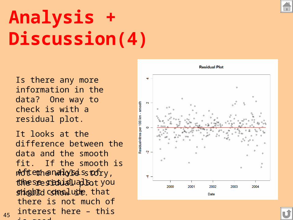
Analysis + Discussion(4)
Is there any more information in the data? One way to check is with a residual plot.
It looks at the difference between the data and the smooth fit. If the smooth is not the whole story, the residual plot should show it.
After analysis of these residuals, you might conclude that there is not much of interest here – this is good.
46
SmoothingPlotting time series
Smoothing and Residual Plots
Seasonality vs trends …
Recall Gas consumption data. The graph suggested the seasonality, and this led
to interesting questions about the cause of the seasonality.
Note: this is an example of a scatter plot. Two “variables” are plotted for a data
set in which the rows of the data are linked:
Var 1(Date) Var 2(Litres per 100 km)
May 5 10.86
May 12 9.24
May 15 11.47
Because one of the variables is “Time”, this kind of data is called a time series.
Why is a time series different from other kinds of data?
See the Residual plot in Analysis(4) of this case study
Back to Case Study
47
Residual Plots
Back to Case Study
You plot (Y-fit of Y) against a predictor variable, or sometimes against Y-fit itself.
If Y-fit is a good description of the “signal” then the residual plot should show no interesting trends. Interesting trends suggest that the model of the fit could be improved.
48
Population changeThe case study Concepts and Techniques
49
Context
The Issue: What do a country’s birth and death rates say about the trend of the changes in its population size, and what variability is there around the world in these trends? We need to ignore immigration and emigration for this simple analysis. We have data for 69 countries – while this is not all countries, it does include countries from the major continents.
50
Analysis and Discussion
51
Analysis and Discussion (1)First let’s look at the data one variable at a time – see the dotplots below.
Death Rates
Birth Rates
52
Analysis + Discussion (2)But the dotplots do not show the relationship between the birth and death rates for each country. For this we need a scatter plot. It would be nice to see the country names – can do, but a bit messy.
Scatter Plot Labeled Scatter Plot
53
Analysis + Discussion (3)A more useful labeled scatter plot uses only the Continent Labels. Note that the birth and death rates do tend to cluster into separate regions of the graph. Can you explain why this is so? (Requires “context” knowledge of course).
54
Analysis + Discussion (4)But is this a good way to arrange the table? Note that sorting the rows often helps.
Sort by birth rate, or by death rate, or by ratio birth/death rate, for example.
The partial table at left is not the best arrangement – try some others.
Homework: (not to hand in, yet)Propose a method for numerical summary of this data. By eye-balling the table, anticipate what your summary would show, and express this in words.
We can alternatively look at the data in a table:
55
Context of the DataTo design an informative table or graph, one needs to make careful use of the context of the data. (labelling plotted points by country, ordering table rows usefully).
The method of analysis you choose will often depend on the context. The relative importance of various questions about the data must be taken into account.
Back to Case Study
56
Dot Plot (2)Dot-plot The dotplots below show that for portraying the distribution of a single variable, dotplots work well. One can infer for example that death rates usually range between 5 and 15 per 1000 population while birth rates vary over a larger range, 15 to 50. However, note that any relationship between birthrates and deathrates is not observable from these plots. We need scatter plots for this.
Back to Case Study
57
ScatterplotThe scatter plot shows the simultaneous values of two variables.
Back to Case Study
58
Table
The general idea is that if a feature of a display is arbitrary, it may sometimes be re-organized to advantage.
Ordering Rows or Columns in a Table
Back to Case Study
59
Labelled Scatterplot
Labelled scatterplot
Back to Case Study
60
Stock Market IndexThe case study Concepts and Techniques
61
ContextHere is some recent year’s stock index levels for the Toronto Stock Market.
How can this series be described?
62
Analysis and DiscussionNote: An introduction to this topic is provided in the article “Randomness inThe Stock Market” by Cleary and Sharpe, in “SAGTU”, pp 359-372.
63
Analysis + Discussion(1)
Coin Flipping reproduces a trend a little like the market. H= +1, T= -1
A slight modification to allow steps of varying size, but still equally likely upor down.
64
Analysis + Discussion (2)
Compare the simulated time series with the stock index series. The fact that the trend is the same is accidental. But the variability does seem similar.
What does this tell us?
That the TSE trend could have occurred when the series had no predictable trend at all - because the simulated series was designed to have no predictable trend.
65
Pattern Illusions in Time SeriesApparent trends can be useless for prediction, as is the case in the symmetric random walk – the level may be useful to guide your actions, but the trend up or down may not persist. It takes a long time series to determine whether trends are real or illusions, and even in a long time series you need some stability in the mechanism to infer anything.
An example of this is in RandWalk.xls
Back to Case Study
66
Random WalkThe simplest random walk is one in which a “person” takes a series of steps of one meter forward or backward. One represents the net movement as a function of the number of steps taken – call it f(t), with t the step number. The graph of f(t) against t is a time series, and it is very useful for understanding some time series phenomena.
The random part might be produced by tossing a fair coin, so that one side (e.g. head) would represent a step forward, and the other side (e.g. tail) would represent a step backward, and both kinds of steps would have the same chance at each step.
Of course, the step sizes need not be equal to one metre – they could be random too. Moreover, the chance of a forward step need not be equal to the chance of a backward step. More general random walks are possible.
The surprising thing about random walks is that what happens on average almost never happens! To explore what actually does happen, explore random walks with the Excel link below -
RandWalk.xlsBack to Case
Study
67
Auto InsuranceThe case study Concepts and Techniques
68
Context
Annual Suppose we pay $5 every day for auto insurance. The company receives 5x365 = $1825 in one year. If I have no accident the company keeps the $1825. If I have an accident, suppose the average cost is $6,000. Also, suppose the company has determined that my probability of having an accident this year is 1/5=0.2. will the company make money?
With one customer, the company could not be sure. But with 100 customers, here is what would happen according to several simulations of a years experience with 100 customers:
69
Analysis and Discussion
70
Analysis and Discussion(1)
The graph shows what would happen if the insurance company had 100 such policies.
Each square is the outcome of one year’s simulated experience.
The simulation suggests that the insurance company will only make a profit in 499 out of 500 years’ experience.
71
Analysis and Discussion(2)Although the 100 policies could possibly have lost the company $417,500, and could possibly have profited the company $182,500, the realistic range of outcomes is a profit in the range ($200, $1150). This is the range of outcomes 95% of the time.
Even though a single policy in which an accident must be paid out will cost the company 6000-1825, i.e. result in a loss of $4175, the aggregated experience of the 100 policies is almost always profitable.
The insurance company is happy.
The policy holder may not be happy
with this expense, but must have
decided the benefit is worth the cost.
72
Stability of Averages (1)-Spreading the RiskAverages are more stable than the values that are averaged*.
The insurance company can spread the risk across many policy holders.
The insurance company sells this service to policy holders – which is why the company takes in more than it pays out.
Back to Case Study
*An important technicality is that the values averaged should themselves beIndependent, or at least not completely dependent. For example, if, after the first value is chosen, all subsequent values are forced to be the same as that first value, the average would be just as variable as the first value.
73
Variability of Averages & Totals(1)
Averages have an SD that is =
(the SD of the original measurements)/ n
Back to Case Study
The total of n measurements is just n times the average measurement.If the average varies by +- 10, then a total of the n things averaged will vary by +- 10 n. [Note: Independence of the original measurements is assumed.]
Example: Policy outcomes average $625 and have an SD of $2683.Then the average outcome 100 policies is still $625 but the SD of thisaverage is 2683/ =$268.30
The total of the 100 policy outcomes averages $62,500 and has an SDof 100 times $268.30 = $26,830.
100
74
Investment RiskThe case study Concepts and Techniques
75
Context
Farmers, Investors, Manufacturers, and Gamblers all understand the maxim “Don’t put all your eggs in one basket”. The idea is that diversification will reduce your risk of catastrophic loss. We illustrate this idea in the context of investment: capital funds are allocated to several classes of investment, like bonds, equities and real estate. Ideally, for the best diversification, the experience of these classes should be “uncorrelated”- their market values should move up and down independently. After demonstrating diversification with real data from the Canadian market, we examine a simulation example to show that the phenomenon is not a transient effect. More specifically, we show that a portfolio of unrelated risky companies can be a low-risk and yet very profitable investment.
76
Analysis and Discussion
1. Real Data 2. Simulation
77
Analysis and Discussion(1)
The table above shows the annual return for 6 Asset Classes. The bottomline is the annualized returns for the 5 year period. The “Combo” is a portfolio of equal amounts of each asset class invested January 1995. Consider now how you would invest in January 2000 for the next five year period. Perhaps equal amounts of the three equity classes?
The equities have not done as well! In fact that equities-only portfolio would only have made 2.28% annualized rate of return over the five years 2000-2004. Compare with the Combo at 4.63% - not great,but better than 2.28%
What about the period 1995-2004 inclusive? Combo is 7.9% while equities are 8.2%. For longer periods still, equities have done better. So your choice depends on your time horizon. How long can you wait?
79
Analysis and Discussion(3)The data suggests that diversification does reduce variability. Note that is also what averaging does – since the SD of an average is less than the SD of the things averaged.
In the example with the real data, we chose a portfolio with equal weights for each asset class – just like an average. Different weights could be used depending on the time horizon and tolerance for variability. What would you choose?
Another way to look at this diversification effect is through a simulation exercise. Imagine a portfolio of very “risky” companies that have a one year prospect described by the probabilities below:Each $1 invested at the beginning of the year returns $0.00 25% of the time$0.50 25% of the time$1.00 25% of the time$4.00 25% of the time Usually a loser, except 25% of the time.
80
Analysis and Discussion(4)Imagine you hold 1 share in each of 100 companies like the one described. So you have invested $100 and one year later you want to know the outcome of your investment. Only a few (about 25%?) of the companies are expected to be profitable in the year, but the ones that are return $4 for every $1 invested. By clicking on the Excel file Invest.xls you can see the distribution of possible outcomes for your $100 portfolio.
You will observe that, while each company has only a slim chanceof returning more than your initial investment, the portfolio is almost sure to return a very substantial profit. This is yet another demonstration of the fact that averages are less variable than the things averaged. Of course, a total is just an average times the number of items (100 in this case), so if the average return is greater than $1, the total return will be greater than $100 – i.e. a profit.
81
Stability of Averages(2)-DiversificationAverages are more stable than the spread of possible values. This effect is strongest when the items averaged vary independently.
A portfolio of investments is more stable and predictable than any one investment in the portfolio. However, this effect requires the investments in the portfolio to be varying independently, or at least not completely in unison. Partial independence will provide a partial stability effect.
Diversification is attained when the items in a portfolio vary independently, or at least have low correlation.
Back to Case Study
82
Risk and Variability
Investment risk in the short term can be measured more simply by the SD of the market value of the investment over periods approximating the short term of interest.
Investment Risk depends on the chance that a loss of a certain size will be realized in a certain time. To calculate it would require a specification of the loss sizes contemplated and the time scale for each of them them to occur.
Note that the SD does not measure risk well for longer term investments. A more variable portfolio may provide greater returns in the longer run. This was illustrated in the real data concerning Equities and Bonds
Back to Case Study
83
Variability of Averages & Totals(2)
Averages have an SD that is =
(the SD of the original measurements)/ n
The total of n measurements is just n times the average measurement.If the average varies by +- 10, then a total of the n things averaged will vary by +- 10 n. It is assumed here that the things averaged vary independently.
Example: The “Risky Company” has an average return of $1.38 and an SD of 1.8. The average return for 100 such companies (acting independently) is 1.38 +- 1.8/ or 1.38+-.18. In other words,typical returns are in the range 20% to 56% - not bad for risky companies! But note the independence assumption – which is hard to achieve completely in practice.
100
Back to Case Study
84
Independence
Two measurements are said to be independent if the variation in one is unrelated to the variation in the other. The technical definition of independence is slightly more restrictive but the idea is as stated here.
For example, if the daily changes in the market price of Stock A are unrelated to the changes for Stock B, then the market prices of A and B are independent. Usually stocks move up and down together to some extent, especially if they are in the same industry. In choosing a portfolio for which stability is important, stocks should be chosen in a variety of industries. Putting “all you eggs in one basket” in this context would be to select all stocks in the portfolio from a single industry, or worse, putting all your investment into one company.
Back to Case Study
85
The War on SpamThe case study Concepts and Techniques
86
The War on SpamThis case study is introduced in the article “Statistics and the War on Spam” by David Madigan pp 135-147 in “SAGTU”.
Most people receive a large proportion of their e-mail as unsolicited “spam”: messages that aim to sell products or opinions that the recipient does not want to receive. Attempts are made to devise rules for “filters” that will identify these spam e-mails before they are read and relegate them to the trash. Of course, the spammers try to disguise their messages to slip through the filters, so there is an on-going battle between potential recipients and the spammers. A complication is that a spam filter may need to be personalized since the messages a recipient is sent from a proper correspondent may differ in nature for different recipients. In this case study we show how a simple spam filter can be constructed and also how it can be assessed for usefulness. We need to know how well it can separate out the wanted and unwanted messages automatically.
87
Analysis
88
Analysis(1)
Many spam e-mails messages will try to arouse your interest by claiming that you have won millions of dollars in a lottery. Why would they do that? One con is to ask you to pay the legal expenses or verification expenses or currency exchange expenses or …. for accessing the money. Then when you pay these to the spammer, the communications end abruptly. Typically the spammer cannot be traced, so you would have been successfully defrauded.
How might you identify these spam messages? A study of this kind of spam shows that very few involve winning a jackpot of less than 25000 dollars or pounds stirling. Other currencies don’t work since many people would not know what to make of them. (For example 1 million Indonesian rupia is currently worth about US$100). How would you instruct a computer to reject e-mails with large currency amounts in them?
89
Analysis(2)
One simple idea is to reject any e-mail with a number greater than 25,000 in it. Of course, if someone sends you a job offer for a $75,000 per annum position, you might miss it! Or, if a consultant sends you some questions concerning a financial report, you might miss that too. Maybe you need a second “rule”. If the e-mail has the word “won” or “winner” as well as a big number, maybe that would delete the fraudulent lottery e-mails. (Real lotteries probably do not use e-mail to announce the winner, so that is not likely a problem here.)
Devise your own spam filter. Apply it manually and see what happens. What proportion of the fraudulent lottery proposals does it accept? This known as the “false negative” rate. What proportion of your legitimate received e-mails does it reject? This is known as the “false positive” rate.
90
Multiple Predictors
The idea we used here is that we can sometimes combine imperfect predictors to produce a nearly perfect predictor. A human example of this is the “brain trust” where several individuals apply their minds to the solution of a problem, and work together in this pursuit. We can also relate this idea to that of taking a average: each sample value is estmating the population mean, but together the estimate is much more accurate.
91
Error Rates
Consider a test that results in a “positive” indication or a “negative” indication. The test (medical, engineering, or …) is usually trying to predict the outcome based on imperfect information. Any prediction method has two kinds of errors, which are sometimes called “false positives” and “false negatives”. The percentage of items tested that result in a false positive is called the false positive rate, and similarly for the false negative rate. The total error rate is the sum of the false positive rate and the false negative rate. When test are not perfect, there is often a statistical task of balancing the two kinds of error rates.
92
SummaryRodney Carr’s Power Point Macros provide a way to
construct electronic notes that:
1. Can make clear the links among non-sequential items2. Can be used on-computer or online, and by the lecturer
or the student
When applied to a Case Study approach to basic stats, has the potential to :
1. Maintain motivation with focus on real-life problems2. Ensures coverage of stat concepts and techniques 3. Provides contextual information of use to some