27
by Joan Lumanauw | June, 2015 Session 6: VISUAL HIERARCHY
| Date post: | 21-Aug-2015 |
| Category: |
Design |
| Upload: | joan-lumanauw |
| View: | 58 times |
| Download: | 14 times |

by Joan Lumanauw | June, 2015
Session 6:
VISUAL HIERARCHY
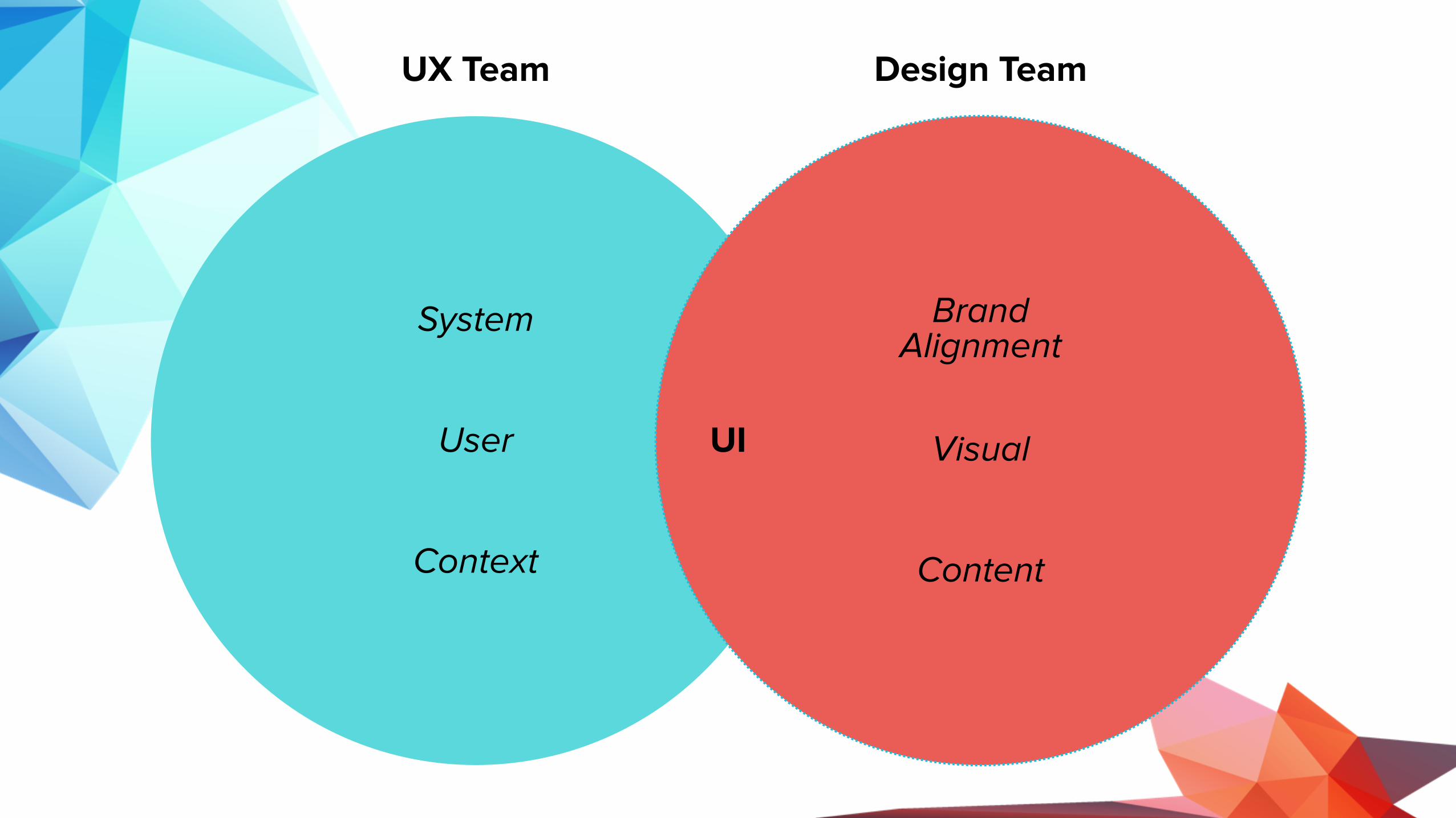
UX Team Design Team
UI
System
User
Context
Brand Alignment
Visual
Content

UX Team Design Team
Content Hierarchy
Content Elements/Features
Interaction
Readability
Colours
Font
Identity
Design Trends
Layout
Icons/Images
Navigations
Usability
Visual HierarchyOne of the most important aspect of UI design
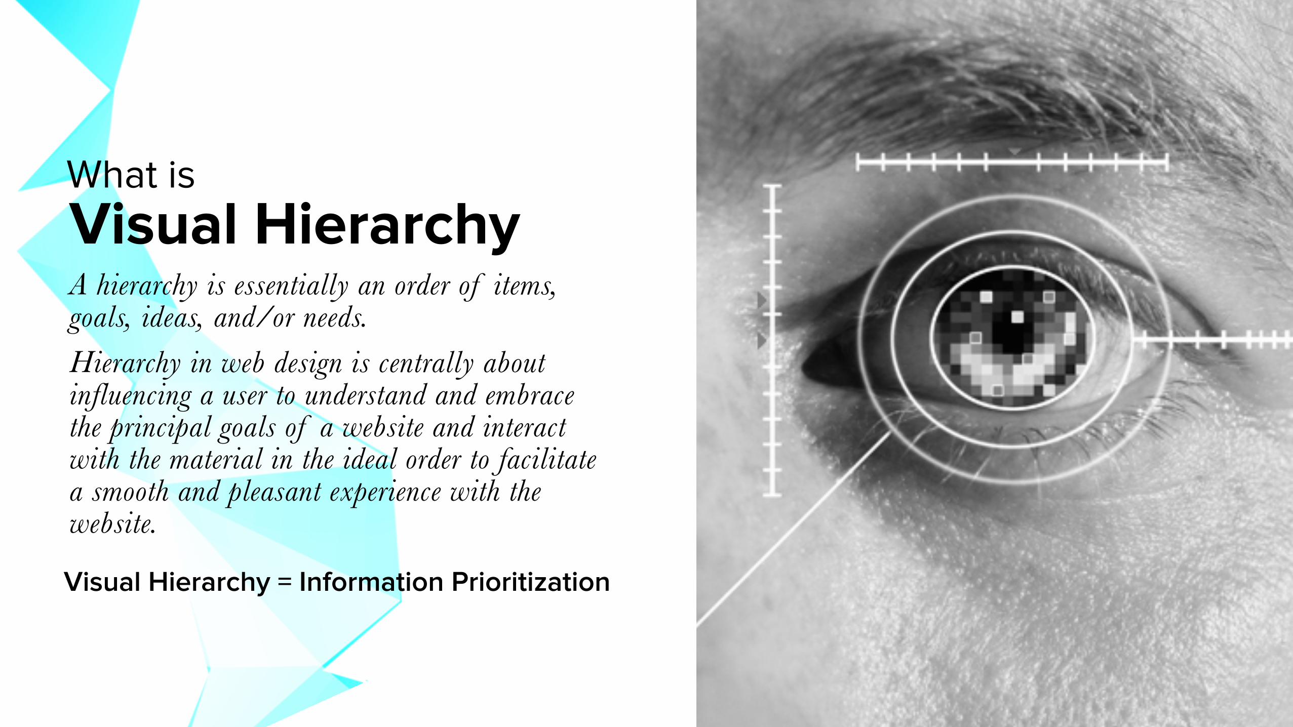
Visual HierarchyA hierarchy is essentially an order of items, goals, ideas, and/or needs. Hierarchy in web design is centrally about influencing a user to understand and embrace the principal goals of a website and interact with the material in the ideal order to facilitate a smooth and pleasant experience with the website.
What is
Visual Hierarchy = Information Prioritization
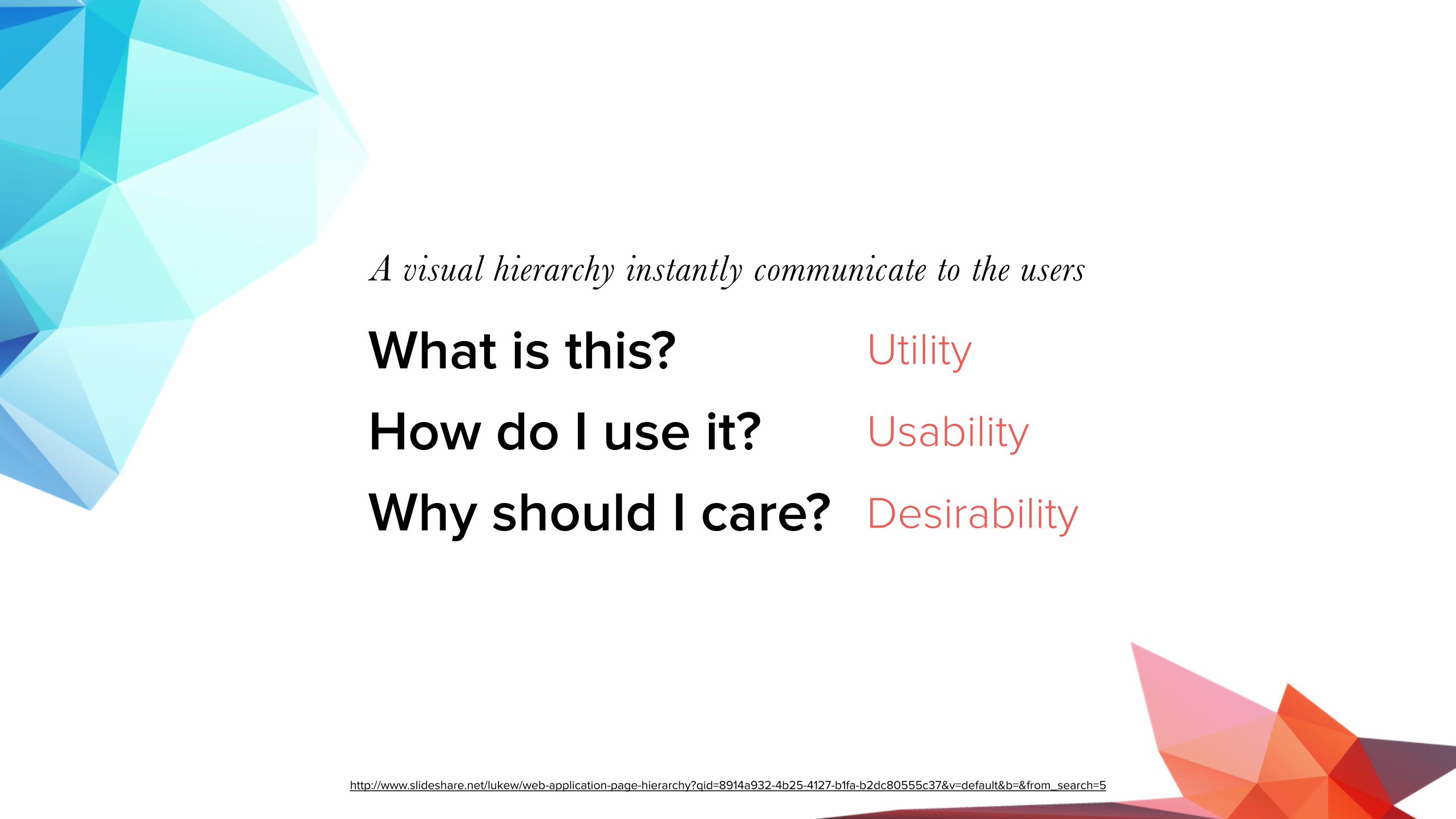
What is this? How do I use it? Why should I care?
A visual hierarchy instantly communicate to the users
Utility
Usability
Desirability
http://www.slideshare.net/lukew/web-application-page-hierarchy?qid=8914a932-4b25-4127-b1fa-b2dc80555c37&v=default&b=&from_search=5

How do we implement visual hierarchy?
Group PRIORITIZECollect
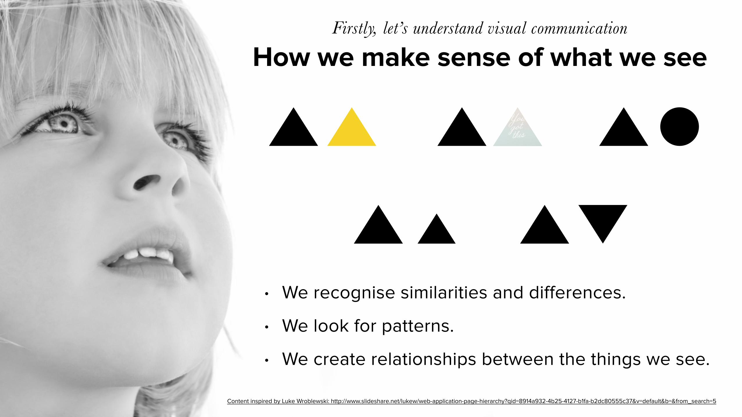
How we make sense of what we seeFirstly, let’s understand visual communication
• We recognise similarities and differences.
• We look for patterns.
• We create relationships between the things we see.
Content inspired by Luke Wroblewski: http://www.slideshare.net/lukew/web-application-page-hierarchy?qid=8914a932-4b25-4127-b1fa-b2dc80555c37&v=default&b=&from_search=5
Content inspired by Luke Wroblewski: http://www.slideshare.net/lukew/web-application-page-hierarchy?qid=8914a932-4b25-4127-b1fa-b2dc80555c37&v=default&b=&from_search=5
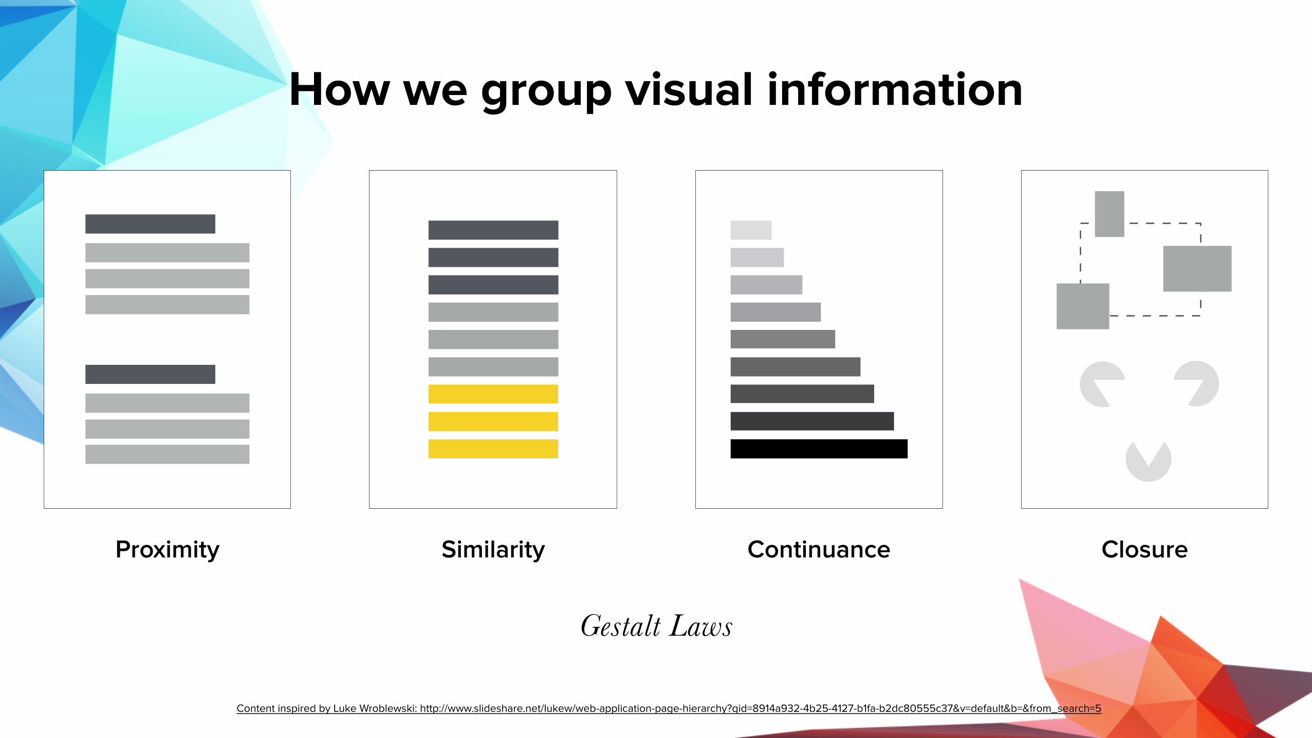
How we group visual information
Proximity Similarity Continuance Closure
Gestalt Laws

How do we establish hierarchy?Now that we know how to group information

Page scanning patternsThe predictable human eye
VS
F-Pattern Z-Pattern
http://www.webdesignerdepot.com/2015/03/how-eye-scanning-impacts-visual-hierarchy-in-ux-design/
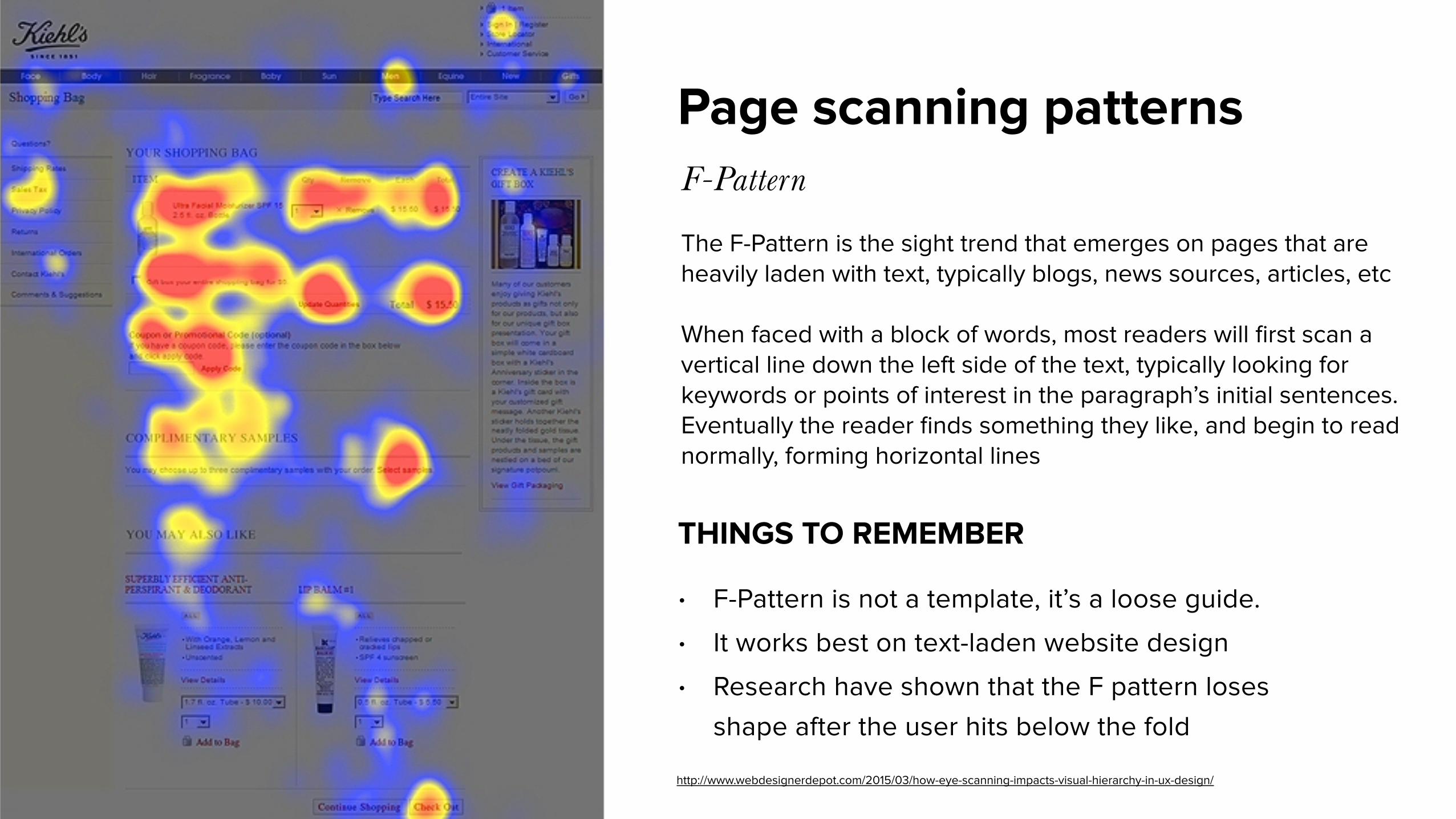
Page scanning patternsF-Pattern
THINGS TO REMEMBER
The F-Pattern is the sight trend that emerges on pages that are heavily laden with text, typically blogs, news sources, articles, etc
When faced with a block of words, most readers will first scan a vertical line down the left side of the text, typically looking for keywords or points of interest in the paragraph’s initial sentences. Eventually the reader finds something they like, and begin to read normally, forming horizontal lines
• F-Pattern is not a template, it’s a loose guide. • It works best on text-laden website design • Research have shown that the F pattern loses
shape after the user hits below the fold
http://www.webdesignerdepot.com/2015/03/how-eye-scanning-impacts-visual-hierarchy-in-ux-design/
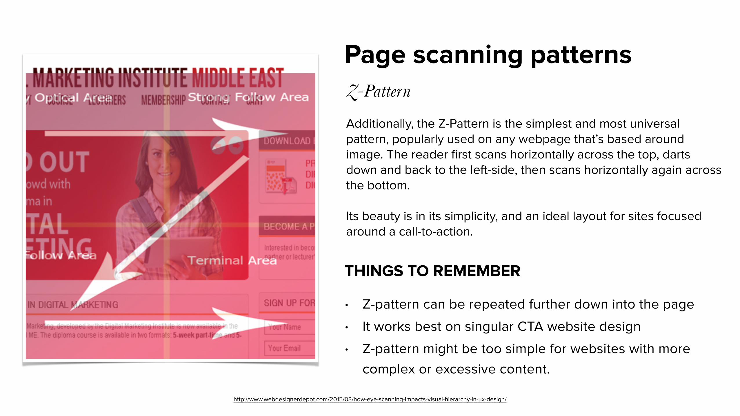
Page scanning patternsZ-Pattern
THINGS TO REMEMBER
Additionally, the Z-Pattern is the simplest and most universal pattern, popularly used on any webpage that’s based around image. The reader first scans horizontally across the top, darts down and back to the left-side, then scans horizontally again across the bottom.
Its beauty is in its simplicity, and an ideal layout for sites focused around a call-to-action.
• Z-pattern can be repeated further down into the page • It works best on singular CTA website design • Z-pattern might be too simple for websites with more
complex or excessive content.
http://www.webdesignerdepot.com/2015/03/how-eye-scanning-impacts-visual-hierarchy-in-ux-design/
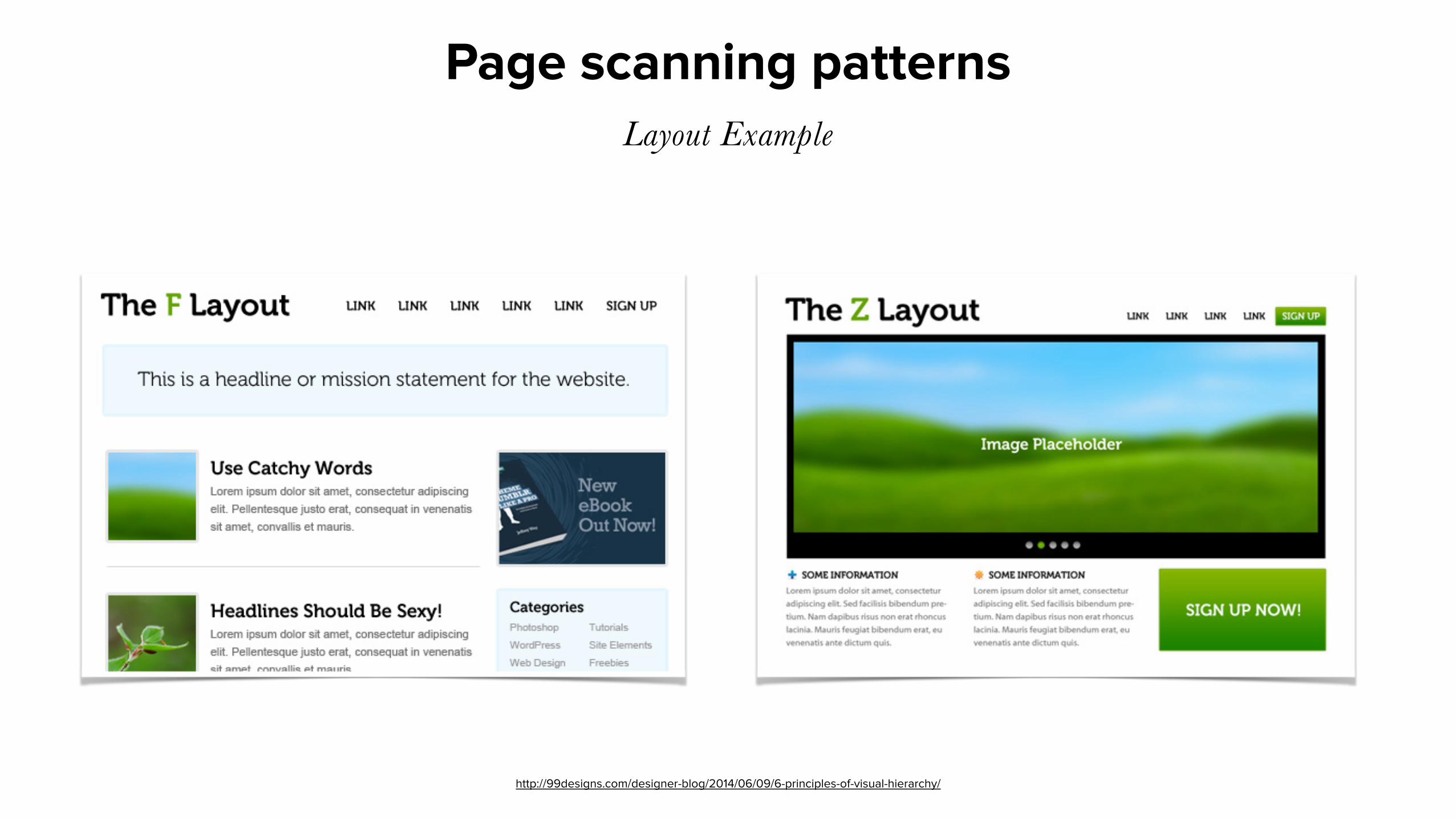
Page scanning patternsLayout Example
http://99designs.com/designer-blog/2014/06/09/6-principles-of-visual-hierarchy/
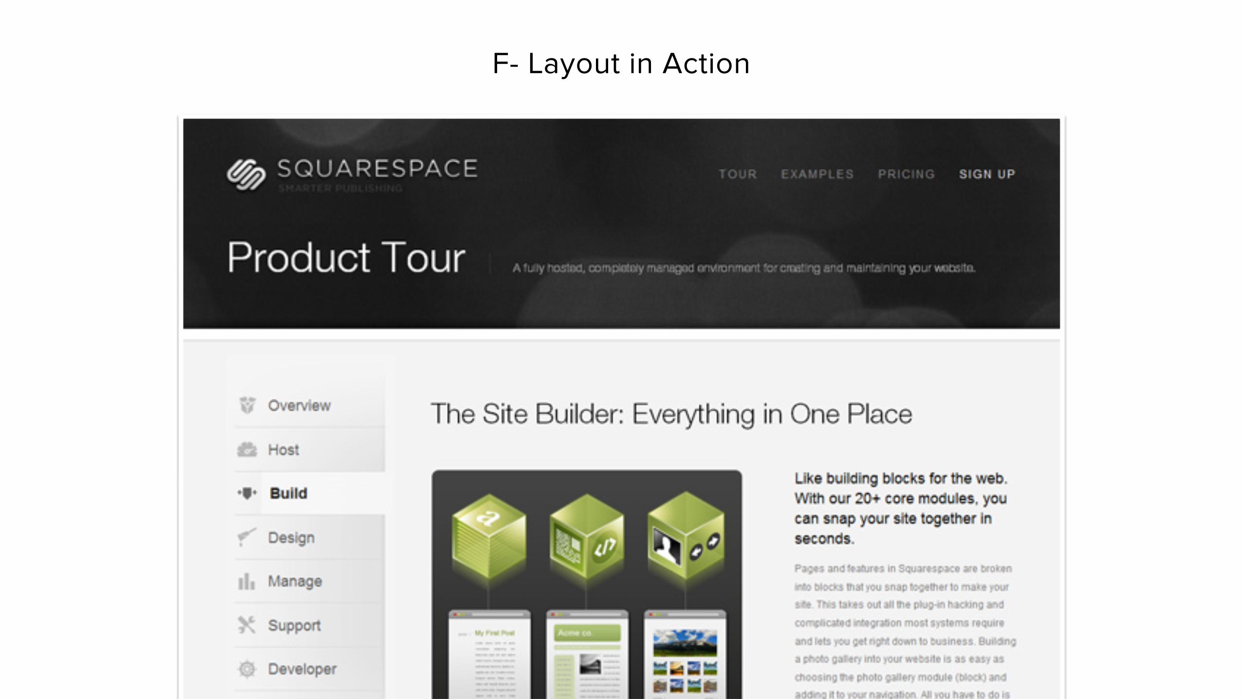
F- Layout in Action
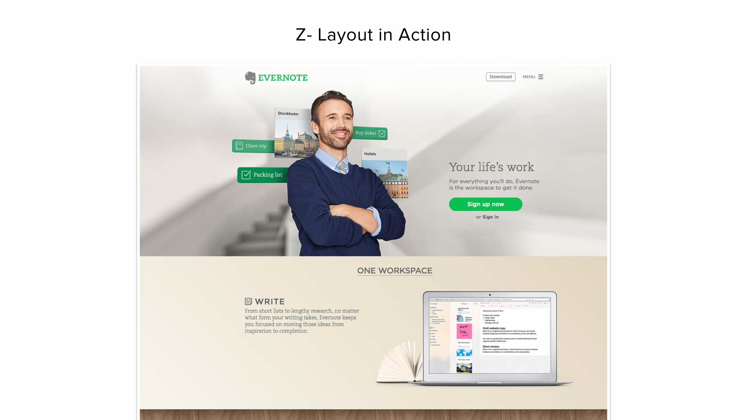
Z- Layout in Action

SizePeople read/see bigger things first.
http://99designs.com/designer-blog/2014/06/09/6-principles-of-visual-hierarchy/
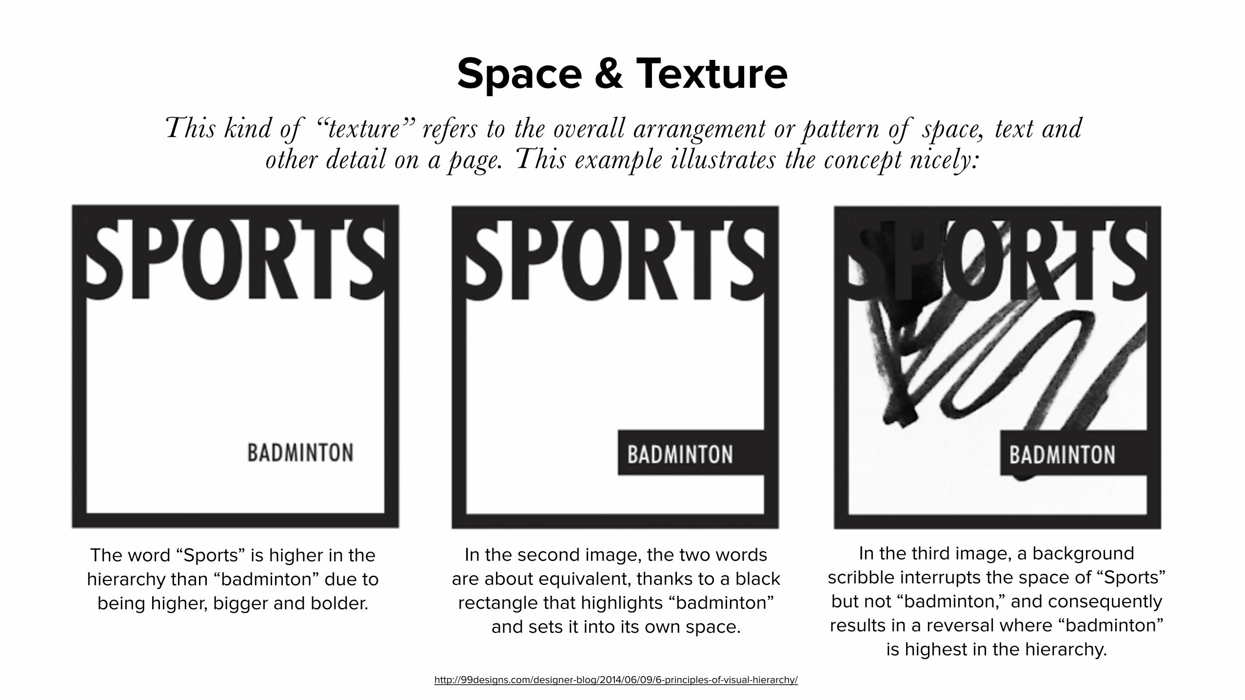
Space & TextureThis kind of “texture” refers to the overall arrangement or pattern of space, text and
other detail on a page. This example illustrates the concept nicely:
The word “Sports” is higher in the hierarchy than “badminton” due to
being higher, bigger and bolder.
In the second image, the two words are about equivalent, thanks to a black rectangle that highlights “badminton”
and sets it into its own space.
In the third image, a background scribble interrupts the space of “Sports” but not “badminton,” and consequently results in a reversal where “badminton”
is highest in the hierarchy.http://99designs.com/designer-blog/2014/06/09/6-principles-of-visual-hierarchy/

Typeface weight
http://99designs.com/designer-blog/2014/06/09/6-principles-of-visual-hierarchy/

Color and tint
Bright colors stand out from muted colors or grayscale, while lighter tints appear more “distant” and thus fall lower on the hierarchy than richer, darker ones.
http://99designs.com/designer-blog/2014/06/09/6-principles-of-visual-hierarchy/
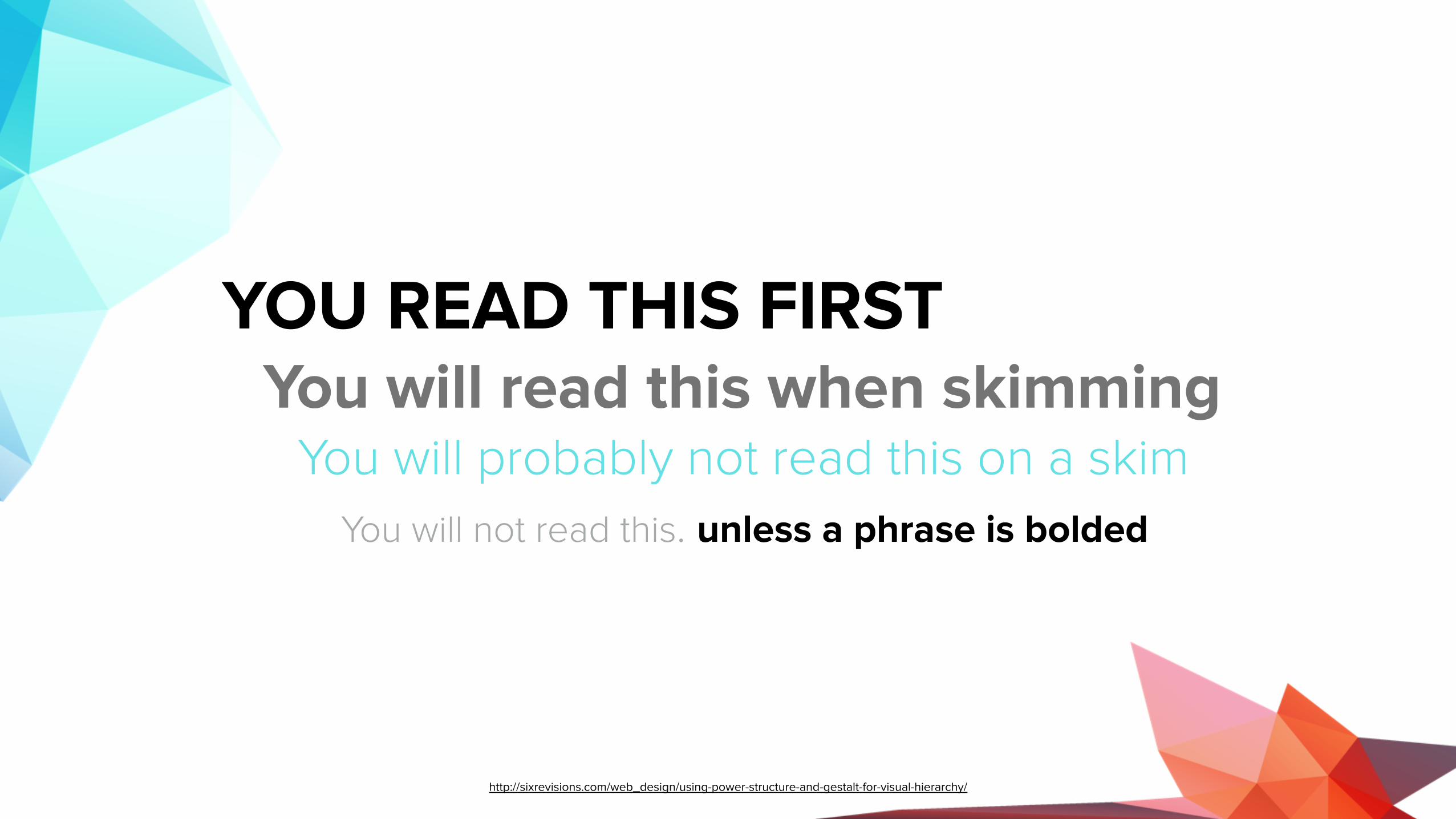
YOU READ THIS FIRST You will read this when skimming You will probably not read this on a skim
You will not read this. unless a phrase is bolded
http://sixrevisions.com/web_design/using-power-structure-and-gestalt-for-visual-hierarchy/
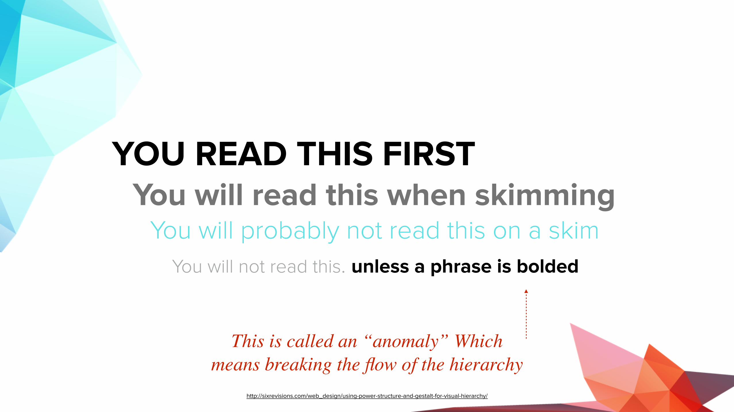
YOU READ THIS FIRST You will read this when skimming You will probably not read this on a skim
You will not read this. unless a phrase is bolded
This is called an “anomaly” Which means breaking the flow of the hierarchy
http://sixrevisions.com/web_design/using-power-structure-and-gestalt-for-visual-hierarchy/
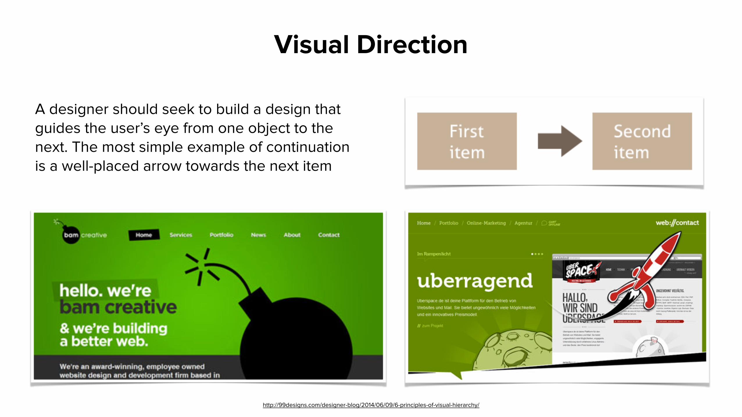
A designer should seek to build a design that guides the user’s eye from one object to the next. The most simple example of continuation is a well-placed arrow towards the next item
Visual Direction
http://99designs.com/designer-blog/2014/06/09/6-principles-of-visual-hierarchy/
Visual Direction
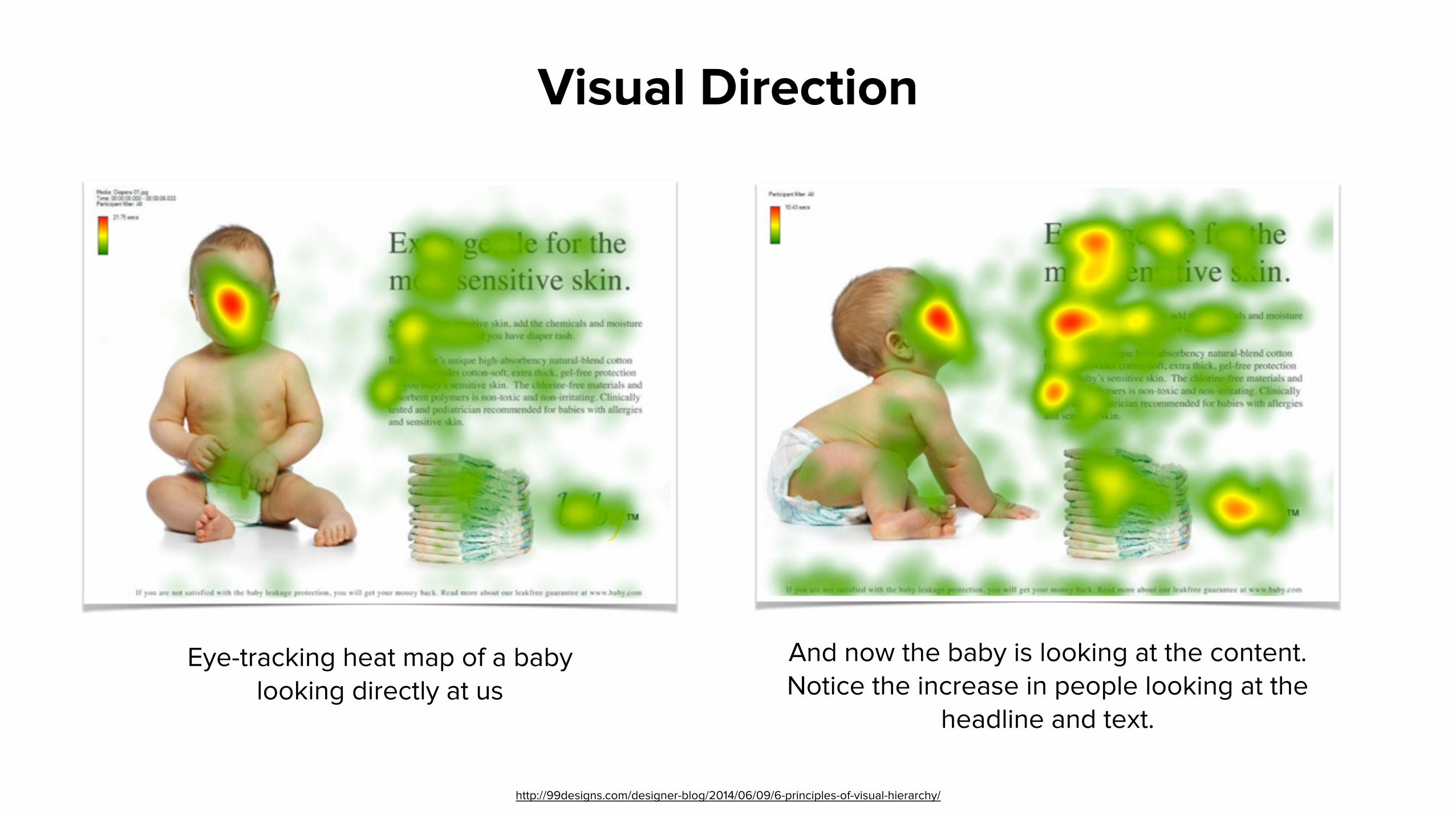
And now the baby is looking at the content. Notice the increase in people looking at the
headline and text.
Eye-tracking heat map of a baby looking directly at us
http://99designs.com/designer-blog/2014/06/09/6-principles-of-visual-hierarchy/
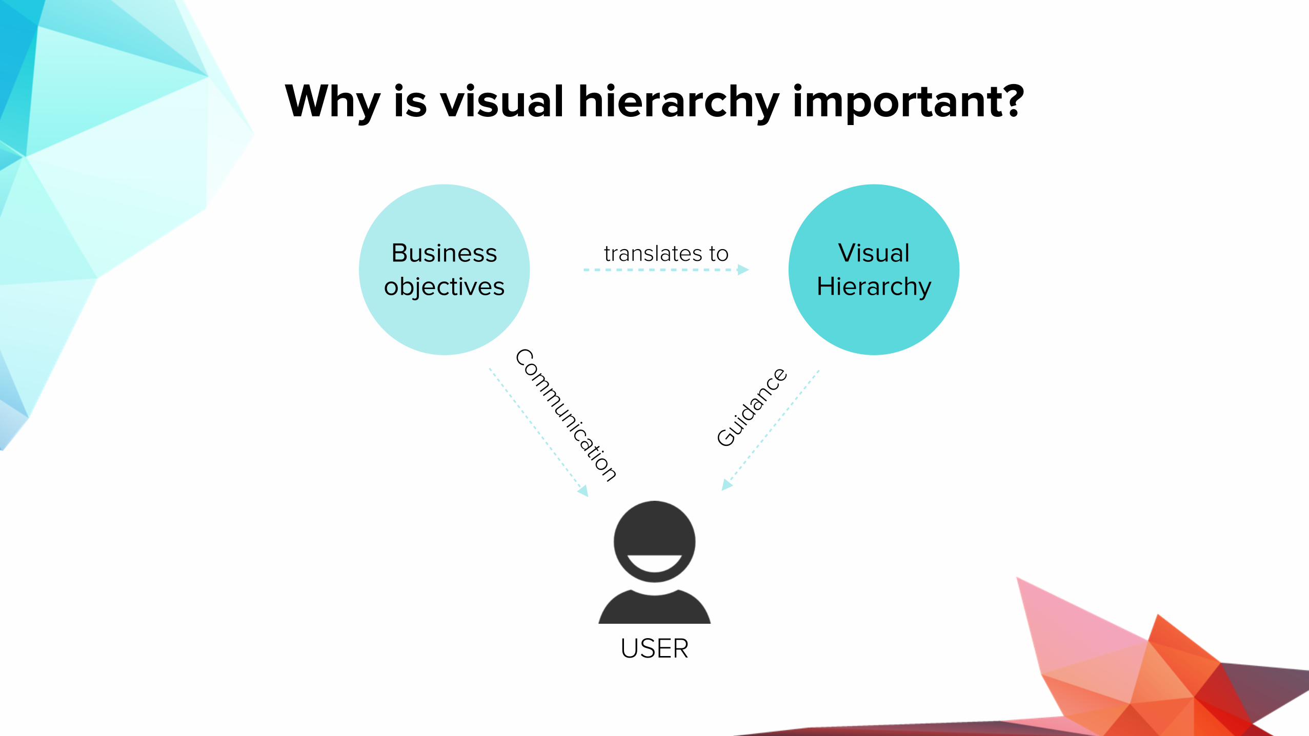
Why is visual hierarchy important?
Business objectives
Visual Hierarchy
USER
translates to
Guidan
ceCom
munication

MIRUM AGENCY 2014
ANY QUESTIONS?Thank you

Visual HierarchyIn pairs, rank the visual hierarchy of the williams-sonoma website.
Exercise 5.1


