58
Visual identity system October 2020 Version 2.0 (Draft)
Visual identity system
October 2020
Version 2.0 (Draft)
Visual identity system v2.0
2
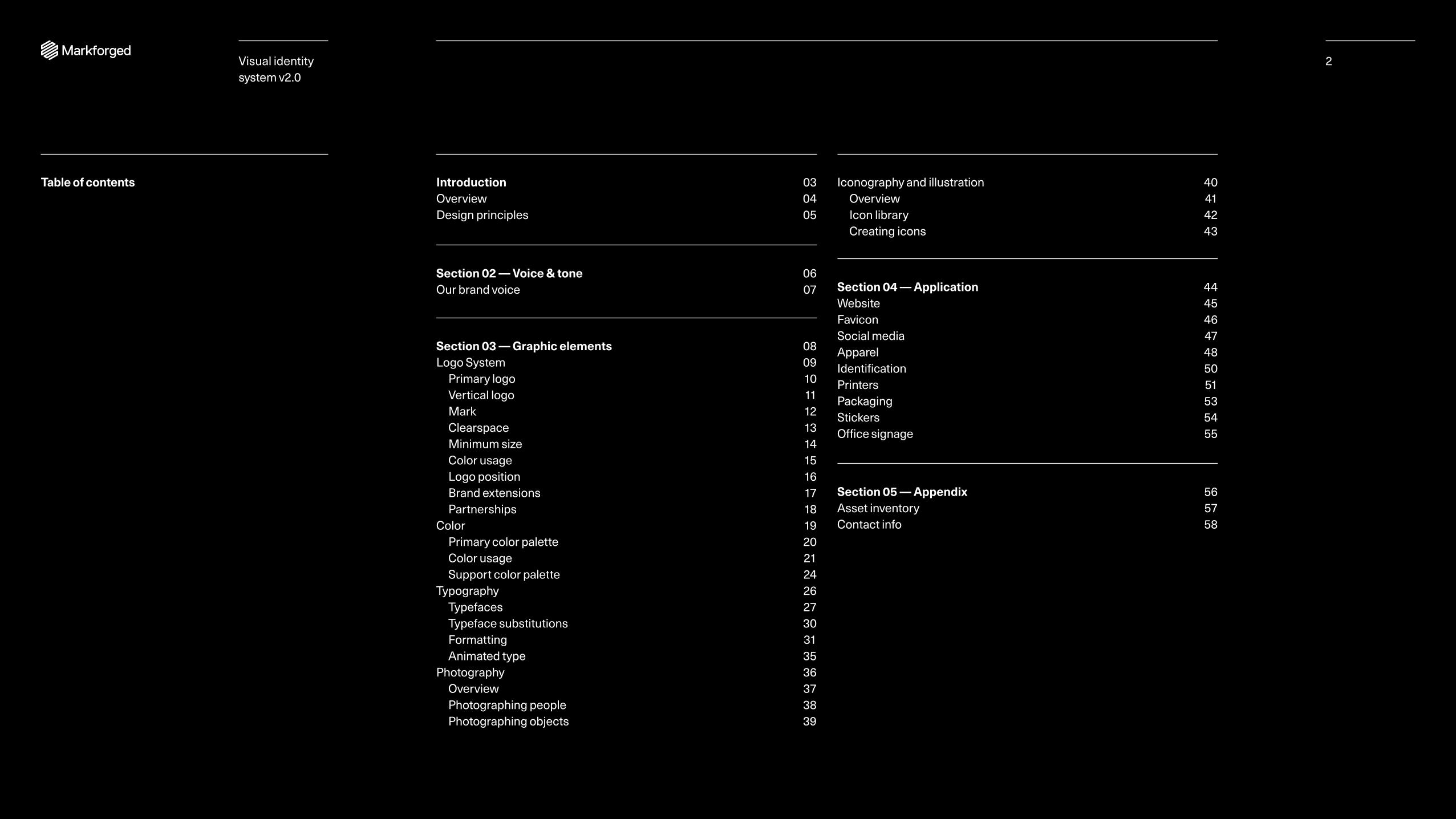
Introduction 03 Overview 04 Design principles 05
Section 02 — Voice & tone 06 Our brand voice 07
Section 03 — Graphic elements 08 Logo System 09 Primary logo 10 Vertical logo 11 Mark 12 Clearspace 13 Minimum size 14 Color usage 15 Logo position 16 Brand extensions 17 Partnerships 18 Color 19 Primary color palette 20 Color usage 21 Support color palette 24 Typography 26 Typefaces 27 Typeface substitutions 30 Formatting 31 Animated type 35 Photography 36 Overview 37 Photographing people 38 Photographing objects 39
Iconography and illustration 40 Overview 41 Icon library 42 Creating icons 43
Section 04 — Application 44 Website 45 Favicon 46 Social media 47 Apparel 48 Identification 50 Printers 51 Packaging 53 Stickers 54 Office signage 55
Section 05 — Appendix 56 Asset inventory 57 Contact info 58
Table of contents
Visual identity system v2.0
2
IntroductionContents Overview Design principles
3Visual identity system v2.0

Visual identity system v2.0
4Introduction
Overview Our visual identity helps the world understand who we are and what we do. It serves as a reminder to society, our industry, and clients — and even to ourselves — why our work is important.
The elements within these guidelines are the tools that enable us to speak confidently and with a unified voice. They are grounded in our strategy and design principles and create a flexible, yet cohesive, brand identity system for Markforged that:
+ Reinforces our brand strategy and visual identity system
+ Helps create consistent application across a wide variety of communications
+ Differentiates us from competitors
These guidelines apply to all Markforged communications. No guidelines can anticipate every possible future need. Our guidelines will require attention and attunement to reflect the needs of our business, and to ensure our design system is communicating to its full potential.
Visual identity system v2.0
5
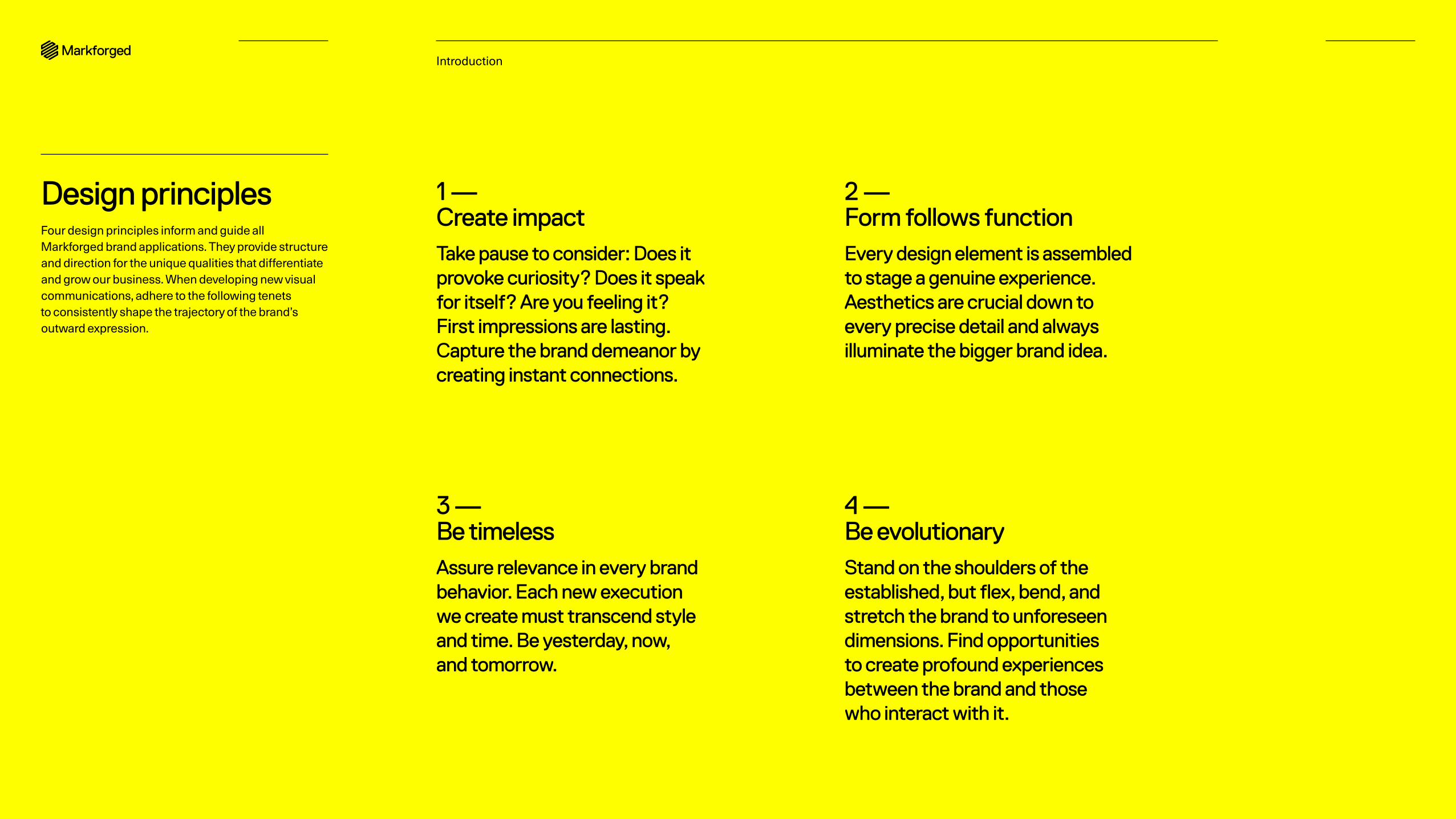
1 — Create impactTake pause to consider: Does it provoke curiosity? Does it speak for itself? Are you feeling it? First impressions are lasting. Capture the brand demeanor by creating instant connections.
2 — Form follows functionEvery design element is assembled to stage a genuine experience. Aesthetics are crucial down to every precise detail and always illuminate the bigger brand idea.
3 — Be timelessAssure relevance in every brand behavior. Each new execution we create must transcend style and time. Be yesterday, now, and tomorrow.
4 — Be evolutionaryStand on the shoulders of the established, but flex, bend, and stretch the brand to unforeseen dimensions. Find opportunities to create profound experiences between the brand and those who interact with it.
Introduction
Design principlesFour design principles inform and guide all Markforged brand applications. They provide structure and direction for the unique qualities that differentiate and grow our business. When developing new visual communications, adhere to the following tenets to consistently shape the trajectory of the brand’s outward expression.
6Section 02
Voice & toneContents Brand voice
Visual identity system v2.0
Visual identity system v2.0
7
Our brand voice
Section 02 — Voice & tone
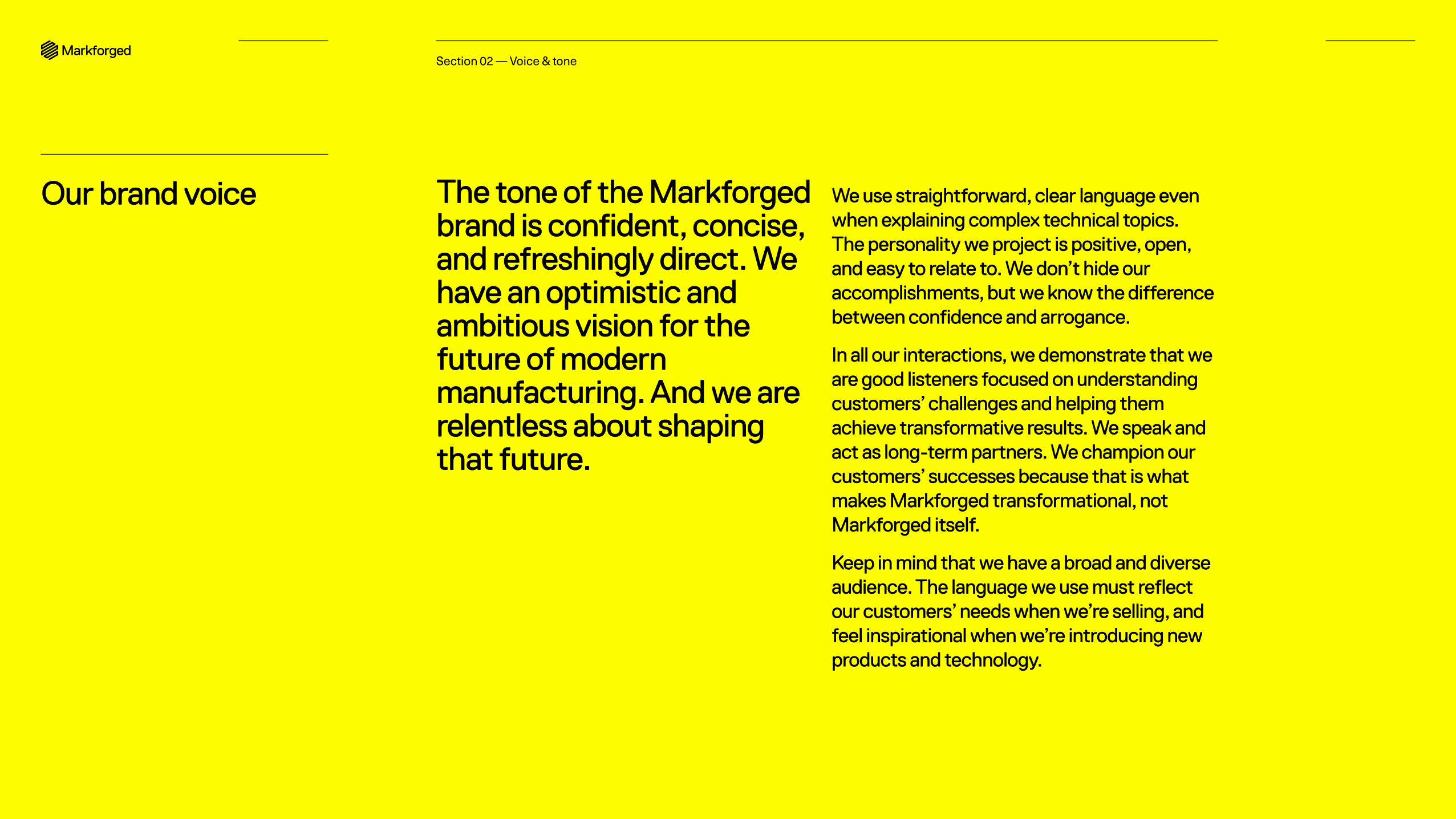
The tone of the Markforged brand is confident, concise, and refreshingly direct. We have an optimistic and ambitious vision for the future of modern manufacturing. And we are relentless about shaping that future.
We use straightforward, clear language even when explaining complex technical topics. The personality we project is positive, open, and easy to relate to. We don’t hide our accomplishments, but we know the difference between confidence and arrogance.
In all our interactions, we demonstrate that we are good listeners focused on understanding customers’ challenges and helping them achieve transformative results. We speak and act as long-term partners. We champion our customers’ successes because that is what makes Markforged transformational, not Markforged itself.
Keep in mind that we have a broad and diverse audience. The language we use must reflect our customers’ needs when we’re selling, and feel inspirational when we’re introducing new products and technology.
8
Graphic elements
Contents Logo system Color Typography Photography Iconography and illustration
Section 03Visual identity system v2.0
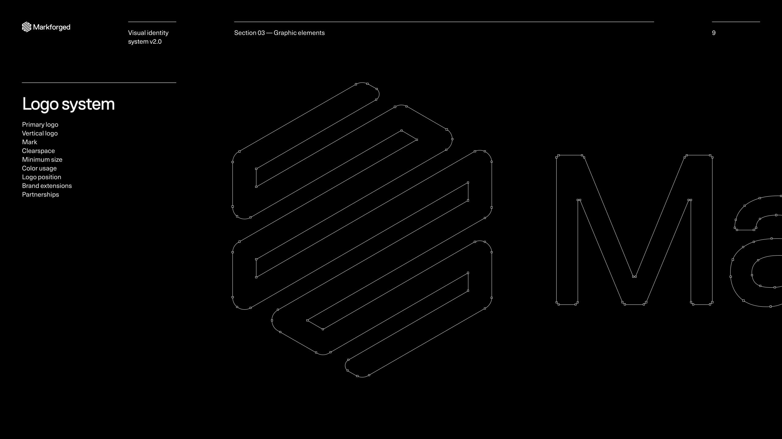
Logo systemPrimary logo Vertical logo Mark Clearspace Minimum size Color usage Logo position Brand extensions Partnerships
9Section 03 — Graphic elementsVisual identity system v2.0
10
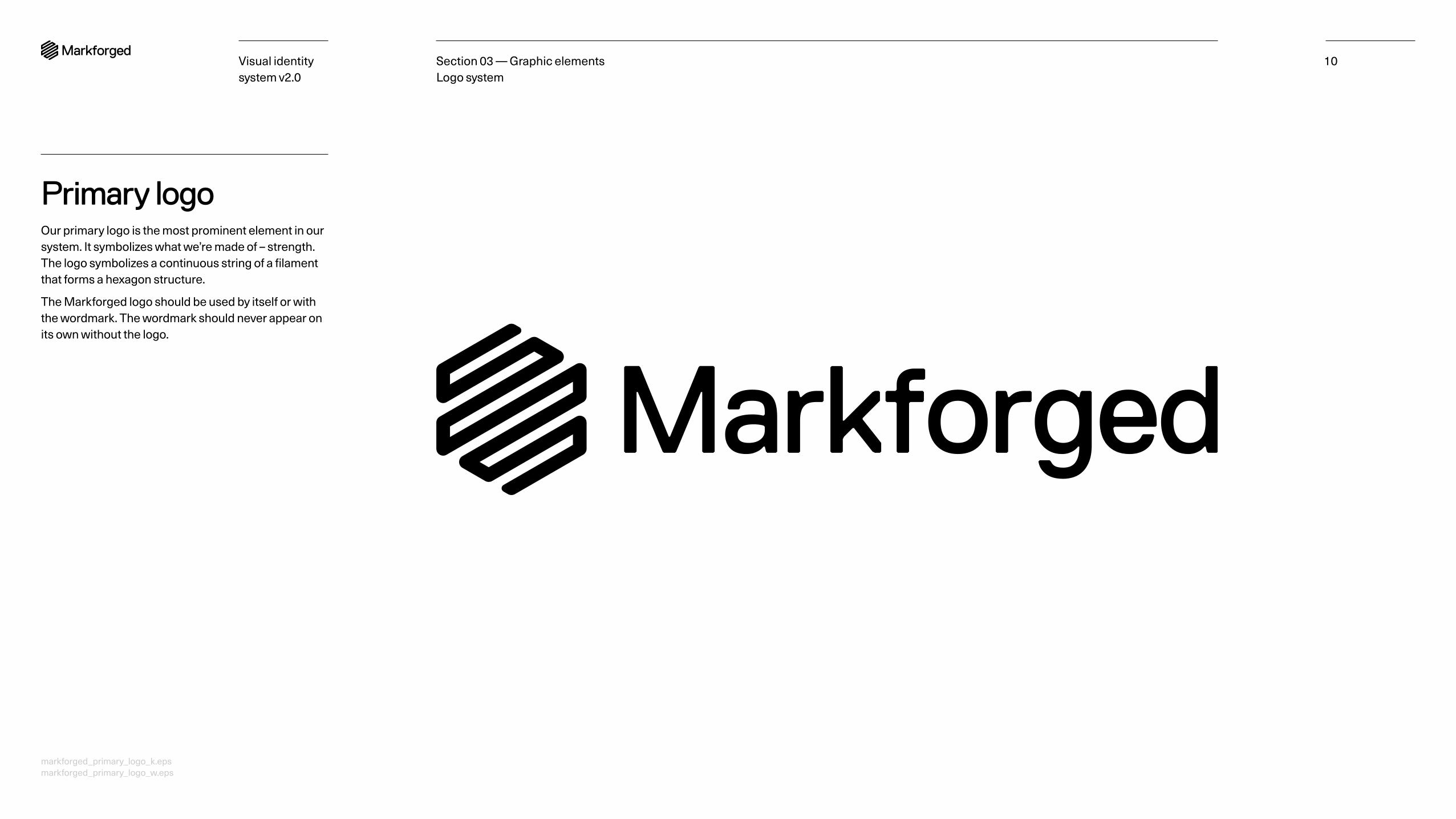
Primary logoOur primary logo is the most prominent element in our system. It symbolizes what we’re made of – strength. The logo symbolizes a continuous string of a filament that forms a hexagon structure.
The Markforged logo should be used by itself or with the wordmark. The wordmark should never appear on its own without the logo.
Section 03 — Graphic elements Logo system
markforged_primary_logo_k.eps markforged_primary_logo_w.eps
Visual identity system v2.0

Vertical logoOur vertical logo is used secondary to our logo during circumstances where horizontal space is limited. We use our vertical logo as an alternate identifier for our company. It is compact, concise, and works well for applications that require efficient use of space.
11Section 03 — Graphic elements Logo system
markforged_vertical_logo_k.eps markforged_vertical_logo_w.eps
Visual identity system v2.0
Visual identity system v2.0
12
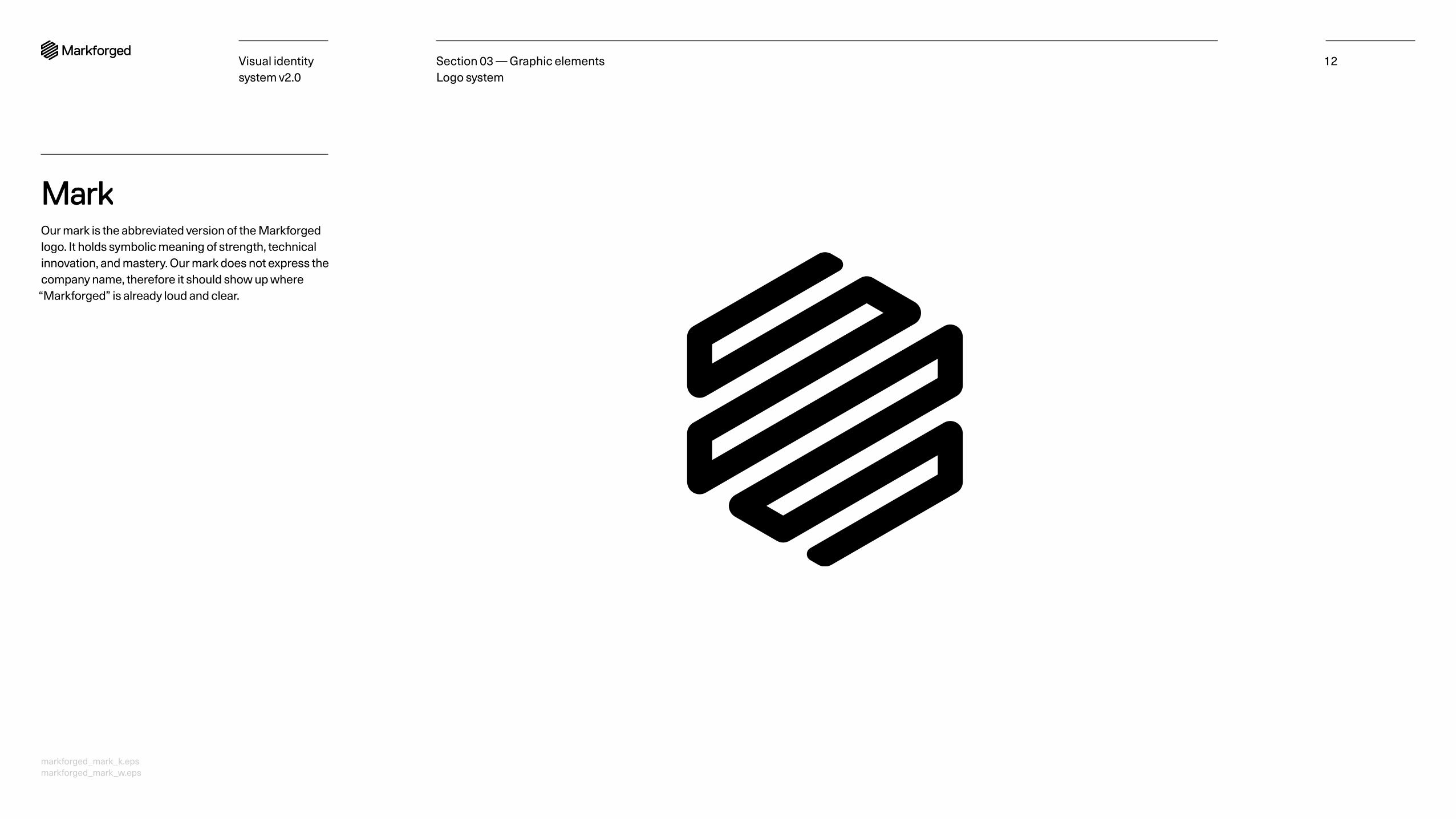
MarkOur mark is the abbreviated version of the Markforged logo. It holds symbolic meaning of strength, technical innovation, and mastery. Our mark does not express the company name, therefore it should show up where “Markforged” is already loud and clear.
Section 03 — Graphic elements Logo system
markforged_mark_k.eps markforged_mark_w.eps
Visual identity system v2.0
13
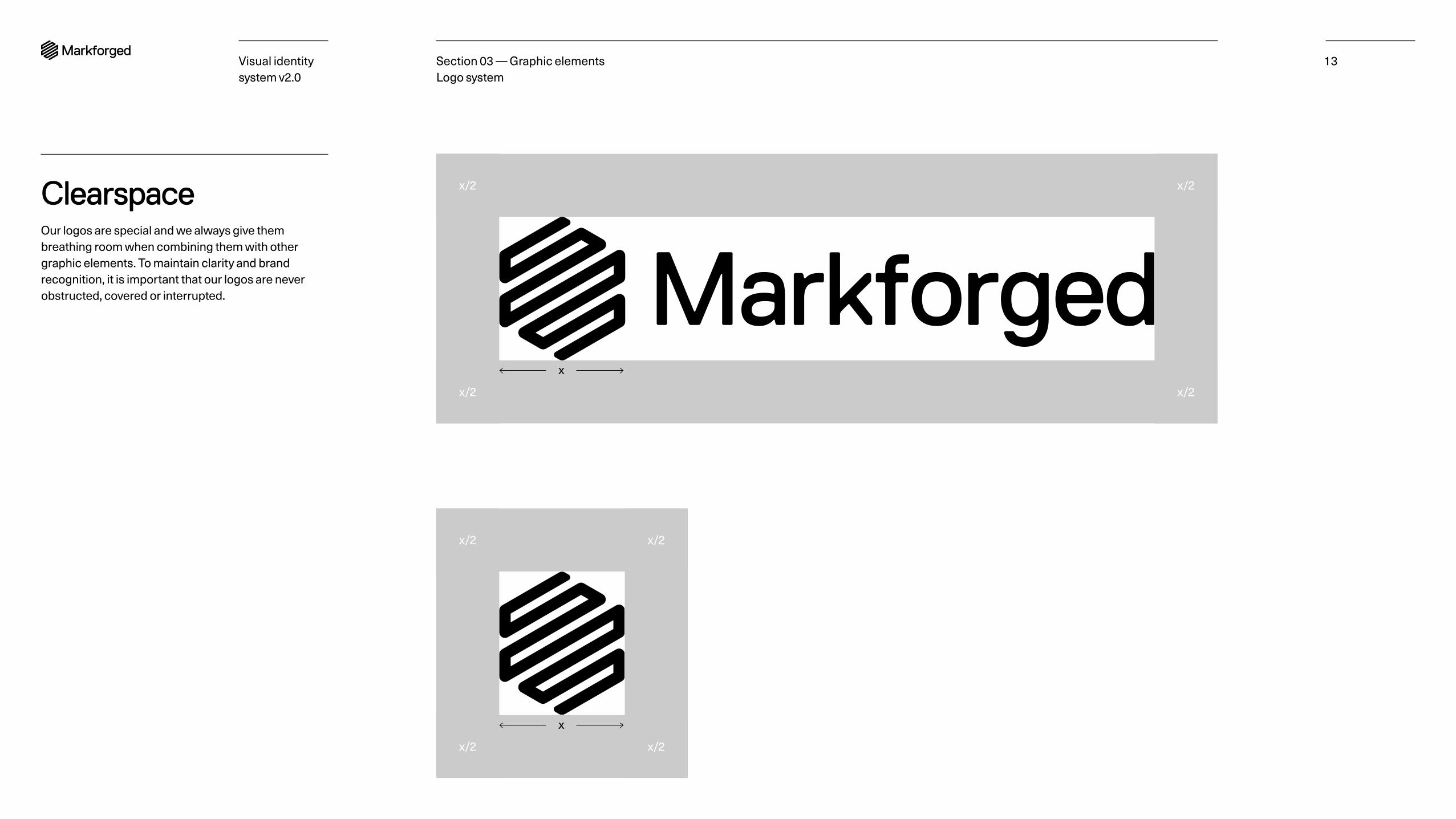
ClearspaceOur logos are special and we always give them breathing room when combining them with other graphic elements. To maintain clarity and brand recognition, it is important that our logos are never obstructed, covered or interrupted.
x/2
x/2
x/2
x/2
x
x
x/2
x/2
x/2
x/2
Section 03 — Graphic elements Logo system
Visual identity system v2.0
14
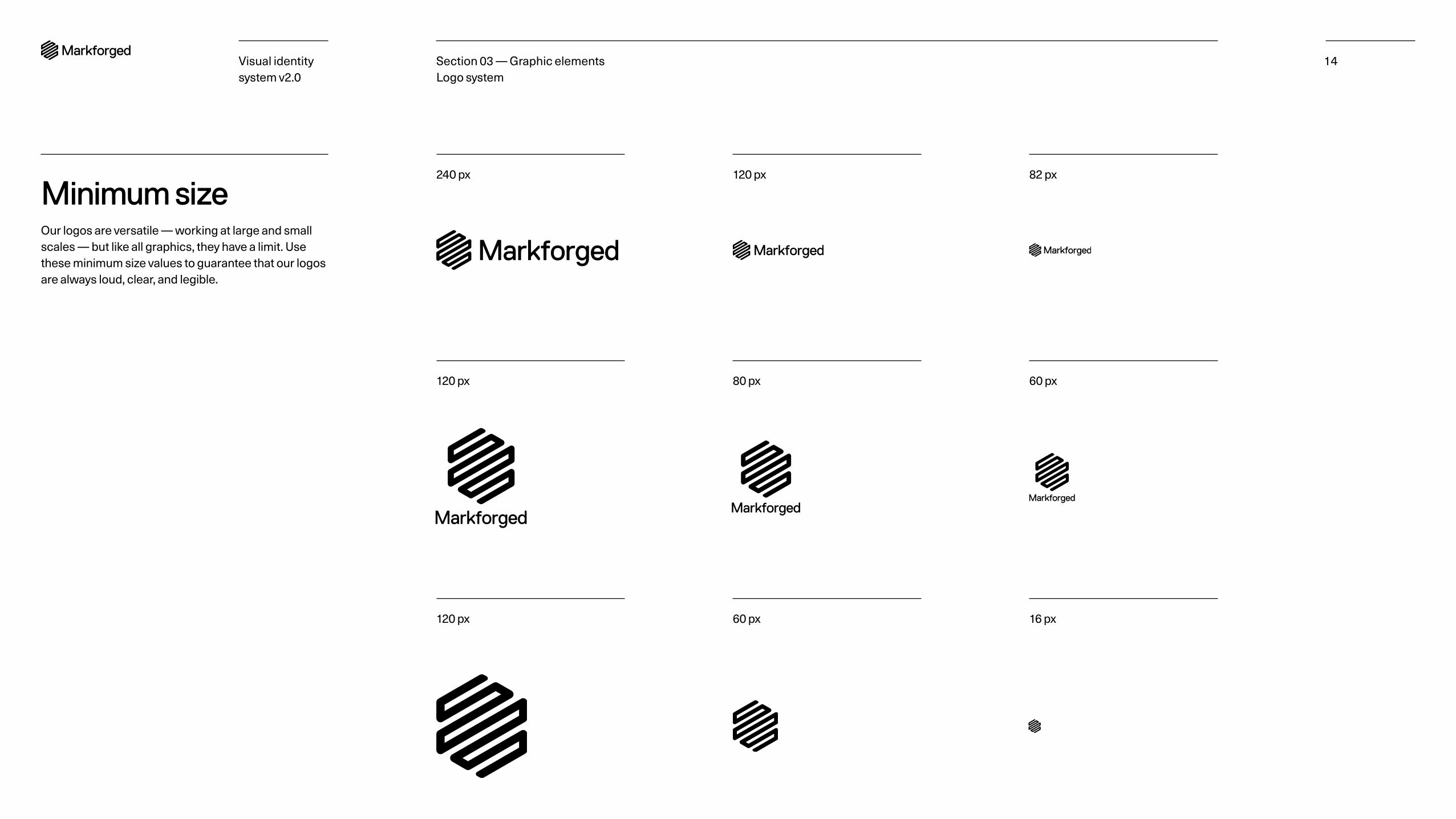
Minimum sizeOur logos are versatile — working at large and small scales — but like all graphics, they have a limit. Use these minimum size values to guarantee that our logos are always loud, clear, and legible.
240 px 120 px 82 px
120 px 60 px 16 px
120 px 80 px 60 px
Section 03 — Graphic elements Logo system
Visual identity system v2.0
15
Black on white
Black on color
White on black
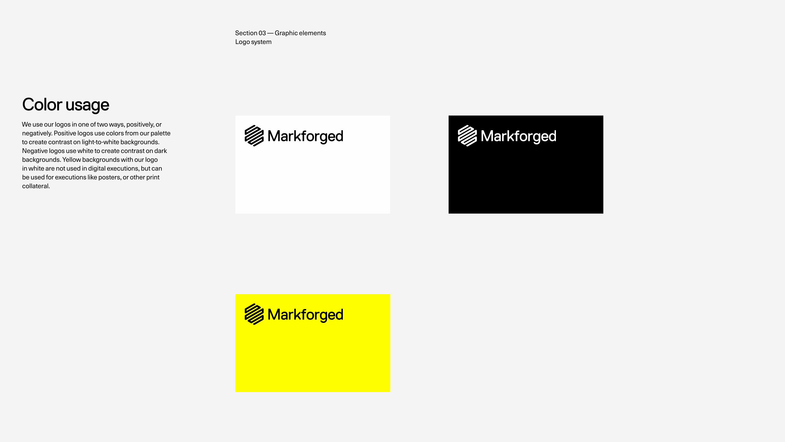
Color usageWe use our logos in one of two ways, positively, or negatively. Positive logos use colors from our palette to create contrast on light-to-white backgrounds. Negative logos use white to create contrast on dark backgrounds. Yellow backgrounds with our logo in white are not used in digital executions, but can be used for executions like posters, or other print collateral.
Section 03 — Graphic elements Logo system
Visual identity system v2.0
16
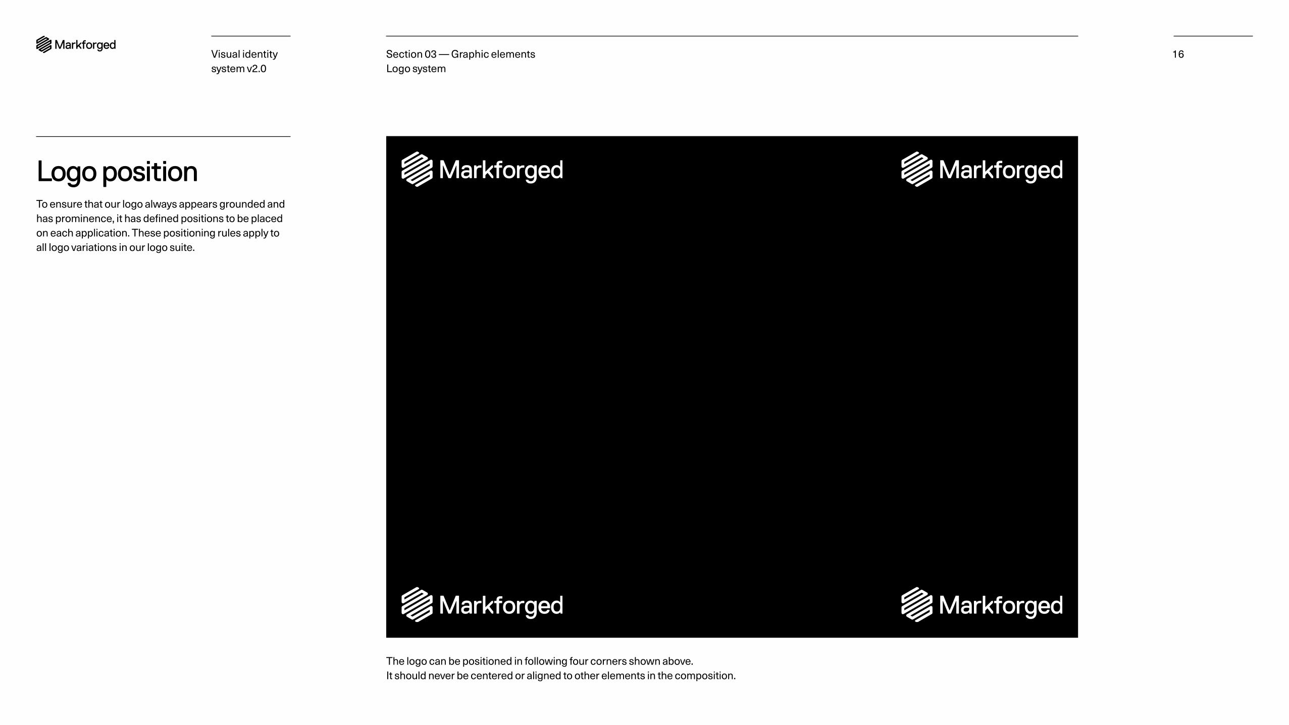
Logo positionTo ensure that our logo always appears grounded and has prominence, it has defined positions to be placed on each application. These positioning rules apply to all logo variations in our logo suite.
The logo can be positioned in following four corners shown above. It should never be centered or aligned to other elements in the composition.
Section 03 — Graphic elements Logo system
Visual identity system v2.0
17
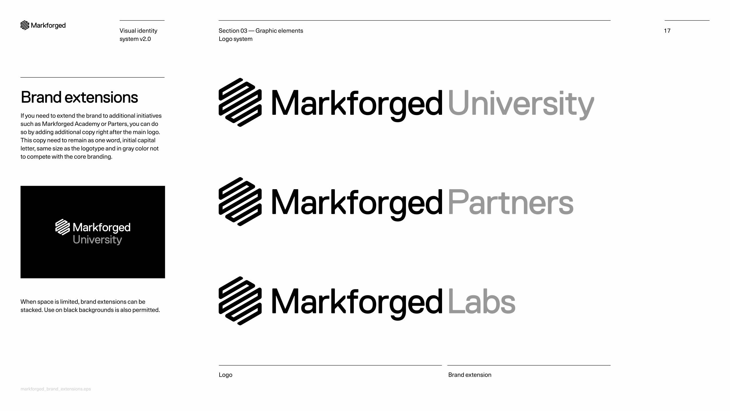
Brand extensionsIf you need to extend the brand to additional initiatives such as Markforged Academy or Parters, you can do so by adding additional copy right after the main logo. This copy need to remain as one word, initial capital letter, same size as the logotype and in gray color not to compete with the core branding.
Logo Brand extension
When space is limited, brand extensions can be stacked. Use on black backgrounds is also permitted.
Section 03 — Graphic elements Logo system
markforged_brand_extensions.eps
Visual identity system v2.0
18
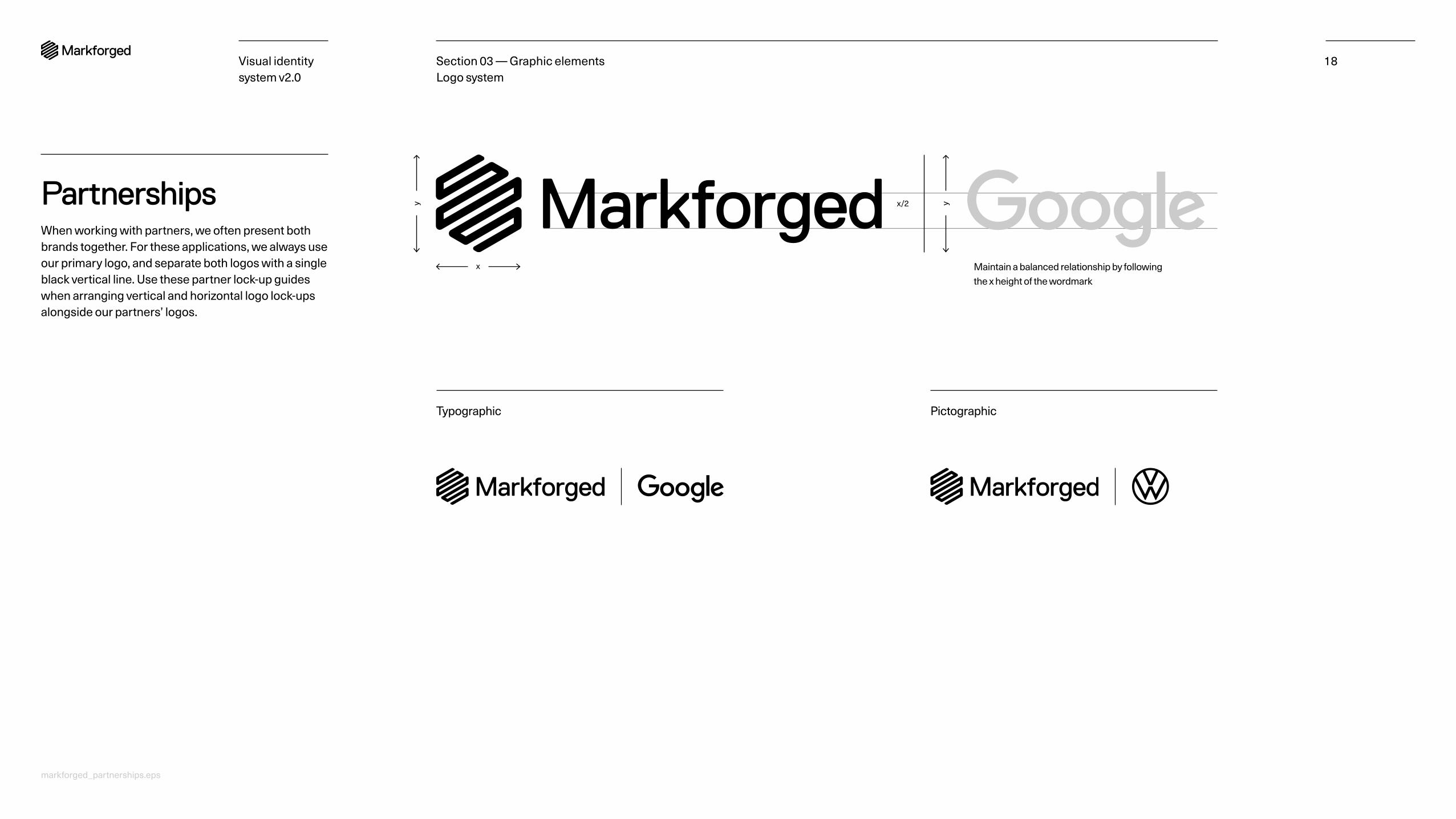
PartnershipsWhen working with partners, we often present both brands together. For these applications, we always use our primary logo, and separate both logos with a single black vertical line. Use these partner lock-up guides when arranging vertical and horizontal logo lock-ups alongside our partners’ logos.
Typographic
Maintain a balanced relationship by following the x height of the wordmark
Pictographic
x
yy x/2
Section 03 — Graphic elements Logo system
markforged_partnerships.eps
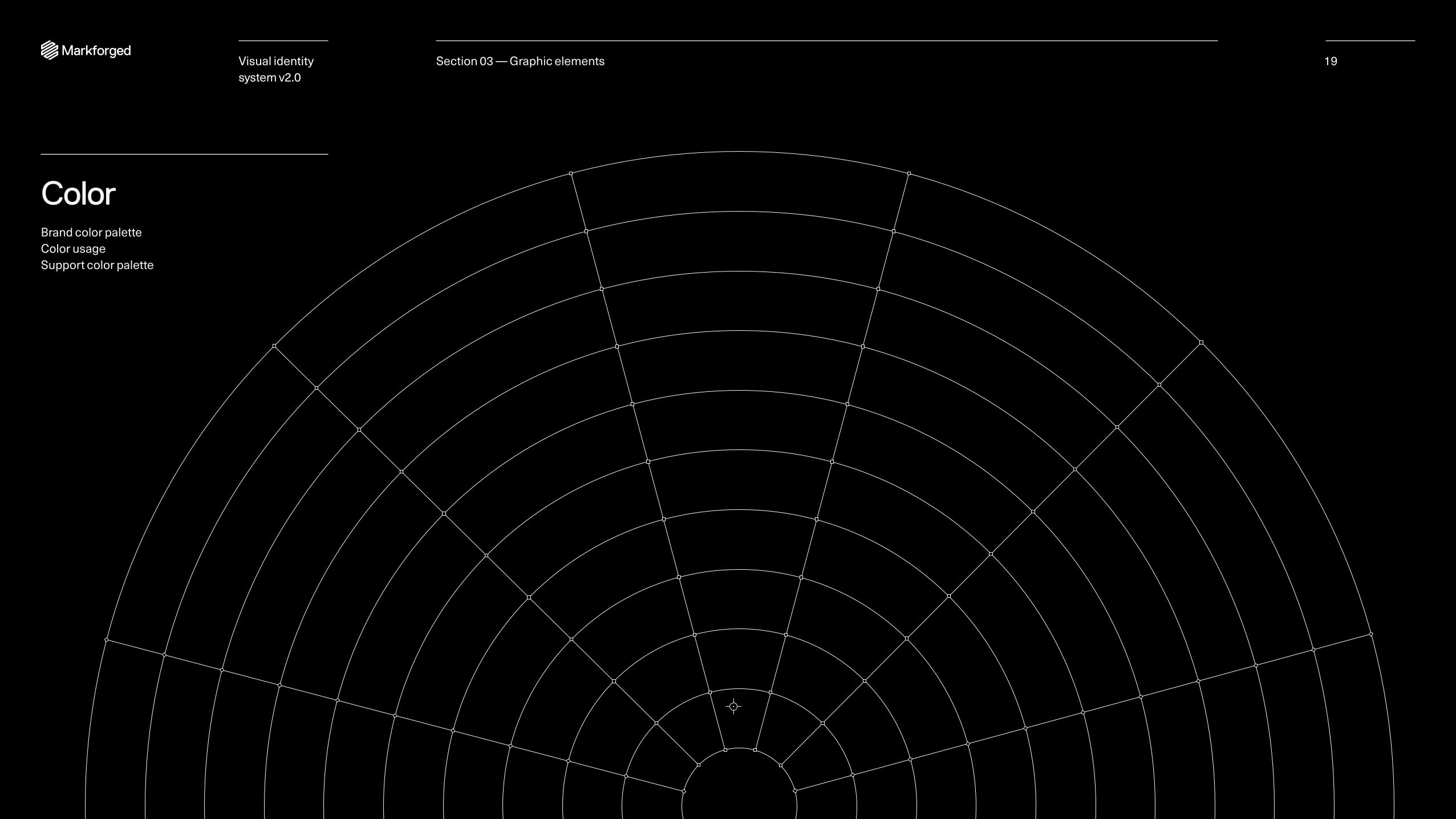
ColorBrand color palette Color usage Support color palette
19Section 03 — Graphic elementsVisual identity system v2.0

Visual identity system v2.0
20
Brand color paletteThis is our primary color palette. It is used for brand communications. Our brand color palette is strong and confident. It’s nested in our products, and in the industrial environments in which they exist.
The primary scheme is black and white accented by manufacturing yellow which represents clarity, strength, and above all embodies the brilliance and passion of our business. Manufacturing yellow is used to either add visual interest or call to action. In certain circumstances it is used as a background to create energy and boldness.
This compelling tension of colors is crucial in differentiating our brand from competitors. In addition to black, white, and yellow our grayscale palette provides shades from 2–60% black.
Manufacturing yellow PMS 803 HEX FFFF00 C0 M0 Y100 K0 R255 G255 B0
Black onyx HEX 000000 C0 M0 Y0 K100 R0 G0 B0
White HEX FFFFFF C0 M0 Y0 K0 (PAPER) R255 G255 B255
Metal 4 HEX 666666 C0 M0 Y0 K60
Metal 3 HEX 999999 C0 M0 Y0 K40
Metal 2 HEX CCCCCC C0 M0 Y0 K20
Metal 1 HEX F4F4F4 C0 M0 Y0 K2
Section 03 — Graphic elements Color
markforged_brand_color_palette_rgb.ase markforged_brand_color_palette_cmyk.ase
Visual identity system v2.0
21
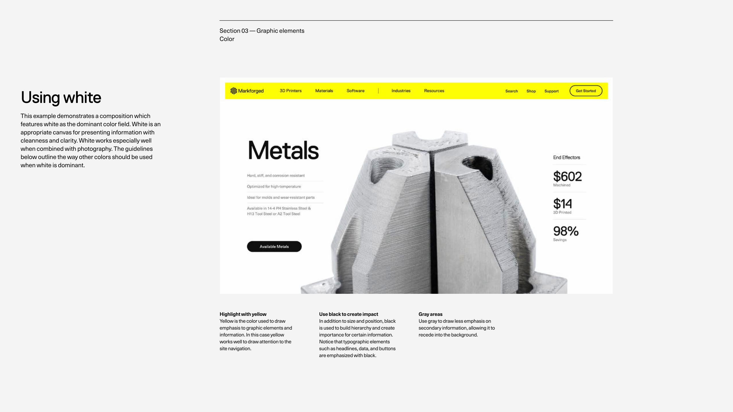
Using whiteThis example demonstrates a composition which features white as the dominant color field. White is an appropriate canvas for presenting information with cleanness and clarity. White works especially well when combined with photography. The guidelines below outline the way other colors should be used when white is dominant.
Home Page
Highlight with yellow Yellow is the color used to draw emphasis to graphic elements and information. In this case yellow works well to draw attention to the site navigation.
Use black to create impact In addition to size and position, black is used to build hierarchy and create importance for certain information. Notice that typographic elements such as headlines, data, and buttons are emphasized with black.
Gray areas Use gray to draw less emphasis on secondary information, allowing it to recede into the background.
Section 03 — Graphic elements Color
Visual identity system v2.0
22
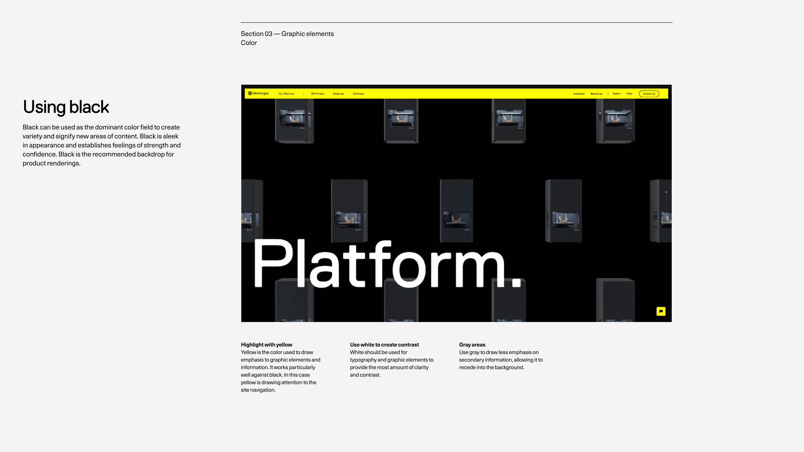
Using blackBlack can be used as the dominant color field to create variety and signify new areas of content. Black is sleek in appearance and establishes feelings of strength and confidence. Black is the recommended backdrop for product renderings.
Highlight with yellow Yellow is the color used to draw emphasis to graphic elements and information. It works particularly well against black. In this case yellow is drawing attention to the site navigation.
Use white to create contrast White should be used for typography and graphic elements to provide the most amount of clarity and contrast.
Gray areas Use gray to draw less emphasis on secondary information, allowing it to recede into the background.
Section 03 — Graphic elements Color
Visual identity system v2.0
23
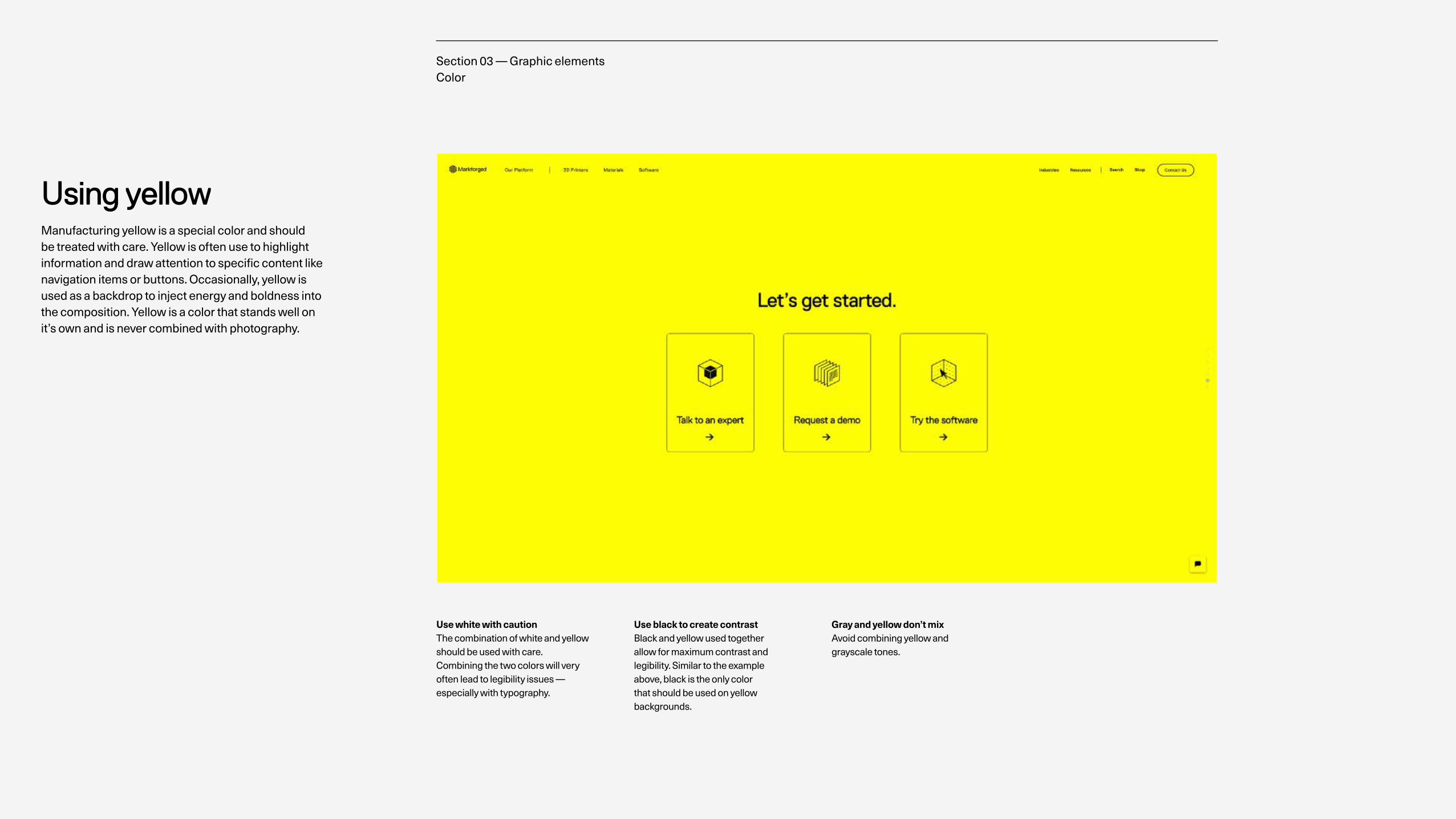
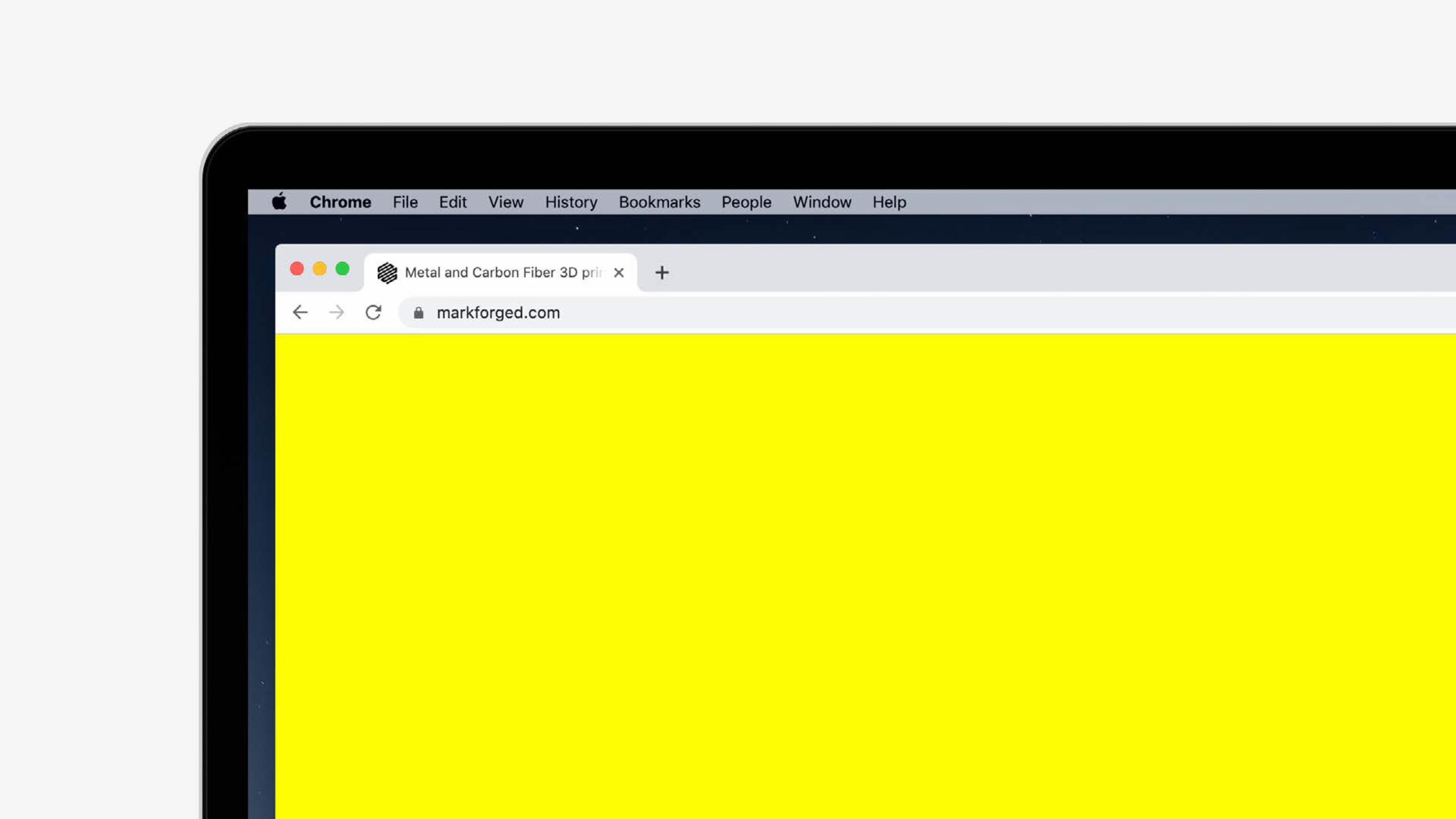
Using yellowManufacturing yellow is a special color and should be treated with care. Yellow is often use to highlight information and draw attention to specific content like navigation items or buttons. Occasionally, yellow is used as a backdrop to inject energy and boldness into the composition. Yellow is a color that stands well on it’s own and is never combined with photography.
Use white with caution The combination of white and yellow should be used with care. Combining the two colors will very often lead to legibility issues — especially with typography.
Use black to create contrast Black and yellow used together allow for maximum contrast and legibility. Similar to the example above, black is the only color that should be used on yellow backgrounds.
Gray and yellow don’t mix Avoid combining yellow and grayscale tones.
Section 03 — Graphic elements Color
Visual identity system v2.0
24Section 03 — Graphic elements Color
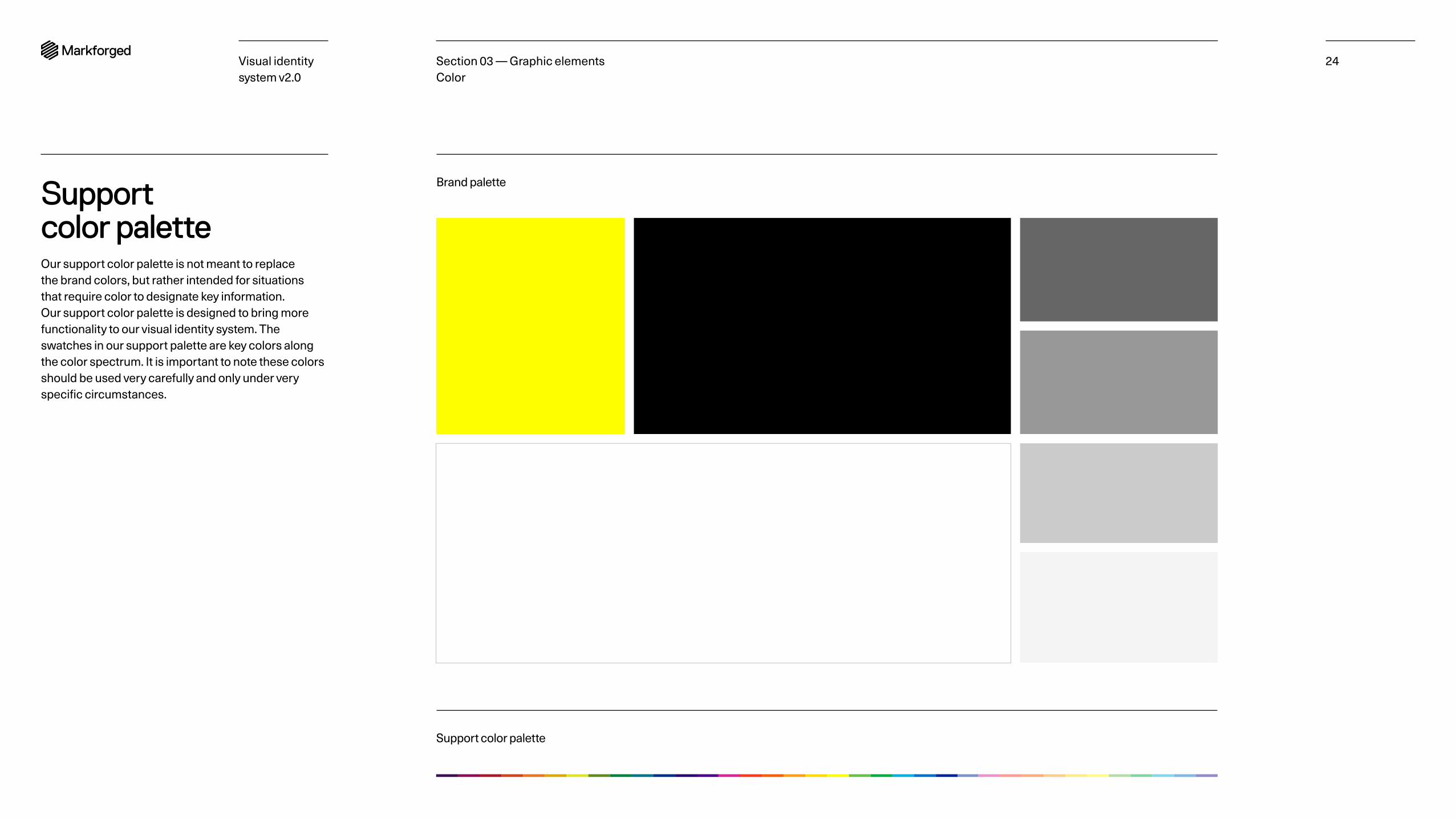
Support color paletteOur support color palette is not meant to replace the brand colors, but rather intended for situations that require color to designate key information. Our support color palette is designed to bring more functionality to our visual identity system. The swatches in our support palette are key colors along the color spectrum. It is important to note these colors should be used very carefully and only under very specific circumstances.
Brand palette
Support color palette
Visual identity system v2.0
25Section 03 — Graphic elements Color
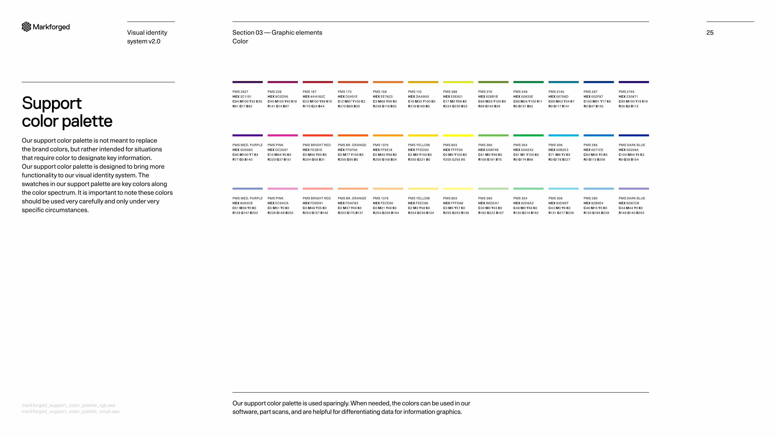
Our support color palette is used sparingly. When needed, the colors can be used in our software, part scans, and are helpful for differentiating data for information graphics.
PMS 2627 HEX 3C1151 C84 M100 Y32 K35 R61 G17 B82
PMS 173 HEX D2451E C12 M87 Y100 K2 R210 G69 B30
PMS 388 HEX E0E621 C17 M0 Y96 K0 R224 G230 B33
PMS 3145 HEX 00758D C89 M43 Y34 K7 R0 G117 B141
PMS 228 HEX 8C0D56 C40 M100 Y40 K18 R141 G14 B87
PMS 158 HEX EE7623 C3 M66 Y99 K0 R238 G118 B35
PMS 370 HEX 628B1B C66 M26 Y100 K9 R99 G140 B28
PMS 287 HEX 002F87 C100 M91 Y17 K6 R0 G47 B135
PMS 187 HEX #AA182C C23 M100 Y88 K15 R170 G24 B44
PMS 110 HEX DAA900 C16 M32 Y100 K0 R218 G169 B0
PMS 348 HEX 00833E C88 M24 Y100 K11 R0 G131 B62
PMS 2745 HEX 230871 C99 M100 Y18 K19 R35 G8 B113
PMS MED. PURPLE HEX 4D008C C85 M100 Y7 K4 R77 G0 B140
PMS BR. ORANGE HEX FF5F00 C0 M77 Y100 K0 R255 G95 B0
PMS 803 HEX FFFF00 C0 M0 Y100 K0 R255 G255 B0
PMS 306 HEX 00B2E3 C71 M8 Y3 K0 R0 G178 B227
PMS PINK HEX DC2597 C10 M94 Y0 K0 R220 G37 B151
PMS 1375 HEX FF9E18 C0 M45 Y98 K0 R255 G158 B24
PMS 360 HEX 6ABF4B C61 M0 Y96 K0 R106 G191 B75
PMS 285 HEX 0071CE C84 M55 Y0 K0 R0 G113 B206
PMS BRIGHT RED HEX FE3B1E C0 M90 Y95 K0 R254 G59 B31
PMS YELLOW HEX FFDD00 C2 M9 Y100 K0 R255 G221 B0
PMS 354 HEX 00AE42 C81 M1 Y100 K0 R0 G174 B66
PMS DARK BLUE HEX 00259A C100 M94 Y4 K2 R0 G38 B154
PMS MED. PURPLE HEX 8093CB C51 M38 Y0 K0 R128 G147 B203
PMS BR. ORANGE HEX FDAF83 C0 M37 Y49 K0 R253 G175 B131
PMS 803 HEX FFFD88 C3 M0 Y57 K0 R255 G253 B136
PMS 306 HEX 83D9EF C43 M0 Y6 K0 R131 G217 B239
PMS PINK HEX EC94CA C5 M51 Y0 K0 R236 G148 B202
PMS 1375 HEX FECE90 C0 M21 Y48 K0 R254 G206 B144
PMS 360 HEX B6DEA7 C30 M0 Y43 K0 R182 G222 B167
PMS 285 HEX 82B9E4 C46 M15 Y0 K0 R130 G185 B228
PMS BRIGHT RED HEX FD9D91 C0 M48 Y35 K0 R253 G157 B145
PMS YELLOW HEX FEEC86 C2 M3 Y58 K0 R254 G236 B134
PMS 354 HEX 82D6A2 C48 M0 Y48 K0 R130 G214 B162
PMS DARK BLUE HEX 928CCB C44 M44 Y0 K0 R146 G140 B203
Support color paletteOur support color palette is not meant to replace the brand colors, but rather intended for situations that require color to designate key information. Our support color palette is designed to bring more functionality to our visual identity system. The swatches in our support palette are key colors along the color spectrum. It is important to note these colors should be used very carefully and only under very specific circumstances.
markforged_support_color_palette_rgb.ase markforged_support_color_palette_cmyk.ase
TypographyPrimary typeface Secondary typeface Typeface substitutions Point size Line height Tracking Linebreaks
26Section 03 — Graphic elementsVisual identity system v2.0
Visual identity system v2.0
27
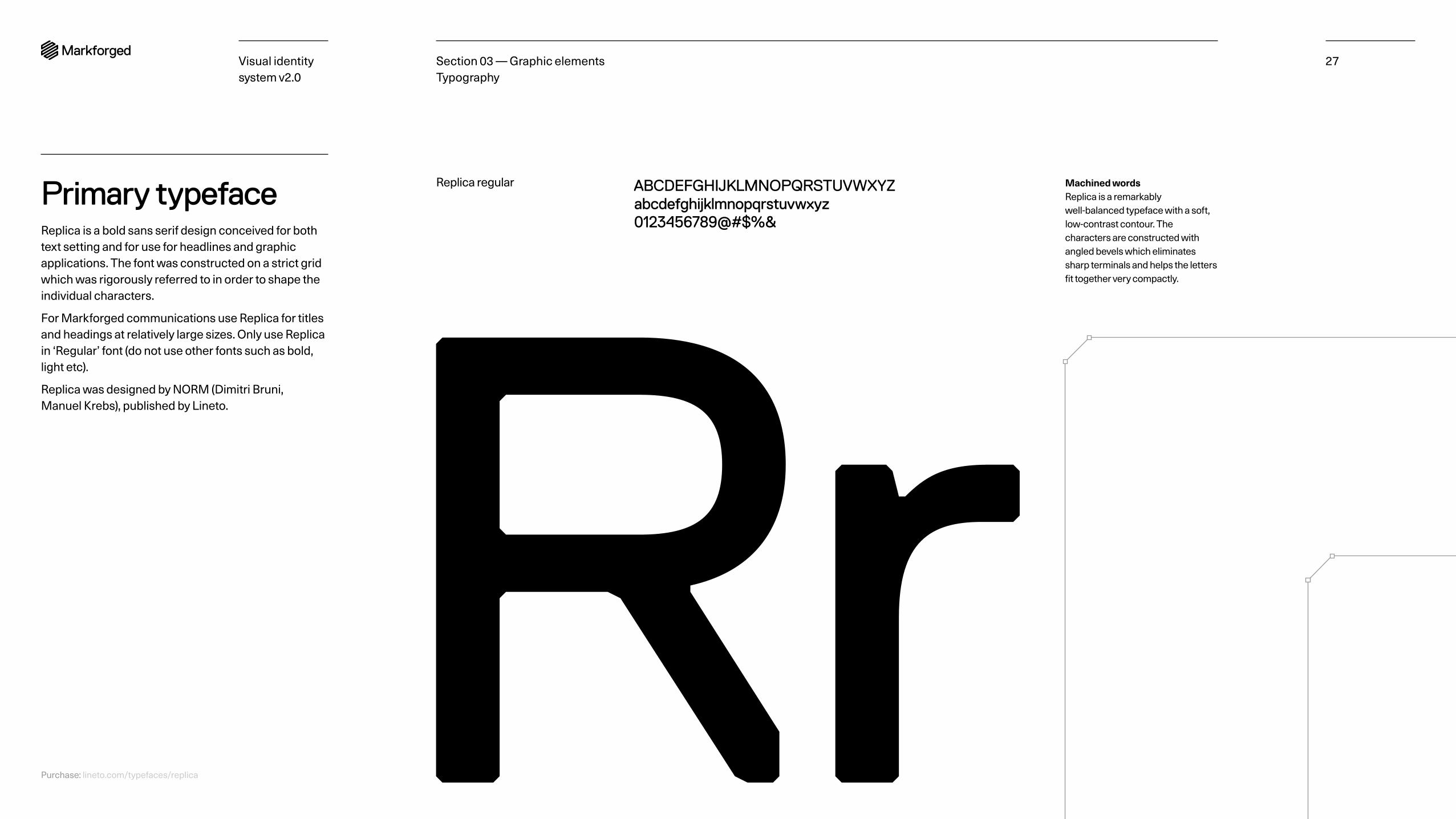
Primary typefaceReplica is a bold sans serif design conceived for both text setting and for use for headlines and graphic applications. The font was constructed on a strict grid which was rigorously referred to in order to shape the individual characters.
For Markforged communications use Replica for titles and headings at relatively large sizes. Only use Replica in ‘Regular’ font (do not use other fonts such as bold, light etc).
Replica was designed by NORM (Dimitri Bruni, Manuel Krebs), published by Lineto.
RrReplica regular ABCDEFGHIJKLMNOPQRSTUVWXYZ
abcdefghijklmnopqrstuvwxyz0123456789@#$%&
Section 03 — Graphic elements Typography
Machined words Replica is a remarkably well-balanced typeface with a soft, low-contrast contour. The characters are constructed with angled bevels which eliminates sharp terminals and helps the letters fit together very compactly.
Purchase: lineto.com/typefaces/replica
Visual identity system v2.0
28
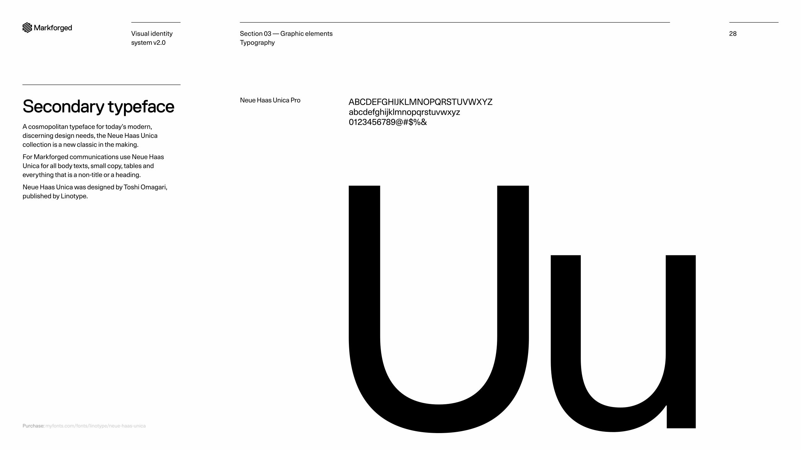
Secondary typefaceA cosmopolitan typeface for today’s modern, discerning design needs, the Neue Haas Unica collection is a new classic in the making.
For Markforged communications use Neue Haas Unica for all body texts, small copy, tables and everything that is a non-title or a heading.
Neue Haas Unica was designed by Toshi Omagari, published by Linotype.
ABCDEFGHIJKLMNOPQRSTUVWXYZabcdefghijklmnopqrstuvwxyz0123456789@#$%&
UuNeue Haas Unica Pro
Section 03 — Graphic elements Typography
Purchase: myfonts.com/fonts/linotype/neue-haas-unica
Visual identity system v2.0
29
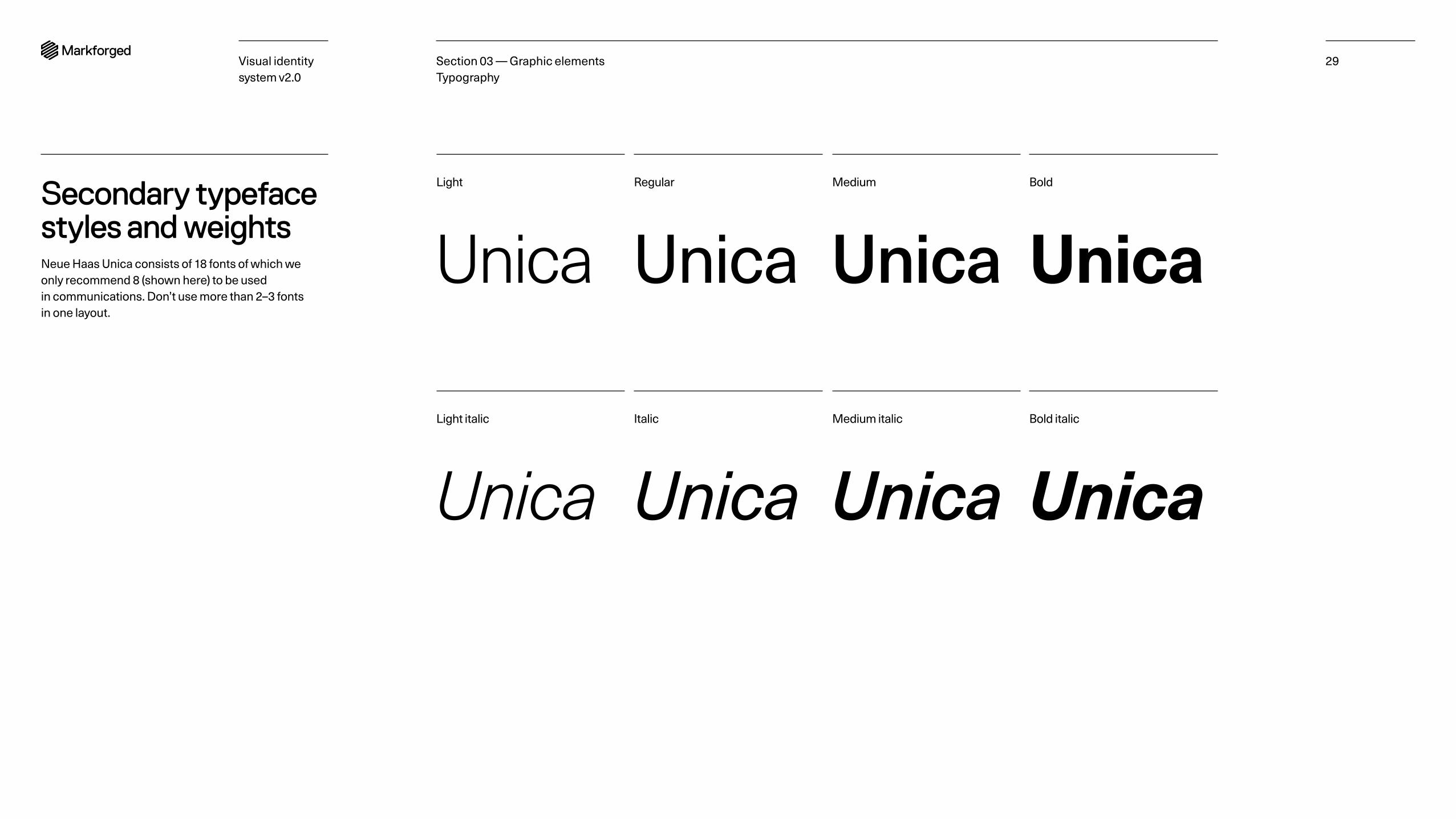
Secondary typeface styles and weightsNeue Haas Unica consists of 18 fonts of which we only recommend 8 (shown here) to be used in communications. Don’t use more than 2–3 fonts in one layout.
Light Regular BoldMedium
Light italic Italic Bold italicMedium italic
Unica Unica Unica Unica
Unica UnicaUnica Unica
Section 03 — Graphic elements Typography
Visual identity system v2.0
30
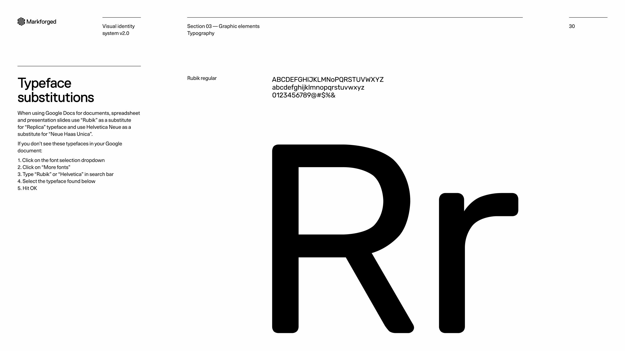
Typeface substitutionsWhen using Google Docs for documents, spreadsheet and presentation slides use “Rubik” as a substitute for “Replica” typeface and use Helvetica Neue as a substitute for “Neue Haas Unica”.
If you don’t see these typefaces in your Google document:
1. Click on the font selection dropdown 2. Click on “More fonts” 3. Type “Rubik” or “Helvetica” in search bar 4. Select the typeface found below 5. Hit OK
Rubik regular ABCDEFGHIJKLMNoPQRSTUVWXYZabcdefghijklmnopqrstuvwxyz0123456789@#$%&
RrSection 03 — Graphic elements Typography
Visual identity system v2.0
31
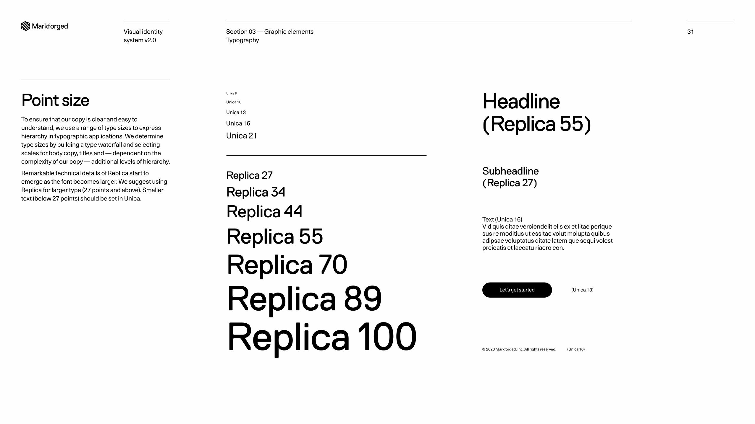
Point sizeTo ensure that our copy is clear and easy to understand, we use a range of type sizes to express hierarchy in typographic applications. We determine type sizes by building a type waterfall and selecting scales for body copy, titles and — dependent on the complexity of our copy — additional levels of hierarchy.
Remarkable technical details of Replica start to emerge as the font becomes larger. We suggest using Replica for larger type (27 points and above). Smaller text (below 27 points) should be set in Unica.
Unica 8
Unica 10
Unica 13
Unica 16
Unica 21
Replica 27
Replica 34
Replica 44
Replica 55Replica 70Replica 89Replica 100 © 2020 Markforged, Inc. All rights reserved. (Unica 10)
Headline (Replica 55)
Subheadline (Replica 27)
Text (Unica 16) Vid quis ditae verciendelit elis ex et litae perique sus re moditius ut essitae volut molupta quibus adipsae voluptatus ditate latem que sequi volest preicatis et laccatu riaero con.
Let’s get started (Unica 13)
Section 03 — Graphic elements Typography
Visual identity system v2.0
32
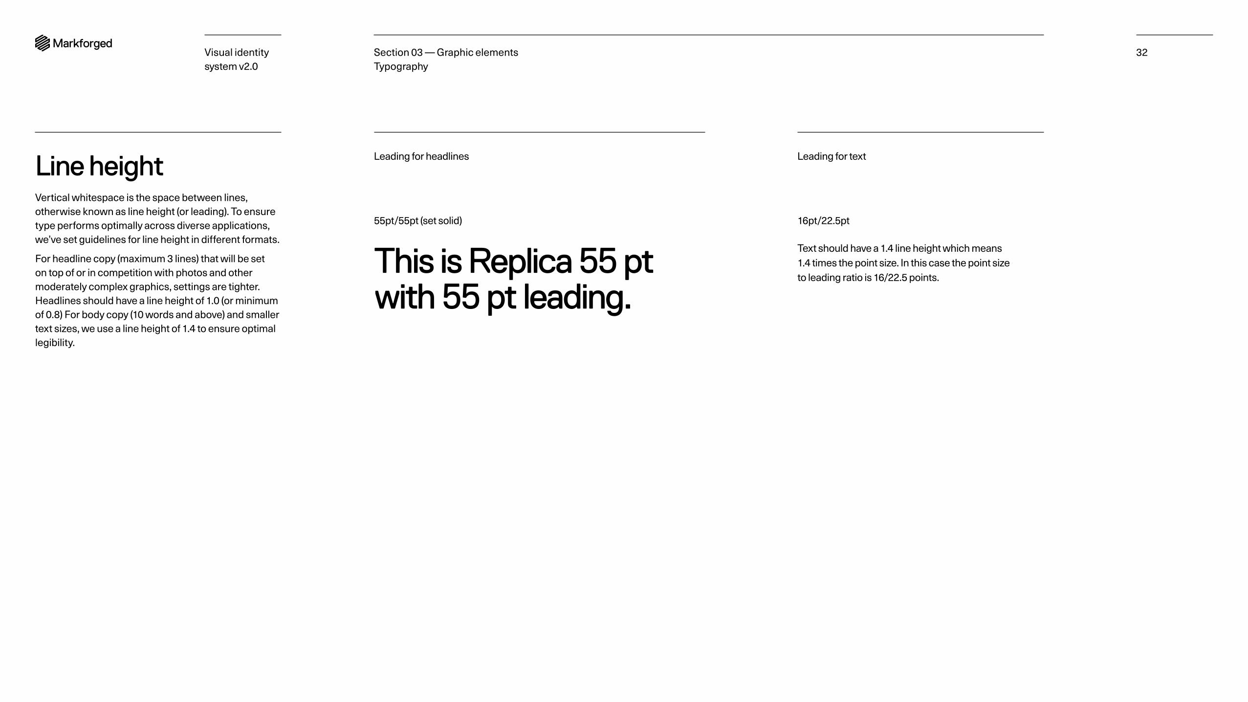
Line heightVertical whitespace is the space between lines, otherwise known as line height (or leading). To ensure type performs optimally across diverse applications, we’ve set guidelines for line height in different formats.
For headline copy (maximum 3 lines) that will be set on top of or in competition with photos and other moderately complex graphics, settings are tighter. Headlines should have a line height of 1.0 (or minimum of 0.8) For body copy (10 words and above) and smaller text sizes, we use a line height of 1.4 to ensure optimal legibility.
16pt/22.5pt
Text should have a 1.4 line height which means 1.4 times the point size. In this case the point size to leading ratio is 16/22.5 points.
55pt/55pt (set solid)
This is Replica 55 pt with 55 pt leading.
Leading for headlines Leading for text
Section 03 — Graphic elements Typography
Visual identity system v2.0
33
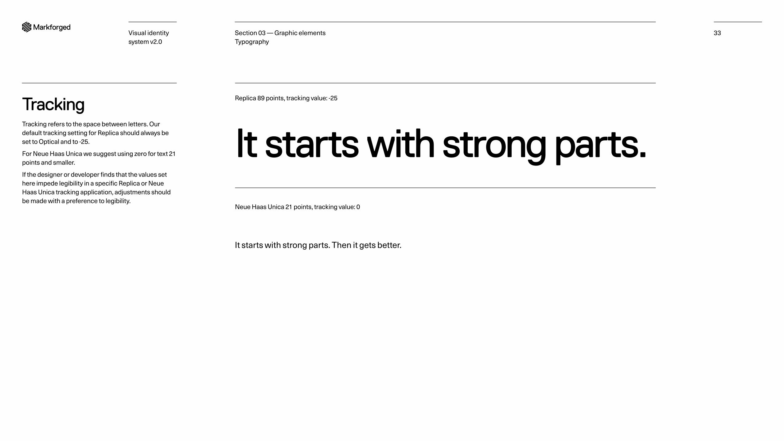
TrackingTracking refers to the space between letters. Our default tracking setting for Replica should always be set to Optical and to -25.
For Neue Haas Unica we suggest using zero for text 21 points and smaller.
If the designer or developer finds that the values set here impede legibility in a specific Replica or Neue Haas Unica tracking application, adjustments should be made with a preference to legibility.
Replica 89 points, tracking value: -25
Neue Haas Unica 21 points, tracking value: 0
It starts with strong parts.
It starts with strong parts. Then it gets better.
Section 03 — Graphic elements Typography
Visual identity system v2.0
34
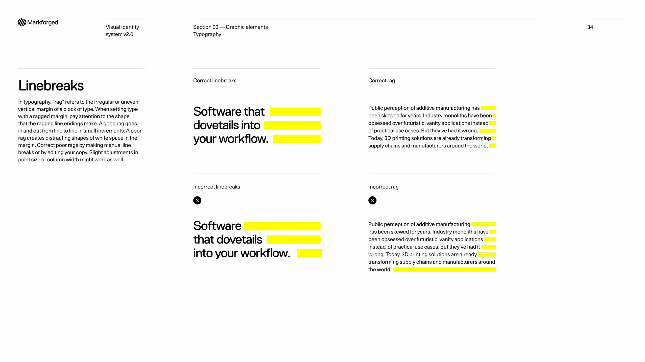
LinebreaksIn typography, “rag” refers to the irregular or uneven vertical margin of a block of type. When setting type with a ragged margin, pay attention to the shape that the ragged line endings make. A good rag goes in and out from line to line in small increments. A poor rag creates distracting shapes of white space in the margin. Correct poor rags by making manual line breaks or by editing your copy. Slight adjustments in point size or column width might work as well.
Software thatdovetails intoyour workflow.
Software that dovetails into your workflow.
Public perception of additive manufacturing has been skewed for years. Industry monoliths have been obsessed over futuristic, vanity applications instead of practical use cases. But they’ve had it wrong. Today, 3D printing solutions are already transforming supply chains and manufacturers around the world.
Public perception of additive manufacturing has been skewed for years. Industry monoliths have been obsessed over futuristic, vanity applications instead of practical use cases. But they’ve had it wrong. Today, 3D printing solutions are already transforming supply chains and manufacturers around the world.
Correct linebreaks
Incorrect linebreaks
Correct rag
Incorrect rag
Section 03 — Graphic elements Typography
Visual identity system v2.0
35
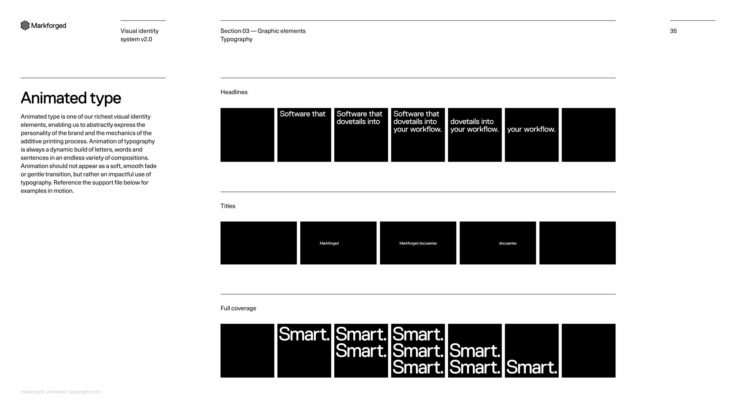
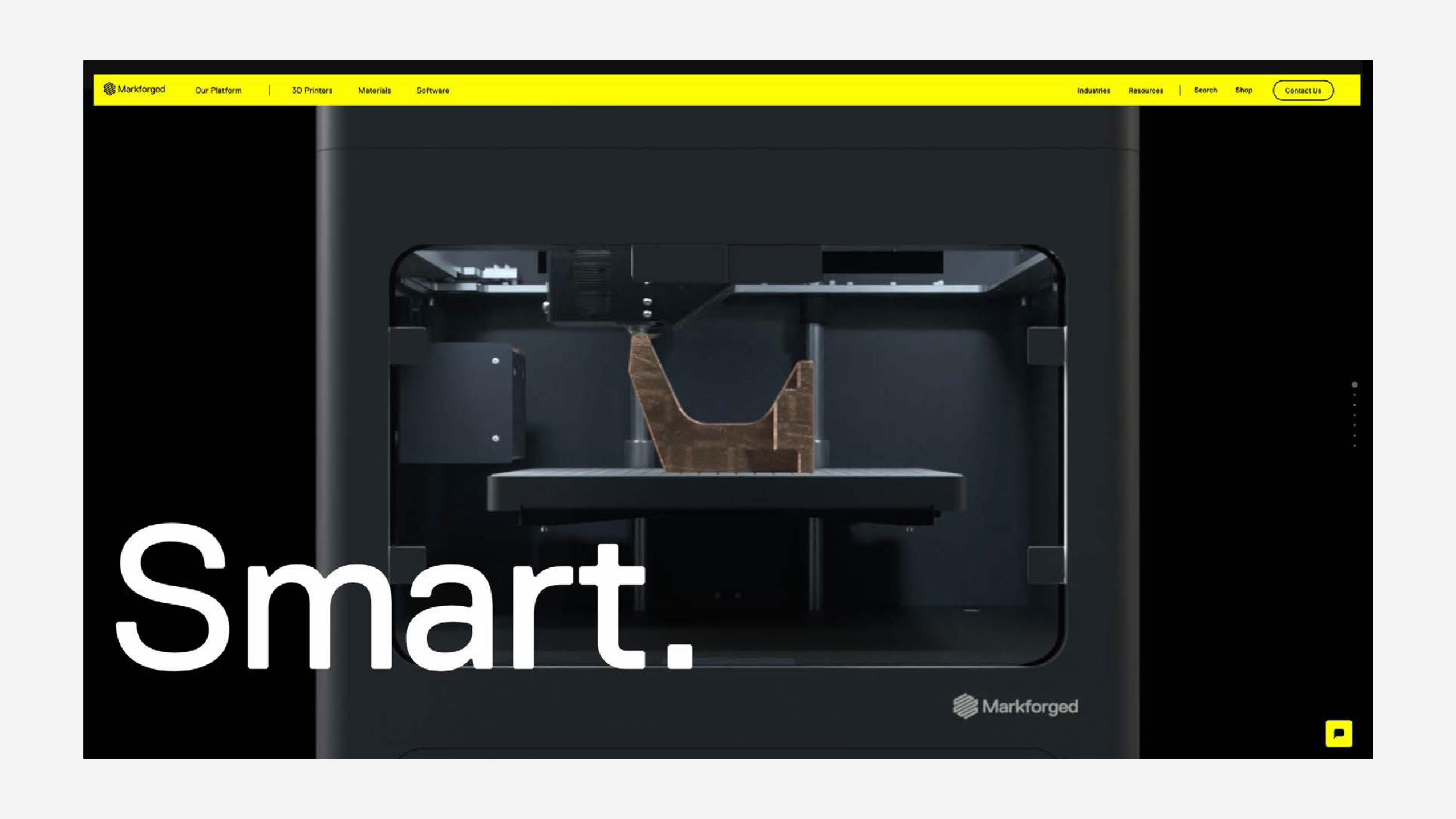
Animated typeAnimated type is one of our richest visual identity elements, enabling us to abstractly express the personality of the brand and the mechanics of the additive printing process. Animation of typography is always a dynamic build of letters, words and sentences in an endless variety of compositions. Animation should not appear as a soft, smooth fade or gentle transition, but rather an impactful use of typography. Reference the support file below for examples in motion.
Section 03 — Graphic elements Typography
Smart. Smart.Smart.
Smart.Smart.Smart.
Smart.Smart. Smart.
Markforged docuseriesMarkforged Markforged docuseries
Headlines
Full coverage
Titles
Software thatdovetails into
Software that Software thatdovetails intoyour workflow.
Software thatdovetails intoyour workflow.
Software thatdovetails intoyour workflow.
markforged_animated_typography.m4v
PhotographyOverview Photographing People Photographing Objects
36Section 03 — Graphic elementsVisual identity system v2.0
Visual identity system v2.0
37Section 03 — Graphic elements Photography
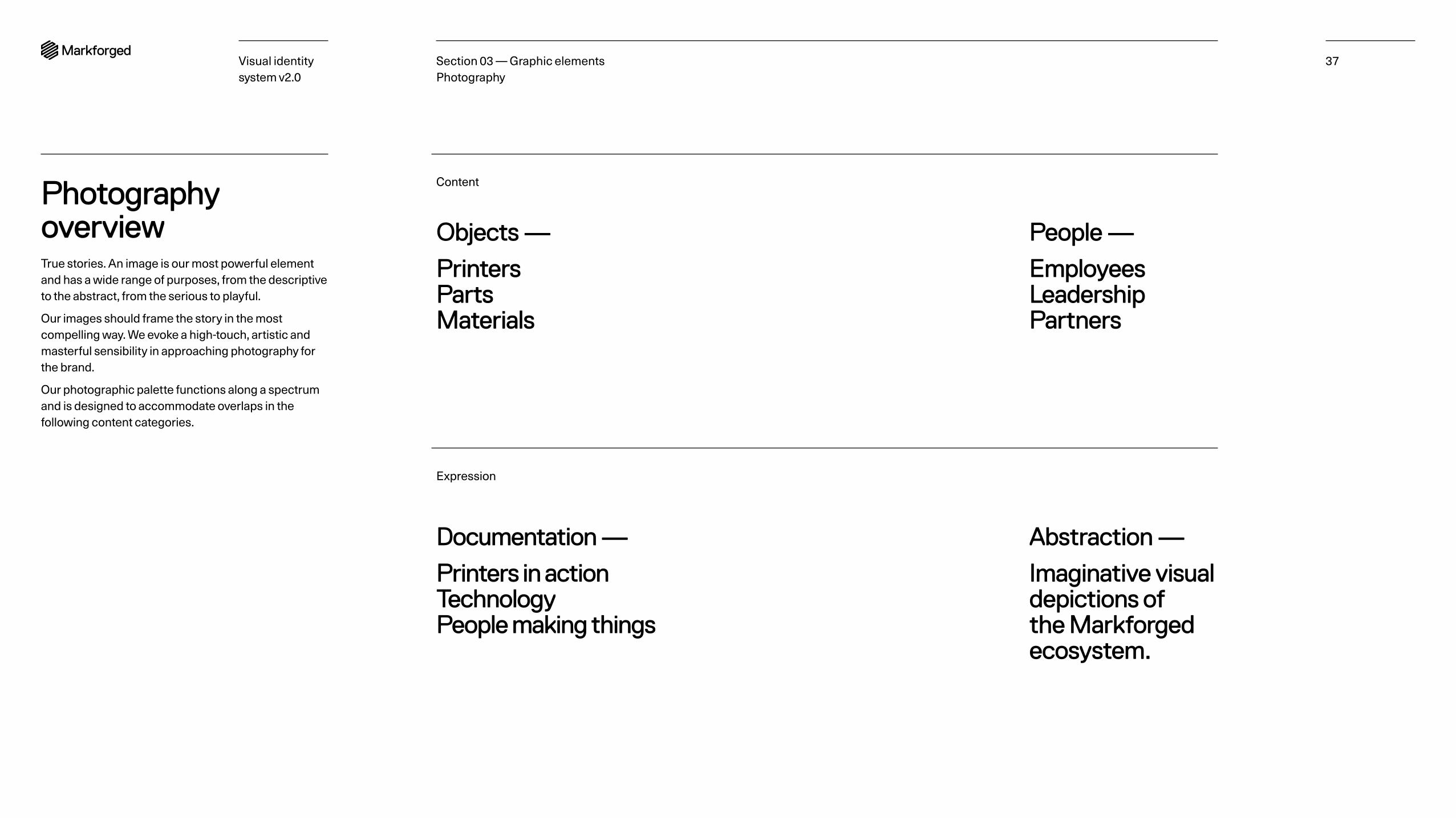
Photography overviewTrue stories. An image is our most powerful element and has a wide range of purposes, from the descriptive to the abstract, from the serious to playful.
Our images should frame the story in the most compelling way. We evoke a high-touch, artistic and masterful sensibility in approaching photography for the brand.
Our photographic palette functions along a spectrum and is designed to accommodate overlaps in the following content categories.
Objects —
Printers Parts Materials
People —
Employees Leadership Partners
Documentation —
Printers in action Technology People making things
Abstraction —
Imaginative visual depictions of the Markforged ecosystem.
Content
Expression
Visual identity system v2.0
38
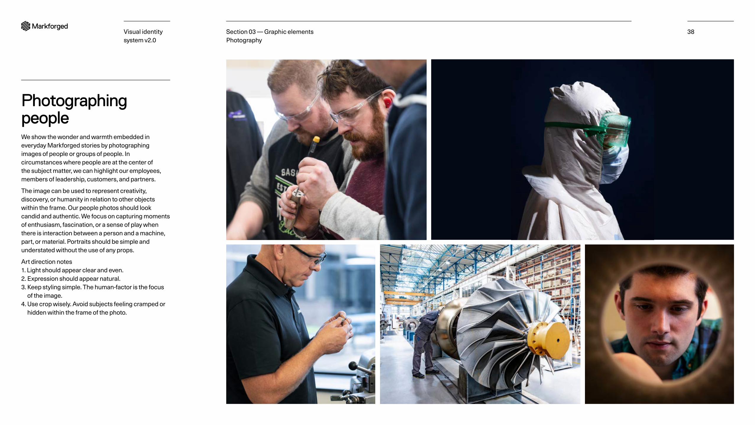
Photographing peopleWe show the wonder and warmth embedded in everyday Markforged stories by photographing images of people or groups of people. In circumstances where people are at the center of the subject matter, we can highlight our employees, members of leadership, customers, and partners.
The image can be used to represent creativity, discovery, or humanity in relation to other objects within the frame. Our people photos should look candid and authentic. We focus on capturing moments of enthusiasm, fascination, or a sense of play when there is interaction between a person and a machine, part, or material. Portraits should be simple and understated without the use of any props.
Art direction notes 1. Light should appear clear and even. 2. Expression should appear natural. 3. Keep styling simple. The human-factor is the focus
of the image. 4. Use crop wisely. Avoid subjects feeling cramped or
hidden within the frame of the photo.
Section 03 — Graphic elements Photography
Visual identity system v2.0
39
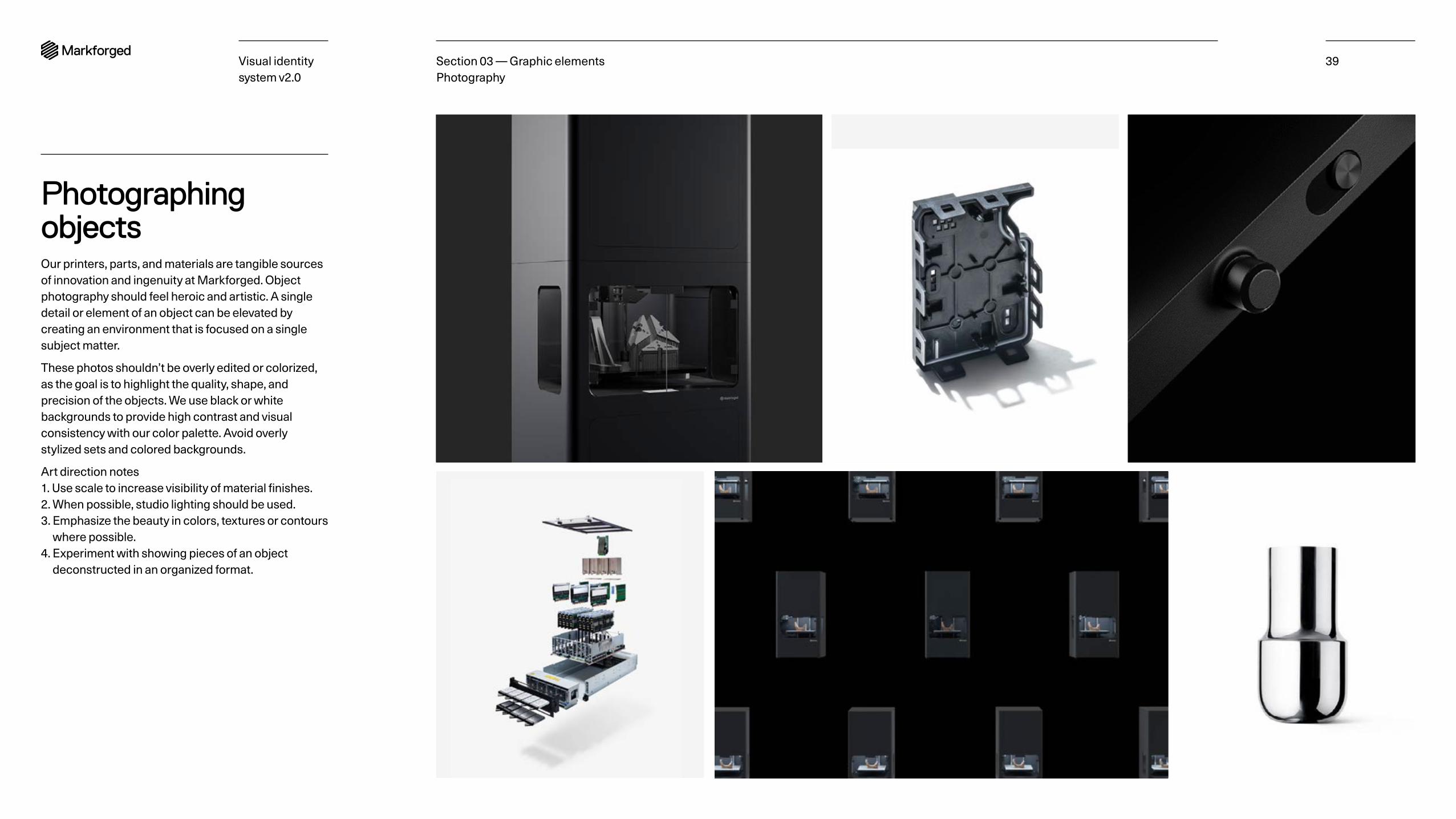
Photographing objectsOur printers, parts, and materials are tangible sources of innovation and ingenuity at Markforged. Object photography should feel heroic and artistic. A single detail or element of an object can be elevated by creating an environment that is focused on a single subject matter.
These photos shouldn’t be overly edited or colorized, as the goal is to highlight the quality, shape, and precision of the objects. We use black or white backgrounds to provide high contrast and visual consistency with our color palette. Avoid overly stylized sets and colored backgrounds.
Art direction notes 1. Use scale to increase visibility of material finishes. 2. When possible, studio lighting should be used. 3. Emphasize the beauty in colors, textures or contours
where possible. 4. Experiment with showing pieces of an object
deconstructed in an organized format.
Section 03 — Graphic elements Photography

Visual identity system v2.0
40Section 03 — Graphic elements
Iconography and illustrationOverview Icon library Creating icons
Visual identity system v2.0
41
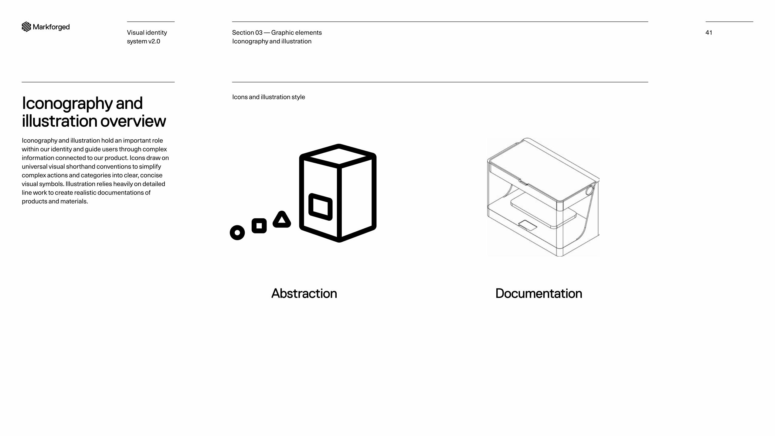
Iconography and illustration overviewIconography and illustration hold an important role within our identity and guide users through complex information connected to our product. Icons draw on universal visual shorthand conventions to simplify complex actions and categories into clear, concise visual symbols. Illustration relies heavily on detailed line work to create realistic documentations of products and materials.
Section 03 — Graphic elements Iconography and illustration
Documentation
Icons and illustration style
Abstraction
Visual identity system v2.0
42
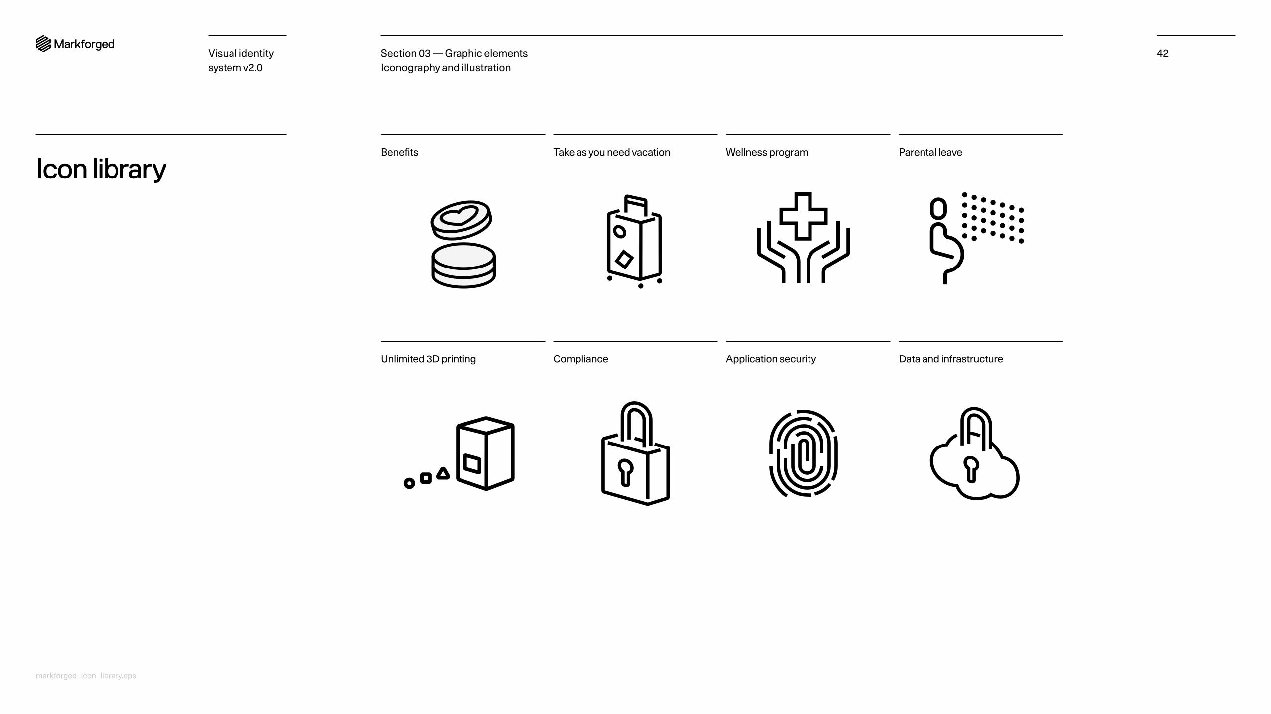
Icon libraryParental leaveWellness programTake as you need vacationBenefits
Data and infrastructureApplication securityComplianceUnlimited 3D printing
Section 03 — Graphic elements Iconography and illustration
markforged_icon_library.eps
Visual identity system v2.0
43
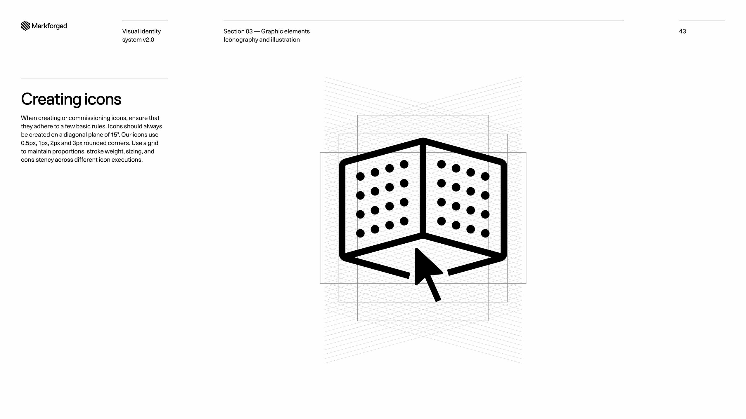
Creating iconsWhen creating or commissioning icons, ensure that they adhere to a few basic rules. Icons should always be created on a diagonal plane of 15°. Our icons use 0.5px, 1px, 2px and 3px rounded corners. Use a grid to maintain proportions, stroke weight, sizing, and consistency across different icon executions.
Section 03 — Graphic elements Iconography and illustration
Visual identity system v2.0
44
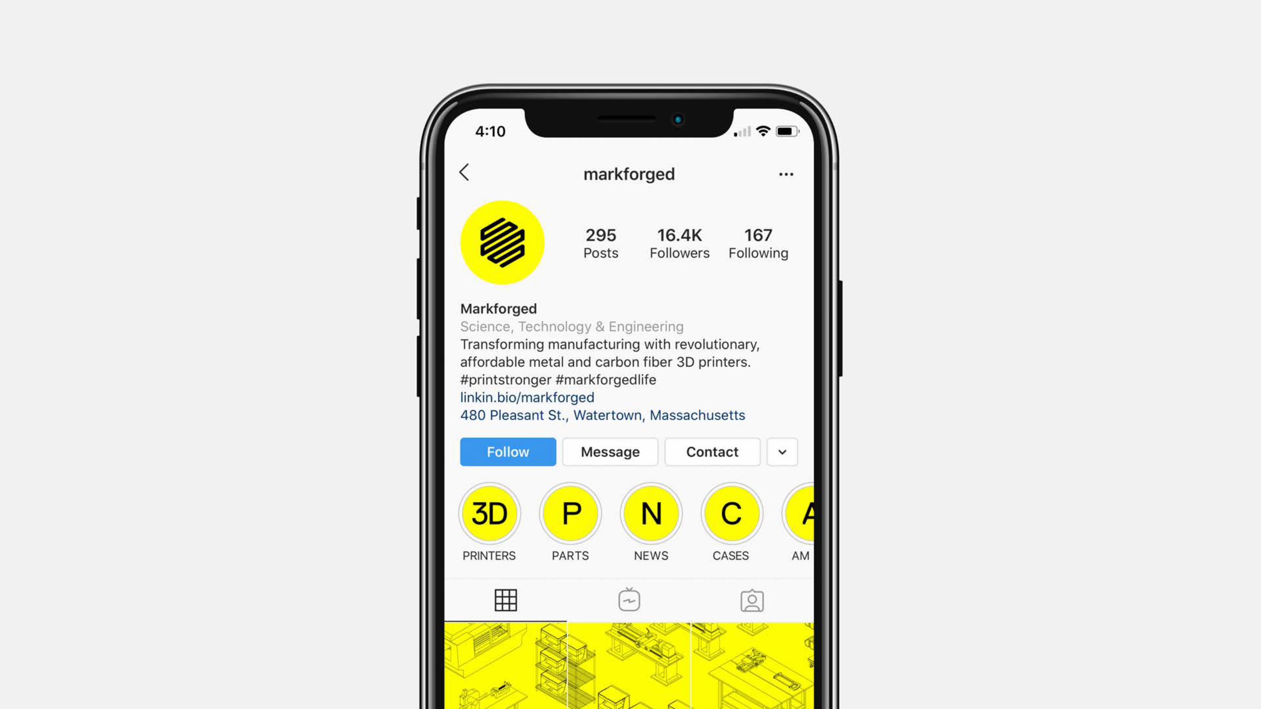
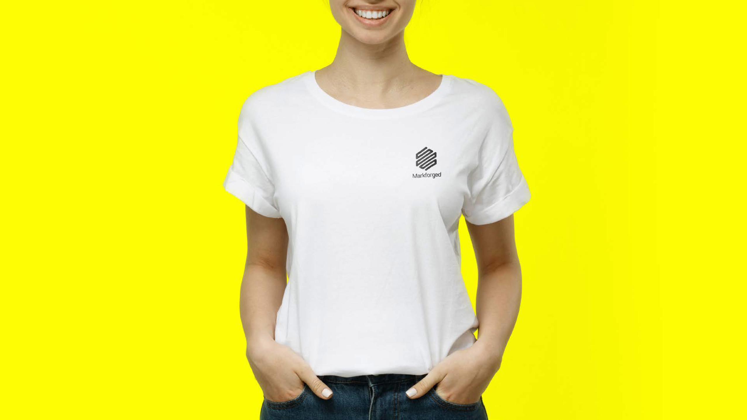
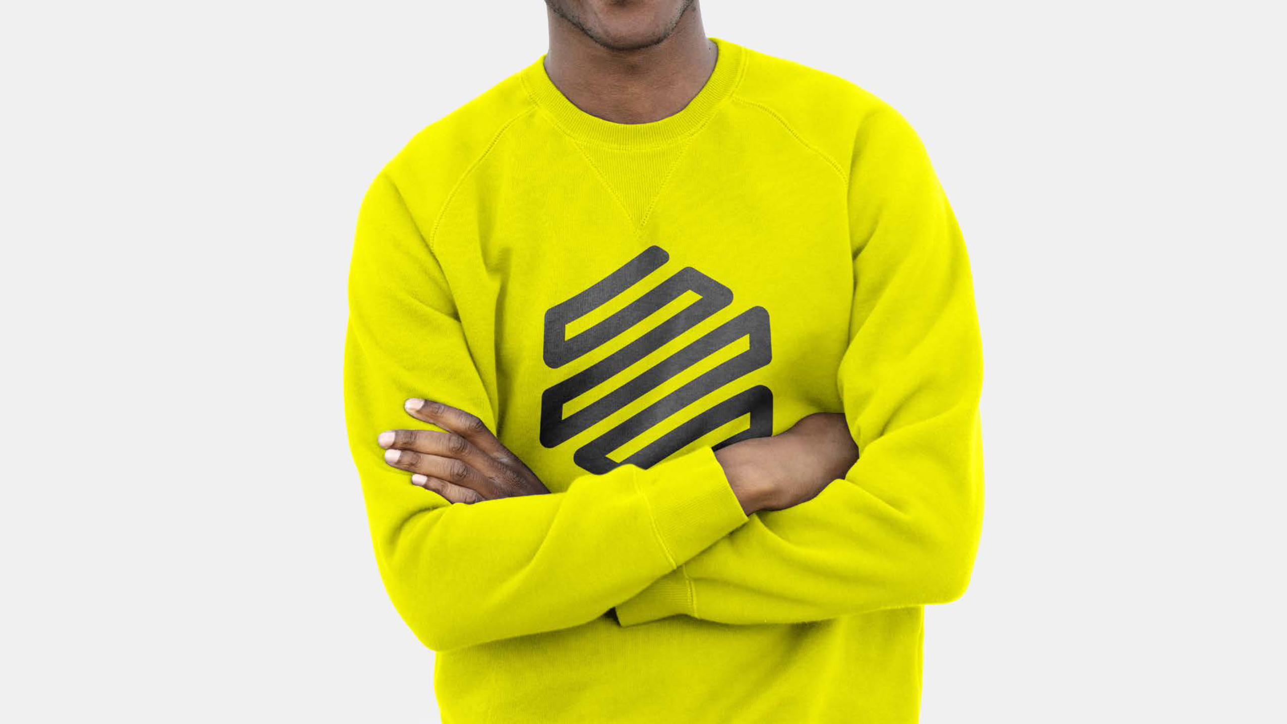
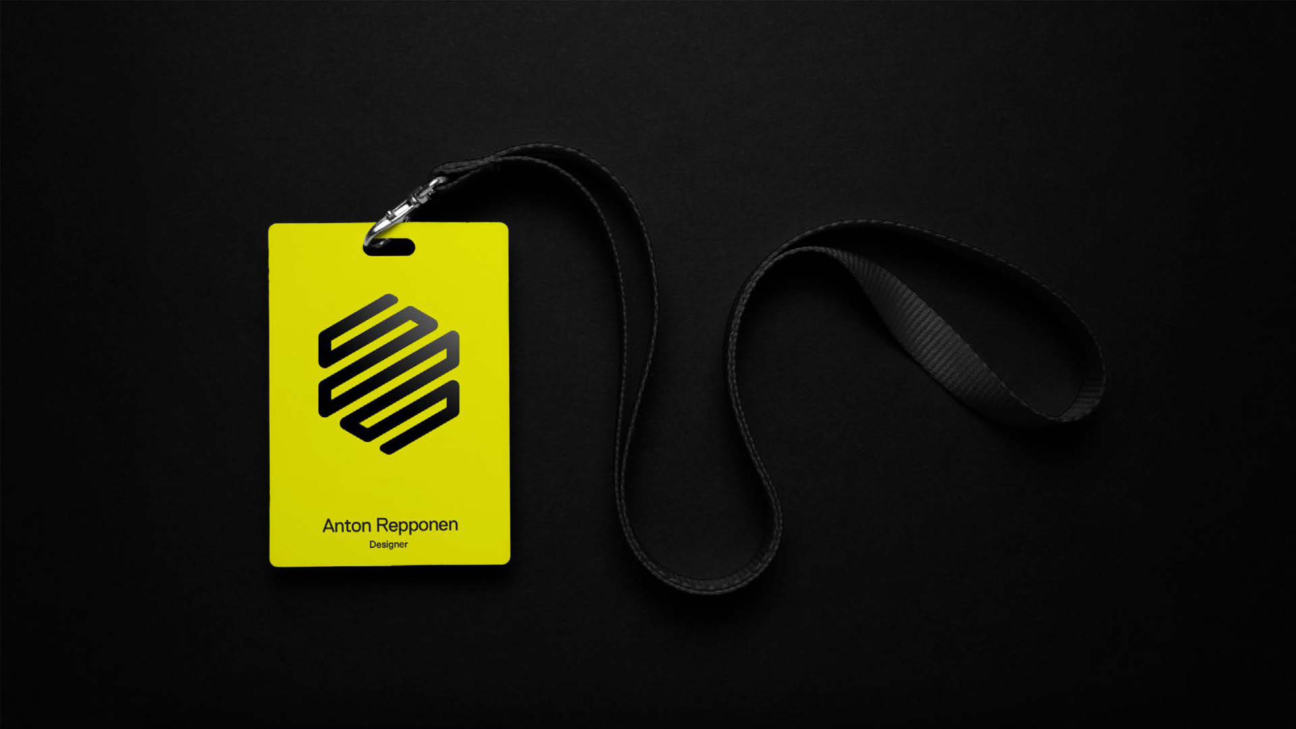
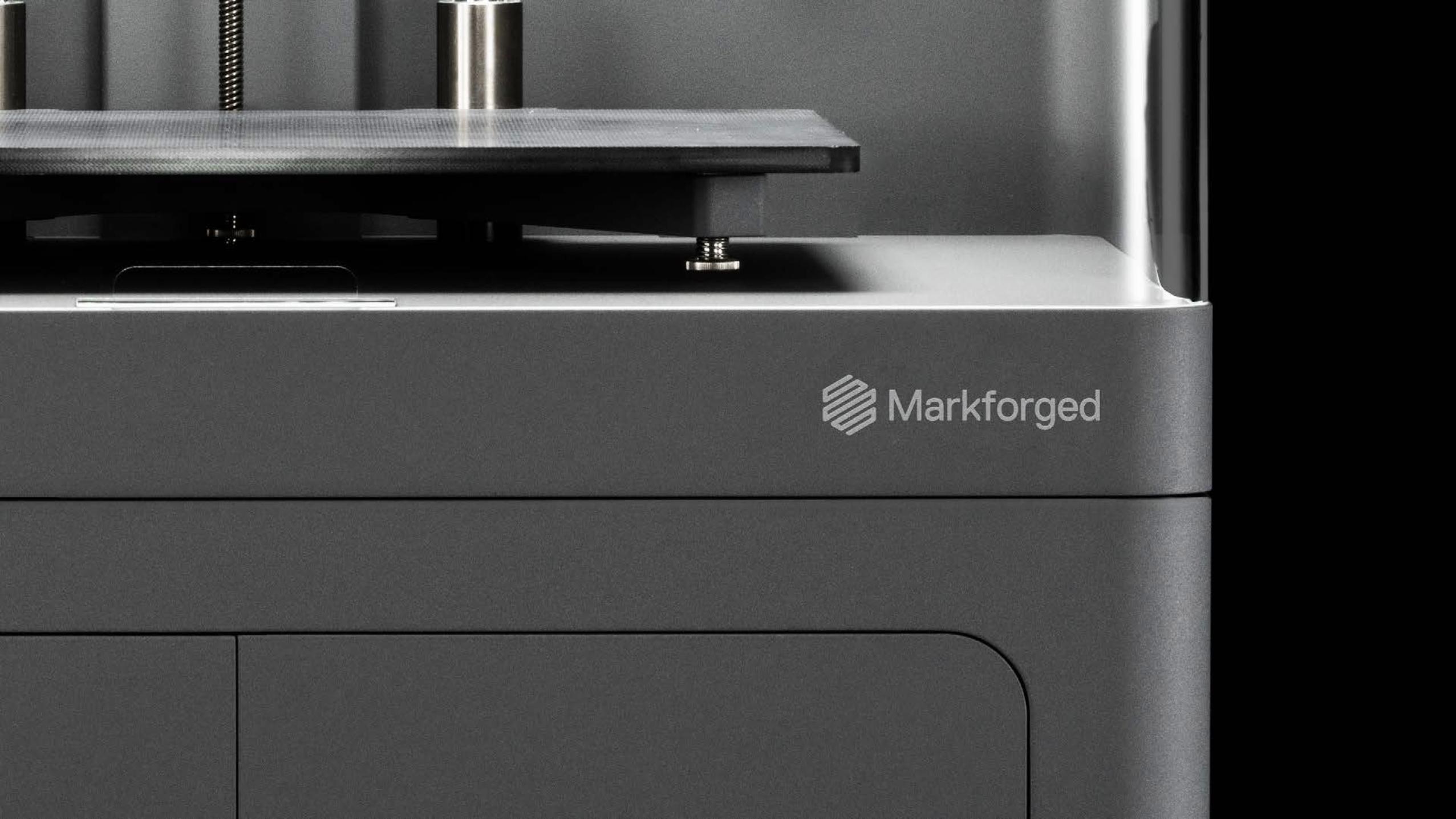
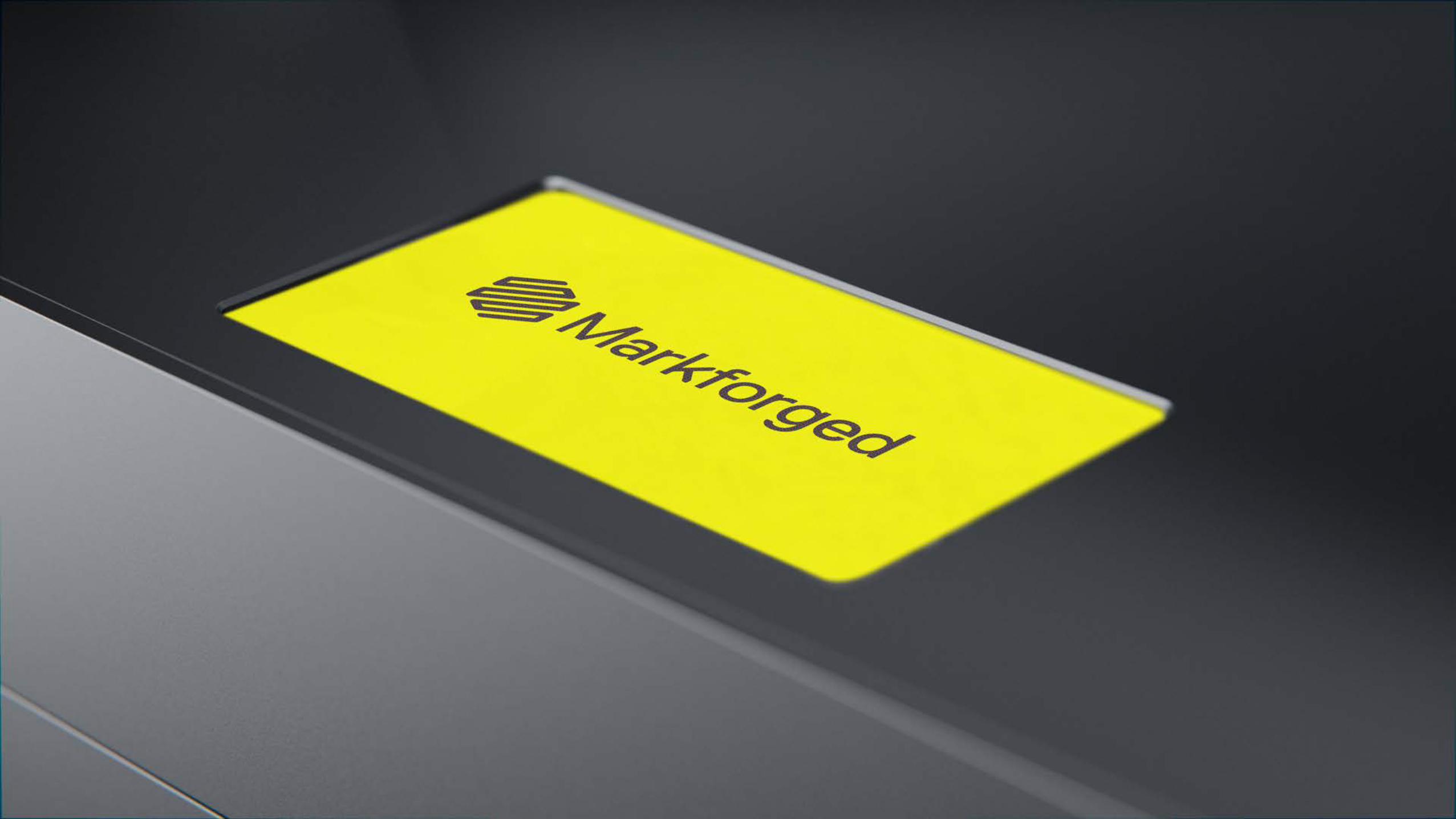
ApplicationContents Website Favicon Social media Apparel Identification Printers Packaging Stickers Office signage
Section 04

Visual identity system v2.0
56
AppendixContents Asset inventory Contact information
Section 05
Visual identity system v2.0
57Section 05 — Appendix
Asset inventory markforged_primary_logo_k.eps markforged_primary_logo_w.eps markforged_vertical_logo_k.eps markforged_vertical_logo_w.eps markforged_mark_k.eps markforged_mark_w.eps markforged_brand_extensions.eps markforged_partnerships.eps markforged_brand_color_palette_rgb.ase markforged_brand_color_palette_cmyk.ase markforged_support_color_palette_rgb.ase markforged_support_color_palette_cmyk.ase markforged_animated_typography.m4v markforged_icon_library.eps
Visual identity system v2.0
58Section 05 — Appendix
Contact information Please visit the brand center for detailed information or reach out to Michael Papish by emailing: [email protected]


![[ BRAND IDENTITY GUIDELINES 2.0 ]](https://static.documents.pub/doc/80x56/586a1a2a1a28abdd708bc074/-brand-identity-guidelines-20-.jpg)


