Colour Theory: Produce your own illustrated document Introduction: The colour wheel is built on three colours: red, yellow, and blue. All other colours can be mixed from these three colours (plus black or white). Show what is meant by Primary and Secondary colours. Primary colours: colours that can be combined to make a useful set of colours Secondary colours: colours, which are a mix of primary colours What are complementary and analogous colours? Complementary colours: contrast colours, which are opposite each other in the colour wheel Analogous colours: adjacent to each other on the colour wheel with one of them being the more dominant colours (primary or secondary) and then this dominant colour will have 2 colours on their side (tertiary) and analogous colours are a safe approach to colour harmony Show what is meant by “warm” colours and “cool” colours. Warm colours and cool colours are opposite each other on the colour wheel. The warm colours consist colours such as, red, yellow, orange etc. and cool colours consist colours such as, blue, green, purple etc. What do we mean by “natural” and “arbitrary” colours? Natural colours: These are colours, which portray/show the natural colour of the object i.e a brown horse Arbitrary colours: These are colours which have no realistic relation to the object that is depicted i.e. a blue horse and also which may have emotional or expressive significance
Transcript
Colour Theory: Produce your own illustrated document
Introduction:
The colour wheel is built on three colours: red, yellow, and blue. All other colours can be mixed from these three colours (plus black or white).
Show what is meant by Primary and Secondary colours.
Primary colours: colours that can be combined to make a useful set of colours
Secondary colours: colours, which are a mix of primary colours
What are complementary and analogous colours?
Complementary colours: contrast colours, which are opposite each other in the colour wheel
Analogous colours: adjacent to each other on the colour wheel with one of them being the more dominant colours (primary or secondary) and then this dominant colour will have 2 colours on their side (tertiary) and analogous colours are a safe approach to colour harmony
Show what is meant by “warm” colours and “cool” colours.
Warm colours and cool colours are opposite each other on the colour wheel. The warm colours consist colours such as, red, yellow, orange etc. and cool colours consist colours such as, blue, green, purple etc.
What do we mean by “natural” and “arbitrary” colours?
Natural colours: These are colours, which portray/show the natural colour of the object i.e a brown horse
Arbitrary colours: These are colours which have no realistic relation to the object that is depicted i.e. a blue horse and also which may have emotional or expressive significance
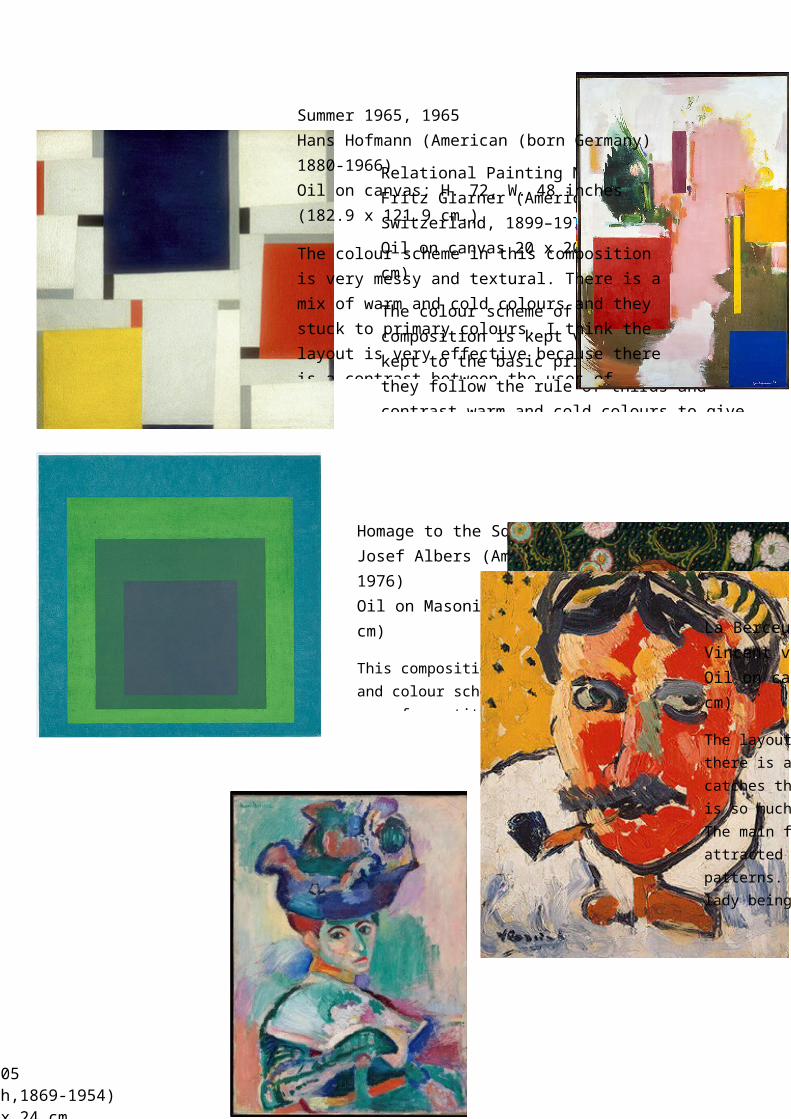
Relational Painting No. 64, 1953Fritz Glarner (American, born Switzerland, 1899–1972)Oil on canvas 20 x 20 in. (50.8 x 50.8 cm)
The colour scheme of this art composition is kept very simple, and kept to the basic primary colours and they follow the rule of thirds and contrast warm and cold colours to give it a more eye catching, structured effect. I think the layout is very simple in comparison to the bright, block colours and this helps make the composition more unique and the differentiation is what makes gives it a striking effect.
Summer 1965, 1965Hans Hofmann (American (born Germany) 1880-1966)Oil on canvas; H. 72, W. 48 inches (182.9 x 121.9 cm.)
The colour scheme in this composition is very messy and textural. There is a mix of warm and cold colours and they stuck to primary colours. I think the layout is very effective because there is a contrast between the uses of simple primary colours layered on top of the messy background. I like how they layered the primary colours on top of the other colours because it associates with the colour wheel and how the primary colours are more dominant.
Homage to the Square: Soft Spoken, 1969Josef Albers (American, born Germany, 1888–1976)Oil on Masonite 48 x 48 in. (121.9 x 121.9 cm)
This composition is kept to a simple format and colour scheme (cold colours). There is a use of repetition, which is the main attraction of this composition. I am intrigued by the simplicity in this painting and I think the colours are very dull, as well as the layout, which helps create a sort of lost, mysterious vibe.
Morning on the Seine near Giverny, 1897Claude Monet (French, 1840- 1926)Oil on canvas; 32 1/8 x 36 5/8 in. (81.6 x 93 cm)
La Berceuse, 1889Vincent van Gogh (Dutch, 1853- 1890)Oil on canvas; 36 1/2 x 29 in. (92.7 x 73.7 cm)
The layout of this composition is very busy and there is a contrast of warm and cold colours. It catches the audience’s attention because there is so much going on, which makes it interesting. The main focus is the lady, however we are also attracted to the background because of the patterns. I like this piece because despite the lady being the main focus, we are able to understand the story and meaning behind the piece by the expression of disgust on her face in relation to the hectic background, which could portray that there is a lot going on in her mind. Also I noticed the the contrast of the complimentary colours; red and green
Henri Matisse (French,1869-1954)Oil on canvas 31 cm x 24 cm
In this composition there is a contrast between warm and cold colours, which helps focus our attention on certain areas of the painting. This piece is very structural but also has a very messy style. I think the colour scheme is very experimental and it contrasts warm and cold colours but a majority of the composition sticks to cold colours, which sets a more depression mood and red tins are added to