Violent crime in London: trends, trajectories and neighbourhoods Alex Sutherland (Behavioural Insights Team) Ian Brunton-Smith (University of Surrey) Oli Hutt and Ben Bradford (University College London) Report prepared for the College of Policing Version number 5.0 October 2020
Transcript
Violent crime in London: trends, trajectories and neighbourhoods Alex Sutherland (Behavioural Insights Team) Ian Brunton-Smith (University of Surrey) Oli Hutt and Ben Bradford (University College London)
Report prepared for the College of Policing Version number 5.0 October 2020
Violent crime in London: trends, trajectories and neighbourhoods college.police.uk
Predicting high vulnerability neighbourhood (HVN) status cross-sectionally using IMD data .................................................................................................... 30
Predicting high vulnerability neighbourhood (HVN) status longitudinally using IMD data ............................................................................................................. 33
Predicting high vulnerability neighbourhood (HVN) status longitudinally using IMD and MPS Public Attitude Survey (PAS) data ............................................... 34
Predicting high vulnerability neighbourhood (HVN) status longitudinally using IMD, MPS Public Attitude Survey (PAS) and stop and search (S&S) data ......... 38
Revisiting support for hypotheses ....................................................................... 40
Results 2: Predicting membership of trajectory groups ....................................... 50
Approach 4: Machine learning and its application to prediction and evaluation ............................................................................................................... 54
Violent crime in London: trends, trajectories and neighbourhoods college.police.uk
Version 5.0 Page 4 of 69
Executive summary The aim of this report is to illustrate some of the ways in which police-recorded crime
data can be combined with other sources to provide a deeper insight into the
geographical and social distribution of violent crime. Specifically, four different
analytical approaches – mapping, predictive models, trajectory models, and machine
learning – are used to consider the patterning of violent crime across London.
Drawing on a range of administrative and survey-based data, results converge on
three central findings. Violent crime is heavily clustered in a small number of lower
layer super output areas (LSOAs). These areas tend to be significantly more
deprived than others; and the recent increase in violent crime has been primarily
confined to a small number of areas, many of which were already relatively prone to
violent offending.
The characteristics of areas – such as deprivation – seem to be the most important
and consistent drivers of violent crime, although other area characteristics, such as
the presence of transport hubs or major shopping centres or night-time economies,
are also relevant. The distribution of violent crime over London is therefore
predictable, in the sense that it clusters in a relatively small number of generally
more deprived areas. It is these areas, moreover, that tend to experience the
sharpest increases in violent crime, when and where this occurs. Public policy on
violent crime can be effectively targeted at a small number of quite readily
identifiable locations. To put it another way, expenditure on place-based violence
reduction programmes would, by and large, be wasted in large parts of London
because violent crime has not really increased in many areas.
Acknowledgements We are grateful to Levin Wheller (College of Policing), Dr Beth Ann Griffin (RAND
Corporation) and Iain Brennan (University of Hull) for their comments on earlier
drafts of this report. Any errors or omissions remain our own.
The early phases of this research were conducted while Alex Sutherland was a
Senior Research Leader at RAND Europe.
Violent crime in London: trends, trajectories and neighbourhoods college.police.uk
Version 5.0 Page 5 of 69
Introduction A better understanding of where, when and how much violence occurs foreshadows
any and all prevention efforts (see WHO, 2010), even for the most serious of crimes
(see, for example, Ceccato et al., 2019), and this requirement has been underlined
by the recent upswing in violent crime across much of England and Wales. Similarly,
knowing more about the location and timing of crime can provide new insights into
how best to deploy limited resources to greatest effect (eg, Sherman, 2013; Newton
et al., 2004). Modern-day access to high-powered computers and rich datasets
opens up possibilities for new and different approaches to be applied to old problems
(see Treverton et al., 2011; Ariel and Partridge, 2016),1 but also for new problems to
be approached with a greater range of ideas. In addition, there is a wider recognition
that even with similar ‘problem profiles’, solutions may need to vary according to
local needs, as the reasons (causes) for a similar level of ‘risk’ may not be the same
in each area (eg, https://whatworksgrowth.org/policy-challenges/disadvantaged-places/).
It is with these ideas in mind that the College of Policing commissioned the UCL
Institute for Global City Policing and the Jill Dando Institute Research Laboratory
(JDIRL) to explore ideas for how London’s crime data (eg, the number and type of
police recorded incidents occurring at each geographic location – latitude and
longitude – during a given time period) might be better used for understanding and
preventing violent crime. The purpose of the report is to set out, with illustrative
analysis, options for using the London violent crime data held in the JDIRL to explore
the neighbourhood level correlates of violent crime, and the trajectories of change in
violent offending in local areas across the capital over the last several years. We
outline four possible approaches – mapping, predictive models, trajectory models,
and machine learning. The overarching aim is to consider the possible uses or
functions of this type of analysis, for example, in relation to: strategic planning,
operational planning, research to better understand London’s crime problem and
1 Notably, this report on policing futures was published only a few years before the rise in the use of police body-worn cameras, but does not mention this as a possibility, although ‘camera’ is mentioned 36 times. This illustrates that innovation/advances that may be ‘just around the corner’ may not be predictable.
possession of article with blade or point, rape, robbery of business property, robbery
of personal property, violent disorder, and domestic abuse. Where we refer to
‘violent crime’ in this report, we are thus referring to this count of notifiable offences
and this definition should be borne in mind.
We also rely on older data, from the MPS PAS (2007–2010), because again, it was
not possible to obtain more up-to-date data in the timeframe open to us, and also
from the 2011 Census. Here, and indeed throughout the report, we rely on the idea
that the socio-structural characteristics of neighbourhoods are quite stable over time.
For example, Sampson and Morenoff (2006) report a remarkably strong correlation
(>0.85) between neighbourhood poverty rates in Chicago in 1970 and in 1990; and
Sampson (2012) reports a similarly high correlation between the neighbourhood
density of non-profit organisations – an indicator of collective efficacy that has been
associated with levels of violent crime (Sharkey et al., 2017) – in 1990 and in 2005.2
Table 1: Data sources used in this report3 Dataset Time span/years Source
Violent crime in
London
04/2013–03/2018 Metropolitan Police/JDI Secure
Lab
Index of Multiple
Deprivation
2015 DCLG/MHCLG website
Census 2011 Office for National Statistics
2 It is worth noting that some areas of London had seen significant changes in land use and regeneration in the last decade, with the most salient example being Stratford following the 2012 Olympics. 3 More recent data to enable better temporal alignment of sources is available, however, time constraints and data access limitations meant it was not possible to include it in this report. The possibility of updating this analysis, if resources were to become available, remains open.
Violent crime in London: trends, trajectories and neighbourhoods college.police.uk
Version 5.0 Page 9 of 69
Dataset Time span/years Source
Stop and search 05/2016–12/2018 data.police.uk (only these years
are geo-coded)
Public Attitudes
Survey
2007–2010 Metropolitan Police Service
Ambulance callouts
for knife crime
2010/11 London Ambulance Service
Identifying LSOAs Aside from a small number of exceptional cases, we do not identify LSOAs in this
report; for example, we do not ‘name’ the 25 LSOAs with the very highest crime
rates alluded to in Approach 1: Mapping. We have two reasons for making this
choice. First, all data presented here is already at least a year old, and levels and
rankings may have changed in the interim period. Second, and more substantively,
our guiding approach is to identify area characteristics associated with levels and
trajectories of violent offending. We have therefore attempted to ‘reduce areas to
variables’ – we are usually not interested in the actual geographic location or name
of an LSOA, but rather in whether, at the aggregate level, greater disadvantage in an
LSOA (for example) makes it more likely to suffer from violent crime.
Violent crime in London: trends, trajectories and neighbourhoods college.police.uk
Version 5.0 Page 10 of 69
Approach 1: Mapping In this section we display a variety of maps generated from the five-years’ worth of
violent crime data. Figure 1 shows the patterns of violent crime (on an ‘all violence’
basis) across LSOAs in 2013 and 2017. The maps are generated by combining data
from all 4,835 Greater London LSOAs for each of the five years between 2013 and
2017, giving a total of 24,175 data points. These 24,175 data points have then been
ranked in order by number of violent crimes and split into deciles across the five-year
period (each LSOA appears five times in this ranked list). Consequently, there are
approximately 2,418 data points in each of these deciles. The LSOA half way down
this list, at the fiftieth percentile, is the LSOA with the average annual crime count
across the five years. Compared to this average, areas shaded red have higher
crime counts, and areas shaded blue have lower crime counts. The increase in red
tones between the maps in Figure 1 therefore, shows the general increase in violent
crime over this period; there was a higher number of top decile data points in 2017
compared with 2013.
Figure 2, again, shows the whole of London for 2017. Here, the raw count of violent
crime per LSOA is used, and the colours adjusted to highlight the 25 LSOAs with the
highest crime counts (more than 500 recorded crimes that year4), with 948 violent
crimes recorded in the most violent LSOA that year. Note how few areas are shaded
red, and how many are blue (the lowest crime areas). Figure 2 therefore, shows that
violent crime is concentrated in a small number of areas, most notably around
Westminster, but also dotted around the rest of the capital.
Combining the above two approaches, Figure 3 maps the year-on-year change in
violent crime across the study period and shows that large year-on-year increases
(>100 crimes) were confined to a very small number of areas. The large LSOA to the
far west of the map is Heathrow, and so constitutes an unusual case. We were
unable to ascertain exactly why recorded violent crime there rose sharply between
2013 and 2014, then fell back, although we believe that the location of both
4 This threshold was selected to highlight the top 25 LSOAs which happened to coincide with the cut-off of 500. The distribution is highly skewed; for instance, the ninetieth percentile drops to only 70 crimes. A very small number of LSOAs have much higher levels of violent crime than elsewhere.
Violent crime in London: trends, trajectories and neighbourhoods college.police.uk
Version 5.0 Page 11 of 69
Colnbrook Immigration Removal Centre and HMP/YOI Feltham could be contributing
to changes in rates locally. It is also worth noting that many areas also saw
reductions in violent crime, sometimes in close proximity to areas of high increases,
demonstrating that it is important in any intervention or study to also consider the
areas surrounding ‘hotspots’. Given the data and time available it was not possible to
examine the causes of these fluctuations, though there are many possible
explanations. For instance, changes in the urban environment, police activity in a
growing violence hotspot, displacement of crime or diffusion of beneficial police
activity into neighbouring areas, or community endeavours to help reduce crime –
which might also lead to increased reporting of crime, even if the underlying amount
of crime is actually unchanged.
Figure 4 focuses on a specific borough, in this case Newham, which consists of 164
LSOAs. This map neatly illustrates the effect large public (in this instance quasi-
public) locations can have – the high crime areas to the north-west are Stratford and
the Westfield shopping centre. Violent crime in Newham is heavily concentrated in
this area. Another area of interest is around East Ham station, in the centre-right of
the maps, which has areas of very low violence both east and west of it, while
violence clearly diffuses north and south from the station, along the high street.
Violent crime in London: trends, trajectories and neighbourhoods college.police.uk
Version 5.0 Page 12 of 69
Figure 1: Violent crime in London, relative to average annual LSOA crime count, 2013 and 2017
Violent crime in London: trends, trajectories and neighbourhoods college.police.uk
Version 5.0 Page 13 of 69
Figure 2: Violent crime in London, 2017
Violent crime in London: trends, trajectories and neighbourhoods college.police.uk
Version 5.0 Page 14 of 69
Figure 3: Year-on-year change in violent crime 2013/14 to 2016/17
Violent crime in London: trends, trajectories and neighbourhoods college.police.uk
Version 5.0 Page 15 of 69
Violent crime in London: trends, trajectories and neighbourhoods college.police.uk
Version 5.0 Page 16 of 69
Violent crime in London: trends, trajectories and neighbourhoods college.police.uk
Version 5.0 Page 17 of 69
Violent crime in London: trends, trajectories and neighbourhoods college.police.uk
Version 5.0 Page 18 of 69
Figure 4: Violent crime in Newham, 2013 and 2017
Violent crime in London: trends, trajectories and neighbourhoods college.police.uk
Version 5.0 Page 19 of 69
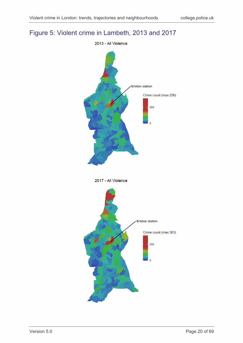
Figures 5 and 6 continue to focus on a particular borough, in this case Lambeth.
Figure 5 shows the counts per year in 2013 and 2017. Striking here is the proximity
of high and low crime areas. The average population of an LSOA is around 1,500
people; these are relatively small urban spaces. On the 2017 map, two LSOAs are
shaded red – high crime – near the centre of the borough. This is the area around
Brixton tube station. Immediately to the west are areas shaded light and mid blue,
where violent crime was much lower that year. Not only is violent crime heavily
concentrated in certain areas, but these can be directly contiguous with areas much
less affected by violence.
Finally, Figure 6 shows the year-on-year change within Lambeth. Note again that
year-on-year increases are confined to a small number of areas, and these tend to
be areas where violent crime was already relatively common. Moreover, many parts
of the borough saw year-on-year falls in violent crime over the period, sometimes
across multiple years, and many of these are again directly adjacent to areas where
crime was increasing.
To summarise, we have shown that between 2013 and 2017 violent crime has
increased across London, but it is important to recognise that this increase is not a
general phenomenon across the entire metropolitan area. In fact, violent crime is
highly localised and a relatively small number of locations account for a very high
proportion of all violent crime. Furthermore, the overall increase in violent crime is
also isolated to a small number of areas – many of which are bordered by areas of
low or declining crime. Hence, it is important to understand the causes of violent
crime at a highly-localised level, in order to be able to disrupt and prevent future
crime.
Having demonstrated that violent crime tends to be concentrated in a small number
of vulnerable areas, and that some of these areas also experience the largest
increases over time; in the following sections we outline various modelling options
that may be used to better understand the neighbourhood correlates of violent crime
and identify vulnerable communities.
Violent crime in London: trends, trajectories and neighbourhoods college.police.uk
Version 5.0 Page 20 of 69
Figure 5: Violent crime in Lambeth, 2013 and 2017
Violent crime in London: trends, trajectories and neighbourhoods college.police.uk
Version 5.0 Page 21 of 69
Figure 6: Year-on-year change in violent crime in Lambeth, 2013/14 to 2016/17
Violent crime in London: trends, trajectories and neighbourhoods college.police.uk
Version 5.0 Page 22 of 69
Approach 2: High vulnerability neighbourhood (HVN) prediction models This section outlines one approach to predicting ‘vulnerable neighbourhoods’. For
the purpose of this section, we define vulnerability as neighbourhoods that have
above-average levels of violence; specifically, those in the seventy-fifth percentile or
higher compared to the rest of London in a given year.5 The rationale is to
demonstrate ways in which ‘high-need’ areas might be identified and what that
means for resourcing; and also how such areas might be predicted, based on known
information. With refinement, such models could be better employed to help identify
not just areas with high levels of violence, but also factors that precede increases in
violence. Although we focus here on the top 25 per cent of all neighbourhoods in
terms of violence, other cut-offs could be used to provide a more or less restrictive
definition of vulnerability.
In this section, as throughout the report, we rely on two important aspects of the
criminological literature to guide our analysis. First, studies have demonstrated that
crime concentrates in particular areas. The majority of (recorded) crime occurs in a
small number of streets/street segments (eg, Weisburd et al., 2012), and, crucially,
there are also differences in the risk of crime between local communities at broader
spatial scales, eg, neighbourhoods. Second, these variations are informed by
features of the local environment including deprivation, residential mobility and ethnic
diversity. This characteristic patterning of crime prompted the development of social
disorganisation theory (Shaw and McKay, 1942), as well as more recent
engagement with collective efficacy (Sampson et al., 1997; Sampson, 2012).
We also consider the association between police activity – as represented by
recorded stop and search – and violent crime. Stop and search is a police power
which has the potential to reduce crime through immediate detection or confiscation
of a weapon, or deterrence by raising the perceived risk of detection. In terms of
deterrence, there is consistent evidence to suggest that an everyday level of police
activity, including stop and search, reduces crime (Boydstun, 1975; Bradford, 2011).
5 This threshold changes by year. 2013: 38 offences or more; 2014: 43 offences or more; 2015: 48 offences or more; 2016: 50 offences or more; 2017: 53 offences or more.
Violent crime in London: trends, trajectories and neighbourhoods college.police.uk
Version 5.0 Page 23 of 69
Beyond this level, there is limited evidence to show increases in activity reduce
crime. Analysis over a 10-year period suggests stop and search has only a very
marginal effect on violent crime rates overall (Tiratelli, 2018), while an evaluation of a
stop and search initiative, aimed specifically at knife crime, found no statistically
significant crime reduction effects (McCandless et al., 2016), although the authors
were not able to consider local targeting. In this report we therefore also consider
whether, at the LSOA level, stop and search activity might be a response to violent
crime. There should be a positive association between stop and search and violent
crime which, precisely because of the relative stability of crime, is persistent over
time.
Drawing on this criminological literature, a number of hypotheses guide the analysis
presented in this section:
H1. Vulnerable neighbourhoods will have a greater number of social and economic
problems, as measured by Index of Multiple Deprivation (IMD) measures, than
non-vulnerable neighbourhoods.
H2. IMD indicators will be predictive of vulnerable neighbourhood status cross-
sectionally.
H3. IMD indicators will be predictive of vulnerable neighbourhood status
longitudinally, where the 2015 IMD data is predicting HVN status in later years.
H4. Collective efficacy will be correlated with being classified as a vulnerable
neighbourhood.
H5. Police activity measured by stop and search at time t-16 will not be associated
with lower levels of violence at time t, but, because of the stability of crime over
time, there should rather be a positive correlation between levels of stop and
search and classification as a vulnerable neighbourhood.
6 ‘t’ refers to the current time period, and therefore ‘t-1’ refers the current time period minus one year (that is, the preceding year).
Violent crime in London: trends, trajectories and neighbourhoods college.police.uk
Version 5.0 Page 24 of 69
Data and methods The data used here are aggregated neighbourhood (LSOA) counts of violent crime
covering 2013–2017 (inclusive). We combine LSOA crime count data with the 2015
IMD7, linked to LSOAs. We then use the IMD data to predict membership of high
vulnerability neighbourhoods (defined below).
Defining vulnerable neighbourhoods To create our high vulnerability neighbourhoods (HVN), we looked at the distribution
of all violence across London in a given year and defined high vulnerability as any
neighbourhood that was equal to or greater than the seventy-fifth percentile in the
distribution in a given year. This means that neighbourhoods may not be consistently
in the high group over time.8 We also acknowledge that the 75 per cent percentile is
an arbitrary cut point. As such, having a higher threshold might lead to different
conclusions and therefore, we would caution against progressing the ideas
presented in the section further without exploring the impact of different thresholds.
For example, one could look at only the top 10 per cent of neighbourhoods.
Given that we have used the seventy-fifth percentile as the cut point then, by
definition, 25 per cent of neighbourhoods a year fall into this group (1,209 LSOAs
each year out of the total of 4,835 LSOAs in London). Table 2 gives the means and
standard deviations for all neighbourhoods classified by vulnerability. As we have
five years of data, the total sample size for Tables 2 and 3 is approximately 24,000.
With Table 2, we are simply averaging across all years of data, but that table is still
illustrative of the differences between high and not-high vulnerability
neighbourhoods. To properly understand Table 2, one must keep in mind that the
table is presenting IMD 2015 scores – where higher scores mean more deprivation.
Note that the IMD 2015 crime score is calculated using data on violent crime, so
7 Details on how the 2015 IMD was created can be found at: https://www.gov.uk/government/statistics/english-indices-of-deprivation-2015. Note that the 2015 IMD utilised data that was generally collected before that year. 8 Of the 24,175 observations (number of LSOAs x five years), there were 756 LSOAs that were ‘outliers’ – consistently high in terms of violence for all five years. In total, 8,029 LSOAs were outliers in terms of violence at least once in the period under study.
Violent crime in London: trends, trajectories and neighbourhoods college.police.uk
Version 5.0 Page 25 of 69
there is some circularity in that score and the classification as high vulnerability. As a
result, we do not analyse this variable any further.
Table 2: Mean 2015 IMD domain scores by vulnerability status9
Low vulnerability neighbourhoods
High vulnerability neighbourhoods
Mean SD N
Mean SD N
Barriers to housing and services
score
28.00 9.20 17885
35.00 8.20 6276
Crime score 0.42 0.53 17885
0.92 0.51 6276
Employment score (rate) 0.10 0.05 17885
0.14 0.06 6276
Education and training score 13.00 10.00 17885
18.00 11.00 6276
Health and disability score -0.36 0.73 17885
0.27 0.57 6276
Income score (rate) 0.14 0.09 17885
0.22 0.08 6276
Living environment score 28.00 14.00 17885
38.00 14.00 6276
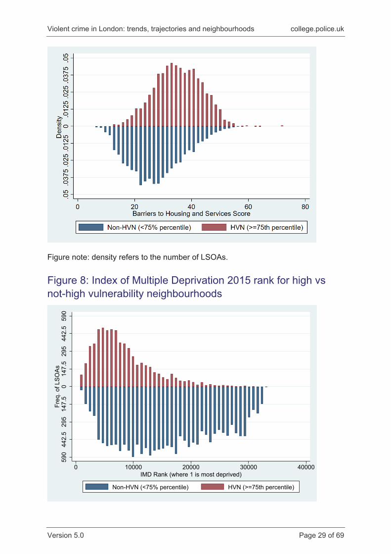
To illustrate the magnitude and nature of the differences between areas summarised
in Table 2, we present a comparison of distributions for six of these measures in
Figure 7 across all years of data (omitting the crime score for the reason given above
– we would expect that to be, by definition, higher in vulnerable neighbourhoods, at
least as we have defined them here). Each chart in Figure 7 is a comparison of the
distribution of each domain score between high and not-high vulnerability
neighbourhoods. The top (red) distribution is for the high vulnerability
neighbourhoods, the bottom (blue) distribution is the not-high vulnerability
neighbourhoods. With the IMD 2015 domain scores, higher scores mean ‘more
deprived in that domain’. What one can see is that for each chart, the high
vulnerability neighbourhoods typically have distributions that are clustered around a
higher average (as per Table 2), but also that the distributions are more tightly
clustered overall. This means that, not only is the average deprivation score higher,
but the higher average observed is because many high vulnerability neighbourhoods
9 As previously outlined, low vulnerability neighbourhoods are defined as those in the less than seventy-fifth percentile in terms of their level of violence, whereas high vulnerability neighbourhoods are those in the seventy-fifth and above percentile.
Violent crime in London: trends, trajectories and neighbourhoods college.police.uk
Version 5.0 Page 26 of 69
have higher scores, rather than the average being driven by a few outlying
neighbourhoods.
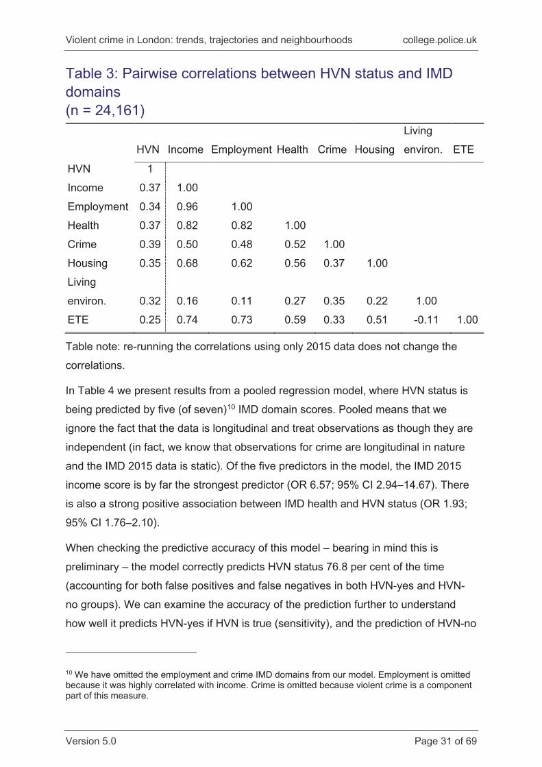
Finally, as an overarching summary of the differences in deprivation between high
and not-high vulnerability neighbourhoods, Figure 8 shows the distribution of the
2015 IMD rank (not score): the rank assigned to each LSOA in England during the
creation of the index. The rank ranges from 1~32,000, with a rank of one meaning
that a given LSOA was the most deprived neighbourhood in England. Figure 8
shows that those London neighbourhoods classed as high vulnerability have a much
higher rank on average, but also that they tend to be clustered at the more deprived
end of the distribution (ie, closer to one).
Figure 7: Distribution of index of deprivation scores by high vulnerability neighbourhood status
Violent crime in London: trends, trajectories and neighbourhoods college.police.uk
Version 5.0 Page 27 of 69
Violent crime in London: trends, trajectories and neighbourhoods college.police.uk
Version 5.0 Page 28 of 69
Violent crime in London: trends, trajectories and neighbourhoods college.police.uk
Version 5.0 Page 29 of 69
Figure note: density refers to the number of LSOAs.
Figure 8: Index of Multiple Deprivation 2015 rank for high vs not-high vulnerability neighbourhoods
590
442.
529
514
7.5
014
7.5
295
442.
559
0Fr
eq. o
f LSO
As
0 10000 20000 30000 40000IMD Rank (where 1 is most deprived)
Non-HVN (<75% percentile) HVN (>=75th percentile)
Violent crime in London: trends, trajectories and neighbourhoods college.police.uk
Version 5.0 Page 30 of 69
Taken together, we have evidence that neighbourhoods experiencing higher levels
of violence do indeed suffer disproportionately in terms of other social and economic
problems. This finding supports the first of our hypotheses (H1), though is far from
novel, given academic interest in the relationships between crime and socio-
economic deprivation, which go back as far as the Chicago School of the 1920s
(see, for example, Bursik, 1984). However, administrative data that uses a wide
range of source measures to create deprivation domains allows one to quickly
summarise the direction and magnitude of differences between groups across
numerous factors. It is clear that, across London, neighbourhoods with high levels of
violent crime tend to suffer from multiple forms of deprivation.
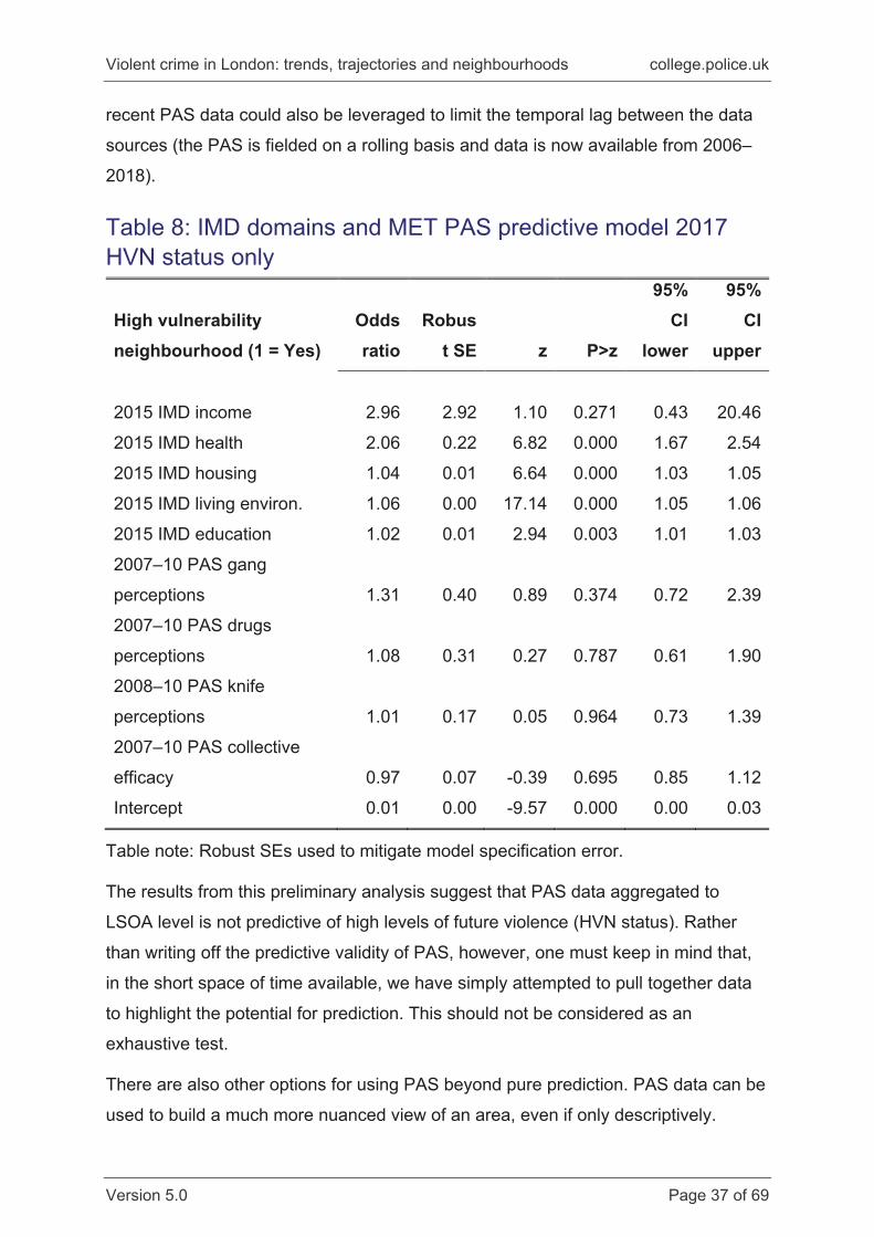
Predicting high vulnerability neighbourhood (HVN) status cross-sectionally using IMD data In this section, we use the categorisation of HVN as our outcome variable, and use
the IMD domain data to predict HVN status. Our expectation is that IMD domain
scores will be predictive of HVN status (H2), but a multiple regression approach
allows us to identify which aspects(s) of deprivation are the most important
correlates of violent crime at the neighbourhood level. Before modelling HVN status,
we looked at the correlation between IMD domains (Table 3). The income and
employment domains were very highly correlated (r = 0.96). As such, adding both
measures to the model would lead to estimation problems, so we only included the
income domain as that is more straightforward to interpret. It is interesting to note
that none of the IMD measures is highly correlated with HVN status – none are
above r = 0.39. It is by no means certain that each will have a ‘unique’ association
with levels of violent crime.
Violent crime in London: trends, trajectories and neighbourhoods college.police.uk
Version 5.0 Page 31 of 69
Table 3: Pairwise correlations between HVN status and IMD domains (n = 24,161)
HVN Income Employment Health Crime Housing
Living
environ. ETE
HVN 1
Income 0.37 1.00
Employment 0.34 0.96 1.00
Health 0.37 0.82 0.82 1.00
Crime 0.39 0.50 0.48 0.52 1.00
Housing 0.35 0.68 0.62 0.56 0.37 1.00
Living
environ. 0.32 0.16 0.11 0.27 0.35 0.22 1.00
ETE 0.25 0.74 0.73 0.59 0.33 0.51 -0.11 1.00
Table note: re-running the correlations using only 2015 data does not change the
correlations.
In Table 4 we present results from a pooled regression model, where HVN status is
being predicted by five (of seven)10 IMD domain scores. Pooled means that we
ignore the fact that the data is longitudinal and treat observations as though they are
independent (in fact, we know that observations for crime are longitudinal in nature
and the IMD 2015 data is static). Of the five predictors in the model, the IMD 2015
income score is by far the strongest predictor (OR 6.57; 95% CI 2.94–14.67). There
is also a strong positive association between IMD health and HVN status (OR 1.93;
95% CI 1.76–2.10).
When checking the predictive accuracy of this model – bearing in mind this is
preliminary – the model correctly predicts HVN status 76.8 per cent of the time
(accounting for both false positives and false negatives in both HVN-yes and HVN-
no groups). We can examine the accuracy of the prediction further to understand
how well it predicts HVN-yes if HVN is true (sensitivity), and the prediction of HVN-no
10 We have omitted the employment and crime IMD domains from our model. Employment is omitted because it was highly correlated with income. Crime is omitted because violent crime is a component part of this measure.
Violent crime in London: trends, trajectories and neighbourhoods college.police.uk
Version 5.0 Page 32 of 69
if HVN-no is true (specificity) (see Agresti, 2007). For sensitivity, the model correctly
predicts HVN-yes 38.9 per cent of the time. For specificity, the figure is much higher
(90.1 per cent). The latter makes sense because with only one-quarter in a given
year classified as HVN-yes, the ‘best’ prediction is to say that no neighbourhood is
HVN-yes, which would be correct 75 per cent of the time. In this case, the model
predictions are slightly better, but the measure of sensitivity is quite poor. To take a
medical analogy, if this were a test for cancer, the model would only correctly predict
that you had cancer 38.9 per cent of the time, even if you already knew that you
definitely had cancer. Though the model performs poorly in terms of its sensitivity,
with refinement and some additional data – for example relating to how areas are
used (are there many pubs and clubs?), day- and night-time populations (do people
travel in from outside the area to visit a night-time economy?), or institutional mix and
density (are there schools or hospitals in the area?) – results could likely be
markedly improved.
Table 4: Pooled logistic regression for HVN status predicted by IMD domains High vulnerability neighbourhood (1 = Yes)
Odds ratio
Std err. z P>z
95% CI lower
95% CI upper
2015 IMD income 6.57 2.69 4.59 0.00 2.94 14.67
2015 IMD health 1.93 0.09 14.53 0.00 1.76 2.10
2015 IMD housing 1.04 0.00 15.86 0.00 1.04 1.05
2015 IMD living environ. 1.05 0.00 37.64 0.00 1.05 1.06
2015 IMD education 1.02 0.00 9.04 0.00 1.02 1.03
Intercept 0.01 0.00 -50.28 0.00 0.01 0.01
Table note: Sample size n = 24,161 pooling data from all years. Pattern of results
does not change if limiting to 2015 data only and the magnitude of results are
repeated if bootstrapped with a smaller sample.
Violent crime in London: trends, trajectories and neighbourhoods college.police.uk
Version 5.0 Page 33 of 69
Predicting high vulnerability neighbourhood (HVN) status longitudinally using IMD data In the next set of models, we exploit the fact that we have longitudinal data and use
the IMD 2015 variables to try and predict HVN status in 2016 and 2017. That means
the outcome has been measured one year and then two years after the predictors,
so this is a ‘true’ prediction based on data that is correctly time-ordered. Table 5
shows the results from this analysis. As before, the IMD income domain is the
strongest predictor of HVN status in both years as measured by the odds ratio (6.60
and 3.63 respectively), followed by IMD health (1.94 and 2.10 respectively). What is
interesting to note is that with one additional year, the magnitude of the relationship
for the IMD income domain is halved, but for other domains the relationships remain
static. This suggests that the IMD income domain may be capturing different
processes than other IMD domains. Put another way, the association between
income deprivation and violent crime seems to be more volatile than the association
between, for example, health deprivation and crime, which seems to be quite
consistent over time. It is important to keep in mind that even though the IMD is
‘static’ and ‘administrative’, the measures actually capture a wide array of social,
economic and psychological processes.
Table 5: Longitudinal models of HVN status predicted by IMD 2015 domains High vulnerability neighbourhood (1 = Yes)
2016
2017
Odds ratio
Robust SE P>z
Odds ratio
Robust SE P>z
2015 IMD income 6.60 6.07 0.040 3.63 3.32 0.158
2015 IMD health 1.94 0.19 0.000 2.01 0.20 0.000
2015 IMD housing 1.04 0.01 0.000 1.04 0.01 0.000
2015 IMD living environ. 1.05 0.00 0.000 1.05 0.00 0.000
Table note: n = 4,832 in 2016; n = 4,834 in 2017. Robust SEs used to mitigate model
specification error.
Violent crime in London: trends, trajectories and neighbourhoods college.police.uk
Version 5.0 Page 34 of 69
Predicting high vulnerability neighbourhood (HVN) status longitudinally using IMD and MPS Public Attitude Survey (PAS) data To add to the previous analysis, we also included data from the Metropolitan Police
PAS. The advantage of using PAS data is that it includes a rich mixture of
psychological and criminological variables that may be predictive of violence in a
given neighbourhood. Evidence from the United States has shown that, for example,
neighbourhoods typified by high levels of interpersonal trust and a willingness to act
on behalf of the common good (AKA collective efficacy) have lower levels of violence
overall (Sampson et al., 1997). What is interesting from a purely
predictive/operational standpoint is that the same strong associations between trust,
cohesion and violence have not been observed in London, perhaps owing to the
nature of London’s mixture of high and low deprivation areas in very close proximity
to one another (Sutherland et al., 2013 and see above).
In this section, we combine historical data from PAS covering 2007–2010, and use
neighbourhood averages of the variables in Table 6 to assess whether these are
predictive of HVN status. Note that the methodology for creating neighbourhood
averages was to look at the proportion of respondents saying that a particular issue
was a minor or major problem in their area.
Table 6: MET PAS questions used in analysis and coverage Question wording Variable
in PAS Year first asked
…to what extent do you think gangs are a problem in this
area?
nq43 2007
…to what extent do you think drug using or selling is a
problem in this area?
q40 2007
…to what extent do you think knife crime is a problem in
this area?
a39a 2008
We also included a previously constructed variable measuring collective efficacy.
Details of the creation and properties of that variable are reported in Sutherland et
al., 2013, so are not repeated here. In short, collective efficacy is a composite
Violent crime in London: trends, trajectories and neighbourhoods college.police.uk
Version 5.0 Page 35 of 69
measure that combines several questions relating to trust in others, social cohesion
and informal social control (see Appendix A in Sutherland et al., 2013, for a review of
questions used).
We include PAS variables as LSOA-level averages in our analysis, alongside the
IMD domain scores used in the previous section. While IMD scores are the
population parameter for a given neighbourhood, PAS scores are a sample estimate.
However, for the purposes of this analysis, we treat the sampled data as if it were a
population parameter (because we are only including the average proportion for
each LSOA).
Table 7 shows the results from a pooled model, with crime data for all years included
(n = 23,050 – despite being generally stable in size over time, some LSOA
boundaries were updated for the 2011 Census as a result of large population
changes since 2001. This means that a small number of newer LSOAs were not
available in the PAS.) Note that this is a longitudinal model in that the PAS data was
collected 2007–2010, IMD in 2015, and crime data from 2013–2017.
As before, the IMD domain scores are predictive of HVN status but the result for the
income domain, for example, is slightly smaller than in the previous analysis. What is
more noticeable, however, is that of the four PAS variables included, only one –
perceptions of knife crime – is (weakly) associated with HVN status (OR 1.18; robust
se 0.09; p. 0.025; 95% CI 1.02–1.36).
Violent crime in London: trends, trajectories and neighbourhoods college.police.uk
Version 5.0 Page 36 of 69
Table 7: IMD domains and MET PAS pooled predictive model results (n = 23,050)
High vulnerability neighbourhood (1 = Yes)
Odds ratio
Robust SE z P>z
95% CI
lower
95% CI
upper
2015 IMD income 4.32 1.92 3.30 0.001 1.81 10.31
2015 IMD health 2.00 0.10 14.56 0.000 1.82 2.20
2015 IMD housing 1.04 0.00 15.85 0.000 1.04 1.05
2015 IMD living environ. 1.06 0.00 37.51 0.000 1.05 1.06
2015 IMD education 1.02 0.00 8.71 0.000 1.02 1.03
2007–10 PAS gang
perceptions 1.16 0.16 1.11 0.267 0.89 1.52
2007–10 PAS drugs
perceptions 0.96 0.13 -0.31 0.756 0.74 1.24
2008–10 PAS knife
perceptions 1.18 0.09 2.24 0.025 1.02 1.36
2007–10 PAS collective
efficacy 1.02 0.03 0.60 0.546 0.96 1.09
Intercept 0.01 0.00 -23.13 0.000 0.00 0.01
Table note: Robust SEs used to mitigate model specification error.
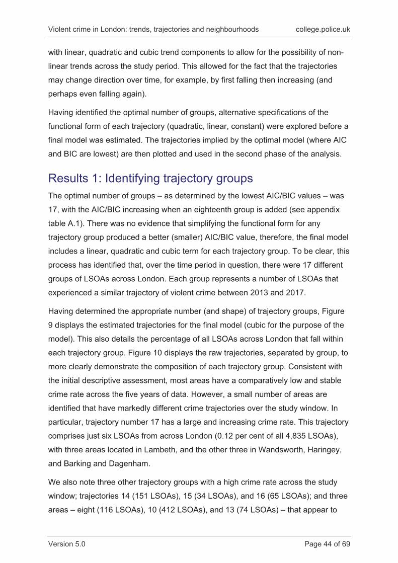
In Table 8, we repeat the IMD PAS analysis, but restricting to HVN status in 2017
only. This means that there is a minimum of seven years, and up to 10 years,
between PAS questions being asked and the outcomes being observed. Given the
lag between predictor about outcome, and the pooled model results, we should
perhaps not be surprised to see that none of the PAS variables is associated with
HVN status in this analysis.
However, as before, the IMD domains are predictive of HVN status even with a two-
year gap (at minimum depending on when the data underlying the IMD was collected
and analysed). These are, of course, very preliminary analyses, but there would be
some merit in trying to more robustly use the IMD data to predict future violence, as
well as include more measures from the PAS, particularly trust in the police. More
Violent crime in London: trends, trajectories and neighbourhoods college.police.uk
Version 5.0 Page 37 of 69
recent PAS data could also be leveraged to limit the temporal lag between the data
sources (the PAS is fielded on a rolling basis and data is now available from 2006–
2018).
Table 8: IMD domains and MET PAS predictive model 2017 HVN status only
High vulnerability neighbourhood (1 = Yes)
Odds ratio
Robust SE z P>z
95% CI
lower
95% CI
upper
2015 IMD income 2.96 2.92 1.10 0.271 0.43 20.46
2015 IMD health 2.06 0.22 6.82 0.000 1.67 2.54
2015 IMD housing 1.04 0.01 6.64 0.000 1.03 1.05
2015 IMD living environ. 1.06 0.00 17.14 0.000 1.05 1.06
2015 IMD education 1.02 0.01 2.94 0.003 1.01 1.03
2007–10 PAS gang
perceptions 1.31 0.40 0.89 0.374 0.72 2.39
2007–10 PAS drugs
perceptions 1.08 0.31 0.27 0.787 0.61 1.90
2008–10 PAS knife
perceptions 1.01 0.17 0.05 0.964 0.73 1.39
2007–10 PAS collective
efficacy 0.97 0.07 -0.39 0.695 0.85 1.12
Intercept 0.01 0.00 -9.57 0.000 0.00 0.03
Table note: Robust SEs used to mitigate model specification error.
The results from this preliminary analysis suggest that PAS data aggregated to
LSOA level is not predictive of high levels of future violence (HVN status). Rather
than writing off the predictive validity of PAS, however, one must keep in mind that,
in the short space of time available, we have simply attempted to pull together data
to highlight the potential for prediction. This should not be considered as an
exhaustive test.
There are also other options for using PAS beyond pure prediction. PAS data can be
used to build a much more nuanced view of an area, even if only descriptively.
Violent crime in London: trends, trajectories and neighbourhoods college.police.uk
Version 5.0 Page 38 of 69
MOPAC already produce a dashboard that maps public sentiment across London
(see https://maps.london.gov.uk/NCC/), which could be expanded on to:
enable individuals to look up their neighbourhood, or officials to have that
information to hand11
incorporate evaluative questions into PAS that allow for post-hoc evaluations of
interventions to be conducted
facilitate a much clearer understanding of areas through more sophisticated
approaches to creating area profiles, such as latent class analysis.12
The rolling design of the PAS survey, with interviews conducted continuously since
2006, means that it would also be possible to provide a more dynamic picture of
these area profiles, and to assess whether changes in the profile of each
neighbourhood are themselves predictive of changes in violent crime.
Predicting high vulnerability neighbourhood (HVN) status longitudinally using IMD, MPS Public Attitude Survey (PAS) and stop and search (S&S) data Here we add police stop and search data to the preceding models. As noted, there is
only a two-year overlap in the S&S data with the violence data, which means a
reduced sample size overall (which is why we did not introduce S&S data earlier in
the analysis steps). In the two years of overlap, we have records of 72,298 (2016)
and 115,722 (2017) stop and searches conducted by the MPS across London.13
Table 9 shows the results of the analysis that includes the 2016 stop and search
data predicting HVN status in 2017. The results for the IMD and PAS measures
remain largely the same – in that PAS measures are unrelated but most IMD
measures are predictive. The additional measure of police stop and search activity in
2016 is also predictive of a neighbourhood being ‘high vulnerability’ in 2017. In other
11 Note that the Borough of Newham has been piloting the incorporation of social surveys into local community dashboards for several years. 12 Latent Class Analysis is a way of bringing together a wealth of information to create latent profiles or classes. It would, for example, be possible to use LCA to create neighbourhood profiles that pull together administrative and survey data. For an example application of LCA, see Sutherland et al., 2017. 13 For 2018, there were 117,082 stop and searches recorded.
Violent crime in London: trends, trajectories and neighbourhoods college.police.uk
Version 5.0 Page 39 of 69
words, areas with higher levels of stop and search in 2016 were more likely to be
HVN in 2017.
What is important to keep in mind here is that we have not filtered stop and search
activity by offence type – so we have a very general measure of police activity in one
year predicting a neighbourhood being an outlier, in terms of violence the following
year. Although other research casts doubt on whether stop and search actually
deters crime (Tiratelli et al., 2018), the purpose of this analysis is merely to
understand if S&S predicts high levels of later crime, which, on first analysis, it
appears to.14 This is not surprising if one considers the stability of violence over time
(eg, in the United States; see Braga et al., 2010) and thus the likely predictability of
where police attention will be focused. The vast literature on hotspot policing makes
clear that the geographical distribution of crime is stable enough for interventions to
be implemented to effectively reduce crime.15
14 The association between S&S and HVN status appears ‘small’ because the result is OR 1.036 (95% CI 1.030–1.043), but the range of S&S is very wide. That is, in 2016 the minimum number of S&S was zero, but the maximum was 591, meaning that for every additional S&S in 2016, the odds of a neighbourhood being HVN increased by 1.036. One must temper this by appreciating that HVN have much higher levels of S&S already. In 2016, non-HVN had an average of eight S&S episodes, whereas HVN neighbourhoods had an average of 33; four times as many. 15 Future research could consider the dynamics of violent crime over time, to consider whether controlling for other characteristics, violence at t-1 – or further back – predicts violence at t.
Violent crime in London: trends, trajectories and neighbourhoods college.police.uk
Version 5.0 Page 40 of 69
Table 9: IMD domains, MET PAS and S&S predictive model 2017 HVN status only High vulnerability neighbourhood (1 = Yes)
Odds ratio
Std err. z P>z
95% CI lower
95% CI upper
2015 IMD income 1.33 1.38 0.28 0.782 0.17 10.17
2015 IMD health 2.10 0.24 6.57 0.000 1.68 2.62
2015 IMD housing 1.03 0.01 5.15 0.000 1.02 1.05
2015 IMD living environ. 1.04 0.00 11.87 0.000 1.04 1.05
Table note: Robust SEs used to mitigate model specification error. +Actual result for
2016 Stop & Search count: OR 1.036; 95% CI 1.033–1.043.
Revisiting support for hypotheses Below we briefly discuss whether the analyses conducted provide support for our
pre-specified hypotheses.
H1. Vulnerable NH will have a greater number of social and economic problems, as
measured by IMD measures, than non-vulnerable NHs.
As reported above, using both domain scores and the overall IMD rank, HVN have a
higher overall level of deprivation across these measures compared to non-HVN. As
such, it should be possible to build up a descriptive profile of HVN neighbourhoods
that pulls together different data sources in order to understand more specifically the
nature of the problems the places (and their residents) face.
Violent crime in London: trends, trajectories and neighbourhoods college.police.uk
Version 5.0 Page 41 of 69
H2. IMD indicators will be predictive of HVN status cross-sectionally.
H3. IMD indicators will be predictive of HVN status longitudinally (in a time t-1
predicting time t model).
Both H2 and H3 were supported in that four of five IMD domain scores were
predictive of HVN status, both cross-sectionally and longitudinally. The caveat being
that the IMD measures come from 2015, so, in fact, all the analyses were
longitudinal in one sense in that the predictors precede the outcome in time.
However, the cross-sectional analyses were in fact pooling outcome data across
years – the risk of doing so is that the significance tests could lead to misleadingly
small p-values. The longitudinal analyses restricted the outcome to two years (2016
and 2017), so we can be more confident that the associations noted were not due to
chance. Although many IMD indicators were predictive and highly significant, the
actual magnitude of association for many was small (eg, odds ratios just above one).
However, one indicator that was consistently predictive and effectively doubled the
odds of an LSOA being classed as vulnerable was the 2015 IMD health score. That
score measures several dimensions of health, including risk of premature death, rate
of emergency hospital admission, mood and anxiety disorders, and comparative
illness/disability ratios (Smith et al., 2015). It may be the case that some of the
reasons for emergency admission to hospital relate to violence, for example, but
more work on this association would be needed before treating IMD health scores as
actionable for violence prevention efforts, for instance.
H4. Collective efficacy will be correlated with being classified a vulnerable
neighbourhood.
H4 was not supported. In spite of the growing literature purporting to demonstrate
the importance of collective efficacy for predicting violence, London stubbornly fails
to conform to this view (see Sutherland et al., 2013).
H5. Police activity measured by stop and search in t-1 will NOT be associated with
lower levels of violence in t, BUT because of the stability of crime over time
there should rather be a positive correlation between levels of stop and search
and classification as a vulnerable neighbourhood.
This hypothesis was supported. Not only did we find no negative correlation between
stop and search and crime, higher levels of stop and search in 2016 were associated
Violent crime in London: trends, trajectories and neighbourhoods college.police.uk
Version 5.0 Page 42 of 69
with a greater probability of being an HVN in 2017. As discussed above, this is likely
due to the stability of where violence/crime occurs, and thus where police activities
will be focused. One implication of this finding, however, is that highly vulnerable
neighbourhoods, suffering from multiple forms of deprivation, tend to receive more
assertive forms of policing that seem to do little to address the crime problems they
face.
In the next section, we explore a modelling technique that considers not only the
level of violent crime in an area but also its trajectory – whether violence is
increasing, decreasing, or remaining constant.
Approach 3: Trajectory models In this section we outline some modelling possibilities that take full account of the
changing trends in crime across each LSOA. There is increasing interest in the
trajectories of crime in space and time t – thinking not just about areas that are at
risk and not at risk of crime, but also changes over time in this relative position. As
described above, the structural and social characteristics of neighbourhoods have
been shown to be reliable predictors of violent – and indeed other – crime at the
local level. However, we currently have comparatively little evidence about the
trajectories of crime across neighbourhoods, and whether we can identify distinctive
patterns associated with the most vulnerable communities.
Using data from London across five years (2013–2017) we explore trajectories of
crime risk across neighbourhoods (as represented by LSOA). To do this, we apply
Nagin’s (2005) Group-Based Trajectory Modelling (GBTM) approach to identify the
number (and shape) of distinct crime trajectory patterns that effectively summarise
the distribution of crime across all 4,835 LSOAs in London. This allows us to
determine the degree of crime concentration in particular high-risk neighbourhoods,
and how these persist over time. Having identified the number of unique trajectory
patterns, we then use data from the Census to try and better understand what
explains membership of these trajectory groups.
The analysis draws on annual crime data, 2013 to 2017, aggregated to LSOA. Crime
rates per 1,000 of the average working population (2011 Census estimate for each
LSOA) are calculated to ensure that levels of crime are adjusted for the number of
Violent crime in London: trends, trajectories and neighbourhoods college.police.uk
Version 5.0 Page 43 of 69
potential targets in each local area. Working population is preferable to resident
population because violent crime tends to occur outside of the home, and there are a
number of areas in London that experience considerably higher daily footfall than the
number of resident properties (for example in the West End). Data are available from
all 4,835 LSOA within London.
Across the study period it is notable that for most areas (88.1 per cent) the general
crime trajectory does not go above 50 crimes per year per 1,000 of the daily working
population. There is also comparatively little variability over time, with the crime rate
of fewer than 1 in 10 LSOAs differing by more than 10 crimes per year, on average.
There are, however, a small number of LSOAs that have higher (and increasing)
crime rates, but the distinct range of trajectories is not clear to observe when
examined descriptively because of the large number of LSOAs across London (see
appendix figure A.1). We therefore use GBTM to identify the distinct trajectory
patterns across London.
Stage 1: Group-based trajectory modelling GBTM is conducted using the traj package in Stata. This estimates a separate
growth trajectory for different groups of neighbourhoods that share a similar
distribution of offences over time, with the functional form of the crime trajectory in
each group determined on an exploratory basis (ie, the trajectories are ‘found’ in the
data rather than specified in advance). To summarise, the GBTM process works to
collapse LSOAs across London into an optimal number of trajectory groups, based
on the number of crimes per 1,000 daily working population each year.
The identification of the correct number of groups and appropriate trajectory patterns
when using GBTM is complex. A wide range of possible combinations of group
number and polynomial structure (ie, curves) are available, meaning a solely
exploratory approach is not viable in most scenarios. Following Nagin (2005),
models with an increasing number of trajectory groups are estimated, with the final
number of trajectory groups determined, based on evaluation of two overall fit
statistics – the Akaike Information Criterion (AIC) and the Bayesian Information
Criterion (BIC). In both cases, a lower score represents a better fitting model, so the
analysis proceeds by fitting a sequence of models with an increasing number of
trajectory groups until the AIC/BIC stop decreasing in value. We estimated models
Violent crime in London: trends, trajectories and neighbourhoods college.police.uk
Version 5.0 Page 44 of 69
with linear, quadratic and cubic trend components to allow for the possibility of non-
linear trends across the study period. This allowed for the fact that the trajectories
may change direction over time, for example, by first falling then increasing (and
perhaps even falling again).
Having identified the optimal number of groups, alternative specifications of the
functional form of each trajectory (quadratic, linear, constant) were explored before a
final model was estimated. The trajectories implied by the optimal model (where AIC
and BIC are lowest) are then plotted and used in the second phase of the analysis.
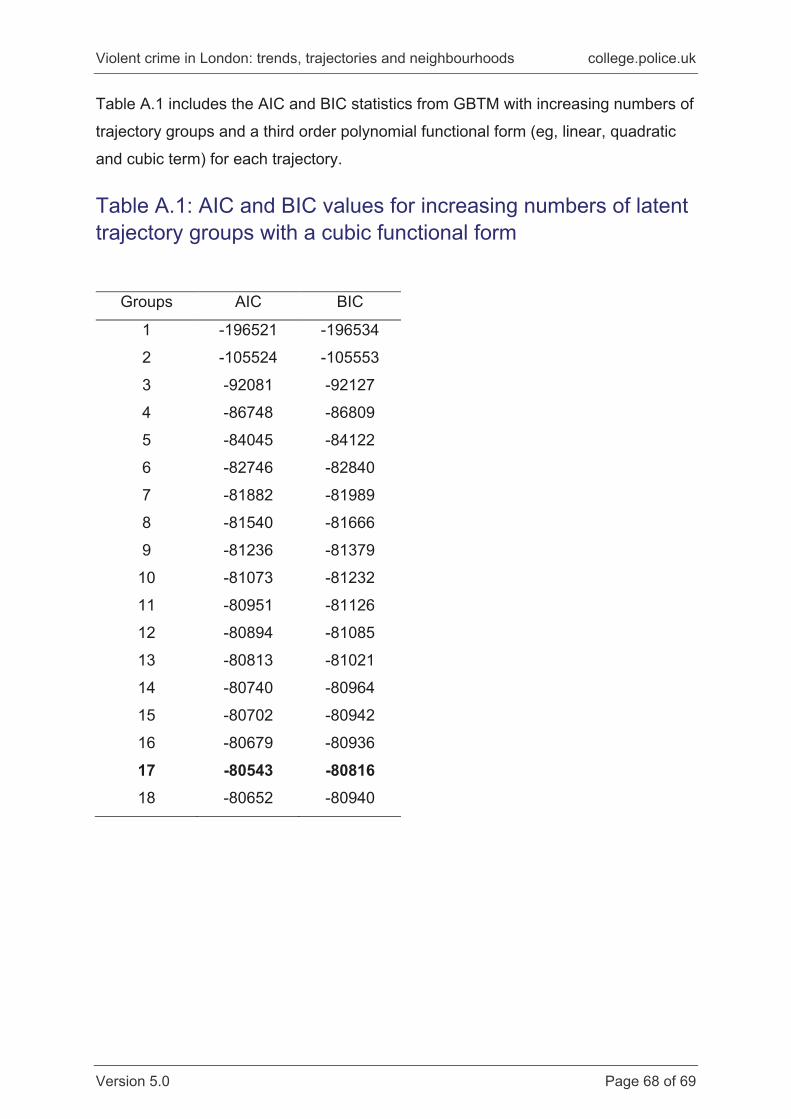
Results 1: Identifying trajectory groups The optimal number of groups – as determined by the lowest AIC/BIC values – was
17, with the AIC/BIC increasing when an eighteenth group is added (see appendix
table A.1). There was no evidence that simplifying the functional form for any
trajectory group produced a better (smaller) AIC/BIC value, therefore, the final model
includes a linear, quadratic and cubic term for each trajectory group. To be clear, this
process has identified that, over the time period in question, there were 17 different
groups of LSOAs across London. Each group represents a number of LSOAs that
experienced a similar trajectory of violent crime between 2013 and 2017.
Having determined the appropriate number (and shape) of trajectory groups, Figure
9 displays the estimated trajectories for the final model (cubic for the purpose of the
model). This also details the percentage of all LSOAs across London that fall within
each trajectory group. Figure 10 displays the raw trajectories, separated by group, to
more clearly demonstrate the composition of each trajectory group. Consistent with
the initial descriptive assessment, most areas have a comparatively low and stable
crime rate across the five years of data. However, a small number of areas are
identified that have markedly different crime trajectories over the study window. In
particular, trajectory number 17 has a large and increasing crime rate. This trajectory
comprises just six LSOAs from across London (0.12 per cent of all 4,835 LSOAs),
with three areas located in Lambeth, and the other three in Wandsworth, Haringey,
and Barking and Dagenham.
We also note three other trajectory groups with a high crime rate across the study
window; trajectories 14 (151 LSOAs), 15 (34 LSOAs), and 16 (65 LSOAs); and three
areas – eight (116 LSOAs), 10 (412 LSOAs), and 13 (74 LSOAs) – that appear to
Violent crime in London: trends, trajectories and neighbourhoods college.police.uk
Version 5.0 Page 45 of 69
exhibit comparatively large increases over time. Taken together, the top four
trajectory groups comprise five per cent of all areas, and all seven trajectories
comprise 17 per cent of all areas across London. To put it another way, and
corresponding with the crime mapping presented above, the GBTM modelling
suggests that a relatively small proportion of LSOAs experienced either sustained
high crime rates and/or relatively large increases in violent crime over the study
period. Most other areas – generally those low in violent crime – saw either a very
small or essentially no increase in crime over the same time period. The
concentration of sustained high crime rates in a small number of areas has been
demonstrated in other studies adopting a GBTM approach using different spatial
scales (see, for example, Weisburd et al., 2004 for an examination of street
segments, and Bannister et al., 2017; Griffiths and Chavez, 2004; Yang et al., 2010
using other neighbourhood definitions). It is also consistent with social
disorganisation theory (Shaw and McKay, 1942) which argues that crime is largely
restricted to those areas characterised by high levels of socio-economic
disadvantage, ethnic diversity, and residential turnover (Kornhauser 1978; Bursik
1986).
Violent crime in London: trends, trajectories and neighbourhoods college.police.uk
Version 5.0 Page 46 of 69
Figure 9: Group-based trajectory plots for London LSOAs (2013–2017)
Violent crime in London: trends, trajectories and neighbourhoods college.police.uk
Version 5.0 Page 47 of 69
Figure 10: Individual group trajectories for London LSOAs (2013–2017)
Violent crime in London: trends, trajectories and neighbourhoods college.police.uk
Version 5.0 Page 48 of 69
To give a clearer sense of the location of the highest crime rate areas, Figure 11
identifies the LSOAs that share the high and increasing crime trajectory (group 17) in
blue, as well as the other three most vulnerable areas (groups 14, 15 and 16) in red.
There is no evidence of strong clustering with regard to the highest crime rate areas
beyond most being in more central London areas. In other words, outside the centre
of the capital, high crime LSOAs are spread fairly evenly.
Figure 11: Map of the highest crime trajectories
Violent crime in London: trends, trajectories and neighbourhoods college.police.uk
Version 5.0 Page 49 of 69
Stage 2: Predicting membership of the most vulnerable areas To connect our trajectory groups more directly with social disorganisation theory, in
the second phase of the analysis, variables are added to the model in order to
explain membership of specific trajectory groups. Because of the large number of
groups identified, we restrict our focus to predicting membership of the most
vulnerable areas, considering membership of the highest violent crime rate area
(trajectory 17), the four most vulnerable areas combined (combining the highest
crime rate area, 17, with trajectories 14, 15, 16) and the three areas exhibiting large
increases over the five-year study window (trajectories 8, 10 and 13).16
The area-level variables are derived from the decennial Census 2011, with a range
of features of local areas combined using a factorial ecology procedure (Rees, 1971)
to produce three summary measures for each area. These cover the level of
urbanicity, concentrated disadvantage, and population mobility. Table 10 includes
details of which Census variables tend to align with each summary measure across
local areas, with values closer to +/-1 indicating that a particular Census
characteristic makes a strong contribution to one of the three summary variables. For
example, areas that have a higher percentage of flats, single parent non-pensioners,
fewer owner-occupied properties, a higher level of population density, and more
overcrowded properties would score highly on the summary measure of urbanicity.
Table 10: Summary measures for local areas – results from factorial ecology model
Urbanicity
Concentrated disadvantage
Population mobility
% flats 0.93 -0.05 -0.06
% single parent non-pensioner 0.88 -0.22 -0.03
% owner occupied -0.88 -0.34 -0.18
Occupancy rating (higher = more
crowded) 0.79 0.20 0.46
Population density 0.67 0.07 0.19
16 Group 8 and 13 experience the largest relative increases over the study period, with increases of 115 per cent and 102 per cent respectively (compared to 39 per cent, 62 per cent, 70 per cent and 88 per cent for the four high crime trajectories). Group 10 experiences a 64 per cent increase.
Violent crime in London: trends, trajectories and neighbourhoods college.police.uk
Finally, Table 12 includes estimates from a multinomial model, simultaneously
predicting membership of the four highest crime areas and the three areas exhibiting
the largest crime increase. This confirms the importance of the urban structure of the
area, level of concentrated disadvantage, and population mobility. Areas that are
identified as having a more urban structure have 1.9 times higher odds of
experiencing a substantial increase in violent crime over the five years, and 3.3 times
higher odds of being in the top four violent crime areas. The odds of being in one of
these two groups are 1.6 times higher for areas exhibiting high levels of
concentrated disadvantage, and between 1.3 and 1.7 times higher for areas
experiencing greater population mobility. Note again that ethnic diversity is not a
significant predictor.
Violent crime in London: trends, trajectories and neighbourhoods college.police.uk
Version 5.0 Page 53 of 69
Table 12: Multinomial regression models predicting membership of vulnerable trajectory groups Odds ratio Logit SE Sig
Increasingly vulnerable trajectories
Ethnic diversity 0.91 -0.10 0.41 0.81
Urbanicity 1.85 0.62 0.06 0.00
Concentrated disadvantage 1.63 0.49 0.06 0.00
Population mobility 1.29 0.25 0.06 0.00
Constant 0.12 -2.11 0.23 0.00
Top 4 high crime trajectories
Ethnic diversity 2.01 0.70 0.70 0.32
Urbanicity 3.30 1.20 0.09 0.00
Concentrated disadvantage 1.64 0.49 0.08 0.00
Population mobility 1.73 0.55 0.08 0.00
Constant 0.02 -3.87 0.42 0.00
Reference: all other trajectories
Violent crime in London: trends, trajectories and neighbourhoods college.police.uk
Version 5.0 Page 54 of 69
Approach 4: Machine learning and its application to prediction and evaluation The final form of exploratory analysis considered in this report returns to the issue of
whether police activity, in the form of stop and search, might be linked to the
distribution of violent crime. We applied propensity score weighting using the
machine-learning (ML) approach to illustrate its potential utility of propensity scores,
and ML for evaluation when one has observational datasets such as in this study.
The core idea behind propensity score weighting is that the propensity score weights
can be used to create a ‘pseudo-randomised’ trial design, whereby groups of
neighbourhoods with and without high levels of stop and search look comparable on
all important confounders of the relationship between high levels of stop and search
and violent crime. ML, in this illustration, will be used to estimate the propensity
score weights. The basic idea of ML for estimation is that it can iterate over
predictors and maximise predictive accuracy through repetition/learning in ways that
humans cannot do so easily. This does not mean that ML approaches are infallible
or free from bias (Saunders et al., 2016; Fry, 2018); they are merely tools that are
well-designed for specific purposes. As such, the burden is still on the
analyst/researcher to choose what data to include in the process, and to understand
the potential for biases to be propagated in prediction models.
Picking up from what seems to be a rather troubling positive association between
stop and search and violent crime (and indeed vulnerability at the neighbourhood
level) described above, the premise here is that we are trying to assess the causal
impact of high levels of stop and search on later violence in a given neighbourhood.
That is, if there are high levels of stop and search, do we later see that violence is
reduced, as is predicted by for example deterrence theory (Tiratelli et al., 2018). High
levels of stop and search are defined here as being in the top 10 per cent of
neighbourhoods, in terms of stop and search. This is an arbitrary approach and is used for illustrative purposes only. A much better approach would be to use data
from an actual policing operation and link that to neighbourhoods/locations.
The simplified analysis steps are:
Violent crime in London: trends, trajectories and neighbourhoods college.police.uk
Version 5.0 Page 55 of 69
1. Model the likelihood of being a high stop and search neighbourhood using the ML
approach, creating a propensity score weight (between 0 and 1) that aims to
balance the groups of neighbourhoods on IMD scores.
2. Check how well balanced the groups are following Step 1. If comparable, then
proceed to analysis. (Note, we have assumed the comparison is acceptable
here.) The ‘balance’ here is an assessment of how similar the two groups are on
the measures we have data for. In attempting to mimic a randomised-controlled
trial we want to be sure that the two groups are comparable on a range of
dimensions.
3. Weight the subsequent analysis using the propensity score weight computed in
Step 1. We are then comparing the impact of high levels of 2016 stop and search
on 2017 violence. The idea is that the weighting means we are comparing
neighbourhoods similar in terms of the covariates used in Step 1. Notionally, the
weighting makes the two groups equivalent, apart from exposure to higher or
lower levels of stop and search in 2016.
The ML package used here was developed by the RAND Corporation and is called
TWANG, which stands for Toolkit for Weighting and Analysis of Non-equivalent
Groups (Griffin et al., 2014). TWANG uses generalised boosted regression models
(GBM) which are non-parametric models, meaning they do not rely on the same
assumptions as, for example, logistic regression models. Through optimising
weighting models, GBM can lead to improved bias reduction and more consistency
when compared to estimating propensity scores using traditional parametric models
like the logistic model (see Lee et al., 2010; Harder et al., 2010; Parast et al., 2017).
As the name suggests, TWANG is often used to generate equivalent groups from
observational data in order to assess the causal impact of an intervention on an
outcome (ie, quasi-experimental research). Underlying this is a prediction model that
aims to try and produce the ‘best’ prediction it can for membership of ‘group A’ –
here, the high stop and search neighbourhoods.17 ML is also not a statistical model
17 The benefits of GBM as implemented by packages such as TWANG is that it (i) uses all available data, including whether data is missing, to optimise the prediction; and (ii) also allows numerous forms of predictors in the model (nominal, interval, ordinal). In particular, the inclusion of ‘missing’ as an optimisation factor is practically important because more standard approaches, as used above, normally drop observations with any missing data unless particular approaches are used (eg,
Violent crime in London: trends, trajectories and neighbourhoods college.police.uk
Version 5.0 Page 56 of 69
in the normal sense, and represents something of a ‘black box’ – which can be more
or less comfortable/appropriate depending on the situation in which they are being
used (particularly in the context of the Data Protection Act 2018).
Machine learning results The variables used in Step 1, to predict being a high stop and search neighbourhood
(the ‘treatment’), were those used earlier in other models (PAS, IMD) along with the
2010/11 ambulance callout rate for knife crime, as previously analysed (Sutherland
et al., 2013). The outcome used for Step 3 is the count of 2017 violent incidents. The
results from the ML approach come in different forms – below we present two
graphical outputs which have been produced, and explain what they are showing
(Step 2).
Figure 12 shows that the overall assessment of imbalance (‘balance measure’) was
reduced after more than 1,000 runs (with the optimal model being iteration 1,796).
This means that the programme optimised balance on the included variables at that
point – after which we can see the balance measure on the y-axis increasing
(worsening as iterations exceed 2,000). Having the model complete after too few
runs is not regarded as preferred because it suggests the algorithm has not cycled
enough times, whereas having too many is suggestive of over-fitting, hence focusing
on the point at which the minima is reached. Figure 10 shows the effect of weighting
on the maximum differences in effect sizes (standardised mean differences) before
and after weighting. This gives an idea of how large initial differences were between
groups prior to weighting. The left-hand side of Figure 13 shows the unweighted
differences across the variables, with some very large between-group differences
(standardised mean difference of nearly one standard deviation). The right-hand side
of Figure 10 shows the weighted differences, and the connecting lines illustrate the
impact of weighting. In short, weighting results in large reductions in differences
between the groups. It is worth pointing out that the results illustrate that this was a
relatively ‘good’ model in some respects, but not with others (not shown), and would
need refining.
imputation – Brunton-Smith et al., 2014). As TWANG iterates over the predictors/models it upweights or downweights those variables that are more or less important for prediction.
Violent crime in London: trends, trajectories and neighbourhoods college.police.uk
Version 5.0 Page 57 of 69
Table 13 shows the results of the analysis we have undertaken, after weighting
neighbourhoods on their propensity to be high stop and search in 2016 using our
propensity score weights along with covariate adjustment. To reiterate, this is an
experimental approach, and results should be interpreted in this light. The model is
looking at the relationship between stop and search in 2016, and violence in 2017.
Including all the variables used for Step 1 in the final analysis is known as a ‘doubly
robust’ procedure. If we assume that what is presented in the table below is a causal
estimate (it is not, but for the sake of exposition), what we observe is that those
neighbourhoods ‘treated’ by high levels of stop and search in 2016 had violence
counts 60 per cent higher in 2017, all else being equal (IRR 1.61; SE 0.08; 95% CI
1.46–1.77). Yet, we know there is an important omitted variable here – the actual
crime rate in 2016 – as that would largely drive the S&S rate. As such, we know that
the ‘effect’ for stop and search is likely over-estimated, and could even be in the
wrong direction, had we accounted for the previous crime rate. Note, however, that
as the 2015 IMD crime score is a good predictor of future crime, we decided to leave
that in the ML model to ensure balance on previous crime data. In this respect, the
model does take into account some previous levels of crime, making the positive
association between stop and search and violent crime even more striking.
Violent crime in London: trends, trajectories and neighbourhoods college.police.uk
Version 5.0 Page 58 of 69
Figure 12: Optimisation results for GBM iterations
Figure 13: Comparison of standardised differences between groups (weighted and unweighted)
Violent crime in London: trends, trajectories and neighbourhoods college.police.uk
Version 5.0 Page 59 of 69
Figure 13: Comparison of standardised differences between groups (weighted and unweighted)
2017 violence IRR Robust
SE z P>z 95% CI lower
95% CI upper
High stop and search
(treatment vs control) 1.61 0.08 9.75 0.000 1.46 1.77
2015 IMD income 0.06 0.04 -4.61 0.000 0.02 0.20
2015 IMD education 1.01 0.00 1.74 0.082 1.00 1.02
2015 IMD health 1.18 0.08 2.41 0.016 1.03 1.35
2015 IMD crime 1.49 0.10 5.86 0.000 1.30 1.70
2015 IMD housing 1.03 0.01 4.91 0.000 1.02 1.04
2015 IMD living environ. 1.01 0.00 4.48 0.000 1.01 1.02
2007–10 PAS gang
perceptions 1.57 0.39 1.82 0.068 0.97 2.56
2007–10 PAS drugs
perceptions 0.91 0.18 -0.50 0.618 0.62 1.33
2008–10 PAS knife
perceptions 0.76 0.08 -2.75 0.006 0.62 0.92
2007–10 PAS collective
efficacy 1.14 0.06 2.31 0.021 1.02 1.27
Intercept 6.06 2.38 4.58 0.000 2.80 13.11
Efforts to use ML approaches for evaluation are rare (see, for example, Berk et al.,
2016), but will become more common as more researchers and organisations
become familiar with the use of these approaches. Further applications of ML with
police data will increase familiarity with the benefits and drawbacks (eg, availability
and quality of data) of these approaches.
Violent crime in London: trends, trajectories and neighbourhoods college.police.uk
Version 5.0 Page 60 of 69
Conclusions and recommendations In this document we have used four different analytical approaches – mapping,
predictive models, trajectory models, and machine learning – each using somewhat
different data sources to consider the patterning of violent crime across London. The
first three approaches converge on three central findings. Violent crime is heavily
clustered in a small number of areas; these areas tend to be significantly more
deprived than others, and the recent increase in violent crime has been primarily
confined to a small number of areas – many of which were already relatively prone to
violent offending.
We assume that the Metropolitan Police Service already use something like the
methods utilised here to target resources across London. However, the strength and
consistency of the link between deprivation and violent crime, both cross-sectionally
and over time, suggests that other kinds of resources also need to be closely
targeted at small local areas. While we have not shown a causal link between
poverty and violent crime, these associations are so consistent, and so in line with
the criminological literature, that they should not be ignored. Notably, our findings
resonate with other UK research in suggesting that it is the structural characteristics
of areas – such as deprivation – that seem to drive violent crime, rather than the
social characteristics, at least as far as these are represented by the notion of
collective efficacy. Here, though, we would caution that the analysis described here
is preliminary at best, and much work is needed on this issue.
Our exploratory analysis also suggests that the geographical and indeed social
patterning of violent crime is relatively easy to predict, at least the level of geographic
aggregation we have used here. It is important to be clear what we mean by this. We
have not predicted crime in the way that a package such as PredPol claims to be
able to do. Rather, we have shown that the distribution of violent crime over London
is predictable in the sense that it clusters in a relatively small number of generally
more deprived areas (and also those marked by large night-time economies or public
spaces). It is these areas, moreover, that tend to experience the sharpest increases
in violent crime, when and where this occurs. On this basis, public policy on violent
crime can be effectively targeted at a small number of quite readily identifiable
locations. To put it another way, expenditure on place-based violence reduction
Violent crime in London: trends, trajectories and neighbourhoods college.police.uk
Version 5.0 Page 61 of 69
programmes would, by and large, be wasted in large parts of London because
violent crime has not really increased in many areas (at least over the period
covered in this study).
Recommendations for further analysis and additional data sources The analyses presented here could be usefully expanded in subsequent research.
Specifically, the prediction models outlined in Approach 2 could be further extended
by examining alternative definitions of HVN. In the current analysis, these
neighbourhoods were defined as the top 25 per cent of LSOAs across London, and it
would be important for future analysis to assess whether the same patterning of
results is evident when different cut-points are used (for example, the top 10 per cent
of LSOAs). Utilising more or less restrictive definitions of vulnerability may lead to the
identification of other important correlates of violent crime. These models could also
be used to generate a more descriptive profile of HVN.
The trajectory models outlined in Approach 3 could also be extended in various ways
to provide a more comprehensive assessment of differing risk profiles across
London. With a longer timeframe it would be possible to produce a more nuanced
picture of the changing violent crime profile in particular London areas, and whether
the highest crime trajectories have always exhibited higher risk. More explicitly,
recognising the geospatial context of London would also be possible, assessing the
extent that high crime areas tend to cluster in broader spatial units (using multilevel
growth mixture models). In the current analyses we focused our attention on the
highest crime trajectories, but it would also be possible to conduct similar
assessments of the remaining trajectory groups in London.
There is also scope to expand the application of machine learning to prediction and
evaluation as detailed in Approach 4. The example pursued in this report relates to
the association between stop and search and violent crime, and we suggested that,
consistent with other research, stop and search seems to have only a very marginal
effect on crime. The model found that higher levels of stop and search do indeed
seem to predict higher levels of crime in subsequent years. This analysis was
preliminary, however, and would benefit from further refinement and additional
assessment of the sensitivity of the results to alternative weighting specifications. We
Violent crime in London: trends, trajectories and neighbourhoods college.police.uk
Version 5.0 Page 62 of 69
would also recommend expanding on this in the future, in order to consider more
fully the effect of police tactics and strategies on violent offending.
A number of different data sources could also be added to the types of analysis
presented above as potential correlates of violent crime. We have already stressed
that greater use of the PAS would be desirable, not least to address the question of
the association between the social characteristics of areas and violence. PAS data is
now available on a continuous basis from 2006–2019, and with the inclusion of
suitable geographic identifiers it would be straightforward to expand the analyses
presented here (in Approach 2) with more contemporaneous data or a wider range of
social constructs. Similarly, the GBTM (in Approach 3) could be expanded to
incorporate social characteristics alongside the more objective indicators available
from the UK Census. The factorial ecology approach could also be expanded to
incorporate a wide range of ecological features of local areas, including details of the
housing structure and age composition of LSOAs (see, for example, Brunton-Smith
and Sturgis, 2011). Land registry data, as well information on the location of police
stations, transport hubs, and recreation areas could also be leveraged to create
more detailed LSOA profiles. Equally, the definition of ‘vulnerable’ could be
expanded through the use of health or social services data. And alternate measures
of violent crime could also be added to the mix. We demonstrated this with the use of
ambulance callout data from 2010/11 and it would be good to update this with more
recent data, or with hospital admissions information. A significant limitation of the
analysis presented here is that it relies so heavily on police record data, which is
known to present a very partial picture of the underlying ‘reality’ of crime.
Finally, we return to our central point about the geographic patterning of crime. What
a data source, such as that held in the JDIRL, allows us to do is drill much further
down than the borough or ward-level representations most commonly seen in
discussions of crime in London. And in doing so, we find very marked variations, not
only across boroughs and wards but within them too. Violent crime in London seems,
on the basis of the analysis we have presented here, to be a profoundly local
phenomenon, with only a relatively small number of localities seriously affected.
Moreover, increases in violent crime are equally concentrated in local areas. Police
and wider social policies aimed at reducing violent crime that do not take this into
account appear likely to be, at best, misdirected and at worst, wasteful. Equally,
Violent crime in London: trends, trajectories and neighbourhoods college.police.uk
Version 5.0 Page 63 of 69
policies that do not take into account the persistent link between violence and
deprivation seem equally problematic.
Violent crime in London: trends, trajectories and neighbourhoods college.police.uk
Version 5.0 Page 64 of 69
References Bannister, J., Bates, E., Kearns, A. (2017). Local variance in the crime drop: A
longitudinal study of neighbourhoods in greater Glasgow, Scotland. British Journal of
Criminology, 58(1): 177–199.
Boydstun, J. (1975). San Diego field interrogation: Final report. Washington, DC:
Police Foundation.
Bradford, B. (2011). Police Numbers and Crime Rates – A Rapid Evidence Review.
London: HMIC.
Brunton-Smith, I. and Sturgis, P. (2011). Do neighborhoods generate fear of crime?:
An empirical test using the British Crime Survey. Criminology, 49(2): 331–369.
Brunton-Smith, I., Carpenter, J., Kenward, M. and Tarling, R. (2014). Multiple
Imputation for handling missing data in social research. Social Research Update, no.
66.
Bursik, R. J. (1984). Urban Dynamics and Ecological Studies of Delinquency. Social
Forces, 63: 393–413.
Bursik, R. J. (1986). Ecological stability and the dynamics of delinquency. Crime and
Justice 8: 35–66.
Griffin, B. A., Ridgeway, G., Morral, A. R., Burgette, L. F., Martin, C., Almirall, D.,
Ramchand, R., Jaycox, L. H. and McCaffrey, D. F. (2014). Toolkit for Weighting and
Analysis of Nonequivalent Groups (TWANG) Website. RAND Corporation
http://www.rand.org/statistics/twang.
Harder, V. S., Stuart E. A. and Anthony J. C. (2010). Propensity score techniques
and the assessment of measured covariate balance to test causal associations in