Visual Analysis of the Air Pollution Problem in Hong Kong Huamin Qu, Member, IEEE, Wing-Yi Chan, Anbang Xu, Student Member, IEEE, Kai-Lun Chung, Kai-Hon Lau, and Ping Guo, Senior Member, IEEE Abstract—We present a comprehensive system for weather data visualization. Weather data are multivariate and contain vector fields formed by wind speed and direction. Several well-established visualization techniques such as parallel coordinates and polar systems are integrated into our system. We also develop various novel methods, including circular pixel bar charts embedded into polar systems, enhanced parallel coordinates with S-shape axis, and weighted complete graphs. Our system was used to analyze the air pollution problem in Hong Kong and some interesting patterns have been found. Index Terms—Weather data visualization, polar system, parallel coordinates, air pollution, visual analytics. ✦ 1 I NTRODUCTION The rapid deterioration of the air quality in Hong Kong has aroused much attention [2]. The city is often cloaked in a heavy haze and the picturesque skyline has been barely visible over the past few years (see Fig. 1). The hazy air not only affects people’s respiratory health and the tourist industry, but also significantly reduces Hong Kong’s sus- tainable competitive advantages. A recent annual quality-of-life study [1, 4] suggested that serious air pollution has already made Hong Kong a less attractive place for expatriates. Hypotheses including external pollutants generated from mainland China, local pollution from too many vehicles, the use of high-sulphur coal in power plants, and a curtain wall effect resulting from dense buildings have been proposed. To study this issue, the Institute for the Environment of the Hong Kong University of Science and Technology has developed a compre- hensive atmospheric and environmental database on Hong Kong and the surrounding regions. The institute attempts to study the correla- tions between different attributes concerning air quality with classical analysis techniques. Some interesting patterns have been found, but it is difficult to obtain convincing results for high-level correlations that cannot be computed with solely numerical methods. Visualization techniques are hence required to assist in detecting trends and similar- ities, and in spotting possible correlations between multiple attributes which are unique for certain regions only. Weather data possesses some special features. Weather data are usually recorded by automatic meteorological stations located in rep- resentative regions at regular time intervals, thus the data are intrin- sically time-varying and contain inherited geographic information. In addition, weather data are typically multivariate and often consist of more than 10 dimensions. Wind speed and direction resulting in a vector are two of the most important attributes in weather data, which differentiates them from ordinary scalar multivariate data. These fea- tures, among others, make weather data visualization a challenging problem, especially since traditional visualization techniques like scat- terplots and glyphs fail to achieve research goals. In this case study, we integrate several well-established visualiza- tion techniques, namely the polar system, parallel coordinates, and the weighted complete graph, into a comprehensive system for weather data visualization and apply the system to analyze the air pollution • Huamin Qu, Wing-Yi Chan, Kai-Lun Chung, Kai-Hon Lau are with the Hong Kong University of Science and Technology, E-mail: [email protected], [email protected], [email protected], [email protected]. • Anbang Xu and Ping Guo are with Beijing Normal University, E-mail: [email protected], [email protected]. Manuscript received 31 March 2007; accepted 1 August 2007; posted online 27 October 2007. For information on obtaining reprints of this article, please send e-mail to: [email protected]. problem in Hong Kong. Some novel techniques have been developed to address special challenges posed by weather data. In particular, we introduce circular pixel bar charts to detect correlations between wind direction, wind speed, and other attributes. We demonstrate how vec- tors and multiple scalar attributes in weather data can be effectively visualized by polar systems with embedded pixel bar charts and tai- lored parallel coordinates. The weighted complete graph is employed to reveal the overall correlation of all data dimensions and to deter- mine the order of axes in parallel coordinates. Based on our system, some interesting patterns have been detected by domain scientists and valuable feedback about these visualization techniques is obtained. The major contributions of this paper are as follows: • We demonstrate how visualization can be used to attack a serious modern day issue. Domain scientists have gained new insights into the air pollution problem in Hong Kong with our advanced visualization system. We limit our study to Hong Kong weather data but the basic system, techniques, and lessons learned can be applied to general air quality analysis. • We develop some novel methods to address special challenges posed by weather data, yet these novel methods are not limited to weather data visualization. For example, polar systems with embedded circular pixel bar charts can be exploited to visual- ize other multivariate data with both scalar attributes and vector fields. Weighted complete graphs can be used to determine the axis order of general parallel coordinates. The remaining parts of this paper are organized as follows. Sec- tion 2 reviews related work on weather data visualization. The system overview is then described in Section 3, followed by a detailed discus- sion of our approach to weather data visualization in Section 4. The experimental results and discussion are presented in Section 5. Finally, we conclude the paper in Section 6. 2 RELATED WORK Weather data visualization is rarely considered a stand-alone problem. Instead, it is commonly addressed within the scope of multivariate data visualization, which sometimes overlooks the uniqueness of weather data including important vector values and time-series nature. Treinish [20, 21] has conducted various research works on weather data visualization but his approaches lean more toward scientific visu- alization rather than information visualization. Healey et al. [9] used nonphotorealistic brush strokes for visualizing multidimensional in- formation spaces like weather data. Tang et al. [19], on the other hand, applied a controllable texture synthesis technique to exploit natural textures for the same purpose. Although these methods yield effective and aesthetic results, they inevitably suffer from limited scalability as the number of individual visual channels of textures is believed to be around only three.
Transcript
Visual Analysis of the Air Pollution Problem in Hong Kong
Abstract—We present a comprehensive system for weather data visualization. Weather data are multivariate and contain vectorfields formed by wind speed and direction. Several well-established visualization techniques such as parallel coordinates and polarsystems are integrated into our system. We also develop various novel methods, including circular pixel bar charts embedded intopolar systems, enhanced parallel coordinates with S-shape axis, and weighted complete graphs. Our system was used to analyzethe air pollution problem in Hong Kong and some interesting patterns have been found.
Index Terms—Weather data visualization, polar system, parallel coordinates, air pollution, visual analytics.
F
1 INTRODUCTION
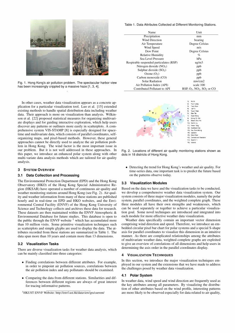
The rapid deterioration of the air quality in Hong Kong has arousedmuch attention [2]. The city is often cloaked in a heavy haze and thepicturesque skyline has been barely visible over the past few years (seeFig. 1). The hazy air not only affects people’s respiratory health andthe tourist industry, but also significantly reduces Hong Kong’s sus-tainable competitive advantages. A recent annual quality-of-life study[1, 4] suggested that serious air pollution has already made Hong Konga less attractive place for expatriates. Hypotheses including externalpollutants generated from mainland China, local pollution from toomany vehicles, the use of high-sulphur coal in power plants, and acurtain wall effect resulting from dense buildings have been proposed.
To study this issue, the Institute for the Environment of the HongKong University of Science and Technology has developed a compre-hensive atmospheric and environmental database on Hong Kong andthe surrounding regions. The institute attempts to study the correla-tions between different attributes concerning air quality with classicalanalysis techniques. Some interesting patterns have been found, butit is difficult to obtain convincing results for high-level correlationsthat cannot be computed with solely numerical methods. Visualizationtechniques are hence required to assist in detecting trends and similar-ities, and in spotting possible correlations between multiple attributeswhich are unique for certain regions only.
Weather data possesses some special features. Weather data areusually recorded by automatic meteorological stations located in rep-resentative regions at regular time intervals, thus the data are intrin-sically time-varying and contain inherited geographic information. Inaddition, weather data are typically multivariate and often consist ofmore than 10 dimensions. Wind speed and direction resulting in avector are two of the most important attributes in weather data, whichdifferentiates them from ordinary scalar multivariate data. These fea-tures, among others, make weather data visualization a challengingproblem, especially since traditional visualization techniques like scat-terplots and glyphs fail to achieve research goals.
In this case study, we integrate several well-established visualiza-tion techniques, namely the polar system, parallel coordinates, and theweighted complete graph, into a comprehensive system for weatherdata visualization and apply the system to analyze the air pollution
Manuscript received 31 March 2007; accepted 1 August 2007; posted online27 October 2007.For information on obtaining reprints of this article, please send e-mail to:[email protected].
problem in Hong Kong. Some novel techniques have been developedto address special challenges posed by weather data. In particular, weintroduce circular pixel bar charts to detect correlations between winddirection, wind speed, and other attributes. We demonstrate how vec-tors and multiple scalar attributes in weather data can be effectivelyvisualized by polar systems with embedded pixel bar charts and tai-lored parallel coordinates. The weighted complete graph is employedto reveal the overall correlation of all data dimensions and to deter-mine the order of axes in parallel coordinates. Based on our system,some interesting patterns have been detected by domain scientists andvaluable feedback about these visualization techniques is obtained.
The major contributions of this paper are as follows:
• We demonstrate how visualization can be used to attack a seriousmodern day issue. Domain scientists have gained new insightsinto the air pollution problem in Hong Kong with our advancedvisualization system. We limit our study to Hong Kong weatherdata but the basic system, techniques, and lessons learned can beapplied to general air quality analysis.
• We develop some novel methods to address special challengesposed by weather data, yet these novel methods are not limitedto weather data visualization. For example, polar systems withembedded circular pixel bar charts can be exploited to visual-ize other multivariate data with both scalar attributes and vectorfields. Weighted complete graphs can be used to determine theaxis order of general parallel coordinates.
The remaining parts of this paper are organized as follows. Sec-tion 2 reviews related work on weather data visualization. The systemoverview is then described in Section 3, followed by a detailed discus-sion of our approach to weather data visualization in Section 4. Theexperimental results and discussion are presented in Section 5. Finally,we conclude the paper in Section 6.
2 RELATED WORK
Weather data visualization is rarely considered a stand-alone problem.Instead, it is commonly addressed within the scope of multivariate datavisualization, which sometimes overlooks the uniqueness of weatherdata including important vector values and time-series nature.
Treinish [20, 21] has conducted various research works on weatherdata visualization but his approaches lean more toward scientific visu-alization rather than information visualization. Healey et al. [9] usednonphotorealistic brush strokes for visualizing multidimensional in-formation spaces like weather data. Tang et al. [19], on the other hand,applied a controllable texture synthesis technique to exploit naturaltextures for the same purpose. Although these methods yield effectiveand aesthetic results, they inevitably suffer from limited scalability asthe number of individual visual channels of textures is believed to bearound only three.
Fig. 1. Hong Kong’s air pollution problem. The spectacular harbor viewhas been increasingly crippled by a massive haze [1, 3, 4].
.
In other cases, weather data visualization appears as a concrete ap-plication for a particular visualization tool. Luo et al. [15] extendedexisting methods to handle spatial distribution data including weatherdata. Their approach is more on visualization than analysis. Wilkin-son et al. [22] proposed statistical measures for organizing multivari-ate displays and for guiding interactive exploration, which help usersdiscover any patterns or outliners more easily in scatterplots. A com-prehensive system VIS-STAMP [8] is especially designed for space-time and multivariate data, which consists of parallel coordinates, self-organizing maps, and pixel-based methods. However, these generalapproaches cannot be directly used to analyze the air pollution prob-lem in Hong Kong. The wind factor is the most important issue inour problem. But it is not well addressed in these approaches. Inthis paper, we introduce an enhanced polar system along with othermulti-variate data analysis methods which are tailored for air qualityanalysis.
3 SYSTEM OVERVIEW
3.1 Data Collection and Processing
The Environmental Protection Department (EPD) and the Hong KongObservatory (HKO) of the Hong Kong Special Administrative Re-gion (HKSAR) have operated a number of continuous air quality andweather monitoring stations around Hong Kong (see Fig. 2). Air qual-ity and weather information from many of these stations are publishedhourly and in real-time on EPD and HKO websites, and the Envi-ronmental Central Facility (ENVF) of the Hong Kong University ofScience and Technology collects and archives these data for research.These datasets are then maintained within the ENVF Atmospheric &Environmental Database for future studies. This database is open tothe public through the ENVF website 1 which has accumulated morethan 10 million visits. Some primitive visualization techniques suchas scatterplots and simple glyphs are used to display the data. The at-tributes recorded from these stations are summarized in Table 1. Thedata span more than 10 years and contain more than 13 dimensions.
3.2 Visualization TasksThere are diverse visualization tasks for weather data analysis, whichcan be mainly classified into three categories:
• Finding correlations between different attributes. For example,in order to pinpoint air pollution sources, correlations betweenthe air pollution index and any pollutants should be examined.
• Comparing the data from different stations. Similarities and dif-ferences between different regions are always of great interestfor tracing informative patterns.
Solar Radiation mw/cm2Air Pollution Index (API) scale 100
Contributed Pollutant to API RSP, O3, NO2, SO2 or CO
Fig. 2. Locations of different air quality monitoring stations shown asdots in 18 districts of Hong Kong.
• Detecting the trend for Hong Kong’s weather and air quality. Fortime-series data, one important task is to predict the future basedon the patterns observe today.
3.3 Visualization ModulesBased on the data we have and the visualization tasks to be conducted,we develop a comprehensive weather data visualization system. Oursystem consists of three major visualization modules, namely the polarsystem, parallel coordinates, and the weighted complete graph. Thesethree modules all have their own strengths and weaknesses, whichcan be used separately or together to achieve a particular visualiza-tion goal. Some novel techniques are introduced and integrated intoeach module for more effective weather data visualization.
Weather data specifically contain an important vector dimensioncomprising wind direction and speed. Therefore, we introduce an em-bedded circular pixel bar chart for polar systems and a special S-shapeaxis for parallel coordinates to visualize this dimension in an intuitivemanner. As there are complicated relationships among the attributesof multivariate weather data, weighted complete graphs are exploitedto give an overview of correlations of all dimensions and help users indetermining the axis order in the parallel coordinates display.
4 VISUALIZATION TECHNIQUES
In this section, we introduce the major visualization techniques em-ployed in our system and the extensions that we have made to addressthe challenges posed by weather data visualization.
4.1 Polar SystemIn weather data, wind speed and wind direction are frequently used asthe key attributes among all parameters. By visualizing the distribu-tion of other attributes based on the wind profile, interesting patternsare more likely to be observed especially for data related to air quality,
(a) (b) (c)
Fig. 3. Traditional polar system: (a) Encoding scheme; (b) Mappingradius without preserving the area; (c) Area-preserving polar system.Blue denotes low values and red denotes high values. The color bar isalso used for other figures.
where different pollutants are correlated with the wind in some ways.Therefore, we apply the polar system, one of the most common repre-sentations for vectors, to encode wind so that the principal wind speedand direction are shown in an intuitive manner.
Fig. 3 shows the encoding scheme of the initial polar system. Fora particular pixel on the polar plane, its distance from the center andthe angle spanning from the north encode wind speed and directionrespectively, while the pixel color encodes a third scalar attribute suchthat its relationship with wind speed and direction is clearly shown.To generate a more reliable representation for the underlying data, as acommon practice in the environmental field, an area-preserving map-ping should be applied on the distance from the center so that pointslocated closer to the center are not overcompressed (see Fig. 3(c)).The simplest measure is to take the square root of the linearly com-puted distance value.
To cope with higher dimensions, we introduce the circular pixel barchart which can be conveniently embedded into a polar system. Thecircular pixel bar chart is an extension to the pixel bar chart [13] whichis derived from the traditional histogram. Three more attributes maybe visualized with the x-position, y-position, and color of a pixel insidethe circular pixel bar chart.
The initial polar system first acts as a guideline for users to exploreother parameters based on the existing information provided. Whenusers are interested in data items lying within a certain range of winddirection and/or wind speed, they can select the respective sector onthe polar plane as described in Fig. 4. The wind information thenbecomes irrelevant and a circular pixel bar is produced only for dataitems falling within the sector of interest. A pixel bar is then bandedand placed in the sector region. The width and height of the originalpixel bar are then transformed to the arc and radius of the sector ac-cordingly, showing the range of wind direction and speed that the pixelbar sector occupied. The x-position, y-position, and pixel color in thiscircular pixel bar now can encode three additional attribute values. Forexample, from the original polar system, users may observe that theamount of sulphur dioxide (SO2) is remarkably high at a certain winddirection and wind speed. They may then further examine the temper-ature, amount of carbon dioxide (CO2), and nitrogen dioxide (NO2)for a higher level of correlation under those particular circumstances.It would be difficult to compute this kind of correlation by traditionalcorrelation measures alone as they are only found in a relatively smallsubset of the data. Nevertheless, it can be notably important as usersare more interested in extreme or abnormal cases in general.
Sometimes users may want to examine the pattern of a sectoragainst the overall one to see if the current sector exhibits similar orexceptional distribution with that of the complete dataset. We thus in-troduce a complementary circular pixel bar, which essentially encodesthe data falling outside the sector, blended underneath the in-range sec-tor. In effect, it highlights the selected data in the plot such that userscan obtain an overall picture for tracking any provocative behavior.Subsequently, there is no re-normalization in the sector as opposed tothe traditional pixel bar chart; data points are normalized based on thefull range of data attribute values.
(a) (b)
Fig. 4. Polar system with circular pixel bar: (a) A sector selected by auser and a circular bar chart embedded into the sector; (b) Blending ofcircular pixel bar for data falling in the sector against one for its comple-ment.
When the data size increases, multiple data items may feature iden-tical wind direction and speed, which are hence mapped onto the samepixel location in the polar system. The display would then becomecluttered and the overlapping of pixels may affect the accuracy of thevisualization. Data filtering and clustering can reduce the data size to amanageable level. For example, we may only show one representativepixel with the average value of all the data items having similar winddirection and speed. After users select a sector and zoom in, a cor-responding circular pixel bar chart will be drawn and the overlappingdata items are usually mapped to different pixels.
(a) (b)
Fig. 5. Comparing circular pixel bars with rectangular ones: (a) A po-lar system with multiple circular pixel bars; (b) Conventional pixel barsfor the sectors. The overall patterns are preserved in the sector forcomparison, and in-depth numerical analysis may be performed on thesupplement rectangular pixel bars.
A polar system with circular pixel bars is more favorable forweather data visualization than a basic pixel bar chart mainly dueto the unique vector information present in the weather data. Windspeed and direction are the major principal attributes from which fur-ther investigation begins. With circularly arranged pixel bars in a well-established polar system for handling vectors, the relationship betweenwind and individual attributes is clearly revealed. Such interaction alsoallows users to demand details for other parameters only on a subsetof the featured data they are interested in, so that the result is lessoverwhelming and distracting information is minimized. This is espe-cially important if multiple sectors are selected and compared by usersbecause the wind information for these sectors is presented simultane-ously in an intuitive manner (see Fig. 5(a)). One major concern forthe circular pixel bar chart is that the regular shape of the basic plot isdistorted, which may affect the accuracy of data analysis. To facilitatequantitative studies, the conventional rectangular pixel bars are alsoprovided alongside the polar system, as presented in Fig. 5(b).
Our polar system can also visually represent the time information ofthe data. In the circular pixel bar chart, time information such as hour,day, month, and year can be treated as additional attributes of the data.For example, we can simply use the x-category to encode year, thex-position to encode month, and the y-position to encode day. Thedata pattern against time is now clearly shown, helping users detect
(a) (b) (c)
Fig. 6. Polar system with time information: (a) x-position, y-position,and color of the sector indicate the month of observation, amount ofSO2, and temperature, respectively; (b) the x-position now representsthe day in which the entry was recorded; (c) the y-position now encodesthe day and the x-position encodes the month.
(a) (b) (c)
Fig. 7. Different layouts of parallel coordinates: (a) Traditional layout; (b)Circular layout; (c) S-style layout.
any significant distribution at a particular point in time (see Fig. 6).Moreover, users may specify the time interval into which they wish todivide the data and subsequent polar plots will be generated to showthe trend over time.
4.2 Parallel Coordinates
Parallel coordinates [11, 12] are powerful visual techniques where at-tributes are represented by parallel vertical axes. Each data item isrepresented by a polygonal line that intersects each axis at respectiveattribute data value. Parallel coordinates are also integrated into oursystem and several extensions have been made to improve their effec-tiveness for weather data visualization.
As discussed earlier, wind direction is one of the most importantattributes in air quality analysis. However, the vertical axis used intraditional parallel coordinates is not good at encoding directions (seeFig. 7(a)). To address this problem, we experimented with differentaxis styles for wind direction. The polar system is widely used to en-code wind. One scheme is to directly embed a polar system into theparallel coordinates (see Fig. 7(b)). However, the lines originatingfrom the left side of a polar system will also pass through the rightside, which causes ambiguity and/or too many crossing lines. The S-shape axis strikes an excellent trade-off (see Fig. 7(c)). It containssome characteristics of the polar system but can be naturally embed-ded into the parallel coordinates. In addition, as wind direction is animportant axis, the S-shape axis stands out among all axes to attractusers’ attention.
Parallel coordinates have been thoroughly studied and many excel-lent techniques are available in reducing visual clutter caused by nu-merous crossing lines [6, 23]. However, the detailed information ofthe data might be lost during the “clustering” or “summarization” pro-cesses. To mitigate this problem, we also draw a scatterplot aboveevery pair of neighboring axes for accurate quantitative analysis (seeFig. 8). Each line between the parallel axes then becomes a point inthe scatterplot. Because points use less space than lines, the overallvisual clutter is reduced.
4.3 Weighted Complete Graph
In our system, both polar systems and parallel coordinates can be usedto detect possible correlations between multiple attributes. However,
Fig. 8. Enhanced parallel coordinates with S-shape axis to encode winddirection and scatterplot to reveal bi-variate relationship between neigh-boring axes.
polar systems with embedded circular pixel bar charts can only re-veal the relationship between five dimensions while only correlationsbetween attributes represented by neighboring axes can usually be de-tected in parallel coordinates. Sometimes, users would want to knowthe overall relationship among all the data dimensions. In this paper,we propose a new technique, the weighted complete graph, as a guidemap for polar systems and parallel coordinates to display the relation-ship between dimensions at higher levels.
Recently, Sauber et al. [16] proposed multifield graphs as visualaids to intuitively provide information about the amount of correla-tions contained in each correlation field. However, one drawback ofthis technique is that the number of nodes in the graph grows expo-nentially with the dimensionality of the data. Although they proposedan optimal strategy to reduce the number of nodes to a certain degree,it is still not easy for users to perceive the correlation information ofall nodes at once.
In our weighted complete graph, each node represents one dimen-sion from the data and the weight of each edge encodes the correla-tion between the adjacent nodes. Compared with multifield graphs,the number of nodes in weighted complete graphs is greatly reduced.More over, the topology of the graph not only reveals the relationshipbetween any two dimensions, but also shows the overall relationshipamong all dimensions. The uses of the weighted complete graph inthe system are two-fold: to visualize the overview relationship amongthe dimensions, and to generate an optimized axis order for parallelcoordinates interactively or automatically.
4.3.1 Definition and Distance Metrics
In a complete graph, every pair of graph vertices is connected by anedge. A weighted complete graph is a complete graph where eachedge has an associated weight. In our application, we can use the nodeto represent the data attribute and the weight of the edge to encode thestrength of correlations between two nodes. The weight of the edge be-tween two nodes, which is the correlation strength, can be computedusing different metrics. There are several correlation measures avail-able for two variables. A common measure, called the correlation co-efficient, can detect linear dependencies for normally distributed data.Another metric, pointwise mutual information which is based on en-tropy, is able to find more general dependencies but at the cost of muchlonger computation time. After testing with various metrics, we finallyadopted the standard correlation coefficient in our system. The corre-lation between two dimensions Xi and X j is defined as
Cs(Xi,Y j) =‖(Xi−X i)(X j−X j)T ‖
((Xi−X i)(Xi−X i)T )12 ((X j−X j)(X j−X j)T )
12
(1)
4.3.2 Layout Optimization and Encoding Scheme
As viewers naturally interpret closely located nodes in a graph asstrongly related [7], we need a layout algorithm for all the nodes ina weighted complete graph so as to reflect the relationships of all di-mensions visually. Barnes and Hut [5] proposed a type of multi-scale
algorithm for the simulation of astronomical systems, and the algo-rithm was then introduced to the graph drawing field [18]. On theother hand, energy based methods are popular for creating straight-linedrawings of undirected graphs. Recently, Noack [17] proposed theedge-repulsion LinLog energy model whose minimum energy draw-ings reveal the clusters of the drawn graphs.
In our system, we use the LinLog energy model [17] with theBarnes-Hut algorithm to render weighted complete graphs. Theweight of each edge is computed by the correlation metric introducedin the previous section.
Fig. 9. Weighted complete graph: (a) Layout of weighted completegraph with node size encoding the accumulated correlation coefficientsand edge encoding the correlation between two nodes. Edges withsmall weights are removed for clarity. (b) Parallel coordinates with auser-chosen axis order based on the weighted complete graph; (c) Par-allel coordinates with a random axis order.
Furthermore, we introduce several encoding schemes to make theweighted complete graph drawing more meaningful and give a betteroverview of relationship information:First, we can use the size of a node to encode the accumulated corre-lations between this node and all other nodes. With this strategy, thearea of the node becomes proportional to the sum of the correlationmeasures between the node and the other nodes. Thus, a bigger nodemeans that the node has larger accumulated correlation measures andmay have a strong relationship with the other nodes.Second, we can set a threshold for the edge weight and remove alllow values and draw only the remaining ones to visually represent thestrength of correlations. The width of the edge encodes the absolutevalue of the correlation coefficient. Positive and negative correlationscan be differentiated using red edges and blue edges respectively. Thisfiltering strategy helps users locate strong correlations easily.
Our layout optimization algorithm can also be applied to a sub-graph. Sometimes users are just interested in the relationship amongcertain dimensions. In this circumstance, users can select certainnodes and the corresponding subgraph will be drawn using the lay-out algorithm (see Fig. 9(a)).
4.3.3 Axis Order Selection for Parallel Coordinates
In parallel coordinates, different orders of axes (each axis denotes onedimension in the multidimensional data) can reveal different aspectsof the dataset and the order in which the axes are drawn is criticallyimportant for effective visualization. Axes representing attributes withpotential correlation should be placed closely so that the relationshiphas a better chance of being revealed. The weighted complete graphcan show the overall relationships of all attributes and those attributeshaving strong correlations tend to appear closer in the graph. There-fore, the weighted complete graph can be applied to guide users inadjusting the axis order of parallel coordinates. The axis order can bedetermined manually, semi-automatically, or automatically. Becausethere are only about 13 dimensions in our data and the layout can beeasily grasped by users, our system thus provides a scheme for usersto manually choose the axis order of the parallel coordinates. Fig. 9shows an example of using a weighted complete graph to choose theaxis order for parallel coordinates.
(a)
(b) (c)
Fig. 10. Detecting the correlation between the Air Pollution Index (API)and other attributes when API is high: (a) Initial polar system withcolor denoting API value. The northwest sector is chosen, plotting RSPagainst solar radiation. (b) Plotting RSP against SO2 instead, high APIvalue (red pixels) are not found when SO2 is high, revealing SO2 con-tributed little to API. (c) Y-position now becomes O3 clearly correlatedwith API. For (b) and (c), suspicious clusters (blue clusters behind greenones) are shown.
Fig. 11. Detecting correlations of the same set of data by Parallel Coor-dinates, with color denoting API value.
5 EXPERIMENTAL RESULTS
The whole system is developed and installed on a Dell Precision mo-bile workstation M70 with 2 GB memory and a 256M Nvidia QuadroFX Go 1400 graphics card. The VTK library is used for rendering. Forall the experimental results in this section, interactive performance isachieved after the data are loaded into the memory.
5.1 Correlation DetectionIn the first set of examples, we tested the effectiveness of our methodon detecting correlations between different attributes of the weatherdata. Finding correlations between multiple attributes is always oneof the major visualization tasks for multivariate data visualization. Inthis section, we present how our system can assist users in detectinginformative correlations.
The example in Fig. 10 aims at finding the correlation between theAir Pollution Index (API) and other dimensions. Our polar plots canhelp users examine any possible correlations between wind direction,wind speed, and any three other attributes chosen by users. We wereonly interested in serious air pollution conditions, which can be se-lected by picking a relevant sector. The API shows no relationshipwith solar radiation (Fig. 10(a)). The pixel bar here shows that APIis highly correlated with Respirable Suspended Particulates (RSP). Infact, the positive correlations between the API with RSP and Ozone(O3) in Hong Kong are known to experts [10], which the polar systemdemonstrates in Fig. 10(c). In addition, Fig. 10(b) suggests that SO2,being mapped to the y-position, does not have a strong correlation withAPI though it is one of the major air pollutants taken into account forcomputing API. It has been known that the contribution of SO2 is neg-ligible compared with RSP and O3 in API calculation. Significantly,two distinct blue clusters in the two latter figures become visible. Therationale behind such findings is still unknown and it is worth furtherstudy in the environmental aspect.
Next we demonstrate how similar conclusions can be drawn fromthe data represented in parallel coordinates in Fig. 11. A gradual color
(a)
(b) (c)
Fig. 12. (a) Tracking the possible internal and external pollution sourcesthrough nine stations in the past three years. Pixel color represents theamount of SO2 recorded in each individual station. (b)-(c) The detailedplots for station Tung Chung and Kwai Chung respectively.
change is perceived at the axis for RSP and O3 as expected, indicat-ing they are positively correlated with API. In contrast, a group of redlines passing through the SO2 axis at a low value implies a high APIreading not necessarily attributed to a large amount of SO2. Moreover,the fact that the solar radiation and temperature are not related to APIis revealed by the messy colored lines found at their vertical axes. Al-though it is more difficult to assess the impact of wind direction andwind speed in parallel coordinates, it is more effective to explore thecorrelations between multiple dimensions than a polar system. For in-stance, NO2 and CO display some partial relationships in the graphthat are worth investigating in the future.
5.2 Similarities and Differences
Hong Kong society mostly weighs external factors in tackling the airpollution problem. Many believe that the source of air pollutantsare the factories on the Pearl River Delta, the manufacturing heart ofChina, located northwest of Hong Kong. Many very often ignore thepollution incurred locally. Other parties hold a conviction that the mo-nopolistic power plants, and the excessive number of vehicles and ves-sels are responsible for the poor air in Hong Kong. To judge the twoadverse statements, we first visualized the amount of sulphur dioxide(SO2) recorded by nine air-monitoring stations in Hong Kong for thepast three years in Fig. 12. As the energy sector and vehicular ex-haust are the two major emission sources of SO2, it may provide usclues on less apparent internal pollution. All of them exhibit a rela-tively high SO2 amount when the wind speed is high and originatingfrom the northwest direction. The high wind speed suggests that SO2is likely brought from the northwest region outside Hong Kong, whichcoincides with what most people suspect. Yet, much to our surprise,the station in Kwai Chung depicts a significantly different relationshipbetween SO2 and the wind. It recorded a large amount of SO2 evenwith a southwest wind regardless of the wind speed. This probablyimplies that the pollution should be closely related to internal factorsbecause the wind speed does not play any important role. Geographic
Fig. 13. Comparing two stations, Kwai Chung and Tung Chung withparallel coordinates using color to represent wind direction. Clusters ofwind direction records are found in Tung Chung station but not in KwaiChung.
location is then taken into consideration to explore the causes of theabnormal pattern to the southwest of Kwai Chung. It turns out that oneof the world’s busiest ports, the Kwai Tsing Container Terminal, is op-erating at the southwest of Kwai Chung. The local pollution observedcan hence be attributed to cargo ships frequently entering and leavingthe port. Although pollutants generated externally usually affect moststations, we should not overlook the internal factors that particularlycause severe air pollution in several districts with congested traffic onland or in the water.
For more in-depth analysis, we compared that Kwai Chung stationdata with another station to study how it behaves differently. In Fig.12(b), we chose the northwest of Tung Chung station which also reg-isters a high SO2 reading with sector selection and plotted the amountof SO2 against day with color encoding Air Pollution Index (API).The Kwai Chung data generally show a higher API value for higherrecorded SO2 values than the Tung Chung station. As we discussedin the previous section, SO2 is not the main pollutant contributing toAPI under normal circumstances, so it again suggests that the localpollution resulting from heavy SO2 emission by vessels is in fact adominating factor in the Kwai Chung region [14].
Fig. 13 compares two stations, Kwai Chung and Tung Chung, us-ing parallel coordinates. With the line color representing wind direc-tion, the relationship between wind direction and all other dimensionscan be easily reviewed. For example, at Kwai Chung, the API is notstrongly related to wind direction whereas at Tung Chung, clusters ofred and blue lines, representing winds from the north and northwest,can be seen at the API axis. Moreover, yellow and green lines thatdenote southwesterly winds are mainly connected to the lower APIvalue in Tung Chung. However, for Kwai Chung, the color spreadsdiversely and a noticeable number of yellowish lines marks the high-est API, which agrees with what we discovered from the polar system.Apart from that, these two stations experience fairly different distribu-tions for O3.
5.3 Time-Series TrendWeather essentially varies with time on a seasonal basis, and may alsosignify certain trends over time when the global climate is also takeninto account. Consequently, our system supports querying with timerange and is able to generate desired results based on user-defined timeintervals as shown in Fig. 14. In this example, data for three succes-sive years for three different stations are visualized with time intervalsset to six months. The two time periods, March to August and Septem-ber to February, display similar distributions over the past three years.The directions of the winds observed are also opposite, which is typ-ical in subtropical regions like Hong Kong which has distinguishableseasons. Furthermore, they also clearly show that the air quality isworse in the winter than in the summer.
Despite the fact that Hong Kong has experienced worse air qualityin recent years, these time-series sequences do not present any grow-ing trend in the API value. It is possible that the overall distributionremains rather constant and the variation that we are looking for issubtle and obscure. A more thorough investigation is then conductedfor spotting any minor abnormality by showing the detailed distribu-tion on a year-to-year basis with sector selection described in Fig. 15for Kwai Chung. The red pixels clearly stand out from the first pixelbar, suggesting that local pollution from SO2 emission was signifi-
Fig. 14. Visualizing time-series data. Each row is comprised of polarplots for different stations, namely Tung Chung, Yuen Long and MongKok, in different periods of time from March 2004 to March 2007 at in-tervals of six months. The pixel color denotes the Air Pollution Index(API).
Fig. 15. Time-series polar plots for Kwai Chung station focusing on theimpact of local pollution from the southwest direction. X-position, y-position, and color of the sector encode day, SO2, and API accordingly.Prominent red pixels are mainly seen in year 2004.
cant in 2004, while a slight improvement is observed in the followingyears, inferring that local pollution has become less dominating in thedistrict.
To visualize time-series data, we do not simply render a sequence ofparallel coordinates. Instead, we first apply the polar system for sam-pling and then add a time axis in the parallel coordinates to show thetime domain. As demonstrated in the previous examples, the polar sys-tem provides users an intuitive interface to select the data that they areinterested in for in-depth analysis. Although we supplied the pixel barfor viewing more attributes, it was not able to give a general overviewon every dimension in the data as parallel coordinates do. However,the major deficiency of parallel coordinates is that clustering and over-lapping become so severe that it is difficult to spot any interesting pat-terns. By combining the two techniques, unnecessary data items arefiltered, leaving the important time-series data effectively representedin parallel coordinates for detailed studies, as illustrated in Fig. 16(b).Users first selected the items with high RSP values, and then both theparallel coordinates and the weighted complete graph on this subsetwere shown for each year. The three weighted complete graphs in Fig.16(a) generally indicate persistent correlations among SO2, CO, RSP,and NO2. Another group of correlated dimensions formed by tempera-ture, solar radiation, and O3 is also found in the graphs. With the helpof the weighted complete graph (Fig. 16(a)) to arrange more corre-lated RSP, SO2, NO2, and CO closer together, one may quickly noticethat polylines for the year 2006 plot are clustered together for mostdimensions. Obviously, all three of them yield similar figures with thetemperature varying dramatically for 2006, in contrast to the data for
(a)
(b)
Fig. 16. 3-year time-series data of Yuen Long district that are con-strained to a range of wind speed and direction by sector selection:(a) Weighted complete graph for each year with edge width encodingthe correlation strength; (b) Parallel Coordinates with a time axis. Coloralso denotes time value for clarity.
2004 and 2005. In the display for 2004, unusual yellow lines are seenat high RSP and NO2 values, resulting in the largest API in this set ofdata. Such abnormalities are not found in the other results, which indi-cates that during this particular time in 2004, some mysterious factorscaused these unexpectedly high NO2 records. For O3, solar radiation,and temperature, they reveal a rather constant pattern through the firsttwo years, also seen from the weighted complete graphs, that theseparameters remain highly correlated throughout the two years whilea decreasing trend of O3 is observed when strong winds are blowingfrom the north.
5.4 DiscussionFrom the experiments, we can see that the three visualization tech-niques all have their advantages and disadvantages. The polar systemis good at revealing the correlation of the wind and another attribute.With the embedded circular pixel bar chart, at most five attributes canbe displayed to users. If users want to find the overall pattern for allattributes, parallel coordinates can be exploited. However, the effec-tiveness of parallel coordinates highly depends on the order of axes.To solve this problem, we compute a correlation value between ev-ery two dimensions. These dimensions and their correlation valuesthen naturally form a weighted complete graph. After filtering out theedges with low weights and computing the layout of the graph basedon a force model, the overall relationship of these dimensions can berevealed. Users will then have a big picture and can further explorethe details using the polar system and parallel coordinates. Therefore,these three visualization techniques can complement each another’sstrengths. Next we demonstrate how the three modules can be usedtogether to analyze the dimension correlations of the year 2006 data atthe Yuen Long station. Users first select a small sector of data fromthe polar system with high RSP under strong northwest wind. Then,based on the corresponding weighted complete graph in Fig. 17(a),we immediately observe some strong positive correlations among theupper attributes and negative correlations among the lower attributesin the graph. When the axes in parallel coordinates are ordered ac-cordingly, these relationships are shown clearly and visual clutters areminimized. While parallel coordinates are good at displaying the gen-eral correlations between multiple attributes, users may switch backto the polar system to plot these dimensions in the embedded pixel
(a)
(b)
Fig. 17. Using a weighted complete graph as a visual aid in explor-ing dimension correlations for year 2006 data of the Yuen Long station:(a) By arranging more correlated attributes together, positive and nega-tive correlations are clearly shown in the parallel coordinates; (b) Userscan also plot the attributes demonstrating interesting relationships in theweighted complete graph as the embedded pixel bar in the polar sys-tem.
bar for more quantitative analysis (Fig. 17(b)). The result suggeststhat the positive correlation between NO2 and RSP found in this sectoralso holds for the whole dataset by comparing with the complementaryplot underneath. On the other hand, the positive correlation betweensolar radiation and O3 is barely revealed as the distribution is ratherdispersed.
The system received very positive feedback from the domain sci-entists at the ENVF of the Hong Kong University of Science andTechnology (HKUST). Among the three modules, the domain scien-tists found that the enhanced polar system with embedded circular barcharts was the most useful one. The scheme is similar to their tradi-tional visual analysis method but nicely integrates several very use-ful techniques. The S-shape axis in the parallel coordinates has thecharacteristics of the polar system and makes wind direction standout among all axes. Therefore, it is readily accepted by them to en-code wind direction. Unlike the polar system, parallel coordinates canreveal all data attributes. However, they prefer to use scatter plotstogether with parallel coordinates because more accurate quantitativeanalysis can be conducted using scatter plots while parallel coordi-nates are good for qualitative analysis. The weighted complete graphcan visually show the results of the traditional linear correlation anal-ysis technique and surely provides a visual aid for users to choose theorder of parallel coordinates and guides users to explore the correla-tion of multiple dimensions using the polar system and parallel coor-dinates. To get the full potential of the weighted complete graph, thedomain scientists suggest that a more advanced nonlinear correlationmetric should be explored. This issue is worth further study.
6 CONCLUSIONS AND FUTURE WORK
In this paper we have presented a comprehensive system for weatherdata visualization. Many visualization techniques are integrated intoour system and several novel techniques are developed. Our systemhas been used to analyze the air pollution problem in Hong Kong andsome interesting patterns have been detected by the domain scientistsusing our system. In the future, we plan to continue our work withdomain scientists and make our system available to the public throughthe website of the ENVF at the HKUST.
ACKNOWLEDGEMENTS
The authors wish to thank Dr. Zibin Yuan at the Institute for the Envi-ronment of the Hong Kong University of Science and Technology forhis help in this project. The data used in this study were measured bythe Environmental Protection Department and the Hong Kong Obser-vatory of the Hong Kong Special Administrative Region. We wouldlike to thank the anonymous reviewers for their valuable comments.Shauna Dalton helped proofread the paper. This work was supportedby RGC grant CERG 618705.
REFERENCES
[1] Hong Kong’s air pollution hits the hightest in seven years. BBC Chinese,September 2002.
[2] Hong Kong’s bad air days. Cover Story, Time Asia, 13 December 2004.[3] Let there be light. Time Asia, 8 May 2006.[4] HK’s air pollution drags it down in eyes of expats, survey shows. South
China Morning Post, 15 March 2007.[5] J. Barnes and P. Hut. A hierarchical O(N log N) force-calculation algo-
rithm. Nature, 324(4):446–449, 1986.[6] M. de Oliveira and H. Levkowitz. From visual data exploration to visual
data mining: A survey. IEEE Transactions on Visualization and Com-puter Graphics, 19(3):378 – 394, 2003.
[7] E. Dengler and W. Cowan. Human perception of laid-out graphs. InProceedings of the International Symposium on Graph Drawing, pages441 – 443, 1998.
[8] D. Guo, J. Chen, A. M. MacEachren, and K. Liao. A visualization systemfor space-time and multivariate patterns (VIS-STAMP). IEEE Transac-tions on Visualization and Computer Graphics, 12(6):1461–1474, 2006.
[9] C. G. Healey, L. Tateosian, J. T. Enns, and M. Remple. Perceptually basedbrush strokes for nonphotorealistic visualization. ACM Trans. Graph.,23(1):64–96, 2004.
[10] J.-P. Huang, C. H. Fung, K. H. Lau, and Y. Qin. Numerical simulationand process analysis of typhoon-related ozone episodes in Hong Kong. J.Geophys. Res., 110, D5301, doi:10.1029/2004JD004914, 2005.
[11] A. Inselberg. Multidimensional visualization with applications to multi-variate problems. SIGGRAPH Course Notes, 2002.
[12] A. Inselberg and B. Dimsdale. Parallel coordinates: A tool for visualizingmultidimensional geometry. In Proceedings of the IEEE Symposium onVisualization, pages 361–378, 1990.
[13] D. A. Keim, M. C. Hao, and U. Dayal. Hierarchical pixel bar charts.IEEE Trans. Vis. Comput. Graph., 8(3):255–269, 2002.
[14] K.-H. Lau, W. M. Wu, C. H. Fung, R. C. Henry, and B. Barron. Sig-nificant marine source for SO2 levels in Hong Kong. Civic-exchangeEnvironmental and Conservation reports, 2005.
[15] A. Luo, D. Kao, and A. Pang. Visualizing spatial distribution data sets.Proceedings of the Symposium on Data visualisation, pages 29–38, 2003.
[16] H. T. Natascha Sauber and H.-P. Seidel. Multifield-graphs: An approachto visualizing correlations in multifield scalar data. IEEE Transactions onVisualization and Computer Graphics, 12(5):917 – 924, 2006.
[17] A. Noack. Energy-based clustering of graphs with nonuniform degrees.In Proceedings of the International Symposium on Graph Drawing, pages309–320, 2005.
[18] A. J. Quigley and P. Eades. Fade: Graph drawing, clustering, and visualabstraction. In Proceedings of the International Symposium on GraphDrawing, pages 197– 210, 2000.
[19] Y. Tang, H. Qu, Y. Wu, and H. Zhou. Natural textures for weather data vi-sualization. Proceedings of the International Conference on InformationVisualization, pages 741–750, 2006.
[20] L. A. Treinish. Multi-resolution visualization techniques for nestedweather models. Proceedings of IEEE Visualization, pages 513–516,2000.
[21] L. A. Treinish. Visual data fusion for applications of high-resolution nu-merical weather prediction. Proceedings of IEEE Visualization, pages477–480, 2000.
[22] L. Wilkinson, A. Anand, and R. Grossman. High-dimensional visual an-alytics: Interactive exploration guided by pairwise views of point distri-butions. IEEE Transactions on Visualization and Computer Graphics,12(6):1363–1372, 2006.
[23] J. Yang, W. Peng, M. O. Ward, and E. A. Rundensteiner. Interactivehierarchical dimension ordering, spacing and filtering for exploration ofhigh dimensional datasets. In Proceedings of the IEEE Symposium onInformation Visualization, pages 105 – 112, 2003.