Visual Composition Slideshow. TAYLER HUESER Composition is one of the most important features of a good photograph. A well-composed photograph is symmetrical, proportionate and well lit; in this sense, composition in photography is similar to "mis en scene" in film. However, composition standards are very high in photography, because photography is an exclusively visual medium. Guidelines for composition are naturally somewhat subjective; however, most photographers agree on a few basic ones. These guidelines are not rules and are not followed by all photographers.
Transcript
Visual Composition Slideshow.
TAYLER HUESER
Composition is one of the most important features of a good photograph. A well-composed photograph is symmetrical, proportionate and well lit; in this sense, composition in photography is similar to "mis en scene" in film. However, composition standards are very high in photography, because photography is an exclusively visual medium. Guidelines for composition are naturally somewhat subjective; however, most photographers agree on a few basic ones. These guidelines are not rules and are not followed by all photographers.
• Line are one of the basic elements of design. Alone or in combination with other lines or shapes they can aid in the readability, appearance and message of a design.
• Picture one was found at: http://www.photoble.com/photo-inspiration/a-line-up-of-20-interesting-line-photos
• Picture two was found at: http://www.photo-junkie.com/photography-tutorials/a-guide-to-leading-lines-in-photography/
These two photos demonstrate the principle of Line. Line is where there trying to guide your eyes to something in the
• Shape is one of the basic elements of design. Alone or in combination with other shapes or lines they can convey universal meanings as well as guide the eye or organize information.
• These two photos demonstrate the principle of Shape 2D. Shape 2D is where the picture is flat and used to show the basic shape of a square or even an animal.
• Picture one was found at: http://www.ebay.co.uk/itm/primary-educational-resource-NUMERACY-2D-shapes-poster-/350280903842
• Picture two was found at: http://stockazoo.com/vector_critters/animal-silhouette-vector-pack/
• Form is the three-dimensionality of an object. You can hold a form; walk around a form and in some cases walk inside a form.
• These two photos demonstrate the principle of Form 3D. Form 3D is where you can actually see the full figure of what it would look like fully complete. Shape 2D is the first step to making it a form 3D.
• Picture one was found at: http://4.bp.blogspot.com/_rjSmndKgJnA/TKMDN9gVgaI/AAAAAAAAAEo/XxHKcg7aBi8/s1600/xl_castle.jpg
• Picture two was found at: http://hdguru3d.com/wp-content/uploads/2012/01/ces.jpg
• There has been a tremendous amount of research on how color affects human beings some of this research suggest that men and woman may respond to colors differently.
• These two photos demonstrate the principle of color. Color is where their grouping a bunch of colors together to capture your attention and drag your eyes to the colors, and probably make you feel something with the colors. Like happiness.
• Picture one was found at: http://forum.graphicdesignblog.org/resources-f20/rainbow-photography-t101.html
• Picture two was found at: http://mylifemyidea.com/2011/12/photography/
• Texture is always a part of our designs whether intentional or not. It is the visual or tactile surface characteristics of a piece.
• These to pictures demonstrate the principle of texture. Texture is where your able to too see all the nicks and crannies that is one the picture, where your able to just feel the roughness(smoothness) on your hands.
• Picture one was found at: http://www.photopoly.net/25-stunning-texture-photographs/
• Picture two was found at: http://kaylamcclintock.wordpress.com/2011/10/20/photography-assignment-5-texture/
• We live in a three-dimensional word of depth. When we look around us, some things seem closer, some further away. The artist can also show the illusion of depth.
• These two photos demonstrate the principle of depth. Depth is taking a picture close up, but on an angle where the other half of the photo looks far from the part that’s close.
• Picture one was found at: http://www.orangeacid.net/blog/2007/01/09/my-ibanez-8-of-365
• Picture two was found at: http://dailydesigninspiration.com/photography/ivan-andreevich/depth/
• When light from a single direction(e.g. Our sun) hits an object, part of the object is in shadow. Light and dark areas within an image provide contrast that can suggest volume.
• These two photos demonstrate the principle of light. Light is where its shone at, it directs yours eyes to the main thing in the picture.
• Picture one was found at: http://digital-photography-school.com/14-tips-for-great-candlelight-photography
• Picture two was found at: http://webdesignledger.com/inspiration/30-magical-examples-of-natural-light-photography
• Since we cant actually show motion in a single image, we have to rely on “tricks” that cause the viewer to perceive motion.
• These two photos demonstrate the principle of Direction. Direction is where the picture is moving, but it focuses on just one thing, where it looks like its not moving, automatically making your eye look straight at that.
• Picture one was found at: http://www.wipeout44.com/tutorial/graphics/136_motion_photography_shutter_speeds.asp
• Picture two was found at: http://digital-photography-school.com/a-beginners-to-capturing-motion-in-your-photography
• Mass equals size. Each piece you create has a physical mass. • These two photos demonstrate the principle of Mass. Mass is where Mass equals
size. Each piece you see has a physical mass. Light the feathers, their just floating in the water, so they must be light, but where as the other photo we see that the man is sweating, so the weight must be heavy.
• Picture one was found at: http://cornfielddreams.blogspot.ca/2011/05/whos-seen-that-picture-of-man-with.html
• Picture two was found at: http://elizabethirvine.com/earth-angels-signposts-everyday-magic/feather-on-water
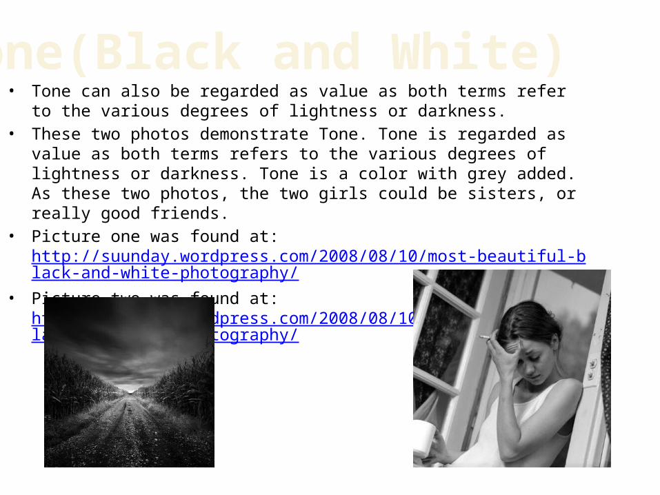
• Tone can also be regarded as value as both terms refer to the various degrees of lightness or darkness.
• These two photos demonstrate Tone. Tone is regarded as value as both terms refers to the various degrees of lightness or darkness. Tone is a color with grey added. As these two photos, the two girls could be sisters, or really good friends.
• Picture one was found at: http://suunday.wordpress.com/2008/08/10/most-beautiful-black-and-white-photography/
• Picture two was found at: http://suunday.wordpress.com/2008/08/10/most-beautiful-black-and-white-photography/
• Value refers to the relative lightness or darkness of a certain area. Value can be used for emphasis. Variations in value are used to create a focal point for the design of a picture.
• These two photos demonstrate the principle of value. Value is where the lightness and darkness of the certain are. Photo one represents happiness where the second photo can represent sorrow.
• Picture one was found at: http://www.picturecorrect.com/tips/understanding-exposure-value-in-photography/
• Picture two was found at: http://judithdenhollander.wordpress.com/category/photography/landscape-photography/
• Space is the area provided for a particular purpose. It may have two dimensions(length and width), such as a floor, or it may have three-dimensions (length, width, and height)
• These two photos demonstrate Space. Space is the area provided for a particular purpose, with the hands and the girl, they are positive, around them is the space, which is called negative.
• Picture one was found at: http://www.thejavajive.com/blog/indonesia/negative-space-positive-results/
• Picture two was found at: http://www.awakenthelightworker.com/
• These two photos demonstrate the principle of emphasis. Emphasis in design provides the focal point for the piece. It is a way of making the element that is most important stand out in design.
• Picture one was found at: http://www.ursispaltenstein.ch/blog/weblog.php?/weblog/comments/5274/
• Picture two was found at: http://nikicruzphotography.wordpress.com/
• News letters, magazines, brochures, annual reports, and books often have many visual elements: columns of text, headlines, photos, illustrations, pull-quotes, etc. Grids allow designer to build page-to-page consistency into these documents.
• These two photos demonstrate the principle of repetition, because the same object that is either stand still, or moving, has more then one image going at once.
• Picture one was found at: http://mapleleafs81.wordpress.com/2011/03/29/rule-of-thirds-point-of-interest-contrast-framing-viewpoint-and-repetition-and-patterns/
• Picture two was found at: http://www.betterphoto.com/gallery/dynoGall2.asp?catID=1011&pageID=2&rows=10&contestCatID=&camID=
• Contrast occurs when two elements are different. The greater the difference the greater the contrast. The key to working with contrast is to make sure the differences are obvious.
• This two photos demonstrate contrast. Contrast is where the greater the contrast, the greater the difference. As these two photos the house and the light hour are a lot greater then the contrast.
• Picture one was found at: http://electronics.howstuffworks.com/cameras-photography/tips/how-to-get-contrast-in-photography2.htm
• Picture two was found at: http://www.destination360.com/north-america/canada/nova-scotia/peggys-cove-lighthouse
• These two photos demonstrate the principle of Harmony. Harmony in paintings is the visually satisfying effect of combining similar, related elements. E.g. adjacent colors on the wheel, similar shapes etc.
• Harmony in painting is the visually satisfying effect of combining similar, related elements.
• Picture one was found at: http://www.benthic.ca/report.php?report=91• Picture two was found at:
• These two photos demonstrate the principle of proximity. Is one of the easiest ways to create a visual structure and give your piece an organized feel is too space items according to their relation to one another.
• Picture one was found at: http://myrtlebeachphotographer.net/myrtle_beach_photographer_contact.html
• Picture two was found at: http://thetension.blogspot.ca/2007_09_30_archive.html