96
Visual design The “look” of your interface
| Date post: | 22-Dec-2015 |
| Category: |
Documents |
| View: | 218 times |
| Download: | 3 times |
Visual design
The “look” of your interface

Who Needs Substance?

Graphic Design
The “look” of an interface or web site, as in “look and feel”
The overall set of images, colors, layouts, fontsConveys an impression, mood

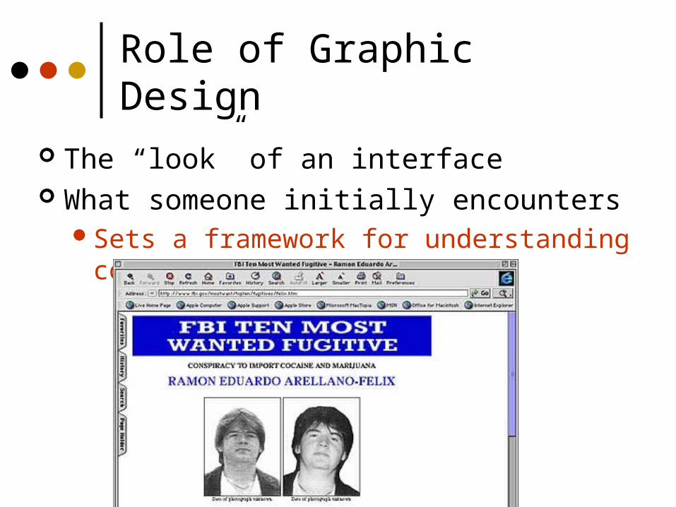
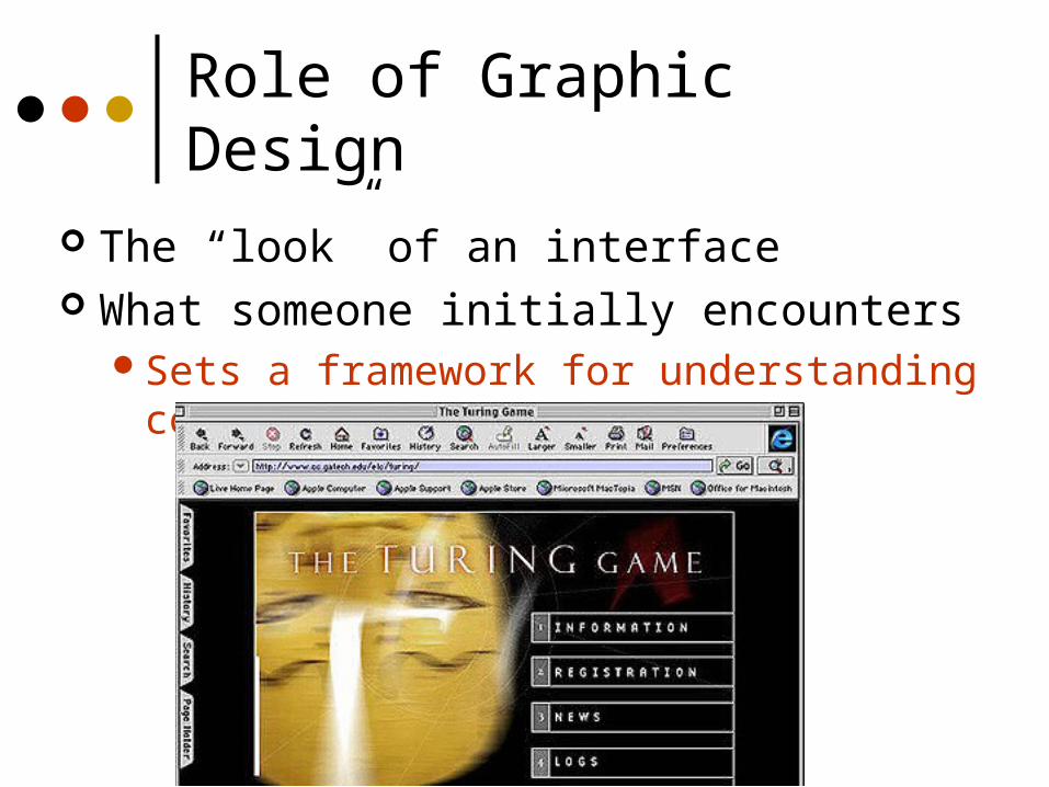
Role of Graphic Design
Create a “look,” an “impression” What someone initially encounters
Sets a framework for understanding content
Role of Graphic Design
The “look” of an interface What someone initially encounters
Sets a framework for understanding content

Role of Graphic Design
The “look” of an interface What someone initially encounters
Sets a framework for understanding content

Role of Graphic Design
The “look” of an interface What someone initially encounters
Sets a framework for understanding content
Role of Graphic Design
The “look” of an interface What someone initially encounters
Sets a framework for understanding content

Role of Graphic Design
The “look” of an interface What someone initially encounters
Graphic Design
It shares aspects of design practices in engineering and CS, but focuses on the cultural, symbolic & affective aspects.
“useful, usable, desirable”
Graphic Design
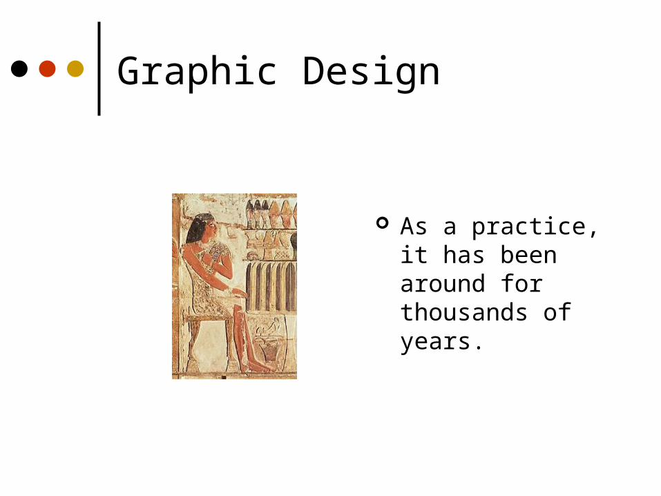
As a practice, it has been around for thousands of years.

Graphic Design
With the industrial revolution, art and design began to diverge
Design for mass-production - of printing, of artifacts
Graphic Design
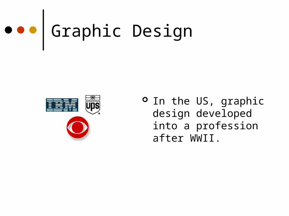
In the US, graphic design developed into a profession after WWII.

Graphic Design
Relies on a BALANCE and integration of:
Objective: relies on quantitative studies, like usability testing Does the “look” work?

Graphic Design
Subjective: “look” relies on subjective judgment by experts, and depends on contextual factors

Graphic Design
Subjective: “look” is contextual, based on culture Culture is learned Cultural meanings change There can be multiple meanings
Uniqueness is valued (not programmable)
You cannot empirically measure the subjective aspects, but there is a discipline to its study
Graphic Design
Is rigorous in its own realm
Knowing graphic design principles will:Enhance your ability to communicate
w/designersEnable you to create more user-
friendly interfaces

Design Philosophies
One point of view:Economy of visual elementsLess is moreClean, well organizedForm follows function – Bauhaus

Graphic Design
Involves knowledge of:SequencingOrganizationLayoutImageryColorTypography

Graphic Design Principles
Metaphor Clarity Consistency Alignment Proximity Contrast

Metaphor
Tying presentation and visual elements to some familiar relevant itemse.g., Desktop metaphor
If you’re building an interface for a grocery application, maybe mimic a person walking through a store with a cart

Example
www.worldwidestore.com/Mainlvl.htm
Overdone?
Clarity
Every element in an interface should have a reason for being thereMake that reason clear too!
Less is more
Clarity
White spaceLeads the eyeProvides symmetry and balance
through its useStrengthens impact of messageAllows eye to rest between elements
of activityUsed to promote simplicity, elegance,
class, refinement
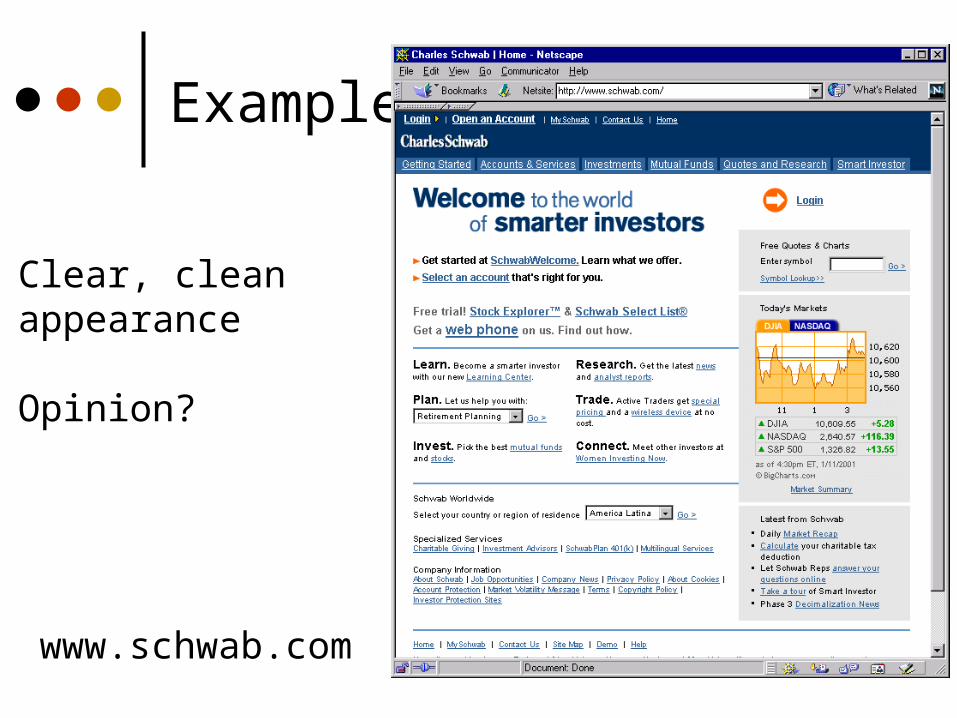
Example
www.schwab.com
Clear, cleanappearance
Opinion?

Example
Clear, cleanappearance
Opinion?
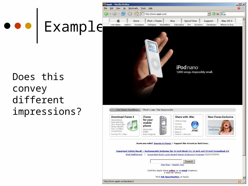
Example
Does this convey different impressions?
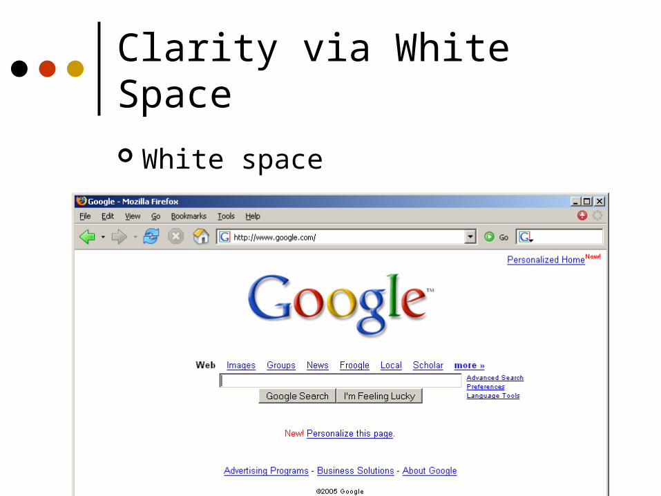
Clarity via White Space
White space

Clarity via “White” Space
White = Open
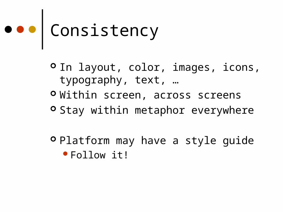
Consistency
In layout, color, images, icons, typography, text, …
Within screen, across screens Stay within metaphor everywhere
Platform may have a style guideFollow it!

Example
Home page Content page 1 Content page 2
www.santafean.com

Alignment
Western worldStart from top left
Allows eye to parse display more easily
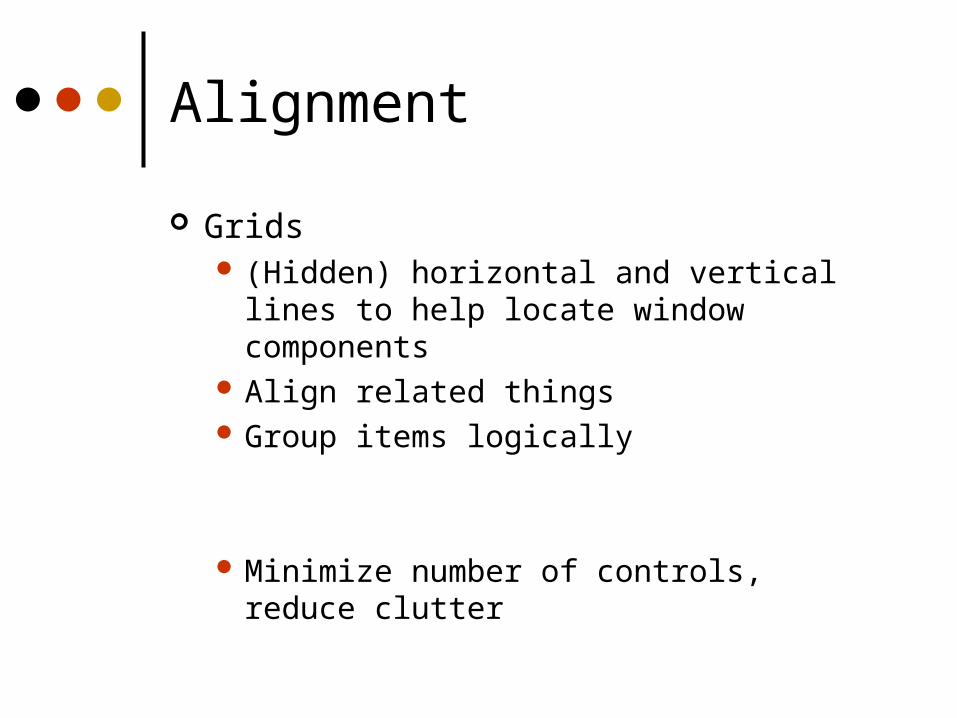
Alignment
Grids (Hidden) horizontal and vertical lines to help
locate window components Align related things Group items logically
Minimize number of controls, reduce clutter

Alignment
Grids - use them

Grid Example

Alignment
Left, center, or right
Choose one, use it everywhere
Novices often center thingsNo definition, calm, very formal
Here is somenew text
Here is some
new text
Here is some
new text
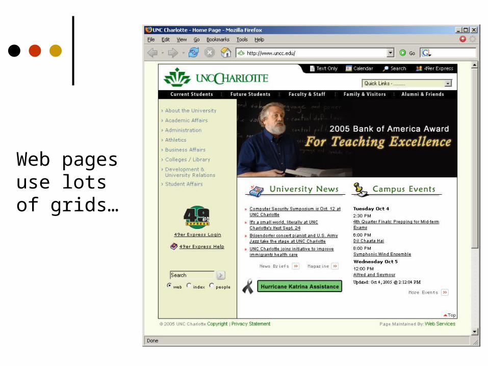
Web pages use lots of grids…

Proximity
Items close together appear to have a relationship
Distance implies no relationship
Time:
Time

Example
Name
Addr1
Addr2
City
State
Phone
Fax
Name
Addr1Addr2
CityState
PhoneFax
Name
Addr1Addr2
CityState
PhoneFax

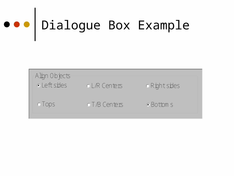
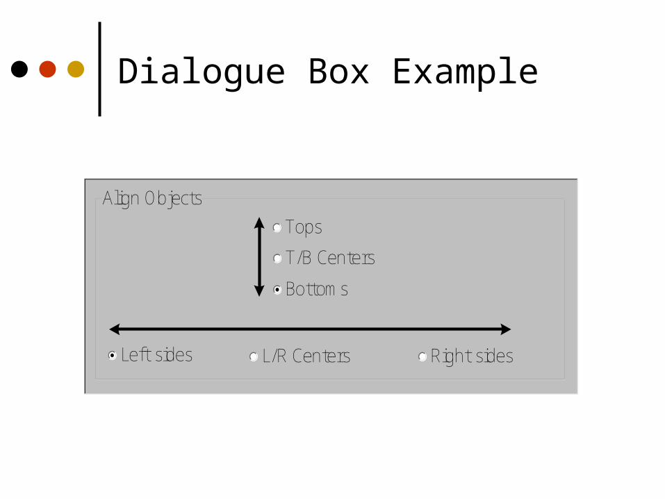
Alignment: Dialogue Box Example
Align ObjectsLeft sides L/R Centers Right sides
Tops T/B Centers Bottoms
Dialogue Box Example
Align ObjectsLeft sides L/R Centers Right sides
Tops T/B Centers Bottoms

Dialogue Box Example
Align ObjectsLeft sides L/R Centers Right sides
Tops T/B Centers Bottoms
Dialogue Box Example
Align Objects
Left sides L/R Centers Right sides
Tops
T/B Centers
Bottoms

Contrast
Pulls you in Guides your eyes around the interface Supports skimming
Take advantage of contrast to add focus or to energize an interface
Can be used to distinguish active control

Contrast
Can be used to set off most important itemAllow it to dominate
Ask yourself what is the most important item in the interface, highlight it
Use geometry to help sequencing

Example
www.delta.com
Importantelement

UI Exercise
Look at interface and see where your eye is initially drawn (what dominates?)
Is that the most important thing in the interface?
Sometimes this can (mistakenly) even be white space!
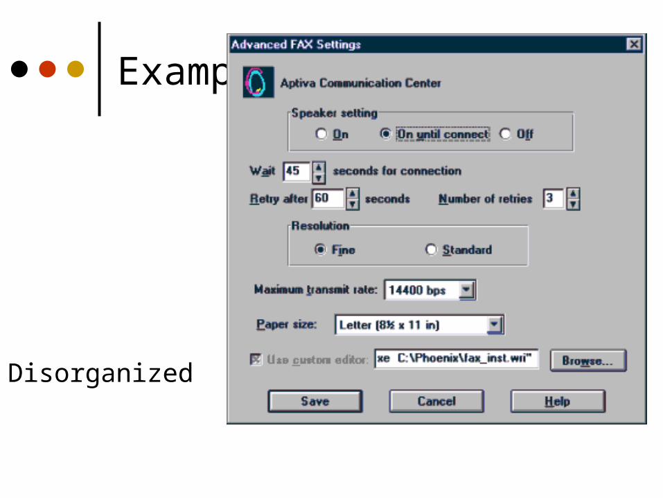
Example
Disorganized

Example
Visual noise

Example
Overuse of3D effects
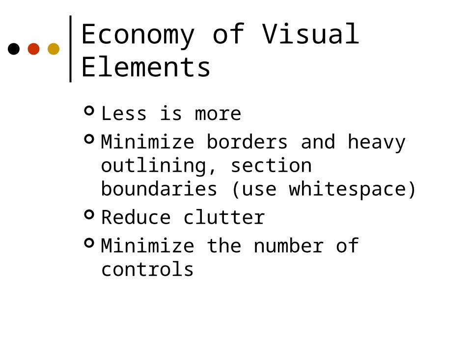
Economy of Visual Elements
Less is more Minimize borders and heavy outlining,
section boundaries (use whitespace) Reduce clutter Minimize the number of controls

Coding Techniques
BlinkingGood for grabbing attention, but use
very sparingly Reverse video, bold
Good for making something stand outAgain, use sparingly

Hue basic color, pigment
Saturation relative purity, brightness,
or intensity of a color Value
lightness or darkness of a color
Most commonly-used model
Characterizing Color - HSV Model
Image from: Adventures in HSV Space, Darrin Cardani, [email protected]

Hue Wavelength (red, green, yellow, blue) Spectrum (VIBGYOR)
Saturation Pastel versus strong (baby blue, sky blue, royal blue)
Value amount of energy (white, light gray, dark gray, black) Usually V = 0.299*R + 0.587*G + 0.114*B
HSV Color Model

HSV Color Space
Typical color selection tools

Color – Reflected and Emitted We see the world via reflected color: light
strikes a surface and is reflected to our eyes – properties of surface dictate color (printers, objects)Subtractive color model - Cyan Magenta
Yellow primaries
Colors on CRT are emitted: light is generated by phosphors and emittedAdditive color model - Red Green Blue
primaries

Color
Use it for a purpose, not to just add some color in

Color Guidelines
Use color sparingly--Design in b/w then add color where appropriate
Use color to draw attention, communicate organization, to indicate status, to establish relationships
Avoid using color in non-task related ways
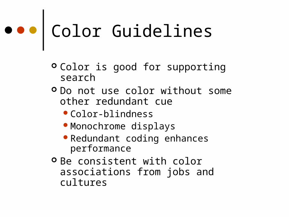
Color Guidelines
Color is good for supporting search Do not use color without some other
redundant cueColor-blindnessMonochrome displaysRedundant coding enhances
performance Be consistent with color associations
from jobs and cultures
Color Guidelines
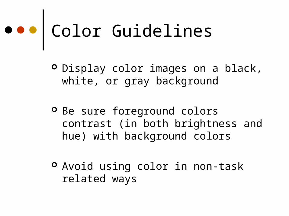
Display color images on a black, white, or gray background
Be sure foreground colors contrast (in both brightness and hue) with background colors
Avoid using color in non-task related ways

How many small ovals?
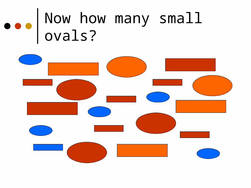
Now how many small ovals?

Visual Exercise
How many small objects? How many rectangles? How many orange objects?

How Many Small objects?

How Many Rectangles?
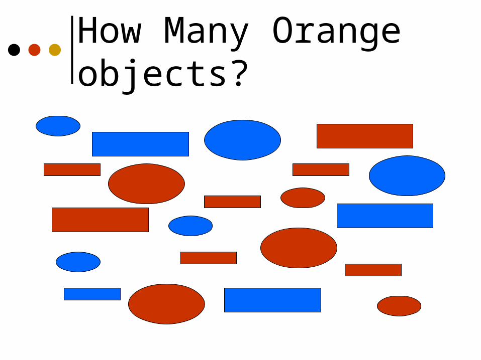
How Many Orange objects?
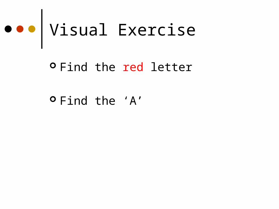
Visual Exercise
Find the red letter
Find the ‘A’
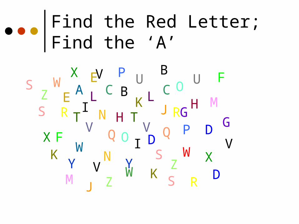
Find the Red Letter; Find the ‘A’
V
RZ
M
F
G
Q
J
C
T
D
W
WP
KV
L
H
IN
E B
S
U O
X
Y
VR
Z
M
F
GQ
J
C
TD
W
AP
K
V
L HI N
E B
S
U
O
XY
RZ
D
K
S WV
S
X
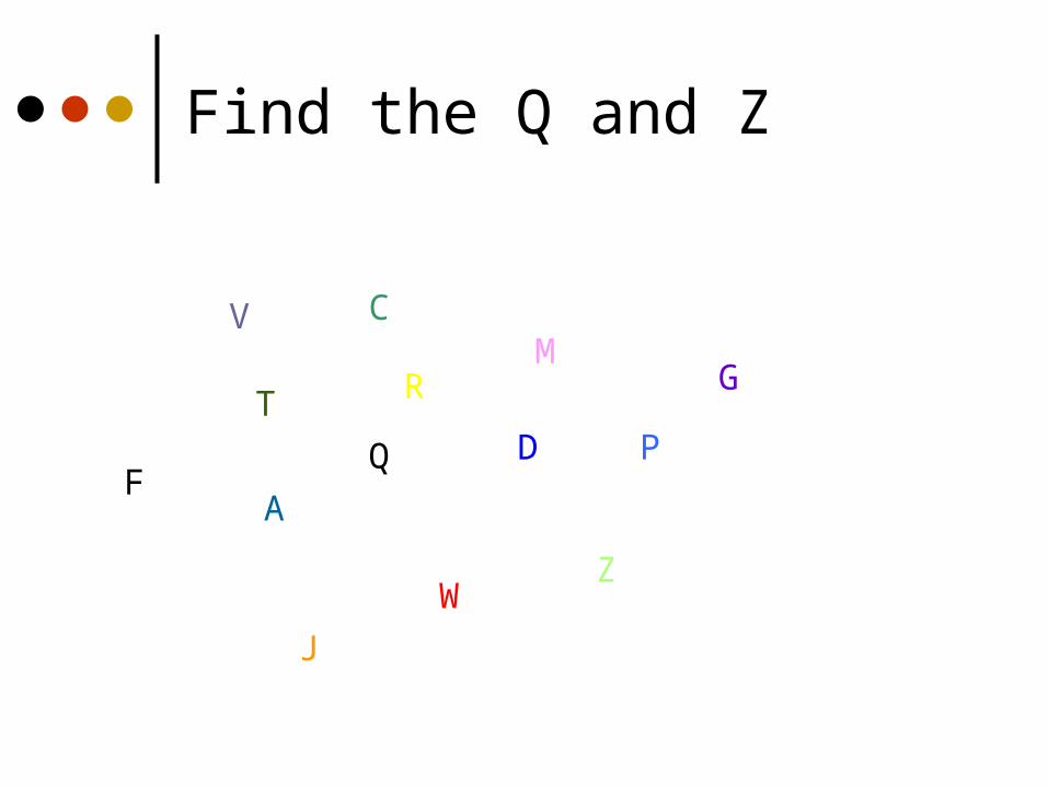
Find the Q and Z
V
R
Z
M
F
G
Q
J
C
TD
W
A
P
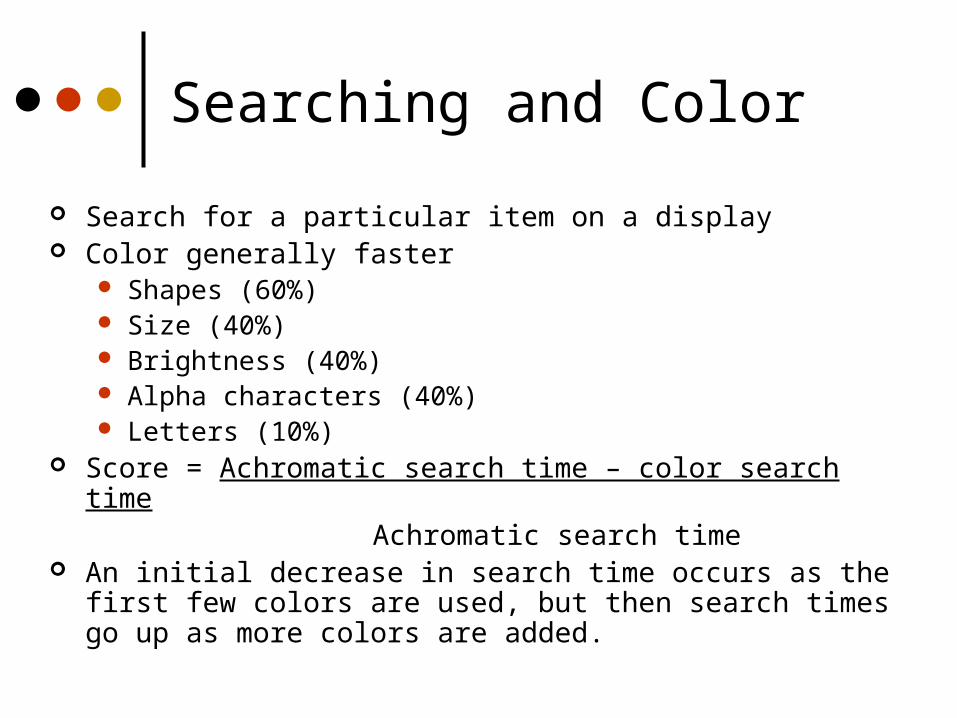
Searching and Color
Search for a particular item on a display Color generally faster
Shapes (60%) Size (40%) Brightness (40%) Alpha characters (40%) Letters (10%)
Score = Achromatic search time – color search timeAchromatic search time
An initial decrease in search time occurs as the first few colors are used, but then search times go up as more colors are added.
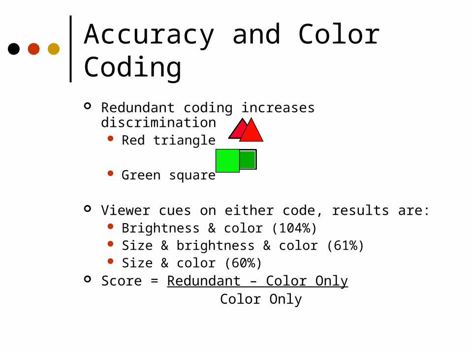
Accuracy and Color Coding
Redundant coding increases discrimination Red triangle
Green square
Viewer cues on either code, results are: Brightness & color (104%) Size & brightness & color (61%) Size & color (60%)
Score = Redundant – Color Only Color Only

Color Guidelines
To express difference, use high contrast colors (and vice versa)
Make sure colors do not “vibrate”
These colors vibrate: they willgive you a headache
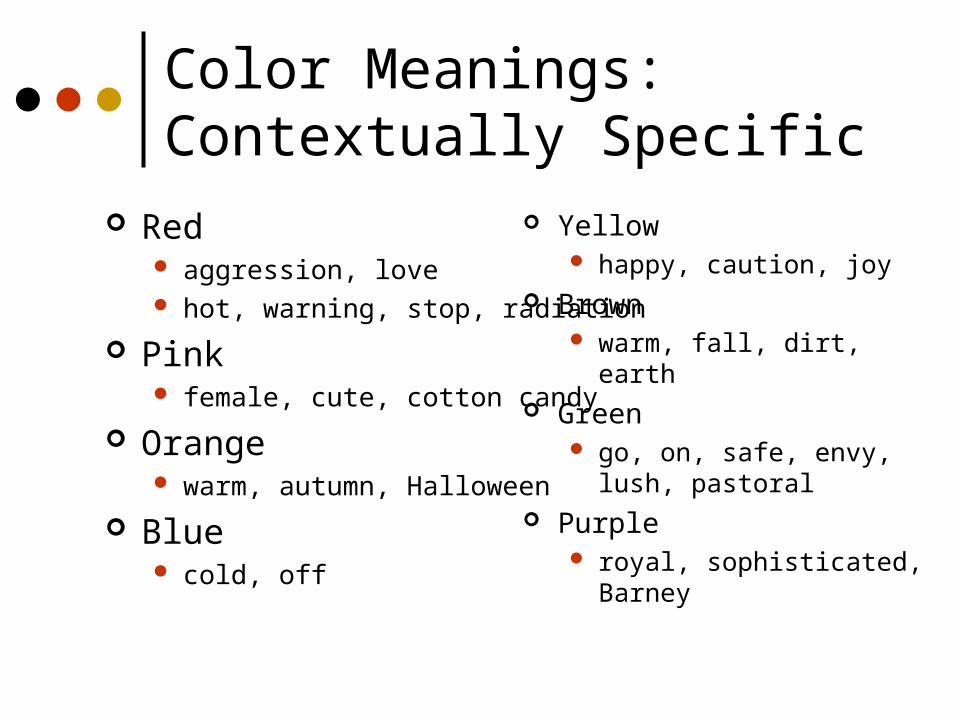
Yellow happy, caution, joy
Brown warm, fall, dirt, earth
Green go, on, safe, envy, lush,
pastoral Purple
royal, sophisticated, Barney
Color Meanings: Contextually Specific
Red aggression, love hot, warning, stop, radiation
Pink female, cute, cotton candy
Orange warm, autumn, Halloween
Blue cold, off

Color Meanings: Culturally Specific
http://www.ricklineback.com/culture2.htm
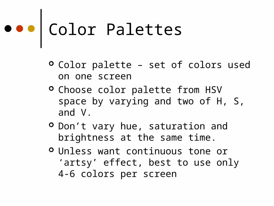
Color Palettes
Color palette – set of colors used on one screen
Choose color palette from HSV space by varying and two of H, S, and V.
Don’t vary hue, saturation and brightness at the same time.
Unless want continuous tone or ‘artsy’ effect, best to use only 4-6 colors per screen

Color Palettes/Suites
Designers often pick a palette of 4 or 5 colors
Variations of 2 colors
Monochromatic (variations of 1 color)
Southwestern (culturally evocative)

Color Palettes Use of pastels and primaries Varyies all of hue, saturation and value

Color Palettes Redesign increased saturation of blue All colors are primary

Effect of Colored Text on Colored Background
Black text on red
Gray text on red
Yellow text on red
Light yellow text on red
Green text on red
Light green text on red
Blue text on red
Pale blue text on red
Dark red text on red
Red text on red
Rose text on red
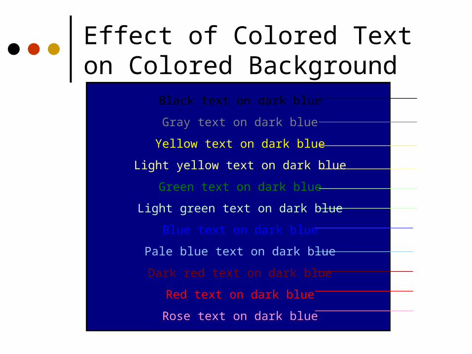
Effect of Colored Text on Colored Background
Black text on dark blue
Gray text on dark blue
Yellow text on dark blue
Light yellow text on dark blue
Green text on dark blue
Light green text on dark blue
Blue text on dark blue
Pale blue text on dark blue
Dark red text on dark blue
Red text on dark blue
Rose text on dark blue

Effect of Colored Text on Colored Background
Not enough contrast between blue text and grey, textured background Inconsistency may cause user to puzzle over icons being different sizes

Effect of Colored Text on Colored Background
Substituted black text for blue Increased contrast
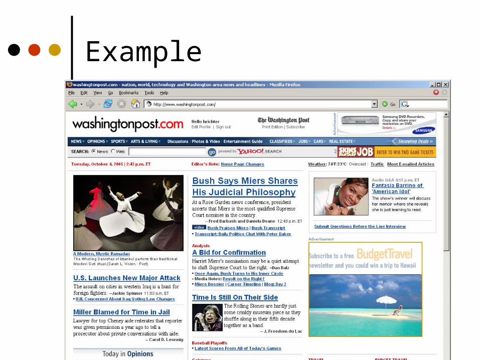
Match your interest, find out what’s new online, discover our most loved services, and make your time online fun and informative. Start by clicking on “A Letter from Steve”, and come back to explore the other areas featured here.

Typography
Characters and symbols should be easily noticeable and distinguishableAvoid heavy use of all upper caseStudies have found that mixed case
promotes faster reading
HOW MUCH FUN IS ITTO READ ALL THIS TEXTWHEN IT’S ALL IN CAPITALS AND YOUNEVER GET A REST
How much fun is itto read all this textwhen it’s all in capitals and younever get a rest

Typographical Hierarchy
This is a level 1 heading
This is a level 2 heading
This is a level 2 heading
This is a level 3 heading
This is a level 2 heading
Example

Icon Design
Represent object or action in a familiar and recognizable manner
Limit number of different icons Avoid excessive detail Make icon stand out from background
Icon Design
Relies on drawing ability – hire someone to do it (there are standards and ways to critique icon design)
Avoid meaningless, gratuitous use of icons
Too many icons quickly become illegible

Icon Design
What do each of these signify?
Almost always want to accompany your iconsby a text label

Use a Graphics Alphabet
Use a basic graphics alphabet from which to form icons

Use a Graphics Alphabet Icons created from the graphics alphabet

What do these icons mean?
Icons should be recognizable, memorable, and discriminable
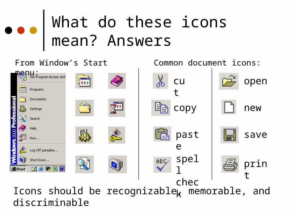
What do these icons mean? Answers
cut
copy
paste
spell check
save
new
open
From Window’s Start menu:
Common document icons:
Icons should be recognizable, memorable, and discriminable
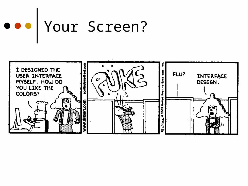
Your Screen?

Remember
Form follows functionVisual elements should help convey
purpose and meaning Be consistent Just like all design – iterate and get
feedback!!

Let’s critique…

Coming up…
Poster session No class next Tuesday – fall break Project part 2 due one week at
NOON! Midterm in less than two weeks.


