36
VISUAL ID ENTITY GUIDE XA00079320
VISUAL
IDENTITY
GUIDE
XA00079320

3
Table of contents
Introduction 4
The philosophy behind ESAB’s visual identity 5
Visual signals 5
The logotype 6
House colours 7
Using trademarks 8
Typography 9
Stationery/letterheads 10
Stationery/order confirmations, invoices and other documents 11
Forms, fax paper, business cards, envelopes and labels 12
E-mail, intranet and Internet 13
Information sheets and presentation material 14
Covers, binders and folders 15
Printed matter 16-19
Instruction books, catalogues and so on 20
Product catalogues 21
Company periodicals 22
Sales campaign and advertising material 23
Advertisements 24-25
Spare parts, wear parts and accessories 26-27
Welding and cutting equipment 28
Consumables packaging 29
Flags 30
Vehicles 30
Signs 31
Exhibitions 32
Merchandise/displays 33
Give-aways 34
Order forms 35
Useful information 36
○ ○ ○ ○ ○ ○ ○ ○ ○ ○ ○ ○ ○ ○ ○ ○ ○ ○ ○ ○ ○ ○ ○ ○ ○ ○ ○ ○ ○ ○ ○
○ ○ ○ ○ ○ ○ ○ ○ ○ ○ ○ ○
○ ○ ○ ○ ○ ○ ○ ○ ○ ○ ○ ○ ○ ○ ○ ○ ○ ○ ○ ○ ○ ○ ○ ○ ○ ○ ○ ○ ○ ○
○ ○ ○ ○ ○ ○ ○ ○ ○ ○ ○ ○ ○ ○ ○ ○ ○ ○ ○ ○ ○ ○ ○ ○ ○ ○ ○ ○ ○ ○
○ ○ ○ ○ ○ ○ ○ ○ ○ ○ ○ ○ ○ ○ ○ ○ ○ ○ ○ ○ ○ ○ ○ ○ ○ ○ ○ ○ ○
○ ○ ○ ○ ○ ○ ○ ○ ○ ○ ○ ○ ○ ○ ○ ○ ○ ○ ○ ○ ○ ○ ○ ○ ○ ○ ○
○ ○ ○ ○ ○ ○ ○ ○ ○ ○ ○ ○ ○ ○ ○ ○ ○ ○ ○ ○ ○ ○ ○ ○ ○ ○ ○ ○ ○ ○ ○
○ ○ ○ ○ ○ ○ ○ ○ ○ ○ ○ ○ ○ ○ ○ ○ ○ ○ ○ ○ ○ ○ ○ ○ ○
○ ○ ○
○ ○ ○ ○ ○ ○
○ ○ ○ ○ ○ ○ ○ ○ ○ ○ ○ ○ ○ ○ ○ ○ ○ ○ ○ ○ ○ ○
○ ○ ○ ○ ○ ○ ○ ○ ○ ○ ○ ○
○ ○ ○ ○ ○ ○ ○ ○ ○ ○ ○ ○ ○ ○ ○ ○ ○ ○ ○ ○ ○ ○
○ ○ ○ ○ ○ ○ ○ ○ ○ ○ ○ ○ ○ ○ ○ ○ ○ ○ ○ ○ ○ ○ ○ ○ ○ ○ ○ ○ ○
○ ○ ○ ○ ○ ○ ○ ○ ○ ○ ○ ○ ○ ○ ○
○ ○ ○ ○ ○ ○ ○ ○ ○ ○ ○ ○ ○ ○ ○ ○ ○ ○ ○ ○ ○ ○ ○ ○ ○ ○
○ ○ ○ ○ ○ ○ ○ ○ ○ ○ ○ ○ ○ ○ ○ ○ ○ ○ ○ ○ ○ ○ ○ ○ ○
○ ○ ○ ○ ○ ○ ○ ○ ○ ○ ○ ○ ○ ○
○ ○ ○ ○ ○ ○ ○ ○ ○ ○ ○ ○ ○ ○ ○ ○ ○ ○ ○ ○ ○ ○ ○ ○ ○ ○ ○ ○ ○
○ ○ ○ ○ ○ ○ ○ ○ ○ ○ ○ ○ ○ ○ ○
○ ○ ○ ○ ○ ○ ○ ○ ○ ○ ○ ○ ○ ○ ○ ○ ○ ○ ○ ○
○ ○ ○ ○ ○ ○ ○ ○ ○ ○ ○ ○ ○ ○ ○ ○ ○ ○ ○ ○ ○ ○ ○
○ ○ ○ ○ ○ ○ ○ ○ ○ ○ ○ ○ ○ ○ ○ ○ ○ ○ ○ ○ ○ ○ ○ ○ ○ ○ ○ ○ ○ ○ ○ ○ ○ ○
○ ○ ○ ○ ○ ○ ○ ○ ○ ○ ○ ○ ○ ○ ○ ○ ○ ○ ○ ○ ○ ○ ○ ○ ○ ○ ○ ○ ○ ○ ○ ○ ○
○ ○ ○ ○ ○ ○ ○ ○ ○ ○ ○ ○ ○ ○ ○ ○ ○ ○ ○ ○ ○ ○ ○ ○ ○ ○ ○ ○ ○ ○ ○ ○ ○ ○
○ ○ ○ ○ ○ ○ ○ ○ ○ ○ ○ ○ ○ ○ ○ ○ ○ ○ ○ ○ ○ ○ ○ ○ ○ ○ ○ ○ ○ ○ ○
○ ○ ○ ○ ○ ○ ○ ○ ○ ○ ○ ○ ○ ○ ○ ○ ○ ○ ○ ○ ○ ○ ○ ○ ○
○ ○ ○ ○ ○ ○ ○ ○ ○ ○ ○ ○ ○ ○ ○ ○ ○ ○ ○ ○ ○ ○ ○ ○ ○ ○ ○ ○ ○ ○ ○
○ ○ ○ ○ ○ ○ ○ ○ ○ ○ ○ ○ ○ ○ ○ ○ ○ ○ ○ ○ ○ ○ ○ ○ ○ ○ ○ ○ ○ ○ ○
○ ○ ○ ○ ○ ○ ○ ○ ○ ○ ○ ○ ○ ○ ○ ○ ○ ○ ○ ○ ○ ○ ○ ○ ○ ○ ○

4
Strengthening ESAB’s visual identity
In our business environment, goodwill, such as the company name and itslogotype, can be expressed in terms of trust, confidence and acceptance onthe one hand and the customer’s signature in the order book on the other.Contradictions in the first can have serious negative effects on the second.This explains why the importance of what we say and how we say it, whatwe do and the way we do it can never be over-emphasised.
This is what identity and communicating with people is all about and itapplies in particular to the visual aspects of our identity. They put the wordswe say on record, with the formal support of our corporate trademark.
”A product is something that is made in a factory; a brand is something thatis bought by a customer. A product can be copied by a competitor; a brandis unique. A product can be quickly outdated; a successful brand istimeless.”
This is why it is extremely important that all the units within the ESAB groupof companies consistently present the same visual identity all over the world.
Conflicting impressions create confusion, weakness and uncertainty.Consistency, on the other hand, creates harmony, strength and confidence.It also produces the advantages which result from standards being appliedby a top-class organisation. ESAB can only maintain its leading position byworking according to these standards through every available communi-cation channel, such as brochures, advertisements, stationery, Web sites,signs and so on.
This revised visual identity guide is designed to help us achieve the bestpossible effect in every visual and communication activity and to do so in apractical and rational manner. All companies within ESAB are instructed tofollow the rules and recommendations in this guide to guarantee themaximum goodwill in the marketplace.
No deviations from these rules and standards are permitted. Any requests tomake changes or modifications must be approved by the MarketCommunication Department at ESAB AB in Göteborg.
Atlanta, March 2000
Ray HoglundPresident and Chief Executive

5
The philosophy behind ESAB’s visualidentityThe shortest route to fast and effective communication issimplicity and consistency of graphic design. The visualsignal must be free from trend-oriented graphic “ornaments”.
ESAB’s basic identity from the 1980s has a simplicity interms of both colour scheme and graphic design. The housecolour was chosen with care and, after many tests, yellowwas found to be the best. It triggers positive associations, itis trendless and, in combination with black, it emits verypowerful identity signals, in what are frequently muddled andconfused workshop settings.
Visual signalsWe have to put the different visual signals on consumablespackaging and machines in order of importance. Theprincipal signal is the ESAB logotype. On packaging, it isfollowed by ISO and RESY labels. We have done this tofacilitate the visual communication and to guide the reader’seye to the point we have chosen. There are no OK, ISO orRESY labels on machinery, so the order is the ESABlogotype, followed by the product name and electrical/mechanical symbols.
Yellow and black is the best colour combination when itcomes to visibility, readability and attracting attention.The powerful ESAB signal transmitted by the combination ofyellow and black must not be reduced or weakened byadding other distracting colours or graphic elements (stripes,dots, borders and so on) which quickly become “outdated”,as well as disrupting the visual signal. This is one of theprerequisites for a consistent graphic identity and it issomething of which we must be extremely observant.
Helvetica - a timeless typeface whichtriggers associations with technologyand industrial operations.
Yellow is one of the mostimportant identity carriers.
The combination of yellowand black constitutes anunbeatable ESAB signal,especially in our industry.
The risk of destroying thepowerful ESAB signal byadding other colours hasto be eliminated.
The graphic elements cannothave the same mutual value.The eye roams around and isunable to find a fixed point.
One of the graphic signalshas to dominate and thusact as an eye-catcher.
ABCDEFGHIJKLMNOPQRSTUVWXYZabcdefghijklmnopqrstuvwxyz
6
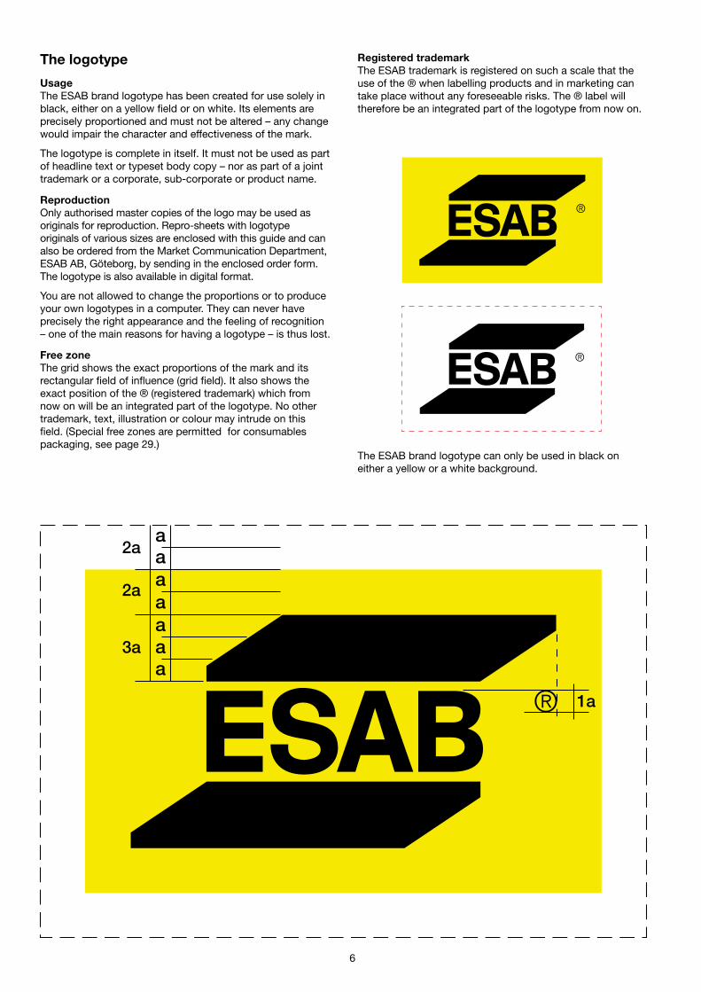
The logotype
UsageThe ESAB brand logotype has been created for use solely inblack, either on a yellow field or on white. Its elements areprecisely proportioned and must not be altered – any changewould impair the character and effectiveness of the mark.
The logotype is complete in itself. It must not be used as partof headline text or typeset body copy – nor as part of a jointtrademark or a corporate, sub-corporate or product name.
ReproductionOnly authorised master copies of the logo may be used asoriginals for reproduction. Repro-sheets with logotypeoriginals of various sizes are enclosed with this guide and canalso be ordered from the Market Communication Department,ESAB AB, Göteborg, by sending in the enclosed order form.The logotype is also available in digital format.
You are not allowed to change the proportions or to produceyour own logotypes in a computer. They can never haveprecisely the right appearance and the feeling of recognition– one of the main reasons for having a logotype – is thus lost.
Free zoneThe grid shows the exact proportions of the mark and itsrectangular field of influence (grid field). It also shows theexact position of the ® (registered trademark) which fromnow on will be an integrated part of the logotype. No othertrademark, text, illustration or colour may intrude on thisfield. (Special free zones are permitted for consumablespackaging, see page 29.)
The ESAB brand logotype can only be used in black oneither a yellow or a white background.
Registered trademarkThe ESAB trademark is registered on such a scale that theuse of the ® when labelling products and in marketing cantake place without any foreseeable risks. The ® label willtherefore be an integrated part of the logotype from now on.

7
House coloursYellow and black are the identifying colours of the ESABbrand. This combination has been found to be the best whenit comes to visibility, readability and attracting attention. Thispowerful ESAB signal must not be reduced or weakened byadding other distracting colours. This is one of theprerequisites for a consistent graphic identity and it issomething to which we must pay proper attention.
The NCS colour systemWhen using the NCS system, the measurement of colour ismade optically and is therefore more true than when thecolour is described according to the PMS scale, for example.ESAB’s shade of yellow is therefore given first and foremostaccording to the NCS scale. Use NCS to define all thecolours that cannot be defined properly using the RGB andCMYK methods.
At the back of this brochure, you will find a sheet ofperforated swatches for colour matching according to theNCS system. It is very important that you always include acolour sample with each printing order to make sure that youobtain the correct colour. Always try to make comparisons innatural daylight.
Below are the colour denominations that you should usewhen defining our yellow house colour.
The RGB colour systemMixing red, green, and blue (RGB) coloured light in variousproportions and intensities can represent a large percentageof the visible spectrum. Where the colours overlap, theycreate cyan, magenta and yellow. RGB colours are calledadditive colours because you create white by adding R, G,and B together – that is, all the light is reflected back to theeye. Additive colours are used for lighting, television andcomputer monitors. Use RGB when preparing a document tobe viewed on a screen or printed on a colour printer.
The CMYK colour systemWhile the RGB model depends on a light source to createcolour, the CMYK model is based on the light-absorbentquality of ink printed on paper. As white light strikestranslucent inks, a portion of the spectrum is absorbed.Colour that is not absorbed is reflected back to your eye.Combining pure cyan (C), magenta (M) and yellow (Y)pigments would result in black, by absorbing, or subtracting,all the colours. Black (K) ink is added for better shadowdensity. Combining these inks to reproduce colour is calledfour-colour process printing. Use CMYK when preparing adocument to be printed using process inks.
RALFor industrial painting of products and cars, the designatedcolour is RAL 1018.
Original yellow: NCS S 0580-Y
The closest printing ink is PMS 012.
RGB:Red 100%, Green 95%, Black 0% (255, 242, 0) (someapplications, such as Adobe, use this method of definingthe RGB colours).
CMYK:Cyan 0%, Magenta 5%, Yellow 100%, Black 0%.
RAL: 1018
Be sure to include a colour guide with each order tomatch our yellow NCS S 0580-Y and ensure that youalways obtain the correct colour whatever basicmaterial you choose. Always try to make comparisonsin light with the colour temperature of 5,000°K.
8
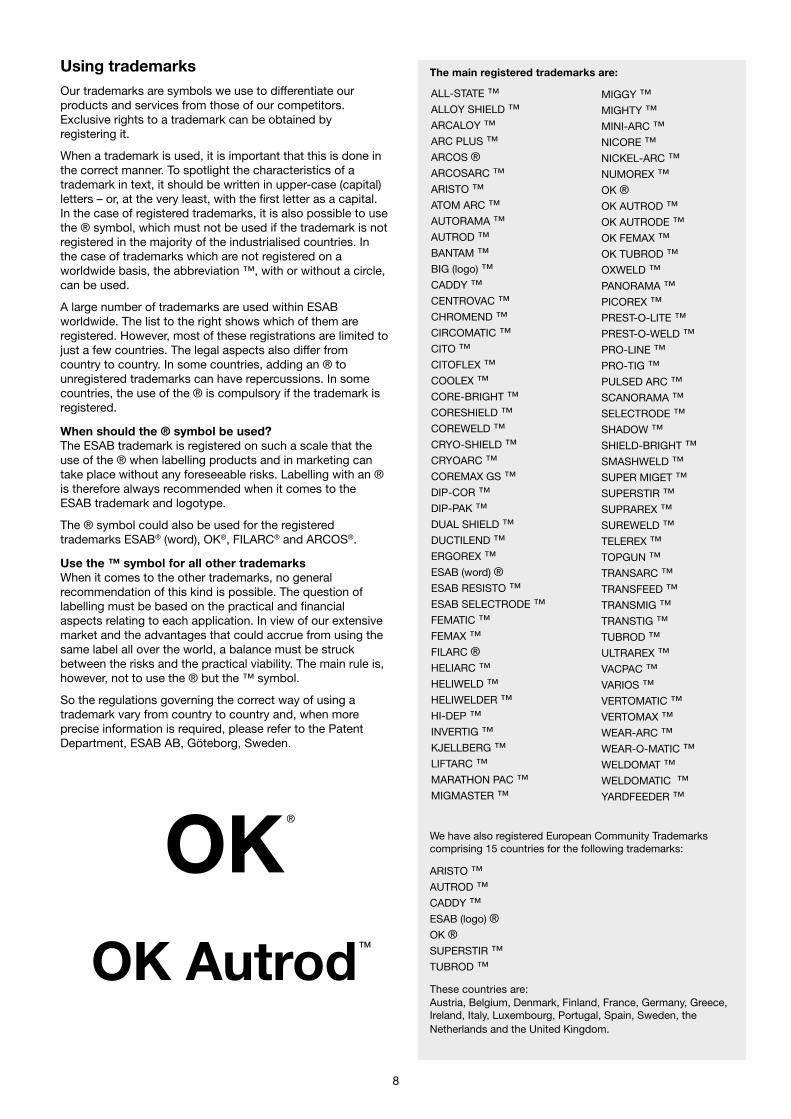
Using trademarksOur trademarks are symbols we use to differentiate ourproducts and services from those of our competitors.Exclusive rights to a trademark can be obtained byregistering it.
When a trademark is used, it is important that this is done inthe correct manner. To spotlight the characteristics of atrademark in text, it should be written in upper-case (capital)letters – or, at the very least, with the first letter as a capital.In the case of registered trademarks, it is also possible to usethe ® symbol, which must not be used if the trademark is notregistered in the majority of the industrialised countries. Inthe case of trademarks which are not registered on aworldwide basis, the abbreviation ™, with or without a circle,can be used.
A large number of trademarks are used within ESABworldwide. The list to the right shows which of them areregistered. However, most of these registrations are limited tojust a few countries. The legal aspects also differ fromcountry to country. In some countries, adding an ® tounregistered trademarks can have repercussions. In somecountries, the use of the ® is compulsory if the trademark isregistered.
When should the ® symbol be used?The ESAB trademark is registered on such a scale that theuse of the ® when labelling products and in marketing cantake place without any foreseeable risks. Labelling with an ®is therefore always recommended when it comes to theESAB trademark and logotype.
The ® symbol could also be used for the registeredtrademarks ESAB® (word), OK®, FILARC® and ARCOS®.
Use the ™ symbol for all other trademarksWhen it comes to the other trademarks, no generalrecommendation of this kind is possible. The question oflabelling must be based on the practical and financialaspects relating to each application. In view of our extensivemarket and the advantages that could accrue from using thesame label all over the world, a balance must be struckbetween the risks and the practical viability. The main rule is,however, not to use the ® but the ™ symbol.
So the regulations governing the correct way of using atrademark vary from country to country and, when moreprecise information is required, please refer to the PatentDepartment, ESAB AB, Göteborg, Sweden.
ALL-STATE ™ALLOY SHIELD ™ARCALOY ™ARC PLUS ™ARCOS ®ARCOSARC ™ARISTO ™ATOM ARC ™AUTORAMA ™AUTROD ™BANTAM ™BIG (logo) ™CADDY ™CENTROVAC ™CHROMEND ™CIRCOMATIC ™CITO ™CITOFLEX ™COOLEX ™CORE-BRIGHT ™CORESHIELD ™COREWELD ™CRYO-SHIELD ™CRYOARC ™COREMAX GS ™DIP-COR ™DIP-PAK ™DUAL SHIELD ™DUCTILEND ™ERGOREX ™ESAB (word) ®ESAB RESISTO ™ESAB SELECTRODE ™FEMATIC ™FEMAX ™FILARC ®HELIARC ™HELIWELD ™HELIWELDER ™HI-DEP ™INVERTIG ™KJELLBERG ™LIFTARC ™MARATHON PAC ™MIGMASTER ™
MIGGY ™MIGHTY ™MINI-ARC ™NICORE ™NICKEL-ARC ™NUMOREX ™OK ®OK AUTROD ™OK AUTRODE ™OK FEMAX ™OK TUBROD ™OXWELD ™PANORAMA ™PICOREX ™PREST-O-LITE ™PREST-O-WELD ™PRO-LINE ™PRO-TIG ™PULSED ARC ™SCANORAMA ™SELECTRODE ™SHADOW ™SHIELD-BRIGHT ™SMASHWELD ™SUPER MIGET ™SUPERSTIR ™SUPRAREX ™SUREWELD ™TELEREX ™TOPGUN ™TRANSARC ™TRANSFEED ™TRANSMIG ™TRANSTIG ™TUBROD ™ULTRAREX ™VACPAC ™VARIOS ™VERTOMATIC ™VERTOMAX ™WEAR-ARC ™WEAR-O-MATIC ™WELDOMAT ™WELDOMATIC ™YARDFEEDER ™
The main registered trademarks are:
We have also registered European Community Trademarkscomprising 15 countries for the following trademarks:
ARISTO ™AUTROD ™CADDY ™ESAB (logo) ®OK ®SUPERSTIR ™TUBROD ™
These countries are:Austria, Belgium, Denmark, Finland, France, Germany, Greece,Ireland, Italy, Luxembourg, Portugal, Spain, Sweden, theNetherlands and the United Kingdom.
OKOK Autrod
TM
®
9
Helvetica Neue 75 Bold
abcdefghijklmnopqrstuvxyzABCDEFGHIJKLMNOPQRST
1234567890%&/()?!#
Helvetica Neue 66 Medium Italic
abcdefghijklmnopqrstuvxyzABCDEFGHIJKLMNOPQRSTU
1234567890%&/()?!#
Helvetica Neue 56 Italic
abcdefghijklmnopqrstuvxyzABCDEFGHIJKLMNOPQRSTU
1234567890%&/()?!#
Times Roman
abcdefghijklmnopqrstuvxyzABCDEFGHIJKLMNOPQRST1234567890%&/()?!#
Times Italic
abcdefghijklmnopqrstuvxyzABCDEFGHIJKLMNOPQRST1234567890%&/()?!#
Times Bold
abcdefghijklmnopqrstuvxyzABCDEFGHIJKLMNOPQRST1234567890%&/()?!#
Times Bold Italic
abcdefghijklmnopqrstuvxyzABCDEFGHIJKLMNOPQRST1234567890%&/()?!#
Helvetica Neue 76 Bold Italic
abcdefghijklmnopqrstuvxyzABCDEFGHIJKLMNOPQRST
1234567890%&/()?!#
Helvetica Neue 65 Medium
abcdefghijklmnopqrstuvxyzABCDEFGHIJKLMNOPQRSTU
1234567890%&/()?!#
Helvetica Neue 55 Roman
abcdefghijklmnopqrstuvxyzABCDEFGHIJKLMNOPQRSTU
1234567890%&/()?!#
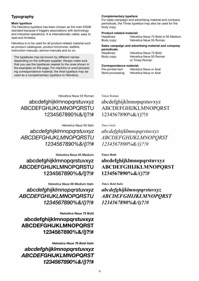
Typography
Main typefaceThe Helvetica typeface has been chosen as the main ESABstandard because it triggers associations with technologyand industrial operations. It is internationally viable, easy toread and timeless.
Helvetica is to be used for all product-related material suchas product catalogues, product brochures, leaflets,instruction manuals, service manuals and so on.
Complementary typefaceFor sales campaign and advertising material and companyperiodicals, the Times typeface may also be used for thebody copy.
Product-related material:Headlines: Helvetica Neue 75 Bold or 65 MediumBody copy: Helvetica Neue 55 Roman
Sales campaign and advertising material and companyperiodicals:Headlines: Helvetica Neue 75 BoldBody copy: Helvetica Neue 55 Roman
or Times Roman
Correspondence material:Pre-printed text: Helvetica Neue or ArialWord processing: Helvetica Neue or Arial
The typefaces may be known by different namesdepending on the software supplier. Always make surethat you use the typefaces nearest to the ones shown inthe examples on this page. For machine or word process-ing correspondence material, the Arial typeface may beused as a complementary typeface to Helvetica.
10
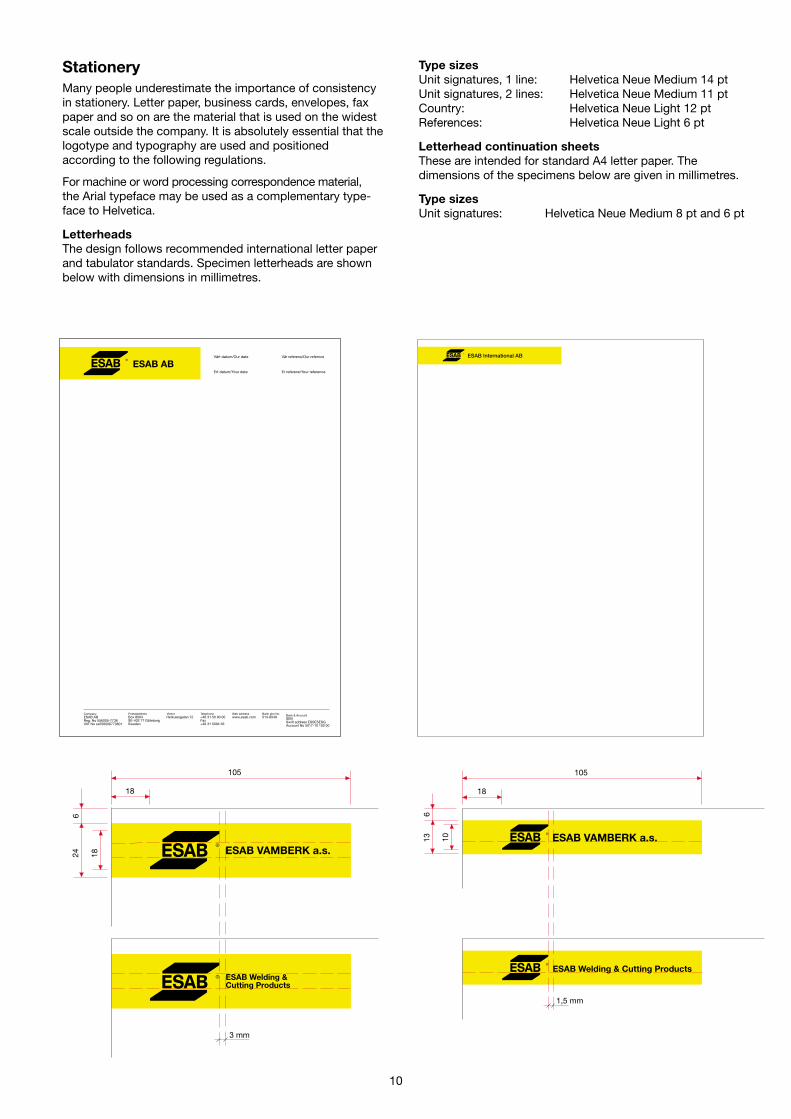
StationeryMany people underestimate the importance of consistencyin stationery. Letter paper, business cards, envelopes, faxpaper and so on are the material that is used on the widestscale outside the company. It is absolutely essential that thelogotype and typography are used and positionedaccording to the following regulations.
For machine or word processing correspondence material,the Arial typeface may be used as a complementary type-face to Helvetica.
LetterheadsThe design follows recommended international letter paperand tabulator standards. Specimen letterheads are shownbelow with dimensions in millimetres.
Type sizesUnit signatures, 1 line: Helvetica Neue Medium 14 ptUnit signatures, 2 lines: Helvetica Neue Medium 11 ptCountry: Helvetica Neue Light 12 ptReferences: Helvetica Neue Light 6 pt
Letterhead continuation sheetsThese are intended for standard A4 letter paper. Thedimensions of the specimens below are given in millimetres.
Type sizesUnit signatures: Helvetica Neue Medium 8 pt and 6 pt
18
105
18246
13 10
18
105
6
ESAB International AB
ESAB Welding &Cutting Products
ESAB VAMBERK a.s.
ESAB Welding & Cutting Products
ESAB VAMBERK a.s.
1,5 mm
3 mm

11
Order confirmations, invoices andother documentsOrder and transport documents are normally generated froman automatic computer system. These documents compriseorder confirmations, packing lists, invoices, paymentreminders, certificates and so on. They should naturally alsobe designed in accordance with ESAB’s visual identity rules.
For cost and practical reasons, most ESAB companies mayprefer only to use documents in black and white. In thiscase, the primary identification on the documents is the
black logotype in the upper left-hand corner of the form. Forthose companies that still prefer to have pre-printed paper,the black logotype should also be placed in the upper left-hand corner and on the same type of yellow strip as is usedfor letterheads.
Since the rules on this page may be changed from time totime due to new logistical routines, always make sure thatyou have the latest version of the guidelines for order andtransport documents by contacting the Market Communi-cation Department in Göteborg.
The colour of the paper should be white and under nocircumstances may the logotype be used in grey or anycolour other than black.
ESAB Nederland BV.Kernkade 83542 CH UTRECHTTelefon: +31 30 2485911Telefax: +31 30 2485260
BTW nr.: NL.007093524801
Pagina 1Faktuuradatum: 04/01/00Faktuurnummer: 131218Ordernummer: 31230984XOOrderdatum: 04/01/00Debiteurnummer: 30005288
Betaling volgens onderstaande condities. Gaarne metvermelding van debiteurnummer en faktuurnummer.
AD EGGEBEEN B.V.AFD. BOEKHOUDING (UW NR.: 1770019POSTBUS 3954530 AJ TERNEUZEN
Afl.adres: AD EGGEBEEN B.V.ENERGIESTRAAT 194538 BZ TERNEUZEN
CREDIT
Uw referentie : Dhr. A. EggebeenBehandeld door: Alwine van de Meent Aflever : Bonus 1999Telefoon : 030 2485386 Fax : 030 2485260 instrukties :
Artikelnummer Omschrij Besteld Geleverd Naleveren Prijs Per Eh. Korting Bedrag
Totaal exclusief BTW : 4,654.00- BTW 17.5 % : 814.45- Totaal credit : NLG 5,468.45-
ABN-AMRO Bank N.V. te Utrecht, rekeningnummer 54.40.11.252Postbank B.V. te ’s Gravenhage, rekeningnummer 255286
BNSC_D_0 25-5-99 15:41
AANSPRAKEN WEGENS NIET-LEVERING OF MANKO DIENEN BINNEN 7 DAGEN NA DATUM VAN DEZE REKENINGSCHRIFTELIJK TE WORDEN INGEDIEND.Tenzij in offertes, orderbevestigingen of overeenkomsten anders is vermeld zijn op alle prijsopgaven en onze leveringen onze Algemene Verkoopvoorwaarden van toepassing. Deze verkoopvoorwaarden aijn te Utrecht gedeponeerd ter Griffie van de Arrondissementsrechtbank en bij de Kamer van Koophandel nr. 77683.
Betaling : Creditfaktuur
BONUS Omzetbonus 1.0- 1.0- 4654.00 1 EA 4,654.00-5% over omzet fl 93.071, - van Scheepswerf* * * * * * * *D E S C H R O E F * * * * * * * * * * * * * *
12
Copy to Document
To Date
00-02-01Reg.no Suppl Page
1/1Subject
From (org code, namne )
CPE-Per Kinde
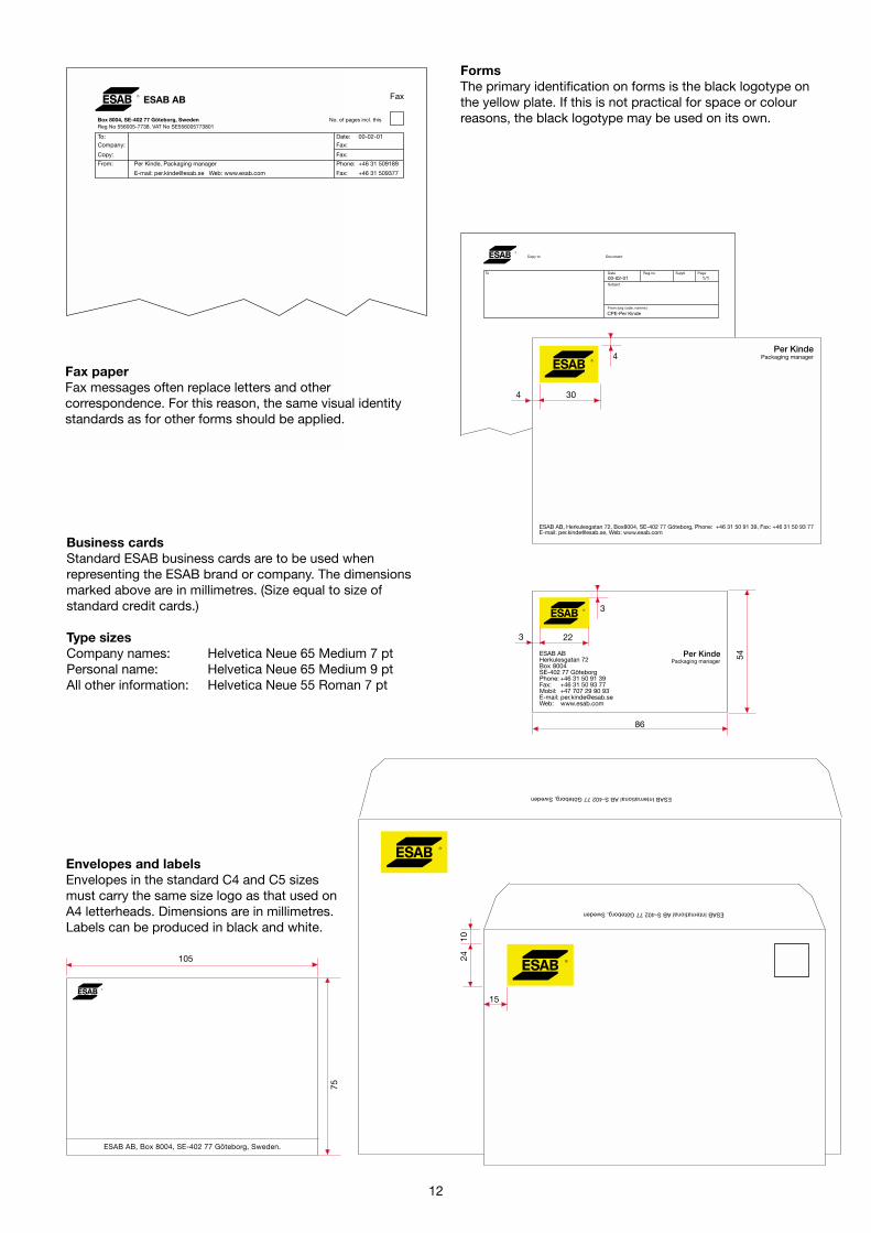
Business cardsStandard ESAB business cards are to be used whenrepresenting the ESAB brand or company. The dimensionsmarked above are in millimetres. (Size equal to size ofstandard credit cards.)
Type sizesCompany names: Helvetica Neue 65 Medium 7 ptPersonal name: Helvetica Neue 65 Medium 9 ptAll other information: Helvetica Neue 55 Roman 7 pt
ESAB International AB S-402 77 Göteborg, Sweden
ESAB International AB S-402 77 Göteborg, Sweden
1024
ESAB AB, Box 8004, SE-402 77 Göteborg, Sweden.
Envelopes and labelsEnvelopes in the standard C4 and C5 sizesmust carry the same size logo as that used onA4 letterheads. Dimensions are in millimetres.Labels can be produced in black and white.
FormsThe primary identification on forms is the black logotype onthe yellow plate. If this is not practical for space or colourreasons, the black logotype may be used on its own.
Fax paperFax messages often replace letters and othercorrespondence. For this reason, the same visual identitystandards as for other forms should be applied.
54
86
Box 8004, SE-402 77 Göteborg, Sweden No. of pages incl. thisReg No 556005-7738. VAT No SE556005773801
To: Date: 00-02-01Company: Fax:
Copy: Fax:
From: Per Kinde, Packaging manager Phone: +46 31 509189
E-mail: [email protected] Web: www.esab.com Fax: +46 31 509377
FaxESAB AB
75
15
105
4
4
30
3
3
22

13
IntranetThe intranet is an internal information tool which is based onthe same technique as the Internet and enables us to spreadand share information within the ESAB group of companiesin a very effective way. The intranet information should or willbe available to all units connected to ESAB’s internal com-munication system called the WAN.
As the intranet is a joint channel, uniformity in terms ofgraphics and layout/navigation is very important. For thisreason, we have created the ESAB intranet guidelines whichshould be used when creating, reading, copying and distri-buting information presented on the ESAB intranet pages.
There are certain degrees of freedom when making a newdocument. There are, however, certain basic layout elementsincluding the ESAB logotype, the navigation frame and thetitle of the page which must always be included in the sameplace on the page.
The Helvetica or Arial typefaces are recommended for use forall texts.
The guidelines and recommendations will be updated atregular intervals. Always make sure that you have the latestversion by contacting your local Infomaster or the MarketCommunication Department in Göteborg.
E-mail messagesIn the beginning, the e-mail message was often used inter-nally when communicating with colleagues. The need forrapid communication and the extended use of computersmeans that correspondence via e-mail has become moreand more widespread externally as well. The e-mail oftenreplaces letters, fax messages and other correspondence.
For this reason, it is important that the header on an e-mailmessage makes it clear which company and individual issending the message. You are therefore recommended touse the first template that is included in our current LotusNotes mail platform, not the more or less imaginative mailheaders that also accompany the system. You are also re-commended to add a suitable “foot” with the necessaryaddress info.
InternetThe use of the global communication network, the Internet, isgrowing at an explosive rate. The size of the network and itsworldwide establishment has made it an extremely popularand cost-effective medium for passing on information to alarge and highly varied target group.
As this is a global medium, uniformity in terms of graphicsand content is important. The visual identity rules which gov-ern printed media also apply in principle to the Internet, butthe technical limitations of the Web and the browser softwareused to navigate through it must naturally be taken intoaccount. Each sales company will have its own Web site,where information specific to its market can be put. The over-all structure should, however, be the same.
The logotype is located in the top left-hand field. The topmenu and the left-hand menu are also fixed. The typefaceused in normal texts and in graphical areas is Verdana. Thisfont has good readability even in small sizes. The typefaceused in headers is Helvetica Neue.
As the Internet can only be described as a living medium, theguidelines and recommendations will be updated at regularintervals. Always make sure that you have the latest versionby contacting your local Infomaster or the Market Communi-cation Department in Göteborg.
14
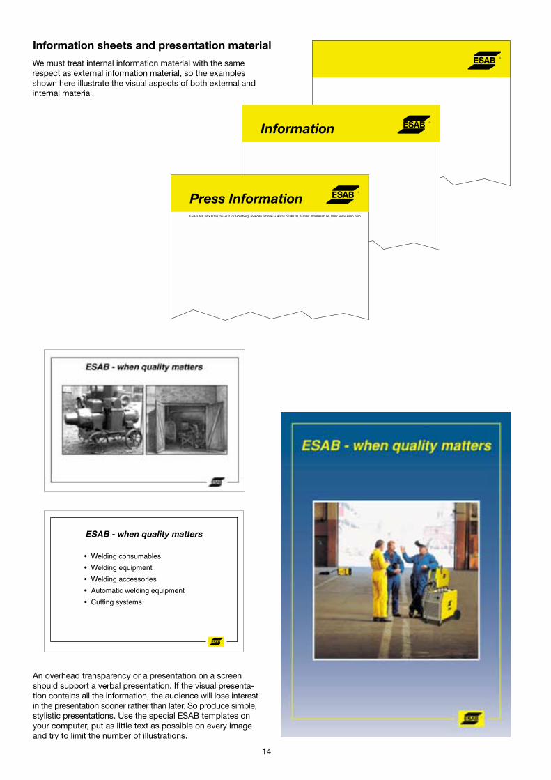
Information sheets and presentation material
We must treat internal information material with the samerespect as external information material, so the examplesshown here illustrate the visual aspects of both external andinternal material.
An overhead transparency or a presentation on a screenshould support a verbal presentation. If the visual presenta-tion contains all the information, the audience will lose interestin the presentation sooner rather than later. So produce simple,stylistic presentations. Use the special ESAB templates onyour computer, put as little text as possible on every imageand try to limit the number of illustrations.
ESAB - when quality matters
• Welding consumables
• Welding equipment
• Welding accessories
• Automatic welding equipment
• Cutting systems
15
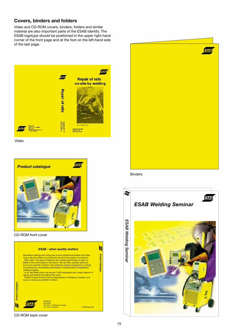
Covers, binders and foldersVideo and CD-ROM covers, binders, folders and similarmaterial are also important parts of the ESAB identity. TheESAB logotype should be positioned in the upper right-handcorner of the front page and at the foot on the left-hand sideof the last page.
ESAB Welding Seminar
ES
AB
Weld
ing S
eminar
CD-ROM front cover
CD-ROM back cover
Product catalogue
Pro
du
ct C
atal
ogu
e
Pro
du
ct Catalo
gu
e
ESAB - when quality matters
Nowadays welding and cutting are crucial industrial processes and oftenhave a decisive effect on productivity and the final quality of a product.
With nearly 100 years of research into welding technology to draw on,ESAB is the world leader in this sector. We can offer superior skills andknow-how and the market’s most extensive product programme coveringeverything from handwelding electrodes to sophisticated computerisedwelding systems.
In all, the ESAB group has around 7,600 employees and a large network ofagents and dealers throughout the world.
ESAB’s Europe division has its headquarters in Göteborg, Sweden, andturnover totals around SEK 8.5 billion.
©1999 Esab AB
ESAB ABBox 8004SE-402 77 Göteborg, SwedenTel +46 31 50 90 00
Video
Binders

LAW 400 and 500
Quattro dio horemtius
Arrus satres para fenti de lopa. Petro
merdi de vanti soti chetti lacca. Divarius
santi parka de molto blaskosius, si
sigolicci basta. Chappa tarrioka de reckla
osatius ossi. Flippo rabasta romasti mali
varta de silo glatta eckis. Opareratio
localo typograttio purpose get. Unit
limma secci ma olli brastomoluss, cecci
promota si bolta forma.
Powerful, efficient and flexible power sourcesin the A 10 system
3535
70
34 10
10
Printed matterThe design of printed matter creates associations in thesame way as logotypes, typography, colours and layouts. Itis important that synergy is obtained in all informationmaterial, not least in order to make it quickly recognisableand to obtain overall print economy.
The ESAB logotype should always be positioned in theupper right-hand corner of the front page.
Front pagesYellow heading with logotype in blackProduct name in black
Typeface Helvetica Neue 66 Bold italic
16
Always use the Helvetica typeface in product-relatedprinted matter both in headlines and in body copy.
Group item number in Helvetica Bold 8 pt inthe lower left-hand corner of the front page.
18 145
It is of the greatest importance that these simple, basicstandards are followed and respected. This is a small yetvital part of our efforts to create a consistent visual picture ofESAB and to strengthen our identity in the world around us.

The stipulated design for printed matter naturally applies toall business areas, such as welding equipment, weldingconsumables and cutting systems.
17
16
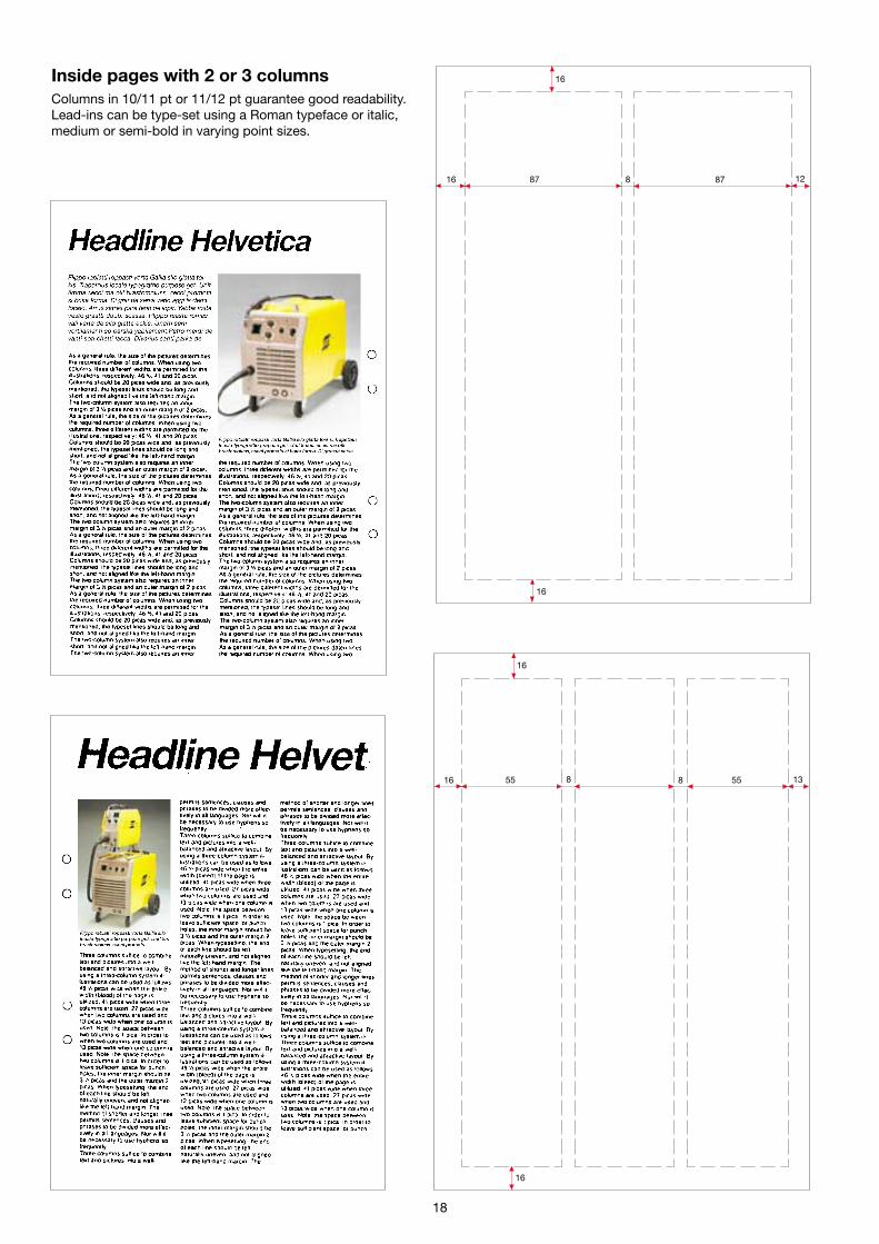
16 87 8 87 12
16
16
5516 8 8 55 13
16
Inside pages with 2 or 3 columnsColumns in 10/11 pt or 11/12 pt guarantee good readability.Lead-ins can be type-set using a Roman typeface or italic,medium or semi-bold in varying point sizes.
18
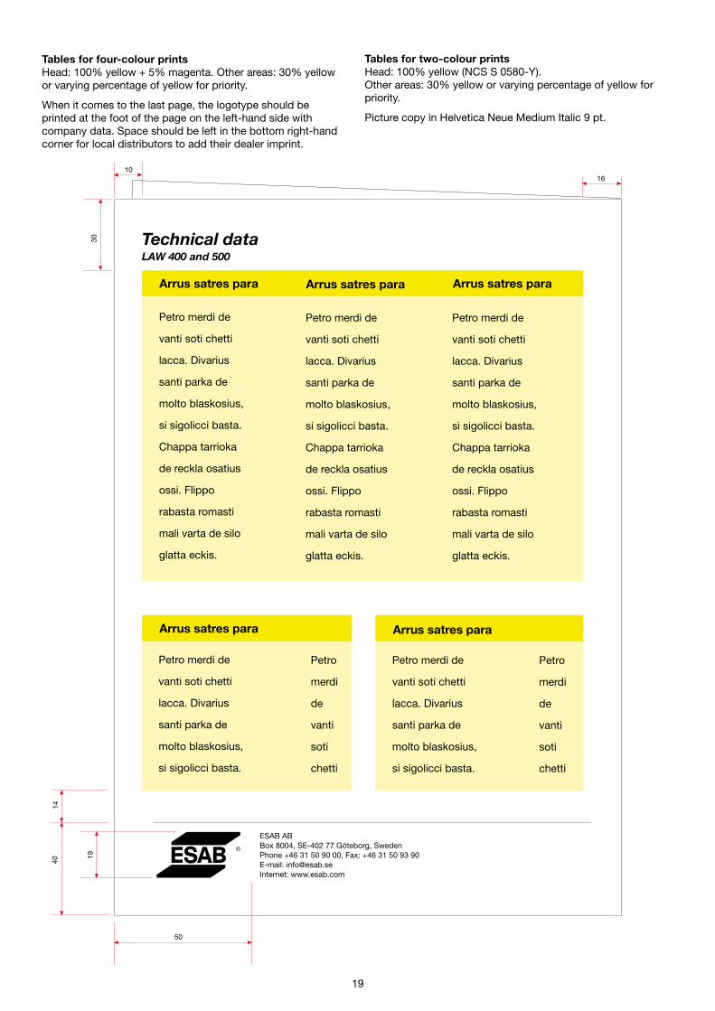
Tables for four-colour printsHead: 100% yellow + 5% magenta. Other areas: 30% yellowor varying percentage of yellow for priority.
When it comes to the last page, the logotype should beprinted at the foot of the page on the left-hand side withcompany data. Space should be left in the bottom right-handcorner for local distributors to add their dealer imprint.
30
50
19
4014
1610
Technical dataLAW 400 and 500
Arrus satres para
Petro merdi de
vanti soti chetti
lacca. Divarius
santi parka de
molto blaskosius,
si sigolicci basta.
Arrus satres para
Petro merdi de
vanti soti chetti
lacca. Divarius
santi parka de
molto blaskosius,
si sigolicci basta.
Petro
merdi
de
vanti
soti
chetti
Petro
merdi
de
vanti
soti
chetti
Arrus satres para
Petro merdi de
vanti soti chetti
lacca. Divarius
santi parka de
molto blaskosius,
si sigolicci basta.
Chappa tarrioka
de reckla osatius
ossi. Flippo
rabasta romasti
mali varta de silo
glatta eckis.
Arrus satres para
Petro merdi de
vanti soti chetti
lacca. Divarius
santi parka de
molto blaskosius,
si sigolicci basta.
Chappa tarrioka
de reckla osatius
ossi. Flippo
rabasta romasti
mali varta de silo
glatta eckis.
Arrus satres para
Petro merdi de
vanti soti chetti
lacca. Divarius
santi parka de
molto blaskosius,
si sigolicci basta.
Chappa tarrioka
de reckla osatius
ossi. Flippo
rabasta romasti
mali varta de silo
glatta eckis.
ESAB ABBox 8004, SE-402 77 Göteborg, SwedenPhone +46 31 50 90 00, Fax: +46 31 50 93 90E-mail: [email protected]: www.esab.com
Tables for two-colour printsHead: 100% yellow (NCS S 0580-Y).Other areas: 30% yellow or varying percentage of yellow forpriority.
Picture copy in Helvetica Neue Medium Italic 9 pt.
19
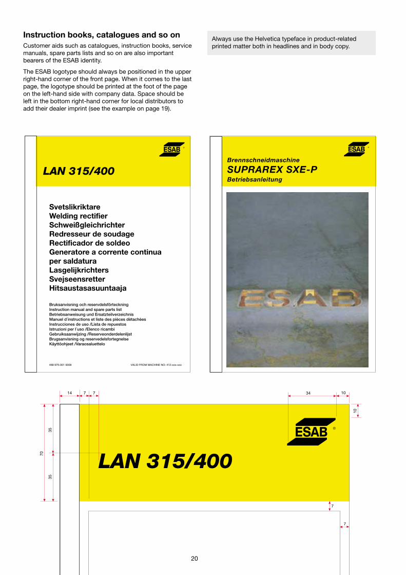
Instruction books, catalogues and so onCustomer aids such as catalogues, instruction books, servicemanuals, spare parts lists and so on are also importantbearers of the ESAB identity.
The ESAB logotype should always be positioned in the upperright-hand corner of the front page. When it comes to the lastpage, the logotype should be printed at the foot of the pageon the left-hand side with company data. Space should beleft in the bottom right-hand corner for local distributors toadd their dealer imprint (see the example on page 19).
Always use the Helvetica typeface in product-relatedprinted matter both in headlines and in body copy.
LAN 315/400
LAN 315/400
14 77
35
70
35
34
10
10
SvetslikriktareWelding rectifierSchweißgleichrichterRedresseur de soudageRectificador de soldeoGeneratore a corrente continuaper saldaturaLasgelijkrichtersSvejseensretterHitsaustasasuuntaaja
Bruksanvisning och reservdelsförteckningInstruction manual and spare parts listBetriebsanweisung und ErsatzteilverzeichnisManuel d´instructions et liste des pièces dètachèesInstrucciones de uso /Lista de repuestosIstruzioni per I´uso /Elenco ricambiGebruiksaanwijzing /ReserveonderdelenlijstBrugsanvisning og reservedelsfortegnelseKäyttöohjeet /Varaosaluettelo
468 975-001 9308 VALID FROM MACHINE NO: 412-xxx-xxx
Brennschneidmaschine
SUPRAREX SXE-PBetriebsanleitung
7
7
20
Filler materials for manualand automatic welding
Sixth edition
Welding Handbook
21
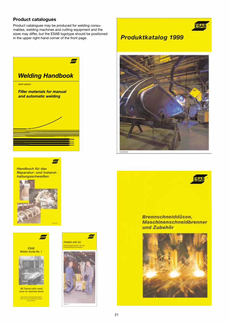
Product cataloguesProduct catalogues may be produced for welding consu-mables, welding machines and cutting equipment and thesizes may differ, but the ESAB logotype should be positionedin the upper right-hand corner of the front page.

Company periodicalsESAB in-house and customer magazines are the mainvehicles for conveying corporate and business newsinternally and externally. As such, they must convey theessence of the ESAB identity visually and verbally andthey must follow professional journalistic principles.
The standards permit some flexibility in the use of layoutand typefaces. However, always make sure that therequirements relating to the proportions and the free zoneof the logotype are complied with.
FENSTERINFORMATIONEN AUS DER SCHWEISS- UND SCHNEIDTECHNIK
831
66
6
84041508
22
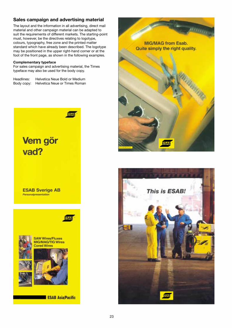
Sales campaign and advertising materialThe layout and the information in all advertising, direct mailmaterial and other campaign material can be adapted tosuit the requirements of different markets. The starting-pointmust, however, be the directives relating to logotype,colours, typography, free zone and the printed matterstandard which have already been described. The logotypemay be positioned in the upper right-hand corner or at thefoot of the front page, as shown in the following examples.
Complementary typefaceFor sales campaign and advertising material, the Timestypeface may also be used for the body copy.
Headlines: Helvetica Neue Bold or MediumBody copy: Helvetica Neue or Times Roman
23

AdvertisementsAn advertisement is publicly authenticated by the companysignature and logotype. Nothing else reflects the character ofa company and its management so broadly by the way itlooks and what it says or infers.
Cluttered, disorderly appearances reduce readability. Con-flicting appearances or statements generate confusion andreduce credibility. It is therefore essential that statements areclear-cut, specific and not misleading.
24
When producing sales campaigns and advertising material,the standards permit some flexibility in the use of typefaces,illustrations and the placing of the logotype. However, alwaysmake sure that the pictures do not interfere with the text flowand that the requirements relating to proportions and the freezone of the logotype are complied with.
Recruitment ad
Brief company information must be usedin all recruitment ads.
Recruitment ad
Product ad
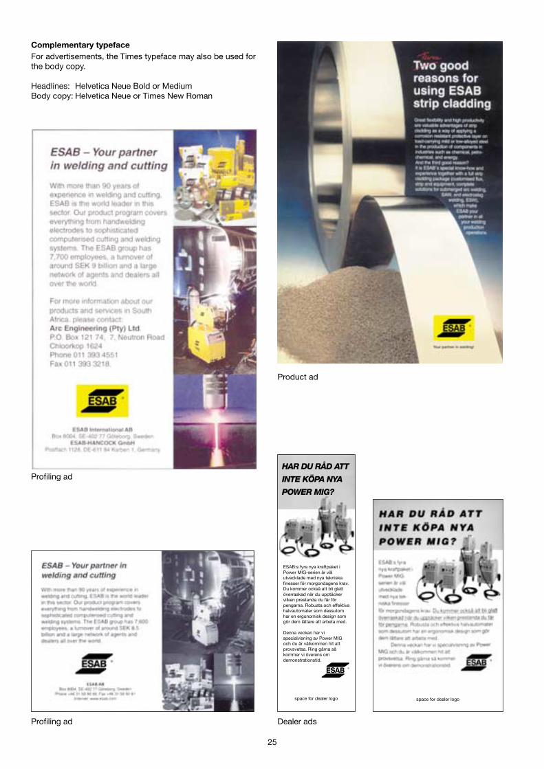
Complementary typefaceFor advertisements, the Times typeface may also be used forthe body copy.
Headlines: Helvetica Neue Bold or MediumBody copy: Helvetica Neue or Times New Roman
Profiling ad
Product ad
Dealer ads
ESAB:s fyra nya kraftpaket iPower MIG-serien är välutvecklade med nya tekniskafinesser för morgondagens krav.Du kommer också att bli glattöverraskad när du upptäckervilken prestanda du får förpengarna. Robusta och effektivahalvautomater som dessutomhar en ergonomisk design somgör dem lättare att arbeta med.
Denna veckan har vispecialvisning av Power MIGoch du är välkommen hit attprovsvetsa. Ring gärna såkommer vi överens omdemonstrationstid.
space for dealer logo
HAR DU RÅD ATT
INTE KÖPA NYA
POWER MIG?
Profiling ad
space for dealer logo
25
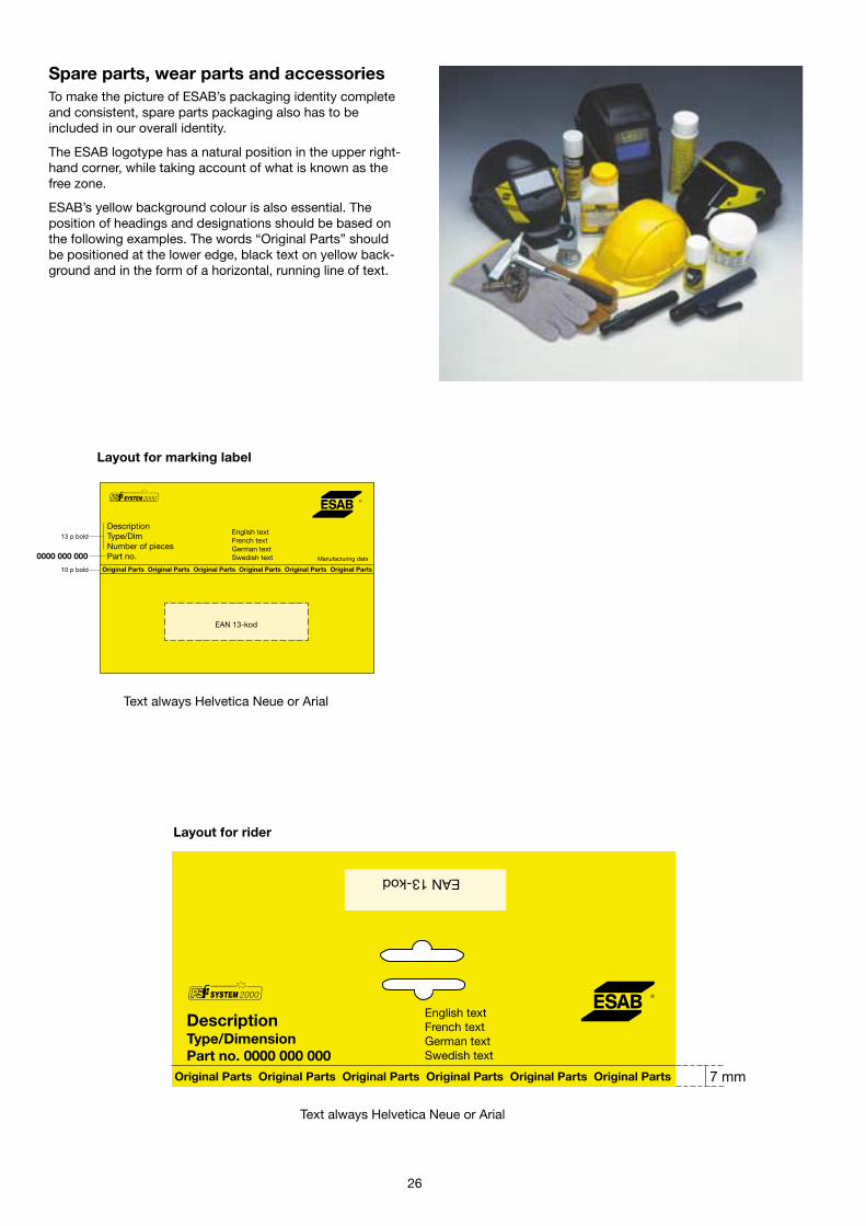
EAN13-kod
DescriptionType/DimensionPart no. 0000 000 000
Original Parts Original Parts Original Parts Original Parts Original Parts Original Parts
English textFrench textGerman textSwedish text
Spare parts, wear parts and accessoriesTo make the picture of ESAB’s packaging identity completeand consistent, spare parts packaging also has to beincluded in our overall identity.
The ESAB logotype has a natural position in the upper right-hand corner, while taking account of what is known as thefree zone.
ESAB’s yellow background colour is also essential. Theposition of headings and designations should be based onthe following examples. The words “Original Parts” shouldbe positioned at the lower edge, black text on yellow back-ground and in the form of a horizontal, running line of text.
26
EAN 13-kod
Original Parts Original Parts Original Parts Original Parts Original Parts Original Parts
DescriptionType/DimNumber of piecesPart no.
English textFrench textGerman textSwedish text Manufacturing date
Layout for marking label
Layout for rider
Text always Helvetica Neue or Arial
Text always Helvetica Neue or Arial
Original Parts Original Parts
Original Parts Original Parts
10 mm
10 mm
10 mm
Helvetica Neue Bold
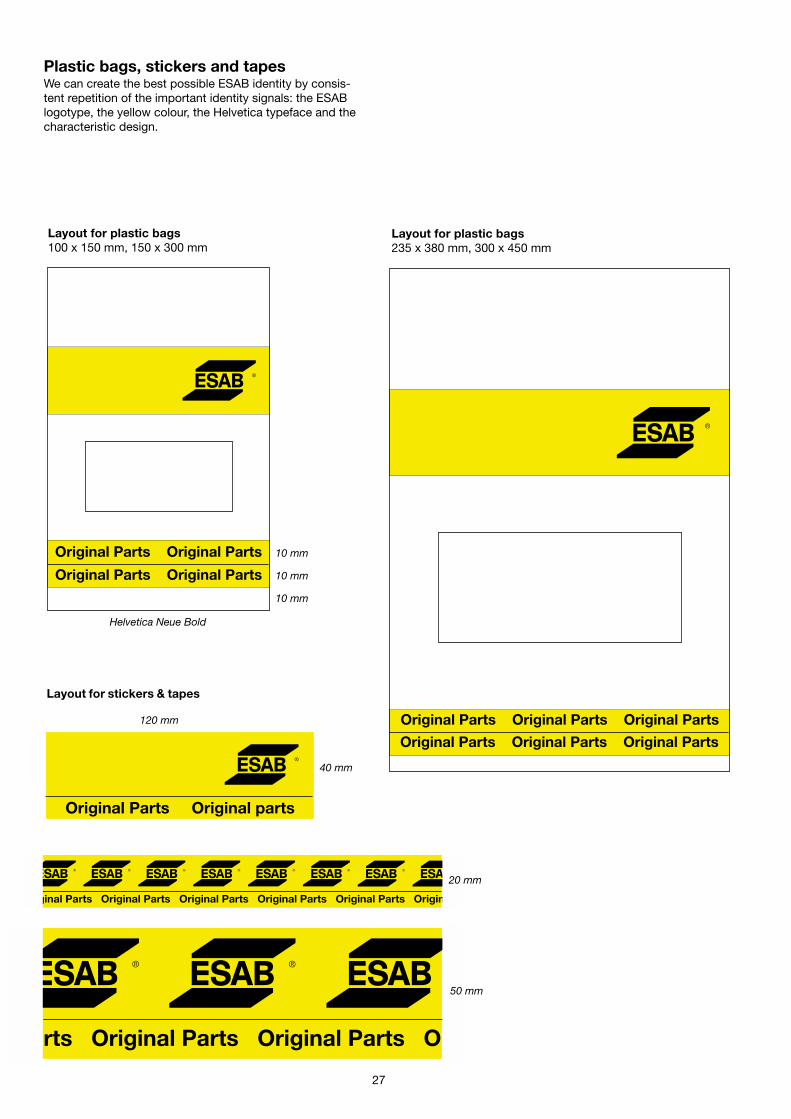
Layout for plastic bags100 x 150 mm, 150 x 300 mm
Original Parts Original Parts Original Parts
Original Parts Original Parts Original Parts
Layout for plastic bags235 x 380 mm, 300 x 450 mm
Layout for stickers & tapes
120 mm
40 mm
Original Parts Original parts
Plastic bags, stickers and tapesWe can create the best possible ESAB identity by consis-tent repetition of the important identity signals: the ESABlogotype, the yellow colour, the Helvetica typeface and thecharacteristic design.
Original Parts Original Parts Original Parts Original Parts Original Parts Original
20 mm
rts Original Parts Original Parts O
50 mm
27
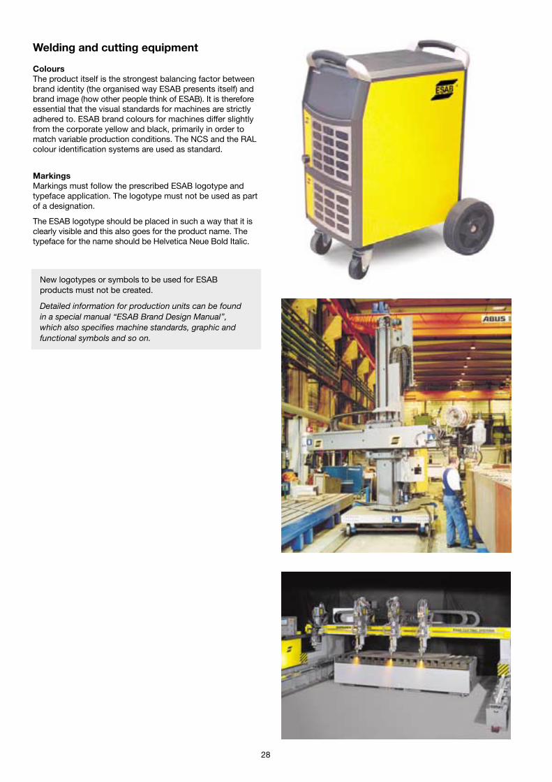
Welding and cutting equipment
ColoursThe product itself is the strongest balancing factor betweenbrand identity (the organised way ESAB presents itself) andbrand image (how other people think of ESAB). It is thereforeessential that the visual standards for machines are strictlyadhered to. ESAB brand colours for machines differ slightlyfrom the corporate yellow and black, primarily in order tomatch variable production conditions. The NCS and the RALcolour identification systems are used as standard.
MarkingsMarkings must follow the prescribed ESAB logotype andtypeface application. The logotype must not be used as partof a designation.
The ESAB logotype should be placed in such a way that it isclearly visible and this also goes for the product name. Thetypeface for the name should be Helvetica Neue Bold Italic.
28
New logotypes or symbols to be used for ESABproducts must not be created.
Detailed information for production units can be foundin a special manual ‘‘ESAB Brand Design Manual’’,which also specifies machine standards, graphic andfunctional symbols and so on.

Consumables packagingESAB has an approved packaging design which forms animportant part of the total corporate identity of the ESABbrand.
ESAB’s house colour combination of yellow and black is avery important identity device. The correct shade of yellow,NCS S 0580-Y, must always be used, regardless of theprinting medium. ESAB and its suppliers share responsibilityfor this.
The ESAB logotype and typefaces must also be used in thecorrect manner. On every product, the visual messagessuch as logotype, product name and so on have beenplaced in order of importance in a logical, pre-determinedmanner. The principal signal is the ESAB logotype, followedby OK and the relevant product names, which are followedby the ISO and RESY symbols.
New logotypes or symbols to be used for ESABproducts must not be created.
29
Detailed information for manufacturing units can befound in a special brochure ‘‘Welding consumablespackaging design guide’’, which can be ordered fromBusiness Area Consumables, ESAB AB, Göteborg –order No. XA 00066120.
30
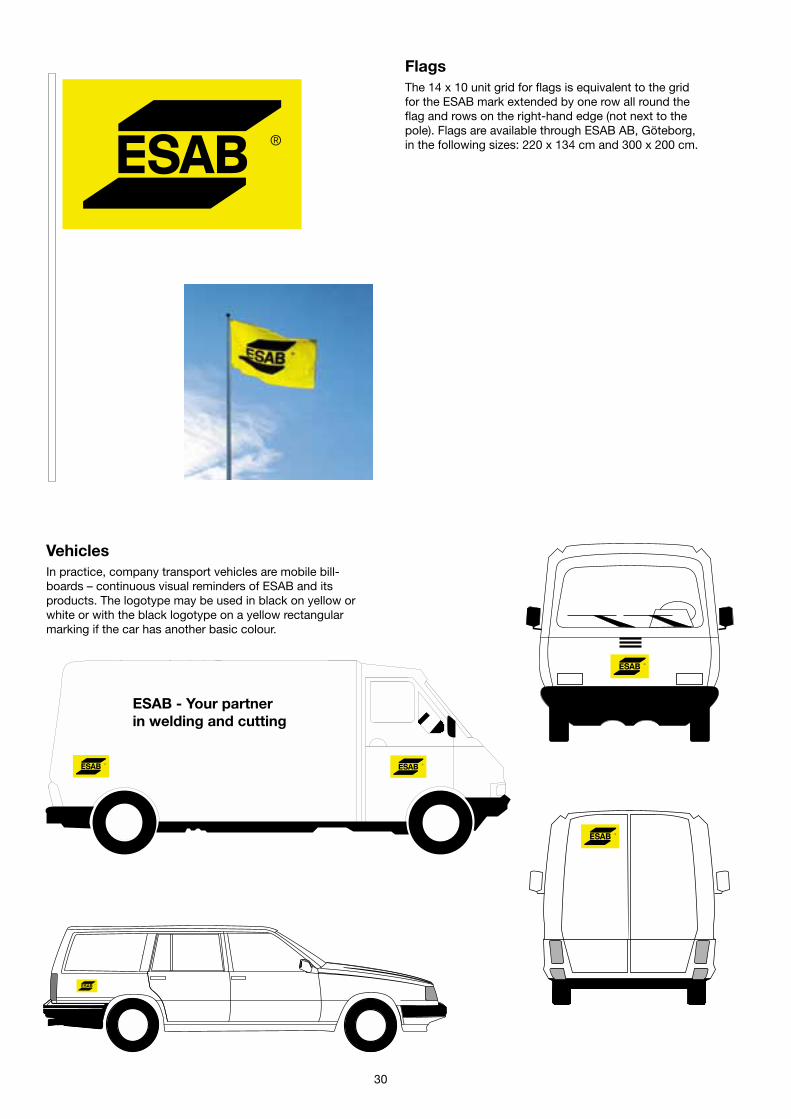
FlagsThe 14 x 10 unit grid for flags is equivalent to the gridfor the ESAB mark extended by one row all round theflag and rows on the right-hand edge (not next to thepole). Flags are available through ESAB AB, Göteborg,in the following sizes: 220 x 134 cm and 300 x 200 cm.
VehiclesIn practice, company transport vehicles are mobile bill-boards – continuous visual reminders of ESAB and itsproducts. The logotype may be used in black on yellow orwhite or with the black logotype on a yellow rectangularmarking if the car has another basic colour.
ESAB - Your partnerin welding and cutting
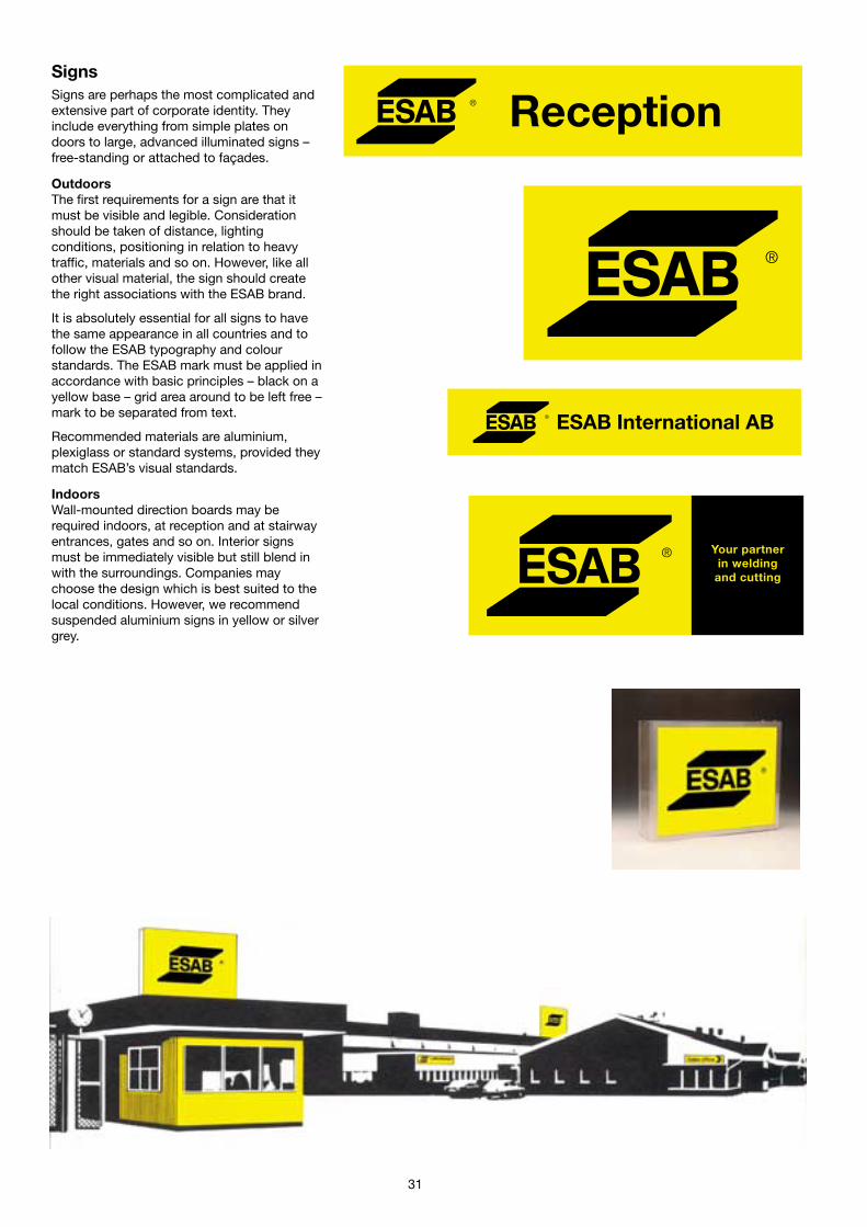
SignsSigns are perhaps the most complicated andextensive part of corporate identity. Theyinclude everything from simple plates ondoors to large, advanced illuminated signs –free-standing or attached to façades.
OutdoorsThe first requirements for a sign are that itmust be visible and legible. Considerationshould be taken of distance, lightingconditions, positioning in relation to heavytraffic, materials and so on. However, like allother visual material, the sign should createthe right associations with the ESAB brand.
It is absolutely essential for all signs to havethe same appearance in all countries and tofollow the ESAB typography and colourstandards. The ESAB mark must be applied inaccordance with basic principles – black on ayellow base – grid area around to be left free –mark to be separated from text.
Recommended materials are aluminium,plexiglass or standard systems, provided theymatch ESAB’s visual standards.
IndoorsWall-mounted direction boards may berequired indoors, at reception and at stairwayentrances, gates and so on. Interior signsmust be immediately visible but still blend inwith the surroundings. Companies maychoose the design which is best suited to thelocal conditions. However, we recommendsuspended aluminium signs in yellow or silvergrey.
ESAB International AB
Reception
Your partnerin welding
and cutting
31
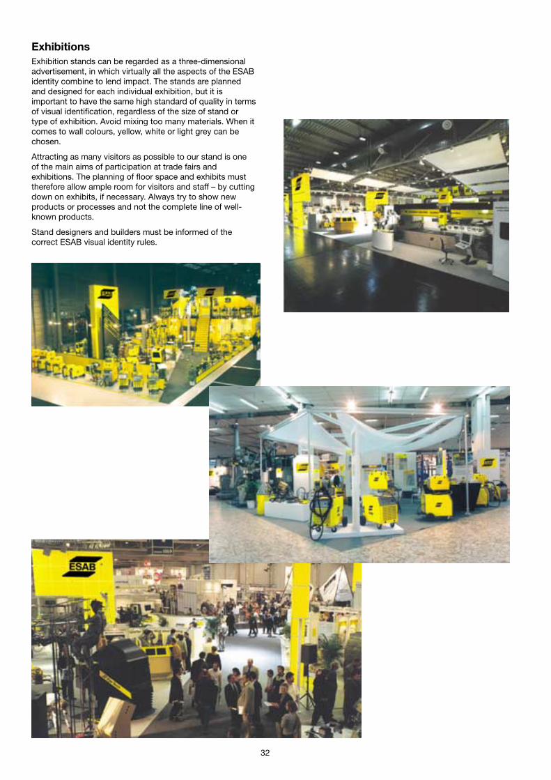
ExhibitionsExhibition stands can be regarded as a three-dimensionaladvertisement, in which virtually all the aspects of the ESABidentity combine to lend impact. The stands are plannedand designed for each individual exhibition, but it isimportant to have the same high standard of quality in termsof visual identification, regardless of the size of stand ortype of exhibition. Avoid mixing too many materials. When itcomes to wall colours, yellow, white or light grey can bechosen.
Attracting as many visitors as possible to our stand is oneof the main aims of participation at trade fairs andexhibitions. The planning of floor space and exhibits musttherefore allow ample room for visitors and staff – by cuttingdown on exhibits, if necessary. Always try to show newproducts or processes and not the complete line of well-known products.
Stand designers and builders must be informed of thecorrect ESAB visual identity rules.
32
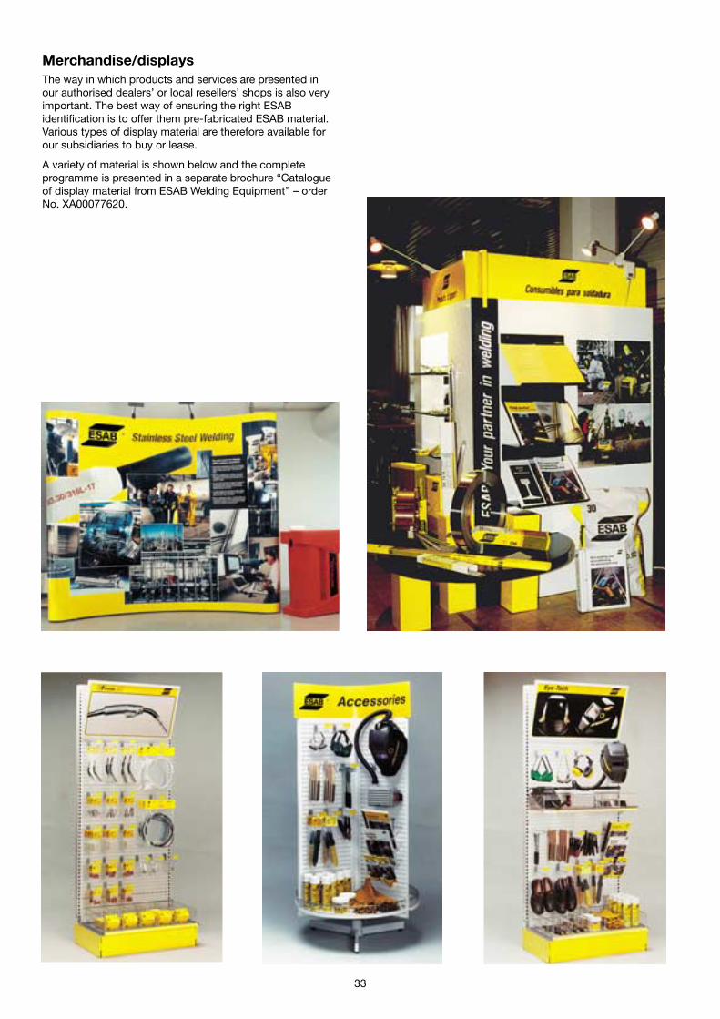
Merchandise/displaysThe way in which products and services are presented inour authorised dealers’ or local resellers’ shops is also veryimportant. The best way of ensuring the right ESABidentification is to offer them pre-fabricated ESAB material.Various types of display material are therefore available forour subsidiaries to buy or lease.
A variety of material is shown below and the completeprogramme is presented in a separate brochure “Catalogueof display material from ESAB Welding Equipment’’ – orderNo. XA00077620.
33

34
Give-awaysThe give-away items must be chosen carefully to match theESAB quality image. When giving away belts, they shouldbe made of genuine leather, for example. The logotype maybe printed or stamped on the material. Certain deviationsfrom colour regulations are permitted. However, all suchdeviations have to be sanctioned by the MarketCommunication Department, Göteborg.


Useful information
The ESAB brand logotypeThe ESAB logotype has been created for usesolely in black, either on a yellow field or onwhite. Its elements are precisely proportionedand must not be altered – any change wouldimpair the character and effectiveness of themark.
The logotype is available on authorised repro-duction sheets or in digital format. You are notallowed to change the proportions or to produceyour own logotypes in a computer. They cannever have precisely the right appearance andthe feeling of recognition – one of the main rea-sons for having a logotype – is thus lost.
One reproduction sheet is included with thisguide. More sheets or the logotype by e-mail oron CD can be ordered from the Market Commu-nication Department, ESAB AB, Göteborg, at theaddress below. Make sure that you specify thefile format you would like.
Colour samplesThe shade of yellow is given first and foremostaccording to the NCS scale. This measurementof colour is made optically and is therefore moretrue than when the colour is described accordingto the PMS scale.
One sheet of colour swatches is included withthis guide. It is very important that you alwaysinclude a colour sample with each printing orderto make sure you obtain the correct colour. Al-ways try to make comparisons in natural day-light. More sheets can be obtained from theMarket Communication Department.
The guide in digital formatThe contents of this guide will also be availableon ESAB’s intranet pages for everyone con-nected to ESAB’s internal communication net-work called the WAN.
It is possible to obtain the guide or parts of theguide as a PDF file via e-mail or on CD. Requestscan be sent to the address below.
Questions and ordersFor queries about details and the use of theitems in this publication, to order material asspecified above or for other questions relating tothe ESAB visual identity, please contact theMarket Communication Department in Göteborg.
ESAB ABMarket Communication Department
Box 8004, SE-402 77 Göteborg, SwedenPhone: +46 31 50 90 00, Fax: +46 31 50 93 90
E-mail: [email protected], Web: www.esab.com Aug
200
0 8
065
Ges
on S
kand
iatr
ycke
riet


