66
Visual Identity Guidelines VERSION 2.0, RELEASE DATE JUNE 2017

Visual Identity GuidelinesVE RS I O N 2 . 0, R E LE AS E DATE J U N E 2017

Preciosa’s visual identity is a unique design system composed of various elements that together create our
distinctive visual style.
The reputation and brand perception are extremely important for Preciosa’s future. We want our customers to have a consistently great experience with our brand across all divisions. Thus we need to ensure that we protect our reputation and brand accordingly. Our identity is not just the logo. It‘s a unique design scheme composed of various components that work together to create our distinctive visual style. It is essential to follow the guidelines in order
to achieve a strong and consistent application of our identity and build strong awareness and recognition of our brand. These Corporate Identity Guidelines provide clear standards and rules for communicating about our company. Our goal is a consistent representation of our Preciosa brand no matter where in the world we are or what medium we use for our communication. Let’s uphold these standards, and keep the Preciosa brand strong.
Stanislav KadlecExecutive Vice Chairman of the Board
F O R E W O R D

Andrea Kroupová The best thing about the future is that you can help shape it. Our new Corporate Identity Guidelines show us the way how to visually mould Preciosa into a premiere, inspirational, traditional and unique company. Iveta Burkoňová The art of decorating is as old as humanity. The desire to stand out, attract attention, and be elegant goes beyond political and cultural boundaries. It reaches across generations and speaks a language that is understood all over the world. Preciosa gives us the art of decorating with crystal. It is an art that inspires with its beauty, brilliance, style and sophistication. The new Identity Guidelines gives us the language with which Preciosa can communicate this beauty and style to its customers in a clear, consistent and graceful way.
Karel Páral A company brand is like a person’s reputation. It is how people feel about a company, how they view it, how they perceive it. You earn your reputation by trying to do difficult things well. One of these things is how a company communicates with the world around it – both what it says and how it is said. How it is said, how it appears, that is what corporate identity is all about. To be consistent, professional and support our brand, we need to start with a cohesive identity.
Puš Petr “Clothes make the man” as the saying goes. How we look is always the first thing that people notice. That is why it is so important to look as polished as we possibly can, and to have clear rules on how to achieve that look.
Alan Nemeš Branding is not only about logos or guidelines. We see it as a matter of choice that is strongly connected with emotions and the stories we want to share.
Kateřina Slezáková Let’s start with a basic but absolutely important description of a brand to evaluate the majestic importance of this document: a brand is a long-term commitment and like every commitment, it relies on ‘do-ability’, or the ability to make and build, which does not happen overnight. Tangible elements refer to the actions we take to build a certain brand identity. Do not panic if you aren’t sure of all the ‘what’ and ‘how’ – that is why the guidelines are here to help us to create our brand, our image, and the stories which will stand out in people’s minds.
M A R K E T I N G B O A R D

Preciosa Group Visual identity guidelines, version 2.0 4
Contents Corporate Identity1.1. Overview1.2 Logotype1.3 Symbol1.4 Corporate Colours1.5 Corporate Fonts
Photography2.1 Overview2.2 Image Visuals2.3 Image Product2.4 Mirroring / Caleidoscope
Layout & Templates3.1 Overview3.2 Layout construction3.3 Frame options3.4 Standart formats3.5 Business Cards3.6 Promotional bags3.7 Brochures3.8 PowerPoint template3.9 Social networks3.10 E-mail signature
Corporate IdentityBAS I C E LE M E NTS O F TH E PR E C I OSA VI S UAL ST YLE

Preciosa Group Visual identity guidelines, version 2.0 6
1.1.1 Overview
Preciosa‘s Corporate Identity is the manner in which our company presents itself to the public, to customers, investors, as well as employees. The Corporate Identity is a backbone of our visual style. It encompasses all basic elements of the identity such as Logotype, Symbol, Corporate Colours and Fonts. It is the primary task of each division to maintain the principles outlined in this guide.
¬ See section 1.1.2 for History of the Logo
Logotype – sections 1.2.1 to 1.2.3 Symbol – sections 1.3.1 to 1.3.8
Corporate Colours – sections 1.4.1 to 1.4.4 Corporate Fonts – sections 1.5.1 to 1.5.4 Logotype & Symbol usage – section 1.3.6
AbcABCAbc
Corporate identity
DIVISIONNAME

Preciosa Group Visual identity guidelines, version 2.0 7
1.1.2 History of the Preciosa Logo
Historically, Preciosa has had several different versions of the logo. The change and modernization of the logo and its use are therefore an integral part of the development of the whole group as well as individual divisions.
Over the years, Preciosa‘s logo has undergone many changes in shape, font and color. The latest change is an integral part of creating a new brand identity for Preciosa. The goal is both to create a unified Preciosa logo across all its divisions, as well as to develop one that symbolizes the corporation‘s shift from just simply a product manufacturer to a strategic partner that adds value, inspiration and creativity to increasingly more demanding customers.
¬ See sections 1.1.3 and 1.1.4 for the changes made to the Logo, System and the system the Logo is used
Corporate identity
Various logos used in the history of Preciosa
Version of the logo used until 2017

Preciosa Group Visual identity guidelines, version 2.0 8
1.1.3 Evolution of the Preciosa Logo Use
Before 2017, each division had its own version of the Preciosa Logo, which resulted in dozens of versions of our logo and inconsistencies in its application on marketing and communication materials.
The aim of the new system is to introduce one basic principle of using the same logo for all divisions. Up until 2017, the Logotype and Division Name were integrated. Moving forward we have separated this into two elements: the primary Logotype, and the secondary Symbol with Division Name. Thanks to this principle, all our marketing and communication materials will be visually consistent and linked throughout the Preciosa Group.
The primary element of the Preciosa brand for all divisions is the Logotype (text PRECIOSA). The secondary element is the Corporate Symbol (our double star) and the Division Name. Here the Symbol remains constant and only the Division Name changes.
Corporate identity
Logos with integrated divison names used until 2017
A new Logotype and separate Symbol with a division name
Crystal ComponentsGroup Cubic Zirconia & Gems Traditional Czech Beads Traditional Czech Glass Lighting Jewellery & Decoration Nadace
Crystal ComponentsGroup Cubic Zirconia & Gems Traditional Czech Beads Traditional Czech Glass Lighting Jewellery & Decoration Nadace
DIVISIONNAME

Preciosa Group Visual identity guidelines, version 2.0 9
1.1.4 Evolution of the Logotype and Symbol
Both original elements of the PPreciosa Logo have undergone change. In the Logotype, the change is noticeable, while the Symbol update is much subtler (mainly due to the registration of the Symbol as a trademark). The biggest change, however, is that the logo now consists of two separate elements - the Logotype and Symbol - rather than an integrated whole.
The Preciosa Logotype has evolved from the original version into a new typography that is more elegant and timeless. Overall, the Logotype is wider and the individual letters are optically balanced. This allows for a better application of the Logotype in larger sizes, such as on the exterior of a store or building.
The Symbol remains largely unchanged: the position of the smaller secondary star is shifted slightly in relation to the main star.
Corporate identity
Evolution of the Preciosa Logotype Evolution of the Preciosa Symbol

Preciosa Group Visual identity guidelines, version 2.0 10
1.2.1 Logotype
As a key component of Preciosa‘s identity, the Logotype is one of its most visible parts. Therefore, the Logotype must be used consistently on all materials and communication. The Logotype must be used as provided and cannot be altered in any way. Please see the Logotype Usage section to review the correct and incorrect use of the Logotype.
Logotype, gray version
Never use the old version of the logo
Logotype, blue version
Logotype, black version
Logotype, white version
Corporate identity

Preciosa Group Visual identity guidelines, version 2.0 11
1.2.2 Logotype Usage Guidelines
When using the Preciosa Logotype, please adhere to the minimum size and white space requirements.
The minimum size has been carefully established to ensure our Logotype is reproduced correctly in smaller sizes. At the minimum size, the Logotype is still clearly legible and provides a strong level of identification. When using a lower-quality printing technique (i.e. screenprinting), it is recommended that the Logotype be used in a larger size.
The white space has been established to ensure Logotype visibility and impact. Maintaining the White Space zone between the Logotype and other graphic elements such as text, images, other logos, etc. ensures that the Logotype always appears unobstructed and distinctly separate from any other graphic elements.
In cases where the minimum size and white space rules can‘t be adhered to, this exception must be approved by the person responsible (usualy brand manager).
Corporate identity
Minimum Size – The minimimum width of the Logotype in print is 25 mm and 90 px when using the Logotypein digital media. Please always take into account the printing technique or type of background behind the logo and, if needed, enlarge the logo to achieve better legibility.
White Space – The absolute minimal clear space around the Logotype from all sides is the same as the height of the logo. However, for the Logotype to properly stand out, it is reccomended to leave twice as much clear space around the Logotype.
25 mm / 90 px
Minimal White Space
Recommended White Space

Preciosa Group Visual identity guidelines, version 2.0 12
1.2.3 Logotype Usage Guidelines
When placing the Logotype on a backgroundwhether it be an image, a solid colour or a pattern, it is essential that there is enough contrast between the logo and the background. The Logotype must not be placed on backgrounds that distract from or compete with the logo.
To avoid incorrect usage and maintain consistency in the application, the Logotype must always be used as provided. The Logotype must not be redrawn or altered in terms of its appearance, components, colors, proportions, or any other property. The Logotype must be always used only in the approved colours (see section Logotype).
Corporate identity
Correct usage of the Logotype on various backgrounds No modifications are allowed to the Logotype
LIGHTING

Preciosa Group Visual identity guidelines, version 2.0 13
Symbol for Preciosa Traditional Czech Beads
Symbol for Nadace Preciosa
Symbol for Preciosa Crystal Components
Symbol for Preciosa Traditional Czech Glass
Symbol for the Preciosa Foundation
Symbol for Preciosa Lighting
Symbol for Preciosa Jewellery & Decoration
Symbol for Vinolok
1.3.1 Horizontal Symbol
A horizontal version of the Symbol was developed for each division. This version of the Symbol is the preferred option for all materials and has been created in gray, black and white options. These have been prepared in both standard and vector bitmap formats for your use. Only these versions may be used - independently re-created versions should not.
Corporate identity
TRADITIONALCZECH BEADS
CRYSTALCOMPONENTS
TRADITIONALCZECH GLASS
LIGHTINGCUBIC ZIRCONIA & GEMS
JEWELLERY & DECORATION
MEMBER OF THE PRECIOSA GROUPFOUNDATIONNADACE
Symbol for Preciosa Cubic Zirconia & Gems
Preciosa Group Visual identity guidelines, version 2.0 14
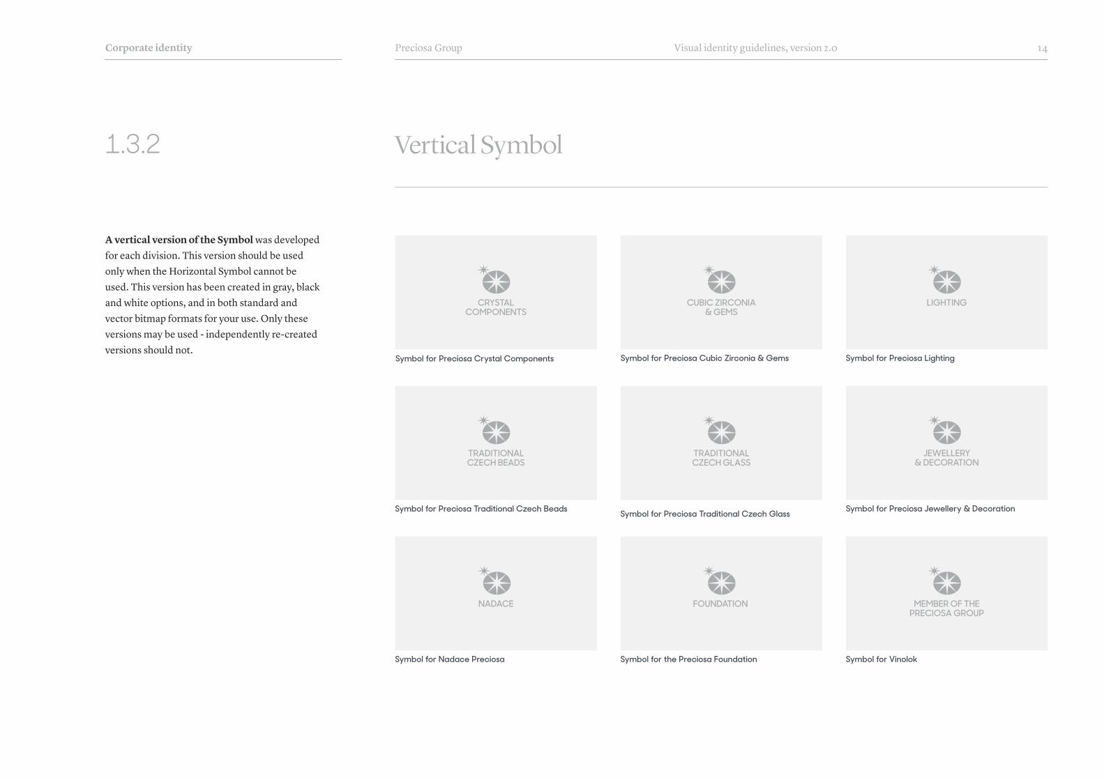
1.3.2 Vertical Symbol
A vertical version of the Symbol was developed for each division. This version should be used only when the Horizontal Symbol cannot be used. This version has been created in gray, black and white options, and in both standard and vector bitmap formats for your use. Only these versions may be used - independently re-created versions should not.
Corporate identity
TRADITIONALCZECH BEADS
CRYSTALCOMPONENTS
TRADITIONALCZECH GLASS
FOUNDATION
LIGHTINGCUBIC ZIRCONIA & GEMS
JEWELLERY & DECORATION
MEMBER OF THE PRECIOSA GROUP
Symbol for Preciosa Traditional Czech Beads
Symbol for Nadace Preciosa
Symbol for Preciosa Crystal Components
Symbol for Preciosa Traditional Czech Glass
Symbol for the Preciosa Foundation
Symbol for Preciosa Cubic Zirconia & Gems Symbol for Preciosa Lighting
Symbol for Preciosa Jewellery & Decoration
Symbol for Vinolok
NADACE

Preciosa Group Visual identity guidelines, version 2.0 15
1.3.3 Symbol Template
Symbol with a division name is a graphical element which is used to label documents and materials with a division name. This Symbol has specific place in layout (see section Frame and Standart formats in chapter Templates). Each division has pre-made version of the Symbol (see pages Horizontal Symbol and Vertical Symbol in this chapter). The pre-made versions should be used for all materials. In case the Symbol and division name must be created again, please use this template.
Horizontal Symbol Template, gray version
Vertical Symbol Template, gray version
Horizontal Symbol Template, black version
Vertical Symbol Template, black version
Horizontal Symbol Template, white version
Vertical Symbol Template, white version
Corporate identity
DIVISIONNAME
DIVISIONNAME
DIVISIONNAME
DIVISIONNAME
DIVISIONNAME
TRADITIONALCZECH BEADS
DIVISIONNAME
DIVISIONNAME
Preciosa Group Visual identity guidelines, version 2.0 16
1.3.4 Symbol Usage Guidelines
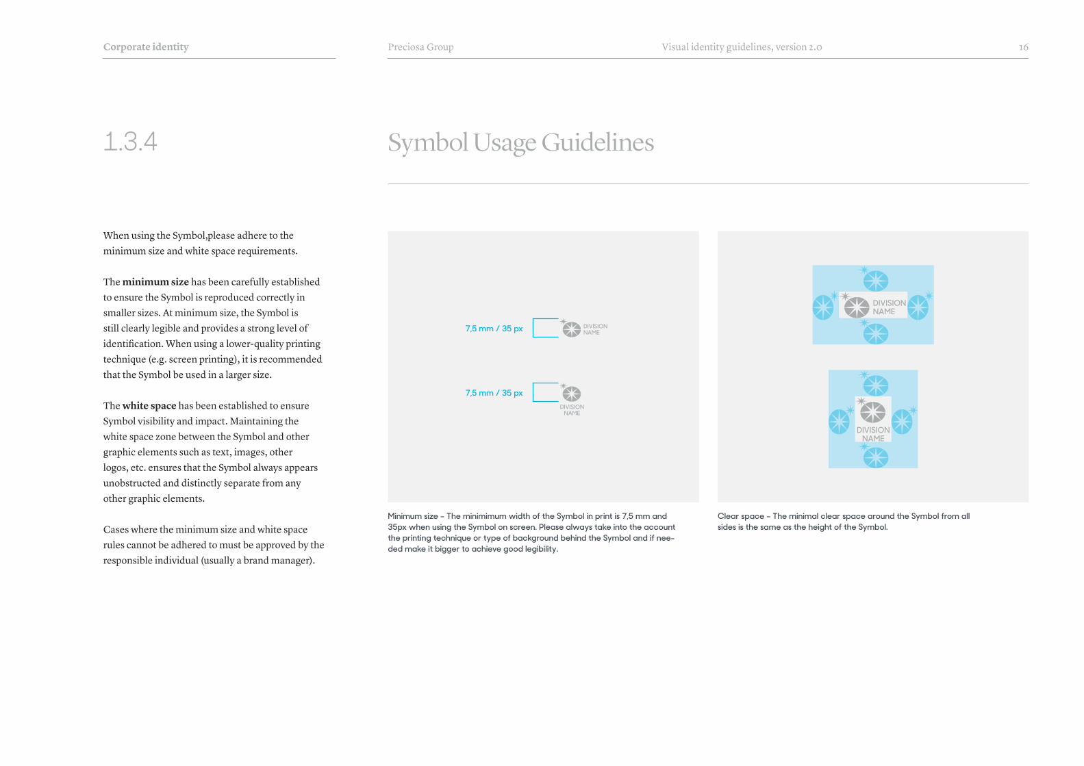
When using the Symbol,please adhere to the minimum size and white space requirements.
The minimum size has been carefully established to ensure the Symbol is reproduced correctly in smaller sizes. At minimum size, the Symbol is still clearly legible and provides a strong level of identification. When using a lower-quality printing technique (e.g. screen printing), it is recommended that the Symbol be used in a larger size.
The white space has been established to ensure Symbol visibility and impact. Maintaining the white space zone between the Symbol and other graphic elements such as text, images, other logos, etc. ensures that the Symbol always appears unobstructed and distinctly separate from any other graphic elements.
Cases where the minimum size and white space rules cannot be adhered to must be approved by the responsible individual (usually a brand manager).
Corporate identity
Minimum size – The minimimum width of the Symbol in print is 7,5 mm and 35px when using the Symbol on screen. Please always take into the account the printing technique or type of background behind the Symbol and if nee-ded make it bigger to achieve good legibility.
Clear space – The minimal clear space around the Symbol from all sides is the same as the height of the Symbol.
7,5 mm / 35 px
7,5 mm / 35 px
DIVISIONNAME
DIVISIONNAME
DIVISIONNAME
DIVISIONNAME

Preciosa Group Visual identity guidelines, version 2.0 17
DIVISIONNAMEDIVISION
NAME
DIVISIONNAMEDIVISION
NAME
DIVISIONNAME
DIVISIONNAME
DIVISIONNAMEDIVISION
NAME
1.3.5 Symbol Usage Guidelines
Corporate identity
When placing the Symbol on a background, whether it is an image, solid colour, or pattern, it is essential that there is enough contrast between the Symbol and the background. The Symbol must not be placed on backgrounds that distract from, or compete with the Symbol.
To avoid incorrect usage and maintain consistency in the application, the Symbol must always be used as provided. The Symbol must not be redrawn or altered in its appearance, components, colors, proportions, or any other property. The Symbol must always be used only in the approved colours.
Correct usage of the Symbol on backgrounds No modifications are allowed to Symbol
DIVISIONNAME
DIVISIONNAME
DIVISIONNAMEDIVISION
NAME
DIVISIONNAME
DIVISIONNAME
DIVISIONNAMEDIVISION
NAME

Preciosa Group Visual identity guidelines, version 2.0 18
1.3.6 Usage of Logotype and Symbol
Corporate identity
The usage of Logotype in combination with Symbol is the most common form of branding for each Preciosa division.
The preferred position of the Logotype is center bottom of the page layout. The Symbol may be placed in two positions. The preferred position is in the top left corner. If this position is not suitable, the Symbol can also be centered at the top of the layout.
The usage of the Logotype and Symbol is described in detail in sections 3.2.1 to 3.2.3. This includes the definition of the size of the Logotype depending on the document format.
¬ See sections 3.2.1 to 3.2.3 for more detail
Prefered position Alternative position

Preciosa Group Visual identity guidelines, version 2.0 19
1.3.7 Usage of the Logotype without Symbol
Corporate identity
A separate Logotype is used wherever it is not possible or desired to mark the material with a Symbol and a division name.
A typical example when only the Logotype is used is for advertising or signage for sponsorship (e.g. a sponsored team uniform), building signage (e.g. storefront name), branding of exhibition booths at trade shows (e.g. joint presentation of several divisions) or any other presentation that is not specific to only one division.

Preciosa Group Visual identity guidelines, version 2.0 20
1.3.8 Usage of the Symbol without a Division Name
Corporate identity
Lorem ipsum dolor, consectetur adipiscing elit, eiusmod tempor incididunt et dolore magna aliqua.
Ut enim ad minim veniam, quis exercitation ullamcolaboris nisi ut aliquip ex commodo consequat.
Preciosa Division – Name of the Presentation 18. Dubna 2016 – Strana 1
N A M E S U R E N A M E
Use of the Symbol without Division Name is allowed. A standalone Symbol is used is used especially where it is not possible or not desired to use the Logotype or a Division Name.
The standalone Symbol is often used in Preciosa Group materials that are intended for all divisions. Another typical use of a standalone Symbol is a profile photo on social networks.
However, the standalone Symbol should not be used as the main logo; it is only to be used as a secondary graphic element.
Profile photo on social networks
Paper bags for all Preciosa divisions
Usage of the standalone Symbol without Division Name

Preciosa Group Visual identity guidelines, version 2.0 21
1.4.1
Corporate identity
Corporate Colours
Preciosa Corporate Colours consist of seven options.
Gray is the most dominant and most used colour in all materials. Gray was selected so that it would not compete with colour photography. Gray also represents sophistication and elegance.
Sand colour is a reference to the raw material from which all Preciosa products are made. It serves as a warm alternative to Gray to create a softer or more empathetic feeling (e.g. for the Preciosa Foundation).
Blue is a legacy colour which refers back to Preciosa‘s history and several decades of its use in the logo. This colour is not dominant in the new Preciosa brand and identity - in fact, some divisions may never use it.
Dark Gray is complimentary colour to Gray. Often it is used when Black would create too stark a contrast.
Off White is a colour used on backgrounds when a white background is not desired.
Black & White (along with Gray and Blue) are used in the Logotype, the Symbol, and for text.
¬ See section 1.4.2 for Corporate Colour Usage
GrayCMYK: 13 / 9 / 10 / 27 RGB: 173 / 174 / 176 HEX: adaeb0Pantone: Cool Gray 5 U*
Off WhiteCMYK: 0 / 0 / 0 / 5RGB: 241 / 242 / 242HEX: f1f2f210% of Pantone Cool Gray 5 U*
WhiteCMYK: 0 / 0 / 0 / 0RGB: 255 / 255 / 255HEX: ffffff
Dark GrayCMYK: 40 / 30 / 20 / 66 RGB: 72 / 77 / 86 HEX: 484d56Pantone: Cool Gray 11 U*
BlackCMYK: 0 / 0 / 0 / 100 RGB: 0 / 0 / 0 HEX: 000000
SandCMYK: 7 / 12 / 32 / 6 RGB: 222 / 203 / 165HEX: decba5Pantone: 7501 U*
BlueCMYK: 70 / 42 / 9 / 48RGB: 51 / 81 / 112 HEX: 335170Pantone: 7463 U*
* All prescribed Pantone colors are the closest variants for CMYK. When printing with Pantone colours, always make visual reference to already printed materials.

Preciosa Group Visual identity guidelines, version 2.0 22
1.4.2
Corporate identity
Corporate Colours - Preferred Use
Logo: WhiteSymbol: Gray 30%BG: GrayHeadline: BlueSubheadline: White Text: White
Logo: BlackSymbol: WhiteBG: GrayHeadline: WhiteSubheadline: Dark Gray Text: White
Headline
Headline
Text lorem ipsum si melioraLO R E M I P S U M S I M E LI O R A
Text lorem ipsum si melioraLO R E M I P S U M S I M E LI O R A
DIVISIONNAME
DIVISIONNAME
Logo: WhiteSymbol: Gray 30%BG: GrayHeadline: Dark GraySubheadline: Gray 30% Text: White
Logo: GraySymbol: GrayBG: Off WhiteHeadline: GraySubheadline: Dark Gray Text: Gray
HeadlineText lorem ipsum si meliora
LO R E M I P S U M S I M E LI O R A
DIVISIONNAME
Logo: BlackSymbol: WhiteBG: SandHeadline: BlueSubheadline: White Text: White
Logo: BlackSymbol: GrayBG: Off WhiteHeadline: BlueSubheadline: Gray Text: Gray
Logo: WhiteSymbol: WhiteBG: SandHeadline: WhiteSubheadline: Black Text: Black
Headline Headline
Headline
Text lorem ipsum si melioraLO R E M I P S U M S I M E LI O R A
Text lorem ipsum si melioraLO R E M I P S U M S I M E LI O R A
Text lorem ipsum si melioraLO R E M I P S U M S I M E LI O R A
DIVISIONNAME
DIVISIONNAME
HeadlineText lorem ipsum si meliora
LO R E M I P S U M S I M E LI O R A
DIVISIONNAME
Logo: WhiteSymbol: Gray 30%BG: BlueHeadline: SandSubheadline: White Text: White
HeadlineText lorem ipsum si meliora
LO R E M I P S U M S I M E LI O R A
DIVISIONNAME
DIVISIONNAME
Each division can choose its dominant and secondary Corporate Colour from the approved colours.
For example, a fashion-driven division such as Preciosa Crystal Components can choose to use Gray and Dark Gray as their dominant colours and use Sand and Blue marginally. On the other hand, a division such as the Preciosa Foundation can use Sand as a dominant colour because of the warm feeling and use other Corporate Colours for its less dominant ones.
The Corporate Colours must be used as the primary colours for backgrounds and text in order to create a cohesive and consistent link between material created by all divisions.
Safe Combinations The eight examples on this page were prepared as the safe options on how to combine primary backround and text Corporate Colours to achieve desired visual style and maintain good legibility. There are other possible combinations which can be used, but these eight options are preferred.

Preciosa Group Visual identity guidelines, version 2.0 23
1.4.3
Corporate identity
Division Colours
In addition to the Corporate Colours, each division can also use its own complementary Division Colours. These colours underscore the division’s character and enable the fine-tuning presentation materials for the specific needs of the division.
Division Colours are not used as the primary colours but as a complement to the main Corporate Colours. Their optimal use is in shorter texts, web buttons, highlighting important information, etc. To a limited extent, Division Colours can be used for headlines as well as the background colour. The overall colour impression of materials should, however, be dominated by the main Corporate Colours.
Important note: Each division is responsible for using their own colours correctly. Therefore each division must create their own colour breakdowns for print and screen use.
Preciosa Traditional Czech Beads
Nadace Preciosa
Preciosa Crystal Components
Preciosa Traditional Czech Glass
Preciosa Cubic Zirconia & Gems Preciosa Lighting
Preciosa Jewellery & Decoration
Vinolok

Preciosa Group Visual identity guidelines, version 2.0 24
1.4.4
Corporate identity
Exceptions for Colour Usage
In some cases, Corporate Colours may not entirely suit a specific project. Such projects may include, for example, a promo of a new product with specific new colour or a trend colour forecast. In such cases, it is possible to extend the set of Corporate Colours with an additional custom colour(s). This additional colour is usually used as a highlight colour – not as a main colour. The additional colour selection can be chosen by the division and its designer.
Usage of additional colour(s) should be an exception, not a rule. An additional colour may be used only for a specific project that has a limited timeframe.
Example of custom background colour
Example of custom headline colour Example of custom subheadline colour
P R O D U C T C ATA L O G U E
Cubic Zirconia& Gems
Main headlinelorem ipsum
LO R E M I P S U M S I M E L I O R A D I E S
Main headlinelorem ipsum
LO R E M I P S U M S I M E L I O R A D I E S
Preciosa Group Visual identity guidelines, version 2.0 25
1.5.1
Corporate identity
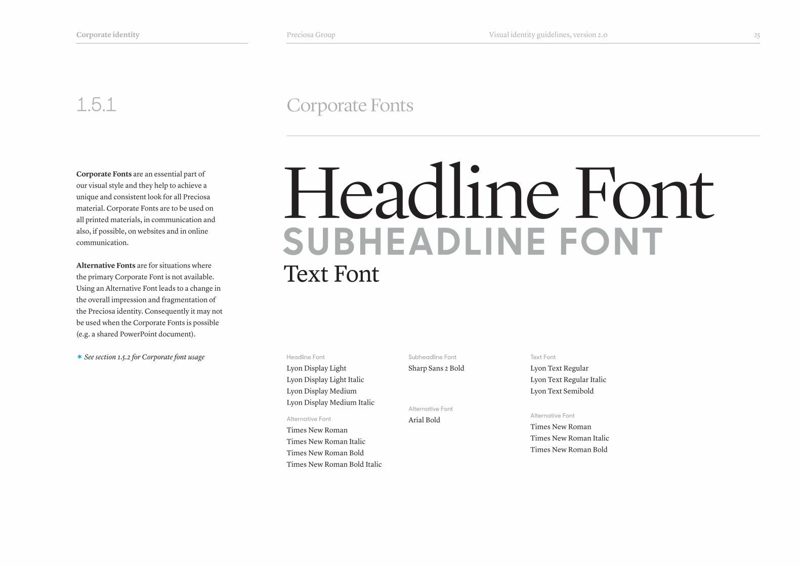
Corporate Fonts
Corporate Fonts are an essential part of our visual style and they help to achieve a unique and consistent look for all Preciosa material. Corporate Fonts are to be used on all printed materials, in communication and also, if possible, on websites and in online communication.
Alternative Fonts are for situations where the primary Corporate Font is not available. Using an Alternative Font leads to a change in the overall impression and fragmentation of the Preciosa identity. Consequently it may not be used when the Corporate Fonts is possible (e.g. a shared PowerPoint document).
¬ See section 1.5.2 for Corporate font usage
Headline FontSU B H EAD LI N E FO NTText Font
Headline Font
Lyon Display LightLyon Display Light ItalicLyon Display MediumLyon Display Medium Italic
Alternative Font
Times New RomanTimes New Roman ItalicTimes New Roman BoldTimes New Roman Bold Italic
Subheadline Font
Sharp Sans 2 Bold
Alternative Font
Arial Bold
Text Font
Lyon Text RegularLyon Text Regular ItalicLyon Text Semibold
Alternative Font
Times New RomanTimes New Roman ItalicTimes New Roman Bold

Preciosa Group Visual identity guidelines, version 2.0 26
1.5.2
Corporate identity
Corporate Fonts Preferred Usage
The examples on the right show the ideal use of the Corporate Fonts. The typograpic style plays an essential part of Preciosa’s visual style and helps to achieve a unique and consistent look for all materials.
Headline FontThe preferred font for headlines is Lyon Display Light. Some words in the headline can be highlighted by using Lyon Display Light Italic. The Alternative Font for headlines is Lyon Display Medium. This font can be used only when the background behind the font is too busy and the Light version is not legible.Note for designers: Always extend the font to 105% of the original width and use optical kerning and letter spacing around -10 (InDesign + Illustrator). Many of the letters in the font have stylistic alternatives and swashes. You can play with these to achieve an interesting look.
Sub-Headline FontThe font for sub-headlines is Sharp Sans No.1 Display Bold. This font is mostly used in all caps.Note for designers: Use optical kerning and letter spacing around +100 (InDesign + Illustrator).
Text FontText is always set in Lyon Text Regular. Highlighting certain sections of text is allowed by using Lyon Text Semibold or Lyon Text Regular Italic.
The OriginalBirthplace
of BohemianCrystal
Lyon Display Light Italic
S H A R P S A N S N O . 1 D I S P L AY B O L DLyon Text ipsum dolor sit amet, consectetur adipiscing elit, sed
do eiusmod tempor incididunt ut labore et dolore magna aliqua.
Ut enim ad minim veniam, quis nostrud exercitation ullamco.
S H A R P S A N S D I S P L A Y N O 1 . B O L D
Laboris nisi ut aliquip ex ea commodo consequat.
Duis aute irure dolor in reprehenderit in voluptate velit esse cillum
dolore eu fugiat nulla pariatur. Excepteur sint occaecat cupidatat.
W W W . W E B S I T E . C O M
N E W COATI N G
CrystalSunriseLU STR R U D O LF
Vznešenost světla vybroušená
k dokonalosti
Headline Font
Sub-Headline Font
Text Font

Preciosa Group Visual identity guidelines, version 2.0 27
4 4.5ssCOLOUR 5 5.5 6 6.5 7 7.5 8 8.5 9 9.5 10 11 11.5
12 16 19 24 29 34 39
6 8ssCOLOUR 10 16 20 30 4 5mmCOLOUR 6
Light Sapphire Opal | 31110 (DF)
Light Sapphire Opal AB | 31110 (TC) (DF)
Light Sapphire Opal | 31110 (S)
Light Sapphire Opal | 31110 (HF)
Light Sapphire Opal AB | 31110 (TC) (S)
Light Sapphire Opal AB | 31110 (TC) (HF)
MC Chaton Rose VIVA 12® | art. 438 11 612
MC Chaton MAXIMA | art. 431 11 615
Light Sapphire Opal | 31110 (U)
Light Sapphire Opal AB | 31110 AB (U)
Light Sapphire Opal AB 2× | 31110 AB 2× (U)
LEGEND:
. . Standard Catalogue Item . . Minimum Order Quantity – for more details
contact the Preciosa Sales Office3
MC Bead Rondell | art. 451 69 302
1.5.3
Corporate identity
Fonts in Tables
When creating tables or charts the Univers LT Condensed font is used for the text within the table. The reason for using this font is that it saves space and ensures good readability even in small font sizes. The detailed use of the fonts is clear from the drawing on this page.
4 4.5ssCOLOUR 5 5.5 6 6.5 7 7.5 8 8.5 9 9.5 10 11 11.5
12 16 19 24 29 34 39
6 8ssCOLOUR 10 16 20 30 4 5mmCOLOUR 6
Light Sapphire Opal | 31110 (DF)
Light Sapphire Opal AB | 31110 (TC) (DF)
Light Sapphire Opal | 31110 (S)
Light Sapphire Opal | 31110 (HF)
Light Sapphire Opal AB | 31110 (TC) (S)
Light Sapphire Opal AB | 31110 (TC) (HF)
MC Chaton Rose VIVA 12® | art. 438 11 612
MC Chaton MAXIMA | art. 431 11 615
Light Sapphire Opal | 31110 (U)
Light Sapphire Opal AB | 31110 AB (U)
Light Sapphire Opal AB 2× | 31110 AB 2× (U)
LEGEND:
. . Standard Catalogue Item . . Minimum Order Quantity – for more details
contact the Preciosa Sales Office3
MC Bead Rondell | art. 451 69 302
MC Chaton Maxima | art. 431 11 615
MC Chaton Rose Viva 12® | art. 438 11 612 MC Bead Rondell | art. 451 69 302
Sharp Sans Display No. 1Bold
Univers LT 67 Bold Condensed
LyonTextRegular
Univers LT 47 Light Condensed
Univers LT 47 Light Condensed
Univers LT 67 Bold
Condensed

Preciosa Group Visual identity guidelines, version 2.0 28
1.5.4
Corporate identity
Exceptions in Font Usage
In some cases, Corporate Fonts may not entirely suit a specific project. Such projects may include, for example, the introduction of a new product, a fashion forecast or, a Christmas greeting. In such cases, it is possible to extend the set of Corporate Fonts with one additional font. This additional font is usually used in the main title/headline of the project to bring about a desired typographic feel. An additional font can be chosen by the division and its designer.
Usage of additional fonts should be an exception, not a rule. An additional font may be used only for a specific project that has a limited timeframe.
Examples of additional font usage
Crystal SunriseN E W C O AT I N G
Light Smoked TopazN E W C O L O U R
S P R I N G / S U M M E R 2 0 1 8Inspirations & Innovations
T H E G O D D E S S O F T H E D A W N

PhotographyTH E KE Y C HAR ACTE R I STI C S O F I MAG E
AN D PRO D U CT PH OTO G R APHY
Preciosa Group Visual identity guidelines, version 2.0 30Templates
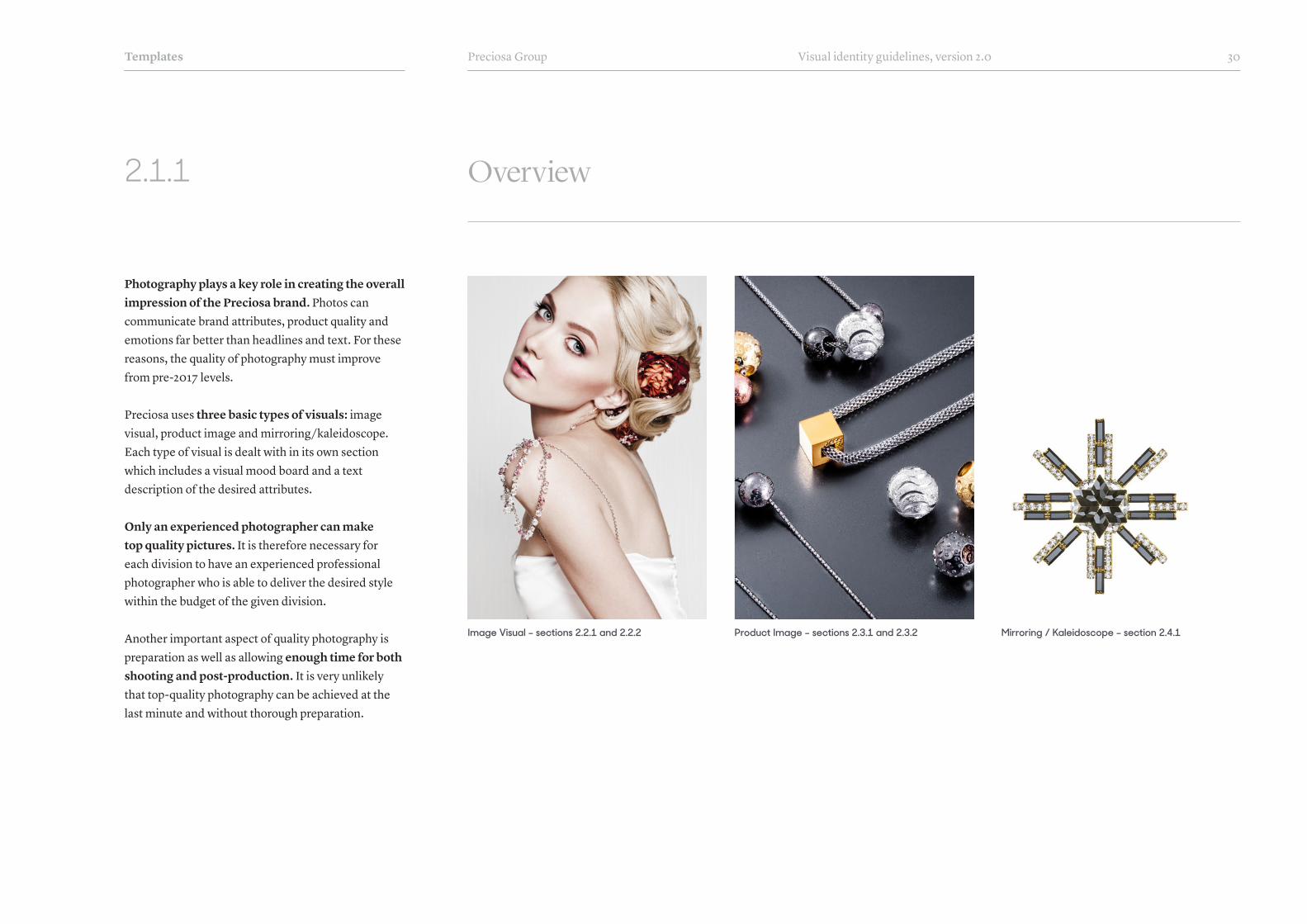
2.1.1 Overview
Photography plays a key role in creating the overall impression of the Preciosa brand. Photos can communicate brand attributes, product quality and emotions far better than headlines and text. For these reasons, the quality of photography must improve from pre-2017 levels.
Preciosa uses three basic types of visuals: image visual, product image and mirroring/kaleidoscope. Each type of visual is dealt with in its own section which includes a visual mood board and a text description of the desired attributes.
Only an experienced photographer can make top quality pictures. It is therefore necessary for each division to have an experienced professional photographer who is able to deliver the desired style within the budget of the given division.
Another important aspect of quality photography is preparation as well as allowing enough time for both shooting and post-production. It is very unlikely that top-quality photography can be achieved at the last minute and without thorough preparation.
Image Visual – sections 2.2.1 and 2.2.2 Product Image – sections 2.3.1 and 2.3.2 Mirroring / Kaleidoscope – section 2.4.1

Preciosa Group Visual identity guidelines, version 2.0 31
2.2.1 Image Visuals
The image visual is the most important visual element of Preciosa’s brand identity. The quality of the visual communicates the quality of Preciosa products far better than a headline or text. Beautiful quality photos are universally understood by customers around the world. Therefore, this type of visual should be dominant for all divisions.
The image visual shows the products of the division as it would be used and should inspire customers through its high aesthetic quality. Whether it’s a visual of a fashion model with jewellery, or a designer working with Preciosa products, it’s important for the overall tone to be inspired by beauty and, ideally, also tell the story of the product.
Image visuals in this section represent the desired photo style. The foundation to thi style is a well-chosen model, appropriate makeup and retouching, simple uncomplicated surroundings, and subtle colours to make the Preciosa product(s) stand out.
¬ See section 2.2.2 for Image Visual Attributes
Templates
*
*

Preciosa Group Visual identity guidelines, version 2.0 32
2.2.2 Attributes of Image Visuals
achievabilityhumanity
beautiful modelstory
uniqueness / distinctivenessatmosphere
memorabilityfirst-rate post-production
internationalitydecency / graciousness
witty
Image visuals should contain as many predefined attributes as possible. By applying these attributes to all divisions, the visual expression of the Preciosa brand will be unified and the aesthetic level of the visuals will increase.
Achievability and Humanity: the model, photo shoot location, makeup, outfit, hairstyle, and other aspects should inspire and show a reality that is a bit more beautiful than everyday life. It is not, however, the goal of photography to show an unreachable lifestyle.
Story: visuals should tell a story. It can be a story of transforming Preciosa products into beautiful jewellery, or a story supporting the product’s characteristics.
Naturally Beautiful Model: the basis of each beautiful photo is a well-chosen model. The model should have natural beauty. It is important for the model to be experienced in front of the camera in order to look natural.
Other Attributes: it is important for visuals to be distinct and thus memorable for the customer. This means that the photo should be original, not a copy of other brands. Photography should not feel provincial. All image visuals must be international in style, even if the intended use is only local. The post-production of the photography should be of high quality, unobtrusive and in line with the marketing campaign message. Photography can nevertheless be witty and make the viewer feel good.
Templates

Preciosa Group Visual identity guidelines, version 2.0 33
2.3.1 Product Image
Product photography is one of the most important aspects of Preciosa’s brand identity. High-quality product photos communicate the quality of Preciosa products better than words. Product image photography is used when it is not possible or desired to use pure image visuals (section 2.2.1).
An experienced photographer is necessary for high-quality product photography. No less important is the set designer who prepares the environment in which the photo is to be taken. It is also critical to focus on quality and not on quantity. The best result is achieved if the photographer focuses on a few key photos rather than creating dozens of photos.
Product photography has to inspire and deliver superior aesthetic quality. There is beauty in simplicity. The play of light and darkness, which is typical for glass and crystal, should be well captured in the photo.
Product photos in this section represent the desired photo style. Best results are achieved with simple set design and neutral colours which allow the Preciosa product(s) to stand out.
¬ See section 2.3.2 for Product Image Attributes
Templates
*

Preciosa Group Visual identity guidelines, version 2.0 34
2.3.2 Product Image Attributes
Product photography should contain as many predefined attributes as possible. By applying these attributes across all divisions, the visual expression of the Preciosa brand will be unified and the aesthetic level of the visuals will increase.
The Game of Light and Darkness: it is important to use a lightsource that highlights the reflections of the glass. Conversely, the background material should ideally not be shiny so that the product stands out better from the background.
Simplicity: less is more. The simpler the environment in which the product is photographed, the more the beauty and sparkle of the glass will emerge. There is no need to create a complicated environment in which the product is photographed; just a simple monochrome background with quality material is needed.
Symmetry: where appropriate, products should be photographed symmetrically. Such an arrangement creates order and calmness instead of chaotic and random.
Playfulness: creativity and the enjoyment of creating should be felt from the photograph. At the same time, however, it is necessary to maintain a high degree of sophistication.
Other Attributes: a top-quality and unconventional set design helps product photography communicate premium quality and originality. When photographing components, a model’s silhouette can be used. If possible, product photography should capture the uniqueness of the product or its use.
Templates
a game of light and shadowssimplicity
geometry / symmetrynon-traditional set design
playfulnessthe brilliance of crystal
atmosphereusp visualization
silhouette

Preciosa Group Visual identity guidelines, version 2.0 35
2.4.1 Mirroring / Kaleidoscope
Mirroring, or kaleidoscope, is a visual principle of working with product photos. This type of visual is especially suitable for smaller products such as crystal components or beads. However, it can be used for jewellery or chandelier trimmings as well.
How to Create MirroringIn this visual principle, individual products are arranged into interesting compositions that are then mirrored or duplicated to create a kaleidoscope-like effect. The number and type of products in the composition, their colour, and their shapes can all be defined by each individual division and its designer. To achieve consistency across divisions, it is important to use this type of visual on a white or very light background, maintain a simple and 2D graphic approach, and adhere to symmetry.
When to UseThis type of visual is ideal for the front page of a product catalogue and replaces the visual style of the ‘flying stones’ that was commonly used up until 2017.
Templates
P R O D U C T C A R D / S E E D B E A D S
Preciosa Twin

Layout & TemplatesLAYO UT CO N STR U CTI O N AN D TE M PLATE S PR E PAR E D
I N TH E PR E C I OSA VI S UAL ST YLE

Preciosa Group Visual identity guidelines, version 2.0 37Templates
3.1.1 Overview
In this section you will find instructions and prepared templates for working with the new identity.
In the Layout section, the way the Logotype, the Symbol and frame are placed is described in detail. In the Template section you will find ready-made layouts for print advertising, online banners and brochures. Next, there are templates for various other materials including business cards, bags, catalogue title pages, brochures and PowerPoint templates.
All templates are available as open data.
Layout construction – sections 3.2.1 to 3.2.4
Brochures – sections 3.7.1 to 3.7.5 Powerpoint – sections 3.8.1 to 3.8.2Bags – sections 3.6.1 to 3.6.3
Standart formats – sections 3.4.1 to 3.4.3 Business Cards – sections 3.5.1 to 3.5.3
Name SurnamePosition in the companyPreciosa Division name
m +420 777 123 456t +420 488 123 456
PreciosaDivision.com
S P R I N G / S U M M E R 2 0 1 8Inspirations & Innovations
P R O D U C T C ATA L O G U E
Cubic Zirconia& Gems

Preciosa Group Visual identity guidelines, version 2.0 38Templates
3.2.1 Layout - Print Ads
The principles of the layout for printed material are based and depend on the document size. The shortest side of the document determines the size of the Logotype and its frame width.
Frame Size: the frame size is equal to 5% of the width of the document’s shortest side. Therefore, the narrower the document, the thinner the frame will be. In cases where the frame would be too thin due to an unusually narrow document size, it is possible to make the frame larger than 5% so that the size optically corresponds to the standard format.
Logotype Size: the width of the Logotype is equal to 22% of the width of the document’s shortest side. The minimum Lototype width is 25 mm and cannot be reduced below this size. Horizontally the Logotype is placed on the center line of the layout. Vertically the ideal position is three times the height of the Logotype from the lower edge of the frame.
Symbol Size: the size of the Symbol depends on the size of the Logotype. Ideally the height of the Logotype should be the same as the height of the oval (with the larger star) in the Symbol, as shown in the illustration on the right.
¬ See section 3.4.1 for Standard Print Layouts
5% of the width of the shortest side
22% of the width of the shortest side
Frame Size
Logotype Size
Preferred position
Alternative position
Symbol Size

Preciosa Group Visual identity guidelines, version 2.0 39Templates
3.2.2 Layout - Banners
The principles of the layout for online materials are different from print material. The main difference is that the frame is not present and that the Logotype size is fixed for all standard banners.
Frame: in banners, the frame that is common in print material is not used, by default. The main reason is to save space, but also that the frame would not be visible on a white background. The use of the frame is, however, allowed if it suits the needs of the banner. In this case, the frame size is constructed in the same way as for print material.
Logotype Size: the standard banner format uses a uniform Logotype size of 90 px wide. Horizontally the Logotype is placed on the center axis. Vertically it is positioned at twice the height of the Logotype from the bottom of the format.
Symbol Size: the size of the Symbol depends on the size of the Logotype. Ideally the height of the Logotype is equal to the height of the oval (with the larger star) on the Symbol, as shown in the illustration on the right.
¬ See section 3.4.2 for Standart Banner Layouts
90 pxLogotype Size
Preferred position
Alternative position
Symbol Size
Preciosa Group Visual identity guidelines, version 2.0 40Templates
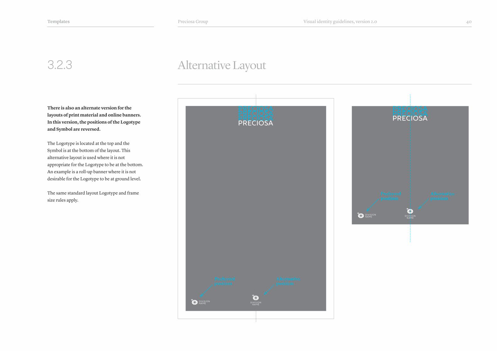
3.2.3 Alternative Layout
There is also an alternate version for the layouts of print material and online banners. In this version, the positions of the Logotype and Symbol are reversed.
The Logotype is located at the top and the Symbol is at the bottom of the layout. This alternative layout is used where it is not appropriate for the Logotype to be at the bottom. An example is a roll-up banner where it is not desirable for the Logotype to be at ground level.
The same standard layout Logotype and frame size rules apply.
Preferred position
Alternative position
Preferred position
Alternative position

Preciosa Group Visual identity guidelines, version 2.0 41Templates
3.2.4 Incorrect Layout Modifications
The layout principles described on previous pages cannot be changed.
The position of the Logotype and Symbol must be adhered to according to the layout principles described in sections 3.2.1 to 3.2.3. The elements can not be moved around.
Similarly, the size of the Logotype and Symbol must be adhered to according to the principles described in sections 3.2.1 to 3.2.3. The elements can not be scaled up or down according to personal preference.
Wrong position of Logotype and Symbol Wrong position of Logotype and SymbolWrong size of Logotype and Symbol

Preciosa Group Visual identity guidelines, version 2.0 42Templates
3.3.1 Frame Options
One of the key visual elements of the new corporate identity is the frame. The frame should appear on front pages of printed and electronic documents. The most common form is the standard frame. This is used in the vast majority of situations. However, if this frame form is not suitable, there are three other alternatives.
The standard frame is the most used form of frame. It consists of a pure white border around the entire document format. In some cases, it is possible for part of the image to bleed onto the frame. Examples of such use can be found in section 3.3.2 Objects outside the frame.
The inverse frame is an inverted version of the standard frame. The white frame is filled with an image or colour. The inside part of the layout can therefore be completely white.
The transparent frame is essentially the standard frame, but with transparency. The division designer can choose the degree of opacity of the transparent frame, though typically, it is around 30-40%. If a white transparent frame is not suitable, a black or other colour may be used.
The line frame should be used sparingly because it has the smallest visual consistency with the standard frame. This frame is formed by a thin inset white line. It is also possible to use a different line colour: for example black or another Corporate Colour.
DI VI SIONNA ME
Standard frame
Inverse frame Transparent frame Line frame
DI VI SIONNA ME
DI VI SIONNA ME
DI VI SIONNA ME

Preciosa Group Visual identity guidelines, version 2.0 43Templates
3.3.2 Objects outside the frame
When working with the frame, it is possible to let parts of the objects on the page to bleed into the frame. As shown in the examples on the right, the objects are partially outside of the frame. This detail adds interest to the layout and should be used when the image allows this treatment. Ideal objects include components, lighting, jewellery and Vinolok closures.
DI VI SIONNA ME
Objects outside the frame
DI VI SIONNA ME
LO R E M I P S U M S I M E L I O R A
Lorem ipsum
LO R E M I P S U M S I M E L I O R A
Lorem ipsum
Preciosa Group Visual identity guidelines, version 2.0 44Templates
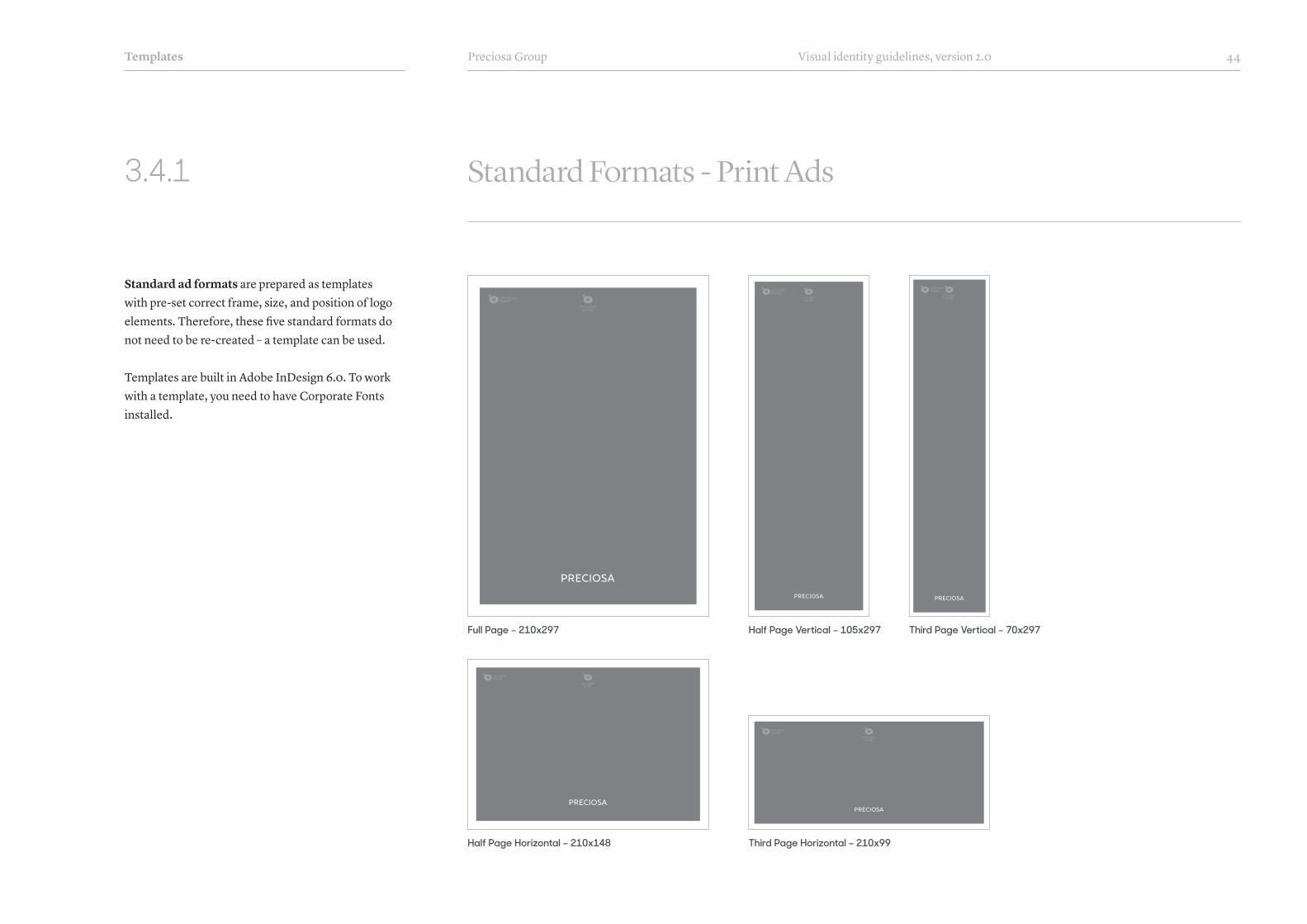
3.4.1 Standard Formats - Print Ads
Standard ad formats are prepared as templates with pre-set correct frame, size, and position of logo elements. Therefore, these five standard formats do not need to be re-created – a template can be used.
Templates are built in Adobe InDesign 6.0. To work with a template, you need to have Corporate Fonts installed.
Half Page Horizontal – 210x148
Full Page – 210x297
Third Page Horizontal – 210x99
Half Page Vertical – 105x297 Third Page Vertical – 70x297
DI VI SIONNA ME
DI VI SIONNA ME
DI VI SIONNA ME
DI VI SIONNA ME
DI VI SIONNA ME
DI VI SIONNA ME
DI VI SIONNA ME
DI VI SIONNA ME

Preciosa Group Visual identity guidelines, version 2.0 45Templates
3.4.2 Standard Formats - Banners
Standard online banner formats are prepared as templates in which the correct size and position of the logo are already set, as well as the size and position of the symbol. Therefore, the seven standard formats do not need to be re-created, but an appropriate template can be used.
Templates are built in Adobe Illustrator 6.0. To work with a template, you need to have Corporate Fonts installed.
120x600 160x600250x250
480x60
745x100
234x60
120x250

Preciosa Group Visual identity guidelines, version 2.0 46Templates
3.4.3 Standard Formats - Brochures
All divisions of the Preciosa Group must have the same standard brochure formats. Formats are based on standard paper formats (A3, A4, A5, etc.) but they are slightly narrowed, giving them elegance and personality. Other formats of brochures are only allowed if none of the following formats can be used for reasons which are beyond the control of the division.
269x420 This format is used primarily for large brochures and newspaper-style material.
190x297 This format is the most commonly used brochure format. It is a format for standard product image brochures and catalogues.
160x250 This format is most commonly used for product sheets or single sheet documents.
134x210 This format is used when the 190x297 format is too large. This format doesn‘t not allow the design to be as elegant, so it should be used sparingly.
99x210 This format is a standard format (DL size). It should only be used on less important brochures or when the budget is tight. This format doesn’t not allow the design to be as elegant, so it should be used sparingly.
DI VI SIONNA ME
DI VI SIONNA ME
DI VI SIONNA ME
DI VI SIONNA ME
DI VI SIONNA ME
DI VI SIONNA ME
DI VI SIONNA ME
DI VI SIONNA ME
DI VI SIONNA ME
DI VI SIONNA ME
269x420 (narrow A3) 190x297 (narrow A4) 160x250 134x210 (narrow A5) 99x210

Preciosa Group Visual identity guidelines, version 2.0 47
3.5.1 Business Cards - Front
The business card template offers two options for the front side. The version without an address is intended for the employees who travel a lot and are not expected to have regular visits or meetings at their offices. The version with an address is to be used by employees that operate mostly locally and thus the office address is essential.
How to Use the TemplateThe only part of the template that can be edited is the text. The size, colour and position of all other elements must remain unchanged. This template should be used for all employees of the Preciosa Group.
¬ See section 3.5.2 and 3.5.3 for Back Side Template
Templates
Front Side without Address Front Side with Address Front Side - Hong Kong
Name Surname常務董事亞太區
手提 +852 1234 5678電話 +852 1234 5678
寶仕奧莎國際(香港)有限公司香港特別行政區九龍灣常悅道3號
企業廣場2期2308室
PreciosaDivision.com
Name SurnamePosition in the CompanyPreciosa Division Name
m +420 777 123 456 t +420 488 123 456
Preciosa a.s., Opletalova 319746601 Jablonec n/Nisou, Czech Rep.
PreciosaDivision.com
Name SurnamePosition in the CompanyPreciosa Division Name
m +420 777 123 456 t +420 488 123 456
PreciosaDivision.com

Preciosa Group Visual identity guidelines, version 2.0 48
3.5.2 Business Cards - Standard Back
The business card template offers four standard options for the back side. Options 1, 2 and 3 can be selected by the employee to best suit his/her job description. Option 1 should be selected when the goal is to present Preciosa as a global company. Option 2 is best for those employees that benefit from the Crystal Valley brand. Option 3 is neutral and can be chosen when Options 1 and 2 are not suitable. The blank back should be used as little as possible.
How to Use the TemplateIn terms of the design (typography, positions, sizes, etc.) the standard back templates cannot be changed in any way. The design must be used as provided. However, the background colour in Options 1, 2 and 3 can be changed to any Corporate Colour.
¬ See section 3.5.3 for Custom Back
Templates
Back, Option #1 Back, Option #2 Back, Option #3
Blank Back
Prague Hong Kong New York
Los Angeles London Moscow
Dubai
The OriginalBirthplace
of BohemianCrystal
CrystalValley.cz
The OriginalBirthplace
of BohemianCrystal
CrystalValley.cz
The OriginalBirthplace
of BohemianCrystal
CrystalValley.cz
Prague Hong Kong
New York Los Angeles
London Moscow
Dubai
Prague Hong Kong
New York Los Angeles
London Moscow
Dubai

Preciosa Group Visual identity guidelines, version 2.0 49
3.5.3 Business Cards - Custom Back - Examples
It is possible to design a custom back side for the business card. Custom back sides can be used for specific occasions such as an important event, exhibition, or when launching a major new product line. The customized back should not be used as standard card and should only be used for a limited time.
How to Use the TemplateThe four examples on this page show possible designs of a custom business card back. However, the design can be different to the examples as long as adheres to all rules described in this manual (i.e. usage of Corporate Colour, Corporate Fonts, photography styles, etc.).
Corporate identity
Examples of custom back sides for business cards
Lorem ipsum dolor amet consectetur
adipiscing elit
Lorem ipsum dolor amet consectetur adipiscing preciosa-aurora.com

Preciosa Group Visual identity guidelines, version 2.0 50
3.6.1 Promotional Bags
In the past each division was responsible for producing their own bags. Under the new Corporate Identity Guidelines all promotional bags will be unified across all divisions within the Preciosa Group. Bags can be ordered through the Central Purchasing Department.
Promotional paper bags have one common design that differs only by the background Corporate Colour. The preferred design of the bag is with handles that in no way disfigure (e.g. create holes on) the front face of the bag. See section 3.6.1 for more details.
Plastic advertising bags are a practical financial option when the price of a paper promotional bag is too high and the brand image is not a priority.
Corporate identity
Example of Medium Bag Example of Large Bag Example of Small Bag Plastic Bag

Preciosa Group Visual identity guidelines, version 2.0 51
3.6.2 Promotional Bags - Production
The preferred production method of paper promotional bags is depicted on the right. This type of production delivers a more elegant result than standard production.
Please follow this guideline to achieve the desired look and quality of the bag.
Corporate identity
The ribbon is matte black with fine serration. It is not a satin ribbon. Minimum width of the ribbon is 25 mm
Ribbon handles are glued to the inside of the bag Munken Lynx Polar,
250 g/m2. Uncoated smooth paper without lamination.The tag line
or message is placed inside the bag

Preciosa Group Visual identity guidelines, version 2.0 52
3.6.3 Promotional Bags - Stickers & Hang Tags
Although all divisions have the same promotional bag design, the look of the bag can be partially modified by using a hang tag.
The hang tag is a way to add additional information to a standard promotional paper bag. The samples shown on this page indicate the design direction of the tag. The final dimension of the hang tag, its construction, and the material to be used are in the hands of the marketing department of the division and its designer. A high aesthetic standard both in the graphic design and in the materials used to make the tag must be adhered to.
Stickers serve to secure the bag from opening. The stickers come in one standard size for all promotional bags. Just like the bags themselves, stickers can be ordered via the Central Purchasing Department.
Corporate identity
CR YS TA LCO MP ONEN TS
CR YS TA LCO MP ONEN TS
Samples of Hang Tags
A bag with Sticker and Hang Tag
Sticker
Preciosa Group Visual identity guidelines, version 2.0 53
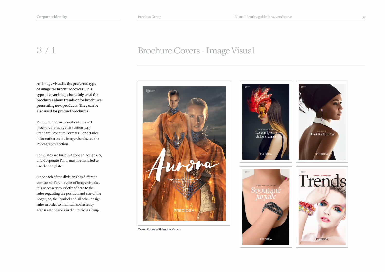
3.7.1 Brochure Covers - Image Visual
An image visual is the preferred type of image for brochure covers. This type of cover image is mainly used for brochures about trends or for brochures presenting new products. They can be also used for product brochures.
For more information about allowed brochure formats, visit section 3.4.3 Standard Brochure Formats. For detailed information on the image visuals, see the Photography section.
Templates are built in Adobe InDesign 6.0, and Corporate Fonts must be installed to use the template.
Since each of the divisions has different content (different types of image visuals), it is necessary to strictly adhere to the rules regarding the position and size of the Logotype, the Symbol and all other design rules in order to maintain consistency across all divisions in the Preciosa Group.
Corporate identity
Cover Pages with Image Visuals
S P R I N G / S U M M E R 2 0 1 8Inspirations & Innovations
L O R E M I P S U M S I M E L I O R A
Lorem ipsum dolor si amet
i N N O VAT I O N S 2 0 1 6
Heart Briolette Cut
N Á R A M K Y Z P R E C I O S A F A R F A L L E ™
Spoutanéfarfalle
S P R I N G / S U M M E R 2 0 17

Preciosa Group Visual identity guidelines, version 2.0 54
3.7.2 Brochure Covers – Product Image
Product images can be used on the front page of a brochure when an image visual is not available and mirroring is not visually appropriate or attractive.
For more information about allowed brochure formats, visit section 3.4.3 Standard Brochure Formats. For detailed information on the visuals, see the Photography section.
Templates are built in Adobe InDesign 6.0, and Corporate Fonts must be installed to use the template.
Since each of the divisions has different content (different types of visuals), it is necessary to strictly adhere to the rules regarding the position and size of the Logotype, the Symbol and all other design rules in order to maintain consistency across all divisions in the Preciosa Group.
Corporate identity
Brochure Cover Pages with Product Image
T H E S T O R Y O F T H E
Crystal Automata
DesnáCollection
P R O D U C T C ATA L O G U E 2 0 17
DecorativeGlassP R O D U C T C ATA L O G U E 2 0 1 7
I N S P I R I T N G C R Y S TA L C R E AT I V I T Y
StickyCrystals
Empress of chandeliersM A R I A T H E R E S I A C H A N D E L I E R

Preciosa Group Visual identity guidelines, version 2.0 55
3.7.3 Brochure Covers - Mirroring
Corporate identity
Mirroring/Kaleidoscope visuals are recommended for covers of product catalogues.
For more information about allowed brochure formats, visit section 3.4.3 Standard Brochure Formats. For detailed information on visuals, visit the Photography section.
Templates are built in Adobe InDesign 6.0, and Corporate Fonts must be installed to use the template.
Since each of the divisions have different content (different types of visuals), it is necessary to strictly adhere to the rules regarding the position and size of the Logotype, the Symbol and all other design rules in order to maintain consistency across all divisions in the Preciosa Group.
Examples of Product Catalogue Cover Pages with Mirroring/Kaleidoscope Visuals
P R O D U C T C ATA L O G U E
Cubic Zirconia& Gems
P R O D U C T C ATA L O G U E
Stones in settings
Your Crystal MysteryC ATA L O G U E O F E X C L U S I V E J E W L L E R Y
M A X I M A C R Y S TA L S B Y P R E C I O S A
Maxima Brilliance
P R O D U C T C A R D / S E E D B E A D S
Preciosa Twin

Preciosa Group Visual identity guidelines, version 2.0 56
3.7.4 Brochure Back
Corporate identity
Brochures in the 190x297 mm format have a standardised back cover. The cover consists of the Division Name, a subheading with the text “A Member of the Preciosa Group” followed by an additional paragraph of text. Underneath this is the division website address. In the top right corner there is a predefined place for the SAP number, the year of publication, and bar code.
Back Cover without Bar Code Back Cover with Bar Code
.../templates/brochure-back-cover.zip
PreciosaDivision.com
Preciosa Division NameA Member of the Preciosa Group
Preciosa Group is a global leader in products manufactured from crystal. From the world famous Czech Beads and Crystal Components used in
fashion industry, to tailor made Lighting projects for luxury hotels, royal palaces and yachts, the true craftsmanship of crystal production
has been present in Bohemia since 16th century.
2017
-X27
7S
PreciosaDivision.com
Preciosa Division NameA Member of the Preciosa Group
The Preciosa Group is a global leader in products manufactured from the finest crystal. From the world-famous Czech Beads and Crystal
Components used in the fashion industry, to custom lighting projects for luxury hotels, royal palaces, and yachts, the true tradition of crystal
craftsmanship has lived in Bohemia since the 16th century.
2017
-X27
7S

Preciosa Group Visual identity guidelines, version 2.0 57
3.7.5 Brochure Spreads
The sample brochure spreads for 190x297mm brochures on the right show different types of typography and various examples of incorporating images.
Text can be set in one, two, or three columns. A full-page image may or may not have a frame. A full-page image on one side works well with a product photograph on a white background on the other side. Usage of the Logotype or the Symbol is allowed inside the brochures, but is not compulsory.
Corporate identity

Preciosa Group Visual identity guidelines, version 2.0 58
3.8.1 PowerPoint Template
The template for presentations includes a set of predefined pages that can be used to create a unified presentation style. It contains a title page, chapter page, several text pages, a page for video playback, pages with different types of quotations, a page with social media links and several other page types.
How to Use ItThe template is designed to be used in PowerPoint. Depending on the type of content, choose a page with a suitable design that you can customize by adding text, images, or other content. If a suitable page is not available in the template, keep as many elements as possible from the other pages when creating a customized page.
Final Presentation UseThe presentation is prepared with Alternative Fonts. This way the presentation can be shared to all Mac and Windows computers.
Corporate identity

Preciosa Group Visual identity guidelines, version 2.0 59
3.8.2 PowerPoint Template - Title Page Examples
To the right are various designs of PowerPoint presentation title pages. Attention should be paid when creating a title page. It must look representative, feel inspiring and create the expectation that interesting information is to follow on the next slides.
Corporate identity

Preciosa Group Visual identity guidelines, version 2.0 60
3.9.1 Social Networks - Profile Image
There are two options for profile images for social networks. The profile image consists of the Corporate Symbol either in gray on white or a white Symbol on a gray background. The Corporate Symbol is to be used by all divisions on all social networks.
Incorrect VersionsThe Preciosa Logotype or the Symbol with a Division Name are not permited as profile images. Both options would be too small and therefore illegible. The standalone Symbol cannot be used in any other colour than gray or white. Take great care not to use the old version of the graphic symbol from Preciosa Logo.
Special ExceptionsIf a special circumstance arrises and a division needs to change its profile image, it is only possible to do so for a very limited time and with a clear strategic goal in mind. Once this special exception ends, the profile image must be returned to the Symbol.
Corporate identity
DIVISIONNAME
Correct Profile Image
Incorrect Profile Images

Preciosa Group Visual identity guidelines, version 2.0 61
3.9.2 Social Networks - Image Posts
Social network image labelling has two basic templates. The first template is with Logotype and text; the second template is without text and features the Logotype and the standalone Symbol, or the Symbol with a Division name. These templates must be adopted by all divisions.
Image Title with TextThe template with text can be modified in several different ways. The designer can choose different background colour ehind the text as well as the degree of opacity. The text can be shown in any Corporate Colour. If the image on which the block is placed does not allow for the preferred center composition, the entire block can be shifted to the left, to the right or up and down, For examples of various designs, see section 3.9.3 Social Media - Examples.
Image Title without TextIn this template, the Logotype and the Symbol can be shown in any allowed colour variant at 100% opacity or less. The Symbol can be used with and also without the Division Name.
Important note: Only use labelling on the first image. Subsequent images can be watermarked.
Corporate identity
Image Title with Text Image Title without Text
Main headlinelorem ipsum
LO R E M I P S U M S I M E L I O R A D I E S
Main headlinelorem ipsum
LO R E M I P S U M S I M E L I O R A D I E S
optional
+11+2

Preciosa Group Visual identity guidelines, version 2.0 62
3.9.3 Social Networks - Examples
The following examples show some options for image title design with text.
A: Standard version with Logotype at the top
B: Mirrored version of the standard version
C: Off-center text block & non-corporate colours
D: A version with a longer headline
E: A verson with longer sub-text
F: A post with non-corporate colours
Corporate identity
Main headlinelorem / May 25–27
LO R E M I P S U M S I M E L I O R A D I E S
Main headlinelorem ipsum
LO R E M I P S U M S I M E L I O R A D I E S
Lorem ipsum dolor sit amet, consectetur
adipiscing elit, sed do eiusmod tempor incididunt ut labore
et dolore magna
Main headline
LO R E M LO R E M I P S U M D O LO R S I T A M E T,
C O N S E C T E T U R A D I P I S C I N G E L I T, S E D D O E I U S M O D
T E M P O R I N C I D I D U N T U T L A B O R E E T D O LO R E
Main headlinelorem ipsum
LO R E M I P S U M S I M E L I O R A D I E S
Main headlinelorem ipsum
LO R E M I P S U M S I M E L I O R A D I E S
D
A
E
B
F
C
Preciosa Group Visual identity guidelines, version 2.0 63
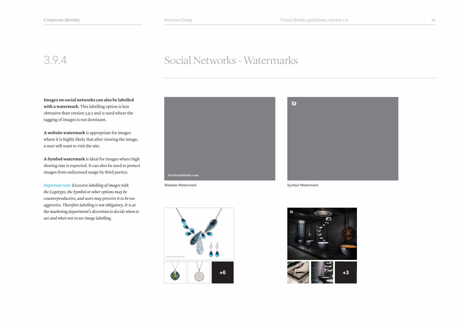
3.9.4 Social Networks - Watermarks
Images on social networks can also be labelled with a watermark. This labelling option is less obtrusive than version 3.9.2 and is used where the tagging of images is not dominant.
A website watermark is appropriate for images where it is highly likely that after viewing the image, a user will want to visit the site.
A Symbol watermark is ideal for images where high sharing rate is expected. It can also be used to protect images from unlicensed usage by third parties.
Important note: Excessive labelling of images with the Logotype, the Symbol or other options may be counterproductive, and users may perceive it to be too aggressive. Therefore labelling is not obligatory. It is at the marketing department’s discretion to decide when to use and when not to use image labelling.
Corporate identity
Website Watermark
PreciosaWebsite.com
PreciosaBeauty.com
Symbol Watermark
+3+6

Preciosa Group Visual identity guidelines, version 2.0 64
3.10.1 E-mail Signature
The e-mail signature is a predefined text and image combination which appears in the e-mail of each Preciosa employee.
Contact details are a compulsory part of the e-mail signature and must be used at all times. Each employee must input their own details in the predefined font style. No changes to colours, fonts, or sizes are allowed.
The e-mail promo banner is an optional component of the e-mail signature. The recommended size is 500x180 px, with the optionally placed in the top left corner, so it appears close to the Coprorate Logotype in the Signature block.
The e-mail is prepared as a HTML file which requires installation into an employee’s e-mail software.
Corporate identity
Contact details
Promo banner

Preciosa Group Visual identity guidelines, version 2.0 65
Glossary of termsVisual Identity: the visual elements of a company‘s presence which includes logotype, signage, design, and marketing collateral (letterhead, business cards, brochures, etc). This document concerns itself with guidelines of the Preciosa Visual Identity.
Brand Identity: the proposition or promise that a company makes to its customers. It includes product features, benefits, quality, customer service as well as the values that the brand possesses. The brand identity is how a company wants its customer to perceive it.
Brand Image: the actual customer’s perception of the company and brand. It is how the customer experiences the company.
Preciosa Logo: the historic version of our corporate logo which combined the double-star symbol and Preciosa logotype. This logo is no longer valid.
Logotype: the newly separate stylized typographic representation of the Preciosa name. It is also called the Preciosa Logotype or simply Logotype.
Symbol: the newly separated graphical representation of Preciosa – the double-star, accompanied with a Division Name. There is a horizontal (preferred) and vertical version.
Standalone Symbol: the newly separated graphical representation of Preciosa – the double-star. Standalone Symbol doesn‘t include a division name.
Corporate Colours: the set of colours which connects all divisions. Those colours are used as the main set of colours for all materials by each division.
etc.Division Colours: an additional 2-3 approved colours for each division. These vary from division to division. Not to be used as main colours.
Corporate Fonts: A set of fonts used for designing print and online materials such as ads, outdoor, brochures, banners, etc.
Alternative Fonts: a set if fonts which replace Corporate Fonts when those cannot be used (e.g. PowerPoint). Thses fonts are pre-installed in all Mac and Windows computers.

of the guidelines is right here. But this is also place where you start. Be creative and inspire others!
Tell the story of the amazing Preciosa Brand – the story that inspires crystal creativity all around the world.
The End...
IDENTITY AND GUIDELINES: TOUCH BRANDING / WWW.TOUCHBRANDING.COM


