63
VISUALISATION, a Primer: Basics, Techniques & Some Guidelines CAGATAY TURKAY, giCentre, City University London DigitalCatapult, 02 June 2015
| Date post: | 09-Aug-2015 |
| Category: |
Science |
| Upload: | cagatay-turkay |
| View: | 112 times |
| Download: | 3 times |
VISUALISATION, a Primer:
Basics, Techniques &
Some GuidelinesCAGATAY TURKAY,
giCentre, City University London
DigitalCatapult, 02 June 2015
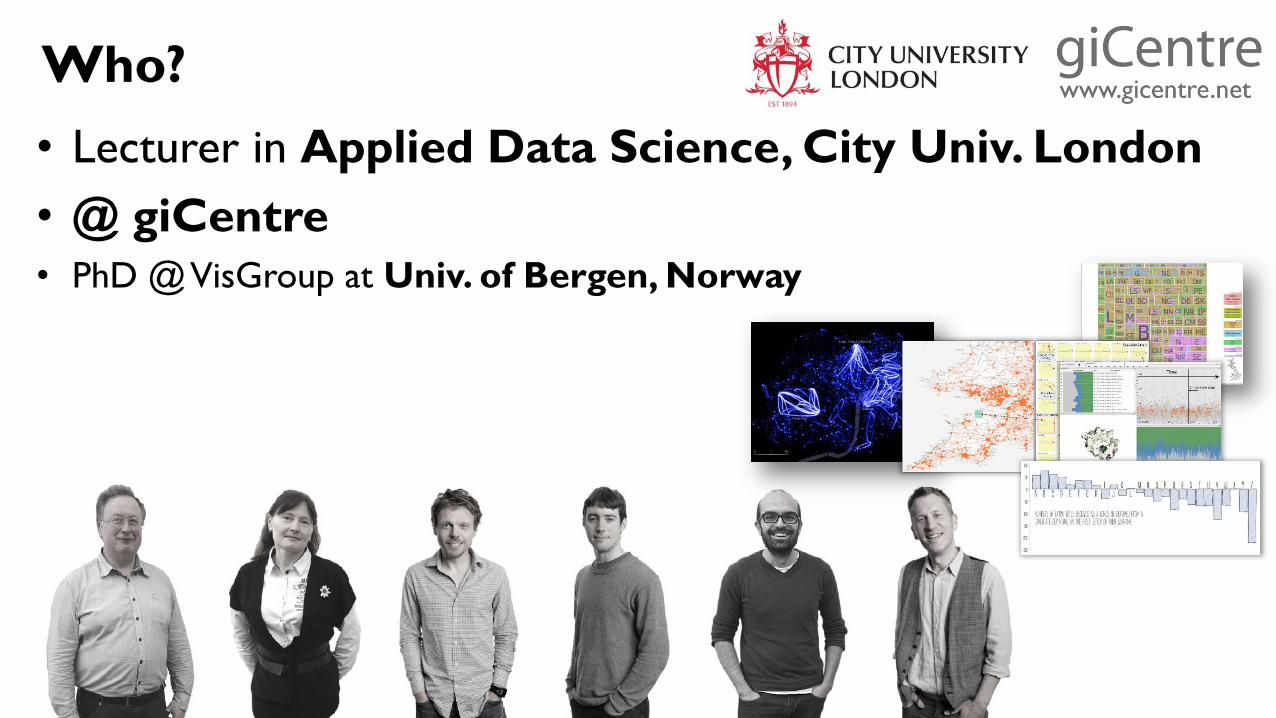
Who?
• Lecturer in Applied Data Science, City Univ. London
• @ giCentre
• PhD @ VisGroup at Univ. of Bergen, Norway
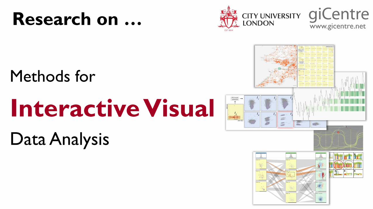
Research on …
Methods for
Interactive VisualData Analysis
Today …
VISUALISATION
Basics – visual channels, theories
Techniques
Guidelines & Rules of Thumb
Examples
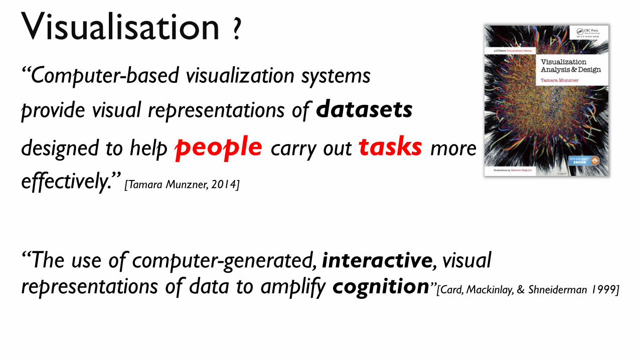
Visualisation ? “Computer-based visualization systems
provide visual representations of datasets
designed to help people carry out tasks more
effectively.” [Tamara Munzner, 2014]
“The use of computer-generated, interactive, visual representations of data to amplify cognition”[Card, Mackinlay, & Shneiderman 1999]
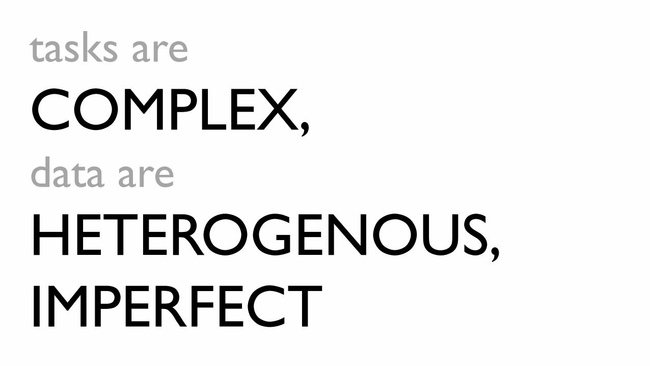
tasks are
COMPLEX, data are
HETEROGENOUS,
IMPERFECT

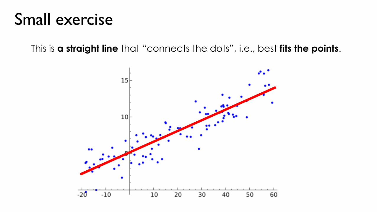
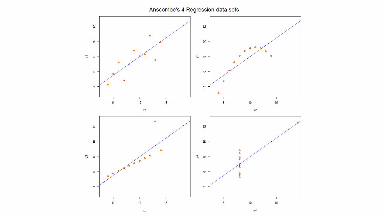
This is a straight line that “connects the dots”, i.e., best fits the points.
Small exercise
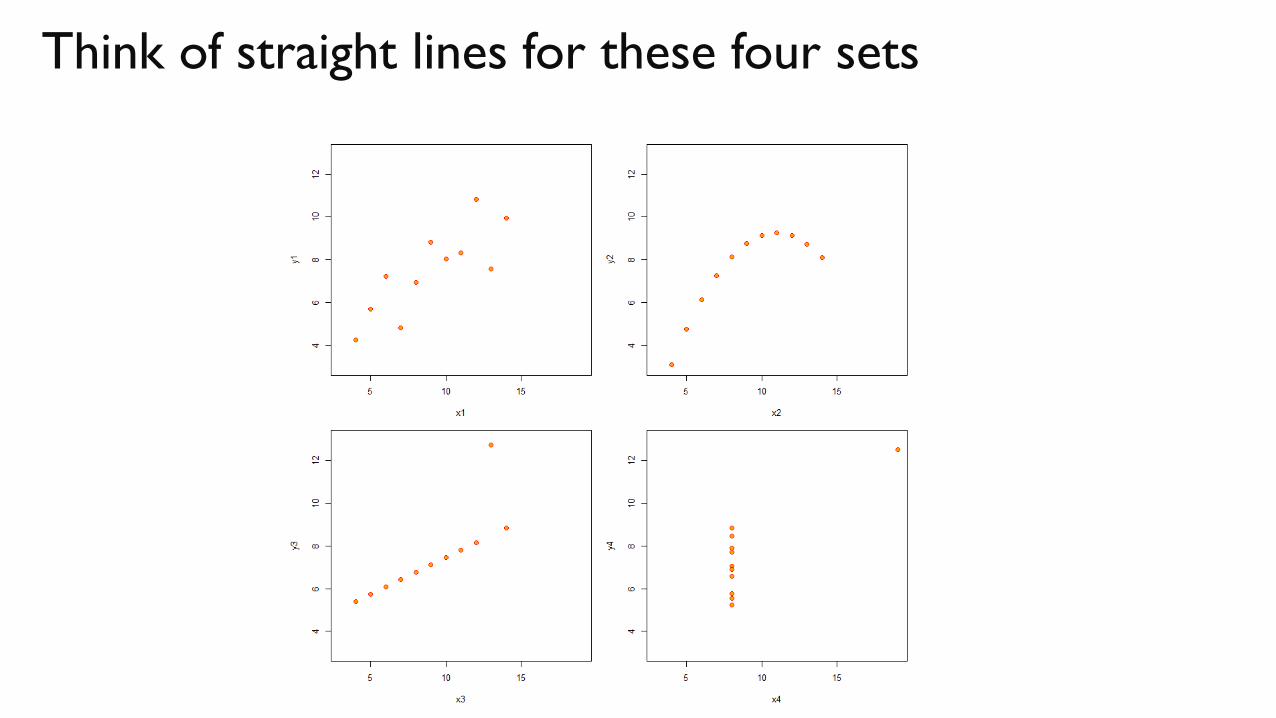
Think of straight lines for these four sets

VISUALISATION helps
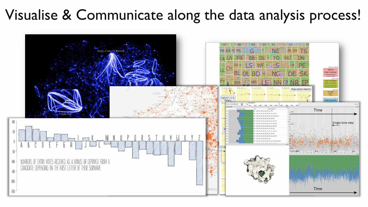
Visualise & Communicate along the data analysis process!
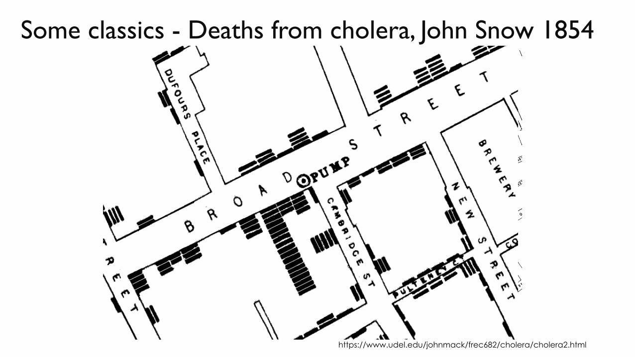
Some classics - Deaths from cholera, John Snow 1854
https://www.udel.edu/johnmack/frec682/cholera/cholera2.html

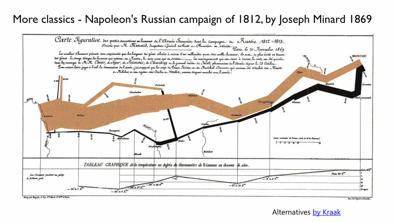
More classics - Napoleon's Russian campaign of 1812, by Joseph Minard 1869
Alternatives by Kraak
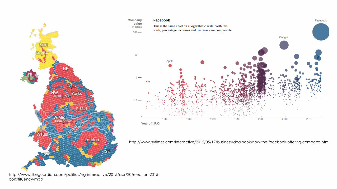
http://www.nytimes.com/interactive/2012/05/17/business/dealbook/how-the-facebook-offering-compares.html
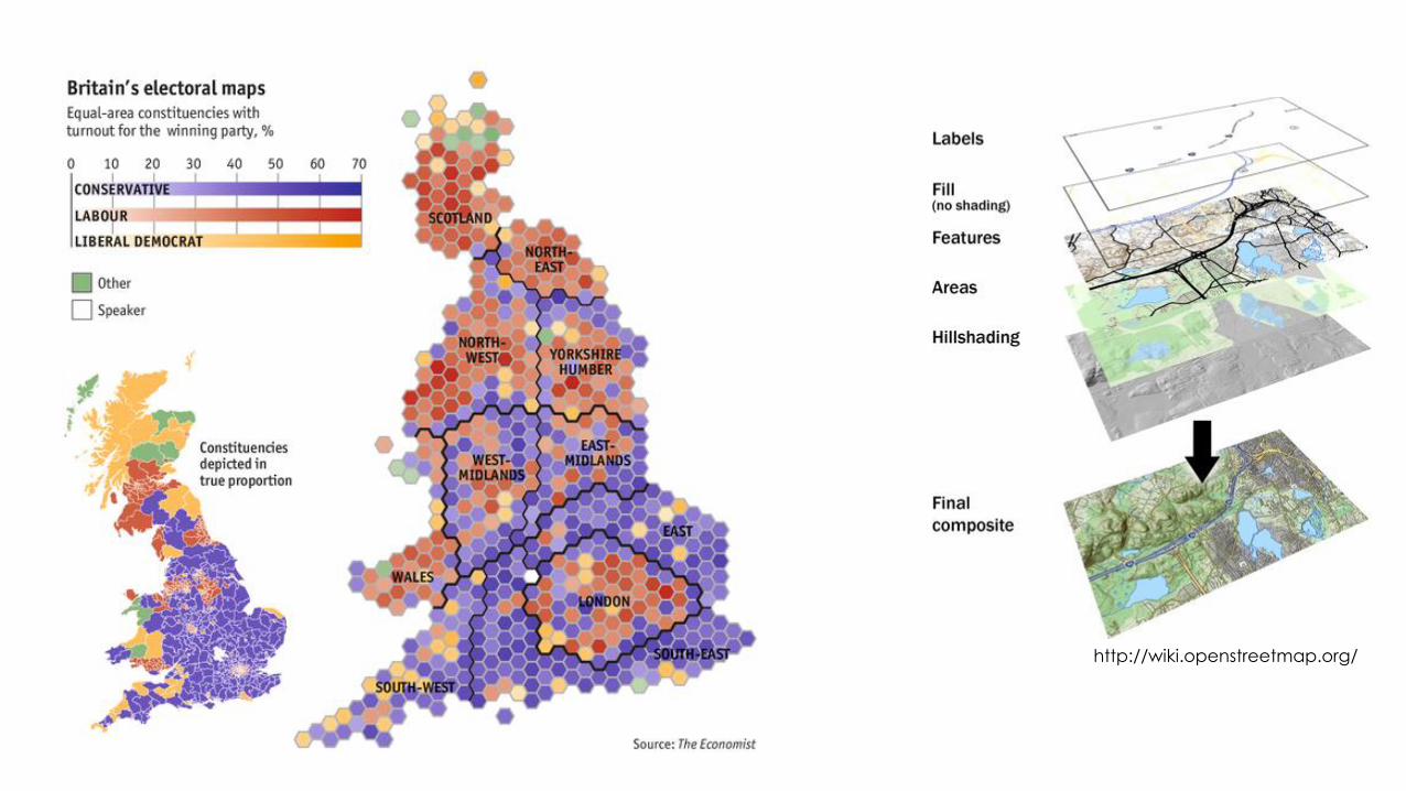
http://www.theguardian.com/politics/ng-interactive/2015/apr/20/election-2015-
constituency-map
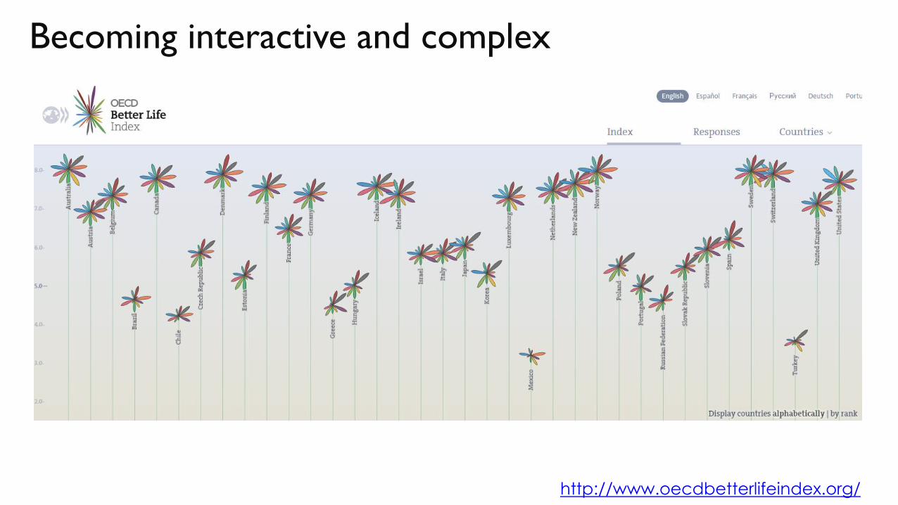
Becoming interactive and complex
http://www.oecdbetterlifeindex.org/

VISUALISATION BASICS
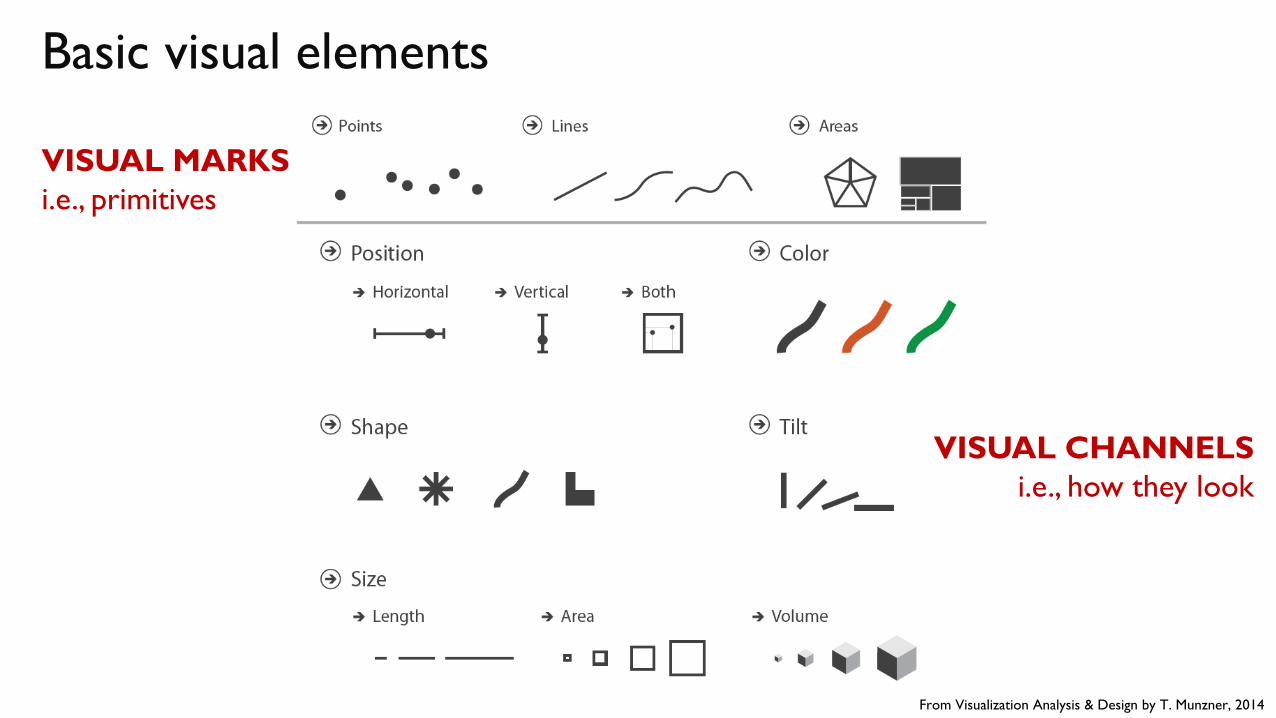
Basic visual elements
From Visualization Analysis & Design by T. Munzner, 2014
VISUAL MARKS
i.e., primitives
VISUAL CHANNELS
i.e., how they look
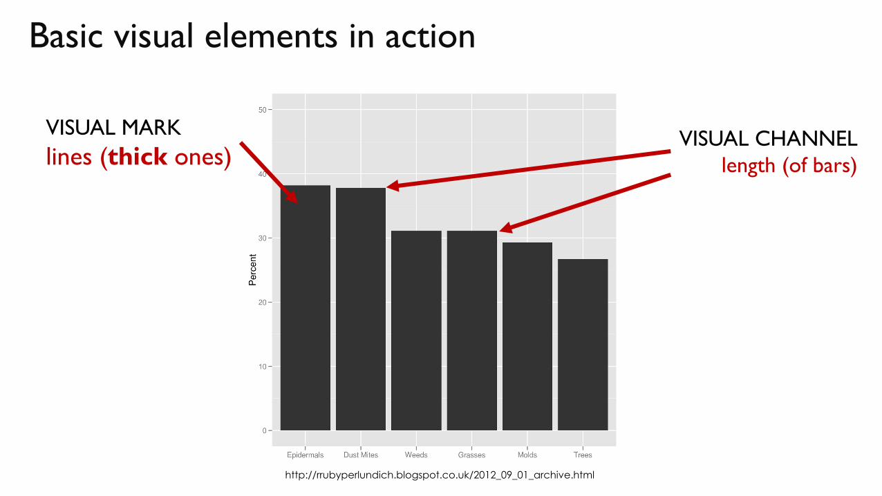
Basic visual elements in action
VISUAL MARK
lines (thick ones)VISUAL CHANNEL
length (of bars)
http://rrubyperlundich.blogspot.co.uk/2012_09_01_archive.html
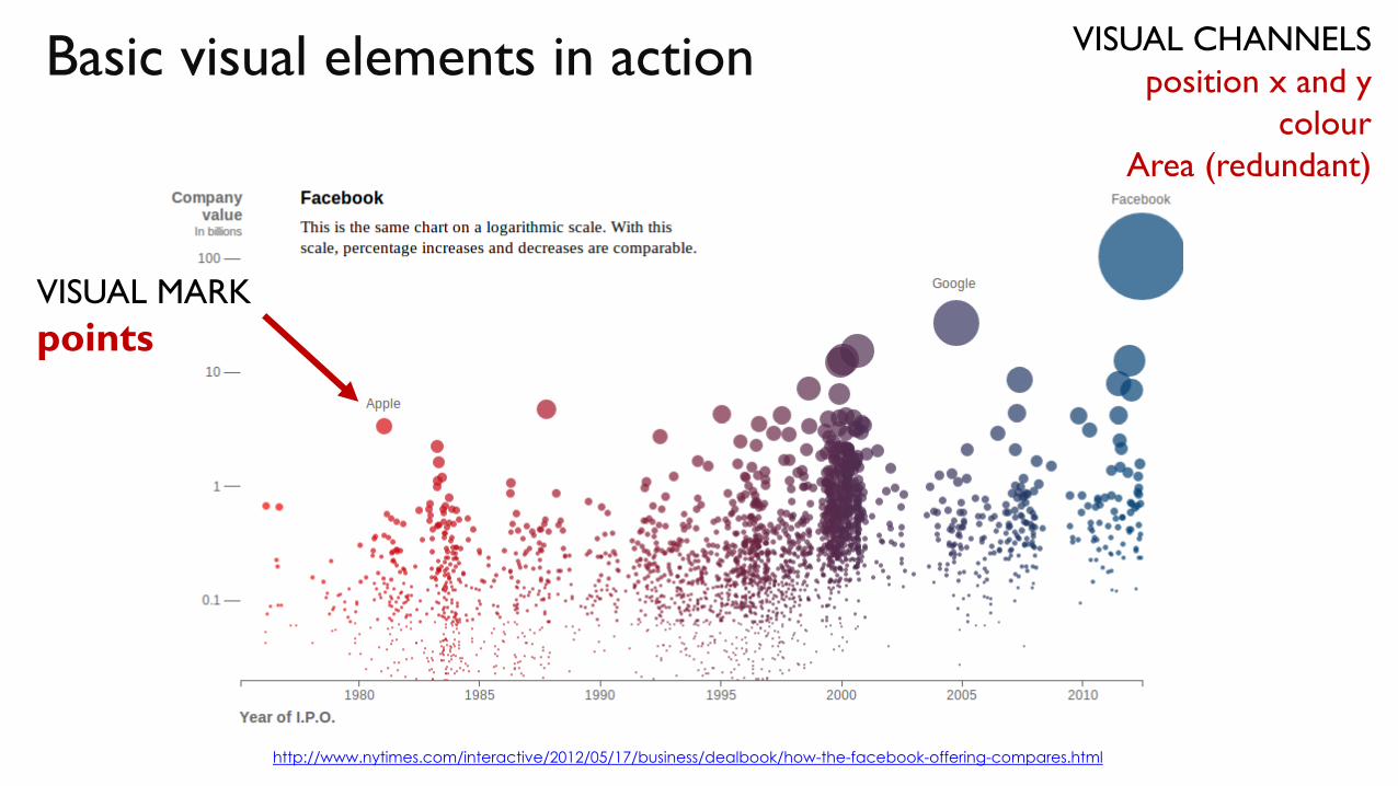
Basic visual elements in action
http://www.nytimes.com/interactive/2012/05/17/business/dealbook/how-the-facebook-offering-compares.html
VISUAL MARK
points
VISUAL CHANNELS
position x and y
colour
Area (redundant)
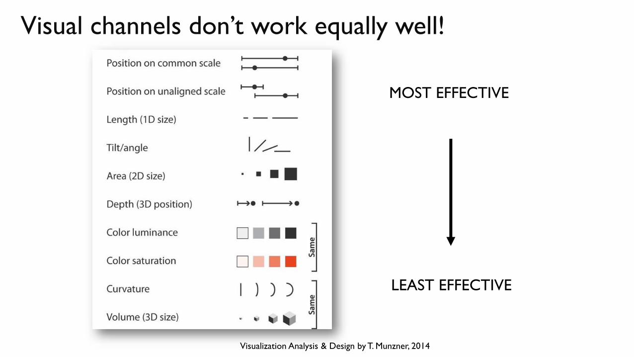
Visual channels don’t work equally well!
Visualization Analysis & Design by T. Munzner, 2014
MOST EFFECTIVE
LEAST EFFECTIVE
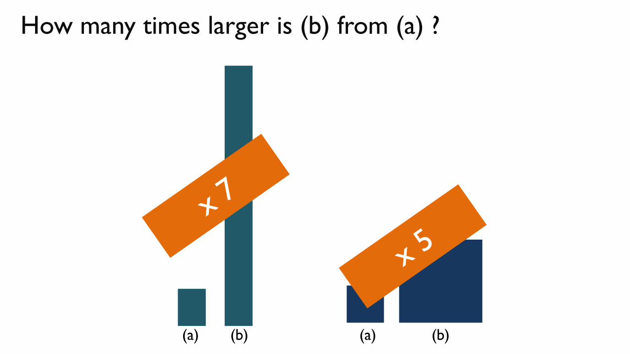
How many times larger is (b) from (a) ?
(a) (b) (a) (b)
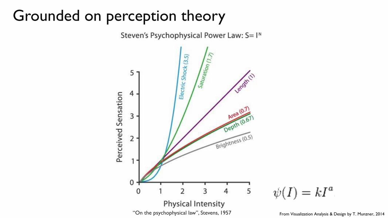
Grounded on perception theory
“On the psychophysical law”, Stevens, 1957 From Visualization Analysis & Design by T. Munzner, 2014
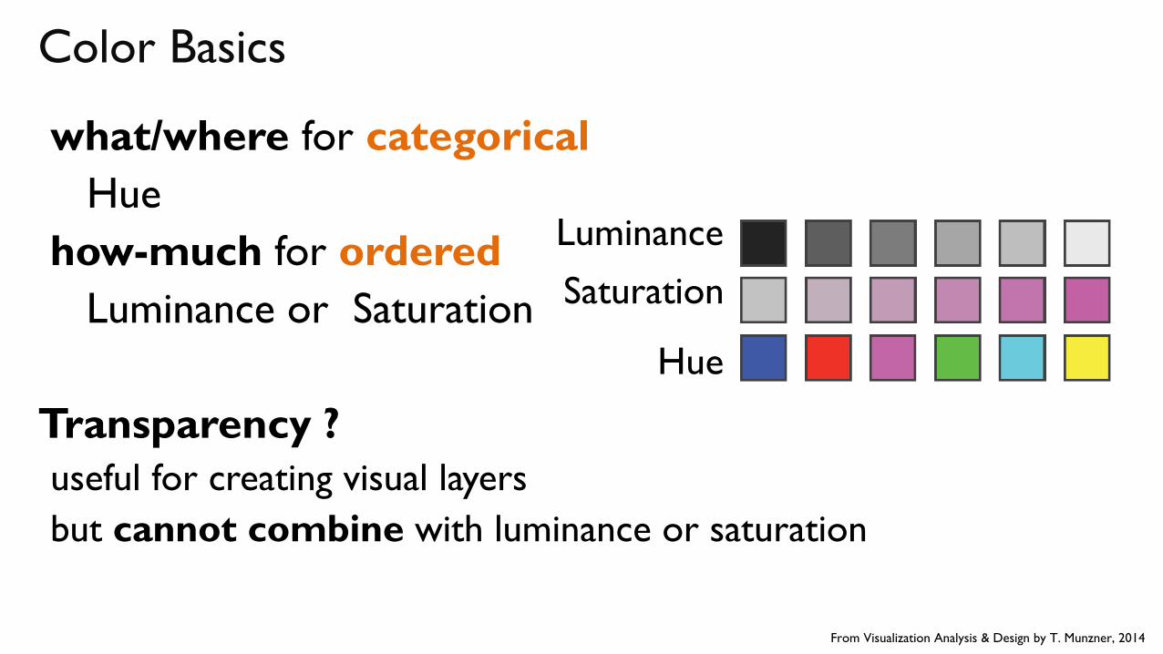
Color Basics
what/where for categorical
Hue
how-much for ordered
Luminance or Saturation
Transparency ?
useful for creating visual layers
but cannot combine with luminance or saturation
Luminance
Saturation
Hue
From Visualization Analysis & Design by T. Munzner, 2014
http://wiki.openstreetmap.org/

a QUICK TOUR through
VISUALISATION
TECHNIQUES
+
Text
Material by Tamara Munzner, http://www.cs.ubc.ca/~tmm/talks.html#minicourse14
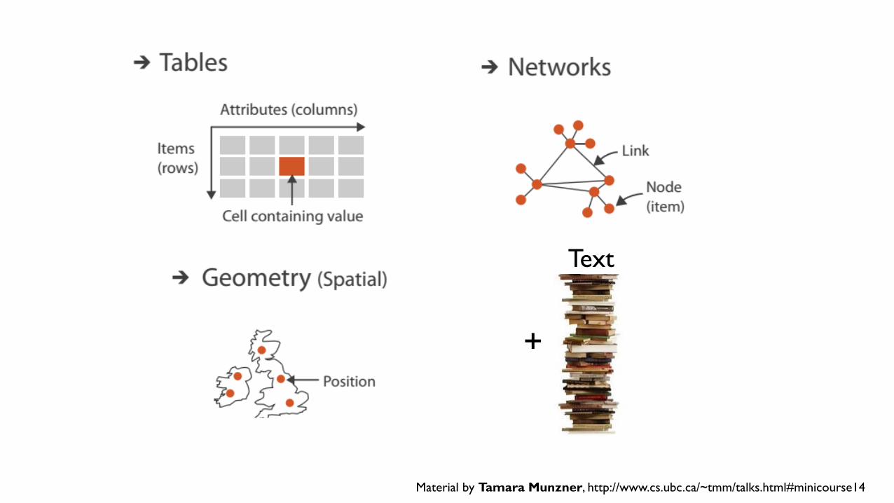
(Some)Visualization Options
For Tabular Data
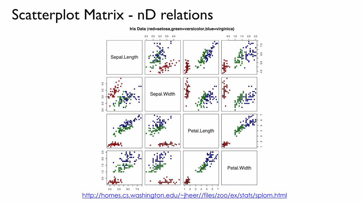
Scatterplot Matrix - nD relations
http://homes.cs.washington.edu/~jheer//files/zoo/ex/stats/splom.html
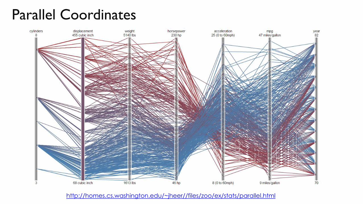
Parallel Coordinates
http://homes.cs.washington.edu/~jheer//files/zoo/ex/stats/parallel.html
(Some)Visualization Options
For Temporal Data
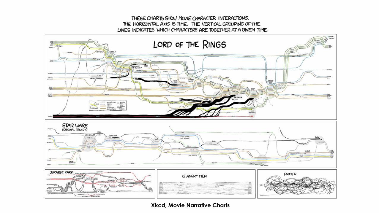
Xkcd, Movie Narrative Charts

The usual Suspect: Line (Function) Plot
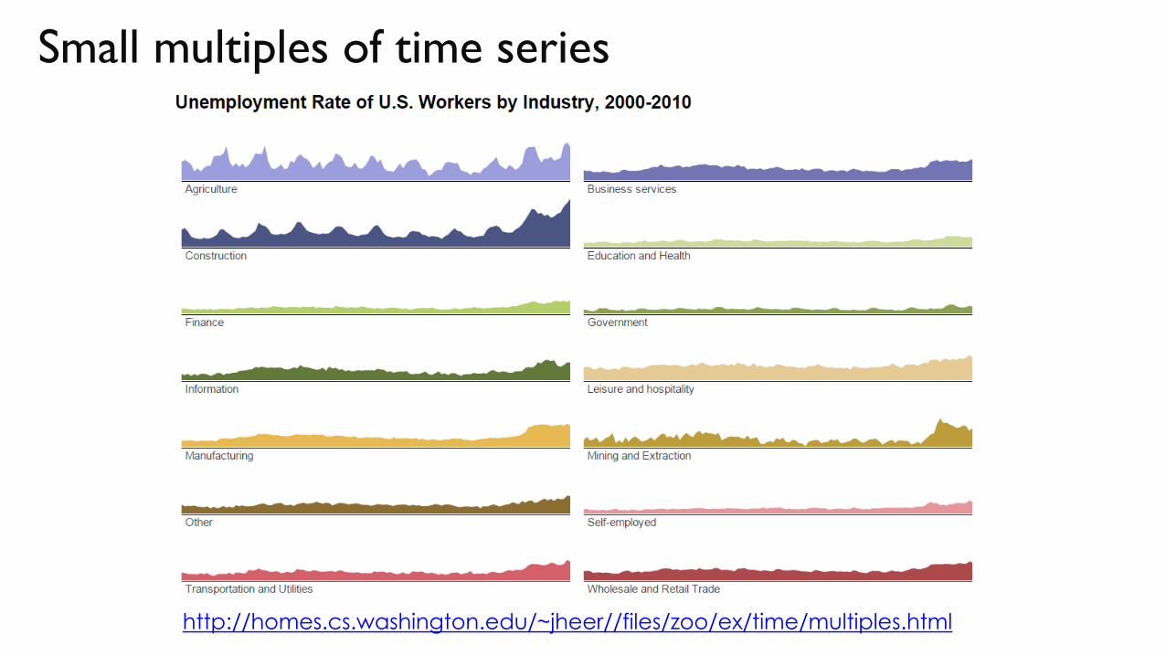
Small multiples of time series
http://homes.cs.washington.edu/~jheer//files/zoo/ex/time/multiples.html
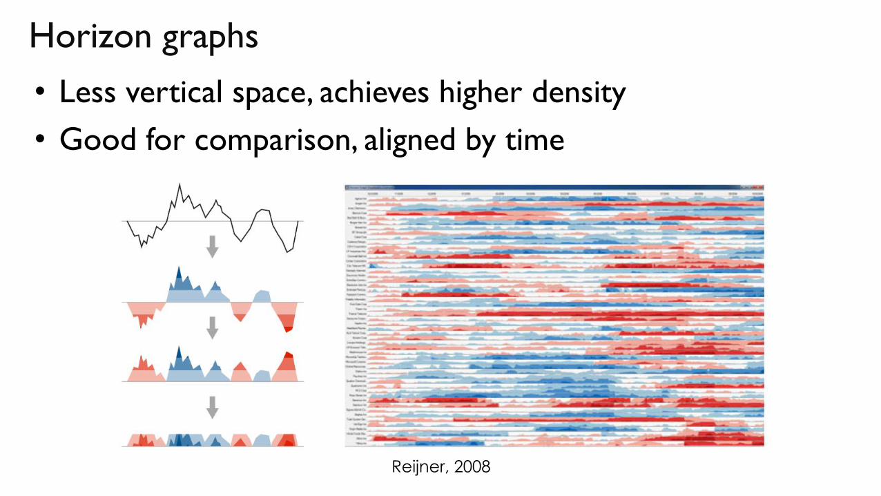
• Less vertical space, achieves higher density
• Good for comparison, aligned by time
Horizon graphs
Reijner, 2008
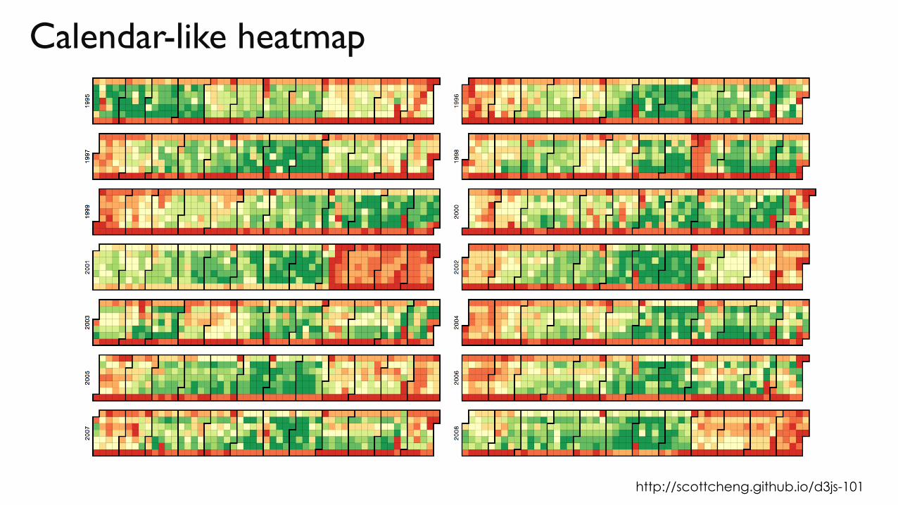
Calendar-like heatmap
http://scottcheng.github.io/d3js-101
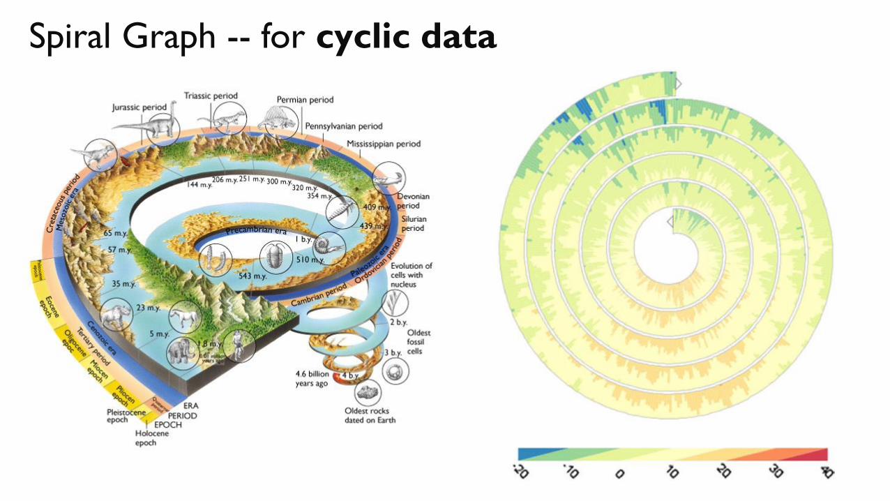
Spiral Graph -- for cyclic data
(Some)Visualization Options
For Geographical Data
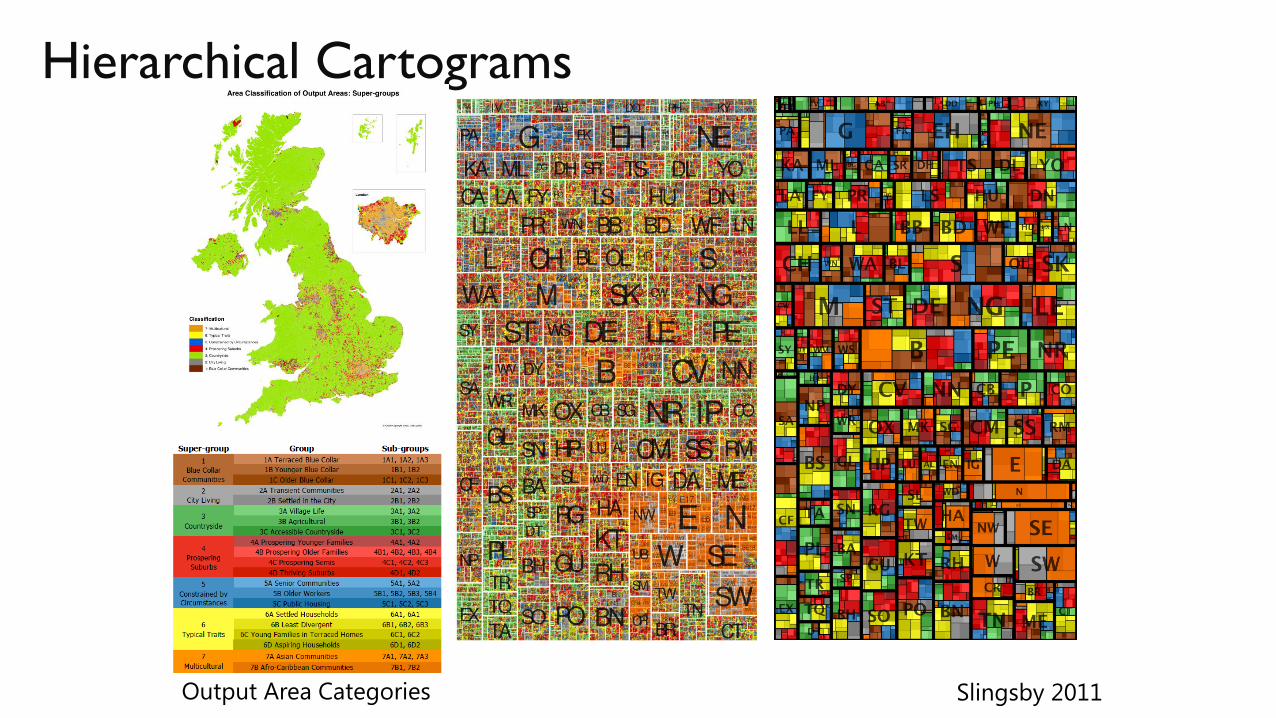
Hierarchical Cartograms
Slingsby 2011Output Area Categories
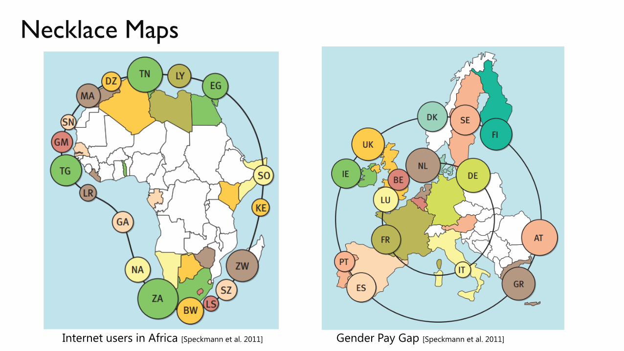
Necklace Maps
Internet users in Africa [Speckmann et al. 2011] Gender Pay Gap [Speckmann et al. 2011]
(Some)Visualization Options
For Network Data
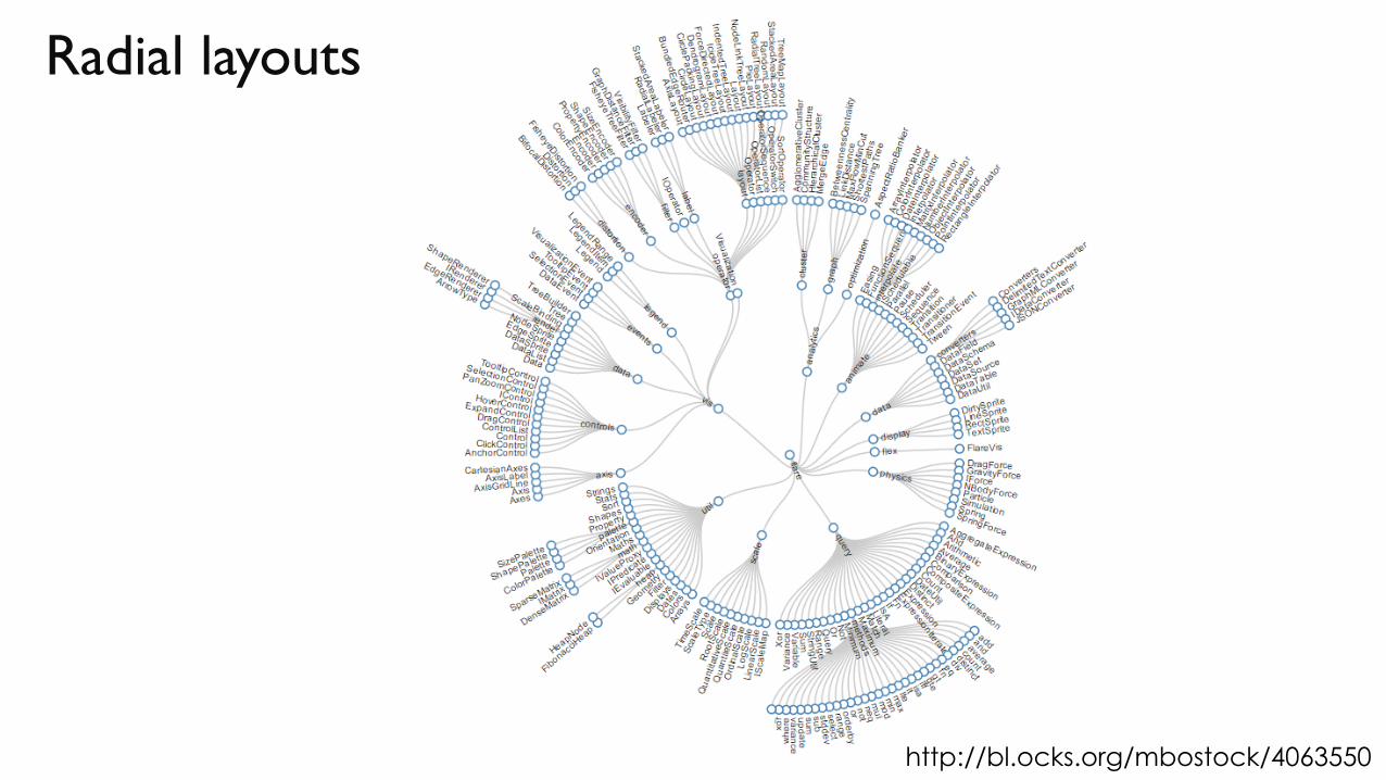
Radial layouts
http://bl.ocks.org/mbostock/4063550
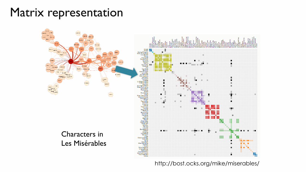
Matrix representation
Characters in
Les Misérables
http://bost.ocks.org/mike/miserables/
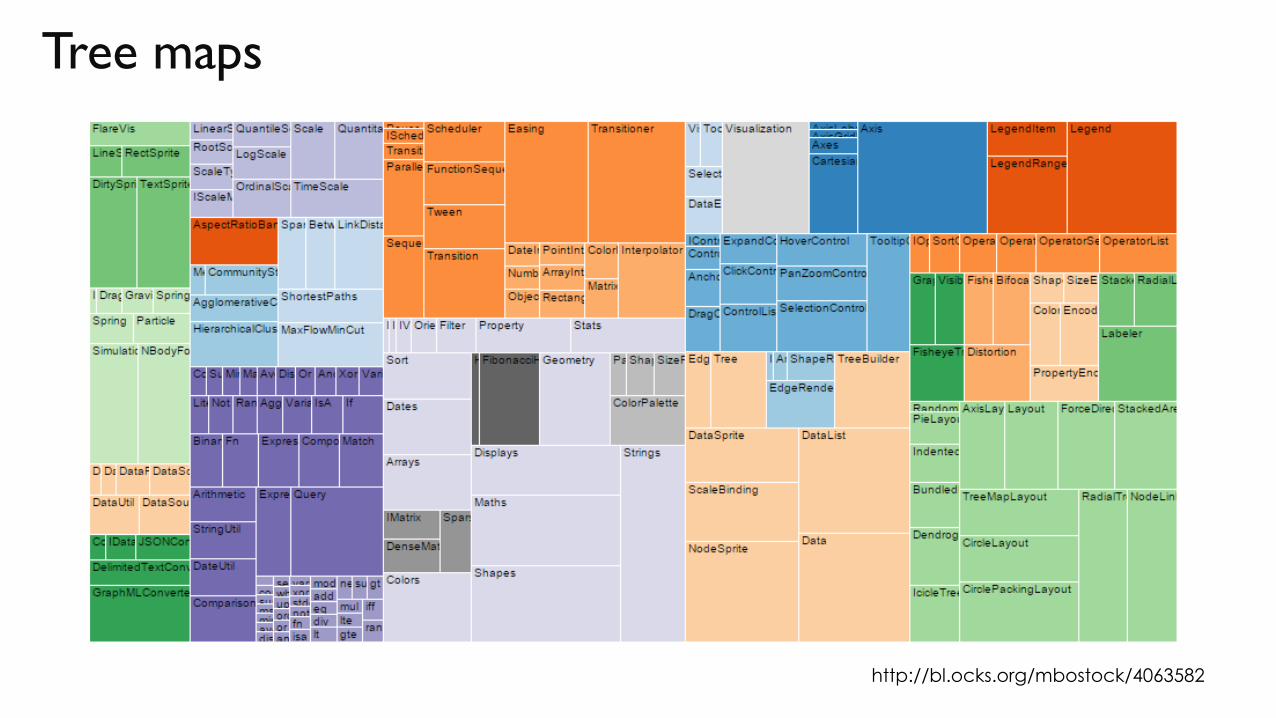
Tree maps
http://bl.ocks.org/mbostock/4063582

WHAT ELSE?
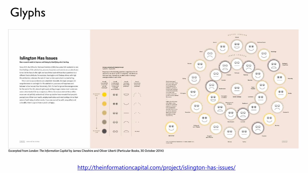
Glyphs
http://theinformationcapital.com/project/islington-has-issues/

Sketchiness to indicate imprecise results

INTERACTION !!(where exciting things happen)
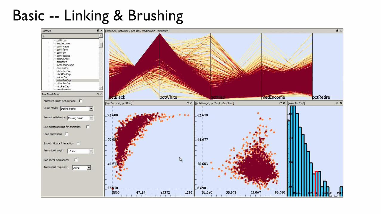
Basic -- Linking & Brushing
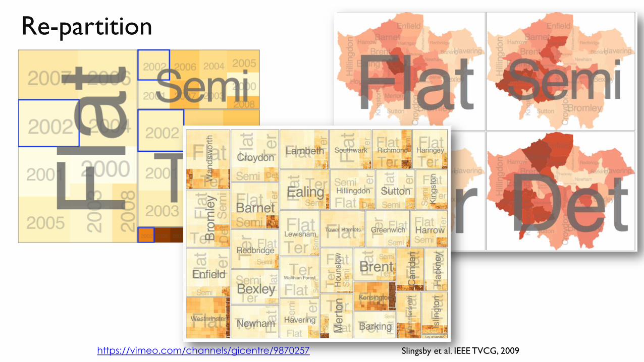
Re-partition
Slingsby et al. IEEE TVCG, 2009https://vimeo.com/channels/gicentre/9870257
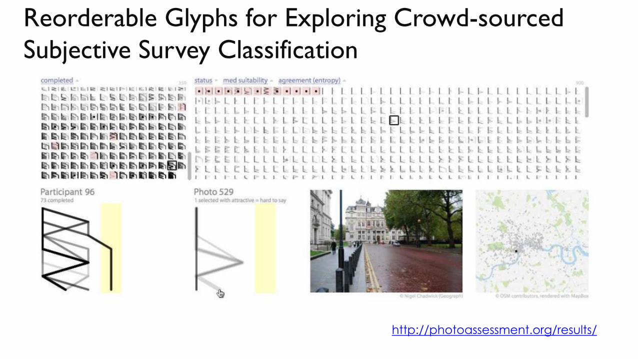
Reorderable Glyphs for Exploring Crowd-sourced
Subjective Survey Classification
http://photoassessment.org/results/

SOME
RECOMMENDATIONS
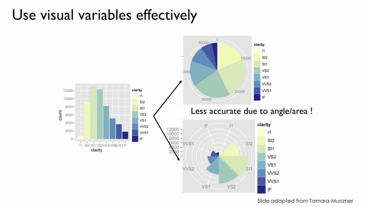
Use visual variables effectively
Less accurate due to angle/area !
Slide adapted from Tamara Munzner
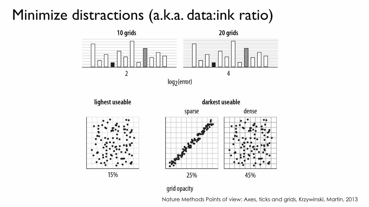
Minimize distractions (a.k.a. data:ink ratio)
Nature Methods Points of view: Axes, ticks and grids, Krzywinski, Martin, 2013
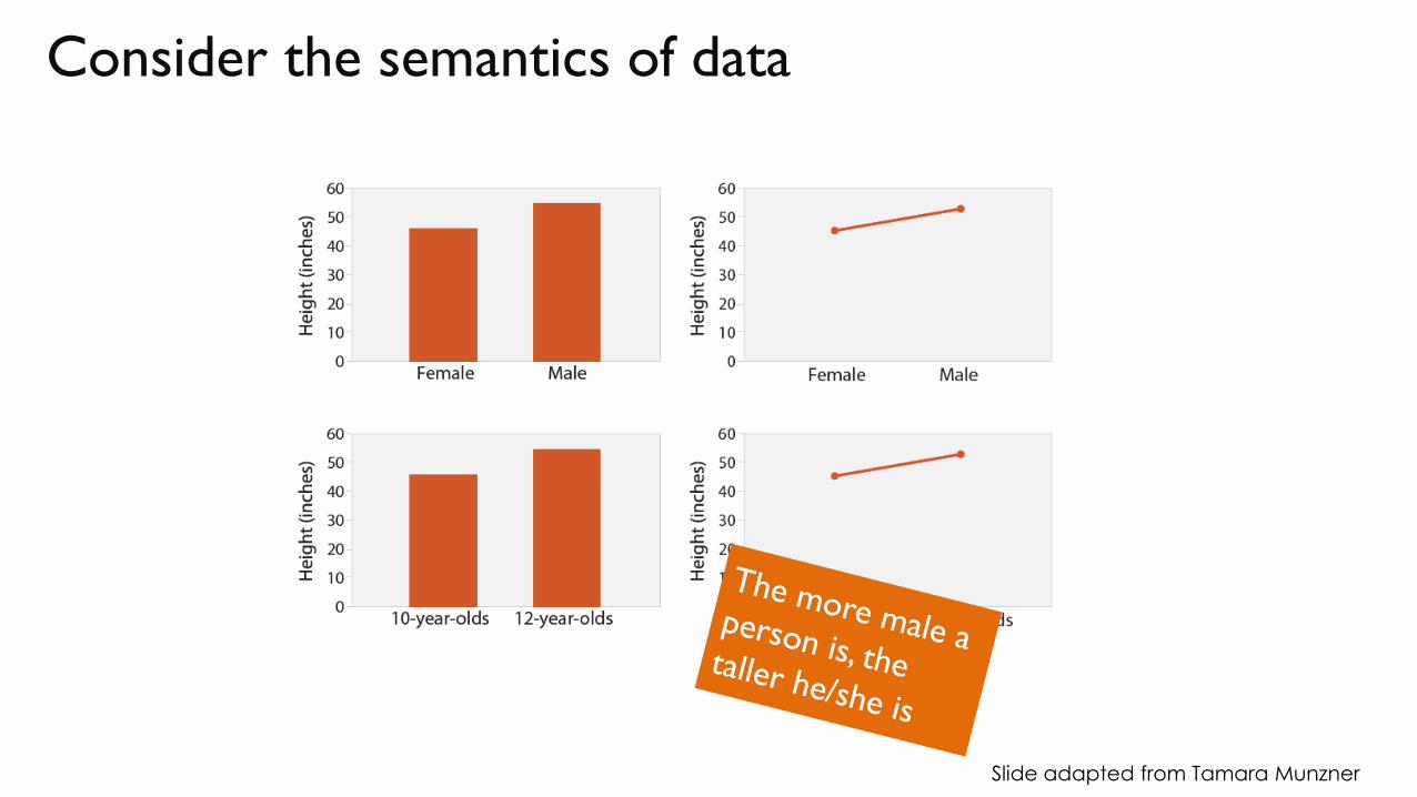
Consider the semantics of data
Slide adapted from Tamara Munzner
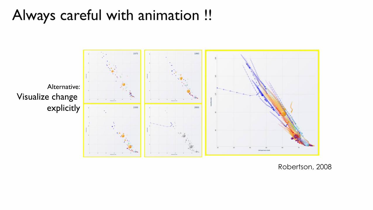
Always careful with animation !!
Robertson, 2008
Alternative:
Visualize change
explicitly
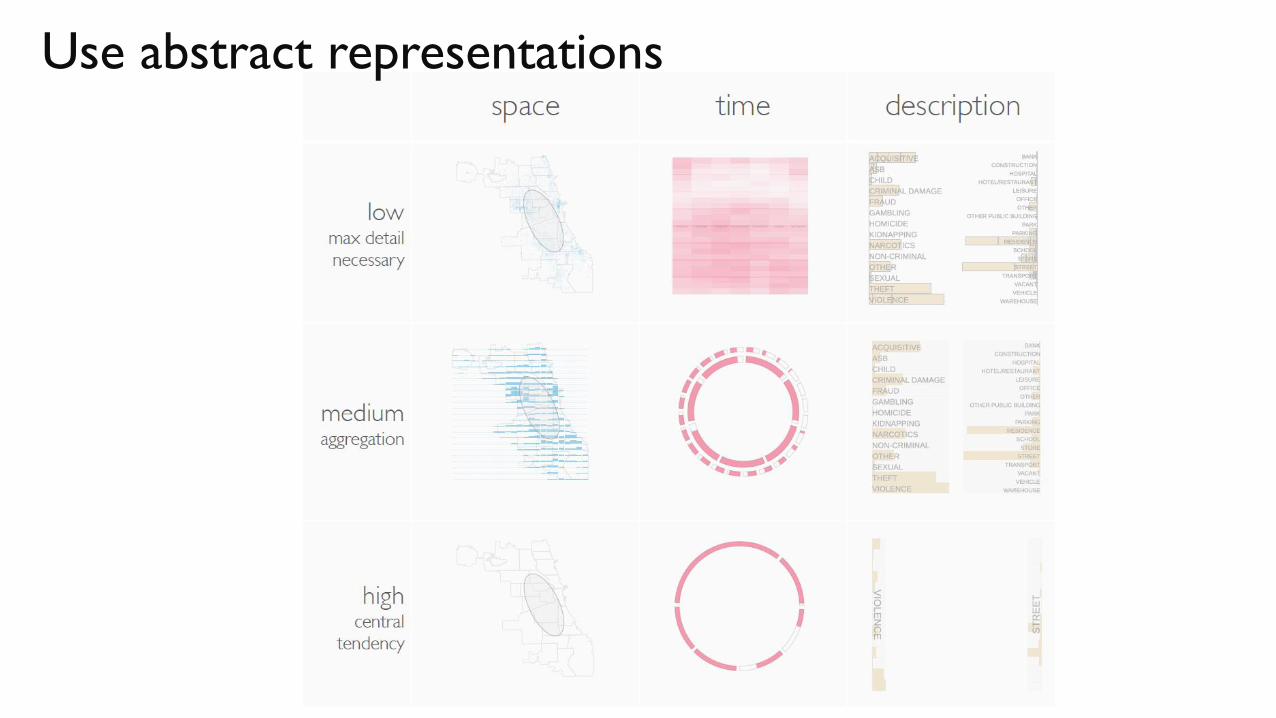
Use abstract representations
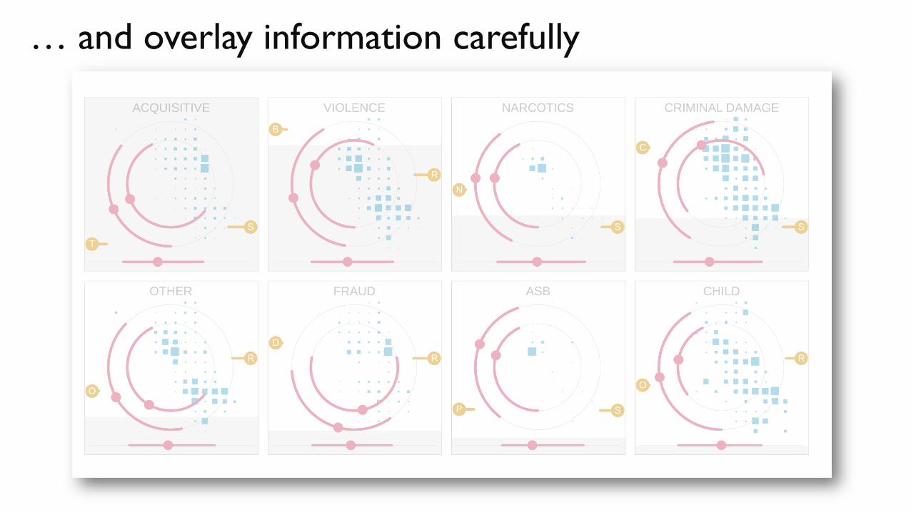
… and overlay information carefully
Never forget the tasks !!!
Thank you !
@cagatay_turkay
http://staff.city.ac.uk/cagatay.turkay.1/