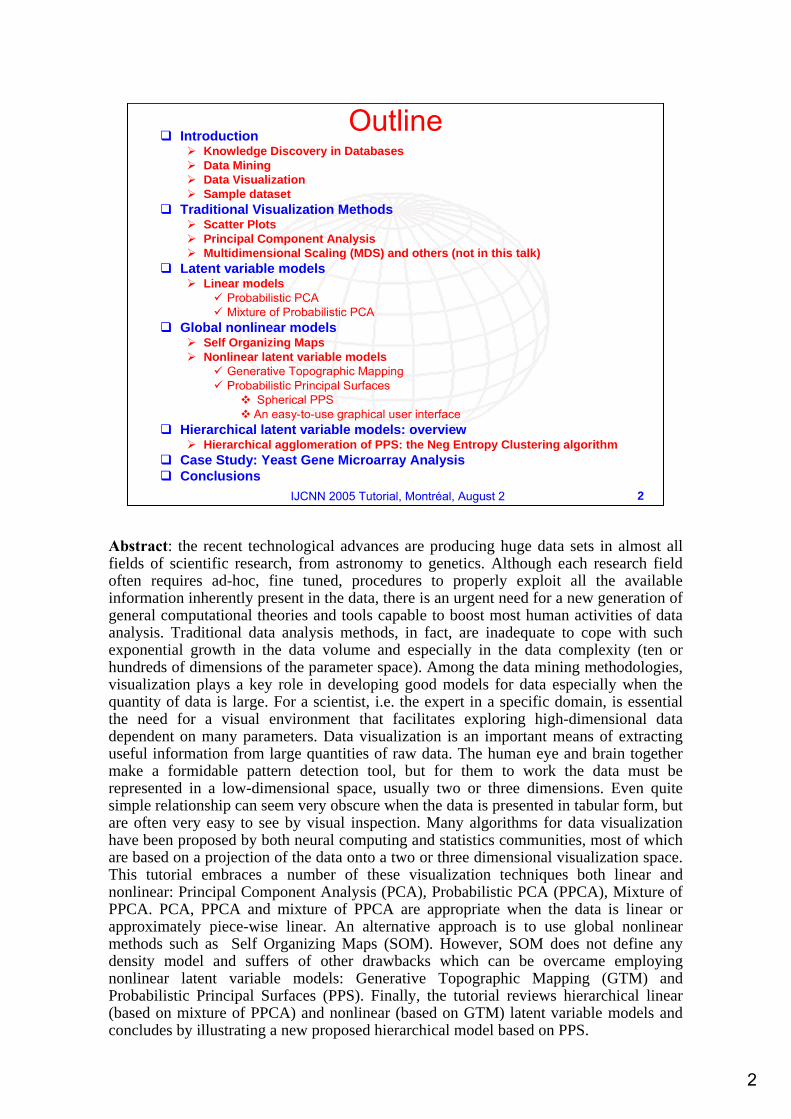
Knowledge Discovery in DatabasesData MiningData VisualizationSample dataset
Traditional Visualization MethodsScatter PlotsPrincipal Component AnalysisMultidimensional Scaling (MDS) and others (not in this talk)
Latent variable modelsLinear models
Probabilistic PCAMixture of Probabilistic PCA
Global nonlinear modelsSelf Organizing MapsNonlinear latent variable models
Generative Topographic MappingProbabilistic Principal Surfaces
Spherical PPSAn easy-to-use graphical user interface
Hierarchical latent variable models: overviewHierarchical agglomeration of PPS: the Neg Entropy Clustering algorithm
Case Study: Yeast Gene Microarray Analysis Conclusions
Abstract: the recent technological advances are producing huge data sets in almost all fields of scientific research, from astronomy to genetics. Although each research field often requires ad-hoc, fine tuned, procedures to properly exploit all the available information inherently present in the data, there is an urgent need for a new generation of general computational theories and tools capable to boost most human activities of data analysis. Traditional data analysis methods, in fact, are inadequate to cope with such exponential growth in the data volume and especially in the data complexity (ten or hundreds of dimensions of the parameter space). Among the data mining methodologies, visualization plays a key role in developing good models for data especially when the quantity of data is large. For a scientist, i.e. the expert in a specific domain, is essential the need for a visual environment that facilitates exploring high-dimensional data dependent on many parameters. Data visualization is an important means of extracting useful information from large quantities of raw data. The human eye and brain together make a formidable pattern detection tool, but for them to work the data must be represented in a low-dimensional space, usually two or three dimensions. Even quite simple relationship can seem very obscure when the data is presented in tabular form, but are often very easy to see by visual inspection. Many algorithms for data visualization have been proposed by both neural computing and statistics communities, most of which are based on a projection of the data onto a two or three dimensional visualization space. This tutorial embraces a number of these visualization techniques both linear and nonlinear: Principal Component Analysis (PCA), Probabilistic PCA (PPCA), Mixture of PPCA. PCA, PPCA and mixture of PPCA are appropriate when the data is linear or approximately piece-wise linear. An alternative approach is to use global nonlinear methods such as Self Organizing Maps (SOM). However, SOM does not define any density model and suffers of other drawbacks which can be overcame employing nonlinear latent variable models: Generative Topographic Mapping (GTM) and Probabilistic Principal Surfaces (PPS). Finally, the tutorial reviews hierarchical linear (based on mixture of PPCA) and nonlinear (based on GTM) latent variable models and concludes by illustrating a new proposed hierarchical model based on PPS.
3
3IJCNN 2005 Tutorial, Montréal, August 2
Transformation
TransformedData
Data mining
Pattern
Data
Interpretation
Selection
TargetData
Preprocessing
PreprocessedData
Knowledge
Data mining
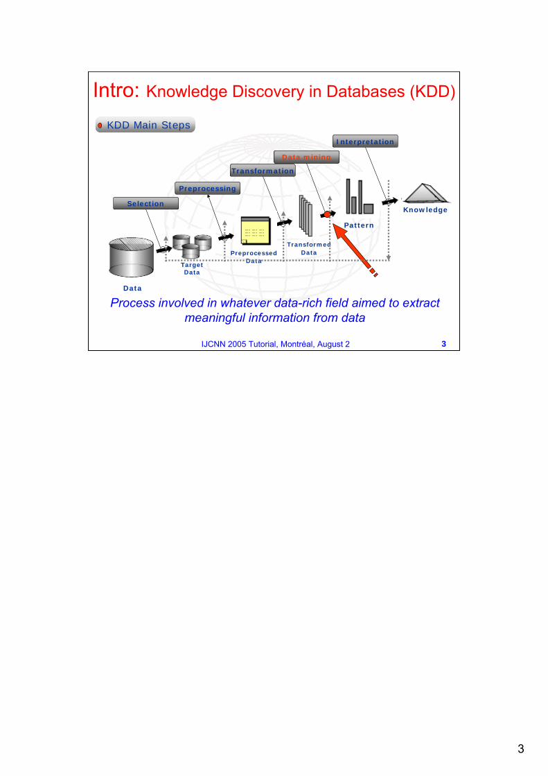
KDD Main Steps
Process involved in whatever data-rich field aimed to extract meaningful information from data
Intro: Knowledge Discovery in Databases (KDD)
4
4IJCNN 2005 Tutorial, Montréal, August 2
Intro: KDD and Data Mining
Data Mining is a key step in KDD process aimed to find meaningful patterns in the data.Data Mining Methods
Intro: Data VisualizationVisualization plays a key role in developing good models for data, especially when the quantity of data is large.
It allows the user to interact with and query the data moreeffectively.
It is an important aid in feature selection, gives informationabout local deviations in performance and provides a useful
`sanity check' for objective quantitative measures (such asgeneralization performance).
It plays an important role in the search for clusters of similardata points, which are most easily determined by eye.
The quantity and complexity of many datasets means thatsimple visualization methods, such as Principal ComponentAnalysis, are not very effective.
6
6IJCNN 2005 Tutorial, Montréal, August 2
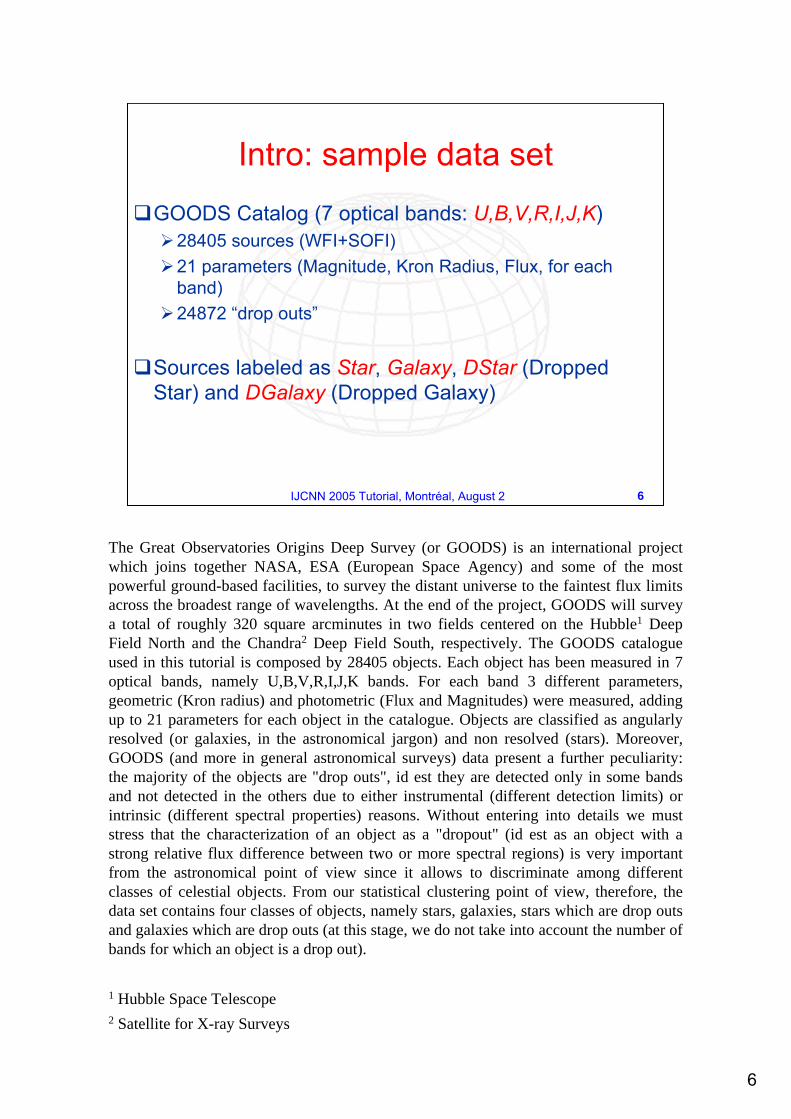
Intro: sample data set
GOODS Catalog (7 optical bands: U,B,V,R,I,J,K)28405 sources (WFI+SOFI)21 parameters (Magnitude, Kron Radius, Flux, for each band)24872 “drop outs”
Sources labeled as Star, Galaxy, DStar (Dropped Star) and DGalaxy (Dropped Galaxy)
The Great Observatories Origins Deep Survey (or GOODS) is an international project which joins together NASA, ESA (European Space Agency) and some of the most powerful ground-based facilities, to survey the distant universe to the faintest flux limits across the broadest range of wavelengths. At the end of the project, GOODS will survey a total of roughly 320 square arcminutes in two fields centered on the Hubble1 Deep Field North and the Chandra2 Deep Field South, respectively. The GOODS catalogue used in this tutorial is composed by 28405 objects. Each object has been measured in 7 optical bands, namely U,B,V,R,I,J,K bands. For each band 3 different parameters, geometric (Kron radius) and photometric (Flux and Magnitudes) were measured, adding up to 21 parameters for each object in the catalogue. Objects are classified as angularly resolved (or galaxies, in the astronomical jargon) and non resolved (stars). Moreover, GOODS (and more in general astronomical surveys) data present a further peculiarity: the majority of the objects are "drop outs", id est they are detected only in some bands and not detected in the others due to either instrumental (different detection limits) or intrinsic (different spectral properties) reasons. Without entering into details we must stress that the characterization of an object as a "dropout" (id est as an object with a strong relative flux difference between two or more spectral regions) is very important from the astronomical point of view since it allows to discriminate among different classes of celestial objects. From our statistical clustering point of view, therefore, the data set contains four classes of objects, namely stars, galaxies, stars which are drop outs and galaxies which are drop outs (at this stage, we do not take into account the number of bands for which an object is a drop out).
1 Hubble Space Telescope2 Satellite for X-ray Surveys
7
7IJCNN 2005 Tutorial, Montréal, August 2
Traditional Visualization Methods Scatter Plots
Scatter Plot: simple plot of one variable against another. Scatter Plot Matrix: matrix of scatter plots showing the relationship between several pairs of variables.Useful for determining whether the values of two variables or the relationship between those variables is the same.
8
8IJCNN 2005 Tutorial, Montréal, August 2
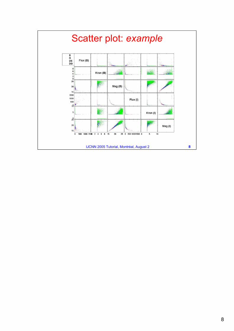
Scatter plot: example
9
9IJCNN 2005 Tutorial, Montréal, August 2
Scatter plots results less useful:
for very high dimensional data
the relations between variables are very complex and hard to interpret
Relations only between pairs of features
Traditional Visualization Methods Scatter Plots
10
10IJCNN 2005 Tutorial, Montréal, August 2
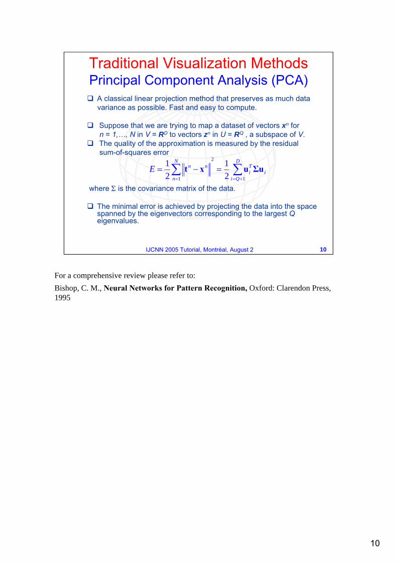
Traditional Visualization Methods Principal Component Analysis (PCA)
A classical linear projection method that preserves as much datavariance as possible. Fast and easy to compute.
Suppose that we are trying to map a dataset of vectors xn forn = 1,…, N in V = RD to vectors zn in U = RQ , a subspace of V.The quality of the approximation is measured by the residualsum-of-squares error
where Σ is the covariance matrix of the data.
The minimal error is achieved by projecting the data into the space spanned by the eigenvectors corresponding to the largest Qeigenvalues.
i
D
Qi
Ti
N
n
nnE Σuuxt ∑∑+==
=−=1
2
1 21
21
For a comprehensive review please refer to:Bishop, C. M., Neural Networks for Pattern Recognition, Oxford: Clarendon Press, 1995
11
11IJCNN 2005 Tutorial, Montréal, August 2
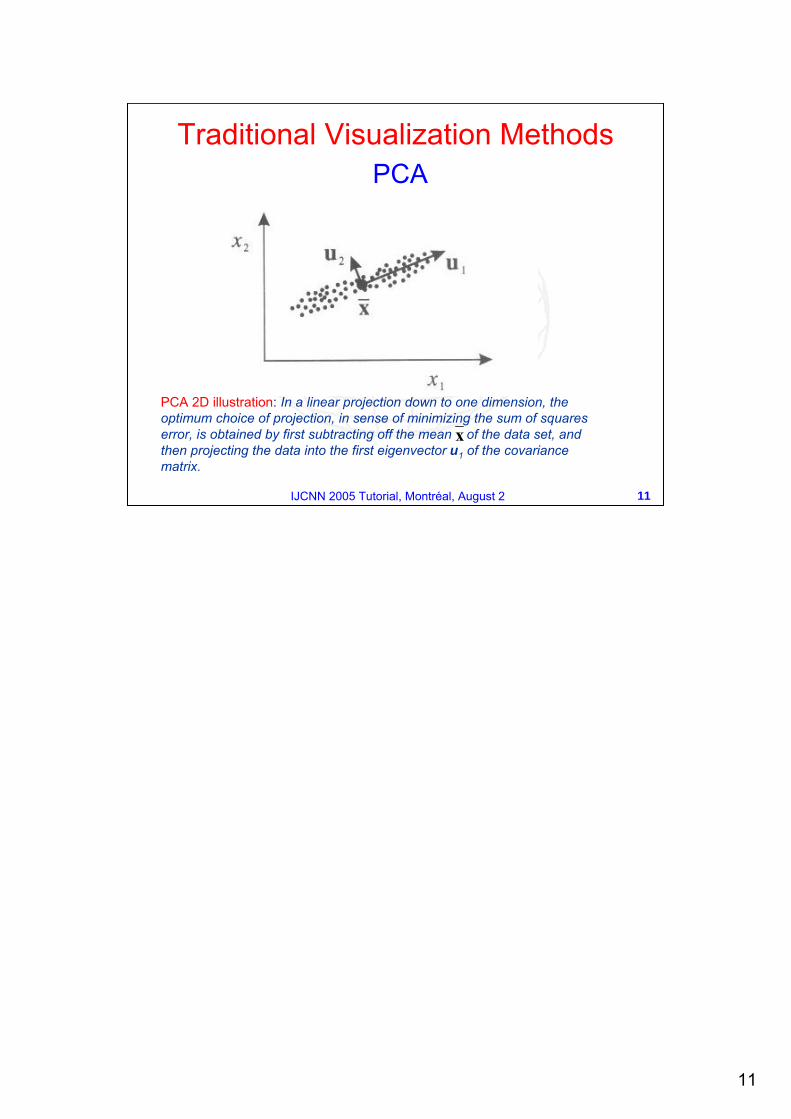
PCA 2D illustration: In a linear projection down to one dimension, the optimum choice of projection, in sense of minimizing the sum of squares error, is obtained by first subtracting off the mean of the data set, and then projecting the data into the first eigenvector u1 of the covariance matrix.
Traditional Visualization MethodsPCA
x
12
12IJCNN 2005 Tutorial, Montréal, August 2
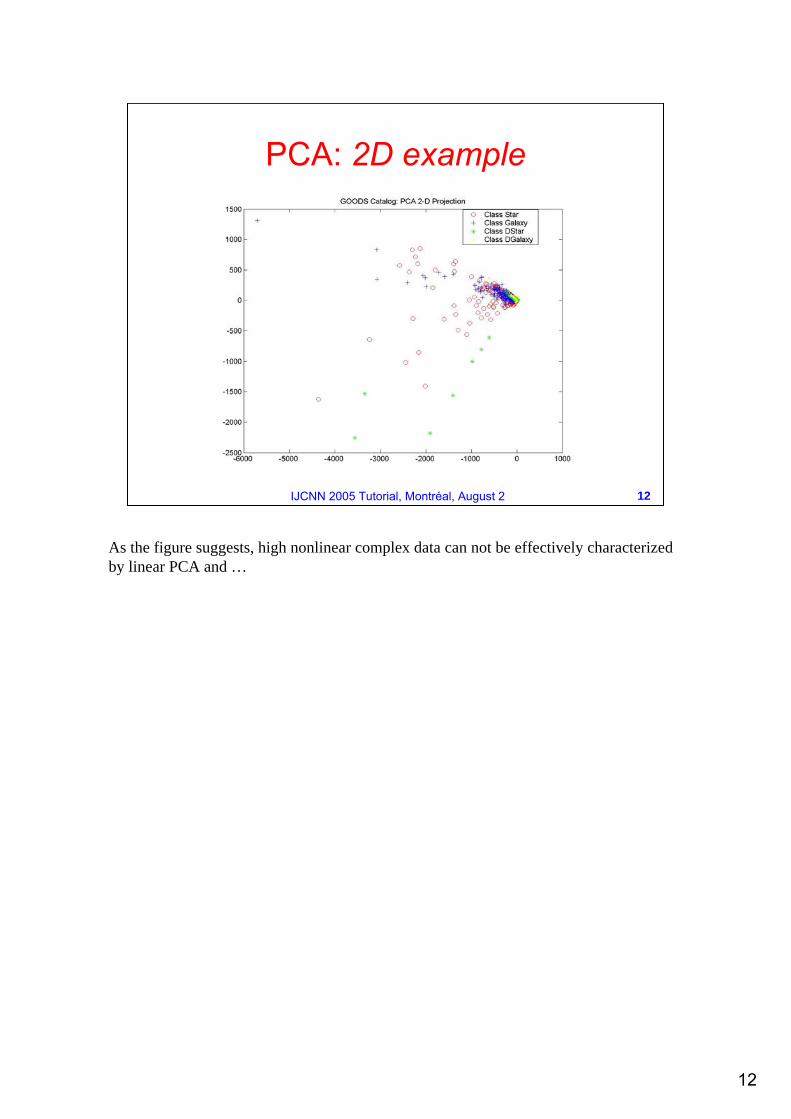
PCA: 2D example
As the figure suggests, high nonlinear complex data can not be effectively characterized by linear PCA and …
13
13IJCNN 2005 Tutorial, Montréal, August 2
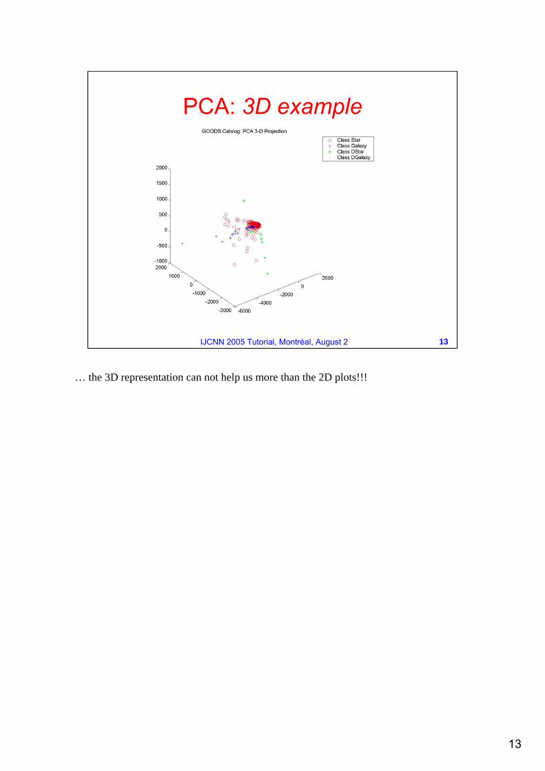
PCA: 3D example
… the 3D representation can not help us more than the 2D plots!!!
14
14IJCNN 2005 Tutorial, Montréal, August 2
Unable to capture the nonlinear nature of data.
Inadequate to characterize strong overlapping data.
Not effective for complex data visualization.
Traditional Visualization Methods PCA
15
15IJCNN 2005 Tutorial, Montréal, August 2
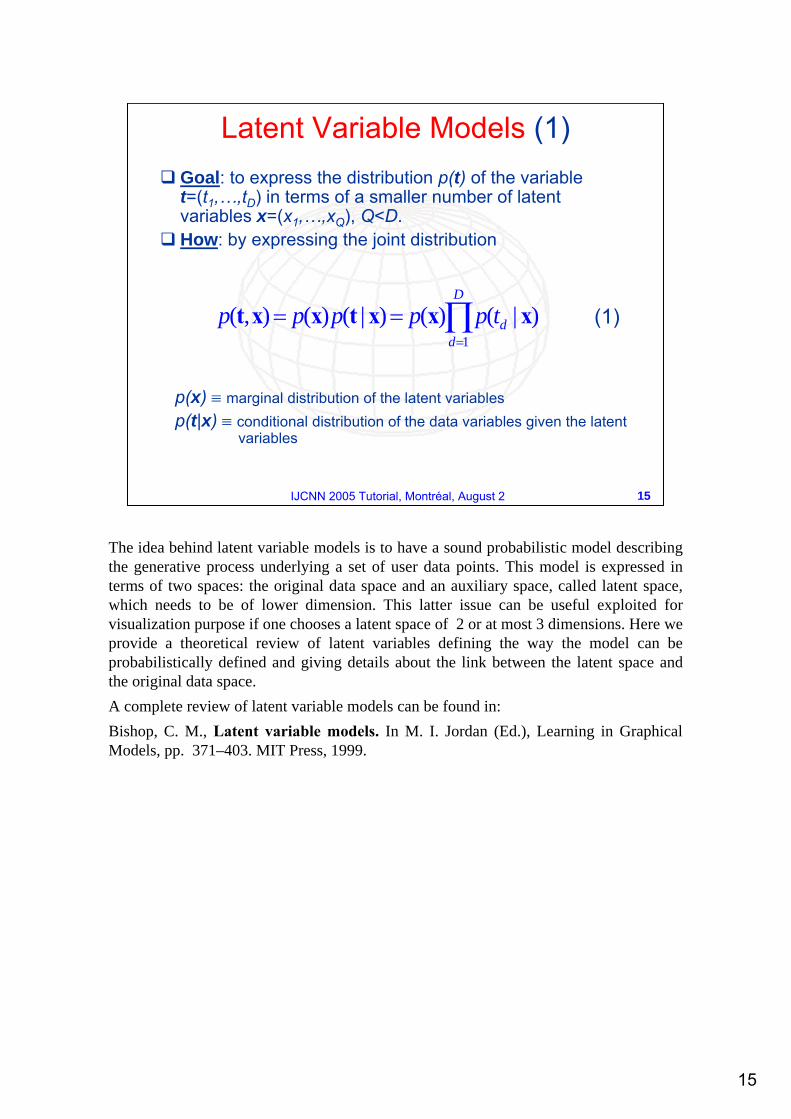
Latent Variable Models (1)Goal: to express the distribution p(t) of the variable t=(t1,…,tD) in terms of a smaller number of latent variables x=(x1,…,xQ), Q<D.How: by expressing the joint distribution
(1)
p(x) ≡ marginal distribution of the latent variablesp(t|x) ≡ conditional distribution of the data variables given the latent
variables
∏=
==D
ddtppppp
1
)|()()|()(),( xxxtxxt
The idea behind latent variable models is to have a sound probabilistic model describing the generative process underlying a set of user data points. This model is expressed in terms of two spaces: the original data space and an auxiliary space, called latent space, which needs to be of lower dimension. This latter issue can be useful exploited for visualization purpose if one chooses a latent space of 2 or at most 3 dimensions. Here we provide a theoretical review of latent variables defining the way the model can be probabilistically defined and giving details about the link between the latent space and the original data space. A complete review of latent variable models can be found in:Bishop, C. M., Latent variable models. In M. I. Jordan (Ed.), Learning in Graphical Models, pp. 371–403. MIT Press, 1999.
16
16IJCNN 2005 Tutorial, Montréal, August 2
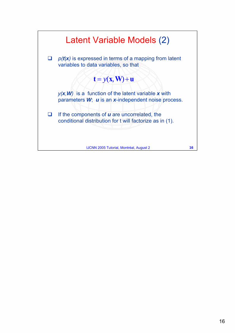
Latent Variable Models (2)
p(t|x) is expressed in terms of a mapping from latent variables to data variables, so that
y(x,W) is a function of the latent variable x with parameters W; u is an x-independent noise process.
If the components of u are uncorrelated, the conditional distribution for t will factorize as in (1).
uWxt += ),(y
17
17IJCNN 2005 Tutorial, Montréal, August 2
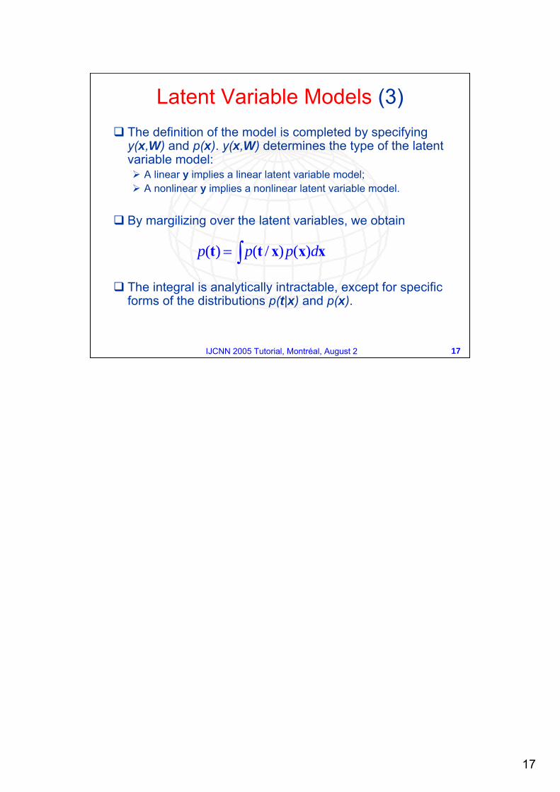
Latent Variable Models (3)The definition of the model is completed by specifying y(x,W) and p(x). y(x,W) determines the type of the latent variable model:
A linear y implies a linear latent variable model;A nonlinear y implies a nonlinear latent variable model.
By margilizing over the latent variables, we obtain
The integral is analytically intractable, except for specific forms of the distributions p(t|x) and p(x).
∫= xxxtt dppp )()/()(
18
18IJCNN 2005 Tutorial, Montréal, August 2
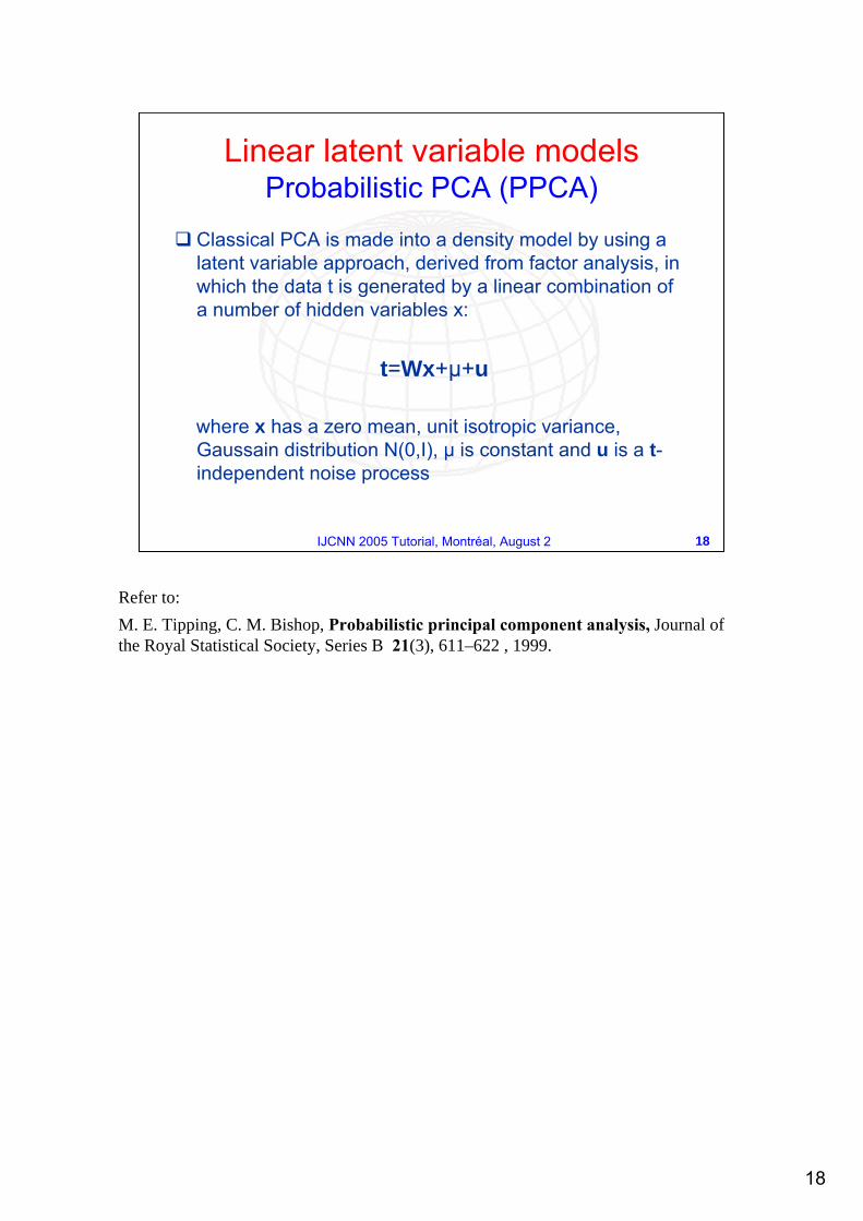
Linear latent variable models Probabilistic PCA (PPCA)
Classical PCA is made into a density model by using a latent variable approach, derived from factor analysis, in which the data t is generated by a linear combination of a number of hidden variables x:
t=Wx+µ+u
where x has a zero mean, unit isotropic variance, Gaussain distribution N(0,I), µ is constant and u is a t-independent noise process
Refer to:M. E. Tipping, C. M. Bishop, Probabilistic principal component analysis, Journal of the Royal Statistical Society, Series B 21(3), 611–622 , 1999.
19
19IJCNN 2005 Tutorial, Montréal, August 2
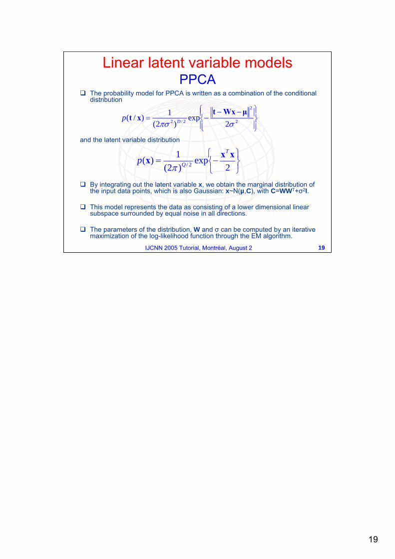
The probability model for PPCA is written as a combination of the conditional distribution
and the latent variable distribution
By integrating out the latent variable x, we obtain the marginal distribution of the input data points, which is also Gaussian: x~N(µ,C), with C=WWT+σ2I.
This model represents the data as consisting of a lower dimensional linear subspace surrounded by equal noise in all directions.
The parameters of the distribution, W and σ can be computed by an iterative maximization of the log-likelihood function through the EM algorithm.
⎭⎬⎫
⎩⎨⎧−=
2exp
)2(1)( 2/
xxxT
Qpπ
⎪⎭
⎪⎬⎫
⎪⎩
⎪⎨⎧ −−−= 2
2
2/2 2exp
)2(1)/(
σπσµWxt
xt Dp
Linear latent variable models PPCA
20
20IJCNN 2005 Tutorial, Montréal, August 2
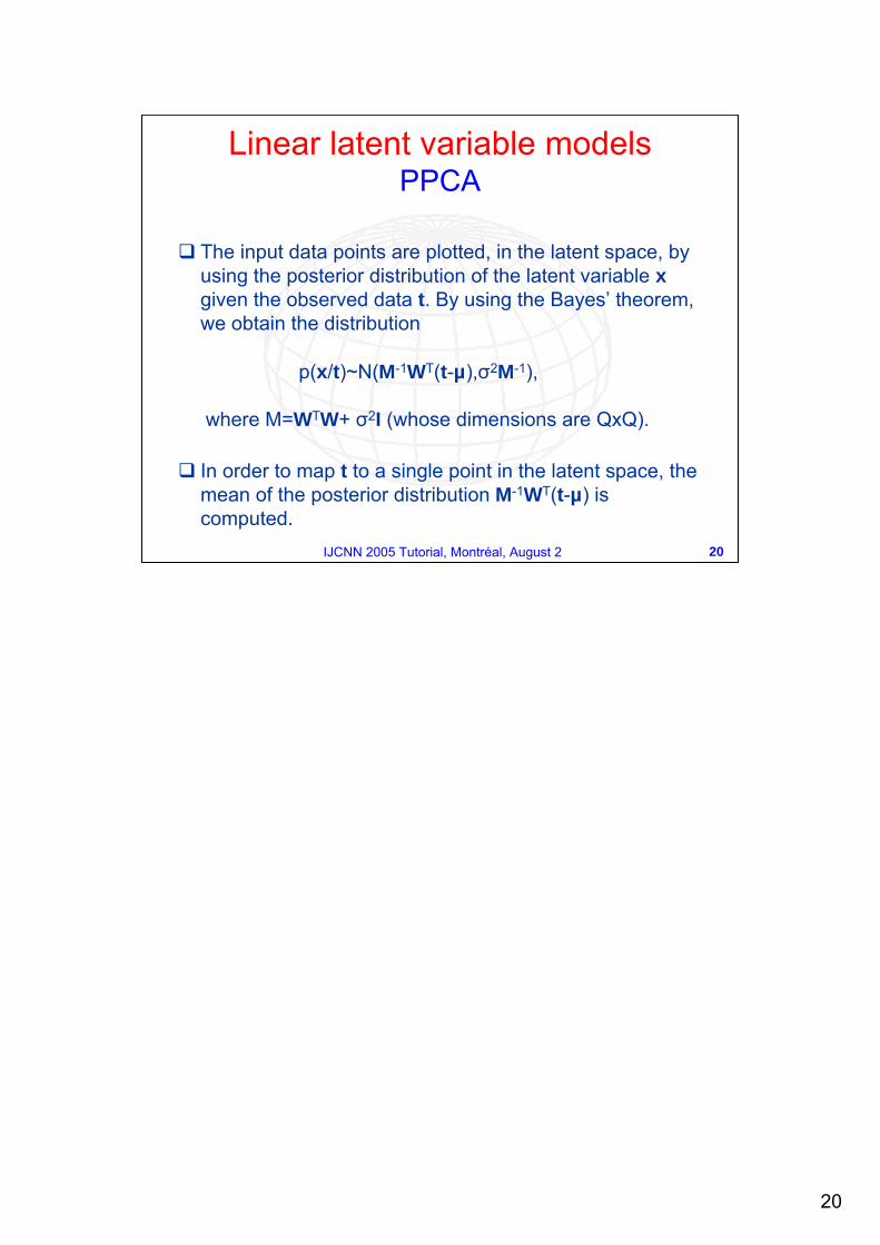
The input data points are plotted, in the latent space, by using the posterior distribution of the latent variable xgiven the observed data t. By using the Bayes’ theorem, we obtain the distribution
p(x/t)~N(M-1WT(t-µ),σ2M-1),
where M=WTW+ σ2I (whose dimensions are QxQ).
In order to map t to a single point in the latent space, the mean of the posterior distribution M-1WT(t-µ) is computed.
Linear latent variable models PPCA
21
21IJCNN 2005 Tutorial, Montréal, August 2
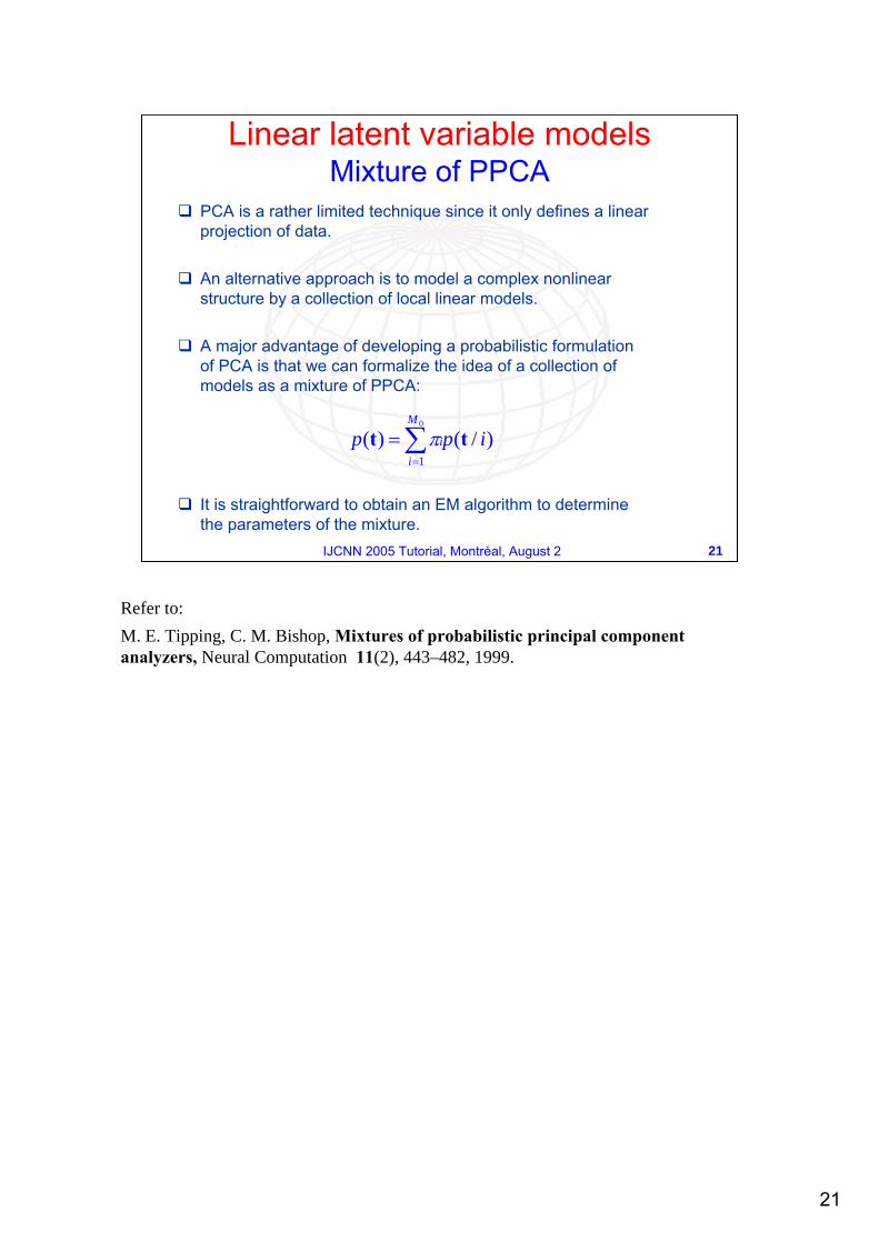
Linear latent variable models Mixture of PPCA
PCA is a rather limited technique since it only defines a linearprojection of data.
An alternative approach is to model a complex nonlinear structure by a collection of local linear models.
A major advantage of developing a probabilistic formulation of PCA is that we can formalize the idea of a collection of models as a mixture of PPCA:
It is straightforward to obtain an EM algorithm to determine the parameters of the mixture.
∑=
=0
1)/()(
M
ii ipp tt π
Refer to:M. E. Tipping, C. M. Bishop, Mixtures of probabilistic principal component analyzers, Neural Computation 11(2), 443–482, 1999.
22
22IJCNN 2005 Tutorial, Montréal, August 2
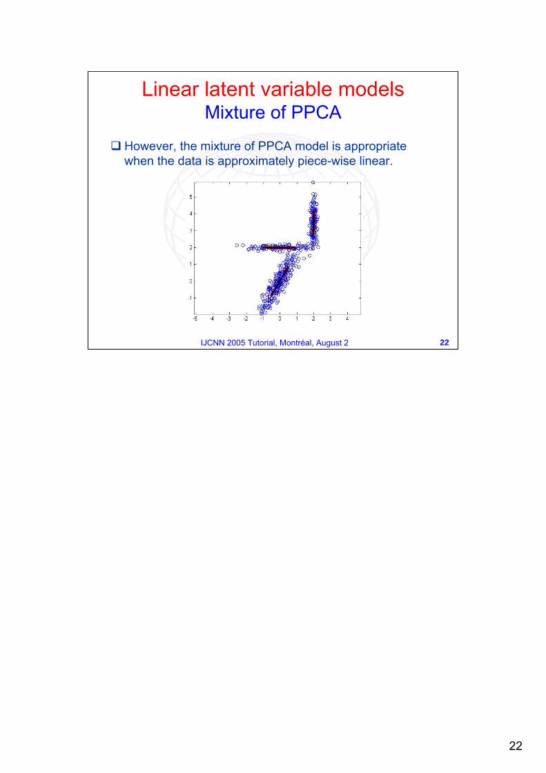
However, the mixture of PPCA model is appropriate when the data is approximately piece-wise linear.
Linear latent variable models Mixture of PPCA
23
23IJCNN 2005 Tutorial, Montréal, August 2
A SOM is composed by neurons located on a regular 1 or 2-dimensional grid.
Each neuron i of the SOM is represented by a n-dimensional weight or reference vector :
][ Tinii mmm ,...,1= n = dimension of input vectors
SOM is based on an unsupervised competitive learning (training is entirely data-driven and the neurons compete with each other).
Neurons are connected to adjacent ones by a neighbourhood relation dictating the topology of the map.
Global nonlinear models Self-Organizing Maps (SOM)
PCA, PPCA and mixture of PPCA are appropriate when the data is linear or approximately piece-wise linear. An alternative approach is to use global nonlinear methods: Self Organizing Maps (SOM), a neural network algorithm based on a competitive learning which summarizes a set of data vectors in a high-dimensional space by a set of reference vectors organized on a lower dimensional sheet (usually two dimensional). SOM has been used for a wide variety of applications thanks to its simplicity and for its several plotting options. For theoretical details refer to:S. Kaski, Data Exploration Using Self Organizing Maps, PhD Thesis, Helsinki Institute of Technology, 1997.T. Kohonen, Self Organizing Maps, Springer, Berlin, Heidelberg, 1995.J. Vesanto, SOM-Based Data Visualization Methods, Intelligent Data Analysis Journal, 1999.For details concerning with application to astrophysical data, refer to:R. Tagliaferri R., G. Longo, A. Staiano A. et al., Neural Networks in Astronomy, in Neural Networks. Special Issue on Neural networks for analysis of complex scientific data: Astronomy and Geosciences, R. Tagliaferri, G. Longo, D'Argenio B. (Eds.), vol. 16 (3- 4), 2003.R. Tagliaferri R., G. Longo, A. Staiano et al., Applications of Neural Networks in Astronomy and Astroparticle Physics, invited review on "Recent Research developments in Astronomy and Astrophysics", 2 (2005), pp.27-58, by Research Signpost.
24
24IJCNN 2005 Tutorial, Montréal, August 2
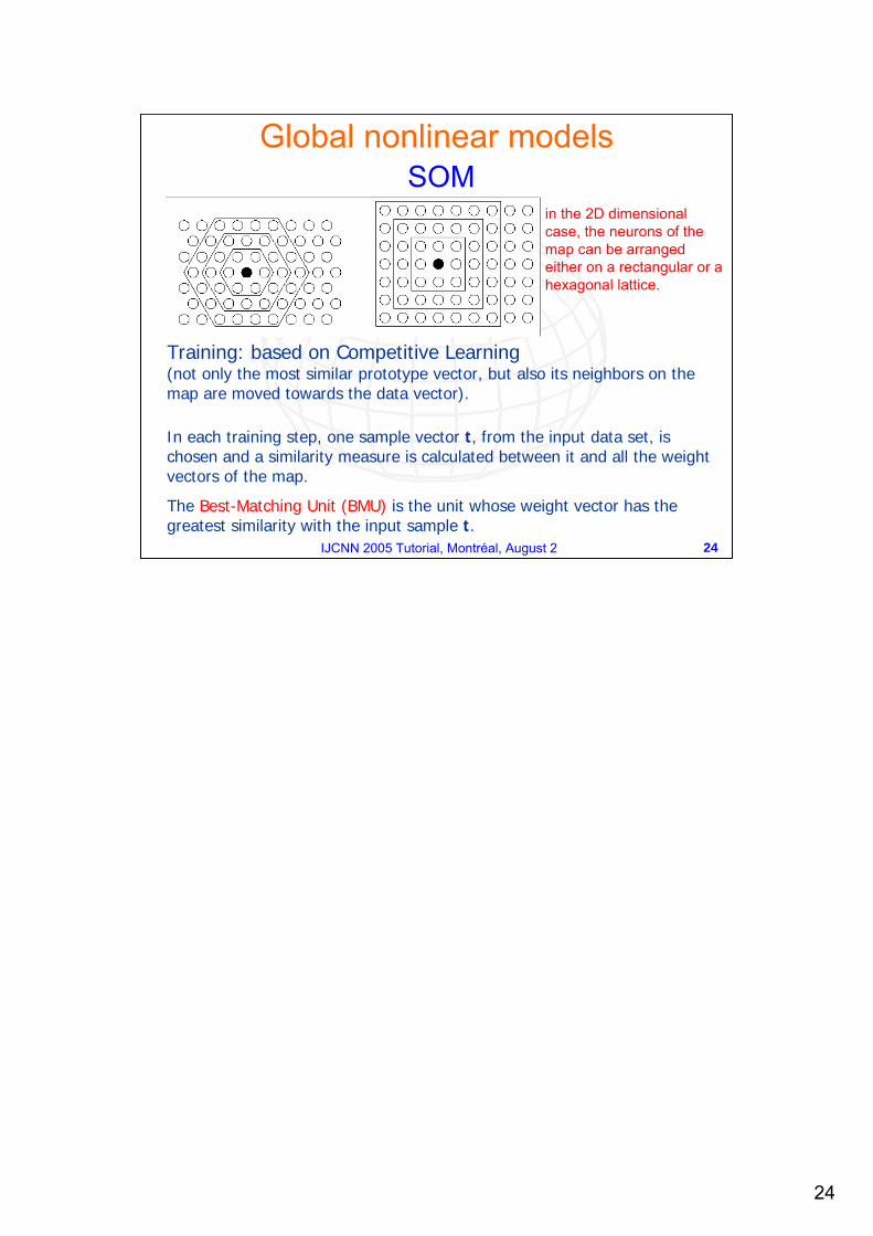
Training: based on Competitive Learning (not only the most similar prototype vector, but also its neighbors on the map are moved towards the data vector).
In each training step, one sample vector t, from the input data set, is chosen and a similarity measure is calculated between it and all the weight vectors of the map.
The Best-Matching Unit (BMU) is the unit whose weight vector has the greatest similarity with the input sample t.
Global nonlinear models SOM
in the 2D dimensional case, the neurons of the map can be arranged either on a rectangular or a hexagonal lattice.
25
25IJCNN 2005 Tutorial, Montréal, August 2
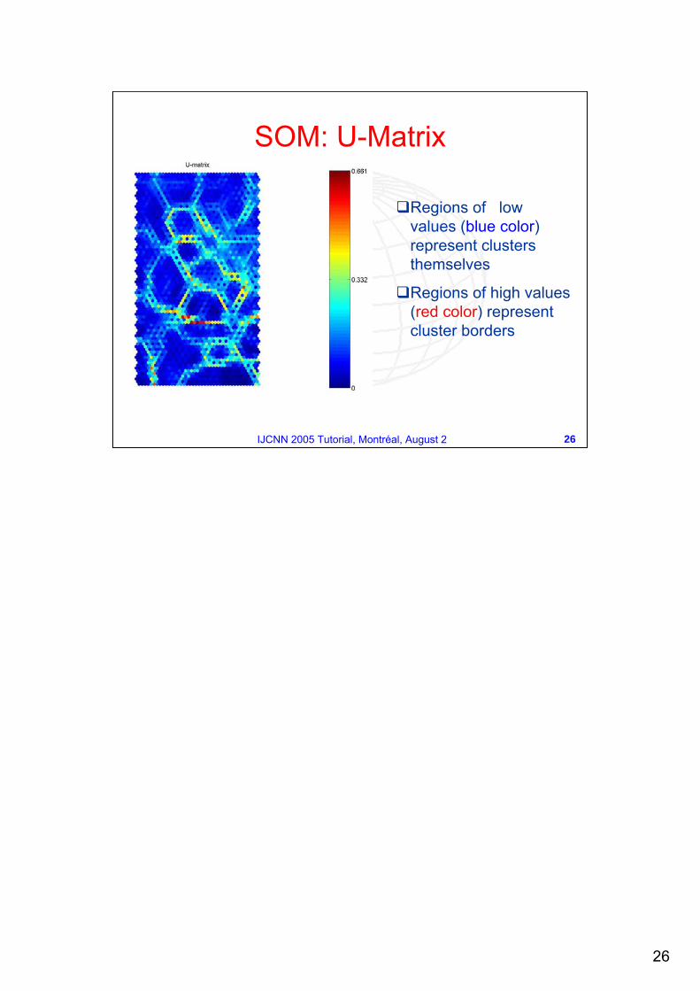
U-Matrix (Unified distance matrix)
Visualizes the clustering structures of the SOM as distances (in the assumed metric) between neighboring map units, thus high values of the U-matrix indicate a cluster border, uniform areas of low values indicate clusters themselves.
Global nonlinear models SOM
26
26IJCNN 2005 Tutorial, Montréal, August 2
SOM: U-Matrix
Regions of lowvalues (blue color)represent clusters themselves
Regions of high values(red color) representcluster borders
27
27IJCNN 2005 Tutorial, Montréal, August 2
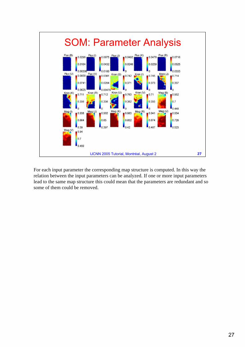
SOM: Parameter Analysis
For each input parameter the corresponding map structure is computed. In this way the relation between the input parameters can be analyzed. If one or more input parameters lead to the same map structure this could mean that the parameters are redundant and so some of them could be removed.
28
28IJCNN 2005 Tutorial, Montréal, August 2
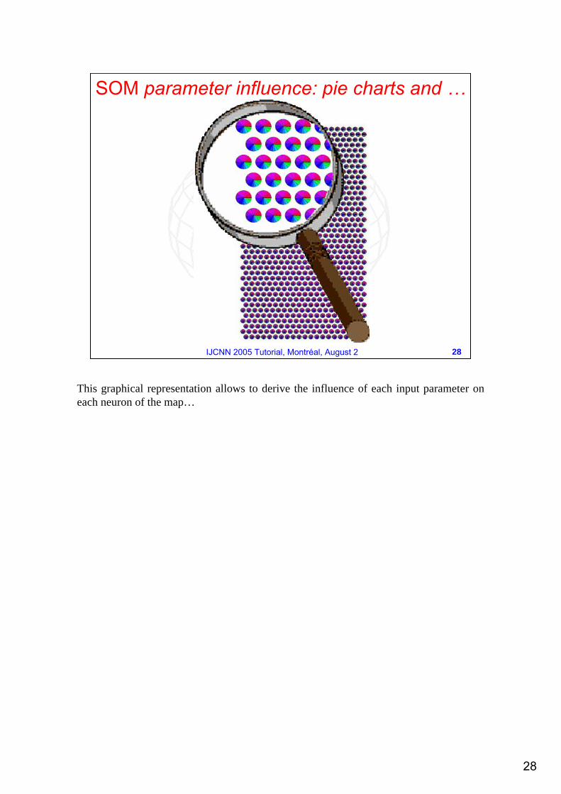
SOM parameter influence: pie charts and …
This graphical representation allows to derive the influence of each input parameter on each neuron of the map…
29
29IJCNN 2005 Tutorial, Montréal, August 2
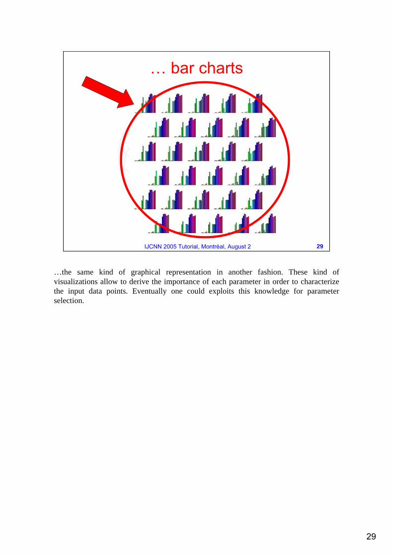
… bar charts
…the same kind of graphical representation in another fashion. These kind of visualizations allow to derive the importance of each parameter in order to characterize the input data points. Eventually one could exploits this knowledge for parameter selection.
30
30IJCNN 2005 Tutorial, Montréal, August 2
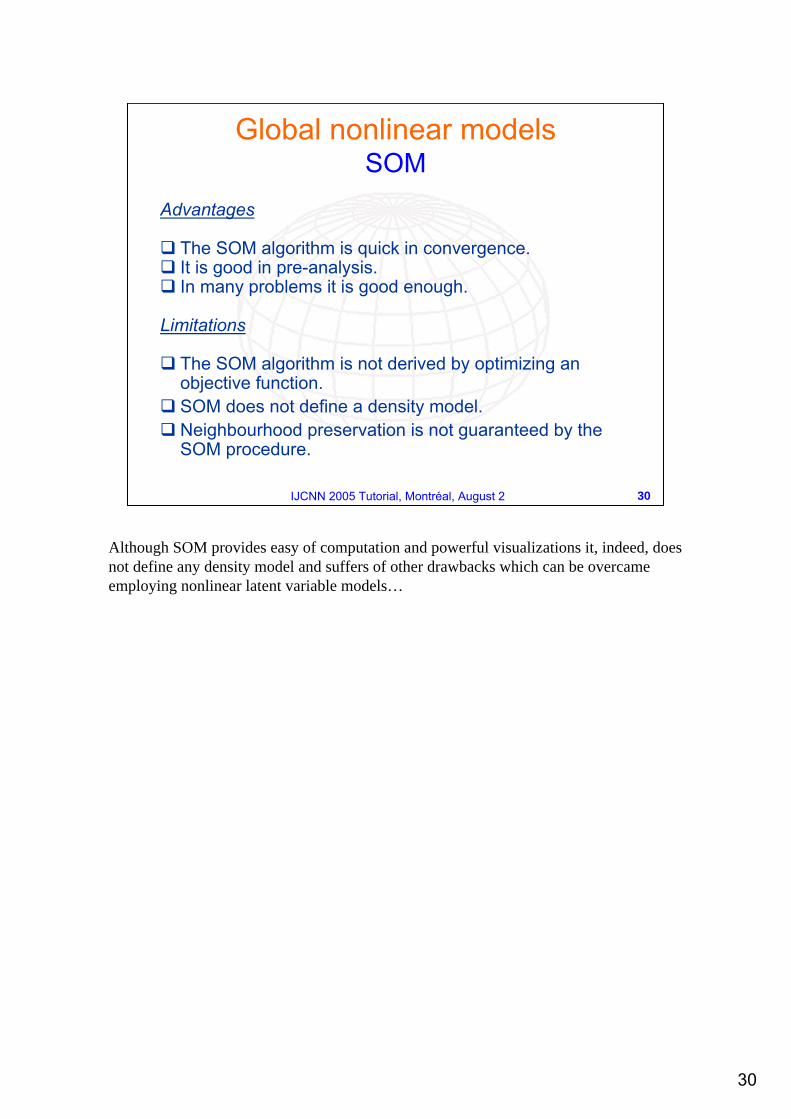
Advantages
The SOM algorithm is quick in convergence.It is good in pre-analysis.In many problems it is good enough.
Limitations
The SOM algorithm is not derived by optimizing an objective function.SOM does not define a density model.Neighbourhood preservation is not guaranteed by the SOM procedure.
Global nonlinear models SOM
Although SOM provides easy of computation and powerful visualizations it, indeed, does not define any density model and suffers of other drawbacks which can be overcame employing nonlinear latent variable models…
31
31IJCNN 2005 Tutorial, Montréal, August 2
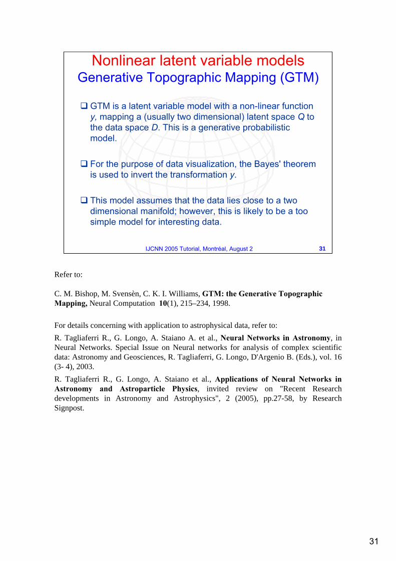
GTM is a latent variable model with a non-linear function y, mapping a (usually two dimensional) latent space Q to the data space D. This is a generative probabilistic model.
For the purpose of data visualization, the Bayes' theorem is used to invert the transformation y.
This model assumes that the data lies close to a two dimensional manifold; however, this is likely to be a too simple model for interesting data.
C. M. Bishop, M. Svensèn, C. K. I. Williams, GTM: the Generative Topographic Mapping, Neural Computation 10(1), 215–234, 1998.
For details concerning with application to astrophysical data, refer to:R. Tagliaferri R., G. Longo, A. Staiano A. et al., Neural Networks in Astronomy, in Neural Networks. Special Issue on Neural networks for analysis of complex scientific data: Astronomy and Geosciences, R. Tagliaferri, G. Longo, D'Argenio B. (Eds.), vol. 16 (3- 4), 2003.R. Tagliaferri R., G. Longo, A. Staiano et al., Applications of Neural Networks in Astronomy and Astroparticle Physics, invited review on "Recent Research developments in Astronomy and Astrophysics", 2 (2005), pp.27-58, by Research Signpost.
32
32IJCNN 2005 Tutorial, Montréal, August 2
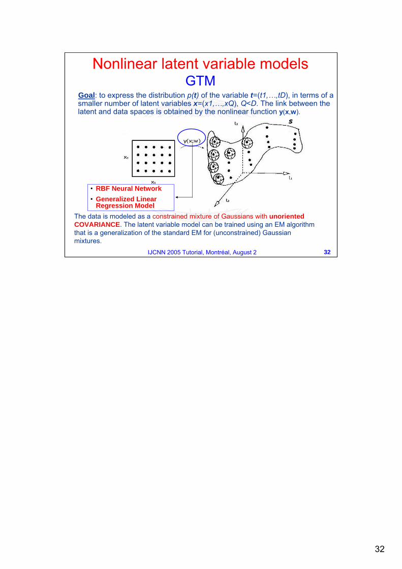
Goal: to express the distribution p(t) of the variable t=(t1,…,tD), in terms of a smaller number of latent variables x=(x1,…,xQ), Q<D. The link between the latent and data spaces is obtained by the nonlinear function y(x,w).
• RBF Neural Network • Generalized Linear
Regression ModelThe data is modeled as a constrained mixture of Gaussians with unorientedCOVARIANCE. The latent variable model can be trained using an EM algorithmthat is a generalization of the standard EM for (unconstrained) Gaussian mixtures.
Nonlinear latent variable models GTM
33
33IJCNN 2005 Tutorial, Montréal, August 2
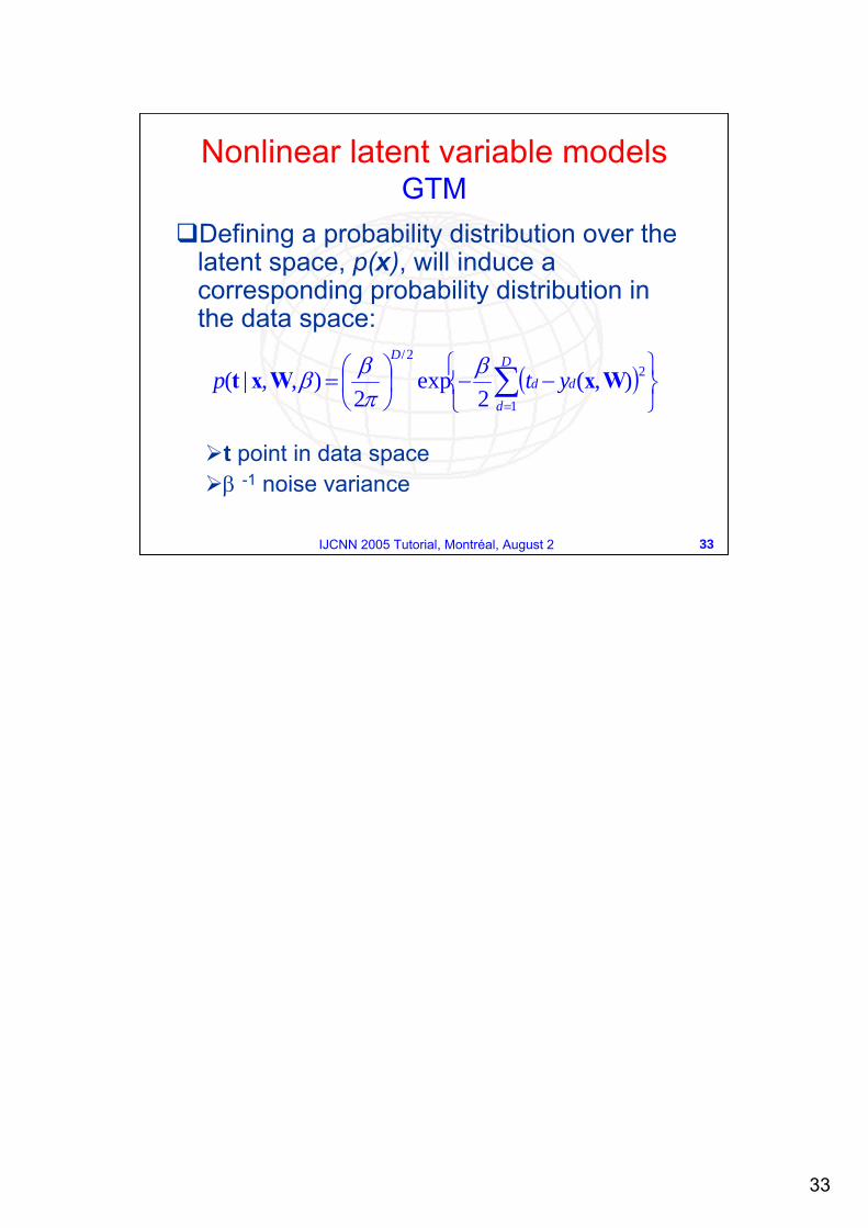
Defining a probability distribution over the latent space, p(x), will induce a corresponding probability distribution in the data space:
t point in data spaceβ -1 noise variance
( )⎭⎬⎫
⎩⎨⎧
−−⎟⎠⎞
⎜⎝⎛= ∑
=
D
d
dd
D
ytp1
22/
),(2
exp2
),,|( WxWxt βπββ
Nonlinear latent variable models GTM
34
34IJCNN 2005 Tutorial, Montréal, August 2
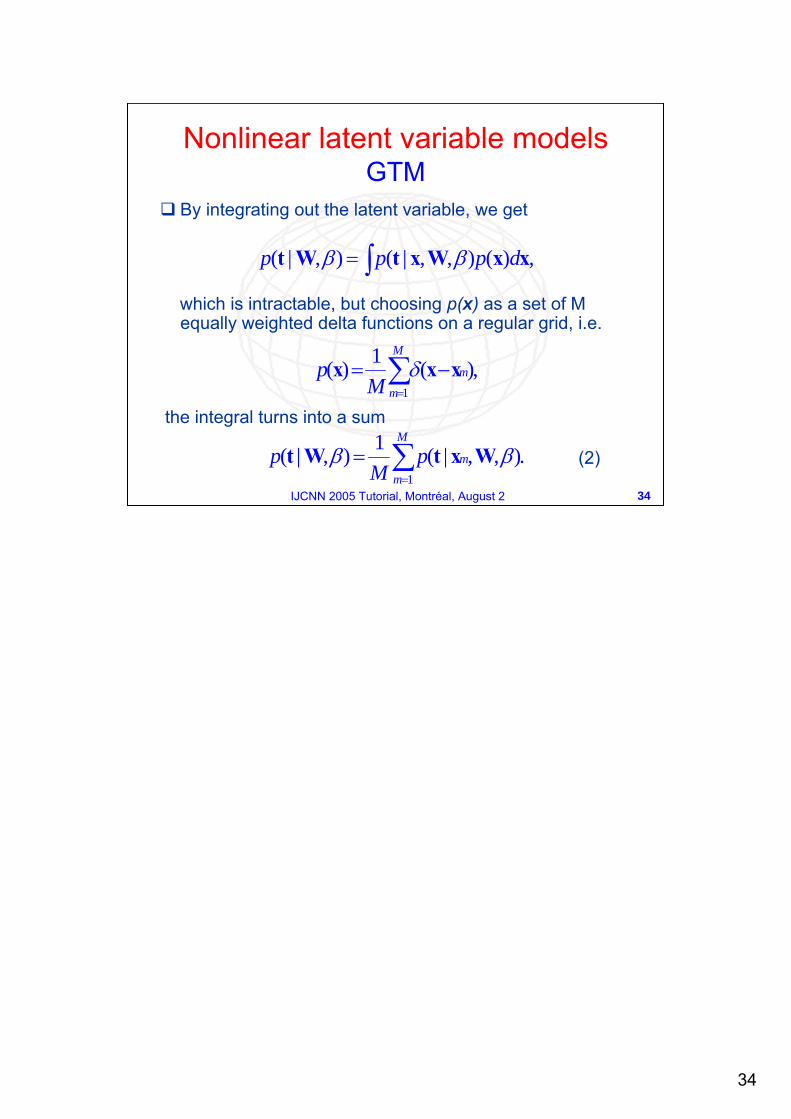
By integrating out the latent variable, we get
which is intractable, but choosing p(x) as a set of M equally weighted delta functions on a regular grid, i.e.
the integral turns into a sum
,)(),,|(),|( xxWxtWt dppp ∫= ββ
,)(1)(1∑=
−=M
m
mM
p xxx δ
.),,|(1),|(1∑=
=M
mmp
Mp ββ WxtWt
Nonlinear latent variable models GTM
(2)
35
35IJCNN 2005 Tutorial, Montréal, August 2
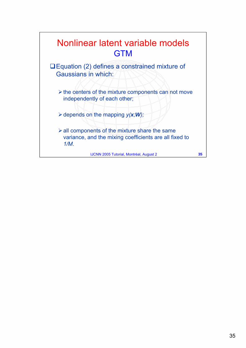
Equation (2) defines a constrained mixture of Gaussians in which:
the centers of the mixture components can not move independently of each other;
depends on the mapping y(x;W);
all components of the mixture share the same variance, and the mixing coefficients are all fixed to 1/M.
Nonlinear latent variable models GTM
36
36IJCNN 2005 Tutorial, Montréal, August 2
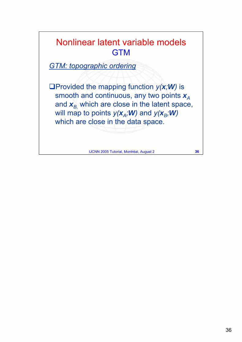
GTM: topographic ordering
Provided the mapping function y(x;W) is smooth and continuous, any two points xAand xB, which are close in the latent space, will map to points y(xA;W) and y(xB;W)which are close in the data space.
Nonlinear latent variable models GTM
37
37IJCNN 2005 Tutorial, Montréal, August 2
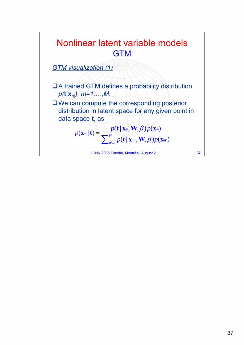
GTM visualization (1)
A trained GTM defines a probability distribution p(t|xm), m=1,…,M.We can compute the corresponding posterior distribution in latent space for any given point in data space t, as
)(),,|()(),,|()|(
'1'
' mM
mm
mmm
ppppp
xWxtxWxttx
∑ =
=β
β
Nonlinear latent variable modelsGTM
38
38IJCNN 2005 Tutorial, Montréal, August 2
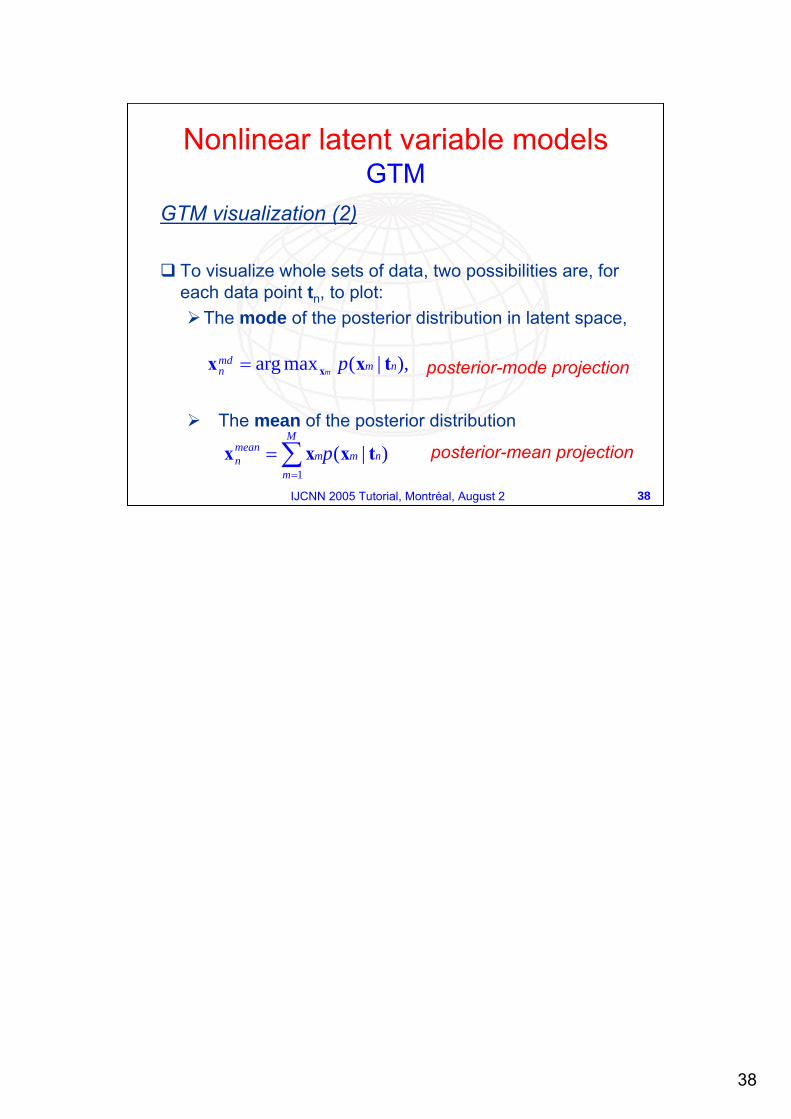
GTM visualization (2)
To visualize whole sets of data, two possibilities are, for each data point tn, to plot:
The mode of the posterior distribution in latent space,
The mean of the posterior distribution
),|(maxarg nmmdn pm txx x=
∑=
=M
mnmm
meann p
1)|( txxx
Nonlinear latent variable modelsGTM
posterior-mode projection
posterior-mean projection
39
39IJCNN 2005 Tutorial, Montréal, August 2
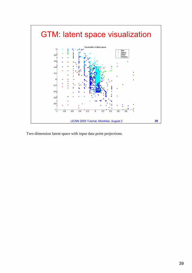
GTM: latent space visualization
Two-dimension latent space with input data point projections.
40
40IJCNN 2005 Tutorial, Montréal, August 2
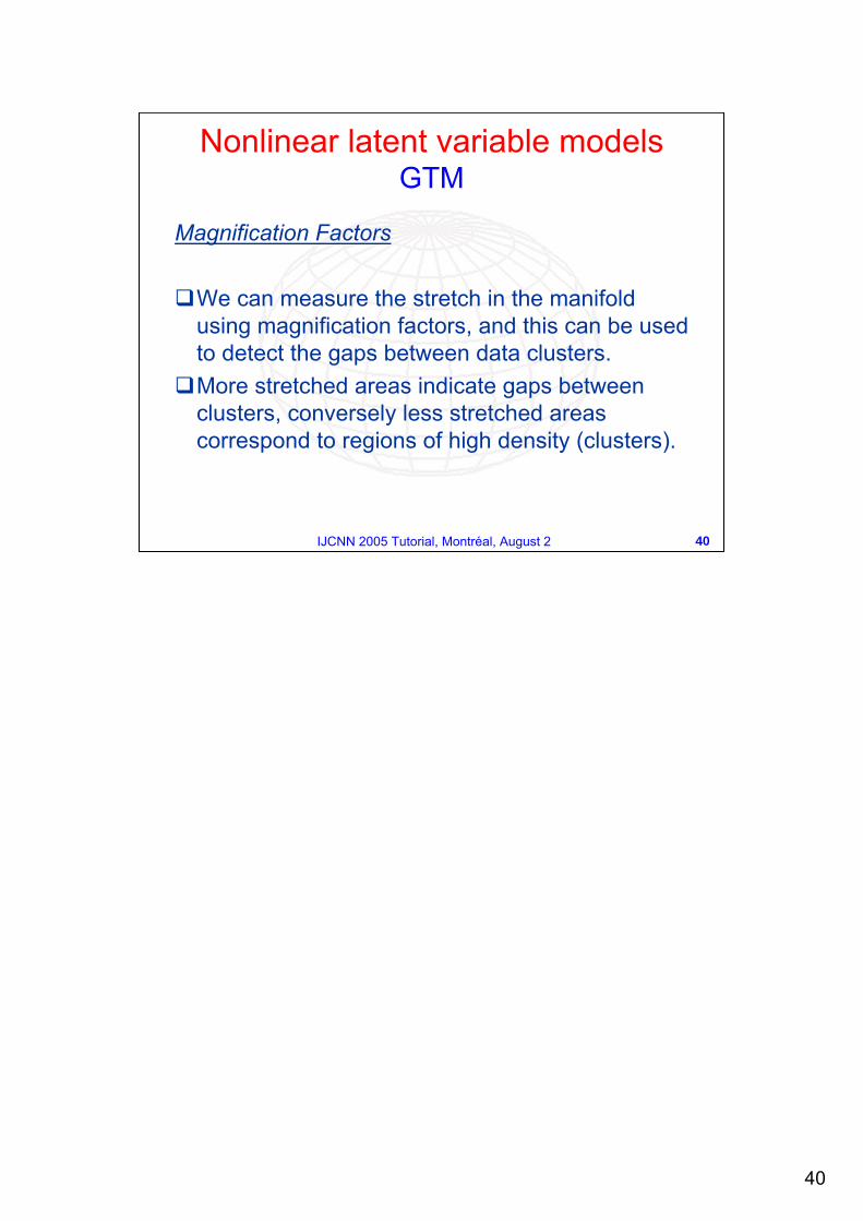
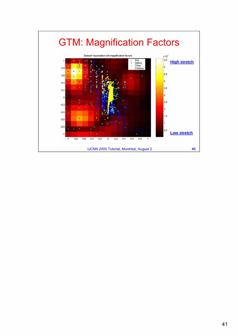
Magnification Factors
We can measure the stretch in the manifold using magnification factors, and this can be used to detect the gaps between data clusters.More stretched areas indicate gaps between clusters, conversely less stretched areas correspond to regions of high density (clusters).
Nonlinear latent variable models GTM
41
41IJCNN 2005 Tutorial, Montréal, August 2
GTM: Magnification Factors
High stretch
Low stretch
42
42IJCNN 2005 Tutorial, Montréal, August 2
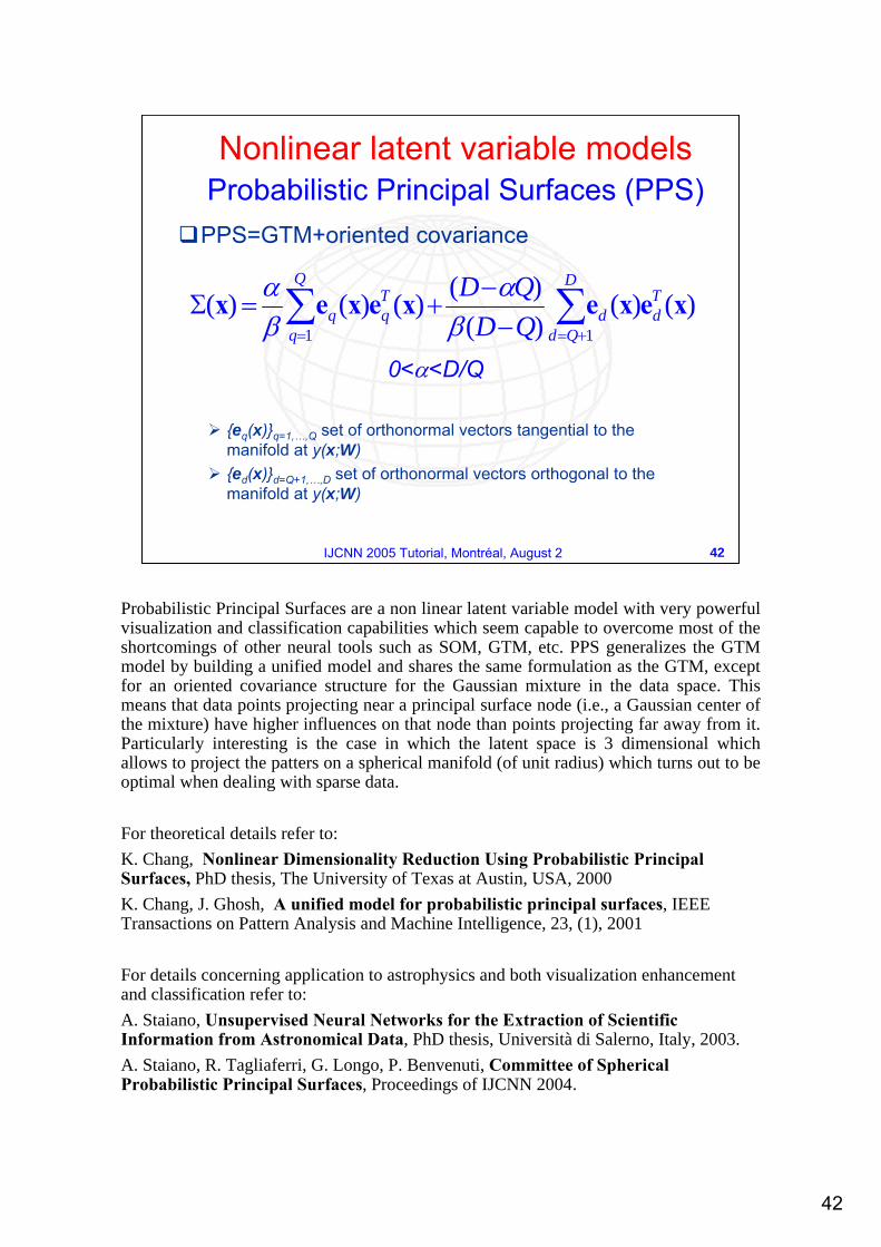
PPS=GTM+oriented covariance
0<α<D/Q
{eq(x)}q=1,…,Q set of orthonormal vectors tangential to the manifold at y(x;W){ed(x)}d=Q+1,…,D set of orthonormal vectors orthogonal to the manifold at y(x;W)
∑∑+== −
−+=Σ
D
Qd
Tdd
Q
q
Tqq QD
QD11
)()()()()()()( xexexexex
βα
βα
Nonlinear latent variable modelsProbabilistic Principal Surfaces (PPS)
Probabilistic Principal Surfaces are a non linear latent variable model with very powerful visualization and classification capabilities which seem capable to overcome most of the shortcomings of other neural tools such as SOM, GTM, etc. PPS generalizes the GTM model by building a unified model and shares the same formulation as the GTM, except for an oriented covariance structure for the Gaussian mixture in the data space. This means that data points projecting near a principal surface node (i.e., a Gaussian center of the mixture) have higher influences on that node than points projecting far away from it. Particularly interesting is the case in which the latent space is 3 dimensional which allows to project the patters on a spherical manifold (of unit radius) which turns out to be optimal when dealing with sparse data.
For theoretical details refer to:K. Chang, Nonlinear Dimensionality Reduction Using Probabilistic PrincipalSurfaces, PhD thesis, The University of Texas at Austin, USA, 2000K. Chang, J. Ghosh, A unified model for probabilistic principal surfaces, IEEE Transactions on Pattern Analysis and Machine Intelligence, 23, (1), 2001
For details concerning application to astrophysics and both visualization enhancement and classification refer to:A. Staiano, Unsupervised Neural Networks for the Extraction of Scientific Information from Astronomical Data, PhD thesis, Università di Salerno, Italy, 2003.A. Staiano, R. Tagliaferri, G. Longo, P. Benvenuti, Committee of Spherical Probabilistic Principal Surfaces, Proceedings of IJCNN 2004.
43
43IJCNN 2005 Tutorial, Montréal, August 2
Under a spherical Gaussian model of the GTM, points 1 and 2 have equal influence on the center node y(x) (a) PPS have an oriented covariance matrix so point 1 is probabilistically closer to the center node y(x) than point 2 (b)
Nonlinear latent variable modelsPPS
Why oriented covariance?
The figure is taken from K. Chang, Nonlinear Dimensionality Reduction Using Probabilistic Principal Surfaces, PhD thesis, The University of Texas at Austin, USA, 2000.
44
44IJCNN 2005 Tutorial, Montréal, August 2
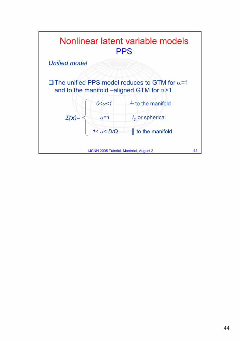
Unified model
The unified PPS model reduces to GTM for α=1 and to the manifold –aligned GTM for α>1
0<α<1 ┴ to the manifold
α=1 ID or spherical
1< α< D/Q ║ to the manifold
Σ(x)=
Nonlinear latent variable modelsPPS
45
45IJCNN 2005 Tutorial, Montréal, August 2
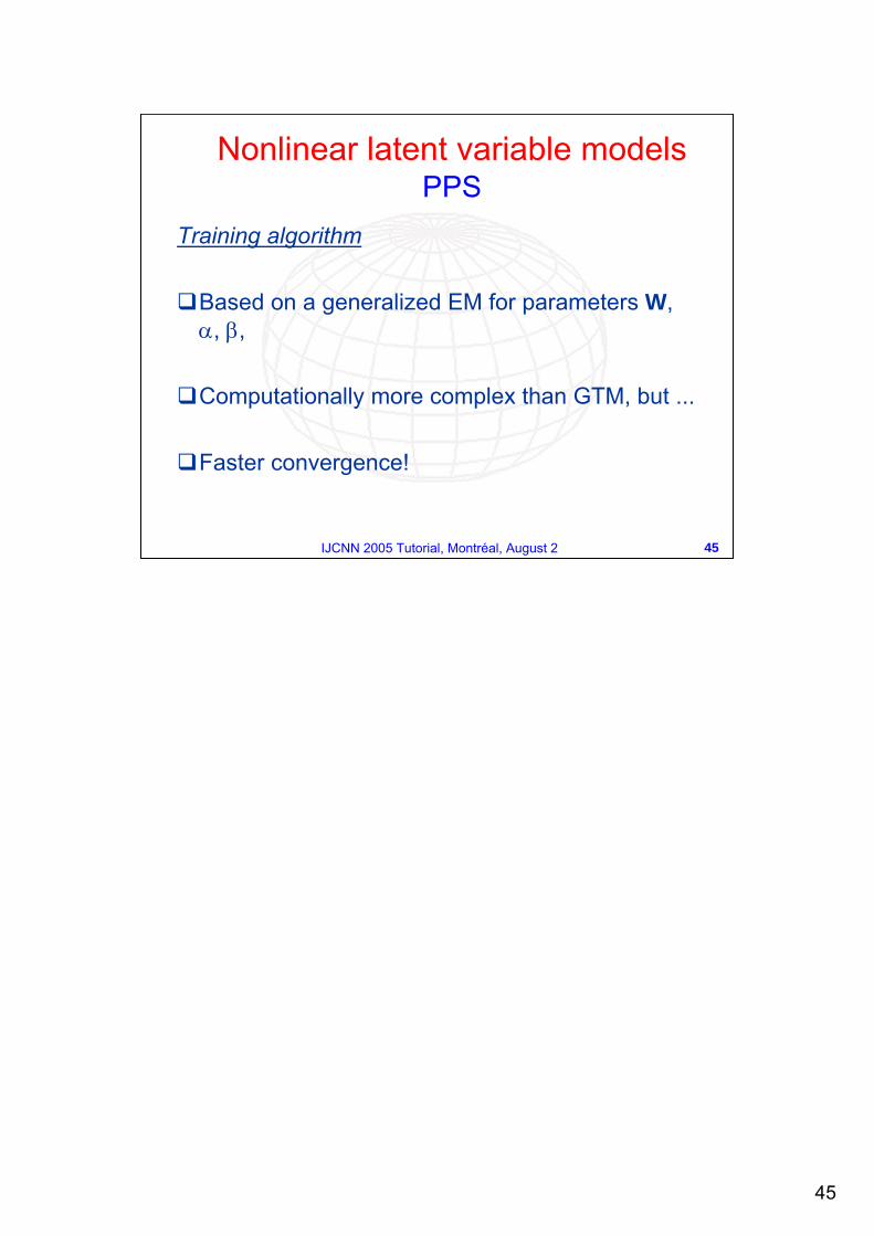
Training algorithm
Based on a generalized EM for parameters W, α, β,
Computationally more complex than GTM, but ...
Faster convergence!
Nonlinear latent variable modelsPPS
46
46IJCNN 2005 Tutorial, Montréal, August 2
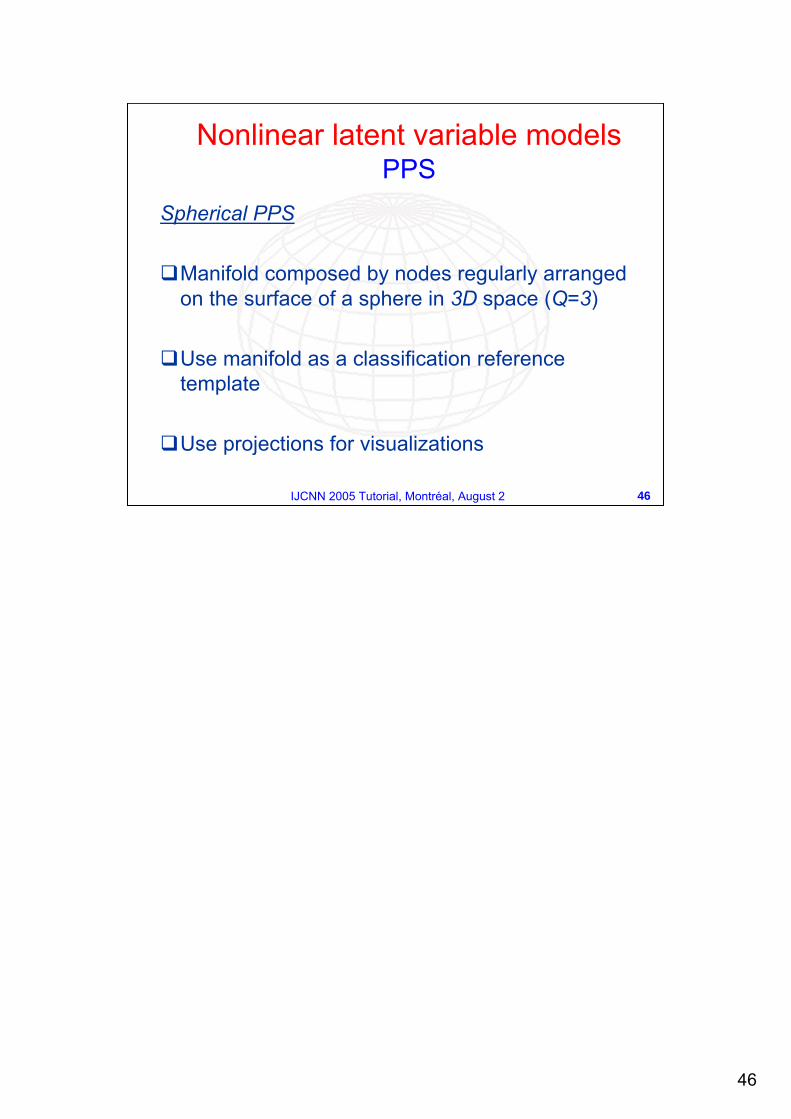
Spherical PPS
Manifold composed by nodes regularly arranged on the surface of a sphere in 3D space (Q=3)
Use manifold as a classification reference template
Use projections for visualizations
Nonlinear latent variable modelsPPS
47
47IJCNN 2005 Tutorial, Montréal, August 2
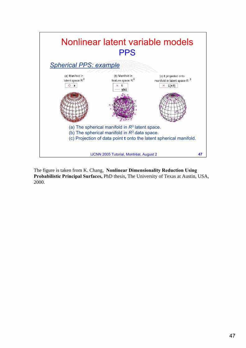
Spherical PPS: example
(a) The spherical manifold in R3 latent space. (b) The spherical manifold in R3 data space. (c) Projection of data point t onto the latent spherical manifold.
Nonlinear latent variable modelsPPS
The figure is taken from K. Chang, Nonlinear Dimensionality Reduction Using Probabilistic Principal Surfaces, PhD thesis, The University of Texas at Austin, USA, 2000.
48
48IJCNN 2005 Tutorial, Montréal, August 2
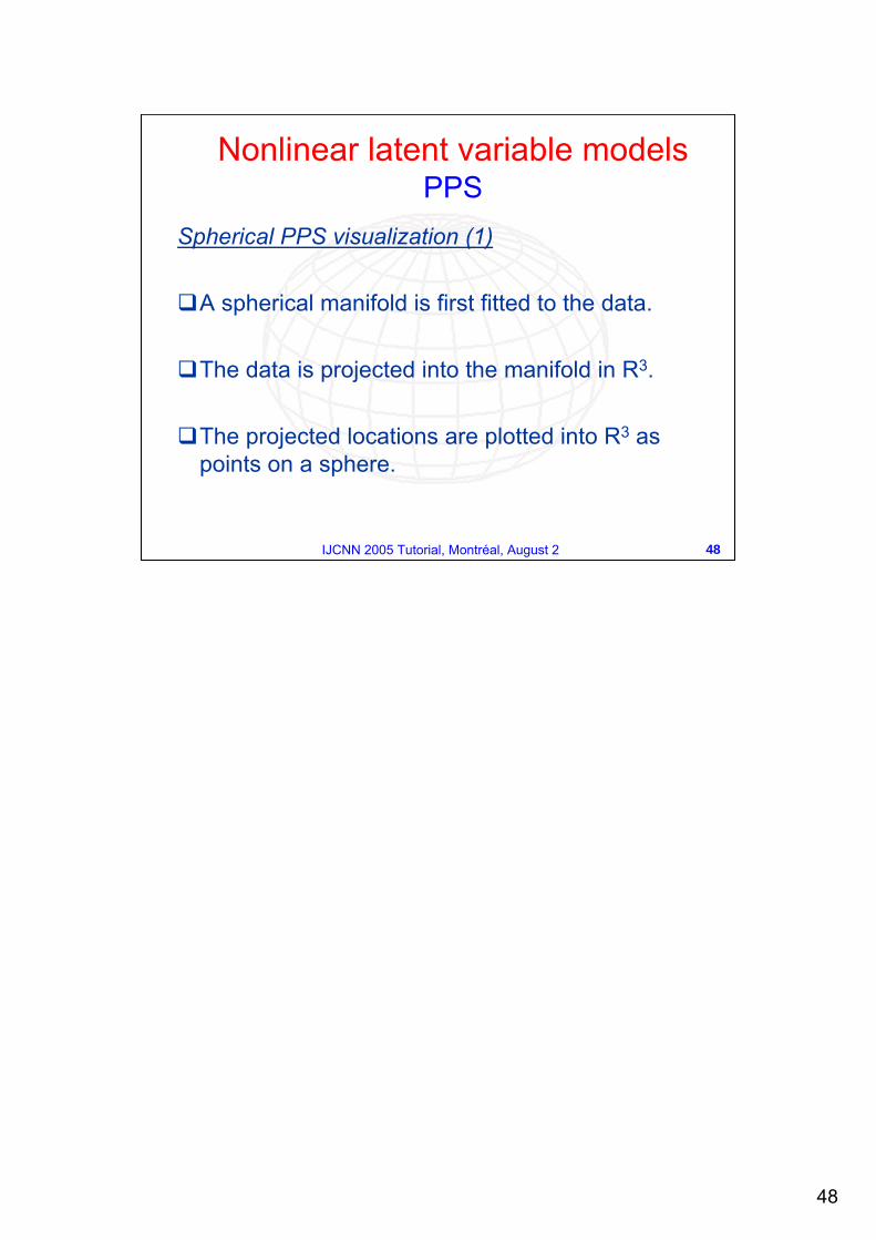
Spherical PPS visualization (1)
A spherical manifold is first fitted to the data.
The data is projected into the manifold in R3.
The projected locations are plotted into R3 as points on a sphere.
Nonlinear latent variable modelsPPS
49
49IJCNN 2005 Tutorial, Montréal, August 2
Spherical PPS visualization (2)
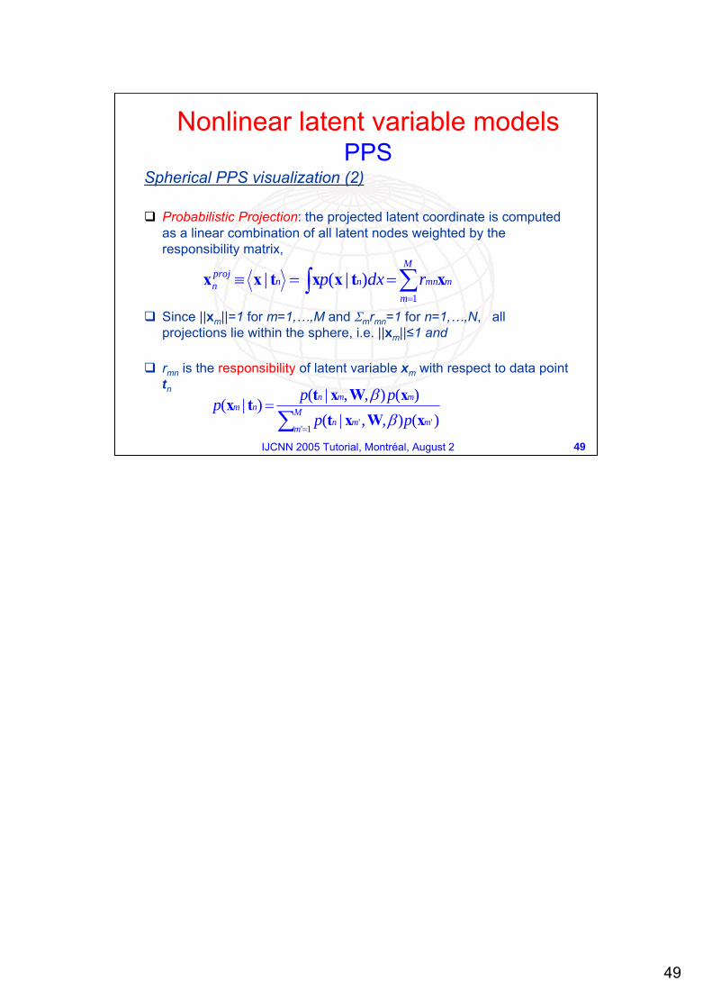
Probabilistic Projection: the projected latent coordinate is computed as a linear combination of all latent nodes weighted by the responsibility matrix,
Since ||xm||=1 for m=1,…,M and Σmrmn=1 for n=1,…,N, all projections lie within the sphere, i.e. ||xm||≤1 and
rmn is the responsibility of latent variable xm with respect to data point tn
∫ ∑=
==≡M
mmmnnn
projn rdxp
1)|(| xtxxtxx
)(),,|()(),,|()|(
'1'
' mM
mmn
mmnnm
ppppp
xWxtxWxttx
∑ =
=β
β
Nonlinear latent variable modelsPPS
50
50IJCNN 2005 Tutorial, Montréal, August 2
Spherical PPS: graphical user interface
We built a graphical user interface which extends the visualization possibilities offered by PPS:
Visualization on the sphere surface;Possibility to interact with points on the sphere;Visualization of the data probability density function on the sphere;Cluster determination and visualization.
Nonlinear latent variable modelsPPS
Refer to:A. Staiano, Unsupervised Neural Networks for the Extraction of Scientific Information from Astronomical Data, PhD thesis, Università di Salerno, Italy, 2003.
51
51IJCNN 2005 Tutorial, Montréal, August 2
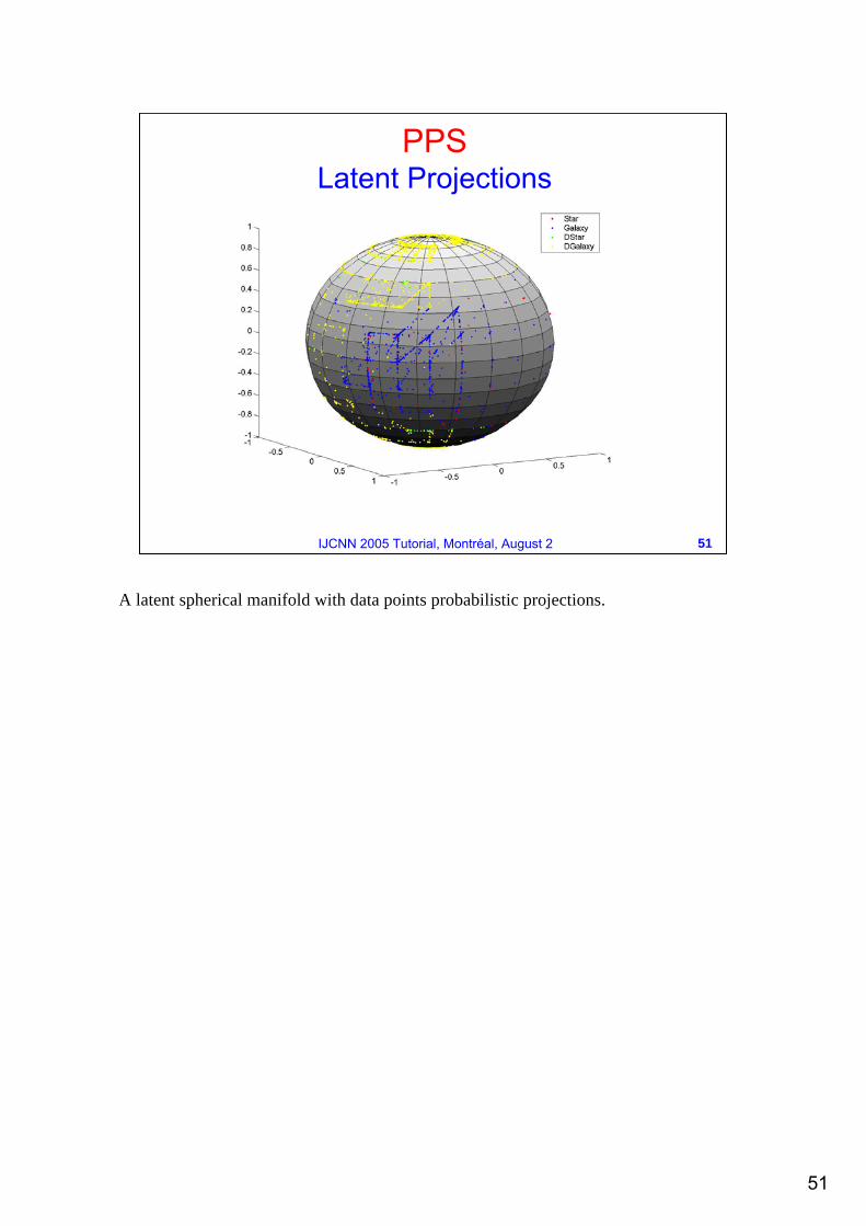
PPSLatent Projections
A latent spherical manifold with data points probabilistic projections.
52
52IJCNN 2005 Tutorial, Montréal, August 2
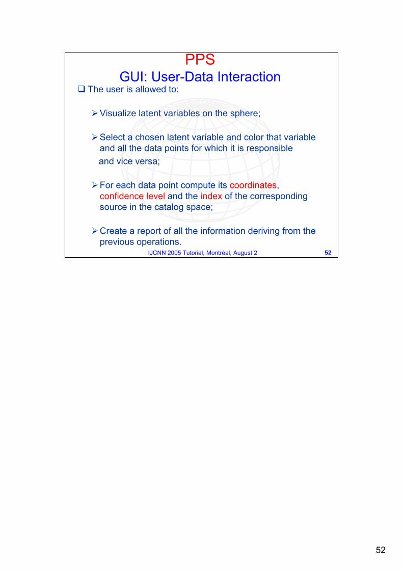
The user is allowed to:
Visualize latent variables on the sphere;
Select a chosen latent variable and color that variable and all the data points for which it is responsible and vice versa;
For each data point compute its coordinates, confidence level and the index of the corresponding source in the catalog space;
Create a report of all the information deriving from the previous operations.
PPSGUI: User-Data Interaction
53
53IJCNN 2005 Tutorial, Montréal, August 2
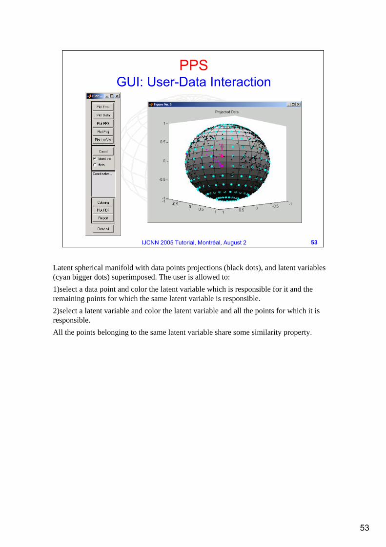
PPSGUI: User-Data Interaction
Latent spherical manifold with data points projections (black dots), and latent variables (cyan bigger dots) superimposed. The user is allowed to:1)select a data point and color the latent variable which is responsible for it and the remaining points for which the same latent variable is responsible. 2)select a latent variable and color the latent variable and all the points for which it is responsible. All the points belonging to the same latent variable share some similarity property.
54
54IJCNN 2005 Tutorial, Montréal, August 2
PPSDensity in latent space
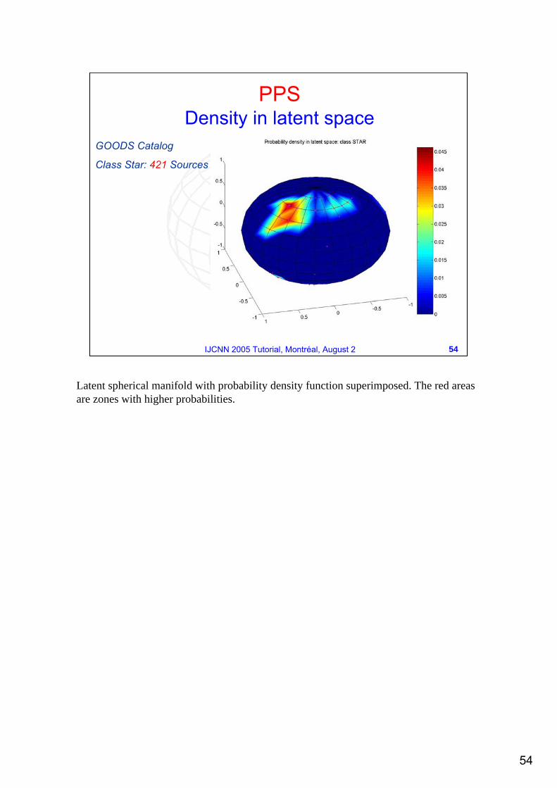
GOODS Catalog
Class Star: 421 Sources
Latent spherical manifold with probability density function superimposed. The red areas are zones with higher probabilities.
55
55IJCNN 2005 Tutorial, Montréal, August 2
PPSDensity in latent space
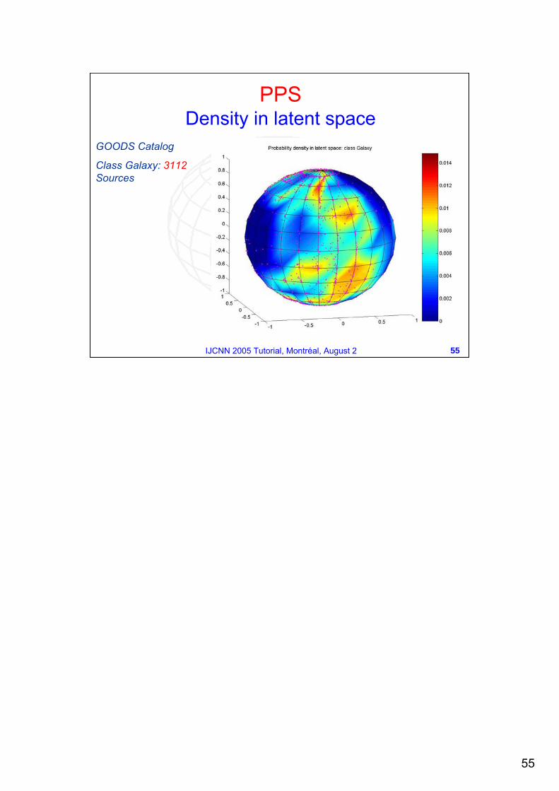
GOODS Catalog
Class Galaxy: 3112Sources
56
56IJCNN 2005 Tutorial, Montréal, August 2
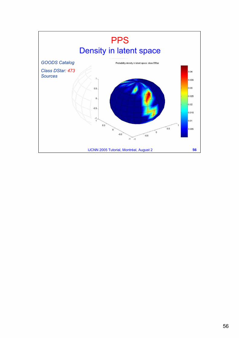
GOODS Catalog
Class DStar: 473Sources
PPSDensity in latent space
57
57IJCNN 2005 Tutorial, Montréal, August 2
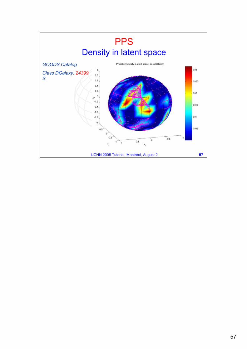
GOODS Catalog
Class DGalaxy: 24399S.
PPSDensity in latent space
58
58IJCNN 2005 Tutorial, Montréal, August 2
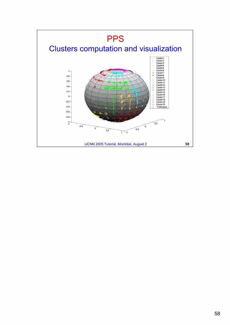
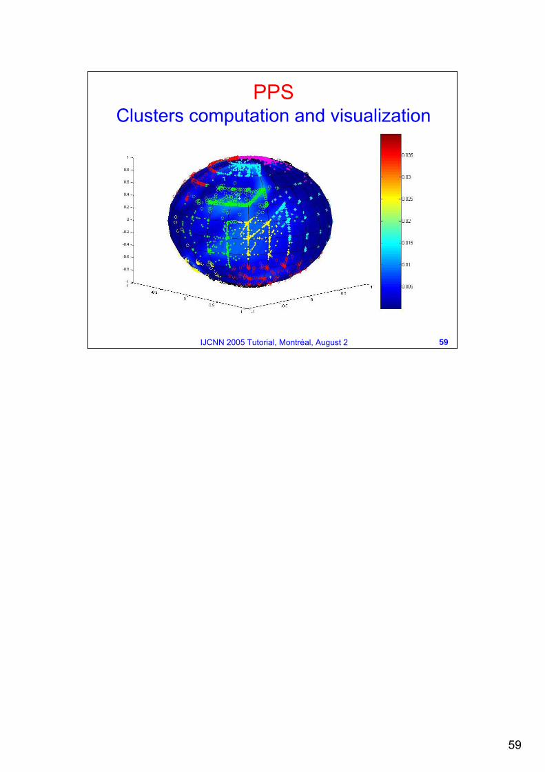
PPSClusters computation and visualization
59
59IJCNN 2005 Tutorial, Montréal, August 2
PPSClusters computation and visualization
60
60IJCNN 2005 Tutorial, Montréal, August 2
Hierarchies of latent variable modelsOverview
Most of the visualization algorithms described so far, project the data onto a two-dimensional visualization space...
But a single two-dimensional projection, even if nonlinear, may not be sufficient to capture all of the interesting aspects of the data.
This intuition is behind the hierarchical development of a linear latent variable model, namely mixture of PPCA, and the nonlinear counterpart based on the GTM.
61
61IJCNN 2005 Tutorial, Montréal, August 2
When exploring a data set through low-dimensional projections in a hierarchical way, one first constructs a top-level plot and then focuses the attention on local region of interest by recursively building the corresponding sub-projections.
The regions of interest are chosen interactively by the user which clicks on those areas considered as particularly complex and thus hiding potential substructure not visible at a first glance.
All the models in the hierarchy are organized in a tree and need to be a consistent probabilistic model of the data.
Hierarchies of latent variable models
62
62IJCNN 2005 Tutorial, Montréal, August 2
From a technical point of view, it is necessary to derive the hierarchical version of the EM algorithm in order to make the hierarchy of sub-models a consistent probabilistic model as a whole.
A further appealing possibility offered by the hierarchical versions of the latent variable models, is that if the base model provides special kind of plots then all the visualization power of these plots can be exploited at any level of the hierarchy.
Hierarchies of latent variable models
63
63IJCNN 2005 Tutorial, Montréal, August 2
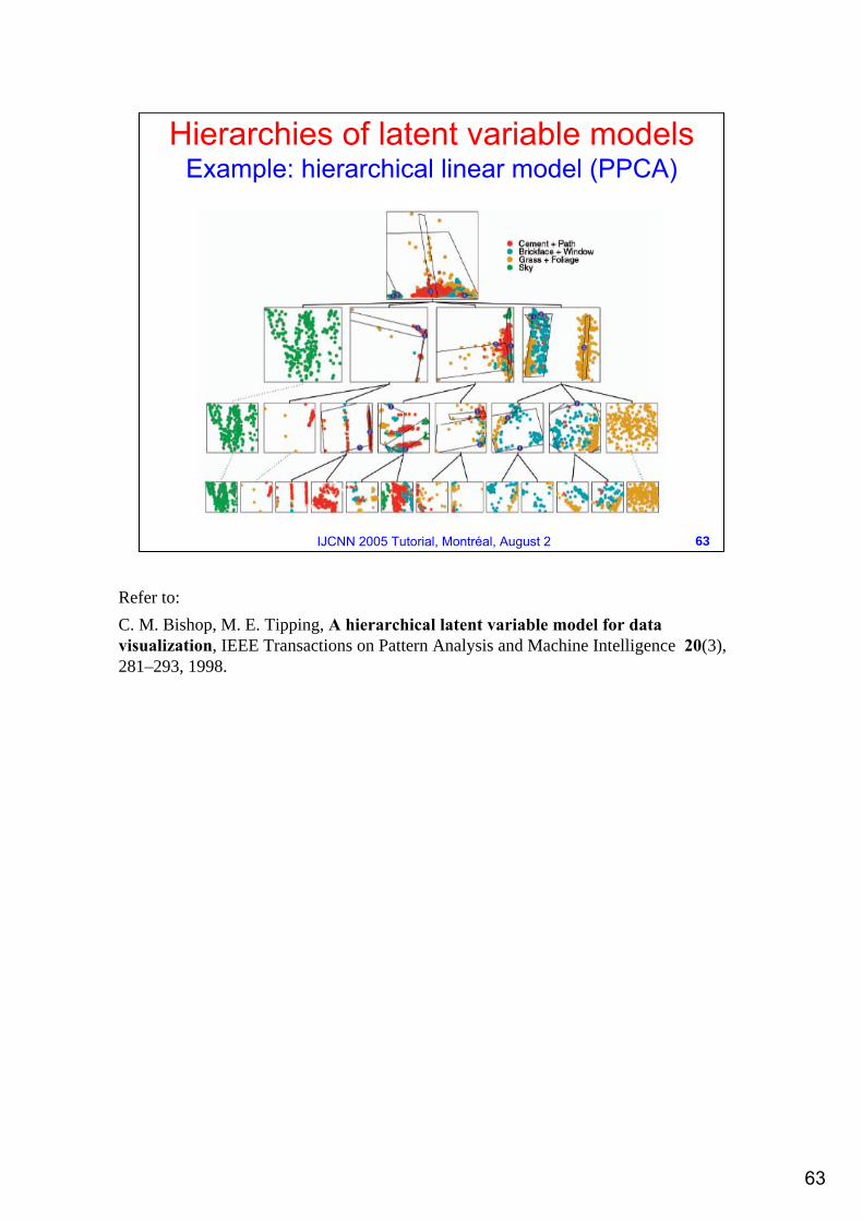
Hierarchies of latent variable modelsExample: hierarchical linear model (PPCA)
Refer to:C. M. Bishop, M. E. Tipping, A hierarchical latent variable model for data visualization, IEEE Transactions on Pattern Analysis and Machine Intelligence 20(3), 281–293, 1998.
64
64IJCNN 2005 Tutorial, Montréal, August 2
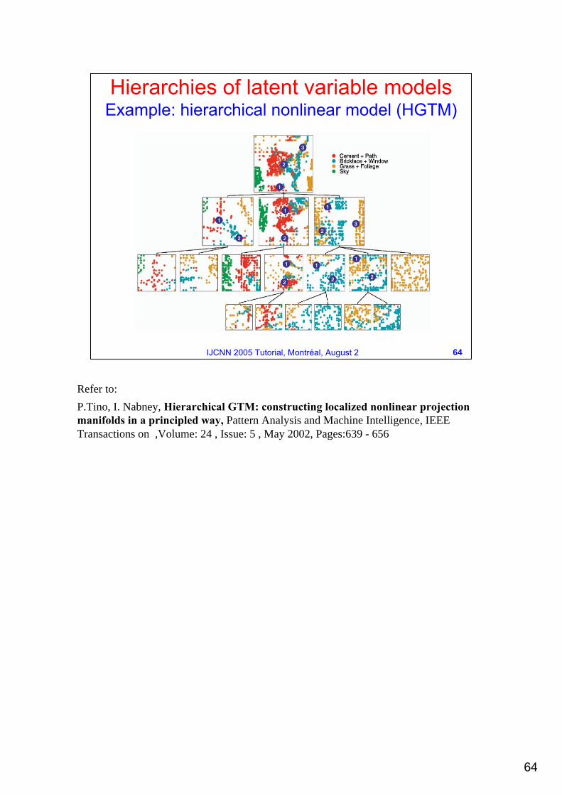
Hierarchies of latent variable modelsExample: hierarchical nonlinear model (HGTM)
Refer to:P.Tino, I. Nabney, Hierarchical GTM: constructing localized nonlinear projection manifolds in a principled way, Pattern Analysis and Machine Intelligence, IEEE Transactions on ,Volume: 24 , Issue: 5 , May 2002, Pages:639 - 656
65
65IJCNN 2005 Tutorial, Montréal, August 2
Hierarchical models: linear vs nonlinear
Allowing for non linearity in the projection manifolds lead to create more detailed and parsimonious visualization plots.
While PCA can introduce, in the visualization plot, only global stretching along the principal axes, the nonlinear projection manifold of GTM can locally stretch and fold in the data space.
This gives the possibility to the hierarchical GTM to make full use of the latent space when describing the local distributions of points.
On the contrary, the PPCA-based linear hierarchy, provides plots often characterized by dense isolated clusters.
66
66IJCNN 2005 Tutorial, Montréal, August 2
Obviously the hierarchical extension may be applied to PPS as well.
The power and the variety of PPS visualization plots can be fully exploited by developing a hierarchical PPS model in the HGTM fashion.
We are currently implementing the HPPS model so the work is still in progress…
…however, we provided a second hierarchical view of PPS…
Hierarchies of latent variable modelsPPS
67
67IJCNN 2005 Tutorial, Montréal, August 2
PPS: hierarchical agglomerationPPS can be used in conjunction with a type of hierarchical agglomerative clustering for the construction of a powerful visualization-clustering tool.
The idea is to start with the probability density function computed by PPS and then applying a hierarchical clustering which merges the Gaussian components of the mixture model.
This task could be accomplished by any clustering algorithm (eventually even not hierarchical as k-means), but…… we developed a special kind of clustering algorithm mainly able to find autonomously the correct number of clusters.
68
68IJCNN 2005 Tutorial, Montréal, August 2
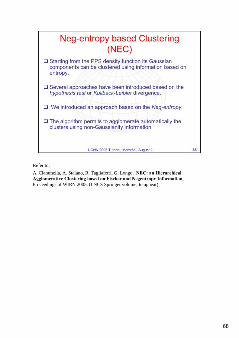
Neg-entropy based Clustering (NEC)
Starting from the PPS density function its Gaussian components can be clustered using information based on entropy.
Several approaches have been introduced based on the hypothesis test or Kullback-Leibler divergence.
We introduced an approach based on the Neg-entropy.
The algorithm permits to agglomerate automatically the clusters using non-Gaussianity information.
Refer to:A. Ciaramella, A. Staiano, R. Tagliaferri, G. Longo, NEC: an Hierarchical Agglomerative Clustering based on Fischer and Negentropy Information, Proceedings of WIRN 2005, (LNCS Springer volume, to appear)
69
69IJCNN 2005 Tutorial, Montréal, August 2
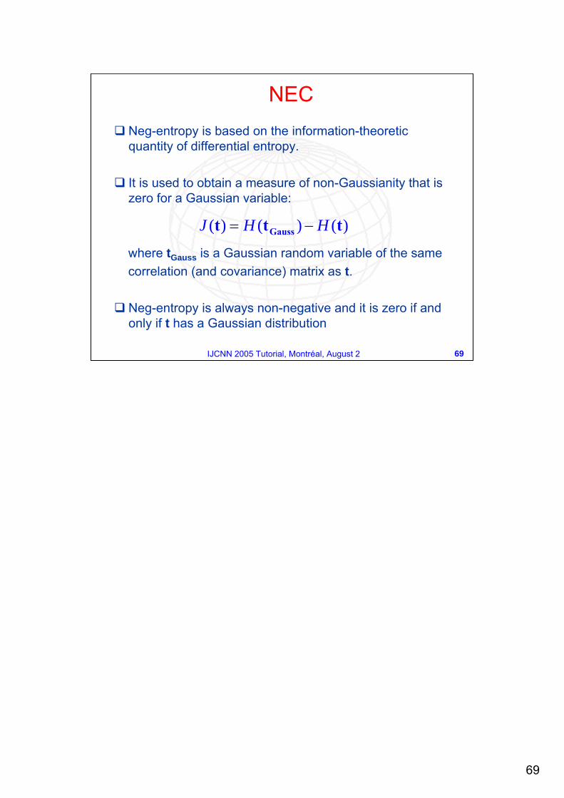
Neg-entropy is based on the information-theoretic quantity of differential entropy.
It is used to obtain a measure of non-Gaussianity that is zero for a Gaussian variable:
where tGauss is a Gaussian random variable of the same correlation (and covariance) matrix as t.
Neg-entropy is always non-negative and it is zero if and only if t has a Gaussian distribution
)()()( ttt Gauss HHJ −=
NEC
70
70IJCNN 2005 Tutorial, Montréal, August 2
The classical method to approximate neg-entropy is using high-order cumulants
where kurt is the kurtosis.
A different and more robust approximation of the neg-entropy is
where υ is a standardized Gaussian variable and t has zero mean and unit variance.
Choosing a G that does not grow fast, one obtains more robust estimators. The following choices of G have proved very useful:
{ } 223 )kurt(41
121)( ttt +≈ EJ
{ } { }[ ]2)()()( υGEGEJ −∝ tt
2t 2
tta
ea
GGaa
G−
−===1 -
41 - )cosh(log1 3421
NEC: approximate neg-entropy
71
71IJCNN 2005 Tutorial, Montréal, August 2
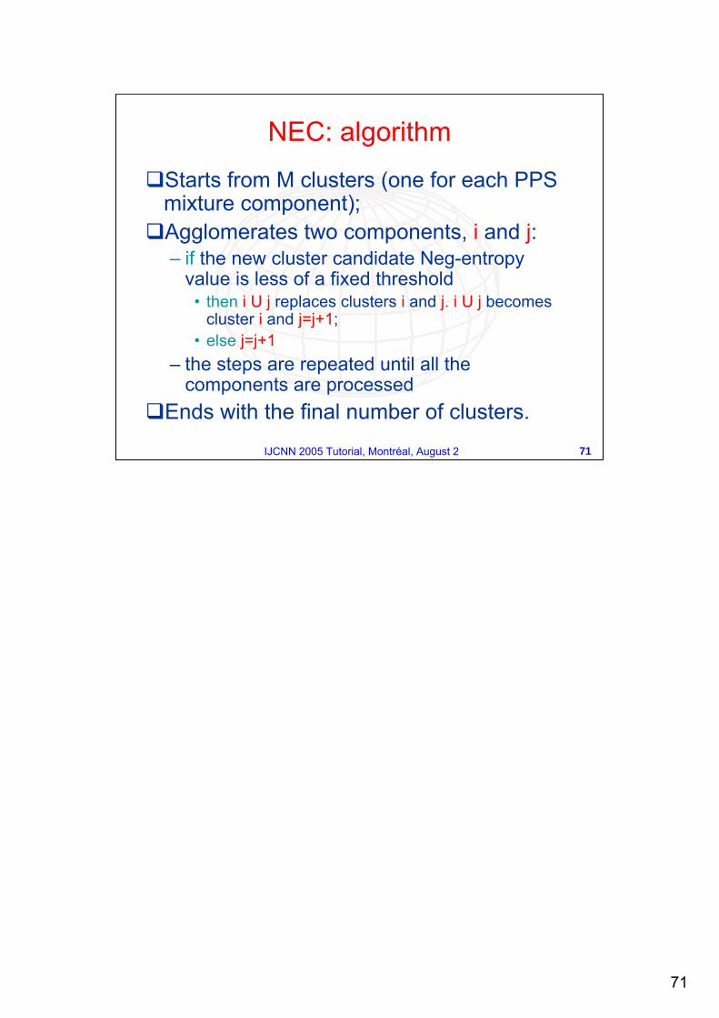
Starts from M clusters (one for each PPS mixture component);Agglomerates two components, i and j: – if the new cluster candidate Neg-entropy
value is less of a fixed threshold • then i U j replaces clusters i and j. i U j becomes
cluster i and j=j+1;• else j=j+1
– the steps are repeated until all the components are processed
Ends with the final number of clusters.
NEC: algorithm
72
72IJCNN 2005 Tutorial, Montréal, August 2
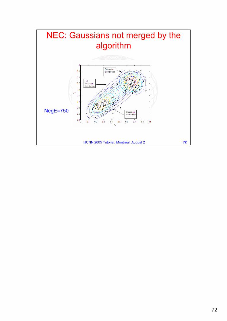
NEC: Gaussians not merged by the algorithm
NegE=750
73
73IJCNN 2005 Tutorial, Montréal, August 2
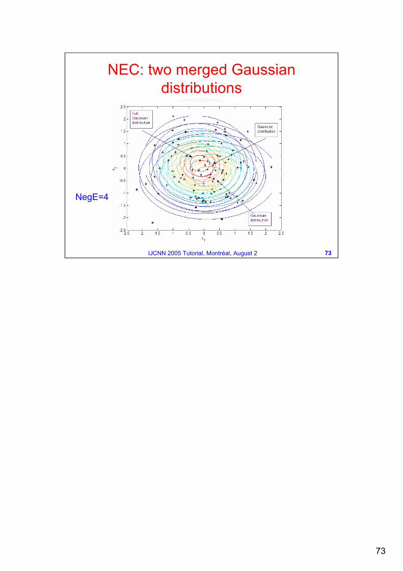
NEC: two merged Gaussian distributions
NegE=4
74
74IJCNN 2005 Tutorial, Montréal, August 2
0 1 2 3 4 5 6 7 80
20
40
60
80
100
dt
Num
ber
of c
lust
ers
0 1 2 3 4 5 6 7 8−0.2
0
0.2
0.4
0.6
0.8
dt
inde
x
meanvariance
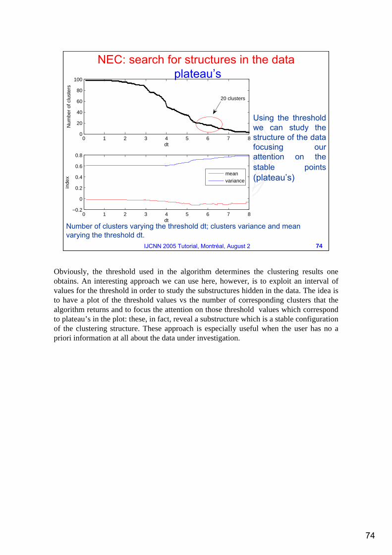
20 clusters
Number of clusters varying the threshold dt; clusters variance and meanvarying the threshold dt.
NEC: search for structures in the dataplateau’s
Using the threshold we can study the structure of the data focusing our attention on the stable points(plateau’s)
Obviously, the threshold used in the algorithm determines the clustering results one obtains. An interesting approach we can use here, however, is to exploit an interval of values for the threshold in order to study the substructures hidden in the data. The idea is to have a plot of the threshold values vs the number of corresponding clusters that the algorithm returns and to focus the attention on those threshold values which correspond to plateau’s in the plot: these, in fact, reveal a substructure which is a stable configuration of the clustering structure. These approach is especially useful when the user has no a priori information at all about the data under investigation.
75
75IJCNN 2005 Tutorial, Montréal, August 2
P. T. Spellman et al., Comprehensive Identification of Cell Cycle-regulated Genes of the Yeast Saccharomycescerevisiae by Microarray Hybridization, Molecular Biology of the Cell, Vol. 9, 3273-3297, December, 19986178 genes each one subject to 6 experiments:– cln3– clb2– alpha factor arrest– cdc15 temperature-sensitive mutant – cdc28– elutriation
73 features associate to each gene. After a preprocessing phase the features were reduced to 32.
Case StudyYeast Gene Microarray Data
Refer to:R. Amato, A. Ciaramella, A. Staiano, R. Tagliaferri, G. Longo, et al., NEC for Gene Expression Analysis, Second International Meeting on Computational Intelligence Methods For Bioinformatics and Biostatistics, Crema, Italy, 2005A. Staiano, A. Ciaramella, G. Raiconi, R. Tagliaferri et al., Data Visualization Methodologies for Data Mining Systems in Bioinformatics, Proceedings of IJCNN 2005, special session on Neural Networks Applications in Bioinformatics, Montreal (Canada), 2005A. Staiano, L. De Vinco, R. Tagliaferri, G. Longo et al., Probabilistic Principal Surfaces for Yeast Gene Microarray Data Mining, Proceedings of the Fourth IEEE International Conference on Data Mining: ICDM 2004, pp. 202-209, Brighton, UK, 2004A. Staiano, R. Tagliaferri, G. Longo et al., Novel Techniques for Microarray Data Analysis: Probabilistic Principal Surfaces and Competitive Evolution on Data, Journal of Computational and Theoretical Nanoscience, Special Issue on Computational Intelligence for Molecular Biology and Bioinformatics, in print.
76
76IJCNN 2005 Tutorial, Montréal, August 2
Case StudyComputational Steps
2. DATA MINING: 3D Spherical PPS3D Spherical PPSand and ClusteringClustering
1. PREPROCESSING: Noise EstimationNoise EstimationMethodMethod and Nonlinear PCANonlinear PCA
77
77IJCNN 2005 Tutorial, Montréal, August 2
The genes behaviour is periodic. The period is the cell cycle.
This implies that a gene behaviour, sampled for two cell cycles, can be considered as two measurements of the same thing.
This can be used to obtain an estimation for the uncertainty of the measurement.
Case StudyGene Noise Estimation Method
78
78IJCNN 2005 Tutorial, Montréal, August 2
Cell cycle duration, i.e. period, depends on some parameters such as temperature, nutrient source, density of cells and so on (for our experiments, periods were in the limits 90 ± 11 min).
To find the exact period length of each experiment we divided the gene time series in two parts and searched for (moving the cutting point in the interval 90 ± 11) the point of best correlation between the two parts.
Case StudyGene Noise Estimation Method
79
79IJCNN 2005 Tutorial, Montréal, August 2
Once obtained the period length, we have computed the noise/signal ratio of each gene, considering:
the difference between the two periods of each gene as an estimation of its noise;
the mean of the two periods as the “real” signal of the gene.
This value was used to exclude too noisy genes.
This estimation is accomplished independently for each experiment.
Case StudyGene Noise Estimation Method
80
80IJCNN 2005 Tutorial, Montréal, August 2
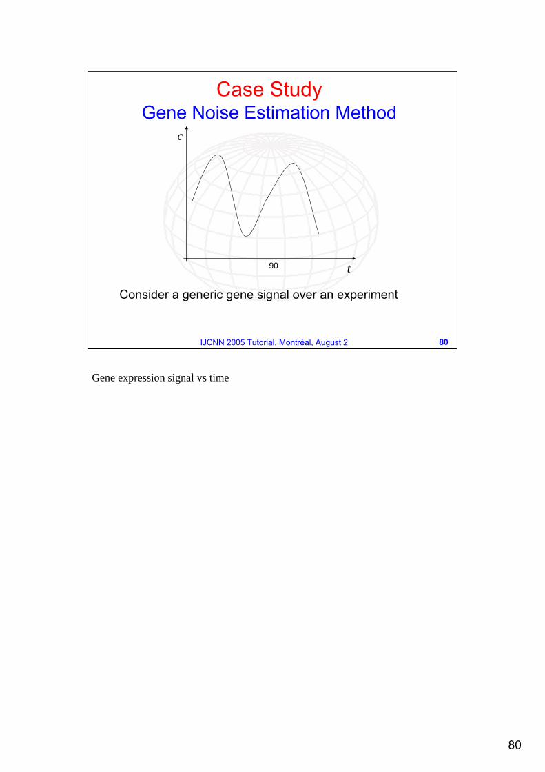
90 t
c
Consider a generic gene signal over an experiment
Case StudyGene Noise Estimation Method
Gene expression signal vs time
81
81IJCNN 2005 Tutorial, Montréal, August 2
90 t
c
90 t
r
We estimate the signal time period
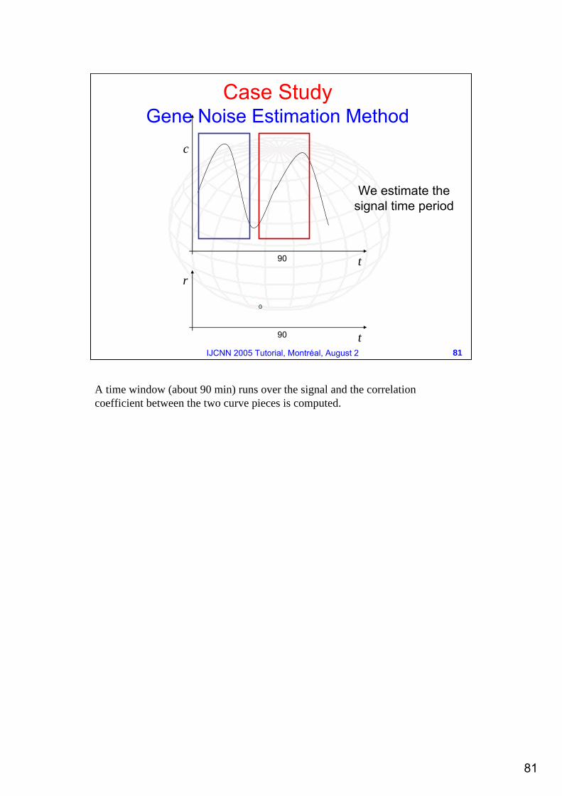
Case StudyGene Noise Estimation Method
A time window (about 90 min) runs over the signal and the correlation coefficient between the two curve pieces is computed.
82
82IJCNN 2005 Tutorial, Montréal, August 2
90 t
c
90 t
r
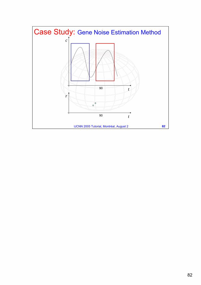
Case Study: Gene Noise Estimation Method
83
83IJCNN 2005 Tutorial, Montréal, August 2
90 t
c
90 t
r
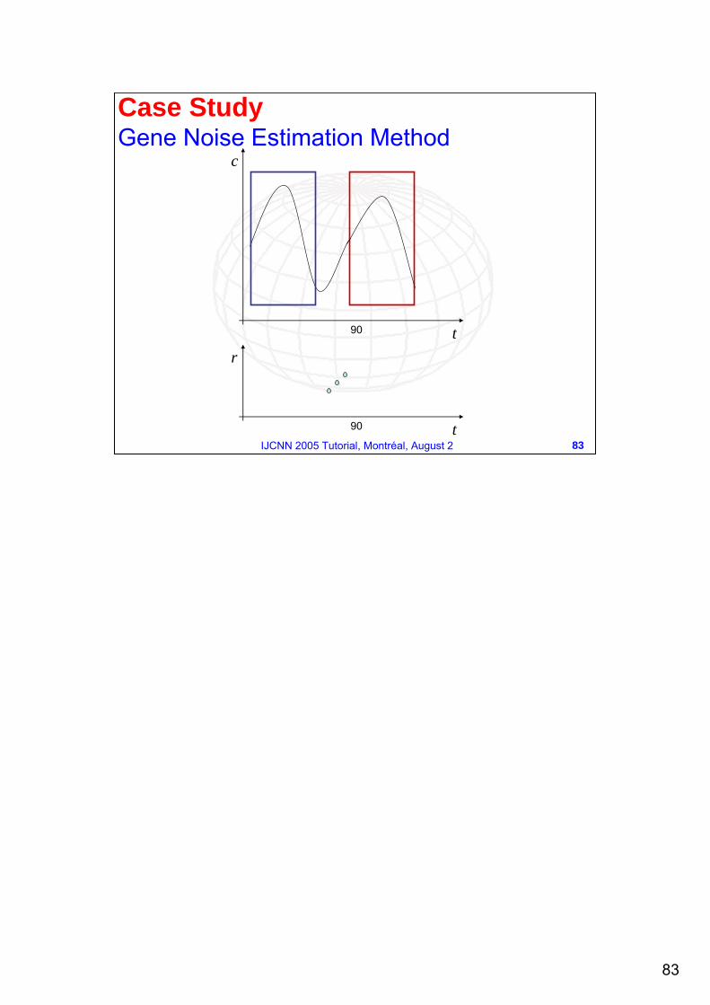
Case StudyGene Noise Estimation Method
84
84IJCNN 2005 Tutorial, Montréal, August 2
90 t
c
90 t
r
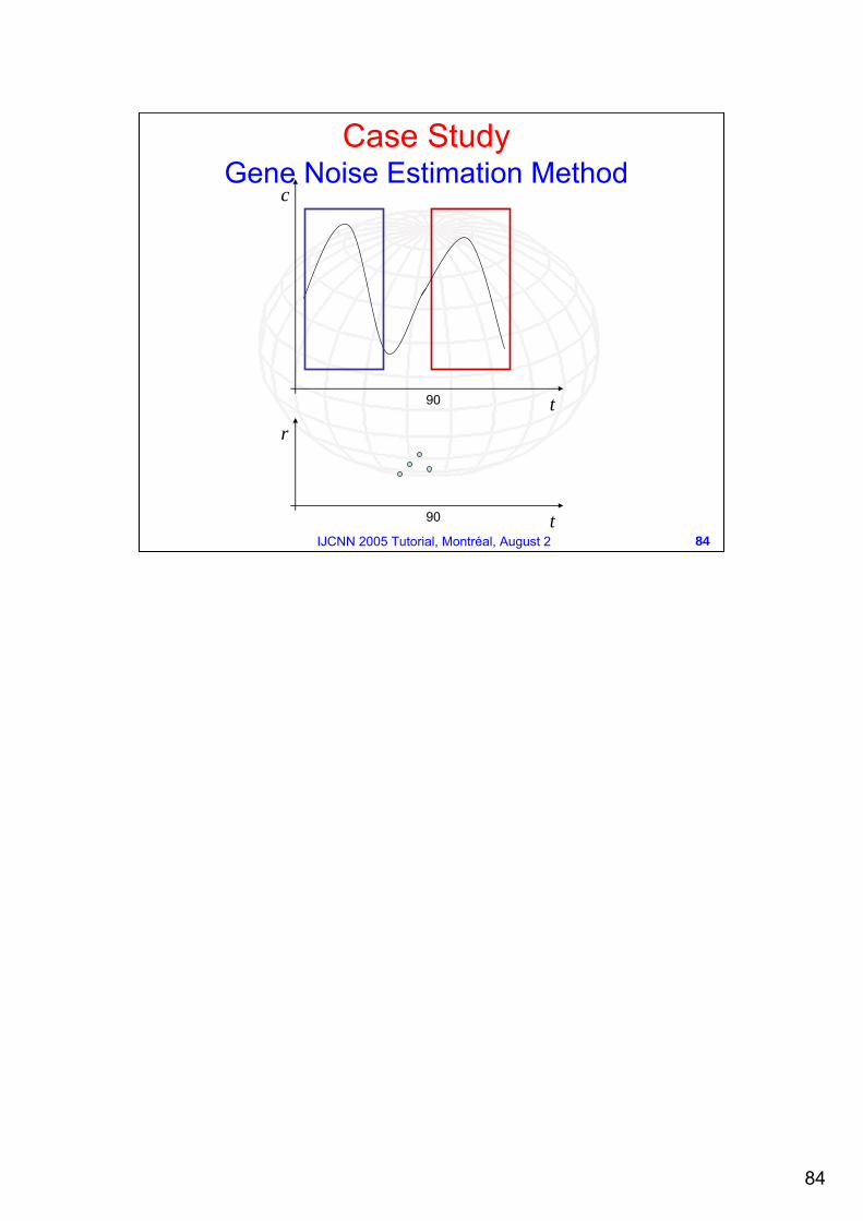
Case StudyGene Noise Estimation Method
85
85IJCNN 2005 Tutorial, Montréal, August 2
90 t
r Best correlationpoint
90
c
Case StudyGene Noise Estimation Method
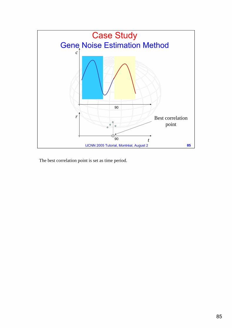
The best correlation point is set as time period.
86
86IJCNN 2005 Tutorial, Montréal, August 2
90 t
c
The signals (before and after the cutting point) are superimposed: the average between them it’s the “true” signal. The difference is our estimate of the noise
Case StudyGene Noise Estimation Method
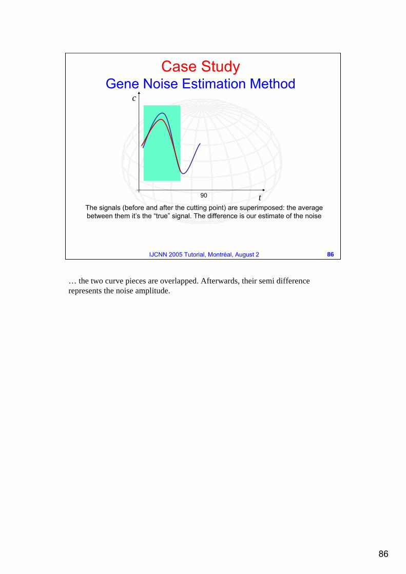
… the two curve pieces are overlapped. Afterwards, their semi difference represents the noise amplitude.
87
87IJCNN 2005 Tutorial, Montréal, August 2
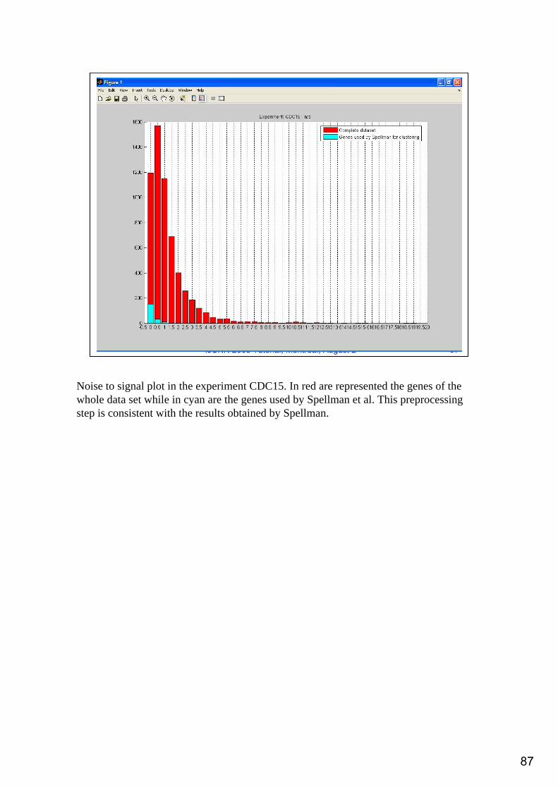
Noise to signal plot in the experiment CDC15. In red are represented the genes of the whole data set while in cyan are the genes used by Spellman et al. This preprocessing step is consistent with the results obtained by Spellman.
88
88IJCNN 2005 Tutorial, Montréal, August 2
Case StudyPreprocessing (nonlinear PCA)
The data of the experiments are unevenly sampled;
To extract the features from the experiments we apply a non-linear Principal Component Analysis;
In details, we apply for each experiment the non-linear PCA to extract the components (1 in our case) to obtain the features.
Refer to:Tagliaferri R., Ciaramella A., Milano L., Barone F., Longo G., Spectral analysis of stellar light curves by means of neural networks, Astronomy and Astrophysics Supplement Series, 137:391--405, 1999.
89
89IJCNN 2005 Tutorial, Montréal, August 2
Case Study3D PCA of Yeast Gene Microarray Data
−10
−5
0
5
10
−6−4
−20
24
6
−6
−4
−2
0
2
4
6
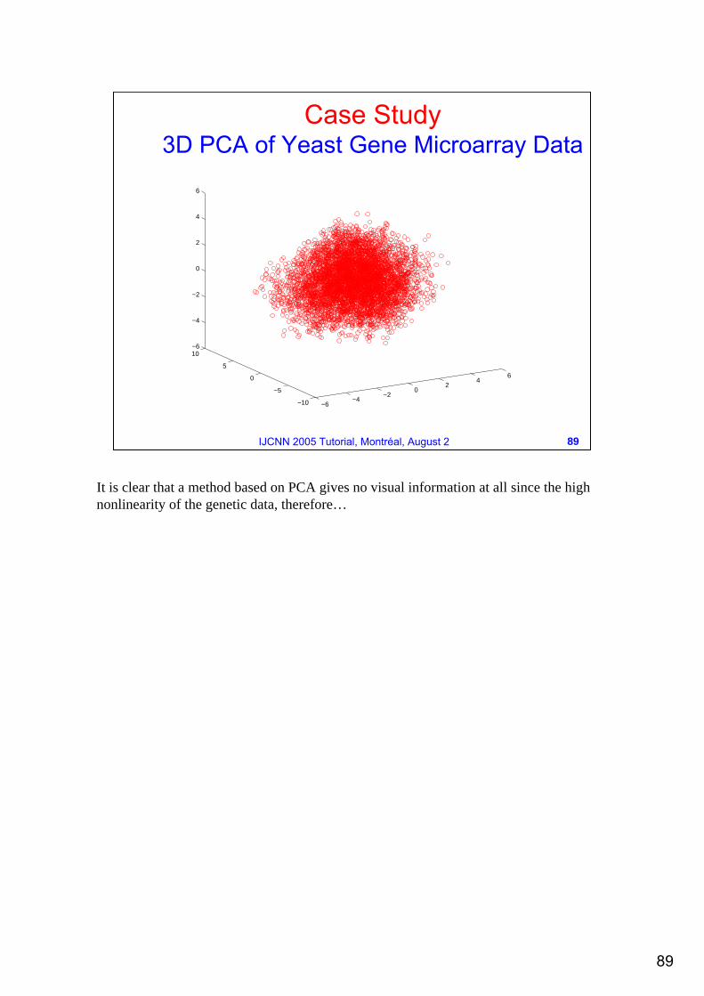
It is clear that a method based on PCA gives no visual information at all since the high nonlinearity of the genetic data, therefore…
90
90IJCNN 2005 Tutorial, Montréal, August 2
Case StudyPPS: data point projections
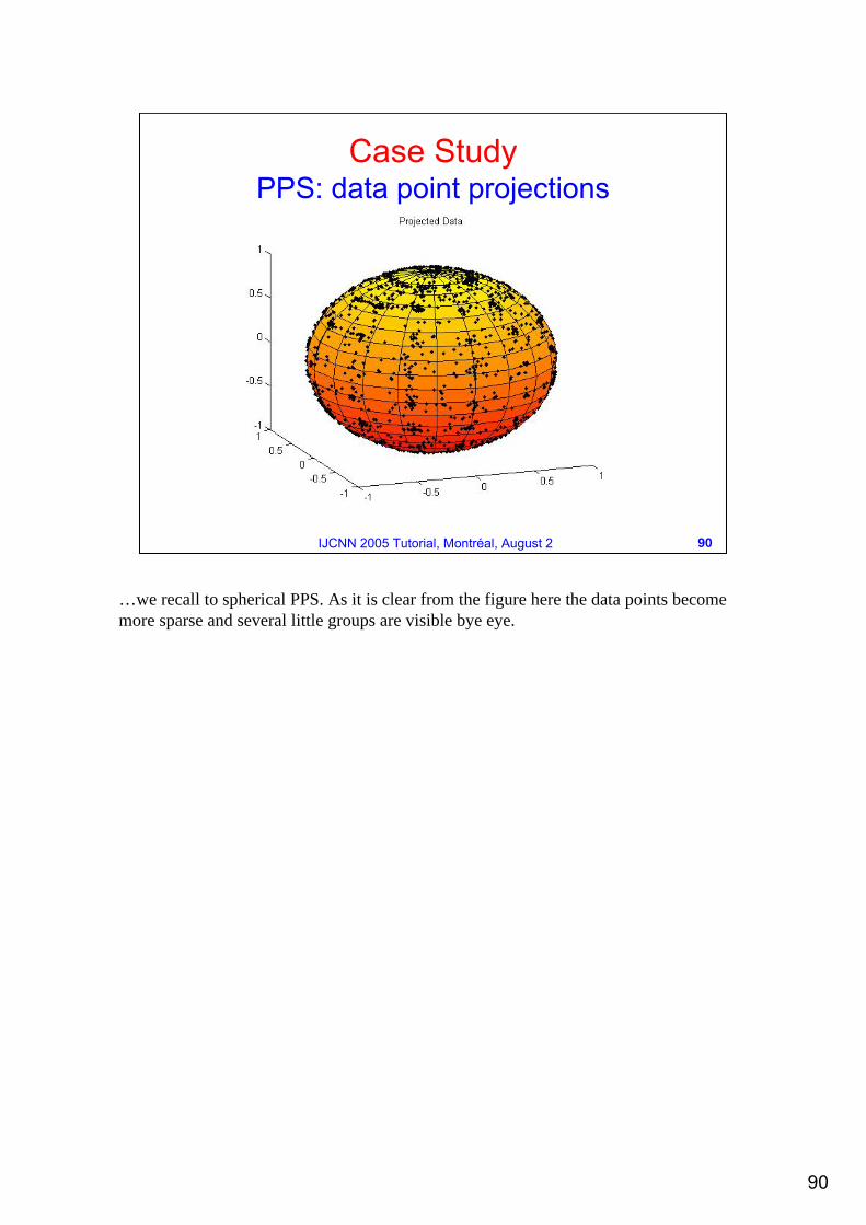
…we recall to spherical PPS. As it is clear from the figure here the data points become more sparse and several little groups are visible bye eye.
91
91IJCNN 2005 Tutorial, Montréal, August 2
Case StudyPPS: probability density function (pdf)
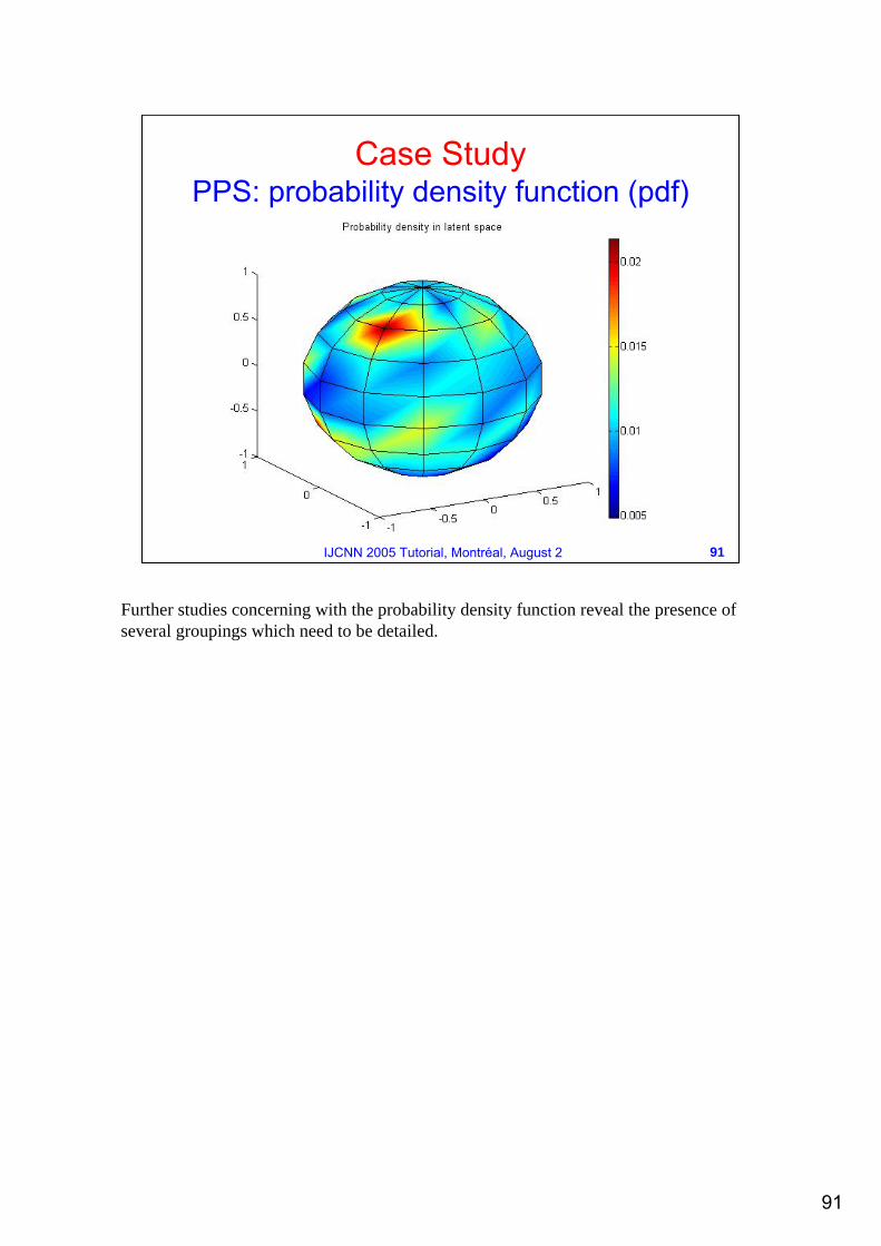
Further studies concerning with the probability density function reveal the presence of several groupings which need to be detailed.
92
92IJCNN 2005 Tutorial, Montréal, August 2
Case StudyPPS: pdf and data point projections
93
93IJCNN 2005 Tutorial, Montréal, August 2
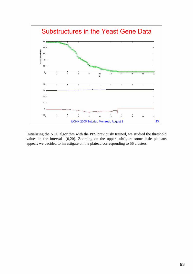
Substructures in the Yeast Gene Data
Initializing the NEC algorithm with the PPS previously trained, we studied the threshold values in the interval [0,20]. Zooming on the upper subfigure some little plateaus appear: we decided to investigate on the plateau corresponding to 56 clusters.
94
94IJCNN 2005 Tutorial, Montréal, August 2
Case Study: PPS+NEC results
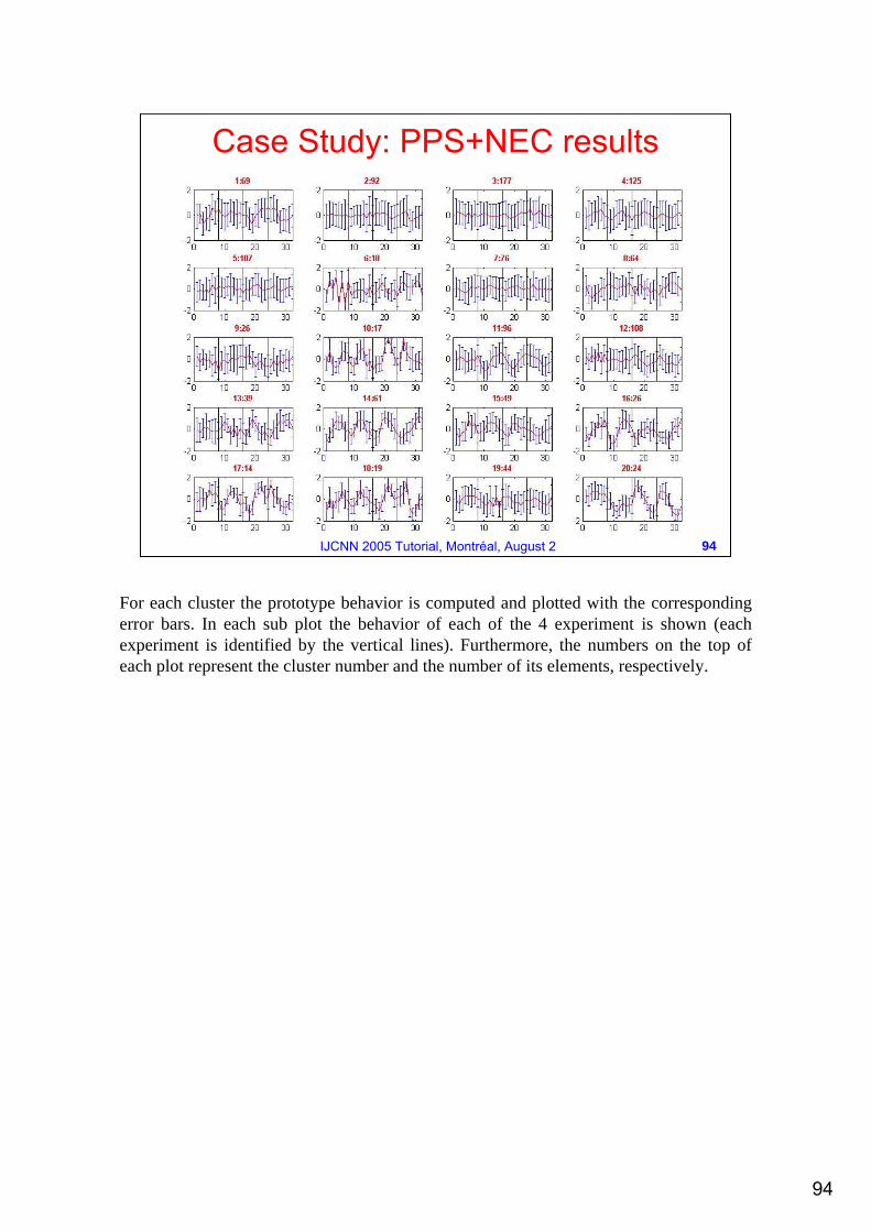
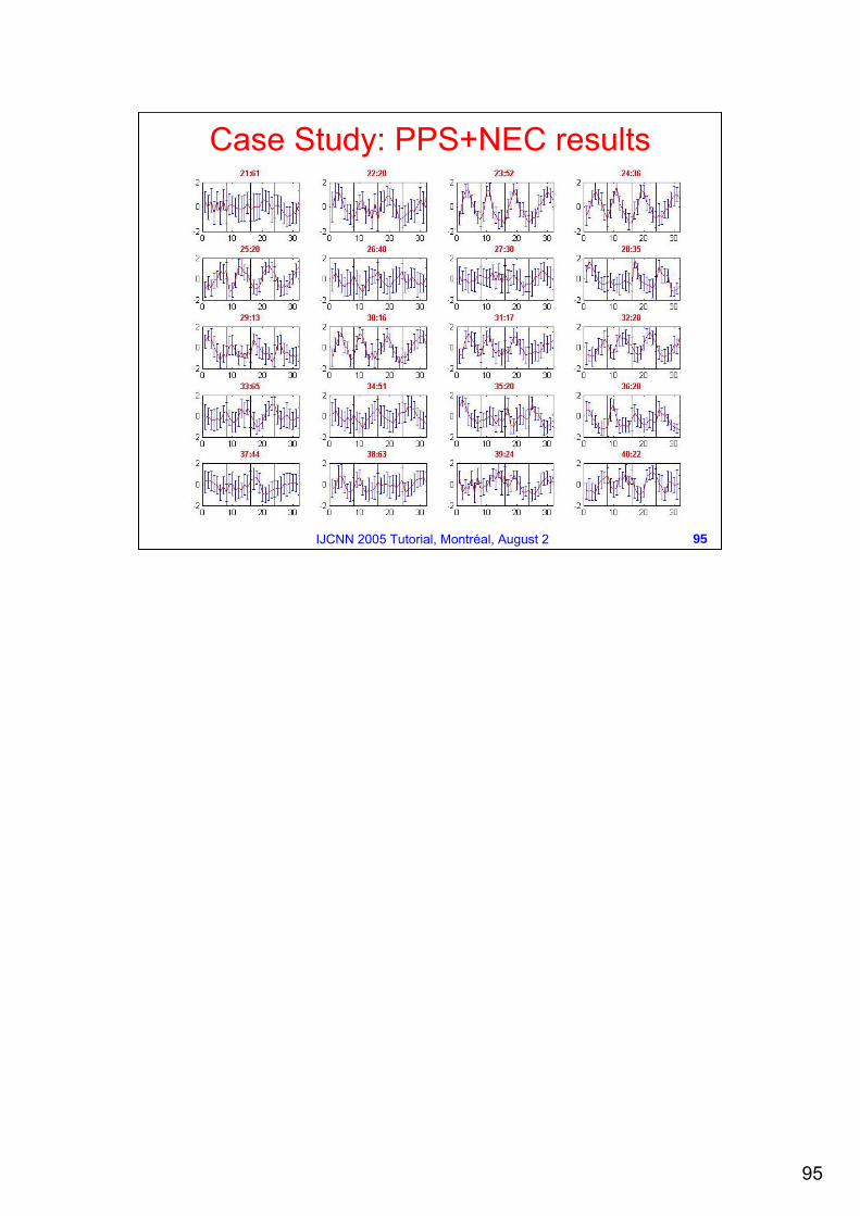
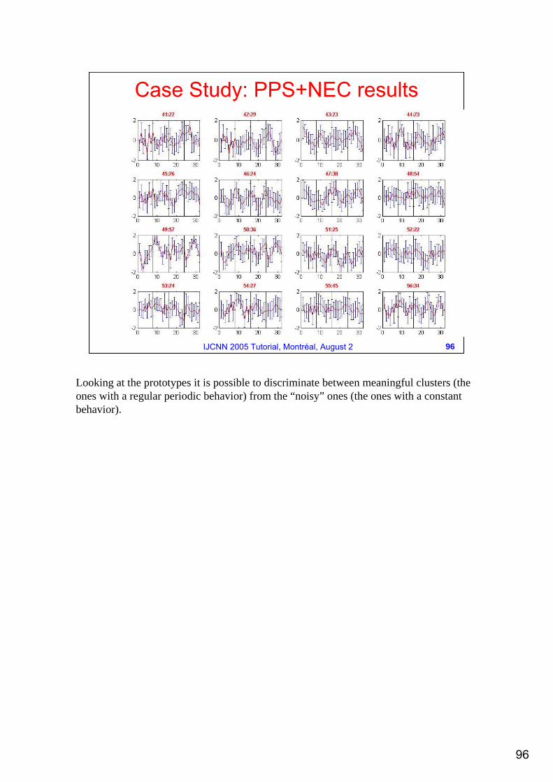
For each cluster the prototype behavior is computed and plotted with the corresponding error bars. In each sub plot the behavior of each of the 4 experiment is shown (each experiment is identified by the vertical lines). Furthermore, the numbers on the top of each plot represent the cluster number and the number of its elements, respectively.
95
95IJCNN 2005 Tutorial, Montréal, August 2
Case Study: PPS+NEC results
96
96IJCNN 2005 Tutorial, Montréal, August 2
Case Study: PPS+NEC results
Looking at the prototypes it is possible to discriminate between meaningful clusters (the ones with a regular periodic behavior) from the “noisy” ones (the ones with a constant behavior).
97
97IJCNN 2005 Tutorial, Montréal, August 2
Case StudyPPS+NEC Results
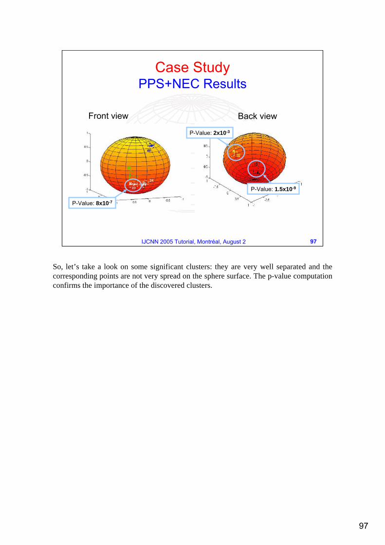
Front view Back view
P-Value: 8x10⁻⁷
P-Value: 2x10⁻³
P-Value: 1.5x10⁻⁹
So, let’s take a look on some significant clusters: they are very well separated and the corresponding points are not very spread on the sphere surface. The p-value computation confirms the importance of the discovered clusters.
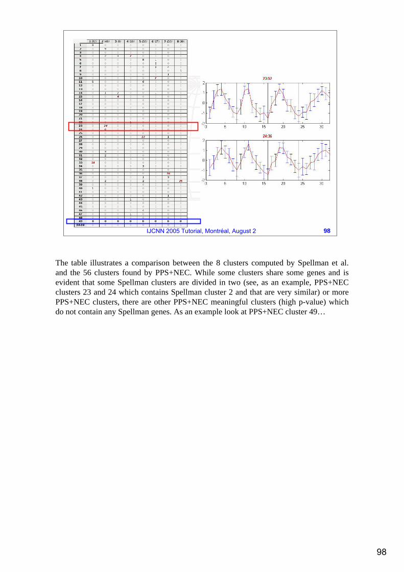
ij-th entry: fraction of Spellman’s cluster j falling in the PPS cluster i
The table illustrates a comparison between the 8 clusters computed by Spellman et al. and the 56 clusters found by PPS+NEC. While some clusters share some genes and is evident that some Spellman clusters are divided in two (see, as an example, PPS+NEC clusters 23 and 24 which contains Spellman cluster 2 and that are very similar) or more PPS+NEC clusters, there are other PPS+NEC meaningful clusters (high p-value) which do not contain any Spellman genes. As an example look at PPS+NEC cluster 49…
99
99IJCNN 2005 Tutorial, Montréal, August 2
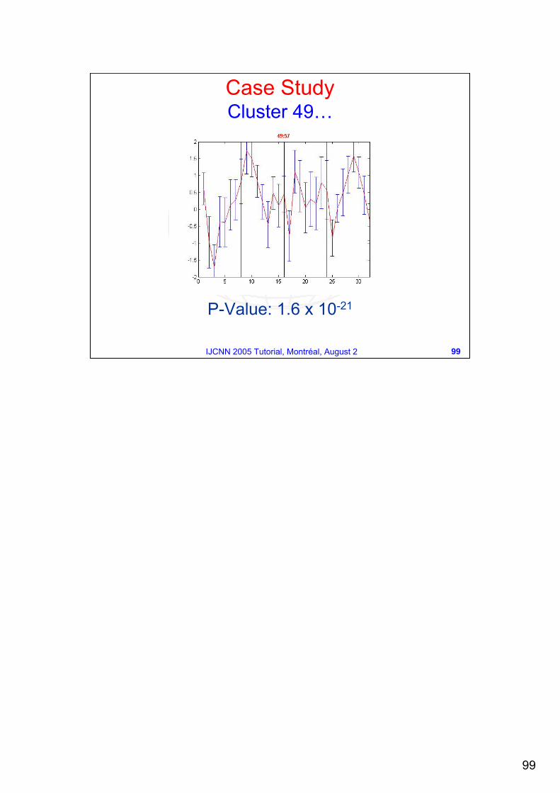
P-Value: 1.6 x 10⁻²¹
Case StudyCluster 49…
100
100IJCNN 2005 Tutorial, Montréal, August 2
Case StudyCluster 23
29 genes;p-value = 8x10⁻⁷;48,98% intersection with Spellman CLN2 cluster;– Most of these genes are strongly cell-cycle regulated,
peak expression occurs in mid–G1 phase;– strongly induced by GAL-CLN3 but are strongly
repressed by GAL-CLB2;– All these genes are involved in DNA replication;
The rest of cluster contains some genes with unknown functions.
Here are some biological motivation of cluster 23. The same interesting studies have been done on other meaningful clusters (such as cluster 49).
101
101IJCNN 2005 Tutorial, Montréal, August 2
Conclusions
Visualization is an important tool in data mining applications for all types of user.
The domain expert must be involved in the process.
Interaction with the plots allows the user to query the data more effectively.
102
102IJCNN 2005 Tutorial, Montréal, August 2
Conclusions (2)Spherical PPS exhibits a number of attractive abilities for classification (not treated here) and visualization of high-D data.
The spherical manifold is able to better characterize and represent the periphery and the sparsity of high-D data due to the curse of dimensionality.
Overcome border effects as in rectangular manifold (GTM) and grid (SOM).
103
103IJCNN 2005 Tutorial, Montréal, August 2
Conclusions (3)We built a graphical user interface which allows to interact with the data projected on a unit sphere surface.
A user is allowed toInteract with data by selecting points on the latent manifold retrieving the corresponding source in the original catalog.
The user is able to localize clusters of data on the sphere which correspond to clusters of similar data in the input space.
Useful for data mining in whatever data rich field.
104
104IJCNN 2005 Tutorial, Montréal, August 2
Bibliography …K. Chang, J. Ghosh, A Unified Model for Probabilistic Principal Surfaces, IEEE Transactions on Pattern Analysis and Machine Intelligence, Vol. 23, No. 1, 2001.
T. Kohonen, Self-organized formation of topologically correct feature maps, Biological Cybernetics, 43, 1982.
C. M. Bishop, M. Svensen, C.K.I. Williams, GTM: The Generative Topographic Mapping, Neural Computation, 10(1), 1998.
J. Vesanto, Data Mining Techniques based on the Self-Organizing Maps, PhD Thesis, Helsinki University of Technology, 1997.
A. Staiano, Unsupervised Neural Networks for the Extraction of Scientific Information from Astronomical Data, PhD Thesis, University of Salerno, 2003.
105
105IJCNN 2005 Tutorial, Montréal, August 2
A. Staiano, R. Tagliaferri at al., Probabilistic Principal Surfaces for Yeast Gene Microarray Data Mining, Proceedings of the IEEE Conference on Data Mining, Brighton (UK), pp. 202-209, 2004.
P. Tino, I. Nabney, Hierarchical GTM: Constructing Localized Nonlinear Projection Manifolds in a Principled Way, IEEE Transaction on Pattern Analysis and Machine Intelligence, Vol24, N. 6, 2002.
C.M. Bishop, M.E. Tipping, A Hierarchical Latent Variable Model for Data Visualization, IEEE Transaction on Pattern Analysis and Machine Intelligence, Vol. 20,N. 3, 1998.