BYU Studies Quarterly BYU Studies Quarterly Volume 55 Issue 2 Article 6 2016 Visualizing Apostolic Succession Visualizing Apostolic Succession Meilan Jin Brigham Young University Iliesa S. K. Delai Brigham Young University-Hawaii Geoffrey M. Draper Brigham Young University-Hawaii Follow this and additional works at: https://scholarsarchive.byu.edu/byusq Part of the Mormon Studies Commons, and the Religious Education Commons Recommended Citation Recommended Citation Jin, Meilan; Delai, Iliesa S. K.; and Draper, Geoffrey M. (2016) "Visualizing Apostolic Succession," BYU Studies Quarterly: Vol. 55 : Iss. 2 , Article 6. Available at: https://scholarsarchive.byu.edu/byusq/vol55/iss2/6 This Article is brought to you for free and open access by the Journals at BYU ScholarsArchive. It has been accepted for inclusion in BYU Studies Quarterly by an authorized editor of BYU ScholarsArchive. For more information, please contact [email protected], [email protected].
Iliesa S. K. Delai Brigham Young University-Hawaii
Geoffrey M. Draper Brigham Young University-Hawaii
Follow this and additional works at: https://scholarsarchive.byu.edu/byusq
Part of the Mormon Studies Commons, and the Religious Education Commons
Recommended Citation Recommended Citation Jin, Meilan; Delai, Iliesa S. K.; and Draper, Geoffrey M. (2016) "Visualizing Apostolic Succession," BYU Studies Quarterly: Vol. 55 : Iss. 2 , Article 6. Available at: https://scholarsarchive.byu.edu/byusq/vol55/iss2/6
This Article is brought to you for free and open access by the Journals at BYU ScholarsArchive. It has been accepted for inclusion in BYU Studies Quarterly by an authorized editor of BYU ScholarsArchive. For more information, please contact [email protected], [email protected].
Meilan Jin, Iliesa S. K. Delai, and Geoffrey M. Draper
For years, The Church of Jesus Christ of Latter-day Saints has pub-lished pictures and other illustrative diagrams to communicate
its message. For example, the children’s book Book of Mormon Stories includes an illustrative map indicating the possible route of Lehi’s fam-ily from the Arabian peninsula to the Americas.1 Seminary students receive bookmarks showing a timeline of peoples and events in the Book of Mormon.2 More recently, the Church has published a series of
“information graphics” (known more commonly as infographics) on its website.3 Infographics combine color, text, and images to convey statis-tical or policy information in a visually pleasing manner. The Church’s infographics cover a range of topics such as humanitarian aid, mission-ary work, and genealogy. However, like all pictures, infographics are inherently static, meant to be viewed but not interacted with. As such, they are great at answering the questions the artist intended but are less
1. See Jerry Thompson and Robert T. Barrett, illustrators, Book of Mormon Stories (Salt Lake City: The Church of Jesus Christ of Latter-day Saints, 1997), 16–17; available at https://www.lds.org/bc/content/shared/content/images/gospel -library/manual/35666/35666_000_008_01.pdf.
2. See https://si.lds.org/bc/seminary/content/library/student-resources/bofm/book-of-mormon-bookmark_eng.pdf.
3. See an example at http://www.mormonnewsroom.org/media/orig/Mor mon _Global-Christ-Centered_12-13-13_Infographic.jpg; see also The Church of Jesus Christ of Latter-day Saints, “Infographics,” Newsroom: The Official Resource for News Media, Opinion Leaders, and the Public, http://www .mormon newsroom.org/article/infographics.
effective at letting the reader discover answers to new questions that may arise from an initial view of the graphic. To allow this deeper level of exploration, graphics must be interactive.
Information Visualization
Information visualization is a field of research typically associated with computer science, although it incorporates elements of statistics, graphic design, and psychology. Information visualization (often abbre-viated as infovis) has been recognized as a distinct field of academic research since the 1990s, with the first academic symposium on info-vis being held in 1995.4 Infovis certainly includes the design, creation, and evaluation of information graphics but focuses more specifically on building interactive systems that allow users to explore large data sets on a computer.
Some of the most-cited projects in infovis research during the past three decades include treemaps (fig. 1) for displaying hierarchical data, parallel coordinates (fig. 2) for visualizing multidimensional data, and ThemeRiver™ (fig. 3) for showing recurring themes in textual data over time.
As stated above, a major focus of infovis research is interactivity. Users must be able to browse, explore, query, and review data visu-ally. These goals were perhaps best articulated by Ben Shneiderman in 1996 in a set of guidelines known as the “Visual Information Seeking Mantra.”5 According to the mantra, every infovis system should offer (at least) the following three features:
1. Overview First2. Zoom and Filter3. Details on Demand
In other words, a visualization system should start by displaying a summary of the entire data set, then allow the user to interactively select part of the data to explore in more depth. The user should also have the option of retrieving full details on any individual data item.
4. “Foreword,” IEEE Symposium on Information Visualization (1995), vii, doi:10.1109/INFOVIS.1995.10003.
5. Ben Shneiderman, “The Eyes Have It: A Task by Data Type Taxonomy for Information Visualizations,” IEEE Symposium on Visual Languages (1996), 336, doi:10.1109/VL.1996.545307.
Figure 1. The treemap, first proposed by Ben Shneiderman,1 divides the screen into nested rect-angles sized according to each category’s proportion relative to the whole. This particular chart was generated by IBM’s ManyEyes software.2
1. Brian Johnson and Ben Shneiderman, “Tree-Maps: A Space-Filling Approach to the Visu-alization of Hierarchical Information Structures,” in Proceedings of the 2nd Conference on Visual-ization ’91 (VIS ’91), ed. Gregory M. Nielson and Larry Rosenblum (Los Alamitos, Calif.: IEEE Computer Society Press, 1991), 284–91.
2. Fernanda B. Viegas, Martin Wattenberg, Frank van Ham, Jesse Kriss, and Matt McKeon, “ManyEyes: A Site for Visualization at Internet Scale,” IEEE Transactions on Visualization and Computer Graphics 13 (November/December 2007): 1121–28.
3
Jin et al.: Visualizing Apostolic Succession
Published by BYU ScholarsArchive, 2016
Figure 2. Parallel coordinates, invented by Alfred Inselberg,1 is a method of displaying many dimensions of data at once. Each vertical axis in the display is assigned to a single attribute, and each entity in the dataset is rendered as a series of connected line segments. This specific chart was generated by Aritra Dasgupta 2 and improves upon the basic parallel coordinates design by rendering segments of less interest in a semitransparent color.
1. Alfred Inselberg and Bernard Dimsdale, “Parallel Coordinates: A Tool for Visualizing Multi-dimensional Geometry,” in Proceedings of the 1st Conference on Visualization ’90 (VIS ’90), ed. Arie Kaufman (Los Alamitos, Calif.: IEEE Computer Society Press, 1990): 361–78.
2. Aritra Dasgupta and Robert Kosara, “Pargnostics: Screen-Space Metrics for Parallel Coordinates,” IEEE Transactions on Visualization and Computer Graphics 16 (November/December, 2010): 1017–26.
Figure 3. The ThemeRiver™ visualization, designed by Havre and others,1 com-bines a layered bar chart with a timeline to show the changes in frequency of key-words in news stories over time.
1. Susan Havre, Elizabeth Hetzler, Paul Whitney, and Lucy Nowell, “Theme-River: Visualizing Thematic Changes in Large Document Collections,” IEEE Trans-actions on Visualization and Computer Graphics 8 (January– March 2002): 9–20, doi:10.1109/2945.981848. 4
The visual information–seeking mantra has served the information visu-alization community well for nearly two decades. However, the advent of mobile devices such as tablets and smartphones poses a special chal-lenge for infovis—in particular the goal of adhering to the first tenet of the mantra: Overview First. How can one effectively display an over-view of a complex data set on devices that have smaller screen sizes and less computational power than traditional desktop computers? There is not likely a single solution that will work for every kind of data; however, to solidify the present discussion, we will focus on time-series data.6
We propose that large time-series datasets can be effectively visual-ized on mobile devices by showing a single “snapshot” of the data at a given moment in time, then allowing the user to easily navigate forward and backward in time to view other snapshots. This limits the number of data points that the system needs to render at any given time while still granting quick access to the remainder of the data. In this way, the on-screen visualization is clean and uncluttered, even on phone-sized screens.
Apostolic Succession App
As a proof of concept for our method of visualizing time-series data on small screens, we designed and implemented a mobile app called Latter-day Apostles that lets users explore a data set of all latter-day Apostles since 1832. There are two apostolic quorums in The Church of Jesus Christ of Latter-day Saints: the Quorum of the First Presidency and the Quorum of the Twelve Apostles. Mathematically, both quorums are examples of well-ordered sets.7 That is, each quorum has a first member and a last mem-ber, with all other members uniquely ranked somewhere in between. For example, in the First Presidency, the President of the Church is the first member, the first counselor is the second member, and the second coun-selor is the third member.8 In the Quorum of the Twelve, the first member is the president of the quorum, who is also the Apostle with the earliest ordination date within the quorum. The second member is the Apostle
6. Edward Tufte, The Visual Display of Quantitative Information (Cheshire, Conn.: Graphics Press, 1983).
with the next-earliest ordination date, and so on until the last member who is the most recently ordained Apostle.
The apostolic quorums are not the only contemporary organizations that follow a well-ordered set model. Other examples include the United States Supreme Court, the Joint Chiefs of Staff, the College of Cardinals in the Catholic Church, and boards of directors for many corporations.
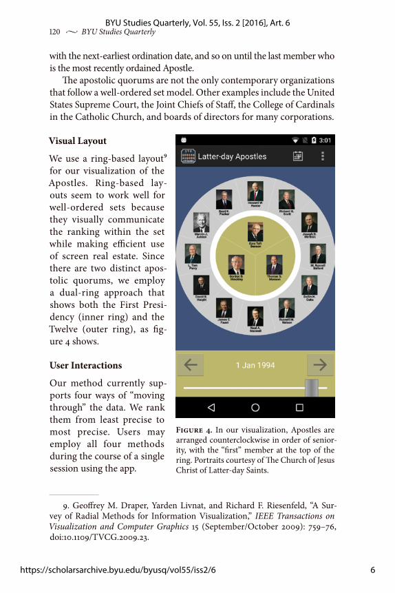
Visual Layout
We use a ring-based layout9 for our visualization of the Apostles. Ring-based lay-outs seem to work well for well-ordered sets because they visually communicate the ranking within the set while making efficient use of screen real estate. Since there are two distinct apos-tolic quorums, we employ a dual-ring approach that shows both the First Presi-dency (inner ring) and the Twelve (outer ring), as fig-ure 4 shows.
User Interactions
Our method currently sup-ports four ways of “moving through” the data. We rank them from least precise to most precise. Users may employ all four methods during the course of a single session using the app.
9. Geoffrey M. Draper, Yarden Livnat, and Richard F. Riesenfeld, “A Sur-vey of Radial Methods for Information Visualization,” IEEE Transactions on Visualization and Computer Graphics 15 (September/October 2009): 759–76, doi:10.1109/TVCG.2009.23.
Figure 4. In our visualization, Apostles are arranged counterclockwise in order of senior-ity, with the “first” member at the top of the ring. Portraits courtesy of The Church of Jesus Christ of Latter-day Saints.
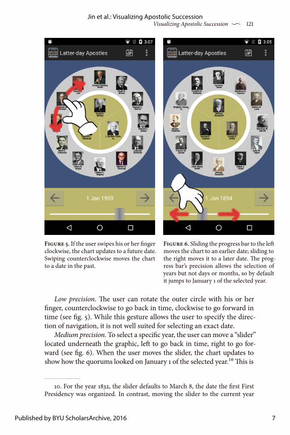
Low precision. The user can rotate the outer circle with his or her finger, counterclockwise to go back in time, clockwise to go forward in time (see fig. 5). While this gesture allows the user to specify the direc-tion of navigation, it is not well suited for selecting an exact date.
Medium precision. To select a specific year, the user can move a “slider” located underneath the graphic, left to go back in time, right to go for-ward (see fig. 6). When the user moves the slider, the chart updates to show how the quorums looked on January 1 of the selected year.10 This is
10. For the year 1832, the slider defaults to March 8, the date the first First Presidency was organized. In contrast, moving the slider to the current year
Figure 5. If the user swipes his or her finger clockwise, the chart updates to a future date. Swiping counterclockwise moves the chart to a date in the past.
Figure 6. Sliding the progress bar to the left moves the chart to an earlier date; sliding to the right moves it to a later date. The prog-ress bar’s precision allows the selection of years but not days or months, so by default it jumps to January 1 of the selected year.
7
Jin et al.: Visualizing Apostolic Succession
Published by BYU ScholarsArchive, 2016
122 v BYU Studies Quarterly
acceptable to get a broad overview of the quorums’ progression over time, but insufficient for those years (such as 2015) when multiple changes occur in the quorums within a single calendar year. For these years, more precise controls are needed.
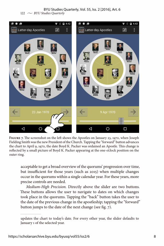
Medium-High Precision. Directly above the slider are two buttons. These buttons allows the user to navigate to dates on which changes took place in the quorums. Tapping the “back” button takes the user to the date of the previous change in the apostleship; tapping the “forward” button jumps to the date of the next change (see fig. 7).
updates the chart to today’s date. For every other year, the slider defaults to January 1 of the selected year.
Figure 7. The screenshot on the left shows the Apostles on January 23, 1970, when Joseph Fielding Smith was the new President of the Church. Tapping the “forward” button advances the chart to April 9, 1970, the date Boyd K. Packer was ordained an Apostle. This change is reflected by a small picture of Boyd K. Packer appearing at the one-o’clock position on the outer ring.
High precision. To see what the quorums looked like on a specific date, the user can select the calendar option from the app’s toolbar. After the user selects an exact date on the calendar, the chart updates immedi-ately to show the quorum membership on that date (see fig. 8).
Consistent with the visual information–seeking mantra, the app does support the notion of “details on demand.” If the user taps any Apostle’s portrait, the app opens a pop-up window with a higher-resolu-tion portrait of that Apostle accompanied by biographical information.
Transitions
It is a well-established design principle in infovis that transitions from one view of the data to the next must be animated. This is not mere eye candy; animated transitions are essential to maintain the user’s sense of context and to avoid disorientation, particularly in radial layouts such as ours.11
11. Ka-Ping Yee, Danyel Fisher, Rachna Dhamija, and Marti Hearst, “Ani-mated Exploration of Dynamic Graphs with Radial Layout,” IEEE Symposium on Information Visualization (2001), 43, doi:10.1109/INFVIS.2001.963279.
Figure 8. Tapping the calendar icon in the app’s toolbar opens a date-selector widget, which allows the user to jump to any date since 1832. In this example, the user has chosen February 3, 2008, the date Thomas S. Monson became President of the Church.
9
Jin et al.: Visualizing Apostolic Succession
Published by BYU ScholarsArchive, 2016
124 v BYU Studies Quarterly
We have chosen the following transitions to represent the different types of transitions an Apostle can make from year to year.
If an Apostle moves from the Quorum of the Twelve to the First Presidency, or vice versa, we simply move the Apostle’s portrait linearly from its previ-ous position to its cur-rent position on the screen (see fig. 9).
If an Apostle moves from one posi-tion of seniority in the Quorum of the Twelve to another, we move the Apostle’s portrait angularly, not linearly. The same is true for an Apostle moving from one position of seniority to another within the First Presi-dency (see fig. 10).
If an Apostle’s por-trait is moving from on-screen to off-screen,
we animate the portrait outward, away from the center of the ring (see fig. 11).
If an Apostle’s portrait is moving from off-screen to on-screen, we animate the portrait linearly, either from the left or right side of the screen, depending on which is closer to the portrait’s final position on the chart (see fig. 12).
These rules, when applied in quick succession, such as when the user drags the slider bar back and forth rapidly, combine to produce a pleas-ing “swirl” visual effect.
Reception
We have been delighted with the reception of the Latter-day Apostles app. As of this writing, it has been downloaded over fifty thousand
Figure 9. Linear transi-tion when an Apostle moves between the two quorums.
Figure 10. Angular transi-tion when an Apostle changes seniority within a quorum.
Figure 11. Apostles move outward radially when exit-ing the chart.
Figure 12. Apostles move inward from left or right when entering the chart.
times since it was first released in August 2014. Interestingly—but not surprisingly—the download rates are cyclical, rising each Sunday and tapering off the other days of the week. Likewise unsurprisingly, down-loads spike every six months around general conference time.
Comments have been overwhelmingly positive. Here are some examples:
• Well executed, great concept. Wonderful way to follow the evolving dynamic of LDS Church leadership across its history. Brilliant con-cept overall. Well done.
• LDS must have. Great resource on LDS history. Very user friendly. No ads. My 8 year old LOVES it.
• Very good. Being fairly new to the Church, I’ve found this fascinat-ing. Very informative, lovely to feel you know them better, and feel closer to them.
• Love It. This is such a fun app. I love the way the date changes by turning the “dial.” Maybe a Relief Society app can be developed. :)
Currently, the app is available only for Android, BlackBerry, and Kindle Fire devices, but we are currently developing a version for iOS. If there is sufficient interest, we may consider bringing the app to Win-dows phones as well. The app is currently available in English and Por-tuguese, with a Spanish translation under development.
Future Work
Although this visualization seems to work well for the apostolic succession data set, we believe it can be applied to other well-ordered sets. As a first step, we are developing an app that lets users visualize the chronology of U.S. Supreme Court justices (see fig. 13).
While conventional wisdom and past studies12 support the
12. Yee, Fisher, Dhamija, and Hearst, “Animated Exploration of Dynamic Graphs with Radial Lay-out,” 43.
Figure 13. Applying our visualization scheme to the U.S. Supreme Court. The chief justice occupies the center of the graphic; associate justices in the periphery. Portraits courtesy of supremecourt.gov.
11
Jin et al.: Visualizing Apostolic Succession
Published by BYU ScholarsArchive, 2016
126 v BYU Studies Quarterly
importance of animation in information visualization systems, other studies13 question this assumption. To that end, we would also like to conduct a usability study evaluating whether the animated transitions employed by the app actually improve user comprehension.
Conclusion
In this paper, we present a general overview of the field of information visualization research and propose an approach to adapting infovis design principles to small-screen devices such as smartphones and tablets. We introduce the software prototype Latter-day Apostles to showcase the possibility of navigating time-series data—in particular, well-ordered sets that vary with time—on a mobile device. Thus far, users have been very receptive to this app and its methods of interaction. We hope that Latter-day Apostles will inspire other infovis researchers in general, and LDS software developers in particular, to create engaging mobile and desktop apps that provide easy navigation through a variety of data sets.
Meilan Jin is from Yanji, China. She is a current master’s student at Brigham Young University. Her research interests include operational research and engi-neered system, policy science and human systems, and information visualiza-tion and mobile app development. She graduated in 2014 with a BS in computer science and a double minor in information systems and English as Second Language from Brigham Young University–Hawaii.
Iliesa S. K. Delai is from Suva, Fiji. He is studying computer science at Brigham Young University–Hawaii. When not adding new features to the Latter-day Apostles app, he also works as the webmaster for BYU–H’s Computer and Information Sciences Department. Iliesa loves spending his leisure time with his family and friends.
Geoffrey M. Draper is Associate Professor of computer science at Brigham Young University–Hawaii. His research interests include information visual-ization, human-computer interaction, mobile app development, and vintage computing. He received a PhD in computer science in 2009 at the University of Utah.
13. Barbara Tversky, Julie Bauer Morrison, and Mireille Betrancourt, “Ani-mation: Can It Facilitate?” International Journal of Human-Computer Studies 57, no. 4 (2002): 247–62.