57
Visualizing Data 9/12/2011 Lisa Kurt Emerging Technologies Librarian Lisa Kurt “twitterized” by: http://visual.ly/twitter

Visualizing Data9/12/2011Lisa Kurt
Emerging Technologies Librarian
Lisa Kurt “twitterized” by: http://visual.ly/twitter
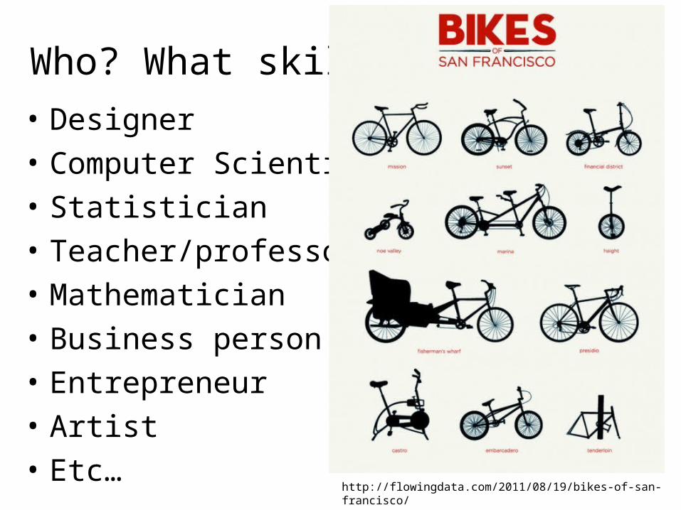
Who? What skills?• Designer• Computer Scientist• Statistician• Teacher/professor• Mathematician• Business person• Entrepreneur• Artist• Etc…
http://flowingdata.com/2011/08/19/bikes-of-san-francisco/

Let’s look at some fun information!
• Web of Science vs. Google ScholarWeb of Science Google Scholar
07/2008 604 643
08/2008 580 604
09/2008 1083 1109
10/2008 1302 1241
11/2008 638 1297
12/2008 677 886

Let’s make it cooler

More cooler

Not awesome enough yet
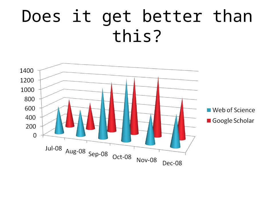
Does it get better than this?

Wow.


“There is no such thing as information overload, only bad design”
-Edward Tufte

1. Composition2. Alignment3. Repetition4. Contrast5. Color6. Typography7. Image
choice
basic design elements
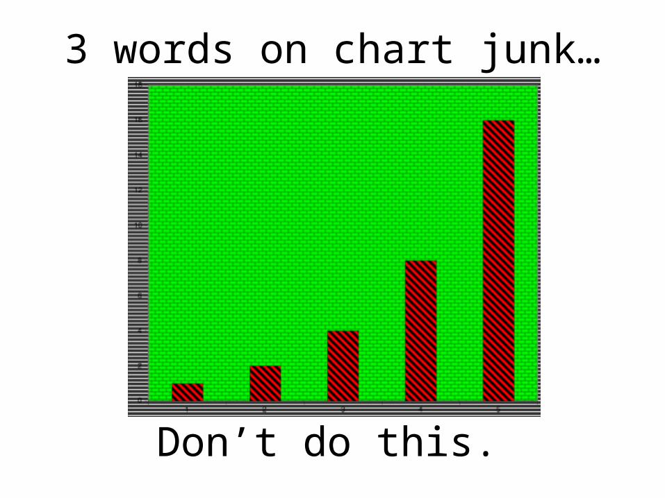
3 words on chart junk…
Don’t do this.
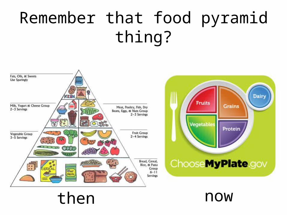
Remember that food pyramid thing?
then now
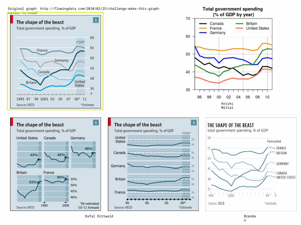
Hrishi Mittal
Rafal Dittwald
Original graph: http://flowingdata.com/2010/02/25/challenge-make-this-graph-easier-to-read/
Brendan

Save pens. Use Garamond font

http://flowingdata.com/category/visualization/
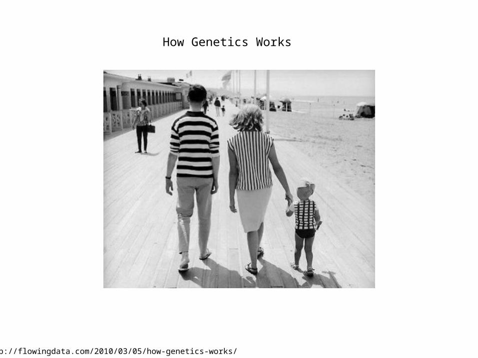
How Genetics Works
http://flowingdata.com/2010/03/05/how-genetics-works/

Rethinking the food nutrition label…
http://flowingdata.com/2011/08/12/rethinking-the-food-nutrition-label/

http://flowingdata.com/category/visualization/page/2/
We have a need to explain andunderstand our world…
even the humorous sides.

Conventions can work with us.
Can you spot conventions used inthis infographic?
http://lemon.ly/slider/the-united-states-use-of-food-stamps

Crayola Crayon Colors Multiply Like Rabbits
http://flowingdata.com/category/visualization/page/4/

Great Breakdown on Tools and Techniques:
http://www.visualisingdata.com/index.php/resources/

Not everything that looks hard,
is as hard as it looks.

http://manyeyes.alphaworks.ibm.com
Many Eyes
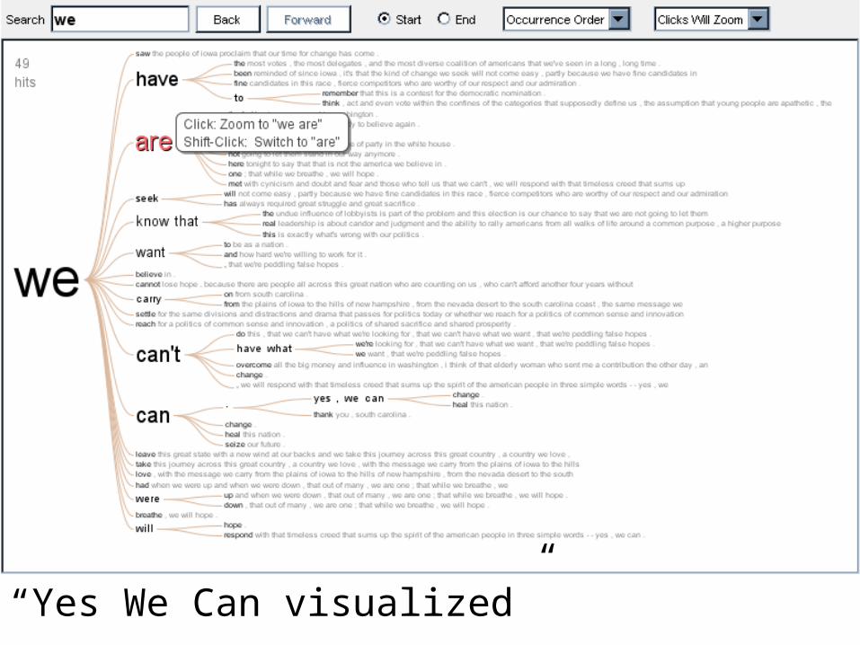
“Yes We Can visualized”


http://code.google.com/apis/visualization/
Google Visualization API

Want to be like Hans Rosling?!?
http://www.youtube.com/watch?v=hVimVzgtD6w

http://code.google.com/apis/chart/interactive/docs/gallery/motionchart.html
Now you can!

Finite State Machine

Unix versions

The code!


http://www.eigenfactor.org
EigenFactor


Hmm… neat but that looks a little too fancy for me…
Not everything that looks hard,
is as hard as it looks!

http://processing.org
Processing

http://www.aharef.info/static/htmlgraph/?url=http://google.com
Webpage Graph


http://benfry.com/deprocess/
Deprocess


Your brain + pencil
Imagination and drawing

http://becktench.com/
I am Beck Tench.

http://becktench.com/

http://thisisindexed.com/
This is indexed


Retrieved from Beautiful Visualization: Looking at Data Through the Eyes of Experts

http://xkcd.com/688/

• Edward Tufte: http://www.edwardtufte.com • NYTimes Visualization Lab: http://open.blogs.nytimes.com/2008/10/27/the-new-york-times-data-
visualization-lab/
• Visually: http://visual.ly/• Flowing Data: http://flowingdata.com/• Lemonly: http://lemon.ly/• Gapminder: http://www.gapminder.org/
Additional resources available:
Your turn!
• Design a single infographic that demonstrates information/data gathered from the candy.
• Sketch on paper or online. Or both!• Consider the color, composition, contrast,
typography, alignment, and repetition when designing your visualization.
• Work with a partner- no more than 3 in a group. • Presentation and discussion.