12
Visualizing Data Visualization February 2017 Keiko Ono, Ph.D. 1
| Date post: | 13-Apr-2017 |
| Category: |
Technology |
| Upload: | keiko-ono |
| View: | 41 times |
| Download: | 0 times |

Visualizing Data Visualization
February 2017
Keiko Ono, Ph.D.
1

Two largest databases of academic literature. In this presentation I use Elsevier’s Sciverse Scopus.
2
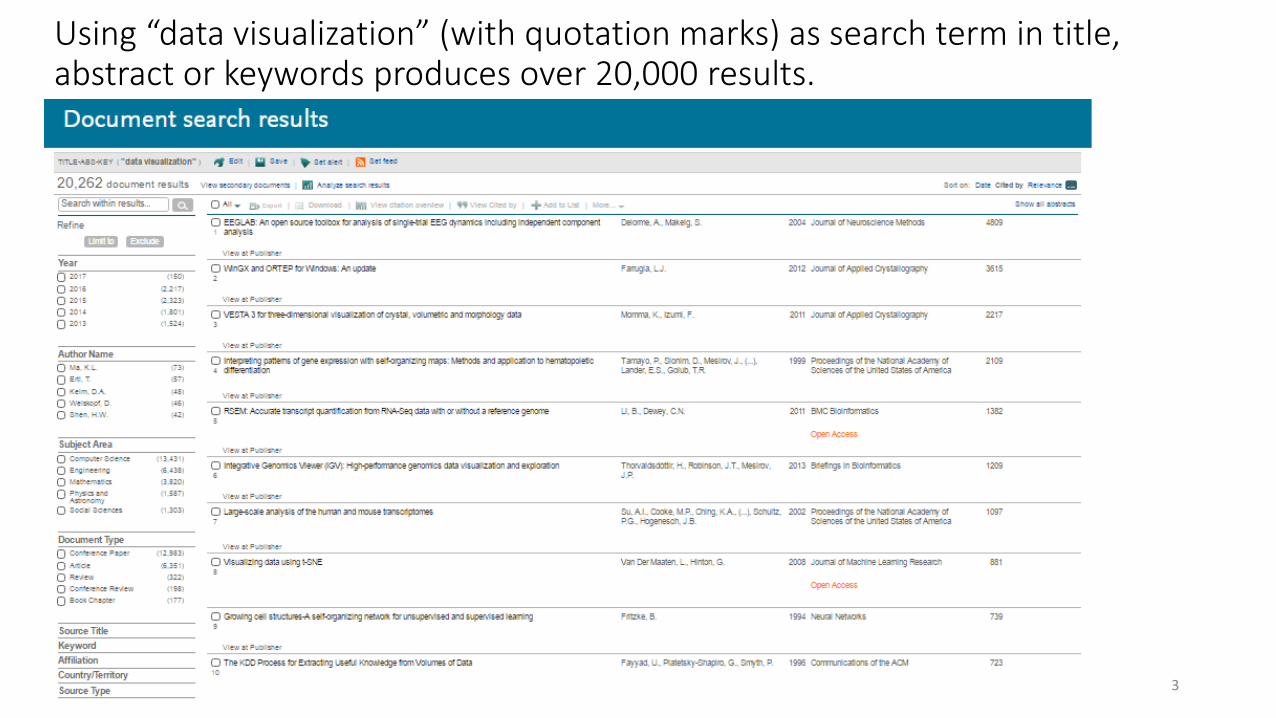
Using “data visualization” (with quotation marks) as search term in title, abstract or keywords produces over 20,000 results.
3

That’s a lot of information. To narrow the scope and find what we’re really looking for, we could use additional search terms. But sometimes we want to understand, make sense of the really big body of literature (in this case n=20,262) In Scopus there’s a default built-in “Analyze Results” function that allows visual summary of the bibliometric data. For each, there’s a frequency table too, so one can create own graphics.
4

One can use “Analyze results” function to see how (1) the # of citations have changed over the years…
Until 1987, the number of citations per year was single digit. It reached 133 in 1996 and 1,168 in 2007. In 2016, there were 2,217 scholarly publications on data visualization!
5

Or to see (2) which journals have published the greatest
number of articles on this topic…
6
No.1. on the list is Lecture Notes in Computer Science (including Subseries Lecture Notes in Artificial Intelligence and Lecture Notes in Bioinformatics)

Or to see (3) who the leading authors are on this topic.
7

And (4) where they are affiliated.
8
The leaders in data visualization research are U of California Davis, Georgia Institute of Technology, U of Utah…and so on. University of Tokyo is ranked #18.
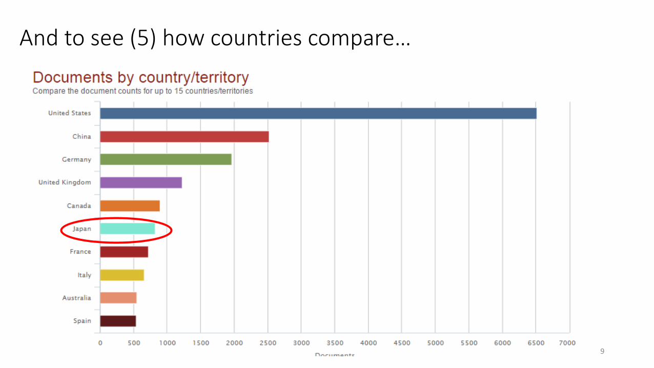
And to see (5) how countries compare…
9

(6) Scopus also visually presents the document type breakdown
10

(7) And by subject area
11
Not clear how these percentages are calculated…??

In summary, research on data visualization has seen an explosive growth in the 21st century. The leading fields of research are computer science, engineering, and mathematics. The United States is the leader in this area of research, followed by China, Germany and UK. Alternatively, using “infographics” as seach term produces far fewer results (only about 200).
12


