+ All Categories
Home > Documents > Visualizing Wearable Technology - University of...

Visualizing Wearable Technology - University of...

Date post: 09-May-2018
Category:
Upload: buinhan
View: 216 times
Download: 2 times
Share this document with a friend
19
Visualizing Wearable Technology Faith Hutchinson + Timothy Meyers + Suhaib Syed Project Goals GOAL 1: Allow users to obtain an overview of current wearable technology Our goal is to provide average consumers with a contextual understanding of the current state of wearable technology. This includes definitions of wearable technology, a brief historical overview of the technology, and and an enhanced way to navigate wearable products in the industry today. Selected Approach A website that provides a comprehensive walkthrough of the wearables space, culminating with an interactive visualization for exploring and gauging the landscape of wearable products in the market today. GOAL 2: Illustrate the growing popularity of wearables As technology giants tout the wearable sector as the next major development in personal computing, cynics remind us that innovation can be synonymous for hype. It is difficult to project long-term economic viability with absolution; however, recent upticks in news coverage and US patent filings confirm the growing presence of wearables. Selected Approach Trends in the news cycle gauge the extent to which a topic is relevant to the public interest at any given time. We used Google Trends to obtain data on the number of times that the terms “wearable technology,” “quantified self,” and “wearable computing” appeared in news headlines from 2004 - 2014. Using Highcharts, we plotted this data on a line chart and enabled the viewing of time-period details with brushing . The trends chart illustrates a marked increase in news headlines around early 2010, with a peak in coverage occurring just this past January. Given additional data resources, we would like to display the variety of sources covering the topic of wearable technology as a means of charting the diffusion of wearables 1
Transcript

Visualizing Wearable Technology Faith Hutchinson + Timothy Meyers + Suhaib Syed

Project Goals

GOAL 1: Allow users to obtain an overview of current wearable technology

Our goal is to provide average consumers with a contextual understanding of the

current state of wearable technology. This includes definitions of wearable

technology, a brief historical overview of the technology, and and an enhanced way

to navigate wearable products in the industry today.

Selected Approach

A website that provides a comprehensive walkthrough of the wearables space,

culminating with an interactive visualization for exploring and gauging the

landscape of wearable products in the market today.

GOAL 2: Illustrate the growing popularity of wearables

As technology giants tout the wearable sector as the next major development in

personal computing, cynics remind us that innovation can be synonymous for

hype. It is difficult to project long-term economic viability with absolution; however,

recent upticks in news coverage and US patent filings confirm the growing presence

of wearables.

Selected Approach

Trends in the news cycle gauge the extent to which a topic is relevant to the public

interest at any given time. We used Google Trends to obtain data on the number of

times that the terms “wearable technology,” “quantified self,” and “wearable

computing” appeared in news headlines from 2004 - 2014. Using Highcharts, we

plotted this data on a line chart and enabled the viewing of time-period details with

brushing . The trends chart illustrates a marked increase in news headlines around

early 2010, with a peak in coverage occurring just this past January. Given

additional data resources, we would like to display the variety of sources covering

the topic of wearable technology as a means of charting the diffusion of wearables

1

from a niche topic, e.g. only appearing in publications like ACM, into one of general

interest, e.g. a feature story in The New York Times.

Patent filings were our other metric for gauging interest. This is because it is

commonly assumed that an increase in patents within a particular field

corresponds to that sector’s growth in the marketplace. Likewise, patent data

uncovers inventors’ perceptions of the value of a sector.

Related Work

Our project was inspired from Suhaib Syed’s research on wearables with Kimiko

Ryokai, and from an article by Steve Mann on the history of wearable computing.

We searched for websites that could provide us with a comprehensive overview of

wearable devices, including definitions of what wearables are, charts showcasing

their increasing popularity, and exhibitions of products that constitute their

industry today. The closest we found was work by Vandrico.com, a technology

consulting company that catalogs currently available wearable devices.

Vandrico has very rich details on individual devices, which are subdivided into

categories of use and body location. They are also up to date, with new products

being added to their database almost every day. While they offer a helpful

interface for exploring each device, such explorations may only take place along

one dimension at a time. For example, a user may select “entertainment” from the

available categories, whereupon she would be directed to another page displaying

devices within that facet; she cannot, however, obtain unions of device information,

such as entertainment devices that are worn on the head.

Our team recognized an opportunity to integrate information on wearables in such

a way that a person could tailor an overview of her choosing, permitting selection

of any combination of facets. Additionally, we noted that designing the interface

interactions such that each selection leads the user to a new page could make an in

depth exploration arduous. We chose to address this by displaying information

within the same page, a means of encouraging continued engagement.

2

What data were used to accomplish the goals?

Steve Mann’s article on the History of Wearable Computing

Google Trends

Hanover Research

Vandrico product database

Which tools were used to accomplish the goals?

Python, Kimono, Excel, Tableau, Highcharts, D3, HTML5, CSS3, JavaScript, JQuery,

The Noun Project

What steps were required to accomplish goals?

Performing preliminary research and identifying the properties of the data

We performed exploratory data analysis using Tableau and Excel to understand the

entities represented by the data, the attributes of the entities, the relationships

between them and their distribution. Our first challenge became apparent after our

preliminary analysis: The attributes of our data lacked mutual exclusivity, making it

difficult to truly categorize the information. This is apparent in the first chart below,

where the lifestyle product category is seemingly a part of almost all category

labels. We realized that we were faced with having to visualize intertwined,

nominal data.

Choosing the graphic forms and principles for visualizing the data

After realizing that we were dealing with nominal data, we referred to our reading

and lecture slides to understand the principles of visualizing this kind of

information. We utilized this reading from Professor's Hearst's Search User

Interfaces to inform our decisions about the visualization framework. It was clear

that any attempts to plot these values on a graph would imply an arrangement and

a trend which would be misleading. We decided to focus on three types of

visualizations for nominal data: Sankey diagrams, Parallel Coordinates, or Node

network diagrams.

3

Left: Bar chart showing frequency of wearable applications as they are applied to our products

Right: Bar chart showing frequency of body locations as they are applied to our products.

4

Sankey

In order to tackle this difficult problem we first considered Sankey diagrams. A

Sankey diagram is really effective in conveying the magnitude and degree of

connection between two points in a chain. We thought we could visualize the flow

of wearable devices across a chain consisting of primary application, body location,

componentry, price and availability. However, after more deliberation we realized

that each wearable can take multiple values in three of the five points on the chain

which would create a complex mesh of connections crisscrossing across columns

and render the visualization unreadable.

Source: http://bost.ocks.org/mike/sankey/

5

Parallel Coordinates

Another option was to display products using basic relationship diagrams, such as

parallel coordinates. While we found that the Sankey was essentially a parallel

coordinates diagram meant for displaying nominal data, we thought of other ways

to demonstrate the relationships between product categories, locations, and

components. Here’s one example of displaying relationships that we investigated:

Source: Pop Chart Lab

Ultimately, we decided that our data was too complex to show in such a way.

Node-Network

Realizing the interconnectedness of the data points we then pursued node-network

diagrams. As described in the Search User Interface reading, a node-network would

help us mitigate the misconception of a message in the arrangement of the data.

We made a prototype by plotting all the wearable devices and defining connections

based on the Jaccard similarity coefficient between their primary applications and

6

body location. However, there were several problems with the way it was

clustering, making it almost unreadable. This was because of the dominance of

devices which had their primary application as ‘Lifestyle’ and had their body

location as ‘Wrist’. Again, the interconnectedness and extreme diversity of products

left the node network as an expert tool at best for navigating the wearables

landscape.

Wearable products, clustered by their body location

7

“Cookie Monster”, or wearable products clustered by primary applications (e.g. Fitness, Lifestyle, Medical, etc.)

Considering the above problem we decided it would be better to head towards a

more customized layout for conveying the landscape of the wearable industry. We

were heavily inspired to create something similar to the following visualization:

http://www.nytimes.com/interactive/2013/02/20/movies/among-the-oscar-conten

ders-a-host-of-connections.html

After several attempts, we concluded that the multi-dimensional nature of our data

made node networks either too complicated altogether (by displaying all

dimensions) or misleading (by only showing one). Here is our attempt at creating a

map of the wearable devices along the primary application dimension.

8

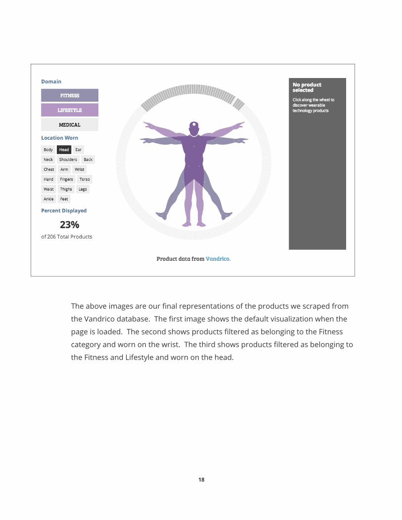
Product clustering combining both body location and application dimensions

9

Mosaic of products arranged by primary application

Re-classification and research

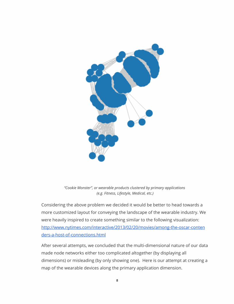
At this point in the process we were struggling with the number of facets about a

device we could visualize while still keeping the whole thing accessible and

meaningful. This is where we made a conscious decision of asking our potential

10

users about what would they like to see, what kind of questions would they ask

when trying to assess the wearable technology industry.

User Research

We interviewed 8 students and discovered some key questions which were of

interest to everyone. Firstly, users wanted to know what wearables were capable of

and how could they benefit from them. Next, they wanted to know the activities

that these devices can track along with the precision. Finally, users wanted to know

about the form factor and where could they be worn on the body.

These results lead us to re-examine our data and see which of the important

questions we could answer with it. We decided on constraining the facets that

would be visualized. In order to convey the capability of wearable devices we

re-classified the devices from seven categories into three main domains of Lifestyle,

Medical and Health. We then defined the ways wearable devices are utilized in each

of those domains. Next, we researched into previous publication and found data

about human activities that can be identified by wearable devices, the sensors that

could be employed to detect those activities and their corresponding accuracies.

Although this particular piece did not make it to this iteration of the visualization,

we understand its importance and are thinking of modifications to the current

visualization in order to accommodate this crucial information. References to some

of the most useful research papers :

Lara, O.D.; Labrador, M.A., "A Survey on Human Activity Recognition using Wearable Sensors," Communications Surveys & Tutorials, IEEE , vol.15, no.3, pp.1192,1209, Third Quarter 2013, doi: 10.1109/SURV.2012.110112.00192, URL: http://ieeexplore.ieee.org/stamp/stamp.jsp?tp=&arnumber=6365160&isnumber=6572931

Andreas Bulling, Ulf Blanke, and Bernt Schiele. 2014. A tutorial on human activity recognition using body-worn inertial sensors. ACM Comput. Surv. 46, 3, Article 33 (January 2014), 33 pages. DOI=10.1145/2499621 http://doi.acm.org/10.1145/2499621

Tobón, D.P.; Falk, T.H.; Maier, M., "Context awareness in WBANs: a survey on medical and non-medical applications," Wireless Communications, IEEE , vol.20, no.4, pp.30,37, August 2013, doi: 10.1109/MWC.2013.6590048, URL: http://ieeexplore.ieee.org/stamp/stamp.jsp?tp=&arnumber=6590048&isnumber=6590039

11

Custom Design - Vitruvian

The user interviews, re-classification of data and the research finally lead us to

imagine a completely custom layout for our visualization. The driving force behind

our approach was using the metaphor of the Vitruvian Man. The 15th century

drawing by Leonardo DaVinci is a testament to the ideal proportions of a human

and this quest of perfection is echoed by the motivations behind the application

and development of wearable devices.

We imagined the vitruvian man surrounded by a halo of all the wearable devices

signifying their connection with the body and how they are trying to extend our

abilities, redefining our capabilities and changing our identity. With this concept in

mind we then executed the following features to make the visualization truly

interactive:

➔ Brushing and Zooming ➔ Sorting ➔ Filtering ➔ Visual presentation of results ➔ Immediate and continuous feedback ➔ Details on demand ➔ Rapid, incremental, and reversible controls

The resulting design met our goals of emphasizing effectiveness, expressiveness,

establishing a connection and avoiding misconceptions. Throughout the process we

regularly referred back to the extensive array of visualizations here:

http://d3js.org/

http://bost.ocks.org/mike/

http://www.pitchinteractive.com/beta/index.php

http://www.visualnews.com/category/visualization-2/

Building the narrative

Our visualization was only one part of a larger goal. We developed a website to

build the narrative, wherein we included highcharts to represent Google trends and

Hanover Research data. We also wrote copy to guide the user through our story,

and included Steve Mann’s Google glass prototype.

12

Initial Sketches of Vitruvian graphic. Left: Interactions Right: In context of page

13

faith
Sticky Note
see attached file, "body_sankey3" for image of wireframe

What kinds of results you obtained, with a focus on usability tests or responses

from prospective or real users?

Initially, we planned to do both a pre- and post- test on users to help us

comprehend what aspects of our visualization were most and least successful.

Furthermore, we wanted to collect demographic information for each user to better

understand their relationship with technology. The many qualitative user tests we

conducted with users during the project showcase gave us valuable information,

however, not all of our participants took the pre-screening survey, so we decided

our n for that portion would not accurately correspond to the results obtained from

testing. Here, we record a few key experiences demonstrative of the capability of

our visualization.

Kimiko Ryokai - Professor at the ISchool

Professor Ryokai was very engaged with the interface and expressed her interest in

using it further to understand potential areas of research. Additionally, she was

able to find some wearable devices for her pet, which was quite amusing to her.

Marko Hrelja - Ex-researcher at Steve Mann’s lab

Marko was very keen on obtaining this visualization. He thought it was extremely

novel and has a lot of potential for researchers and start-ups to understand the

current market. He was so excited that he has invited us to present this

visualization at a wearable technology conference at Google.

Shaun Guidici - MIMS Student

Shaun found the filtering functionality confusing. Initially, he could not identify the

active and inactive states of the devices when he applied filters. After applying a

number of filters he wanted to have a button to clear all filters rather than deselect

each of them separately. He liked the interactive elements but thought it was

difficult to explore because of the need to place the cursor over small arcs with

some precision, he would have preferred using the arrow key to go around all the

devices.

14

Final Visualization

Our completed work can be found here:

http://people.ischool.berkeley.edu/~f.hutchinson/wearables-viz-master/dev_web/

The GitHub repo for this project, which contains our codebase, is located here:

https://github.com/tim35050/wearables-viz

The following are screenshots of the core visualizations. Note that the final product

is a website with important copy that narrates our story. These screenshots are

taken out of context, and are only shown to present the primary visual components

of our work.

15

The chart above expresses the prevalence of wearables in the news over time.

Values are relative to the height of discussion in the media, which occurred on

January 5, 2014. Media flurry might be explained by the simultaneous occurrence

of the Consumer Electronic Show, in which technology companies had the

opportunity to debut their latest innovations.

Market data from Hanover Research, shows the increase in US patents for

wearables from 2003 - 2013. According to Hanover, patent activity offers a

significant forecast of potential developments in the consumer marketplace.

16

17

The above images are our final representations of the products we scraped from

the Vandrico database. The first image shows the default visualization when the

page is loaded. The second shows products filtered as belonging to the Fitness

category and worn on the wrist. The third shows products filtered as belonging to

the Fitness and Lifestyle and worn on the head.

18

WORK CONTRIBUTION

We each contributed to the project in different ways, sometimes extending outside

of how we had initially delegated tasks. In the following, we ranked our personal

participation in each part of the project from 1 - 3:

1: “minimal role” 2: “supporting role” 3: “significant role”

FAITH TIM SUHAIB

Concept Development ➔ create layout sketch ➔ create interactions ➔ scope data collection ➔ prototyping with paper ➔ prototyping with whiteboard ➔ prototyping with d3

3

2 3

Research ➔ explore Vandrico to become familiar with item facets ➔ EDA from Vandrico for overview of product distribution ➔ research CHI 2014 papers to acquire high-level insight ➔ interview industry professionals and potential users ➔ analyze best practices for visual design of nominal data ➔ analyze market data from Hanover and Accenture ➔ analyze Google Trends ➔ user test with final prototype

2

2 3

Refine ➔ determine improvements with UX testing of Vandrico’s site ➔ establish key product facets that are concise but informative

2 1 2

Code ➔ initially manually entered items into Excel ➔ scraping the Vandrico database using Python ➔ cleanse/transform the data with Python ➔ d3 development ➔ Highcharts ➔ HTML + CSS

2 3 1

Design ➔ node network ➔ after data reformat, redesign ➔ implement Vitruvian design ➔ implement Google Trends Chart ➔ implement US Patents ➔ write copy to support narrative

3 3 2

19


Recommended