6
WDF MAGAZINE Analysis
| Date post: | 17-Aug-2015 |
| Category: |
Education |
| Upload: | bendraper98 |
| View: | 54 times |
| Download: | 0 times |

WDF MAGAZINE
Analysis
Front Cover - Negatives
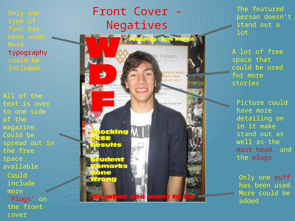
A lot of free space that could be used for more stories
Picture could have more detailing on in it make stand out as well as the mast head, and the plugs
Only one type of font has been used. More typography could be included
Could include more ‘Plugs’ on the front cover
Only one type of font has been used. More typography could be included
Only one puff has been used. More could be added
All of the text is over to one side of the magazine. Could be spread out in the free space available
The featured person doesn’t stand out a lot

Contents Page - Negatives
The same picture has been used on the contents page. Something different could be used or it could be made to not stand out as much
A lot of negative unused space. More stories and information can be added
The blur effect on the image makes it look unprofessional
The stories could be made to be easier to read, and stand out more so people will want to read them
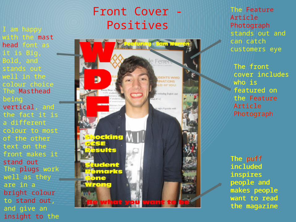
Front Cover - PositivesI am happy with
the mast head font as it is Big, Bold, and stands out well in the colour choice
The Feature Article Photograph stands out and can catch customers eye
The Masthead being vertical, and the fact it is a different colour to most of the other text on the front makes it stand out
The plugs work well as they are in a bright colour to stand out, and give an insight to the contents
The front cover includes who is featured on the Feature Article Photograph
The puff included inspires people and makes people want to read the magazine
The front cover includes who is featured on the Feature Article Photograph
The puff included inspires people and makes people want to read the magazine

Contents Page - Positives
The mast head for the contents page being vertical is unusual and looks professional
The titles being in different colours makes them stand out
The Contents Feature Article Photograph is blurred and makes it not stand out as so the stories can stand out instead
The stories are lined up neatly and in order and page numbers for the stories are included

Tools I UsedI used the vertical text tool to add the ‘WDF’ Masthead, and the horizontal text tall for the other writing on both the Front cover and the Contents page
I used the smudge tool to get rid of any imperfections on his face and skin, and also the enhance tool to improve the detailing on his face such as his lips
I used the blur effect to make the back ground of the contents page slightly blurry so that it isnt the readers main focus, but the text on the contents page is.


