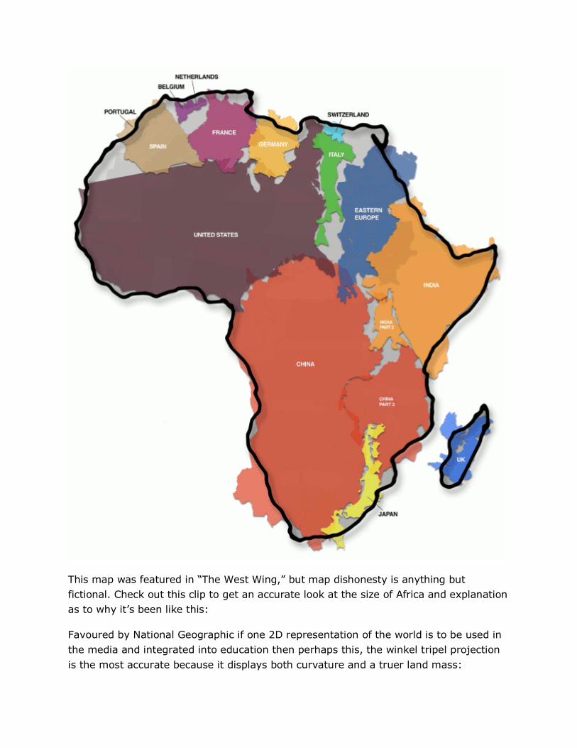
We Have Been Misled By A Flawed World Map For 500 Years Posted 3 days, 21 hrs ago by Satyapriya Articles Societal History 0 Source: www.livelearnevolve.com | Original Post Date: August 15, 2013 – We now know the Earth is round. Therefore, the challenge of any world map is to represent a round Earth on a flat surface. There are thousands of map projections, and each has certain strengths and corresponding weaknesses but the one you’re now picturing in your head most likely isn’t the area accurate representation. A more accurate representation of land mass is the Peters Projection Map seen here:
Transcript
We Have Been Misled By A Flawed World Map For 500 Years Posted 3 days, 21 hrs ago by Satyapriya
Articles
Societal
History
0
Source: www.livelearnevolve.com | Original Post Date: August 15, 2013 –
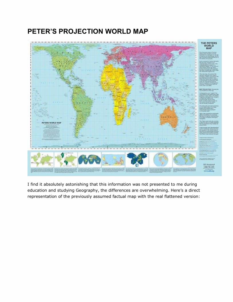
We now know the Earth is round. Therefore, the challenge of any world map is to
represent a round Earth on a flat surface. There are thousands of map projections, and
each has certain strengths and corresponding weaknesses but the one you’re now
picturing in your head most likely isn’t the area accurate representation. A more
accurate representation of land mass is the Peters Projection Map seen here: