83
Web Design for Programmers Brian Hogan NAPCS Slides and content ©2008 Brian P. Hogan Do not reproduce in any form without permission

Web Design for Programmers
Brian Hogan
NAPCS
Slides and content ©2008 Brian P. HoganDo not reproduce in any form without permission

Quick Disclaimers
• This is a crash course!
• Many topics are simplified to keep things moving
• There’s more to learn after this is over!
• This is not show and tell - get ready to build something!

We are going to learn stuff
• Basic Color Theory
• Learn how to choose colors
• Basic Typography
• Learn how to choose fonts
• Basic layouts
• How to mock up a site in Photoshop
• BasIc XHTML and CSS

We’re gonna build stuff
• We’ll build a logo that can scale using Illustrator
• We’ll build a mockup of the site in Photoshop
• We’ll write some code
• XHTML
• CSS

Good vs. Bad Design
• Most successful web designs have a few things in common:
• They are accessible
• Most users have little problem finding the information they need
• They are easy to read
• There are good clean fonts laid out appropriately
• They are visually-appealing

Bad Design
High-contrast colors,

Good Design
Uniform, easy to read, easy to get signed up.

Design is more than pretty colors!
• Design based around your content
• Be appropriate!
• Be interesting!
• Be clear!
• Make sure users find what they came for quickly!
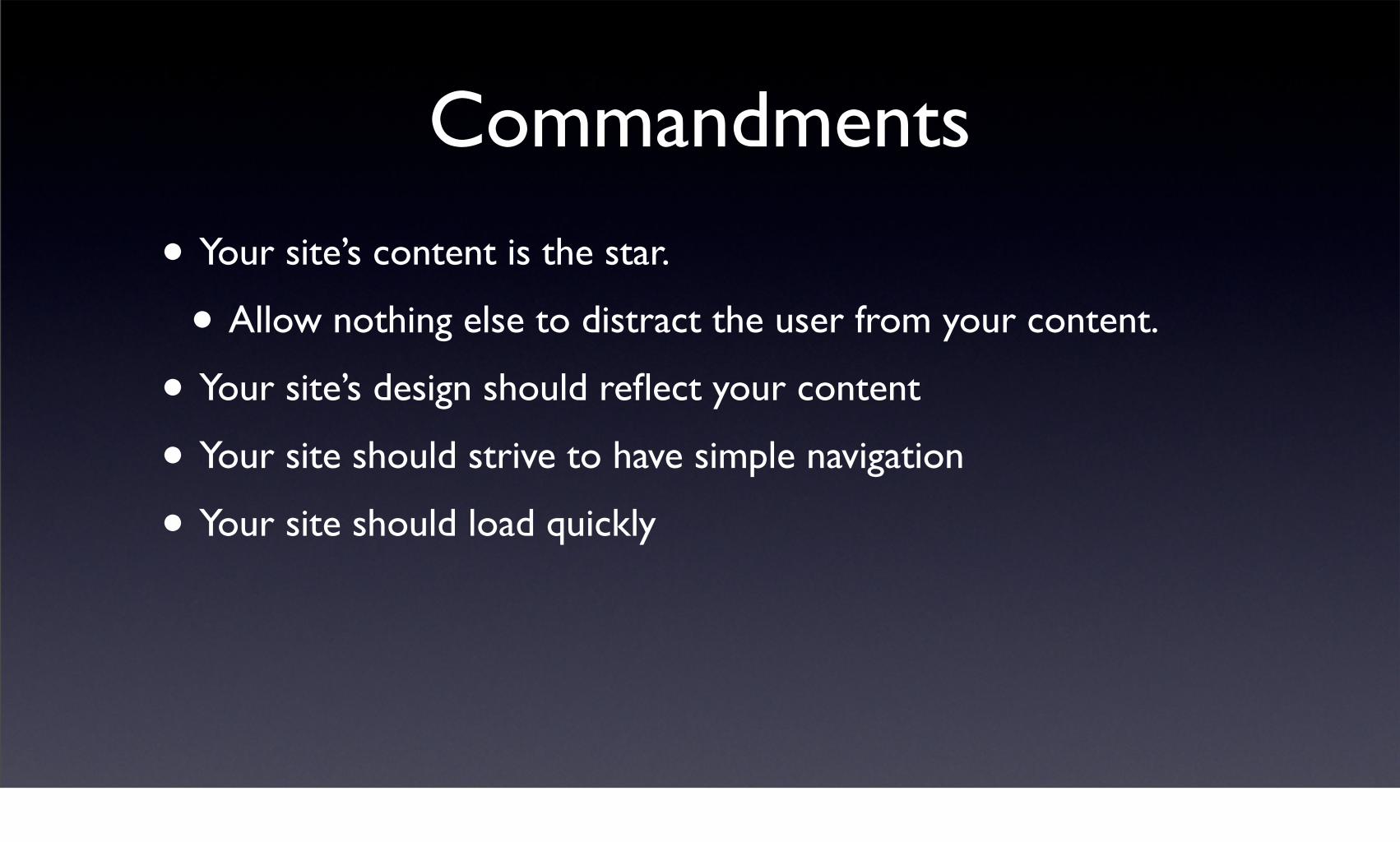
Commandments
• Your site’s content is the star.
• Allow nothing else to distract the user from your content.
• Your site’s design should reflect your content
• Your site should strive to have simple navigation
• Your site should load quickly

Basics of Layout
• Process is the same for basic HTML, templates for a CMS, or a Rails template

Navigation
• Should be easy to find and use
• Positions
• Top of the page
• Sidebar
• Keep it small
• No scrolling to see the navigation!

Gather information
• What does the site do?
• What’s the site’s target audience?
• What’s the goal of the company?
• Who are the competitors?

Sketch your stuff
• Before you sit down at the computer, sketch ideas on paper
• Great for working with clients
• Avoid whiteboards – you want to keep the sketches with you!
• Flipcharts are fun for meetings!

Doesn’t have to be pretty

Get inspired!
• Surf the web and see what’s out there
• Get potential clients to show you things they like
• It helps you see what will please them

Sketching Guidelines
• Sketch three variations
• One simple
• One complex
• One in the middle
• Draw boxes if you’re not a great artist

Color
• Color is one of the most important parts of your design
• It conveys information
• It evokes an emotional response.
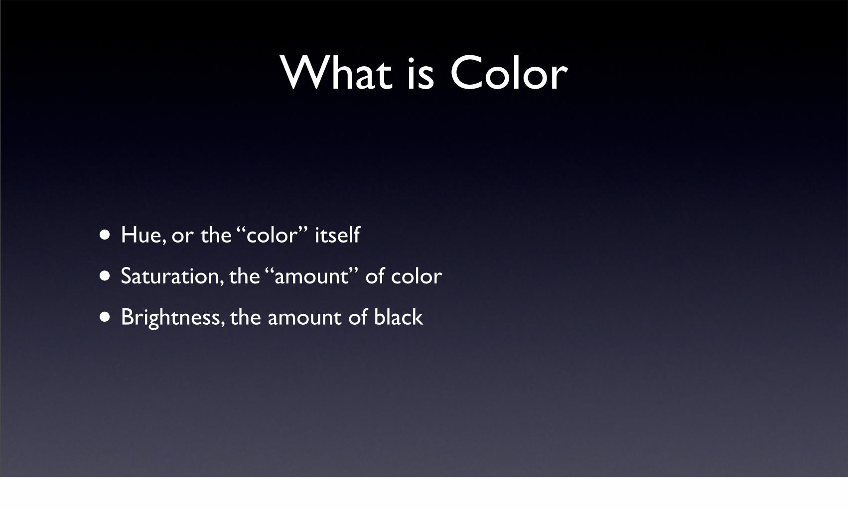
What is Color
• Hue, or the “color” itself
• Saturation, the “amount” of color
• Brightness, the amount of black

Basic Color Theory

Color Schemes
• Monochromatic
• Pick a hue
• Choose various shades (brightness and saturation combinations)

Monochromatic

Analogous
• Pick a hue on the color wheel
• Pick its neighbors to the left and right
• Choose various shades (brightness and saturation combinations)

Analogous

Complimentary
• Pick a hue on the color wheel and then pick the color that sits 180 degrees across from the first color.
• Use saturation and brightness to create additional colors
• Be careful! This can be a shocking scheme!

Complimentary
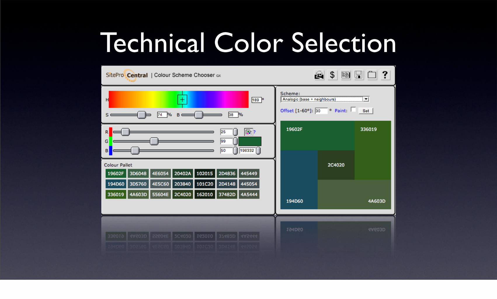
Technical Color Selection

Photographs
• Photographs make the site come alive
• Use professional-looking photographs
• Take your own or use stock photos
http://www.istockphoto.com/file_closeup/object/5464361_home.php?id=5464361

Natural Color Selection
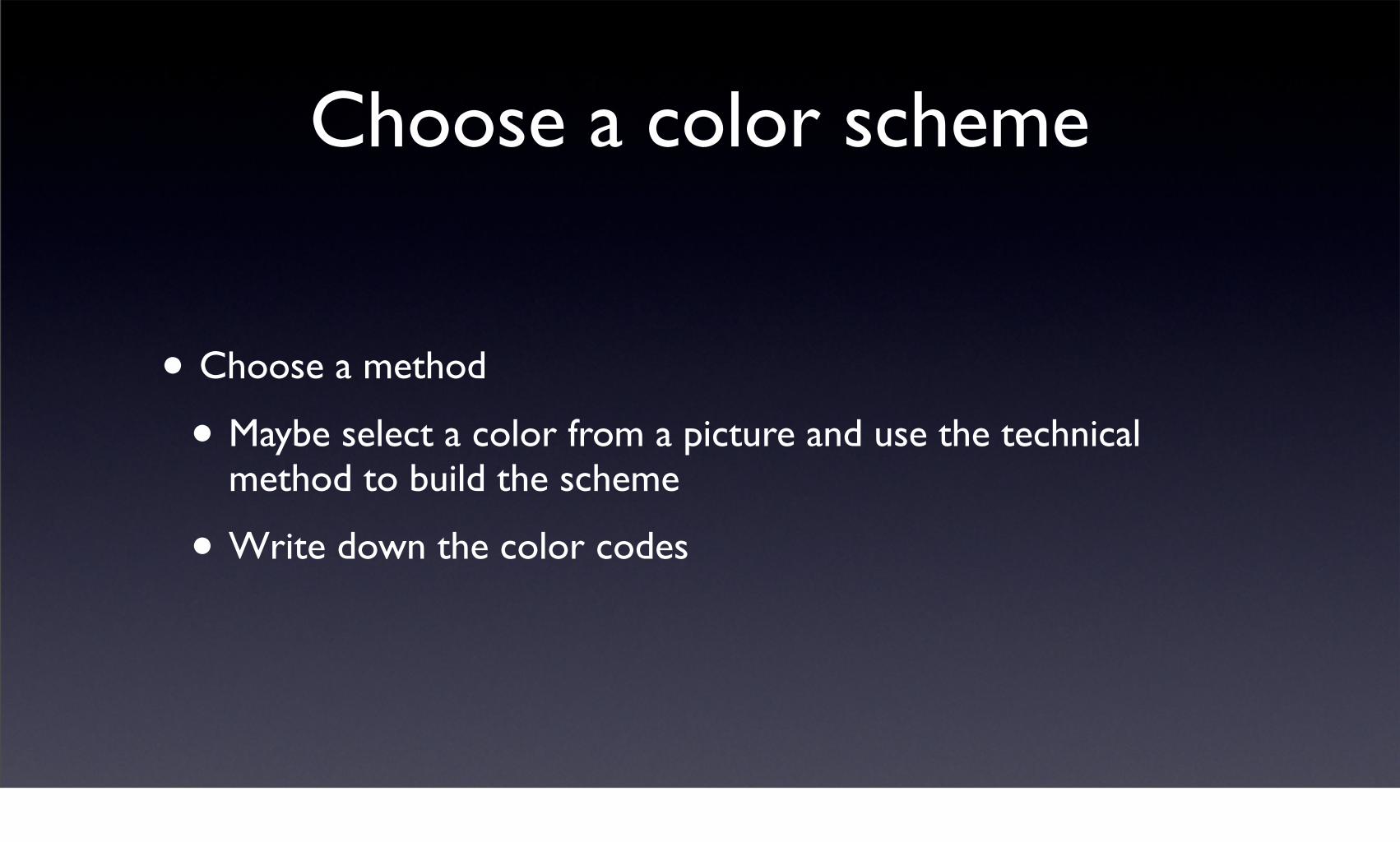
Choose a color scheme
• Choose a method
• Maybe select a color from a picture and use the technical method to build the scheme
• Write down the color codes
Typography
• Typography is all about making your content readable
• It’s more than picking fonts!

Font types
• Serif
• Sans Serif
• Script
• Monospaced
• Symbols

Serif
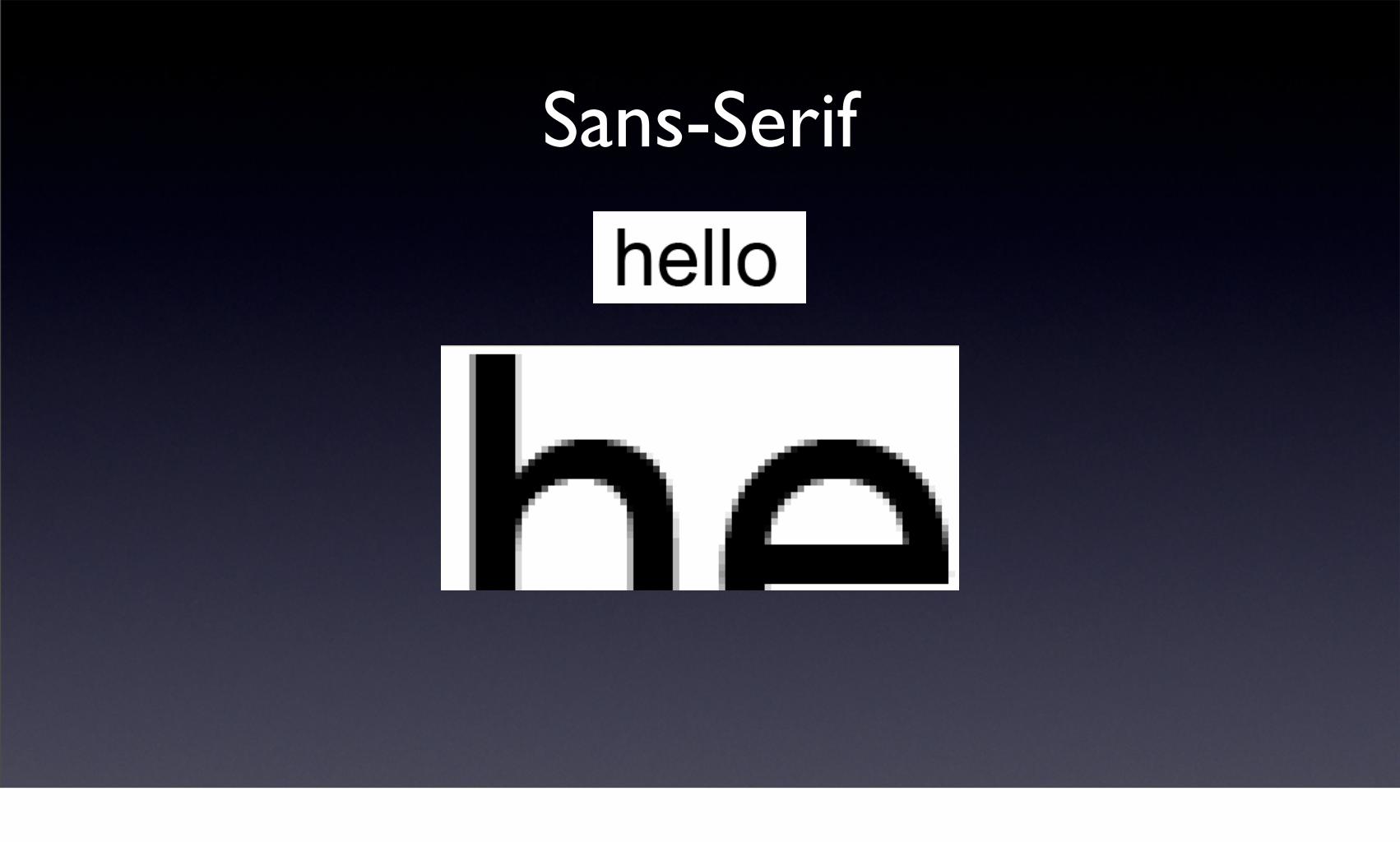
Sans-Serif

Monospaced
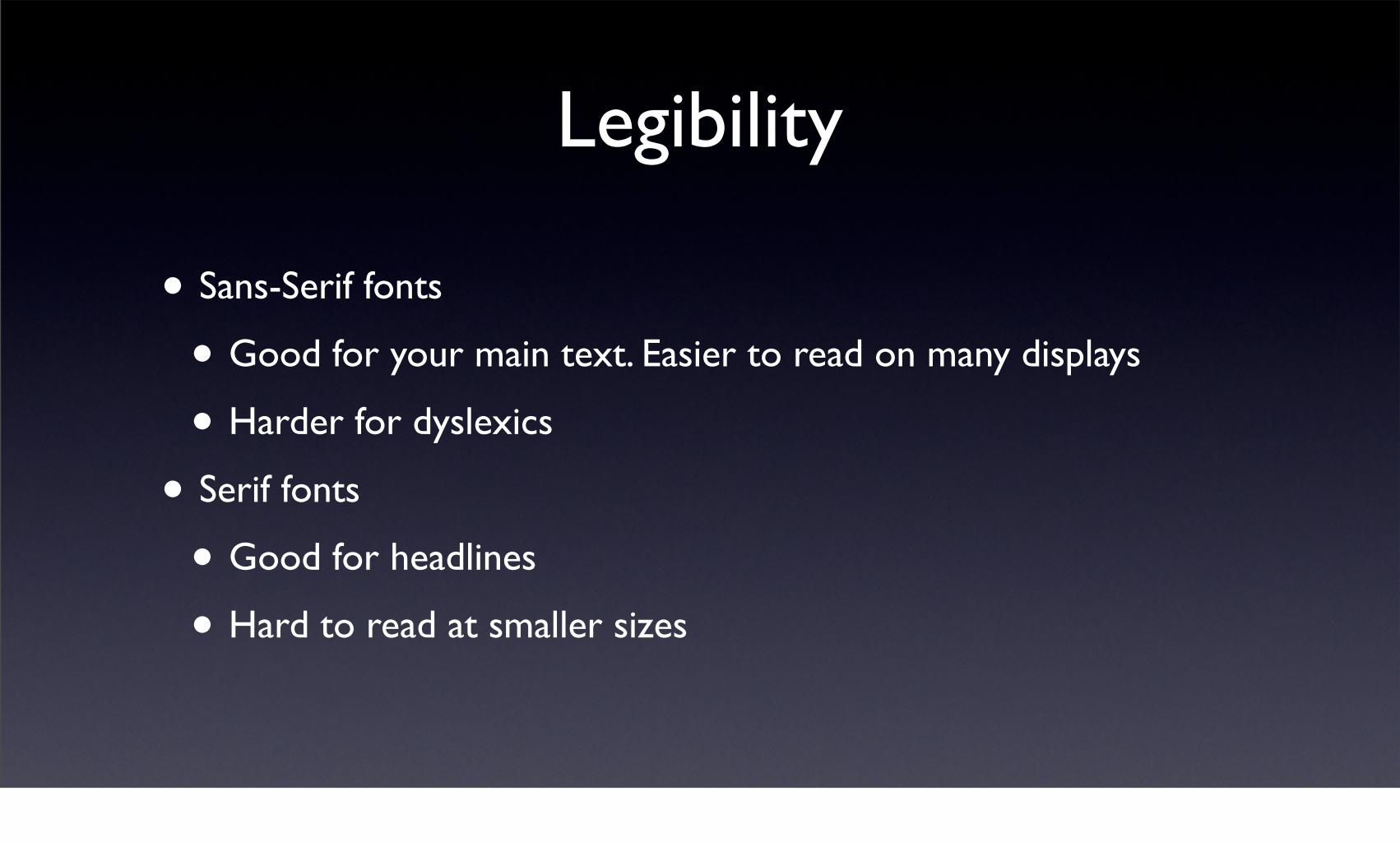
Legibility
• Sans-Serif fonts
• Good for your main text. Easier to read on many displays
• Harder for dyslexics
• Serif fonts
• Good for headlines
• Hard to read at smaller sizes

Fonts and Style
• Browsers across platforms only support a small group of fonts
• You can use images to replace text to retain a font’s style
• Use sparingly!
• You can have “fallback fonts” defined in CSS

The Baseline Grid
• Pay attention to vertical space. Fonts have a line-height.
• When working with fonts, define the font size and the line-height
• Ensure that all element heights are divisible by the line height

Limited Options
• Web browsers only support a certain number of fonts by default
• The font you choose needs to be installed on your users’ machines

http://www.ampsoft.net/webdesign-l/WindowsMacFonts.html

No Grid Used

Grid Used

Basics of a Grid
• Pick a font and a unit of spacing (line-height)
• 12px font with 18px line-height (12/18)
• Use the line-height for spaces between elements
• Increase line-height when a font crosses it
• 24px fonts have 36px line-height
• All image heights need to adhere to the line-height
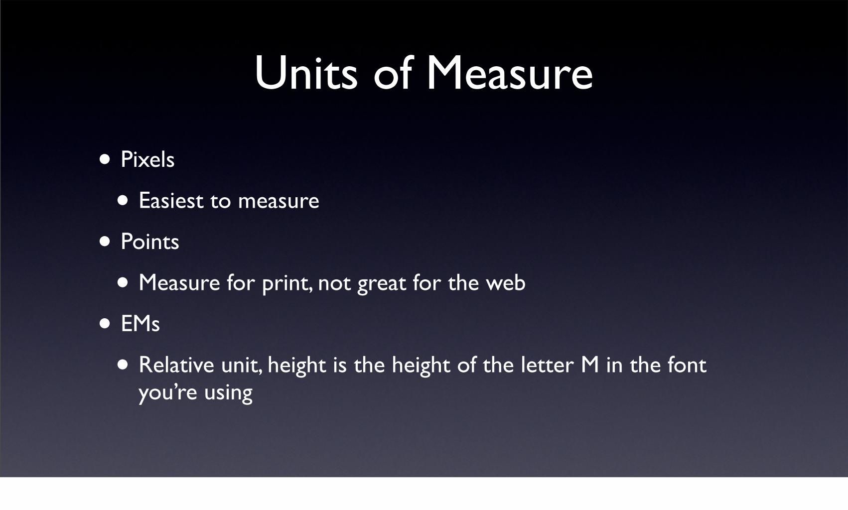
Units of Measure
• Pixels
• Easiest to measure
• Points
• Measure for print, not great for the web
• EMs
• Relative unit, height is the height of the letter M in the font you’re using

Logo Design
• Logos are used everywhere
• Web, print, billboards, t-shirts
• Design a logo to be scalable
• Vector graphics

Designing a Logo
• Logo should be easy to recognize
• Should be appropriate for your audience

Learning to Draw with Illustrator
• Basic Shapes
• Duplicating
• Paths
• Pens
• Fonts

Make a Logo

Mockup with Photoshop
• Use Photoshop to lay out your page
• Import other elements
• logos, photographs, etc
• Extract elements for use in CSS and HTML
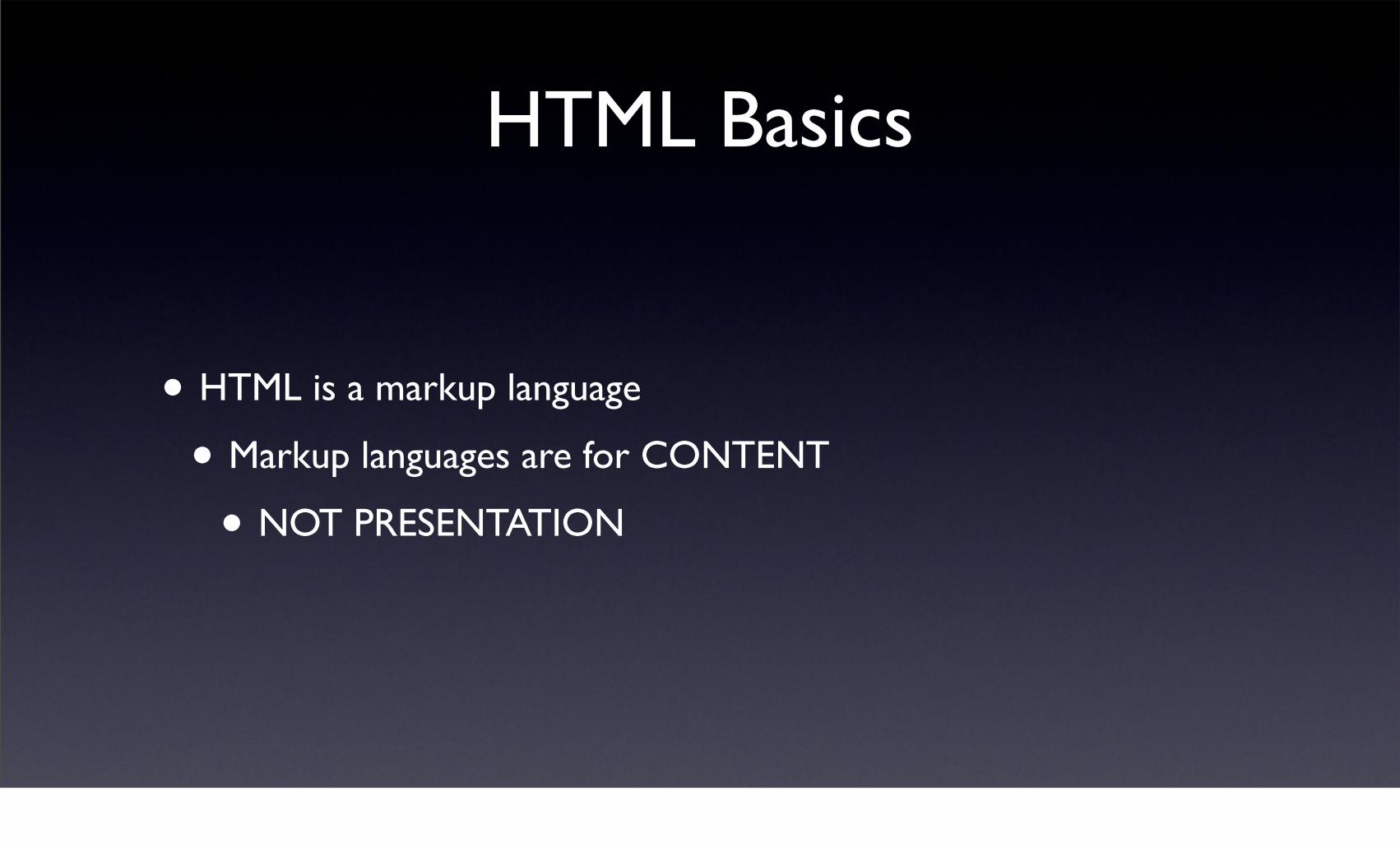
HTML Basics
• HTML is a markup language
• Markup languages are for CONTENT
• NOT PRESENTATION

Semantic Markup
• Use the correct tags to represent your content
• Headings
• Lists
• Paragraphs
Tables
• Avoid tables for layout whenever possible.

HTML Tags
• Tags, or elements, wrap your content
• Formatting tags
• Content tags
• Invisible tags

Block level tags
• DIV<div>This is a section</div>
• H1 through H6<h1>This is a headline</h1><h2>This is a smaller headline</h2>
• P<p>This is a paragraph</p>
• Forms, tables, lists

Inline Elements
• a<a href=”/home”>Home</a>
• img<img src=”/images/rails.png” alt=”Rails logo” />
• spanThis text should be <span>wrapped</span>

Scope
• Tags that wrap content have a scope
• Opening tag
• Closing tag
• <strong>bolded words</strong>
• Important to open and close tags properly!

Valid markup
• Valid markup is the key to success
• Without valid markup, pages render incorrectly in many browsers
• CSS and Javascript are affected greatly

Block vs Inline Elements
• Block elements start on a new line
• Inline elements don’t.
• You can change this behavior with CSS
• It’s important to understand the default styles of HTML elements!

Doctype
• The doctype you choose determines what validation rules will be applied to your document.
• It also determines whether IE will be nice to you or not.
• Standards vs. Quirks mode

Create Your HTML Page

Validation
• Invalid documents can cause problems
• CSS and JavaScript tend to FAIL
• Validation is easy with Web Developer Toolbar

CSS Basics
• Cascading Style Sheets define the presentation
• Fonts, colors
• images, positioning
• Rules tell browsers how to render the content

A CSS Rule

Types of Stylesheets
• Inline Styles
• Inline Stylesheet
• External stylesheet
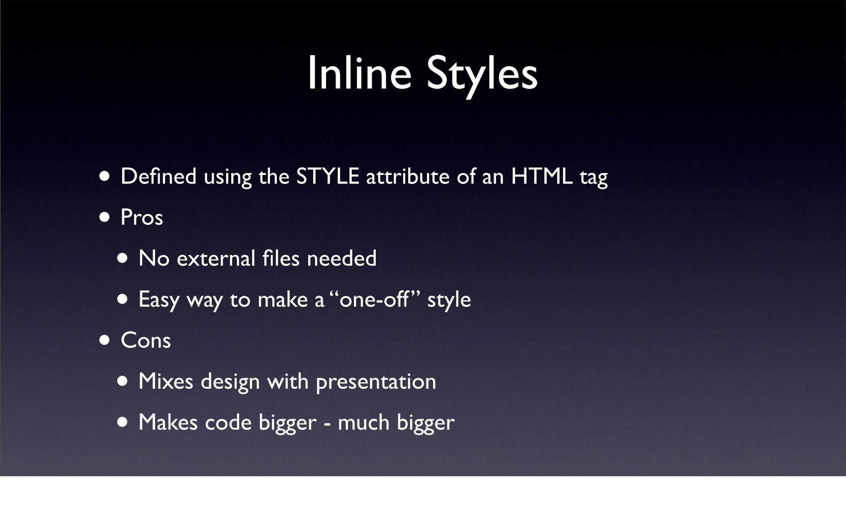
Inline Styles
• Defined using the STYLE attribute of an HTML tag
• Pros
• No external files needed
• Easy way to make a “one-off” style
• Cons
• Mixes design with presentation
• Makes code bigger - much bigger

Inline Stylesheet
• Entire stylesheet defined within the <STYLE> tag within the page’s header
• Pros
• Great for one-off pages where the style is different
• No external files needed
• Cons
• No way to share styles across pages

External Stylesheets
• Use the LINK tag to include a stylesheet
• Pros
• Can be shared across pages
• Cons
• Requires an extra file and thus an extra download
• Requires more rigid documentation

Media Types
• Stylesheets can be associated with media types
• Screen
• Projector
• Printer
• Easy way to handle print versions of your page

Selectors
• HTML elements
• Classes
• IDs
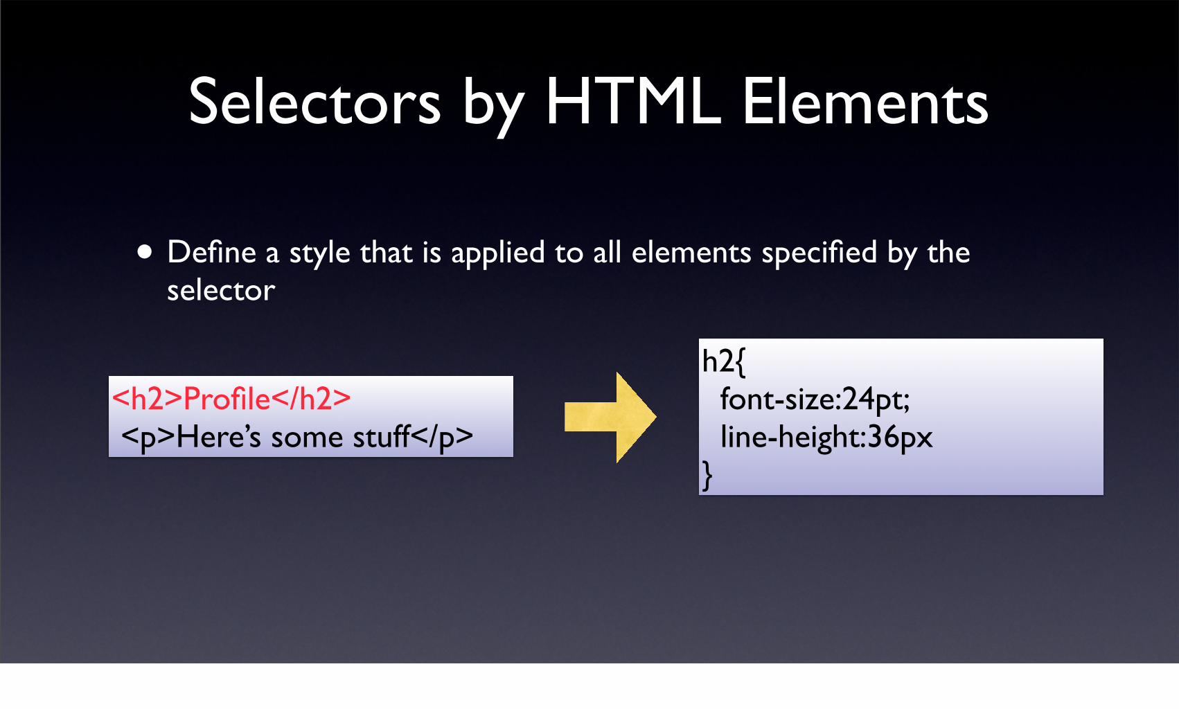
Selectors by HTML Elements
• Define a style that is applied to all elements specified by the selector
h2{ font-size:24pt; line-height:36px}
<h2>Profile</h2> <p>Here’s some stuff</p>

Selectors by Class Name• Define a style by referencing the associated class attribute
assigned to elements in the document
<div class=”box”> <p>Here’s some text</p></div>
<div class=”box2”> <p>Here’s more text</p></div>
.box{ font-weight:bolder; border:1px solid #000; padding:5%; color:#669; line-height:18px;}

Selectors by ID Name• Define a style by referencing the associated class attribute
assigned to elements in the document
<div id=”header”> <h1>This is a headline</h1></div>
<div id=”main”> <p>Here’s more text</p></div>
#header{ background-color:#ffe; color:#000; margin-bottom:18px;}

Guidelines for use
• IDs can’t be used on more than one element per page
• ID selectors are great for defining position of regions of page
• Classes can be reused
• Class selectors are great for defining how a group of items look
• HTML elements already exist
• HTML element selectors are great for changing how elements appear

Grouping
• You can share a single style definition using groups of selectors, separated by commas
<h1>Header</h1>
<h2>Subheader</h2><p>This is a paragraph</p>
.h2, p{ margin-left:18px; color:#669; line-height:18px;}

Scoping
• You can ensure that styles are only applied to elements you specify by using scoping
<div class=”special”><p>This is not affected</p>
<p class=”special”>This is affected</p>
p.special{ margin:left: 18px;}

Layout.css
• Positioning of regions
• Definition of line-heights

Resetting
• Browsers have their own default styles for elements. To be sure you get what you want, set margins and paddings on everything to 0
• Or at least everything that matters

Web Graphics
• JPEG
• For pictures and complex images with many colors - lossy compression
• GIF
• For logos, simple artwork, only 256 colors max, basic transparency, no loss compression, support for animation
• PNG
• Many colors, transparency support which is not supported in older browsers

Style.css
• All of your colors, images, and fonts are here, including your font sizes and line heights

Optimizing Images
• Take a large image and prepare it for the web
• Convert DPI to 72px
• Convert image dimensions to something useful
• Compress image
• Remove colors
• Reduce quality
• Use a good image editor

Accessibility
• Make your site accessible to people with disabilities
• and you make it accessible to everyone

How?• Make sure your pages validate
• Use ALT attributes for images
• Avoid things that flash rapidly
• Make sure it downloads quickly
• Make sure it works on older browsers
• Test it on a phone
• Test it on a Mac!!!
• Test it on a PC!!!
Questions

Follow up
• Web
• http://www.napcs.com
• Contact me
• hoganbp on #rubyonrails


