+ All Categories
Home > Technology > Week 4 - Designing pages

Week 4 - Designing pages

Date post: 06-Aug-2015
Category:
Upload: tori-palmer
View: 228 times
Download: 1 times
Share this document with a friend
Popular Tags:
24
Designing Pages Chapter 6 Technical Report Writing Today (Tenth Edition) Daniel Riordan Emeritus Professor of English University of Wisconsin-Stout Copyright © 2014 Wadsworth. All Rights Reserved. 6-1
Transcript

Designing Pages

Chapter 6

Technical Report Writing Today (Tenth Edition)

Daniel Riordan

Emeritus Professor of English

University of Wisconsin-Stout

Copyright © 2014 Wadsworth. All Rights Reserved. 6-1

Copyright © 2014 Houghton Mifflin. All Rights Reserved. 6-2

Chapter ContentsChapter 6 In a Nutshell

Using Visual Features to Revel Contents

Using Text Features to Convey Meaning

Developing a Style Sheet

Focus on Color

Using Visual Features to Reveal Content

The visual features that reveal content are white space and chunks; bullets; head systems; and headers, pagination, and rules.

White Space and Chunks

white space is the key visual feature of a document;

white is space is any where there is no text or visual aid;

white space creates chunks;

chunks are blocks of text that reveal logical structure.

Copyright © 2014 Wadsworth. All Rights Reserved. 6-3

Using Visual Features to Reveal Content: Cont.

chunks are blocks of text that reveal logical structure;

chunks can also indicate hierarchy;

See Figure 6.1 One Chunk Report-an email message produced as one chunk:

(the number of points in the message is not clear).

See Figure 6.2 Three-Chunk Report-the same message with chunks:

(the number of points in the message is clear).

See Figure 6.3 Hierarchy in Chunk Report-the message shows white space that creates a chunk of subordinate points.

Copyright © 2014 Wadsworth. All Rights Reserved. 6-4

Using Visual Features to Reveal Content: Cont.

Report Bullets

bullets emphasize list items;

numbers provides a greater emphasize of list items.

See Figure 6.4 Bulleted List-notice the bullets emphasize the list items, causing the reader to focus on the items.

Head Systems

head indicates the contents of the section that follows.

head system is a pattern of heads (called levels) to indicate both the content and the relationship (hierarchy) of the sections in the document.

Copyright © 2014 Wadsworth. All Rights Reserved.6-5

Using Visual Features to Reveal Content: Cont.

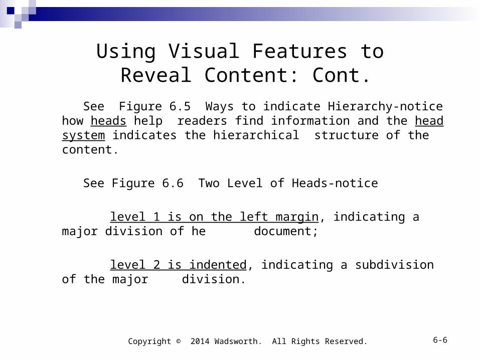
See Figure 6.5 Ways to indicate Hierarchy-notice how heads help readers find information and the head system indicates the hierarchical structure of the content.

See Figure 6.6 Two Level of Heads-notice

level 1 is on the left margin, indicating a major division of he document;

level 2 is indented, indicating a subdivision of the major division.

Copyright © 2014 Wadsworth. All Rights Reserved. 6-6

Using Visual Features to Reveal Content: Cont.

Head systems have two basic styles (open and closed);

an open system uses only the position and size of the heads;

a closed system uses a number arrangement to indicate

hierarchy.

See Figure 6.7 Open System-notice the position and size of heads.

See Figure 6.8 Closed System- notice the use of numbers that indicate hierarchy.

Copyright © 2014 Wadsworth. All Rights Reserved. 6-7

Using Visual Features to Reveal Content: Cont.

Headers or Footers, Pagination, and Rules

headers or footers appear tin the upper or lower margins of a page; they usually name the section of the document for the reader:

page numbers usually appear at the top right or top left of he page (depending on whether the page is a right-hand or left-hand page) or bottom center of the page;

Rules, or lines on the page, act like heads (they divide text into identifiable section and an indicate hierarchy).

(See Figure 6.9 Basic Page Parts.)

Copyright © 2014 Wadsworth. All Rights Reserved. 6-8

Using Text to Convey Meaning

Text features are used top convey meaning are highlighters, font, font size, leading, columns and line length, and justification.

Text features are used

to emphasize words or groups of words; to give the text a certain personality.

Copyright © 2014 Wadsworth. All Rights Reserved. 6-9

Using Text to Convey Meaning: Cont.

Highlighters

Highlighters focus the reader’s attention on an idea by making a word or phrase stand out:

types of highlighters-common highlighters are

Boldface

Italics

ALL CAPS

Vertical lists

Quotation marks

Copyright © 2014 Wadsworth. All Rights Reserved. 6-10

Using Text to Convey Meaning: Cont.

use highlighters to help your readers-give the highlighter a function:

for example, when you highlight (bold) a word to indicate a specific meaning, you have set up a convention that readers will look for (you have defined a guide rule for your document).

other ways to use highlighters-consider

using italics to emphasize a word that you will define;

using quotation marks to introduce a word used ironically or to indicate a special usage;

Copyright © 2014 Wadsworth. All Rights Reserved. 6-11

Using Text to Convey Meaning: Cont.

using all caps as a variant of boldface, usually for short phrases or sentences;

using vertical lists to emphasize individual items in the list.

Font, Font Size, Leading, Columns and Line Length, and Justification

Font-or type face; fonts that routinely appear in report are

Times

Helvetic

Palatino

Copyright © 2014 Wadsworth. All Rights Reserved.

6-12

Using Text to Convey Meaning: Cont.

font size-font size is the height of letters and is measured in points:

common text sizes are 9, 10,and 12 points; common heading sizes are 14, 18, and 24 points; most magazines use 10-point type; most reports use 12 point type.

(See Figure 6.10 Test Features.)

leading-leading is the amount of space between linesand is measure in points and is always greater than the font size:

Copyright © 2014 Wadsworth. All Rights Reserved. 6-13

Using Text to Convey Meaning: Cont.

columns-columns are vertical lines of type:

normal typed page is just one wide column; reports seldom require more than two columns; reports and manuals with several graphics usually have two columns.

justification-justification is aligning the first or last letters of the lines of a column:

left justified (the first letter of each line starts at the left margin);

right justified (the letters that end lines are aligned at the right margin).

(research shows that ragged-right text reads more easily than right- justified text (Felker).

(See Figure 6.10 Text Features.)Copyright © 2014 Wadsworth. All Rights Reserved.

6-14

Using Text to Convey Meaning: Cont.

Combining Features to Orchestrate the Text for Readers analyze: identify the rhetorical clusters in your document-rhetorical

clusters are visual and verbal elements tht help the reader interpret the content in a certain way:

rhetorical clusters include

titles; heads; visuals; captions; paragraphs; warnings; numbers; types of links.

Copyright © 2014 Wadsworth. All Rights Reserved. 6-15

Using Text to Convey Meaning: Cont.

standardize: give each text or visual feature a purpose-use highlighting (such as bold type).

the reader will quickly interpret the cluster, helping them with the contents of the document.

be consistent: treat all like items consistently throughout the document-repeat the design of any item, and that repetition sets up the expectation of readers.

once the expectation is set up, readers look for the same item to cue them to interpret the content.

be neat: align items-create a system of margins and start similar features at the same margin.

(See Figure 6.11 Ineffective Versus Effective Use of Edges.)

Copyright © 2014 Wadsworth. All Rights Reserved. 6-16

Using Text to Convey Meaning: Cont.

learn: use the design tips of experts-designers have researched many features to determine what is most effective.

design tips include

1. use top-to bottom orientation to gain emphasis (Sevilla);2. use brightness to gain emphasis (Sevilla);3. use larger-to-smaller orientation (Sadowski) (Figure 6.12);4. use left-to right orientation (Rubens) (Figure 6.13);5. place visuals so that they move readers’ attention from left to right (Rubens; Xerox) (Figure 6.14);

6. in a multiple page document, “hang” items from the top margin (Cook and Kellogg) (Figure 6.15);7. learn to use color effectively (“Focus on Color,” pages 171-178).

Copyright © 2014 Wadsworth. All Rights Reserved. 6-17

Using Text to Convey Meaning: Cont.

Focus on Ethical Design

Design Honestly. Suppose that in a progress report you must discuss whether your department has met its production goal. The page-formatting techniques you use could either aid or hinder the reader’s perception of the truth. For instance, you might use a boldfaced head to call attention to the department’s success:

Widget Line Exceeds Goals. Once again this month, our widget line has exceeded production goals, this time by 18%. Conversely, to downplay poor performance, you might use a more subdued format, one without boldface and a head with a vague phrase:

Final Comments. Great strides have been made in resolving previous difficulties in meeting monthly production goals. This month’s achievement is nearly equal to

expectations. If reader misunderstanding could have significant consequences, however, your use of “Final Comments” is actually a refusal to take responsibility for telling the stakeholder what he or she needs.

(See page 150)Copyright © 2004 Houghton Mifflin. All Rights Reserved. 6-18

Copyright © 2014 Wadsworth. All Rights Reserved. 6-19

Developing a Style Sheet

To remain consistent, develop a style sheet (a list of specifications for each element in your documents);

for example, for a two page memo, a style sheet would be quite short:

margins: inch margin on all four sides; line treatment: no justification; spacing within text: single-space within

paragraphs, double-space between paragraphs;

heads: heads flush left and boldfaced, triple-space above heads, and double space bellow.

Developing a Style Sheet: Cont.for a more complicated document, a style sheet world be more detailed, adding

a multilevel system of heads; page numbers; rules for page top and bottom; rules offset visuals; captions for visuals headers and footers; lists.

Copyright © 2014 Wadsworth. All Rights Reserved. 6-20

Developing a Style Sheet: Cont.

(See Figure 6.16 Sample Template.)

(See Figure 6.17 Two Column Design.)

(See Figure 6.18 One Column Design.)

Worksheet for a Style Sheet (page 160).

Copyright © 2014 Wadsworth. All Rights Reserved. 6-21

Focus on Color Effects Produced by Color Relationships

The color wheel and visibility –the key concepts is the color wheel, which provides a way to see how colors elate to one another;

Value affects visibility of individual hues-a color’s relationship with itself.

How colors can be used in documents-color has four functions in documents:

to make text stand out;

to target information;

to indicate organization;

to Indicate the point in a visual

Copyright © 2014 Wadsworth. All Rights Reserved.6-22

Focus on Color: Cont.

Use color to make the text stand out-color makes the text clearly visible;

Use color to target information-color focuses attention so strongly that it creates “information targets”;

Use color to indicate organization-color creates visual logic;

Use color to indicate the point of a visual design-color in visual aid draws readers’ attention to specific items.

Copyright © 2014. Wadsworth. All Rights Reserved. 6-23

Focus on Color: Cont.

Summary guideline for using color-follow basic guidelines in your handing of color:

be consistent; correctly use contrast; correctly use feeling and association; generally use only one hue with varying tints and shads; help color blind readers by using different brightnesses of

the same color.

(See pages 171-177.)

Copyright © 2014 Wadsworth. All Rights Reserved. 6-24


Recommended