NBER WORKING PAPER SERIES WHY DO THE POOR LIVE IN CITIES? Edward L. Glaeser Matthew E. Kahn Jordan Rappaport Working Paper 7636 http://www.nber.org/papers/w7636 NATIONAL BUREAU OF ECONOMIC RESEARCH 1050 Massachusetts Avenue Cambridge, MA 02138 April 2000 Justin Funches, Joseph Geraci, Albert Saiz and Monica Lamb were superb research assistants. Financial assistance was provided by the National Science Foundation and the Sloan Foundation. Seminar participants at Harvard and Michigan and Jan Brueckner, David Cutler, Steve Malpexxi, Andrei Shleifer and Bill Wheaton gave us helpful comments. The views expressed herein are those of the authors and do not necessarily reflect the position of the National Bureau of Economic Research, the Federal Reserve Bank of Kansas City or the Federal Reserve System.. 2000 by Edward L. Glaeser, Matthew E. Kahn, and Jordan Rappaport. All rights reserved. Short sections of text, not to exceed two paragraphs, may be quoted without explicit permission provided that full credit, including notice, is given to the source.
Transcript
NBER WORKING PAPER SERIES
WHY DO THE POOR LIVE IN CITIES?
Edward L. GlaeserMatthew E. KahnJordan Rappaport
Working Paper 7636http://www.nber.org/papers/w7636
NATIONAL BUREAU OF ECONOMIC RESEARCH1050 Massachusetts Avenue
Cambridge, MA 02138April 2000
Justin Funches, Joseph Geraci, Albert Saiz and Monica Lamb were superb research assistants.Financial assistance was provided by the National Science Foundation and the Sloan Foundation.Seminar participants at Harvard and Michigan and Jan Brueckner, David Cutler, Steve Malpexxi,Andrei Shleifer and Bill Wheaton gave us helpful comments. The views expressed herein are those ofthe authors and do not necessarily reflect the position of the National Bureau of Economic Research, theFederal Reserve Bank of Kansas City or the Federal Reserve System..
2000 by Edward L. Glaeser, Matthew E. Kahn, and Jordan Rappaport. All rights reserved. Short sectionsof text, not to exceed two paragraphs, may be quoted without explicit permission provided that full credit,
including notice, is given to the source.
Why Do the Poor Live in Cities?Edward L. Glaeser, Matthew E. Kahn, and Jordan RappaportNBER Working Paper No. 7636April 2000
ABSTRACT
More than 17 percent of households in American central cities live in poverty; in American
suburbs, just 7.4 percent of households live in poverty. The income elasticity of demand for land
is too low for urban poverty to be the result of wealthy individuals' wanting to live where land is
cheap (the traditional urban economics explanation of urban poverty). Instead, the urbanization of
poverty appears to be the result of better access to public transportation in central cities, and central
city governments favoring the poor (relative to suburban governments).
Edward L. Glaeser Matthew E. KahnDepartment of Economics Department of Economics327 Littauer Center 1002A lAB, mail code 3308Harvard University Columbia UniversityCambridge, MA 02138 2960 Broadwayand NBER New York, NY 10027
Jordan RappaportResearch DepartmentFederal Reserve Bank of Kansas City925 Grand BoulevardKansas City, MO 64198
I. Introduction
In 1990, 17.5 percent of the population in the central cities of MSAs lived in poverty
compared with just 6.9 percent of the population in suburbs. The gap between city and
suburban poverty rates is just as large for people who have recently moved between
MSAs as it is for long-time residents. Hence we argue that the concentration ofpoverty in
central cities occurs mainly because such cities attract poor people, not because central
cities make people poor.' While it is also true that substantial poverty exists in manyrural areas, herein we focus on the well-documented fact that within U.S. metropolitan
areas, the poor generally live in central cities and middle-income individuals generally
live in suburbs (Margo 1992, Mieszkowski and Mills 1993, Mills and Lubuele l997).2
This puzzle of why the poor live disproportionately in cities is one of the central
questions in urban economics. A primary triumph of urban land use theory (Alonso 1964
and Muth 1968, or AMIM) is its ability to explain the urban centralization of the poor.
This monocentric urban model argues that richer consumers want to buy more land and
therefore choose to live where land is cheap. The model can explain why thepoor live in
city centers as long as the income elasticity of demand for land is greater than the income
elasticity of travel costs per mile (which is often thought to be one). The AMM model
remaths the textbook explanation of urban poverty (see Mills and Hamilton, 1995).
While elegant, the AMM model fails empirically. Its explanation binges on a large
income elasticity of demand for land area itself. 'While the income elasticity of total
spending on housing may indeed by greater than one, we fmd using both aggregate and
micro-data that the income elasticity of demand for land area is unlikely to be more than
0.4. This upper bound is extremely robust to alternative specifications. Our findings echo
Economic theorists have argued that there are poor people in cities because cities make people poor dueto the social milieu m cities . The work of Case and Katz, (1991) and others suggest that the concentrationof the poor into dense areas generates harmful local spillovers that exacerbate social problems.2 Here and below, "poverty" is based on the standard Census Bureau classification which establishesfamily income thresholds based on family size and number of dependent children under 18.
:1
those of Wheaton (1977) who also provides empirical evidence that AMIJVI cannot explain
the sorting of the poor into cities.
More generally, housing market explanations carmot explain much of the urban
centralization of the poor. The cost of housing for the rich, relative to the cost of housing
for the poor, does not decline in suburbs. Rather, across metropolitan areas, the urban
centralization of the poor is greatest in those areas where the poor have the greatest
housing market incentive (relative to the rich) to suburbanize. Our evidence on housing
prices also casts doubt on the importance of filtering and zoning explanations of urban
poverty.3 Nor is the urban centralization of the poor primarily the result of the poor
choosing to live where the housing stock is older.
Authors who have accepted the empirical weakness of the AJvllIvl model have often
looked at crime, schools and other urban social problems to explain the flight of the rich
from cities (see Mieszkowski and Mills 1993, Mills and Lubuele, 1999). In many ways,
such arguments are certainly right. After all, people who leave the cities often cite these
urban social problems as a primary reason for theft exodus (see Katz, fling and Liebman,
1999). The rich appear willing to pay to avoid proximity to the poor, perhaps because of
factors like low-quality public schools and crime.4 However urban social problems are
not really explanations of urban poverty. Such problems derive from the very
concentration of poor people in cities rather than anything intrinsic to cities themselves.5
Urban social problems therefore create a multiplier effect where an initial attraction of the
poor to cities will then be greatly magnified to create significant rich-poor segregation.
But to understand the urban centralization of poverty, we must understand the initial
underlying forces attracting the poor to cities.
3 For recent research on the impact of zonmg on the locational choice of different income groups see(Iiyourko and Voith (1997), who attribute a good deal of the sorting of the wealthy into the suburbs tomortgage interest deduction.4 More educated people are more likely to migrate out of a high crime center city than the less educated.For people with an education level greater than 12 years, an increase of one crime in the central cityreduces their numbers in city by 1.54. Conversely, for people with less than 12 years of schooling, the out-migration response is .77 (Berry-Cullen and Levitt 1999).
Glaescr and Sacerdote (1999) present evidence suggesting that one-half of urban crime appears related tothe selection of the crime-prone individuals into cities.
2
We believe that the empirical evidence supports the importance of transportation modes
in explaining why the poor live in cities. Public transport is inexpensive but slow. LeRoy
and Sonstelie (1983) argue that low cash fixed costs but high fixed and marginal time
costs make public transportation differentially attractive to the poor. Cars, in contrast, are
expensive and fast. High fixed and marginal cash costs but low marginal time costs make
cars differentially attractive to the rich. The group with the lower marginal cost of
commuting should live fin-ther from the metropolitan work center.
Strong empirical evidence supports the importance of public transportation in explaining
the location decisions of the poor. Within cities, proximity to public transportation has
large explanatory power for the location of the poor. This holds for train stops in Atlanta,
Boston, Chicago, Portland, and Washington and for bus stops in Los Angeles.
Of course, transit access is endogenous and public transportation may be structured to
service the poor. To address this possible endogeneity, we first examine the effect of
proximity to subways in the outer boroughs of New York City. No subway stops have
been added since 1942 and so at least some claim might be made that subway-stop
locations were predetermined prior to the evolution of many neighborhood
characteristics. Again, the large explanatory power of public transit access for location of
the poor accounts for most of. the negative connection between proximity to the city
center and urban poverty. To further address endogeneity, we look at rail expansions in
Atlanta, Portland, and Washington D.C. in the 1980s. These three extensions were
explicitly designed to connect central city areas to richer suburbs and not to improve
access in poor areas. Here, the census tracts that gained access to public transportation
became poorer.
Across metropolitan areas, there is a strong positive correlation between public
transportation use in the central city (relative to the suburbs) and the concentration of
poverty in the central city; this holds even when we look at the public transportation use
of only the rich. Detailed examination of different metropolitan areas suggests a three-
ring model of urban location: an interior walking ring where rich people live, a middle
3
public transportation ring where poor people live, and an exterior car ring where rich
people live. One implication of the transport mode model, which is empirically true, is
that where only cars are used, the rich tend to live closer to the city center. We also find,
again supporting the model, the when subway systems lead to a larger public
transportation zone, income stays low in this enlarged transport zone.
A second underlying force attracting the poor to cities are more redistributive government
policies. The poor are 9.7 percentage points more likely to live in a subsidized public
housing unit and 23 percent more likely to receive significant government income
transfers if they live in a central city rather than a suburb.6 Across metropolitan areas, the
urban concentration of the poor is greatest where the central city is most differentially
generous to the poor. Within older metropolitan areas, we find that city geographic
borders have large effects on the location of the poor (holding distance from the city
center constant).
The ability of different transportation modes to explain the urban concentration of
poverty was surprising to us. But perhaps it shouldn't have been such a surprise. After all,
cities arise from the desire to eliminate transport costs for goods, people and ideas. From
this point of view, it follows naturally that locational patterns within cities result from
transport technologies.
H. Preliminary Facts and Discussion of Data Sources
hi this section, we review basic facts on United States urban poverty based on 1990
Census data. Throughout the paper, we will refer the reader to Appendix II for a
discussion of data sources and variable definitions.
Table I—Basic Facts: In Table 1, we present the basic stylized facts that we are trying to
explain. The data in this table are based on the hidividual Public Use Micro-Sample
(IPUIIvIS) 1990 sample. In the first column, we give the poverty rate for members of the
4
population subgroup who are living in the central cities of metropolitan areas (based on
the census designation of central cities and using the formal census definition of whether
a household is in poverty). In the second column, we provide the poverty rate for
comparable persons living in the metropolitan area outside of the central city (which we
will refer to as suburbs). In the third colunm, we show the comparable poverty rate forthose who live outside of metropolitan areas altogether.
The first row shows the poverty rate for all heads of households betweenages 18 and 65.
The poverty rate is much higher in the central city than in the suburbs. The poverty rate
outside of metropolitan areas is also high, but that is not the focus of this paper, which
aims to explain intra-metropolitan area sorting. The second and thirdrows look at sorting
by race. It is clearly true that a significant amount of sorting occurs within each racial
group, although a non-trivial amount of urban poverty is explained by the greater
prevalence of African-Americans living in central cities. The greatest degree ofurbanization of poverty occurs in the mid-west followed by the east. Relativepoverty is
much less in the south and lowest in the west. The final rows of Table 1 document that
recent migrants to cities are as poor as long term urban residents. The most natural
explanation of this fact is that cities are attracting the poor, not just making them.
Inside Cities—Figure 1 and 2 and Table 2: The poverty rates enumerated in Table 1
conceal the considerable heterogeneity that exists within some metropolitan areas. Using
aggregate tract level data from the 1990 decennial census, Figures 1 and 2 illustrate the
coimection between income and distance from the city center.7 The figures plot the fitted
value of the logarithm of tract median household income against tract distance from the
central business district based on a fourth-order polynomial regression. Central business
district location is from the 1982 Census, which was based on polls of local leaders.
6 Elsewhere (Glaeser, Kahn and Rappaport, 1999), we have tested a set of theories about why big citiesredistribute more per-capita than smaller cities.' Census tracts are geographic units delineated by the Census Bureau to contain between 2,000 and 4,000households. See Appendix IT for further details.
5
Figure 1 shows the income-distance relationship for four older metropolitan areas (New
York, Chicago, Philadelphia and Boston). In these cities (and in most other older cities)
there is a clear u-shaped pattern. The census tracts closest to the city center are often
among the richest in the metropolitan area. The poorest census tracts come next with the
bottom of the curves generally lying between and three and five miles away from the
central business district. After that point income rises again. In most cities, income
begins to fall again in the outer suburbs.
Figure 2 shows the income-distance relationship for four newer cities (Los Angeles,
Atlanta, Houston and Phoenix). In these cities a different pattern emerges. Rather than a
u-shaped pattern, median income shows nearly a monotonic increasing relationship with
distance from the central business district. As in the older cities, income sometimes falls
in the outer suburbs.
Table 2 shows the results from regressing tract median household income and tract
poverty rates on tract distance from the central business district using a spline with cut
points at three (3) miles and ten (10) miles.8 Colunms 1 and 4 show that across all U.S.
metropolitan areas, poverty drops most and income rises most within three miles of the
central business district.
The remaining colunms of Table 2 examine two subsets of metropolitan areas, which we
refer to as "new cities" and "old cities". Each subset contains six metropolitan areas, and
together the subsets represent the twelve largest primary metropolitan statistical areas in
the United States. The six old cities (New York, Chicago, Philadelphia, Detroit, Boston
and San Francisco) were among the ten most populous U.S. cities in 1900. In contrast,
the six new cities (Los Angeles, Atlanta, Houston, Dallas, Miami and Nassau-Suffolk)
had much smaller populations in 1900. For the old cities (Colunms 2 and 5), moving
away from the city center in the zero-to-three mile interval, poverty rises and income falls
with distance from the CBD. Thereafter, poverty falls and income rises with distance
though this effect becomes negligible after ten miles. For the new cities (Colunms 3 and
6
6), moving away from the city center in both the zero-to-three and three-to-ten intervals,
poverty falls and income rises with distance from the CBD. Beyond ten miles, there is a
slight reversal with poverty increasing and income decreasing with distance from the
CBD.
Thus we see that there are two very different patterns among American metropolitan
areas. In older cities, with established downtowns and centralized employment, the rich
often live closest to the city center. In newer cities, with decentralized employment and
with a physical infrastructure built for vehicle use rather than walking, income rises
monotonically with distance from the central business district.
A last stylized fact is that the sorting of households by income within metropolitan areas
is not new. Figure 3 shows the income-distance relationship in 1910 for New York City.9
The richest wards appear to be located between five and ten miles from the CBD.
Thereafter income declines with distance from the CBD. While the relatively small
number of wards make statistical significance weak, a polynomial fits the same inverted
u-shaped relationship between income and distance that we see among the older cities in
1990. The fact that the poor lived close to the central city in 1910 suggests that
explanations for urban poverty which rely on current tousing market conditions can not
fit the data well.1°
III. Empirically Appraising the AMM Explanation
The Alonso-Muth-Mills (AMIM) model is the masterpiece of urban theory. The heart of
this model is a compensating differential: housing and land prices decline with distance
from the central business district (CBD) to compensate individuals for J.onger commutes.
If commuting costs rise by one dollar per day with each unit of distance, then individual
These points were chosen fairly arbitrarily. Results are not sensitive to using alternative, similar, splinecutoffs.
Because we do not have income data for 1910, we instead construct a predicted median income based on1910 occupational data and 1950 mean incomes across occupations. We have done this for Chicago andBoston as well and we fmd similar results.
7
willingness to pay for total land consumed must decline with distance by one dollar per
day.'1 Thus the change in willingness to pay per unit of land falls with distance by one
dollar divided by units of land consumed.
The model can also explain sorting within cities. The more a group is willing to pay (per
acre of land) for locations close to the CBD, the closer to the CBD they will indeed live.
Where two groups live side-by-side, the group which has a willingness to pay that rises
more sharply with proximity (at the border point) will live closer to the city center. As
the slope of the willingness to pay per acre of land equals commuting cost per unit
distance divided by total acres consumed, the poor will live closer to the city if:
(1)ConnutingCostof Poor CommutingCostofRich
Land Area of Poor Land Area of Rich
This equation can be transformed into an elasticity-type condition:
(1')Poor's Land ALand Area Poor's Commuting Cost ACommuting Costs
Poor's Income Aincome Poor's Income Alncome
where ALand Area equals the land area consumed by the rich minus the land area
consumed by the poor. This equation is a discrete approximation of the more general
condition in a model where incomes fall along a continuum. In that more general model,
poor people will live closer to the center if the income elasticity of demand for land area
is greater than the income elasticity of commuting costs. (see Wheaton 1977, or Mills and
10 Gin and Sonstelie (1992) argue that streetcars were too expensive for ordinary people at the turn of thecentury. As such, the poorest citizens walked and were willing to pay most for housing closest to jobs.
In some versions of the AMM model (Muth, 1969, DeSalvo, 1977), housing and land are the same andthis leads to a focus on the income elasticity of demand for housing rather than land. More generally thetotal cost of housing equals the cost of structure plus the cost of land. This total cost of housing must fallwith distance. Therefore unless construction costs vary with distance from the CED (which does notappear to be the case), the compensating differential must occur through the price of land. Even whenstructure density varies, as long as the density is chosen optimally for marginal changes, all effects workthrough land price. The Muth and DeSalvo models implicitly assume that the income elasticity of demandfor land and for housing are identical, so they are also consistent with our exclusive focus on the incomeelasticity of demand for land.
8
Hamilton, 1995)12 Thus, we focus on estimating the income elasticity of demand for
land after first discussing the empirical estimates of the income elasticity of commuting
costs.
Theory suggests that the income elasticity of commuting costs per mile should be close to
one. The marginal cost of an extra mile spent commuting includes both time and cash
costs, but generally cash costs per mile are small relative to time costs. For public
transportation, the marginal financial cost per mile is often zero. For automobiles, these
costs are also likely to be small. Valuing time at either the wage rate, or at some constant
fraction of the wage rate (as most empirical work assumes, see Small, 1992), implies a
unitary income elasticity of commuting costs.'3
However, some urban research on commuting costs has reported empirical evidence of
smaller commuting cost elasticities (see Small 1992 and Calfee and Whinston 1998).
The latter paper uses a contingent valuation survey where respondents with different
income levels were asked about their willingness to pay for a shorter commute. There
may be reasons to be suspicious of subjects' accuracy in answering these abstract
questions. Empirical work on household residence and commuting patterns, in contrast,
finds income elasticities greater than one (Bajari and Kahn, 2000). Given such
inconclusive empirical estimates, we use the theoretically predicted unitary elasticity of
commuting costs with respect to income as our benchmark value.
Our objective now is to estimate the income elasticity of demand for land, and to compare
this elasticity with the benchmark value of one. While there is a large empirical literature
on the income elasticity of demand for housing as a whole, there has been little work on
the income elasticity of demand for lot size. Our basic household level regression is:
12 In the case of two mcome groups, the rich will live further away if ratio of land consumed by the richrelative to the land consumed by the poor is greater than the ratio of commuting costs per mile for the richrelative to commuting costs for the poor.13 For example, if time costs 15 dollars per hour, cars drive at 30 miles per hour (the average rate in ourempirical work on driving speeds discussed later) and cars cost 20 cents per mile, then the income elasticityof commuting costs is .71.
9
(2) Log(Lot Size) = a + 8 * Log(Income)+ Other Controls + e,
Our primary data source for this exercise is the 1995 American Housing Survey (AHS),
which provides us with information on the individual incomes, personal characteristics
and lot si.ze for single family homes.
The first two regressions of Table 3 show results from estimating equation (2) using as
observations individuals who own single-family homes for which we have data on lot
size. The OLS regression in Colunm 1 estimates a 0.108 income elasticity of demand for
lot size: as income doubles, lot size increases by 10 percent. A common issue throughout
the income elasticity literature is the possibility that individuals' current reported income
may misrepresent the actual permanent income on which they may base their purchasing
decisions. To address this, Column 2 instruments for income using years of schooling.'4
The resulting IV estimate of the income elasticity of demand for lot size is 0.299.
Estimating income elasticity using only single family homes is surely problematic,
especially as much of the population in most large cities lives in multi-family dwellings.
Unfortunately, we do not have data on lot size for multi-family dwellings. To overcome
this problem, we have constructed a lot size variable for apartment residents. For these
buildings, we have taken interior area and multiplied it by 1.5 to find total area consumed
by each household. This multiple is relatively arbitrary and is meant to accommodate
hallways, lobbies and external space. We then divide by the number of floors in the
apartment building to calculate land area per household. Using this constructed measure
of land consumption, Colunms 3 and 4 report OLS and IV estimates of the income
elasticity demand for land of 0.092 and 0.019, respectively. That instrumenting reduces
the estimated elasticity occurs because better-educated individuals tend to live in taller
buildings, which in turn use less land space per household. Stratifying the AHS data by
metropolitan area, and running 34 regression estimates of equation (1), we find additional
evidence that the income elasticity of demand for land is low. The ordinary least squares
14Schooling is an invalid instrument if it has a direct effect on the demand for land, which it may have.
For our estimates to be biased downwards, however, schooling must have a direct negative effect on thedemand for land, which is possible but seems unlikely to us.
10
estimates of the income elasticity of demand for land is less than 0.4 in all metropolitan
areas, and the estimate is greater than 0.3 in only two areas.
Probably the strongest component of the income elasticity of demand for land is the
preference by high-income households to live in single-family detached housing.
Therefore, in regressions (5) and (6), we pooi the single-family home lot size variable
with the estimated per household lot size variable for apartment dwellers. Doing so
yields an OLS estimated income elasticity of 0.44 and an IV estimated income elasticity
of 0.36. That these are the largest of the various income elasticity estimates confirms the
primary role of demand for single detached housing in contributing to high income
households demand for land. But even these higher estimates are below the unitary
income elasticity required by AMM to explain income location patterns.
One alternative view is that richer individuals don't care about owning large quantities of
land themselves. Instead, they want to live in lower density communities which may
have fewer social problems and other public amenities. Estimating the income elasticity
of demand for land based on individual lot size would therefore underestimate the true
income elasticity of demand for land. To examine such a possibility, we look at the
relationship between median family income and average household land use at the tract
level. Of course, such an approach cannot account for the large amounts of tract land
space that may be used for commercial and other non-residential, "non-open space"
purposes. Another advantage of tract level analysis is that we can control for distance
from the Central Business District in our regressions
In regression (7), we find an income elasticity of 0.23 at the tract level. This estimate
changes little if we instrument using education, and since we are using median income at
the tract level the transitory income problem is much less likely to be severe. Overall,
our results show a quite consistent pattern where the elasticity of the demand for space
with respect to income lies between 0.1 and 0.4. If these elasticities are correct, then the
AIvIM theory can only explain sorting if the income elasticity of the cost of commuting
time were lower than 0.3, which seems implausible.
:1.1
A More General Approach to the Housing Market
The previous section focused on the elasticity of demand for land. When the very
particular conditions needed for the Alonso-Muth-Mills hold, the income elasticity of
demand for land is the key to understanding whether housing markets explain thepoorliving in cities. But there are other housing market phenomena including exclusionary
zoning provisions (which mandate a minimum suburban house size above that desired by
the poor) and filtering (the large urban stock of older, low-cost housing) which would
lead to the poor living in cities. Housing market forces will cause the sorting of thepoor
into cities, if they lead the prices for the housing of the poor to be relatively more
expensive in suburbs. To evaluate this possibility, we calculate the following quantity:
where "j" indexes housing attributes, Price if — PriceffIJTb reflects the difference in
prices between cities and suburbs and Quantity 5'OOT reflects the quantity of attribute
consumed (on average in both locations) by the poor. When housing consumption levels
are fixed, this quantity reflects the financial incentive created by the housing market for
the poor to live in suburbs (so negative values measure the financial incentive for the
poor to live in cities).'5
To estimate the price differences, in Appendix Table 1, we use the 1995 American
Housing Survey to perform a standard housing price hedonic regression:
(4) .075 * Housing Price = a * CC + Characteristic1 * cc 4c Characteristic1 +8
where CC is a dummy variable that takes on a value of one if the house is in the central
city. The dependent variable is the self-reported housing value times .075. Mutiplying
by .075 is meant to convert the price of a house into an annual flow cost (assuming a 7.5
15 Inprevious versions of this paper, we have addressed the situation where housing bundles adjust tolocations. This significantly complicates the analysis but does not appear to change the basic conclusions.
12
percent interest cost). The interaction terms (ö) represent the extra price of
characteristic j in the central city. The regression also includes a complete set of
metropolitan area dunmiies. Appendix Table 1 reports our estimate of the basic prices
(j3) and the added central city premia (o1). At the bottom of Column 3, we report the
total annual financial incentive created by housing prices for the poor to live in suburbs
(i.e. the sum over the various housing market characteristics of the central city premium
multiplied by poor households' mean quantity consumed). The -$149 value implies poor
households' mean housing consumption bundle is indeed less expensive in cities than in
suburbs, though we consider and annual savings of$l49 to be quite small.
To see if this phenomenon is general, we ran run separate housing regressions using the
1990 Census for 86 metropolitan areas. For each metropolitan area, for each housing
attribute, we calculate central city premia from rental price regressions. Again, we
interact these premia with the housing consumption choices of the poor (on average) in
the metropolitan area as a whole. In 57 cases, the poor face a premium for living in
cities. In 29 cases, the poor face a premium for living in suburbs. Across MSAs, there is
a 363 dollar annual extra cost associated with living in the cities for the poor. This result
differs slightly from the AHS, and in this case we tend to favor the AHS results because
they are based on a much better set of housing characteristics. However, the findings
from the Census certainly suggest that these results are not particularly strong.
Of course, basic urban economics never suggested that urban housing should be cheap.
The critical question is whether it is cheaper for the rich or for the poor. To answer this
question, we estimate the housing incentive for the rich, i.e.
(Price -Price)*Quantit41 again using the 1990 census and the American
Housing Survey. In Appendix Table 1, we show that this quantity is negative for the rich
in the American Housing Survey. Indeed, the housing incentive for the rich in AHS is
-590 dollars, which is much larger than the housing incentive for the poor. Since the
housing incentives for the rich to live in cities are much stronger than the incentives for
the poor, it is hard to believe that housing markets are leading the poor to live in cities.
13
Across metropolitan areas, we find that in 52 out of 86 metropolitan areas, the rich face a
price premium for living in suburbs. Figure 4 shows the price premia of central city
living for the rich and poor respectively. The values for the poor are generally positive.
The values for the rich are generally negative. The extra cost of living in the city given
the average housing bundle of the rich is almost uniformly lower (i.e. it lies below the 45
degree line) than the extra cost of living in the city given the average housing bundle of
the poor. These results imply that housing markets don't explain the sorting of the poor
into cities. Indeed,, if taken literally these results imply that housing market factors on
their own, would lead the rich to live in cities.
As a final piece of evidence, we look at whether different values of
(Price7 —Price71' )*(Quantityff — Quanti,y00r) across cities can explain different
levels of poverty. We regress the difference in the poverty rate between the central city
and the suburbs in each MSA on (Priceff — Pricerurh )*(QuafltjRch — Quantity ioor),
which is estimated separately across MSAs. Figure 5 shows the relationship between the
poverty rate gap (i.e. the difference in the poverty rate between the central city and the
suburbs) and this variable, which we call the housing cost incentive gap. The relationship
is negative and in places where housing markets predict that the rich should suburbanize
more, they suburbanize less.16 This is another blow for the importance of housing market
explanations.
Appendix Table 2 presents a second piece of evidence on the idea that cities attract the
poor because of the supply of older housing. In this table, we regress tract poverty rates
and tract median family income on tract distance from the CBD along with 5 variables
that measure the percentage of tract housing stock in each of five age categories. We find
that housing stock age in fact is not a strong predictor of poverty or income. The basic
16 A natural interpretation of this is that whefl the rich suburbanize more forexogenous reasons, the priceof housing for the rich in suburbs rises.
14
income-distance relationships detailed above are not altered by controlling for housing
stock age.
Some people have suggested that with zoning, a housing market approach is just
inappropriate. These scholars argue that because of zoning rules there just isn't any
housing for the poor in suburbs so it makes no sense to look at housing prices. While
there are certainly some suburbs where zoning has eliminated most low cost housing,
nevertheless in every American metropolitan area there is a substantial amount of low
cost housing in the suburbs. For example, 12.7 percent of the owner occupied houses in
the suburbs are valued at or below the median value for houses owned by families living
in poverty ($47,000; source 1990 IPLJIMS; $1990). Similarly, 30.4 percent of suburban
rental units are priced at or below the median rental payment by households living in
poverty. Since there is a positive, quite significant quantity of low cost housing in
suburbs, we think our approach (looking at prices) is appropriate.
IV. Modes of Transportation
This section attempts three tasks. First, we ask whether poor people live in areas where
public transportation is available. Second, we examine a model with three transportation
modes and argue that this model explains both transportation and residential patterns.
Finally, we present limited evidence on the decentralization of employment and suggest
that this may be important in understanding the population patterns of the newer cities of
the South and West.
Tables 4 and 5, Access to Public Transportation: Public transit is a relatively inexpensive
transport mode; and in general, central cities allow for easier access to public transport
then do suburbs. Higher relative demand for public transport by the poor could therefore
help explain why the poor choose to live in cities. Presumably, public transportation
exists, particularly in inner cities, either because of historical infrastructure investment (in
the case of subways, nearly all of which were built prior to. World War II) or greater
population densities (needed for bus routes). Because the location of public
transportation may itself be driven by the location of poverty, ideally, we would like to
15
see the effects of exogenously determined access to public transportation. In addition,
most transportation experts believe that new access to public transport, especially railtransport, is not skewed toward poor areas.
Using three different sets of aggregate tract-level data, Table 4 shows the results from
regressing median family income on distance from CBD along with the percentage of
individuals using public transit:
(5) Log(Median Income) =a+/3* Public Transport Usage + c,
Colunm 1 replicates the basic income-distance relationship shown earlier (in Table 2) for
a subsample made up of tracts within the Chicago, Washington DC, Atlanta, Portland and
Boston metropolitan areas. In Column 2, including public transportation usage greatly
increases explanatory power and eliminates most of the negative relationship between
distance and income. In Column 3, instrumenting for public transportation usage using
distance to train stops admits nearly identical results to the OLS estimates in Colunm 2.
Access to public transportation appears to explain the bulk of the connection between
distance and income, Of course, the possibility remains that the train stop locations were
chosen to serve poor areas.
Table 4, Columns 4 through 6 replicate these results using tract level data from Los
Angeles with distance to the nearest public bus route as the instrument for public
transportation usage. Again, controlling for public transportation usage completely
eliminates any positive relationship between distance and income and so explains the
connection between poverty and urban proximity. In this case, instrumenting causes the
estimated coefficient on public transport to rise, not fall. We recognize that because they
are easier to move, these bus routes may in part have been located to address the needs of
poorer residents.
Table 4, Columns 7 through 9 measure transportation usage solely by subway usage
using tract level data from the New York City boroughs of Queens, Brooklyn, and the
16
Bronx. (Staten Island has no subways and subwaycoverage is far too dense in Manhattan
to provide any meaningfiul variation). For this sample, no subway stops have been added
since 1942; thus any endogeneity on stop locations stems frompoverty levels of at least
48 years earlier. As many neighborhoods have changed radically during this period, we
believe that these locations can be thought of as having some degree ofexogeneity. Theresults are quite compatible with the earlier samples. Public transportation usage appears
to strongly predict poverty and to explain a substantial amount (two-thirds or so) of the
connection between proximity and poverty.
For three cities (Atlanta, Portland and Washington, D.C.) public transit construction
between 1980 and 1990 increased resident access to transit. As discussed in Baum-Snow
and Kahn (2000), these transit expansions were not targeted to increase transit access for
poorer tracts. In Table 5, we look at whether poverty rose in tracts where rail
transportation became more accessible. Our view is that public transportation's appeal to
the poor arises because it eliminates the need to own a car; hence in measuring increased
transit access, we want to pick up areas where new construction made it possible to walk
to a transit line. Using data for the Atlanta, Portland and Washington DC metro areas,
Columns 1 through 3 report results from a regression of the change in a tract's poverty
rate on a dummy variable that equals one if a census tract was further than one kilometer
from a transit line in 1980 but was within one kilometer of a transit line in 1990:
(6) Poverty Rat;990 - PovertyRate1980 = a+ fl" Change in Proximity to Transit +s.
In all cases, increased public transit access is associated with an increase in the poverty
iates, but only in Atlanta is the effect strongly significant. Regression (4) pools the three
cities allowing for metropolitan-area fixed effects. In this regression, the positive effect
of increased public transit access on poverty is statistically significant at the 0.01 level.
Regression (5) uses the pooled sample and additionally controls for distance from the
central business district and the poverty rate as of 1980; the effect of increased transit
access on increasing poverty is slightly diminished but remains positive and significant.
While the results in Table 5 are not as strong or robust as we would desire, they continue
17
to suggest the positive impact of access to public transportation on the location of the
poor.
Anecdotal information also suggests that changes in public transportation can lead to
increased poverty. For example, Harlem's evolution into a ghetto begins with the
extension of the subway into that area (see Osofsky, 1966). As public transportation
came to Harlem, African-Americans moved from less-segregated, less attractive areas
closer to the city center into this newly accessible place.
A second approach to study the role of public transportation is to look at whether the
sorting of the poor into central cities is different in metropolitan areas where public
transportation is more differentially used in central cities. For a set of more than eighty
metropolitan areas, we can calculate differential use of public transportation in central
cities versus suburbs.'7 To eliminate the possibility that greater poverty is causing this
usage, we look only at public transportation usage for people who are earning more than
$75,000 per year. We then regress this MSA-level measure of differential public
transport usage on the difference in the poverty rate between central cities and suburbs.
The correlation between the two variables is 29 percent. Figure 6 shows the close
connection between relative public transportation usage and relative poverty. This further
points to the importance of public transportation in driving the presence of urban poverty.
A final piece of evidence we have on this point is to show the impact of central city
residence on car ownership. If we regress car ownership on central city status, poverty
Poor people who live in the center city are 26 percentage points less likely to own a car
than a poor person who lives in the suburbs and 22 percentage points less likely to own a
18
car than a non-poor person who lives in the city. Graphically, this relationship is
illustrated in Figure 7, which shows car ownership by income for three locations: central
cities across the U.S., suburban locations across the U.S. and central cities in our old
cities. hi suburban areas, even the poorest people own cars. In central cities, richer
people own cars, poorer people do not. The income elasticity of car ownership is
particularj.y steep in the older cities. Since ears are a very large budget item, the ability to
rely on public transit provides poor people with a substantial incentive to urbanize.
The Three Mode Model: The previous discussion treated access to public transport as
exogenous. In this section, we present a model (based on Arnott and McKinnon, 1978,
and LeRoy and Sonsteli.e, 1983) where public transportation and residence-by-income
patterns emerge endogenously from technological aspects of different transport modes.
The basic intuition is that public transportation is a mode of transportation with a high
time cost per mile and high time fixed costs. These fixed costs induce thepoor, who have
a lower value of time, to disproportionately use public transportation. The high time
costs per mile mean that the poor might be willing to pay more than the rich to live close
to the city center to avoid extraordtharily long commutes using public transportation,
even if public transportation could be used anywhere.
To formalize this argument, consider a model with a fixed population of rich and poor
(NR,k and Np00) living in a long, narrow city and commuting to the center. We assume
that there are three modes of transportation. The rich and poor have opportunity costs of
time equal to VRjch and Wp00 respectively. Each mode of transportation (denoted with
subscript j) has fixed time costs (['4, fixed financial costs (C1) and a time cost per mile
(T1). For simplicity assume that each person consumes 1 unit of land at a price p(cl),
where d is distance from the central business district, and each person has one unit of
time to allocate to work and transportation. We consider three modes of transportation:
walking (j=w), public transportation (jp) and automobiles (j=c). For simplicity we
17 While there are over 330 metropolitan areas, the Census micro IPUMS data only identifies separatecentral city and suburbs for roughly a quarter of these MSAs. The 1995 AHS data identifies separate cityand suburbs for only 34 metropolitan areas.
19
assume that F = = 0, C,,,, = Cj,. = 0 and T >TA,. > T0. The following proposition
characterizes the equilibrium of the model:
Proposition: There are always high wage persons living closest to the Central Business
District and walking. If some rich people drive and some poor people take publi.c
transportation, and TA,, / T > W]jch / Wpoor then (generically) there must be poor people
living between the rich people who are driving and the rich people who are walking.
(Proof is Appendix I).
There are many equilibrium structures of the model (dependthg on parameter values), but
in general there will be three zones to the city. Closest to the city center there will be
walkers (and the closest walkers must be rich). In the next zone, people conmrnte using
public transportation. In the last zone, people commute using cars. Within any of these
zones, rich people will live closer to the center than poor people because of their greater
value of time. However, if TA. /T > WRjCh / Wpoor then there will be poor people in the
public transportation zone living closer to the city than rich people who live in the
automobile zone. This condition is the public transportation model equivalent of the
classic AMtvt condition that the income elasticity of demand for land needs to be greater
than one. We will examine this theory by looking for these zones and trying to measure
the fixed time costs and per mile time costs of different transportation modes
Figure 8 shows plots of public transportation usage, median income (relative to the
maximum in the sample) and walking with distance from the central business district.
We present results for Chicago, Los Angeles, New York and Philadelphia. The results
support the idea of three zones (everywhere except for Los Angeles). In all cities,
walking to work declines very sharply within two miles of the central business and then
plateaus at some fairly low number (presumably the walkers five miles from the CBD are
not likely to be walking to the city center). In Chicago, New York and Philadelphia,
public transportation first rises and then declines. In New York and Chicago, public
transportation use declines slowly and still remains in use fairly far from the city center.
20
In Los Angeles, public transportation declines monotonically with distance from the
CBD.
Average income appears to track the different zones moderately well. In New York,
Chicago and Philadelphia, income is high close to the center where people are walking to
work. Income then declines in the region where public transportation is common. Then
incomes begins rising as car usage eliminates public transit use. In Los Angeles, median
income rises with distance and so minors the decline in public transit usage. The raw
graphs appear to support the three mode model.
To further examine this model, we use the 1995 National Personal Transportation Survey
to look at the time costs of different transportation modes. As discussed in the data
appendix, this data source provides detailed information on commuting patterns by
transport mode for various commuters. For each of the three modes, we regress,
(8) Time to Work = a+ /J * (Distance to Work c 5 miles) +j2 * Distance (> 5miles) + c.
We allow the slope of "distance to work" to vary by including a spline because traffic
speeds appear to be much faster for longer distances (presumably because these
commutes are being done in the lower density areas of the MSA).
Our first regression in Table 6 shows results for walking. Walking appears to take
between 11 and 16 minutes per mile, Certainly this seems somewhat brisk, but it is not
completely implausible. The second regression shows results for automobile users. Car
travel takes about two minutes per mile for very short commutes and one minute per mile
on the margin for the longest commutes. This implies car speeds ranging from 30 to 60
miles per hour, which seems quite reasonable. Given its large sample size, we are
particularly confident about this automobile regression.
The third and fourth regressions show results for public transportation. The fixed time
costs are much higher than in the case of cars. Compared with the 4 minute fixed time
21
cost of car travel (warming the engine, finding a parking spot), travel by bus is associated
with a 19 minute fixed time cost and travel by train, a 22 minute fixed time cost. The
marginal time cost of driving ranges from 54 to 65 percent of the time costs of taking a
bus for distances up to ten miles. For close commutes, taking a car is faster than taking a
train. For longer commutes, though the marginal time cost of taking a train is actually
lower than that of taking a car, for nearly all observed commuting distances the high fixed
costs of taking a train implies that taking a car remains faster.
To see whether these numbers seem broadly compatible with observed residential
patterns, consider the mode choices that would be made given these parameter estimates:
use a time cost of 12.4 minutes per mile for walking (with a 3.6 minute fixed cost), 2.t
minutes per miles driving (with a 4.3 minute fixed cost) and 3.3 minutes per mile cost of
taking a bus (with a 19.3 minute fixed cost). We assume no cash costs of walking or
taking a bus. In this case, taking a bus dominates walking beyond 1.72 miles: This
seems to match up reasonably well with what we see in Figure 8. To determine when
automobile travel dominates buses, we need to determine the average cash cost of car
travel per trip and the cash cost of time. For example, if we thought that car travel costs 5
dollars per trip, then the crossover point hinges completely on the cost of commuting
time. For individuals whose cost of time is twelve dollars per hour, it only makes sense
to drive for trips that are over 8 miles. Since this roughly corresponds to the transition
points in Figure 8, we believe that this model seems to work reasonably well in
explaining the observed transport mode patterns.
To understand whether the multiple mode model can explain the sorting of the poor into
central cities, we must compare the ratio of the time costs per mile of cars and buses
implies with the ratio of opportunity costs of time for rich and poor. This means that the
key question is whether the opportunity cost of time of the poor group is worth more or
less than 0.6 times the time of the richer group. While certainly there are some poorer
persons whose time is worth less than one-half of the average rich person's time, Figure 8
shows income differences that are much closer. The rise in income with distance is much
less than 100 percent which is what you would need for the poor people who take public
transportation to live further from the city center than the rich people who drive in cars.
22
Of course, this model would predict that in countries with wider incomedisparities (suchas Brazil), the rich would live closer to the central city as indeed they do.
We now test two fbrther implications of the model. One implication of the model is that
in areas where only one mode of transportation is used, the rich will live closer to the city
center. There are no areas of cities where public transportation use (or walking) is
ubiquitous. But th.ere are areas where only cars are used. We look at sorting only in
those areas where public transportation appears not to be available (or at least where
public transport is unattractive as indicated by low usage). We define these areas by
grouping all census tracts within four mile rings of the CBD together (i.e. all tracts within
zero and four miles together, all tracts within four and eight miles together, etc.). We
then consider a four mile ring to have essentially no public transportation if in 90percentor more of the tracts in that ring, more than 97 percent of the workers in each tract do not
use public transportation. We have also eliminated all tracts within three miles of the
CBD under the theory that here walking is always a viable option. Colunm(1) of Table 7
shows a significant negative relationship between distance from CBD and income in the
car zones. In an area where only one mode of transportation is being used, richer people
appear to live closer to city center. This suggests that the existence of multiple modes of
transport is crucial for understanding why the poor live in cities.
As a second test of the theory, we look at the effects of subways across metropolitan
areas. The theory predicts that the transition from poor to rich will occur when cars
replace public transportation. If a different transportation technology changes the point at
which cars substitute for public transportation, this will change the point where urban
poverty is replaced by higher income areas. We examine the subset of metropolitan
areas that have subways. The effect of these subways is to move the public transit zone
much ifirther out since the time cost per mile of subways is much lower than the time cost
per mile of buses. As regression (2) in Table 7 shows, in non-subway cities public
transportation usage drops off quickly within three miles of the CBD. In subway cities
there is no connection between public transportation usage and distance from the CBD
until one reaches beyond three miles. We interpret this difference as the result of the
subway technology.
23
The key implication of the three mode model is that the model predicts that the transition
from poor to rich will occur when the transition from public transportation to cars occurs.
As such, in subway cities this transition will be in the region between 3 and 10 miles. In
non-subway cities, the transition will be between zero and three miles. In regression (3),
we find that income rises sharply between zero and three miles from the CBD in non-
subway cities, just when cars are replacing public transportation. The interaction terms in
the same regression show that in subway cities the transition from poverty to wealth
occurs between three and ten miles just when cars are replacing public transportation in
those cities.
Figures 9, Panels A and B, show the patterns of income and public transportation usage in
subway cities and non-subway cities respectively. In both cases, income and public
transportation usage track one another (note that we have inverted income values with
respect to the vertical axis). In cities with subways, public transit use remains high even
at distances relatively far from the city center. In the subway cities, near the city center
median income falls with distance from the CBD as predicted by the three-mode model
(assuming a zone in which both poor and non-poor individuals use public transit). The
rise in income and fall in public transit usage beyond three miles from the CBD in
subway cities presumably pick up the shifi from public transit to car usage by high
income individuals.
An additional benefit of the transportation mode model is that it can explain the different
income-location patterns between old and new cities described in the stylized fact section
above. In new cities, even within three miles of the city center, the rich drive cars and the
poor take public transportation. The correlation between the logarithm of income and
public transportation use at the census tract level in the new cities within three miles of
the CBD is -.626. As the rich are driving, it is quite understandable that they live further
from the city center.
However, in the old cities there is no negative connection between income and public
transportation use, Indeed, the correlation between the logarithm of income and public
24
transportation use is positive .0371 in old cities within three miles of the CBD.
Furthermore in that region there is a particularly strong positive relationship between
walking and income: .245. As the rich appear to be particularly drawn to the high time
cost per mile teclmology in older cities, it should not surprise us to find them closer to the
city center in the older cities. In the newer cities, the rich are particularly likely to drive
cars and it should therefore not surprise us to find them living further from the city center.
Thus, the transportation model can explain the differences between the old and the new
cities.
Decentralized Employment: A final benefit of the transportation mode model is that it
can predict income-locational patterns even for non-monocentric cities. A monocentric
representation poorly captures the reality of many newer cities, which feature a more
uniform distribution of employment across space (Mieszkowski and Smith 1991,
Giuliano and Small 1991). When employment is decentralized, we need not be surprised
that the rich live on the fringes of the city. After all, they do not increase their coimnutes
by living on the edges (Gordon, Kumar and Richardson 1991). Figure 10 shows
employment densities for New York and for Los Angeles. One third of the employment
in the New York metropolitan area works within one mile of the CBD. The comparable
number for Los Angeles is under five percent.
To examine the differences between old cities and new cities more closely, Table S
regresses time to work on distance from the CBD. The first two regressions show results
for the old and new cities. For both types of cities, within three miles each mile to the
city center adds one minute to the commute. In the three-to-ten-mile zone, commute
times continue to rise (by almost a minute a mile) in old cities. But in new cities,
connnute times actually fall with distance from the CBD in the three-to-ten-mile zone;
the natural explanation is that these workers are not commuting into the city. With
decentralized employment, distance from the CBD does not mean longer commutes.
Regression (3) shows the relationship between miles to work and family income using the
1995 National Personal Transportation Survey. In the old cities, richer people live further
from work. This effect is lessened in the new cities. Regression (4) shows the general
comiecti.on between employment density and income in old cities and new cities. In the
25
old cities, employment density is strongly negatively correlated with income. In thenew
cities, employment density is orthogonal to income.
These effects suggest that in newer cities employment is less fixed at the city center. If
employment can be decentralized, then the rich can live in the suburbs and not have
lengthy commutes. A full treatment of this topic requires an analysis of the joint location
of firms and workers, which is beyond the scope of this paper (see White, 1998, for an
analysis).
IV. The Role of Politics
A third theory that we believe is important in the choice by the poor to live in cities is the
role of big city governments. Differential generosity to thepoor by big city governments
relative to suburban governments may create another reason why thepoor congregate in
cities (see, for instance, Borjas 1999 and Blank 1988 for evidence on welfare magnets).
Again, though, a primary reason why big city govennents are so generous is that the
poor live in cities, so the exogeneity of this force is in question. For our empirical work,
we will focus on whether political boundary effects exist.
To examine whether there are political boundary effects, we use the tract level data. The
basic idea is quite simple. The previous models suggest that distance from the central
business district will be the crucial determinant of location of rich and poor. Political
models suggest that political boundaries will be important, over and above their
relationship with distance. These political boundaries presumably matter because central
cities pursue policies that are more redistributive than suburbs. These policies may
include housing market policies (such as zoning and public housing) and may also affect
transportation—the subsidy to public transportation may be greater in inner cities.
Central city governments may also be more generous in public health provision and may
also provide more friendly and accessible welfare administration. Finally, the focus of
important public services such as policing and schools may be more pro-poor in big
cities than in suburbs.
26
For our twelve large metropolitan areas, we have coded whether census tracts lie inside or
outside the largest city. Our first approach is to simply see if holding distance from the
central business district constant, there is a central-city effect. In Table 9, the second
regression shows the effect of for the six old metropolitan areas. The poverty rate is
higher by 8 percent in the central city. This is a very large effect similar in magnitude to
the effects related to distance from the CBD. Separate regressions for each of these cities
also yield comparable 8 percent central-city effects. Notice, though, that compared to the
base equation shown in Column 1, controlling for central city status only slightly changes
the coefficients on distance from the CBD. As such, politics cannot explain observed
distance-income relationships.
In the third regression, we control for the ratio of public housing units in the tract to total
housing units. We find a strong positive relationship between public housing and
poverty. Of course, the direction of causality in this regression is unclear—public
housing may be built in areas in which the poor are more likely to live. Surprisingly,
though, controlling for public housing has only a modest effect on the distance
coefficients and on the central city dummies. This occurs because public housing appears
to be much more evenly allocated than we had guessed. However, we conjecture that
suburban public housing is more likely to be used by the elderly whereas urban public
housing is more likely to be used by the non-elderly poor.
Regressions (4)-(6) repeat these results for the new cities. In these cases, there is no
political boundary effect. The distance effects are substantial, but in none of the cities
(except for Washington, D.C.) is there a significant boundary effect (in some of the cities,
the boundary effects go in the wrong direction). This fits with anecdotal information on
the differences between newer city governments and the older city governments in the
East and Midwest, which suggest that the city governments of the older cities are much
more redistributive.
We now try to quantif' the magnitude of these political incentives for location of the poor
in central cities. In Table 10, we regress income from the government received by poor
27
households on a dummy if the household lives in a central city. The data source is the
1990 census micro-sample. Our first regression shows that the take-up rate for
households in poverty is 8.8 percent higher in central cities. The second result shows that
households in poverty receive 756 dollars more annually if they live in the center city
relative to what they would have received had they lived in the suburbs. All of this effect
works through higher take-up rates.
The third regression shows that poor people have an added 9.7 percent chance to live in
public housing if they live in a central city. Based on 1995 ABS data, we have estimated
a home price hedonic and find that a quality adjusted apartment's monthly rent is $140
lower if it is public housing in the suburbs and $180 lower if it is public housing in the
center relative to the market price of a comparable unit. This means that the expected
monthly financial benefit to the poor from living in the city public housing relative to the
expected monthly benefits from living in suburban public housin.g comes to $4 per
month. Thus, between welfare and public housing, the total incentive for the poor to live
in cities is $64 per month.
To examine whether these effects really relate to the degree of centralization of poverty,
we have calculated take-up rates and public housing residence rates across metropolitan
areas using the census and the American Housing Survey. We then correlate the
centralization of poverty (poverty rate in the city minus poverty rate in the suburbs) on
two political variables: the difference in take-up rates between the cities and the suburbs
and the differences in the probability of living in public housing for thepoor between the
cities and the suburbs. The relationship between differential take-up rates and
centralization of poverty is shown in Figure 11. This as well as the relationship between
public housing and centralization of poverty are shown in Appendix Table 3. Both
variables are strongly correlated with the degree of centralization of the poor (39 percentand 29 percent respectively).
V. Conclusion
28
Traditional housing market explanations cannot explain the sorting of the poor into
central cities, The income elasticity of demand for land is just too low. Instead, we find
that transportation-mode choice plays a key role in explaining income sorting. The role
of public transportation appears to be augmented in older cities by government programs
that disproportionately favor the poor. In the newer cities, the puzzle of centralization of
the poor is also explained in part by the decentralization of employment: as jobs are
decentralized, high wage households are also decentralized.
There is no question that rich-poor segregation is a general phenomenon, much of which
is unrelated to the urban theories discussed herein. Instead, we have argued that factors
like schools and crime should be seen as a result of the poor choosing to live in cities
rather than being the reason for their doing so. However, this sort of secondary effect
may in practice be much more important in people's decisions than transportation and it
may act as a multiplier so that an initial incentive pulling the poor into cities will create
massive sorting.
Public transportation theory offers the possibility to explain income-sorting patterns
across nations. Many authors have noted that in many European cities the poor live in
suburbs (see Brueckner, Thisse and Zenou, 1997). High gas taxes and generous
subsidization of public transportation mean that the high car mileage associated with
American-style suburbs are unattractive to most middle-income Europeans. Furthermore,
European central city governments are often national and often subsidize the rich rather
than the poor. Thus the combination of public transportation and government can explain
th.e U.S. — Europe differences in the location of the poor.
There are two policy implications of this work. First, our fmdings on the importance of
public transportation suggests that public transportation is an important policy instrument
which can influence the location decisions of the poor (as argued by Meyer, Kain and
Wohl, 1965). Second, the importance of political boundaries may mean that there are
politically created distortions that artificially induce the poor to crowd into cities.
29
Appendix I: Proof of Proposition I
Lemma: Land prices are continuous in distance from the central business district.
Proof: The nature of land pricing in this model is such that all rich people achieve an
identical level of utility, UnCh, and all poor people achieve an identical level of utility,
Upoor. Consider a city segment with an identical income population using an identical
transportation mode. So that individuals remain equally well-off, it must be that p'(d) =-
W'l. Next consider a border at d* which divides identical income populations using
different transportation modes. It immediately follows that those using the transportation
mode with a higher marginal cost to distance, C+WT, will live on the CBD side of d*.
While the slope of p(d) will change discretely at d*, p(d) must be continuous at d*; if not,
the individuals on the high-priced side of d* could increase their utility by using their
current transportation mode on the other side of d*. A similar argument establishes the
continuity of prices at a border between different income groups.
Proposition: There are always high wage persons living closest to the Central Business
District and walking. If some rich people drive and some poor people take publictransportation, and T,, / T > WReCk / Wp00, then (generically) there must be poor people
living between the rich people who are driving and the rich people who arc walking.
Proof Regardless of income, the person who is closest to the CBD must walk. That is,
for any F > 0, C0 >0 and T>T>T0, there exists a d** such that for d < d**, WTd CWiFe + WTd and WITWd < + WTCd. The higher opportunity cost of time to rich
people implies that rich people who walk will live closer to the CBD than any poor
people who walk (there may be none). Hence the person who is closest to the CBD must
be rich and walk.
To prove the second sentence, assume to the contrary that all rich people live in a
continuum stretching out from the city center. By assumption some rich people drive. As
driving has the lowest marginal time cost of the three transportation modes, among rich
30
people, those who drive must live the farthest from the CBD. Let the border between rich
and poor people occur at d* **• Assume the poor person living on the distant side of d* **
uses public transport. By the above lemma, prices are continuous at d***. Therefore the
slope at which prices decline on the distant side of d*** must be less steep than the slope
on the CBD side of d***, i.e. p'(d***)<p'(d***+). If not, both poor and rich people
could increase their utility by moving to the other side of d*** while continuing to use
their same transportation mode. p'(d***) TCwICh; V(d***+)=TpWpoor. Substituting and
rearranging, Tp/Tc <Wncb/Wpoor. But this violates an initial assumption. If the poor person
on the distant side of d*** walks, a similar argument establishes that Tw/Tc C W/W1,00
which in turn implies Tp/Tc C WnCh/WPOOr.
31
Appendix II: Data Sources
The source for the census tract data is the 1990 Census of Population and HousingSTF3A files. The Central business district location is from the 1982 Census, which wasbased on polls of local leaders. Each tract's distance to this CBD is calculated basedonthe latitude and longitude of the tract's center.
1910 and 1990 Census of Population and Housing is from the integrated public use microsamples available at httP://www.hist.umn.edu/ipums. Both data sets provide householdlevel data with metropolitan area identifiers. The 1910 data provide ward identifiers andthe 1990 data provide center city/suburb identifiers for a subset of the metropolitan areas.
To estimate city and suburban housing attribute prices, we use the 1995 AmericanRousing Survey (AHS). The data can be downloaded at www.huduser.org. We use allobservations of households that live in a standard metropolitan statistical area. For eachhousing unit, we observe whether it is located in a central city or not, and whether theutht is owner occupied or a rental. For renter occupied housing, the ARS data indicateswhether the unit is public housing or rent controlled. For rental occupied housing,monthly rent is reported (which is top coded at $1,000). For owner occupied housing,home prices are top coded at $250,000. The data include numerous proxies for the unit'sstructure type which include: square footage, rooms, bathrooms, the unit's structure type,whether a garage is present and the lot size of land. The AHS data also includesdemographic data on each family living in a housing unit. The family's poverty status iscoded. This allows us to construct average housing attribute consumption for familiesabove and below the poverty line in cities and in suburbs.
The source for the transit data presented in specifications 1-3 in Table Five is Baum-.Snow and Kalm (2000). The transit coverages for 1980 and 1990 were constructed usingseparate transit histories taken from various places off of the Internet for each of the fivetransit systems studied. The transit access variables, built using GIS software, weremerged into the 1990 data set (because this is the year for which the GIS-delineatedcensus tract codes matched) and then converted back to 1980 tracts with the rest of the1990 data using population weighted conversion factors. This procedure yields for eachcensus tract its distance to the nearest transit line in 1980 and 1990.
Los Angeles Bus Access Data is from the Countywide Planning Department, LosAngeles County Metropolitan Transportation Authority (LACMTA), One Gateway Plaza,Mail Stop 99-23-7 Los Angeles, CA 90012. GIS software is used tomerge digitalizedtransit routes with census tracts.
Nationwide Personal Transportation Survey (NPTS) 1995 wave (see www-cta.ornl.gov/npts/1995). This 1995 random survey of 22,000 households' travel patternsidentifies city and suburban dwellers and includes a detailed set of questions consideringtransport usage. For each household, the 1995 NPTS indicates whether the householdlives in a metropolitan area (SMSA) and provides information on each vehicle in the
32
household's stock including miles driven in the last year. The data set also providesinformation on the head of household. The NPTS reports which SMSA a householdlives in and whether they live in the central city or suburb of that SMSA. In addition,each household's block and census tract population density is reported and thehousehold's distance from public transit and its distance from work.
ZIP Code Business Patterns 1995 - Basic data items are extracted from the StandardStatistical Establishment List, a file of all known single and multi- establishmentcompanies maintained and updated by the Bureau of the Census. The annual CompanyOrganization Survey provides individual establishment data for multi-establishmentcompanies. Data for single establishment companies are obtained from various CensusBureau programs, such as the Annual Survey of Manufactures and Current BusinessSurveys, as well as from administrative records of the Internal Revenue Service and theSocial Security Administration.
Tract level data on the number of housing units which are public housing comes from theUS Department of Housing and Urban Development. "Subsidized Housing Projects'Geographic Codes, form HUD-95 1" July 1996. See www.huduser.org.
33
References
Alonso, William. (1964) Location and Land Use. Cambridge: Harvard University Press.
Arnott, Richard and James MacKim-ion. (1978) "Market and. Shadow Land Rents withCongestion". American Economic Review. 68 588-600.
Bajari, Patrick and Matthew Kahn. (2000) "A Discrete Choice Model of HousingDemand", mimeo.
Baum-Snow, Nathaniel and Matthew Kahn. (2000) "The Effects of New Public Projectsto Expand Urban Rail Transit." Journal of Public Economics, forthcoming.
Blank, Rebecca. (1988). The Effect of Welfare and Wage Levels on the LocationDecisions of Female-Headed Households Journal of Urban Economics; v24 n2September, pp. 186-211.
Brueckner, Jan, J-F, Thisse andY, Zenou (1997) "Why is Downtown Paris So Rich andDetroit So Poor? An Amenity Based Explanation," European Economic Review.
Calfee, John and Clifford Winston. (1998) "The Value of Automobile Travel Time:Implications for Congestion Policy," Journal of Public Economics 69(1): 83-102.
Case, Ann. and Lawrence Katz. (1991) "The Company You Keep: The Effect of Familyand Neighborhood on Disadvantaged Youth," NBER Working Paper # 3705.
Cullen, Julie-Berry; and Steven Levitt. (1999) Crime, Urban Flight, and theConsequences for Cities. Review of Economics and Statistics;8 1(2), May, pages 159-69.
DeSalvo, J. " Urban Household Behavior in a Model with Completely CentralizedEmployment" (1977) Journal of Urban Economics 4:1-14.
Gin, Alan and Jon Sonstelie. (1992) "The Streetcar and Residential Location inNineteenth Century Philadelphia" Journal of Urban Economics, 32 92-107.
Giuliano, Genevieve and Kenneth Small. (1991). "Subcenters in the Los AngelesRegion," Regional Science and Urban Economics) 2 1(2) 163-182.
Glaeser, Edward and Bruce Sacerdote (1999) "Why is there more crime in cities?"Journal of Political Economy 107: 5225-5258.
Glaeser, Edward, Matthew Kahn and Jordan Rappaport. "Redistribution in Cities" 1999
34
Gordon, Peter, Ajay Kumar and Many Richardson. (1991) "The Influence ofMetropolitan Spatial Structure on Commuting Time," Journal of Urban Economics26(2): 138-151.
Gyourko, Joe. and Richard. Voith, (1997) "Does the U.S. Tax Treatment of HousingPromote Suburbanization and Central City Decline?", mimeograph.
Katz, Lawrence, Jeffrey Kling, and Jeffrey Liebman (1999) "Moving to Opportunity inBoston: Early Impacts of a Housing Mobility Program," mimeographed.
LeRoy, Stephen and Jon Sonstelie. (1983). "Paradise Lost and Regained: TransportationInnovation, Income and Residential Location" Journal of Urban Economics 13, 67-89
Margo, Robert. (1992) "Explaining the Postwar Suburbanization of the Population in theUnited States; the Role of Income, Journal of Urban Economics 31: 301-310.
Meyer, JoIm., Kain, JoIm. and Martin. Wohl (1965) The Urban Transportation Problem.Cambridge: Harvard University Press.
Mieszkowski, Peter and Edwin Mills, "The Causes of Metropolitan Suburbanization,"Journal of Economic Perspectives, Vol. 7, no, 3 (Summer 1993): 135-147.
Mieszkowski, Peter and Barton Smith. "Analyzing Urban Decentralization: The Case ofHouston," Regional Science and Urban Economics. 21(2). 183-199. 1991.
Mills, Edwin. and Bruce Hamilton (1995) Urban Economics. New York: Prentice Hall.
Mills, Edwin, and Luan Sende Lubuele, "Irmer Cities," Journal of Economic Literature,Vol. 35, June, 1997, pp. 727-56.
Muth, Richard. (1968) Cities and Housing. Chicago: University of Chicago Press.
Osofsky, Gilbert. (1966) Harlem: The Making of a Ghetto. New York.
Small, Kenneth. (1992) Urban Transportation Economics. Fundamentals of Pure andApplied Economics, 51. Hanvood Academic Publishers.
Small, Kenneth. and S. Gomez-Ibafiez, Urban Transportation. Chapter 14. Handbook ofRegional and Urban Economics, Volume 3: Applied Urban Economics, edited by PaulCheshire and Edwin Mills, Amsterdam: North Holland.
Wheaton, William. (1977) "Income and Urban Residence: An Analysis of ConsumerDemand for Location." American Economic Review 67: 620-631.
White, Michelle. (1998) "Location Choice and Commuting Behavior in Cities withDecentralized Employment," Journal of Urban Economics 24(2): 129-52.
35
TABLE 1: Poverty in Cities and Suburbs
0.175 0.069 0.105
(0.330) (0.254) (0.306)
0.294 0.154 0.276(0.455) (0.361) (0.447)
0.136 0.062 0.086
(0.342) (0.241) (0.281)
0.205 0.036 0.132
(0.403) (0.281) (0.339)
0.140 0.052 0.076(0.347) (0.222) (0.266)
0.486 0.255 0.332(0.499) (0.436) (0.470)
0.105 0.045 0.068(0.307) (0.208) (0.253)
0.276 0.144 0.220(0.447) (0.351) (0.414)
0.186 0.055 0.068
(0.389) (0.389) (0.253)
0.224 0.054 0.114(0,417) (0.226) (0.317)
0.175 0.081 0.129(0.380) (0.273) (0.335)
0.134 0.078 0.108
(0.341) (0.268) (0.311)
5 years 0.202 0.084 0.132
(0.401) (0.278) (0.339)
in the last0.161 0.070 0.108
(368) (0.255) (0.310)
0.213 0.089 0.14]
(0.409) (0.284) (0.348)
0.143 0.052 0.074
(0.350) (0.222) (0.262)
All
Live in central city Live in suburbs Live outside MSA
Black
Non-black
Age between 18 and 40
Age between 40 and 65
Not in the labor force
In the labor force
Male
Northeast
Midwest
South
West
Changed house in the last
Changed house and MSA5 years
Changed house within the sameMSA in the last 5 years
Stayed in same house for the ]ast 5years
Notes: Tins table shows the percentage of residents who ore in poverty The numbers in parentheses are standard deviations. The data ore from the 1990IPUMS microdato.
TA
BL
E 2: D
istance from C
ity Center, Poverty and Incom
e
Dependent V
ariable: A
ll
(1)
Poverty rate
Old cities
New
cities
(2) (3)
Lo
All
(4)
g of median fam
ily income
Old cities
New
cities
(5) (6)
Intercept 0.3475
(0.0022)
0.2406 0.4428
(0.0077) (0.0127)
10.0049
(0.0076)
10.6199 9.6875
(0.0265) (0.0511)
Distance from
CB
D, less
-0.0511 than 3 m
iles (0.0008)
0.0093 -0.0522
(0.0024) (0.0039)
0.1248
(0.0026)
-0.1130 0.1579
(0.0082) (0.0157)
Distance from
CB
D,
-0.1081 betw
een 3 and 10 miles
(0.0004)
-0.0341 -0.0207
(0.0009) (0.0012)
0.0407
(0.0013)
0.1157 0.0700
(0.0031) (0.0048)
Distance from
CB
D, m
ore 0.0008
than 10 miles
(0.0001)
-0.0007 0.0006
(0.0003) (0.0002)
-0.0044
(0.0004)
0.0035 -0.0033
(0.0011) (0.0008)
Observations
33,645 A
djustedR-Sguared
0.3355 6,477
2,736 0.3212
0.3139 33,536 0.3130
6,444 2,731
0.2963 0.2487
Notes: N
umbers in parentheses are standard errors.
The unit of observation are census tracts. D
ata source 1990 STF3A
file. include N
ew Y
ork. Boston. C
hicago and Philadelphia and the "new cities" include L
os Angeles. H
ouston Atlanta and Phoenix. M
SA fixed effects are included. T
he old cities"
TA
BL
E 3: T
he Income E
lasticity of Dem
and for Space
Am
erican Housing Survey: Individual L
evel Data
Log of land per household for
Log of land consum
ption D
ependent Variable:
Log of lot size
apartment residents
for apartments and hom
es
Estim
ation: O
LS
IV
OL
S IV
O
LS
IV
(1) (2)*
(3)
(4)1'
(5) (5)1'
Tract L
evel D
ata
Log of land per household
OL
S
(7)
hitercept
Log of fam
ily income
Distance from
CB
D, less
than 3 miles
Distance from
CB
D,
between 3 and 10 m
iles
Distance from
CB
D, m
ore than 10 m
iles
81198
5.8172
(0.1062)
(0.4091)
0.1084 0.2992
(0.0100) (0.0324)
5,0959
5.2904
(0.1086) (0.5243)
0.0915 0.0192
(0.0108) (0.0339)
3.7006 4.7955
(0.1358) (0.5451)
0.4419 0.3635
(0.0130) (0.0411)
-10.1664
(0.1621)
0.2334
(0.0161)
0.29 80
(0.0079)
0.1619
(0.0040)
0.09 14
(0.0020)
Observations
Adjusted R
-Sg'd. 8,843
8,843 0.1045
0.0669 4,148
4,148 0.3059
0.2982 13862
13862 0.218
0.2159 29359 0.5963
Notes: N
umbers in parentheses are standard errors. In regression (7,), w
e include MSA
fixed effects. •,tion dum
mies are used c's ins! ,'u,nental variables for incom
e.
It . . DO t 0 0
C,
p CD
C
0 It C, C
O -o
CD
CO
wor p 0 0-
C
CO
C,
0
0 ii F 0 0 a P 0 to
'0
0 0 0 a CC
,
0 0 L0 LA
F C
a a C
LA w
0
0 0 a 0 \0 0 a to C
C, to
C,
0 0•
P 0 00 to a -J 0
L0
0 0 0 -0 —4
P 0 LA
P 0 C LA
a F
C
00 -a
P 0 00 CC
,
P C C
C, C
C, C
C,
F C
CC, 2
P —a C
00 C
0 DC
, 0
0
P w LA
cM 0'
C 'a to LA
P C C
00 cc)
F C
to a
C C
C
CC,
P 0 'a 0 C
C, 0
0 0
P C
'0 'a
C
CC
, 00
C
'a 0 'a P 00
00 to
P C C
'a LA
C C
to U
)
P 0 C -o C
P C
00 0'
0 C to to '0
P to
LA
C C
-a CC
, a —
a '0 LA a
La
00 5-
a rD
C a
F 'C
to CC
,
a C
a '0
P C C
to '0
F C C
'0 U)
P 0 0 CC
, 00
P C C
'0 C
0 0
CD
0—
DO
C
D C
D C
C
D
F C to
'C
C 'C
CC
,
C C
'0 to CO
a
C• —
a U)
C 0 C
a P 0 C
a —
a
P C
'0 LA
C C
to
—
C o a 4 LA
U)
—0 LA
LA
C U
) 00 C -a
C 0 to
F C a -a
F C
C —a -a
C 0 0 C
C, to
C
C LA
to
F C
to 'C C
C,
-o to a
C
C -a 00
C
00 C '0 00
C C
-4 LA
-a C
C,
PP 0 C
U)
— C
C,
U)
F C C
CC
, U)
F C C
C,
P C to —
0 CC,
C cc 00
P C LA
to
-a a LA
P to 00 0
LA LA
U) C
C,
PP CC
—
U) 'a
0 —
a
P C C C
LA
F C to C
-o
F C
LA
0 a a —a
P a LA C
a U
)
TABLE 5: Increased Public Transit Access' Impact on Changes in Tract Poverty
Dependent Variable:Atlanta
(1)
1980 to 1990 C
Wash. D.C.(2)
hange in po
Portland(3)
verty rate
All three cities*
(4) (5)
Intercept 0,0438
(0.0084)
-0.0055
(0.0028)
0.0310
(0.0081)
0.0301
(0.0062)
0.0132
(0.0070)
Tract within .5 miles of transit in 1990 but notwithin .5 miles of transit in 1980
0.0395
(0.0150)0.0177
(0.0105)
0.0203
(0.0232)
0.0271
(0.0080)
0.0169
(0.0082)
Distance from CBD, less than 3 miles -0.0090
(0.0 157)
Distance from CIII), between 3 and 10 miles 0.0070
(0.0020)
Distance from CHD, more than 10 miles -0.0002
(0. 0003)
Poverty rate in 1980 0.1783
(0.02 87)
Observations
Adjusted R-Sguared231
0.0252728
0.0025207
-0.00111,166
0.08231,099
0.3094
Notes: Numbers in parentheses are standard errors. Census tract is the unit of analysis. For data details see Appendix.* City dummies are included in regression.
TA
BL
E 6: T
ravel Tim
es by Mode and L
ocation
Dependent V
ariable:
Transport M
ode: W
alking (1)
Travel tim
C
ar
(2)
e to work B
us
(3) T
rain/Subway
(4)
Intercept 3.5552
(0.3274)
4.2802
(0.2254)
19.2964
(2.2951)
22.1375
(6.4347)
Miles to work if less than Smiles
12.4047
(0.4450)
2.1130
(0.0562)
3.3361
(0.6186)
3.3150
(1.4507)
Miles to w
ork if more than Sm
iles 1.2085
(0.0124)
1.8412
(0.1648)
0.7601
(0.1865)
Observations
AdjustedR-Sguared
568 0.5780
15,374 0.5531
695
0.3004 220
0.1339
Notes:
The tint! of analysis is the household. N
umbers in parentheses are standard errors. For specification (I), w
e estimate the regression for com
muters w
ho live within
3 miles from
work. Source: 1995 N
ational Personal Transportation Survey.
TABLE 7: Transportation Zones
.
Dependent Variable: Log of Income
All Car Zone
(1)
Percent using.
public transit
(2)
.
Log of income
(3)Intercept 10.6820
(0.0098)
01935
(0.0016)
10.0080
(0.0083)
Distance from COD, less than 3miles
-0.0208
(0.0006)
0.1745
(0.0033)
Distance from CBD, between 3 and10 miles
-0.0073
(0.0022)
-0.0082
(0.0005)
0.0262
(0.0024)
Distance from CBD, more than 10miles
-0.0111
(0.0008)
Distance from COD less than 3
miles*Subway City Dummy0,0189
(0.0001)
-0.2213
(0.0078)
Distance from CBD between 3 and
10 miles *Subway City Dummy-0,0228
(0.0009)
0.0654
(0.0046)
Observations 5941 20781Adjusted R-sguared 0.3909 0.7895Note: Standard errors in parenthesis. All regressions include ineiropolitan area ftxed effect.
207810.3378
The "All Car Zone" is defined in section IVof the text
TABLE 8: Employment Density and Travel Time to Work
Dependent Variable:.
Time to Work
Old Cities, New Cities,Tract Data Tract Data
(1) (2)
Log (Median.
Family Income)
.Individual Data
from NPTS
(3)
Employment-
Density
Old and New-
Cities, TractData
(4).
Intercept
Distance from CBD, lessthan 3 miles
Distance from CBD,between 3 and 10 miles
Distance from CBD,more than 10 miles
Distance to work
Distance to work timesnew City
New City Dummy
Log of income
Log of income timesnew city
-0.2399 -0.3542
(0.6886) (1.2855)
1.1516 1.0312
(0.1178) (0.1747)
0.9805 -0.1926
(0.0475) (0.0615)
-0.3454 0.2021
(0.0334) (0.0328)
13.3559
(0.3375)
1.4416
(0.0302)
-0.1315
(0.0617)
-5 .2366
(0.7536)
9.6435
(0.2527)
-0.3220
(0 .0265)
0.2301
(0.0610)
ObservationsAdjusted R-Sguared
4908 12820.6897 0.3669
5,3170.3936
5,2350.3569
Notes: Numbers in parentheses are standard errors. Regressions (J) and (2) also include controls fortransportation mode usage. In regressions (1), (2) and (4) the unit of observation is a census tract. Alt regressionsinclude MSA fixed effects.
TA
BL
E 9 Poverty and Political B
oundaries
Dependent V
ariable: Poverty R
ate
Old C
ities N
ew C
ities
(1) (2)
(3) (4)
Intercept
Distance from
CE
D, less than 3 m
iles
Distance from
CB
D, betw
een 3 and 10 miles
Distance from
CI3D
, more than 10 m
iles
Central city
Public housings share of total census tract housing stock
0.256 0.170
0.125 (0.008)
(0.010) (0.010)
0.007 0.011
0.016 (0.002)
(0.002) (0.002)
-0.034 -0.030
-0.028 (0.001)
(0.001) (0.001)
-0.0006 0.0014
0.0011
(0.0003) (0.0004)
(0.0003)
0.081 0.081
(0.006) (0.005)
0.278
(0.0 10)
0.440 0.455
(0.015) (0.017)
-0.055 -0.056
(0.004) (0.004)
-0.015 -0.016
(0.001) (0.001)
0.0005 0.0005
(0.0002) (0.0002)
-0.013
(0.017)
Observations
Adjusted R
-squared 5144
5,144 5,144
0.2999 0.3209
04053 1,452
1,452 0.2937
0.2947
Notes. U
nit of analysis is the census tract. All regressions contain M
SA-specfic effects.
Thcse regressions include housing age, .vize and style characteristic controls.
Standard errors in parentheses,
TABLE 10: Redistribution in Cities and Subinbs
Probability of welfarelake-up for households
in poverty
Annual PublicAssistance
Receipts (S)
irobability of livingin pnblic housing
Intercept 0.233 43.29 0.0267
(0.004) (2.95) (0.004)
Central City 0.088 38.4! 0.018
(0.005) (5.13) (0.006)
Poverty.
528.87 0.062
(7.28) (.010)
Poverty*Centrat City 718.5 0.097
Adjusted R-squared 0.0609
(10.71)
0.101
(.012)
0.077Observalions 33,602 327,756 11,902
Notes: All regressions contain MSA specflc effects. Data source for welfare take up is theData source for public housing is 1995 ANS.
APPENDIX TABLE 1: Housing Prices and the Incentive to Suburbanize
Price of a dwelling City differentialMean variablevalues: poor
Adjusted k-Squared 0.7105Observations 21,755Incentive to suburbanize -$143 per year -$590 per yearNotes: The city column reflects the coefficient of the interaction of the variable and a city dummy.Numbers in parentheses are standard deviations. VISA fixed effects included. Data Source: 1995 AHS.Price measured as an annual payment.
APPENDIX TABLE 2: Poverty, Income, and Housing Age
Dependent Variable:all
(1)
Poverty rateold
(2)
new
(3)
Log of median familall old
(4) (5)
y incomenew
(6)
Intercept 0,2161
(0.0084)
0.1017
(0.0228)
0.3828
(0.0267)
10.6196 11.2463
(0.0289) (0.0819)
9.8719
(0.1071)
Distance from CBD, less than 3miles
-0.0457
(0.0008)
0.0117
(0.0023)
-0.0511
(0.0039)
0.1048 -0.1154(0.0027) (0.0082)
0.1582
(0.0158)
Distance from CBD, between 3and 10 miles
-0.0093
(0.0004)
-0.0347
(0.0009)
-0.0177
(0.0014)
0.0326 0.1176
(0.0013) (0.0033)
0.0611
(0.0054)
Distance from CBD, more than10 miles
0.0007
(0.0001)
-0.0013
(0.0003)
0.0007
(0.0002)
-0.0045 0.0039
(0.0004) (0.0012)
-0.0036
(0.0008)
Housing stock 6 to 10 years old 0.2062
(0.0161)
0.5031
(0.0431)
-0.0417
(0.0456)
-0.7799 -1.3876
(0.0559) (0.1565)
-0.0477
(0.1834)
Housing stock 11 to 20 years old 0.0931
(0.0099)
0.1666
(0.0274)
0.0461
(0.0287)
-0.4516 -0.7965
(0.0342) (0.0976)
-0.1174
(0.1159)
Housing stock 21 to 30 years old 0.1121
(0.0095)
0.1650
(0.0250)
0.0660
(0.0283)
-0.4684 -0.7211
(0.0329) (0.0897)
-0.0942
(0.1144)
Housing stock 31 to 40 years old 0.0341
(0.0090)
0.0911
(0.0239)
0.0226
(0.0251)
-0.3970 -0.5530
(0.0311) (0.0859)
-0.1824
(0.1008)
Housing stock older than4lyears
0.1584
(0.0083)
0.1175
(0.2278)
0.0830
(0.0254)
-0.7143 -0.5896
(0.0287) (0.0810)
-0.2597
(0.1021)
ObservationsAdjusted R-SguaredNotes: Standard errors in parentheses. Uni
33,6120.3567
t ofobservatio
6,4630.3519
ii is the census era
2,7350.3189
ct. AU regresslo
33,536 6,4440.3335 0.3094
its include MSA fixed effects.
2,7310.2521
Public transport use differential
Public transport use differential (rich)
Walk to w
ork differential
Welfare take-up rates
differential Project differential
Poverty differential
Public transport use differential 1.000
Public transport use differential (rich)
0 894 .
1 000 .
Welfare take up rates differential
-0.061 0.109
-0.083 1.000
Housing differential
0.084 -0.018
0.119 -0,0562
1.000
Poverty Rate D
ifferential 0.389
0.290 0.3668
-0.3889 0.294
Note: differentials are (he differences from
values in central city to values in suburbs.
Table 1: Income and Distance iioni the City Center.Four Old Cities
11.5_i
11
10.5-
10—
o Philadelphiao Chicago
0
A New YorkBoston
105Distance from CBD
0 5Distance from CBD
A Los AngelesHouston
Figure 2: Income and Distance from CBD, Four New Cities
o Atlantao Phoenix
11 -j
10.5-
10-
9.5—
10
Figure 3: Occupational Status and Distance from CBD,New York 1910 Ward Data
Occupational Status New York
35 -
0 0
0 0 00 0
25 -
5 10 15Distance from CBD
Figure 4: Housing Incentives to Live in the City: Rich vs. Poor
5OOO
0-
-5000 -
Urban price premium for Rich 45 Degree Line
-4000 -2000 0Urban price premium for Poor
2000 4000
0
a
0
Os
°cP
Figure 5: Urban Poverty and Housing Market Incentives
Excess Poverty in Central City Poverty Predicted by Housing-3 -
I I I I
-3000 -2000 -1000 0 1000Relative Cost Savings of Rich
Figure 6: Urban Poverty and Public TransportationDifferences between Cities and Suburbs
3-
.2 -
—
0-
Excess Poverty in Central City
0o00
Poverty Predicted by Transit
-.1 0 .1Public Transit Use Differential
.2 -3
000 c
Figure 7: Vehicle Ownership Rates in Cities and Suburbs
o Suburbo Older MSA Center City
e\ Center City
1
I I F I I20000 30000 40000 60000 60000
Household IncomeVehicle Ownership by Income and Location
.4
.2 -
0 1 ohoo
Figu
re 8
: Z
ones
of T
rans
port
atio
n M
odes
Acr
oss
Four
Citi
es
Dis
tanc
e fr
om C
BD
in I
Vile
s In
com
e an
d T
rans
port
atio
n M
ode
by D
ista
nce
from
CB
D
i P
erce
nt W
alki
ng
LosA
ngel
es
Inco
me
Per
cent
Usi
ng P
ublic
Tra
nsit
chic
ago
.6 -
0-
.6 -
.4 -
.2 -
OH
Nev
tforlc
P
hila
delp
hia
10
110
15
Figure 9: Public Transit Usage, Income, and Distance to CBD
A. Cities with Subway Systems
0.5 9.6 r00PubIicTransitUsag 10.0
CD
10.2C
104
106 C)oiMedianlncome) 03
1018
0 I I I I 11.00 1 2 3 4 5 6 7 8 9 10
Distance from CBD (miles)
B. Cities without Subway Systems
0I0)U)
U)CI-I-C.)
n0-
0.5
0.4
0.3
0.2
0.1
0
9.6
9.8
10.0
10.2
10.4
10.6
10.8
11.0
r0'C
CDa.DI
C)03CD
0 1 2 3 4 5 6 7 8 9 10
Distance from CBD (miles)
Figure 10: Cumulative Disfribution of Employmentin New York and Los Angeles
1—
.75 -
.5 -
.25 -
0-
o NewYorkCity A Los Angeles
30I F F I I
0 5 10 15 20 25Distance from CBD in MIes
CDF of Employment With Distance From the CBD
Figure 11 :Urban Poverty and Higher Takeup Ratesfor Government Assistance in Cities


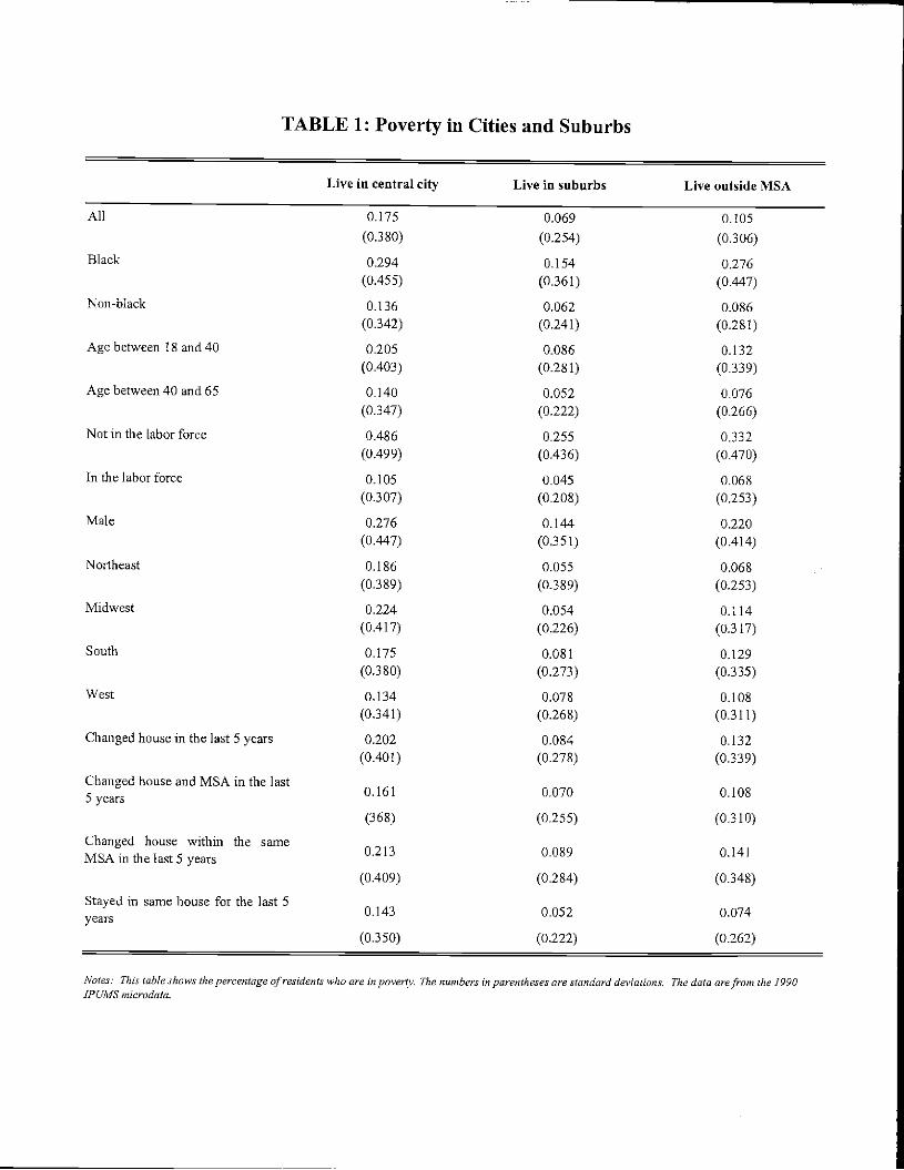
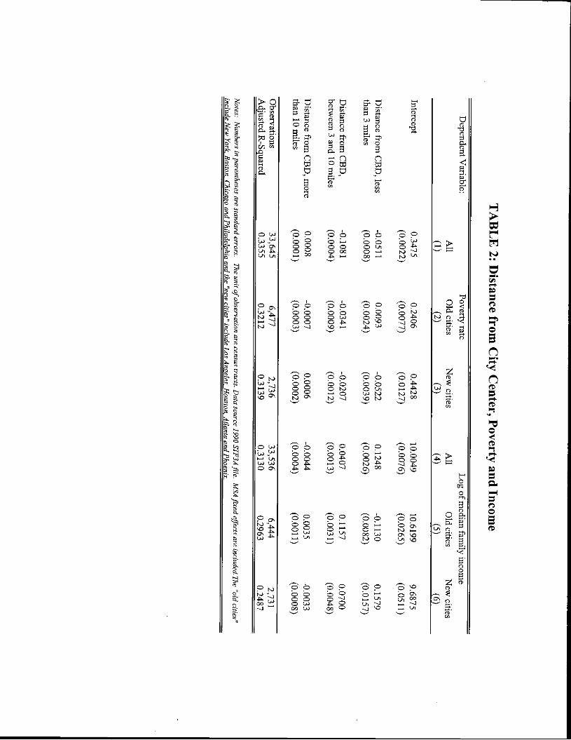
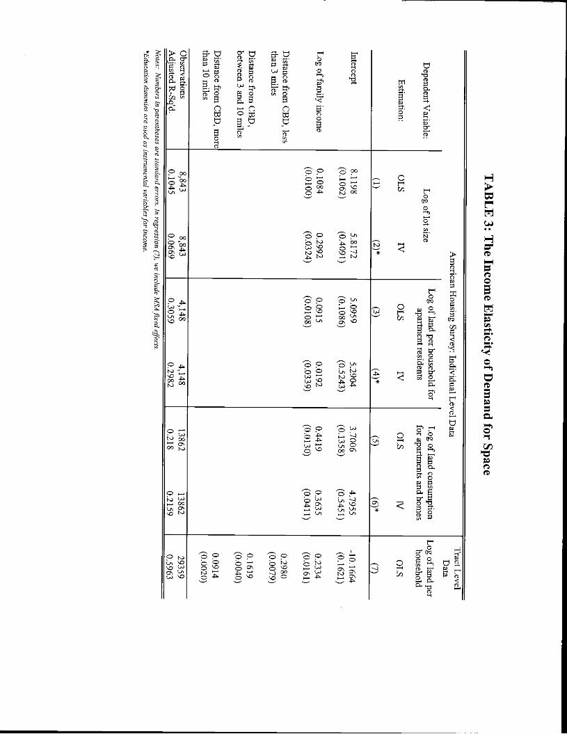
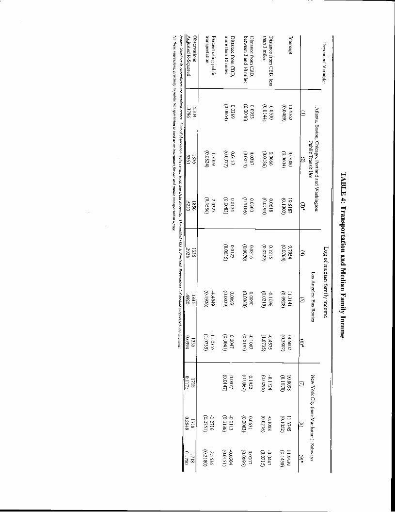
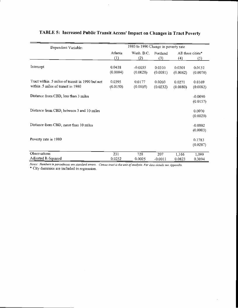
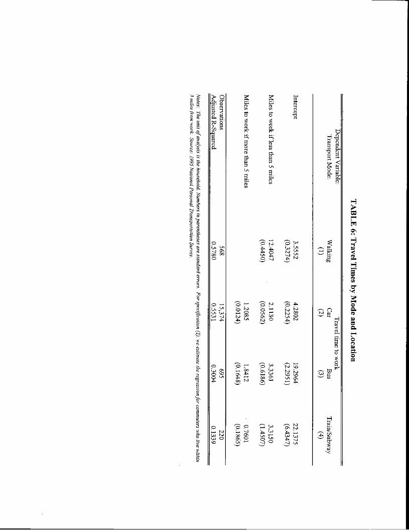
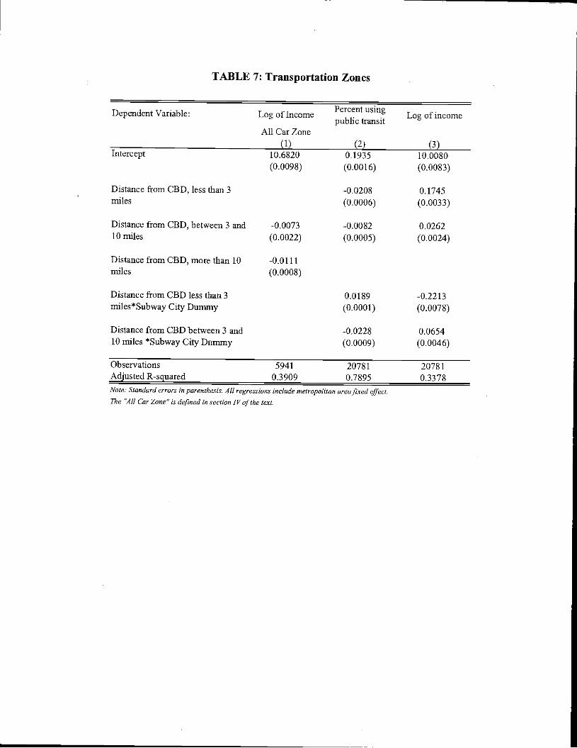
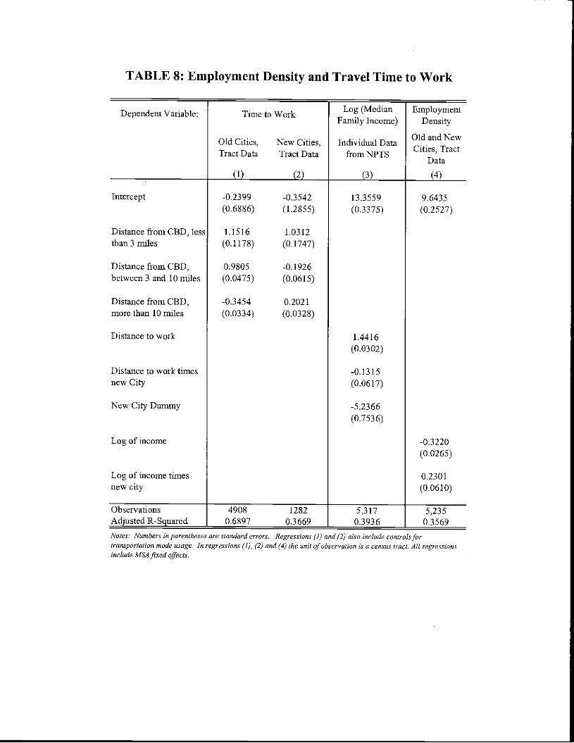


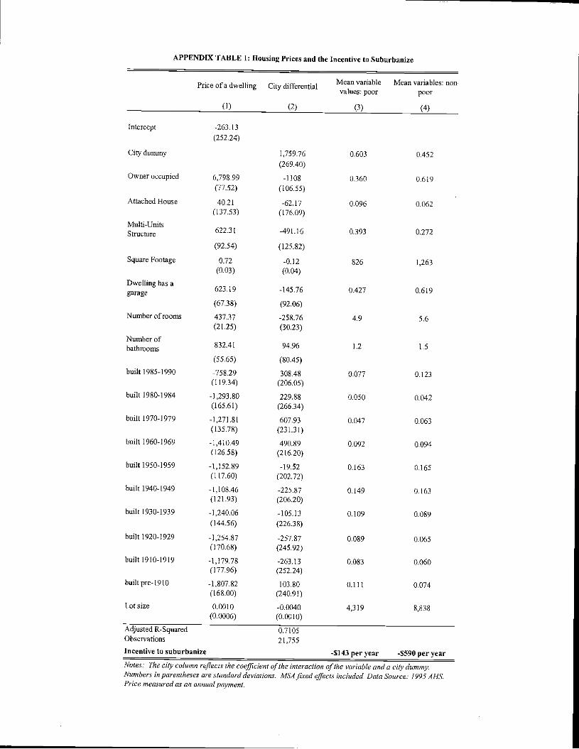

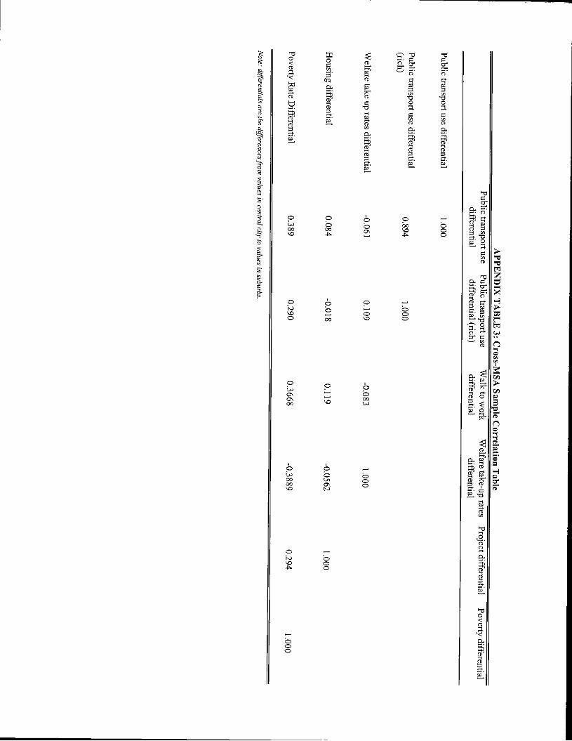
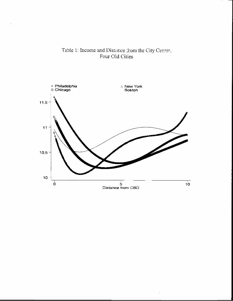
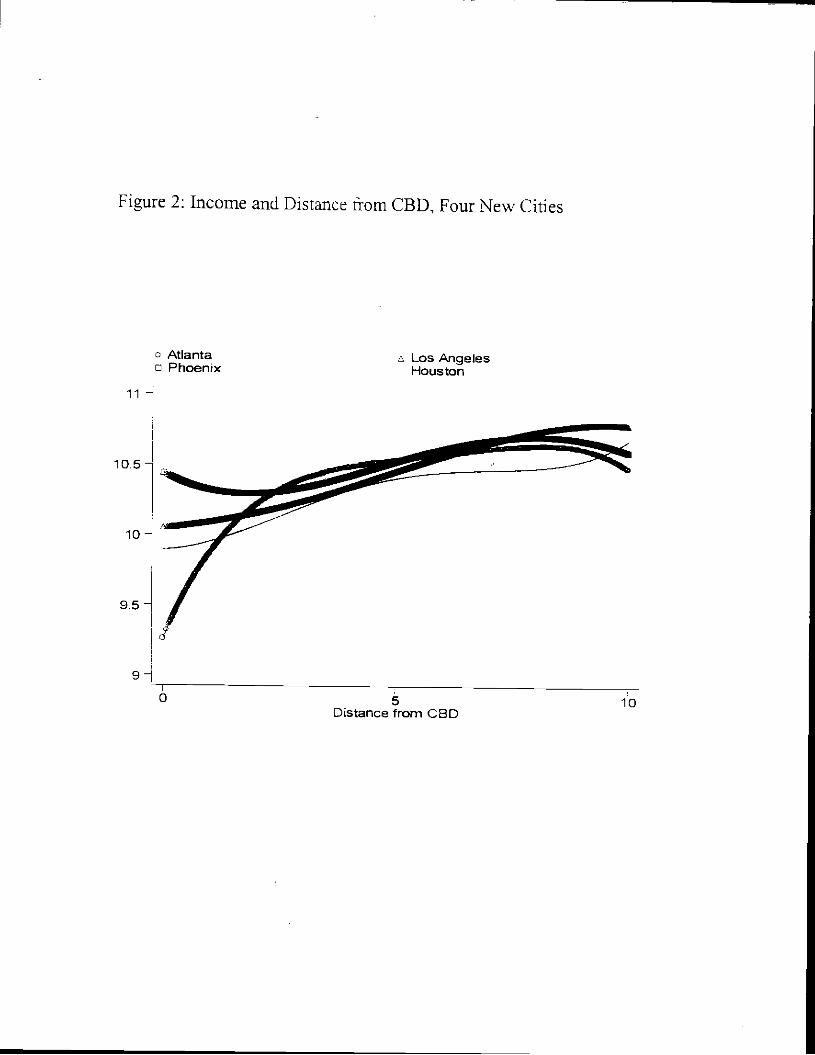
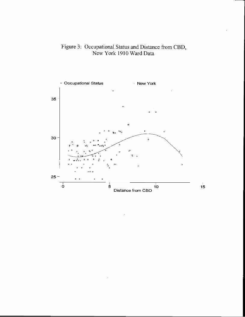
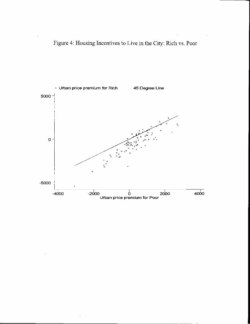
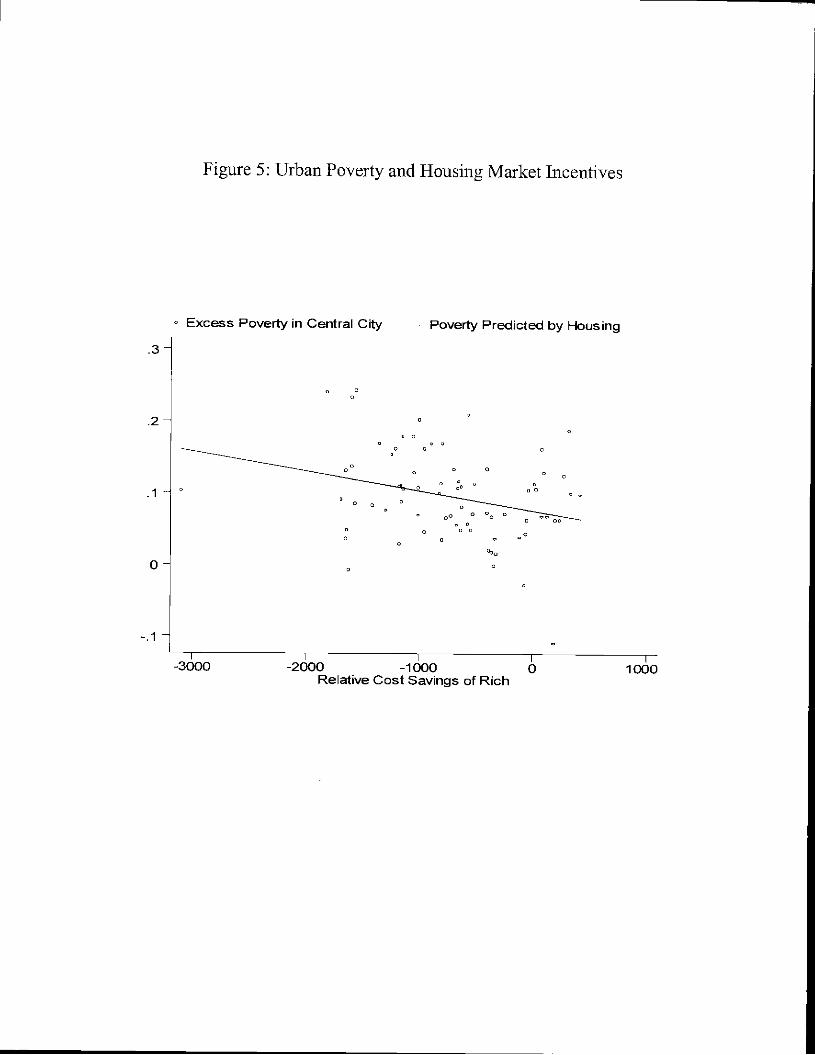
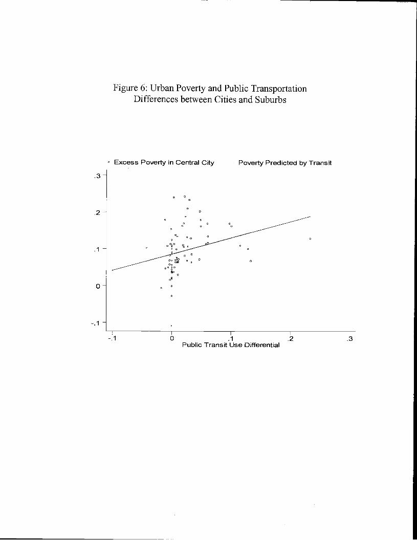

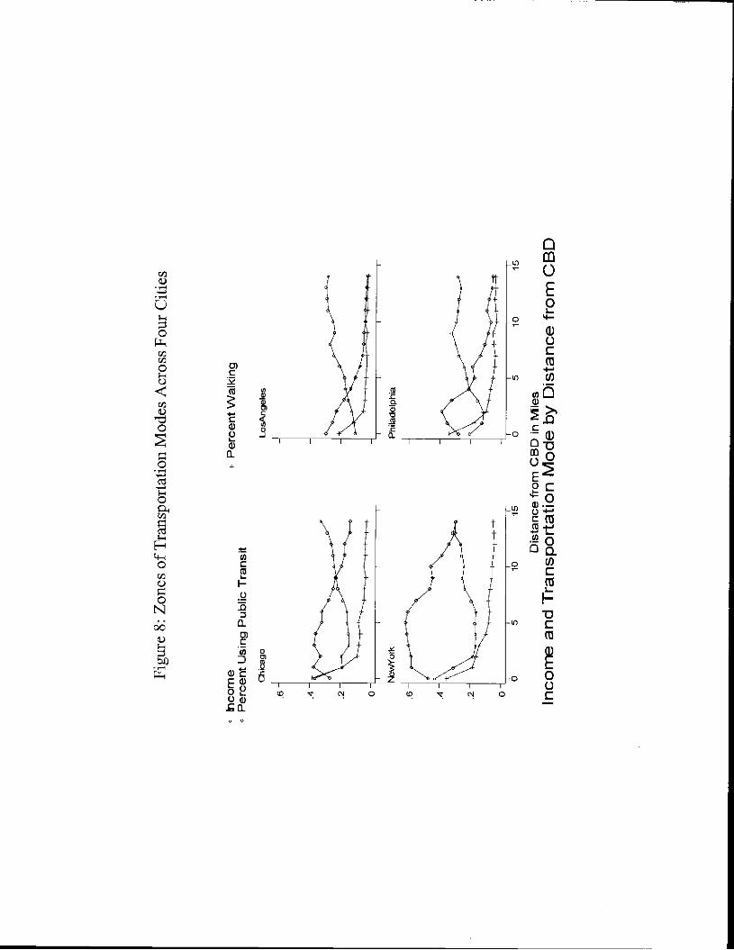


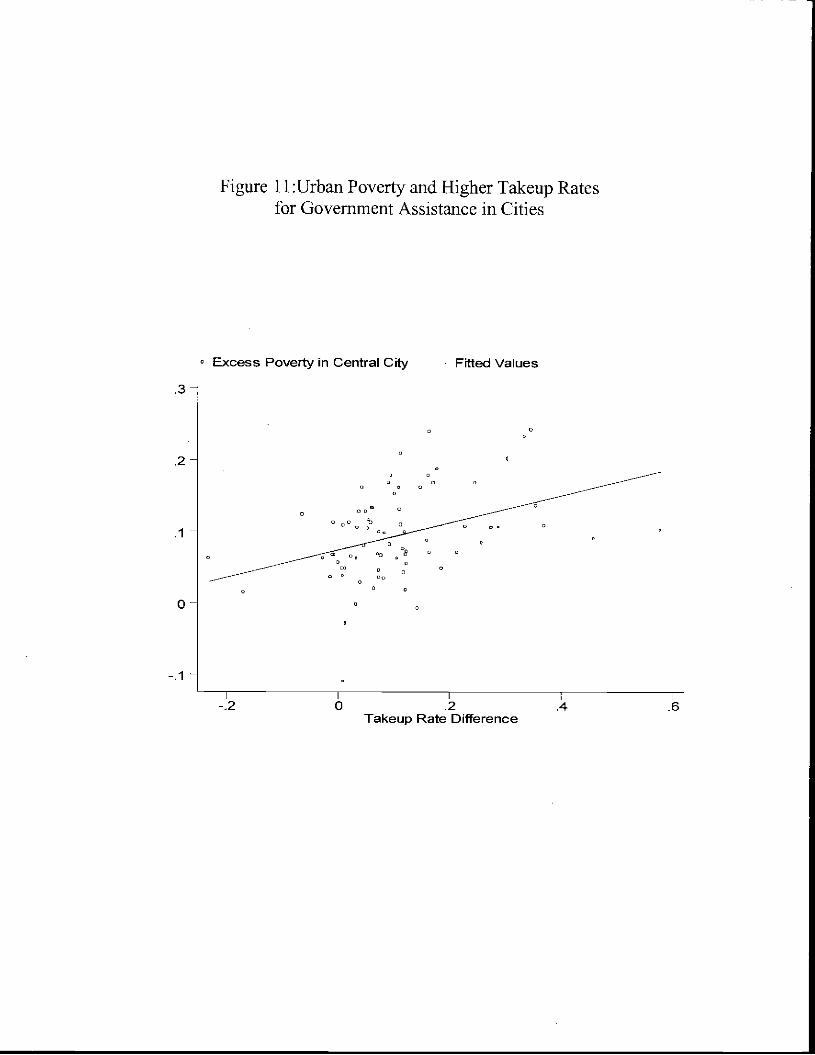


![Why Poor Live in Inner Cities [Math Based]](https://static.documents.pub/doc/80x56/577ccf9b1a28ab9e7890277d/why-poor-live-in-inner-cities-math-based.jpg)