26
World Population Dynamics EXA106 now has 10 of these people.
| Date post: | 22-Dec-2015 |
| Category: |
Documents |
| Upload: | merryl-doris-allen |
| View: | 213 times |
| Download: | 0 times |

World Population Dynamics
EXA106 now has 10 of these people.

The Population Explosion

Population Explosion—a recent event
• Last 200 years or less for MDCs – Industrial Revolution– Improvement in sanitation and medicine
• Last 50 years or less for LDCs– Transfer of technology, i.e. medical,
agricultural (Green Revolution)

Frequency of Vital Events: The Population Clock
• Population Clockhttp://www.census.gov/main/www/popclock.html
• Vital Events (per time unit)http://www.census.gov/cgi-bin/ipc/pcwe
• The global population reached 6 billion in fall of 1999

Rates of Global Pop. Changeuse: International Data Base http://www.census.gov/ipc/www/idbnew.html,
then Online Demographic Aggregation
• CBR (crude birth rate) = number of births per 1000 population– 1990: 24 Today: 21.3
• CDR (crude death rate) = number of deaths per 1000 population– 1990: 9 Today: 8.93
• growth rate = birth rate - death rate (often in %)– 1990: 1.5% Today: 1.3%– growth rates have come down

Beginning Population
Plus Births
Minus Out-Migrants
Minus Deaths
Plus In-Migrants
Ending Population
Population Change

POPULATION STRUCTUREThe population pyramid displays the age
and sex structure of a country or given area
Population inFive Year
Age bands
Usually, but not always,In % to make for easier
comparisonsbetween countries
OLD DEPENDANTS
ECONOMICALLYACTIVE
YOUNG DEPENDANTS
FEMALESTo the rightMALES
To the left

What Population Pyramids Show Us
KEY
slope of pyramid indicate the death rate
width of the base is related to birth rate/fertility rate
proportions of men and women can suggest male or female migrations
height of graph can indicate life expectancy (ignore the very thin end of the wedge as occurs on graph B as these people are a definite minority)
"kinks" indicate dramatic reductions in birth rate or increases in death rate in the past
area of graph indicates total population - compare areas of differentpopulation age groups or different sex on one graph
The overall shape of the population pyramid can indicate whether it is an Economically More Developed Country or Economically Less Developed Country
Economically More Developed Country
Economically LessDeveloped Country

Population Pyramids related to the Demographic Transition Model
Stage 1 Stage 2 Stage 3 Stage 4
Both birth rates andDeath rates areHigh, so populationgrowth rates are slow but populationIs usually restoredDue to high birth Rate. Short lifeExpectancy
EXAMPLESScotland before 1760New GuineaRemote parts ofAmazonia
Population startsto grow at anexponential rate due to fall in Crude Death Rate. More living In middle age.Life expectancy risesInfant mortality rate falls.
EXAMPLES
Scotland 1760 - 1830Republic of Congo
Population continuesto grow but at slowerrate. Low C Death Rate.Dramatically decliningCrude Birth Rate.
EXAMPLESScotland 1870 -1950Algeria, TunisiaMorocco
IMPLICATIONS IMPLICATIONS IMPLICATIONS IMPLICATIONS
Low Crude Birth Rate and Crude Death RateHigher dependancy ratioand longer life expectancyCrude Death Rate does Rise slightly because ofThe ageing population
EXAMPLES
Scotland today.Japan, USA
There is some merit in including or considering a Stage 5 today with a declining population

Population Pyramid of Mexico, 2000
-6 -4 -2 0 2 4 6
0-4
10-14
20-24
30-34
40-44
50-54
60-64
70-74
80-84
Millions
FemaleMale
11

Population Pyramid of Sweden, 2000
-350 -250 -150 -50 50 150 250 350
0-4
10-14
20-24
30-34
40-44
50-54
60-64
70-74
80-84
Thousands
FemaleMale
11

Population Pyramid
• Mexican pyramid
– Much wider base than the others.
– Beginning of transition.
– Rapidly growing population where the percentage of people under 15 years of age is high.
• Sweden’s pyramid
– Does not appear to be a pyramid at all.
– Youngest component is smaller than its middle-aged population and only slightly larger than its aged population.
– No-growth situation, since some deaths occur from all age groupings.
– Sweden has a higher death rate than Mexico.

Fast Growth

Slow Growth

Negative Growth

Birth Fluctuations & Age Structure
Source: PRB, Population Bulletin, V58, N4, p27.

Population Pyramid, Berlin 1946
-5 -4 -3 -2 -1 0 1 2 3 4 5
0-4
10-14
20-24
30-34
40-44
50-54
60-64
70-74
80-84
Percentage of the population
FemaleMale
11

Population Pyramid
• German pyramid– Shows the most extreme example of population
decline.– Vast difference between males and females in
the upper age groups.– Vast number of military casualties among the
population which fought the WWII.– Significant impacts in the post WWII labor
market.
11

Homework task:
Use the site below and others to collect data on the following:
Population Pyramids on the Webhttp://www.census.gov/ipc/www/idbpyr.html
•The Crude birth rate, death rate and population totals for two contrasting countries, one being a country in either stage 2/3 of the DTM and one in stage 5. (Try also to get predictive data if you can up until the year 2005) Once you have collected the data (remember to use advance searches on Google), either draw the graphs or print them off using a computer.•Mark on the different stages that the graphs show and add annotations to describe and explain the changes shown. Try and be as accurate as possible in your labeling (see UK graph as an example)•Using the site above, copy three population pyramids for a range of year (probably 1980, present and the predictive 2050) and place them in the correct locations on the graph. If possible try and find the pyramid that shows the impact of HIV, for your stage 2/3 country.•Now add labels to your pyramid similar to what you did in class.
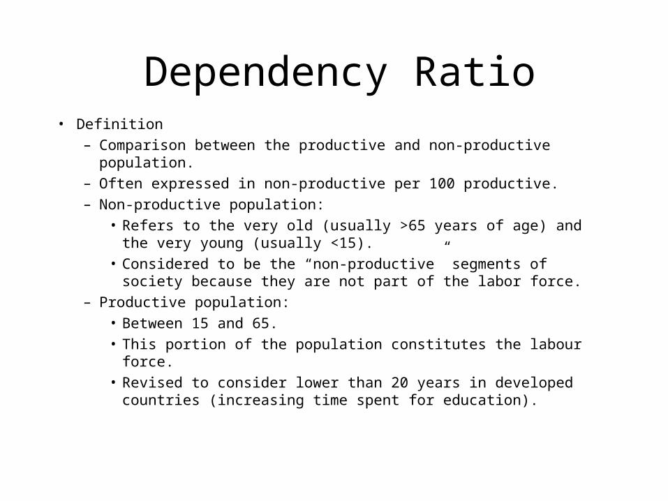
Dependency Ratio• Definition
– Comparison between the productive and non-productive population.
– Often expressed in non-productive per 100 productive.
– Non-productive population:
• Refers to the very old (usually >65 years of age) and the very young (usually <15).
• Considered to be the “non-productive” segments of society because they are not part of the labor force.
– Productive population:
• Between 15 and 65.
• This portion of the population constitutes the labour force.
• Revised to consider lower than 20 years in developed countries (increasing time spent for education).

Dependency Ratio• Implications
– Society incurs costs in supporting its dependent population.– Old age generates social costs:
• Retirement benefits.• Increased medical expenditures.• USA: 12% of the population over 65 accounting for 60% of health care costs.• Greater consumption of other social services.
– Youths:• Some medical costs.• Great expenditures for education.
– National budgets often reflect these expenditures.– Linked with the population pyramid:
• Pyramidal distributions have high dependency ratios.• “Rectangular” distributions have high dependency ratios.• Transitional pyramids have low dependency ratios.
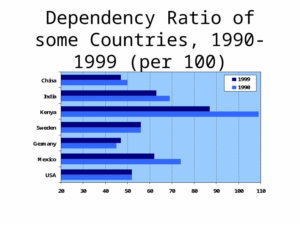
Dependency Ratio of some Countries, 1990-1999 (per 100)
20 30 40 50 60 70 80 90 100 110
USA
Mexico
Germany
Sweden
Kenya
India
China 1999
1990

Dependency Ratio
• Aging
– Major shift in health issues.
– 1995: 380 million people aged 65 years and above.
– 2020: over-65 population is projected to increase globally by 82%, to more than 690 million.
– For every baby born today in an industrialized country, there are 10 people aged 65 or over.
– By the year 2020 there will be 15 such elderly persons for each newborn.
– In developing countries, the ratio today is 2 people over 65 for every newborn, and 4 for every newborn by 2020.

Population 60 and Over, Industrial and Developing Countries, 1950-95, With
Projections to 2050
0
200
400
600
800
1000
1200
1400
1600
Developing countries
Developed countries

Percentage of the Population between 15 and 65, 2000
Less than 50.00
50.01 - 55.00
55.01 - 58.00
58.01 - 60.00
60.01 - 65.00
More than 65.00
NA

Dependency Ratio
• Impacts– Social security costs.– Medical costs and the medical industry at large.– Public sector funds such as the federal budget.– Goods and services used by the elderly experience
increasing demand levels.– Those used by the young and/or middle aged will
decline in relative importance.– Local impacts (school districts).


