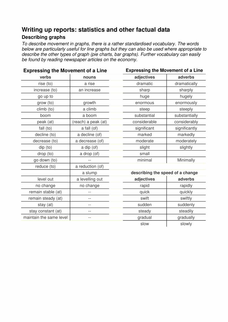
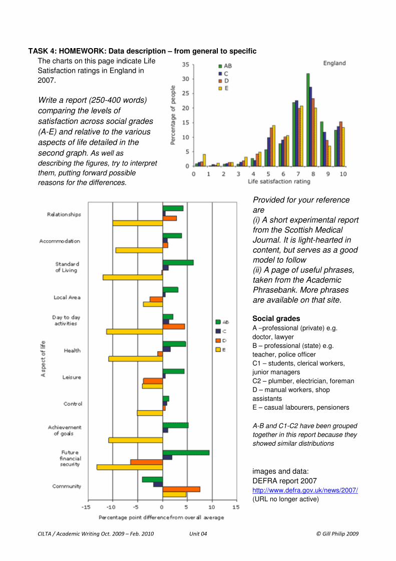
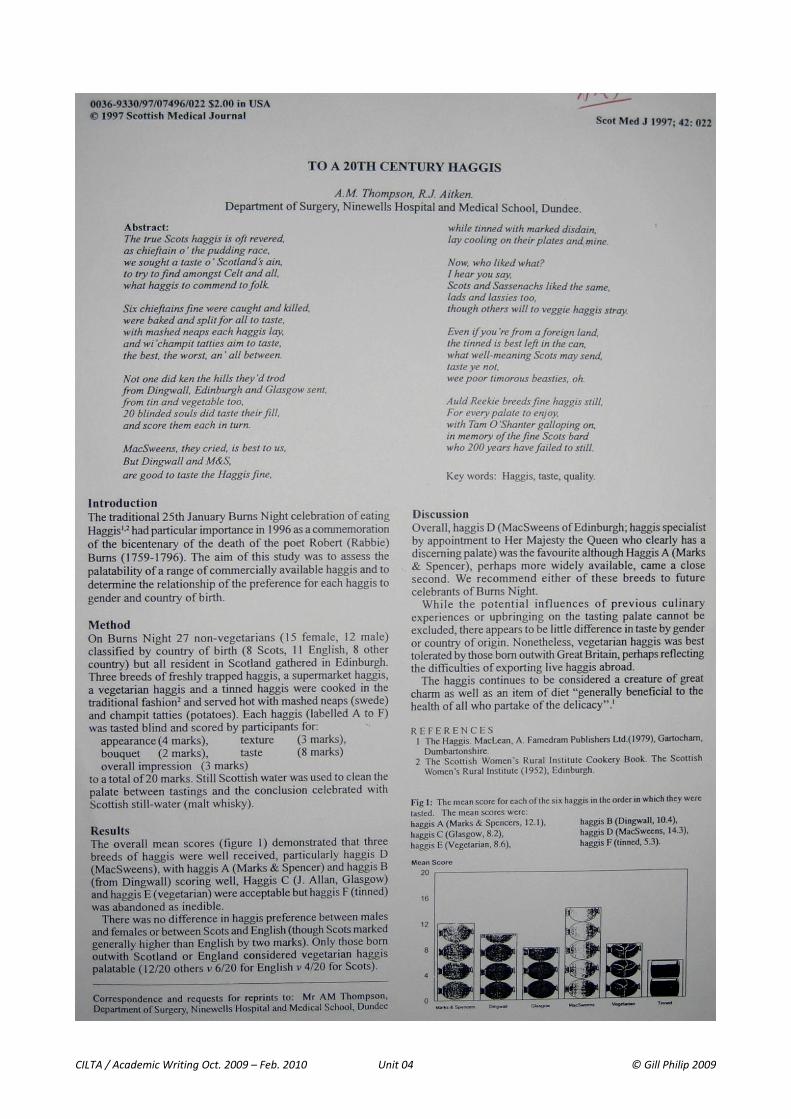
Writing up reports: statistics and other factual data Describing graphs To describe movement in graphs, there is a rather standardised vocabulary. The words below are particularly useful for line graphs but they can also be used where appropriate to describe the other types of graph (pie charts, bar graphs). Further vocabulary can easily be found by reading newspaper articles on the economy. Expressing the Movement of a Line Expressing the Movement of a Line verbs nouns adjectives adverbs rise (to) a rise dramatic dramatically increase (to) an increase sharp sharply go up to huge hugely grow (to) growth enormous enormously climb (to) a climb steep steeply boom a boom substantial substantially peak (at) (reach) a peak (at) considerable considerably fall (to) a fall (of) significant significantly decline (to) a decline (of) marked markedly decrease (to) a decrease (of) moderate moderately dip (to) a dip (of) slight slightly drop (to) a drop (of) small go down (to) -- minimal Minimally reduce (to) a reduction (of) a slump describing the speed of a change level out a levelling out adjectives adverbs no change no change rapid rapidly remain stable (at) -- quick quickly remain steady (at) -- swift swiftly stay (at) -- sudden suddenly stay constant (at) -- steady steadily maintain the same level -- gradual gradually slow slowly
Transcript
Writing up reports: statistics and other factual data Describing graphs
To describe movement in graphs, there is a rather standardised vocabulary. The words below are particularly useful for line graphs but they can also be used where appropriate to describe the other types of graph (pie charts, bar graphs). Further vocabulary can easily be found by reading newspaper articles on the economy.
Expressing the Movement of a Line Expressing the Movement of a Line
verbs nouns adjectives adverbs
rise (to) a rise dramatic dramatically
increase (to) an increase sharp sharply
go up to huge hugely
grow (to) growth enormous enormously
climb (to) a climb steep steeply
boom a boom substantial substantially
peak (at) (reach) a peak (at) considerable considerably
APPENDIX: language for describing and writing up data
http://www.phrasebank.manchester.ac.uk/
Reference to aim/method To assess X, the Y questionnaire was used. Changes in X and Y were compared using ...... The average scores of X and Y were compared in order to ...... The correlation between X and Y was tested. Simple statistical analysis was used to ......
Location and summary statements:
Table 1
Figure 1 The table below The pie chart above
shows
compares presents provides
the experimental data on X. the results obtained from the preliminary analysis of X. the intercorrelations among the nine measures of X. some of the main characteristics of the the breakdown of
As shown in Figure 12.1,
As can be seen from the table (above), It can be seen from the data in Table 12.1 that From the graph above we can see that From the data in Figure 9, it is apparent that
the X group reported significantly more Y than the
other two groups.
Highlighting significant data in a table/chart It is apparent from this table/graph/chart/histogram that... This table is quite revealing in several ways. First, unlike the other tables... Data from this table can be compared with the data in Table # which shows ........... In Fig.10 there is a clear trend of decreasing ......
Statements of result (positive) Strong evidence of X was found when ...... On average, Xs were shown to have ...... The mean score for X was ...... A positive correlation was found between X and Y. Further analysis showed that ......
Statements of result (negative) No significant differences were found between ..... No increase in X was detected. No difference greater than X was observed. The Chi-square test did not show any significant differences between ......
Highlighting significant, interesting or surprising results The most striking result to emerge from the data is that ...... Interestingly, this correlation is related to ..... The single most striking observation to emerge from the data comparison was ......
Reporting results from questionnaires and interviews The majority of Over/Approximately half of 70% of Almost two-thirds (64%) of A small number of
respondents those who responded those surveyed the participants those interviewed
felt that .... reported that ... indicated that... suggested that... did not comment on...
Of the # patients who completed the questionnaire
Of the study population,
just over half # subjects
indicated that ....... completed and returned the questionnaire.