79
BASIC GUIDELINES 1 BASIC GUIDELINES Würth Corporate Design

Basic guidelines 1
Basic guidelinesWürth Corporate Design
Basic guidelines 2
Foreword
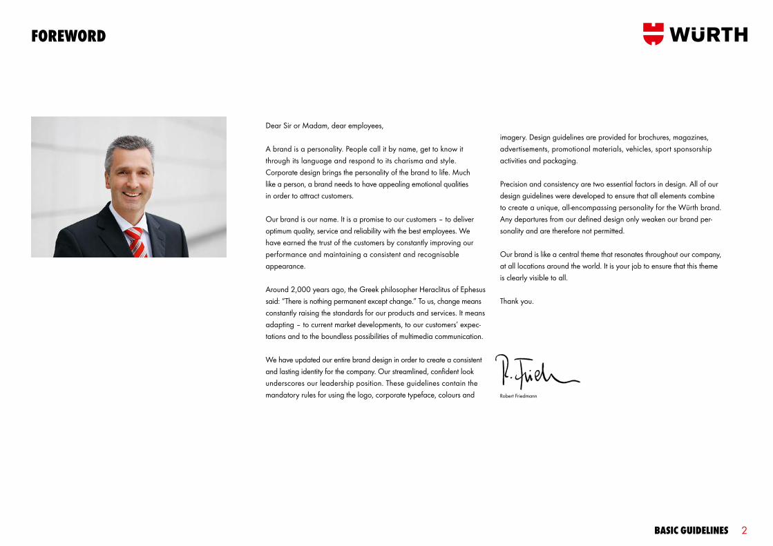
Dear Sir or Madam, dear employees,
A brand is a personality. People call it by name, get to know it through its language and respond to its charisma and style. Corporate design brings the personality of the brand to life. Much like a person, a brand needs to have appealing emotional qualities in order to attract customers.
Our brand is our name. It is a promise to our customers – to deliver optimum quality, service and reliability with the best employees. We have earned the trust of the customers by constantly improving our performance and maintaining a consistent and recognisable appearance.
Around 2,000 years ago, the Greek philosopher Heraclitus of Ephesus said: “There is nothing permanent except change.” To us, change means constantly raising the standards for our products and services. It means adapting – to current market developments, to our customers’ expec - tations and to the boundless possibilities of multimedia communication.
We have updated our entire brand design in order to create a consistent and lasting identity for the company. Our streamlined, confident look underscores our leadership position. These guidelines contain the mandatory rules for using the logo, corporate typeface, colours and
imagery. Design guidelines are provided for brochures, magazines, advertisements, promotional materials, vehicles, sport sponsorship activities and packaging.
Precision and consistency are two essential factors in design. All of our design guidelines were developed to ensure that all elements combine to create a unique, all-encompassing personality for the Würth brand. Any departures from our defined design only weaken our brand per-sonality and are therefore not permitted.
Our brand is like a central theme that resonates throughout our company, at all locations around the world. It is your job to ensure that this theme is clearly visible to all.
Thank you.
Robert Friedmann
Basic guidelines 3
1. inTroducTion2. Brand mark3. colours4. TYPograPHY5. grid/laYouT PrinciPle6. imagerY
conTenTs
7. Brand arcHiTecTure 8. inserTs 9. TaBles and cHarTs 10. TecHnical illusTraTions 11. FasTY

Basic guidelines 4
1. inTroducTion
all guidelines aT a glance
corPoraTe design inTerPlaY oF guidelines
Basic guidelinesWürth Corporate Design
PrinT media andsales PromoTion
Würth Corporate Design
DESINFEKTIONSMITTELDISINFECTANT AGENT
Adolf Würth GmbH & Co. KG74650 Künzelsau, GermanyT +49 (0)7940 15-0F +49 (0)7940 15-1000www.wuerth.com Art. 0613 640 37 5L
PFLEGEN, REINIGEN, ENTFERNEN | MAINTENANCE, CLEANING, REMOVING | PFLEGEN, REINIGEN, ENTFERNEN | MAINTENANCE, CLEANING, REMOVING
FEINSTAUBMASKENPARTICULATE RESPIRATOR
FEINSTAUBMASKENPARTICULATE RESPIRATOR
20 VE/St.
Art. 0613 640 37
FEINSTAUBMASKENPARTICULATE RESPIRATOR
PACKAGINGWürth Corporate Design
veHicle Branding
Würth Corporate Design
PromoTional maTerials
Würth Corporate Design
sTaTionerYWürth Corporate Design
INDOOR AND OUTDOOR DESIGN
Würth Corporate Design
SIGNAGE 1
SIGNAGEWürth Corporate Design
The Basic Guidelines describe the basic elements of our corporate design and provide a general overview of the rules that apply to all media. Detailed rules and specifications are provided in our media-specific guidelines.

Basic guidelines 5
1. inTroducTion visual idenTiTY
würTH variFix
10 / 11
Dem Feuer Grenzen setzen.Lorem ipsum dolor sit amet, consetetur sadipscing elitr, sed diam nonumy eirmod tempor invidunt ut labore et dolore magna aliquyam erat, sed diam voluptua. At vero eos et accusam et justo duo amet. Lorem ipsum dolor sit amet, consetetur sadipscing elitr, sed diam nonumy eirmod tempor invidunt ut labore et dolore ma-gna aliquyam erat, sed diam.
Adolf Würth GmbH & Co. KG · 74650 Künzelsau · Telefon 07940 15-0 · Telefax 07940 15-1000 · [email protected] · www.wuerth.de
JeTzT graTisinfomaterial anfordern: Brandschutz service Hotline: 0800/1813900oder per [email protected]
ProFiexPress
05/2010
pro Set in Euro
299,-Poliermaschienen-SetArt.-Nr. 070245201 • Poliermaschine PM 250-E• Polierteller-Set, 125 mm • Polierpad, orange
Mehr Informationen auf Seite 4
PROFINewsAngebot des Monats August 2009
Mehr Informationen aud Seite 4
neu!Gratis Lorem ipsum dolor
Würth construction10 / 11
An/To: Hans MustermannCc : Bernd Beispiel, Erika Exempel, Sarah SampleFirma/Company: MusterfirmaFax-Nr./Fax-No.: +49 211 123456
Von/Our ref.: Prof. Dr. Markus Ipsum-MustermannFax-Nr./Fax-No.: +49 7940 15 - 5678Tel.-Nr./Tel-No.: +49 7940 15 - 1234E-Mail: [email protected]
Datum/Date: Künzelsau, 00.00.2010Seiten: 01
FAX
Adolf Würth GmbH & Co. KG · 74650 Künzelsau · T +49 7940 15 - 0 · F +49 7940 15 -1000 · [email protected] · www.wuerth.de Hausanschrift: Reinhold-Würth-Straße 12 –17 · 74653 Künzelsau-Gaisbach · Sitz Künzelsau, Amtsgericht Stuttgart HRA 590261 Komplementärin: Würth-Verwaltungsgesellschaft mbH, Sitz Künzelsau, Amtsgericht Stuttgart HRB 590135 Geschäftsführer: Jürgen Graf, Norbert Heckmann, Bernd Herrmann, Uwe Hohlfeld, Thomas Klenk, Andreas Kräutle, Volker Retz, Martin Schäfer, Prof. Dr. Harald Unkelbach
Faxnachricht: Wuerth Book/Bold Lorem Ipsum
Sehr geehrte Damen und Herren,
lorem ipsum dolro sit amet adisciping enit nostrud dolulate lorem deliIrila dolor adionasas enit acidu-isit nostrud dolutate faci bla conulla comm odolo es tatumi est nulputat elisl ut nonullas fequi vent sit amet lorem ipsum. Iriladolor adionasas enit aciduisitnostrud do lutate faci bla conulla comm odolo es quis, cortin fadu iuscilit wiscilit lamconullamasasen.
Vent aut wisismo dolesti onsequis augue tatum duisit nostrud dolutate faci bla conulla comm odolo es tatumi estulputat elislut nonullas feum ametuericid dolesequat luptat nullamc onse qmai met, sed te magna conse eugue est deliqui psummod exer sendipi smodip etestioin.
Mit freundlichen Grüßen
Markus Ipsum-Muster
Zeichen/Abteilung 123/abc
T +49 7940 15-1234F +49 7940 [email protected]
Künzelsau, 00.00.2010
Adolf Würth GmbH & Co. KG · 74650 Künzelsau
Herrn Alois MustermannFirma BeispielBeispiel-Industriegebiet Schneidergasse 1333378 Musterstadt
Adolf Würth GmbH & Co. KG · 74650 Künzelsau · T +49 7940 15 - 0 · F +49 7940 15 -1000 · [email protected] · www.wuerth.de Hausanschrift: Reinhold-Würth-Straße 12 –17 · 74653 Künzelsau-Gaisbach · Sitz Künzelsau, Amtsgericht Stuttgart HRA 590261 Komplementärin: Würth-Verwaltungsgesellschaft mbH, Sitz Künzelsau, Amtsgericht Stuttgart HRB 590135 Geschäftsführer: Jürgen Graf, Norbert Heckmann, Bernd Herrmann, Uwe Hohlfeld, Thomas Klenk, Andreas Kräutle, Volker Retz, Martin Schäfer, Prof. Dr. Harald Unkelbach
Standardbrief: Betreffzeile Lorem ipsum
Sehr geehrte Damen und Herren,
lorem ipsum dolro sit amet adisciping enit nostrud dolulate lorem deliIrila dolor adionasas enit acidu-isit nostrud dolutate faci bla conulla comm odolo es tatumi est nulputat elisl ut nonullas fequi vent sit amet lorem ipsum. Iriladolor adionasas enit aciduisitnostrud do lutate faci bla conulla comm odolo es tatumi esultat elislut nonullas feufeum ametueri ciduntla faaccum endiamaas, mari quamasti nonsequis, cortin fadu iuscilit wiscilit lamconullamasasen.
Vent aut wisismo dolesti onsequis augue tatum duisit nostrud dolutate faci bla conulla comm odolo es tatumi estulputat elislut nonullas feum ametuericid dolesequat luptat nullamc onse qmai met, sed te magna conse eugue est deliqui psummod exer sendipi smodip etestioin.
Mit freundlichen Grüßen
Markus Ipsum-Muster
Prof. Dr. Markus Ipsum-MustermannMusterfunktion
Adolf Würth GmbH & Co. KG · 74650 KünzelsauT +49 7940 15 -1234 · F +49 7940 15 - 5678 M +49 170 1234567 [email protected] · www.wuerth.de
diligence. Fairness. HigH-qualiTY work.
cargo kamPanJe
Guaredisch ipsum Elitr, sed diam nonumy eirmod temnvidunt ut labore et dolore magna aliquyam erat diam voluptua. At vero eos et accusam et justo duo. dolores et ea rebum.
Dits consecetur Elitr, sed diam nonumy eirmod temnvidunt ut labore et dolore magna aliquyam erat diam voluptua.
nYHeT! Pilotjakkepr stk
498,-
INTERN BRIEFMitteilung für die Außendienst und Niederlassungsmitarbeiter Nr. 359 Ausgabe 11.08
GuaREdIsch sEd dENETuR Ipsuscil diat verosto diamcon Seite 27
LuTTEM IN VuLBuT Habis at denetur Seite 36
Ipsuscil diat verosto Lorm ipsum dolrosit guardisch neufumes.
KONTAKTINTERNDas Würth MitarbeitermagazinNr. 138 Ausgabe 03.09 Jahrgang 18
LOREm Ipsum Cenim vullut Seite 12
GuAREdIsch sEd dENETuR Ipsuscil diat verosto diamcon Seite 27
cOmmOLE pRAEs Habis at denetur Seite 36
min henit praestrud magnisim dit adionsequis nim iusto dolorpe
DER PARTNERDas Magazin für Würth Partner Kunden 01. März 2010
LoREm iPsum DoLoR stet clita kasd gubergren seite 27
siT AmET coNsETETuR stet clita kasd gubergren seite 28

Basic guidelines 6
1. inTroducTion visual idenTiTY

Basic guidelines 7
2. Brand mark
Basic guidelines 8
2. Brand mark
Basic guidelines 9
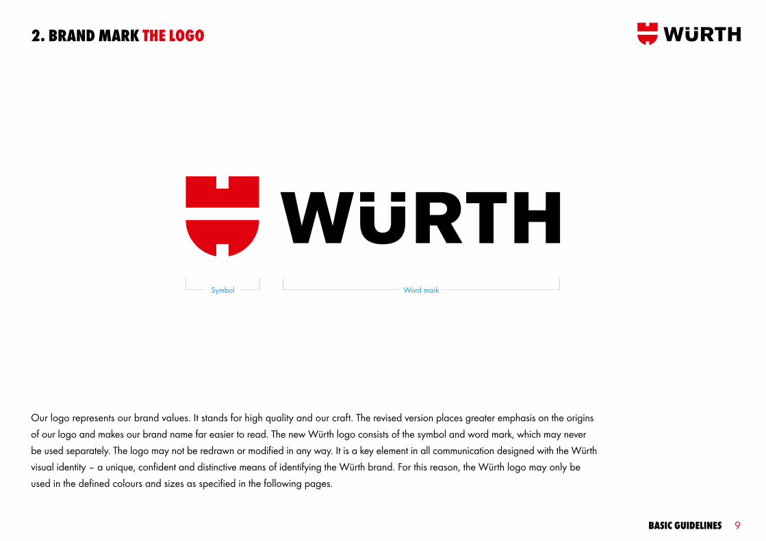
Our logo represents our brand values. It stands for high quality and our craft. The revised version places greater emphasis on the origins of our logo and makes our brand name far easier to read. The new Würth logo consists of the symbol and word mark, which may never be used separately. The logo may not be redrawn or modified in any way. It is a key element in all communication designed with the Würth visual identity – a unique, confident and distinctive means of identifying the Würth brand. For this reason, the Würth logo may only be used in the defined colours and sizes as specified in the following pages.
2. Brand mark THe logo
Symbol Word mark

Basic guidelines 10
Our preferred logo version is red and black on a white background because it can be used consistently in nearly all media. Its striking look promotes the recognition of the brand. This version is generally used in our communication. The reverse red and white version on a black background may be used on products, promotional items and clothing if necessary.
Preferred logo on a white background Red and white (reverse) logo on a black background. Used on black products, for example.
2. Brand mark colour versions
Basic guidelines 11
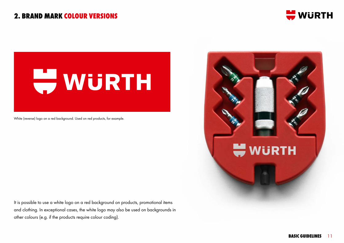
White (reverse) logo on a red background. Used on red products, for example.
2. Brand mark colour versions
It is possible to use a white logo on a red background on products, promotional items and clothing. In exceptional cases, the white logo may also be used on backgrounds in other colours (e.g. if the products require colour coding).
Basic guidelines 12
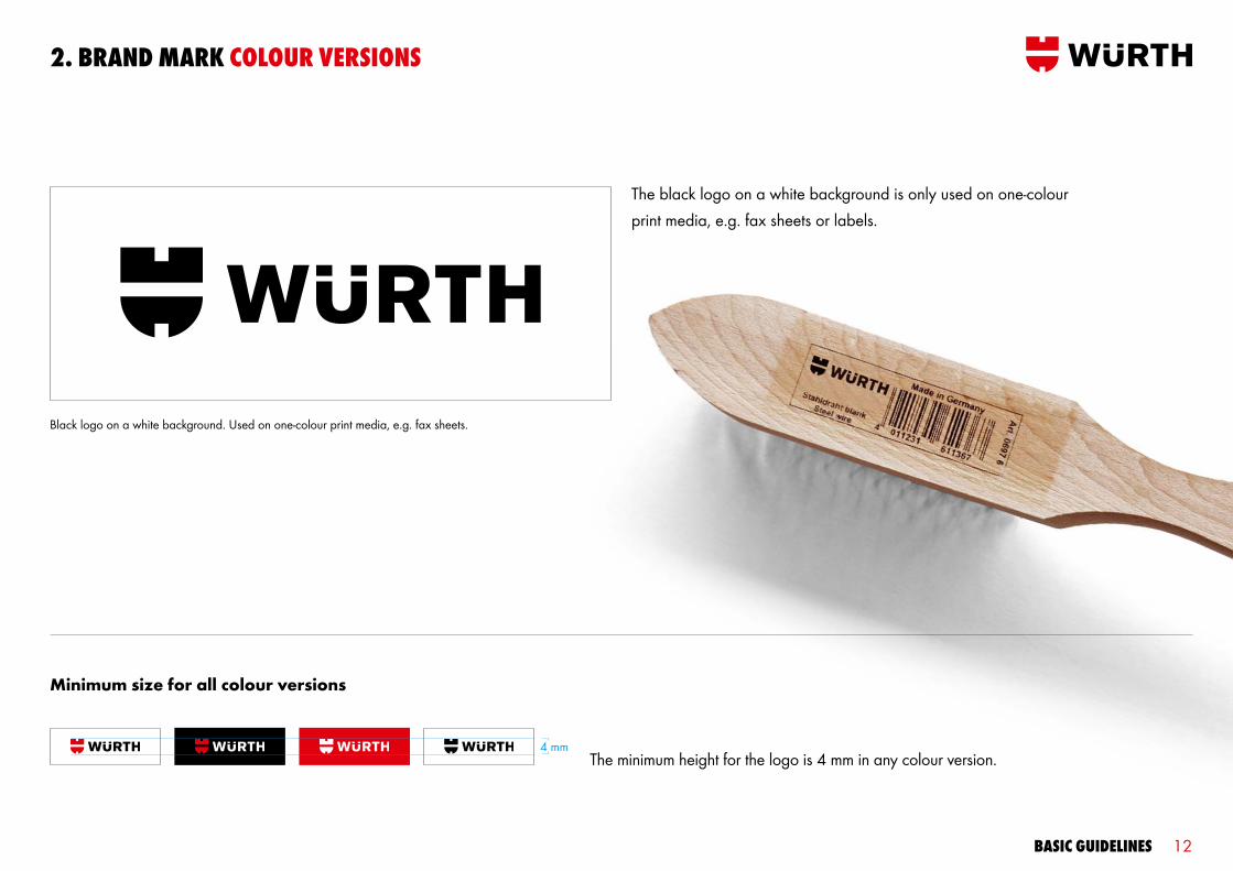
Black logo on a white background. Used on one-colour print media, e.g. fax sheets.
2. Brand mark colour versions
The black logo on a white background is only used on one-colour print media, e.g. fax sheets or labels.
The minimum height for the logo is 4 mm in any colour version.
Minimum size for all colour versions
4 mm
Basic guidelines 13
2. Brand mark sPecial versions
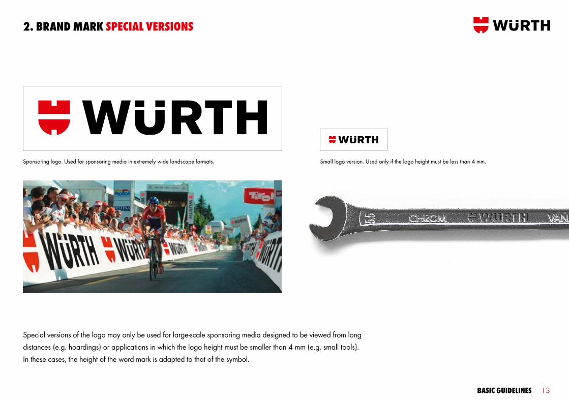
Special versions of the logo may only be used for large-scale sponsoring media designed to be viewed from long distances (e.g. hoardings) or applications in which the logo height must be smaller than 4 mm (e.g. small tools). In these cases, the height of the word mark is adapted to that of the symbol.
Sponsoring logo. Used for sponsoring media in extremely wide landscape formats. Small logo version. Used only if the logo height must be less than 4 mm.
Basic guidelines 14
2. Brand mark cenTred versions
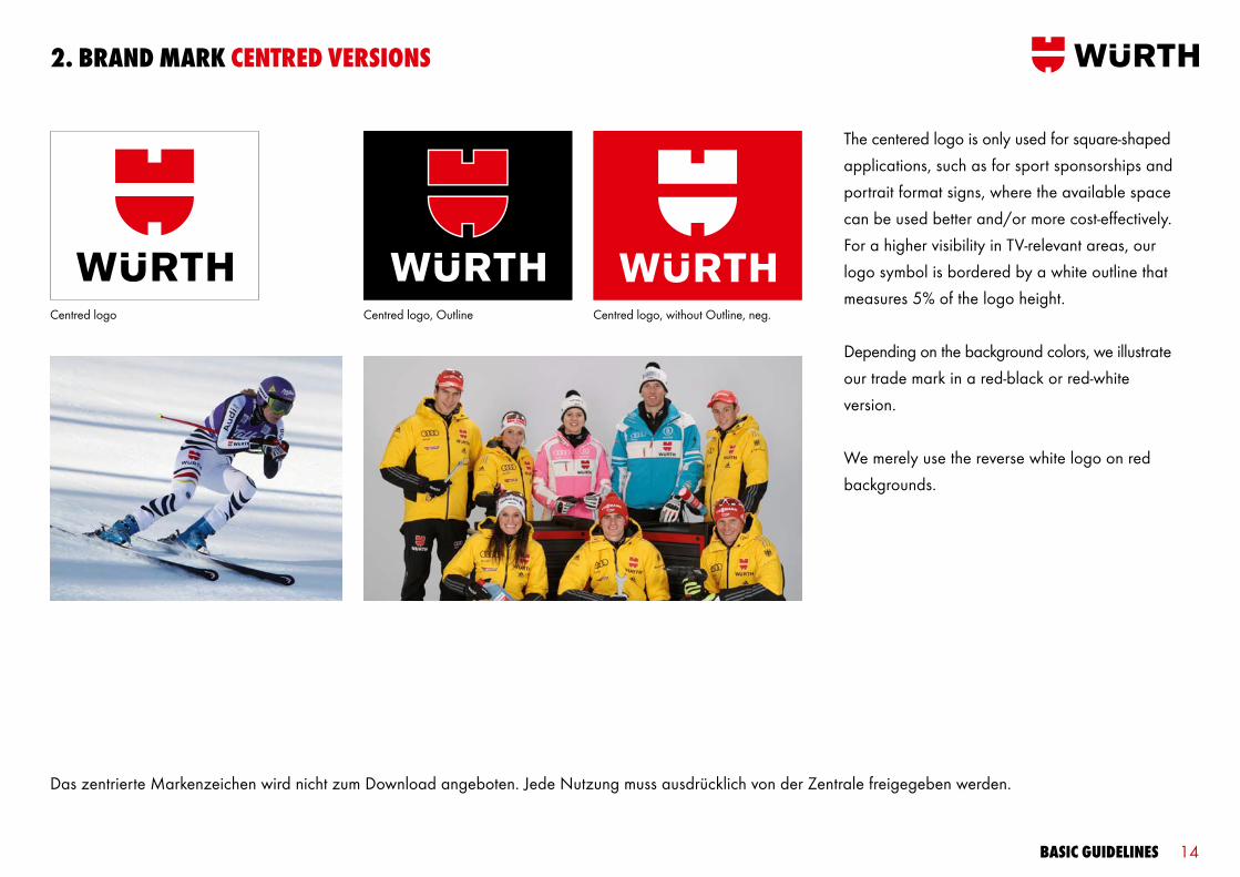
Das zentrierte Markenzeichen wird nicht zum Download angeboten. Jede Nutzung muss ausdrücklich von der Zentrale freigegeben werden.
The centered logo is only used for square-shaped applications, such as for sport sponsorships and portrait format signs, where the available space can be used better and/or more cost-effectively. For a higher visibility in TV-relevant areas, our logo symbol is bordered by a white outline that measures 5% of the logo height.
Depending on the background colors, we illustrate our trade mark in a red-black or red-white version.
We merely use the reverse white logo on red backgrounds.
Centred logo Centred logo, Outline Centred logo, without Outline, neg.
Basic guidelines 15
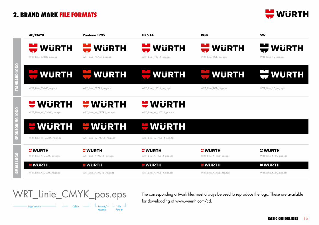
2. Brand mark File FormaTs
WRT_Linie_CMYK_pos.eps
WRT_Linie_CMYK_pos.eps WRT_Linie_P1795_pos.eps WRT_Linie_HKS14_pos.eps WRT_Linie_RGB_pos.eps WRT_Linie_1C_pos.eps
WRT_Linie_CMYK_neg.eps WRT_Linie_P1795_neg.eps WRT_Linie_HKS14_neg.eps WRT_Linie_RGB_neg.eps WRT_Linie_1C_neg.eps
4C/CMYK Pantone 1795 HKS 14 RGB SW
WRT_Linie_W_CMYK_neg.eps WRT_Linie_W_P1795_neg.eps WRT_Linie_W_HKS14_neg.eps
WRT_Linie_W_CMYK_pos.eps WRT_Linie_W_P1795_pos.eps WRT_Linie_W_HKS14_pos.eps
WRT_Linie_K_CMYK_neg.eps WRT_Linie_K_P1795_neg.eps WRT_Linie_K_HKS14_neg.eps WRT_Linie_K_RGB_neg.eps WRT_Linie_K_1C_neg.eps
WRT_Linie_K_CMYK_pos.eps WRT_Linie_K_P1795_pos.eps WRT_Linie_K_HKS14_pos.eps WRT_Linie_K_RGB_pos.eps WRT_Linie_K_1C_pos.eps
sTan
dard
logo
sPon
sori
ng lo
gosm
all l
ogo
The corresponding artwork files must always be used to reproduce the logo. These are available for downloading at www.wuerth.com/cd.
Logo version File format
Positive/negative
Colour

Basic guidelines 16
2. Brand mark File FormaTs
Zentriertes Logo ohne outline_1C_pos.eps
Zentriertes Logo ohne outline_CMYK_neg.eps
Ohne Outline Mit Outline
cenT
red
logo
Zentriertes Logo ohne outline_CMYK_pos.eps
Zentriertes Logo ohne outline_1C_neg.eps Zentriertes Logo outline_HKS14_pos.eps Zentriertes Logo outline_HKS14_pos.eps
Zentriertes Logo ohne outline_1C_neg.epsLogoversion Datei-
format Positiv/negativ
Outline Farbe

Basic guidelines 17
2. Brand mark PosiTion, size and Free sPace
Sample illustration, A4 portrait format (illustration size 50%)
When used in print media, the logo is always 12 grid units wide. It is positioned at the top right corner of the format, 2 grid units away from the top and right edges of the format.
No other elements may be positioned within the free space surrounding the logo. The free space measures 2 grid units to the left and 4 grid units below the logo.
The position and size of the logo are defined and may not be modified. Some media feature the logo in different sizes and positions. These specifications are explained in the corresponding guidelines.
2
4
22 12

Basic guidelines 18
Different sizes are used in certain media. These specifications are explained in the corresponding guidelines.
2. Brand mark size on diFFerenT FormaTs
DIN A4 DIN A5, DIN long and smaller DIN A3 DIN A2
Logo width (12 grid units):
42 mm 60 mm 84 mm 120 mm
Basic guidelines 19
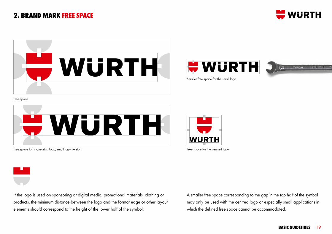
2. Brand mark Free sPace
If the logo is used on sponsoring or digital media, promotional materials, clothing or products, the minimum distance between the logo and the format edge or other layout elements should correspond to the height of the lower half of the symbol.
Free space
Free space for sponsoring logo, small logo version
A smaller free space corresponding to the gap in the top half of the symbol may only be used with the centred logo or especially small applications in which the defined free space cannot be accommodated.
Smaller free space for the small logo
Free space for the centred logo

Basic guidelines 20
2. Brand mark don’Ts
The brand mark is the strongest element we have to promote brand awareness and set ourselves apart from the competition. For this reason, it must be used consistently in all applications. The above examples show incorrect uses of the logo that must be avoided.
Don’t use other logo colours
Don’t change the distances between the elements
Don’t use a 3-D version on 2-D media
Don’t distort the logo
Don’t tilt the logo
Don’t use the symbol on its own
Don’t use the logo on a background image
Don’t use new logo versions Don’t use other logo proportions
Don’t use body type
Don’t use the word mark on its own
Basic guidelines 21
3. colours

Basic guidelines 22
3. colours
The corporate colour Würth Red gives our visual identity its charac-teristic appearance and is used extensively in all media. We use our primary colours, white, dark grey, grey and light grey, to comple-ment Würth Red. The interplay of the corporate colour and primary colours gives our corporate design a fresh and vibrant look.

Basic guidelines 23
3. colours
When combined, our colours convey the strength and quality of our brand and create our characteristic look. This is why it is essential that they be used consistently in all applications. Würth Red and our primary colours are used to create striking background areas. Würth Red, black and white are also used for typography. Our highlighting colours cyan and green are only used for inserts, tables and charts. To ensure that the colours always have a consistent appearance, the sRGB IEC 61966-1.2 profile should be used when creating or editing RGB files.
Würth Cyan Pantone Process CyanCMYK 100/0/0/0RGB 0/147/221Web 009EE0
Würth Green Pantone 390CMYK 22/0/100/8RGB 186/196/5 Web B9C900
Würth RedPantone 1795HKS 14CMYK 0/100/100/0RGB 204/0/0Web CC0000 RAL 3020
corPoraTe colour PrimarY colours
HigHligHTing colours
Würth BlackPantone Process BlackCMYK 0/0/0/100RGB 0/0/0Web 000000 RAL 9017
Würth Dark GreyPantone 424CMYK 0/0/0/70 RGB 96/93/92 Web 605D5C RAL 7043
Würth Grey Pantone 422CMYK 0/0/0/40RGB 149/149/149 Web 959595RAL 7042
Würth Light Grey Pantone 427CMYK 0/0/0/10RGB 222/222/222 Web DEDEDERAL 7047
Würth WhiteCMYK 0/0/0/0RGB 255/255/255 Web FFFFFF
Basic guidelines 24
4. TYPograPHY
Basic guidelines 25
4. TYPograPHY
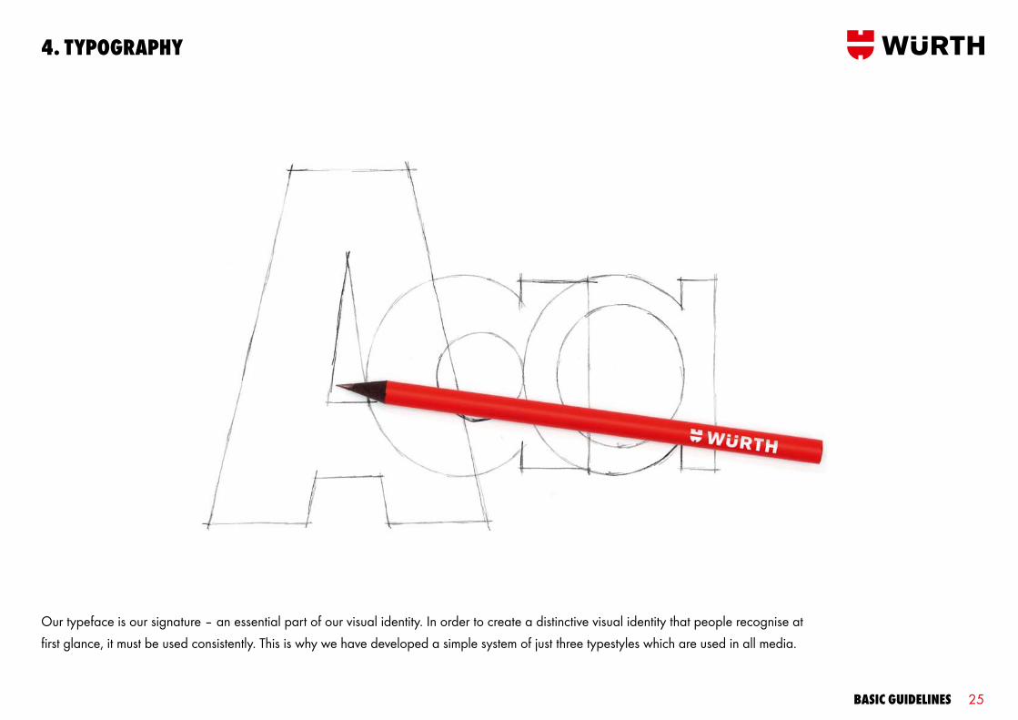
Our typeface is our signature – an essential part of our visual identity. In order to create a distinctive visual identity that people recognise at first glance, it must be used consistently. This is why we have developed a simple system of just three typestyles which are used in all media.

Basic guidelines 26
Wuerth Book
Wuerth Bold
wuerTH exTra Bold condaBcdeFgHiJklmnoPqrsTuvwxYz1234567890 For Headlines and TiTles
abcdefghijklmnopqrstuvwxyz1234567890 for toplines, sublines, subheadlines, highlighting and emphasis
abcdefghijklmnopqrstuvwxyz1234567890 for body copy, page numbers, table contents and margins
4. TYPograPHY THree TYPesTYles
Wuerth Extra Bold Cond is the powerful typeface we use for main headlines and titles. We use only the uppercase characters of this typeface, which people immediately recognise and associate with our brand. The Wuerth Book and Wuerth Bold typestyles are used for all other text elements. The streamlined, geometric shape of this typeface makes a simple, reliable and professional impression. All text elements are always left-aligned with a character spacing of 0.

Basic guidelines 27
4. TYPograPHY on diFFerenT colours
Würth Red
Light grey (10%)
Black (on products, packaging and images)
Grey (40%)
White
Dark grey (70%)
loremiPsum loremiPsum loremiPsumBody copy and headlines are white against a Würth Red background. Black can also be used for headlines. Duis autem vel eum iriure dolor in hendrerit in vulputate velit esse molestie consequat, vel illum dolore eu feugiat nulla.
loremiPsumBody copy and headlines are black against a light grey background. Würth Red can also be used for headlines. Duis autem vel eum iriure dolor in hendrerit in vulputate velit esse molestie consequat, vel illum dolore eu feugiat nulla.
loremiPsumBody copy and headlines are black against a grey background. White can also be used for headlines. Duis autem vel eum iriure dolor in hendrerit in vulputate velit esse molestie consequat, vel illum dolore eu feugiat nulla.
loremiPsumBody copy and headlines are set only in white against a dark grey background. Duis autem vel eum iriure dolor in hendrerit in vulputate velit esse molestie consequat, vel illum dolore eu feugiat nulla. Lorem ipsum sit dolor.
Body copy and headlines are white against a black background. Würth Red can also be used for headlines. Duis autem vel eum iriure dolor in hendrerit in vulputate velit esse molestie consequat, vel illum dolore eu feugiat nulla.
Body copy and headlines are black against a white background. Würth Red can also be used for headlines. Duis autem vel eum iriure dolor in hendrerit in vulputate velit esse molestie conse-quat, vel illum dolore eu feugiat nulla.
The Würth corporate and primary colours may be used as the backgrounds for typography. The type may be black, white or red only. The colour used for the headline is usually the same as the body copy. A second headline colour defined for each background colour may be used with the main headline colour. Exception: Only white type may appear on dark grey backgrounds.

Basic guidelines 28
5. grid/ laYouT PrinciPle
Basic guidelines 29
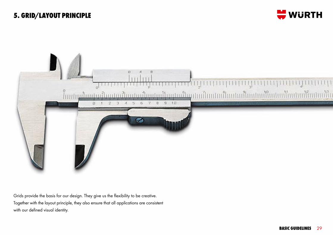
Grids provide the basis for our design. They give us the flexibility to be creative. Together with the layout principle, they also ensure that all applications are consistent with our defined visual identity.
5. grid/laYouT PrinciPle
Basic guidelines 30
5. grid/laYouT PrinciPle THe grid
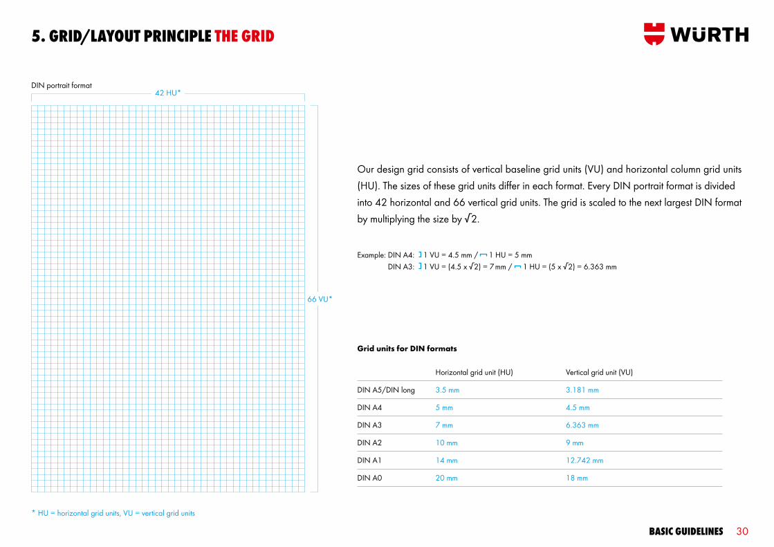
Our design grid consists of vertical baseline grid units (VU) and horizontal column grid units (HU). The sizes of these grid units differ in each format. Every DIN portrait format is divided into 42 horizontal and 66 vertical grid units. The grid is scaled to the next largest DIN format by multiplying the size by √2.
Grid units for DIN formats
Example: DIN A4: 1 VU = 4.5 mm / 1 HU = 5 mm DIN A3: 1 VU = (4.5 x √2) = 7 mm / 1 HU = (5 x √2) = 6.363 mm
DIN A5/DIN long
DIN A4
DIN A3
DIN A2
DIN A1
DIN A0
3.5 mm
5 mm
7 mm
10 mm
14 mm
20 mm
3.181 mm
4.5 mm
6.363 mm
9 mm
12.742 mm
18 mm
Horizontal grid unit (HU) Vertical grid unit (VU)
DIN portrait format
66 VU*
42 HU*
* HU = horizontal grid units, VU = vertical grid units

Basic guidelines 31
DIN landscape format
The vertical and horizontal grid units are also used for landscape formats. Each DIN landscape format is divided into 59 horizontal grid units and 47 vertical grid units. Incomplete grid units that are smaller than half of one grid unit are not counted. If the incomplete unit is larger than half of the defined grid unit, it is rounded up and counted as an entire unit.
Example DIN A4: 1 VU = 4.5 mm / 1 HU = 5 mm
47 VU*
59 HU*
* HU = horizontal grid units, VU = vertical grid units
5. grid/laYouT PrinciPle THe grid

Basic guidelines 32
5. grid/laYouT PrinciPle THe grid on non-din FormaTs
The grid unit size is defined for each DIN format. If the layout is created in a non-DIN format, the grid unit size of the closest DIN format should be used. The basis for comparison is the format area.
DIN A4 portrait
US letter216 x 279 mm
230 x 288 mm 210 x 310 mm
DIN A4 landscape
1
2
3
4
5
1
3 4 5
2

Basic guidelines 33
5. grid/laYouT PrinciPle THe laYouT PrinciPle
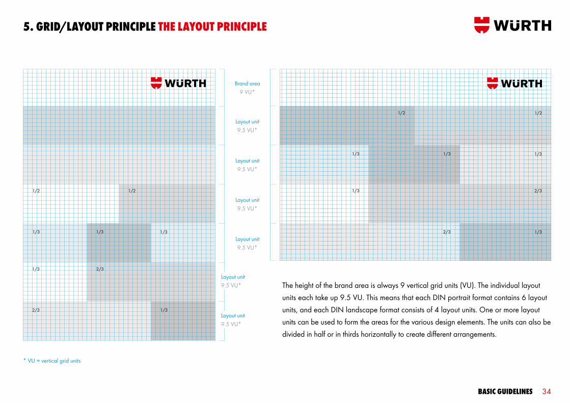
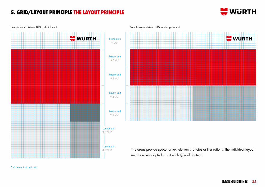
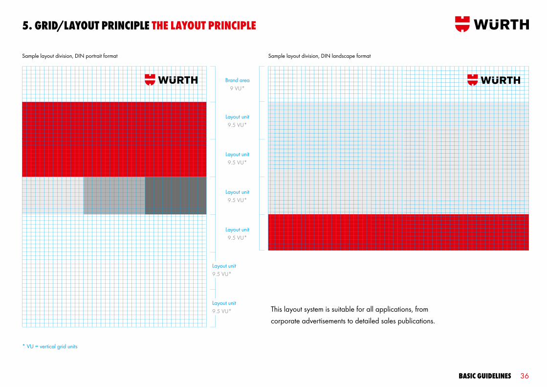
Our versatile layout system organises all elements into individual areas positioned in relation to the brand area. These layout units can be combined in a variety of ways to create our flexible and unique visual identity.
Basic guidelines 34
The height of the brand area is always 9 vertical grid units (VU). The individual layout units each take up 9.5 VU. This means that each DIN portrait format contains 6 layout units, and each DIN landscape format consists of 4 layout units. One or more layout units can be used to form the areas for the various design elements. The units can also be divided in half or in thirds horizontally to create different arrangements.
Brand area9 VU*
Layout unit 9.5 VU*
Layout unit 9.5 VU*
Layout unit 9.5 VU*
Layout unit 9.5 VU*
Layout unit 9.5 VU*
Layout unit 9.5 VU*
5. grid/laYouT PrinciPle THe laYouT PrinciPle
* VU = vertical grid units
1/2 1/2
1/3
1/3
2/3
1/3
2/3
1/3
1/31/2
1/3
1/3
2/3
1/3
2/3
1/3
1/3
1/2
Basic guidelines 35
The areas provide space for text elements, photos or illustrations. The individual layout units can be adapted to suit each type of content.
5. grid/laYouT PrinciPle THe laYouT PrinciPle
Sample layout division, DIN portrait format Sample layout division, DIN landscape format
* VU = vertical grid units
Brand area9 VU*
Layout unit9.5 VU*
Layout unit9.5 VU*
Layout unit9.5 VU*
Layout unit9.5 VU*
Layout unit9.5 VU*
Layout unit9.5 VU*
Basic guidelines 36
This layout system is suitable for all applications, from corporate advertisements to detailed sales publications.
5. grid/laYouT PrinciPle THe laYouT PrinciPle
* VU = vertical grid units
Sample layout division, DIN portrait format Sample layout division, DIN landscape format
Brand area9 VU*
Layout unit9.5 VU*
Layout unit9.5 VU*
Layout unit9.5 VU*
Layout unit9.5 VU*
Layout unit9.5 VU*
Layout unit9.5 VU*
Basic guidelines 37
6. imagerY

Basic guidelines 38
6. imagerY
Images are an important part of Würth’s communication. The pictures we use in our media reflect the identity of our brand. Our imagery is authentic, clear and demonstrates our close relationship with our customers. Würth Red is an important colour accent. Instead of creating this accent after the fact, it is a natural element of the image motif supple mented by white, black and other “clear” colours. The amount of red required in each image is not specified. This ensures that they always have an authentic feel and are not unrealistic or artificially colourful. The imagery should also include any colours that correspond to specific target groups.
Basic guidelines 39
6. imagerY mood Boards
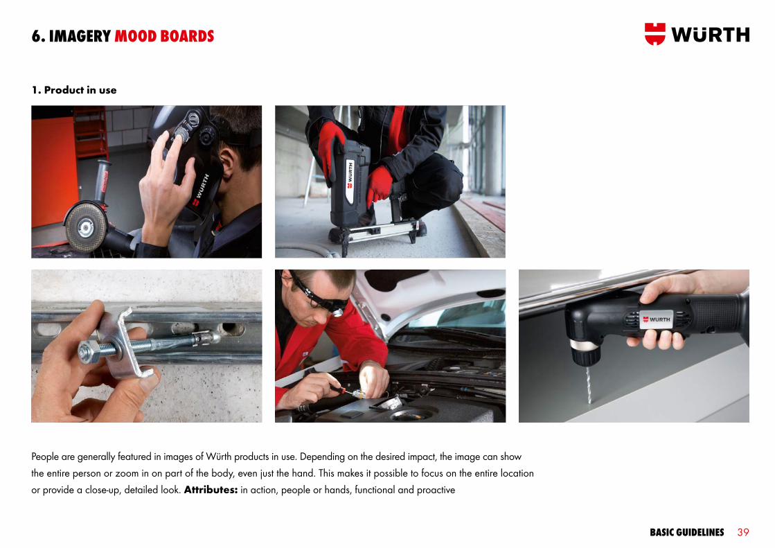
1. Product in use
People are generally featured in images of Würth products in use. Depending on the desired impact, the image can show the entire person or zoom in on part of the body, even just the hand. This makes it possible to focus on the entire location or provide a close-up, detailed look. Attributes: in action, people or hands, functional and proactive
Basic guidelines 40
6. imagerY mood Boards
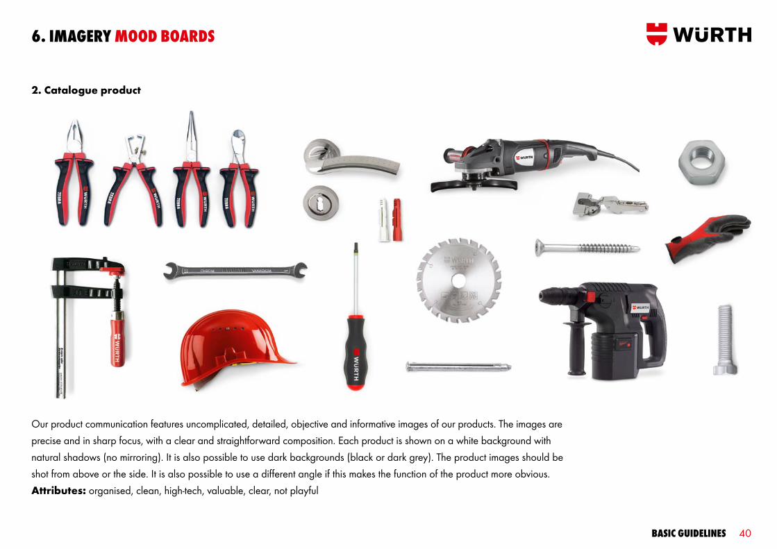
2. Catalogue product
Our product communication features uncomplicated, detailed, objective and informative images of our products. The images are precise and in sharp focus, with a clear and straightforward composition. Each product is shown on a white background with natural shadows (no mirroring). It is also possible to use dark backgrounds (black or dark grey). The product images should be shot from above or the side. It is also possible to use a different angle if this makes the function of the product more obvious. Attributes: organised, clean, high-tech, valuable, clear, not playful

Basic guidelines 41
6. imagerY mood Boards
3. Product in corporate photography
Our corporate photography uses a structured composition and limited colours to underscore the high quality of our products. Blurring can be integrated to create intriguing spatial perspectives. Corporate images can be taken in natural surroundings or a studio. Attributes: high-quality, elegant, aesthetic and confident

Basic guidelines 42
6. imagerY mood Boards
4. Customers, sales staff and people
The people in our images are friendly and optimistic partners who work with everyone as equals. Extreme high and low camera angles should be avoided. The people are shown in realistic situations, e.g. providing customer service or advice, or using our products and systems. Attributes: open, communicative, dynamic, relaxed and distinctive
Basic guidelines 43
7. Brand arcHiTecTure

Basic guidelines 44
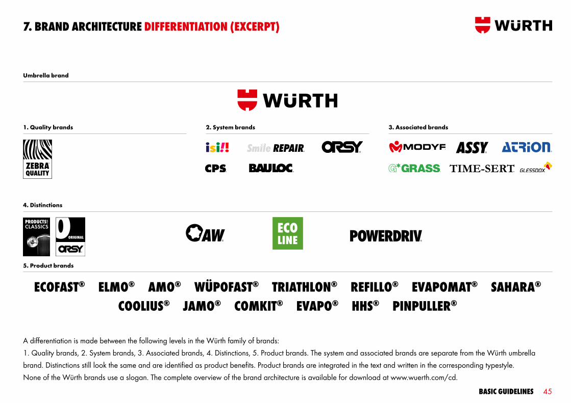
The brand architecture organises and manages the Würth family of brands. It classifies the individual brands and products, creating a clear structure for customers and employees. The brand architecture allows us to design communication which meets our customer’s specific needs while emphasising product benefits.
7. Brand arcHiTecTure
Basic guidelines 45
7. Brand arcHiTecTure diFFerenTiaTion (excerPT)
Umbrella brand
1. Quality brands 2. System brands 3. Associated brands
4. Distinctions
5. Product brands
A differentiation is made between the following levels in the Würth family of brands: 1. Quality brands, 2. System brands, 3. Associated brands, 4. Distinctions, 5. Product brands. The system and associated brands are separate from the Würth umbrella brand. Distinctions still look the same and are identified as product benefits. Product brands are integrated in the text and written in the corresponding typestyle. None of the Würth brands use a slogan. The complete overview of the brand architecture is available for download at www.wuerth.com/cd.
ecoFasT® elmo® amo® wüPoFasT® TriaTHlon® reFillo® evaPomaT® saHara® coolius® Jamo® comkiT® evaPo® HHs® PinPuller®

Basic guidelines 46
7. Brand arcHiTecTure deFiniTion
Quality brands identify especially exclusive products or products which provide a special benefit to the customer. They are used for the system, associated and product brands.
Distinctions identify special features of a product or range.
System brands are those which specifically focus on providing a service to increase customer satisfaction.
The associated brands unify especially innovative product groups with long-term strategic market potential and/or unique selling propositions as compared to the competition.
The product brands stand only for individual products with long-term strategic market potential, strong innovation and/or unique selling propositions as compared to the competition.
Umbrella brand
1. Quality brands 2. System brands 3. Associated brands
4. Distinctions
5. Product brands

Basic guidelines 47
7. Brand arcHiTecTure umBrella Brand
It is always clear that Würth is the voice behind the communication. The logo is featured on media of different shapes, colours and structures (2-D and 3-D). The preferred logo version is red/black on a white or neutral background. The defined small logo version is used for smaller applications in which the logo height is less than 4 mm (e.g. on small tools, see p. 15).
Preferred version Reverse version, two colours Reverse version, one colour
Basic guidelines 48
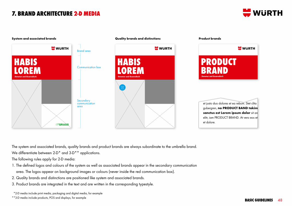
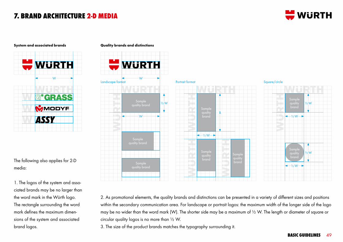
7. Brand arcHiTecTure 2-d media
System and associated brands Quality brands and distinctions Product brands
HaBis loremDenetur sed Guaredisch
ProducT BrandDenetur sed Guaredisch
HaBis loremDenetur sed Guaredisch
Samplequality brand
*2-D media include print media, packaging and digital media, for example **3-D media include products, POS and displays, for example
The system and associated brands, quality brands and product brands are always subordinate to the umbrella brand. We differentiate between 2-D* and 3-D** applications.The following rules apply for 2-D media:1. The defined logos and colours of the system as well as associated brands appear in the secondary communication
area. The logos appear on background images or colours (never inside the red communication box).2. Quality brands and distinctions are positioned like system and associated brands.3. Product brands are integrated in the text and are written in the corresponding typestyle.
Brand area
Communication box
Secondarycommunicationarea
Basic guidelines 49
7. Brand arcHiTecTure 2-d media
W WLandscape format Portrait format Square/circle
W
½ W
System and associated brands Quality brands and distinctions
Samplequality brand
Samplequality brand
½ W
B
Samplequalitybrand
Samplequality brand
Samplequality brand ½ W
½ W
½ W
½ W
Samplequalitybrand
Samplequalitybrand
The following also applies for 2-D media:
1. The logos of the system and asso-ciated brands may be no larger than the word mark in the Würth logo. The rectangle surrounding the word mark defines the maximum dimen-sions of the system and associated brand logos.
2. As promotional elements, the quality brands and distinctions can be presented in a variety of different sizes and pos itions within the secondary communication area. For landscape or portrait logos: the maximum width of the longer side of the logo may be no wider than the word mark (W). The shorter side may be a maximum of ½ W. The length or diameter of square or circular quality logos is no more than ½ W.3. The size of the product brands matches the typography surrounding it.
Samplequality brand
Basic guidelines 50
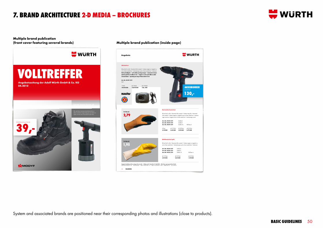
7. Brand arcHiTecTure 2-d media – BrocHures
50 Volltreffer
Angebote
Angebot freibleibend. Nur solange Vorrat reicht · Gültig vom 01. April bis 31. Mai 2010 · Alle Preise zzgl. gesetzlicher MwSt.Adolf Würth GmbH & Co. KG · 74650 Künzelsau · Telefon +49 (0)7940 15 - 0 · Telefax +49 (0)7940 15 -1000 · [email protected] · www.wuerth.de
Pro Paar ab
1,95
Pro Paar ab
2,79Mechanikerhandschuh
Ibh ea facil in ulla • feummod ulla consenit • lutatue mag ulla • feummod ulla consenit • lutatue magnis er magnisit suscin ut lorer sectet lore • tatumsa-nagn suscnis er magnisit suscin ut lorer sectet lore • tatumsanagn suscin
Art.-Nr. M 041 019 Größe 8 Art.-Nr. M 041 019 Größe 9 Art.-Nr. M 041 019 Größe 10 VE/Paar 6
6 Paar ab 12 Paar ab 24 Paar ab 36 Paar 3,70 EUR 3,45 EUR 2,95 EUR 2,79 EUR
Akkubohrer
Ibh ea facil in ulla • feummod ulla consenit • lutatue magnis er magnisit su-scin ut lorer sectet lore • tatumsanagn suscin ut lorer sectet lore • tatumsan Gait ip elendignim • zzrit volobor percing essequa • mconsecte te conse-quatem quat lan ut nullaorer ate • magna cor si tat, quat nibh ex endio eraesed tatum • ipsusting exer ing er illaore dolore te tet
Art.-Nr. M 041 019 VE/1
1 Stück ab 3 Stück ab 10 Stück 149,90 EUR 138,90 EUR 130,- EUR
Nitrilhandschuh gelb
Ibh ea facil in ulla • feummod ulla consenit • lutatue magnis er magnisit su-scin ut lorer sectet lore • tatumsanagn suscin ut lorer sectet lore • tatumsan
Art.-Nr. M 041 019 Größe 8 Art.-Nr. M 041 019 Größe 9 Art.-Nr. M 041 019 Größe 10 VE/Paar 6
ab 12 Paar ab 24 Paar ab 36 Paar 2,95 EUR 2,45 EUR 1,95 EUR
akkuBoHrer pro Stück ab
130,-
vollTreFFer
Sicherheitsschuh, pro Paar ab
39,-
Lorem ipsum ipsum sitconsecetur dolor amet
Elitr, sed diam nonumy eirmod temnvidunt ut labore et dolore magna aliquyam erat diam vo-luptua. At vero eos et accusam et justo duo.
Angebotszeitung der Adolf Würth GmbH & Co. KG04.2010
System and associated brands are positioned near their corresponding photos and illustrations (close to products).
Multiple brand publication (inside page)Multiple brand publication (front cover featuring several brands)

Basic guidelines 51
Lorem ipsum dolor
• Lorem ipsum • Dolor sit amet consectetur adipisicing • elit sed do eiusmod • tempor incididunt ut labore et • dolore magna aliqua • Ut enim ad minim veniam, quis nostrud exercitation ullamco laboris nisi ut aliquip ex ea commodo • Duis aute irure dolor in reprehenderit • in voluptate velit esse cillum dolore
Artikelnummer: M 018 028 0 schwarz 1 Paar: LOREMGrößen: 39-48 ab 3 Paar: LOREM ab 10 Paar. LOREM
1
3 Iriuscincinim
• Lorem ipsum • Dolor sit amet consectetur adipisicing • elit sed do eiusmod • tempor incididunt ut labore et • dolore magna aliqua • Ut enim ad minim veniam, quis nostrud exercitation ullamco laboris nisi Lorem ipsum • Dolor sit amet consectetur adipisicing • elit sed do eiusmod • tempor incididunt ut labore et
Artikelnummer: M 018 028 0 schwarz 1 Paar: loremGrößen: 39-48 ab 3 Paar: lorem ab 10 Paar. lorem
2 Agniatum velissed eugait
• Lorem ipsum • Dolor sit amet consectetur adipisicing • elit sed do eiusmod • tempor incididunt ut ut aliquip ex ea commodo • Duis aute irure dolor in reprehenderit • in voluptate velit esse cillum dolore Lorem ipsum • Dolor sit amet consectetur adipisicing • elit sed do eiusmod • tempor incididunt ut labore et
Artikelnummer: M 018 028 0 schwarz 1 Paar: loremGrößen: 39-48 ab 3 Paar: lorem
Lorem ipsum dolor sit
• Lorem ipsum • Dolor sit amet consectetur adipisicing • elit sed do eiusmod • tempor incididunt ut
Artikelnummer: M 018 028 0 schwarz 1 Paar: loremGrößen: 39-48 ab 3 Paar: lorem
5 Lorem ipsum dolor sit
Artikelnummer: M 018 028 0 schwarz 1 Paar: lorem#Größen: 39-48 ab 3 Paar: lorem
14 vollTreFFer
Die neue MODYF Kollektion ist da!
Lorem ipsum dolor sit amet consetetur duis autem dolorAt, sequi et, core erit ilit lut volor sus-cil elit at. Olor augue magnibh et prat dipsummod tis nonse ex eliquamet, siscilit wisissi siscil dionsendit ea faccum velit, commodiam, con utpat ut autpat nullandigna aut nonsecte
4
MODYF Angebote
vollTreFFer
Lorem ipsum ipsum sitconsecetur dolor amet
Elitr, sed diam nonumy eirmod temnvidunt ut labore et dolore magna aliquyam erat diam luptua. At vero eos et accusam et justo duo.
Angebotszeitung der Adolf Würth GmbH & Co. KG04.2010
7. Brand arcHiTecTure 2-d media – BrocHures
Single brand publication (front cover) Single brand publication (inside page)
If the publication only covers a single system or associated brand, the corresponding logo is positioned on an insert in the communication area on the front cover. This logo is also placed in relation to each product photo or illustration on the inside pages, similar to the multiple brand publications. All logo sizes must correspond to the defined specifications.

Basic guidelines 52
7. Brand arcHiTecTure 3-d media
The following rules apply for 3-D media*:
Our products come in many different shapes and colours. As a result, there is no uniform format for the design. To solve this issue, we divide each 3-D medium into brand and communciation areas. These are always opposite each other, either on the front and back, or on clearly separate parts of the product.
The system and associated brand logos are always featured in the communication area along with the additional product information (e.g. item number). The size specifications for logos in 2-D media generally apply here.
These defined sizes are adapted for use on especially small products. In these cases, the logos for the umbrella, system and associated brands are similar in size.
Quality brands are included on the packaging, which is treated like other 2-D media. The word mark is placed on the respective products. Product brands are part of the product information and do not receive special emphasis.
Brand area
Communication area
Brand area Communication area
Umbrella brand and communication areas on different sides
Umbrella brand and communication areas in clearly defined areas on the same side
*3-D media include products, POS and displays, for example
Basic guidelines 53
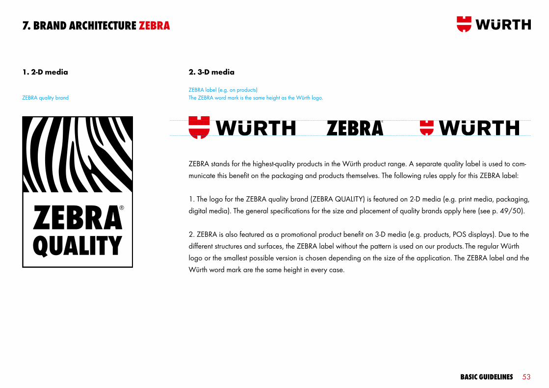
7. Brand arcHiTecTure zeBra
ZEBRA stands for the highest-quality products in the Würth product range. A separate quality label is used to com-municate this benefit on the packaging and products themselves. The following rules apply for this ZEBRA label:
1. The logo for the ZEBRA quality brand (ZEBRA QUALITY) is featured on 2-D media (e.g. print media, packaging, digital media). The general specifications for the size and placement of quality brands apply here (see p. 49/50).
2. ZEBRA is also featured as a promotional product benefit on 3-D media (e.g. products, POS displays). Due to the different structures and surfaces, the ZEBRA label without the pattern is used on our products. The regular Würth logo or the smallest possible version is chosen depending on the size of the application. The ZEBRA label and the Würth word mark are the same height in every case.
1. 2-D media 2. 3-D media
ZEBRA quality brandZEBRA label (e.g. on products)The ZEBRA word mark is the same height as the Würth logo.

Basic guidelines 54
64
Aufreiber VierkAnt
Vorstecher
hAndentgrAter din 355 c
henkel-kocheisen
MW
F - 0
8/05
-005
03
1
1
2
2
Klinge: Rundklinge, mattverchromt.und Innensechskantschlüssel.2 Mit Holzgriff
Klinge: Rundklinge, mattverchromt.und Innensechskantschlüssel.2 Mit Holzgriff
Stahl geschmiedet. Zum Lochen von Gummi, Pappe, Leder,Kunststoffplanen etc.
Klingen-Ømm
Senker- Ø mm
Ainch Art.-Nr.
10 12,4 121 0713 421 51010 20,5 136 0713 421 58
Verwendung: Zum sauberen Entgraten und Ansenken von Bohrungen.
Ømm Form Art.-Nr.4 0880 223 2045 0880 223 2056 0880 223 2068 0880 223 20810 0880 227 311 0880 223 21112 0880 228 314 0880 223 21416 0880 220 318 0880 223 218
rund 1 1
Ømm Form Art.-Nr.20 0880 232 20125 0880 233 25136 0880 823 6140 0880 236 40117,0 x11 0880 203 1122,5 x13 0880 201 1140,0 x10 0880 201 1142,0x 22 0880 221 1140,5x 8 Schlitz
eckig0880 200 401
Klingen-Ømm
A B / Cmm mm
Ainch Art.-Nr.
6 100 96 / 31 4 " 0613 230 921
6 100 86 / 35 4 " 0715 34 47 21
Klingen-Ømm
A B / Cmm mm
Ainch Art.-Nr.
6 100 96 / 31 4 " 0613 230 911
6 100 86 / 35 4 " 0715 34 49 21
1
rund
oval
7. Brand arcHiTecTure zeBra – 2-d media
oFFerTaPromozionaleValidità: Luglio – Agosto 2009
+ In omaggio! Cacciavite „Revolver“ ZEBRA
Kit „Piacere Würth Cargo“
Art. 1988 890 103
il kit
39,90
ZEBRA publication (front cover) ZEBRA publication (inside page)
The ZEBRA quality brand logo is used to communicate the benefits of ZEBRA products in 2-D media (print media, packaging, digital media). The logo is placed in relation to the corresponding photos and illustrations (close to the product) in print media. The packaging also features a striking ZEBRA pattern.

Basic guidelines 55
7. Brand arcHiTecTure zeBra – 3-d media
The word mark is used to identify the ZEBRA quality brand on 3-D media. The ZEBRA label and Würth word mark are the same height. The regular logo or the smallest possible version is used depending on the size of the application.
Basic guidelines 56
7. Brand arcHiTecTure inTroducing addiTional Brands
Responsible for introducing and organising additional/existing brands:
Thomas Rosenberger/MWC T +49 7940 [email protected]
Roland Kampe/GG T +41 71 [email protected]
Detlef Lederer/MWC T +49 7940 [email protected]
Roland Kampe/GG T +41 71 [email protected]
Domestic International

Basic guidelines 57
8. inserTs
Basic guidelines 58
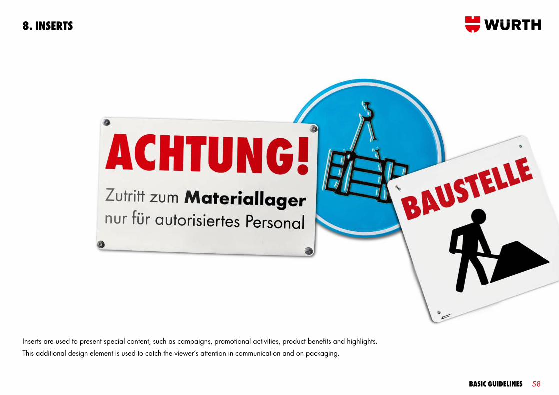
Inserts are used to present special content, such as campaigns, promotional activities, product benefits and highlights. This additional design element is used to catch the viewer’s attention in communication and on packaging.
8. inserTs
Basic guidelines 59
8. inserTs sHaPe and colour
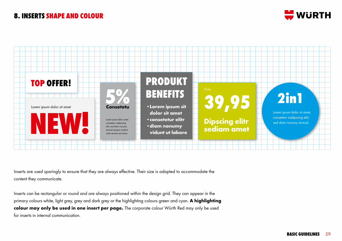
Inserts are used sparingly to ensure that they are always effective. Their size is adapted to accommodate the content they communicate.
Inserts can be rectangular or round and are always positioned within the design grid. They can appear in the primary colours white, light grey, grey and dark grey or the highlighting colours green and cyan. A highlighting colour may only be used in one insert per page. The corporate colour Würth Red may only be used for inserts in internal communication.
ToP oFFer! ProdukTBeneFiTs• Lorem ipsum sit
dolor sit amet• consetetur elitr• diam nonumy
vidunt ut labore
39,95Only
Dipscing elitr sediam amet
Lorem ipsum dolor amet, consetetur sadipscing elitr, sed diam nonumy eirmod. tempor invidunt mata sanctus est Lorem.
Lorem ipsum dolor sit amet, consetetur sadipscing elitr, sed diam nonumy eirmod.
2in1
Basic guidelines 60
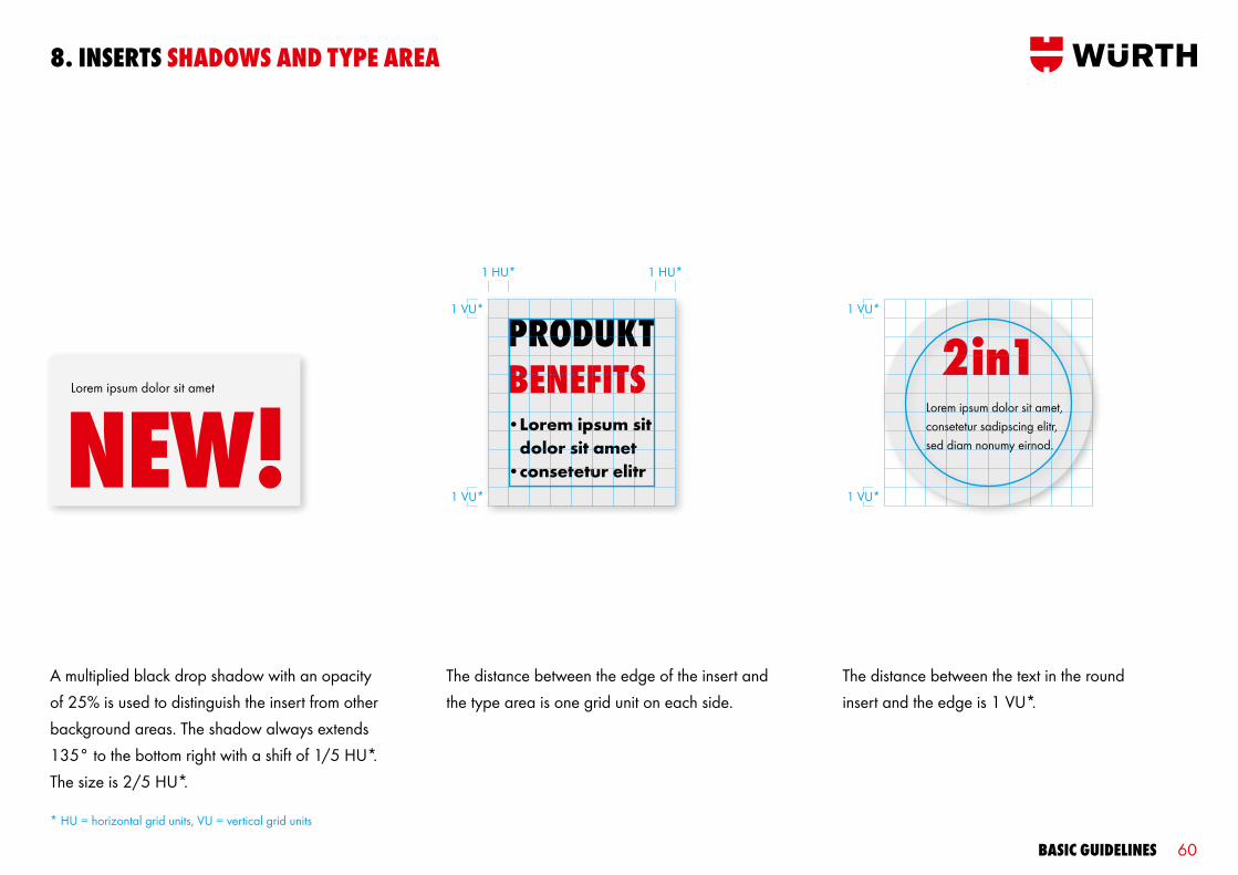
1 VU*
1 VU*
8. inserTs sHadows and TYPe area
A multiplied black drop shadow with an opacity of 25% is used to distinguish the insert from other background areas. The shadow always extends 135° to the bottom right with a shift of 1/5 HU*. The size is 2/5 HU*.
The distance between the edge of the insert and the type area is one grid unit on each side.
* HU = horizontal grid units, VU = vertical grid units
• Lorem ipsum sit dolor sit amet
• consetetur elitr
1 HU*1 HU*
Lorem ipsum dolor sit amet, consetetur sadipscing elitr, sed diam nonumy eirnod.
2in11 VU*
1 VU*
The distance between the text in the roundinsert and the edge is 1 VU*.

Basic guidelines 61
8. inserTs TYPograPHY
White typography is always used on inserts in highlighting colours. The specifications in the typography on different colours section (see p. 28) apply for all other backgrounds.
The text is always left-aligned and positioned within the grid. The typography should extend across the entire width and height of the type area as far as possible.
Only key words and prices appear in uppercase letters in Wuerth Extra Bold Cond. All other information is in mixed type in Wuerth Book or Wuerth Bold. The type sizes and line spacing defined for each medium should be used here.
39.95onlYDipscing elitr
5%ConsetetuLorem ipsum dolor amet, consetetur sadipscing elitr, sed diam nonumy eirmod. tempor invidunt mata sanctus est Lorem.
ToP oFFer!
Basic guidelines 62
9. TaBles and cHarTs
Basic guidelines 63
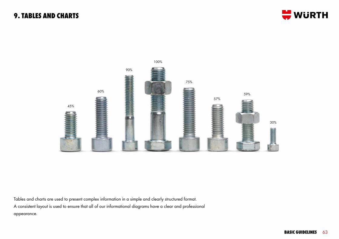
Tables and charts are used to present complex information in a simple and clearly structured format. A consistent layout is used to ensure that all of our informational diagrams have a clear and professional appearance.
100%
45%
60%
75%
57%59%
30%
90%
9. TaBles and cHarTs
Basic guidelines 64
Table titleTakimata Sanctus Ø mm Item no. VE/St. Consetur amet Lorem ipsum 1015 – 1195 50 0683 360 631 1Consetetur sadipscing 1015 – 1195 50 0683 360 634 1Kasd gubergren 1015 – 1195 50 0683 360 635 1Lorem ipsum 1015 – 1195 34 0683 360 637 1Sadipscing elitr 1015 – 1195 35 0683 360 636 1Lorem ipsum 1015 – 1195 35 0683 360 636 2Kasd gubergren 1015 – 1195 35 0683 360 636 3Consetetur sadipscing 1015 – 1195 35 0683 360 636 3Sadipscing elitr 1015 – 1195 40 0683 360 636 4
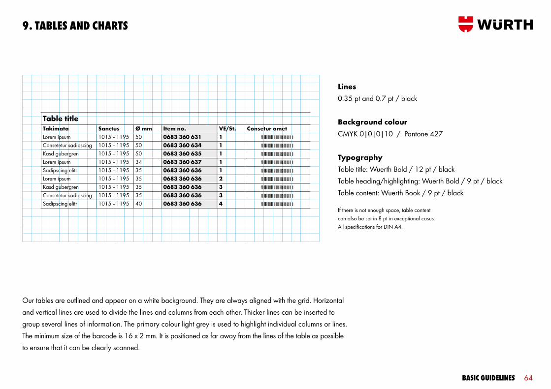
Our tables are outlined and appear on a white background. They are always aligned with the grid. Horizontal and vertical lines are used to divide the lines and columns from each other. Thicker lines can be inserted to group several lines of information. The primary colour light grey is used to highlight individual columns or lines. The minimum size of the barcode is 16 x 2 mm. It is positioned as far away from the lines of the table as possible to ensure that it can be clearly scanned.
Lines0.35 pt and 0.7 pt / black
Background colourCMYK 0|0|0|10 / Pantone 427
TypographyTable title: Wuerth Bold / 12 pt / blackTable heading/highlighting: Wuerth Bold / 9 pt / blackTable content: Wuerth Book / 9 pt / black
If there is not enough space, table content can also be set in 8 pt in exceptional cases. All specifications for DIN A4.
9. TaBles and cHarTs

Basic guidelines 65
9. TaBles and cHarTs
Data can be depicted using 2-D pie charts as well as line and bar graphs. These diagrams appear in the primary colours light grey, grey and dark grey and are always placed on a white background. The colours should be arranged to create the greatest possible contrast. The corporate colour Würth Red and highlighting colours can be used to accentuate information. Division colours may also be used, but only sparingly, as they are not part of the defined Würth colour palette.
40% black
70% black10% black
10% black
Würth Red
40% black
Pie chart heading Bar graph heading
LinesDividing lines: 0.35 pt and 0.7 pt / black Graph lines: 1.4 pt
TypographyHeadings: Wuerth Bold / 9 pt / blackValues, legend: Wuerth Book / 9 pt / black or
Wuerth Book / 6 pt / blackSource: Wuerth Book / 6 pt / black
100% cyan
Würth Red
70% black
40% black
10% black
Line graph heading
22% cyan, 100% yellow, 8% black Würth Red70% black40% black
140
130
120
110
100
90
04.06 01.07 02.07 03.07 04.07 01.08
10. TecHnical illusTraTions
Basic guidelines 67
10. TecHnical illusTraTions
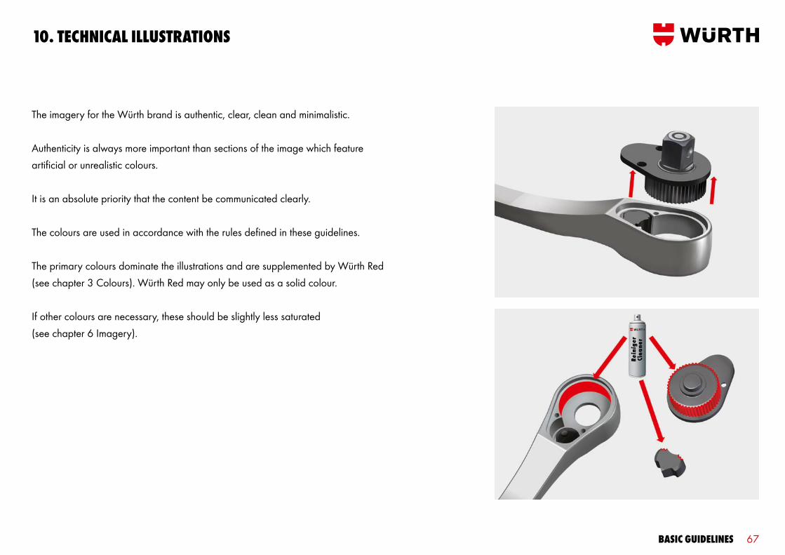
The imagery for the Würth brand is authentic, clear, clean and minimalistic.
Authenticity is always more important than sections of the image which feature artificial or unrealistic colours.
It is an absolute priority that the content be communicated clearly.
The colours are used in accordance with the rules defined in these guidelines.
The primary colours dominate the illustrations and are supplemented by Würth Red (see chapter 3 Colours). Würth Red may only be used as a solid colour.
If other colours are necessary, these should be slightly less saturated (see chapter 6 Imagery).

Basic guidelines 68
10. TecHnical illusTraTions
Informative Narrative
The informative style is used if the illustration is not very complex. This style makes a very technical and functional impression. It has a two-dimensional and simplistic appearance. Variations in colour and material reproductions are used sparingly. The primary attributes are clarity, objectivity and technical precision.
The narrative style is used if the complexity of the illustration requires close attention to detail. It makes a realistic, photo-like impression, and focuses on the characteristics of the materi-als. Detailed processes and procedures are illustrated clearly. These illustrations are sophisticated and of very high quality. The primary attributes are functionality, neatness and technical integrity.
Two styles of illustrations are used to meet the different requirements:
Basic guidelines 69
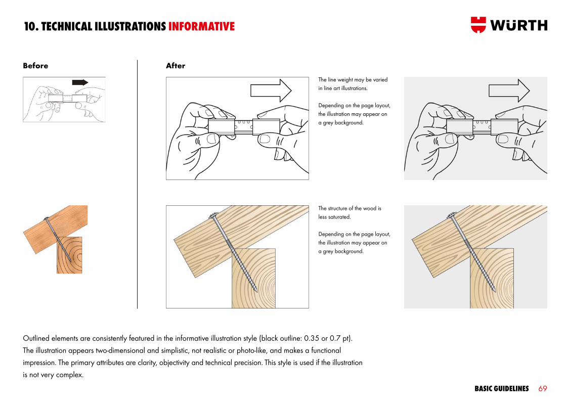
10. TecHnical illusTraTions inFormaTive
Before After
Outlined elements are consistently featured in the informative illustration style (black outline: 0.35 or 0.7 pt). The illustration appears two-dimensional and simplistic, not realistic or photo-like, and makes a functional impression. The primary attributes are clarity, objectivity and technical precision. This style is used if the illustration is not very complex.
The line weight may be varied in line art illustrations.
Depending on the page layout, the illustration may appear on a grey background.
The structure of the wood is less saturated.
Depending on the page layout, the illustration may appear on a grey background.
Basic guidelines 70
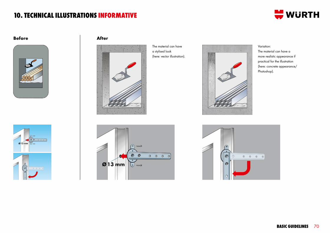
10. TecHnical illusTraTions inFormaTive
The material can have a stylised look (here: vector illustration).
Variation: The material can have a more realistic appearance if practical for the illustration (here: concrete appearance/ Photoshop).
Before After
Basic guidelines 71
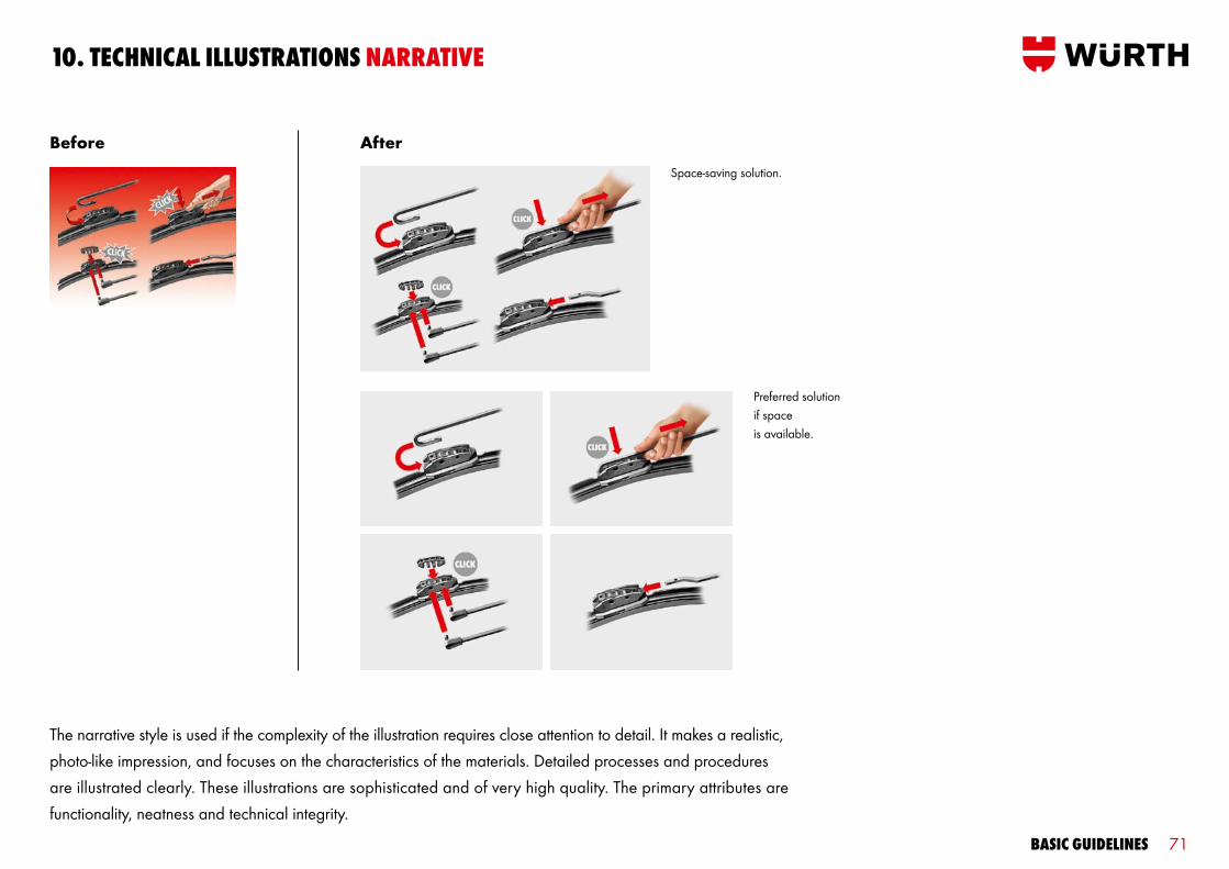
10. TecHnical illusTraTions narraTive
Space-saving solution.
Preferred solution if space is available.
The narrative style is used if the complexity of the illustration requires close attention to detail. It makes a realistic, photo-like impression, and focuses on the characteristics of the materials. Detailed processes and procedures are illustrated clearly. These illustrations are sophisticated and of very high quality. The primary attributes are functionality, neatness and technical integrity.
Before After

Basic guidelines 72
10. TecHnical illusTraTions narraTive
It is also possible to combine linear elements with 3D/realistic, photo-like elements (e.g. realistic, photo-like Würth products and purely linear secondary elements).
Before After

Basic guidelines 73
10. TecHnical illusTraTions narraTive
Before After
Basic guidelines 74
10. TecHnical illusTraTions narraTive
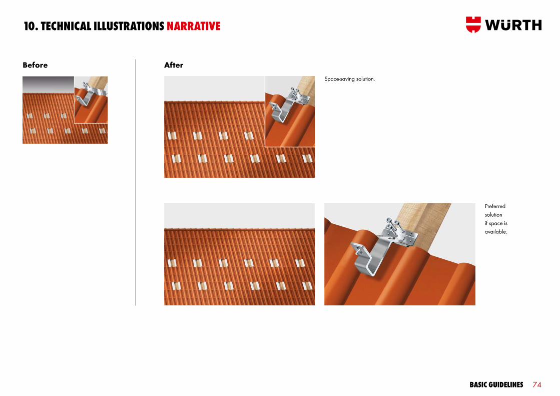
Space-saving solution.
Preferred solution if space is available.
Before After

11. FasTY

Basic guidelines 77
309 kundenmanagement
315� 2007
312� prozente
308 tasse
314 rennrad
311� regio mg
307 diver
313 herz
310 masterservice
VERTRIEB INNENDIENST
WIR HEBEN AB!
11. FasTY
Fasty – authorised versions Fasty – non-authorised versions
exce
rPT o
F Fas
TY v
ersi
ons
039 kalender 08
045 reise 21
042 person 03
038 kalender 06
044 person 21
041 kollege 11
037 jubiläum 06
043 person 18
040 kollege 04
003 fasty_angelehnt
009 fasty_mauer
006 fasty_logo
002 fasty_mutter_lachend
008 fasty_läuft pfeifend
005 fastys_mit bleistift
001 fasty_liegend
007 fasty_jongliert
003 fasty_flieger
066 planer
072 ballon
069 beschlag
065 gelbe_seiten
071 mv
068 snowman
064 brieftaube
070 zuckerbaby
067 wirvombau
138 handy
144 schild
141 erschöpft
137 träger
143 rollschuh
140 sekt
136 schreiner
142 putzer
139 computer
291�biathlon
297 maxmo
294 geschenke
290 2005
296�orsy
293�marille
289�rheinhessen
295�wissen
292 langlauf
The popular Fasty will continue to represent the Würth product line in future. He supports the brand as an identifying figure and mascot at image-enhancing events by promoting awareness of the Würth brand across all target audiences. Fasty’splayful appearance would compete with the focus of our core business, namely customer support and the quality of ourproducts. For this reason, Fasty is not used in conjunction with our core business. Fasty mascots featuring the centred logo or system brands are not used, or the logo or system brand should be eliminated.
Basic guidelines 78
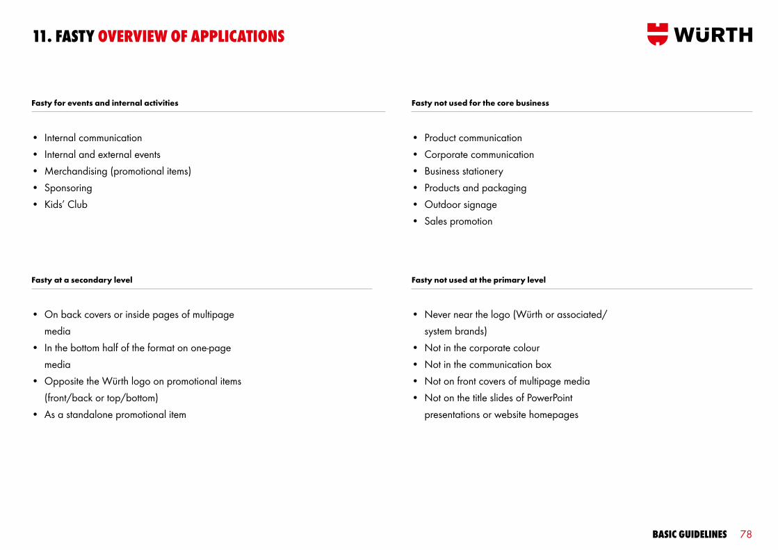
11. FasTY overview oF aPPlicaTions
• On back covers or inside pages of multipage media
• In the bottom half of the format on one-page media
• Opposite the Würth logo on promotional items (front/back or top/bottom)
• As a standalone promotional item
• Never near the logo (Würth or associated/ system brands)
• Not in the corporate colour• Not in the communication box• Not on front covers of multipage media• Not on the title slides of PowerPoint
presentations or website homepages
Fasty not used at the primary level
• Internal communication• Internal and external events• Merchandising (promotional items)• Sponsoring• Kids’ Club
• Product communication• Corporate communication• Business stationery• Products and packaging• Outdoor signage• Sales promotion
Fasty for events and internal activities Fasty not used for the core business
Fasty at a secondary level

Basic guidelines 79
11. FasTY PlacemenT
WLandscape format Portrait format Square/circle
W
½ W
Fasty
Sample Fasty
Sample Fasty
½ W
W
Sample Fasty Sample
Fasty
Sample Fasty ½ W
½ W
½ W
½ W
Sample Fasty
Sample Fasty
The maximum size of the Fasty mascot corresponds to the size of the word mark in the Würth logo. The rectangle surrounding the word mark defines the maximum length of the sides of Fasty. If Fasty is portrayed in portrait or landscape format, the longer side may not be longer than the width (W) of the word mark. The shorter side may be no longer than ½ W. The side length or diameter of a square or circular Fasty may be no longer than ½ W.
Sample Fasty
Basic guidelines 80
conTacT deTails
Last revised February 2013.
Your designs will shape Würth’s presence in the public eye.These guidelines are designed to assist you in your work. If you have any questions, please contact our Marketing/Advertising department.
Dieter MünchT +49 (0)7940 15-1247F +49 (0)7940 [email protected]


