ProductSAP Crystal Dashboard Design, personal edition
LevelUndergraduateBeginner
FocusDashboard Design
AuthorSonja HechtUCC Munich
Version1.0
MOTIVATIONThis case study introduces advanced techniques in dashboard design with SAP Crystal Dashboard Design. You will learn how to use different maps for visualization and how to structure information on a dashboard using container components.Furthermore, you are introduced to the concept of dynamic visibility. After completing this case study, you should be able to create advanced dashboards using the introduced components.
PREREQUISITESThe fundamental understanding of SAP Crystal Dashboard Design is a prerequisite for the students, covered in chapters ‘Introduction’, ‘Basic Concepts’ and ‘Advanced Techniques’. LECTURE NOTES
This case study is based on SAP Crystal Dashboard Design and Excel 2007. As a prerequisite each student should have the excel file Benchmarking.xls that includes the spreadsheet model used for this case study.
SAP Crystal Dashboard Design Advanced Techniques Case Study Benchmarking Sales Organizations
MODULE BI3-M2-03a – ADVANCED TECHNIQUES
Business Scenario
You are the assistant of Global Bikes’ global sales manager. The sales manager was pleased with the first dashboard you created for him, and now he requests a second dashboard, covering following requirements:On a yearly base, sales organizations over the USA, Australia and Europe are benchmarked against each other to find out how the sales organizations perform. For a general overview on the sales organizations worldwide, their location should be shown geographically on a worldwide map and on a detailed map for each region. Above that, gross sales and pieces sold should be displayed for each sales organization.Beside this geographical overview, the global sales manager wants to compare sales organizations within one region by profit margin, costs and discount. Furthermore, he wants to compare the number of bikes sold within a region with the worldwide number of bikes sold.
As this is quite a lot of information, you decide to split up the dashboard into two different views that can be selected using a tab set.
The first tab covers the geographical overview including a worldwide map and three regional maps for the USA, Germany and Australia. By selecting a region from the map, the sales organization of this region is displayed including the gross sales and the pieces sold by this sales organization. As there is not enough space to show all four maps at the same time, you decide to use dynamic visibility for the maps. By using this technique, the user is able to select from a radio button menu which map he wants to be displayed. You draw the first outline for this tab in PowerPoint, and this is the result:
Display Sales Organizations: Worldwide by continent Australia Germany USA
Sales Organization:
Australia Gross Sales: 49,043 TEUR Pieces Sold: 65432
Click on a region for details
MODULE BI3-M2-03a – ADVANCED TECHNIQUES
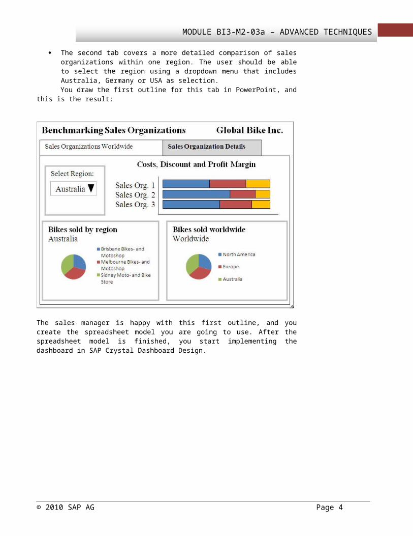
The second tab covers a more detailed comparison of sales organizations within one region. The user should be able to select the region using a dropdown menu that includes Australia, Germany or USA as selection. You draw the first outline for this tab in PowerPoint, and this is the result:
The sales manager is happy with this first outline, and you create the spreadsheet model you are going to use. After the spreadsheet model is finished, you start implementing the dashboard in SAP Crystal Dashboard Design.
Task 1: Create a new SAP Crystal Dashboard Design project and import a spreadsheetShort description: You create a new SAP Crystal Dashboard Design project that is based on an existing spreadsheet including the global sales data.
1. Please start SAP Crystal Dashboard Design (Xcelsius):
Start → Programs → Xcelsius → Xcelsius 2008
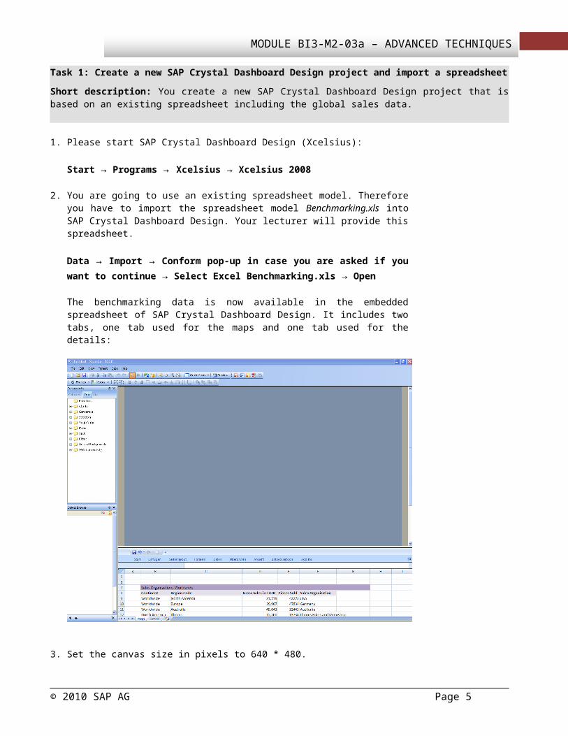
2. You are going to use an existing spreadsheet model. Therefore you have to import the spreadsheet model Benchmarking.xls into SAP Crystal Dashboard Design. Your lecturer will provide this spreadsheet.
Data → Import → Conform pop-up in case you are asked if you want to continue → Select Excel Benchmarking.xls → Open
The benchmarking data is now available in the embedded spreadsheet of SAP Crystal Dashboard Design. It includes two tabs, one tab used for the maps and one tab used for the details:
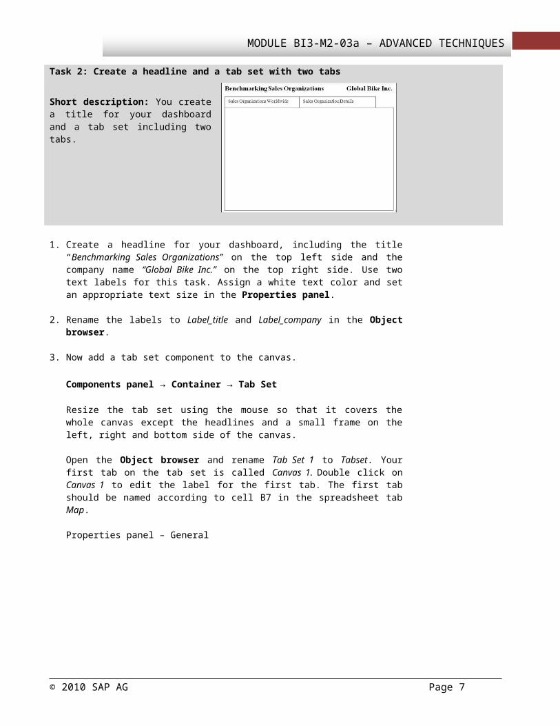
Task 2: Create a headline and a tab set with two tabs
Short description: You create a title for your dashboard and a tab set including two tabs.
1. Create a headline for your dashboard, including the title “Benchmarking Sales Organizations” on the top left side and the company name “Global Bike Inc.” on the top right side. Use two text labels for this task. Assign a white text color and set an appropriate text size in the Properties panel.
2. Rename the labels to Label_title and Label_company in the Object browser.
3. Now add a tab set component to the canvas.
Components panel → Container → Tab Set
Resize the tab set using the mouse so that it covers the whole canvas except the headlines and a small frame on the left, right and bottom side of the canvas.
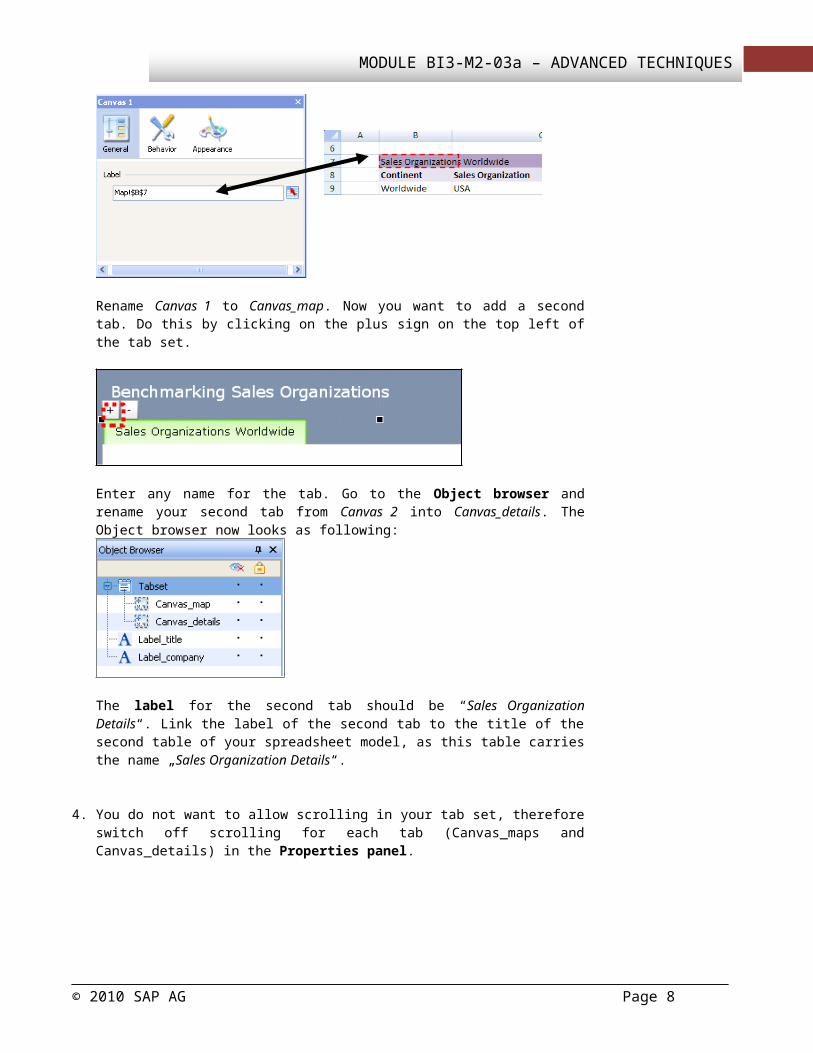
Open the Object browser and rename Tab Set 1 to Tabset. Your first tab on the tab set is called Canvas 1. Double click on Canvas 1 to edit the label for the first tab. The first tab should be named according to cell B7 in the spreadsheet tab Map.
Properties panel – General
Rename Canvas 1 to Canvas_map. Now you want to add a second tab. Do this by clicking on the plus sign on the top left of the tab set.
Enter any name for the tab. Go to the Object browser and rename your second tab from Canvas 2 into Canvas_details. The Object browser now looks as following:
The label for the second tab should be “Sales Organization Details“. Link the label of the second tab to the title of the second table of your spreadsheet model, as this table carries the name „Sales Organization Details“.
4. You do not want to allow scrolling in your tab set, therefore switch off scrolling for each tab (Canvas_maps and Canvas_details) in the Properties panel.
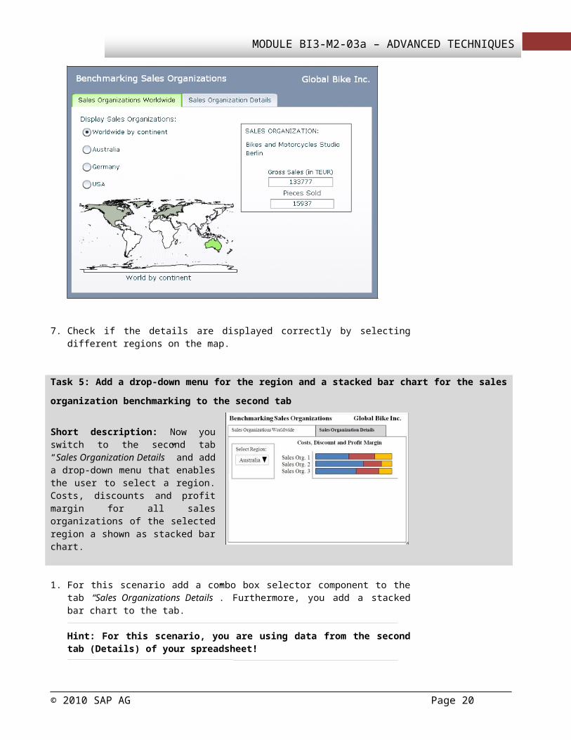
5. Save your changes and run the preview to check your dashboard. The dashboard should look as follows:
Task 3: Create a menu to select one of the four maps
Short description: You add a radio button selector with four buttons. The user can select one of these buttons, and then the corresponding map (worldwide, Australia, Germany or USA) is displayed on the canvas.
1. For this scenario you have to drag a radio button selector component to the first tab “Sales Organization Worldwide” of your tab set. Furthermore, you add four map components to the first tab, including map “Worldwide by continent”, “Australia by region”, “Germany by State”, and “USA (continental)”.
2. First, you configure the properties of the radio button. Double click on the radio button to open the Properties panel. You have to configure only the General tab.
3. Dependent on the selection, the position of the selected button is now inserted into cell B4. Each position now has to be linked to a map. In case cell B4 includes a certain status, the linked map is shown, and all other maps are hidden. The positions are as follows:
Radio Button Position in cell B4 Linked MapWorldwide by continent 1 World by continentAustralia 2 Australia by regionGermany 3 Germany by state USA 4 USA (continental)
4. Go to the Object browser and rename the maps to World, USA, Germany and Australia. Rename Radio button 1 to Radio_button_select. Hide all maps using the Object browser, except the World map. The Object browser now should look as follows:
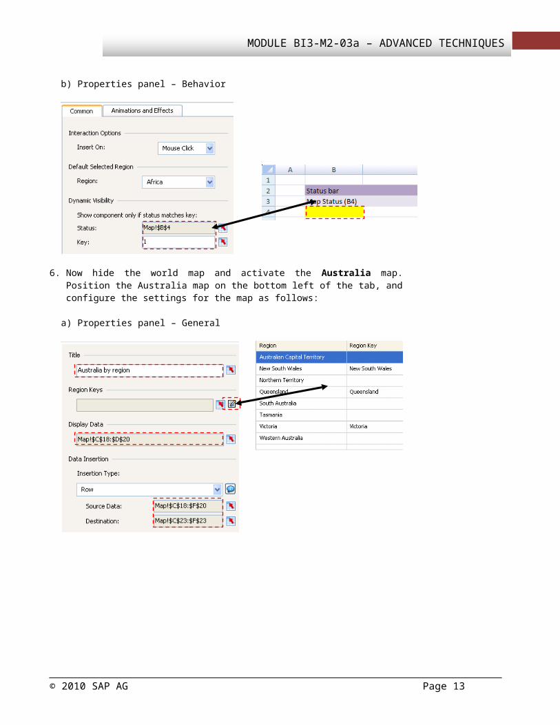
6. Now hide the world map and activate the Australia map. Position the Australia map on the bottom left of the tab, and configure the settings for the map as follows:
7. Now hide the Australia map and activate the Germany map. Position the Germany map on the bottom left of the tab, and configure the settings for the map as follows:
8. Now hide the Germany map and activate the USA map. Position the USA map on the bottom left of the tab, and configure the settings for the map as follows:
a) Properties panel – General
b) Properties panel - Behavior
9. Finally, for each map change the “Selectable Color” to grey in the Properties panel.
10. Save your changes and run the preview to check your dashboard. The dashboard should look as follows:
11. Test the radio buttons and check if each map is displayed. If required, adjust the layout and position of your components.
Task 4: Add a text field to show the details for a selected region
Short description: By clicking on a selectable area within any of the four maps, the sales organization, gross sales and pieces sold should be displayed in the upper right corner of the tab. Therefore you add a rectangle as frame and the required labels.
1. First you create the frame for the details area. Add a rectangle component to the upper right side of the first tab. Rename the rectangle in the Object browser into Frame_details.
2. In a next step, you create a title for the details area. Drag a label component into the rectangle, and assign the text “Sales Organization” to the label in the labels Properties panel.
3. Now you add a second label component positioned under the first label. This label includes the name of the selected sales organization. The text is dynamically populated from the spreadsheet from cell F23.
7. Check if the details are displayed correctly by selecting different regions on the map.
Task 5: Add a drop-down menu for the region and a stacked bar chart for the sales organization benchmarking to the second tab
Short description: Now you switch to the second tab “Sales Organization Details” and add a drop-down menu that enables the user to select a region. Costs, discounts and profit margin for all sales organizations of the selected region a shown as stacked bar chart.
1. For this scenario add a combo box selector component to the tab “Sales Organizations Details”. Furthermore, you add a stacked bar chart to the tab.
Hint: For this scenario, you are using data from the second tab (Details) of your spreadsheet!
2. First, you configure the properties of the combo box. Double click on the combo box to open the Properties panel. You have to configure the General tab of the Properties panel as follows:
Properties panel – General
Add the labels by selecting the displayed range in the spreadsheet. You do not have to maintain the labels manually.
3. Now configure the properties of the stacked bar chart. The data source of your chart is the Destination area populated by the combo box selector component. Double click on the stacked bar chart to open the Properties panel.
Task 6: Add two pie charts to compare the bikes sold within a region with the bikes sold worldwide
Short description: Add two pie charts. The pie chart on the left hand side includes the number of bikes sold by the sales organizations within the selected region. The pie chart on the right hand side includes the number of bikes sold within a region compared to other regions.
1. First, you add two pie charts to the tab “Sales Organization Details”.
2. Open the Object browser and rename the pie chart on the left hand side to pie_region and the pie chart on the right hand side to pie_world.
3. Open the Properties panel of pie chart pie_region and configure the General tab as shown below:
a) Properties panel - General b) Properties panel - Appearance
4. Open the Properties panel of pie chart “pie_world” and configure the General tab as shown in the following. For this chart, you are using data from the “map” tab of your spreadsheet model.
a) Properties panel - General b) Properties panel - Appearance
5. Finally, for each pie chart go to the Layout tab of the Appearance area in the Properties panel and switch off the chart background.
6. Save your changes and run the preview to check your dashboard. The dashboard should look as follows: