Use of low angle shots for the main image- gives the people present in the image a sense of status, causes them to seem more superior. Mast Head- Bold and large magazine head bar- attracts audiences attention and makes it clear to readers what magazine it is. It provides information to readers as to who the target audience are, 18-25 year olds, passionate about rap. Main cover line- Use of the colour yellow doesn't’t match the colour pallet therefore highlights ‘The Dirty Dozen’ as the most important aspect of the article. Yellow is also a colour of joy and energy, for that reason, the use of yellow is effective The Barcode presents the magazine as professional. Also, allows readers to be aware of the edition and issue of the magazine. The main image relates to the stereotypical genre of Rap/Hip-hop as there are people wearing gold chains and some what expensive ornaments, as most rappers are very aware of their aesthetic features, their image. The image is also placed on a white background, which helps to highlight the main theme of the magazine. It will help attract target audiences as it will relate to the codes and convention on rappers. The symbolism of the main image here is to represent rap as a collective, suggesting an interlinked relationship between all rappers that are visible. The group are made to seem superior through the use of a low straight on camera angle, suggesting to target audiences that as a collective rappers can make a difference. The left third of the magazine conforms the codes and conventions as it includes vital information that must be visible. It includes the names of rappers who are included within the issue providing the Artist credit cover lines- black or red outlined in white helps to draw the attention of the readers due to the contrast in colour. The colour scheme of red, black and white is common for Hip- hop music magazines and is also continuous throughout XXL as they are bold colours that make a statement to audiences.
Transcript
Use of low angle shots for the main image- gives the people present in the image a sense of status, causes them to seem more superior.
Mast Head- Bold and large magazine head bar- attracts audiences attention and makes it clear to readers what magazine it is. It provides information to readers as to who the target audience are, 18-25 year olds, passionate about rap.
Main cover line- Use of the colour yellow doesn't’t match the colour pallet therefore highlights ‘The Dirty Dozen’ as the most important aspect of the article. Yellow is also a colour of joy and energy, for that reason, the use of yellow is effective as it would stimulate a positive emotion from target audiences.
The Barcode presents the magazine as professional. Also, allows readers to be aware of the edition and issue of the magazine.
The main image relates to the stereotypical genre of Rap/Hip-hop as there are people wearing gold chains and some what expensive ornaments, as most rappers are very aware of their aesthetic features, their image. The image is also placed on a white background, which helps to highlight the main theme of the magazine. It will help attract target audiences as it will relate to the codes and convention on rappers.The symbolism of the main
image here is to represent rap as a collective, suggesting an interlinked relationship between all rappers that are visible. The group are made to seem superior through the use of a low straight on camera angle, suggesting to target audiences that as a collective rappers can make a difference.
The left third of the magazine conforms the codes and conventions as it includes vital information that must be visible. It includes the names of rappers who are included within the issue providing the target audience with an insight into the magazine.
Artist credit
cover lines- black or red outlined in white helps to draw the attention of the readers due to the contrast in colour. The colour scheme of red, black and white is common for Hip-hop music magazines and is also continuous throughout XXL as they are bold colours that make a statement to audiences.
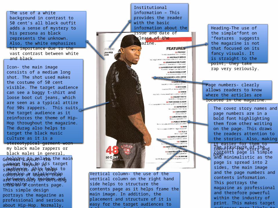
The use of a white background in contrast to 50 cent’s all black outfit adds a sense of mystery to his persona as black represents the unknown. Also, the white emphasizes his importance due to the vast contrast between white and black.
Heading-The use of the simple font on “features” suggests the magazine is not that focused on its fancy visuals. It is straight to the point, they take rap very seriously.
Page numbers- clearly allows readers to know where the articles are located in the magazine.
Icon- the main image consists of a medium long shot. The shot used makes the costume of 50 cent visible. The target audience can see a baggy t-shirt and loose boot cut jeans, which are seen as a typical attire for 90s rappers. This suits the target audience as it reinforces the theme of Hip-Hop throughout the magazine. The durag also helps to target the black music culture as it is a stereotypical garment worn my black male rappers or black males in general, helping to relate the main image back to its target audience, this helps to develop a relationship between the readers and magazine.
General Layout- the general layout is simplistic as it only consists of aspect that are necessary in defining this as a contents page. This simple design portrays the magazine as professional and serious about Hip-Hop. Normally, XXL choose to label their contents page as ‘The A-side’ making it unique and different compared to other accounts.
The cover story names and page numbers are in a bold font highlighting them from other writing on the page. This draws the readers attention to the stories. Also, making it easier for them to identify the story and page.
Institutional information – This provides the reader with the basic information about the issue and date of release of the magazine.
Vertical column- the use of the vertical column on the right hand side helps to structure the contents page as it helps frame the main image. In addition, the placement and structure of it is easy for the target audiences to follow, therefore their eyes are automatically drawn to the information available of the contents page
The structure of the contents page is simple and minimalistic as the page is spread into 2 sides, the main image and the page numbers and contents information. This portrays the magazine as professional and therefore powerful within the industry of print. This makes target audiences more likely to purchase the magazine as they are attracted to the respect that comes with the magazine.
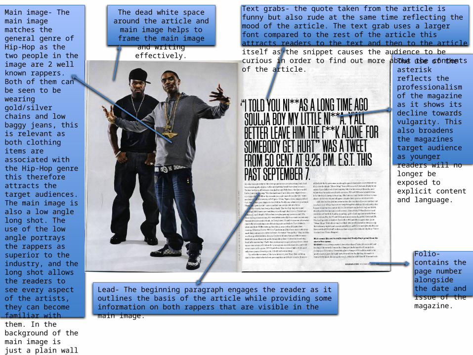
Folio- contains the page number alongside the date and issue of the magazine.
Main image- The main image matches the general genre of Hip-Hop as the two people in the image are 2 well known rappers. Both of them can be seen to be wearing gold/silver chains and low baggy jeans, this is relevant as both clothing items are associated with the Hip-Hop genre this therefore attracts the target audiences. The main image is also a low angle long shot. The use of the low angle portrays the rappers as superior to the industry, and the long shot allows the readers to see every aspect of the artists, they can become familiar with them. In the background of the main image is just a plain wall suggesting that the only important ‘XXL’ is music itself and they are serious about the topic, this would attract a target audience of young people who are passionate about Hip-hop music.
Text grabs- the quote taken from the article is funny but also rude at the same time reflecting the mood of the article. The text grab uses a larger font compared to the rest of the article this attracts readers to the text and then to the article itself as the snippet causes the audience to be curious in order to find out more about the contents of the article.
The dead white space around the article and main image helps to
frame the main image and writing effectively.
The use of the asterisk reflects the professionalism of the magazine as it shows its decline towards vulgarity. This also broadens the magazines target audience as younger readers will no longer be exposed to explicit content and language.
Lead- The beginning paragraph engages the reader as it outlines the basis of the article while providing some information on both rappers that are visible in the main image.